What Proof Our Climate is Warming?

This is a reblog of a post at Manhattan Contrarian How Do You Tell If The Earth’s Climate System “Is Warming”? Excerpts in italics with my bolds

Back in August I had a post by the title of “How Do You Tell If The Earth’s Climate System “Is Warming”? The post took note of the fact that, with a time series (like for temperature) that fluctuates up and down, you can always give a presentation that makes the trend look to be whatever you want it to be, so long as you get to pick the start date. If you want to make it look like the trend is up, you pick a start date where the value of the series is low; and if you want to make it look like the trend is down, you pick a start date where the value of the series is high. Nothing to it! With the earth’s climate system, you have nearly infinite numbers of years that you can go back to get the result you want. Those who want to convince you that the earth’s climate system “is warming” typically pick as their start date either the 1880s or the 1970s, both of which were notable low points in the temperature times series. The trick is so obvious that you would think that nobody could be fooled. But, among others, they seem to have bamboozled Google, which as that August post noted, had taken to including on YouTube videos involving climate skeptics a legend stating “Multiple lines of scientific evidence show that the climate system is warming.”

“Multiple lines of evidence”? Really Google, is there any “line of evidence” that matters as to whether something “is warming” or “is cooling” other than the temperature time series? They don’t enlighten us as to what that other “line of evidence” might be.

Anyway, enough months have now passed for another year to end, so we now have three full years since the most recent temperature peak, which occurred in January 2016. Here is the latest UAH satellite temperature graph for the lower troposphere, going from the time the satellites were launched (1979) to December 2018:

The 0.25 deg C temperature anomaly of the latest value represents a decline of some 0.61 deg C from the peak anomaly of 0.86 deg C in January 2016. That 0.61 deg C decline is not small in the context of this series. The whole range on this chart from coldest month (-0.51 deg C in 1984) to warmest month (+ 0.86 deg C in 2016) is only 1.37 deg C; and the 0.61 deg C drop represents close to half of that.

According to Dr. Roy Spencer of UAH (publisher of the graph), 2018 came in as the 6th warmest in the 40 years of the satellite time series. That would still put 2018 among the warmer years. But it also means that five previous years were warmer, one of them being 1998 — a full 20 years ago.

A number of questions occur to me, as I’m sure they do to you:

To support the assertion that the earth’s climate system “is warming,” shouldn’t the temperature be higher each year over the preceding year?

CO2 emissions have been increasing year by year, and the amount of cumulative CO2 in the atmosphere has been increasing year by year. Isn’t that supposed to be the driving mechanism behind global temperature? How is it possible for temperature to decline, and by a rather significant amount, when CO2 has increased?

Obviously, there must be some force at work sufficient to overcome the increase in CO2. What is that force? How do you know that that force will not continue to overcome the influence of the CO2? Indeed, how do you know that that force, alone or in combination with some other forces known or unknown, will not so completely overcome the influence of CO2 as to bring on the next ice age?

How many years of temperature decline does it take before it is no longer appropriate to assert that the climate system “is warming”? I mean, we’re using the present tense here. Since when do we use the present tense in our language to mean “something that occurred more than three years ago but has not occurred for the last three years”?

You might be interested in the take of our various highly prestigious “scientific societies” on the question of whether the earth’s climate system “is warming.” You can find a compilation of summary statements on that subject at the NASA web site at this link. NASA’s page is titled “Scientific consensus: Earth’s climate is warming.” (Side question: What is a page with that title still doing up two years into the Trump administration?). A few examples:

American Association for the Advancement of Science: “The scientific evidence is clear: global climate change caused by human activities is occurring now, and it is a growing threat to society.”

American Medical Association: “Our AMA … supports the findings of the Intergovernmental Panel on Climate Change’s fourth assessment report and concurs with the scientific consensus that the Earth is undergoing adverse global climate change and that anthropogenic contributions are significant.”

American Physical Society: “The evidence is incontrovertible: Global warming is occurring.”

OK, these guys are a little more slippery with the wording than just saying (along with Wikipedia, Google and NASA) that “the climate system is warming.” But clearly NASA wants you to think that the phrase “climate change is occurring” is functionally the same thing.

Unfortunately for these societies, the question of whether the earth “is warming” is really not a scientific question, but rather only one of appropriate use of the English language. I don’t know where the temperatures may go from here — and neither do they. But a full three years into an obvious cooling cycle, isn’t it time to recognize that this awkward use of language is no longer appropriate?

See Also:  Man Made Warming from Adjusting Data

Pacific Arctic Ice Recovering

Open image in new tab to enlarge.

The image shows ice extents on January 7 for the last three years.  The two Pacific basins are Bering Sea on the right and Okhotsk on the left.  In recent years they had less ice coinciding with the warm Blob in the North Pacific, but it is obvious how strongly Bering is freezing this year. Together they are tracking the combined 12 year average, and Okhotsk is growing ice strongly along the Kamchatka peninsula dividing the two seas.

An updated outlook for the NH winter comes on January 7, 2019 from Dr. Judah Cohen of AER Arctic Oscillation and Polar Vortex Analysis and Forecasts  Excerpts with my bolds.

I have once again received some attention for a forecast of a PV (Polar Vortex) disruption to be followed by widespread severe winter weather. After the winter of 2005/06, I know that I cannot guarantee an outcome no matter how tantalizing close it seems to the finish line. That winter, all six steps in our model verified and yet the forecast busted, at least for the Eastern US. And I think the lessons from that winter are applicable to this winter. There has been a lot of discussion, at least on Twitter, will the stratospheric PV split couple to the surface. I don’t think the question is whether the stratosphere and troposphere will couple, there is already strong evidence that they are coupling. The stratospheric and troposphere PVs are vertically stacked as I showed in a tweet earlier today and can be seen from plots below. Furthermore, the most anomalous cold and snowfall across the NH are currently co-located with those PVs.

Looking forward it looks like the coupling will strengthen over time. The GFS is predicting the first “drip” of warm polar cap geopotential height anomalies from the stratosphere to the troposphere at the end of the week and this weekend which is reflected in a short term drop in the AO. The GFS is predicting more “dripping” for the following weekend though more uncertainty exists with any event beyond a week. But regardless how robust the stratosphere-troposphere coupling currently looks, the magnitude and duration on the NH weather is still highly uncertain. And in an attempt to troll me, Mother Nature has delivered a PV split that is very much reminiscent of the PV split in winter 2006 (see Figure iii).

Figure iii. a) Observed 10 mb geopotential heights (contours) and geopotential height anomalies (m; shading) for 1 – 3 February 2006 and b) Observed 500 mb geopotential heights (contours) and geopotential height anomalies (shading) for 1 – 28 February 2006.

I believe that for a robust tropospheric and weather response to the stratospheric PV split a warm Arctic in the lower to mid-troposphere is critical. If I were to make a winter forecast for winter 2005/06, I would still make the same forecast and I still don’t understand what went wrong with the forecast that winter. In Figure iii I also include the 500 mb geopotential height pattern from that winter and in contrast to the stratosphere the mid-troposphere remained cold in the Central Arctic with low pressure right over the North Pole. Surprisingly, to me at least, the Arctic in the low to mid-troposphere has been relatively cold this winter and for the most part, the forecasts are for that to continue. I think the warmer the Arctic relative to normal over the coming weeks the more likely severe winter weather including cold and snow to be widespread across the NH.

Troughing/negative geopotential height anomalies previously centered near Alaska and the Gulf of Alaska are predicted to continue to drift towards the Dateline supporting ridging/positive geopotential height anomalies downstream over western North America centered over Western Canada with more troughing/negative geopotential height anomalies across eastern North America (Figure 5b). This will favor normal to above normal temperatures across Western Canada and the Western US with normal to below normal temperatures for the Eastern US and especially Eastern Canada (Figure 8). The ECMWF model is predicting less amplified ridging in western North America with milder temperatures in the Eastern US.

Currently the stratospheric PV has broken into several pieces or daughter vortices. The major daughter vortex is centered near Scandinavia and a minor daughter vortex is centered over Quebec and New England with a possible third daughter vortex over the North Pacific with ridging and accompanying warming centered in the Beaufort Sea (Figure 12). The daughter vortex over Scandinavia is predicted to drift west and further split into two with one vortex over Northwest Russia and another over Western Europe with the other vortex over Quebec and New England drifting west into Central Canada.

Figure 12. (a) Analyzed 10 mb geopotential heights (dam; contours) and temperature anomalies (°C; shading) across the Northern Hemisphere for 7 January 2019. (b) Same as (a) except forecasted averaged from 13 – 17 January 2019. The forecasts are from the 00Z 7 January 2019 GFS operational model.

The predicted details of the stratospheric PV disruption are showing better consistency among the weather models. An MMW (Major Mid-winter Warming) has occurred as well as a PV split. Instead there still remains much uncertainty with the impacts of the stratospheric warming on the weather. Following the peak of the stratospheric warming, I would expect the warm/positive PCHS to “drip” down into the troposphere, which is now predicted by at least the GFS. A sudden stratospheric warming not only leads to a warm Arctic in the stratosphere but also at the surface as well. And a warmer Arctic favors more severe winter weather in the NH midlatitudes including the Eastern US. I do think there is uncertainty how warm much the Arctic warms in the lower troposphere and surface and could play a major role in the duration and magnitude of the weather impacts of the PV split.

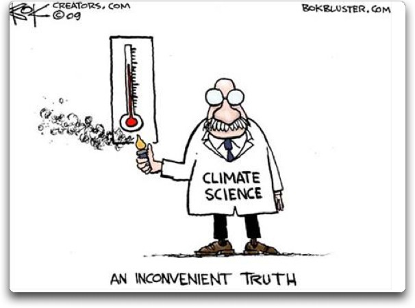
Figure 9. Forecasted snowfall anomalies (mm/day; shading) from 18 – 22 January 2019. The forecasts are from the 00Z 7 January 2019 GFS ensemble.

Once again additional snowfall is possible across much of northern Eurasia including Siberia, Western Asia, Scandinavia, Central and even possibly Western Europe (Figure 9). Seasonable to cold temperatures across Eastern Canada and even the Northeastern US will also support potentially new snowfall (Figure 9). Mild temperatures could result in snowmelt across Southeastern Europe, Turkey, Alaska, Western Canada and the Western US (Figure 9).

See Also:Snowing and Freezing in the Arctic

Kids Climate Case to be Appealed Before Trial

A monkey wrench in the Works.

Previous posts have followed the twists and turns of the lawsuit Juliana vs. US, initiated and funded by Our Children’s Trust.  In November the Supreme Court signaled their desire that lower courts rein in the scope of the lawsuit.  The District Court backed off and now the Ninth Circuit Court will take up the appeal in advance of any trial activity.  The significance and implications are described in an article by Karen Savage at Climate Liability News Appeals Court OKs Pre-Trial Appeal of Kids Climate Case, Siding With Government  Excerpts in italics with my bolds.

The Ninth Circuit Court of Appeals has granted a petition by the Trump administration for a rare pre-trial appeal in the landmark constitutional climate lawsuit, Juliana v. United States. The appeals court agreed to the interlocutory appeal, which leaves the future progress of the case unclear.

Generally, interlocutory appeals consider certain aspects of a case while allowing other issues to proceed. The young plaintiffs in the case, 21 young people from around the country, have asked District Court Judge Ann Aiken to clarify how the case will move forward while the Ninth Circuit considers its appeal. They argue that they should be allowed to continue the discovery process and other pre-trial proceedings.

The Ninth Circuit’s decision came as somewhat of a surprise because it had denied repeated attempts by the government to short-circuit the case before trial. A three-judge panel voted 2-1 to grant this request, while denying other motions, including the government’s fourth writ of mandamus request. The writ of mandamus is even rarer than an interlocutory appeal because it requires the higher court to decide the lower court clearly abused its judicial power.

But granting the interlocutory appeal still throws the case into uncertainty.

Chief Judge Sidney Thomas and Circuit Judge Marsha Berzon voted for the government’s motion while Circuit Judge Michelle Friedland dissented.

The Ninth Circuit Dec.26, 2018 ruling (here) states:

An interlocutory appeal under 28 U.S.C. § 1292(b) is authorized when a district court order “‘involves a controlling question of law as to which there is substantial ground for difference of opinion’ and where ‘an immediate appeal from the order may materially advance the ultimate termination of the litigation.’” Reese v. BP Expl. (Alaska) Inc., 643 F.3d 681, 687–88 (9th Cir. 2011) (quoting 28 U.S.C. § 1292(b)). The district court properly concluded that the issues presented by this case satisfied the standard set forth in § 1292(b) and properly exercised its discretion in certifying this case for interlocutory appeal.

The petition for permission to appeal pursuant to 28 U.S.C. § 1292(b) is granted. Within 14 days after the date of this order, petitioners shall perfect the appeal in accordance with Federal Rule of Appellate Procedure 5(d). All pending motions are denied as moot.

Previously, the petitioners (Our Children’s Trust) have repeatedly argued for a 50 day trial first and then appeal afterward.

In a reply brief, the federal government pushed back, telling the justices that it had made every possible effort in the lower courts to avoid reaching this point, but had been unsuccessful. The government emphasized that what the plaintiffs are asking the federal courts to do is extraordinary, “nothing less than a complete transformation of the American energy system – including the abandonment of fossil fuels.” Such a request, the government continued, “has no place in federal court,” so that granting the government a reprieve from the upcoming trial would “preserve the judiciary’s essential role under the Constitution.”

The government added that, contrary to the plaintiffs’ assurances, the prospect winning on appeal after an “extensive” trial had already taken place would provide little comfort to the government, because of the enormous amount of resources that would have to be devoted to pretrial preparations and the trial itself.

Summary:

What a concept!  Let’s have judges decide national energy policy.  And when the economy fails because energy supply is too expensive and unreliable, will the black robes be accountable to the public?  Nope.  And let’s turn a courtroom over to members of a doomsday cult for 50 days so they can persuade the public of their beliefs and fears. Even worse idea. Let’s hope even the Ninth Circuit can see the folly in this proceeding.

For background on the lawsuit see:  Supremes Kick Kids Lawsuit Down the Road

For background on the false GHG Endagerment Finding see: GHGs Endangerment? Evidence?

i

December Cooling by Sea, More than by Land

banner-blog

With apologies to Paul Revere, this post is on the lookout for cooler weather with an eye on both the Land and the Sea.  UAH has updated their tlt (temperatures in lower troposphere) dataset for December.   Previously I have done posts on their reading of ocean air temps as a prelude to updated records from HADSST3. This month I will add a separate graph of land air temps because the comparisons and contrasts are interesting as we contemplate possible cooling in coming months and years.

Presently sea surface temperatures (SST) are the best available indicator of heat content gained or lost from earth’s climate system.  Enthalpy is the thermodynamic term for total heat content in a system, and humidity differences in air parcels affect enthalpy.  Measuring water temperature directly avoids distorted impressions from air measurements.  In addition, ocean covers 71% of the planet surface and thus dominates surface temperature estimates.  Eventually we will likely have reliable means of recording water temperatures at depth.

Recently, Dr. Ole Humlum reported from his research that air temperatures lag 2-3 months behind changes in SST.  He also observed that changes in CO2 atmospheric concentrations lag behind SST by 11-12 months.  This latter point is addressed in a previous post Who to Blame for Rising CO2?

The December update to HadSST3 will appear later this month, but in the meantime we can look at lower troposphere temperatures (TLT) from UAHv6 which are already posted for December. The temperature record is derived from microwave sounding units (MSU) on board satellites like the one pictured above.

The UAH dataset includes temperature results for air above the oceans, and thus should be most comparable to the SSTs. There is the additional feature that ocean air temps avoid Urban Heat Islands (UHI).  The graph below shows monthly anomalies for ocean temps since January 2015.

uah oceans 201812
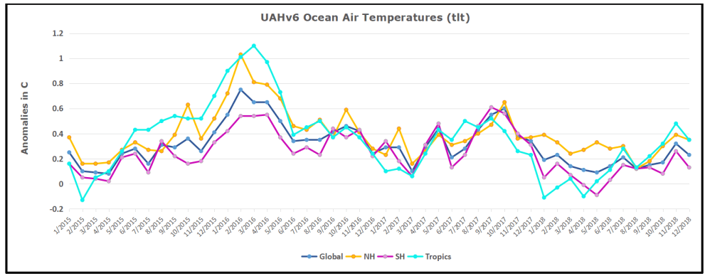
The anomalies over the entire ocean dropped to the same value, 0.12C  in August (Tropics were 0.13C).  Warming in previous months was erased, and September added very little warming back. In October and November NH and the Tropics rose, joined by SH last month.,  In December 2018 all regions cooled resulting in a global drop of nearly 0.1C.

Taking a longer view, we can look at the record since 1995, that year being an ENSO neutral year and thus a reasonable starting point for considering the past two decades.  On that basis we can see the plateau in ocean temps is persisting. Global ocean temps are the lowest December since 2014.  It also appears that the NH Autumn upward bump is over and temps will likely trend downward.

Land Air Temperatures Plunged in September, then Rose in October

We sometimes overlook that in climate temperature records, while the oceans are measured directly with SSTs, land temps are measured only indirectly.  The land temperature records at surface stations record air temps at 2 meters above ground.  UAH gives tlt anomalies for air over land separately from ocean air temps.  The graph updated for December is below.uah land 201812

The greater volatility of the Land temperatures is evident, and also the dominance of NH, which has twice as much land area as SH.  Note how global peaks mirror NH peaks.  In December air over Tropics fell sharply, SH slightly, while the NH land surfaces rose, pulling up the Global anomaly for the month.  Despite the warming, air temps over land were the lowest December since 2013 both Globally and for the Tropics.  And all regions are cooler than December 2015 when the El Nino was starting in earnest.

Summary

TLTs include mixing above the oceans and probably some influence from nearby more volatile land temps.  It is striking to now see NH and Global land temps dropping rapidly.  TLT measures started the recent cooling later than SSTs from HadSST3, but are now showing the same pattern.  It seems obvious that despite the three El Ninos, their warming has not persisted, and without them it would probably have cooled since 1995.  Of course, the future has not yet been written.


Exaggerating Green Energy Supply

dave_gangland

As noted here before, public opinion surveys are often “push polls”, raising issues like climate change as part of an effort to promote public concern.  Such surveys also inform activists how successful or not has been the media messaging in generating belief and support for climate policy proposals.

Sometimes the questionnaires are manipulated to show the greatest possible public awareness and support..  For example, see:  The Art of Rigging Climate Polls.

Other times, the survey is used to chide the public for failing to buy into claims and propaganda prominently advanced in the media.  For example, see: “Hottest Year” Misdirection, where mainstream media claims 17 of the last 18 years were the hottest on record, while the public in 37 countries guessed only 9.  After checking the data, the correct answer is more likely 5.

That same survey, Perils of Perceptions, reported that in most countries the public overestimates how much green energy they consume.  That finding is the subject of this post.  As we will see, energy from renewables is perceived to be much higher than numbers from the World Bank.  And since those numbers are themselves exaggerated, the gap between virtuous green behavior and performance is even greater than stated.

The renewable energy finding from Ipsos (here):

The majority of countries overestimate the amount of energy used that comes from renewable sources in their country. The average guess is 26% when it’s actually only 19%. Malaysia, Saudi Arabia, China and Singapore were the furthest out; some countries, though, actually underestimate how much progress they have made with renewables, such as Sweden and Montenegro.

Now, 19% of energy consumed coming from renewables looks high to me, so let’s explore two of the countries:  Canada and the Netherlands.

First, The Canadian Story on Green Energy Supply

energyuse

Question is Framed to be Misleading

Note that wind and solar power are presented as examples of renewable energy sources, when in reality hydro and nuclear are much larger sources of power (electricity). Note also respondents are led to confuse power with total energy, which is a much larger amount.

What is the Reality of Canadian Energy Supply (Consumption)

World Bank shows 22% of Canada’s total energy consumption was from renewables in 1990 and 2015.

Let’s test that number against the Canadian Energy Fact Book 2016–2017 (which presents 2014 as the latest statistics).  The categories are defined nicely in this diagram:
Energy Flow
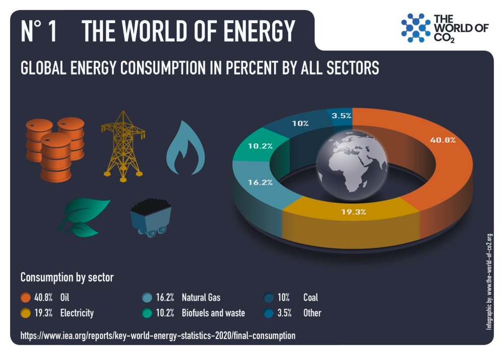
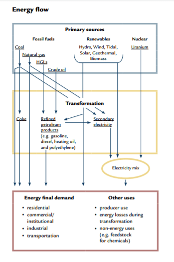
Working from the top down, first is the mix of total primary energy supply by source:
Canada Primary Energy Supply
In this fact book, energy supply is equivalent to energy consumed, since it is calculated after adjusting for energy imports and exports. Note that 17.7% is the amount of energy from renewables, and hydro is 11.6%.   Let’s see how much of renewable energy comes from wind and solar:
Canada Renewable Energy
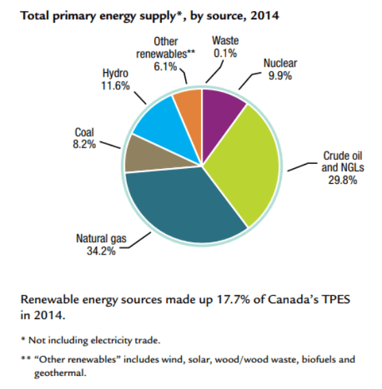
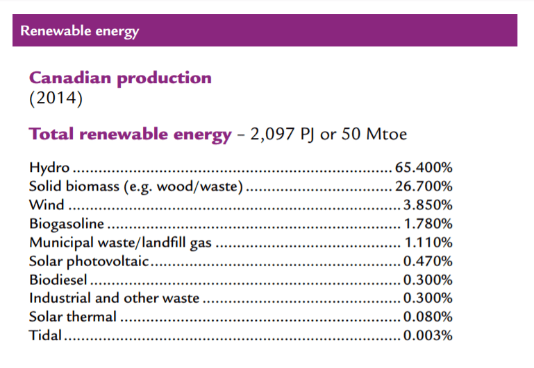
So Canadians actually consume 4.35% of their renewable energy from wind and solar. 92% of Canadian renewable energy comes from the traditional sources:  Hydro dams and burning wood.

Combining the two tables, we see that 80% of the Other Renewables is solid biomass (wood), which leaves at most 1% of Canadian total energy supply coming from wind and solar.

Second, the Netherlands Green Energy Story

According to the Ipsos Perils of Perception survey, respondents from the Netherlands said on average 22% of their energy is Green, while the World Bank says only 6% comes from Green sources.  Last year there was a provocative and entertaining analysis of Dutch perceptions versus green energy realities broadcast on a popular Sunday morning TV show.  The episode was called Green Electrical Shocks, and is provided below for your enjoyment and edification.

Green Electrical Shocks


On Sunday Feb.4, 2018, a weekly news program aired in the Netherlands on the titled subject. H/T Climate Scepticism. The video clip is below with English subtitles. For those who prefer reading, I provide the substantial excerpts from the program with my bolds.

How many of you have Green Electricity? I will estimate 69%
And how much nationally? Oh, 69%!
So we are very average, and in a good way, because the climate is very important.

Let me ask: Green electricity comes from . . .?
Yes, electricity produced from windmills and solar panels.
Nearly 2/3 of the Dutch are using it. That’s the image.

Well I have green news and bad news.
The green news: Well done!
The bad news: It is all one big lie.
Time for the Green Electrical Shocks.

Shock #1: The green electricity from your socket is not green.
When I switched to green electricity I was very proud.
I thought, Yes, well done! The climate is getting warmer, but not any more thanks to me.

Well, that turned out to be untrue.
All producers deliver to one communal grid. Green and grey electricity all mix.
The electricity you use is always a mix of various sources.
OK. It actually makes sense not to have separate green and grey cables for every house.
So it means that of all electricity, 69% is produced in a sustainable way. But then:


Shock #2: Green Electricity is mostly fake.
Most of the green electricity we think we use comes from abroad.
You may think: So what. Green is green.

But that electricity doesn’t come from abroad, it stays abroad.
If you have green electricity at home, it may mean nothing more than that your supplier has bought “green electricity certificates”.

In Europe green electricity gets an official certificate,
Instead of selling on the electricity, they sell on those certificates.
Norway, with its hydro power, has a surplus of certificates.
Dutch suppliers buy them on a massive scale, while the electricity stays in Norway.


The idea was: if countries can sell those certificates, they can make money by producing more green electricity.
But the Norwegians don’t produce more green electricity.
But they do sell certificates.

The Dutch suppliers wave with those certificates, and say Look! Our grey electricity is green.
Only one country has produced green electricity: Norway.
But two countries take the credit.
Norway, because they produce green electricity, and the Netherlands because, on paper, we have green electricity. Get it? That’s a nice deal.

More and more countries sell those certificates. Italy is now the top supplier.
We buy fake green electricity from Italy, like some kind of Karma ham.

Now, let’s look again at the green electricity we all think we use.
So the real picture isn’t 69%. If you cancel the certificates, only 21% of electricity is really green.
Nowadays you can even order it separately if you don’t want to be part of that Norway certificates scam.
You may think: 21% green is still quite a lot. But it is time for:


Shock #3: Not all energy is electricity.
If you talk about the climate, you shouldn’t just consider electricity but all energy.
When you look at all energy, like factories, cars, trains, gas fires, then the share of consumer electricity is virtually nothing.
If you include everything in your calculation, it turns out that only 6% of all the energy we use in the Netherlands is green. It is a comedy, but wait:

Trees converted into pellets by means of petroleum powered machinery.

Shock #4: Most green energy doesn’t come from sun or wind, like you might think.
Even the 6%, our last green hope, is fake. According to the CBS we are using more sun and wind energy, but most of the green energy is produced by the burning of biomass.
Ah, more than half of the 6% green energy is biomass.

Ridiculous. What is biomass really? It is organic materials that we encounter every day.
Like the content of a compost heap. How about maize leaves or hay?
The idea behind burning organic materials is that it will grow up again.
So CO2 is released when you burn it, but it will be absorbed again by new trees.

However, there is one problem. The forest grows very slowly and our power plants burn very fast.
This is the fatal flaw in the thinking about biomass. Power plants burn trees too fast, so my solution: slow fire. Disadvantage: it doesn’t exist. So this is our next shock.

Shock#5: Biomass isn’t all that sustainable.
It’s getting worse. There aren’t enough trees in the Netherlands for biomass.
We can’t do it on our own. We don’t have enough wood, so we get it from America.

In the USA forests are cut at a high rate, Trees are shredded and compressed into pellets.
These are shipped to the Netherlands and end up in the ovens of the coal plants.
It’s a disaster for the American forests, according to environmental groups.

So we transport American forests on diesel ships to Europe.
Then throw them in the oven because it officially counts as green energy.
Only because the CO2 released this way doesn’t count for our total emissions.

In reality biomass emits more CO2 than natural gas and coal.
These are laws of nature, no matter what European laws say.
At the bottom line, how much sustainable energy do we really have in the Netherlands?
Well, the only real green energy from windmills, solar panels etc. Is only 2.2%. of all the energy we use.

In Conclusion
So the fact that 2/3 of the audience and of all Dutch people use green electricity means absolutely nothing. It’s only 2.2%, and crazier still, the government says it should be at 14% by 2020.
They promised: to us, to Europe, to planet Earth: 14 instead of 2.2.

Instead of making a serious attempt to save the climate, they are only working on accounting tricks, like buying pieces of paper in Norway and burning American forests.
They are only saving the climate on paper.

Summary Comment

As the stool above shows, the climate change package sits on three premises. The first is the science bit, consisting of an unproven claim that observed warming is caused by humans burning fossil fuels. The second part rests on impact studies from billions of research dollars spent uncovering any and all possible negatives from warming. And the third leg is climate policies showing how governments can “fight climate change.”

It is refreshing to see more and more articles by people reasoning about climate change/global warming and expressing rational positions. Increasingly, analysts are unbundling the package and questioning not only the science, but also pointing out positives from CO2 and warming.  And as the Dutch telecast shows, ineffective government policies are also fair game.

More on flawed climate policies at Reasoning About Climate

Happy Arctic New Year 2019


2019 with bears
With the end of December, Arctic ice is rebuilding in the dark up to its annual maximum before the beginning of dawn in March.  Since many of the seas are already at their maximum extents, the coming months will only add about 2M km2 to the approximately 13M km2 of ice in place.

BandO2018340to365

The map above shows the remarkable growth of Bering Sea ice in December.  The Bering ice extent grew from 57k km2 to 459k km2 yesterday, exceeding the March Bering maximum of 451k km2.  Okhotsk has grown ice more slowly, now at 347k km2 slightly below average.  Note Chukchi Sea north of Bering froze completely as of day 350.

The regrowth of Arctic ice extent was slower than usual until recently. After showing resilience in September, ending higher than 2007, ice growth lagged in October, then recovered in November and kept pace with average through most of December.

Arctic2018365

In December, 2018 ice extent has grown by close to 11 year average until the last 10 days.  As of Dec. 31, 2018 ice extent is ~300k km2  (2%) less than average (2007 to 2017).  The chart also shows the variability of ice extent over the years during this month.  2007 ramped up to match average, while 2017 was almost 200k km2 lower than 2018 at year end.  SII is showing 2018 lower than MASIE 2018, closely matching MASIE 2017.

The table below shows this year compared to average and to 2017 for day 365.  Since several years in the dataset were missing day 365, I am making the comparison a day later.

Region 2018365 Day 365 
Average
2018-Ave. 2017365 2018-2017
 (0) Northern_Hemisphere 12805066 13107229 -302163 12628187 176880
 (1) Beaufort_Sea 1070498 1070245 253 1070445 53
 (2) Chukchi_Sea 966006 963990 2016 943883 22124
 (3) East_Siberian_Sea 1087137 1087133 5 1087120 18
 (4) Laptev_Sea 897845 897842 3 897845 0
 (5) Kara_Sea 773183 889865 -116682 892689 -119507
 (6) Barents_Sea 261190 437725 -176534 331819 -70629
 (7) Greenland_Sea 522009 582349 -60340 555757 -33748
 (8) Baffin_Bay_Gulf_of_St._Lawrence 1069626 1023935 45691 978074 91552
 (9) Canadian_Archipelago 853337 853059 279 853109 229
 (10) Hudson_Bay 1260903 1230818 30086 1260838 66
 (11) Central_Arctic 3194383 3206157 -11774 3191526 2858
 (12) Bering_Sea 458758 422870 35888 194350 264408
 (13) Baltic_Sea 20842 35624 -14782 13345 7497
 (14) Sea_of_Okhotsk 347016 375834 -28818 336595 10421

The main deficit to average is in Barents and Kara Seas on the Atlantic side, partly offset by surpluses in Hudson and Baffin Bays and in Bering Sea on the Pacific side.  Note the huge increase in Bering ice this year compared to 2017.  This coincides with the disappearing warm water Blob in the North Pacific, as reported by Cliff Mass.

No one knows what will happen to Arctic ice.

Except maybe the polar bears.

And they are not talking.

Except, of course, to the admen from Coca-Cola

Summary

There is no need to panic over Arctic ice this year, or any year.  It fluctuates according to its own ocean-ice-atmospheric processes and we can only watch and be surprised since we know so little about how it all works.  Judah Cohen at AER thinks much greater snowfall in October and since will make for a very cold winter.  We shall see.  It is already adding more mass to the Greenland ice sheet than in previous years.

cohen-schematic

See Natural Climate Factors: Snow

In any case, the early and extensive ice in the Canadian Arctic regions was well received by our polar bears.