The Ever Changing Climate

Update: January 31, 2020

This is an update to a post Simple Science 2: World of Climate Change with two new slides and a revised sequence. Context below is from the previous with the new content.

Raymond of RiC-Communications  studio commented on a recent post and made an offer to share here some graphics on CO2 for improving public awareness.  He has produced 12 interesting slides which are presented in the post Here’s Looking at You, CO2.  This post presents the three initial charts he has so far created on a second theme The World of Climate Change.  I find them straightforward and useful, and appreciate his excellent work on this. Project title is link to RiC-Communications. (For some reason I had problems getting my Opera browser to load the revised links, but Edge worked fine.

This project is The World of Climate Change

Infographics can be helpful, in making things simple to understand. Climate change is a complex topic with a lot of information and statistics. These simple step by step charts are here to better understand what is occurring naturally and what could be caused by humans. What is cause for alarm and what isn’t cause for alarmism if at all. Only through learning is it possible to get the big picture so as to make the right decisions for the future.

– N° 1 600 million years of global temperature change
– N° 2 Earth‘s temperature record for the last 400,000 years
– N° 3 Holocene period and average northern hemispheric temperatures
– N° 4 140 years of global mean temperature
– N° 5 120 m of sea level rise over the past 20‘000 years


Comment:

This project will explore information concerning how aspects of the world climate system have changed in the past up to the present time.  Understanding the range of historical variation and the factors involved is essential for anticipating how future climate parameters might fluctuate.

For example:

The Climate Story (Illustrated) looks at the temperature record.

H20 the Gorilla Climate Molecule looks at precipitation patterns.

Data vs. Models #2: Droughts and Floods looks at precipitation extremes.

Data vs. Models #3: Disasters looks at extreme weather events.

Data vs. Models #4: Climates Changing looks at boundaries of defined climate zones.

And in addition, since Chart #5 features the Statue of Liberty, here are the tidal gauge observations there compared to climate model projections:


Jan. 30 Ordinary Arctic Ice

A previous post noted the Pacific ice see saw had returned, with Bering Sea slow to recover.  The image above shows that now both Pacific seas are recovering ice strongly in the second half of January 2020. As supported by the table later, the pace of refreezing was slow to begin but 2020 extents are now quite ordinary and tracking the 13 year average (2007 to 2019 inclusive). Okhotsk Sea on the left has steadily grown 250k km2 ice extent to be currently at 68% of last March maximum.  Bering on the right added 170k km2 and now exceeds last March max by 3%.

On the Atlantic side there has also been some ice growth on the margins.  Notably Barents Sea on the right has added 160k km2 to exceed its average by 40%, and is now 95% of last March max.  Also visible on the upper left is ice forming in the Gulf of St. Lawrence and Baffin Bay ice slowly extending south. The graph below shows the ice extent growing during January compared to some other years and the 13 year average (2007 to 2019 inclusive).

Note that the  NH ice extent 13 year average increases about 1.2M km2 during January, up to 14.4M km2. MASIE 2020 stated with a slower icing rate, dropping 300k km2 lower than average before catching up to reaching the average on January 19 and tracking closely since.  Other years were lower at this point, while MASIE and SII 2020 are showing nearly the same extents.

The table shows where the ice is distributed compared to average.  Deficits in Greenland Sea and Baffin Bay are offset by a 230k km2 surplus of Barents Sea ice.  At this point the surplus in Okhotsk exceeds the Bering deficit. 

Region 2020030 Day 030 Average 2020-Ave. 2018030 2020-2018
 (0) Northern_Hemisphere 14333538 14344185  -10647  13819038 514500 
 (1) Beaufort_Sea 1070655 1070223  432  1070445 210 
 (2) Chukchi_Sea 965972 965999  -27  965971
 (3) East_Siberian_Sea 1087137 1087133  1087120 18 
 (4) Laptev_Sea 897845 897842  897845
 (5) Kara_Sea 934901 914385  20515  880656 54245 
 (6) Barents_Sea 783310 553930  229380  471973 311337 
 (7) Greenland_Sea 482444 588685  -106241  506539 -24094 
 (8) Baffin_Bay_Gulf_of_St._Lawrence 1260581 1347235  -86653  1384973 -124392 
 (9) Canadian_Archipelago 854282 853059  1223  853109 1174 
 (10) Hudson_Bay 1260192 1260815  -623  1260838 -646 
 (11) Central_Arctic 3212864 3207580  5284  3176620 36244 
 (12) Bering_Sea 584617 645329  -60712  402199 182419 
 (13) Baltic_Sea 12939 80631  -67693  37943 -25004 
 (14) Sea_of_Okhotsk 894008 807371  86637  763761 130247 

Footnote:  Interesting comments on January 13 by Dr. Judah Cohen at his blog regarding the Arctic fluctuations. Excerpts in italics with my bolds.

Arctic sea ice extent

The positive AO is conducive to sea ice growth and Arctic sea ice growth rate continues to grow slowly and remains well below normal but higher than recent winters; the weather pattern remains favorable for further sea ice growth. Negative sea ice anomalies exist in three regions: the Bering Sea, around Greenland-Canadian Archipelagos and Barents-Kara Seas. The anomalies in the North Pacific sector have shrunk (Figure 16), and based on model forecasts negative sea ice anomalies in the Bering Sea can shrink further in the next two weeks. Below normal sea ice in and around Greenland and the Canadian Archipelagos may favor a negative winter NAO, though there are no signs of such a scenario. Based on recent research low sea ice anomalies in the Chukchi and Bering seas favors cold temperatures in central and eastern North America while low sea ice in the Barents-Kara seas favor cold temperatures in Central and East Asia, however this topic remains controversial. Recent research has shown that regional anomalies that are most highly correlated with the strength of the stratospheric PV are across the Barents-Kara seas region where low Arctic sea ice favors a weaker winter PV.

Northern Hemisphere Snow Cover

Despite a strongly postive AO snow cover has advanced across Eurasia and is now near decadal means. And if the snowfall forecasts for Europe ever verify it could advance further. Above normal snow cover extent in October, favors a strengthened Siberian high, cold temperatures across northern Eurasia and a weakened polar vortex/negative AO this upcoming winter followed by cold temperatures across the continents of the NH.

Illustration by Eleanor Lutz shows Earth’s seasonal climate changes. If played in full screen, the four corners present views from top, bottom and sides. It is a visual representation of scientific datasets measuring Arctic ice extents and snow cover.

Who’s the Real Joker: Joaquin or Greta?

Sputnik has the story Russian Pranksters Posing as Greta Thunberg and Her Dad Clown Around With Joker’s Joaquin Phoenix.  Excerpts in italics with my bolds.

Greta Thunberg is the protagonist of ‘Stars Save the Earth’, a series of phone call pranks by Russian radio hosts Vladimir ‘Vovan’ Kuznetsov and Alexei ‘Lexus’ Stolyarov. This time, they attempted to prove to Joaquin Phoenix who is the real Joker out there.

Vovan and Lexus, a Russian duo notorious for their pranks of politicians and celebrities, have punked Joaquin Phoenix – posing as Greta Thunberg and her father.

Vovan said that Greta’s role was played by a woman they are familiar with, but won’t reveal her name. In an audio of the call published on Wednesday, Lexus can be heard impersonating Svante Thunberg.

Seconds into the call, Joaquin Phoenix brought in his longtime partner and fiancé Rooney Mara.

“I’m a big fan of your work and your last movie,” the fake Greta says.

Lexus chimes in: “Greta has no rights [sic] to go to the movie, but we broke the rules and watched it”, to chuckles from Joaquin and Rooney.

An unsuspecting Joaquin goes on to recall how they heard a speech by Greta: “[We] were moved by what you said and just your commitment to this work.”

‘Greta’ then unveils her special offer to the actor: an awareness-raising campaign called Stars Save the Earth.

Both Joaquin and his fiancé say they’d be happy to help. As Rooney expands on how important animal rights protection is to them, Greta interjects by asking if she could get a “small part” in a prospective Joker sequel.

Joaquin breaks into laughter, before admitting that they haven’t written one yet and no decision has been made on a sequel, and that he would like to have Rooney play there too. He promises though to “keep [Greta] in mind” if another Joker movie comes up.

‘Greta’ then suggests she could star as the violent supervillain Harley Queen because she bears some similarities to the character: “Sometimes I want to take a basketball [sic] bat and smash all the politicians that think they are very smart.”

Joaquin and Rooney both laugh as he promises to talk to the writer and the director about it.

Lexus/Svante recounts a fictitious story about how he met with Jared Leto, who played the Joker in the 2016 film Suicide Squad, and how Leto went out of his way trying to prove that he was a better Joker than Phoenix and was eventually rushed to hospital by ambulance.

The Hollywood couple appears confused, and Joaquin says he feels sorry for the ‘Thunbergs’.

‘Greta’ then begs Joaquin (“just a few more seconds please”) to laugh as the Joker. He says he has devoted a lot of time working into it and cannot just do it on the spot, but eventually concedes.

‘Svante’, who is also an actor in real life, also does the Joker laughter (it isn’t even close though).

‘Greta’ calls her ‘father’ a bad actor and they start an argument. “I don’t have to do it again”, Lexus shouts. “The neighbours will call the police again.”

Greta appears in DC comics

It culminates in shots being fired, and after a few seconds’ pause Joaquin realises: “Oh my God we were being punked. We are totally getting punked. It’s brilliant. What you guys did was brilliant.”

Vovan and Lexus, who have recently tricked a US governor into thinking that Russia is about to annex Alaska, seem to have embraced Greta Thunberg’s planet-saving legacy.

Earlier this month, they published an audio of their conversation with Democratic Rep. Maxine Waters, who promised the Swedish activist to do everything to save Chunga-Changa (a fictitious island from a popular Soviet cartoon).

Footnote:  l’ve been thinking that the climate scare will be past its peak when comedians ernestly poke fun at CO2 obsession.  I didn’t see this one coming.

Corrupting Climate and Weather

An article at The Spectator raises the question Do alarmists know the difference between weather and climate?  The author Charles Moore may also be a man for all seasons like Sir Thomas More.  Excerpts in italics with my bolds and images.

A lot of clever people are putting the ‘green’ into ‘greenbacks’

Until recently, those expressing skepticism about climate change catastrophe have been hauled over the coals (or the renewables equivalent) for not understanding the difference between ‘climate’ and ‘weather’. The lack of global warming at the beginning of the 21st century was not to be taken, chided the warmists, as evidence that climate change was not happening. Weather was the passing phenomenon of each day: climate was the real, deep thing.

Now, however, the alarmists themselves have elided the two concepts, using the Australian bush fires as their cue. As Sir David Attenborough puts it: ‘The moment of crisis has come’. They could be right, of course, but how could they really know? In this sense, President Trump is surely justified in warning, at Davos, against the ‘Prophets of Doom’. Prophecy is a different skill from an exact understanding of the here and now.

Mr Trump might usefully have talked about the Profits of Doom too. If the movement can persuade western society that the climate emergency is upon us, there are enormous sums to be made by people who claim to be able to remedy it. Hence the patter now coming out of companies such as Blackrock, BP or Microsoft, fanned by Mammon’s public intellectuals, such as Mark Carney. A lot of clever people are putting the ‘green’ into ‘greenbacks’. A lot of less clever investors are going to get their fingers burnt.

See Also Stoking Big Climate Business

Footnote:  Case in Point:  Green Fraudsters Plead Guilty

Jeff Carpoff, 49, of Martinez, pleaded guilty today to conspiracy to commit wire fraud and money laundering. His wife, Paulette Carpoff, 46, pleaded guilty today to conspiracy to commit an offense against the United States and money laundering. According to court documents, between 2011 and 2018, DC Solar manufactured mobile solar generator units (MSG), solar generators that were mounted on trailers that were promoted as able to provide emergency power to cellphone towers and lighting at sporting events. A significant incentive for investors were generous federal tax credits due to the solar nature of the MSGs.

The conspirators pulled off their scheme by selling solar generators that did not exist to investors, making it appear that solar generators existed in locations that they did not, creating false financial statements, and obtaining false lease contracts, among other efforts to conceal the fraud. In reality, at least half of the approximately 17,000 solar generators claimed to have been manufactured by DC Solar did not exist.

“By all outer appearances this was a legitimate and successful company,” said Kareem Carter, Special Agent in Charge IRS Criminal Investigation. “But in reality it was all just smoke and mirrors — a Ponzi scheme touting tax benefits to the tune of over $900 million. IRS CI is committed to investigating those who take advantage and impact the financial well-being of others for their own personal gain.”

“The Federal Deposit Insurance Corporation, Office of Inspector General (FDIC-OIG) is pleased to join our law enforcement colleagues in announcing these guilty pleas,” stated Special Agent in Charge Wade Walters for the FDIC OIG San Francisco Regional Office. “The defendants conspired with others to create a fraudulent business venture that duped unsuspecting entities, including banks, to invest approximately $1 billion, which the two later used to support a lavish lifestyle.

Source:  https://wattsupwiththat.com/2020/01/27/dc-solar-owners-plead-guilty-to-largest-ponzi-scheme-in-eastern-california-history/

I Want You Not to Panic


I’ve been looking into claims for concern over rising CO2 and temperatures, and this post provides reasons why the alarms are exaggerated. It involves looking into the data and how it is interpreted.

First the longer view suggests where to focus for understanding. Consider a long term temperature record such as Hadcrut4. Taking it at face value, setting aside concerns about revisions and adjustments, we can see what has been the pattern in the last 120 years following the Little Ice Age. Often the period between 1850 and 1900 is considered pre industrial since modern energy and machinery took hold later on. The graph shows that warming was not much of a factor until temperatures rose peaking in the 1940s, then cooling off into the 1970s, before ending the century with a rise matching the rate of earlier warming. Overall, the accumulated warming was 0.8C.

Then regard the record concerning CO2 concentrations in the atmosphere. It’s important to know that modern measurement of CO2 really began in 1959 with Mauna Loa observatory, coinciding with the mid-century cool period. The earlier values in the chart are reconstructed by NASA GISS from various sources and calibrated to reconcile with the modern record. It is also evident that the first 60 years saw minimal change in the values compared to the post 1959 rise after WWII ended and manufacturing was turned from military production to meet consumer needs. So again the mid-20th century appears as a change point.

It becomes interesting to look at the last 60 years of temperature and CO2 from 1959 to 2019, particularly with so much clamour about climate emergency and crisis. This graph puts together rising CO2 and temperatures for this period. Firstly note that the accumulated warming is about 0.8C after fluctuations. And remember that those decades witnessed great human flourishing and prosperity by any standard of life quality. The rise of CO2 was a monotonic steady rise with some acceleration into the 21st century.

Now let’s look at projections into the future, bearing in mind Mark Twain’s warning not to trust future predictions. No scientist knows all or most of the surprises that overturn continuity from today to tomorrow. Still, as weathermen well know, the best forecasts are built from present conditions and adding some changes going forward.

Here is a look to century end as a baseline for context. No one knows what cooling and warming periods lie ahead, but one scenario is that the next 80 years could see continued warming at the same rate as the last 60 years. That presumes that forces at play making the weather in the lifetime of many of us seniors will continue in the future. Of course factors beyond our ken may deviate from that baseline and humans will notice and adapt as they have always done. And in the back of our minds is the knowledge that we are 11,500 years into an interglacial period before the cold returns, being the greater threat to both humanity and the biosphere.

Those who believe CO2 causes warming advocate for reducing use of fossil fuels for fear of overheating, apparently discounting the need for energy should winters grow harsher. The graph shows one projection similar to that of temperature, showing the next 80 years accumulating at the same rate as the last 60. A second projection in green takes the somewhat higher rate of the last 10 years and projects it to century end. The latter trend would achieve a doubling of CO2.

What those two scenarios mean depends on how sensitive you think Global Mean Temperature is to changing CO2 concentrations. Climate models attempt to consider all relevant and significant factors and produce future scenarios for GMT. CMIP6 is the current group of models displaying a wide range of warming presumably from rising CO2. The one model closely replicating Hadcrut4 back to 1850 projects 1.8C higher GMT for a doubling of CO2 concentrations. If that held true going from 300 ppm to 600 ppm, the trend would resemble the red dashed line continuing the observed warming from the past 60 years: 0.8C up to now and another 1C the rest of the century. Of course there are other models programmed for warming 2 or 3 times the rate observed.

People who take to the streets with signs forecasting doom in 11 or 12 years have fallen victim to IPCC 450 and 430 scenarios.  For years activists asserted that warming from pre industrial can be contained to 2C if CO2 concentrations peak at 450 ppm.  Last year, the SR1.5 lowered the threshold to 430 ppm, thus the shortened timetable for the end of life as we know it.

For the sake of brevity, this post leaves aside many technical issues. Uncertainties about the temperature record, and about early CO2 levels, and the questions around Equilibrium CO2 Sensitivity (ECS) and Transient CO2 Sensitivity (TCS) are for another day. It should also be noted that GMT as an average hides huge variety of fluxes over the globe surface, and thus larger warming in some places such as Canada, and cooling in other places like Southeast US. Ross McKitrick pointed out that Canada has already gotten more than 1.5C of warming and it has been a great social, economic and environmental benefit.

So I want people not to panic about global warming/climate change. Should we do nothing? On the contrary, we must invest in robust infrastructure to ensure reliable affordable energy and to protect against destructive natural events. And advanced energy technologies must be developed for the future since today’s wind and solar farms will not suffice.

It is good that Greta’s demands were unheeded at the Davos gathering. Panic is not useful for making wise policies, and as you can see above, we have time to get it right.

Climate Models: Good, Bad and Ugly

Several posts here discuss INM-CM4, the Good CMIP5 climate model since it alone closely replicates the Hadcrut temperature record, as well as approximating BEST and satellite datasets. This post is prompted by recent studies comparing various CMIP6 models, the new generation intending to hindcast history through 2014, and forecast to 2100.

Background

Much revealing information is provided in an AGU publication Causes of Higher Climate Sensitivity in CMIP6 Models by Mark D. Zelinka et al. (2019). H/T Judith Curry.  Excerpts in italics with my bolds.

The severity of climate change is closely related to how much the Earth warms in response to greenhouse gas increases. Here we find that the temperature response to an abrupt quadrupling of atmospheric carbon dioxide has increased substantially in the latest generation of global climate models. This is primarily because low cloud water content and coverage decrease more strongly with global warming, causing enhanced planetary absorption of sunlight—an amplifying feedback that ultimately results in more warming. Differences in the physical representation of clouds in models drive this enhanced sensitivity relative to the previous generation of models. It is crucial to establish whether the latest models, which presumably represent the climate system better than their predecessors, are also providing a more realistic picture of future climate warming.

The objective is to understand why the models are getting badder and uglier, and whether the increased warming is realistic. This issue was previously noted by John Christy last summer:
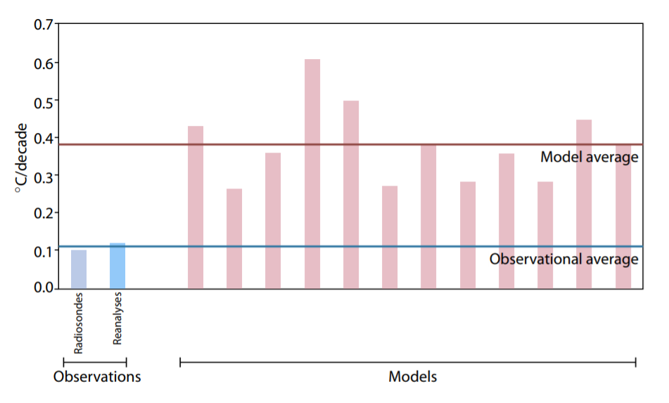
Figure 8: Warming in the tropical troposphere according to the CMIP6 models.
Trends 1979–2014 (except the rightmost model, which is to 2007), for 20°N–20°S, 300–200 hPa.

Christy’s comment: We are just starting to see the first of the next generation of climate models, known as CMIP6. These will be the basis of the IPCC assessment report, and of climate and energy policy for the next 10 years. Unfortunately, as Figure 8 shows, they don’t seem to be getting any better. The observations are in blue on the left. The CMIP6 models, in pink, are also warming faster than the real world. They actually have a higher sensitivity than the CMIP5 models; in other words, they’re apparently getting worse! This is a big problem.

Why CMIP6 Models Are More Sensitive

Zelinka et al. (2019) delve into the issue by comparing attributes of the CMIP6 models currently available for diagnostics.

1 Introduction

Determining the sensitivity of Earth’s climate to changes in atmospheric carbon dioxide (CO2) is a fundamental goal of climate science. A typical approach for doing so is to consider the planetary energy balance at the top of the atmosphere (TOA), represented as

urn:x-wiley:grl:media:grl60047:grl60047-math-0004

where urn:x-wiley:grl:media:grl60047:grl60047-math-0005 is the net TOA radiative flux anomaly,
urn:x-wiley:grl:media:grl60047:grl60047-math-0006 is the radiative forcing,
urn:x-wiley:grl:media:grl60047:grl60047-math-0007 is the radiative feedback parameter, and
urn:x-wiley:grl:media:grl60047:grl60047-math-0008 is the global mean surface air temperature anomaly.

The sign convention is that urn:x-wiley:grl:media:grl60047:grl60047-math-0009 is positive down and urn:x-wiley:grl:media:grl60047:grl60047-math-0010 is negative for a stable system.

Conceptually, this equation states that the TOA energy imbalance can be expressed as the sum of the radiative forcing and the radiative response of the system to a global surface temperature anomaly. The assumption that the radiative damping can be expressed as a product of a time‐invariant and global mean surface temperature anomaly is useful but imperfect (Armour et al., 2013; Ceppi & Gregory, 2019). Under this assumption, one can estimate the effective climate sensitivity (ECS), the ultimate global surface temperature change that would restore TOA energy balance.

urn:x-wiley:grl:media:grl60047:grl60047-math-0014

where urn:x-wiley:grl:media:grl60047:grl60047-math-0015 is the radiative forcing due to doubled CO urn:x-wiley:grl:media:grl60047:grl60047-math-0016. .

ECS therefore depends on the magnitude of the CO2 radiative forcing and on how strongly the climate system radiatively damps planetary warming. A climate system that more effectively radiates thermal energy to space or more strongly reflects sunlight back to space as it warms (larger magnitude urn:x-wiley:grl:media:grl60047:grl60047-math-0007 )  will require less warming to restore planetary energy balance in response to a positive radiative forcing, and vice versa.

Because GCMs attempt to represent all relevant processes governing Earth’s response to CO2, they provide the most direct means of estimating ECS. ECS values diagnosed from CO2 quadrupling experiments performed in fully coupled GCMs as part of the fifth phase of the Coupled Model Intercomparison Project ranged from 2.1 to 4.7 K. It is already known that several models taking part in CMIP6 have values of ECS exceeding the upper limit of this range. These include CanESM5.0.3 , CESM2, CNRM‐CM6‐1, E3SMv1, and both HadGEM3‐GC3.1 and UKESM1.

In all of these models, high ECS values are at least partly attributed to larger cloud feedbacks than their predecessors.

In this study, we diagnose the forcings, feedbacks, and ECS values in all available CMIP6 models. We assess in each model the individual components that make up the climate feedback parameter and quantify the contributors to intermodel differences in ECS. We also compare these results with those from CMIP5 to determine whether the multimodel mean or spread in ECS, feedbacks, and forcings have changed.

The range of ECS values across models has widened in CMIP6, particularly on the high end, and now includes nine models with values exceeding the CMIP5 maximum (Figure 1a). Specifically, the range has increased from 2.1–4.7 K in CMIP5 to 1.8–5.6 K in CMIP6, and the intermodel variance has significantly increased (p = 0.04).

One model’s ECS is below the CMIP5 minimum (INM‐CM4‐8).

This increased population of high ECS models has caused the multimodel mean ECS to increase from 3.3 K in CMIP5 to 3.9 K in CMIP6. Though substantial, this increase is not statistically significant (p = 0.16).  ERF urn:x-wiley:grl:media:grl60047:grl60047-math-0039 has increased slightly on average in CMIP6 and its intermodel standard deviation has been reduced by nearly 30% from 0.50 Wm^2 in CMIP5 to 0.36 Wm^2 in CMIP6 (Figure 1b).

This ECS increase is primarily attributable to an increased multimodel mean feedback parameter due to strengthened positive cloud feedbacks, as all noncloud feedbacks are essentially unchanged on average in CMIP6. However, it is the unique combination of weak overall negative feedback and moderate radiative forcing that allows several CMIP6 models to achieve high ECS values beyond the CMIP5 range.

The increase in cloud feedback arises solely from the strengthened SW low cloud component, while the non‐low cloud feedback has slightly decreased. The SW low cloud feedback is larger on average in CMIP6 due to larger reductions in low cloud cover and weaker increases in cloud liquid water path with warming. Both of these changes are much more dramatic in the extratropics, such that the CMIP6 mean low cloud amount feedback is now stronger in the extratropics than in the tropics, and the fraction of multimodel mean ECS attributable to extratropical cloud feedback has roughly tripled.

The aforementioned increase in CMIP6 mean cloud feedback is related to changes in model representation of clouds. Specifically, both low cloud cover and water content increase less dramatically with SST in the middle latitudes as estimated from unforced climate variability in CMIP6.

Figure 1. INM-CM5 representation of temperature history. The 5-year mean GMST (K) anomaly with respect to 1850–1899 for HadCRUTv4 (thick solid black); model mean (thick solid red). Dashed thin lines represent data from individual model runs: 1 – purple, 2 – dark blue, 3 – blue, 4 – green, 5 – yellow, 6 – orange, 7 – magenta. In this and the next figures numbers on the time axis indicate the first year of the 5-year mean

The Nitty Gritty

Open image in new tab to enlarge.

The details are shown in Supporting Information for “Causes of higher climate
sensitivity in CMIP6 models”. Here we can seen how specific models stack up on the key variables driving ECS attributes.

Open image in new tab to enlarge.

Figure S1. Gregory plots showing global and annual mean TOA net radiation anomalies
plotted against global and annual mean surface air temperature anomalies. Best-fit ordinary linear least squares lines are shown. The y-intercept of the line (divided by 2) provides an estimate of the effective radiative forcing from CO2 doubling (ERF2x), the slope of the line provides an estimate of the net climate feedback parameter (λ), and the x-intercept of the line (divided by 2) provides an estimate of the effective climate sensitivity (ECS). These values are printed in each panel. Models are ordered by ECS.

Open image in new tab to enlarge.

Figure S7. Contributions of forcing and feedbacks to ECS in each model and for the multimodel means. Contributions from the tropical and extratropical portion of the feedback are shown in light and dark shading, respectively. Black dots indicate the ECS in each model, while upward and downward pointing triangles indicate contributions from non-cloud and cloud feedbacks, respectively. Numbers printed next to the multi-model mean bars indicate the cumulative sum of each plotted component. Numerical values are not printed next to residual, extratropical forcing, and tropical albedo terms for clarity. Models within each collection are ordered by ECS.

Open image in new tab to enlarge.

Figure S8. Cloud feedbacks due to low and non-low clouds in the (light shading) tropics and (dark shading) extratropics in each model and for the multi-model means. Non-low cloud feedbacks are separated into LW and SW components, and SW low cloud feedbacks are separated into amount and scattering components. “Others” represents the sum of LW low cloud feedbacks and the small difference between kernel- and APRP-derived SW low cloud feedback. Insufficient diagnostics are available to compute SW cloud amount and scattering feedbacks for the FGOALSg2 and CAMS-CSM1-0 models. Black dots indicate the global mean net cloud feedback in each model, while upward and downward pointing triangles indicate total contributions from non-low and low clouds, respectively. Models within each collection are ordered by global mean net cloud feedback.

My Summary

Once again the Good Model INM-CM4-8 is bucking the model builders’ consensus. The new revised INM model has a reduced ECS and it flipped its cloud feedback from positive to negative.The description of improvements made to the INM modules includes how clouds are handled:

One of the few notable changes is the new parameterization of clouds and large-scale condensation. In the INMCM5 cloud area and cloud water are computed prognostically according to Tiedtke (1993). That includes the formation of large-scale cloudiness as well as the formation of clouds in the atmospheric boundary layer and clouds of deep convection. Decrease of cloudiness due to mixing with unsaturated environment and precipitation formation are also taken into account. Evaporation of precipitation is implemented according to Kessler (1969).

Cloud radiation forcing (CRF) at the top of the atmosphere is one of the most important climate model characteristics, as errors in CRF frequently lead to an incorrect surface temperature.

In the high latitudes model errors in shortwave CRF are small. The model underestimates longwave CRF in the subtropics but overestimates it in the high latitudes. Errors in longwave CRF in the tropics tend to partially compensate errors in shortwave CRF. Both errors have positive sign near 60S leading to warm bias in the surface temperature here. As a result, we have some underestimation of the net CRF absolute value at almost all latitudes except the tropics. Additional experiments with tuned conversion of cloud water (ice) to precipitation (for upper cloudiness) showed that model bias in the net CRF could be reduced, but that the RMS bias for the surface temperature will increase in this case.

Resources:

Temperatures According to Climate Models  Initial Discovery of the Good Model INM-CM4 within CMIP5

Latest Results from First-Class Climate Model INMCM5 The new version improvements and historical validation


Planetary CO2 in the Long Run

This is a new slide from Raymond at RIC-Communications added to twelve others in a project entitled The World of CO2.  Below is a reprinted post with the background and complete set of exhibits, or infographics as he calls them. Recently Dr. William Happer referred to this long historical view to correct activists who claim we are conducting a dangerous experiment on the planet by burning fossil fuels and releasing CO2.  As the chart shows, CO2 atmospheric concentrations have been much higher throughout history, with today being a period of CO2 famine.  As well the graph shows that temperatures can crash even when CO2 is high, and periods that remained warm while CO2 declined. Also apparent is our current time well into an interglacial period, classified by paleoclimatologists as an “Icehouse.  See Post Climate Advice: Don’t Worry Be Happer

Previous Post Here’s Looking at You CO2 

Raymond of RiC-Communications  studio commented on a recent post and made an offer to share here some graphics on CO2 for improving public awareness.  This post presents the eleven charts he has produced so far. I find them straightforward and useful, and appreciate his excellent work on this. Project title is link to RiC-Communications.

Updates January 21 and 26, 2020, with added slides

This project is: The world of CO2

Infographics can be helpful, in making things simple to understand. CO2 is a complex topic with a lot of information and statistics. These simple step by step charts should help to give you an idea of CO2’s importance. Without CO2, plants wouldn’t be able to live on this planet. Just remember, that if CO2 falls below 150 ppm, all plant life would cease to exist.

– N° 1 Earth‘s atmospheric composition
– N° 2 Natural sources of CO2 emissions
– N° 3 Global anthropogenic CO2 emissions
– N° 4 CO2 – Carbon dioxide molecule
– N° 5 The global carbon cycle
– N° 6 Carbon and plant respiration
– N° 7 Plant categories and abundance (C3, C4 & CAM Plants)
– N° 8 Photosynthesis, the C3 vs C4 gap
– N° 9 Plant respiration and CO2
– N° 10 The logarithmic temperature rise of higher CO2 levels.
N° 11 Earths atmospheric composition in relationship to CO2
– N° 12 Human respiration and CO2 concentrations.
– N° 13 600 million years of temperature change and atmospheric CO2

And in Addition

Note that the illustration #10 assumes (as is the “consensus”) that doubling atmospheric CO2 produces a 1C rise in GMT (Global Mean Temperature).  Even if true, the warming would be gentle and not cataclysmic.  Greta and XR are foolishly thinking the world goes over a cliff if CO2 hits 430ppm.  I start to wonder if Greta really can see CO2 as she claims.

It is also important to know that natural CO2 sources and sinks are estimated with large error ranges.  For example this table from earlier IPCC reports:

Below are some other images I find meaningful, though they lack Raymond’s high production values.

co2-levels2018

2020 Pacific Ice Rebounds

A previous post reprinted below pointed out how Pacific ice recovers in fits and starts, often see sawing between Bering and Okhotsk Seas.  Now both of them are growing faster than the 13 year average (2007 to 2019 inclusive).  The image above shows how much colder is Alaska this year versus 2019, probably related to Bering icing over.  In the last 9 days, Bering added 100k km2, now up to 85% of last March max.  Okhotsk added 150k km2 up to 67% of last March max.

The graph shows how January 2020 compared to 13 year average and some other years of interest.

This year’s recovery is matching and slightly exceeding average, and ahead of other recent years.  MASIE shows extents slightly higher than SII.

By January there are not many places where Arctic ice extent can grow.  All the Eurasian shelf seas are full, as is the case on the CanAm side: Beaufort, CAA, Hudson Bay covered completely.  Barents  and Greenland Seas have some room to grow, as does Baffin Bay.  But mainly the variability is on the Pacific side, where the usual Bering/Okhotsk see saw is reappearing.

As we have seen in past winters, ice in the Pacific Arctic tends to grow in fits and spurts, often alternating between Bering and Okhotsk Seas.  The above image of the first two weeks of 2020 shows Okhotsk on the left growing ice steadily while Bering waffled back and forth ending with almost the same extent.  Combined the two seas ice extents are slightly below the 13 year average at this time, due to Bering’s slow recovery.

The January graph shows MASIE and SII reporting the same pace of ice recovery and matching 2019.  This is somewhat below the 13 year average (2007 to 2019 inclusive) and higher than 2017 and 2018. The table below shows the distribution of ice extent among the Arctic regions on January 14.

Region 2020014 Day 014 Average 2020-Ave. 2018014 2020-2018
 (0) Northern_Hemisphere 13541376 13776703 -235327 13340428 200948
 (1) Beaufort_Sea 1070655 1070223 432 1070445 210
 (2) Chukchi_Sea 965972 965812 160 965971 1
 (3) East_Siberian_Sea 1087137 1087133 4 1087120 18
 (4) Laptev_Sea 897845 897842 3 897845 0
 (5) Kara_Sea 932936 909656 23280 925247 7689
 (6) Barents_Sea 619526 508236 111290 393026 226500
 (7) Greenland_Sea 483377 610574 -127197 521896 -38519
 (8) Baffin_Bay_Gulf_of_St._Lawrence 1039079 1172487 -133408 1173039 -133960
 (9) Canadian_Archipelago 854282 853058 1225 853109 1174
 (10) Hudson_Bay 1260192 1251600 8592 1260838 -646
 (11) Central_Arctic 3233354 3210543 22811 3194383 38971
 (12) Bering_Sea 414963 521989 -107026 241830 173133
 (13) Baltic_Sea 8863 43903 -35040 24486 -15623
 (14) Sea_of_Okhotsk 651004 626433 24571 696684 -45681

2019 NH ice is 235k km2 below the 13-year average, or 1.7%, and 200k km2 more than 2018 on that date.  The deficits are in Bering, Greenland Sea and Baffin Bay, partly offset by surpluses in Barents, Kara and Okhotsk.

cg524a47d218458

The next month or so will show how the Pacific ice shapes up.

seesaw


In Praise of Jim Lehrer and Real News

Jim Lehrer was a trustworhty source of news and information for decades hosting the PBS News Hour along with Robin MacNeil.  The Dallas Morning News editorial explains why he was so valuable and what is so sorely missed in today’s news media.  Jim Lehrer’s old school journalism is exactly how we should still be doing it today Excerpts in italics with my bolds.

When he signed off from his long and excellent broadcasting career, Jim Lehrer was still the same sort of journalist that he started as. He was, as he put it, a newspaperman.

The term is dated now, but Lehrer described in a common term then something important about the kind of journalism he did. It was a journalism that was sober and serious, more attached to reason than emotion, and in relentless pursuit of the facts.

His journalism was rooted in the way he did his job early in his career on the city desk of the Dallas Times-Herald and the Dallas Morning News, before he sat in front of a camera at KERA and launched himself in broadcast.

The camera’s lights never changed the man or the way he did his work, and the nation was better for it.

In his years alongside Robin MacNeil and alone, Lehrer, who died today at 85, presented the news fairly, fully and with genuine balance, standing as an example of how the work should be done of both presenting and consuming information about our world.

And it stands in such stark contrast to the nonstop nonsense of bias, noise and garbage that presents itself as television news today. That is entertainment created to hold eyeballs and sell ads. And that wasn’t Jim Lehrer’s journalism.

Lehrer was of the old school. In public broadcasting he perhaps did have the same pressures that commercial television might have applied. But given his personal character and his strong sense of the ethics of journalism, we doubt any commercial calling would have fit him at all.

Every journalist practicing the craft today should listen to his words about how to do the job and do it well. Because that is exactly what he did.

Here is what he said.

People often ask me if there are guidelines in our practice of what I like to call MacNeil Lehrer journalism. Well, yes, there are, and here they are.

Do nothing I cannot defend.
Cover, write and present every story with the care I would want if the story were about me.
Assume there is at least one other side or version to every story.
Assume the viewer is as smart and caring and as good a person as I am.
Assume the same about all people on whom I report.
Assume personal lives are a private matter until a legitimate turn in the story absolutely mandates otherwise.
Carefully separate opinion and analysis from straight news stories and clearly label everything.
Do not use anonymous sources or blind quotes except on rare and monumental occasions. No one should ever be allowed to attack another anonymously.
And, finally, I am not in the entertainment business.

Rest in peace, Jim Lehrer. You were a great newspaperman.

Footnote: 

After Lehrer and MacNeil left, the PBS News Hour lost its edge, went soft and biased.  When global warming/climate change arose as an issue, the new team proved unable to steer in the cross currents.  I wrote a few times to suggest names of experts who would provide a balance to the alarmists they typically interviewed.  But environmentalists in their audience (and staff?) did not want any contrary information, and the show followed the party line rather than offending or educating.  In the old days, Lehrer and MacNeil were my go to channel for political event reporting, but that also later collapsed into panels of progressives and never-Trumpers.  It’s now little different from the other news entertainment outlets, sadly.