Update: January 31, 2020
This is an update to a post Simple Science 2: World of Climate Change with two new slides and a revised sequence. Context below is from the previous with the new content.
Raymond of RiC-Communications studio commented on a recent post and made an offer to share here some graphics on CO2 for improving public awareness. He has produced 12 interesting slides which are presented in the post Here’s Looking at You, CO2. This post presents the three initial charts he has so far created on a second theme The World of Climate Change. I find them straightforward and useful, and appreciate his excellent work on this. Project title is link to RiC-Communications. (For some reason I had problems getting my Opera browser to load the revised links, but Edge worked fine.
This project is The World of Climate Change
Infographics can be helpful, in making things simple to understand. Climate change is a complex topic with a lot of information and statistics. These simple step by step charts are here to better understand what is occurring naturally and what could be caused by humans. What is cause for alarm and what isn’t cause for alarmism if at all. Only through learning is it possible to get the big picture so as to make the right decisions for the future.
– N° 1 600 million years of global temperature change
– N° 2 Earth‘s temperature record for the last 400,000 years
– N° 3 Holocene period and average northern hemispheric temperatures
– N° 4 140 years of global mean temperature
– N° 5 120 m of sea level rise over the past 20‘000 years

Comment:
This project will explore information concerning how aspects of the world climate system have changed in the past up to the present time. Understanding the range of historical variation and the factors involved is essential for anticipating how future climate parameters might fluctuate.
For example:
The Climate Story (Illustrated) looks at the temperature record.
H20 the Gorilla Climate Molecule looks at precipitation patterns.
Data vs. Models #2: Droughts and Floods looks at precipitation extremes.
Data vs. Models #3: Disasters looks at extreme weather events.
Data vs. Models #4: Climates Changing looks at boundaries of defined climate zones.
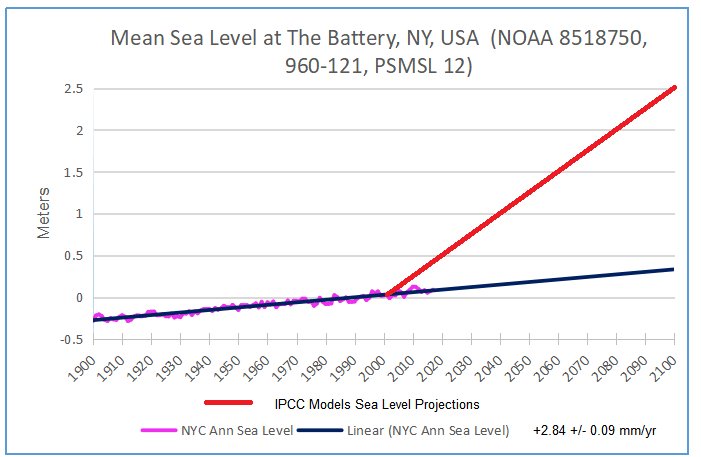
And in addition, since Chart #5 features the Statue of Liberty, here are the tidal gauge observations there compared to climate model projections:


Reblogged this on Climate Collections.
LikeLike
Thanks Ron for posting!!!!! Cheers and happy weekend.
LikeLike
N° 6 The World of Climate Change (Under review)
European alpine glacier history during the Holocene period.
http://www.ric-communications.ch/referenzen/simple-science-2.html
I had the pleasure of discovering Gernot Patzelt and Christian Schlüchter, two geologists who have been studying glacier history over the Holocene period. Both have been able measuring the historical sizes of the European alps due to their retreat at the moment. They have both discovered that the tree lines where much higher in the past. They have discovered this because of all the tree remains that have been exposed as the glaciers retreat. The corresponding graph shows that the glaciers had completely vanished at many locations and that these correspond to the warming periods in the past. These periods being warmer than they are now.
The glaciers that are now retreating had stared to expand during the last cooling periods since the middle ages. For those who are screaming that the glaciers are disappearing at an alarming rate, this news didn’t site very well. However since both geologist speak only german and that this information is sort of under the radar, most people still get the impression that something is very wrong. Christian Schlüchter himself admits to being forced to keep his opinions on his discovery for himself due to pressure for his superiors. He admits that the momentary funding of all the other projects around our CO2 would be harmed by this assessment.
Unfortunately this lectures are only in German. Links below.
Gernot Patzelt
Christian Schlüchter (Dec. 2019)
I traced down the graph for Gernot Patzelt and rearranged it a little so it’s easier to understand.
– I put the tree growth at the top
– Glacier retreats directly underneath
– Summer temperatures (May – September*) 12 thousand years.
* May – September is when the temperatures are high enough to melt the glaciers. Only at this time of the year do the retreat.
LikeLike
Cool. I think that since the green blocks have no scale or dimension, it would be good to show the 100m per 0.6C reference.
LikeLike
Good morning Ron
Thanks for the feedback. I’m not sure I can write that. There was never a reference to what the height difference where. I will have to ask Christian Schlüchter who just wrote back to me with some feedback to the chart that I need to make. I have to carefully read everything twice since I’m working in two languages and I want to get it just right. He was very surprised and complicated the work. That form a pro! WoW
You’ll be hearing from me …
LikeLike
Raymond, that figure for the movement is in the grey slide just below your exhibit.
LikeLike
OK. Of course, the main point of the image is that the little ice age was the coldest time of the Holocen (earlier slide) and that since then glaciers have mostly retreated in starts and stops. I suppose the green blocks are only to signify a melting period, and not necessarily the amount of tree line movement. It’s just that the metric struck me as a new finding. I believe Schlüchter also said something about how much higher was the tree line in the past. I will look for it.
LikeLike
Yes, Schlüchter said in his Munich presentation; “The timberline was at least 300 meters higher which indicates a minimum of 1.8° C higher temperatures. So that is where the 100m per 0.6C comes from. It would be important to know how general or specific is that metric.
LikeLike
Hi Ron
1) I’ll include the 100 m on the bar chart, I missed that one while I was jockeying back and forth trying to track down the original data. There aren’t that many sources for this graph around.
–––––––––––––––––––––
2) “The timberline was at least 300 meters higher which indicates a minimum of 1.8° C higher temperatures.
Super, however I’ll leave it at 100 meters for the moment. This way if anyone comes along to dispute the chart I won’t have to explain the discrepancy. (Do you have the Youtube link for his presentation.)
–––––––––––––––––––––
3) Chart N° 3 Holocene World of Climate Change
Christian noted a mistake on this chart.
“Coldest Holocene”
Should read as
“Coldest Holocene Climate Minima”
My mistake regardless, this is the correct term for the dip in temperature. That is what is written on the original chart.
–––––––––––––––––––––
4) I’m going to make the changes to the Glacier chart and get a last check on it form Christian as a cross reference.
–––––––––––––––––––––
His was very impressed with the series of charts, especially the Climate Change series, since it goes back much further in the time line of our planet temperature record. Many historians who have nothing to do with climate are also concerned about the inaccuracies of that past. Alone all the archaeological that show that past civilizations where able to thrive due to higher temperatures and better crop yields is an aspect that gets completely ignored. This include the previous light ice age period.
You’ll be hearing from me.
LikeLike
Raymond, hintermbusch is where I got the links:
https://hintermbusch.wordpress.com/2019/12/01/climate-conference-munich-2019/
There is a link to a video of the presentation but not a transcript AFAICS. There are links to other papers by Schlüchter.
LikeLike
Morning Ron
Yes that’s the same video I saw on another channel. The information form the link is a help as well. Thanks
I’ve uploaded the chart with the following changes that include:
– Eastern European alpine glacier history during the Holocene period. (Eastern and not European only)
– Added the 100 meters in tree line rise (movement: 100 m/0.6 °C)
– Tree remains found higher than present day (remains vs trunks)
I’ll send it to Christina on last time … let you know if everything is ok.
Cheers R.
LikeLike
Good work. Do make the point in your notes on graphic 6 that May through September temps are the ones that matter, which why they are displayed.
Your wording was good: * May – September is when the temperatures are high enough to melt the glaciers. Only at this time of the year do they retreat.
LikeLike