Despite what you may be hearing, Arctic ice is not presently declining, a big disappointment to fear mongers. Something happened to cause a rapid decline in the decade 1998 to 2007, but since then the ice has been stable or slightly rising.
The analysis below comes from the MASIE dataset, whose managers have no stated position on global warming, climate change, or the future of Arctic ice. They simply report daily ice conditions for the safety of ships operating in Arctic seas. It is the highest resolution, most accurate report of daily ice conditions. MASIE historical records became available once NSIDC confirmed that the records have reasonable consistency starting with 2006.
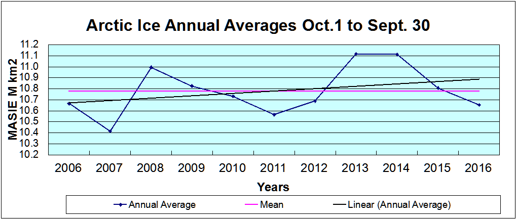
Big Picture Shows Recovery from 2007 Low
Arctic ice extents are cyclical with maximums occurring in March and the annual minimums in September. Autumn snowfall and winter weather affect the March ice, and September varies with warm and salty water circulations, cloudiness affecting brightness, and stormy weather breaking and compressing ice. The annual average of ice extent factors in fluctuations over the entire cycle.
Since we are at the end of the melt season, the chart below takes 12 month averages starting Oct. 1 to display average annual ice extents for the last 11 years.
The minimum occurred in 2007 at ~10.4 M km2 and all years have been higher than that, including 2006, 2012 and 2016 virtually tied at ~10.7 M km2. The trendline is descriptive, not predictive; that is, the line serves only to show the pattern in this brief history, the future could go higher or lower with equal uncertainty.
It should be noted that the variability is quite constrained within +/- 0.4 M km2, or +/- 3% of the annual average. Also 5 years are above average, and 6 years are below.
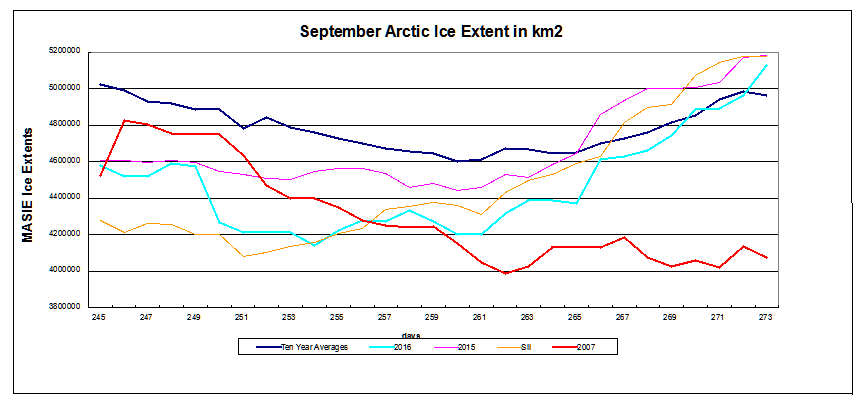
September Ice Minimums
The chart below shows comparative measures of September ice extents.
The red line is September 2007, which was the lowest in the last 10 years, except for 2012 which was hit by the great Arctic Cyclone. More importantly, 2007 had the smallest annual average ice extent in the MASIE record (since 2006). The blue line is the ten-year average for days in September (2006 to 2015 inclusive). MASIE 2015 is in purple, MASIE 2016 in green, and 2016 NOAA SII (Sea Ice Index) is in yellow.
While the minimums all occurred days 260 to 262, 2007 extents were already trending lower, and presently the other measures are converging above average. With SII virtually tied with MASIE, that index will also be showing a September average ~ 4.5 M km2.
2016 is now slightly above average, having gone below the average annual minimum (4.6 M km2 on Sept. 16) for 17 days before regaining the lost ice.
The table below shows the locations of ice among the various seas making up the Arctic Ocean. Day 273 is Sept. 30 most years; 2016 being a leap year is one day later. So the official 2016 results will benefit from an additional day of ice extent exceeding 5M km2.
Region
2016273
Day 273 Average
2016-Ave.
2015273
2016-2015
(0) Northern_Hemisphere
5128960
5014059
114901
5183385
-54426
(1) Beaufort_Sea
376071
574043
-197972
530396
-154325
(2) Chukchi_Sea
427460
212714
214746
329362
98098
(3) East_Siberian_Sea
323001
329489
-6488
265744
57257
(4) Laptev_Sea
295732
162254
133477
165663
130069
(5) Kara_Sea
163
43464
-43301
45328
-45166
(6) Barents_Sea
271
24142
-23871
1445
-1174
(7) Greenland_Sea
194462
256519
-62057
256733
-62271
(8) Baffin_Bay_Gulf_of_St._Lawrence
50141
49107
1034
71775
-21635
(9) Canadian_Archipelago
347668
356314
-8646
352788
-5120
(10) Hudson_Bay
0
4953
-4953
15485
-15485
(11) Central_Arctic
3112850
2999948
112902
3147524
-34674
2016 is above average with deficits mainly in Beaufort, Kara, and Greenland seas, offset by surpluses in Chukchi, Laptev and Central Arctic.
Summary
Those claiming global warming is proved by declining Arctic ice are losing that line of evidence. Not only has it stopped declining, the evidence is growing that it varies over quasi-60 year cycles because of changes in water circulations, wind and weather. And some researchers think that the ice may continue to grow up and up in the near future.
Green economics was on full display this week when the Ontario provincial government decided to cancel contracts for additional electrical power from renewables, such as those previously offered in March 2016.
Definition of Rent-Seeking, noun (economics):
the act or process of using one’s assets and resources to increase one’s share of existing wealth without creating new wealth.
(specifically) the act or process of exploiting the political process or manipulating the economic environment to increase one’s revenue or profits.
Definition of Ratepayer:
a person who pays a regular charge for the use of a public utility, as gas or electricity, usually based on the quantity consumed.
Feed-in tariffs for 20-year renewable power contracts have the ratepayers outraged, as voiced by the opposition (CBC):
“This government has plowed ahead for years signing contracts for energy we simply do not need,” said Opposition Leader Patrick Brown. “The premier has become the best minister of economic development that Pennsylvania and New York has ever seen.”
The Tories used virtually all their time in question period talking about individuals and business owners struggling with soaring electricity rates, and claimed Thibeault’s cancellation announcement was an admission by the Liberals that their green energy policies were misguided.
“It’s bad policy,” said Brown. “I just wish at this point, now that they’ve acknowledged that they’ve made a mistake, that they would apologize. They made a huge mistake on the energy file and everyone in Ontario is paying for it.”
Mr. Thibeault said contracts signed in an earlier green-energy procurement will be honoured. In March, the province reached 16 deals with 11 firms to build wind, solar and hydroelectric projects for a total of 455 megawatts of new capacity. The negotiated prices were much lower than earlier fixed-price contracts for renewables because of the competitive bidding.
Ontario already has more than 4,000 MW of wind capacity and 2,000 of solar power.
The Liberal government has been under pressure from the opposition and rural residents who oppose wind farms to scale back its renewable plans and to find a way to trim increases in electricity prices.
Rent-Seekers Push Back
Renewables lobbyists are defending their interests (Globe and Mail):
But the cancellation was a shock to the renewable-energy industry, which was counting on the new program, which would have awarded contracts for about 1,000 MW of projects in 2018.
John Gorman, president of the Canadian Solar Industries Association, said the decision could hurt manufacturers and installers of solar product in the province just as they are becoming significant global competitors.
Robert Hornung, president of the Canadian Wind Energy Association, said the wind industry is “shocked and extremely disappointed.”
Lobby group Environmental Defence called the cancellation “short-sighted” and said this is “exactly the wrong time to put the brakes on renewable energy.”
Etc., Etc.
Summary
Several rent-seekers as well as the Energy Minister said renewable prices were coming down, but didn’t say they are still several multiples of the $23/MWh Ontario wholesale price. Nor did anyone point out the cancellation is only avoiding a future rate increase, not bringing rates down. The politics have forced the administration into promising an 8% cut in consumer electricity rates, and it can only come from reducing the subsidies. Hence the howling.
MASIE: “high-resolution, accurate charts of ice conditions”
Walt Meier, NSIDC, October 2015 article in Annals of Glaciology.
I’ve been waiting for September 30 results to compare the monthly average for this year with previous ones. But the remarkable rate of refreezing in the Arctic needs reporting. MASIE counts ice extent using 40% coverage of 4k km2 grid cells, making it the highest resolution dataset. As well, it incorporates estimates from satellite passive microwave sensors, supplemented with satellite imagery and reports from buoys and ships.
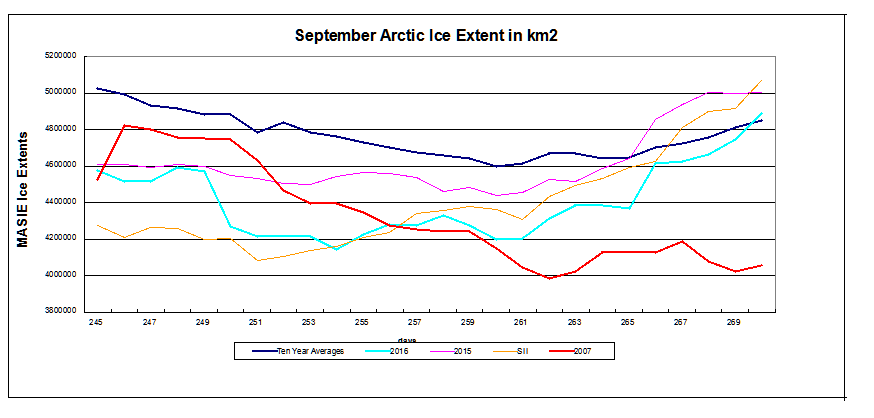
The red line is September 2007, which was the lowest in the last 10 years, except for 2012 which was hit by the great Arctic Cyclone. More importantly, 2007 had the smallest annual average ice extent in the MASIE record (since 2006). The blue line is the ten-year average for days in September (2006 to 2015 inclusive). MASIE 2015 is in purple, MASIE 2016 in green, and 2016 NOAA SII (Sea Ice Index) is in yellow.
While the minimums all occurred days 260 to 262, 2007 extents were already trending lower, and presently the other four measures are converging. Since the September rate of regaining ice was at a decadal high in 2015, it is remarkable for 2016 to be improving on that. Since 2007 will end the month close to where it is now, we can project that 2016 monthly average will be considerably higher, likely to exceed also 2008. With SII virtually tied with MASIE, that index will also be showing a September average well over 4.4M km2.
Summary
With 2016 ice extents surging, we can project that Arctic ice has continued on a flat or slightly increasing trendline with no evidence of a decline since 2007.
Why the Discrepancy between SII and MASIE?
The issue also concerns Walter Meier who is in charge of SII, and as a true scientist, he is looking to get the best measurements possible. He and several colleagues compared SII and MASIE and published their findings last October. The purpose of the analysis was stated thus:
Our comparison is not meant to be an extensive validation of either product, but to illustrate as guidance for future use how the two products behave in different regimes.
The Abstract says: Passive microwave sensors have produced a 35 year record of sea-ice concentration variability and change. Operational analyses combine a variety of remote-sensing inputs and other sources via manual integration to create high-resolution, accurate charts of ice conditions in support of navigation and operational forecast models. One such product is the daily Multisensor Analyzed Sea Ice Extent (MASIE). The higher spatial resolution along with multiple input data and manual analysis potentially provide more precise mapping of the ice edge than passive microwave estimates. However, since MASIE is based on an operational product, estimates may be inconsistent over time due to variations in input data quality and availability. Comparisons indicate that MASIE shows higher Arctic-wide extent values throughout most of the year, largely because of the limitations of passive microwave sensors in some conditions (e.g. surface melt). However, during some parts of the year, MASIE tends to indicate less ice than estimated by passive microwave sensors. These comparisons yield a better understanding of operational and research sea-ice data products; this in turn has important implications for their use in climate and weather models.
The whole document is informative and worth the read.
For instance MASIE is described thus:
Human analysis of all available input imagery, including visible/infrared, SAR, scatterometer and passive microwave, yields a daily map of sea-ice extent at a 4 km gridded resolution, with a 40% concentration threshold for the presence of sea ice. In other words, if a gridcell is judged by an analyst to have >40% of its area covered with ice, it is classified as ice; if a cell has <40% ice, it is classified as open water.
The fact that MASIE employs human judgment is discomforting to climatologists as a potential source of error, so Meier and others prefer that the analysis be done by computer algorithms. Yet, as we shall see, the computer programs are themselves human inventions and when applied uncritically by machines produce errors of their own.
The passive microwave sea-ice algorithms are capable of distinguishing three surface types (one water and two ice), and the standard algorithms are calibrated for thick first-year and multi-year ice (Cavalieri, 1994). When thin ice is present, the algorithms underestimate the concentration of new and thin ice, and when such ice is present in lower concentrations they may detect only open water. The underestimation of concentration and extent of thin-ice regions has been noted in several evaluation studies. . .Melt is another well-known cause of underestimation of sea ice by passive microwave sensors.
The paper by Meier et al. is a good analysis, as far as it goes. In a post NOAA is Losing Arctic Ice I showed the gory details and brought the comparison up to date.
Seeing a lot more of this lately, along with hearing the geese honking. And in the next month or so, we expect that trees around here will lose their leaves. It definitely is climate change of the seasonal variety.
Interestingly, the science on this is settled: It is all due to reduction of solar energy because of the shorter length of days (LOD). The trees drop their leaves and go dormant because of less sunlight, not because of lower temperatures. The latter is an effect, not the cause.
Of course, the farther north you go, the more remarkable the seasonal climate change. St. Petersburg, Russia has their balmy “White Nights” in June when twilight is as dark as it gets, followed by the cold, dark winter and a chance to see the Northern Lights.
And as we have been monitoring, the Arctic ice has been melting from sunlight in recent months, but will now begin to build again in the darkness to its maximum in March.
We can also expect in January and February for another migration of millions of Canadians (nicknamed “snowbirds”) to fly south in search of a summer-like climate to renew their memories and hopes. As was said to me by one man in Saskatchewan (part of the Canadian wheat breadbasket region): “Around here we have Triple-A farmers: April to August, and then Arizona.” Here’s what he was talking about: Quartzsite Arizona annually hosts 1.5M visitors, mostly between November and March.
Of course, this is just North America. Similar migrations occur in Europe, and in the Southern Hemisphere, the climates are changing in the opposite direction, Springtime currently. Since it is so obviously the sun causing this seasonal change, the question arises: Does the sunlight vary on longer than annual timescales?
The Solar-Climate Debate
And therein lies a great, enduring controversy between those (like the IPCC) who dismiss the sun as a driver of multi-Decadal climate change, and those who see a connection between solar cycles and Earth’s climate history. One side can be accused of ignoring the sun because of a prior commitment to CO2 as the climate “control knob”.
The other side is repeatedly denounced as “cyclomaniacs” in search of curve-fitting patterns to prove one or another thesis. It is also argued that a claim of 60-year cycles can not be validated with only 150 years or so of reliable data. That point has weight, but it is usually made by those on the CO2 bandwagon despite temperature and CO2 trends correlating for only 2 decades during the last century.
One scientist in this field is Nicola Scaffeta, who presents the basic concept this way:
“The theory is very simple in words. The solar system is characterized by a set of specific gravitational oscillations due to the fact that the planets are moving around the sun. Everything in the solar system tends to synchronize to these frequencies beginning with the sun itself. The oscillating sun then causes equivalent cycles in the climate system. Also the moon acts on the climate system with its own harmonics. In conclusion we have a climate system that is mostly made of a set of complex cycles that mirror astronomical cycles. Consequently it is possible to use these harmonics to both approximately hindcast and forecast the harmonic component of the climate, at least on a global scale. This theory is supported by strong empirical evidences using the available solar and climatic data.”
He goes on to say:
“The global surface temperature record appears to be made of natural specific oscillations with a likely solar/astronomical origin plus a noncyclical anthropogenic contribution during the last decades. Indeed, because the boundary condition of the climate system is regulated also by astronomical harmonic forcings, the astronomical frequencies need to be part of the climate signal in the same way the tidal oscillations are regulated by soli-lunar harmonics.”
He has concluded that “at least 60% of the warming of the Earth observed since 1970 appears to be induced by natural cycles which are present in the solar system.” For the near future he predicts a stabilization of global temperature until about 2016 and cooling until 2030-2040.
A Deeper, but Accessible Presentation of Solar-Climate Theory
I have found this presentation by Ian Wilson to be persuasive while honestly considering all of the complexities involved.
The author raises the question: What if there is a third factor that not only drives the variations in solar activity that we see on the Sun but also drives the changes that we see in climate here on the Earth?
The linked article is quite readable by a general audience, and comes to a similar conclusion as Scaffeta above: There is a connection, but it is not simple cause and effect. And yes, length of day (LOD) is a factor beyond the annual cycle.
It is fair to say that we are still at the theorizing stage of understanding a solar connection to earth’s climate. And at this stage, investigators look for correlations in the data and propose theories (explanations) for what mechanisms are at work. Interestingly, despite the lack of interest from the IPCC, solar and climate variability is a very active research field these days.
Once again, it appears that the world is more complicated than a simple cause and effect model suggests.
For everything there is a season, a time for every purpose under heaven.
What has been will be again, what has been done will be done again;
there is nothing new under the sun. (Ecclesiastes 3:1 and 1:9)
Update Sept. 17: Commentary with Dr. Arnd Bernaerts
ArndB comments:
Fine writing, Ron, well done!
No doubt the sun is the by far the most important factor for not living on a globe with temperatures down to minus 200°C. That makes me hesitating to comment on „solar and climate variability” or “the sun drives climate” (currently at NTZ – link above), but today merely requesting humbly that the claimed correlation should be based at least on some evidence showing that the sun has ever caused a significant climatic shift during the last one million years, which was not only a bit air temperature variability due to solar cycles that necessarily occur in correlation with the intake and release of solar-radiation by the oceans and seas.
Interestingly the UK MetOffice just released a report (Sept.2015, pages 21) titled:
“Big Changes Underway in the Climate System?”
by attributing the most possible and likely changes to the current status of El Niño, PDO, and AMO, and – of course – carbon dioxide -, and a bit speculation on less sun-energy (see following excerpt at link)
From p. 13: “It is well established that trace gases such as carbon dioxide warm our planet through the “greenhouse effect”. These gases are relatively transparent to incoming sunlight, but trap some of the longer-wavelength radiation emitted by the Earth. However, other factors, both natural and man-made, can also change global temperatures. For example, a cooling could be caused by a downturn of the amount of energy received from the sun, or an increase in the sunlight reflected back to space by aerosol particles in the atmosphere. Aerosols increase temporarily after volcanic eruptions, but are also generated by pollution such as sulphur dioxide from factories.
These “external” factors are imposed on the climate system and may also affect the ENSO, PDO and AMO variations……
My Reply:
Thanks Arnd for engaging in this topic.
My view is that the ocean makes the climate by means of its huge storage of solar energy, and the fluctuations, oscillations in the processes of distributing that energy globally and to the poles. In addition, the ocean is the most affected by any variation in the incoming solar energy, both by the sun outputting more or less, and also by clouds and aerosols blocking incoming radiation more or less (albedo or brightness variability).
The oscillations you mention, including the present El Nino (and Blob) phenomenon, show natural oceanic variability over years and decades. Other ocean cycles occur over multi-decadal and centennial scales, and are still being analyzed.
At the other end of the scale, I am persuaded that the earth switches between the “hot house” and the “ice house” mainly due to orbital cycles, which are an astronomical phenomenon. These are strong enough to overwhelm the moderating effect of the ocean thermal flywheel.
The debate centers on the extent to which solar activity has contributed to climate change over the last 3000 years of our current interglacial period, including current solar cycles.
Don Quixote ( “don key-ho-tee” ) in Cervantes’ famous novel charged at some windmills claiming they were enemies, and is celebrated in the English language by two idioms:
Tilting at Windmills–meaning attacking imaginary enemies, and
Quixotic (“quick-sottic”)–meaning striving for visionary ideals.
It is clear that climateers are similary engaged in some kind of heroic quest, like modern-day Don Quixotes. The only differences: They imagine a trace gas in the air is the enemy, and that windmills are our saviors.
A previous post (at the end) addresses the unreality of the campaign to abandon fossil fuels in the face of the world’s demand for that energy. Now we have a startling assessment of the imaginary benefits of using windmills to power electrical grids. This conclusion comes from Gail Tverberg, a seasoned analyst of economic effects from resource limits, especially energy. Her blog is called Our Finite World, indicating her viewpoint. So her dismissal of wind power is a serious indictment. A synopsis follows. (Title is link to article)
In fact, I have come to the rather astounding conclusion that even if wind turbines and solar PV could be built at zero cost, it would not make sense to continue to add them to the electric grid in the absence of very much better and cheaper electricity storage than we have today. There are too many costs outside building the devices themselves. It is these secondary costs that are problematic. Also, the presence of intermittent electricity disrupts competitive prices, leading to electricity prices that are far too low for other electricity providers, including those providing electricity using nuclear or natural gas. The tiny contribution of wind and solar to grid electricity cannot make up for the loss of more traditional electricity sources due to low prices.
Let’s look at some of the issues that we are encountering, as we attempt to add intermittent renewable energy to the electric grid.
Issue 1. Grid issues become a problem at low levels of intermittent electricity penetration.
Hawaii consists of a chain of islands, so it cannot import electricity from elsewhere. This is what I mean by “Generation = Consumption.” There is, of course, some transmission line loss with all electrical generation, so generation and consumption are, in fact, slightly different.
The situation is not too different in California. The main difference is that California can import non-intermittent (also called “dispatchable”) electricity from elsewhere. It is really the ratio of intermittent electricity to total electricity that is important, when it comes to balancing. California is running into grid issues at a similar level of intermittent electricity penetration (wind + solar PV) as Hawaii–about 12.3% of electricity consumed in 2015, compared to 12.2% for Hawaii.
Issue 2. The apparent “lid” on intermittent electricity at 10% to 15% of total electricity consumption is caused by limits on operating reserves.
In theory, changes can be made to the system to allow the system to be more flexible. One such change is adding more long distance transmission, so that the variable electricity can be distributed over a wider area. This way the 10% to 15% operational reserve “cap” applies more broadly. Another approach is adding energy storage, so that excess electricity can be stored until needed later. A third approach is using a “smart grid” to make changes, such as turning off all air conditioners and hot water heaters when electricity supply is inadequate. All of these changes tend to be slow to implement and high in cost, relative to the amount of intermittent electricity that can be added because of their implementation.
Issue 3. When there is no other workaround for excess intermittent electricity, it must be curtailed–that is, dumped rather than added to the grid.
Based on the modeling of the company that oversees the California electric grid, electricity curtailment in California is expected to be significant by 2024, if the 40% California Renewable Portfolio Standard (RPS) is followed, and changes are not made to fix the problem.
Issue 4. When all costs are included, including grid costs and indirect costs, such as the need for additional storage, the cost of intermittent renewables tends to be very high.
In Europe, there is at least a reasonable attempt to charge electricity costs back to consumers. In the United States, renewable energy costs are mostly hidden, rather than charged back to consumers. This is easy to do, because their usage is still low.
Euan Mearns finds that in Europe, the greater the proportion of wind and solar electricity included in total generation, the higher electricity prices are for consumers.
Issue 5. The amount that electrical utilities are willing to pay for intermittent electricity is very low.
To sum up, when intermittent electricity is added to the electric grid, the primary savings are fuel savings. At the same time, significant costs of many different types are added, acting to offset these savings. In fact, it is not even clear that when a comparison is made, the benefits of adding intermittent electricity are greater than the costs involved.
Issue 6. When intermittent electricity is sold in competitive electricity markets (as it is in California, Texas, and Europe), it frequently leads to negative wholesale electricity prices. It also shaves the peaks off high prices at times of high demand.
When solar energy is included in the mix of intermittent fuels, it also tends to reduce peak afternoon prices. Of course, these minute-by-minute prices don’t really flow back to the ultimate consumers, so it doesn’t affect their demand. Instead, these low prices simply lead to lower funds available to other electricity producers, most of whom cannot quickly modify electricity generation.
A price of $36 per MWh is way down at the bottom of the chart, between 0 and 50. Pretty much no energy source can be profitable at such a level. Too much investment is required, relative to the amount of energy produced. We reach a situation where nearly every kind of electricity provider needs subsidies. If they cannot receive subsidies, many of them will close, leaving the market with only a small amount of unreliable intermittent electricity, and little back-up capability.
This same problem with falling wholesale prices, and a need for subsidies for other energy producers, has been noted in California and Texas. The Wall Street Journal ran an article earlier this week about low electricity prices in Texas, without realizing that this was a problem caused by wind energy, not a desirable result!
Issue 7. Other parts of the world are also having problems with intermittent electricity.
Needless to say, such high intermittent electricity generation leads to frequent spikes in generation. Germany chose to solve this problem by dumping its excess electricity supply on the European Union electric grid. Poland, Czech Republic, and Netherlands complained to the European Union. As a result, the European Union mandated that from 2017 onward, all European Union countries (not just Germany) can no longer use feed-in tariffs. Doing so provides too much of an advantage to intermittent electricity providers. Instead, EU members must use market-responsive auctioning, known as “feed-in premiums.” Germany legislated changes that went even beyond the minimum changes required by the European Union. Dörte Fouquet, Director of the European Renewable Energy Federation, says that the German adjustments will “decimate the industry.”
Issue 8. The amount of subsidies provided to intermittent electricity is very high.
The US Energy Information Administration prepared an estimate of certain types of subsidies (those provided by the federal government and targeted particularly at energy) for the year 2013. These amounted to a total of $11.3 billion for wind and solar combined. About 183.3 terawatts of wind and solar energy was sold during 2013, at a wholesale price of about 2.8 cents per kWh, leading to a total selling price of $5.1 billion dollars. If we add the wholesale price of $5.1 billion to the subsidy of $11.3 billion, we get a total of $16.4 billion paid to developers or used in special grid expansion programs. This subsidy amounts to 69% of the estimated total cost. Any subsidy from states, or from other government programs, would be in addition to the amount from this calculation.
In a sense, these calculations do not show the full amount of subsidy. If renewables are to replace fossil fuels, they must pay taxes to governments, just as fossil fuel providers do now. Energy providers are supposed to provide “net energy” to the system. The way that they share this net energy with governments is by paying taxes of various kinds–income taxes, property taxes, and special taxes associated with extraction. If intermittent renewables are to replace fossil fuels, they need to provide tax revenue as well. Current subsidy calculations don’t consider the high taxes paid by fossil fuel providers, and the need to replace these taxes, if governments are to have adequate revenue.
Also, the amount and percentage of required subsidy for intermittent renewables can be expected to rise over time, as more areas exceed the limits of their operating reserves, and need to build long distance transmission to spread intermittent electricity over a larger area. This seems to be happening in Europe now.
There is also the problem of the low profit levels for all of the other electricity providers, when intermittent renewables are allowed to sell their electricity whenever it becomes available. One potential solution is huge subsidies for other providers. Another is buying a lot of energy storage, so that energy from peaks can be saved and used when supply is low. A third solution is requiring that renewable energy providers curtail their production when it is not needed. Any of these solutions is likely to require subsidies.
Conclusion
Few people have stopped to realize that intermittent electricity isn’t worth very much. It may even have negative value, when the cost of all of the adjustments needed to make it useful are considered.
Energy products are very different in “quality.” Intermittent electricity is of exceptionally low quality. The costs that intermittent electricity impose on the system need to be paid by someone else. This is a huge problem, especially as penetration levels start exceeding the 10% to 15% level that can be handled by operating reserves, and much more costly adjustments must be made to accommodate this energy. Even if wind turbines and solar panels could be produced for $0, it seems likely that the costs of working around the problems caused by intermittent electricity would be greater than the compensation that can be obtained to fix those problems.
The economy does not perform well when the cost of energy products is very high. The situation with new electricity generation is similar. We need electricity products to be well-behaved (not act like drunk drivers) and low in cost, if they are to be successful in growing the economy. If we continue to add large amounts of intermittent electricity to the electric grid without paying attention to these problems, we run the risk of bringing the whole system down.
Why the Quest to Reduce Fossil Fuel Emissions is Quixotic
Roger Andrews at Energy Matters puts into context the whole mission to reduce carbon emissions. You only have to look at the G20 countries, who have 64% of the global population and use 80% of the world’s energy. The introduction to his essay, Electricity and energy in the G20:
While governments fixate on cutting emissions from the electricity sector, the larger problem of cutting emissions from the non-electricity sector is generally ignored. In this post I present data from the G20 countries, which between them consume 80% of the world’s energy, summarizing the present situation. The results show that the G20 countries obtain only 41.5% of their total energy from electricity and the remaining 58.5% dominantly from oil, coal and gas consumed in the non-electric sector (transportation, industrial processes, heating etc). So even if they eventually succeed in obtaining all their electricity from low-carbon sources they would still be getting more than half their energy from high-carbon sources if no progress is made in decarbonizing their non-electric sectors.
The whole article is enlightening, and shows how much our civilization depends on fossil fuels, even when other sources are employed. The final graph is powerful (thermal refers to burning of fossil fuels):
Figure 12: Figure 9 with Y-scale expanded to 100% and thermal generation included, illustrating the magnitude of the problem the G20 countries still face in decarbonizing their energy sectors.
The requirement is ultimately to replace the red-shaded bars with shades of dark blue, light blue or green – presumably dominantly light blue because nuclear is presently the only practicable solution.
Summary
There is another way. Adaptation means accepting the time-honored wisdom that weather and climates change in ways beyond our control. The future will have periods both cooler and warmer than the present and we must prepare for both contingencies. Colder conditions are the greater threat to human health and prosperity. The key priorities are robust infrastructures and reliable, affordable energy.
Footnote:
This video shows Don Quixote might have more success against modern windmills.
Over 10 million ordinary people have told the UN what matters most to them, and here are the results.
According to this huge UN survey, good education, healthcare and jobs are far and away the top priorities. And way down at the bottom is “Action taken on climate change.” You would think that the UN Secretary-General would have many things on his plate, and even “Phone and Internet Access” comes ahead of climate change.
Yet because Ki-moon is seeking a legacy in bringing the Paris accord into force, that last-place concern is at the top of his agenda.
Summary
In a previous post Hammer and Nail I suggested that climate activists like Ban Ki-Moon are working on their own needs for esteem and self-actualization, while most of the world are struggling with the most basic needs. This survey proves that point, especially when charts show that only in richer, more developed countries does climate change rise a few steps above the bottom.
It could be argued that the Paris accord is not really action on climate change, just symbolism like the Angry Bird, but it is still a focus on the thing that matters least to the masses.
More on misplaced ecological priorities at Daily Maverick
Footnote:
From the Final Episode of Yes Prime Minister (on the subject of climate change)
PM Jim Hunt
“But how can we do something about
something that isn’t happening?”
Sir Humphrey Appleby
“It’s much easier to solve an
imaginary problem than a real one.”
This is a reblog of a post from dedicated environmentalist Michael Lewis which I am happy to put here following his comments. He does not agree with me on some matters and thinks I am too hard on environmental activists, ascribing nefarious motives that they do not have, in his opinion and experience.
At the same time, we seem to share a view that the Global Warming bandwagon is detrimental to the environment by diverting time, effort and resources to fight an imaginary problem, while real and serious environmental and social degradations and threats are not adequately addressed.
I appreciate his position particularly because it discredits the lie that global warming skeptics are all uncaring capitalists and big oil shills. I especially like the quote from Maslow, whose hierarchy of human needs contributed much to organizational sociology and motivational management. In the interest of singing from the same hymnbook, here is Between the Hammer and Nail from Michael Lewis.
Yes, I know everyone has jumped aboard the Global Warming bandwagon, hammered together the climate change apartment house and moved in lock stock and barrel to the CO2-causes-Climate-Change studio apartment. It’s a shame that such a ramshackle edifice dominates the climate science skyline.
“If all you have is a hammer, everything looks like a nail.” Abraham Maslow, The Psychology of Science, 1966
Part One
Climate change has become the cause celebre of modern thought and action, the hammer employed to bang on almost everything else. Every Progressive cause from highway congestion to homelessness simply must be cast in the glare of Climate Change and/or Global Warming. Every organization from the United Nations to my local County Board of Supervisors is invested in the concept as the source of funding for addressing all social ills.
The basis for this totalitarian acceptance of human caused climate change, aka Anthropogenic Global Warming (AGW) is the theory of radiative forcing of atmospheric warming, the so-called Greenhouse Effect. As we’ll see later, this is an instance of an attempt to prove an experiment by invoking a theory, rather than the accepted scientific process of proving a theory by experimentation and hypothesis testing.
Carbon dioxide radiative forcing was first proposed by Joseph Fourier in 1824, demonstrated by experiment by John Tyndall in 1859, and quantified by Svante Arrhenius in 1896. The unfortunate and inaccurate descriptor “Greenhouse Effect” was first employed by Nils Gustaf Ekholm in 1901.
The basic premise of the “Greenhouse Gas” theory is that greenhouse gases raise the temperature at the surface of the Earth higher than it would be without them (+33º C). Without these gases in the atmosphere (water vapor (0 to 4%), Carbon dioxide (0.0402%), Methane (0.000179%), Nitrous oxide (0.0000325%) and Fluorinated gases (0.000007%) life on this planet would be impossible.
This basic theory is deployed to buttress the assumptions that increased atmospheric greenhouse gas concentrations (mainly CO2) cause increased global average surface temperature, and, therefore lowering atmospheric CO2 concentrations will reduce or even reverse increases in global average surface temperature.
Let’s look at the observations and assumptions that have led to this erroneous conclusion.
Observations and Assumptions
Observation – Humans produce greenhouse gases through industrial activity, agriculture and respiration, increasing the atmospheric concentration of CO2 from ~300 ppmv to ~400 ppmv over the past 58 years
Observation – The calculated measure of global average surface temperature has increased by about 0.8° Celsius (1.4° Fahrenheit) since 1880.
Assumption – Adding more CO2 to the atmosphere causes an increase in global average surface temperature.
Assumption – Increase in global average surface temperature will cause changes in global climates that will be catastrophic for all life on Earth.
Conclusion – Therefore, reducing human CO2 production will result in a reduction in atmospheric CO2 concentration and a consequent reduction in increase of global average surface temperature, stabilizing global climates and preventing catastrophic climate change.
Items 1 and 2 are observations with which few climate scientists disagree, though there may be quibbles about the details. CO2 and temperature have both increased, since at least 1850. Items 3 and 4 are assumptions because there is no evidence to support them. The correlation between global average surface temperature and atmospheric CO2 concentration is not linear and it is not causal. In fact, deep glacial ice cores record that historical increases in CO2 concentration have lagged behind temperature rise by 200 to 800 years, suggesting that, if anything, atmospheric CO2 increase is caused by increase in global average surface temperature.
Nevertheless, the “consensus” pursued by global warming acolytes is that Svante Arrhenius’ 1896 “Greenhouse Gas” theory proves that rising CO2 causes rising temperature.
However, in the scientific method, we do not employ a theory to prove an experiment. Since we have only one coupled ocean/atmosphere system to observe, the experiment in this case is the Earth itself, human CO2 production, naturally occurring climate variation, and observed changes in atmospheric CO2 and global average surface temperature. There is no control with which to compare observations, thus we can make no scientifically valid conclusions as to causation. If we had a second, identical planet earth to compare atmospheric changes in the absence of human produced CO2, we would be able to reach valid conclusions about the role of CO2 in observed climate variation, and we would have an opportunity to weigh other causes of climate variation shared by the two systems.
To escape from our precarious position between the hammer and the nail, we should understand all possible causal factors, human caused, naturally occurring, from within and from without the biosphere in which all life lives.
Based on our current cosmology, it is my conclusion that we live in a chaotic, nonlinear, complex coupled ocean/atmospheric adaptive system, with its own set of naturally occurring and human created cycles that interact to produce the climate variation we observe. This variation is not the simple linear relationship touted by the IPCC and repeated in apocalyptic tones by those who profit from its dissemination, but rather is a complex interplay of varying influences, that results in unpredictable climate variation.
More about chaos and complexity in the next installment.
IPCC thinks life is linear, but in fact it looks more cyclical.
Footnote: Maslow’s Hierarchy of Human Needs
Could it be that climate activists are working on their own needs at the top two tiers, and want to impose their projects onto billions of people struggling with the most fundamental needs?
Much of the hysteria over atmospheric CO2 arises from dismissing the past, and thus losing the context for interpreting the present. Recently, one scientist suggested that climate researchers should be schooled in geology before commenting on climate change. Instead of that, of course, most of them are based in environmentalism. So as a public service this post presents some excellent and time-tested evidence produced by Dr Guy LeBlanc Smith. h/t Jeff Hayes
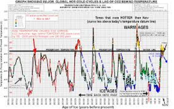
This graph, compiled by Ex-CSIRO scientist Dr Guy LeBlanc Smith PhD, AIG, AAPG, from data obtained from deep core drilling on the Greenland Ice Sheet, shows that all life on earth now, including polar bears, coral reefs and humans, have survived massive sea level changes and rapid and dramatic changes in earth’s temperature. There were no coal fired power stations and no gas guzzling cars to cause these changes then, and the same natural forces will change the future. Humans will need wits and resources to cope with future changes and every diversion of our resources to nonsense like Cap-n-Tax will reduce the chances that we will survive future changes.
The real danger to all life on earth is NOT warming and abundant aerial plant food (carbon dioxide) – the real threat is ICE and plant starvation.
Climate Activists are like Ambulance Chasers
Taxing carbon dioxide under the misguided perception that it causes temperature change is like placing a tax on ambulances because they cause vehicle accidents. Like CO2, ambulances arrive after the event.
Vehicle accidents occur and some time later ambulances arrive.
Temperature goes up and some time later CO2 goes up.
Clearly there is a parallel… Using the logic of many misguided politicians and their advisers, it would seem feasible through careful assumption-based computer modelling to show this… and build a scenario for taxing ambulances and thereby reducing vehicle accidents.
I am a concerned professional research scientist with over 30 years experience, latter part with CSIRO as a Principal Research Scientist. As my funding no longer depends on politicians, I am free to make my information and conclusions public.
We are now in the closing stages of the Cap-n-Tax debate. We need to rely on evidence and facts, not propaganda, before such crucial decisions are taken.
The real world evidence such as revealed in the ice cores suggests that the Carbon Pollution Reduction Scheme is built on fraud.
The Really Long View: How Does the Modern Warming Period Compare
Dr. Smith’s high res graph was blocked by both Facebook and Tinypic, so this is the best I can show now.
Dr. Smith produced an additional graph to display how temperatures have changed over the ages compared to the present and how measured CO2 varies in response to measured temperature changes. Of course, these estimates come from proxies since the timescale goes back through several ice ages.
But the message from the ice cores is clear: Through the ages, CO2 responds to temperatures and not the other way around. The other message is also clear: Climates change between warm and cool, and warm has always been good for humans and the biosphere. We should concern ourselves with preparing for the cold times with robust infrastructure and reliable, affordable energy.
Summary
H/t to Jeff Hayes, who recently posted this letter from Dr. Smith (here)
Dr. LeBlanc Smith’s letter:
Jeff,
Thanks for using my chart.
I too have been fighting this fraudulent ‘human-caused & CO2 driven’ climate variation issue for decades.
I have used this graphic (with others) to counter teaching this fraud in our Australian education system, who started teaching the AGW fraud to school kids, mine particularly, and I wanted information that would be seen in context easily by kids and the less illiterate, so they would not get lost in text.
Being a scientist, I further wanted to see the climate information from source, to check its veracity, hence downloading the data from NOAA at Boulder all those years back, and making my own graphic to show context. Al Gore would not have got started if he had overlaid his temperature and CO2 graphics on a common timeline… where the temperature driver is clearly exposed. I am truly surprised these ‘green terrorists’ are still free to prosecute this fraud.
I am a retired Principal Research Scientist with Australian government CSIRO (Commonwealth Scientific and Industrial Research Organisation).
I fought against this from within the organisation for years. There are still those there who like the gravy train funding resulting from supporting the erroneous but politically convenient mantra of humans and CO2 climate alarm, despite it flying in the face of decades of empirical science showing AGW is a myth and fraud.
I would draw your attention to the Clexit campaign, which I am a signatory and founding member…
To view this release with all images intact click:
I still enjoy the video graphics at CO2 science.org website, of the pea growing in CO2 enriched atmosphere…
Also their detailed demonstration of the agricultural production increases from rising CO2 levels, all at no cost.
Gratifying broadly that doubling CO2 will increase crop production by more than half again, whilst using 20% less water whilst doing this, and further increasing resilience of plants to heat stress by an additional 10 degrees celsius – all for free! Why are we trying to tax this?
Anyway, thanks for the response to my graphic.
best regards
Guy
Dr Guy LeBlanc Smith, PhD, MAIG, MAAPG
Director Rock Knowledge Services Pty Ltd
Queensland Australia
The stone-age didn’t end because we ran out of stones…think smart!
Warming alarmists see no good coming out of rising CO2 and the current climate optimum, and their warnings extend to forests as well. So in love with their theory of global warming, they cannot see the forests as they are, and as documented in numerous research studies.
Claim: Forest growth is diminished by higher CO2 and warmer summers.
Fact: CO2 increases have improved forest health.
Claim: Forest areas will be hard-hit by future droughts.
Fact: No trend in droughts is discernible.
Claim: Warmer temperatures increase damage from pests and pathogens.
Fact: Enhanced CO2 is making forests more resilient to diseases and infestations.
Claim: Old growth forests will not sequester CO2 as young forests do.
Fact: Rising CO2 has given new life even to aging forests.
Almost ALL C3 pathway vegetation (trees, bushes, wheat, rice and 95% of all plants) are CO2-starved except in extremely high rainfall environments like tropical rain-forests. They need to keep their CO2-absorbing stomata more open to get the CO2 they need but this also leads to more loss of water through evapotranspiration.
As rainfall gets lower and lower, the 95% of plants that are C3 suffer more and more until they cannot even grow anymore. In low rainfall and low CO2, these plants are done, and the C4 pathway grasses take over. The C4 grasses are more efficient at absorbing CO2 so do not require as much rainfall. Even 10 inches per year is enough.
But take anywhere on the planet where grasses are dominant, it is because rainfall is too low for trees and bushes, combined with CO2 being too low.
Now ramp-up CO2 and the trees do better in these regions. In fact, they do better absolutely everywhere. Now ramp-up precipitation as well, as should happen in a warmer world, and we have forests everywhere and they grow better everywhere.
Go back to the little ice age, when temperatures were lower and precipitation was lower and CO2 was lower, all plants grew at a lower rate and C3 crops like vegetables, wheat and rice probably failed regularly and people died of starvation.
In the ice ages, when all these numbers were even far lower, our ancestors lived off the grassland herbivores because there were no trees or bushes and no fruit, nuts, wheat, or berries to be found. But there were lots of grass-eating herbivores like the Auroch which was the ancestor of today’s cattle. Our ice age ancestors were mainly meat-eaters.
Highlights • We review information on US forest health in response to climate change. • We found that trees are tolerant of rising temperatures and have responded to rising carbon dioxide. • No long-term trends in US drought have been found in the literature. • CO2 tends to inhibit forest pests and pathogens. • Projections of forest response to climate change are highly variable.
Abstract: The health of United States forests is of concern for biodiversity conservation, ecosystem services, forest commercial values, and other reasons. Climate change, rising concentrations of CO2 and some pollutants could plausibly have affected forest health and growth rates over the past 150 years and may affect forests in the future. Multiple factors must be considered when assessing present and future forest health. Factors undergoing change include temperature, precipitation (including flood and drought), CO2 concentration, N deposition, and air pollutants. Secondary effects include alteration of pest and pathogen dynamics by climate change.
We provide a review of these factors as they relate to forest health and climate change. We find that plants can shift their optimum temperature for photosynthesis, especially in the presence of elevated CO2, which also increases plant productivity. No clear national trend to date has been reported for flood or drought or their effects on forests except for a current drought in the US Southwest. Additionally, elevated CO2 increases water use efficiency and protects plants from drought. Pollutants can reduce plant growth but concentrations of major pollutants such as ozone have declined modestly. Ozone damage in particular is lessened by rising CO2. No clear trend has been reported for pathogen or insect damage but experiments suggest that in many cases rising CO2 enhances plant resistance to both agents.
There is strong evidence from the United States and globally that forest growth has been increasing over recent decades to the past 100+ years. Future prospects for forests are not clear because different models produce divergent forecasts. However, forest growth models that incorporate more realistic physiological responses to rising CO2 are more likely to show future enhanced growth. Overall, our review suggests that United States forest health has improved over recent decades and is not likely to be impaired in at least the next few decades.
Carbon Sequestration
On the specific issue of aging forests losing their ability to absorb CO2, extensive research is reviewed at CO2 Science (here)
As important as are these facts about trees, however, there’s an even more important fact that comes into play in the case of forests and their ability to sequester carbon over long periods of time. This little-acknowledged piece of information is the fact that it is the forest itself – conceptualized as a huge super-organism, if you will – that is the unit of primary importance when it comes to determining the ultimate amount of carbon that can be sequestered on a unit area of land. And it when it comes to elucidating this concept, it seems that a lot of climate alarmists and political opportunists can’t seem to see the forest for the trees that comprise it.
That this difference in perspective can have enormous consequences was demonstrated quite clearly by Cary et al. (2001), who noted that most models of forest carbon sequestration wrongly assume that “age-related growth trends of individual trees and even-aged, monospecific stands can be extended to natural forests.” When they compared the predictions of such models against real-world data gathered from northern Rocky Mountain subalpine forests that ranged in age from 67 to 458 years, for example, they found that aboveground net primary productivity in 200-year-old natural stands was almost twice as great as that of modeled stands, and that the difference between the two increased linearly throughout the entire sampled age range.
The answer is rather simple. For any tree of age 250 years or more, the greater portion of its life (at least two-thirds of it) was spent in an atmosphere of much-reduced CO2 content. Up until 1920, for example, the air’s CO2 concentration had never been above 300 ppm throughout the entire lives of such trees, whereas it is currently 400 ppm or 33% higher. And for older trees, even greater portions of their lives were spent in air of even lower CO2 concentration. Hence, the “intervention” that has given new life to old trees and allows them to “live long and prosper,” would appear to be the aerial fertilization effect produced by the flooding of the air with the CO2 that resulted from the Industrial Revolution and that is currently being maintained by its ever-expanding aftermath (Idso, 1995).
Based on these many observations, as well as the results of the study of Greenep et al. (2003) – which strongly suggested, in their words, that “the capacity for enhanced photosynthesis in trees growing in elevated CO2 is unlikely to be lost in subsequent generations” – it would appear that earth’s forests will remain strong sinks for atmospheric carbon far beyond the date at which the world’s climate alarmists have proclaimed they would have given back to the atmosphere most of the carbon they had removed from it over their existence to that point in time. And subsequent reports have validated this assessment.
Summary
No doubt that forests are threatened by the human race, but it has nothing to do with CO2, which trees love. Urban and agricultural encroachments can and do cause loss of forest habitats. Pests and pathogens come and go in cycles, and their impacts can be mitigated by proper forest management.
The 2015 Global Forest Resources Assessment was encouraged by the reduced rate of deforestation and the increasing quality and extent of forest management practices in many countries.
Too bad so much effort and funding is wasted on IPCC circuses.
David Ellard provides a thorough and timely explanation of the carbon cycle from first principles. His essay meets the standard for all speeches or papers: “A presentation should be like a woman’s dress–long enough to cover the subject but short enough to be interesting.” (OK I’m dated and not PC: the long enough part is passé).
Since the subject is to describe the carbon dioxide fluxes and atmospheric residence timescales, the essay is necessarily long. It is made more lengthy by the need to untangle confusions, deceptions and obfuscations of CO2 science by IPCC partisans pushing CO2 alarms. To completely remove the wool from your eyes takes a full reading and pondering. I will attempt a synopsis here to encourage interested parties to take the lesson for themselves. The experience reminded me of college classes I took majoring in Organic Chemistry, though in those days CO2 was anything but contentious.
Several posts here (links below) have danced around Ellard’s subject, but his exposition is the real deal. Getting to the bottom of this issue, he explains how Henry’s law works regarding CO2 in the real world, makes an important distinction between CO2 molecules and ions, and factors in an accounting of the CO2 output from rising populations of humans and animals.
One of the most controversial topics in understanding the build-up of carbon dioxide in the atmosphere is the question of timescales – the effect of the build-up depends not only on the amounts being released by human(-related) activities but also on how long the gas stays in the atmosphere.
In fact much of the controversy/confusion stems from the fact that there are two relevant timescales, one which determines how the amount of carbon dioxide in the atmosphere equilibrates with other reservoirs (notably physical exchange with the oceans, and biological exchange via photosynthesis and respiration), and another which determines the exchange of carbon atoms.
By analysing the amounts of a marker carbon isotope (carbon-13) it is possible to calculate these two timescales. The timescale for the amount of carbon dioxide is approximately twenty years, a significantly shorter timescale than often claimed (e.g. by the IPCC). From these figures, we can also deduce that the increased carbon dioxide in the atmosphere since the industrial revolution has led to a noticeable increase in the photosynthetic rate of the Earth’s plants and green algae (about 8%). This has clear implications for the on-going discussions on the costs, and indeed benefits, of increasing carbon dioxide levels.
The reasons why the IPCC’s (and others’) estimates of carbon dioxide timescales in the atmosphere are overestimated are analysed – notably because no account is taken of changes in net respiration rates (ever more people, and domesticated animals, and animal pests that depend on them), because hydrocarbon usage by UN member states is underreported (quite possibly for reasons of political prestige), and finally because the models ignore the key empirical evidence (the carbon-13 isotope measurements).
Excerpts from Ellard’s Article
The purpose of this post is to try and explain the nature of the two timescales, and pin down using actual physical measurements (rather than computer games) the size of both.
What Henry’s Law is telling us, then, is that when we add molecules of carbon dioxide to the atmosphere, these molecules will ultimately partition themselves (leaving aside the effects of the biota) in an approximately fixed ratio between atmosphere and ocean (the solvent).
Three questions arise: what is the dilution of carbon dioxide in the oceans? what does ‘ultimately’ mean? and what actually is the value of the fixed ratio? In order of asking: very dilute (the oceans are approximately 500 times undersaturated in molecular carbon dioxide), it depends on the mixing processes both within and between the atmosphere and ocean (discussed further on), and:
To rephrase then, for every six molecules of CO2 that are introduced into the atmosphere, five of the six (again ignoring biological processes) will end up in the oceans, only one of them will hang around in the air. Not only that but, as noted above, molecular CO2 is a very dilute solute in the oceans. At current rates, it would take tens of thousands of years for mankind to achieve saturation.The partition ratio 1:5 will continue to apply for the foreseeable future!
The basic take home fact is that the ‘dissolved inorganic carbon’ or DIC in the world’s oceans is, in principle, a mixture of molecular carbon dioxide and dissolved carbonates. What is the ratio of molecular to ionic carbon dioxide? The smart among you will already have guessed: there is approximately 9 times as much ionic CO2 dissolved in the oceans as molecular. Only the latter is in Henry’s Law equilibrium with CO2 in the atmosphere. Hence the different ratios of 1:5 (atmospheric:molecular dissolved CO2) and 1:50 (atmospheric:molecular plus ionic dissolved CO2 i.e. DIC).
[fig.2 Schematic of ocean-atmosphere physical exchange]
So we can now recap. Before the exchange the atmosphere contained ten surplus marked molecules of carbon dioxide. After the exchange, there were still nine surplus molecules in the atmosphere, but none of them contained the marker! The ocean gained a single extra molecule of carbon dioxide but gained an extra nine atoms of marked carbon (and lost nine unmarked ones).
Since the industrial revolution, the human population of this planet has exploded. Not just humans though. We also have caused an explosion in the number of domestic animals, sheep, pigs, cows and chickens and the like. And not just the intended results of human food production. There are a myriad rats, cockroaches, potato blight funguses and the like out there which depend for their existence on our (unintended) generosity. They are also all busy respiring carbon dioxide into the atmosphere, thanks to us.
We have to take this into account, as well as any changes in photosynthetic fluxes (which have the opposite tendency, to reduce atmospheric carbon dioxide). I would need a whole other post to discuss this in detail, but I am simply going to assume that one third of the ‘excess’ carbon dioxide is not of hydrocarbon origin. The crucial point is that this excess CO2 will not have the distinctive carbon-13 marking. Its carbon-13 profile will be almost identical to (well, pretty similar to, we will ignore the difference for simplicity) that already in the atmosphere.
So we are going to calculate the carbon dioxide adjustment timescale as a function of the deep ocean-surface mixing timescale but reduce the result by a third to take into account non-hydrocarbon anthropogenic CO2 emissions. If you object to this piece of fudging, by all means feel free to do the calculation without it.
If you plot a graph of this using values of the deep ocean-surface mixing timescale of between, say, 0 and 100 years (which really should cover all eventualities), the value of the adjustment timescale varies between 16 and 23 years. Let’s take a happy median, thus:
The current concentration of carbon dioxide in the atmosphere is 400 ppmv and is increasing by 2 ppmv/year. If the atmospheric adjustment timescale is 20 years then it means the oceans and biota are together absorbing 5 ppmv/year of the excess. Three quarters of this absorption is due to the increase in productivity of the biota and one quarter to the Henry’s Law re-equilibration in the oceans.
So we can say that for every seven molecules of CO2 put into the air by mankind, of which just under five are from burning hydrocarbons, two accumulate there, one and a bit is dissolved into the oceans and just under four are reabsorbed by the biota via increased photosynthetic productivity.
Conclusion
But to my mind the most striking result, if we bring the carbon-13 isotope evidence fully to bear, is the increase in photosynthesis that must have taken place over the course of the twentieth century. The Henry’s Law equilibration between atmosphere and oceans is simply too slow to get rid of much of mankind’s excess CO2. The fact that there is not a lot more of this CO2 still lingering in the atmosphere (and therefore that the proportion which is hydrocarbon-derived is not even smaller) shows us that the donkey work of mopping up (most of) the excess has been carried out by the biota – all the phytoplankton, trees, grasses and algae that give wide areas of our planet’s surface its distinctive green colour.
Bio – David Ellard
David Ellard studied Natural Sciences at Kings College Cambridge with specialisations in mathematical and atmospheric chemistry.
Since then he has worked over twenty years in the European Commission in Brussels in various science/technology/law-related areas, notably responsible for the Commission’s proposed directive on the patentability of computer-implemented inventions.
My Footnote
Many thanks to David Ellard for this clear and readable treatise on established CO2 science, which still applies despite climate activists attempting to unsettle it. Before anyone takes a stand on CO2 and global warming, be sure to remove the wool from over your eyes.