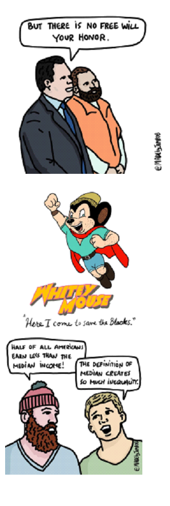
Pandemonia Funnies Madebyjimbob

Humor is important as a means of poking holes in narratives that assert beliefs contrary to reality.  Jimbob has become a force skewering notions of climate change, as well as other distorted ideas comprising the “woke” PC canon.  Those inside the believer bubble will not be affected, but the important audience are those ignorant or agnostic about the so called “progressive, post-modern agenda.”   Philosopher Mortimer Adler put it this way:

Any teacher will tell you it is much easier to teach a student who is ignorant than one who is in error, because the student who is in error on a given point thinks that he knows whereas in fact he does not know. . .It is almost necessary to take the student who is in error and first correct the error before you can teach him. . .The path from ignorance to knowledge is shorter than the path from error to knowledge.

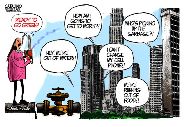
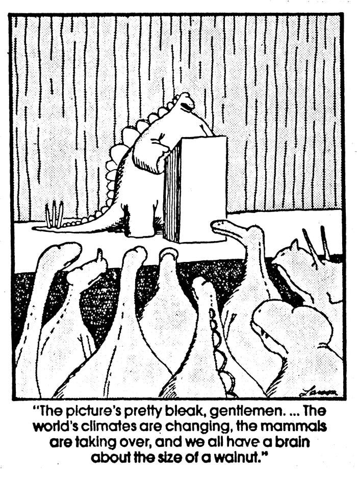
And the best part is that the alarmist side is denied any use of humor due to their doomsterism.  Below are a selection from the many cartoons madebyjimbob, currently touched by the virus and shutdowns along with  everything from climate change to racism, to cancel culture to genderism to the failure of higher education.

Footnote:  H/T to Liz Wolfe writing at the Federalist featuring an interview with madebyjimbob A Conversation With The Anti-Political Correctness Satirist Who Is Pissing Off Instagram

Footnote: BTW, there’s a new dance craze sweeping Quebec, a new version of Blame It On Co-Corona.

IPCC Wants a 10-year Lockdown

You’ve seen the News:

While analysts agree the historic lockdowns will significantly lower emissions, some environmentalists argue the drop is nowhere near enough.–USA Today

Emissions Declines Will Set Records This Year. But It’s Not Good News.  An “unprecedented” fall in fossil fuel use, driven by the Covid-19 crisis, is likely to lead to a nearly 8 percent drop, according to new research.–New York Times

The COVID-19 pandemic cut carbon emissions down to 2006 levels.  Daily global CO2 emissions dropped 17 percent in April — but it’s not likely to last–The Verge

In fact, the drop is not even enough to get the world back on track to meet the target of the 2015 Paris Agreement, which aims for global temperature rise of no more than 1.5 degree above pre-industrial levels, said WHO S-G Taalas. That would require at least a 7% annual drop in emissions, he added.–Reuters

An article at Las Vegas Review-Journal draws the implications Environmentalists want 10 years of coronavirus-level emissions cuts.  Excerpts in italics with my bolds.

It’s always been difficult for the layman to comprehend what it would entail to reduce carbon emissions enough to satisfy environmentalists who fret over global warming. Then came coronavirus.

The once-in-a-century pandemic has devastated the U.S. economy. The April unemployment rate is 14.7 percent and rising. Nevada has the highest unemployment rate in the country at 28.2 percent. One-third of families with children report feeling “food insecure,” according to the Institute for Policy Research, Northwestern University. Grocery prices saw their largest one-month increase since 1974.

To keep the economy afloat, the U.S. government has spent $2.4 trillion on coronavirus programs. Another expensive relief bill seems likely. Unless the end goal is massive inflation, this level of spending can’t continue.

Amazingly, the United States has it good compared with many other places in the world. David Beasley, director of the U.N. World Food Program, has estimated that the ongoing economic slowdown could push an additional 130 million “to the brink of starvation.”

That’s the bad news. The good news for global warming alarmists is that economic shutdowns reduce carbon emissions. If some restrictions remain in place worldwide through the end of the year, researchers writing in Nature estimate emissions will drop in 2020 by 7 percent.

For some perspective, the U.N.’s climate panel calls for a 7.6 percent reduction in emissions — every year for a decade. And now we get a real-world glimpse of the cost.

What happens if we return to the course we were on before this pandemic?  A previous post shows that the past continuing into the future is not disasterous, and that panic is unwarranted.

I Want You Not to Panic

I’ve been looking into claims for concern over rising CO2 and temperatures, and this post provides reasons why the alarms are exaggerated. It involves looking into the data and how it is interpreted.

First the longer view suggests where to focus for understanding. Consider a long term temperature record such as Hadcrut4. Taking it at face value, setting aside concerns about revisions and adjustments, we can see what has been the pattern in the last 120 years following the Little Ice Age. Often the period between 1850 and 1900 is considered pre industrial since modern energy and machinery took hold later on. The graph shows that warming was not much of a factor until temperatures rose peaking in the 1940s, then cooling off into the 1970s, before ending the century with a rise matching the rate of earlier warming. Overall, the accumulated warming was 0.8C.

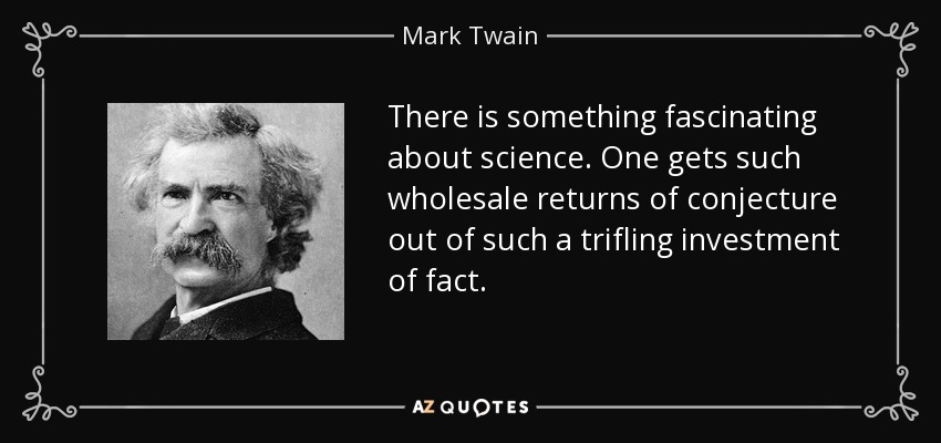
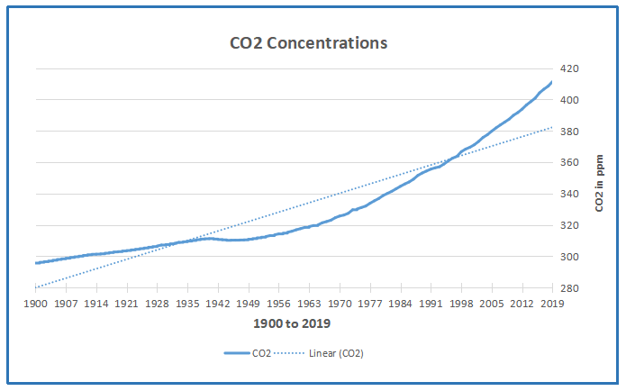
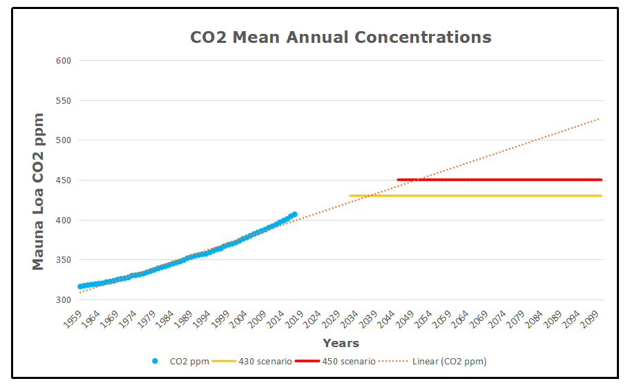
Then regard the record concerning CO2 concentrations in the atmosphere. It’s important to know that modern measurement of CO2 really began in 1959 with Mauna Loa observatory, coinciding with the mid-century cool period. The earlier values in the chart are reconstructed by NASA GISS from various sources and calibrated to reconcile with the modern record. It is also evident that the first 60 years saw minimal change in the values compared to the post 1959 rise after WWII ended and manufacturing was turned from military production to meet consumer needs. So again the mid-20th century appears as a change point.

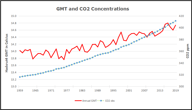
It becomes interesting to look at the last 60 years of temperature and CO2 from 1959 to 2019, particularly with so much clamour about climate emergency and crisis. This graph puts together rising CO2 and temperatures for this period. Firstly note that the accumulated warming is about 0.8C after fluctuations. And remember that those decades witnessed great human flourishing and prosperity by any standard of life quality. The rise of CO2 was a monotonic steady rise with some acceleration into the 21st century.

Now let’s look at projections into the future, bearing in mind Mark Twain’s warning not to trust future predictions. No scientist knows all or most of the surprises that overturn continuity from today to tomorrow. Still, as weathermen well know, the best forecasts are built from present conditions and adding some changes going forward.

Here is a look to century end as a baseline for context. No one knows what cooling and warming periods lie ahead, but one scenario is that the next 80 years could see continued warming at the same rate as the last 60 years. That presumes that forces at play making the weather in the lifetime of many of us seniors will continue in the future. Of course factors beyond our ken may deviate from that baseline and humans will notice and adapt as they have always done. And in the back of our minds is the knowledge that we are 11,500 years into an interglacial period before the cold returns, being the greater threat to both humanity and the biosphere.

Those who believe CO2 causes warming advocate for reducing use of fossil fuels for fear of overheating, apparently discounting the need for energy should winters grow harsher. The graph shows one projection similar to that of temperature, showing the next 80 years accumulating at the same rate as the last 60. A second projection in green takes the somewhat higher rate of the last 10 years and projects it to century end. The latter trend would achieve a doubling of CO2.

What those two scenarios mean depends on how sensitive you think Global Mean Temperature is to changing CO2 concentrations. Climate models attempt to consider all relevant and significant factors and produce future scenarios for GMT. CMIP6 is the current group of models displaying a wide range of warming presumably from rising CO2. The one model closely replicating Hadcrut4 back to 1850 projects 1.8C higher GMT for a doubling of CO2 concentrations. If that held true going from 300 ppm to 600 ppm, the trend would resemble the red dashed line continuing the observed warming from the past 60 years: 0.8C up to now and another 1C the rest of the century. Of course there are other models programmed for warming 2 or 3 times the rate observed.

People who take to the streets with signs forecasting doom in 11 or 12 years have fallen victim to IPCC 450 and 430 scenarios.  For years activists asserted that warming from pre industrial can be contained to 2C if CO2 concentrations peak at 450 ppm.  Last year, the SR1.5 lowered the threshold to 430 ppm, thus the shortened timetable for the end of life as we know it.

For the sake of brevity, this post leaves aside many technical issues. Uncertainties about the temperature record, and about early CO2 levels, and the questions around Equilibrium CO2 Sensitivity (ECS) and Transient CO2 Sensitivity (TCS) are for another day. It should also be noted that GMT as an average hides huge variety of fluxes over the globe surface, and thus larger warming in some places such as Canada, and cooling in other places like Southeast US. Ross McKitrick pointed out that Canada has already gotten more than 1.5C of warming and it has been a great social, economic and environmental benefit.

So I want people not to panic about global warming/climate change. Should we do nothing? On the contrary, we must invest in robust infrastructure to ensure reliable affordable energy and to protect against destructive natural events. And advanced energy technologies must be developed for the future since today’s wind and solar farms will not suffice.

It is good that Greta’s demands were unheeded at the Davos gathering. Panic is not useful for making wise policies, and as you can see above, we have time to get it right.

Epidemiology Journal: Use HCQ+AZ

Prestigious medical journal urges outpatient use of hydroxychloroquine regimen for COVID-19
Reported at Just The News.  Excerpts in italics with my bolds.

‘These medications need to be widely available and promoted immediately for physicians to prescribe,’ the American Journal of Epidemiology says.

A prestigious medical journal is criticizing news media coverage of hydroxychlorioquine in the battle against coronavirus, saying there is evidence the anti-malarial drug combined with the antibiotic azithromycin helps in the early stages of outpatient treatment.

“These medications need to be widely available and promoted immediately for physicians to prescribe,” the American Journal of Epidemiology reported in an article published this week that pushed back against claims the regimen has been dangerous or ineffective in all cases.

“Hydroxychloroquine plus azithromycin has been widely misrepresented in both clinical reports and public media, and outpatient trials results are not expected until September,” the journal noted, urging medical professionals and the public to recognize there are different stages of the disease that may require different treatments.

The article said the two candidate medications which have been widely reported – remdesivir and hydroxychloroquine plus azithromycin — need to be looked at differently.

“Remdesivir has shown mild effectiveness in hospitalized inpatients, but no trials have been registered in outpatients,” it said.

Meanwhile, the regimen with hydroxychloroquine has been the subject of five studies, including two controlled clinical trials, that “have demonstrated significant major outpatient treatment efficacy.”

The article noted that while there have been some instances of the drug regimen creating heart arrhythmias, the reactions are relatively small compared to those dying from COVID-19.

“Hydroxychloroquine+azithromycin has been used as standard-of-care in more than 300,000 older adults with multicomorbidities, with estimated proportion diagnosed with cardiac arrhythmias attributable to the medications 47/100,000 users, of which estimated mortality is <20%, 9/100,000 users, compared to the 10,000 Americans now dying each week.” the journal said.

The most compelling argument, the journal said, is how hydroxycholoroquine plus azithromycin reduces the rate of mortality.

Below are the percentages of doctors prescribing the hydroxychloroquine plus azithromycin regimen to COVID-19 patients across the globe:

72% in Spain;
49% in Italy;
41% in Brazil;
39% in Mexico;
28% in France;
23% in the US;
17% in Germany;
16% in Canada;
13% in the UK;

And at four New York hospitals, a recent study found that adding zinc sulfate with hydroxychloroquine and azithromycin significantly cuts both the need for intubation and mortality risks by half, researchers said.

Covid Inflation

The story of inflated coronavirus death statistics reminds of decades of climate science manipulations.  When the models produce big scary numbers, and reality fails to rise to predictions, data must be managed to keep scientists’ credibility.  With so much economic damage from shutdowns, many experts are vulnerable to be proven wrong and their advice unfounded.

How this is playing in the pandemic is reported by Timothy Allen & John Lott at Real Clear Politics U.S. COVID-19 Death Toll Is Inflated.  Excerpts in italics with my bolds.

The latest Centers for Disease Control data show that the COVID-19 fatality rate is 0.26% — four times higher than the worst rate for the seasonal flu over the past decade. That is dramatically lower than the World Health Organization’s estimate of 3.4% and Dr. Anthony Fauci’s initial guess of about 2%.

When the CDC projected 1.7 million deaths back in March, it used an estimated death rate of 0.8%. Imperial College’s estimate of 2.2 million deaths assumed a rate of 0.9%. The fear generated by the projections drives the public policy debate. The Washington Post headline, “As deaths mount, Trump tries to convince Americans it’s safe to inch back to normal,” were part of a steady diet of such fare. When Georgia opened up over a month ago, the Post warned: “Georgia leads the race to become America’s No. 1 Death Destination.”

The CDC currently puts the number of confirmed deaths at about 100,000. But even the “best estimate” 0.26% fatality rate is a significant overestimate because of how the CDC is counting deaths. The actual rate is fairly close to a recent bad year for the seasonal flu. And though public health officials have been transparent about how they are counting coronavirus deaths, the implications for calculating the infection fatality rate are not appreciated.

“The case definition is very simplistic,” Dr. Ngozi Ezike, director of Illinois Department of Public Health, explains. “It means, at the time of death, it was a COVID positive diagnosis. That means, that if you were in hospice and had already been given a few weeks to live, and then you also were found to have COVID, that would be counted as a COVID death. It means, technically even if you died of [a] clear alternative cause, but you had COVID at the same time, it’s still listed as a COVID death.”

Medical examiners from Colorado to Michigan use the same definition. In Macomb and Oakland counties in Michigan, where most of the deaths in that state occurred, medical examiners classify any death as a coronavirus death when the postmortem test is positive. Even people who died in suicides and automobile accidents meet that definition.

Such expansive definitions are not due to rogue public health officials. The rules direct them to do this. “If someone dies with COVID-19, we are counting that as a COVID-19 death,” White House coronavirus response coordinator Dr. Deborah Birx recently noted.

Beyond including people with the virus who clearly didn’t die from it, the numbers are inflated by counting people who don’t even have the virus. New York has classified many cases as coronavirus deaths even when postmortem tests have been negative. The diagnosis can be based on symptoms, even though the symptoms are often similar to those of the seasonal flu.

The Centers for Disease Control guidance explicitly acknowledges the uncertainty that doctors can face when identifying the cause of death. When coronavirus cases are “suspected,” the agency counsels doctors that “it is acceptable to report COVID-19 on a death certificate.” This advice has produced a predictable inflation in the numbers. When New York City’s death toll rose above 10,000 on April 21, the New York Times reported that the city included “3,700 additional people who were presumed to have died of the coronavirus but had never tested positive” – more than a 50% increase in the number of cases.

Nor can this be explained by false-negative results in the tests. For the five most commonly used tests, the least reliable test still scored a 96% accuracy rate in laboratory settings. Some doctors report feeling pressure from hospitals to list deaths as being due to the coronavirus, even when the doctors don’t believe that is the case “to make it look a little bit worse than it is.” That is pressure they say they never previously faced in reporting deaths from the seasonal flu.

There are financial incentives that might make a difference for hospitals and doctors. The CARES Act adds a 20% premium for COVID-19 Medicare patients. Birx and others are also concerned that the CDC’s “antiquated” accounting system is double-counting cases and inflating mortality and case counts “by as much as 25%.” When all these anomalies are added up, it becomes apparent that we simply don’t have an accurate death toll from this new coronavirus. But it seems clear that the correct rate is just a little worse than the rate for the 2017-2018 flu.

Meanwhile, the Washington Post, New York Times, and others claim that we are undercounting the true number of deaths. They reach that conclusion by showing that the total number of deaths from all causes is about 30% greater than we would typically expect from March through early May. They then conclude that the excess is due to deaths not being accurately labeled as due to the coronavirus.

But these are not normal times. Many people with heart problems aren’t going to the hospital for fear of the virus. Delaying cancer surgeries and other serious medical treatments for months has real impacts on life expectancies. The stress of the situation is almost certainly increasing suicides and other illnesses. Which is not to minimize the threat: Even if the true death toll is now closer to 50,000 than 100,000, this pandemic is a big deal. But we need some perspective. During the 2017-18 flu season, 61,000 Americans died from the flu.

Public health officials need to face a lot of serious questions about how they counted Coronavirus deaths. We don’t have all the answers yet, but it’s clear the inflated numbers have helped mislead people into a state of alarmism.

Timothy Allen is a governor of the College of American Pathologists and chairs the Department of Pathology at the University of Mississippi Medical Center.

John Lott is the president of the Crime Prevention Research Center.

See also Man Made Warming from Adjusting Data

Cartoon by Josh at cartoonsbyjosh.com

OMG! Ozone Extinction Event 360 M Years Ago!

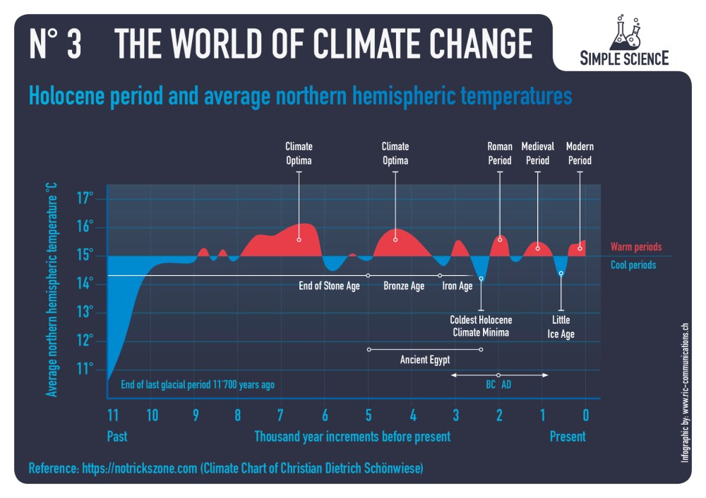
Check out the Devonian period in the chart above. See anything extraordinary?

The doomster cult strikes again, this time picking on O3 rather than CO2.  From researchers at University of Southhampton, Erosion of ozone layer responsible for mass extinction event published at ScienceDaily. Excerpts in italics with my bolds.

Researchers at the University of Southampton have shown that an extinction event 360 million years ago, that killed much of the Earth’s plant and freshwater aquatic life, was caused by a brief breakdown of the ozone layer that shields the Earth from damaging ultraviolet (UV) radiation.

This is a newly discovered extinction mechanism with profound implications for our warming world today.

Now, scientists have found evidence showing it was high levels of UV radiation which collapsed forest ecosystems and killed off many species of fish and tetrapods (our four limbed ancestors) at the end of the Devonian geological period, 359 million years ago. This damaging burst of UV radiation occurred as part of one of the Earth’s climate cycles, rather than being caused by a huge volcanic eruption.

The ozone collapse occurred as the climate rapidly warmed following an intense ice age and the researchers suggest that the Earth today could reach comparable temperatures, possibly triggering a similar event. Their findings are published in the journal Science Advances.

Remember when scientists discovered things that made life better and brought hope and possibilities for the future?  Remember when data was consulted before announcing an apocalypse?  Look at the chart below and ask yourself if the warming periods are getting longer and hotter in our Holocene period.

And if you are worried about the ozone layer, here’s some good news from NASA.

Personally, I find Extinction Rebellion really scary.

Confusing Urgent with Important

One of the things we learned in organizational science was that managers are prone to focus attention and resources on urgent situations at the expense of more serious threats to viability.  Thus the aphorism:  “When you are up to your ass in alligators it’s difficult to remember that your initial objective was to drain the swamp”.  Many times we consultants saw clients working hard to put out fires (complaints, delays, etc.) while oblivious to strategic weaknesses eroding their ability to compete with rivals.  One memorable client responded to our product profitabilty analysis showing why they were losing money, “I can’t drop that product, it’s our best seller!”

All this by way of introduction to an article at Real Clear Politics Miscalculating Risk: Confusing Scary With Dangerous  In this case the subject is evaluating risks, but the mistake can also be made regarding opportunities. Excerpts in italics with my bolds.

The coronavirus kills, everyone knows it. But this isn’t the first deadly virus the world has seen, so what happened? Why did we react the way we did? One answer is that this is the first social media pandemic. News and narratives travel in real-time right into our hands.

This spreads fear in a way we have never experienced. Drastic and historically unprecedented lockdowns of the economy happened and seemed to be accepted with little question.

We think the world is confusing “scary” with “dangerous.” They are not the same thing. It seems many have accepted as fact that coronavirus is one of the scariest things the human race has ever dealt with. But is it the most dangerous? Or even close?

There are four ways to categorize any given reality. It can be scary but not dangerous, scary and dangerous, dangerous but not scary, or not dangerous and not scary.

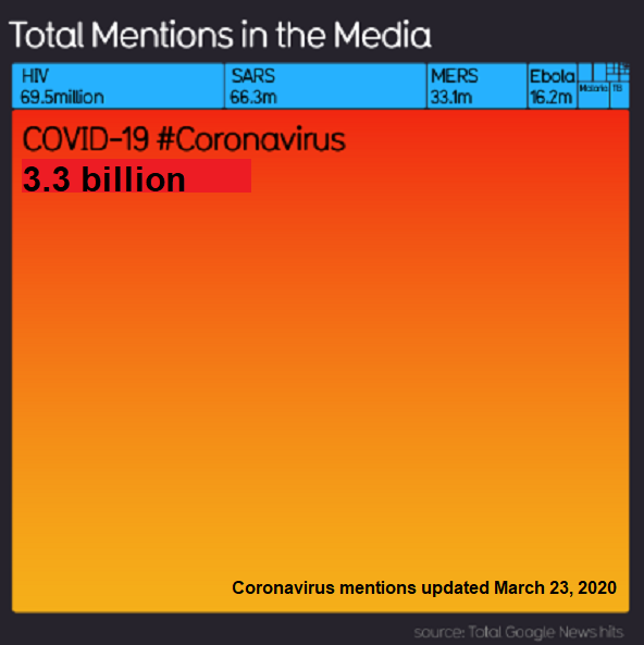
Clearly, COVID-19 ranks high on the scary scale. A Google news search on the virus brings up over 1.5 billion news results. To date, the virus has tragically killed nearly 100,000 people in the United States, and more lives will be lost. But on a scale of harmless to extremely dangerous, it would still fall into the category of slightly to mildly dangerous for most people, excluding the elderly and those with preexisting medical conditions.

In comparison, many have no idea that heart disease is the leading cause of death in the United States, killing around 650,000 people every year, 54,000 per month, or approximately 200,000 people between February and mid-May of this year. This qualifies as extremely dangerous. But most people are not very frightened of it. A Google news search for heart disease brings up around 100 million results, under one-fifteenth the results of the COVID-19 search.

It’s critical to be able to distinguish between fear and danger. Fear is an emotion, it’s the risk that we perceive. As an emotion, it is often blind to the facts. For example, the chances of dying from a shark attack are minuscule, but the thought still crosses most people’s minds when they play in the ocean. Danger is measurable, and in the case of sharks, the danger is low, even if fear is sometimes high.

Imagine if an insurance actuary was so scared of something that she graded it 1,000 times riskier than the data showed. This might be a career-ending mistake. This is exactly what people have done regarding COVID-19: making decisions on fear and not data.

According to CDC data, 81% of deaths from COVID-19 in the United States are people over 65 years old, most with preexisting conditions. If you add in 55-64-year-olds that number jumps to 93%. For those below age 55, preexisting conditions play a significant role, but the death rate is currently around 0.0022%, or one death per 45,000 people in this age range. Below 25 years old the fatality rate of COVID-19 is 0.00008%, or roughly one in 1.25 million, and yet we have shut down all schools and day-care centers, some never to open again! This makes it harder for mothers and fathers to remain employed.

All life is precious. No death should be ignored, but we have allowed our fear to move resources away from areas that are more dangerous, but less scary, to areas that are scary, but less dangerous. And herein lies the biggest problem.

Hospitals and doctors’ offices have had to be much more selective in the people they are seeing, leaving beds open for COVID-19 patients and cutting out elective surgeries. According to Komodo, in the weeks following the first shelter-in-place orders, cervical cancer screenings were down 68%, cholesterol panels were down 67%, and the blood sugar tests to detect diabetes were off 65% nationally.

It doesn’t stop there. The U.N. estimates that infant mortality rates could rise by hundreds of thousands in 2020 because of the global recession and diverted health care resources. Add in opioid addiction, alcoholism, domestic violence and other detrimental reactions from job loss and despair. It’s tragic.

The benefits gained through this fear-based shutdown (if there really are any) have massively increased dangers in the both the short term and the long term. Every day that businesses are shuttered, and people remain unemployed or underemployed, the economic wounds grow more deadly. The loss of wealth is immense, and this will undermine the ability of nations around the world to deal with true dangers for decades to come, maybe forever. We have altered the course of economic growth.

Shutting down the private sector (which is where all wealth is created) is truly dangerous even though many of our leaders suggest we shouldn’t be scared of it. Another round of stimulus is not what we need. Like a Band-Aid on a massive laceration, it may stop a tiny bit of the bleeding, but the wound continues to worsen, feeding greater and more elaborate intervention. Moreover, we are putting huge financial burdens on future generations because we are scared about something that the data reveal as far less dangerous than many other things in life.

A shutdown may slow the spread of a virus, but it can’t stop it. A vaccine may cure us. But in the meantime, we have entered a new era, one in which fear trumps danger and near-term risk creates long-term problems. It appears many people have come to this realization as the data builds. Hopefully, this will go down in history as a mistake that we will never repeat.


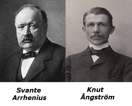
Pick Your A-Team: Arrhenius or Ångström

“Those who cannot remember the past are condemned to repeat it.”–George Santayana 1905

Interesting that Svante Arrhenius was elevated as the founder of AGW belief system. He was ignored for many decades after Knut Ångström and his assistant Herr Koch showed that reducing CO2 concentrations did not affect the amount of IR absorbed by the air. That’s almost as interesting as discovering that shutting down the global economy over fear of Covid19 has little effect on atmospheric CO2 concentrations.

As a fellow Scandinavian, Ångström agreed with Arrhenius that his projected warming would be a good thing, even in the lower estimates Svante made later on. Still, Ångström had two objections to Arrhenius’ conjecture about global warming from increasing CO2. In 1900, Herr J. Koch, laboratory assistant to Knut Ångström, did not observe any appreciable change in the absorption of infrared radiation by decreasing the concentration of CO2 up to a third of the initial amount. This result, in addition to the observation made a couple of years before that the superposition of the water vapour absorption bands, more abundant in the atmosphere, over those of CO2, convinced most geologists that calculations by Svante Arrhenius for CO2 warming were wrong.

Ångström’s 1900 paper (english translation) was About the importance of water vapor and carbon dioxide during the absorption of the Earth’s atmosphere Title is link to pdf. Conclusion:

Under no circumstances should carbon dioxide absorb more than 16 percent of terrestrial radiation, and the size of this absorption varies quantitatively very little, as long as there is not less than 20 percent of the existing value. The main alteration caused by a decrease in atmospheric carbon dioxide content, is that the absorption exerted by the carbon dioxide (about 16 percent of the radiation) is only completed by a thicker atmospheric layer, so that the heat is a little more dispersed in the atmosphere.

Many decades passed without reference to Arrhenius until the AGW movement took off in the 1980s and advocates wanted an ancient founder for their ideas. Obviously, Ångström’s position had to be destroyed by articles at RealClimate and Wikipedia (the same team after all.) So it is now declared that Arrhenius was right and Ångström wrong, based on some claims about “line-broadening” and the famous raised Effective Radiating Level (ERL). Ångström’s experimental results were not overturned but were deemed the” Saturation Fallacy”. Meanwhile,today’s climate realists acknowledge that the IR absorption by CO2 is logarithmic with diminishing returns. Attempts to find the raised ERL in modern satellite and balloon datasets have also failed, but alarmists are undaunted. (See reprinted post below)

Background from previous post Global Warming Theory and the Tests It Fails


Many people commenting both for and against reducing emissions from burning fossil fuels assume it has been proven that rising GHGs including CO2 cause higher atmospheric temperatures.  That premise has been tested and found wanting, as this post will describe.  First below is a summary of Global Warming Theory as presented in the scientific literature.  Then follows discussion of several unsuccessful attempts to find evidence of the hypothetical effects from GHGs in the relevant datasets.  Concluding is the alternative theory of climate change deriving from solar and oceanic fluctuations.

Scientific Theory of  Global Warming

The theory is well described in an article by Kristian (okulaer) prefacing his analysis of  “AGW warming” fingerprints in the CERES satellite data.  How the CERES EBAF Ed4 data disconfirms “AGW” in 3 different ways  by okulaer November 11, 2018. Excerpts below with my bolds.  Kristian provides more detailed discussion at his blog (title in red is link).

Background: The AGW Hypothesis

For those of you who aren’t entirely up to date with the hypothetical idea of an “(anthropogenically) enhanced GHE” (the “AGW”) and its supposed mechanism for (CO2-driven) global warming, the general principle is fairly neatly summed up here.

I’ve modified this diagram below somewhat, so as to clarify even further the concept of “the raised ERL (Effective Radiating Level)” – referred to as Ze in the schematic – and how it is meant to ‘drive’ warming within the Earth system; to simply bring the message of this fundamental premise of “AGW” thinking more clearly across.
Then we have the “doubled CO2” (t1) scenario, where the ERL has been pushed higher up into cooler air layers closer to the tropopause:

So when the atmosphere’s IR opacity increases with the excess input of CO2, the ERL is pushed up, and, with that, the temperature at ALL ALTITUDE-SPECIFIC LEVELS of the Earth system, from the surface (Ts) up through the troposphere (Ttropo) to the tropopause, directly connected via the so-called environmental lapse rate, i.e. the negative temperature profile rising up through the tropospheric column, is forced to do the same.

The Expected GHG Fingerprints

How, then, is this mechanism supposed to manifest itself?

Well, as the ERL, basically the “effective atmospheric layer of OUTWARD (upward) radiation”, the one conceptually/mathematically responsible for the All-Sky OLR flux at the ToA, and from now on, in this post, dubbed rather the EALOR, is lifted higher, into cooler layers of air, the diametrically opposite level, the “effective atmospheric layer of INWARD (downward) radiation” (EALIR), the one conceptually and mathematically responsible for the All-Sky DWLWIR ‘flux’ (or “the atmospheric back radiation”) to the surface, is simultaneously – and for the same physical reason, only inversely so – pulled down, into warmer layers of air closer to the surface. This latter concept was explained already in 1938 by G.S. Callendar. Feldman et al., 2015, (as an example) confirm that this is still how “Mainstream Climate Science (MCS)” views this ‘phenomenon’:

The gist being that, when we make the atmosphere more opaque to IR by putting more CO2 into it, “the atmospheric back radiation” (all-sky DWLWIR at sfc) will naturally increase as a result, reducing the radiative heat loss (net LW) from the surface up. And do note, it will increase regardless of (and thus, on top of) any atmospheric rise in temperature, which would itself cause an increase. Which is to say that it will always distinctly increase also RELATIVE TO tropospheric temps (which are, by definition, altitude-specific (fixed at one particular level, like ‘the lower troposphere’ (LT))). That is, even when tropospheric temps do go up, the DWLWIR should be observed to increase systematically and significantly MORE than what we would expect from the temperature rise alone. Because the EALIR moves further down.

Conversely, at the other end, at the ToA, the EALOR moves the opposite way, up into colder layers of air, which means the all-sky OLR (the outward emission flux) should rather be observed to systematically and significantly decrease over time relative to tropospheric temps. If tropospheric temps were to go up, while the DWLWIR at the surface should be observed to go significantly more up, the OLR at the ToA should instead be observed to go significantly less up, because the warming of the troposphere would simply serve to offset the ‘cooling’ of the effective emission to space due to the rise of the EALOR into colder strata of air.

What we’re looking for, then, if indeed there is an “enhancement” of some “radiative GHE” going on in the Earth system, causing global warming, is ideally the following:

OLR stays flat, while TLT increases significantly and systematically over time;
TLT increases systematically over time, but DWLWIR increases significantly even more.
Effectively summed up in this simplified diagram.

Figure 4. Note, this schematic disregards – for the sake of simplicity – any solar warming at work.

However, we also expect to observe one more “greenhouse” signature.

If we expect the OLR at the ToA to stay relatively flat, but the DWLWIR at the sfc to increase significantly over time, even relative to tropospheric temps, then, if we were to compare the two (OLR and DWLWIR) directly, we’d, after all, naturally expect to see a fairly remarkable systematic rise in the latter over the former (refer to Fig.4 above).

Which means we now have our three ways to test the reality of an hypothesized “enhanced GHE” as a ‘driver’ (cause) of global warming.
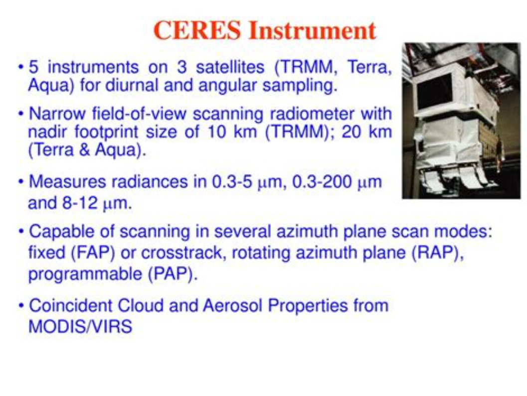
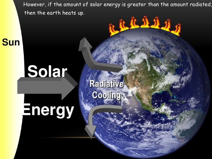
Three Tests for GHG Warming in the Sky

The null hypothesis in this case would claim or predict that, if there is NO strengthening “greenhouse mechanism” at work in the Earth system, we would observe:

1. The general evolution (beyond short-term, non-thermal noise (like ENSO-related humidity and cloud anomalies or volcanic aerosol anomalies))* of the All-Sky OLR flux at the ToA to track that of Ttropo (e.g. TLT) over time;
2. The general evolution of the All-Sky DWLWIR at the surface to track that of Ttropo (Ts + Ttropo, really) over time;
3. The general evolution of the All-Sky OLR at the ToA and the All-Sky DWLWIR at the surface to track each other over time, barring short-term, non-thermal noise.

* (We see how the curve of the all-sky OLR flux at the ToA differs quite noticeably from the TLT and DWLWIR curves, especially during some of the larger thermal fluctuations (up or down), normally associated with particularly strong ENSO events. This is because there are factors other than pure mean tropospheric temperatures that affect Earth’s final emission flux to space, like the concentration and distribution (equator→poles, surface→tropopause/stratosphere) of clouds, water vapour and aerosols. These may (and do) all vary strongly in the short term, significantly disrupting the normal temperature↔flux (Stefan-Boltzmann) connection, but in the longer term, they display a remarkable tendency to even out, leaving the tropospheric temperature signal as the only real factor to consider when comparing the OLR with Ttropo (TLT). Or not. The “AGW” idea specifically contends, resting on the premise, that these other factors (and crucially also including CO2, of course) do NOT even out over time, but rather accrue in a positive (‘warming’) direction.)
Missing Fingerprint #1

The first point above we have already covered extensively. The combined ERBS+CERES OLR record is seen to track the general progression of the UAHv6 TLT series tightly, both in the tropics and near-globally, all the way from 1985 till today (the last ~33 years), as discussed at length both here and here.

Since, however, in this post we’re specifically considering the CERES era alone, this is how the global OLR matches against the global TLT since 2000:
Figure 5.

This is simply the monthly CERES OLR flux data properly scaled (x0.266), enabling us to compare it more directly to temperatures (W/m2→K), and superimposed on the UAH TLT data. Watch how closely the two curves track each other, beyond the obvious noise. To highlight this striking state of relative congruity, we remove the main sources of visual bias in Fig.5 above. Notice, then, how the red OLR curve, after the 4-year period of fairly large ENSO-events (La Niña-El Niño-La Niña) between 2007/2008 and 2011/2012, when the cyan TLT curve goes both much lower (during the flanking La Niñas) and much higher (during the central El Niño), quickly reestablishes itself right back on top of the TLT curve, just where it used to be prior to that intermediate stretch of strong ENSO influence. And as a result, there is NO gradual divergence whatsoever to be spotted between the mean levels of these two curves, from the beginning of 2000 to the end of 2015.

Missing Fingerprint #2

The second point above is just as relevant as the first one, if we want to confirm (or disconfirm) the reality of an “enhanced GHE” at work in the Earth system. We compare the tropospheric temperatures with the DWLWIRsfc ‘flux’, that is, the apparent atmospheric thermal emission to the surface:

Figure 9. Note how the scaling of the flux (W/m2) values is different close to the surface than at the ToA. Here at the DWLWIR level, down low, we divide by 5 (x0.2), while at the OLR level, up high, we divide by 3.76 (x0.266).

We once again observe a rather close match overall. At the very least, we can safely say that there is no evidence whatsoever of any gradual, systematic rise in DWLWIR over the TLT, going from 2000 to 2018. If we plot the difference between the two curves in Fig.9 to obtain the “DWLWIR residual”, this fact becomes all the more evident:

Figure 10.

Remember now how the idea of an “enhanced GHE” requires the DWLWIR to rise significantly more than Ttropo (TLT) over time, and that its “null hypothesis” therefore postulates that such a rise should NOT be seen. Well, do we see such a rise in the plot above? Nope. Not at all. Which fits in perfectly with the impression we got at the ToA, where the TLT-curve was supposed to rise systematically up and away from the OLR-curve over time, but didn’t – no observed evidence there either of any “enhanced GHE” at work.

Missing Fingerprint #3

Finally, the third point above is also pretty interesting. It is simply to verify whether or not the CERES EBAF Ed4 ‘radiation flux’ data products are indeed suggesting a strengthening of some radiatively defined “greenhouse mechanism”. We sort of know the answer to this already, though, from going through points 1 and 2 above. Since neither the OLR at the ToA nor the DWLWIR at the surface deviated meaningfully from the UAHv6 TLT series (the same one used to compare with both, after all), we expect rather by necessity that the two CERES ‘flux products’ also shouldn’t themselves deviate meaningfully overall from one another. And, unsurprisingly, they don’t:

Figure 14.  Difference plot (“DWLWIR residual”)

Again, it is so easy here to allow oneself to be fooled by the visual impact of that late – obviously ENSO-related – peak, and, in this case, also a definite ENSO-based trough right at the start (you’ll plainly recognise it in Fig.14); another perfect example of how one’s perception and interpretation of a plot is directly affected by “the end-point bias”. Don’t be fooled:

If we expect the OLR at the ToA to stay relatively flat, but the DWLWIR at the sfc to increase significantly over time, even relative to tropospheric temps, then, if we were to compare the two (OLR and DWLWIR) directly, we’d […] naturally expect to see a fairly remarkable systematic rise in the latter over the former (refer to Fig.4 above).

Looking at Fig.14, and taking into account the various ENSO states along the way, does such a “remarkable systematic rise” in DWLWIR over OLR manifest itself during the CERES era?

I’m afraid not …

Four Lines of Evidence Against GHG Warming Hypothesis

The lack of GHG warming in the CERES data is added to three previous atmospheric heat radiation studies.


  1.  In 2004 Ferenc MIskolczi studied the radiosonde datasets and found that the optical density at the top of the troposphere does not change with increasing CO2, since reducing H2O maintains optimal radiating efficiency.  His publication was suppressed by NASA, and he resigned from his job there. He has elaborated on his findings in publications as recently as 2014. See:  The Curious Case of Dr. Miskolczi

2.  Ronan and Michael Connolly  studied radiosonde data and concluded in 2014:

“It can be seen from the infra-red cooling model of Figure 19 that the greenhouse effect theory predicts a strong influence from the greenhouse gases on the barometric temperature profile. Moreover, the modeled net effect of the greenhouse gases on infra-red cooling varies substantially over the entire atmospheric profile.

However, when we analysed the barometric temperature profiles of the radiosondes in this paper, we were unable to detect any influence from greenhouse gases. Instead, the profiles were very well described by the thermodynamic properties of the main atmospheric gases, i.e., N 2 and O 2 , in a gravitational field.”

While water vapour is a greenhouse gas, the effects of water vapour on the temperature profile did not appear to be related to its radiative properties, but rather its different molecular structure and the latent heat released/gained by water in its gas/liquid/solid phase changes.

For this reason, our results suggest that the magnitude of the greenhouse effect is very small, perhaps negligible. At any rate, its magnitude appears to be too small to be detected from the archived radiosonde data.” Pg. 18 of referenced research paper

See:  The Physics Of The Earth’s Atmosphere I. Phase Change Associated With Tropopause

3.  An important proof against the CO2 global warming claim was included in John Christy’s testimony 29 March 2017 at the House Committee on Science, Space and Technology. The text and diagram below are from that document which can be accessed here.

IPCC Assessment Reports show that the IPCC climate models performed best versus observations when they did not include extra GHGs and this result can be demonstrated with a statistical model as well.

Figure 5. Simplification of IPCC AR5 shown above in Fig. 4. The colored lines represent the range of results for the models and observations. The trends here represent trends at different levels of the tropical atmosphere from the surface up to 50,000 ft. The gray lines are the bounds for the range of observations, the blue for the range of IPCC model results without extra GHGs and the red for IPCC model results with extra GHGs.The key point displayed is the lack of overlap between the GHG model results (red) and the observations (gray). The nonGHG model runs (blue) overlap the observations almost completely.

An Alternative Theory of Natural Climate Change

Dan Pangburn is a professional engineer who has synthesized the solar and oceanic factors into a mathematical model that correlates with Average Global Temperature (AGT). On his blog is posted a monograph Cause of Global Climate Change explaining clearly his thinking and the maths.  I provided a post with some excerpts and graphs as a synopsis of his analysis, in hopes others will also access and appreciate his work on this issue.  See  Quantifying Natural Climate Change

Footnote on the status of an hypothetical effect too small to be measured:  Bertrand Russell’s teapot
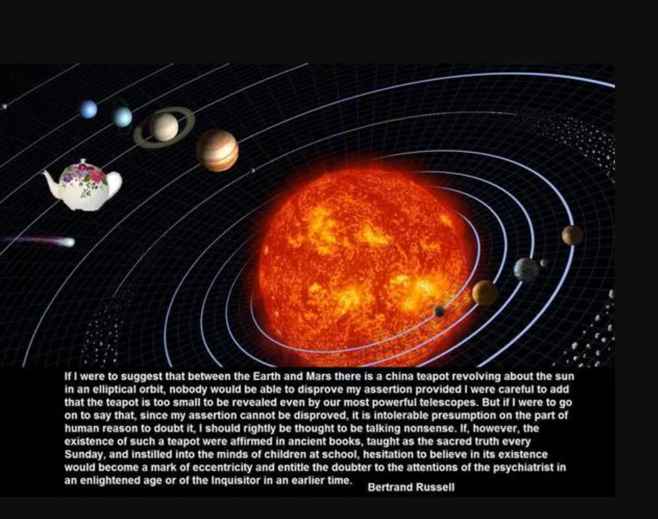
Open image in new tab to enlarge.

Postscript:

A further reference comes from the brief submiitted by Professors Happer, Koonin and Lindzen to the Climate Tutorial for Judge Alsup. The pertinent citation is as follows:

“On average, the absorption rate of solar radiation by the Earth’s surface and atmosphere is equal to emission rate of thermal infrared radiation to space. Much of the radiation to space does not come from the surface but from greenhouse gases and clouds in the lower atmosphere, where the temperature is usually colder than the surface temperature, as shown in the figure on the previous page. The thermal radiation originates from an “escape altitude” where there is so little absorption from the overlying atmosphere that most (say half) of the radiation can escape to space with no further absorption or scattering. Adding greenhouse gases can warm the Earth’s surface by increasing the escape altitude. To maintain the same cooling rate to space, the temperature of the entire troposphere, and the surface, would have to increase to make the effective temperature at the new escape altitude the same as at the original escape altitude. For greenhouse warming to occur, a temperature profile that cools with increasing altitude is required.

Over most of the CO2 absorption band (between about 580 cm-1 and 750 cm-1 ) the escape altitude is the nearly isothermal lower stratosphere shown in the first figure. The narrow spike of radiation at about 667 cm-1 in the center of the CO2 band escapes from an altitude of around 40 km (upper stratosphere), where it is considerably warmer than the lower stratosphere due heating by solar ultraviolet light which is absorbed by ozone, O3. Only at the edges of the CO2 band (near 580 cm-1 and 750 cm-1 ) is the escape altitude in the troposphere where it could have some effect on the surface temperature. Water vapor, H2O, has emission altitudes in the troposphere over most of its absorption bands. This is mainly because water vapor, unlike CO2, is not well mixed but mostly confined to the troposphere.”

A synopsis of that submission was posted as Cal Climate Tutorial: The Meat


The Push for Climate Death Certificates

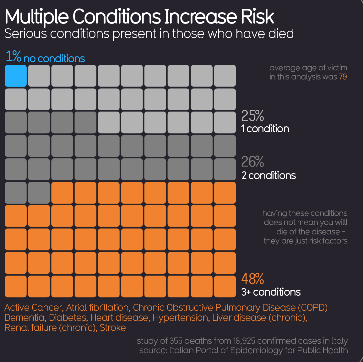
So now we have the climatists calling for attributing many more deaths to warmer temperatures in order to blame CO2 emissions. No doubt they noticed how powerful were the Covid19 death statistics in getting the public to comply with lockdown regulations. Their logic is clear: When people die with multiple diseases, pick the one that’s politically useful. (“Never let a crisis go to waste.”) Never mind that 90+% of Covid deaths were people with cancers, chronic lung disease, obesity, diabetes, and so on.

Ideological Perversion of Science

This push for climate death certificates demonstrates a recurring pattern: reducing life’s multitude of factors and values down to a single dimension as the be all and end all. Environmentalism puts nature first, ignoring that humans are a part of nature, and have a managerial role to play. Many naturalists have reduced further into climatists, who extrapolated the 1978 to 1998 warming into hellfire and brimstone for the planet. Anything bad that happens, from Acne to Zika virus, was caused by global warming/climate change.

These reductionists, or single-issue partisans, are upset that the public is not as concerned as they are. A recent Gallup pole of US voters reported that climate concerns ranked dead last among most important problems. Thus the interest in amping up the death tolls attributed to fossil fuels.

Where’s the Utility in Assigning Causes?

The fundamental flaw in all this advocacy is what to do about the threat. Currently there is much ado about a dam breaking in Michigan because of rainfall. Of course, it’s blamed on CO2 emissions, with concerns that more and more dams will fail because of higher precipitation. Buried in the details is the news that the dam operator was refused permission to release water from the reservoir to protect the fresh water mussels downstream. So we have not only single issue environmentalists, but also single-species advocates.

Even if there were evidence (generally there isn’t) to expect higher rainfall in a catchment area, what action would practically protect the dam? Sign up to an international Climate Treaty? Legislate quotas for electricity from renewables? Ban oil and gas pipeline? Divest from Big Energy companies? Sue somebody, everybody?

The only useful thing to do is reinforce the damsite to increase its capacity, which would likely involve heavy machinery powered by fossil fuels.

This is but one example of the upside-down thinking by all single-issue advocates, including climatists. If you claim hotter weather is coming (despite no statistical proof), what action would usefully protect against mortality? More and better air conditioning has worked so far, carbon offsets not so much.

Footnote:  For a discussion of how climate alarmists reduce reality down to their preconceived notion, see Climate Reductionism

Georgians Dine Out, Pundits Eat Crow

Matthew Walther writes at the Week We should be grateful for good news in Georgia.  Excerpts in italics with my bolds.

I hate to be the bearer of bad news, but Atlanta is not burning. Bodies are not piled up in the streets. Hospitals in Georgia are not being overwhelmed; in fact, they are virtually empty. There is no mad rush for ventilators (remember those?). Instead, men, women, and children in the Peach State are returning to some semblance of normal life: working outside their homes, going to restaurants and bars, getting haircuts, exercising, and most important, spending time with their friends and families and worshipping God. The opening that began more than three weeks ago is continuing apace.

Oh, my apologies, you were waiting for bad news? Sorry, I forgot, we were actually not supposed to be rooting for the virus. Despite the apparent relish behind headlines like “Georgia’s Experiment in Human Sacrifice,” one assumes that most Americans, even the ones most committed to omnidirectional prophecies of doom, were actually hoping this would happen. While it really is a shame that we do not get to gloat about the cravenness and stupidity of yet another GOP politician, I think on balance most of us will be glad to hear that Gov. Brian Kemp was not badly wrong here.

What is happening instead of the widely predicted bloodbath? Confirmed cases of the virus are obviously increasing (though the actual rolling weekly average of new ones have been headed down for nearly a month) while deaths remain more or less flat. This is in fact what happens when you test more people for a disease that is not fatal or even particularly serious for the vast majority of those who contract it, for which the median age of death is higher than the American life expectancy.

How was this possible? One answer is that the lockdown did not in fact do what it was supposed to do, which is to say, meaningfully impede transmission of the virus.

In fact, data both from states like Georgia and from abroad suggests that the lifting of lockdowns is positively correlated with a decrease in rates of infection. This could be because lockdowns are inherently ineffective at slowing down a disease whose spread appears to be largely intrafamilial and nosocomial.

It could also be the weather. That’s right: another thing that we were told months ago not even to suggest aloud because it would be irresponsible to make assumptions of any kind about the virus, even sensible ones, like the idea that wearing masks just might help slow it down. This is not science. COVID-19 arrived from China, not from outer space. Unsurprisingly, it appears to behave very much like other respiratory viruses, including influenza. It hates sunlight and the outdoors generally and prefers cramped stuffy conditions, like those found in public transit systems and dense housing complexes with poor ventilation.

It is worth pointing out here that journalists and Democratic politicians (most notably Stacey Abrams, the former Georgia state representative who labors under the bizarre illusion that she won a statewide election there two years ago and would now like to be vice president) were not the only critics of Gov. Kemp. After a series of spasmodic muscular contractions that seemed to have resulted in tweets calling upon unnamed persons to “liberate” various states, President Trump changed his mind and insisted on more than one occasion that he “strongly disagreed” with the decision to open Georgia. Expecting anything resembling consistency from this president is a fool’s errand, but one hopes that at least some of his supporters remember that he was wrong here.

None of what I have written above should be taken to suggest that Kemp’s handling of the pandemic is above reproach, or that he should receive a medal for clear-sightedness here. (I might give one instead to Gov. Ron DeSantis of Florida, where amid shrill moaning about the non-existent dangers of people standing on beaches, thousands of lives may have been saved by a swift executive order banning the re-introduction of coronavirus patients to elder care facilities). Nor am I suggesting that things in the Peach State cannot possibly take a turn for the worse, especially if appropriate measures are not taken in nursing homes.

Two much narrower claims are being made. The first is that those who insisted that Georgia would be transformed into a post-apocalyptic wasteland within days or even weeks of reopening were wrong, and predictably so.

The second is that this is something about which we should be happy.

Hurricane Hype (Again)

James Taylor explains at climaterealism Miami Herald Misleads Readers About Reassuring NOAA Hurricane Study.  A study finding calmer recent storm seasons was flipped into alarms about global warming/climate change.  Excerpts in italics with my bolds.

Among the top Google News search results this morning for “climate change,” the Miami Herald published an article asserting a new study shows global warming is causing more Atlantic hurricanes. In reality, the new study shows there is a declining trend in hurricanes in many parts of the world and concludes there will likely be a declining trend globally during the 21st century. Moreover, objective data show the number of Atlantic hurricanes is declining, just like the forecast global trend.

The National Oceanic and Atmospheric Administration (NOAA) study referenced by the Herald reports, “our climate models project decreases in the number of global TCs [tropical cyclones] toward the end of the 21st century due to the dominant effect of greenhouse gases on decreasing TC occurrence in most of the tropics, consistent with many previous studies.”

The NOAA study reported a trend of “substantial decreases” in Indian Ocean and North Pacific hurricanes is already detected in the record. The study asserts there has been an increase in Atlantic hurricanes since 1980, which “anthropogenic aerosols could have also influenced.”

The major takeaway from the NOAA study is there will be fewer hurricanes as the world continues its modest warming. That is good news. Rather than reporting good climate news, however, the Herald goes to great lengths to try to pull some bad news from a good-news study.

The only reason the authors of the NOAA study could report an increase in Atlantic hurricanes since 1980 is because the decade ending in 1980 was an abnormally low year, with the fewest number of Atlantic hurricanes on record. So, any trend line starting at the record-low point of 1980 will show more frequent hurricanes. However, a more complete and representative record shows a long-term and ongoing decline in Atlantic hurricanes. The graph below illustrates that point.

Located in Florida, the Miami Herald surprisingly did not mention two very important facts about hurricanes and Florida. As documented in Climate at a Glance: Hurricanes, Florida recently concluded an 11-year period (2005 through 2016) without a landfalling hurricane of any size—the longest such period in recorded history. The Gulf of Mexico also recently benefited from its longest hurricane-free period in recorded history (2013 through 2016).

For completely misleading its readers about the recent NOAA study, and for asserting the exact opposite of the truth regarding hurricane frequency and Atlantic hurricane frequency, the Miami Herald earns a gigantic Pinocchio award.

Footnote:  The 2020 consensus forecast for the coming hurricane season is for an active season (H/T trackthetropics)

GWO’s prediction calls for 16 named storms, 7 hurricanes and 3 to 4 major hurricanes. They note the United States can expect 5 named storms to make landfall, with 2 or 3 hurricane landfalls – one of which will likely be a major category 3 hurricane. Professor David Dilley – senior research scientist for GWO, says several favorable meteorological and climatological factors are in place to produce another above average hurricane season this year. Some of the factors include a 72-year ClimatePulse Hurricane Landfall Enhancement Cycle – coupled with the continuance of above normal warm Atlantic Ocean and Gulf of Mexico water temperatures – and the lack of either a moderate or strong El Niño to subdue the hurricane seasons. Entire forecast: https://www.globalweatheroscillations.com/

Of course, any storm making US landfall is big weather news, and the media is ready.