Brad Keyes, Climatism Fortune Teller

It is a wickedly satirical look into the future of the climate debate by Brad Keyes (here). The comic relief is welcome as a refreshment from pushing back against the relentless fictional claims and alarms. Lots of inside jokes and sceptics’ wish dreams concerning future misfortunes of leading alarmist figures.

The post covers a lot of ground as Keyes looks into his crystal ball and reports on happenings he sees from 2017 up to 2052. Everyone’s funny bone is different, but these were especially entertaining, IMO:

2017 – Michael Mann’s courtroom loss decried as “a death knell for free speech.”

2018 – ECHR agrees “Holocaust denier” is an intentionally demeaning reference to climate denial.

2018 – James Hansen blames eclipse on global warming, but others hesitate to attribute any specific EAE (extreme astronomical event) to carbon emissions.

2019 – The Trenberth Travesty is captured by satellite imagery.

2020 – Psychiatric Manual of Mental Disorders updated to deal with Weather control delusional disorder, Munchhausen’s by proxy and Medieval global warming denial.

2023 – Weary of the emotive, polarizing nature of the debate, scientists will now refer to global warming as “climate 9/11.”

2024 – Drawing heavily on the principles of the Delphi Technique, Naomi Oreskes changes the scientific method to the Delphi Technique.

2025 – In simultaneous media releases around the globe, every scientific body of international or national standing announces that the only safe atmospheric CO2 concentration is zero ppm. They explain: “Lowballing” is the only way to achieve 300-400 ppm.

2027 – The first climatically-correct chemistry textbooks appear in Australian high schools. The dioxide anion has been renamed ‘pollution’; chemical symbol C now stands for ‘cancer.’

2028 – It’s official: reputable science website SkepticalScience quietly removes “Consensus levels have plateaued” from its list of myths.

2031 – A Climateball stadium becomes the scene of ugly rioting today after a supporter of the denier (pro-cancer-pollutionist) side is overheard using the hate term “w_rmist.”

2034 – Spring is silent this year after a wind turbine kills the last American bald eagle.

2037 – As sea level rise continues to defy expectations, tracking almost 1m (3ft.) below ensemble model projections, science’s newest fear is that the Earth’s surface will be completely dry by the year 51000.

2038 – An attempt to replicate the Doran and Zimmermann [2009] consensus survey instead finds most of the scientists now deny the science, with almost 85% endorsing the statement that “According to the weight of the data, the evidence is wrong.”

Ocean Trumps Global Warming

Internal Climate Variability Trumps Global Warming (here) is a
great post by hydrologist Rob Ellison confirming how the Oceans Make Climate. He was intrigued by discovering that rivers in eastern Australia changed form – from low energy meandering to high energy braided forms and back – every few decades. For almost 30 years he looked for the source and import of this variability, and has found it in the ocean.

Turns out that it is a combination of conditions in the northern and central Pacific Ocean that is of immense significance. A 20 to 30 year change in the volume of frigid and nutrient rich water upwelling from the abysmal depths. A generally warmer or cooler sea surface in the northern Pacific and greater frequency and intensity of El Niño or La Niña respectively. This sets up changes in patterns of wind, currents and cloud that cause changes in rainfall, biology and temperature globally. In the cool pattern shown above – booming ecologies, drought in the Americas and Europe, rainfall in Australia, Indonesia, Africa, China and India and cooler global temperatures. The reverse in the warm phase. Warming to 1944, cooling to 1976, warming again to 1998 and – at the least – not warming since. It leads to a prediction that the La Niña currently emerging is likely to be large.

A Persistent Ocean Cycle

Changes in the Pacific Ocean state can be traced in sediment, ice cores, stalagmites and corals. A record covering the last 12,000 years was developed by Christopher Moy and colleagues from measurements of red sediment in a South American lake. More red sediment is associated with El Niño. The record shows periods of high and low El Niño activity alternating with a period of about 2,000 years. There was a shift from La Niña dominance to El Niño dominance 5000 years ago that is associated with the drying of the Sahel. There is a period around 3,500 years ago of high El Niño activity associated with the demise of the Minoan civilisation (Tsonis et al, 2010).

Tessa Vance and colleagues devised a 1000 year record from salt content in an Antarctic ice core. More salt is La Niña as a result of changing winds in the Southern Ocean. It revealed several interesting facts. The persistence of the 20 to 30 year pattern. A change in the period of oscillation between El Niño and La Niña states at the end of the 19th century. A 1000 year peak in El Niño frequency and intensity in the 20th century which resulted in uncharacteristically dry condition since 1920.

Conclusion

The whole post is worth reading and a solid contribution to our understanding. Ellison’s summary is pertinent, compelling and wise.

It is quite impossible to quantify natural and anthropogenic warming in the 20th century.  The assumption that it was all anthropogenic is quite wrong.  The early century warming was mostly natural – as was at least some of the late century warming.  It seems quite likely that a natural cooling with declining solar activity – amplified through Pacific Ocean states – will counteract rather than add to future greenhouse gas warming.   A return to the more common condition of La Niña dominance – and enhanced rainfall in northern and eastern Australia – seems more likely than not.

I predict – on the balance of probabilities – cooler conditions in this century.  But I would still argue for returning carbon to agricultural soils, restoring ecosystems and research on and development of cheap and abundant energy supplies.  The former to enhance productivity in a hungry world, increase soil water holding capacity, improve drought resilience, mitigate flooding and conserve biodiversity.  We may in this way sequester all greenhouse gas emissions for 20 to 30 years.  The latter as a basis for desperately needed economic growth.  Climate change seems very much an unnecessary consideration and tales of climate doom – based on wrong science and unfortunate policy ambitions – a diversion from practical and measured development policy.

Australia’s River Systems ABC

Chameleon Climate Models

Chameleon2

Paul Pfleiderer has done a public service in calling attention to
The Misuse of Theoretical Models in Finance and Economics (here)
h/t to William Briggs for noticing and linking

He coins the term “Chameleon” for the abuse of models, and explains in the abstract of his article:

In this essay I discuss how theoretical models in finance and economics are used in ways that make them “chameleons” and how chameleons devalue the intellectual currency and muddy policy debates. A model becomes a chameleon when it is built on assumptions with dubious connections to the real world but nevertheless has conclusions that are uncritically (or not critically enough) applied to understanding our economy. I discuss how chameleons are created and nurtured by the mistaken notion that one should not judge a model by its assumptions, by the unfounded argument that models should have equal standing until definitive empirical tests are conducted, and by misplaced appeals to “as-if” arguments, mathematical elegance, subtlety, references to assumptions that are “standard in the literature,” and the need for tractability.

Chameleon Climate Models

Pfleiderer is writing about his specialty, financial models, and even more particularly banking systems, and gives several examples of how dysfunctional is the problem. As we shall see below, climate models are an order of magnitude more complicated, and abused in the same way, only more flagrantly.

As the analogy suggests, a chameleon model changes color when it is moved to a different context. When politicians and activists refer to climate models, they assert the model outputs as “Predictions”. The media is rife with examples, but here is one from Climate Concern UK

Some predicted Future Effects of Climate Change

  • Increased average temperatures: the IPCC (International Panel for Climate Change) predict a global rise of between 1.1ºC and 6.4ºC by 2100 depending on some scientific uncertainties and the extent to which the world decreases or increases greenhouse gas emissions.
  • 50% less rainfall in the tropics. Severe water shortages within 25 years – potentially affecting 5 billion people. Widespread crop failures.
  • 50% more river volume by 2100 in northern countries.
  • Desertification and burning down of vast areas of agricultural land and forests.
  • Continuing spread of malaria and other diseases, including from a much increased insect population in UK. Respiratory illnesses due to poor air quality with higher temperatures.
  • Extinction of large numbers of animal and plant species.
  • Sea level rise: due to both warmer water (greater volume) and melting ice. The IPCC predicts between 28cm and 43cm by 2100, with consequent high storm wave heights, threatening to displace up to 200 million people. At worst, if emissions this century were to set in place future melting of both the Greenland and West Antarctic ice caps, sea level would eventually rise approx 12m.

Now that alarming list of predictions is a claim to forecast what will be the future of the actual world as we know it.

Now for the switcheroo. When climate models are referenced by scientists or agencies likely to be held legally accountable for making claims, the model output is transformed into “Projections.” The difference is more than semantics:
Prediction: What will actually happen in the future.
Projection: What will possibly happen in the future.

In other words, the climate model has gone from the bookshelf world (possibilities) to the world of actualities and of policy decision-making.  The step of applying reality filters to the climate models (verification) is skipped in order to score political and public relations points.

The ultimate proof of this is the existence of legal disclaimers exempting the modellers from accountability. One example is from ClimateData.US

Disclaimer NASA NEX-DCP30 Terms of Use

The maps are based on NASA’s NEX-DCP30 dataset that are provided to assist the science community in conducting studies of climate change impacts at local to regional scales, and to enhance public understanding of possible future climate patterns and climate impacts at the scale of individual neighborhoods and communities. The maps presented here are visual representations only and are not to be used for decision-making. The NEX-DCP30 dataset upon which these maps are derived is intended for use in scientific research only, and use of this dataset or visualizations for other purposes, such as commercial applications, and engineering or design studies is not recommended without consultation with a qualified expert. (my bold)

Conclusion:

Whereas some theoretical models can be immensely useful in developing intuitions, in essence a theoretical model is nothing more than an argument that a set of conclusions follows from a given set of assumptions. Being logically correct may earn a place for a theoretical model on the bookshelf, but when a theoretical model is taken off the shelf and applied to the real world, it is important to question whether the model’s assumptions are in accord with what we know about the world. Is the story behind the model one that captures what is important or is it a fiction that has little connection to what we see in practice? Have important factors been omitted? Are economic agents assumed to be doing things that we have serious doubts they are able to do? These questions and others like them allow us to filter out models that are ill suited to give us genuine insights. To be taken seriously models should pass through the real world filter.

Chameleons are models that are offered up as saying something significant about the real world even though they do not pass through the filter. When the assumptions of a chameleon are challenged, various defenses are made (e.g., one shouldn’t judge a model by its assumptions, any model has equal standing with all other models until the proper empirical tests have been run, etc.). In many cases the chameleon will change colors as necessary, taking on the colors of a bookshelf model when challenged, but reverting back to the colors of a model that claims to apply the real world when not challenged.

A model becomes a chameleon when it is built on assumptions with dubious connections to the real world but nevertheless has conclusions that are uncritically (or not critically enough) applied to understanding our economy. Chameleons are not just mischievous they can be harmful − especially when used to inform policy and other decision making − and they devalue the intellectual currency.

Thank you Dr. Pfleiderer for showing us how the sleight-of-hand occurs in economic considerations. The same abuse prevails in the world of climate science.

Paul Pfleiderer, Stanford University Faculty
C.O.G. Miller Distinguished Professor of Finance
Senior Associate Dean for Academic Affairs
Professor of Law (by courtesy), School of Law

Footnote:

There are a series of posts here which apply reality filters to attest climate models.  The first was Temperatures According to Climate Models where both hindcasting and forecasting were seen to be flawed.

Others in the Series are:

Sea Level Rise: Just the Facts

Data vs. Models #1: Arctic Warming

Data vs. Models #2: Droughts and Floods

Data vs. Models #3: Disasters

Data vs. Models #4: Climates Changing

Exxon Shareholders Reject Activists May 25

Update May 26 below

May 25, 2016: A shareholder proposition from global warming alarmists was soundly defeated today at the Annual Meeting. Activists took heart that 38% of shares were voted in favor, larger than previous such actions received. It appears that much of that support came from the Norwegian sovereign wealth fund, which is a story in its own right.

The world’s largest sovereign wealth fund announced Tuesday that it would back shareholder resolutions requiring Chevron and ExxonMobil to report on how climate change could threaten assets during extreme weather events or put revenues at risk due to government efforts to transition from fossil fuels to renewable sources.

The company that manages Norway’s $872 billion fund said the boards of directors for the oil giants should better anticipate those risks — as well as any upsides — and report on them to shareholders. (here)

Anyone visiting Norway (as I did last year) will recognize from the prices of everything and the obvious signs of conspicious consumption that modern Norway is a Petro-state. I don’t have Tesla sales statistics handy, but just walking around Oslo, you can clearly see more of them per capita than anywhere outside of Hollywood. (Huge subsidies and free recharging helps.)

Now the Norwegians deserve credit for putting their enormous profits from North Sea oil into a fund for future generations. Don’t see that in Saudia Arabia or Iran, or most other Petro-States. But their acceptance of CO2 warming dogma is as jarring as the Rockefeller Foundation funding anti-petroleum activists. Why all this guilt over energy resources?

Other major investors promoting the action included: The Church Commissioners for England, Trustee of New York State Common Retirement Fund, Amundi, AXA Investment Management, BNP Paribas, CalPERS, and Legal & General Investment Management.

The proposition itself is based upon a flimsy set of suppositions, as explained here: https://rclutz.wordpress.com/2t016/05/01/behind-the-alarmist-scene/

Update May 26

Some sources give more insight into the activism employed,

From CNBC

Earlier this month, a letter signed by 1,000 professors from over 40 global universities, including Oxford and Ivy League colleges like Harvard, was sent by Positive+Investment — a campaign group launched by Cambridge students — to Exxon and Chevron’s top 20 shareholders urging they pass the resolutions.

But institutional shareholders including Norway’s $872 billion sovereign wealth fund, the Church of England, and the U.S.’s largest state pension fund are already throwing their weight behind the climate cause.

Norges Bank Investment Management (NBIM) publicly disclosed that it plans to vote in favor of climate impact assessment reports for both Chevron and Exxon, telling reporters earlier this month that it would relentlessly push the companies to be more open about their climate change strategies, even if the proposals didn’t pass at this year’s AGM.

According to its 2015 holdings report, NBIM holds a 0.85 percent stake in Chevron worth $1.45 billion, and a 0.78 percent stake in Exxon worth $2.54 billion.

And the push will continue according to Washington Examiner:

“The recommendation by Exxon’s board to outright reject every single climate resolution from shareholders sends an incontestable signal to investors: it’s due time to divest from Exxon’s deception,” said May Boeve, executive director of the group 350.org, a leading proponent of the Keep it in the Ground campaign and movement for pension funds, schools and others to divest from investments in fossil fuels. Many scientists blame the greenhouse gases emitted from the burning of fossil fuels, such as crude oil and coal, for man-made climate change.

ExxonMobil has been targeted because they have not given an inch to demands from alarmists.  But other energy companies all also under attack. Shell shareholders overwhelmingly voted against considering a proposition to convert the company into a renewables business.

Attempts to appease bullies seldom stop them from making more and bigger demands.  Those companies now talking “Green” in order to be politically correct on climate change won’t be left alone to conduct their businesses. ExxonMobil knows this already, and has the subpoenas to prove it.

Beliefs and Uncertainty: A Bayesian Primer

Those who follow discussions regarding Global Warming and Climate Change have heard from time to time about the Bayes Theorem. And Bayes is quite topical in many aspects of modern society:

Bayesian statistics “are rippling through everything from physics to cancer research, ecology to psychology,” The New York Times reports. Physicists have proposed Bayesian interpretations of quantum mechanics and Bayesian defenses of string and multiverse theories. Philosophers assert that science as a whole can be viewed as a Bayesian process, and that Bayes can distinguish science from pseudoscience more precisely than falsification, the method popularized by Karl Popper.

Named after its inventor, the 18th-century Presbyterian minister Thomas Bayes, Bayes’ theorem is a method for calculating the validity of beliefs (hypotheses, claims, propositions) based on the best available evidence (observations, data, information). Here’s the most dumbed-down description: Initial belief plus new evidence = new and improved belief.   (A fuller and more technical description is below for the more mathematically inclined.)

Now that doesn’t sound so special, but in fact as you will see below, our intuition about probabilities is often misleading. Consider the classic Monty Hall Problem.

The Monty Hall Game is a counter-intuitive statistics puzzle:

There are 3 doors, behind which are two goats and a car.
You pick a door (call it door A). You’re hoping for the car of course.
Monty Hall, the game show host, examines the other doors (B & C) and always opens one of them with a goat (Both doors might have goats; he’ll randomly pick one to open)
Here’s the game: Do you stick with door A (original guess) or switch to the other unopened door? Does it matter?

Surprisingly, the odds aren’t 50-50. If you switch doors you’ll win 2/3 of the time!

Don’t believe it? There’s a Monty Hall game (here) where you can prove it to yourself by experience that your success doubles when you change your choice after Monty eliminates one of the doors. Run the game 100 times either keeping your choice or changing it, and see the result.

The game is really about re-evaluating your decisions as new information emerges. There’s another example regarding race horses here.

The Principle Underlying Bayes Theorem

Like any tool, Bayes method of inference is a two-edged sword, explored in an article by John Horgon in Scientific American (here):
“Bayes’s Theorem: What’s the Big Deal?
Bayes’s theorem, touted as a powerful method for generating knowledge, can also be used to promote superstition and pseudoscience”

Here is my more general statement of that principle: The plausibility of your belief depends on the degree to which your belief–and only your belief–explains the evidence for it. The more alternative explanations there are for the evidence, the less plausible your belief is. That, to me, is the essence of Bayes’ theorem.

“Alternative explanations” can encompass many things. Your evidence might be erroneous, skewed by a malfunctioning instrument, faulty analysis, confirmation bias, even fraud. Your evidence might be sound but explicable by many beliefs, or hypotheses, other than yours.

In other words, there’s nothing magical about Bayes’ theorem. It boils down to the truism that your belief is only as valid as its evidence. If you have good evidence, Bayes’ theorem can yield good results. If your evidence is flimsy, Bayes’ theorem won’t be of much use. Garbage in, garbage out.

Embedded in Bayes’ theorem is a moral message: If you aren’t scrupulous in seeking alternative explanations for your evidence, the evidence will just confirm what you already believe. Scientists often fail to heed this dictum, which helps explains why so many scientific claims turn out to be erroneous. Bayesians claim that their methods can help scientists overcome confirmation bias and produce more reliable results, but I have my doubts.

Horgon’s statement comes very close to the legal test articulated by Bradford Hill and widely used by courts to determine causation of liability in relation to products, medical treatments or working conditions.

By way of context Bradford Hill says this:

None of my nine viewpoints can bring indisputable evidence for or against the cause-and-effect hypothesis and none can be required as a sine qua non. What they can do, with greater or less strength, is to help us to make up our minds on the fundamental question – is there any other way of explaining the set of facts before us, is there any other answer equally, or more, likely than cause and effect?

Such is the legal terminology for the “null” hypothesis: As long as there is another equally or more likely explanation for the set of facts, the claimed causation is unproven.  For more see the post: Claim: Fossil Fuels Cause Global Warming

Limitations of Bayesian Statistics

From the above it should be clear that Bayesian inferences can be drawn when there are definite outcomes of interest and historical evidence of conditions that are predictive of one outcome or another. For example, my home weather sensor from Oregon Scientific predicts rain whenever air pressure drops significantly because that forecast will be accurate 75% of the time, based on that one condition. The Weather Network will add several other variables and will increase the probability, though maybe not always in predicting the outcomes in my backyard.

When it comes to the response of GMT (Global Mean Temperatures) to increasing CO2 concentrations, or many other climate concerns, we currently lack the historical probabilities because we have yet to untangle the long-term secular trends from the noise of ongoing, normal and natural variability.

Andrew Gelman writes on Bayes statistical methods and says this:

In short, I think Bayesian methods are a great way to do inference within a model, but not in general a good way to assess the probability that a model or hypothesis is true (indeed, I think ‘the probability that a model or a hypothesis is true’ is generally a meaningless statement except as noted in certain narrow albeit important examples).

A Fuller (more technical) Description of Bayes Theorem

The probability that a belief is true given new evidence
equals
the probability that the belief is true regardless of that evidence
times
the probability that the evidence is true given that the belief is true
divided by
the probability that the evidence is true regardless of whether the belief is true.
Got that?

The basic mathematical formula takes this form: P(B|E) = P(B) * P(E|B) / P(E), with P standing for probability, B for belief and E for evidence. P(B) is the probability that B is true, and P(E) is the probability that E is true. P(B|E) means the probability of B if E is true, and P(E|B) is the probability of E if B is true.

lesson-72-bayesian-network-classifiers-6-638

The application above shows some important facts to remember about Beliefs and Uncertainties:

Tests are not the event. We have a cancer test, separate from the event of actually having cancer. We have a test for spam, separate from the event of actually having a spam message.

Tests are flawed. Tests detect things that don’t exist (false positive), and miss things that do exist (false negative).

Tests give us test probabilities, not the real probabilities. People often consider the test results directly, without considering the errors in the tests.

False positives skew results. Suppose you are searching for something really rare (1 in a million). Even with a good test, it’s likely that a positive result is really a false positive on somebody in the 999,999.

Data vs. Models #4: Climates Changing

188767-004-6bde1150

Köppen climate zones as they appear in the 21st Century.

Every day there are reports like this:

An annual breach of 2 degrees could happen as soon as 2030, according to climate model simulations, although there’s always the chance that climate models are slightly underestimating or overestimating how close we are to that date. Writing with fellow meteorologist Jeff Masters for Weather Underground, Bob Henson said the current spike means “we are now hurtling at a frightening pace toward the globally agreed maximum of 2.0°C warming over pre-industrial levels.”

That abstract, mathematically averaged world, the subject of so much media space and alarm, has almost nothing to do with the world where any of us live. Because nothing on our planet moves in unison.

Start with the hemispheres:

There’s clearly warming over the century, but also a divergence since about 1975, whereby NH rises much more than the SH.

Using round numbers, the Northern Hemisphere (NH) half of the total surface combines 20% land with 30% ocean, while the SH comprises 9% land with 41% ocean. With the oceans having huge heat capacities relative to the land, the NH has much more volatility in temperatures than does the SH. But more importantly, the trends in multi-decadal warming and cooling also differ.

Climates Are Found Down in the Weeds

The top-down global view needs to be supplemented with a bottom-up appreciation of the diversity of climates and their changes.

slide_4


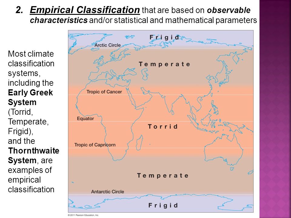
The ancient Greeks were the first to classify climate zones. From their travels and sea-faring experiences, they called the equatorial regions Torrid, due to the heat and humidity. The mid-latitudes were considered Temperate, including their home Mediterranean Sea. Further North and South, they knew places were Frigid.

Based on empirical observations, Köppen (1900) established a climate classification system which uses monthly temperature and precipitation to define boundaries of different climate types around the world. Since its inception, this system has been further developed (e.g. Köppen and Geiger, 1930; Stern et al., 2000) and widely used by geographers and climatologists around the world.

Köppen and Climate Change

The focus is on differentiating vegetation regimes, which result primarily from variations in temperature and precipitation over the seasons of the year. Now we have an interesting study that considers shifts in Köppen climate zones over time in order to identify changes in climate as practical and local/regional realities.

The paper is: Using the Köppen classification to quantify climate variation and change: An example for 1901–2010
By Deliang Chen and Hans Weiteng Chen
Department of Earth Sciences, University of Gothenburg, Sweden

Hans Chen has built an excellent interactive website (here): The purpose of this website is to share information about the Köppen climate classification, and provide data and high-resolution figures from the paper Chen and Chen, 2013: Using the Köppen classification to quantify climate variation and change: An example for 1901–2010 (pdf)

The Köppen climate classification consists of five major groups and a number of sub-types under each major group, as listed in Table 1. While all the major groups except B are determined by temperature only, all the sub-types except the two sub-types under E are decided based on the combined criteria relating to seasonal temperature and precipitation. Therefore, the classification scheme as a whole represents different climate regimes of various temperature and precipitation combinations.

Main characteristics of the Köppen climate major groups and sub-types:

Major group  Sub-types
A: Tropical Tropical rain forest: Af
Tropical monsoon: Am
Tropical wet and dry savanna: Aw, As
B: Dry Desert (arid): BWh, BWk
Steppe (semi-arid): BSh, BSk
C: Mild temperate Mediterranean: Csa, Csb, Csc
Humid subtropical: Cfa, Cwa
Oceanic: Cfb, Cfc, Cwb, Cwc
D: Snow Humid: Dfa, Dwa, Dfb, Dwb, Dsa, Dsb
Subarctic: Dfc, Dwc, Dfd, Dwd, Dsc, Dsd
E: Polar Tundra: ET
Ice cap: EF

Temporal Changes in Climate Zones

This study used a global gridded dataset with monthly mean temperature and precipitation, covering 1901–2010, which was produced and documented by Kenji Matsuura and Cort J. Willmott from Department of Geography, University of Delaware. Station data were compiled from different sources, including Global Historical Climatology Network version 2 (GHCN2) and the Global Surface Summary of Day (GSOD).The data and associated documentations can be found at http://climate.geog.udel.edu/climate/html_pages/Global2011/

In the maps below, the Köppen classification was applied on temperature and precipitation averaged over shorter time scales, from interannual to decadal and 30 year. The 30 year averages were calculated with an overlap of 20 years between each sub-period, while the interannual and decadal averages did not have overlapping years. Black regions indicate areas where the major Köppen type has changed at least once during 1901–2010 for a given time scale. Thus, the black regions are likely to be sensitive to climate variations, while the colored regions identify spatially stable regions.

Chen_and_Chen_2013fig2ab

Chen_and_Chen_2013fig2c


Major group Time scales
Interannual (%) Interdecadal (%) 30-year (%)
A                45.5                    89.0                 94.2
B                45.1                    85.2                 91.8
C                35.3                    77.4                 87.3
D                30.0                    83.3                 91.0
E                78.2                    92.8                 96.2

The table and images show that most places have had at least one entire year with temperatures and/or precipitation atypical for that climate.  It is much more unusual for abnormal weather to persist for ten years running.  At 30-years and more the zones are quite stable, such that is there is little movement at the boundaries with neighboring zones.

Over time, there is variety in zonal changes, albeit within a small range of overall variation:

Fig. 3. Temporal changes in the relative areas (area for 30 year windows minus the long term mean during 1901–2010, divided by the long term mean) of the five major Köppen groups. The 30 year window is moved forward with an interval of 10 years and the years showing the data indicates the middle of the 30 year window, e.g. 1995=1981–2010.

Chen and Chen Conclusions

By using a global gridded temperature and precipitation data over the period of 1901–2010, we reached the following conclusions:

  • Over the whole period (1901–2010), the mean climate distributions have a comparable pattern and portion with previous estimates. The five major groups A, B, C, D, E take up 19.4%, 28.4%, 14.6%, 22.1%, and 15.5% of the total land area on Earth respectively. Since the relative changes of the areas covered by the five major groups are all small on the 30 year time scale, the agreement indicates that the climate dataset used overall is of comparable quality with those used in other studies.
  • On the interannual, interdecadal, and 30 year time scales, the climate type for a given grid may shift from one type to another and the spatial stability decreases towards shorter time scales. While the spatially stable climate regions identified are useful for conservation and other purposes, the instable regions mark the transition zones which deserve special attention since they may have implications for ecosystems and dynamics of the climate system.
  • On the 30 year time scale, the dominating changes in the climate types over the whole period are that the arid regions occupied by group B (mainly type BWh) have expanded and the regions dominated by arctic climate (EF) have shrunk along with the global warming and regional precipitation changes.

Summary: The Myth of “Global” Climate Change

Climate is a term to describe a local or regional pattern of weather. There is a widely accepted system of classifying climates, based largely on distinctive seasonal variations in temperature and precipitation. Depending on how precisely you apply the criteria, there can be from 6 to 13 distinct zones just in South Africa, or 8 to 11 zones only in Hawaii.

Each climate over time experiences shifts toward warming or cooling, and wetter or drier periods. One example: Fully a third of US stations showed cooling since 1950 while the others warmed.  It is nonsense to average all of that and call it “Global Warming” because the net is slightly positive.  Only in the fevered imaginations of CO2 activists do all of these diverse places move together in a single march toward global warming.

Arctic Marginal Ice Melting May 15

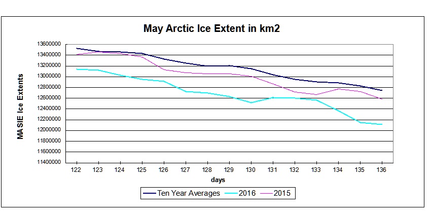
In the chart below MASIE shows Arctic ice extent is below average and lower than 2015 at this point in the year.

MASIE 2016 day136

Looking into the details, it is clear that the marginal seas are melting earlier than last year, while the central ice pack is holding steady.

Ice Extents Ice Extent
Region 2015136 2016136 km2 Diff.
 (0) Northern_Hemisphere 12585032 12116610 -468423
 (1) Beaufort_Sea 1033428 942536 -90892
 (2) Chukchi_Sea 930045 933354 3309
 (3) East_Siberian_Sea 1087137 1087120 -17
 (4) Laptev_Sea 897845 897809 -36
 (5) Kara_Sea 899673 864423 -35250
 (6) Barents_Sea 337707 222091 -115616
 (7) Greenland_Sea 615714 575320 -40395
 (8) Baffin_Bay_Gulf_of_St._Lawrence 1201099 1015356 -185743
 (9) Canadian_Archipelago 833900 830174 -3726
 (10) Hudson_Bay 1175953 1185893 9940
 (11) Central_Arctic 3237268 3198923 -38345
 (12) Bering_Sea 153646 160277 6630
 (13) Baltic_Sea 66 2839 2774
 (14) Sea_of_Okhotsk 180119 198519 18400

Another difference this year is the Beaufort Gyre cranking up ten days ago, compacting ice and reducing extent by about 150k km2, and putting the loss ahead of last year.  As Susan Crockford points out (here), this is not melting but ice breaking up and moving. Of course, warmists predict that will result in more melting later on, which remains to be seen. In any case, Beaufort extent is down 12% from max, which amounts to 1% of the NH ice loss so far.

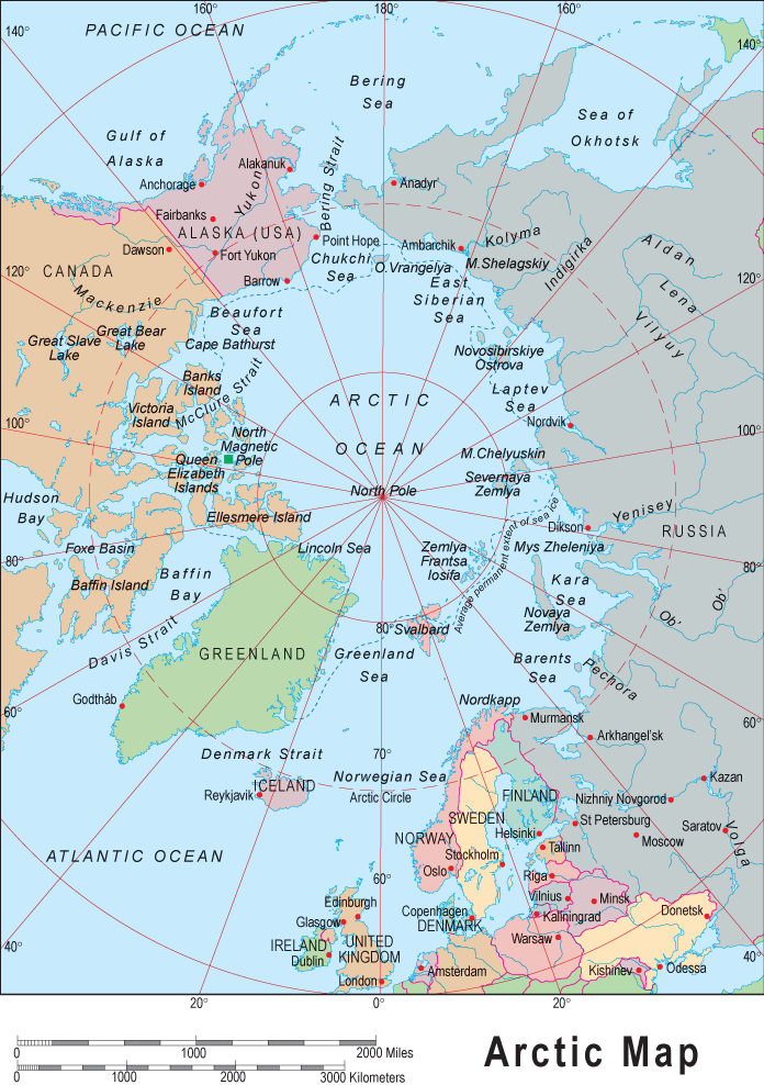
arctic-map

Comparing the Arctic seas extents with their maximums shows the melting at the margins:

2016136 NH Max Loss % Loss Sea Max % NH Loss
 (0) Northern_Hemisphere 2960990 19.64%
 (1) Beaufort_Sea 127909 11.95% 1%
 (2) Chukchi_Sea 32636 3.38% 0%
 (3) East_Siberian_Sea 0 0.00% 0%
 (4) Laptev_Sea 0 0.00% 0%
 (5) Kara_Sea 70565 7.55% 0%
 (6) Barents_Sea 377288 62.95% 3%
 (7) Greenland_Sea 84393 12.79% 1%
 (8) Baffin_Bay_Gulf_of_St._Lawrence 629226 38.26% 4%
 (9) Canadian_Archipelago 23004 2.70% 0%
 (10) Hudson_Bay 74977 5.95% 1%
 (11) Central_Arctic 47787 1.47% 0%
 (12) Bering_Sea 607955 79.14% 4%
 (13) Baltic_Sea 94743 97.09% 1%
 (14) Sea_of_Okhotsk 1110178 84.83% 8%

It is clear from the above that the bulk of ice losses are coming from Okhotsk, Barents and Bering Seas, along with Baffin Bay-St. Lawrence; all of them are marginal seas that will go down close to zero by September.  The entire difference between 2016 and 2015 arises from Okhotsk starting with about 500k km2 more ice this year, and arriving at this date virtually tied with 2015.

Note: Some seas are not at max on the NH max day.  Thus, totals from adding losses will vary from NH daily total.

AER says this about the Arctic Oscillation (AO):

Currently, the AO is negative and is predicted to slowly trend towards neutral (Figure 1). The current negative AO is reflective of positive geopotential height anomalies across much of the Arctic, especially the North Atlantic side and mostly negative geopotential height anomalies across the mid-latitudes.

September Minimum Outlook

Historically, where will ice be remaining when Arctic melting stops? Over the last 10 years, on average MASIE shows the annual minimum occurring about day 260. Of course in a given year, the daily minimum varies slightly a few days +/- from that.

For comparison, here are sea ice extents reported from 2007, 2012, 2014 and 2015 for day 260:

Arctic Regions 2007 2012 2014 2015
Central Arctic Sea 2.67 2.64 2.98 2.93
BCE 0.50 0.31 1.38 0.89
Greenland & CAA 0.56 0.41 0.55 0.46
Bits & Pieces 0.32 0.04 0.22 0.15
NH Total 4.05 3.40 5.13 4.44

Notes: Extents are in M km2.  BCE region includes Beaufort, Chukchi and Eastern Siberian seas. Greenland Sea (not the ice sheet). Canadian Arctic Archipelago (CAA).  Locations of the Bits and Pieces vary.

As the table shows, low NH minimums come mainly from ice losses in Central Arctic and BCE.  The great 2012 cyclone hit both in order to set the recent record. The recovery since 2012 shows in 2014, with some dropoff last year, mostly in BCE.

Summary

We are only beginning the melt season, and the resulting minimum will depend upon the vagaries of weather between now and September.  At the moment, 2016 was slightly higher than 2015 in March, and is now trending toward a lower May extent.  OTOH 2016 melt season is starting without the Blob, with a declining El Nino, and a cold blob in the North Atlantic.  The AO is presently neutral, giving no direction whether cloud cover will reduce the pace of melting or not.  Meanwhile we can watch and appreciate the beauty of the changing ice conditions.

Waves and sea ice in the Arctic marginal zone.


Cool: Quebec teen Studies Stars, Discovers Ancient Mayan City


Mouth of Fire

William Gadoury is a 15-year-old student from Saint-Jean-de-Matha in Lanaudière, Quebec. The precocious teen has been fascinated by all things Mayan for several years, devouring any information he could find on the topic.

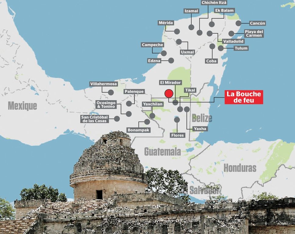
During his research, Gadoury examined 22 Mayan constellations and discovered that if he projected those constellations onto a map, the shapes corresponded perfectly with the locations of 117 Mayan cities. Incredibly, the 15-year-old was the first person to establish this important correlation.

Then Gadoury took it one step further. He examined a twenty-third constellation which contained three stars, yet only two corresponded to known cities.

Gadoury’s hypothesis? There had to be a city in the place where that third star fell on the map.

Satellite images later confirmed that, indeed, geometric shapes visible from above imply that an ancient city with a large pyramid and thirty buildings stands exactly where Gadoury said they would be. If the find is confirmed, it would be the fourth largest Mayan city in existence.

Once Gadoury had established where he thought the city should be, the young man reached out to the Canadian Space Agency where staff was able to obtain satellites through NASA and JAXA, the Japanese space agency.

“What makes William’s project fascinating is the depth of his research,” said Canadian Space Agency liaison officer Daniel de Lisle. “Linking the positions of stars to the location of a lost city along with the use of satellite images on a tiny territory to identify the remains buried under dense vegetation is quite exceptional.”

Gadoury has decided to name the city K’ÀAK ‘CHI, a Mayan phrase which in English means “Mouth of Fire.”

Gadoury

Summary

Now that is the way you do science: Find a correlation, form a theory explaining it, make a prediction, and verify it in the real world.  The preliminary confirmation is by remote sensing with satellite images showing the geometrical shapes.

“I did not understand why the Maya built their cities away from rivers, on marginal lands, and in the mountains. They had to have another reason, and as they worshiped the stars, the idea came to me to verify my hypothesis,” Gadoury told Le Journal de Montreal.

“I was really surprised and excited when I realized that the most brilliant stars of the constellations matched the largest Maya cities,” he added.

The next step for Gadoury will be seeing the city in person. He’s already presented his findings to two Mexican archaeologists, and has been promised that he’ll join expeditions to the area.

What a delightful young scientist and a wonderful achievement.

Sources: Earth Mystery NewsEpoch Times.

Data vs. Models #3: Disasters

Addendum at end on Wildfires

Looking Through Alarmist Glasses

In the aftermath of COP21 in Paris, the Irish Times said this:

Scientists who closely monitored the talks in Paris said it was not the agreement that humanity really needed. By itself, it will not save the planet. The great ice sheets remain imperiled, the oceans are still rising, forests and reefs are under stress, people are dying by tens of thousands in heatwaves and floods, and the agriculture system that feeds 7 billion human beings is still at risk.

That list of calamities looks familiar from insurance policies where they would be defined as “Acts of God.” Before we caught CO2 fever, everyone accepted that natural disasters happened, unpredictably and beyond human control. Now of course, we have computer models to project scenarios where all such suffering will increase and it will be our fault.

For example, from an alarmist US.gov website we are told:

Human-induced climate change has already increased the number and strength of some of these extreme events. Over the last 50 years, much of the U.S. has seen increases in prolonged periods of excessively high temperatures, heavy downpours, and in some regions, severe floods and droughts.

By late this century, models, on average, project an increase in the number of the strongest (Category 4 and 5) hurricanes. Models also project greater rainfall rates in hurricanes in a warmer climate, with increases of about 20% averaged near the center of hurricanes.

Looking Without Alarmist Glasses

But looking at the data without a warmist bias leads to a different conclusion.

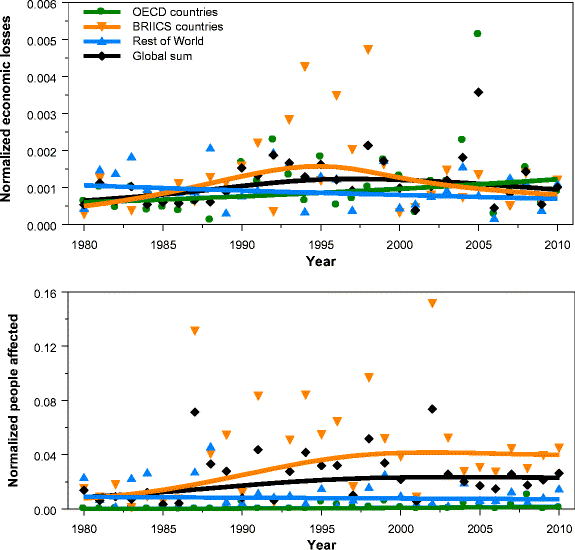
The trends in normalized disaster impacts show large differences between regions and weather event categories. Despite these variations, our overall conclusion is that the increasing exposure of people and economic assets is the major cause of increasing trends in disaster impacts. This holds for long-term trends in economic losses as well as the number of people affected.

From this recent study:  On the relation between weather-related disaster impacts, vulnerability and climate change, by Hans Visser, Arthur C. Petersen, Willem Ligtvoet 2014 (open source access here)

Data and Analysis

All the analyses in this article are based on the EM-DAT emergency database. This database is open source and maintained by the World Health Organization (WHO) and the Centre for Research on the Epidemiology of Disasters (CRED) at the University of Louvain, Belgium (Guha-Sapir et al. 2012).

The EM-DAT database contains disaster events from 1900 onwards, presented on a country basis. . .We aggregated country information on disasters to three economic regions: OECD countries, BRIICS countries (Brazil, Russia, India, Indonesia, China and South Africa) and the remaining countries, denoted hereafter as Rest of World (RoW) countries. OECD countries can be seen as the developed countries, BRIICS countries as upcoming economies and RoW as the developing countries.

The EM-DAT database provides three disaster impact indicators for each disaster event: economic losses, the number of people affected and the number of people killed. . .The data show large differences across disaster indicators and regions: economic losses are largest in the OECD countries, the number of people affected is largest in the BRIICS countries and the number of people killed is largest in the RoW countries.

Fig. 3 Economic losses normalized for wealth (upper panel) and the number of people affected normalized for population size (lower panel). Sample period is 1980–2010. Solid lines are IRW trends for the corresponding data.

Fig. 3
Economic losses normalized for wealth (upper panel) and the number of people affected normalized for population size (lower panel). Sample period is 1980–2010. Solid lines are IRW trends for the corresponding data.

The general idea behind normalization is that if we want to detect a climate signal in disaster losses, the role of changes in wealth and population should be ruled out; however, this is complicated by the fact that changes in vulnerability may also play a role. . .(After extensive research), we conclude that quantitative information on time-varying vulnerability patterns is lacking. More qualitatively, we judge that a stable vulnerability V t, as derived in this study, is not in contrast with estimates in the literature.

Climate drivers

Historic trend estimates for weather and climate variables and phenomena are presented in IPCC-SREX (2012, see their table 3-1). The categories ‘winds’, ‘tropical cyclones’ and ‘extratropical cyclones’ coincide with the ‘meteorological events’ category in the CRED database. In the same way, the ‘floods’ category coincides with the CRED ‘hydrological events’ category. The IPCC trend estimates hold for large spatial scales (trends for smaller regions or individual countries could be quite different).

The IPCC table shows that little evidence is found for historic trends in meteorological and hydrological events. Furthermore, Table 1 shows that these two events are the main drivers for (1) economic losses (all regions), (2) the number of people affected (all regions) and (3) the number of people killed (BRIICS countries only). Thus, trends in normalized data and climate drivers are consistent across these impact indicators and regions.

Summary

People who are proclaiming that disasters rise with fossil fuel emissions are flying in the face of the facts, and in denial of IPCC scientists.

Trends in normalized data show constant, stabilized patterns in most cases, a result consistent with findings reported in Bouwer (2011a) and references therein, Neumayer and Barthel (2011) and IPCC-SREX (2012).

The absence of trends in normalized disaster burden indicators appears to be largely consistent with the absence of trends in extreme weather events.

For more on attributing x-weather to climate change see: X-Weathermen Are Back

Addendum on Wildfires

Within all the coverage of the Fort McMurray Alberta wildfire, there have also been lazy journalists linking the event to fossil fuel-driven global warming, with a special delight of this being located near the oil sands.  The best call to reason has come from A Chemist in Langley, who argues for defensible science against mindless activism.  Of course, he has taken some heat for being so rational.

Here is what he said about the data and the models regarding boreal forest wildfires:

Well the climate models indicate that in the long-term (by the 2091-2100 fire regimes) climate change, if it continues unabated, should result in increased number and severity of fires in the boreal forest. However, what the data says is that right now this signal is not yet evident. While some increases may be occurring in the sub-arctic boreal forests of northern Alaska, similar effects are not yet evident in the southern boreal forests around Fort McMurray.

My final word is for the activists who are seeking to take advantage of Albertans’ misfortunes to advance their political agendas. Not only have you shown yourselves to be callous and insensitive at a time where you could have been civilized and sensitive but you cannot even comfort yourself by hiding under the cloak of truth since, as I have shown above, the data does not support your case.

Data vs. Models #2: Droughts and Floods

This post compares observations with models’ projections regarding variable precipitation across the globe.

There have been many media reports that global warming produces more droughts and more flooding. That is, the models claim that dry places will get drier and wet places will get wetter because of warmer weather. And of course, the models predict future warming because CO2 continues to rise, and the model programmers believe only warming, never cooling, can be the result.

Now we have a recent data-rich study of global precipitation patterns and the facts on the ground lead the authors to a different conclusion.

Stations experiencing low, moderate and heavy annual precipitation did not show very different precipitation trends. This indicates deserts or jungles are neither expanding nor shrinking due to changes in precipitation patterns. It is therefore reasonable to conclude that some caution is warranted about claiming that large changes to global precipitation have occurred during the last 150 years.

The paper (here) is:

Changes in Annual Precipitation over the Earth’s Land Mass excluding Antarctica from the 18th century to 2013 W. A. van Wijngaarden, Journal of Hydrology (2015)

Study Scope

Fig. 1. Locations of stations examined in this study. Red dots show the 776 stations having 100–149 years of data, green dots the 184 stations having 150–199 years of data and blue dots the 24 stations having more than 200 years of data.

Fig. 1. Locations of stations examined in this study. Red dots show the 776 stations having 100–149 years of data, green dots the 184 stations having 150–199 years of data
and blue dots the 24 stations having more than 200 years of data.

This study examined the percentage change of nearly 1000 stations each having monthly totals of daily precipitation measurements for over a century. The data extended from 1700 to 2013, although most stations only had observations available beginning after 1850. The percentage change in precipitation relative to that occurring during 1961–90 was plotted for various countries as well as the continents excluding Antarctica. 

There are year to year as well as decadal fluctuations of precipitation that are undoubtedly influenced by effects such as the El Nino Southern Oscillation (ENSO) (Davey et al., 2014) and the North Atlantic Oscillation (NAO) (Lopez-Moreno et al., 2011). However, most trends over a prolonged period of a century or longer are consistent with little precipitation change.Similarly, data plotted for a number of countries and or regions thereof that each have a substantial number of stations, show few statistically significant trends.

Fig. 8. Effect of total precipitation on percentage precipitation change relative to 1961–90 for stations having total annual precipitation (a) 1000 mm. The red curve is the moving 5 year average while the blue curve shows the number of stations. Considering only years having at least 10 stations reporting data, the trends in units of % per century are: (a) 1.4 ± 2.8 during 1854–2013, (b) 0.9 ± 1.1 during 1774–2013 and (c) 2.4 ± 1.2 during 1832–2013.

Fig. 8. Effect of total precipitation on percentage precipitation change relative to 1961–90 for stations having total annual precipitation (a) less than 500 mm, (b) 500 to 1000 mm, (c) more than 1000 mm. The red curve is the moving 5 year average while the blue curve shows the number of stations. Considering only years having at least 10 stations reporting data, the trends in units of % per century are: (a) 1.4 ± 2.8 during 1854–2013, (b) 0.9 ± 1.1 during 1774–2013 and (c) 2.4 ± 1.2 during 1832–2013.

Fig. 8 compares the percentage precipitation change for dry stations (total precipitation <500 mm), stations experiencing moderate rainfall (between 500 and 1000 mm) and wet stations (total precipitation >1000 mm). There is no dramatic difference. Hence, one cannot conclude that dry areas are becoming drier nor wet areas wetter.

Summary

The percentage annual precipitation change relative to 1961–90 was plotted for 6 continents; as well as for stations at different latitudes and those experiencing low, moderate and high annual precipitation totals. The trends for precipitation change together with their 95% confidence intervals were found for various periods of time. Most trends exhibited no clear precipitation change. The global changes in precipitation over the Earth’s land mass excluding Antarctica relative to 1961–90 were estimated to be:

Periods % per Century
 1850–1900 1.2 ± 1.7
 1900–2000 2.6 ± 2.5
 1950–2000 5.4 ± 8.1

A change of 1% per century corresponds to a precipitation change of 0.09 mm/year or 9 mm/century.

As a background for how precipitation is distributed around the world, see the post: Here Comes the Rain Again. Along with temperatures, precipitation is the other main determinant of climates, properly understood as distinctive local and regional patterns of weather.  As the above study shows, climate change from precipitation change is vanishingly small.

Data vs. Models #1 was Arctic Warming.