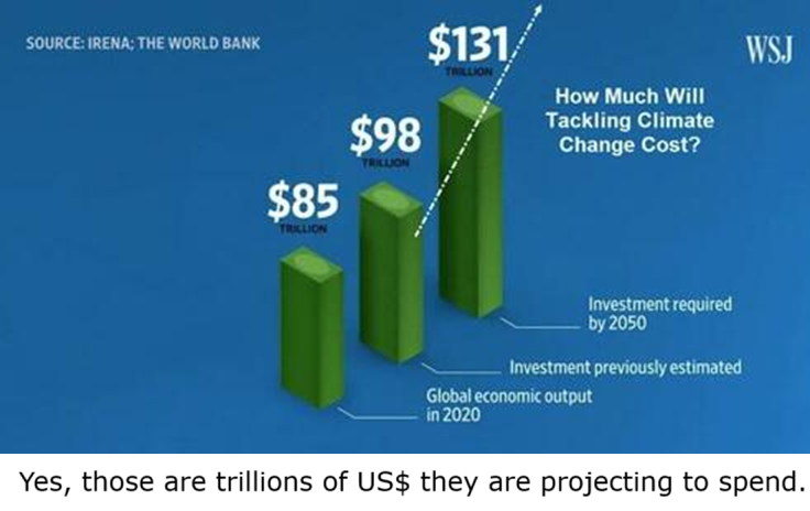
The above images put into perspective the scale of William Murray’s issue in his Real Clear Energy article regarding energy investments The $20 Trillion Question: How to Spend It and How Not To. Excerpts in italics with my bolds and added images.
$20 trillion is a lot of money. One would expect a big bang to follow the spending of twenty-thousand billion dollars. It’s a lot of money! It’s pretty much the total present value of America’s GDP.
This is the sum that was globally spent — largely by Europe and the United States — in a coordinated effort by the developed world to decarbonize the global economy.China, in contrast, sold the world windmills and solar panels while it opened a new coal-fired power plant per month.
What was the net effect of this “Green” Marshall Plan? Hydrocarbon consumption continued to increase anyway. All that was achieved was a tiny reduction, just 2%, in the share of overall energy supplied by hydrocarbons. Put simply, as the energy pie got bigger and all forms of energy supply increased, hydrocarbons ended up with a slightly smaller share of a larger pie.
We also saw the de-industrialization of the European and American economies — not just with higher prices at the gas pump and on electric bills, but a stealth green tax that was passed on to consumers on everything. This is the culprit of our American and global affordability crisis.
So much treasure and pain for a 2 percent reduction in the share of hydrocarbons.
What a tilting-at-windmills waste. The worst bang for the public and private buck ever. Yet, the Chicken Little believers of the Church of Settled Science and the grifters who profited from it will still sing in unison that it failed because they did not go far enough. If only the global community spent and regulated more!
In contrast, the actual Marshall Plan(which ran from 1948 to 1951) rebuilt a decimated Europe into an industrial, interconnected, peaceful powerhouse. It was a great success by any measure. At the time, its price tag was huge: $13.3 billion in nominal 1948-1951 dollars, which is the equivalent of approximately $150 billion in today’s dollars.
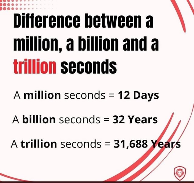
Since a trillion is such a large number, let’s divide $20 trillion by an inflation-adjusted Marshall plan of $150 billion and we have 133 Marshall opportunities. Money was not the problem. To give a sense of the comparative bang-for-buck, by the Marshall program’s end, the aggregated Gross National Product (GDP) of the participating nations rose by more than 32 percent,and industrial output increased by a remarkable 40 percent.
President Trump has been on the global-funding rounds and has secured upwards of $18 trillion in investments. He has secured the equivalent of 120 Marshall Plans — just 2 shy of $20 trillion — to be invested here and nowhere else.
Unlike NAFTA — where the rich got richer under the banner of free markets and in exchange America’s underemployed families got cheaper goods — Trump’s is a recipe for prosperity for all Americans.
Making these investments an American reality will require a growing army of blue- and white-collar workers. With the wealth that it creates, our debt could be paid down and, finally, off. Social Security and Medicare would be placed on a solid footing for time immemorial. All our public obligations to each other would be paid from ever-growing prosperity and not from borrowed money and strangling debt service.
Nothing approaching this level of intentional investment in one country has ever been done. Yes, a similar tranche of greenbacks was burnt to no noticeable environmental benefit and great economic hardship for all. And yes, the American economy under the guise of comparative advantage sent trillions to our south and east — putting America second, hollowing out the American middle class, and neutering the American dream.
Trump’s Plan is the opposite of both failed experiments. Like the original Marshall plan, Trump’s is a recipe for the re-industrialization of the American economy and military, and it is not going to be fueled by windmills and solar farms but with hydrocarbons and uranium. That’s the Trump Plan. It has merit.
Yet, if we look at the polls,Trump is underwater and his base show signs of stress fractures. You bring peace to the Middle East, stop 6 other wars, and bring in some $20 trillion in America First-investments within your first year, and you come home to find yourself underwater and called a lame duck. Democracies — even Democratic Republics — are known to be fickle and hard to please, but this is still rich — and it will result in poverty, which is the opposite of affordability if it continues.
Without the use of tariffs and his deal making, there would not be $20 trillion looking to onshore to the United States. You can blame Trump for higher costs on bananas and coffee. But it’s the cost of electricity and healthcare — not the cost of coffee and bananas — that are roiling kitchen-table economics.
Vice President JD Vance recently made the right call for popular and populist patience. Those who are impatient should look at the offsets already passed, like no taxes on social security, tips, and overtime. That helps pay for bananas and coffee and then some.
My fellow Americans, these sovereign wealth funds that are presently lining up on our water’s edge are coming here based on promises made from a can-do president speaking for a can-do nation. While Trump is a can-do guy, are “We the People” presently a can-do people? Or, do we at least want to return to becoming a can-do people again? The “can’t do” forces are legion and they are the ones now championing the affordability crisis that they caused.
When America was a can-do nation, we built the Empire State Building
in a year. Today, it would take years to get a permit.
Those willing to invest such money will require some certitude that the power they’ll need will be there to “build, baby, build.” If not, the money and the opportunity will pass before it has the possibility to take needed root.
And what about us, the American family, worker, and business that continues to struggle under the legacy of throttling energy privation? In short, we all have a common good — a shared interest — in righting the wrongs that control our grid and our nation’s future.
The good news is that a bill was introduced in the House during the government shutdown. It’s called the “Affordable, Reliabile, Clean Energy Security Act.” Unlike Obamacare, which clocked in at 903 pages, this bill is a lean 763 words, that, if it became law — and it should — would change everything for the better. (Unlike Obamacare, which is recipe for un-affordability).
Mr. President, your one beautiful bill was missing this one thing. Your short- and long-term, America First ambitions are dramatically increased by making this bill into law before the midterm elections. Connect the state siting of these investments to Democrat support of the bill and you will find it on your desk before the midterms. Executive orders don’t offer the energy security that these investors require and that the American people deserve.
$20 trillion is a lot of money. Coming to our shores is a new lease on the American experiment as we enter our 250th birthday hopelessly divided and broke. Let us come together and solve not just the affordability crisis but set the conditions of greatness for the next 250 years.
Kathryn Porter’s recent article on the plight of UK’s electrical grid at her blog: Electrification – can the grid cope?The excerpt below provides findings from her new research paper, available at the link above.
Electrification has become the default answer to almost every energy and climate question. Heat? Electrify it. Transport? Electrify it. Industry? Electrify it. In policy circles, electrification is often treated as a frictionless substitute for fossil fuels: cleaner, simpler, and largely inevitable. In this new report I take a look at what electrification would mean for the GB power grid, if it went ahead as planned. I also consider the impact of additional demand from AI data centres.
Electrification policy rests on optimistic assumptions
Across heating, transport and industry, electrification targets rely on a similar set of assumptions:
♦ that consumers will change behaviour rapidly, ♦ that costs will fall quickly and predictably, and ♦ that electricity infrastructure will expand smoothly to accommodate new demand.
The report tests these assumptions sector by sector and finds them wanting.
The good news is that electrification targets are unlikely to be met without some form of compulsion. In heating, rapid deployment of heat pumps is implausible under current conditions. Consumer resistance remains high, installer numbers are growing too slowly, and both capital and running costs are materially higher than for gas heating. Even where heat‑pump subsidies reduce upfront costs, households still face additional expenditure on larger emitters, pipework and insulation, as well as higher ongoing energy bills because electricity prices remain far above gas prices. These are not marginal issues – they are fundamental barriers to mass adoption.
Transport electrification faces a similar gap between ambition and delivery. Mandates for electric vehicles are running ahead of public willingness to adopt them, while grid and charging‑infrastructure constraints remain severe. These problems are magnified for larger vehicles. There is currently no credible fast‑charging solution for HGVs, and electrifying buses outside dense urban centres is far more challenging than policy documents typically acknowledge, particularly where vehicles do not return regularly to a single depot.
In industry, the constraint is both technical feasibility and economic viability. High electricity prices have driven deindustrialisation across large parts of the UK economy, reducing electricity demand far more quickly than electrification can increase it. In practice, deindustrialisation is the dominant trend, and a stronger driver of demand than electrification across the economy as a whole.
Across all three sectors, the modelling used by both NESO and the Climate Change Committee depends on behavioural and technological assumptions that are optimistic, weakly evidenced, and often inconsistent across scenarios. My report does not assume electrification will fail entirely, but it does find that current targets are unlikely to be met without significant compulsion, which brings its own political and social risks.
The system is under strain even without electrification
The bad news is that, even without electrification, the electricity grid is likely to struggle unless action is taken. One of the most important findings of my report is that the GB electricity system is already heading towards a serious adequacy problem even if large‑scale electrification largely fails.
Renewables cannot provide security of supply during prolonged low‑wind winter events, and reliance on interconnectors is risky when neighbouring systems face similar weather patterns. Meanwhile, just under 5 GW of nuclear generation is scheduled to close by 2032 at the latest, and around 12 GW of CCGT capacity is at risk of closure due to age and declining utilisation.
While Hinkley Point C and perhaps a small amount of new open‑cycle gas capacity may come online over the next five to seven years, this does not come close to offsetting expected closures. Under plausible assumptions, the system could face a capacity shortfall of around 12 GW on cold, low‑wind winter days.
In such conditions, meeting demand without rationing would be impossible.
Replacing or upgrading ageing gas generation is constrained by long lead times. New rotors typically require around 5 years, and entirely new gas turbines 7-8 years, reflecting global supply‑chain bottlenecks. These are physical constraints that cannot be resolved by market reform or policy ambition alone.
Britain is not alone in facing a potential problem with system adequacy. Norway, the Netherlands and Germany were all considered as part of the report and in each case, possible shortages are identified. Norway assumes that flexibility, demand response, or batteries will full the gap. The Dutch are less confident and intend to monitor the generation mix in neighbouring countries in the hope of persuading them to maintain enough firm generation to secure the Dutch grid on low wind days. Only Germany has explicitly identified a need to build more gas generation, although its target is likely inadequate.
Europe at night from space NASA 2016
Flexibility helps, but does not replace firm capacity
One of the report’s central findings is that electrification does not increase demand evenly. Heat pumps, EV charging, and industrial electrification all tend to concentrate demand in time (cold evenings, post‑work charging windows), and concentrate demand in space (residential feeders, urban substations, motorway corridors).
Annual energy numbers hide this – a system can look comfortable
on a terawatt‑hour basis while becoming acutely
stressed for a few hundred hours a year.
Flexibility features heavily in electrification plans with smart charging, demand response, batteries, and thermal storage. While flexibility can shave peaks, this only works where consumers tolerate loss of convenience. In many cases, policymakers ignore real-world constraints such as fire risks associated with overnight operation of domestic appliances, and noise restrictions within multi-occupancy residential buildings. Batteries are energy‑limited and cannot cover prolonged stress events. Many flexibility services depend on digital systems that introduce new operational and cyber risks. Flexibility may reduces costs at the margin, but it does not eliminate the need for firm capacity, resilient networks, or system strength.
Infrastructure challenges present further risks
In addition to the issues with reliable generation capacity, there are further difficulties with distribution and transmission constraints which arrive earlier and are also hard to fix quickly. Key points from the report include:
Local distribution networks were not designed for mass electrification of heat and transport
Reinforcement timelines are measured in years, and often a decade or more
Connection queues and “paper capacity” obscure real‑world deliverability
The report also identifies risks with aging grid infrastructure and the recently identified risks that premature closure of offshore gas pipelines may constrain gas supplies to the grid on cold winter days, limiting the gas available for electricity generation.
What this means in practice
Taken together, the findings point to an uncomfortable conclusion. The GB electricity system is likely to struggle to maintain today’s level of demand reliably, let alone accommodate the additional 7–10 GW of load in 2030 implied by current electrification agendas. AI data centres are therefore likely to pursue off‑grid solutions, not because of technological failure but because the grid is no longer perceived as sufficiently reliable for mission‑critical loads.
Large‑scale electrification of heat and industry before 2030 appears improbable, and likely remains so for several years thereafter. Without decisive policy action, the probability of regional rationing, blackouts and cascading grid failures rises materially.
To restore Britain’s energy security, government must
pivot from aspirational modelling to credible planning.
This means:
♦ supporting life extension of ageing gas generation, ♦ accelerating procurement of new dispatchable capacity, ♦ reforming network investment incentives to prioritise resilience, and ♦ reassessing electrification timelines.
Net zero targets cannot be allowed to override public safety.
Security of supply must once again become
the foundational principle of UK energy policy.
For years, climate change “deniers” have been attacked and ridiculed because we don’t believe in the “science” of the left. Yet, invented “science” isn’t science, and too many scientists have cowed to it, incentivized by money or fear of being cancelled, and have climbed on the bandwagon.
More and more people, however, are realizing the scam
that’s been perpetrated and are speaking out.
And now, those who defend climate change caused by humans are furious and alarmed. To discourage dissenters to the progressive narrative, the UN stepped up to stop the “disinformation”, intending to ramp up the war against climate change “deniers”:
At the United Nations Climate Change Conference (COP30), held in Brazil in November 2025, several states endorsed the UN’s ‘Declaration on Information Integrity on Climate Change, an initiative recognizing and trying to combat the rise in climate disinformation in media and politics.’
The UN Declaration is professedly a pledge to ‘fight false information’ about climate change.
At first glance, the Declaration seems fairly innocuous. But if you read it carefully, it clearly condemns those who don’t agree with the UN agenda, demanding censorship of the opposition, largely through the media. Here is one of the listed commitments:
Promote and support the sustainability of a diverse and resilient media ecosystem through adequate policies to enable and ensure accurate and reliable coverage, specially, within this context, on climate and environmental issues, as well as policies on advertising transparency and accountability….
It is not the place of the UN to determine a limitation on discussion of climate change, or create a media network to censor opposing viewpoints or findings. And yet they persist in pursuing this agenda and insist that everyone fall in line. Desiree Fixler, an expert in sustainable finance and investment banking and a former member of the WEF’s Global Future Council on Responsible Investing turned whistleblower, identified the climate change crisis as a hoax:
Fixler, a whistleblower, used to work as a sustainability officer for Deutsche Bank, until she exposed their ‘greenwashing’ and was fired for it. Since then, she has been exposing the climate change narrative and the ‘net zero’ agenda as a scam. In a recent podcast, she explained how the UN and WEF agendas of net zero emissions and ‘stakeholder capitalism’ – a WEF concept – are means to gain control and implement socialism. ‘They’re lying to the public,’ Fixler recently said on the Winston Marshall podcast.
‘They’ve manufactured a climate crisis. There is climate change, but there is no climate crisis… asset managers, consultants, and governments… they’re all in on it because they all profit from it.’
Last year, Stanford University reported on a “rise” in new organizations pushing back against the left’s “climate change crisis” claims:
New Stanford-led research in PLOS One reveals a growing constellation of think tanks, research institutes, trade associations, foundations, and other groups actively working to oppose climate science and policy. The number of countries with at least one such ‘counter climate change organization’ has more than doubled over the past 35 years.
The researchers, in a roundabout way, recognize the aggressiveness of the left’s climate change policies in action to be a major factor for the pushback:
According to the Jan. 22 study, the two factors most closely linked to the formation of at least one counter climate change organization are the strength of a country’s commitment to protecting the natural environment and the level of formal organization in its social sector.
(As it turns out, people are less concerned with some unobservable boogeyman than they are with their utility bills and whether or not they can afford a car.)
An especially frustrating part of this story is that climate change adherents mischaracterize the position of the “deniers” who don’t deny that the climate is changing, but that there is inadequate scientific evidence to suggest that human beings are the source of those changes. This is a critical issue:
How can we consider stopping climate change when
we don’t have scientific data about what causes it?
All the warming since 1940s followed oceanic cyclical events.
Well-known scientists are finally speaking out against the UN censorship initiative:
Prominent voices, including Bjorn Lomborg, have criticized the UN’s stance, insisting that taxpayer-funded climate policies warrant thorough scrutiny, not censorship.
Lomborg contends that the UN’s agenda is not only misguided but runs the risk of economically damaging the very countries it claims to help, as evidenced by countries like Germany facing high energy costs amid aggressive climate goals.
We must take seriously the efforts of the UN to censor scientific debate, because the consequences could be dire:
The implications of this censorship extend far beyond the realm of energy policy, as it threatens foundational principles of democracy and free expression, calling into question the very nature of scientific and academic inquiry.
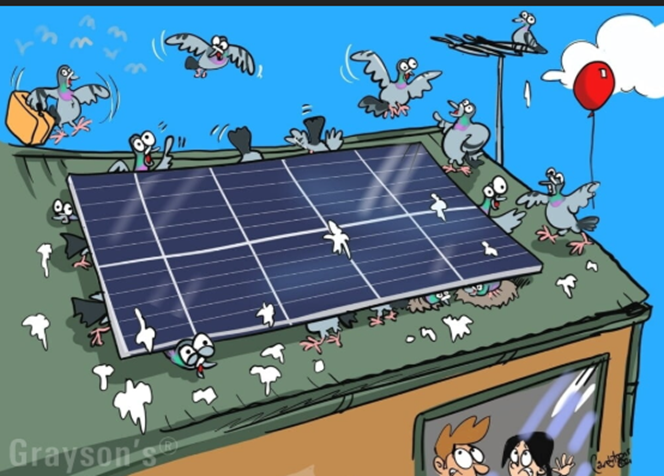
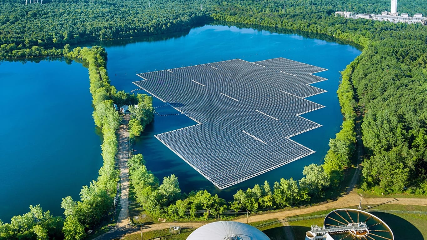
Your correspondent has a confession. I need to get up at least two hours earlier to keep abreast of all the current madness that is Net Zero. The un-walked dog will have to go back to resuming her slumbers on the best seat in the house while I digest the latest reports piling trillions of pounds onto the realistic cost of the Net Zero fantasy. Long hours must be spent trying to work out how the sinister Miliband plans to make household energy cheaper by giving billions to useless, unreliable wind and solar, and then sticking the horrendous costs straight onto consumer bills. “Cheaper than gas!” this still-at-large lunatic is apparently still howling. Then I would have time for a good laugh with the really dumb stuff. And none dafter than the recent suggestion from the Green Blob-funded Conservative Environment Network (CEN) to blanket inland water areas with solar panels, killing local aquatic life and tricking diving birds into crashing into them.
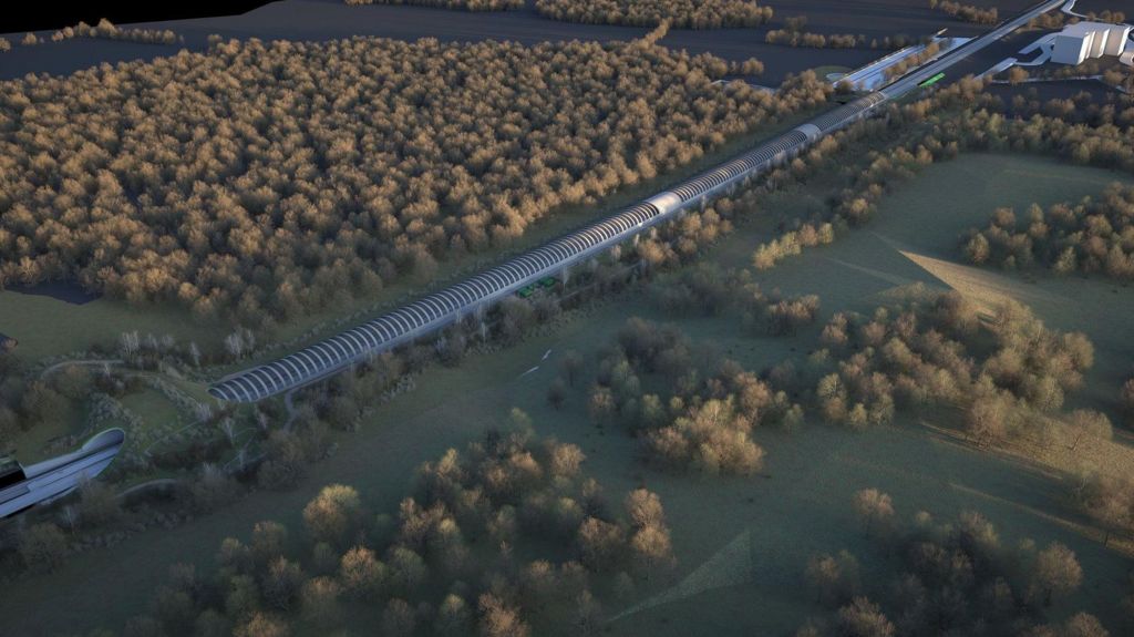
If they were bats mistaking floating solar panels for water, hundreds of millions, maybe billions, of pounds would need to be spent constructing elaborate protecting tunnels (okay, I know the Sun will not be able to shine on the panels, but it doesn’t much anyway in the winter, and I am just making it all up, like everyone else in the Net Zero business). The last Conservative government allowed spending of £120 million to protect a few rare bats by building a 1,000-metre tunnel on the new high-speed railway from London to Birmingham.
The bat protection structure runs for 1km over the railway line, costing £120m.
But then perhaps such magic money-tree largesse would not be available for water bird-whacking solar panels – ‘green’ technology is good and different rules apply. Bats are killed in their millions worldwide by giant wind turbines, but nobody gives a flying squeak about that.
The CEN wants the UK Government to cut red tape to “unleash” solar farm developments on “man-made bodies of water” and to help projects selling power to the electricity grid. It is claimed that red tape has put a straitjacket on private investment in the UK floating solar industry. Man-made water areas are said to include disused docks and quarries along with on-farm reservoirs. CEN wants to encourage water companies to build solar farms on the 570 reservoirs that exist in the UK, potentially generating 2.7 terawatt-hours of electricity.
Waiving local planning rules for unreliable energy projects is much in fashion with the national political parties, particularly Labour and the Conservatives, who face forthcoming local election humiliation at the hands of the surging anti-Net Zero Reform Party.
Many long-standing pools of freshwater, whether originally man-made
or not, become vibrant centres of aquatic and avian life.
Dumping huge solar panels on the surface is a considerable nature killer. A paper published last month in Environmental Science and Technology examined the interaction of birds and floating solar panels and concluded that their industrial structure could pose “significant risk” to certain bird species, especially those with limited visual acuity and flight manoeuvrability adapted to aquatic habitats. Birds most at risk were said to be waterfowl, shorebirds and gulls.
The big danger for birds is one of fatal collision with solar panels that replicate the surface of water. It can affect birds diving for food but is a particular problem for aquatic species that land harder and faster on water. The panels also present problems for birds that require a ‘runway’ to take off. Overall, the survey suggests fatalities of around 11.61 birds per megawatt generated per year. Needless to say, there are other ecological concerns that will need to be ignored by Net Zero fanatics. With even limited panel coverage there will be changes in shading, dissolved oxygen levels and water temperature. These create altered microclimates and disrupt food chains.
The CEN looks forward to generating 2.7 terawatts from panelling over the ponds, a power source that, due to its appalling unreliability, will further destabilise Britain’s already creaking grid. It is the latest quack scheme produced by an operation supported by 49 Conservative MPs that remains dedicated to the Net Zero lunacy. This caucus, which represents a significant 41% of the current parliamentary party, is a substantial roadblock to attempts by the party’s leadership to move away from all the Net Zero hysteria that has engulfed the Conservatives over the last two decades. Attempts last year by the leader Kemi Badenoch to ditch the 2050 Net Zero commitment were met by the CEN director Sam Hall complaining to the Guardian that the move “undermines the significant environment legacy of successive Conservative governments”.
But politics is a fluid business in the modern Conservative party. The CEN parliamentary group includes Simon Hoare and Sir Roger Gale, the two midwit buffers who intended to vote last year for a society-destroying private bill that would have cut all hydrocarbon use in the UK to 10% within 10 years. On the other hand, it also counts Esther McVey, who recently informed Talk Radio that Net Zero was a “dud”.
Tom Harris and Todd Royal explain why “official” temperature history from Canada government is distorted to invent warming where very little has actually ocurred. Their article: Is Canada basing its climate policies on ‘decision-based evidence-making?’ Excerpts in italics with my bolds and added images.
Politicians want us to believe that they base their decisions on solid, verifiable evidence. “Evidence-based decision-making,” they call it. But what if the decision is made first and then the data is selected, or left uncorrected, in order to support the now politically correct decision? That would then be “decision-based evidence-making.” In other words, a complete corruption of honest decision-making.
It seems that Environment and Climate Change Canada (ECCC) is doing exactly thatwith the country’s temperature data in order to support the government’s mantra that Canada is “warming twice as fast as the global average.” For, if the one-degree anomalous spike in Canada’s “mean temperature” in 1998 is removed from the data, as even ECCC researchers themselves advocated previously should be done to preserve data integrity in cases like this, then Canada is not warming at all and much of the $200 billion spent on the climate file by the federal Liberal government since 2015 is a complete waste.
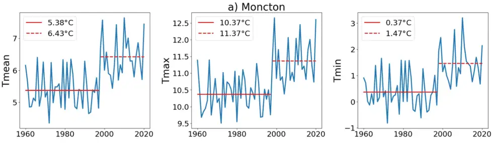
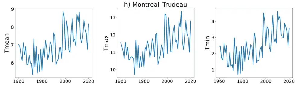
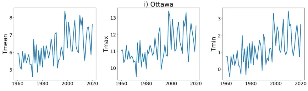
In 2021, Dr. Joseph Hickey, a data scientist with a PhD in Physics, specializing in complexity science, then an employee of the Bank of Canada, alerted ECCC to this one-degree jump in temperature data across much of Canada, and asked for an explanation. The below graphs of mean, maximum and minimum temperatures constructed with data from three Canadian cities—Moncton (on which Hickey illustrates the step change with red lines), Ottawa and Montreal—are samples of those created by Hickey using ECCC data downloaded on November 11, 2025, data that is the same as that he sent to ECCC researchers as an attachment to his email of June 24, 2021.
Ignoring their previous position about the need to remove such sudden discontinuities from the data, ECCC staff had little to say and left the anomaly in the record, asserting that it was “probably” a real sudden change in temperature.
Making matters worse, another Bank of Canada employee, economist Julien McDonald-Guimond, had already alerted ECCC by email on December 7, 2020, that he had found more than 10,000 instances of days for which the daily minimum temperature was greater than the daily maximum temperature. Again, ECCC staff had no reasonable justification.
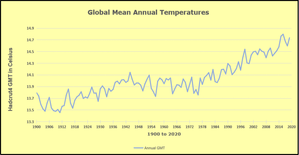
Dr. Hickey shows that, if you apply ECCC’s trend analysis method to their data, you find an increase of 1.74° C (which is statistically significant) from 1948 to 2018. And then, he tells us, if you correct for the one-degree step increase in 1998, you find only a 0.29°C rise. That small change “is indistinguishable from zero,” explains Hickey. “There is no evidence of warming.”
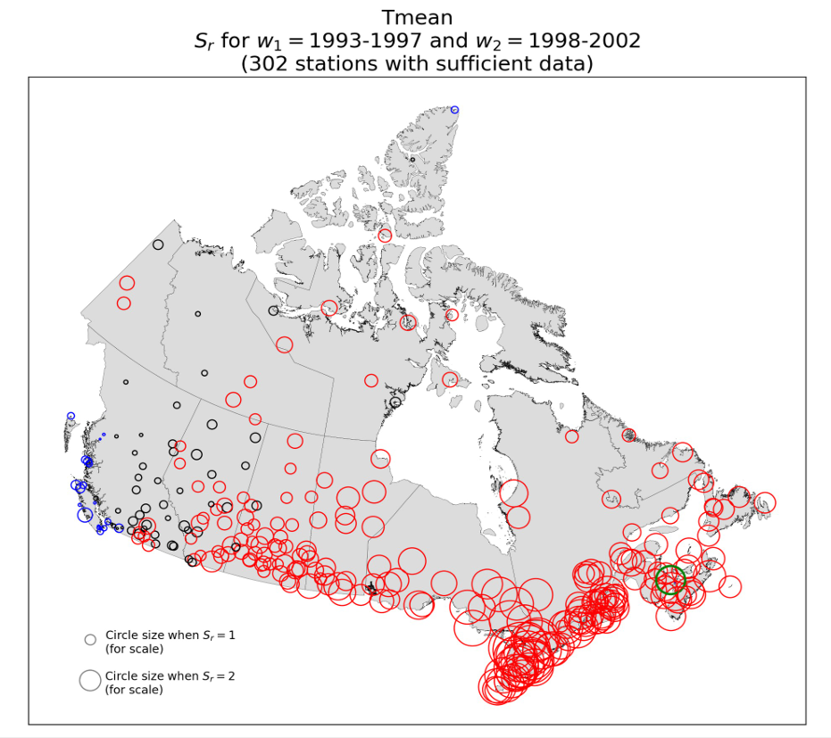
Figure 7: Map showing Sr calculated using Tmean, for the break year 1998 with two five-year windows (1993-1997 and 1998-2002) for the 302 3rd generation AHCCD stations with sufficient data. Circle radius is proportional to the absolute value of Sr. Circle colour indicates Sr ranges as follows: blue: Sr < 0; black: 0 ≤ Sr ≤ 1; red: Sr > 1. Moncton, NB (Sr = 2.74) is indicated with a green circle, for reference.
In Figure 7, AHCCD stations with Sr < 0 are coloured blue, while black indicates 0 ≤ Sr ≤ 1, and red indicates Sr > 1. The AHCCD records with the largest stepwise increases at 1998 are located in Eastern and Central Canada (including the stations listed in Table A), and there are many records with discernible steps at 1998 in the Prairies (provinces of Manitoba, Saskatchewan, and Alberta) and the north of the country. British Columbia remains the main outlier, with most ofits AHCCD stations having no discernible steps at 1998.
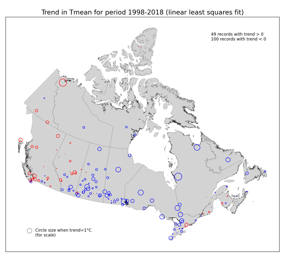
Figure 8: Map of trend in Tmean over the period 1998-2018, for the 3rd generation AHCCD stations with sufficient data, calculated using linear least-squares fitting. Circle radius is proportional to the absolute value of the trend. Blue circles correspond to negative trends (trend < 0) and red circles to positive trends (trend > 0).
In Figure 8, the trend for a particular Tmean record is equal to the slope (°C/year) from a linear least-squares fit to its data for 1998-2018, times 21 years. An AHCCD station was considered to have sufficient data if its record had at least 350 days of non-missing daily data per year for every year from 1998 2018. Approximately two thirds of the AHCCD records with sufficient data have negative trends for 1998-2018 using linear least-squares fitting.
Summation
This report demonstrates Environment Canada’s dismissive response to being alerted to a large, apparently non-climatic artifact in its flagship temperature time-series product, an artifact which could, on its own, be responsible for essentially all of the calculated warming for many Canadian locations over the past six or seven decades.
The said apparent artifact, referred to as the “1998 step-increase feature” in this report, is a stepwise increase of approximately 1°C in magnitude occurring at 1998 in the annual mean time-series of daily maximum, minimum, and mean temperatures for many stations across Canada in Environment Canada’s Adjusted and Homogenized Canadian Climate Data (AHCCD).
Canadian fearmongering about a “climate emergency” served only to empower a bureaucratic class intent on
controlling consumption and taxing lifestyles.
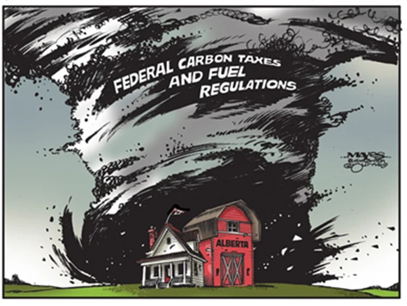
A recent memorandum of understanding between Canadian prime minister Mark Carney and Alberta premier Danielle Smith represents the inevitable reassertion of economic necessity over the fantasy of “decarbonization” that has gripped Ottawa for the past decade.
Allowing for the construction of a pipeline to transport Albertan oil to a Pacific export terminal, the agreement prompted the resignation of one liberal member of parliament and celebration from the province’s leader. “This is a great day for Alberta,” declared Smith.
Global Warming survey of Canadians, twisted and ignored by Trudeau Liberals.
Atlantic Canada, parts of Quebec, and even Ontario benefit from royalties and tax revenues generated by hydrocarbons extracted thousands of miles away. So-called moral objections to oil sands development are often voiced by inhabitants of Halifax or Montreal, but rarely heard is a willingness to forgo the western revenue that keeps hospitals open and public payrolls funded.
So, it was financial reality that drove Carney to upend expectations established by countless government documents, climate pledges, and regulatory frameworks the previous government put in place to “save the planet” by discouraging the use of fossil fuels.
Canada’s climate industrial complex had predicted that pipelines would become stranded assets and that Alberta would fade into irrelevance as net zero became federal policy. However, the deal signed by Carney moves in the opposite direction, making provisions for new infrastructure and signaling that even Canada’s most climate-obsessed federal leadership cannot govern without fossil fuels.
In technical terms, the federal cap on oil and gas emissions has been suspended. The Clean Electricity Regulation — a proposed constraint on Alberta’s ability to generate affordable power — has been loosened. Timelines for reducing methane emissions have been extended beyond 2030. Yes, there are caveats that appear to impose a soft form of anti-carbon sentiment, but the overall picture has changed.
The Canadian Broadcasting Corporation (CBC), a publicly funded institution, has consistently parroted environmental advocates who treat fossil fuels as abominations rather than economic necessities. This messaging has convinced many Canadians that their government is committing a terrible sin by producing energy the world demands. Lost on them is the fact that Canadian oil and natural gas are produced under far more stringent standards than exist in the Middle East, Russia, or other regions.
Energy abundance underpins prosperity. Nations that constrain their energy supply impoverish themselves. Nations that produce reliable, affordable energy benefit their populations and the broader world. Canada should produce the energy for itself and export the surplus to global markets.
Advertisement
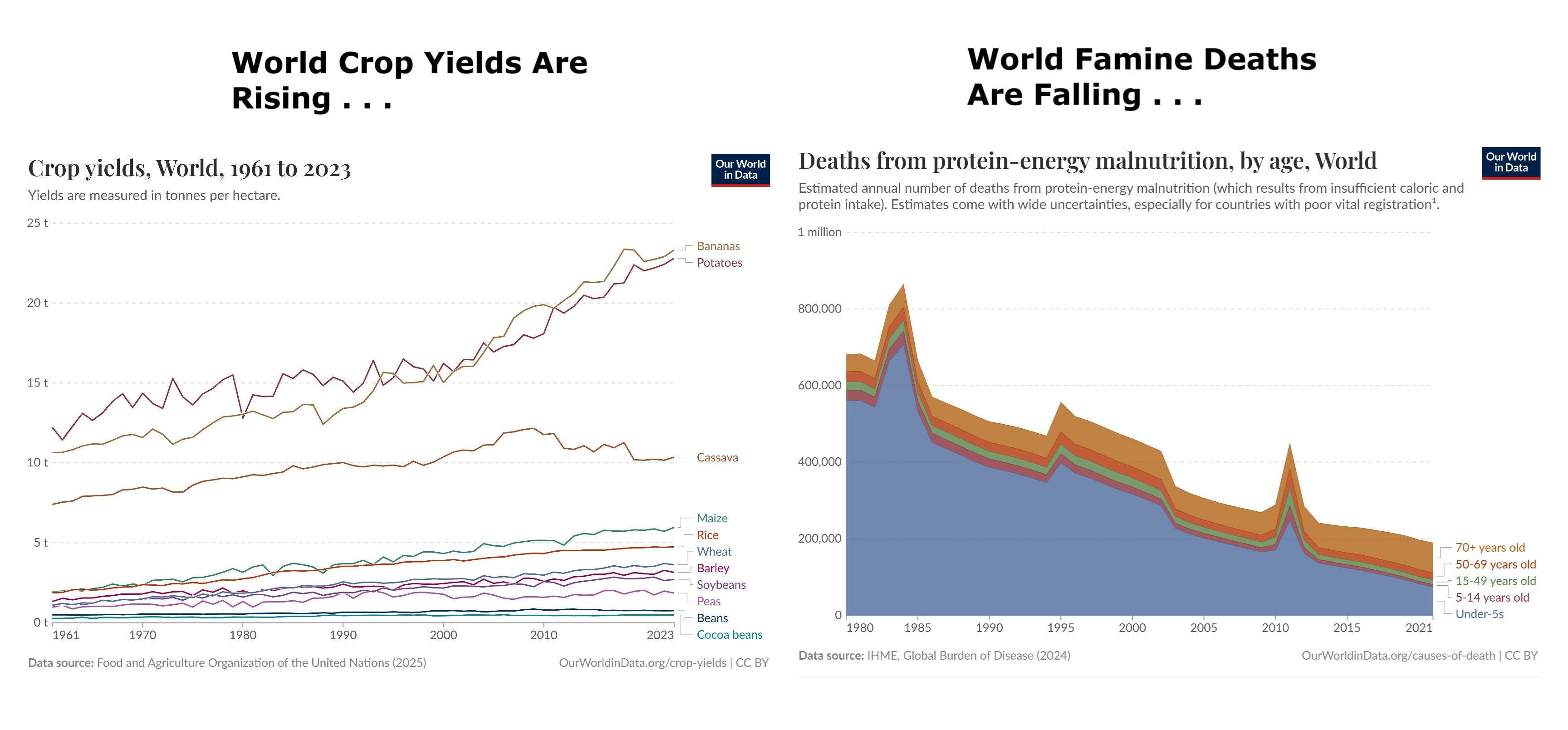
Beyond energy economics, there is another dimension to Canada’s economic future that the legacy climate orthodoxy dismisses: agriculture. Canada’s warming climate has extended growing seasons across the prairies and opened new agricultural possibilities.
According to official data, “total wheat production rose 11.2% year over year to a record 40 million (metric tons) in 2025, surpassing the previous record set in 2013.” Canola production rose 13%, surpassing a record set in 2017. Barley and oat production rose 19% and 17%, respectively.
In all, the output for all principal field crops increased by 4% year-over-year. For the next crop year (2025-2026), total production is projected to reach near record levels, up 3% year-over-year and 8% above the previous five-year average.
Historical analysis demonstrates that climate conditions across Canadian agricultural regions have shifted toward longer growing seasons, with more frost-free days and expanded viable crop zones.
Critics will claim that allowing a new pipeline is a betrayal of future generations. But what truly endangers posterity? A fraction of a degree of warming that extends growing seasons?Or a future of energy scarcity, deindustrialization, and economic stagnation?
Fearmongering about a “climate emergency” served only to empower a bureaucratic class intent on controlling consumption and taxing lifestyles. It did nothing to change atmospheric physics or the needs of people who rely on affordable energy to survive.
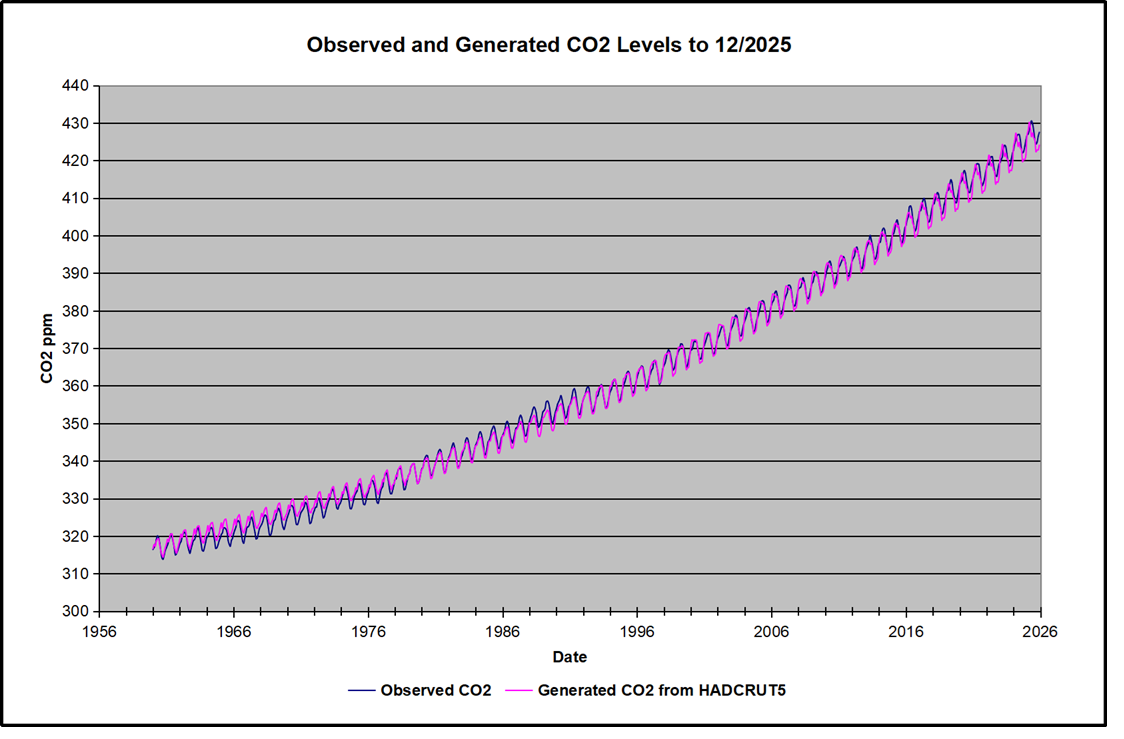
Previously I have demonstrated that temperature changes are predictive of changes in atmospheric CO2 concentrations. That includes the remarkable GMT spike starting in January 2023 and rising to a peak in April 2024, then dropping down to end of 2025. The most recent study was Yearend 2025, Cooling Temperatures Reducing CO2 Rise employing Mauna Loa CO2 data and UAH GMT data.
I noticed at WUWT my post was included in Weekly Climate and Energy News Roundup #674 with a comment attached: [SEPP Comment: The time period of the claimed lower CO2 rise is too short to be clear.] Now if that is referring to a table detailing the two variables during 2024 and 2025, I can understand it. But it also disregards the complete study covering UAH satellite temperature changes clearly leading Mauna Loa CO2 changes over a period of 45 years.
Along with some comments on my blog, I wondered whether the entire ML record of CO2 levels could be predicted from global temperature changes, which would require a GMT dataset covering 1959 to the present. This post shows that HADCRUT5 qualifies and indeed confirms other studies by researchers. I was particularly interested in the lack of warming in the 1960s and 70s, before the satellite temperature data became available.
The answer is yes: Just as temperature spikes result
in a corresponding CO2 spike as expected. Cooler temperatures are predictive of lower CO2 levels.
Above are HadCRUT5 temperature anomalies compared to CO2 monthly changes year over year during 65 years from 1959 to present.
Changes in monthly CO2 synchronize with temperature fluctuations, which for HadCRUT5 are anomalies referenced to the 1961-1990 period. CO2 differentials are calculated for the present month by subtracting the value for the same month in the previous year (for example December 2025 minus December 2024). Temp anomalies are calculated by comparing the present month with the baseline month. Note the recent CO2 upward spike and drop following the temperature spike and drop.
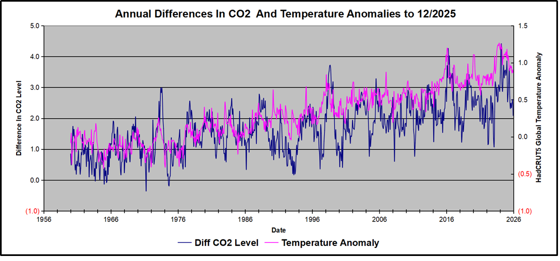
The final proof that CO2 follows temperature due to stimulation of natural CO2 reservoirs is demonstrated by the ability to calculate CO2 levels since 1959 with a simple mathematical formula:
For each subsequent year, the CO2 level for each month was generated
CO2 this month this year = a + b × Temp this month this year + CO2 this month last year
The values for a and b are constants applied to all monthly temps, and are chosen to scale the forecasted CO2 level for comparison with the observed value. The values for scaling HADCRUT5 and MLCO2 were “a” = 1.2 and “b” = 1.52 Here is the result of those calculations.
In the chart calculated CO2 levels correlate with observed CO2 levels at 0.9992 out of 1.0000. This mathematical generation of CO2 atmospheric levels is only possible if they are driven by temperature-dependent natural sources, and not by human emissions which are small in comparison, rise steadily and monotonically. For a more detailed look at the recent fluxes, here are the results since 2015, an ENSO neutral year.
For this recent period, the calculated CO2 values match well the annual lows, while some annual generated values of CO2 are slightly higher or lower than observed at other months of the year. Still the correlation for this period is 0.98
Footnote:
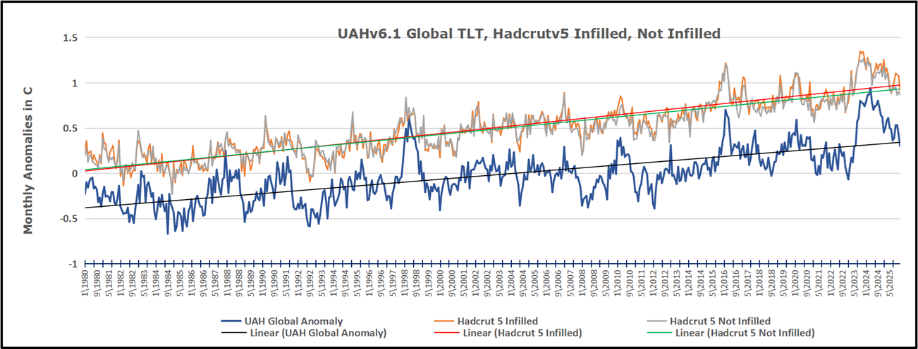
Hadcrut v5 offers a choice of two GMT data sets, one which infills grid cells lacking data and one which does not, compiling data only from cells with sufficient data. The analysis here shows data from Hadcrut 5 Not Filled In, though results from the Filled In dataset are virually the same with a slight upward bias. The overall lower anomalies in UAH are due to a later baseline, 1991 to 2020.
Key Point
Changes in CO2 follow changes in global temperatures on all time scales, from last month’s observations to ice core datasets spanning millennia. Since CO2 is the lagging variable, it cannot logically be the cause of temperature, the leading variable. It is folly to imagine that by reducing human emissions of CO2, we can change global temperatures, which are obviously driven by other factors.
The massive fluxes from natural sources dominate the flow of CO2 through the atmosphere. Human CO2 from burning fossil fuels is around 4% of the annual addition from all sources. Even if rising CO2 could cause rising temperatures (no evidence, only claims), reducing our emissions would have little impact.
For those who prefer reading, below is an excerpted transcript lightly edited from the interview, including my bolds and added images.
Hey everyone, it’s Andrew Klavan with this week’s interview with Bjorn Lomborg. I met Bjorn, he probably doesn’t remember this, but I met him many, many years ago at Andrew Breitbart’s house. Andrew brought Bjorn over to talk in LA and I listened to him talking about all the simple and inexpensive things that could be done to make actual change and do actual good in terms of climate change, which I think at that point was still global warming.
And you know, we had a small audience, and I asked the question, well, if these are so such smart, cheap ideas, why don’t politicians do them? And Bjorn said, well, because that wouldn’t give them the chance to display their virtue. And I thought, here’s a man who not only knows about science, but actually knows about human nature. And I’ve been following him ever since.
He is a president of the Copenhagen Consensus Center, a visiting fellow at Stanford University’s Hoover Institution, an author of False Alarm and Best Things First, the best writer, I think, on climate issues and other issues. Bjorn, it’s good to see you.
Andrew, it’s great to be here. And I do remember that event, although I remember it for seeing the guy who played on Airplane. Sorry. So I remember that because it was it’s still one of my favorite movies. It’s one of the greatest movies ever made, I think. It really is very, very funny. Yeah.
On a totally different direction. So I was watching with great approval Donald Trump’s appearance at the United Nations. I guess it would be when we’re playing this last week. And he he had this. I’m just going to read just a little bit of the speech. He said in the 1920s and the 1930s, they said global cooling will kill the world. We have to do something.Then they said global warming will kill the world. But then it started getting cooler. So now they could just call it climate change because that way they can’t miss if it goes higher or lower, whatever the hell happens. It’s climate change. It’s the greatest con job ever perpetrated on the world, in my opinion. Do you agree with that?
So I get where he’s coming from. And I think there’s some some truth to this. I mean, Donald Trump always speaks in larger than real life words. Yes. So it’s not a con job. There is a problem. And actually, in some sense, bizarrely, as it may sound, you know, the world is built all of our infrastructure is built to live at the temperature that we’ve had for the last hundred or two hundred years. That’s true in Los Angeles. That’s true in Boston. It’s true everywhere in the world. And so if it gets colder or if it gets warmer, that will be a problem. So there is an issue here.
But obviously, it’s vastly exaggerated when people then talk about the end of the world. You may remember that this was one of the favorite terms of Biden, but not just Biden, but pretty much everyone for the last four years and certainly more as well. That this is an existential crisis. There was a recent survey by the OECD, so in all rich countries in the world, where they found that percent of all peoplebelieve that unmitigated climate change, so climate change we don’t fix, will likely or very likely lead to the end of mankind. And that, of course, is a very different statement.
There is a problem, that’s true. It’s not the end of the world. But the end of the world is a great way to get funding.
And that’s why people are playing it out. But it doesn’t make for good policy. Remember, if you think the end of the world is near, you’re going to throw everything in the kitchen sink at this, which, of course, is what the campaigners would like you to do. But you will probably waste an incredible amount of resources because you’re just going to try everything.
Climate change is a problem. So I disagree with Trump there. But yes, there is an incredible amount of exaggeration. And I agree with him there. So there’s I mean, the climate changes but we’re not living in a glass bubble. And we’ve even in I don’t know, I guess it was the late 19th century, the Thames in London froze over and people went skating on it. It’s so there are these big changes and there have been ice ages, obviously. How much of this or do we know how much of this is is caused by human beings?
I have to preface this with saying I’m a social scientist, so I work a lot on the costs and the benefits of us doing policies against climate change. I’ve met with a lot of the natural scientists who study all this. Please don’t do this at home, but I’ve read the UN climate panel report, most of the pages, not all of them. And it’s incredibly boring, but it’s also very, very informative. So so I have a reasonably good take on this. And what they tell us is that the majority of the recent warming that we’ve seen is due to climate change.
I have no idea to evaluate that, no way of independently evaluating that is due to natural climate change or is manmade, due to mankind. So is it mostly due to us emitting CO from burning fossil fuels?
So there is a significant part of what’s changed over the last century or thereabouts, which is about two degrees Fahrenheit or one degree Celsius. So that’s something and that’s something we should look at. But also, we should get a sense of what’s the total impact of this. Well, actually, climate economics have spent the last three decades trying to estimate: what’s the total cost of everything that happens with climate change.
So, you know, there are lots of negatives. There’ll be more heat waves. There’ll possibly be stronger storms. There’s also going to be fewer cold waves, which is actually a good thing. There’s also going to be CO2 fertilization. So we’ll have more greenery. You know, if you add all the negatives and all the positives, it become a net negative. That’s why it’s a problem. But also get a sense of this.
If you look across all of the studies that we’ve done, we estimate the net negative impact today is about 0.3% of GDP. So yeah, a problem, not the end of the world. And it’s crucial to say, if you look out till 2100 which is sort of the standard time frame, which is a long time from now, we estimate if we do nothing more about climate change, so we end up with three degrees Celsius, so about degrees 5.6 Fahrenheit, then the cost will be about to 2 to 3% of global GDP every year.
That’s certainly not nothing. That’s a lot of trillions of dollars. But again, it’s 2 to 3%. It’s not, you know, the end of mankind, It’s not anywhere near a hundred percent. And this is not me saying this. This is the guy William Nordhaus from Yale university, the only guy to get the Nobel prize in climate economics. And Richard Tol one of the most quoted climate economists in the world. They’ve done separate studies. One to find 2%, the other one to find 3%. That’s the order of magnitude we’re talking about. And just for, for added emphasis, remember by then everyone in the world will be much, much better off.
Just like if you compared people from back in 1925 and until today, the UN on its standard trajectory estimate, the average person in the world by the end of the century will be somewhere around 450% as rich as he or she is today. That’s not the US that will. And you know, people come from Denmark and other rich countries might only be 200% as rich, but many in Africa and elsewhere will be a thousand percent richer. So on average, because of climate change, it will feel like they’re only 435% as rich, which sort of emphasizes, yes, that’s a problem. I would rather have a world that’s 450% as rich trather than one that’s 435%. But it’s not the end of the world.
It’s still a fantastically much better world, just a slightly less fantastically much better world. And that less money that people will have will mean less money you have to spend, what, shoring up buildings. And so the way they measure that is actually in equivalence of how much you would need to get compensated to live with the problems.
So we don’t actually look at whether people will fix it or not. You know, it’s a bit like, if you have a slightly dangerous job, you get more money. And that’s basically a way of saying, but you’ll also have to live with that constant slightly higher risk of dying. Right. So we’re compensating you for that. That’s the, that’s the amount that we’re talking about. So it’ll feel like you’re only % as rich, although you’ll probably in reality, get all that, that slight extra money to get up to 450%, but then you will also have to live with some problems from climate change.
This week I was arguing with a socialist, lovely guy, but just the guy who believes that like all money should be redistributed. And I was pointing out that this was giving a lot of power to the people in power. And one of the things I sent him was this article you wrote in the, in the New York Post, which was exactly the kind of article that makes me angry. And I mean, it makes me frustrated with our politics. I want to read just a couple of sentences. Last year, the world spent over $2 trillion on climate policies. This is Bjorn Lomberg writing in the New York Post. By 2050 net zero carbon emissions will cost an impossible $27 trillion every year. So this, this will choke growth, spike energy costs and hit the poor hardest and still will deliver only 17 cents back on every dollar spent. Meanwhile, mere billions of dollars could save millions of lives. I’d like to take this apart a little bit, but to begin with all the stuff that we are spending this money on, is it doing anything? Will it have any effect?
It will. I mean, what, what are we spending money on and what will it do? So these $2 trillion, that’s sort of the official number from the International Energy Agency and many others. It’s a very soft number because obviously what goes into all this money, surprisingly, it’s also all the cost into EVs or electric cars, which of course gives you a thing that can drive you from place A to B, at least if it’s been charged. So, I mean, there are some benefits to this. It’s also spending on solar panels and wind turbines, which again, obviously gives you electricity when the sun is shining and the wind is blowing. It actually also gives you higher electricity costs all the other times, because you now need to have backup power for when it’s not shining or windy, and that capital is being used less.
So there’s a lot of spending, it’s a very big headline number. There’s $2 trillion, everyone uses it, but it, but it’s not all that informative, because the global economy is about a hundred trillion dollars. It means we’re spending 2% on stuff that we probably wouldn’t have done had we not been scared witless on climate change. And that’s a waste. I mean, remember the total spend on healthcare is perhaps 8%. The total spend on education globally is about 5%.
These are big numbers. This is something that could have done a lot of good elsewhere. But I think the real point here is to say people want to take us to a cost that’s much, much, much higher. Remember all the world’s governments, almost all the world’s government now, not Donald Trump and the US, but most governments have pledged in one form or another that we’re going to go net zero around 2050 or shortly thereafter. But nobody looked at what the cost of this will be, which is a little surprising. Because the numbers I’m going to show you suggest that this one single promise is about a thousand times more expensive than the second costliest policy to which the world has ever committed, which was the Versailles treaty back in 1919, had Germany actually paid all the money it was supposed to. That cost was about half a trillion dollars in today’s money, which of course is why Germany never paid it. But now we’re talking about something that is going to be in the order of a thousand to two to 3000 times more costly.
Yet nobody’s looked at what the cost will be and what will be the benefits?
There’s no official estimate of this.
So two years ago, a professor from Yale university, Robert Mendelsohn, gathered a lot of really smart climate economists to try to estimate what’s the cost, and what’s the benefit of net zero. A lot of those really, really smart economists ended up chickening out. You can understand why it’s a really hard question. You’re also asking what will happen in the next hundred years and you’re trying to put estimates on it. At the end of the day, they published a big study published in the journal of climate change economics, which is a period article.
And they had one benefit estimate and three cost estimates. So this is obviously not great, but it’s the only thing the world has. And so that gives you a sense of how much will this cost and how much good will do. If you take the average of these three cost estimates, that gives you $27 trillion in cost per year throughout the 21st century. That’s where that number comes from. $27 trillion. So that’s about a quarter of global GDP right now, because we’re going to be much richer, that is only going to be about 7% of global GDP across the 21st century. But you know, that’s an enormous cost that’s on the magnitude of bigger than education, a bit smaller than healthcare and for everyone in the world, that’s a lot of money.
Now, if this gave you a lot of benefits that might be worthwhile. I mean, we pay a lot of money for stuff that’s good, but we’ve already established that even if we could entirely get rid of climate change, it would only reduce costs by two to 3%. So spending 7% to get rid of two to 3% is a bad deal, but unfortunately net zero by 2050 means we’ll only get rid of part of it, right? Because we’ll already have cost a lot of climate change. So the net benefit is only about 1% of GDP across the century or about four and a half trillion dollars.
So there’s a real benefit. That’s why climate change is real. There’s a real benefit to net zero, but the benefit is much, much lower than the cost. So $4.5 trillion in benefits, $27 trillion in cost every year in the 21st century, we’ll be paying much, much more than the benefits will generate for the world. That’s just a bad deal. There’s no other way to put it.
And the fact that we’re not honest about this and that most people just are not honest about it is one of the reasons why we’re wasting money and spending it so badly. The last bit of the quote that you just said was we could do so many other good things. Remember, most people in the world are not living in nice countries like the US or Denmark. Most people are not considering, you know, the biggest problem which of the many programs and series they want to follow are, am I going to take first or watch first? Or, you know, what kind of takeout am I going to have? They worry about their kids dying from easily curable infectious diseases, not having enough food, having terrible education, not enough jobs, corruption, all these other things. And the truth is we could solve many of these problems, not all of them, but many of them to save millions of lives at a fraction, a tiny, tiny fraction of this cost. So instead of talking trillions, we’re talking billions.
Why is it that we’re so obsessed with spending trillions to do almost no good a hundred years from now, instead of spending billions and doing a lot of good right now to avoid people dying from tuberculosis and malaria, avoid people having terrible education, getting better economies, all these things that we know work at much lower cost. That’s my central question to all these feel gooders. I mean, I know that they want to feel good about themselves, but in some sense, I would like to believe that they actually want to have done good at the end of the day.
I think it’s much more a question of saying, if I am doing effective policies, there’s not much money to hand out to friends and to buy more votes and all that kind of stuff. Whereas if I am overseeing, you know, an enormous amount of spending on stuff that doesn’t really matter. So I can just spend it on whatever. Then clearly I have a lot more latitude and a lot more opportunity to get people to like me and to show what a good person I am. So I think in some sense, it’s just plain politics. You know, if you’re saying the world is on fire and you’re at risk. But vote for me and I can save your kids. And it’s only going to cost you 7%. I can see, you know, why people want to vote for that. But if you’re saying, look, things are fine and just give me a little bit of money and I’ll fix the rest of the problems. It doesn’t quite have the same ring to it, does it?
So, so if, if we were to get to net zero, wouldn’t that cripple poor countries? I mean, in other words, it seems to me that people who burn the most fossil fuels are the people who are building up most and the people who are developing most. Whereas we’re sort of, we’ve sort of leveled off, haven’t we?
Yes. So the truth about the $27 trillion is that this is an optimistic estimate, sort of assuming that we’re going to be smart. But I don’t know what the climate future is going to look like. I don’t think anyone really knows, but we have a good sense that we’re good at, you know, innovating stuff. And we know how to get CO2 free energy. We can do it with nuclear. We also know we can get some from solar and wind. We’ll probably have more batteries. We’ll have lots of things. I think the world was sort of, you know, stumble through and we’ll be okay. But the point is we could have been much, much better off.
Does that affect your sense of politics at all? Oh, of course it does. And I’m disappointed that half the world would tend to dismiss a lot of this because these are inconvenient facts, With that said though I also talk about all the incredibly important things we could do in the poor part of the world. This is not true for most of the world, this is a very Western, kind of rich world situation where we have this very clear distinction between right and left. And, and a lot on the left, I think have sort of gone off on the deep end on some of these things.
For instance, on climate change, which has become this identifying totem, that they worship, and not in a smart way. Remember a lot of standard left-wing belief was about helping the downtrodden, which I perfectly agree with. And I think a lot of people would agree, we need to get poor people out of poverty. That’s a terrible situation and it destroys human dignity and liberty and all kinds of things. We should absolutely do something about that. But the truth is that’s where, you know, seven eighths of the world’s population is because they know poverty and they want to get out of it.
Although when you go to these events in New York and, and elsewhere, even politicians from Africa and elsewhere, they’ll of course say all the platitudes that come along with getting some funding from rich Western nations. But in the private cocktail conversations afterwards, you know, they don’t look at Germany and the UK and say: oh yes, deindustrialization and incredibly high energy costs, that’s what we want. No, they look at China because they want to get rich like China did.
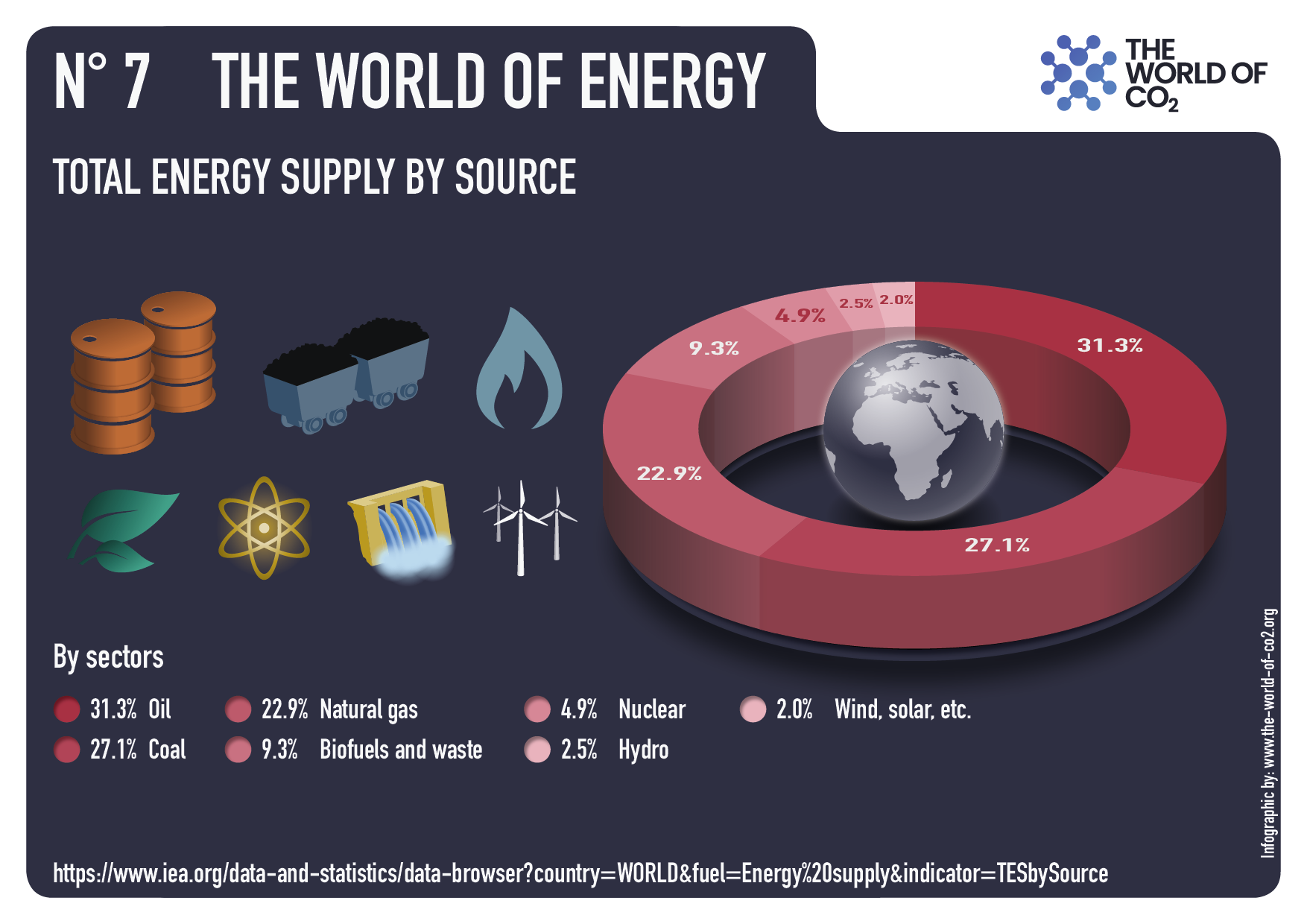
And China of course got rich famously by dramatically increasing its energy consumption through coal. At its lowest China’s energy from renewables was 7.5%, and now it’s up to about 11%. So people think, oh China is this green giant, but no it’s not. It gets the vast majority of its energy from coal. And not surprisingly, because that has been historically the cheap opportunity to drive your economy and development.
The best context for understanding decadal temperature changes comes from the world’s sea surface temperatures (SST), for several reasons:
The ocean covers 71% of the globe and drives average temperatures;
SSTs have a constant water content, (unlike air temperatures), so give a better reading of heat content variations;
A major El Nino was the dominant climate feature in recent years.
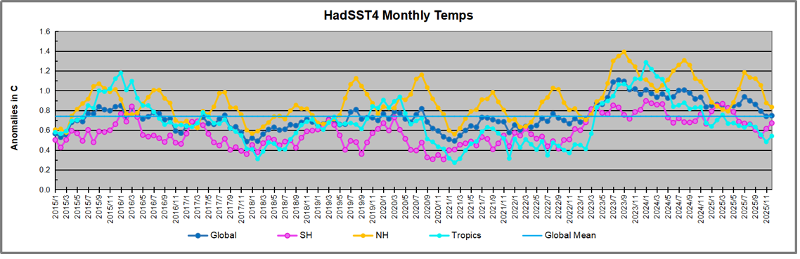
Previously I used HadSST3 for these reports, but Hadley Centre has made HadSST4 the priority, and v.3 will no longer be updated. I’ve grown weary of waiting each month for HadSST4 updates, so the July and August reports were based on data from OISST2.1. This dataset uses the same in situ sources as HadSST along with satellite indicators. Now however, the US government is shut down and updates to climate datasets are likely to be delayed. Reminds of what hospitals do when their budgets are slashed: They close the Maternity Ward to get public attention.
This December report is based again on HadSST 4, but with a twist. The data is slightly different in the new version, 4.2.0.0 replacing 4.1.1.0. Product page is here.
The Current Context
The chart below shows SST monthly anomalies as reported in HadSST 4.2 starting in 2015 through December 2025. A global cooling pattern is seen clearly in the Tropics since its peak in 2016, joined by NH and SH cycling downward since 2016, followed by rising temperatures in 2023 and 2024 and cooling in 2025.
Note that in 2015-2016 the Tropics and SH peaked in between two summer NH spikes. That pattern repeated in 2019-2020 with a lesser Tropics peak and SH bump, but with higher NH spikes. By end of 2020, cooler SSTs in all regions took the Global anomaly well below the mean for this period. A small warming was driven by NH summer peaks in 2021-22, but offset by cooling in SH and the tropics, By January 2023 the global anomaly was again below the mean.
Then in 2023-24 came an event resembling 2015-16 with a Tropical spike and two NH spikes alongside, all higher than 2015-16. There was also a coinciding rise in SH, and the Global anomaly was pulled up to 1.1°C in 2023, ~0.3° higher than the 2015 peak. Then NH started down autumn 2023, followed by Tropics and SH descending 2024 to the present. During 2 years of cooling in SH and the Tropics, the Global anomaly came back down, led by Tropics cooling from its 1.3°C peak 2024/01, down to 0.6C in September this year. Note the smaller peak in NH in July 2025 now declining along with SH and the Global anomaly cooler as well. In December the Global anomaly exactly matched the mean for this period, with all regions converging on that value, led by a 6 month drop in NH. Essentially, all the warming since 2015 is now gone.
Comment:
The climatists have seized on this unusual warming as proof their Zero Carbon agenda is needed, without addressing how impossible it would be for CO2 warming the air to raise ocean temperatures. It is the ocean that warms the air, not the other way around. Recently Steven Koonin had this to say about the phonomenon confirmed in the graph above:
El Nino is a phenomenon in the climate system that happens once every four or five years. Heat builds up in the equatorial Pacific to the west of Indonesia and so on. Then when enough of it builds up it surges across the Pacific and changes the currents and the winds. As it surges toward South America it was discovered and named in the 19th century It iswell understood at this point that the phenomenon has nothing to do with CO2.
Now people talk about changes in that phenomena as a result of CO2 but it’s there in the climate system already and when it happens it influences weather all over the world. We feel it when it gets rainier in Southern California for example. So for the last 3 years we have been in the opposite of an El Nino, a La Nina, part of the reason people think the West Coast has been in drought.
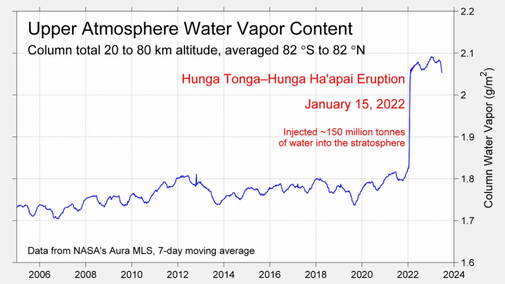
It has now shifted in the last months to an El Nino condition that warms the globe and is thought to contribute to this Spike we have seen. But there are other contributions as well. One of the most surprising ones is that back in January of 2022 an enormous underwater volcano went off in Tonga and it put up a lot of water vapor into the upper atmosphere. It increased the upper atmosphere of water vapor by about 10 percent, and that’s a warming effect, and it may be that is contributing to why the spike is so high.
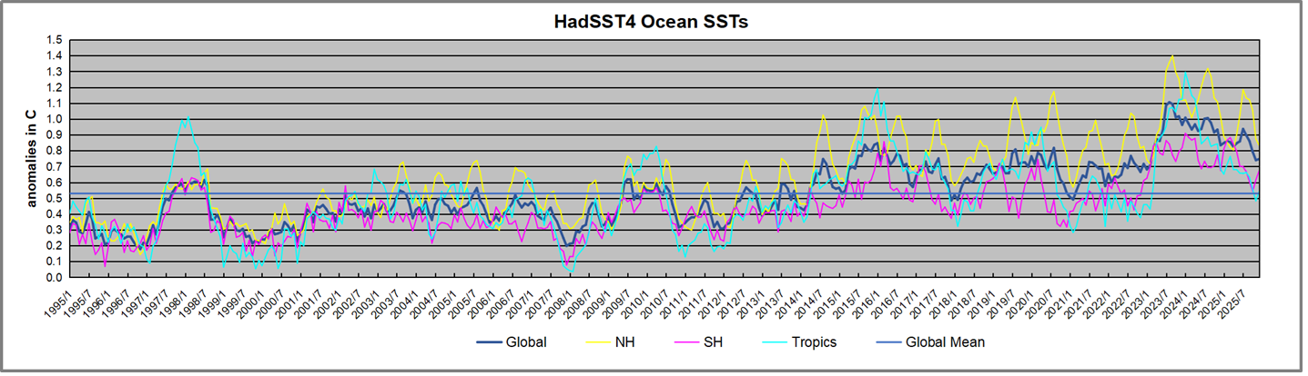
A longer view of SSTs
To enlarge, open image in new tab.
The graph above is noisy, but the density is needed to see the seasonal patterns in the oceanic fluctuations. Previous posts focused on the rise and fall of the last El Nino starting in 2015. This post adds a longer view, encompassing the significant 1998 El Nino and since. The color schemes are retained for Global, Tropics, NH and SH anomalies. Despite the longer time frame, I have kept the monthly data (rather than yearly averages) because of interesting shifts between January and July. 1995 is a reasonable (ENSO neutral) starting point prior to the first El Nino.
The sharp Tropical rise peaking in 1998 is dominant in the record, starting Jan. ’97 to pull up SSTs uniformly before returning to the same level Jan. ’99. There were strong cool periods before and after the 1998 El Nino event. Then SSTs in all regions returned to the mean in 2001-2.
SSTS fluctuate around the mean until 2007, when another, smaller ENSO event occurs. There is cooling 2007-8, a lower peak warming in 2009-10, following by cooling in 2011-12. Again SSTs are average 2013-14.
Now a different pattern appears. The Tropics cooled sharply to Jan 11, then rise steadily for 4 years to Jan 15, at which point the most recent major El Nino takes off. But this time in contrast to ’97-’99, the Northern Hemisphere produces peaks every summer pulling up the Global average. In fact, these NH peaks appear every July starting in 2003, growing stronger to produce 3 massive highs in 2014, 15 and 16. NH July 2017 was only slightly lower, and a fifth NH peak still lower in Sept. 2018.
The highest summer NH peaks came in 2019 and 2020, only this time the Tropics and SH were offsetting rather adding to the warming. (Note: these are high anomalies on top of the highest absolute temps in the NH.) Since 2014 SH has played a moderating role, offsetting the NH warming pulses. After September 2020 temps dropped off down until February 2021. In 2021-22 there were again summer NH spikes, but in 2022 moderated first by cooling Tropics and SH SSTs, then in October to January 2023 by deeper cooling in NH and Tropics.
Then in 2023 the Tropics flipped from below to well above average, while NH produced a summer peak extending into September higher than any previous year. Despite El Nino driving the Tropics January 2024 anomaly higher than 1998 and 2016 peaks, following months cooled in all regions, and the Tropics continued cooling in April, May and June along with SH dropping. After July and August NH warming again pulled the global anomaly higher, September through January 2025 resumed cooling in all regions, continuing February through April 2025, with little change in May,June and July despite upward bumps in NH. Now temps in all regions have cooled led by NH from August through December 2025.
What to make of all this? The patterns suggest that in addition to El Ninos in the Pacific driving the Tropic SSTs, something else is going on in the NH. The obvious culprit is the North Atlantic, since I have seen this sort of pulsing before. After reading some papers by David Dilley, I confirmed his observation of Atlantic pulses into the Arctic every 8 to 10 years.
Contemporary AMO Observations
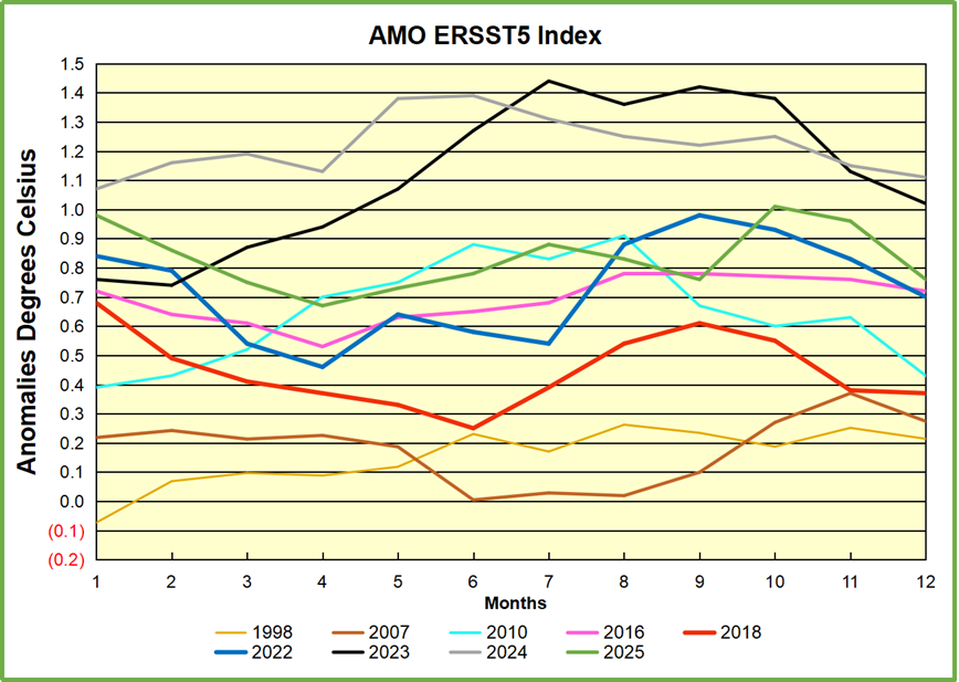
Through January 2023 I depended on the Kaplan AMO Index (not smoothed, not detrended) for N. Atlantic observations. But it is no longer being updated, and NOAA says they don’t know its future. So I find that ERSSTv5 AMO dataset has current data. It differs from Kaplan, which reported average absolute temps measured in N. Atlantic. “ERSST5 AMO follows Trenberth and Shea (2006) proposal to use the NA region EQ-60°N, 0°-80°W and subtract the global rise of SST 60°S-60°N to obtain a measure of the internal variability, arguing that the effect of external forcing on the North Atlantic should be similar to the effect on the other oceans.” So the values represent SST anomaly differences between the N. Atlantic and the Global ocean.
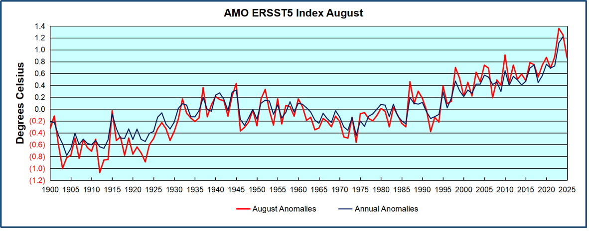
The chart above confirms what Kaplan also showed. As August is the hottest month for the N. Atlantic, its variability, high and low, drives the annual results for this basin. Note also the peaks in 2010, lows after 2014, and a rise in 2021. Then in 2023 the peak reached 1.4C before declining to 0.9 last month. An annual chart below is informative:
Note the difference between blue/green years, beige/brown, and purple/red years. 2010, 2021, 2022 all peaked strongly in August or September. 1998 and 2007 were mildly warm. 2016 and 2018 were matching or cooler than the global average. 2023 started out slightly warm, then rose steadily to an extraordinary peak in July. August to October were only slightly lower, but by December cooled by ~0.4C.
Then in 2024 the AMO anomaly started higher than any previous year, then leveled off for two months declining slightly into April. Remarkably, May showed an upward leap putting this on a higher track than 2023, and rising slightly higher in June. In July, August and September 2024 the anomaly declined, and despite a small rise in October, ended close to where it began. Note 2025 started much lower than the previous year and headed sharply downward, well below the previous two years, then since April through September aligning with 2010. In October there was an unusual upward spike, now reversed down to match September 2025.
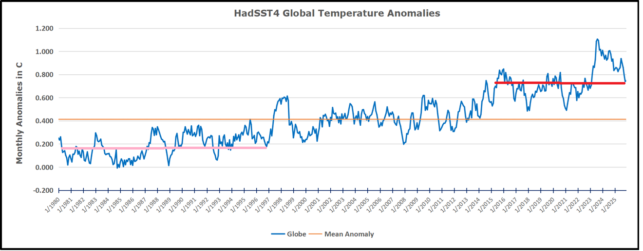
The pattern suggests the ocean may be demonstrating a stairstep pattern like that we have also seen in HadCRUT4.
The rose line is the average anomaly 1982-1996 inclusive, value 0.18. The orange line the average 1982-2025, value 0.41 also for the period 1997-2012. The red line is 2015-2025, value 0.74. As noted above, these rising stages are driven by the combined warming in the Tropics and NH, including both Pacific and Atlantic basins.
The oceans are driving the warming this century. SSTs took a step up with the 1998 El Nino and have stayed there with help from the North Atlantic, and more recently the Pacific northern “Blob.” The ocean surfaces are releasing a lot of energy, warming the air, but eventually will have a cooling effect. The decline after 1937 was rapid by comparison, so one wonders: How long can the oceans keep this up? And is the sun adding forcing to this process?
USS Pearl Harbor deploys Global Drifter Buoys in Pacific Ocean
The agreement in question is the United Nations Framework Convention on Climate Change, or UNFCCC, which the US joined and Congress ratified in 1992, when George H.W. Bush was in the White House. The agreement does not require the US to cut fossil fuels or pollution, but rather sets a goal of stabilizing the amount of climate pollution in the atmosphere at a level that would “prevent dangerous anthropogenic (human-caused) interference with the climate system.”
It also set up a process for negotiations between countries that have come to be known as the annual UN climate summits. It was under the UNFCCC’s auspices that the Kyoto Protocol was negotiated in 1995, and the Paris Agreement in 2015 — two monumental moments of global cooperation and progress toward limiting harmful climate pollution.
In addition, the agreement requires the submission of an annual national climate pollution inventory, which the Trump administration notably skipped this year.
President Trump withdrew the US from the Paris Agreement for a second time on his first day in office. With Wednesday’s move,the US will now become the first country to withdraw from the climate treaty, since virtually every country is a member, according to the Natural Resources Defense Council, an environmental group.
Because the Senate ratified the UNFCCC in 1992, it is a legal gray area as to whether President Donald Trump can unilaterally pull the country out of it. However, if Congress plays a role, the Republican majority would presumably back the move.
If successful, the withdrawal would prevent the US from officially participating in subsequent annual climate summits and could call into question the country’s commitment to other longstanding agreements to which it is a party. It may also prompt other nations to reevaluate their commitments to the UNFCCC and UN climate talks, risking not just US climate progress but that of others.
A US withdrawal could make it difficult for a future president to rejoin the Paris Agreement, since that agreement was struck under the auspices of the UNFCCC.
Trump also moved to withdraw the US from the UN Intergovernmental Panel on Climate Change, or IPCC — a Nobel Prize-winning group that publishes reports on global warming. While the president likely can’t bar US scientists from participating in IPCC reports, the move could have ramifications for federal scientists who would otherwise contribute. A White House fact sheet stated:
“Many of these bodies promote radical climate policies, global governance, and
ideological programs that conflict with U.S. sovereignty and economic strength.”
So, it’s a trifeca: UNFCC, IPCC, and Paris Accord
“The Paris Parrot is not dead, it’s just resting.”


 The system is under strain even without electrification


 Beyond energy economics, there is another dimension to Canada’s economic future that the legacy climate orthodoxy dismisses: agriculture. Canada’s warming climate has extended growing seasons across the prairies and opened new agricultural possibilities.
 a
a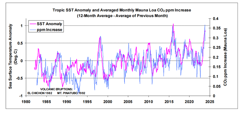 Recently another researcher, Bernard Robbins, found similar causation between ML CO2 and SST fluctuations reported by NOAA Global SST dataset.
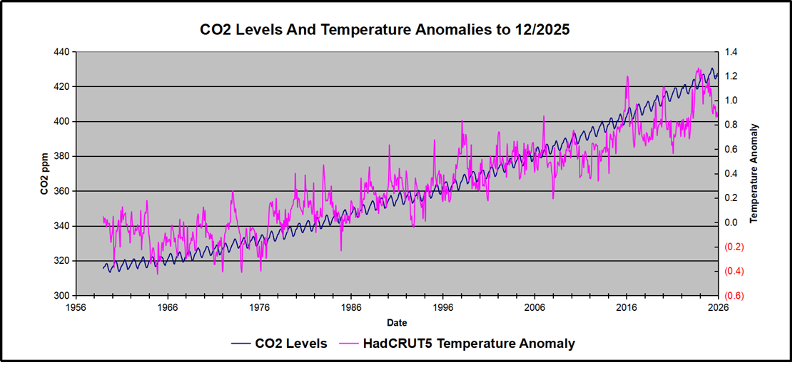


 The best context for understanding decadal temperature changes comes from the world’s sea surface temperatures (SST), for several reasons: