Here Comes the Rain Again

In climate discussions, someone is bound to say: Climate is a lot more than temperatures. And of course, they are right. So let’s consider the other major determinant of climate, precipitation.

The global story on rain is straightforward:

“Precipitation is a major component of the water cycle, and is responsible for depositing the fresh water on the planet. Approximately 505,000 cubic kilometres (121,000 cu mi) of water falls as precipitation each year; 398,000 cubic kilometres (95,000 cu mi) of it over the oceans. Given the Earth’s surface area, that means the globally averaged annual precipitation is 990 millimetres (39 in). Climate classification systems such as the Köppen climate classification system use average annual rainfall to help differentiate between differing climate regimes.

http://en.wikipedia.org/wiki/Precipitation_(meteorology)

Globally, average precipitation can vary from +/-5% yearly, but there is no particular trend in the history of observations. But rain is one of those things where averages don’t tell you much. For starters, look at where it’s coming down:

So about 1 meter a year is the nominal average of all rain over all surfaces. Some places get up to 10 meters of rain (about 400 inches ) and others get near none. 47% of the earth is considered dryland, defined as anyplace where the rate of evaporation/transpiration exceeds the rate of precipitation. A desert is defined as a dryland with less than 25 cm of precipitation. In the image above, polar deserts are remarkably defined. It just does not have much hope of precipitation as there is little heat to move the water. More heat in, more water movement. Less heat in, less water movement.

Then there’s the seasonal patterns. The band of maximum rains moves with the sun: More north in June, more south in December. More sun, more heating, more rain. Movement in sync with the sun, little time delay. Equatorial max solar heat has max rains. Polar zones minimal heating, minimal precipitation. It’s a very tightly coupled system with low time lags.

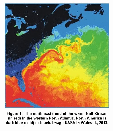
The other obvious thing is how central land areas get dry desert conditions if they are not in the equatorial band nor near a warm water current. Brazil, in particular, benefits from warm coastal waters and near equatorial rains. The Gulf Stream rescues Europe from a much drier climate, but I fear the Gulf Stream shifting of zones also puts parts of Saharan Africa out of the equatorial wet. (In some times during history it DOES get a load of water, though…)
From E.M. Smith
https://chiefio.wordpress.com/2011/11/01/what-does-precipitation-say-about-heat-flow/

How do Oceans Make Rain

Here I am taking direction from A. M Makarieva and her colleagues. She explains:

“Water vapor originating by evaporation sustained by solar radiation represents a source of ordered potential energy that is available for generation of atmospheric circulation, including the biotic pump. We will further consider details of this process.

As we can see, early in its life the cloud expands in all directions, meanwhile the air continues to converge towards the (growing) condensation area. This process is at the core of condensation-induced dynamics: as condensation occurs and local pressure drops, this initiates convergence and ascent. They, in their turn, feedback positively on condensation intensity, such that the air pressure lowers further, convergence becomes more extensive and so on — as long as there is enough water vapor around to feed the process.

And where does the water vapor come from? Ocean evaporation, 87%, Plant transpiration 10% , Other evaporation, lakes, rivers, etc. 3%.

Air circulation without condensation (A) and with condensation (B). Gray squares are the air volumes, which in case (B) contain water vapor shown by small blue squares inside gray ones. White squares indicate those air volumes that have lost their water vapor owing to condensation. Blue arrows at the Earth’s surface represent evaporation that replenishes the store of water vapor in the circulating air.

On Fig. B we can see a circulation accompanied by water vapor condensation (water vapor is shown by blue squares). At a certain height water vapor condenses leaving the gaseous phase, while the remaining air continues to circulate deprived of water vapor (this depletion is shown by empty white squares): it first rises and then descends. As one can see, in such a circulation total mass of the rising air would be larger than total mass of the descending air (cf. an escalator transporting people up). The motor driving such a circulation would not only have to compensate the friction losses, but also have to work against gravity that is acting on the ascending air.

One can see from Fig. B that the difference between the cumulative masses of the ascending and descending air parcels grows with increasing height where condensation occurs. This difference also grows with increasing amount of water vapor in the air (i.e. with increasing size of the blue squares). The dynamic power of condensation, on the other hand, is also proportional to the amount of water vapor, but it is practically independent of condensation height.

Condensation height (a proxy for precipitation pathlength) grows with increasing temperature of the Earth’s surface. It is shown in the paper that power losses associated with precipitation of condensate particles become equal to the total dynamic power of condensation at surface temperatures around 50 degrees Celsius. Since the observed power of condensation-driven winds is equal to the total dynamic power of condensation (the “motor”) minus the power spent on compensating precipitation, at such temperatures the observed circulation power becomes zero and the circulation must stop. For commonly observed values of surface temperature these losses do no exceed 40% of condensation power and cannot arrest the condensation-induced circulation. Over 60% of condensation power is spent on friction at the Earth’s surface.

Why Some Places Get More Rain Than Others

This figure shows the “tug-of-war” between the forest and the ocean for the right to become a predominant condensation zone. In Fig. a: on average the Amazon and Congo forests win this war: annual precipitation over forests is two to three times larger than the precipitation over the Atlantic Ocean at the same latitude. Note the logarithmic scale on the vertical axis: “1” means that the land/ocean precipitation ratio is equal to e = 2.718, “2” means it is equal to e2 ≈ 7.4; “0” means that this ratio is unity (equal precipitation on land and the ocean); “-1” means this ratio is 1/e ≈ 0.4; and so on.

In Fig. b: the Eurasian biotic pump. In winter the forest sleeps, so the ocean wins, and all moisture remains over the ocean and precipitates there. In summer, when trees are active, moisture is taken from the ocean and distributed regularly over seven thousand kilometers. The forest wins! (compare the red and black lines) As a result, precipitation over the ocean in summer is lower than it is in winter, despite the temperature in summer is higher.

Finally, in panel (c): an unforested Australia. One can often hear that Australia is so dry because it is situated in the descending branch of the Hadley cell. But this figure shows that such an interpretation does not hold. Both in wet and dry seasons precipitation over Australia is four to six times lower than over the ocean. There is no biotic pump there. Being unforested, oceanic moisture cannot penetrate to the Australian continent irrespective of how much moisture there is over the ocean; during the wet season it precipitates in the coastal zones causing floods. Gradually restoring natural forests in Australia from coast to interior will recover the hydrological cycle on the continent.

http://www.bioticregulation.ru/pump/pump9.php

biotic pump

The Biotic Pump A. M Makarieva et al

Water cycle on land owes itself to the atmospheric moisture transport from the ocean. Properties of the aerial rivers that ensure the “run-in” of water vapor inland to compensate for the gravitational “run-off” of liquid water from land to the ocean are of direct relevance for the regional water availability. The biotic pump concept clarifies why the moist aerial rivers flow readily from ocean to land when the latter gives home to a large forest — and why they are reluctant to do so when the forest is absent.

While it is increasingly common to blame global change for any regional water cycle disruption, the biotic pump evidence suggests that the burden of responsibility rather rests with the regional land use practices. On large areas on both sides of the Atlantic Ocean, temperate and boreal forests are intensely harvested for timber and biofuel. These forests are artificially maintained in the early successional stages and are never allowed to recover to the natural climax state. The water regulation potential of such forests is low, while their susceptibility to fires and pests is high.

https://2s3c.wordpress.com/2012/04/22/taac/

Conclusion

So the oceans make rain, and together with the forests the land receives its necessary fresh water. There is a threat from human activity, but it has nothing to do with CO2. Land use practices leading to deforestation have the potential to disrupt this process. Without trees attracting the moist air from the ocean there is desert.

Ironically, modern societies burn fossil fuels instead of burning the forests as in the past.

Temperature Data Review Project–My Submission

An International Temperature Data Review Project has been announced, along with a call for analyses of surface temperature records to be submitted. The project is described here: http://www.tempdatareview.org/

Below is my submission.

Update April 27:  Notice was received today that this submission has gone to the Panel.

Overview

I did a study of 2013 records from the CRN top rated US surface stations. It was published Aug. 20, 2014 at No Tricks Zone. Most remarkable about these records is the extensive local climate diversity that appears when station sites are relatively free of urban heat sources. 35% (8 of 23) of the stations reported cooling over the century. Indeed, if we remove the 8 warmest records, the average rate flips from +0.16°C to -0.14°C. In order to respect the intrinsic quality of temperatures, I calculated monthly slopes for each station, and averaged them for station trends.

Recently I updated that study with 2014 data and compared adjusted to unadjusted records. The analysis shows the effect of GHCN adjustments on each of the 23 stations in the sample. The average station was warmed by +0.58 C/Century, from +.18 to +.76, comparing adjusted to unadjusted records. 19 station records were warmed, 6 of them by more than +1 C/century. 4 stations were cooled, most of the total cooling coming at one station, Tallahassee. So for this set of stations, the chance of adjustments producing warming is 19/23 or 83%.

Adjustments Multiply Warming at US CRN1 Stations

A study of US CRN1 stations, top-rated for their siting quality, shows that GHCN adjusted data produces warming trends several times larger than unadjusted data.

The unadjusted files from ghcn.v3.qcu have been scrutinized for outlier values, and for step changes indicative of non-climatic biases. In no case was the normal variability pattern interrupted by step changes. Coverages were strong, the typical history exceeding 95%, and some achieved 100%.(Measured by the % of months with a reported Tavg value out of the total months in the station’s lifetime.)

The adjusted files are another story. Typically, years of data are deleted, often several years in a row. Entire rows are erased including the year identifier, so finding the missing years is a tedious manual process looking for gaps in the sequence of years. All stations except one lost years of data through adjustments, often in recent years. At one station, four years of data from 2007 to 2010 were deleted; in another case, 5 years of data from 2002 to 2006 went missing. Strikingly, 9 stations that show no 2014 data in the adjusted file have fully reported 2014 in the unadjusted file.

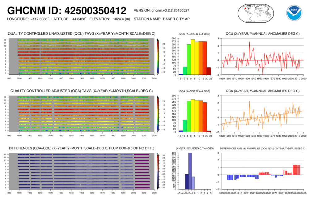
It is instructive to see the effect of adjustments upon individual stations. A prime example is 350412 Baker City, Oregon.

Over 125 years GHCN v.3 unadjusted shows a trend of -0.0051 C/century. The adjusted data shows +1.48C/century. How does the difference arise? The coverage is about the same, though 7 years of data are dropped in the adjusted file. However, the values are systematically lowered in the adjusted version: Average annual temperature is +6C +/-2C for the adjusted file; +9.4C +/-1.7C unadjusted.

Baker City GHCHM NOAA

How then is a warming trend produced? In the distant past, prior to 1911, adjusted temperatures decade by decade are cooler by more than -2C each month. That adjustment changes to -1.8C 1912-1935, then changes to -2.2 for 1936 to 1943. The rate ranges from -1.2 to -1.5C 1944-1988, then changes to -1C. From 2002 onward, adjusted values are more than 1C higher than the unadjusted record.

Some apologists for the adjustments have stated that cooling is done as much as warming. Here it is demonstrated that by cooling selectively in the past, a warming trend can be created, even though the adjusted record ends up cooler on average over the 20th Century.

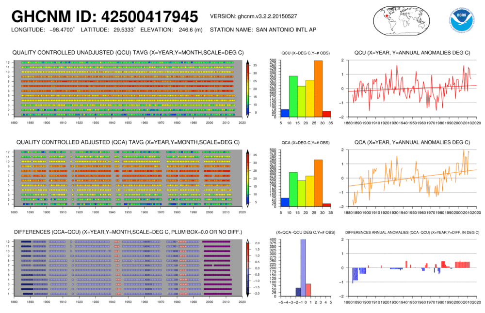
San Antonio GHCHM NOAA

A different kind of example is provided by 417945 San Antonio, Texas. Here the unadjusted record had a complete 100% coverage, and the adjustments deleted 262 months of data, reducing the coverage to 83%. In addition, the past was cooled, adjustments ranging from -1.2C per month in 1885 gradually coming to -0.2C by 1970. These cooling adjustments were minor, only reducing the average annual temperature by 0.16C. Temperatures since 1997 were increased by about 0.5C each year.  Due to deleted years of data along with recent increases, San Antonio went from an unadjusted trend of +0.30C/century to an adjusted trend of +0.92C/century, tripling the warming at that location.

The overall comparison for the set of CRN1 stations:

Area FIRST CLASS US STATIONS
History 1874 to 2014
Stations 23
Dataset Unadjusted Adjusted
Average Trend 0.18 0.76 °C/Century
Std. Deviation 0.66 0.54 °C/Century
Max Trend 1.18 1.91 °C/Century
Min Trend -2.00 -0.48 °C/Century
Ave. Length 119 Years

These stations are sited away from urban heat sources, and the unadjusted records reveal a diversity of local climates, as shown by the deviation and contrasting Max and Min results. Seven stations showed negative trends over their lifetimes through 2014.

Adjusted data reduces the diversity and shifts the results toward warming. The average trend is 4 times warmer, only 2 stations show any cooling, and at smaller rates. Many stations had warming rates increased by multiples from the unadjusted rates. Whereas 4 months had negative trends in the unadjusted dataset, no months show cooling after adjustments.
Periodic Rates from US CRN1 Stations

°C/Century °C/Century
Start End Unadjusted Adjusted
1915 1944 1.22 1.51
1944 1976 -1.48 -0.92
1976 1998 3.12 4.35
1998 2014 -1.67 -1.84
1915 2014 0.005 0.68

Looking at periodic trends within the series, it is clear that adjustments at these stations increased the trend over the last 100 years from flat to +0.68 C/Century. This was achieved by reducing the cooling mid-century and accelerating the warming prior to 1998.

Methodology

Surfacestations.org provides a list of 23 stations that have the CRN#1 Rating for the quality of the sites. I obtained the records from the latest GHCNv3 monthly qcu report, did my own data quality review and built a Temperature Trend Analysis workbook. I made a companion workbook using the GHCNv3 qca report. Both datasets are available here:
ftp://ftp.ncdc.noaa.gov/pub/data/ghcn/v3/

As it happens, the stations are spread out across the continental US (CONUS): NW: Oregon, North Dakota, Montana; SW: California, Nevada, Colorado, Texas; MW: Indiana, Missouri, Arkansas, Louisiana; NE: New York, Rhode Island, Pennsylvania; SE: Georgia, Alabama, Mississippi, Florida.

The method involves creating for each station a spreadsheet with monthly average temperatures imported into a 2D array, a row for each year, a column for each month. The sheet calculates a trend for each month for all of the years recorded at that station. Then the monthly trends are averaged together for a lifetime trend for that station. To be comparable to others, the station trend is presented as degrees per 100 years. A summary sheet collects all the trends from all the sheets to provide trend analysis for the set of stations and the geographical area of interest. Thus the temperatures themselves are not compared, but rather the change derivative expressed as a slope.

I have built Excel workbooks to do this analysis, and have attached two workbooks: USHCN1 Adjusted and Unadjusted.

Conclusion

These 23 US stations comprise a random sample for studying the effects of adjustments upon historical records. Included are all USHCN stations inspected by surfacestations.org that, in their judgment, met the CRN standard for #1 rating. The sample was formed on a physical criterion, siting quality, independent of the content of the temperature records. The only bias in the selection is the expectation that the measured temperatures should be uncontaminated by urban heat sources.

It is startling to see how distorted and degraded are the adjusted records compared to the records submitted by weather authorities. No theory is offered here as to how or why this has happened, only to disclose the records themselves and make the comparisons.

In conclusion, it is not only a matter of concern that individual station histories are altered by adjustments. But also the adjusted dataset is the one used as input into programs computing global anomalies and averages. This much diminished dataset does not inspire confidence in the temperature reconstruction products built upon it.

Thank you for undertaking this project. Hopefully my analyses are useful in your work.

Sincerely, Ron Clutz

US CRN1 Unadjusted TTA2 2014       US CRN1 Adjusted TTA 2014

On Climate Theories–Response to David A.

David, thanks for elaborating on your thinking and questions on this topic. There is much uncertain and unknown about the functioning of our climate system. I listen when a seasoned expert such as John Christy says:

“The reason there is so much contention regarding “global warming” is relatively simple to understand: In climate change science we basically cannot prove anything about how the climate will change as a result of adding extra greenhouse gases to the atmosphere.

So we are left to argue about unprovable claims.”
http://www.centredaily.com/2014/03/20/4093680/john-r-christy-climate-science.html

So everyone is theorizing and wondering if and when the best theory will win–that is, become the new conventional wisdom. According to Christy, the science is far from settled, and he has examined the datasets extensively, having built some of them himself.

I have also learned a lot from Nullius in Verba, who is one of best explaining these things to us laymen. For example, he comments:

“It would be slightly more accurate to say that the lapse rate is the vertical temperature gradient at which convection switches off and therefore stops cooling the surface.

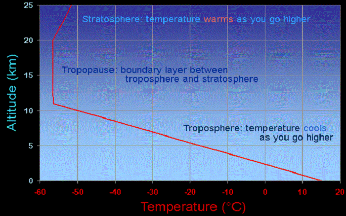
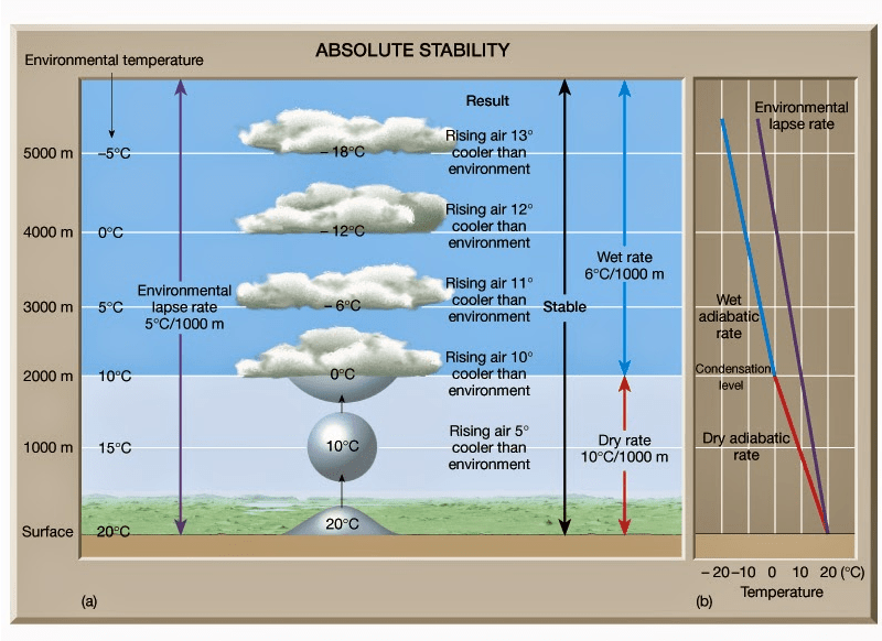
The sun warms the surface, but the heat escapes very quickly by convection so the build-up of heat near the surface is limited. In an incompressible atmosphere, it would *all* escape, and you’d get no surface warming. But because air is compressible, and because gases warm up when they’re compressed and cool down when allowed to expand, air circulating vertically by convection will warm and cool at a certain rate due to the changing atmospheric pressure. Air cools as it rises and expands, and warms as it descends and is compressed. This warming/cooling effect means that hot air no longer rises when it would cool faster from expansion than the surrounding air. Cold air can sit on top of warm air and be stable. The adiabatic lapse rate is why the tops of mountains are colder than their bottoms.

It’s a bit like the way a pot of boiling water sticks at a temperature of 100 C. If you turn the gas up, the water boils more vigorously, carrying more energy off as steam, which balances the extra energy supplied and keeps the temperature still at exactly 100 C. The rate at which heat escapes is very non-linear – extremely fast for temperatures above the threshold, extremely slow for temperatures below it. So long as the system is driven hard enough, it will get driven up against the non-linear limit and held there. The lapse rate does the same thing, except that instead of fixing the temperature, it fixes its gradient so you get a rigid slope that can freely float up and down in level.

The temperature at the average altitude of emission to space converges on the temperature that radiates the same energy the Earth absorbs. All levels above and below it are held in a fixed relationship to it by the lapse rate. The temperature at any other level is the temperature at the emission altitude plus the lapse rate times the difference in heights. Hence, the temperature at the surface differs by the lapse rate times the average height of emissions to space.

It’s interesting to consider what would happen if you had a strongly absorbing greenhouse material but a zero lapse rate. You’d get lots of backradiation, but no greenhouse warming. By marvelous happenstance we do have such a physical situation in the oceans. Water absorbs all thermal radiation within about 20 microns, making it something like 20,000 times more powerful a greenhouse material than the atmosphere. It’s a (relatively) easy calculation to show that if radiation was the only way heat could be transported, as the backradiation argument assumes, the temperature a metre down would be several thousand degrees! But water is almost incompressible, having a lapse rate of around 0.1 C/km, and so convection nullifies it entirely. Fortunate, eh? . . .

“The direction of net energy flow is determined only by the difference in temperatures, not the amount of stuff. If you have a big body at a cold temperature next to a small body at a very hot temperature, the cold body might be emitting more heat overall because of its bigger surface area, but the net flow is still from the hot body to the cold. Most of the heat emitted from the big cold body doesn’t hit the small body, because it’s so small. Only the temperature matters.

The way this is arranged varies depending on the configuration, but it always happens. People have had a lot of fun over the years trying to construct exotic arrangements of mirrors and radiators and insulators and heat engines to try to break the rule, but nobody has succeeded yet. The second law of thermodynamics is one on the most thoroughly challenged and tested of all the laws of physics. I do encourage people to try though. The prize on offer is a perpetual motion machine to the lucky winner who defeats it!

hat tip to Homer Simpson

Nullius in Verba holds forth here:
http://bishophill.squarespace.com/discussion/post/2471448?currentPage=5

David, I am not a fan of thought experiments about hypothetical worlds with or without CO2. I have read too many threads that go around in circles until everyone turns into wheels.

I do like what E.M. Smith (Chiefio) said sometime ago:

“It is peculiar that everyone is so taken in by the whole notion of the so-called ’radiative greenhouse effect’ being such an ingrained necessity, such a self-evident, requisite part, as it were, of our atmosphere’s inner workings. The ’truth’ and the ’reality’ of the effect is completely taken for granted, a priori. And yet, the actual effect is still only a theoretical construct.

In fact, when looking at the real Earth system, it’s quite evident that this effect is not what’s setting the surface temperature of our planet.

The whole thing can be stated in a simple, yet accurate manner.

The Earth, a rocky sphere at a distance from the Sun of ~149.6 million kilometers, where the Solar irradiance comes in at 1361.7 W/m2, with a mean global albedo, mostly from clouds, of 0.3 and with an atmosphere surrounding it containing a gaseous mass held in place by the planet’s gravity, producing a surface pressure of ~1013 mb, with an ocean of H2O covering 71% of its surface and with a rotation time around its own axis of ~24h, boasts an average global surface temperature of +15°C (288K).

Why this specific temperature? Because, with an atmosphere weighing down upon us with the particular pressure that ours exerts, this is the temperature level the surface has to reach and stay at for the global convectional engine to be able to pull enough heat away fast enough from it to be able to balance the particular averaged out energy input from the Sun that we experience.

It’s that simple.”

Update 1 May 5,2015

David, an additional point of some importance: There is empirical support for the lapse rate existing independent of IR activity.

Global warmists share an assumption that CO2 raises the effective radiating altitude, thereby warming the troposphere and the surface. Now this notion can be found in textbooks and indeed operates in all the climate models. Yet there is no empirical evidence supporting it. What data there is (radiosonde balloon readings) detects no effect from IR active gases upon the temperature profile in the atmosphere.

“It can be seen from the infra-red cooling model of Figure 19 that the greenhouse effect theory predicts a strong influence from the greenhouse gases on the barometric temperature profile. Moreover, the modeled net effect of the greenhouse gases on infra-red cooling varies substantially over the entire atmospheric profile.

However, when we analysed the barometric temperature profiles of the radiosondes in this paper, we were unable to detect any influence from greenhouse gases. Instead, the profiles were very well described by the thermodynamic properties of the main atmospheric gases, i.e., N 2 and O 2 , in a gravitational field.”

While water vapour is a greenhouse gas, the effects of water vapour on the temperature profile did not appear to be related to its radiative properties, but rather its different molecular structure and the latent heat released/gained by water in its gas/liquid/solid phase changes.

For this reason, our results suggest that the magnitude of the greenhouse effect is very small, perhaps negligible. At any rate, its magnitude appears to be too small to be detected from the archived radiosonde data.” Pg. 18 of referenced research paper

Open Peer Rev. J., 2014; 19 (Atm. Sci.), Ver. 0.1. http://oprj.net/articles/atmospheric-science/19 page 18 of 28

In summary David, it is observed and accepted by all that there is a ~33C difference between the temperature at the surface and at the effective radiating level (the tropopause, where convection stops). Warmists attribute that increase in temperature to the IR activity of CO2.

Others, including me, contend that it is the mass of the atmosphere, mostly O2 and N2 delaying the loss of heat from the surface until IR active gases are able to cool the planet effectively without obstruction. That retention of heat in the atmosphere is measurable in the lapse rate. And 90% of the IR activity is due to H2O, especially in the lower troposphere.

On the Energy Highway with David A. “All watts are not created equal.”

I was quite taken with comments by David A. on my water wheel post, and am posting the discussion here in case others are interested.

Note: This is not a climateball playing field, so ideas and facts are welcome, but not disparaging remarks. Comments containing the latter will be deleted.

On April 24, David A. Said:

Good Article IMV.
“The energy represented by a solar photon spends an average 43 hours in the Earth system before it is lost to space. Some spend just a millisecond while a very, very tiny percentage might get absorbed in the deep ocean and spend a thousand years on Earth or longer.”
=============================
A Law if you will; “Only two things can affect the energy content of a system in a radiative balance, either a change in the input, or a change in the residence time of some aspect of the energy within the system.”

In ALL cases not involving disparate solar insolation changes, the residence time of the energy must be understood in order to quantify the warming or cooling degree. For instance, clouds are capable of both increasing the residence time of some LWIR radiation from the surface, and decreasing the residence time of SW insolation from the Sun. The net affect is dependent on both the amount of energy affected, and the residence time of the energy affected, which is dependent on both the WL of the energy, and the materials said energy encounters.

I would like to clarify my residence time with a traffic analogy. Numbers are simplified to a ten basis, for ease of math and communication. Picture the earths system (Land, ocean and atmosphere) as a one lane highway. Ten cars per hour enter, (TSI) and ten cars per hour exit (representing radiation to space.) The cars (representing one watt per square meter) are on the highway for one hour. So there are ten cars on the highway. (the earth’s energy budget)
Now let us say the ten cars instantly slow to a ten hour travel time. Over a ten hour period, the energy budget will increase from ten cars, to 100 cars, with no change of input. Let us say we move to a one hundred hour travel time. Then there will be, over a one hundred hour time period, an increase of 990 cars.

Of course the real earth has thousands of lanes traveling at different speeds, and via conduction, convection, radiation, evaporation, condensing, albedo changes, GHGs, etc, etc, trillions of cars constantly changing lanes, with some on the highway for fractions of a second, and some for centuries. Also The sun changes WL over its polarity cycles far more then it changes total TSI. Additionally the sun can apparently enter phases of more active, or less active cycles which last for many decades.

Some factors increase residence time in the atmosphere (GHG) but may reduce energy entering a long term residence like the oceans. For Instance, W/V clear sky conditions, greatly reduces surface insolation at disparate W/L. Such thoughts caused me to question the disparate contributions to earth’s total energy budget of SWR verses LWIR.
Such thought are cause for me to question the total amount of geothermal heat within the oceans, as many of these cars are on a very slow, century’s long lane.

It is true that 100 watts per sq. M of SWR, has the same energy as 100 watts per sq. M of LWIR, however their affect on earth’s energy balance can be dramatically different. In this sense, not all watts are equal.

For instance lets us say 100 watts of LWIR back radiation strikes the ocean surface. That energy then accelerates evaporation where said energy is lifted to altitude, and then condenses, liberating some of that energy to radiate to space. Now lets us assume the same 100 watts per sq M strikes the ocean, but this time it is composed of SWR, penetrating up to 800 ‘ deep. Some of that energy may stay with in the ocean for 800 years. The SWR has far more long term energy, and even warming potential then the LWIR.

Now, let us say the sun enters a multi-decadal increased active phase, and the SWR W/L which deeply penetrates the ocean surface is .1 Watt per sq meter higher then previously. his .01 watt increase, due to the very long residence time, now accumulates in the ocean for the entire multi decadal solar increase.

The oceans are a three dimensional SW selective surface, and should never be treated like a simple blackbody.

Ron C. replied:

David, thanks a lot for your comment. I take it that your traffic analogy refers to the flow of energy from the surface through the atmosphere to space. And in that case, the sun is like an assembly plant where cars are rolling into our system at a (mostly) constant rate. When the traffic jams, the additional cars continue to fill the road because they are impeded from turning off into space. An interesting point is the role of the oceans as a kind of parking lot with a variable release of cars onto the road, and thus acts as a buffer between the factory and the traffic flow.
I want to think next about the mechanisms at the interface between oceans and air.

On April 24 David A. said:

Thank you Ron. To clarify, The highway is the earth’s system, defined as the “oceans, land, and atmosphere”, the on ramp is Total Solar Insolation, and the off ramp is radiation to space. So in this context albedo radiation is a Lamborghini, and the ocean is gridlock (or parking lot as you said) on the highway. Yes, the ocean is the dog, and the atmosphere is the tail, and a snubbed one at that.

A practical example is seen annually. in the SH summer, the earth receives about 7 percent more insolation, (a massive increase in input, close to 90 watts per sq. meter.) yet the atmosphere cools! Is the earth gaining or losing energy in the SH summer? There is certainly reduced residence time in the NH, due to increased albedo of snow on the land mass heavy N.H, and increased residence time in the SH, due to amplified SW ocean penetration. Both factors however remove energy from the atmosphere; the NH through reflecting energy to space, and the SH via absorbing the energy into the oceans, away from the atmosphere for much longer periods. So, despite a massive increase in insolation, the atmosphere cools, but does the earth gain or lose energy? I am guessing that it gains energy, unless SH cloud cover greatly expands, but I have never seen this quantified.

All non-input change theories on climate are a manifestation of the affect of “residence time.” I have found this useful in talking to “Slayers” I tell them the GHE is based on increasing the residence time of certain WL of LWIR energy via redirecting exiting LWIR energy back into the system, while input remains constant, thus more total energy is within the system. The greater the increase in residence time of the energy, the greater the potential energy accumulation.

In “slayers” defense I will say that some of the energy in the atmosphere is the result of conduction, and if conducted energy manifesting as heat strikes a GHG molecule, and is causative to that GHG molecule sending that energy to space, then said GHG molecule is cooling, as otherwise the conducted energy would have stayed within the atmosphere if it had simply conducted to another non GHG molecule. I have been unsuccessful in getting anyone to quantify how often this happens. In the lower atmosphere collision, or conduction transfers dominate and GHG molecule function pretty much the same as non GHG molecules, transferring energy via collision more rapidly then via radiation.

In this sense I maintain not all watts are equal. In a past WUWT post Willis asserted that the LWIR re-striking the surface, via back radiation, was equal to the SW striking the surface, sans the clouds presence. I maintained that while the watts may be equal, the SW was causative to a much greater overall energy within the “system” due to it longer residence time striking and penetrating the tropical SH ocean, up to 800 feet deep. ( the epipelagic Zone ) and some even deeper to 3000′ (Mesopelagic Zone)

The interchange between the ocean and the atmosphere is a very active place. My understanding is that the oceans are, on average, a bit warmer then the surface atmosphere. (The dog is wagging the tail)

Regarding LWIRs ability to heat the ocean, I am often struck by how black and white the argument usually goes; as in…”LWIR cannot warm the oceans”. The counter argument goes, “can to”. I watched a very long post at WUWT go on and on like that. I tried once or twice to say wait a minute guys, let quantify this, or admit we don’t know. In general I think most of the energy of LWIR goes into evaporation, convection, and energy release through condensing at altitude, and radiation lost to space. However I can see the potential for the surface in some areas to warm, and slow the release of ocean heat. But if the state of our climate science is such that we do not know the answer to this in detail, then this alone, ignoring a dozen other major unknowns, is, IMV, adequate to completely discount the models.

Ron C. responds:

David, I am stimulated by this discussion and am posting it separately for others’ interest.

Your point about SH summer provides observational confirmation of the effects of thermal storage in the oceans.

Previously I have thought about your points in terms of the delay in heat transport from surface to space. Surrounded by the nearly absolute cold of space, our planet’s heat must move in that direction, which involves pushing it through the atmosphere. Of course, you are right that there is an additional delay within the oceans from the overturning required to bring energy to the surface for cooling. I like the image above depicting the water wheel as a massive traffic circle.

The Difference between climate on the Earth and the Moon

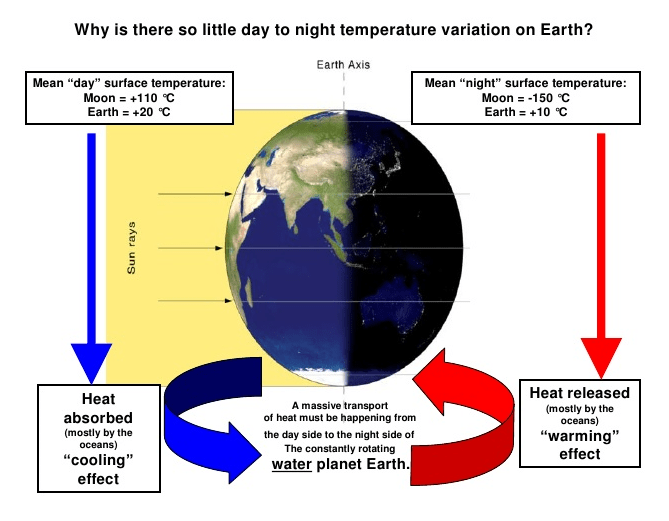
The intensity of solar energy is the same for the Earth and Moon, yet the dark side of the earth is much warmer than the dark side of the moon. And the bright side of the earth is much cooler than the bright side of the moon. Why are the two climates so different?

Earth’s oceans and atmosphere make the difference. Incoming sunlight is reduced by gases able to absorb IR and also by reflection from clouds and non-black surfaces. The earth’s surface is heated by sunlight, much of it stored and distributed by the oceans (71% of the planet surface). The atmosphere delays the upward passage of heat, and like a blanket slows the cooling allowing a buildup of temperature at the surface until there is a balance of heat radiating to space from the sky to match the solar energy coming in.

How the Atmosphere Processes Heat

There are 3 ways that heat (Infra-Red or IR radiation) passes from the surface to space.

1) A small amount of the radiation leaves directly, because all gases in our air are transparent to IR of 10-14 microns (sometimes called the “atmospheric window.” This pathway moves at the speed of light, so no delay of cooling occurs.

2) Some radiation is absorbed and re-emitted by IR active gases up to the tropopause. Calculations of the free mean path for CO2 show that energy passes from surface to tropopause in less than 5 milliseconds. This is almost speed of light, so delay is negligible.

3) The bulk gases of the atmosphere, O2 and N2, are warmed by conduction and convection from the surface. They also gain energy by collisions with IR active gases, some of that IR coming from the surface, and some absorbed directly from the sun. Latent heat from water is also added to the bulk gases. O2 and N2 are slow to shed this heat, and indeed must pass it back to IR active gases at the top of the troposphere for radiation into space.

In a parcel of air each molecule of CO2 is surrounded by 2500 other molecules, mostly O2 and N2. In the lower atmosphere, the air is dense and CO2 molecules energized by IR lose it to surrounding gases, slightly warming the entire parcel. Higher in the atmosphere, the air is thinner, and CO2 molecules can emit IR and lose energy relative to surrounding gases, who replace the energy lost.

This third pathway has a significant delay of cooling, and is the reason for our mild surface temperature, averaging about 15C. Yes, earth’s atmosphere produces a buildup of heat at the surface. The bulk gases, O2 and N2, trap heat near the surface, while IR-active gases, mainly H20 and CO2, provide the radiative cooling at the top of the atmosphere.

planetary-cooling-vents_full2

The Climate Water Wheel

Updates 1 and 2 at bottom.

I recently came across this comment:

“During the height of the day at the equator, 1361 joules/m2/second (less 30% Albedo) is coming in from the Sun but the surface temperature only increases as if 0.0017 joules/m2/second is absorbed (or impacts the temperature at 2 meters). The extra 959.9983 joules/m2/second flows away from the surface effectively almost as fast as the energy is coming in.

Your calculator says surface temperatures should increase to 87C.

At night, virtually no radiation is coming in (and the upwelling less downwelling radiation) says the surface should be losing about 100 joules/m2/second but it actually only loses 0.001 joules/m2/second.
This is the real-world now versus the theoretical.” Bill Illis

http://wattsupwiththat.com/2011/02/13/a-conversation-with-an-infrared-radiation-expert/

And then Derek John posted this:

I was intrigued by the wheel in the diagram, but also puzzled about the numbers. In comparison to the moon, the earth’s temperature decrease is small, but still the image shows overnight cooling on average from 20C to 10C, in contradiction to the Illis comment above.

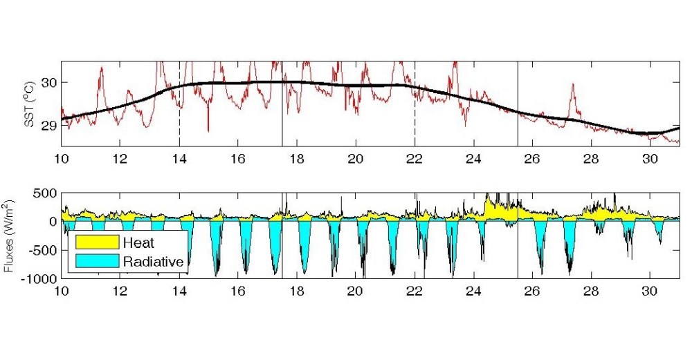
Digging deeper, I read in Wikipedia that diurnal SST (Sea Surface Temperature) is measured to vary on calm days by about 6C. But what it said next opened my eyes: “The temperature of the ocean at depth lags the Earth’s atmosphere temperature by 15 days per 10 meters (33 ft), which means for locations like the Aral sea, temperatures near its bottom reach a maximum in December and a minimum in May and June.”

You see? Illis is talking about the accumulation of heat, and the diagram shows surface temperatures, “surface” being the key word. In infrared remote sensing methodology the radiation emanates from the top “skin” of the ocean, approximately the top 0.01 mm or less. A 6C change there is nothing compared to the massive thermal capacity underneath.  After all, the top 2 meters of the ocean match the entire heat in the overlaying atmosphere. And land surface temperatures aren’t measuring the surface, but rather the air 1 meter up. Sure the soil cools off at night, but go down even a few centimeters, and the warmth remains. People would not have built and lived in underground villages in places like Cappadocia if the land gave up its heat so readily.

And so I can understand something else Bill Illis said:

“The energy represented by a solar photon spends an average 43 hours in the Earth system before it is lost to space. Some spend just a millisecond while a very, very tiny percentage might get absorbed in the deep ocean and spend a thousand years on Earth or longer. In essence, the Earth has accumulated 1.9 days worth of solar energy. If the Sun did not come up tomorrow, it would take around 86 hours for at least the land temperature to fall below -200C.”
http://wattsupwiththat.com/2011/02/13/a-conversation-with-an-infrared-radiation-expert/#more-33954

6m (20ft) flywheel, weighs 15 tonnes. Used at Gepps Cross, Adelaide, South Australia Meatworks

The Oceans function as a Thermal Energy Flywheel

I’m speaking metaphorically, since flywheels like the one pictured above store rotational energy, and thereby maintain a steady rate, resisting periodic fluctuations. It seems that oceans have the same effect on the climate, by storing thermal energy from the sun. That’s where most of the 1.9 days of solar energy is circulating. The general term would be “accumulator”, such as rechargeable batteries, capacitors, or hydroelectric reservoirs. But I want to use flywheel because it is always in motion like the seas. And there is a precedent:

“The ocean is truly the flywheel of the climate system. By definition, a flywheel gains its efficiency from interactions with other parts of the system. Climate is determined, to a large extent, by the rates of energy transfer across the sea surface. It is these rates that determine the lag times and feedback loops and so ultimately the character of climate fluctuations in the oceans and elsewhere.”

Eric B. Kraus, 1987, ‘Oceans, Climate of’, in: Rhodes W. Fairbridge (ed.), The Encyclopaedia of Climatology (Earth Science), 1987, p.638-642

Models Missing the Ocean Flywheel

Climate science has been obsessed with only a part of the system, namely the atmosphere and radiation, in order to focus attention on the non-condensing IR active gases. The climate is framed as a 3D atmosphere above a 2D surface. That narrow scope leaves out the powerful non-radiative heat transfer mechanisms that dominate the lower troposphere, and the vast reservoir of thermal energy deep in the oceans.

As Dr. Robert E Stevenson writes, it could have been different:

“As an oceanographer, I’d been around the world, once or twice, and I was rather convinced that I knew the factors that influenced the Earth’s climate. The oceans, by virtue of their enormous density and heat-storage capacity, are the dominant influence on our climate. It is the heat budget and the energy that flows into and out of the oceans that basically determines the mean temperature of the global atmosphere. These interactions, plus evaporation, are quite capable of canceling the slight effect of man-produced CO2.”

In 1991, when the IUGG and its associations met in Vienna for their General Assembly, the presidents and the secretaries-general of the four associations I’ve mentioned, discussed the program we would propose to forward to the International Commission of Scientific Unions (ICSU) for consideration at the 1992 Rio de Janeiro Conference. We all decided not to prepare any programs!

In our joint statement, which I paraphrase here, we noted that “To single out one variable, namely radiation through the atmosphere and the associated ‘greenhouse effect,’ as being the primary driving force of atmospheric and oceanic climate, is a simplistic and absurd way to view the complex interaction of forces between the land, ocean, atmosphere, and outer space.”

Furthermore, we stated, “climate modeling has been concentrated on the atmosphere with only a primitive representation of the ocean.” Actually, some of the early models depict the oceans as nearly stagnant. The logical approach would have been to model the oceans first (there were some reasonable ocean models at the time), then adding the atmospheric factors.

Well, no one in ICSU nor the United Nations Environment Program/World Meteorological Organization was ecstatic about our suggestion. Rather, they simply proceeded to evolve climate models from early weather models. That has imposed an entirely atmospheric perspective on processes which are actually heavily dominated by the ocean.”

http://www.21stcenturysciencetech.com/articles/ocean.html

Efforts to Model the Ocean Flywheel

In the real world, radiative heat loss is determined by the temperature differential, fixed at the top of the atmosphere by the vacuum of space, and maintained at the bottom of the atmosphere by the oceans. The surface temperatures are noisy because the water is always in motion, made chaotic by flowing over and around irregular land masses. But the oceans’ bulk keeps the temperature within a remarkably tight range over the millennia.

More recently, the computer-driven models are coupled with ocean models, but often these are appendages, added on trying to improve the performance of atmospheric circulation. One of the features of these models is the setting used for the oceans’ “inertia”, which affects how slowly the artificial system responds to changes. The flywheel is a better metaphor since the oceans are always in motion while stabilizing temperatures and climate.


Some models are starting to have dynamic linking of ocean heat storage and circulation to the atmosphere. Results are proving interesting:

Climate Sensitivity to Changes in Ocean Heat Transport
Marcelo Barreiro et al 2011
http://journals.ametsoc.org/doi/full/10.1175/JCLI-D-10-05029.1

“According to our model, if the OHT increases further from present-day values, it would cool the global climate. Moreover, it shows large sensitivity to relatively small changes: a 25% increase in OHT cools the climate by more than 4 K (Fig. 2a). Further increases (beyond 25%) would also cool the climate but more gradually. The transition from a warming to a cooling effect of increased OHT is not gradual but abrupt. To better resolve this transition, we ran additional experiments for c = 1.05, 1.1, 1.15, and 1.20. Our results show that the occurrence of a warmer climate with increased OHT is valid for c < 1.15, which is for less than a 15% increase in the present-day values. Thus, in this model, the current climate is such that the ocean heat transport is close to its maximum positive influence.”

“To date, our understanding of the climatic response to changed OHT comes mainly from atmospheric models coupled to fixed oceans (e.g., W03, H05). Our results point out that not only is the lack of dynamical adjustment an important issue when using these models, but also that the parameterization of low clouds can result in cloud–SST radiative feedbacks of different strengths. In the end, only through the use of coupled models that allow the interaction between these processes will it be possible to address this question fully. Nonetheless, we believe the results presented here can serve as a guide for future explorations of the role of the oceans in climate.”

Another Gift from the Seas

It turns out that not only do the oceans maintain the mild habitat to which we are adapted, they also leave a climate record on the ocean floor. On longer time scales, the ocean flywheel is overwhelmed by orbital changes to the incoming solar energy, triggering regime shifts between the “Hot House” and the “Ice House”. Between shifts, the flywheel maintains the new steady state.

From Christopher R. Scotese, PALEOMAR Project

“There are also d18O isotopes which have proven to be very reliable proxies for temperature in the distant past. There are even International Standards for how to use these proxies to estimate temperature. Search Vienna Standard Mean Ocean Water if you want to know more about this.

The climate history charts in the article at the main post are based on this proxy of course.

There are d18O isotopes which have been dated going back all the way to 2.6 billion years ago. In total, there are 40,000 dated dO18 proxies covering the periods back to this time. 40,000 reliable proxies is more than enough to make a call about this history.

Here are the temperature estimates and all of the CO2 estimates over the last 40 million years (the data used in the paper are in this chart but I am using all the reliable numbers that there are, so rather than 8 data points, there is a total of 16,000 datapoints here between temps and CO2).”

When one runs the numbers in the proper way with these isotopes, one gets very close to Scotese’s temperature history. They can produce a higher resolution history than Scotese, however, which matches to a “T” the major developments in climate history that we know about from other disciplines like geology, paleontology etc.”  Bill Illis

http://wattsupwiththat.com/2015/04/15/strong-evidence-for-rapid-climate-change-found-in-past-millenia/#comment-1908208

Summary

Dr. Stevenson summarizes:

“Contrary to recent press reports that the oceans hold the still-undetected global atmospheric warming predicted by climate models, ocean warming occurs in 100-year cycles, independent of both radiative and human influences.”

“Inland locations are less restrained by the oceans, so the surface air experiences a wider temperature range than it does over the oceans. Land cannot store heat for long, which is why hot days are quickly followed by cold nights in desert regions. For most of the Earth, however, the more dominant ocean temperatures fix the air temperature.”

“This happens through several means:

(1) The oceans transport heat around the globe via massive currents which sweep grandly through the various ocean basins. As a result, the tropics are cooler than they would be otherwise, and the lands of the high latitudes are warmer. The global circulation of heat in the oceans moderates the air temperatures around the whole world.

(2) Because of the high density/specific heat of sea water, the entire heat in the overlying atmosphere can be contained in the top two meters of the oceans. This enormous storage capacity enables the oceans to “buffer” any major deviations in temperature, moderating both heat and cold waves alike.

(3)Evaporation is constantly taking place at the surface of the seas. It is greatest in the tropics and weakest near the polar regions. The effect of evaporation is to cool the oceans and, thereby, the surface atmosphere.”
http://www.21stcenturysciencetech.com/articles/ocean.html

Conclusion

In the real world climate, water in all its phases is the heart of the matter, and atmosphere is ancillary. Since Copernicus we all think of our planetary system with the sun in the center. We should be thinking of our climate system with the oceans in the center.

How inappropriate to call this planet Earth when it is quite clearly Ocean. Arthur C. Clarke

I have been trying to make sense of these things, and this post is the result. Thank you to Bill Illis, Robert Stevenson and Arnd Bernaerts for writings I just discovered and which crystallized my thinking. Ron Clutz

Update 1 April 24: Discussion with David A. Is elevated to a post here:
https://rclutz.wordpress.com/2015/04/24/on-the-energy-highway-with-david-a-all-watts-are-not-created-equal/

Update 2 April 25: This essay mentions d18O from ocean sediments as a proxy for climate change. Below is linked an interesting study using these to reconstruct Norwegian Sea SST over several centuries

Comment by kennethrichards at Paul Homewood website:

And the warmer oceans during the MWP and modern times are explained (> 99% significance) by the solar variations at these times…the “medieval and modern [solar] maxima.”
—–
http://onlinelibrary.wiley.com/doi/10.1029/2010JC006264/full

“Here we present an exceptionally well-dated marine sediment sequence in the eastern Norwegian Sea which records 1–2°C variations of temperature in northward flowing Atlantic waters that are robustly correlated with various estimates of solar activity spanning the last 1000 years. The temperature and solar proxy variations appear to be synchronous within dating errors, which, together with the large amplitude of the temperature signal and its correlation into central Europe, suggests strong coupling of the regional atmospheric and oceanic responses to the Sun.”

Solar forcing of ocean SST . . .Hummmm.  The plot thickens.

Sun and Noah

Okhotsk, Barents, Who Cares?

More people are familiar with the above brand of work and casual wear than know of the similarly named sea near the Arctic Circle. And many confuse the Barents and Bering Seas which are on opposite sides of the Arctic. So what?

Here’s the thing: This year’s NH sea ice extent (Arctic plus nearby seas) is down. And so we’re getting the warnings about the Arctic “death spiral” and starving polar bears. It turns out that most of the difference between this year and last comes from less ice in Okhotsk and Barents.

So it is very timely that Dr. Bernaerts has posted an essay on events shaping the climate in those two places:
Arctic sea ice record low – 02/25/2015
and human offshore activities not to blame – at least a bit?
http://www.ocean-climate-law.com/13/Arch/5.html

While the total maximum ice extent in NH is always 14-16 MKm2, both OKhotsk and Barents max extents vary a lot year to year. For example, the Sea of Okhotsk covers 1.58 MKm2 – it’s a huge basin that was virtually filled with ice in March 1979 but only about 1/3 filled in 2015.

Both seas cover about the same area (1,5 Mio. km²),  the Sea of Okhotsk with an average depth of 859 m, and the Barents Sea only 230 m, but differ grossly in many other aspects. While the latter is a continental Shelf, with three islands (Spitsbergen, Franz Josef Land and Novaya Zemlya) as boundaries and open to the North Atlantic and Arctic Ocean, the Sea of Okhotsk is semi enclosed, with an internal current system (Fig. 8-9).

Okhotsk will lose all its ice by July, and Barents usually retains less than 20%.

Bernaerts’ larger point is that in addition to natural variations in circulations, winds and clouds, human activity is also changing the climate, and particularly the ice extent in these places. Both have extensive fishing and commercial shipping, ice-breakers operating, submarine fleet exercises, sea bottom oil extraction, etc. All of these have an effect in the direction of inhibiting ice formation.

Oh, and about the polar bears: They have never been at Okhotsk and never will be. As for Barents, the ice conditions are providing suitable hunting conditions for the polar bears (perhaps the seals deserve a warning).
http://polarbearscience.com/2015/04/12/challenging-polar-bear-fearmongering-about-arctic-sea-ice-extent-for-march-2015/

Dr. Bernaerts concludes:

“The recent new Arctic sea ice record gives little reason for lamenting, but should be seen as an opportunity to investigate and understand the human activities in the Barents and Okhotsk Sea. It could be observed that both seas differed most from average due to warmer sea water temperature. Although it may be difficult to assess the impact of worldwide shipping and fishing on climatic changes and ‘global warming’, it is a much lower challenge if only the impact of two regional seas, representing only about 1% of the global water surface, is investigated.”
http://www.ocean-climate-law.com/13/Arch/5.html

Heraclitus (535 BC – 475 BC) famously said, “No man ever steps in the same river twice.” The same can be said for anyone sailing in these seas.

Footnote:
After the early arrival at maximum in February, NH ice extent went sideways and is now on the track of recent years. Where it goes from here is always entertaining.

Quebec Joins California Carbon Market


Yesterday I commented at MasterResource concerning a sale of carbon credits by a Montreal enterprise:

“Follow the money.  This scheme is all about selling carbon credits to energy producers who have to buy them, the money ultimately coming from consumers. Expect to see a net transfer of wealth out of California. And it’s already started.”

Alas, on closer inspection, my dreams of California greenbacks flowing here to Montreal were just an illusion. It’s actually Quebec who will be going to the cleaners.

Perhaps I was caught up in irrational exuberance. There has also been a feeling in Québec that the province would make money with cap-and-trade—“that Québec has a lot to sell”. Québec should also have an advantage as one of the least carbon intensive jurisdictions in North America, with zero-carbon hydro-electric power.

Well, that makes sense, but it’s not how it works.

There’s Two Sides to the Story.

“Montreal’s Biothermica Technologies Inc. clinched a deal earlier this month to sell $860,000 worth of carbon credits – generated by reducing methane emissions at a coal mine in Alabama – to an unnamed California buyer who needed them to meet the state’s climate regulations.”

“Meanwhile, on the other side of the market, Norcan Petroleum Products GP must purchase carbon allowances in joint Quebec-California auctions in order to cover the greenhouse gas (GHG) emissions that will result when the fuel it sells in the province is consumed.”

“For the province’s largest importer of gasoline, the system is an administrative headache and competitive challenge. The company, which is part-owned by Irving Oil Ltd., expects to spend $60-million a year to cover its emissions and – along with other fuel distributors – will pass that cost along motorists in an additional 3.6-cent-a-litre tax.”

Depending on the price of carbon, it could even get worse for Quebec drivers. Carbon currently costs $11.39 per tonne. Drivers will pay two and a half cents more per litre if this goes up to $15, six cents more for $30 per tonne, and a dime more for $50.

Quebecers already pay the most tax on gas in North America. Since the beginning of the year, they have paid on average over 50 cents in taxes for each litre they buy.

http://www.theglobeandmail.com/report-on-business/industry-news/energy-and-resources/a-provincial-problem-putting-a-price-on-carbon/article23678654/

Amazingly, since gasoline retailers jerk the pump prices up and down each week by at least 10 cents/liter, most drivers don’t notice these tax increases.


What’s in the Trading Deal?

It is worth repeating that the cap-and-trade systems adopted in California and Québec are not mandated by any international convention, and the agreement to link schemes remains voluntary and subject to each jurisdiction’s political process and legal system. The two parties believe this is win-win, though I come to a different conclusion below.

Both jurisdictions are politically and socially liberal with populations mostly deferential to global warming concerns. Both want to lead in “fighting climate change” without a political uproar over a imposing a new tax. And in both places are found a growing community of experts, consultants, ENGOs, and businesses who have seized upon the many opportunities offered by emissions trading.

In French, an expression says that in any embrace, there’s always a kisser and a kissee. That is, one of the two wants it more, and here it is Quebec needing California more than the other way around. With Quebec’s economy one sixth that of the Golden State, having it’s own market was not feasible.

For California, why bother, except for the symbolism of someone else joining? Therein lies the base reality: California was sold the notion that Quebec will be a net buyer of credits, not a seller.

On to the Economic Projections

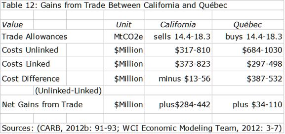
Picture1

“We estimate that the costs of reducing 14.4-18.3 million tCO2e of emissions would be much greater for Québec if its cap-and-trade system were not linked to California: at between $694-1030 million based on prices in the table above. Thus, Québec gains between $34-110 million from trading with California. For California, due to the slight rise over unlinked prices, the linked price would increase the cost of reducing 14.4-18.3 million tCO2e by about $13-56 million. Nonetheless, inflows from Québec would more than compensate for these additional costs and California’s net gain from trade would be $284-442 million. To summarize, both California and Québec gain from trading in comparison to a situation where their cap-and-trade systems remain unlinked, but
California gains more.” p36

From: The Political Economy of California and Québec’s Cap-and …
http://www.sustainableprosperity.ca/dl1235

The Bottom Line

California gets a revenue transfer and Quebec gets a discounted price on its action plan. But maybe more importantly, both get a bump in their cash flows. Proceeds from selling allowances are expected to increase the revenues of the Quebec government by $500 million for 2015 alone. By 2020, it represents an expected $3.5 billion of extra income.

Conclusion

My view on this deal is tainted by my not accepting the premise that CO2 is a pollutant rather than essential to life in the biosphere. Thus carbon reduction targets are not only arbitrary, but unnecessary, unless you believe catastrophe is coming and you don’t want to be blamed for it.

“We should obviously try to gauge whether the benefits of such action are greater than the costs of forcing people off hydrocarbons, but such a calculation is devilishly difficult, if not impossible. And to suggest that the net results might be negative is to be barred from conversation.”

“All forms of approved climate action divert individuals and industry away from cheap and plentiful energy sources to more expensive sources. They also involve deadweight costs in terms of bureaucratic oversight and compliance.”

Peter Foster: Low climate ‘summit’ in Quebec

You’d think there would be a cautionary tale in this for others, but Ontario has committed and those two provinces make up 56% of Canadian GDP.

“When it comes to fighting climate change, Ontario has already been at war with the provincial economy, devastating consumers and undermining growth. In a burst of regulatory overkill, the province ordered a shutdown of its coal plants and orchestrated a massive overhaul of the provincial electricity market, at massive cost to consumers. When the plant shutdowns began around 2009, Ontario industry and individual consumers used 139 TWh (trillions of watt hours) of electricity. In 2014, the province used the same amount of electricity coal free, but the total cost has increased from $8.6 billion in 2009 to $12.7 billion in 2014, a jump of $4 billion.”

“That’s expensive carbon reduction. Much of the increased spending comes from Ontario’s feed-in-tariff and other subsidies to allow the installation of wind and solar power and construction of new gas-powered plants. According to government figures, closing the Ontario coal plants reduced annual carbon emissions by maybe 10-million tonnes between 2009 and 2014. Let’s see, back of the envelope, $4 billion divided by 10-million tones of carbon, works out to about $400 per tonne of carbon per year. Where were the market economists now pushing carbon taxes when that plan was hatched?”
Terence Corcoran: Manufacturing carbon hobgoblins

Oh, and Quebec’s reward for low carbon intensity? Just like reducing weight is more difficult when you are already skinny, so Quebec will have to pay more to achieve its targets.

“Because of Québec’s hydroelectric resources, the emissions intensity of its economy is lower than that of California and, consequently, current economic models anticipate that opportunities to reduce further are generally more costly relative to California. Economic modeling of allowance prices in Québec in the absence of a linked cap-and-trade system range from $37-43 per tCO2e in 2013, increasing to $59-69 per tCO2e for 2020 vintages.”

http://www.sustainableprosperity.ca/dl1235

Couldn’t we just rest upon our low carbon laurels until the others catch up? And by the way, this month Hydroquebec customers got a 4.3% rate increase. The renewables lobby says not to blame it on their feed-in tariffs.

Headlines Claim, But Details Deny

The advertising proverb says it all: “The large print giveth, and the small print taketh away.”

Unfortunately, climate science is rife with this. A research announcement is released and the same text appears in media articles everywhere, the only difference being who can attach the scariest headline. One list of things claimed to be caused by global warming numbers 883, including many head scratchers.
http://www.numberwatch.co.uk/warmlist.htm
For example: species extinctions.

WWF claims “The rapid loss of species we are seeing today is estimated by experts to be between 1,000 and 10,000 times higher than the natural extinction rate. MSNBC laments the “fact” that 100,000 species of flora and fauna will no longer be with us by next Christmas. And yet, WWF also estimates the number of identified unique species to be between 1.4 to 1.8 million, an uncertainty of 400,000. As someone said, “Anytime extinctions are claimed, ask for the names.” The debunking is done in detail here:
http://www.americanthinker.com/articles/2015/02/plenty_of_wiggle_room_in_scientific_certainty.html#ixzz3XIw5UJqd

On this blog, Science Matters, several posts address specific misleading and exaggerated claims made in the media:

Arctic Sea Ice Factors

Lawrence Lab Report: Proof of Global Warming?

The Permafrost Bogeyman


IPCC the Worst Offender

But the IPCC Assessment Reports display the worst abuse of headline claims denied by statements in the details. The headlines are in the Summary for Policy Makers (SPM) while scientists write the details in the Working Group reports, in particular WGII.

We see again a familiar pattern in the latest AR5 round of IPCC releases. As previously, the SPM features alarming statements, which are then second-guessed (undermined) by the actual science imbedded in the report details.

Example Ocean Acidification

For example, I looked at the topic of ocean acidification and fish productivity. The SPM asserts on Page 17 that fish habitats and production will fall and that ocean acidification threatens marine ecosystems.

“Open-ocean net primary production is projected to redistribute and, by 2100, fall globally under all RCP scenarios. Climate change adds to the threats of over-fishing and other non-climatic stressors, thus complicating marine management regimes (high confidence).” Pg 17 SPM

“For medium- to high-emission scenarios (RCP4.5, 6.0, and 8.5), ocean acidification poses substantial risks to marine ecosystems, especially polar ecosystems and coral reefs, associated with impacts on the physiology, behavior, and population dynamics of individual species from phytoplankton to animals (medium to high confidence).” Pg 17 SPM

WGII Report, Chapter 6 covers Ocean Systems. There we find more nuance and objectivity:

“Few field observations conducted in the last decade demonstrate biotic responses attributable to anthropogenic ocean acidification” pg 4

“Due to contradictory observations there is currently uncertainty about the future trends of major upwelling systems and how their drivers (enhanced productivity, acidification, and hypoxia) will shape ecosystem characteristics (low confidence).” Pg 5

“Both acclimatization and adaptation will shift sensitivity thresholds but the capacity and limits of species to acclimatize or adapt remain largely unknown” Pg 23

“Production, growth, and recruitment of most but not all non-calcifying
seaweeds also increased at CO2 levels from 700 to 900 µatm Pg 25

“Contributions of anthropogenic ocean acidification to climate-induced alterations in the field have rarely been established and are limited to observations in individual species” Pg. 27

“To date, very few ecosystem-level changes in the field have been attributed to anthropogenic or local ocean acidification.” Pg 39

Ocean Chemistry on the Record

Contrast the IPCC headlines with the the Senate Testimony of John T. Everett, in which he said:

“There is no reliable observational evidence of negative trends that can be traced definitively to lowered pH of the water. . . Papers that herald findings that show negative impacts need to be dismissed if they used acids rather than CO2 to reduce alkalinity, if they simulated CO2 values beyond triple those of today, while not reporting results at concentrations of half, present, double and triple, or as pointed out in several studies, they did not investigate adaptations over many generations.”

“In the oceans, major climate warming and cooling and pH (ocean pH about 8.1) changes are a fact of life, whether it is over a few years as in an El Niño, over decades as in the Pacific Decadal Oscillation or the North Atlantic Oscillation, or over a few hours as a burst of upwelling (pH about 7.59-7.8) appears or a storm brings acidic rainwater (pH about 4-6) into an estuary.”
http://www.epw.senate.gov/public/index.cfm?FuseAction=Files.View&FileStore_id=db302137-13f6-40cc-8968-3c9aac133b16

Conclusion

Many know of the Latin phrase “caveat emptor,” meaning “Let the buyer beware”.

When it comes to climate science, remember also “caveat lector”–”Let the reader beware”.

Climate Pacemaker: The AMOC


Update May 19, 2015 text added at end.

We hear a lot about CO2 as climate’s “control knob, but about the oceans’ pacemaker, AMOC? Not so much.

In the Water World post, I referenced the match between SSTs (sea surface temperatures) as recorded in HadISSAT and the IPO, an index of SSTs in the Eastern Pacific: North, Central and South. This is a brief discussion of the Atlantic role in shaping climate patterns, especially in Europe and North America.

The Big Picture

Since global average temperatures are dominated by the oceans as measured by SSTs, it is significant that multidecadal cycles are presently shifting from warmer phases to cooler. The PDO entered its cooler period recently, and the current weak El Nino is evidence of this. (Pacific Decadal Oscillation is an index of Northeastern Pacific based upon ~30-year periods, warm when El Ninos dominate, and cool when La Ninas rule.)

Atlantic Multidecadal Oscillation (AMO). Source: http://www.appinsys.com/globalwarming/SixtyYearCycle.htm

Now the focus is on the Atlantic SSTs and what to expect from the AMO (Atlantic Multidecadal Oscillation), which has peaked and is likely to trend downward. In the background is a large scale actor, the Atlantic Meridional Overturning Circulation (AMOC) which is the Atlantic part of the global “conveyor belt” moving warm water from the equatorial oceans to the poles and back again.

The notion of the AMOC as the climate pacemaker derives from its role in conveying Pacific shifts into the Atlantic.

“An index of AMOC variability is defined, and the manner in which key variables covary with it is determined. In both models the following is found. (i) AMOC variability is associated with upper-ocean (top 1 km) density anomalies (dominated by temperature) on the western margin of the basin in the region of the Mann eddy with a period of about 20 years. These anomalies modulate the trajectory and strength of the North Atlantic Current. The importance of the western margin is a direct consequence of the thermal wind relation and is independent of the mechanisms that create those density anomalies. (ii) Density anomalies in this key region are part of a larger-scale pattern that propagates around the subpolar gyre and acts as a “pacemaker” of AMOC variability. (iii) The observed variability is consistent with the primary driving mechanism being stochastic wind curl forcing, with Labrador Sea convection playing a secondary role.”

http://journals.ametsoc.org/doi/full/10.1175/JCLI-D-11-00460.1

The Atlantic Leading the Stadium Wave

The critical role of the AMOC and the Atlantic’s global influence is described as part of a “stadium wave” by which the effects ripple throughout all the ocean oscillations.

“A warm (cool) Atlantic triggers a cascade of polarity changes in participating teleconnections, resulting in a cooling (warming) hemispheric climate signal about 30 years later – the “stadium wave”. The periodicity of changes in the North Atlantic AMO appears to be largely governed by the Atlantic sector of the meridional overturning circulation (AMOC). As the cascade of atmospheric and lagged oceanic teleconnections converts a warm (cool)-Atlantic-born signal into a Pacific cooling (warming) signal, the AMOC is re-configuring the Atlantic SST signature. By the time the Pacific begins to cool (warm) as a result of an initially warm (cool) North Atlantic, the North Atlantic, itself, is cooling (warming). The conflated result of temperature profiles within each oceanic basin is a cooling (warming) hemisphere, poised to reverse trend as a result of the once-again-cooling (warming) North Atlantic SSTs (which will ultimately lead to a warming (cooling) climate). No conclusion on what exactly causes the NHT is given, just that it strongly coincides with the trends of combined PDO and AMO.”
Marcia Wyatt comment here:
On The AMO+PDO Dataset

A draft of Wyatt et al (2011) can be read here:

Click to access 1WKT_2012_author_manuscript.pdf

What is the AMOC up to these days?

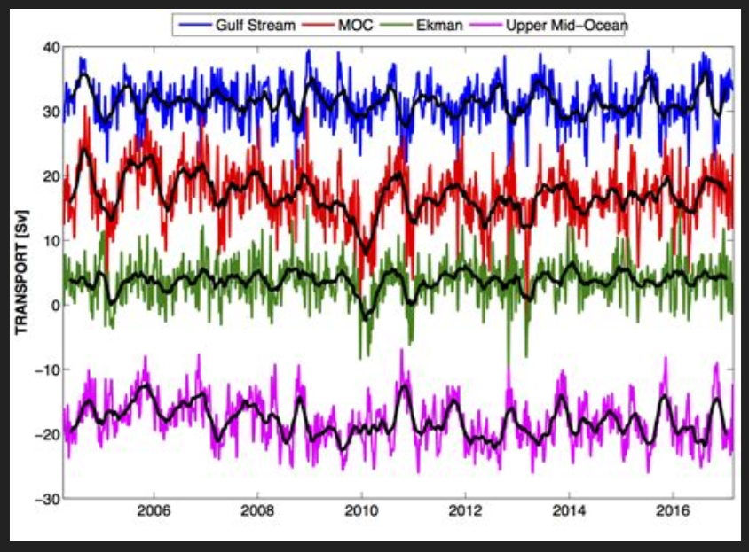
“We have shown that there was a slowdown in the AMOC transport between 2004 and 2012 amounting to an average of −0.54 Sv yr−1 (95 % c.i. −0.08 to −0.99 Sv yr−1) at 26◦ N, and that this was primarily due to a strengthening of the southward flow in the upper 1100 m and a reduction of the southward transport of NADW below 3000 m. This trend is an order of magnitude larger than that predicted by climate models associated with global climate change scenarios, suggesting that this decrease represents decadal variability in the AMOC system rather than a response to climate change. (lower North Atlantic deep water (LNADW) upper (UNADW) . . .our observations show no significant change in the Gulf Stream transport over the 2004–2012 period when the AMOC is decreasing.”

Click to access os-10-29-2014.pdf

Implications for AMO and Atlantic SSTs

“The poleward transport of heat in the sub-tropical North Atlantic has been shown (Johns et al., 2011) to be highly correlated with the Atlantic meridional overturning circulation (AMOC). One petawatt (PW = 1015 W) of heat carried by the AMOC is released to the atmosphere between 26◦ N and 50◦ N and has important impacts on the climate of the North Atlantic region (e.g. Srokoz et al., 2012). The AMOC varies on a range of timescales (e.g. Eden and Willebrand, 2001; Kanzow et al., 2010) and is thought to have played a key role in rapid climate change in the past (Ganopolski and Rahmstorf, 2001).”

Click to access Kerr%20Science%2005.pdf

“A speed up (slow down) of the AMOC is in favor of generating a warm (cold) phase of the AMO by the anomalous northward (southward) heat transport in the upper ocean, which reversely leads to a weakening (strengthening) of the AMOC through changes in the meridional density gradient after a delayed time of ocean adjustment. This suggests that on multidecadal timescales the AMO and AMOC are related and interact with each other.”

Click to access Zhang_Wang_JGR2013.pdf

Are we on the cusp of oceanic climate change?

“Sometime after the turn of the century the Atlantic Multidecadal Oscillation peaked.  Due to the volatility of the data and the short time frame, it’s tough to determine when it peaked. But for illustration purposes, Figure 2 compares the same two sea surface temperature data subsets starting in 2003.  The surface of the North Atlantic has cooled slightly over that time, while the surfaces of the rest of the global oceans show very little warming.”

https://bobtisdale.wordpress.com/2014/10/24/new-study-predicts-a-slight-cooling-of-north-atlantic-sea-surface-temperatures-over-the-next-decade/

“The AMO tracks to the solar irradiance with a lag of about 8-9 years. This suggests the current warm AMO state will end by around 2015. Northern Hemispheric temperature will take a leg down. With the cooling of the Pacific now and more La Ninas, look for net cooling especially in the tropics until then.” Joseph D’Aleo

Click to access AMO_Important_in_Northern_Hemispheric_Anomalies.pdf

Update May 19, 2015

Dr. William Gray in his 2012 paper:

“The global surface warming of about 0.7°C that has been experienced over the last 150 years and the multi-decadal up-and-down global temperature changes of 0.3-0.4°C that have been observed over this period are hypothesized to be driven by a combination of multi-century and multi-decadal ocean circulation changes. These ocean changes are due to naturally occurring upper ocean salinity variations. Changes in CO2 play little role in these salinity driven ocean climate forcings. “

A great deal of AMOC explanation is available in Dr. Gray’s paper:

Click to access gray2012.pdf

Included are excellent diagrams and charts, such as these:

gray2012MOC

gray2012multi-decadal

On Measuring Ocean Heat Flux

Following Dr. Bernaerts’ discussion that Oceans Make Climate, and that naval activity has an effect, this post overviews issues concerning the heat flux at the boundary between sea surface and atmosphere.

The Basics

mmedson

The graph displays measures of heat flux in the sub-tropics during a 21-day period in November. Shortwave solar energy shown above in green labeled radiative is stored in the upper 200 meters of the ocean. The upper panel shows the rise in SST (Sea Surface Temperature) due to net incoming energy. The yellow shows latent heat cooling the ocean, (lowering SST) and transferring heat upward, driving convection.

From
An Investigation of Turbulent Heat Exchange in the Subtropics
James B. Edson

“One can think of the ocean as a capacitor for the MJO (Madden-Julian Oscillation), where the energy is being accumulated when there is a net heat flux into the ocean (here occurring to approximately November 24) after which it is released to the atmosphere during the active phase of the MJO under high winds and large latent heat exchange.”

Click to access mmedson.pdf

Turbulence Changes Both Parts of the Heat Flux

As mentioned above, this flux is not in equilibrium or steady state, but constantly subject to turbulence, both natural and man-made. Therein lies the difficulty in measuring it accurately and documenting changes over time. The study above, while not addressing ships, shows that latent heat varies considerably with turbulence.

“Turbulence in the surface layer of the ocean contributes to the transfer of heat, gas and momentum across the air-sea boundary. As such, study of turbulence in the ocean surface layer is becoming increasingly important for understanding its effects on climate change.”

“Moving surface vessels such as ships typically produce wakes which are highly visible in ocean SAR images, where the region behind the vessel displays a region of wake turbulence and surface currents which produce a visible backscattering response.”

Click to access osd-9-2851-2012-print.pdf

Turbulence Changes the Ocean Albedo

Ship Wake

Schematic of a typical turbulent ship wake as viewed by SAR.
Measurement of turbulence in the oceanic mixed layer using Synthetic Aperture Radar (SAR)
S. G. George and A. R. L. Tatnall 2012

The incoming solar energy is reduced by the “bright water” resulting from air bubbles and foam in the wake.

“The albedo change over land caused by land‐use and land‐cover modifications is well documented [Forster et al., 2007]. However, modification of the ocean albedo by human activities is unknown, even though the oceans cover 70% of Earth’s surface and absorbs approximately 93% of incident solar radiation.”

“This study provides new insights into ship‐generated disturbances on the ocean surface, which have received little attention in climate studies, but is potentially significant for the ocean‐ atmosphere energy balance and could affect climate.”

“The strong enhancement of ocean reflectance in the ship wake is unambiguous, and >100% in most cases in the spectral range from the ultraviolet to the near‐infrared (0.340 mm ≤l≤ 2.205 mm), and clearly seen in the ocean BRDF measurements. These results are derived from angular and spectral measurements of the intensity of reflected solar radiation from an airborne instrument over several regions of the ocean disturbed by the ship wakes. The implication for the global radiation budget at the top of the atmosphere has been demonstrated in this study.”
Gatebe et al 2011
http://onlinelibrary.wiley.com/doi/10.1029/2011GL048819/pdf

However authors of this study do not estimate albedo effect from shipping to be significant at this time.

“Changes in surface albedo represent one of the main forcing agents that can counteract, to some extent, the positive forcing from increasing greenhouse gas concentrations. Here, we report on enhanced ocean reflectance from ship wakes over the Pacific Ocean near the California coast, where we determined, based on airborne radiation measurements that ship wakes can increase reflected sunlight by more than 100%. We assessed the importance of this increase to climate forcing, where we estimated the global radiative forcing of ship wakes to be -0.00014 plus or minus 53% Watts per square meter assuming a global distribution of 32331 ships of size of greater than or equal to 100000 gross tonnage. The forcing is smaller than the forcing of aircraft contrails (-0.007 to +0.02 Watts per square meter), but considering that the global shipping fleet has rapidly grown in the last five decades and this trend is likely to continue because of the need of more inter-continental transportation as a result of economic globalization, we argue that the radiative forcing of wakes is expected to be increasingly important especially in harbors and coastal regions.”

There are some efforts to measure the infrared signature of ship wakes, including emitted energy.

“The sea surface turbulent trailing wake of a ship, which can be rather easily observed in the infrared by airborne surveillance systems, is a consequence of the difference in roughness and temperature between the wake and the sea background. We have developed a phenomenological model for the infrared radiance of the turbulent wake by assuming that the sea surface roughness is dependent upon the turbulent intensity near the sea surface. . .Given the incident solar, atmospheric, and sky infrared radiances, we calculate the reflected and emitted sea surface radiance from both the wake and the background. We compare the infrared contrast of the wake with infrared image data obtained in an airborne trial.”

Modeling the turbulent trailing ship wake in the infrared
Vivian Issa and Zahir A. Daya 2014
http://www.dtic.mil/cgi-bin/GetTRDoc?AD=ADA555507

Conclusion

Ocean turbulence is being studied but not as extensively as atmospheric turbulence. In both domains, drawing climate conclusions is challenging. There is an albedo effect of a ship’s wake that reflects solar SW, but one study considers it a small effect. The release of latent heat varies significantly with wind changes, but the effect from shipping is not known. Other ocean effects from shipping are not discussed here, such as additional release of CO2 and ice-breaking in the Arctic .