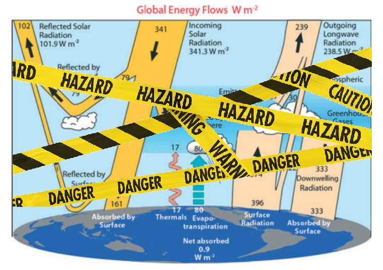
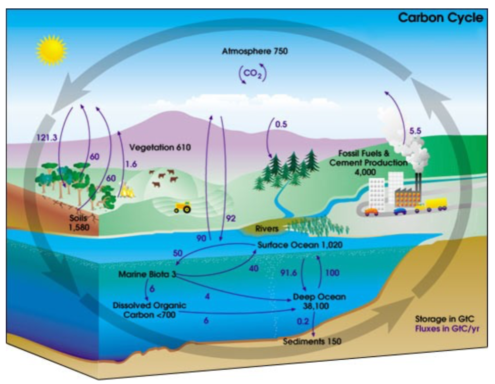
Figure 1. The global annual mean energy budget of Earth’s climate system (Trenberth and Fasullo, 2012.)
Recently in a discussion thread a warming proponent suggested we read this paper for conclusive evidence. The greenhouse effect and carbon dioxide by Wenyi Zhong and Joanna D. Haigh (2013) Imperial College, London. Indeed as advertised the paper staunchly presents IPCC climate science. Excerpts in italics with my bolds.
IPCC Conception: Earth’s radiation budget and the Greenhouse Effect
The Earth is bathed in radiation from the Sun, which warms the planet and provides all the energy driving the climate system. Some of the solar (shortwave) radiation is reflected back to space by clouds and bright surfaces but much reaches the ground, which warms and emits heat radiation. This infrared (longwave) radiation, however, does not directly escape to space but is largely absorbed by gases and clouds in the atmosphere, which itself warms and emits heat radiation, both out to space and back to the surface. This enhances the solar warming of the Earth producing what has become known as the ‘greenhouse effect’. Global radiative equilibrium is established by the adjustment of atmospheric temperatures such that the flux of heat radiation leaving the planet equals the absorbed solar flux.
The schematic in Figure 1, which is based on available observational data, illustrates the magnitude of these radiation streams. At the Earth’s distance from the Sun the flux of radiant energy is about 1365Wm−2 which, averaged over the globe, amounts to 1365/4 = 341W for each square metre. Of this about 30% is reflected back to space (by bright surfaces such as ice, desert and cloud) leaving 0.7 × 341 = 239Wm−2 available to the climate system. The atmosphere is fairly transparent to short wavelength solar radiation and only 78Wm−2 is absorbed by it, leaving about 161Wm−2 being transmitted to, and absorbed by, the surface. Because of the greenhouse gases and clouds the surface is also warmed by 333Wm−2 of back radiation from the atmosphere. Thus the heat radiation emitted by the surface, about 396Wm−2, is 157Wm−2 greater than the 239Wm−2 leaving the top of the atmosphere (equal to the solar radiation absorbed) – this is a measure of ‘greenhouse trapping’.
Why This Line of Thinking is Wrong and Misleading
Principally, the Earth is not a disk illuminated 24/7 by 1/4 of solar radiant energy.
That disk in the cartoon denies the physical reality of a rotating sphere, and completely distorts the energy dynamics. Christos Vournas addresses this issue directly in deriving his planetary temperature equation that corresponds to NASA satellite measurements of planets and moons in our solar system. Previous posts provide background for this one focusing on the radiant heating of the rotating water planet we call Earth (though Ocean would be more accurate). See How to Calculate Planetary Temperatures and Earthshine and Moonshine: Big Difference.
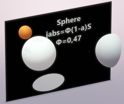
Φ – is the dimensionless Solar Irradiation accepting factor. It recognizes that a sphere’s surface absorbs the incident solar irradiation not as a disk of the same diameter, but accordingly to its spherical shape. For a smooth spherical surface Φ = 0,47
The classical blackbody surface properties
A blackbody planet surface is meant as a classical blackbody surface approaching. Here are the blackbody’s properties:
1. Blackbody does not reflect the incident on its surface radiation. Blackbody absorbs the entire radiation incident on its surface.
2. Stefan-Boltzmann blackbody emission law is: Je = σ*Τe⁴
Notice:
Te is the blackbody’s temperature (surface) at every given moment. When the blackbody is not irradiated, the classical blackbody gradually cools down, gradually emitting away its accumulated energy. The classical blackbody concept assumes blackbody’s surface being warmed by some other incoming irradiation source of energy – see the Sun’s paradigm. Sun emits like a blackbody, but it emits its own inner energy source’s energy. Sun is not considered as an irradiation receiver. And sun has a continuous stable temperature.
Therefore we have here two different blackbody theory concepts.
a. The blackbody with the stable surface temperature due to its infinitive inner source (sun, stars).
b. The blackbody with no inner energy source.
This blackbody’s emission temperature relies on the incoming outer irradiation only.
Also in the classical blackbody definition it is said that the irradiation incident on the blackbody is totally absorbed, warms the blackbody and achieves an equilibrium emission temperature Te. It is an assumption.
This assumption, therefore, led to the next assumption: the planet like a blackbody emitting behavior. And, consequently, it resulted to the planet’s Te equation, in which it is assumed that planet’s surface is interacting with the incoming irradiation as being in a uniform equilibrium temperature.
Consequently it was assumed that planet’s surface had a constant equilibrium temperature (which was only the incident solar irradiation dependent value) and the only thing the planet’s surface did was to emit in infrared spectrum out to space the entire absorbed solar energy.
3. When irradiated, the blackbody’s surface has emission temperature according to the Stefan-Boltzmann Law:
Te = (Total incident W /Total area m² *σ)¹∕ ⁴ K
σ = 5,67*10⁻⁸ W/m²K⁴, the Stefan-Boltzmann constant.
Notice: This emission temperature is only the incoming irradiation energy depended value. Consequently when the incoming irradiation on the blackbody’s surface stops, at that very moment the blackbody’s emission temperature disappears. It happens because no blackbody’s surface accumulates energy.
4. Blackbody interacts with the entire incident on the blackbody’s surface radiation.
5. Blackbody’s emission temperature depends only on the quantity of the incident radiative energy per unit area.
6. Blackbody is considered only as blackbody’s surface physical properties. Blackbody is only a surface without “body”.
7. Blackbody does not consist from any kind of a matter. Blackbody has not a mass. Thus blackbody has not a specific heat capacity. Blackbody’s cp = 0.
8. Blackbody has surface dimensions. So blackbody has the radiated area and blackbody has the emitting area.
9. The entire blackbody’s surface area is the blackbody’s emitting area.
10. The blackbody’s surface has an infinitive conductivity.
11. All the incident on the blackbody’s surface radiative energy is instantly and evenly distributed upon the entire blackbody’s surface.
12. The radiative energy incident on the blackbody’s surface the same very instant the blackbody’s surface emits this energy away.
A Real Planet is Not a Blackbody
But what happens there on the rotating real planet’s surface?
The rotating real planet’s surface, when it turns to the sunlit side, is an already warm at some temperature, from the previous day, planet’s surface.
Thus, when assuming the planet’s surface behaving as a blackbody, we face the combination of two different initial blackbody surfaces.
a. The one with an inner energy source.
And
b. The one warmed by an outer irradiation.
The Real Planet’s Surface Properties:
1. The planet’s surface has not an infinitive conductivity. Actually the opposite takes place. The planet’s surface conductivity is very small, when compared with the solar irradiation intensity and the planet’s surface infrared emissivity intensity.
2. The planet’s surface has thermal behavior properties. The planet’s surface has a specific heat capacity, cp.
3. The incident on the planet solar irradiation is not being distributed instantly and evenly on the entire planet’s surface area.
4. Planet does not accept the entire solar irradiation incident in planet’s direction. Planet accepts only a small fraction of the incoming solar irradiation. This happens because of the planet’s albedo, and because of the planet’s smooth and spherical surface reflecting qualities, which we refer to as “the planet’s solar irradiation accepting factor Φ”.
Planet reflects the (1-Φ + Φ*a) portion of the incident on the planet’s surface solar irradiation. And Planet absorbs only the Φ(1 – a) portion of the incident on the planet’s surface solar irradiation.
Here “a” is the planet’s average albedo and “Φ” is the planet’s solar irradiation accepting factor.
For smooth planet without thick atmosphere, Earth included, Φ=0,47
5. Planet’s surface has not a constant intensity solar irradiation effect. Planet’s surface rotates under the solar flux. This phenomenon is decisive for the planet’s surface infrared emittance distribution.
The real planet’s surface infrared radiation emittance distribution intensity is a planet’s rotational speed dependent physical phenomenon.
Φ factor explanation
The Φ – solar irradiation accepting factor – how it “works”. It is not a planet specular reflection coefficient itself.
There is a need to focus on the Φ factor explanation. Φ factor emerges from the realization that a sphere reflects differently than a flat surface perpendicular to the Solar rays.
It is very important to understand what is really going on with planets’ solar irradiation reflection.
There is the specular reflection and there is the diffuse reflection.
The planet’s surface Albedo “a” accounts for the planet’s surface diffuse reflection. Albedo is defined as the ratio of the scattered SW to the incident SW radiation, and it is very much precisely measured (the planet Bond Albedo).
So till now we didn’t take in account the planet’s surface specular reflection. A smooth sphere, as some planets are, are invisible in space and have so far not been detected and the specular reflection not measured . The sphere’s specular reflection cannot be seen from the distance, but it can be seen by an observer situated on the sphere’s surface.

Thus, when we admire the late afternoon sunsets on the sea we are blinded from the brightness of the sea surface glare. It is the surface specular reflection that we see then.
Jsw.absorbed = Φ*(1-a) *Jsw.incoming
For a planet with albedo a = 0 (completely black surface planet) we would have
Jsw.reflected = [1 – Φ*(1-a)]*S *π r² =
Jsw.reflected = (1 – Φ) *S *π r²
For a planet which captures the entire incident solar flux (a planet without any outgoing specular reflection) we would have Φ = 1
Jsw.absorbed = Φ*(1-a) *Jsw.incoming
Jsw.reflected = a *Jsw.incoming
And
For a planet with Albedo a = 1 , a perfectly reflecting planet
Jsw.absorbed = 0 (no matter what is the value of Φ)
In general: The fraction left for hemisphere to absorb is Jabs = Φ (1 – a ) S π r²
We have Φ for different planets’ surfaces varying 0,47 ≤ Φ ≤ 1
And we have surface average Albedo “a” for different planets’ varying 0 ≤ a ≤ 1
Notice:
Φ is never less than 0,47 for planets (spherical shape).
Also, the coefficient Φ is “bounded” in a product with (1 – a) term, forming the Φ(1 – a) product cooperating term. Thus Φ and Albedo are always bounded together.
The Φ(1 – a) term is a coupled physical term.
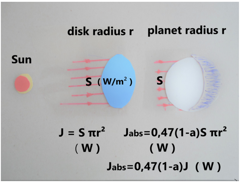
The Φ(1 – a) term “translates” the absorption of a disk into the absorption of a smooth hemisphere with the same radius.
When covering a disk with a hemisphere of the same radius the hemisphere’s surface area is 2π r². The incident Solar energy on the hemisphere’s area is the same as on the disk: Jdirect = π r² S
But the absorbed Solar energy by the hemisphere’s area of 2π r² is: Jabs = Φ*( 1 – a) π r² S
It happens because a smooth hemisphere of the same radius “r” absorbs only the Φ*(1 – a)S portion of the directly incident on the disk of the same radius Solar irradiation.
In spite of hemisphere having twice the area of the disk, it absorbs only the Φ*(1 – a)S portion of the directly incident on the disk Solar irradiation.
Gaseous Planets
Φ = 1 for gaseous planets, as Jupiter, Saturn, Neptune, Uranus, Venus, Titan.
Gaseous planets do not have a surface to reflect radiation. The solar irradiation is captured in the thousands of kilometers gaseous abyss. The gaseous planets have only the albedo “a”.
Heavy Cratered Planets
Φ = 1 for heavy cratered planets, as Calisto and Rhea ( not smooth surface planets, without atmosphere ).
The heavy cratered planets have the ability to capture the incoming light in their multiple craters and canyons. The heavy cratered planets have only the albedo “a”.
That is why the albedo “a” and the factor “Φ” we consider as different values. Both of them, the albedo “a” and the factor “Φ” cooperate in the
Energy in = Φ(1 – a) left side of the Planet Radiative Energy Budget.
Conclusively, the Φ -Factor is not the planet specular reflection portion itself.
The Φ -Factor is the Solar Irradiation Accepting Factor (in other words, Φ is the planet surface shape and roughness coefficient).
Bottom Line
What is going on here is that instead of Jabs.earth = 0,694* 1.361 π r² ( W ) we should consider Jabs.earth = 0,326* 1.361 π r² ( W ).
Averaged on the entire Earth’s surface we obtain:
Jsw.absorbed.average = [ 0,47*(1-a)*1.361 W/m² ] /4 =
= [ 0,47*0,694*1.361W/m² ] /4 = 444,26 W/m2 /4 = 111,07 W/m²
Jsw.absorbed.average = 111,07 W/m² or 111 W/m²
Example: Comparing Earth and Europa
Earth / Europa satellite measured mean temperatures 288 K and 102 K comparison
All the data below are satellites measurements. All the data below are observations.
| Planet |
Earth |
Europa |
| Tsatmean |
288 K |
102 K |
| R |
1 AU |
5.2044 AU |
| 1/R² |
1 |
0,0369 |
| N |
1 |
1/3.5512 rot/day |
| a |
0.3 |
0.63 |
| (1-a) |
0.7 |
0.37 |
| coeff |
0.91469 |
0.3158 |
We could successfully compare Earth /Europa ( 288 K /102 K ) satellite measured mean temperatures because both Earth and Europa (moon of Jupiter) have two identical major features.
Φearth = 0,47 because Earth has a smooth surface and Φeuropa = 0,47 because Europa also has a smooth surface.
cp.earth = 1 cal/gr*°C, it is because Earth has a vast ocean. Generally speaking almost the whole Earth’s surface is wet. We can call Earth a Planet Ocean. Europa is an ice-crust planet without atmosphere, Europa’s surface consists of water ice crust, cp.europa = 1cal/gr*°C.
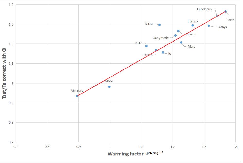
The table below shows how well the universal equation estimates temperatures of planets and moons measured by NASA.
| Planet |
Φ |
Te.correct |
[(β*N*cp)¹∕ ⁴]¹∕ ⁴ |
Tmean |
Tsat |
| Mercury |
0.47 |
364 |
0.8953 |
325.83 |
340 |
| Earth |
0.47 |
211 |
1.3680 |
287.74 |
288 |
| Moon |
0.47 |
224 |
0.9978 |
223.35 |
220 |
| Mars |
0.47 |
174 |
1.2270 |
213.11 |
210 |
| Io |
1 |
95.16 |
1.1690 |
111.55 |
110 |
| Europa |
0.47 |
78.83 |
1.2636 |
99.56 |
102 |
| Ganymede |
0.47 |
88.59 |
1.2090 |
107.14 |
110 |
| Calisto |
1 |
114.66 |
1.1471 |
131.52 |
134 ±11 |
| Enceladus |
1 |
55.97 |
1.3411 |
75.06 |
75 |
| Tethys |
1 |
66.55 |
1.3145 |
87.48 |
86 ± 1 |
| Titan |
1 |
84.52 |
1.1015 |
96.03 |
93.7 |
| Pluto |
1 |
37 |
1.1164 |
41.60 |
44 |
| Charon |
1 |
41.9 |
1.2181 |
51.04 |
53 |
My Comment:
This post explains why it is an error to treat Earth (or any planetary body) as a classic blackbody in either the absorption of incident energy or in the emission of radiation. Thus the typical energy balance cartoons are not funny, they are false and misleading. A further error arises in claiming that greenhouse gases like CO2 in the atmosphere cause surface warming by trapping Earth radiation and slowing the natural cooling. This fallacy is addressed directly in a previous post Why CO2 Can’t Warm the Planet.
The table above and graph below show that Earth’s warming factor is correctly calculated despite ignoring any effect from its thin atmosphere.


 Jon Entine writes again lamenting false alarms by scientists and journalists


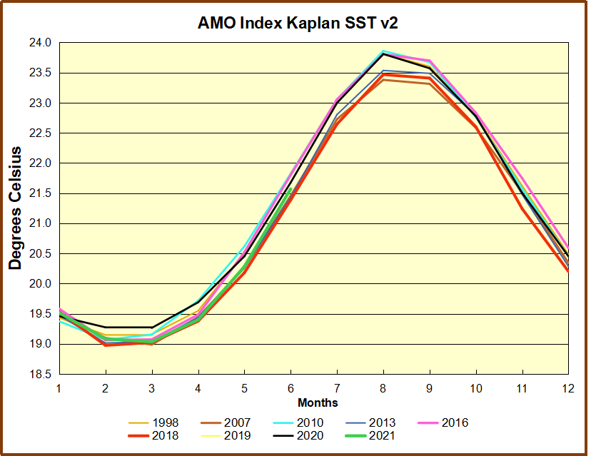
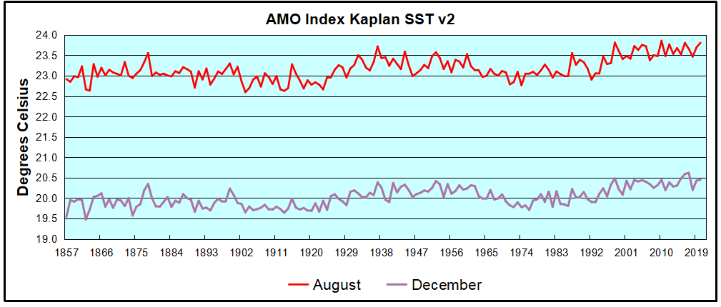 The AMO Index is from from Kaplan SST v2, the unaltered and not detrended dataset. By definition, the data are monthly average SSTs interpolated to a 5×5 grid over the North Atlantic basically 0 to 70N. The graph shows August warming began after 1992 up to 1998, with a series of matching years since, including 2020. Because the N. Atlantic has partnered with the Pacific ENSO recently, let’s take a closer look at some AMO years in the last 2 decades.