Many headlines proclaiming lots of warming with the current La Nina ending. Some examples from the usual suspects:
El Niño is coming, chances rising it will be historically strong,CNN
What Makes This Year’s Super El Niño the Strongest in 140 Years?, Science Times
Weather experts warn of ‘super’ El Niño. Here’s what could happen,. USA Today
Here’s What The Super El Niño Means In Your State, Weather.com
After all, warmists need warming to justify their narrative, and people attending outdoor sporting events in NH are noticing how cool it is presently. So hope abounds for a great reversal in coming months, while leaving unstated that oceanic cycles are a natural climate driver unaffected by CO2 emissions.
Importantly, the theory of human-caused global warming asserts that increasing CO2 in the atmosphere changes the baseline and causes systemic warming in our climate. On the contrary, the graph above shows all of the warming since 1947 was episodic, coming from three brief El Nino events associated with oceanic cycles. And in 2024 we saw an amazing episode with a temperature spike driven by ocean air warming in all regions, along with rising NH land temperatures, now dropping well below its peak.
Is a Super El Nino Coming? Yes and No.
The certainty in the headlines is speculative and exaggerated. The Climate Prediction Center is more circumspect and unbiased. The forecast is here: ENSO Alert System Status: El Niño Watch Synopsis in italics with my bolds and added images.
El Niño is likely to emerge soon (82% chance in May-July 2026)
and continue through Northern Hemisphere winter 2026-27
(96% chance in December 2026-February 2027).
In the past month, ENSO-neutral conditions continued, as indicated by near-average sea surface temperatures (SSTs) in the east-central equatorial Pacific Ocean [Fig. 1].
The latest weekly Niño-3.4 index value was +0.4°C, with the westernmost (Niño-4) and easternmost (Niño-1+2) indices at +0.5°C and +1.0°C, respectively [Fig. 2]. The equatorial subsurface temperature index (average from 180°-100°W) increased for the sixth consecutive month [Fig. 3], with widespread, significantly above-average subsurface temperatures across the equatorial Pacific [Fig. 4]. Westerly wind anomalies were observed over the western equatorial Pacific at low levels and were evident over the central and east-central Pacific at upper levels. Convection was near average on the equator near the Date Line and was suppressed around Indonesia [Fig. 5]. Collectively, the coupled ocean-atmosphere system reflected ENSO-neutral conditions.
The North American Multi-Model Ensemble (NMME) average, including the NCEP CFSv2 [Fig. 6], favors El Niño to form by next month and persist through Northern Hemisphere winter 2026-27.
While confidence in the occurrence of El Niño has increased since last month, there is still substantial uncertainty in the peak strength of El Niño, with no strength categorization exceeding a 37% chance [Figs. 7 & 8].
The strongest El Niño events in the historical record are characterized by significant ocean-atmosphere coupling through the summer, and it remains to be seen whether this occurs in 2026.Stronger El Niño events do not ensure strong impacts; they can only make certain impacts more likely (see CPC outlooks for probabilities of seasonal anomalies). In summary, El Niño is likely to emerge soon (82% chance in May-July 2026) and continue through Northern Hemisphere winter 2026-27 (96% chance in December 2026-February 2027).
Warming in Nino 3.4 index in 2026.
This discussion is a consolidated effort of the National Oceanic and Atmospheric Administration (NOAA), NOAA’s National Weather Service, and their funded institutions. Oceanic and atmospheric conditions are updated weekly on the Climate Prediction Center web site (El Niño/La Niña Current Conditions and Expert Discussions). A probabilistic strength forecast is available here. The next ENSO Diagnostics Discussion is scheduled for 11 June 2026.
The best context for understanding decadal temperature changes comes from the world’s sea surface temperatures (SST), for several reasons:
The ocean covers 71% of the globe and drives average temperatures;
SSTs have a constant water content, (unlike air temperatures), so give a better reading of heat content variations;
A major El Nino was the dominant climate feature in recent years.
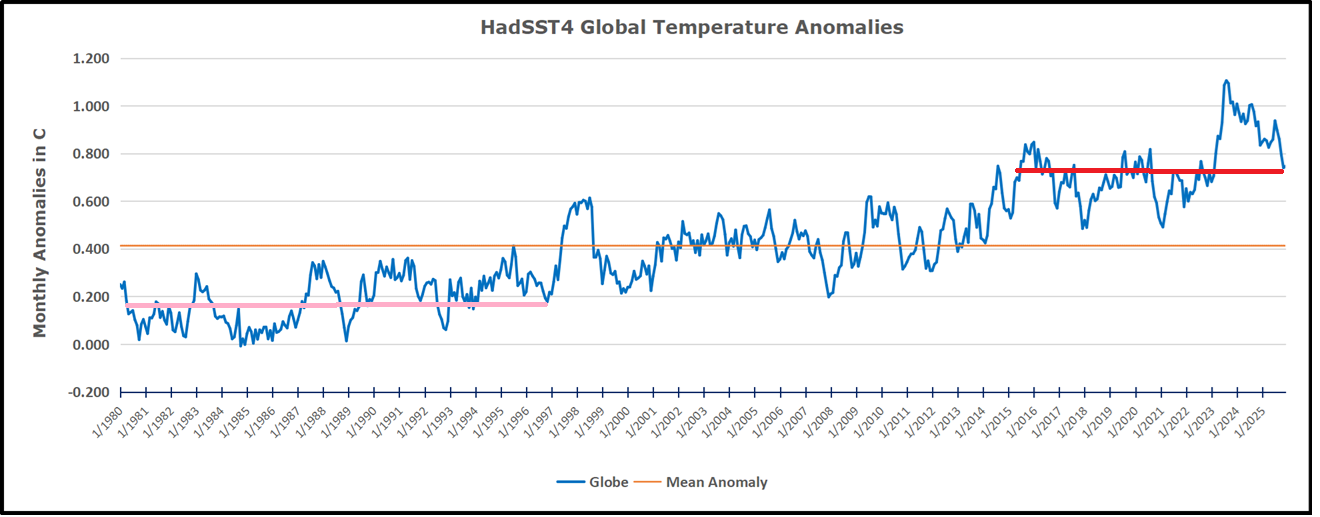
Previously I used HadSST3 for these reports, but Hadley Centre has made HadSST4 the priority, and v.3 will no longer be updated. This February report is based on HadSST 4, but with a twist. The data is slightly different in the new version, 4.2.0.0 replacing 4.1.1.0. Product page is here.
The Current Context
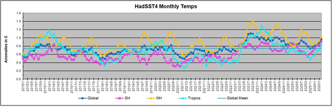
The chart below shows SST monthly anomalies as reported in HadSST 4.2 starting in 2015 through February 2026. A global cooling pattern is seen clearly in the Tropics since its peak in 2016, joined by NH and SH cycling downward since 2016, followed by rising temperatures in 2023 and 2024 and cooling in 2025, now with a steady mild rising in 2026.
Note that in 2015-2016 the Tropics and SH peaked in between two summer NH spikes. That pattern repeated in 2019-2020 with a lesser Tropics peak and SH bump, but with higher NH spikes. By end of 2020, cooler SSTs in all regions took the Global anomaly well below the mean for this period. A small warming was driven by NH summer peaks in 2021-22, but offset by cooling in SH and the tropics, By January 2023 the global anomaly was again below the mean.
Then in 2023-24 came an event resembling 2015-16 with a Tropical spike and two NH spikes alongside, all higher than 2015-16. There was also a coinciding rise in SH, and the Global anomaly was pulled up to 1.1°C in 2023, ~0.3° higher than the 2015 peak. Then NH started down autumn 2023, followed by Tropics and SH descending 2024 to the present. During 2 years of cooling in SH and the Tropics, the Global anomaly came back down, led by Tropics cooling from its 1.3°C peak 2024/01, down to 0.5C in November 2025. That same month, the Global anomaly exactly matched the mean for this period, with all regions converging on that value, lincluding a 5 month drop in NH. Now in 2026, due to a six-month rise in SH and Tropice, plus NH the last three months, the Global anomaly in April is matching the value 2 years ago, 04/2024.
Comment:
The climatists have seized on this unusual warming as proof their Zero Carbon agenda is needed, without addressing how impossible it would be for CO2 warming the air to raise ocean temperatures. It is the ocean that warms the air, not the other way around. Recently Steven Koonin had this to say about the phonomenon confirmed in the graph above:
El Nino is a phenomenon in the climate system that happens once every four or five years. Heat builds up in the equatorial Pacific to the west of Indonesia and so on. Then when enough of it builds up it surges across the Pacific and changes the currents and the winds. As it surges toward South America it was discovered and named in the 19th century It iswell understood at this point that the phenomenon has nothing to do with CO2.
Now people talk about changes in that phenomena as a result of CO2 but it’s there in the climate system already and when it happens it influences weather all over the world. We feel it when it gets rainier in Southern California for example. So for the last 3 years we have been in the opposite of an El Nino, a La Nina, part of the reason people think the West Coast has been in drought.
It has now shifted in the last months to an El Nino condition that warms the globe and is thought to contribute to this Spike we have seen. But there are other contributions as well. One of the most surprising ones is that back in January of 2022 an enormous underwater volcano went off in Tonga and it put up a lot of water vapor into the upper atmosphere. It increased the upper atmosphere of water vapor by about 10 percent, and that’s a warming effect, and it may be that is contributing to why the spike is so high.
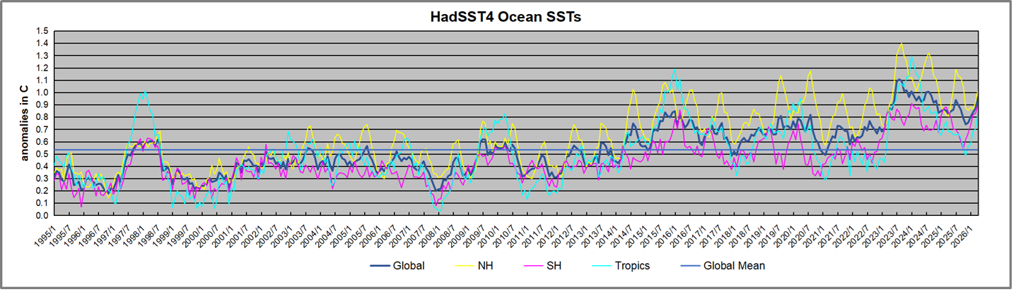
A longer view of SSTs
To enlarge, open image in new tab.
The graph above is noisy, but the density is needed to see the seasonal patterns in the oceanic fluctuations. Previous posts focused on the rise and fall of the last El Nino starting in 2015. This post adds a longer view, encompassing the significant 1998 El Nino and since. The color schemes are retained for Global, Tropics, NH and SH anomalies. Despite the longer time frame, I have kept the monthly data (rather than yearly averages) because of interesting shifts between January and July. 1995 is a reasonable (ENSO neutral) starting point prior to the first El Nino.
The sharp Tropical rise peaking in 1998 was dominant in the record, starting Jan. ’97 to pull up SSTs uniformly before returning to the same level Jan. ’99. There were strong cool periods before and after the 1998 El Nino event. Then SSTs in all regions returned to the mean in 2001-2.
SSTS fluctuate around the mean until 2007, when another, smaller ENSO event occurs. There is cooling 2007-8, a lower peak warming in 2009-10, following by cooling in 2011-12. Again SSTs are average 2013-14.
Now a different pattern appears. The Tropics cooled sharply to Jan 11, then rise steadily for 4 years to Jan 15, at which point the most recent major El Nino takes off. But this time in contrast to ’97-’99, the Northern Hemisphere produces peaks every summer pulling up the Global average. In fact, these NH peaks appear every July starting in 2003, growing stronger to produce 3 massive highs in 2014, 15 and 16. NH July 2017 was only slightly lower, and a fifth NH peak still lower in Sept. 2018.
The highest summer NH peaks came in 2019 and 2020, only this time the Tropics and SH were offsetting rather adding to the warming. (Note: these are high anomalies on top of the highest absolute temps in the NH.) Since 2014 SH has played a moderating role, offsetting the NH warming pulses. After September 2020 temps dropped off down until February 2021. In 2021-22 there were again summer NH spikes, but in 2022 moderated first by cooling Tropics and SH SSTs, then in October to January 2023 by deeper cooling in NH and Tropics.
Then in 2023 the Tropics flipped from below to well above average, while NH produced a summer peak extending into September higher than any previous year. Despite El Nino driving the Tropics January 2024 anomaly higher than 1998 and 2016 peaks, following months cooled in all regions, and the Tropics continued cooling in April, May and June along with SH dropping. After July and August NH warming again pulled the global anomaly higher, September through January 2025 resumed cooling in all regions, continuing February through April 2025, with little change in May,June and July despite upward bumps in NH. Now temps in all regions have cooled from August through November 2025, followed by a rebound of mild warming in 2026 appears in all regions through April.
What to make of all this? The patterns suggest that in addition to El Ninos in the Pacific driving the Tropic SSTs, something else is going on in the NH. The obvious culprit is the North Atlantic, since I have seen this sort of pulsing before. After reading some papers by David Dilley, I confirmed his observation of Atlantic pulses into the Arctic every 8 to 10 years.
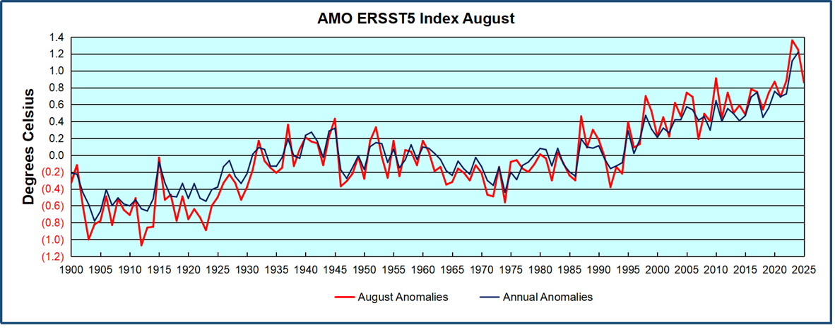
Contemporary AMO Observations
Through January 2023 I depended on the Kaplan AMO Index (not smoothed, not detrended) for N. Atlantic observations. But it is no longer being updated, and NOAA says they don’t know its future. So I find that ERSSTv5 AMO dataset has current data. It differs from Kaplan, which reported average absolute temps measured in N. Atlantic. “ERSST5 AMO follows Trenberth and Shea (2006) proposal to use the NA region EQ-60°N, 0°-80°W and subtract the global rise of SST 60°S-60°N to obtain a measure of the internal variability, arguing that the effect of external forcing on the North Atlantic should be similar to the effect on the other oceans.” So the values represent SST anomaly differences between the N. Atlantic and the Global ocean.
The chart above confirms what Kaplan also showed. As August is the hottest month for the N. Atlantic, its variability, high and low, drives the annual results for this basin. Note also the peaks in 2010, lows after 2014, and a rise in 2021. Then in 2023 the peak reached 1.4C before declining to 0.9 August 2026. An annual chart below is informative:
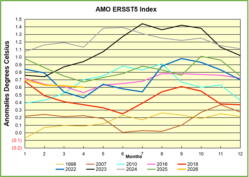
Note the difference between blue/green years, beige/brown, and purple/red years. 2010, 2021, 2022 all peaked strongly in August or September. 1998 and 2007 were mildly warm. 2016 and 2018 were matching or cooler than the global average. 2023 started out slightly warm, then rose steadily to an extraordinary peak in July. August to October were only slightly lower, but by December cooled by ~0.4C.
Then in 2024 the AMO anomaly started higher than any previous year, then leveled off for two months declining slightly into April. Remarkably, May showed an upward leap putting this on a higher track than 2023, and rising slightly higher in June. In July, August and September 2024 the anomaly declined, and despite a small rise in October, ended close to where it began. Note 2025 started much lower than the previous year and headed sharply downward, well below the previous two years, then since April through September aligning with 2010. In October there was an unusual upward spike, now reversed down to match 2022 and 2016. The orange 2026 line continues downward and is visible on top of 2016 purple line, well below the peak years of 2023 and 2024.
The pattern suggests the ocean may be demonstrating a stairstep pattern like that we have also seen in HadCRUT4.
The rose line is the average anomaly 1982-1996 inclusive, value 0.18. The orange line the average 1982-2025, value 0.41 also for the period 1997-2012. The red line is 2015-2025, value 0.74. As noted above, these rising stages are driven by the combined warming in the Tropics and NH, including both Pacific and Atlantic basins.
The oceans are driving the warming this century. SSTs took a step up with the 1998 El Nino and have stayed there with help from the North Atlantic, and more recently the Pacific northern “Blob.” The ocean surfaces are releasing a lot of energy, warming the air, but eventually will have a cooling effect. The decline after 1937 was rapid by comparison, so one wonders: How long can the oceans keep this up? And is the sun adding forcing to this process?
USS Pearl Harbor deploys Global Drifter Buoys in Pacific Ocean
2025 ended with a steadily declining rate of rising CO2 in the atmosphere following a 20 month cooling since April 2024, peak of an unusual and unexplained warming spike. That rate declined further in the first four months of 2026. Historical records show that around 1875 was the coldest time in the last 10,000 years. That was the end of the Little Ice Age (LIA), and since then temperatures have warmed at an average rate of about 0.5C per century. The recovery of the biosphere and ocean warming resulted in rising levels of CO2 in the atmosphere.
Syun-Ichi Akasofu, founder of the University of Alaska Fairbanks’ Geophysical Institute reported on this pattern in 2009.
At times, there are warming spikes, in the 1930s and 40s for example, and the rate of rising CO2 goes up. At other times, such as 1950s and 60s, temperatures cool, and rising CO2 slows down. More recently, in 2023 and 24, we saw temperatures spike up before falling back down in 2025 and now in 2026. [Note: A study of ocean biochemistry processes confirms that since the end of the LIA rising temperatures have been accompanied by rising CO2 at a rate of ~2 ppm per year. [ See: Slam Dunk: Δtemp Drives Δco2, Ocean Biochemistry at Work ]
Furthermore, going back to previous warmings prior to the satellite record shows that the entire rise of 0.8C since 1947 is due to oceanic, not human activity.
Importantly, the theory of human-caused global warming asserts that increasing CO2 in the atmosphere changes the baseline and causes systemic warming in our climate. On the contrary, all of the warming since 1947 was episodic, coming from three brief events associated with oceanic cycles. And in 2024 we saw an amazing episode with a temperature spike driven by ocean air warming in all regions, along with rising NH land temperatures, now dropping well below its peak.
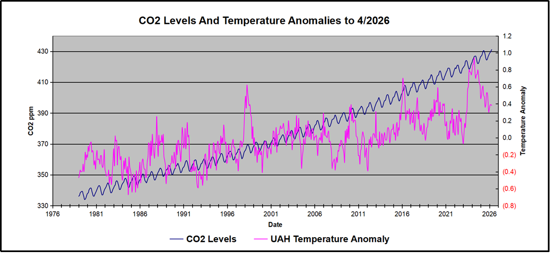
Previously I have demonstrated that changes in atmospheric CO2 levels follow changes in Global Mean Temperatures (GMT) as shown by satellite measurements from University of Alabama at Huntsville (UAH). A link to that background post is provided later below.
This post updates the analysis with the most current observations, testing the premise that temperature changes are predictive of changes in atmospheric CO2 concentrations. The chart at the top shows the two monthly datasets: CO2 levels in blue reported at Mauna Loa, and Global temperature anomalies in purple reported by UAHv6.1, both through April 2026. Would such a sharp increase in temperature be reflected in rising CO2 levels, according to the successful mathematical forecasting model? Would CO2 levels decline as temperatures dropped following the peak?
The answer is yes: that temperature spike resulted
in a corresponding CO2 spike as expected.
And lower CO2 levels followed the temperature decline.
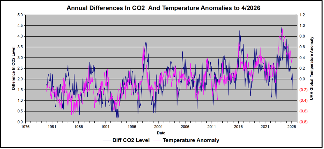
Above are UAH temperature anomalies compared to CO2 monthly changes year over year.
Changes in monthly CO2 synchronize with temperature fluctuations, which for UAH are anomalies referenced to the 1991-2020 period. CO2 differentials are calculated for the present month by subtracting the value for the same month in the previous year (for example April 2026 minus April 2025). Temp anomalies are calculated by comparing the present month with the baseline month. Note the recent CO2 upward spike and drop following the temperature spike and drop.
The table below shows clearly the pattern of observed temperatures declining along with declining rates of rising observed CO2. The CO2 rate peaked at 4.41 ppm, then declined over the next 25 months to 1.48 ppm, nearly the baseline rate since the LIA. There are fluctuations in the CO2 monthly response since the differential is influenced by the previous year as well as current year. By 2026/4, the rate of 1.48 ppm was one-third of the peak rate of 4.41 ppm.
Month
temperature anomaly
co2 Diff. from previous year
2024\1
0.79
3.32
2024\2
0.86
4.23
2024\3
0.87
4.41
2024\4
0.94
3.14
2024\5
0.78
2.87
2024\6
0.7
3.25
2024\7
0.74
3.72
2024\8
0.75
3.31
2024\9
0.8
3.53
2024\10
0.73
3.56
2024\11
0.64
3.39
2024\12
0.62
3.54
2025\1
0.46
3.85
2025\2
0.5
2.54
2025\3
0.58
2.77
2025\4
0.61
3.13
2025\5
0.5
3.61
2025\6
0.48
2.70
2025\7
0.36
2.32
2025\8
0.39
2.49
2025\9
0.53
2.34
2025\10
0.53
2.49
2025\11
0.43
2.61
2025\12
0.3
2.09
2026\1
0.35
1.97
2026\2
0.39
2.26
2026\3
0.38
2.01
2026\4
0.39
1.48
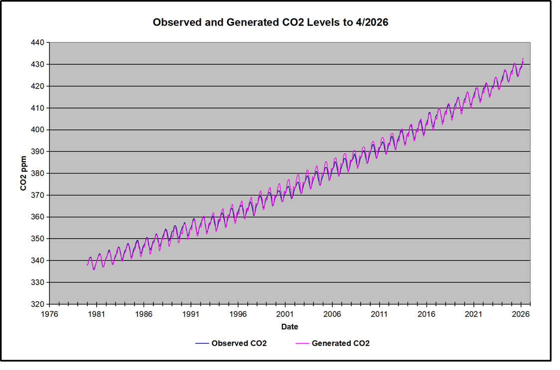
The final proof that CO2 follows temperature due to stimulation of natural CO2 reservoirs is demonstrated by the ability to calculate CO2 levels since 1979 with a simple mathematical formula:
For each subsequent year, the CO2 level for each month was generated
CO2 this month this year = a + b × Temp this month this year + CO2 this month last year
The values for a and b are constants applied to all monthly temps, and are chosen to scale the forecasted CO2 level for comparison with the observed value. Here is the result of those calculations.
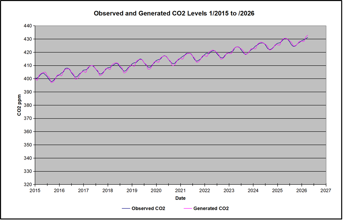
In the chart calculated CO2 levels correlate with observed CO2 levels at 0.9988 out of 1.0000. This mathematical generation of CO2 atmospheric levels is only possible if they are driven by temperature-dependent natural sources, and not by human emissions which are small in comparison, rise steadily and monotonically. For a more detailed look at the recent fluxes, here are the results since 2015, an ENSO neutral year.
For this recent period, the calculated CO2 values match well the annual highs, while some annual generated values of CO2 are slightly higher or lower than observed at other months of the year. Still the correlation for this period is 0.9946.
Key Point
Changes in CO2 follow changes in global temperatures on all time scales, from last month’s observations to ice core datasets spanning millennia. Since CO2 is the lagging variable, it cannot logically be the cause of temperature, the leading variable. It is folly to imagine that by reducing human emissions of CO2, we can change global temperatures, which are obviously driven by other factors.
I received today an email from Dr. Bernd Fleischmann acknowledging my effort to present an english version of his recent presentation. In order to have a more accurate and complete communication he sent me the set of english slides in a pdf embedded below. Along with several additional exhibits, this makes a much more powerful and accessible statement of his points regarding the notion of a Climate Crisis. You can either scroll through the exhibits embedded on this page, or download the pdf file by hitting the download button at the bottom.
I thank Dr. Fleischmann for his research and organized critique of this issue and for speaking truth to the powers that be, many of whom are still entranced by a false narrative.
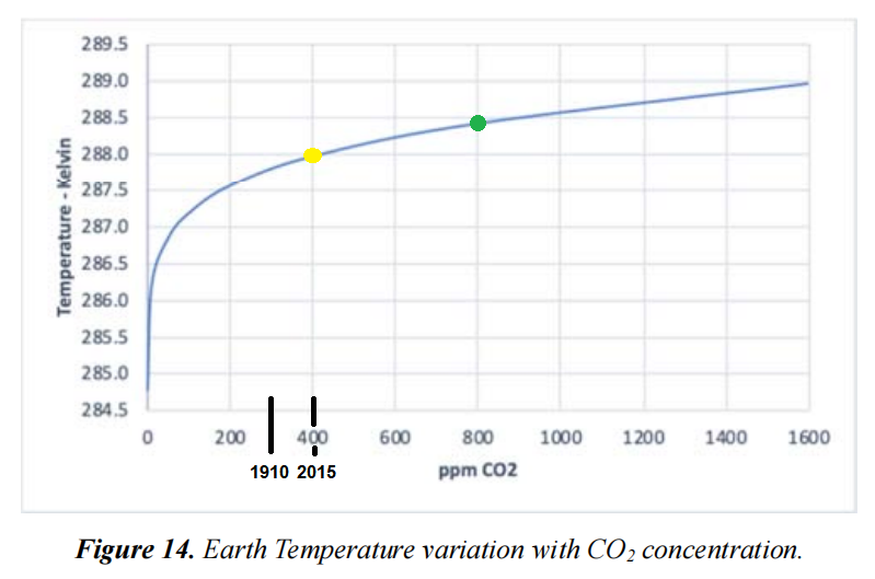
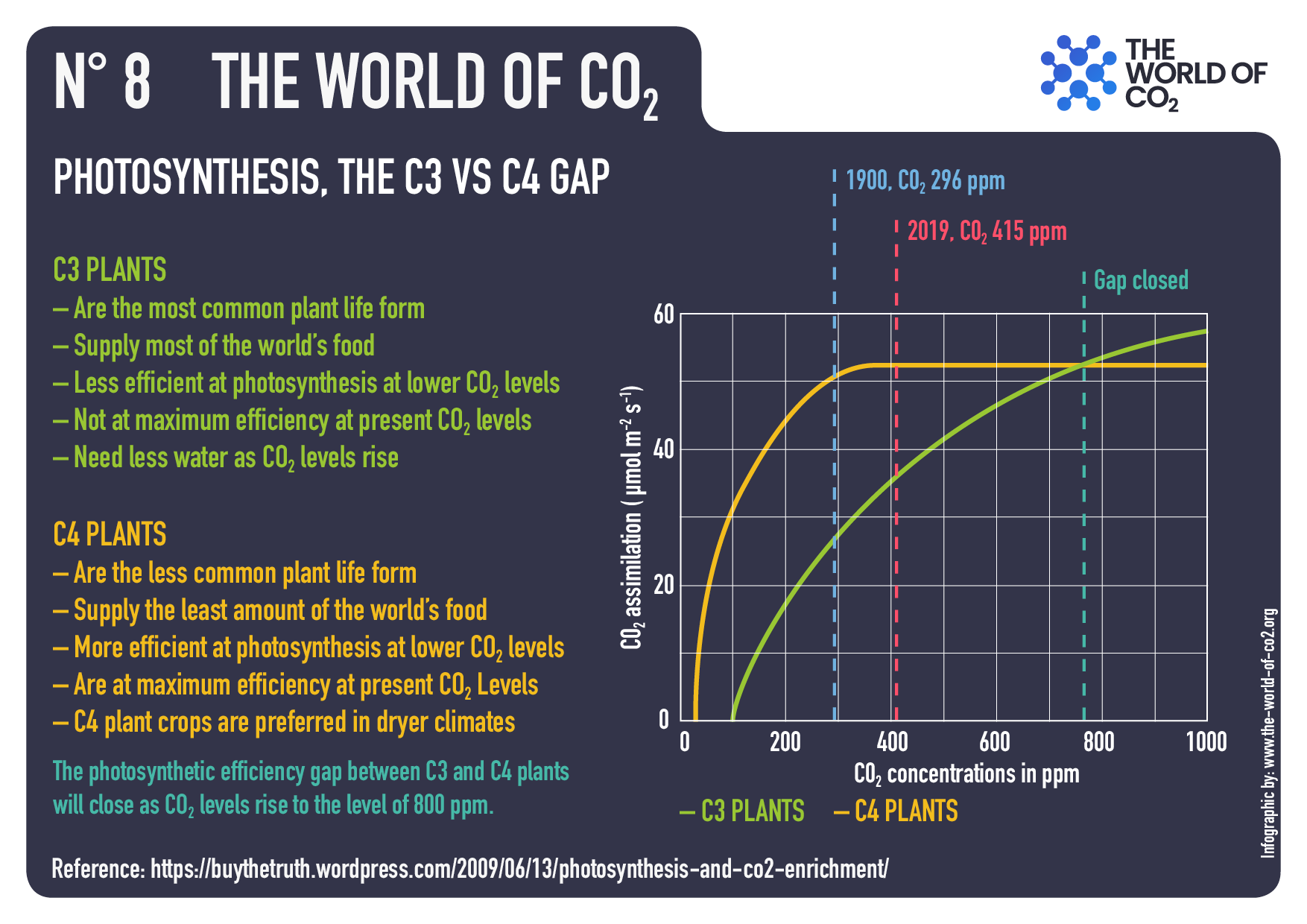
Yellow dot is the present day ppm CO2 and the Green dot is double present ppm CO2. NASA estimates CO2 was 300 ppm in 1910 and 400 ppm in 2015. Exhibit from Coe et al. with added information.
Consensus climate science asserts as given a difference of 33°K between earth surface temperature average 288°K and top of the atmosphere temperature average 255°K. It further claims that IR active gases in the atmosphere (so-called “greenhouse gases”) cause the entire 33°K by their absorption of IR emitted from the earth. A recent peer-reviewed paper took without challenging that presumption and proceeded to attribute the warming effect to the various GHGs: H2O, CO2, CH4, and N2O. The researchers are expert with measures of atmospheric radiation activity and use of the HITRAN database. The paper is The Impact of CO2, H2O and Other “Greenhouse Gases” on Equilibrium Earth Temperatures by David Coe et al. Excerpts in italics with my bolds. H\T Paul Homewood
Abstract
It has long been accepted that the “greenhouse effect”, where the atmosphere readily transmits short wavelength incoming solar radiation but selectively absorbs long wavelength outgoing radiation emitted by the earth, is responsible for warming the earth from the 255K effective earth temperature, without atmospheric warming, to the current average temperature of 288K. It is also widely accepted that the two main atmospheric greenhouse gases are H2O and CO2.
What is surprising is the wide variation in the estimated warming potential of CO2, the gas held responsible for the modern concept of climate change. Estimates published by the IPCC for climate sensitivity to a doubling of CO2 concentration vary from 1.5 to 4.5°C based upon a plethora of scientific papers attempting to analyse the complexities of atmospheric thermodynamics to determine their results.
The aim of this paper is to simplify the method of achieving a figure for climate sensitivity not only for CO2, but also CH4 and N2O, which are also considered to be strong greenhouse gases, by determining just how atmospheric absorption has resulted in the current 33K warming and then extrapolating that result to calculate the expected warming due to future increases of greenhouse gas concentrations.
The HITRAN database of gaseous absorption spectra enables the absorption of earth radiation at its current temperature of 288K to be accurately determined for each individual atmospheric constituent and also for the combined absorption of the atmosphere as a whole. From this data it is concluded that H2O is responsible for 29.4K of the 33K warming, with CO2 contributing 3.3K and CH4 and N2O combined just 0.3K. Climate sensitivity to future increases in CO2 concentration is calculated to be 0.50K, including the positive feedback effects of H2O, while climate sensitivities to CH4 and N2O are almost undetectable at 0.06K and 0.08K respectively. This result strongly suggests that increasing levels of CO2 will not lead to significant changes in earth temperature and that increases in CH4 and N2O will have very little discernable impact.
Discussion
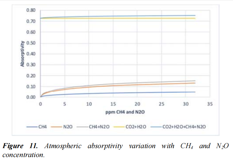
Unlike water vapour, the mean CO2 concentration will remain constant at all atmospheric levels, although its density will reduce as altitude increases and pressure and temperature decrease. CO2 concentration however will vary considerably with location and with seasons, as biospheric photosynthesis removes substantial seasonal amounts of CO2 from the atmosphere. A mean level of 400ppm has been assumed for the following calculations of atmospheric absorptivity. Similarly, CH4 and N2O concentrations will be considered to remain constant at current average levels of 1.8ppm and 0.32ppm respectively.
CH4 and N2O are indeed very powerful absorbers of infra-red radiation. Increasing the concentrations of each gas to 30ppm (a 16fold increase in the case of CH4 and an almost 100fold increase in N2O) would result in a combined absorption of 15%, close to the value of 18% for 400ppm of CO2. The combined absorptive impact in the presence of H2O and CO2 however reduces this absorption to less than 3% as can be seen in Figure 11 due to the overlap of the absorption bands of CO2 and H2O. It would thus take a huge increase in atmospheric concentrations of these gases to have any significant impact on total atmospheric infra-red absorption.
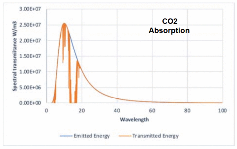
Figures 4, 5 and 6 show the transmission of the spectral radiation Eλ, through current atmospheric concentrations of CO2 and H2O and through the combination of the two gases. Absorptivities of both CO2 and H2O, as well as CH4 and N2O, have been determined over the range 3 to 100µm to a resolution of 0.1cm-1. It is clear that significant amounts of radiated energy are absorbed by both CO2 and H2O. It is also clear that there is considerable overlap of the absorption bands of CO2 and H2O with the H2O absorption being the dominant factor.
Coe et al. Figures 4, 5 and 6.
It is of some interest to calculate the increase in temperature that has occurred due to the increase in atmospheric CO2 levels from the 280ppm prior at the start of the industrial revolution to the current 420ppm registered at the Mona Loa Observatory. (K. W. Thoning et. al. 2019) [17]. The HITRAN calculations show that atmospheric absorptivity has increased from 0.727 to 0.730 due to the increase of 140ppm CO2, resulting in a temperature increase of 0.24Kelvin. This is, therefore, the full extent of anthropogenic global warming to date.
Conclusions
From this it follows that the 33Kelvin warming of the earth from 255Kelvin, widely accepted as the zero-atmosphere earth temperature, to the current average temperature of 288Kelvin, is a 29.4K increase attributed to H2O, 3.3K to CO2 and 0.3K to CH4 and N2O combined. H2O is by far the dominant greenhouse gas, and its atmospheric concentration is determined solely by atmospheric temperature. Furthermore, the strength of the H2O infra-red absorption bands is such that the radiation within those bands is quickly absorbed in the lower atmosphere resulting in further increases in H2O concentrations having little further effect upon atmospheric absorption and hence earth temperatures. An increase in average Relative Humidity of 1% will result in a temperature increase of 0.03Kelvin.
By comparison CO2 is a bit player. It however does possess strong spectral absorption bands which, like H2O, absorb most of the radiated energy, within those bands, in the lower atmosphere. It also suffers the big disadvantage that most of its absorption bands are overlapped by those of H2O thus reducing greatly its effectiveness. In fact, the climate sensitivity to a doubling of CO2 from 400ppm to 800ppm is calculated to be 0.45 Kelvin. This increases to 0.50 Kelvin when feedback effects are taken into account. This figure is significantly lower than the IPCC claims of 1.5 to 4.5 Kelvin.
The contribution of CH4 and N2O is miniscule. Not only have they contributed a mere 0.3Kelvin to current earth temperatures, their climate sensitivities to a doubling of their present atmospheric concentrations are 0.06 and 0.08 Kelvin respectively. As with CO2 their absorption spectra are largely overlapped by the H2O spectra again substantially reducing their impact.
It is often claimed that a major contributor to global warming is the positive feedback effect of H2O. As the atmosphere warms, the atmospheric concentration of H2O also increases, resulting in a further increase in temperature suggesting that a tipping point might eventually be reached where runaway temperatures are experienced. The calculations in this paper show that this is simply not the case. There is indeed a positive feedback effect due to the presence of H2O, but this is limited to a multiplying effect of 1.183 to any temperature increase. For example, it increases the CO2 climate sensitivity from 0.45K to 0.53K.
A further feedback, however, is caused by a reduction in atmospheric absorptivity as the spectral radiance of the earth’s emitted energy increases with temperature, with peak emissions moving slightly towards lower radiation wavelengths. This causes a negative feedback with a temperature multiplier of 0.9894. This results in a total feedback multiplier of 1.124, reducing the effective CO2 climate sensitivity from 0.53 to 0.50 Kelvin.
Feedback effects play a minor role in the warming of the earth. There is, and never can be, a tipping point. As the concentrations of greenhouse gases increase, the temperature sensitivity to those increases becomes smaller and smaller. The earth’s atmosphere is a near perfect example of a stable system. It is also possible to attribute the impact of the increase in CO2 concentrations from the pre-industrial levels of 280ppm to the current 420ppm to an increase in earth mean temperature of just 0.24Kelvin, a figure entirely consistent with the calculated climate sensitivity of 0.50 Kelvin.
The atmosphere, mainly due to the beneficial characteristics and impact of H2O absorption spectra, proves to be a highly stable moderator of global temperatures. There is no impending climate emergency and CO2 is not the control parameter of global temperatures, that accolade falls to H2O. CO2 is simply the supporter of life on this planet as a result of the miracle of photosynthesis.
Footnote:
Coe et al. confirm what Ångström showed experimentally a century ago. He stated in 1900:
“Under no circumstances should carbon dioxide absorb more than 16 percent of terrestrial radiation, and the size of this absorption varies quantitatively very little, as long as there is not less than 20 percent of the existing value.” See Pick Your A-Team: Arrhenius or Ångström
Aaron L. Nielson writes at Civitas Outlook regarding a possilble outbreak of scientifc chicanery by regulatory agencies in the wake of SCOTUS dismissing the Chevron deference to such bureaucrats.
The Court’s decision to overrule Chevron deference may have
the unintended effect of strengthening the
temptation to rely on the science charade.
What happens after the U.S. Supreme Court makes it harder for agencies to regulate? There are at least a couple of possibilities. Option One: an agency might just stop trying to regulate under that policy. Or Option Two: an agency might seek another path to achieve the same thing. The danger of Option Two may be one of the most important—but underappreciated—of the Court’s decision in Loper Bright, which overruled Chevron deference. My fear is that agencies will not simply give up but instead will lean into what Professor Wendy Wagner has dubbed “the Science Charade.”
Let’s start with some basics. Under Chevron, courts would defer to an agency’s reasonable interpretation of ambiguous statutory language. The idea was that because agencies are more politically accountable than courts and have a better technical grasp of how complex statutory schemes work, when a statute administered by an agency is ambiguous, courts should get out of the way and let the agency act so long as the agency’s resolution of the ambiguity is reasonable. Chevron presented legal and conceptual problems (including why ambiguity should favor the agency rather than regulated parties, who may be punished—sometimes even criminally—for violating the agency’s view of the statute), but also a practical one that goes to the heart of administrative incentives. Because agencies could expand their power by finding ambiguities, agency officials, often responding to political demands, would unsurprisingly stretch to find them so they could pursue aggressive policies that Congress never authorized.
In Loper Bright, the Court essentially said “enough.” Under our Constitution, the legislature makes the law, and courts ensure that the executive stays within the law as written by Congress. After Loper Bright, courts decide the meaning of statutes, even statutes with some ambiguity. As Justice Clarence Thomas has, Article III’s vesting of the “judicial power” in the judiciary “calls for that exercise of independent judgment,” but “Chevron deference precludes judges from exercising that judgment,” thereby “wrest[ing] from Courts the ultimate interpretative authority to ‘say what the law is,’ and hand[ing] it over to the Executive.”
Loper Bright thus should be a welcome development for purposes of respecting the separation of powers, especially if agencies accept the limits of their authority. But there is a danger: What if they don’t? What if the same political dynamic that prompted agencies to stretch statutes in the first place may also prompt agencies to find alternatives to Chevron?
I have recently penned an articleabout one such alternative: the science charade. Wagner coined the term decades ago to explain an important dynamic within administrative law. As she observed, because judges often defer to agencies on questions of science, “the courts offer agencies strong and virtually inescapable incentives to conceal policy choices under the cover of scientific judgments and citations.” Rather than justifying the agency’s policy choice as a policy choice, agencies instead may dress-up their decisions as compelled by science.
To be sure, there are limits to the science charade. Agencies must engage in reasoned decision-making and justify their conclusions as not arbitrary or capricious. So if agencies push too hard, reviewing courts will sometimes catch on that a regulator’s policy choice has outrun its science. For example, I once worked on a where the National Marine Fishery Service used a “model [that] assumed that salmonids would be exposed to lethal levels of the pesticides continuously for a 96-hour period,” but never explained “why the 96-hour exposure assumption accurately reflected real-world conditions.” The appellate court didn’t buy it—but the district court did. This illustrates how difficult it can be to persuade a court to second-guess an agency’s invocation of science. (I often wonder what would have happened had the Environmental Protection Agency itself not criticized the National Marine Fishery Service’s “unreasonable” assumption.)
The intuition driving Wagner’s theory, thus, is impossible to brush aside. To be clear, I do not claim that agencies do this all the time. When we discuss the administrative state, we often focus on unusual occurrences rather than on an agency’s more banal, bread-and-butter operations. But that does not mean we should not worry about incentives or ignore the risk that unthinkable behavior may become more thinkable if bad incentives are not curbed. Agencies are filled with people who want certain policies. Human nature being what it is, people sometimes respond to incentives. So if the best way to get a policy through is to drape a policy decision in as much science as an agency can credibly muster, shouldn’t we expect regulators sometimes to succumb to the science charade’s temptation?
And that brings me to my thesis: Because agencies can no longer use Chevron to pursue policies that Congress has not allowed, their incentive to use the “science charade” should increase, again, at least at the margins.
As I explain in my article, suppose Congress has authorized an agency to “regulate Chemical X if it harms the public health.” Suppose further that agency officials want to restrict Chemical X because it harms birds, but it is unclear whether it has negative health effects on people. Under Chevron, the agency might have argued that the statute is ambiguous as to whether its authority is limited to protecting human health, so it can use the statute to protect birds, too. Of course, such a strained reading may have worked even before Loper Bright, but now agencies know that this interpretation won’t fly. So instead, the agency may lean into the science charade. Because generalist judges may be more comfortable deferring to scientific analysis than to overt policymaking, agencies may deduce that they should not say “we care about birds,” but instead should overstate what the science says about the effects of Chemical X on human health.
Using the science charade as a substitute for Chevron, may thus
allow them to protect birds under the guise of protecting human health.
This increased incentive to rely on faux science should be alarming for at least two reasons.One, the statute books overflow with delegations that are triggered when certain facts about the world exist—facts that require scientific or technical (e.g., economics) judgments beyond the ordinary experience of judges. Agencies may thus stop scouring the U.S. Code for ambiguities and instead scour it for delegations that kick in if certain scientific findings are made. And two, there is a “boy who called wolf” danger.
Good policy needs good science, but if agencies cannot be trusted,
skeptical courts may erroneously reject agency conclusions
that, in reality, are supported by good science.
Unfortunately, there is no great solution to the science charade. The reason why the charade can work is that judges are not scientists, and even if they have some scientific or other technical training, no one can know everything about everything. Generalist judges are simply not equipped to understand all the technical issues the administrative state presents. Although there are downsides, the best answer might be greater procedural formality in the regulatory process—complete with more extensive cross-examination of agency experts to create a record that may be more understandable to judges. (Of course, the dynamic effect of that prospect may be to dissuade bad science from the get-go.) As I have explained elsewhere, increasing procedural rigor is not costless, which is one reason the administrative state has largely moved away from procedural devices such as cross-examination. But for certain categories of regulatory action, it might make sense to head off bad incentives. Of course, some may argue (presumably, Wagner herself) that such costs are not worth it. But especially given the heightened incentive caused by Chevron’s demise, I’m not so sanguine.
Like most complex systems, the administrative state resists easy answers. It is important to think through incentives and unintended consequences. The Court’s decision to overrule Chevron deference addresses one incentive—the enticement to hunt for statutory language that agencies can claim is ambiguous. But it may have the unintended effect of strengthening the temptation to rely on the science charade. There is no silver-bullet solution; it is important to recognize why agencies act as they do and to create systems to best maximize the benefits of agency expertise while preventing its abuse.
Footnote: A Blast from the past warning about this very issue
On the subject, ‘How to get climate policy back on course’ , A panel of British professors included this observation:
“Climate change was brought to the attention of policy-makers by scientists. From the outset, these scientists also brought their preferred solutions to the table in US Congressional hearings and other policy forums, all bundled. The proposition that ‘science’ somehow dictated particular policy responses, encouraged –indeed instructed – those who found those particular strategies unattractive to argue about the science.
So, a distinctive characteristic of the climate change debate has been of scientists claiming with the authority of their position that their results dictated particular policies; of policy makers claiming that their preferred choices were dictated by science, and both acting as if ‘science’ and ‘policy’ were simply and rigidly linked as if it were a matter of escaping from the path of an oncoming tornado.
In the case of climate modelling, which has been prominent in the public debate, the many and varied ‘projective’ scenarios (that is, explorations of plausible futures using computer models conditioned on a large number of assumptions and simplifications) are sufficient to undergird just about any view of the future that one prefers. But the ‘projective’ models they produce have frequently been conflated implicitly and sometimes wilfully with what politicians really want, namely ‘predictive’ scenarios: that is, precise forecasts of the future.”
In the above presentation, Dr. Bernd Fleischmann cuts to the quick on the Issue: Is Climate hysteria scientifically refuted? In this provocative lecture, the speaker addresses current climate and environmental issues in the context of global warming and the political agenda. He criticizes the German Federal Constitutional Court’s climate rulingand questions the compatibility of fundamental rights with CO2 reduction measures. Furthermore, he refutes the tipping point theory and many climate models as unreliable, emphasizing the marginal influence of CO₂ on temperature in favor of natural factors.
He also addresses the unintended consequences of wind power and warns against a political agendathat allegedly seeks greater control over the population. The speaker appeals to the audience to critically consider the information disseminated. H/T NoTricksZone
I received today an email from Dr. Bernd Fleischmann acknowledging my effort to present an english version of his recent presentation. In order to have a more accurate and complete communication he sent me the set of english slides in a pdf embedded below. Along with several additional exhibits, this makes a much more powerful and accessible statement of his points regarding the notion of a Climate Crisis. You can either scroll through the exhibits embedded on this page, or download the pdf file by hitting the download button at the bottom. Link in red goes to post with english slikes.
The original language is german, but video settings allow for choice of language, both audio and closed captions. For those who prefer to read I provide below a lightly edited transcript with my bolds and added images consisting of the following themes:
Introduction to the Climate Issue
Ignorance as the Basis of Climate Policy
The Media and Their Responsibility
Propaganda in Climate Research
The Reality of the ‘Climate Crisis’
The Influence of CO2 on Plants
Wind Turbines and Their Unexpected Consequences
Redistribution Through Climate Policy
Conclusions and Personal Remarks
Introduction to the Climate Issue
The question is, of course, a rhetorical question, as you can imagine. But the topic is interesting and still very important. And you can see that, for example, in the climate decision of the Federal Constitutional Court. Most of you probably don’t remember it being published a few years ago. But the fewest know that we will be affected by it for the next few years. Because it was decided that for Germany a carbon dioxide budget of 6.7 gigatons is still available, so that we can save the global climate.
And we have already used half of that. And we will have used the remaining half in the next five years or so. And what comes next? The Constitutional Court already has a solution for this. It wrote at the time that behaviors that are directly or indirectly associated with CO2 emissions can only be allowed if the basic rights can be implemented in accordance with climate protection. But the relative weight of freedom of movement, i.e. not free time, but freedom of movement, i.e. eating a sausage, driving a car, these are freedom of movement, because all of this is harmful to carbon dioxide. They are then restricted.
And we have to be aware of that. In the decision that took place without oral negotiations and without listening to reasonable people, but only relied on the results of the IPCC and the Potsdam Institute for Climate Research, only these, I would say, alarmist models were laid down. And now we have to ask ourselves, can you trust them? Can you trust the Potsdam Institute for Climate Research? It is the most influential climate institute in the world with almost 500 employees, which we all here finance, as far as we pay taxes.
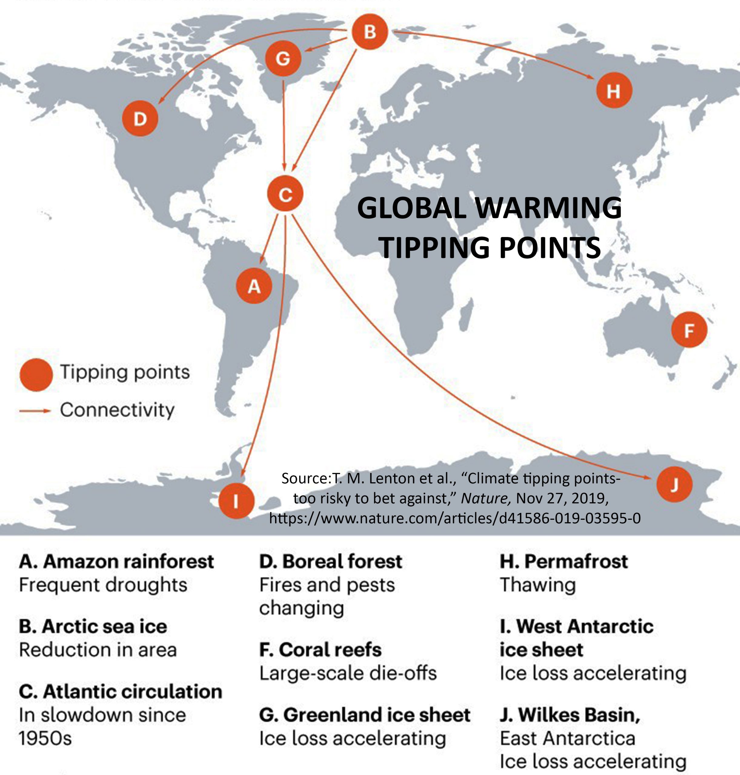
And they, for example, they brought up the legend of the tipping points. There was a publication in 2008. And this is a picture from this publication without the arrows. I added the arrows. I may have to explain it briefly. Tipping points are elements of the Earth’s climate system. These are these colorful surfaces here that will tip when it gets a few degrees warmer. That’s the assumption. And they defined around a dozen of these tipping points at the time.
And eleven years later, in 2019, the five elements on which the arrows indicate, I added these arrows because they no longer appeared in the update in 2019. For example, the greening of the Sahara was a positive tipping point. The theory is, and it’s actually true so far, when it gets warmer, more water evaporates from the oceans. There are then clouds and then it rains more. And then the Sahara turns green. And as a tipping point, it was also defined that way because it stays green.
But because this is not alarmistic enough, this tipping point was thrown out. And the other tipping points don’t appear in the update either. This is a graphic from the update in 2019. Other tipping points are defined there. But they have long been contradicted by statistics and climate history. So the greening of the Sahara was no longer an issue.
And measurements contradict almost all these tipping points. And as alarmists, they pay for themselves. So you can’t trust the Potsdam Institute for Climate Follow-up Research.
At least, you can trust the World Climate Council. They wrote something right 13 years ago. Namely, if the CO2 content in the atmosphere doubles, i.e. 100% more, then the temperature rises by any value between 1 and 6 degrees. That was pretty honest. Especially because they also added with 10% more probability, with 5% less probability.
Ignorance as the Basis of Climate Policy
But ultimately, this tension between 1 and 6 degrees means that they don’t know. This is a sign of ignorance. And everything that is told to us, it is based on a mean value that they have taken, but which cannot be justified by the models. It is arbitrary.
If you look at CO2 alone, then it becomes warmer by a maximum of 1 degree, rather less. And everything that is added, it comes through feedback. And these positive feedbacks, these reinforcing feedbacks. A feedback, a positive one is, for example, if I hold the microphone towards the speaker, then it whistles. This is a reinforcing feedback.
And every reinforcing feedback in a loss-free system leads to instability. And the climate would then be unstable if these models were correct. But the climate has been stable for the last 10,000 years, as we all know. The climate system is stable, the feedbacks are not reinforcing. And the measurements also confirm these reinforcing feedbacks.
Richard Lindzen is one of the advisors of Donald Trump. And he is an emerited professor. Almost everyone who dares to tell the truth is emerited these days, because they are no longer dependent on financial support. And he said, all models do not agree with the observations. So the positive feedback in the models is wrong. In the last IPCC report of 2021, this span was slightly reduced from 1 to 6 degrees.
But at the same time he wrote, our new models scatter more than the old ones. That is, it is actually a larger span that these models produce, which has nothing to do with reality. And from the new IPCC report is this graph.
I have to explain this now. This graph represents the reflected solar radiation. What comes down from the sun is reflected. From clouds, from everything that is on the earth’s surface, from ice and snow, of course, but also from plants, etc. And this graph, the black one, is supposed to be the measurement. And the colorful ones are models. And this graph shows that the reflection is increasing. So more is scattered back. And if more solar radiation is scattered back, it gets colder.
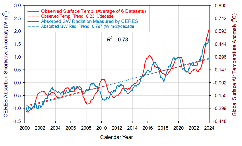
Figure 8. Comparison between observed global temperature anomalies and CERES-reported changes in the Earth’s absorbed solar flux. The two data series representing 13-month running means are highly correlated with the absorbed SW flux explaining 78% of the temperature variation (R2 = 0.78). The global temperature lags the absorbed solar radiation between 0 and 9 months, which indicates that climate change in the 21st Century was driven by solar forcing.
So this graph indicates that this cannot be a reason for the warming that we have found. And this is the original graph, the lower graph. From the CERES program, that is a satellite measurement program, you can call it. And the two graphs are exactly mirrored. So in fact, the reflected solar radiation, which is reflected by the sun, has become less over the last few years. And significantly less. And that explains the warming. That is, because the IPCC has shown the opposite, they have mirrored it. This cannot have been a coincidence.
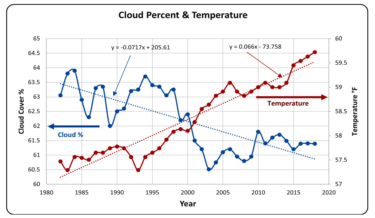
Figure 10. This graph is the cloud fraction and is set forth on the left vertical axis. The temperature is on the right vertical axis and the horizontal axis represents the observation year. The information was extrapolated from figures prepared by Hans-Rolf Dubal and Fritz Vahrenholt [37]. Source: Nelson & Nelson (2024;)
The report has 3,000 pages, just the one from the Working Group 1, which deals with physics. And around this graph, there is about a third page, which deals with it and does not really thematize it. So, the increase in the absorbed solar radiation, it is less reflected, it is absorbed more, that explains the warming. And I calculated that, how the temperature development is. And I have taken this increase of the absorbed solar radiation into account.
The exhibit shows since 1947 GMT warmed by 0.8 C, from 13.9 to 14.7, as estimated by Hadcrut4. This resulted from three natural warming events involving ocean cycles. The most recent rise 2013-16 lifted temperatures by 0.2C. Previously the 1997-98 El Nino produced a plateau increase of 0.4C. Before that, a rise from 1977-81 added 0.2C to start the warming since 1947.
And El Niño in the Pacific and the Niño phenomena in the Atlantic. These are ocean cycles, which are irregular, but occur again and again. They then cause, for example, for this warming 2010, 2016, 2024. So it has to do with the ocean cycles. And the linear trend since 2000 to 2025, it comes from the increase of the absorbed solar radiation. The blue curve is the temperature curve measured by satellites. And the orange curve, I hope this is also orange here, the orange curve is the temperature curve that I calculated.
Without greenhouse gases, only the effects, increase of the absorbed solar radiation and the ocean cycles in the Pacific and in the Atlantic. That’s it. That’s it to calculate how the temperature develops. The difference between the two curves is in the middle 0.05 degrees. And you will not finda climate researcher who, with the greenhouse theory, with CO2 and something else, comes to similarly good agreement. I have, as I said, completely ignored the greenhouse gases and come to a very good agreement.
CO2 plays a small role, in my opinion, but it is so small that it has been declining more or less in the rush for at least the last 25 years. So what the IPCC said in 2013, 1 to 6 degrees temperature range, this ignorance, that was the basis for the Paris climate agreement, for the EU Green Deal, for the Climate Decision of the Federal Constitutional Court and, as a result, for the destruction of industry in Germany, for the poverty of the population. You probably already feel it in your wallet. And for future freedom restrictions. All this is based on ignorance.
The Media and Their Responsibility
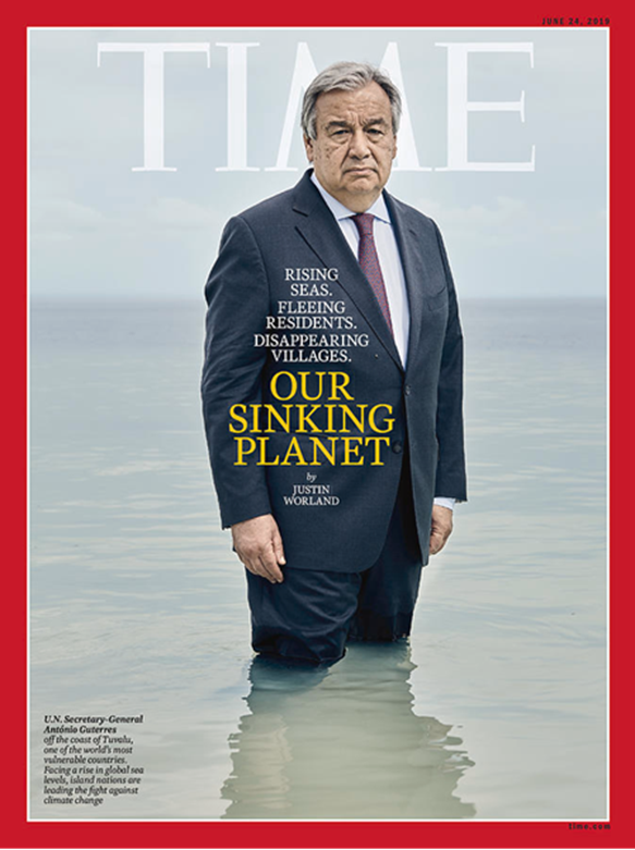
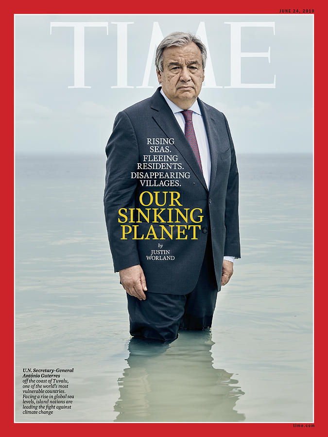
And the Germans are of course not the only ones who are on this wrong path. The UNO propagates it quite strongly. This figure here, this knight of the sad figure, this is Antonio Guterres, the UN General Secretary, and he spoke of the sinking planet. He is very good with his formulations. The sinking planet, it supposedly stands in the water in front of Tuvalu. This is an island group in the Pacific. Coral islands.
And the article in Time magazine is from 2019. A year earlier there was a publication that dealt with how the surface of Tuvalu develops. And they found that Tuvalu is growing. Coral islands adapt to the sea level. The corals form a rock. This is then partially ground up in the surf and lifted up to the island with the next storm. That is why they have not sunk in the last thousand years and will not do so when the sea level rises, which it does, but also much slower than many claim. It grows at almost all measuring stations only with 1-2 mm per year. So that was a lie that the planet is sinking.
Nonsense anyway. He then increased it with the statement that the era of global warming is over. We are now in the era of global cooking. I think that from 10 km above sea level the water boils at 40 ° C or so. But what he says is complete nonsense. I ask myself, how did this socialist become UN Secretary General? Who is pulling the strings? And the most important question that interests me the most is, what does this guy smoke? Time magazine definitely spreads lies.
When I read this headline it took me about 5 seconds to find out in Google what is really going on with Tuvalu. And they have to do that too. It is their duty as journalists to report truthfully.
Well, the Time magazine is not so great now, but we still have the Upper Bavarian Volkszeitung. Climate emergency, United Nations set alarm. This, of course, also comes from Guterres. And it says in the article I called it on April 20th. The article is from March 24th. And it says the past year was the second or third warmest since measured.
The second or third warmest, okay. But we know exactly that it was 1.43 degrees warmer than 150 years ago. So they know that by a hundredth of a degree. But not whether it was the second or third warmest. Questionable. Well, the reference period is 1850 to 1900. Guterres added other nonsense, load limits, etc. Of course I looked at it. I thought, okay, very interesting.
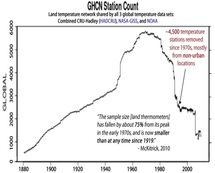
What measuring stations were there in 1850? I looked up at NASA. The Goddard Institute for Space Studies has several thousand measuring stations that are, I’m not allowed to say, manipulated, that design it creatively. But of course they didn’t do that for the time from 1850, because these are all measuring stations from the time until 1879.
They don’t need new glasses. There are none. This is a graph directly from the website of NASA GIS. And you can enter which period. I entered from 1879. So all stations that have been running continuously since 1879. And that’s exactly zero. Exactly zero. And then I looked at what it looks like on the other side of the globe. So it’s Pacific, Australia, Antarctica. And the period from 1880. There were the first measuring stations. And that’s a handful. A handful for half the globe. At that time there was not a single measuring station in Africa.
Not a single one. And in many other countries of the world there was not a single measuring station. And on 95% of the earth’s surface there were no measuring stations at all. There are still no measuring stations today that provide really meaningful values in most of Africa on an area of 20 million square kilometers. That’s twice as much as the area of Europe. There are no measuring stations.
And then they produce a temperature for the globe with an accuracy of one hundredth of a degree for a period when there were practically no measuring stations. That’s nonsense. Yes, down here in Argentina there is a measuring station. I looked at it. It shows a cooling down for the last 150 years. So how much warmer has it actually become? Certainly not 1.43 degrees since the end of the Little Ice Age.
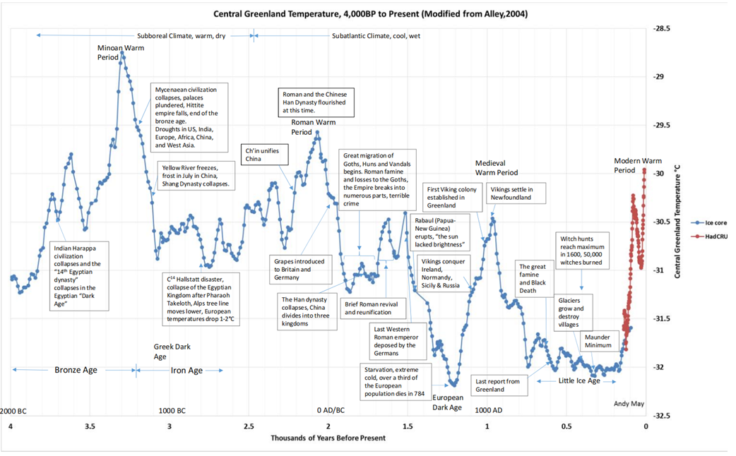
Yes, the end of the 19th century. Yes, this reference period 1850 to 1900. That was the coldest phase of the Holocene of the last 10,000 years. The glaciers have advanced as far as never in the last 10,000 years. They have threatened villages in Switzerland. You can read that. It was the coldest phase.
And a warmer phase was, for example, the High Middle Ages about 1,000 years ago. And you know that it was about as warm as it is today. Otherwise, the Vikings would not have made their way to Greenland. Well, Greenland was not entirely green. It is not entirely covered by ice today. But Iceland was ice-free a few thousand years ago.
And my estimate for the temperature development in the last 1,000 years is 0 plus or minus 1 degree. So I don’t know it exactly. I don’t know if anyone knows it better. But this 0 plus or minus 1 degree is, let’s say, an engineer-like statement with an uncertainty.
Propaganda in Climate Research
1.43 degrees without uncertainty is propaganda. And propaganda is what the media can do best. Some of you may remember this hysteria from three years ago. Po river and Lake Garda are drying up. The editorial network Deutschland is one of almost 500 media where the SPD has the say. 500. I think they have a share in more media than not. But they were not the only ones.
Po river and Lake Garda are drying up. Lake Garda is only filled to 38%. The average depth of Lake Garda is 133 meters. Absolutely ridiculous. But news agencies like Reuters and EPA have spread the nonsense. The Süddeutsche Zeitung, Die Zeit and of course ARD and ZDF. And the fact is, the level was only 0.5 meters lower than usual at this time of year. A few months later it was higher than usual in the summer.
Yes, this is just normal variation. Therefore, my recommendation to the media and if a media representative is here, please turn on your brain before you spread nonsense.
The Reality of the ‘Climate Crisis’
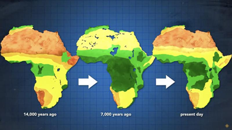
So, there would be a climate crisis if it got colder. Yes, the little ice age, that was the phase of starvation, poverty, but also flooding. The largest part of the flood was 200 years ago in the little ice age, 1804. Not the one 5 years ago, in 1804 it was worse. And what you see here, this is the vegetation in North Africa. Once to the peak of the Holocene, that is, the current warm season, about 6000 years ago.
And there you see three little white spots up here. I don’t know if you can see them on the screen. Yes, you can still see them. These three little white spots, that was the desert 6000 years ago. Today it is almost the entire desert of North Africa because it has become colder. It was warmer back then and there were no glaciers on Iceland because it was warmer.
So there were not glaciers, but birch forests. And the lower graphic is for the last interglacial warm period 130,000 years ago. It was even warmer there. It was about 8 degrees warmer than today. And what happened? The Sahara was even greener. And all climate researchers know that it was warmer and greener back then.
That’s why you hear a lot, we had the hottest month, the hottest year since 125,000 years ago. Because 125,000 years ago the interglacial period came to an end and the ice age began. And the EME warm period was so warm without the four private jets of Bill Gates. He has four, two Bombardier, two Gulfstream and without our beautiful SUV.
The Influence of CO2 on Plants
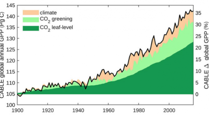
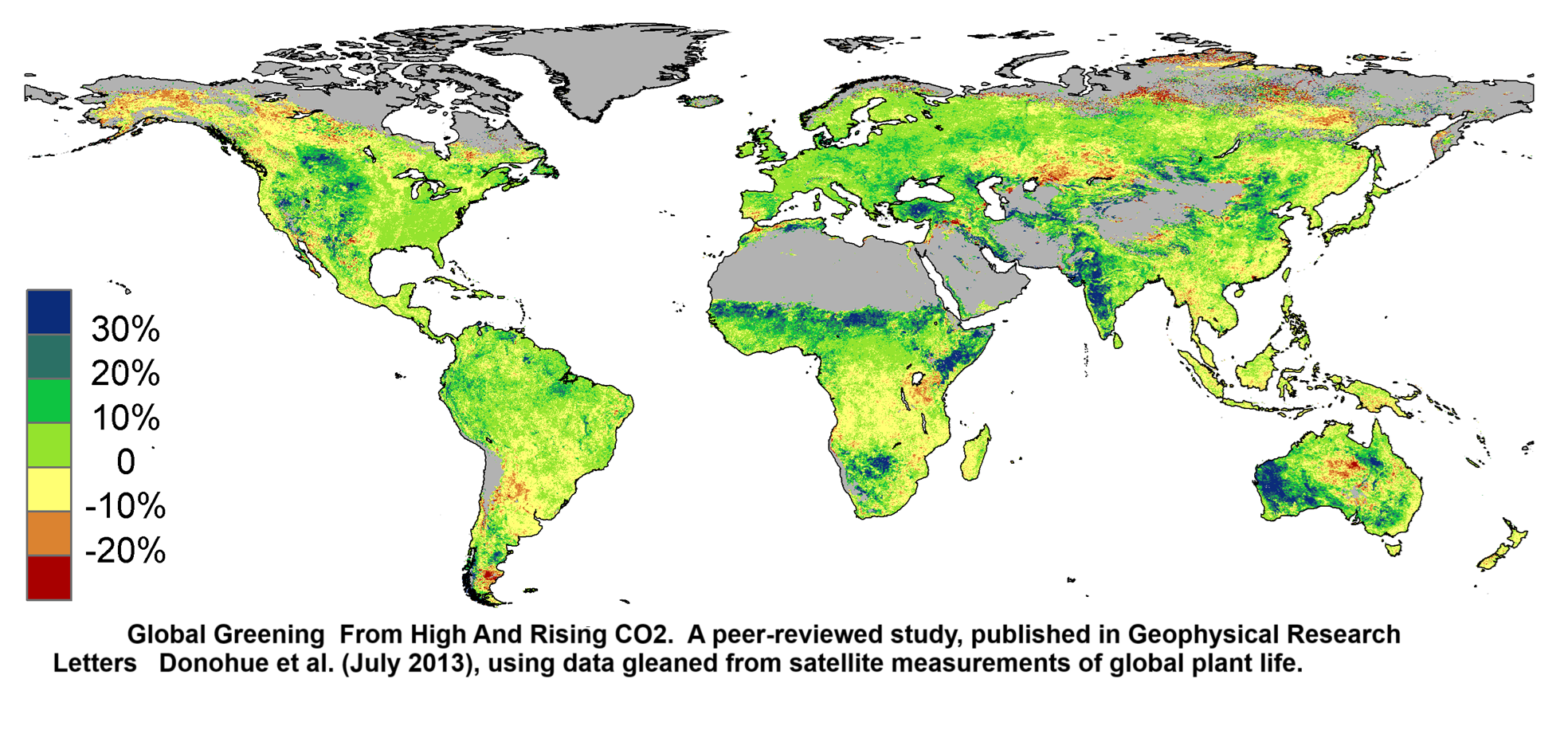
Back to the topic of the climate crisis. More CO2 is of course also good. The plants need CO2 to grow. Everyone knows that. And the more CO2 is in the air, the better they grow. That’s why CO2 dioxide is often added. And this graph is from the Australian Environment Agency. This graph shows the growth of leaf coverings in the last 40 years. And green and blue areas show an increase in leaves and only the red areas show a decrease.
So where there is a fire, there is less fire. But especially in the semi-dry areas in the Sahel, that is the area south of the Sahara, from the Atlantic to the Indian ocean, it has become much greener. In India it has become much greener.
In Australia and other areas it has become much greener. That is why they do not belong to war zones. The population of the Sahel has tripled to quadrupled in all countries in the last 40 years. Because it has become greener, they were able to do that. The deserts are getting smaller. And the Sahel has benefited more than almost any other region in the world.
The Süddeutsche Zeitung has written the opposite. Where is the Sahel zone, whose inhabitants suffer the most from climate change? I think Dr. Weiss, the director of the Wissensredaktion, knows it better. I had a communication with the Süddeutsche three years ago. I showed them with scientific publications ten mistakes on their website . Within a few days I got an answer. They did not try to contradict me. They told me five other things, which were also wrong. These mistakes are still on the website. And I have a presentation on my website, in which the mistakes are shown and why they are mistakes. And because I drew the attention of the Süddeutsche Zeitung to the mistakes, it is no longer an accident or out of ignorance. They deliberately lie.
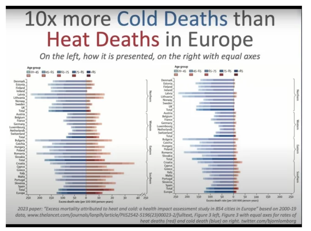
Is it better to be warm? Someone has to tell this to Karl Lauterbach, who annoys us with his heat protection killers. This is from a publication in Lancet. This is one of the most famous medical science journals. Unfortunately, the graphic is as it is. You can’t see what it says. This is an overview of all European countries, from southern Europe to northern Europe.
The blue bars are deaths from severe cold. The red bars are deaths from severe heat. It looks similar in size. It looks like this for you, because you can’t see the scale below. The ones in the front can see it. The scale is about 5 different.
And if you compare it with the same scale, it looks like the chart on the right. There are 5 to 10 times more deaths from cold than from heat Even in southern Europe, there are more deaths from cold than from heat. Even in the countries of Africa and Oceania, this was found in another publication.
Heat is not the problem. In Singapore, the average temperature is 17 degrees higher than in Germany. And people live 5 years longer. It even says on Wikipedia, there are different times, life expectancy, temperature. Of course, this is even on Wikipedia on different pages, life expectancy, temperature, but it is a fact. So five to ten times more deaths from cold than from heat.
Wind Turbines and Their Unexpected Consequences
So why are we doing all this with the wind turbines? Can we trust the wind turbine lobby? Of course, this is also a rhetorical question, the solution is coming.
This is unfortunately a complicated graphic, but it can be explained relatively well. Because it doesn’t cool down so well, more water evaporates from the ground. The soils dry out more with wind turbines. And if you plaster the whole world with wind turbines, if you switch the entire energy supply to wind and sun, then there is a Temperature increase that people have calculated. And the red curve down here, this is the temperature curve for the case that 40% of the total energy is generated by wind turbines, 4 seconds. 40% worldwide increases the temperature, I think you can see, by 1 to 3°, so more than carbon dioxide. Its a Chinese publication and Germany would then be a single windpark with hundreds of thousands of wind turbines.
Firstly, we don’t want to see that and, secondly,
we don’t want it for our soils and for the quality of life.
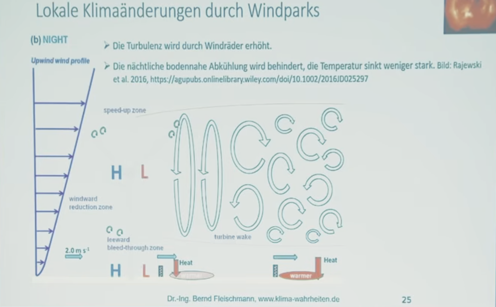
But not only the Chinese have found out, but there is a marine research center, the Helmholz-Zentrum Hereon. They have investigated this for wind turbines in the sea and they have found that these wind farms are changing the North Sea. They even change the ocean currents, they change the mixing on the surface and the reduction of the wind behind the wind farms. This can be measured up to 70 km behind the wind farm.
And then they wrote, so not me, but Helmholz-Zentrum Hereon, who live on taxpayers’ money, they were honest, they wrote that the changes show similar orders of magnitude as the suspected ones changes due to climate change. So, we want to prevent climate change and prevent a suspected and definitely create climate change with the wind turbines. So it really doesn’t get any dumber than that.
And we don’t just change the climate with wind turbines,
some people get sick with the infrasound of the wind turbines.
Not everyone may be so sensitive, but these infracircuits are the pulsed pressure changes that result from such a propeller blade passing the mast. This creates a pressure that spreads. You can’t hear it, but you can feel it. These are enormously high switching pressures and just like they are in the Discoen bass, you can feel it when you’re around. And sensitive people can still do that in 5 km distance, via petzo channels in our cells.
There are publications for this discovery, the Pzukanal even won the Nobel Prize in 2021. So that’s science, that’s not whirlwind. And the organ that suffers the worst from these pressure fluctuations is our brain. And maybe they want to make us stupid on purpose so that we continue to vote for the old parties. I don’t know. So, here are a few sources. There is much more. You can’t find the information on my website yet. I have them relatively new.
Redistribution Through Climate Policy
Okay, they trust Harald Lesch from his statements. He once said that there were temperature increases of more than 10° within a few decades. That’s right. That happened in the Ice Age. Today the argument says:
“Climate change is man-made, leads to catastrophic storms and thermal power plants increase the temperature through their waste heat.”
This is all wrong with the idea of the climate case He has a climate kit for the Ludwig Maximilian University which was distributed to all kinds of schools. When presenting this case, he made 30 false statements in one hour, which I was able to prove to him. 30, so one every 2 minutes. I won’t go into detail about it now, you can find a PDF on my website. If you see, hit me around the ears. Good.
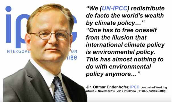
So, who ultimately benefits? Ottmar Edenhofer said that 16 years ago, he is Director of the Potsdam Institute for Climate Research and he said that we are redistributing money and de facto destroying the world’s wealth. He did not say to whom it would be redistributed. However, he has admittedly, it has nothing to do with environmental policy. In any case, it doesn’t reach the poorest. And who benefits?
Yes, who has benefited from the Covid vaccination? Vaccination in quotation marks, of course. Some of you will probably think of this name here. Bill Gates has sent a letter to all participants of the last climate conference in Brazil and said that there are more important things than a certain temperature that we must not exceed. Feeding the world is more important and he did not say the medical care provided by the pharmaceutical companies he leads. I took a closer look at his letter.
He makes statements in various areas where we have to achieve net zero. He stands by his statement, we need net zero as soon as possible. and he named 36 companies in this letter. And I took a look at what kind of companies they are. They are all from Breakthrough Energy’s portfolio. This is an investment vehicle that he founded, in which Jeff Bezos of Amazon, Bloomberg Media’s Michael Bloomberg, George Soros, Mark Zuckerberg and other billionaires are involved.
Why did he write this letter? Because the USA has withdrawn from the Paris Climate Agreement and all these companies are not viable, without subsidies and without regulations that applied in the USA and no longer apply. That was a battle letter to the other states. Make the motto: “Help me, otherwise I’ll get in trouble from my fellow billionaires.” And this energy transition in quotation marks with almost everything we do is a redistribution from poor to rich and super-rich and he actually admitted it himself.
Conclusions and Personal Remarks
So, I’m slowly coming to the end. I spoke a little slower so that I could be understood well. I hope this worked.
The question is, of course, why are other climate scientists not being heard? And there’s this email that was laid out as part of ClimateGate a few years ago, very revealing. The most influential climate scientist to the most influential climate scientist in the United States, saying we will publish and keep out of the IPCC report publications that do not correspond to their opinion. And if necessary, we will redefine what peer review, is. So they deliberately make propaganda.
Conclusion: There is no threat of a climate crisis.The greenhouse effect caused by carbon dioxide is marginal. Carbon dioxide is the gas of life. More carbon dioxide makes the world greener. The influence of the sun from clouds and ocean cycles determines the temperature.
Wind turbines raise the temperature. And they dry out the soils. To do this, they poison the environment with the glass fibers that are knocked out. They kill insects 5000 tons per year. It was once calculated in Germany. They kill feather mice and birds of prey.
Infrasound makes you sick and reduces plant growth. This is because plants also have these petzo channels in their cells and grow less well. Science agrees, it is a lie. I am the living example that it is a lie. And the energy transition is a redistribution of normal earners.
Never trust AD, ZDF, Süddeutsche Zeitung etc. So many of them have not known me to this day. I am not a well-known expert, because you only become a well-known expert if you support government policy, and I don’t do that. Thank you very much.
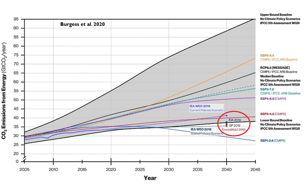
The IPCC has published a new generation of climate scenarios – and buried in the fine print is a remarkable concession: the extreme warming pathways that dominated climate research, policy, and media coverage for decades were never actually plausible. It took a while to notice because almost no one in mainstream media bothered to report it. Science policy analyst Roger Pielke Jr. wrote,
“The Intergovernmental Panel on Climate Change (IPCC) has just published the next generation of climate scenarios,” calling it “big news” that “eliminated the most extreme scenarios that have dominated climate research over much of the past several decades.”
The conclusion was unambiguous. “The IPCC and broader research community has now admitted that the scenarios that have dominated climate research, assessment and policy during the past two cycles of the IPCC assessment process are implausible. They describe impossible futures.”
Those “impossible futures” formed the backbone of a decade-plus of apocalyptic climate messaging – melting ice caps, submerged coastlines, mass extinctions, widespread crop failures, and global hunger, always around the corner, always demanding immediate, economy-reshaping action to avert a catastrophe that, it now turns out, the underlying science community had assigned to a category closer to science fiction than projection.
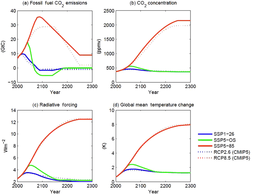
The new IPCC framework formally demotes its remaining “HIGH scenario” from expected outcome to “exploratory – a thought experiment, not a projection.” [SSP5-85]
That’s a significant institutional retreat.
Pielke noted that the previous framework lacked “any systematic effort to evaluate plausibility of scenarios,” meaning the scariest pathways were able to dominate the policy debate for years without anyone in the room applying a basic reality check.
What matters today is that the group with official responsibility for developing climate scenarios for the IPCC and broader research community has now admitted that the scenarios that have dominated climate research, assessment and policy during the past two cycles of the IPCC assessment process are implausible. They describe impossible futures.
Curiously, the revised framework was technically adopted back in 2021, but has only now filtered into public view as related technical and institutional changes caught up. And it’s fair to ask why. The policy consequences of those “impossible futures” were very real.
It cannot be over-emphasised how important this finding of implausibility is. It means that almost every fearmongering mainstream media climate headline and story that has been written over the last 15 years is junk. Of course it also explains why a growing band of sceptical commentators have refused to accept the political concept of ‘settled’ science and have engaged in widespread debunking. Shooting fish in a barrel is one way of describing this work. At times, with just a modicum of investigative scepticism, the stories can be seen as little more than an insult to average human intelligence.
When the RCP8.5 assumptions are loaded into computer models, they run politically-convenient red hot suggestions that the temperature in 2100 will rise by about 4°C from a 1850-1900 baseline – in other words, a rise of nearly 3°C in the next 80 years. Only the most deranged eco loons will claim such large short-term rises out loud, so the activist scientists quietly loaded garbage assumptions into their computers to arrive at their garbage-out Armageddon scares. The writing was on the wall for RCP8.5 last year when President Trump’s executive order titled ‘Restoring Gold Standard Science’ effectively banned the use of RCP8.5 for scientists on the United States federal payroll. It also noted one of the unrealistic RCP8.5 assumptions driving deliberate climate psychosis to be that end-of-century coal use will exceed estimates of recoverable reserves.
At the time, the climate researcher Zeke Hausfather dismissed the Trump Administration’s claims about RCP8.5 by stating that the research community had moved on. But Pielke has taken issue with this ‘nothing to see here’ claim. He states that from 2018 to 2021, Google Scholar reported 17,000 articles published using RCP8.5 compared with 16,900 in the next three year period. “Some shift,” he observed.
Again, those using less charitable words might note that the ultimate climate crackpipe has proved difficult to put down. A long and painful process of rehabilitation now seems likely.
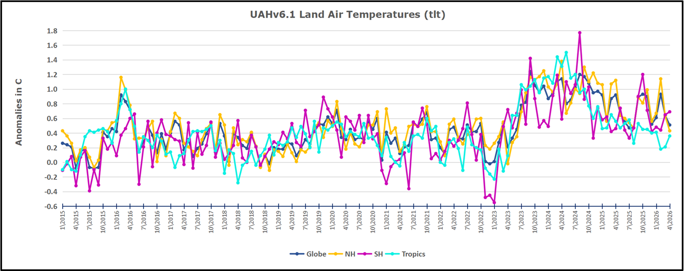
The post below updates the UAH record of air temperatures over land and ocean. Each month and year exposes again the growing disconnect between the real world and the Zero Carbon zealots. It is as though the anti-hydrocarbon band wagon hopes to drown out the data contradicting their justification for the Great Energy Transition. Yes, there was warming from an El Nino buildup coincidental with North Atlantic warming, but no basis to blame it on CO2.
As an overview consider how recent rapid cooling completely overcame the warming from the last 3 El Ninos (1998, 2010 and 2016). The UAH record shows that the effects of the last one were gone as of April 2021, again in November 2021, and in February and June 2022 At year end 2022 and continuing into 2023 global temp anomaly matched or went lower than average since 1995, an ENSO neutral year. (UAH baseline is now 1991-2020). Then there was an usual El Nino warming spike of uncertain cause, unrelated to steadily rising CO2, and now dropping steadily back toward normal values.
For reference I added an overlay of CO2 annual concentrations as measured at Mauna Loa. While temperatures fluctuated up and down ending flat, CO2 went up steadily by ~66 ppm, an 18% increase.
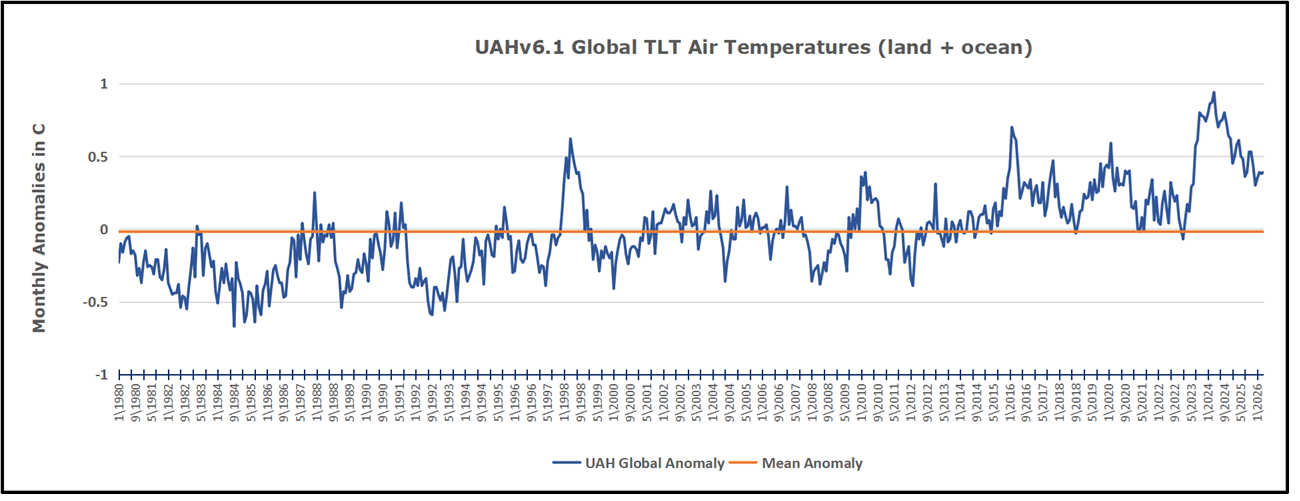
Furthermore, going back to previous warmings prior to the satellite record shows that the entire rise of 0.8C since 1947 is due to oceanic, not human activity.
The animation is an update of a previous analysis from Dr. Murry Salby. These graphs use Hadcrut4 and include the 2016 El Nino warming event. The exhibit shows since 1947 GMT warmed by 0.8 C, from 13.9 to 14.7, as estimated by Hadcrut4. This resulted from three natural warming events involving ocean cycles. The most recent rise 2013-16 lifted temperatures by 0.2C. Previously the 1997-98 El Nino produced a plateau increase of 0.4C. Before that, a rise from 1977-81 added 0.2C to start the warming since 1947.
Importantly, the theory of human-caused global warming asserts that increasing CO2 in the atmosphere changes the baseline and causes systemic warming in our climate. On the contrary, all of the warming since 1947 was episodic, coming from three brief events associated with oceanic cycles. And in 2024 we saw an amazing episode with a temperature spike driven by ocean air warming in all regions, along with rising NH land temperatures, now dropping well below its peak.
Chris Schoeneveld has produced a similar graph to the animation above, with a temperature series combining HadCRUT4 and UAH6. H/T WUWT
April 2026 UAH Temps: Land Cools More Than Ocean Warms
With apologies to Paul Revere, this post is on the lookout for cooler weather with an eye on both the Land and the Sea. While you heard a lot about 2020-21 temperatures matching 2016 as the highest ever, that spin ignores how fast the cooling set in. The UAH data analyzed below shows that warming from the last El Nino had fully dissipated with chilly temperatures in all regions. After a warming blip in 2022, land and ocean temps dropped again with 2023 starting below the mean since 1995. Spring and Summer 2023 saw a series of warmings, continuing into 2024 peaking in April, then cooling off to the present.
UAH has updated their TLT (temperatures in lower troposphere) dataset for April 2026. Due to one satellite drifting more than can be corrected, the dataset has been recalibrated and retitled as version 6.1 Graphs here contain this updated 6.1 data. Posts on their reading of ocean air temps this month are ahead the update from HadSST4. I posted recently on March 2026 Mild Warming SSTs Continue.These posts have a separate graph of land air temps because the comparisons and contrasts are interesting as we contemplate possible cooling in coming months and years.
Sometimes air temps over land diverge from ocean air changes. 2025 showed a sharp contrast between land and sea, first with ocean air temps falling in January recovering in February. Then in November and December SH land temps spiked while ocean temps showed litle change. In February 2026 NH land temps doubled, from Dec. 0.53C up to 1.14C last month. Despite SH land changing little, and Tropical land cooling, the Global land anomaly jumped up from 0.53 to 0.93C. That reversed in March with both NH land and Global land anomaly back down to 0.63C. That cooling offset SH Ocean warming doubling from 0.19C to 0.38C. Now in April NH land has cooled further down to 0.51C while NH ocean warmed slightly. SH air temps went oppositely: SH land wamed slightly while SH ocean dropped from 0.38C to 0.27C. Note that in the first 4 months of 2026 the Global land and ocean air temps have hardly varied from 0.38C.
Note: UAH has shifted their baseline from 1981-2010 to 1991-2020 beginning with January 2021. v6.1 data was recalibrated also starting with 2021. In the charts below, the trends and fluctuations remain the same but the anomaly values changed with the baseline reference shift.
Presently sea surface temperatures (SST) are the best available indicator of heat content gained or lost from earth’s climate system. Enthalpy is the thermodynamic term for total heat content in a system, and humidity differences in air parcels affect enthalpy. Measuring water temperature directly avoids distorted impressions from air measurements. In addition, ocean covers 71% of the planet surface and thus dominates surface temperature estimates. Eventually we will likely have reliable means of recording water temperatures at depth.
Recently, Dr. Ole Humlum reported from his research that air temperatures lag 2-3 months behind changes in SST. Thus cooling oceans portend cooling land air temperatures to follow. He also observed that changes in CO2 atmospheric concentrations lag behind SST by 11-12 months. This latter point is addressed in a previous post Who to Blame for Rising CO2?
After a change in priorities, updates are now exclusive to HadSST4. For comparison we can also look at lower troposphere temperatures (TLT) from UAHv6.1 which are now posted for April 2026. The temperature record is derived from microwave sounding units (MSU) on board satellites like the one pictured above. Recently there was a change in UAH processing of satellite drift corrections, including dropping one platform which can no longer be corrected. The graphs below are taken from the revised and current dataset.
The UAH dataset includes temperature results for air above the oceans, and thus should be most comparable to the SSTs. There is the additional feature that ocean air temps avoid Urban Heat Islands (UHI). The graph below shows monthly anomalies for ocean air temps since January 2015.
After sharp cooling everywhere in January 2023, there was a remarkable spiking of Tropical ocean temps from -0.5C up to + 1.2C in January 2024. The rise was matched by other regions in 2024, such that the Global anomaly peaked at 0.86C in April. Since then all regions have cooled down sharply to a low of 0.27C in January. In February 2025, SH rose from 0.1C to 0.4C pulling the Global ocean air anomaly up to 0.47C, where it stayed in March and April. In May drops in NH and Tropics pulled the air temps over oceans down despite an uptick in SH. At 0.43C, ocean air temps were similar to May 2020, albeit with higher SH anomalies. In November/December all regions were cooler, led by a sharp drop in SH bringing the Global ocean anomaly down to 0.02C. In 2026, ocean warming is evident, but now SH cooling offset NH and Tropical warming.
Land Air Temperatures Tracking in Seesaw Pattern
We sometimes overlook that in climate temperature records, while the oceans are measured directly with SSTs, land temps are measured only indirectly. The land temperature records at surface stations sample air temps at 2 meters above ground. UAH gives tlt anomalies for air over land separately from ocean air temps. The graph updated for March is below.
Here we have fresh evidence of the greater volatility of the Land temperatures, along with extraordinary departures by SH land. The seesaw pattern in Land temps is similar to ocean temps 2021-22, except that SH is the outlier, hitting bottom in January 2023. Then exceptionally SH goes from -0.6C up to 1.4C in September 2023 and 1.8C in August 2024, with a large drop in between. In November, SH and the Tropics pulled the Global Land anomaly further down despite a bump in NH land temps. February showed a sharp drop in NH land air temps from 1.07C down to 0.56C, pulling the Global land anomaly downward from 0.9C to 0.6C. Some ups and downs followed with returns close to February values in August. A remarkable spike in October was completely reversed in November/December, along with NH dropping sharply bringing the Global Land anomaly down to 0.52C, half of its peak value of 1.17C 09/2024. In 2026 January and February Global land rebounded up to 1.14C, led by a NH warming spike. That NH spike was reversed in March and April back down to 0.43C and the Global land anomaly pulled back down despits some SH and Tropical land warming.
The Bigger Picture UAH Global Since 1980
The chart shows monthly Global Land and Ocean anomalies starting 01/1980 to present. The average monthly anomaly is -0.02 for this period of more than four decades. The graph shows the 1998 El Nino after which the mean resumed, and again after the smaller 2010 event. The 2016 El Nino matched 1998 peak and in addition NH after effects lasted longer, followed by the NH warming 2019-20. An upward bump in 2021 was reversed with temps having returned close to the mean as of 2/2022. March and April brought warmer Global temps, later reversed
With the sharp drops in Nov., Dec. and January 2023 temps, there was no increase over 1980. Then in 2023 the buildup to the October/November peak exceeded the sharp April peak of the El Nino 1998 event. It also surpassed the February peak in 2016. In 2024 March and April took the Global anomaly to a new peak of 0.94C. The cool down started with May dropping to 0.9C, later months declined steadily until August Global Land and Ocean was down to 0.39C. then rose slightly to 0.53 in October, before dropping to 0.3C in December, and slightly higher since, now at 0.39C in 2026.
The graph reminds of another chart showing the abrupt ejection of humid air from Hunga Tonga eruption.
TLTs include mixing above the oceans and probably some influence from nearby more volatile land temps. Clearly NH and Global land temps have been dropping in a seesaw pattern, nearly 1C lower than the 2016 peak. Since the ocean has 1000 times the heat capacity as the atmosphere, that cooling is a significant driving force. TLT measures started the recent cooling later than SSTs from HadSST4, but are now showing the same pattern. Despite the three El Ninos, their warming had not persisted prior to 2023, and without them it would probably have cooled since 1995. Of course, the future has not yet been written.
Many of my posts include some high quality infographics produced by a colleague, Raymond Inauen of RIC-Communications. In 2024 because of other pressing time demands, Raymond discontinued the website he set up to host the infographics. This post is to announce that he has now reactivated the website up for the public to access a series of infographics regarding CO2 and climate science.
The Website content is:
The World of CO2
Readers will be aware of previous posts on the four themes to be discovered. Raymond introduces this resource in this way:
WELCO₂ME
Would you like to learn more about CO₂ so you can have informed conversations about climate policy and future energy investments? Or would you rather pass judgment on CO₂ after learning about the basics? Then this is the website for you.
There are 29 infographic images that can be downloaded in four PDF files. Thanks again, Raymond for your interest and efforts to make essential scientific information available to one and all. PDF links are in red.
There are 29 infographic images that can be downloaded in four PDF files. Thanks again, Raymond for your interest and efforts to make essential scientific information available to one and all. PDF links are in red.
At that website the high resolution infographic PDFs can be downloaded at no charge with no restrictions on use. There are also informative videos and FAQ pages, as well as links to contact with questions, comments or additional suggestions. There is also a link to support this work if you are so inclined.
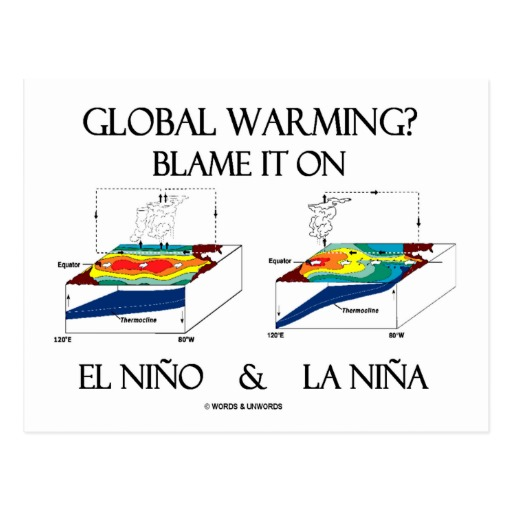
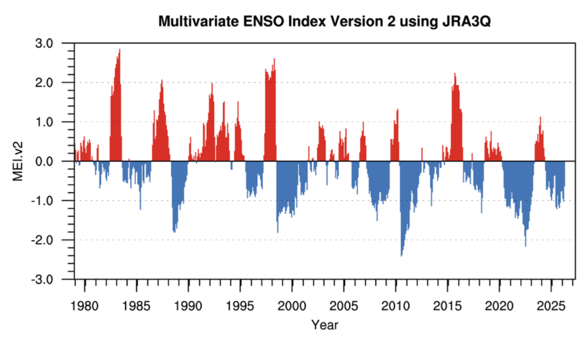

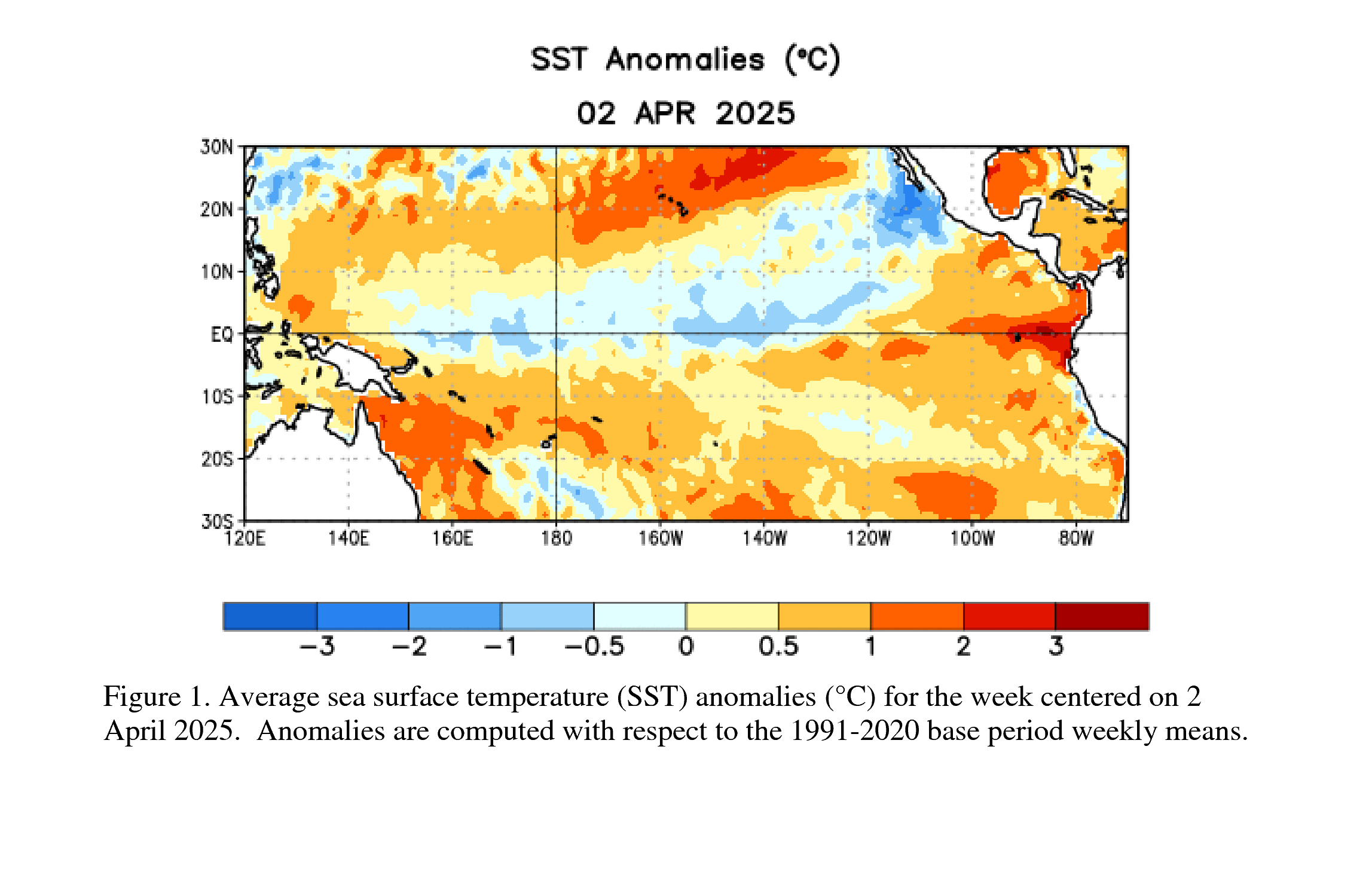 The latest weekly Niño-3.4 index value was +0.4°C, with the westernmost (Niño-4) and easternmost (Niño-1+2) indices at +0.5°C and +1.0°C, respectively [Fig. 2]. The equatorial subsurface temperature index (average from 180°-100°W) increased for the sixth consecutive month [Fig. 3], with widespread, significantly above-average subsurface temperatures across the equatorial Pacific [Fig. 4]. Westerly wind anomalies were observed over the western equatorial Pacific at low levels and were evident over the central and east-central Pacific at upper levels. Convection was near average on the equator near the Date Line and was suppressed around Indonesia [Fig. 5]. Collectively, the coupled ocean-atmosphere system reflected ENSO-neutral conditions.
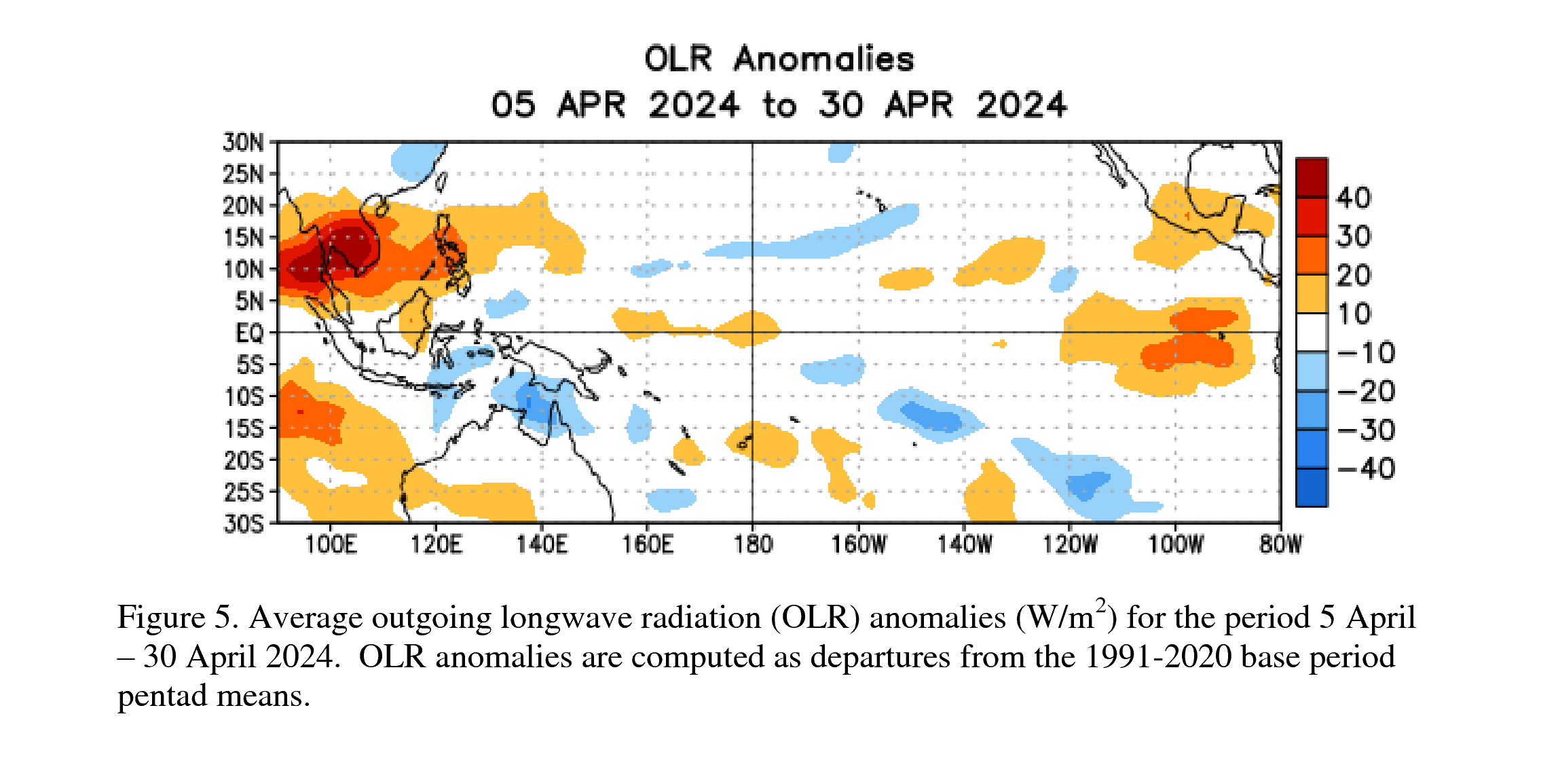
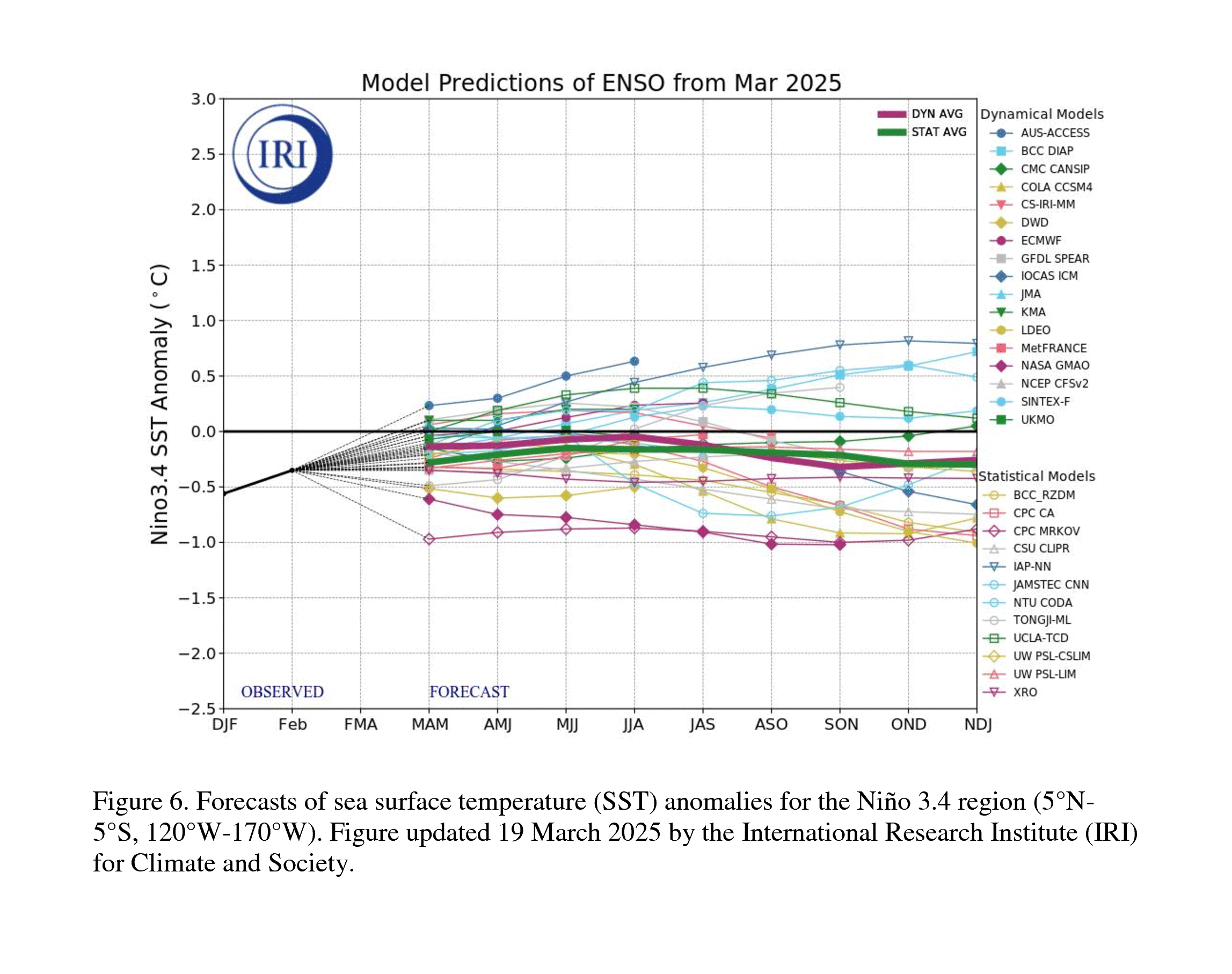
 The strongest El Niño events in the historical record are characterized by significant ocean-atmosphere coupling through the summer, and it remains to be seen whether this occurs in 2026. Stronger El Niño events do not ensure strong impacts; they can only make certain impacts more likely (see CPC outlooks for probabilities of seasonal anomalies). In summary, El Niño is likely to emerge soon (82% chance in May-July 2026) and continue through Northern Hemisphere winter 2026-27 (96% chance in December 2026-February 2027).

 The best context for understanding decadal temperature changes comes from the world’s sea surface temperatures (SST), for several reasons: