Barents Sea Ice-Free. How Come?

Might maritime activities, such as shipping, oil extraction, fishing etc. be having an effect on Barents Sea ice extents?  Arnd Bernaerts has an informative post up at his blog: They warm-up the Arctic! Shipping, Off-Shore, Science etc.!

Dr. Bernaerts explains:

It is not known which alterations shipping, naval forces, research vessels and off-shore industry cause in the Arctic Ocean sea-body structure, whether ice covered or not, and the subsequent impact on the annual sea ice and the polar-weather, called climate change. Bad that science has no idea about this human Arctic warming aspect. Worse, science has never rose, or ever been willing to raise and investigate the subject. At least you will face a hard time to find anything in this respect.

When considering the possible impact of ocean uses on climate change, any activities at sea north of the Polar Circle is a multifold higher than in any other Ocean region. Between the Arctic Ocean and the Equator the climatic impact of human activities the difference could be several hundred, if not thousand times, due to extreme narrow structure margin concerning water temperature and salinity. The temperature range in the upper 150 meter sea surface level is minus 2° to plus 4°C. Arctic salinity is down to 30ppt in places, while the oceans vary between 34ppt and 36ppt. So far it is statistics, and they are ‘wrong’ if not properly applied.

Navigating and other ocean uses in Arctic sea areas without knowing the impact is irresponsible. Navigating through compact ice is even worse, as the force of ship screws may travel over long distances, with significant changes to sea temperatures and salinity.

Summary

The whole article is informative and raises important questions (and not for the first time).  Time to stop obsessing over CO2, the “magic” gas, and try to understand real human impacts.

A Russian liquid gas tanker (LNG) “Christophe de Margerie” just set two Arctic records few weeks ago (Details). The ship not only traveled through the Arctic in record time, but has done so without the use of an icebreaker escort. She is the first of a total of 15 planned LNG carriers that will be gradually deployed.


Media Duping Scandal


Being “framed” is slang when someone is blamed for something they did not do, i.e. being set up by means of false evidence and witnesses.  For example, this is current news:

Majority of Americans now say climate change makes hurricanes more intense, poll finds
A majority of Americans say that global climate change contributed to the severity of recent hurricanes in Florida and Texas, according to a new Washington Post-ABC News poll. That marks a significant shift of opinion from a dozen years ago, when a majority of the public dismissed the role of global warming and said such severe weather events just happen from time to time.

In a 2005 Post-ABC poll, taken a month after Hurricane Katrina ravaged the Gulf Coast and devastated New Orleans, 39 percent of Americans said they believed climate change helped to fuel the intensity of hurricanes. Today, 55 percent believe that.

Gee, do you think that all the mass media reports connecting the storms with climate change had anything to do with that polling result?  Here is just today’s sample from Google News of mainstream press articles pushing the linkage.

Hurricanes spur Schneider action on climate change Chicago Tribune

Hurricanes: A perfect storm of chance and climate change? BBC News

Like hurricanes, climate change is dangerous, but smart storm fixes won’t help climate USA TODAY

Next-generation models revealing climate change effect on hurricanes Phys.Org

After hurricanes, climate change resurfaces in Washington Houston Chronicle

Scientific models saved lives from Harvey and Irma. They can from climate change too The Guardian

National Guard chief cites ‘bigger, larger, more violent’ hurricanes as possible evidence of climate change Washington Post

Paradise lost? Caribbean leaders want action on climate change and help rebuilding Miami Herald

Yes, climate change made Harvey and Irma worse CNN

In addition, there are dozens of articles from climate advocacy sites like Greenpeace, Huffpost, Insideclimatenews, etc.

An exception to the onslaught appeared to be this one from The Stranger Why Connecting Climate Change with Powerful Hurricanes Is Doing More Damage Than Good

But it turns out to be another extreme hit piece by Sarah Myhre, who is no stranger to alarmism. (Background at Again Falsely Linking Smoking and Climate Science)

This time she attacks the media reporting on hurricanes and climate change, because they seem to allow for doubt (tsk, tsk). (Below her text with my bolds)

We need to poke a hole in this toxic narrative and news cycle around climate attribution. When I say attribution, what I am referring to are the ongoing arguments of attributing specific weather events to climate change: Was Hurricane Harvey caused by climate change? Was the low snow year of 2015, up and down the Cascadian mountains, caused by climate change? These questions—individually—are interesting and important to answer. But the science of Earth system change is not altered by the relative statistical significance of our attribution certainty. Far from it.

What’s more, this framing of attribution uncertainty is continually used to support climate action obstruction and denialist voices in our culture. When you hear pandering equivocation about climate and weather events, alarm bells should start ringing in your head. This news cycle is absolutely toxic and we together need to get our broad cultural conversation off this hamster wheel.

One closing point: When we use uncertainty around attributing individual weather events to climate change to call for “more data” or “better climate science” (think of Cliff Mass) we are driving a wedge between public health and public safety. We mislead the public because the message we send is: We don’t know what’s happening. This simply isn’t true; we do know what is happening. However, in some cases, we lack high-quality time series data to statistically detect the signal of climate from the noise of weather.

Summary

The last line in Myhre’s article says it all: We know what’s going on, we just don’t have the facts yet.

Despite all of the levelheaded statements by hurricane experts cautioning against jumping to these conclusions, and despite the IPCC SREX reports saying the linkage is not proven, the media and activists went on a rant proclaiming climate change makes hurricanes worse. They trumpeted these claims, and now take pride in a survey showing they succeeded in duping the public. That is a duping scandal and the mass media is at fault.  Shame on them.

Background from Previous Post:

Climate Thought Control explains the deliberate media strategy to mold public opinion in support of climate change activism.

Jennifer Good is a communications professor explaining how the media is expected to mold public opinion in favor of climate activism. Her article in the Toronto Star Putting hurricanes and climate change into the same frame is revealing, especially the subtitle A study shows network Hurricane coverage this month did not link an increase in extreme weather to global warming. 

The prof is disappointed that climate change was not even more frequently mentioned in stories about the recent hurricanes. She considers it an opportunity missed.  (Update: Since her article was published, the media took up the cause big time.) Some excerpts below with my bolds.

I have analyzed two weeks of broadcast news stories that appeared on America’s seven largest TV networks as well as Canada’s CTV network. In just over 1,500 stories about hurricanes, “Trump” was discussed in 907 of those stories (or about 60 per cent), while “business” was discussed in 572 of those stories (or about 38 per cent).

“Climate change” was discussed in just 79 of the hurricane stories — or about five per cent.

What’s Wrong with Professional, Objective Reporting?

The fundamental answer is that climate change and extreme weather (i.e., hurricanes) need to be framed together more often. As scientists have pointed out, while climate change is not causing the weather, it is definitely exacerbating the weather. But increasingly adding climate change to the extreme weather frame is only the tip of the (yes, melting) iceberg. Alternatives to “business as usual” need to be part of the media’s, and our, extreme weather frames.

Of those 1,500 broadcast news stories involving hurricanes, only four also mentioned “fossil fuels,” and not a single news broadcast discussed “alternative energy.”

Similarly, while “economy” is discussed in 187 of the hurricane news stories, only 18 stories discussed hurricanes, the economy and climate change together; and not one story explored the links between an economic model based on endless growth, and the implications of this endless growth for the planet and climate change.

The Purpose of Media is to Manipulate Public Opinion

In his seminal 2010 paper “Why It Matters How We Frame the Environment,” published in the journal Environmental Communication, the American linguist and philosopher George Lakoff offered that the world is made up of frames. “Framing” is how our neural system defines a concept by grouping together what goes with — or gets framed with — that concept. Our brains are wired this way.

For example, when you read “climate change,” your brain immediately frames the concept of climate change with certain words and concepts. Everyone cognitively frames “climate change” somewhat differently, but there might also be large overlaps. Terms like “fossil fuels” and “human activity” might be in many people’s climate change frames, although frames can differ widely. (Think, for example, of climate change skeptics.)

Not surprisingly, the news media plays a significant role in how our brains frame concepts. The more the media frames a story by associating it with certain words and concepts, the more likely we are to use those same words and concepts in our own framing.

And conversely, if the news media never framed a story using certain concepts, there is “hypocognition,” or as Lakoff proposed, a “lack of ideas we need.”

In times of crisis, there are many immediate and urgent stories that need to be told about lives and loss, bravery and struggle. But crisis also provides an opportunity for change — an opportunity to shift our frames and include the ideas we desperately need.

So far, that opportunity seems to have been missed. Meanwhile, the oceans get warmer.

The Other Side of the Story

While the prof is totally convinced she knows what the public needs to know about weather and climate, actual weather scientists disagree with her.  In fact, the efforts to link storms and fossil fuels were present way too often and hindered the public from understanding these events.

For instance, Hurricane scientist Dr. Ryan Maue ripped climate ‘hype’ on Irma & Harvey in his WSJ article Climate Change Hype Doesn’t Help.

As soon as Hurricanes Harvey and Irma made landfall in the U.S., scientists, politicians and journalists began to discuss the role of climate change in natural disasters. Although a clear scientific consensus has emerged over the past decade that climate change influences hurricanes in the long run, its effect upon any individual storm is unclear. Anyone trying to score political points after a natural disaster should take a deep breath and review the science first.

As a meteorologist with access to the best weather-forecast model data available, I watched each hurricane’s landfall with particular interest. Harvey and Irma broke the record 12-year major hurricane landfall drought on the U.S. coastline. Since Wilma in October 2005, 31 major hurricanes had swirled in the North Atlantic but all failed to reach the U.S. with a Category 3 or higher intensity.

Even as we worked to divine exactly where the hurricanes would land, a media narrative began to form linking the devastating storms to climate change. Some found it ironic that states represented by “climate deniers” were being pummeled by hurricanes. Alarmists reveled in the irony that Houston, home to petrochemical plants, was flooded by Harvey, while others gleefully reported that President Trump’s Mar-a-Lago might be inundated by Irma.

By focusing on whether climate change caused a hurricane, journalists fail to appreciate the complexity of extreme weather events. While most details are still hazy with the best climate modeling tools, the bigger issue than global warming is that more people are choosing to live in coastal areas, where hurricanes certainly will be most destructive.

Summary

Actual scientists are calling for less, not more manipulative journalism.

And as for the oceans getting warmer, Prof. Good, that is due to the oceans storing and releasing solar energy, nothing to do with burning fossil fuels.  The oceans heat the atmosphere, and not the other way around.  See Empirical Evidence: Oceans Make Climate

Footnote:  If Framing doesn’t work, what’s next?

Paris is a Parrot

“The Paris Accord is not dead, it is just resting.”

Lawrence Solomon of Energy Probe thinks the Paris Accord is a dead parrot, as he writes in the Financial Post: Paris is dead. The global warming deniers have won. Excerpts below with my bolds.

As Solomon sees it, events are unfolding in a way that proves Trump’s wisdom in withdrawing the US from the failing Paris Accord.

Huge Expansion of Coal-fired Power Plants

The Global Coal Plant Tracker portal confirmed that coal is on a tear, with 1600 plants planned or under construction in 62 countries. The champion of this coal-building binge is China, which boasts 11 of the world’s 20 largest coal-plant developers, and which is building 700 of the 1600 new plants, many in foreign countries, including high-population countries such as Egypt and Pakistan that until now have burned little or no coal.

China builds UHV projects across regions allowing coal-fired power stations to be built near coal reserves, away from population centers

All told, the plants underway represent a phenomenal 43 per cent increase in coal-fired power capacity, making Trump’s case that China and other Third World countries are eating the West’s lunch, using climate change as a club to kneecap us with expensive power while enriching themselves.

Sagging Investment in Renewables

As reported by Bloomberg New Energy Finance, renewables investment fell in 2016 by 18 per cent over the peak year of 2015, and nine per cent over 2014. In the first two quarters of 2017, the trend continued downward, with double-digit year-over-year declines in each of the first two quarters. Even that paints a falsely rosy picture, since the numbers were propped up by vanity projects, such as the showy solar plants built in Abu Dhabi and Dubai. In the U.K., renewable investment declined by 90 per cent.

None of the Bloomberg data represents hard economic data, however, since virtually all renewables facilities are built with funny money — government subsidies of various kinds. As those subsidies come off, a process that has begun, new investment will approach zero per cent, and the renewables industry will collapse. Even with Obama-sized subsidies, the clean-energy industry has seen massive bankruptcies, the largest among them in recent months being Europe’s largest solar panel producer, SolarWorld, in May, and America’s Suniva, in April.

Renewables are Environmental Hazards

As reported in July in Daily Caller, solar panels create 300 times more toxic waste per kilowatt-hour than nuclear reactors — they are laden with lead, chromium, cadmium and other heavy metals damned by environmentalists; employ hazardous materials such as sulfuric acid and phosphine gas in their manufacture; and emit nitrogen trifluoride, a powerful greenhouse gas that is 17,200 times more potent than CO2 as a greenhouse gas over a 100-year time period.

acciona_wind_xl_410_282_80_c1

Climate Doom and Gloom Predictions Prove Unreliable

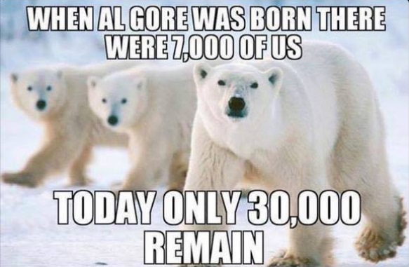
One recent admission comes from Oxford’s Myles Allen, an author of a recent study in Nature Geoscience: “We haven’t seen that rapid acceleration in warming after 2000 that we see in the models,” he stated, saying that erroneous models produced results that “were on the hot side,” leading to forecasts of warming and inundations of Pacific islands that aren’t happening. Other eye-openers came in the discovery that the Pacific Ocean is cooling, the Arctic ice is expanding, the polar bears are thriving and temperatures did indeed stop climbing over 15 years.

polar-bear-and-al-gore-meme

Public Opinion Manipulated by Fake Evidence

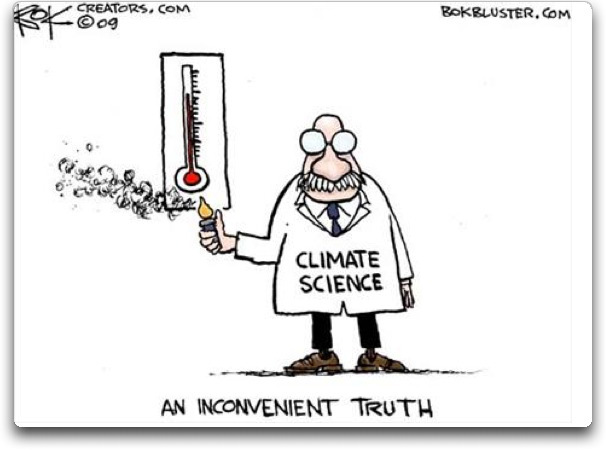
As the Daily Caller and the Wall Street Journal both reported in April, Obama administration officials are admitting they faked scientific evidence to manipulate public opinion. “What you saw coming out of the press releases about climate data, climate analysis, was, I’d say, misleading, sometimes just wrong,” former Energy Department Undersecretary Steven Koonin told the Journal, in explaining how spin was used, for example, to mislead the public into thinking hurricanes have become more frequent.

an_inconvenient_lighter

The evidence against Paris continues to mount. Paris remains dead.  

Beating a dead parrot is no better than beating a dead horse.

Steady September Arctic Ice


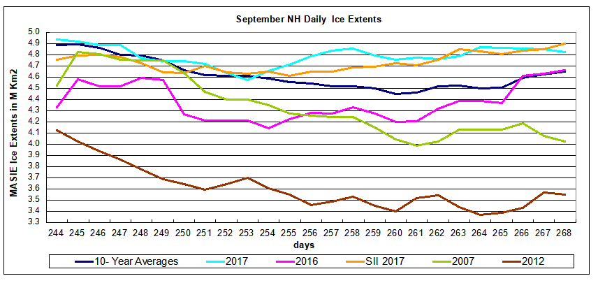
With five days left in the month, we can project the likely 2017 September results and compare with years of the previous decade.  2017 is provisional depending on the next five days, but MASIE is averaging 4.8M km2 and the daily extents are over that amount.  SII is 60k km2 lower, but just went over 4.9M, so has a chance to also reach 4.8M.

In August, 4.5M km2 was the median estimate of the September monthly average extent from the SIPN (Sea Ice Prediction Network) who use the reports from SII (Sea Ice Index), the NASA team satellite product from passive microwave sensors.

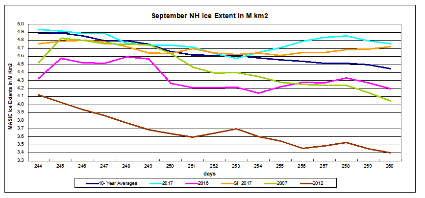
The graph below shows September comparisons through day 268.Note that as of day 260, 2016 had begun its remarkable recovery, now matching the 10 year average, nearly 200k km2 below 2017. Meanwhile 2007 is 800k km2 behind and the Great Arctic Cyclone year of 2012 is 1.3M km2 less than 2017.  Note also that SII is currently showing slightly more ice than MASIE.

The narrative from activist ice watchers is along these lines:  2017 minimum is not especially low, but it is very thin.  “The Arctic is on thin ice.”  They are basing that notion on PIOMAS, a model-based estimate of ice volumes, combining extents with estimated thickness.  That technology is not mature, and in any case refers to the satellite era baseline, which began in 1979.

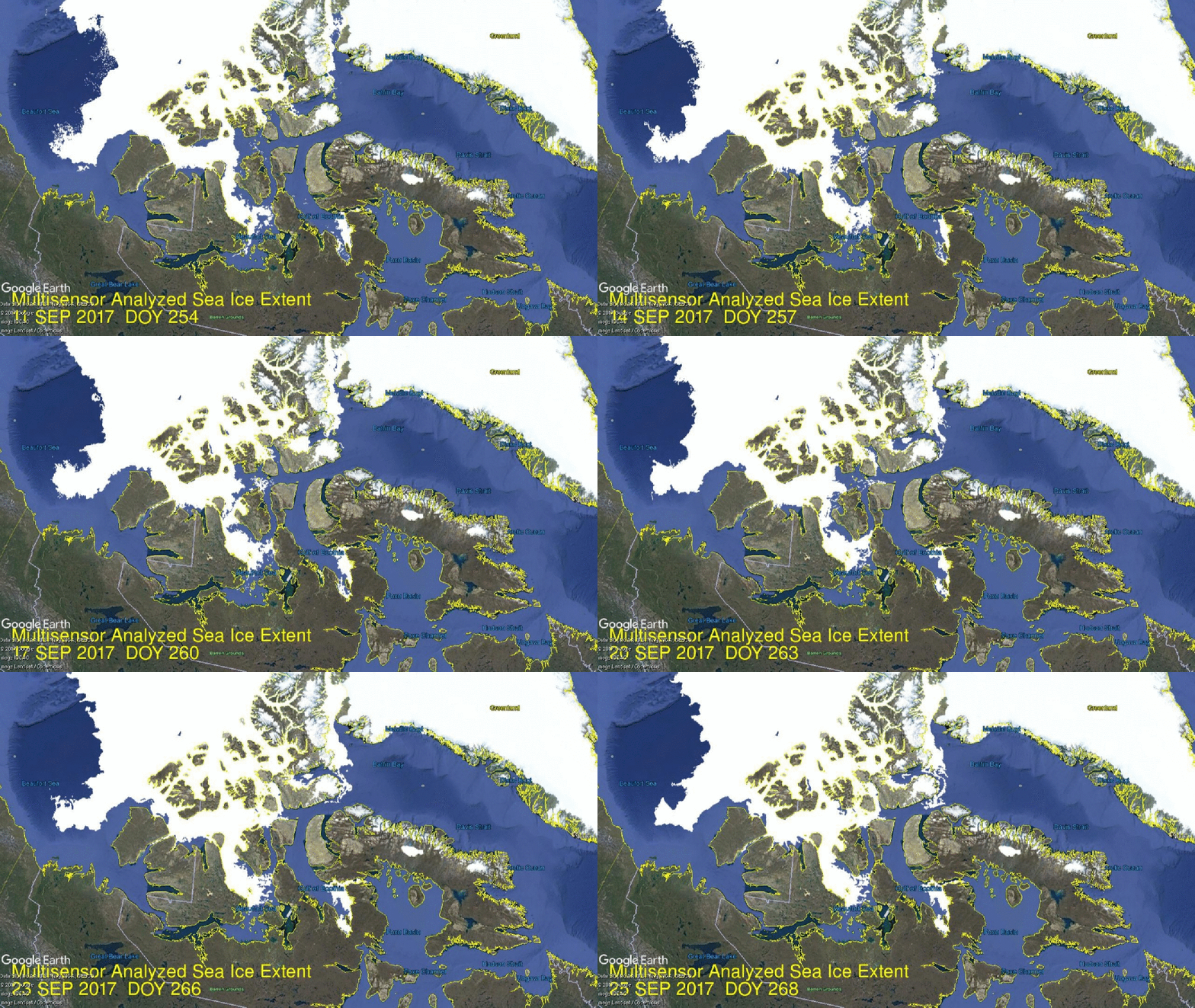
The formation of ice this year does not appear thin, since it is concentrated in the central Arctic.  Consider how CAA (Canadian Arctic Archipelago added 100k km2 in the last two weeks:

Click on image to enlarge.

The table shows ice extents in the regions for 2017, 10 year averages and 2007 for day 268. Decadal averages refer to 2007 through 2016 inclusive.

Region 2017268 Day 268
Average
2017-Ave. 2007268 2017-2007
 (0) Northern_Hemisphere 4824033 4648420 175613 4025906 798128
 (1) Beaufort_Sea 358982 488920 -129937 466599 -107617
 (2) Chukchi_Sea 71545 180769 -109224 3054 68491
 (3) East_Siberian_Sea 259179 276825 -17646 311 258868
 (4) Laptev_Sea 275826 138290 137536 222968 52858
 (5) Kara_Sea 42802 22613 20189 18246 24556
 (6) Barents_Sea 6112 20560 -14448 4851 1261
 (7) Greenland_Sea 111111 229228 -118116 335161 -224050
 (8) Baffin_Bay_Gulf_of_St._Lawrence 74169 36672 37497 41385 32784
 (9) Canadian_Archipelago 472601 293992 178610 274334 198267
 (10) Hudson_Bay 1276 3154 -1878 1936 -661
 (11) Central_Arctic 3149271 2956302 192969 2655784 493487

Note the strong surpluses in Canadian Archipelago and the Central Arctic, which is already at 95% of its March maximum.  On the Russian side, Laptev and Kara are surplus to average, while East Siberian has grown to approach average.

Summary

Earlier observations showed that Arctic ice extents were low in the 1940s, grew thereafter up to a peak in 1977, before declining.  That decline was gentle until 1994 which started a decade of multi-year ice loss through the Fram Strait.  There was also a major earthquake under the north pole in that period.  In any case, the effects and the decline ceased in 2007, 30 years after the previous peak.  Now we have a plateau in ice extents, which could be the precursor of a growing phase of the quasi-60 year Arctic ice oscillation.

For context, note that the average maximum has been 15M, so on average the extent shrinks to 30% of the March high before growing back the following winter.  In 2017 about 33% of the March maximum was retained, so the melt season losses were considerably less than in the past.

Background from Sept. 20

Dave Burton asked a great question in his previous comment, and triggered this response:

Dave, thanks for asking a great question. All queries are good, but a great one forces me to dig and learn something new, in this case a more detailed knowledge of what goes into MASIE reports.

You asked, where do they get their data? The answer is primarily from NIC’s Interactive Multisensor Snow and Ice Mapping System (IMS). From the documentation, the multiple sources feeding IMS are:

Platform(s) AQUA, DMSP, DMSP 5D-3/F17, GOES-10, GOES-11, GOES-13, GOES-9, METEOSAT, MSG, MTSAT-1R, MTSAT-2, NOAA-14, NOAA-15, NOAA-16, NOAA-17, NOAA-18, NOAA-N, RADARSAT-2, SUOMI-NPP, TERRA

Sensor(s): AMSU-A, ATMS, AVHRR, GOES I-M IMAGER, MODIS, MTSAT 1R Imager, MTSAT 2 Imager, MVIRI, SAR, SEVIRI, SSM/I, SSMIS, VIIRS

Summary: IMS Daily Northern Hemisphere Snow and Ice Analysis

The National Oceanic and Atmospheric Administration / National Environmental Satellite, Data, and Information Service (NOAA/NESDIS) has an extensive history of monitoring snow and ice coverage.Accurate monitoring of global snow/ice cover is a key component in the study of climate and global change as well as daily weather forecasting.

The Polar and Geostationary Operational Environmental Satellite programs (POES/GOES) operated by NESDIS provide invaluable visible and infrared spectral data in support of these efforts. Clear-sky imagery from both the POES and the GOES sensors show snow/ice boundaries very well; however, the visible and infrared techniques may suffer from persistent cloud cover near the snowline, making observations difficult (Ramsay, 1995). The microwave products (DMSP and AMSR-E) are unobstructed by clouds and thus can be used as another observational platform in most regions. Synthetic Aperture Radar (SAR) imagery also provides all-weather, near daily capacities to discriminate sea and lake ice. With several other derived snow/ice products of varying accuracy, such as those from NCEP and the NWS NOHRSC, it is highly desirable for analysts to be able to interactively compare and contrast the products so that a more accurate composite map can be produced.

The Satellite Analysis Branch (SAB) of NESDIS first began generating Northern Hemisphere Weekly Snow and Ice Cover analysis charts derived from the visible satellite imagery in November, 1966. The spatial and temporal resolutions of the analysis (190 km and 7 days, respectively) remained unchanged for the product’s 33-year lifespan.

As a result of increasing customer needs and expectations, it was decided that an efficient, interactive workstation application should be constructed which would enable SAB to produce snow/ice analyses at a higher resolution and on a daily basis (~25 km / 1024 x 1024 grid and once per day) using a consolidated array of new as well as existing satellite and surface imagery products. The Daily Northern Hemisphere Snow and Ice Cover chart has been produced since February, 1997 by SAB meteorologists on the IMS.

Another large resolution improvement began in early 2004, when improved technology allowed the SAB to begin creation of a daily ~4 km (6144×6144) grid. At this time, both the ~4 km and ~24 km products are available from NSIDC with a slight delay. Near real-time gridded data is available in ASCII format by request.

In March 2008, the product was migrated from SAB to the National Ice Center (NIC) of NESDIS. The production system and methodology was preserved during the migration. Improved access to DMSP, SAR, and modeled data sources is expected as a short-term from the migration, with longer term plans of twice daily production, GRIB2 output format, a Southern Hemisphere analysis, and an expanded suite of integrated snow and ice variable on horizon.

http://www.natice.noaa.gov/ims/ims_1.html

Footnote

Some people unhappy with the higher amounts of ice extent shown by MASIE continue to claim that Sea Ice Index is the only dataset that can be used. This is false in fact and in logic. Why should anyone accept that the highest quality picture of ice day to day has no shelf life, that one year’s charts can not be compared with another year? Researchers do this, including Walt Meier in charge of Sea Ice Index. That said, I understand his interest in directing people to use his product rather than one he does not control. As I have said before:

MASIE is rigorous, reliable, serves as calibration for satellite products, and continues the long and honorable tradition of naval ice charting using modern technologies. More on this at my post Support MASIE Arctic Ice Dataset


Crunching Climate $$$

The Paris agreement involves estimates of future damages because of global warming assumed to be caused by burning of fossil fuels. Looking into the numbers raises a surprising predicament, as explained by Ronald Bailey of Reason Magazine. The title of his article points to the problem:

Climate Change Will Reduce Incomes in 2100 from $97,000 to $95,000

Global per capita income now is $10,000. How much should we spend to prevent climate change losses in 2100?

Set aside the flawed science claiming CO2 is the climate control knob, even the damage estimates pale in comparison with the march of prosperity. Bailey works with the numbers from alarmist economists Nordhaus and Moffatt. Excerpt below with my bolds.

The Yale economist William Nordhaus has spent decades using a combination of econometric and climate models to estimate global warming’s future effects. He isn’t the only researcher who’s been attempting to make such projections, and Nordhaus’ latest study considers a range of different estimates. (Get your salt shaker ready.)

In a new National Bureau of Economic Research working paper, Nordhaus and his colleague Andrew Moffatt survey 36 different estimates (derived from 27 studies) of climate change’s impact on gross world product by the year 2100. Nordhaus and Moffatt note that “there are many studies of theoretical temperature increases in the 2 to 4°C range, and that they cluster in the range of a loss of 0 to 4% of global output.” After crunching the numbers, they report:

The estimated impact from the preferred regression is 1.63% of income at 3°C warming and 6.53% of income at a 6°C warming. We make a judgmental adjustment of 25% to cover unquantified sectors….With this adjustment, the estimated impact is -2.04 (+ 2.21)% of income at 3°C warming and -8.16 (+ 2.43)% of income at a 6°C warming.

The authors note that the Intergovernmental Panel on Climate Change’s Fifth Assessment Report declined to make an estimate of future losses, but in the Fourth Report, the panel stated that “Global mean losses could be 1 to 5% of GDP for 4°C of warming.” This means that Nordhaus and Moffatt’s findings are broadly in line with the climate change consensus.

So what do these findings portend for people lucky enough to be alive in 2100? Let’s consider the best-case scenario first. Annual gross world product is currently somewhere around $75 trillion, which without adjustments means that global income stands at around $10,000 per capita. Assume 3 percent economic growth from now until 2100, and a global population that year of 9 billion. Without climate change, world GDP would rise to $872 trillion and income would be $97,000 per capita. Assuming a 3°C increase in average temperature, that would reduce global GDP from $872 trillion to $854 trillion, and income to $95,000 per capita. At 6°C, the figures would be $800 trillion and $89,000 per capita.

In the unlikely event that global economic growth dawdles along at only 2 percent per year for the rest of this century, gross world product would rise to only $388 trillion and income to $43,000 per capita without warming. A 3°C rise in average temperature would reduce global GDP to $380 trillion and income to $42,000 per person; a 6°C increase would cut global GDP to $360 trillion and income to $40,000 per person.

The Nordhaus and Moffatt survey of studies also found “no indication from the damage estimates of a sharp discontinuity or high convexity.” In other words, the studies do not identify threshold effects in which damages from climate change accelerate in the future.

These calculations bring up this question: How much should people living today making an average of $10,000 apiece spend in order to prevent the future incomes from falling from $97,000 to $95,000 per capita?

Now is the time to get out your salt shaker and liberally apply the sodium chloride to these calculations.

See also post Climate Policies Gouge the Masses

Excerpt: David R. Henderson, public policy economist at the Stanford Hoover Institution, puts the issue this way:

Claims that human-caused global warming will raise average temperatures by 2C to 5C over the next 100 years and cause serious harm to society are controversial. However, assuming that global warming will be a big problem, there are two important questions: (1) What should be done about it? and (2) When should it be done?

There is much debate about what discount rate to use when comparing environmental costs and benefits. Generally, the more one values today’s dollars over tomorrow’s, the higher is one’s discount rate. At one extreme, an infinitely high discount rate would imply that we place almost no value on future consumption. Conversely, using a discount rate of zero means that benefits today are no more valuable than benefits 100 years from now..

However, the choice of which discount rate to use is not about the weight given to the well-being of future generations but about opportunity costs. Investments people make today are likely to increase the wealth of their descendants, giving future generations greater resources to exercise their preferences regarding environmental protection.

The higher the rate of return that can be earned by investing a dollar today, the more wealth future generations are deprived of if the money is spent now. Thus, Kevin Murphy of the University of Chicago argues that we should use the market interest rate as the discount rate because that is the opportunity cost of climate mitigation. Interestingly, even Stern’s own model assumes that people 200 years from now will have real incomes that are more than 10 times incomes today. This means that if the government taxes people today explicitly or through regulations to reduce climate change 200 years from now, the government will be taxing the poor to help the rich.


Degrees of Climate Truth

Previous posts have dealt with science as a mode of inquiry, and described the process of theory and observation by which scientific knowledge is obtained. This post presents work by Andy May to classify the degrees of scientific certainty or truth, and apply these to climate claims.

The essay Facts and Theories comes from his blog Andy May Petrophysicist.
Excerpts below with my bolds.

Categories of Scientific Knowledge

Newton provided us with his descriptive “Law of Gravitation.” Newton’s law tells us what gravity does and it is very useful, but it tells us nothing about how it works. For that we need Einstein’s theory of relativity. Theories and laws are not necessarily related in science. A law simply describes what happens without describing why. A scientific theory attempts to explain why a relationship holds true.

In the scientific community, for both a law and a theory, a single conflicting experiment or observation invalidates them. Einstein once said:

“No amount of experimentation can ever prove me right; a single experiment can prove me wrong.”

So, let’s examine our topics in that light. Newton’s descriptive law of gravity, based on mass and distance, are there any exceptions? Not to my knowledge, except possibly on galactic sized scales, black holes and probably on very, very small sub-atomic scales. In everyday life, Newton’s law works fine. How about Einstein’s theory of gravity (Relativity), any exceptions? None that I know of at any scale.

How about evolution? Species evolve, we can see that in the geological record. We can also watch it happen in some quickly reproducing species. Thus we could describe evolution as a fact. It happens, but we cannot describe how without more work. Early theories of the evolutionary process include Darwin’s theory of natural selection and Lamarck’s theory of heritable species adaptation due to external stresses. Due to epigenetic research we now know that Darwin and Lamarck were both right and that evolution involves both processes. For a summary of recent research into the epigenetic component of evolution see this Oxford Journal article. Thus well-established facts and scientific laws rarely change but theories do evolve. I might add that while facts and laws don’t often change, they are easily dismissed when contradictory data are gathered. The modern theory of evolution is a good example of where competing theories can merge into one.

Most scientific theories begin as hypotheses. A hypothesis is best described as an idea of what might be causing a specific event to occur. A proper scientific hypothesis, like a theory, must be falsifiable. That is, we must be able to design an experiment or foresee an observation that will make the hypothesis false. “Climate change” is not falsifiable, it is not a scientific hypothesis or a theory. “Man-made climate change” is a scientific hypothesis since it is falsifiable. Hypotheses and theories are evolving things, new facts and observations cause them to change. In this way we build the body of science. Science is mostly skepticism. We look for what does not fit, we poke at established facts and laws, at theories and hypotheses. We try and find flaws, we check the numbers. Worse, science done properly means we spend more time proving ourselves wrong than we do proving we are right. Life is tough sometimes.

So how does this fit with the great climate change debate. I’ve made a table of phrases and identified each common phrase as a fact, theory, law, hypothesis, or simply an idea. These are my classifications and certainly open for debate.

In Table 1 we can see that the comparison of man-made climate change and the possibility of a man-made climate catastrophe are not really comparable to the theories of gravity and evolution. Man-made climate change is more than an idea, it is based on some observations and reasonable models of the process have been developed and can be tested. But, none of the models have successfully predicted any climatic events. Thus, they are still a work-in-progress and not admissible as evidence supporting a scientific theory.

The idea of man-made climate change causing a catastrophe at the scale of Islamic terrorism is pure speculation. The models used to compute man’s influence don’t match any observations, this is easily seen in Figure 1 which is Dr. John Christy’s graph of the computer model’s predictions versus satellite and weather balloon observations. I should mention that satellite and weather balloon measurements are independent of one another and they are independent of the various surface temperature datasets, like HADCRUT and GHCN-M. All of the curves on the plot have been smoothed with five year averages.

The purple line going through the observations is the Russian model “INM-CM4.” It is the only model that comes close to reality. INM-CM4, over longer periods, does very well at hindcasting observed temperatures. This model uses a CO2 forcing response that is 37% lower than the other models, a much higher deep ocean heat capacity (climate system inertia) and it exactly matches lower tropospheric water content and is biased low above that. The other models are biased high. The model predicts future temperature increases at a rate of about 1K/century, not at all alarming and much lower than the predictions of the other models. (See Temperatures According to Climate Models)

One can consider each model to be a digital experiment. It is clear that the range of values from these digital experiments exceeds the predicted average temperature increase. This does not give us much confidence in the accuracy of the models. Yet, the IPCC uses the difference between the mean model temperature anomalies and observed surface temperatures since 1950 to compute man’s influence on climate.   (See Climate Models Explained)

In particular Soon, Connolly and Connolly (SCC15) believe that the IPCC chose an inappropriate model of the variation in the sun’s output (TSI or total solar irradiance). There are many models of solar variation in the peer reviewed literature and it is a topic of vigorous debate. Eight recent models are presented in Figure 8 of SCC15 (see Figure 3). Only low solar variability models (those on the right of Figure 3) are used by the IPCC to compute man’s influence on climate although just as much evidence exists for the higher variability models on the left. The scales used in the graphs are all the same, but the top and bottom values vary. At minimum, the IPCC should have run two cases, one for high variability and one for low. SCC15 clearly shows that the model used makes a big difference.

Any computer Earth model must establish a track record before it is used in calculations. The Earth is simply too complex and natural climate cycles are poorly understood. If natural cycles cannot be predicted they cannot be subtracted from observations to give us man’s influence on climate. The debate is not whether man influences climate, the debate is over how much man contributes and whether or not the additional warming dangerous. This observer, familiar with the science, would say the jury is still out. Certainly, the case for an impending catastrophe has not been made as this requires two speculative jumps. First, we need to assume that man is the dominant driver of climate, second we need to assume this will lead to a catastrophe. One can predict a possible catastrophe if the most extreme climate models are correct, but the record shows they are not. Only INM-CM4 matches observations reasonably well and INM-CM4 does not predict anything remotely close to a catastrophe.

In the study of the process of evolution the problem is the same. Some believe that the dominant process is natural selection and epigenetic change is minor. Some believe the opposite. Everyone believes that both play a role. As in climate science, figuring out which process is dominant is tough.

Recent climate history (the “pause” in warming) suggests that we have plenty of time to get our arms around this problem before doing anything drastic like destroying the fossil fuel industry and sending billions of people into poverty due to a lack of affordable energy.

Summary:  Scientific vs. Social Proof

In the IPCC reports certainty is presented in terms of social proofs. For example, an assertion is rated as Very High Confidence, or 95% Certain, meaning almost all consulted experts held that opinion. A claim rated as Moderate Confidence is in fact 50% Certain, meaning it is regarded as equally unlikely. Statements regarded as Low Confidence are thought to be so improbable that one wonders why they are presented. In any case, these are not scientific assessments, but rather opinion polling of people thought to be knowledgeable.

In contrast, Andy May demonstrates how scientific proof is obtained: A law or theory stands as along as no exceptions have been found. Or the law or theory is modified to stipulate more clearly under what conditions it operates. His classification of climate facts, theories and ideas sits well with me and helps to clarify what is presently known and unknown in this field.

As shown above, a theory or hypothesis falls if exceptions are observed.  Are there exceptions to the hypothesis of man-made global warming?  Yes, indeed there are many.  One of the most important disproofs (it only takes one) is actually provided by the climate models.

Figure 5. Simplification of IPCC AR5 shown above in Fig. 4. The colored lines represent the range of results for the models and observations. The trends here represent trends at different levels of the tropical atmosphere from the surface up to 50,000 ft. The gray lines are the bounds for the range of observations, the blue for the range of IPCC model results without extra GHGs and the red for IPCC model results with extra GHGs.The key point displayed is the lack of overlap between the GHG model results (red) and the observations (gray). The nonGHG model runs (blue) overlap the observations almost completely.

IPCC Assessment Reports show that the IPCC climate models performed best versus observations when they did not include extra GHGs and this result can be demonstrated with a statistical model as well.

Full explanation at Warming from CO2 Unlikely

For more on measurements and science see Data, Facts and Information


Sorry Climate Science

h/t Scottish Skeptic for referring to this article by James Delingpole in the Sun UK

How scientists got their global warming sums wrong — and created a £1TRILLION-a-year green industry that bullied experts who dared to question the figures

The summary puts the point clearly.  The scientists who produce those doomsday reports for the Intergovernmental Panel on Climate Change finally come clean. The planet has stubbornly refused to heat up to predicted levels.  Read the whole thing.  Favorite excerpts below with my bolds.

I’VE just discovered the hardest word in science.

Not pneumonoultramicroscopicsilicovolcanoconiosis (inflammation of the lungs caused by inhalation of silica dust). Nor palmitoyloleoylphosphatidylethanolamine (a lipid bilayer found in nerve tissue).

No, the actual hardest word — which scientists use so rarely it might as well not exist — is “Sorry”.

Which is a shame because right now the scientists owe us an apology so enormous that I doubt even a bunch of two dozen roses every day for the rest of our lives is quite enough to make amends for the damage they’ve done.

Thanks to their bad advice on climate change our gas and electricity bills have rocketed.

So too have our taxes, our car bills and the cost of flying abroad, our kids have been brainwashed into becoming tofu-munching eco-zealots, our old folk have frozen to death in fuel poverty, our countryside has been blighted with ranks of space-age solar panels and bat-chomping, bird-slicing eco-crucifixes, our rubbish collection service hijacked by hectoring bullies, our cities poisoned with diesel fumes . . .

And all because a tiny bunch of ­scientists got their sums wrong and scared the world silly with a story about catastrophic man-made global warming.

This scare story, we now know, was at best an exaggeration, at worst a ­disgraceful fabrication. But while a handful of reviled and derided sceptics have been saying this for years, it’s only this week that those scientists have fessed up to their mistake.

One scientist has described the ­implications of the new Nature Geoscience report as “breathtaking”. He’s right. What it effectively does is scotch probably the most damaging ­scientific myth of our age — the notion that man-made carbon dioxide (CO2) is causing the planet to warm at such dangerous and ­unprecedented speeds that only massive government intervention can save us.

For a quarter of a century now — it all really got going in 1992 when 172 nations signed up to the Rio Earth Summit — our politicians have believed in and acted on this discredited theory.

Doomsday was predicted, but midnight passed without disaster.

In the name of saving the planet, war was declared on carbon dioxide, the benign trace gas which we exhale and which is so good for plant growth it has caused the planet to “green” by an extraordinary 14 per cent in the last 30 years.

This war on CO2 has resulted in a massive global decarbonisation industry worth around $1.5trillion (£1.11trillion) a year. Though it has made a handful of green crony capitalists very rich, it has made most of us much poorer, by forcing us to use expensive “renewables” instead of cheap, abundant fossil fuels.

So if the science behind all this ­nonsense was so dodgy, why did no one complain all these years?

Well, a few of us did. Some — such as Johnny Ball and David Bellamy — were brave TV celebrities, some — Graham Stringer, Peter Lilley, Owen Paterson, Nigel (now Lord) Lawson — were ­outspoken MPs, some were bona fide scientists. But whenever we spoke out, the response was the same — we were bullied, vilified, derided and dismissed as scientifically illiterate loons by a powerful climate alarmist establishment which brooked no dissent.

Unfortunately this alarmist establishment has many powerful media allies. The BBC has a huge roster of eco-activist reporters and science “experts” who believe in man-made global warming, and almost never gives sceptics air time.

It comes as little consolation to those of us who’ve been right all along to say: “I told you so.”

In the name of promoting the global warming myth, free speech has been curtailed, honest science corrupted and vast economic and social damage done. That ­apology is long overdue.

Footnote:

For a short course in how climate science was exploited, Richard Lindzen provides details and names in this post Climate Science Was Broken

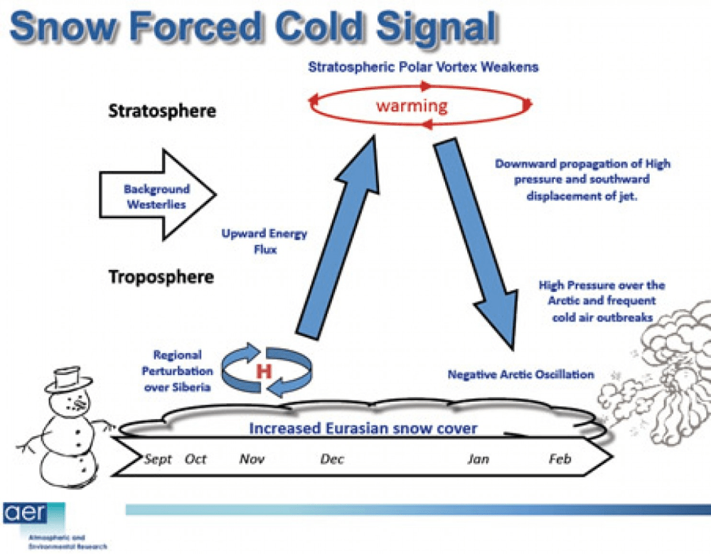
Overview Winter Climate for NH

cohen-schematic2

The diagram represents how Dr. judah Cohen pictures the Northern Hemisphere wintertime climate system.  He leads research regarding Arctic and NH weather patterns for AER.  He explains the dynamics in an interview at Washington Post (here):

My colleagues, at AER and at selected universities, and I have found a robust relationship between two October Eurasian snow indices and the large-scale winter hemispheric circulation pattern known as the North Atlantic or Arctic Oscillation pattern (N/AO).

The N/AO is more highly correlated with or explains the highest variance of winter temperatures in eastern North America, Europe and East Asia than any other single or combination of atmospheric or coupled ocean-atmosphere patterns that we know of. Therefore, if we can predict the winter N/AO (whether it will be negative or positive) that provides the best chance for a successful winter temperature forecast in North America but certainly does not guarantee it.

[Of the two indices we’ve analyzed], the first and longer [more data points] index is simply the monthly mean snow cover extent (SCE) for the entire month [of October] as measured from satellites. This record dates back to at least 1972 and is available on the Rutger’s Global Snow Lab website.

The second index that we developed last year, with the support of NSF and NOAA grants, measures the daily rate of change of Eurasian snow cover extent also during the entire month of October, which we refer to as the Snow Advance Index or SAI.

There have been recent modeling studies that demonstrate that El Nino modulates the strength and position of the Aleutian Low that then favors stratospheric warmings and subsequently a negative winter N/AO that are consistent with our own research on the relationship between snow cover and stratospheric warmings. So the influence of ENSO on winter temperatures in the Mid-Atlantic and the Northeast may be greater than I acknowledge or that is represented in our seasonal forecast model.

How It Works

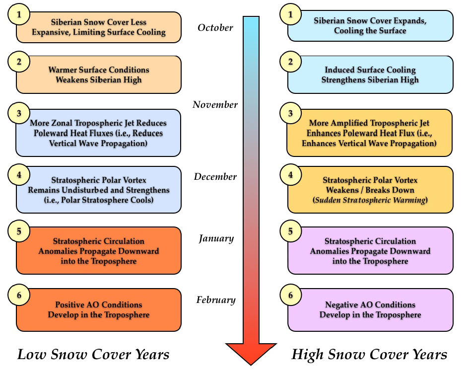
Conceptual model for how fall snow cover modifies winter circulation in both the stratosphere and the troposphere–The case for low snow cover on left; the case for extensive snow cover on right.

1. Snow cover increases rapidly in the fall across Siberia, when snow cover is above normal diabatic cooling helps to;
2. Strengthen the Siberian high and leads to below normal temperatures.
3. Snow forced diabatic cooling in proximity to high topography of Asia increases upward flux of energy in the troposphere, which is absorbed in the stratosphere.
4. Strong convergence of WAF (Wave Activity Flux) indicates higher geopotential heights.
5. A weakened polar vortex and warmer down from the stratosphere into the troposphere all the way to the surface.
6. Dynamic pathway culminates with strong negative phase of the Arctic Oscillation at the surface.

From Eurasian Snow Cover Variability and Links with Stratosphere-Troposphere
Coupling and Their Potential Use in Seasonal to Decadal Climate Predictions by Judah Cohen

Extensive 2016 Siberian snowfall led to unusually rapid recovery of Arctic sea ice following relatively low September 2016 minimum.

What About Winter 2017-2018?

Dr. Cohen’s Winter Outlook for NH  September 18, 2017

Many important markers are currently being set indicating the atmosphere is beginning in earnest the transition from summer to winter. There are four features that I am monitoring closely over the coming weeks and months to gauge the evolving atmospheric circulation pattern and resultant weather across the NH.

The first is the nascent stratospheric polar vortex (PV). The PV has returned to the NH polar stratosphere. Much recent research including my own has shown that the relative strength of the PV if not forces, certainly leads prolonged periods of temperature anomalies across key regions of the NH. A strong PV is related to relatively milder temperatures across the mid-latitudes of the NH while a weak PV is related to relatively colder temperatures across the mid-latitudes of the NH. This relationship is strongest in mid-winter. Early signs are that the PV will start off relatively weak similar to last fall. This is somewhat surprising because increasing greenhouse gases favor colder stratospheric temperatures and hence a stronger PV. Poleward heat flux or vertical wave activity flux is predicted to be unusually active in the coming two weeks, which is likely the reason for the predicted relatively weak start to the PV.  (my bolds)

The active poleward heat flux is also likely related to the second feature that I will be following – high latitude blocking. The negative AO state is often a manifestation of strong high latitude blocking while the positive AO often reflects a lack of high latitude blocking. The predicted negative AO in the coming two weeks is a result of predicted strong high latitude blocking with the dominant block predicted to reside in the region of Scandinavia and the Barents-Kara seas. In the near term this will lead to a cold and snowy period across most of Siberia. Blocking in this region is favorable for weakening the stratospheric polar vortex and will likely lead to weakening of the PV over the next two weeks. If similar blocking occurs later on during the late fall and early winter it will favor a sudden stratospheric warming (SSW). SSW in the winter often precedes extended periods of severe winter weather across the continents of the NH. (my bolds)

The third feature is Arctic sea ice extent. The minimum in Arctic sea ice extent is achieved this time of year and if the minimum has not already been reached it should occur relatively soon. The past two blogs I suggested the possibility that the sea ice minimum could be similar to the years 2008 and 2010 and that is looking likely. Sea ice extent is extremely low compared to climatology but will not be a new record low. The largest anomalies are in the North Pacific side of the Arctic in the Beaufort Sea. This pattern matches recent Septembers. Typically, the largest anomalies migrate with the progression of fall to the North Atlantic side of the Arctic. It is my opinion that low sea ice favors high latitude blocking but the nature of the blocking is regionally dependent. For example, low sea ice in the Barents-Kara Seas favors blocking in the northwest Eurasia sector resulting in cold temperatures in parts of Asia. (my bolds)

The fourth feature is Siberian snow cover. My, along with my colleagues and others, research has shown that extensive Siberian snow cover in the fall favors a trough across East Asia with a ridge to the west near the Urals. The atmospheric circulation pattern favors more active poleward heat flux, a weaker PV and cold temperatures across the NH. With a predicted strong negative AO in the coming weeks, snow cover is likely to advance relatively quickly heading into October. It is very early in the snow season but recent falls have been snowy across Siberia and therefore I do expect another upcoming snowy fall across Siberia. Though admittedly, recent Siberian snow cover as a predictor of winter temperatures has been mixed.

Summary

Uh oh.  Now where did I put away my long johns?

Arctic Ice Exceeds at Minimum

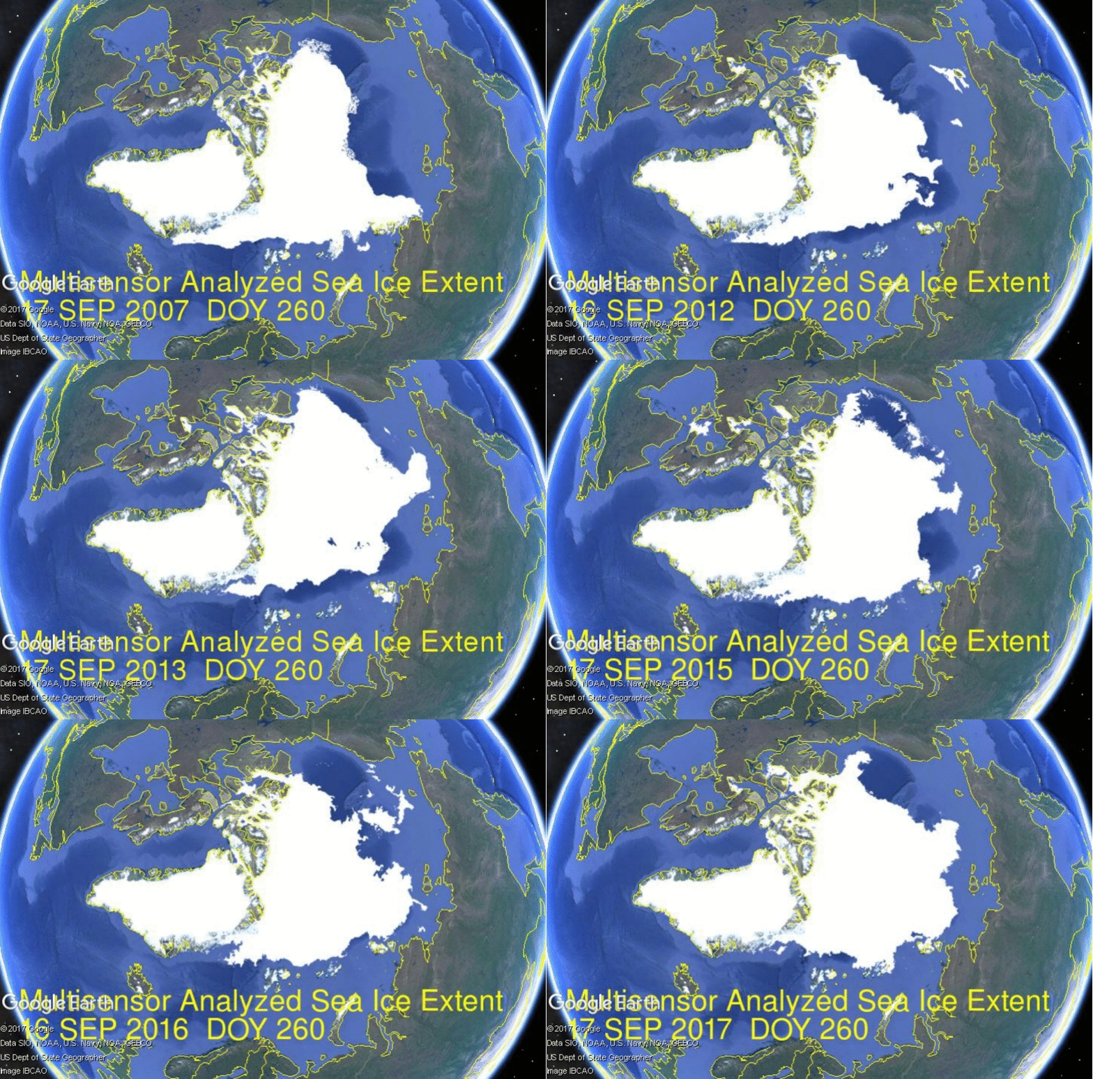
It is the most typical day this decade for the annual Arctic ice extent minimum. Some take any year’s slightly lower minimum as proof that Arctic ice is dying, but the image below shows extents from 2007, mostly smaller than 2017.

While the daily average extent for the last 10 years bottomed out on day 260, years like 2016 and 2009 hit minimum on day 254.  This year’s extent was at 4.7M km2 for a week, hit bottom at 4.6M on day 253, then rose up and over 4.8M km2.  SII (Sea Ice Index) 2017 is similar to MASIE, though a bit lower lately. The graph below shows September comparisons through day 260.
Note that as of day 260, 2017 has gone 300k km2 above average, 500k km2 more than 2016, 700k km2 higher than 2007, and 1400k km2 greater than 2012.  All regions have added ice, with Central Arctic the only exception.  That is likely due to Central Arctic sea already full of ice at 3.1M km2.

The table shows ice extents in the regions for 2017, 10 year averages and 2007 for day 260.

Region 2017260 Day 260
Average
2017-Ave. 2007260 2017-2007
 (0) Northern_Hemisphere 4757445 4449204 308241 4045776 711669
 (1) Beaufort_Sea 411648 468835 -57187 481384 -69736
 (2) Chukchi_Sea 106342 145834 -39492 22527 83815
 (3) East_Siberian_Sea 320193 257482 62711 311 319882
 (4) Laptev_Sea 241780 123163 118617 235869 5912
 (5) Kara_Sea 21251 20846 405 44067 -22816
 (6) Barents_Sea 1664 24778 -23114 7420 -5756
 (7) Greenland_Sea 90072 213695 -123622 333181 -243109
 (8) Baffin_Bay_Gulf_of_St._Lawrence 65653 26566 39086 26703 38950
 (9) Canadian_Archipelago 430824 247034 183790 225526 205299
 (10) Hudson_Bay 1932 6975 -5042 2270 -338
 (11) Central_Arctic 3071252 2912912 158339 2665244 406008

The largest deficits to average are in BCE and Greenland Sea, more than offset by huge surpluses in Central Arctice, CAA and Laptev.  Note the strong growth in East Siberian offsetting the Beaufort deficit.

Over this decade, the Arctic ice minimum has not declined, but looks like fluctuations around a plateau since 2007. By mid-September, all the peripheral seas have turned to water, and the residual ice shows up in a few places. The table below indicates where  ice is found in September. (Shows day 260 amounts with 10 year averages)

Arctic Regions 2007 2010 2012 2014 2015 2016 2017 Average
Central Arctic Sea 2.67 3.16 2.64 2.98 2.93 2.92 3.07 2.91
BCE 0.50 1.08 0.31 1.38 0.89 0.52 0.84 0.87
LKB 0.29 0.24 0.02 0.19 0.05 0.28 0.26 0.17
Greenland & CAA 0.56 0.41 0.41 0.55 0.46 0.45 0.52 0.46
B&H Bays 0.03 0.03 0.02 0.02 0.10 0.03 0.07 0.03
NH Total 4.05 4.91 3.40 5.13 4.44 4.20 4.76 4.45

BCE (Beaufort, Chukchi and East Siberian) on the Asian side are quite variable as the largest source of ice other than the Central Arctic itself.   Greenland Sea and CAA (Canadian Arctic Archipelago) together hold almost 0.5M km2 of ice at minimum, fairly consistently.   LKB are the European seas of Laptev, Kara and Barents, a smaller source of ice, but a difference maker some years, as Laptev was in 2016 and 2017.  Baffin and Hudson Bays are almost inconsequential.  The biggest contributors to 2017 success are Central Arctic, Canadian Archipelago and Laptev.

For context, note that the average maximum has been 15M, so on average the extent shrinks to 30% of the March high before growing back the following winter.

Update Sept. 20

Dave Burton asked a great question in his comment below, and triggered this response:

Dave, thanks for asking a great question. All queries are good, but a great one forces me to dig and learn something new, in this case a more detailed knowledge of what goes into MASIE reports. My answer above refers only to a sub-product which combines MASIE with JAXA.

You asked, where do they get their data? The answer is primarily from NIC’s Interactive Multisensor Snow and Ice Mapping System (IMS). From the documentation, the multiple sources feeding IMS are:

Platform(s) AQUA, DMSP, DMSP 5D-3/F17, GOES-10, GOES-11, GOES-13, GOES-9, METEOSAT, MSG, MTSAT-1R, MTSAT-2, NOAA-14, NOAA-15, NOAA-16, NOAA-17, NOAA-18, NOAA-N, RADARSAT-2, SUOMI-NPP, TERRA

Sensor(s): AMSU-A, ATMS, AVHRR, GOES I-M IMAGER, MODIS, MTSAT 1R Imager, MTSAT 2 Imager, MVIRI, SAR, SEVIRI, SSM/I, SSMIS, VIIRS

Summary: IMS Daily Northern Hemisphere Snow and Ice Analysis

The National Oceanic and Atmospheric Administration / National Environmental Satellite, Data, and Information Service (NOAA/NESDIS) has an extensive history of monitoring snow and ice coverage.Accurate monitoring of global snow/ice cover is a key component in the study of climate and global change as well as daily weather forecasting.

The Polar and Geostationary Operational Environmental Satellite programs (POES/GOES) operated by NESDIS provide invaluable visible and infrared spectral data in support of these efforts. Clear-sky imagery from both the POES and the GOES sensors show snow/ice boundaries very well; however, the visible and infrared techniques may suffer from persistent cloud cover near the snowline, making observations difficult (Ramsay, 1995). The microwave products (DMSP and AMSR-E) are unobstructed by clouds and thus can be used as another observational platform in most regions. Synthetic Aperture Radar (SAR) imagery also provides all-weather, near daily capacities to discriminate sea and lake ice. With several other derived snow/ice products of varying accuracy, such as those from NCEP and the NWS NOHRSC, it is highly desirable for analysts to be able to interactively compare and contrast the products so that a more accurate composite map can be produced.

The Satellite Analysis Branch (SAB) of NESDIS first began generating Northern Hemisphere Weekly Snow and Ice Cover analysis charts derived from the visible satellite imagery in November, 1966. The spatial and temporal resolutions of the analysis (190 km and 7 days, respectively) remained unchanged for the product’s 33-year lifespan.

As a result of increasing customer needs and expectations, it was decided that an efficient, interactive workstation application should be constructed which would enable SAB to produce snow/ice analyses at a higher resolution and on a daily basis (~25 km / 1024 x 1024 grid and once per day) using a consolidated array of new as well as existing satellite and surface imagery products. The Daily Northern Hemisphere Snow and Ice Cover chart has been produced since February, 1997 by SAB meteorologists on the IMS.

Another large resolution improvement began in early 2004, when improved technology allowed the SAB to begin creation of a daily ~4 km (6144×6144) grid. At this time, both the ~4 km and ~24 km products are available from NSIDC with a slight delay. Near real-time gridded data is available in ASCII format by request.

In March 2008, the product was migrated from SAB to the National Ice Center (NIC) of NESDIS. The production system and methodology was preserved during the migration. Improved access to DMSP, SAR, and modeled data sources is expected as a short-term from the migration, with longer term plans of twice daily production, GRIB2 output format, a Southern Hemisphere analysis, and an expanded suite of integrated snow and ice variable on horizon.

http://www.natice.noaa.gov/ims/ims_1.html

Footnote

Some people unhappy with the higher amounts of ice extent shown by MASIE continue to claim that Sea Ice Index is the only dataset that can be used. This is false in fact and in logic. Why should anyone accept that the highest quality picture of ice day to day has no shelf life, that one year’s charts can not be compared with another year? Researchers do this, including Walt Meier in charge of Sea Ice Index. That said, I understand his interest in directing people to use his product rather than one he does not control. As I have said before:

MASIE is rigorous, reliable, serves as calibration for satellite products, and continues the long and honorable tradition of naval ice charting using modern technologies. More on this at my post Support MASIE Arctic Ice Dataset


Climate Thought Control

Being “framed” is slang when someone is blamed for something they did not do, i.e. being set up by means of false evidence and witnesses.

Jennifer Good is a communications professor explaining how the media is expected to mold public opinion in favor of climate activism. Her article in the Toronto Star Putting hurricanes and climate change into the same frame is revealing, especially the subtitle A study shows network Hurricane coverage this month did not link an increase in extreme weather to global warming.

The prof is disappointed that climate change was not more frequently mentioned in stories about the recent hurricanes. She considers it an opportunity missed.  Some excerpts below with my bolds.

I have analyzed two weeks of broadcast news stories that appeared on America’s seven largest TV networks as well as Canada’s CTV network. In just over 1,500 stories about hurricanes, “Trump” was discussed in 907 of those stories (or about 60 per cent), while “business” was discussed in 572 of those stories (or about 38 per cent).

“Climate change” was discussed in just 79 of the hurricane stories — or about five per cent.

What’s Wrong with Professional, Objective Reporting?

The fundamental answer is that climate change and extreme weather (i.e., hurricanes) need to be framed together more often. As scientists have pointed out, while climate change is not causing the weather, it is definitely exacerbating the weather. But increasingly adding climate change to the extreme weather frame is only the tip of the (yes, melting) iceberg. Alternatives to “business as usual” need to be part of the media’s, and our, extreme weather frames.

Of those 1,500 broadcast news stories involving hurricanes, only four also mentioned “fossil fuels,” and not a single news broadcast discussed “alternative energy.”

Similarly, while “economy” is discussed in 187 of the hurricane news stories, only 18 stories discussed hurricanes, the economy and climate change together; and not one story explored the links between an economic model based on endless growth, and the implications of this endless growth for the planet and climate change.

The Purpose of Media is to Manipulate Public Opinion

In his seminal 2010 paper “Why It Matters How We Frame the Environment,” published in the journal Environmental Communication, the American linguist and philosopher George Lakoff offered that the world is made up of frames. “Framing” is how our neural system defines a concept by grouping together what goes with — or gets framed with — that concept. Our brains are wired this way.

For example, when you read “climate change,” your brain immediately frames the concept of climate change with certain words and concepts. Everyone cognitively frames “climate change” somewhat differently, but there might also be large overlaps. Terms like “fossil fuels” and “human activity” might be in many people’s climate change frames, although frames can differ widely. (Think, for example, of climate change skeptics.)

Not surprisingly, the news media plays a significant role in how our brains frame concepts. The more the media frames a story by associating it with certain words and concepts, the more likely we are to use those same words and concepts in our own framing.

And conversely, if the news media never framed a story using certain concepts, there is “hypocognition,” or as Lakoff proposed, a “lack of ideas we need.”

In times of crisis, there are many immediate and urgent stories that need to be told about lives and loss, bravery and struggle. But crisis also provides an opportunity for change — an opportunity to shift our frames and include the ideas we desperately need.

So far, that opportunity seems to have been missed. Meanwhile, the oceans get warmer.

The Other Side of the Story

While the prof is totally convinced she knows what the public needs to know about weather and climate, actual weather scientists disagree with her.  In fact, the efforts to link storms and fossil fuels were present way too often and hindered the public from understanding these events.

For instance, Hurricane scientist Dr. Ryan Maue ripped climate ‘hype’ on Irma & Harvey in his WSJ article Climate Change Hype Doesn’t Help.

As soon as Hurricanes Harvey and Irma made landfall in the U.S., scientists, politicians and journalists began to discuss the role of climate change in natural disasters. Although a clear scientific consensus has emerged over the past decade that climate change influences hurricanes in the long run, its effect upon any individual storm is unclear. Anyone trying to score political points after a natural disaster should take a deep breath and review the science first.

As a meteorologist with access to the best weather-forecast model data available, I watched each hurricane’s landfall with particular interest. Harvey and Irma broke the record 12-year major hurricane landfall drought on the U.S. coastline. Since Wilma in October 2005, 31 major hurricanes had swirled in the North Atlantic but all failed to reach the U.S. with a Category 3 or higher intensity.

Even as we worked to divine exactly where the hurricanes would land, a media narrative began to form linking the devastating storms to climate change. Some found it ironic that states represented by “climate deniers” were being pummeled by hurricanes. Alarmists reveled in the irony that Houston, home to petrochemical plants, was flooded by Harvey, while others gleefully reported that President Trump’s Mar-a-Lago might be inundated by Irma.

By focusing on whether climate change caused a hurricane, journalists fail to appreciate the complexity of extreme weather events. While most details are still hazy with the best climate modeling tools, the bigger issue than global warming is that more people are choosing to live in coastal areas, where hurricanes certainly will be most destructive.

Summary

Actual scientists are calling for less, not more manipulative journalism.

And as for the oceans getting warmer, Prof. Good, that is due to the oceans storing and releasing solar energy, nothing to do with burning fossil fuels.  The oceans heat the atmosphere, and not the other way around.  See Empirical Evidence: Oceans Make Climate

Footnote:  If Framing doesn’t work, what’s next?

an-order