Cohler Crushes IPCC Circle of Lies

From 10.000 Years to 4: One Equation Falsifies the Entire IPCC CO₂ Narrative – by Jonathan Cohler

The video above is a recent presentation by Jonathan Cohler at EIKE ( European Climate and Energy Institute).  The english audio is available. He does a complete and evidence-based destruction of IPCC “concensus” Climate Science.  For those prefering to read I provide a transcript lightly edited from the captions, along with some bolds and key exhibits from the talk.

Just very briefly, I’m Jonathan Cohler. I’m a Harvard-trained physicist, AI researcher, software developer.  I serve on the Heartland Institute’s Board of Policy Advisors, and I’m a member of the CO2 Coalition. And over the past year, I’ve authored six climate papers, both peer-reviewed and pre-print, with illustrious co-authors including Willie Soon, David Legates, Keston Green, and Ole Humlum.

Collectively, the papers falsify the entire IPCC framework.

I presented some of this at Heartland’s conference in Washington this April, but today at EIKE is the first public presentation of our newest paper on the bomb radiocarbon falsification of the IPCC CO2 attribution, and more. So I’m going to start here by sharing my screen with you so you can see the presentation. So for 38 years, numerous IPCC purported metrics and associated lies have been paraded before the world as settled science.

Today, I’m going to show you that none of them are true, and most aren’t even real. One note on language I use, I use the word lie in its plain sense, a statement that is not true. Intent is not part of the definition.  Orwell’s 2 plus 2 equals 5 is a lie regardless of who says it or why. When I call an IPCC claim a lie, I’m stating it’s false.

That said, intent in this case is not in doubt. The IPCC has had 38 years of access to all the data and the resources of every major government on earth. It knows what it has been promulgating, it knows what it has been suppressing, and significant numbers of scientists know as well. I won’t name any individuals, they know who they are, but I will name the institution, the IPCC.

My presentation is based on five papers, my 2025 peer-reviewed paper, building on Essex et al., 2007, and proving again that global mean surface temperature, GMST, does not exist. Our 2026 peer-reviewed paper on the invalidity of Argo-based ocean heat content with co-authors Dave Legates, Keston Green, Ole Humlum, Franklin Soon, and Willie Soon. Our 2026 paper with co-author Willie Soon on the dominance of natural CO2 dynamics currently under review.

My pre-print proving my new physical tether theorem. And most recently, our paper with co-author Willie Soon analyzing 50 years of global bomb radiocarbon decay, falsifying the key assumptions of the IPCC carbon cycle framework. I want to acknowledge all my co-authors, and in particular, my mentor and dear friend Willie Soon, whose decades of courageous work made much of this possible.  I also want to honor the truly seminal contributions of Christopher Essex and Demetris Koutsoyiannis, whose work laid the foundation for all my papers here.

So let’s start with the verdict. Every major public-facing claim of the Intergovernmental Panel on Climate Change, IPCC, is scientifically invalid and categorically false. Not uncertain, not weakened, not in need of more research, false. I’ll prove this in the next 35 minutes or so by math, physics, and data. Words lie. Math does not. A statement is either derivable from its premises or not. There is no, quote, 97% of mathematicians agree nonsense. There’s proof or there isn’t.

For 38 years, the IPCC has paraded a framework draped in equations, satellite data, supercomputer models, academy awards, even Nobel Prizes. A snake eating its own tail.  Each piece appears to validate the next. Once you see that the circle is empty, the entire framework collapses. Each lie leads to the next. None stand on their own.

GMST,Global mean surface temperature, the number that has purportedly risen 1.1 degrees since 1850, the number whose further rise to 1.5 or 2 degrees is, “catastrophic”, what some have called, “the most important number in the world”. CMIP, the Coupled Model Intercomparison Project, those are the general circulation models tuned to reproduce GMST.

OHC stands for Ocean Heat Content, a physically meaningless global aggregate constructed by the same averaging machinery as GMST. EEI, Earth’s Energy Imbalance, the energy gain inferred from OHC overriding satellite radiation measurements. CO2, atmospheric carbon dioxide, the persistence and attribution modeled by Bern impulse response functions validated against CMIP purported driving force in the entire attribution chain.

And then the loop closes back on itself. GMST tunes the models. The models produce Bern. Bern produces the budgets. Budgets define the targets. Targets are written in GMST. Each of the five nodes is independently falsified by physics, data, and math.

Let’s begin. Node 1, GMST is physically meaningless.

It’s the anchor of every policy claim. The Paris Agreement is written in degrees of GMST. Equilibrium climate sensitivity is defined in GMST. Transient climate response is defined in GMST. Attribution regressions use GMST as a dependent variable. CMIP models are tuned to reproduce GMST trajectories.

But GMST was proven meaningless in a 2007 paper by Essex, McKitrick, and Andresen unrefuted in 19 years. Two months ago, my physical tether theorem paper established from axioms of classical science alone that GMST cannot exist in the real world. It’s completely physically meaningless.

You take valid local thermometer readings, average them, get a global average. Seems right. Why not? Think telephone numbers. Average the phone numbers of everyone in Boston and Halle. Then ask three simple questions. Whose phone number is it? Is it a phone number? Does it mean anything at all?

Temperature is an intensive property defined only under local
thermodynamic equilibrium in single connected systems, like a
phone
number that applies to one point on a telecom network.

The Earth’s surface, oceans, and atmosphere are not in equilibrium. They’re an open-driven non-equilibrium system. Persistent gradients, persistent fluxes, in-homogeneity at every scale.  Physics has no law for aggregating local temperatures into a global mean. Disconnected systems cannot affect each other. Unlike quantum mechanical spooky action at a distance, which Einstein doubted and my friend and colleague John Clauser proved real, there is no thermodynamics at a distance.

The temperature in Boston has zero effect on the temperature in Halle. Temperature is defined only in a connected equilibrium system, and it is precisely the partial derivative of U, internal energy, with respect to S, entropy. Every thermometer agrees.

For an aggregate of disconnected systems, there is no thermodynamics, period. The GMST formulas imposed by the IPCC, NASA, or NOAA are just made up. The output is a number, not a temperature. Not anything in the physical, real world. The 2007 Essex paper showed the consequences for averaging arithmetic, area weighted, mass weighted, fourth root, enthalpy weighted. They all yield different numbers and different trends from the same data.

The choice is arbitrary. This isn’t a quarrel over data adjustments. We’re not talking about urban heat islands, homogenization, data improvement. No amount of data improvements can fix a category error. No averaging convention can rescue it. My physical tether theorem states it formally.

An abstract math formula is scientifically valid if and only if it is connected to the physical world by a unique, physical law-governed objective link. For a connected, equilibrated system, that link exists. Temperature is precisely the partial derivative of U with respect to S, and every valid thermometer agrees.  A unique mapping exists. For disconnected systems, no physics, no mapping, just arbitrary statistical aggregations with no unique operational definition. The outputs are meaningless numbers.

GMST is a number the IPCC has falsely labeled as a temperature. Consequences are immediate and total. The 1.5 degree C limit is not a physical threshold. It’s an arbitrary number with a fake label applied to a meaningless calculation. The claim that the planet is warm by 1.1 degrees C is not a measurement. The equilibrium climate sensitivity defined as a change in GMST per CO2 doubling is equally physically meaningless.

The AR5 attribution statement,  “more than half of observed warming is anthropogenic”,  is a regression on a dependent variable that doesn’t exist. Every claim built on GMST is null and void. And AR6 went further. They abandoned their own calibrated uncertainty language and declared human influence, “unequivocal”, and then proceeded to use the word at least 37 times.

Unequivocal is not a science word. Science does not produce unequivocal claims.

Math proofs do. Empirical science operates within probability and falsifiability. Karl Popper settled this long ago. By its own word choice, the IPCC has abandoned science. Node 1 falsified. Every quantity dependent on GMST collapses with it.

Node 2, CMIP models are tuned to a fiction.

Every IPCC projection comes from CMIP, the coupled model intercomparison project. The models are tuned so simulated GMST matches the numerically calculated and physically meaningless GMST. Remember, there is no observed GMST. Those are just Orwellian words that the IPCC uses. It is purely a calculation.

Models that fail to reproduce historical GMST are discarded or retuned. GMST is physically meaningless. The model tuning target is physically meaningless. The model extracted parameters are extracted against a physically meaningless target. This is not a small effect. Cloud feedbacks, radiative forcing, equilibrium climate sensitivity, transient climate response, every one is an emergent property of models optimized against a physically meaningless target.

Equilibrium climate sensitivity, look at what IPCC actually means by this. ECS is defined as the change in GMST between models at 280 and 560 ppm CO2 both run to model equilibrium. But the earth is never in equilibrium. The fact that a model converges to equilibrium proves it isn’t modeling the earth. The equilibrium is a feature of the model, not the earth.

And even that’s not true. The CMIP model purveyors don’t actually run to that fictional equilibrium. They run 150 years or so, observe the drift, and extrapolate. They assume the model will reach an equilibrium that it never reaches.

ECS is an assumed extrapolation of an unreached state of a model
that fails reality at the level of being able to converge in the first place.

All to promulgate a number physically meaningless by definition. If A is meaningless and B is meaningless, then A minus B is meaningless. A and B are both meaningless GMST values. I know this is twisted IPCC Orwellian stuff, but follow me here because this is what is actually happening. Trillions of dollars of policy are calibrated to a number that does not exist in the real world, to a fake equilibrium state that never occurs in a model that fails to represent earth by virtue of having that equilibrium state in the first place.

And the model itself contains essentially none of the physics that drives earth’s permanent non-equilibrium state, namely meaningful cloud microphysics and feedbacks, real solar variability, turbulence, phase changes, biological dissipation, and more. Node 2, falsified.


Node 3, IPCC’s Argo-derived ocean heat content is physically meaningless. 

You’ll notice I keep repeating those words. It’s not just a tick. My personal favorite from the circle of lies.  Argo has deployed roughly 4,400 autonomous floats across the oceans. Each measures local temperature, salinity, and pressure as they drift.

And ocean heat content is a real physical concept and a physical
phenomenon, but what the IPCC presents as ocean heat content is not.

Orwell strikes again. Argo-derived IPCC OHC is a global statistical aggregate fabricated from local measurements through five layers of processing that destroy all physical meaning. This is the official Argo map, and it looks impressive, but it’s cropped to hide the poles and doesn’t differentiate deep from upper floats.

This is the real picture from NOAA showing every float that surfaced in the 12 days prior to March 25. Look at the poles. Virtually no floats beyond 60 degrees. And the entire deep Argo fleet has deployed only 230 floats to the bottom half of the ocean, below 2,000 meters, where literally half of the thermal energy resides. But the Argo program calls that, “nearly complete global coverage” in perfect Orwell style. Let that sink in for a moment.

Half the ocean’s volume sits below 2,000 meters, and it’s not sampled at all. Twenty-five percent of the surface is excluded entirely. Continental shelves, the Mediterranean, South China Sea, the Arctic, all ice-covered regions, add continental slopes and polar undersampling, and the IPCC interpolation scheme covers at most 40 percent of ocean volume.

Within the 40 percent, the volume actually sampled around the temperature sensors is one part per billion, 10 to the ninth. So here’s how each of the 4,200 non-deep floats works. They descend to 1,000 meters. They drift for nine days doing nothing. They drop down to 2,000 meters. They ascend slowly to the surface over 6 to 10 hours, collecting about 1,000 temperature measurements. Then they spend about 15 minutes at the surface to get a GPS time and location fix, transmit the measurements to a satellite, rinse and repeat for a few years until the battery dies.

Now, to be fair, that’s valid local data gathering,
but that’s also where reality ends.

Five steps destroy the physics. Number one, there is no subsurface positioning. Every measurement from the ascent is assigned to the one surface GPS time and location fix. Two, 12,000 profiles per month are extrapolated onto 45,000 grid cells using correlation scales up to 2,800 kilometers. Every single gridded value is calculated, not measured, and extrapolation does not increase information content. It decreases it. Number three, the same invalid process constructs a reference climatology over an arbitrary 15-year baseline, adding an entire other layer of invalid averaging.

Then anomalies are computed, which we like to call the ghost minus ghost trick, a discrete sum over these calculated meaningless anomalies, not an integral, which would require continuous data, multiplied by incorrectly assumed constant density and heat capacity.

EEI is then declared to be 0.7 plus or minus 0.2 watts per square meter
despite 60% of the ocean unsampled and true uncertainty easily
exceeding plus or minus 1 watt per square meter.

The actual result, EEI (Earth’s Energy Imbalance) is no different from zero. Even without thermodynamic nullification, at least seven independent uncertainty sources, mesoscale variability, deep ocean ignorance, sea level closure, framework bias, baseline bias, and more easily exceed plus or minus 1 watt per meter squared. The claimed signal of 0.7 is smaller than the noise. Now in 1998, the founding document designed ARGO for real-time forecasting, namely hurricane intensification, marine weather, search and rescue, ship routing, fisheries, ENSO outlooks, decision windows of hours to weeks. Neither ARGO nor land weather stations were designed for centennial energy accounting. The original ARGO objectives contained no mention whatsoever of global ocean heat content or earth energy imbalance because ARGO was never designed for global climate monitoring.

That idea was forced on the system more than a decade later during ClimateGate when Kevin Trenberth emailed hockey stick Michael Mann and the entire climate science hockey team. He wrote,

“We can’t account for the lack of warming, and it is a travesty that we can’t. The CERES data shows there should be even more warming, but the data are surely wrong. Our observing system is inadequate”.

What followed was a 12-year program to repurpose ARGO as the global energy accounting tool, force series to match ARGO, and codify the result into AR6 as EEI equals 0.7 plus or minus 0.2. Our OHC paper published on March 10th this year agrees with Trenberth’s 2009 assessment. His response a few days later, he said,  “It is absolute nonsense. I don’t want to waste my time on it”. Clearly, we’re over the target. Node 3 falsified. ARGO derived OHC is physically meaningless.

Node 4, Earth’s energy imbalance is indistinguishable from zero.

First, look at the name, Earth’s energy imbalance. Watts are power, not energy. The correct name would be net radiative flux or power balance at the top of the atmosphere. But honesty is not an IPCC concern. The IPCC’s founding mandate charges them with assessing, “the risk of human-induced climate change”. Not whether humans are causing it, but that humans are causing it. The conclusion is built into the question.

EEI is computed in one of two ways. First, from CERES top of atmosphere satellite measured net radiation flux. And second, from ARGO derived OHC growth divided by Earth’s surface area and elapsed time. The CERES team itself admitted in Loeb et al. 2018 that its instruments cannot measure the absolute energy budget. And yet AR6 figure 7.2 went ahead and reported EEI as 0.7 plus or minus 0.2 watts per square meter with no caveat. Notice, by the way, that the number sits down at the surface on the ocean, not at the top of the atmosphere.

Hmm. Where does that number come from?  CERES quietly reports an absolute imbalance of 4.3 watts per square meter, then silently adjusts it to match the ARGO derived 0.7. The matched values are then cited as independent confirmation of each other. AR6 page 935 documents the adjustment openly. Circular reasoning, not validation. The signal is indistinguishable from zero. Node 4, falsified.

Node 5, bomb radiocarbon falsification of the carbon cycle.

My newest paper with Willie Soon titled, One Equation Reproduces 54 Years of Bomb Radiocarbon Decay and Challenges Central Assumptions of the IPCC Carbon Cycle Framework. We extracted two atmospheric time scales precisely from the data. It falsifies every Bern IRF model the IPCC has published. It shows post-industrial CO2 rise is natural. And it closes every standard IPCC and consensus escape hatch, including the Suess effect.

Between 1955 and 1963, atmospheric thermonuclear, aka hydrogen bomb testing, roughly doubled atmospheric carbon-14, known as radiocarbon. After the 1963 test ban, the excess decayed. We have measured that continuously for over 50 years. This is the most precise impulse response experiment ever done. We created the pulse. The atmosphere gave us the response. No model, no tuning, a direct measurement of nature’s eeigenvalue.

The IPCC has had this data set for 40 years and never used it to check,
validate, or falsify any of its carbon cycle claims.

They ignored it. We don’t. Start with two definitions from AR6 glossary, page 2237. Number one, “carbon dioxide is an extreme example. Its turnover time is only about four years” because of the rapid exchange between the atmosphere and the ocean and terrestrial biota. Number two, “response time or adjustment time is the time scale characterizing the decay of an instantaneous pulse into the reservoir”. Both are measured atmospheric quantities.

The global measured turnover time given by atmospheric inventory divided by gross output flux is 3.8 plus or minus 0.12 years.  Computed two independent ways. First, snapshot mass balance from AR6 figure 512 and refined reservoir routing on Mauna Loa data. They agreed to better than 1% supported by dozens of peer-reviewed studies over 40 years. Even the IPCC quotes about four years.

The adjustment time, the decay of an instantaneous pulse is exactly what the radiocarbon experiment measures. The 1955 to 63 nuclear tests were the pulse. The answer, decay time scale is 18.383 plus or minus 0.015 years. Single exponential R squared 99.998% over 54 years.

Using the IPCC’s own AR6 definitions, the two atmospheric time scales are 3.8 years for CO2 turnover and 18.383 years for bomb radiocarbon adjustment time linked by the bridge equations shown on the slide. Not 1,000, not 10,000, not hundreds of thousands. That’s what the data says. Now, look at what the IPCC has published. The Bern IRF model is the carbon cycle equation underlying every IPCC CO2 projection, every global warming potential, every CO2 equivalent number, every remaining carbon budget, every net zero pathway. The IPCC labels its time scales as policy relevant, then applies the Bern IRF models at 100, 200, 500, and even 1,000 year horizons.

The IPCC’s published Bern IRF models take a specific mathematical form, a permanent fraction, A0, plus a sum of exponentials. AR2 used five exponentials, AR3 through 6 used three exponentials. Now, look at the E folding time, T sub 1 over E. AR5 and 6 say it’s 165 years, AR4 says it’s 96 years, AR3 says it’s 46, and AR2 says it’s 41. Look at the permanent fraction, A0. AR5 and 6 say it’s 22%, AR4 says it’s 22, AR3 said it was 15, and AR2 said it was 14%. Very strange.

Now, look at the tau 1, which is the longest time constant. AR5 and 6 said it was 394 years, AR4 said it was 173, AR3 said it was 171, and AR2 said it was 372. Real physical impulse responses don’t double and halve and double again as modeling groups update their codes.

The bomb radiocarbon record was a single exponential decay the whole time. Bern was not. Now, look at all four Bern IRFs against the actual data. Everyone diverges within the first year or two. The Bern models predict 33 to 48% of a pulse will remain after 54 years. The data at 54 years says 4%.

The divergence from reality grows dramatically, a factor of 10 by 2020, a factor of 90 by 100 years, and a factor of 18,500 at 200 years. What does the IPCC say? AR5 box 6.1, multiple residence times for an excess of carbon dioxide emitted in the atmosphere, stating, “15 to 40% of CO2 emitted until 2100 will remain in the atmosphere longer than 1,000 years”.

Now, step back for a moment. Why are they using this functional form at all? Why a sum of exponentials with a permanent constant added? The multi-exponential family is the natural function class for linear relaxation processes. That part is correct mathematics. But the family is general. The simplest member of the family, which is one exponential with no permanent fraction, decays to zero with a single time constant. Exactly what the data shows, 18.383 years, permanent fraction zero.

The data picks the simplest answer within the IPCC’s own function class.  But the IPCC doesn’t allow that answer. Their published forms require permanent fractions from 14 to 22%. They require three or more exponentials. And neither of those requirements comes from physics or reality.

There are constraints imposed on top of the function class
to purposely exclude the single exponential point.

Why? The single exponential has no permanent fraction. The permanent fraction is the entire policy payload. It’s what creates the multi-thousand year residence result. It is the lie buried in the math. It justifies cumulative carbon budgets, net zero targets, the claim that an emission today is committing the atmosphere for a thousand years or more. All lies. Set the permanent fraction to what the data shows, i.e. zero, and the cumulative emissions framework collapses.  Set the number of modes to what the data requires, i.e. one, and the long tail disappears. The function class is correct, but its constraints were chosen to to preserve a predetermined political conclusion.

Bern is parallel. Reality is serial. We call this the parallel serial fallacy.  A sum of exponentials is the impulse response of independent parallel reservoirs each draining directly on its own time constant. That is how the Bern IRF manufactures the long tails.

But reality is serial. Carbon flows from the atmosphere to
the surface ocean. Surface ocean to the thermocline
to the deep ocean. Each stage feeds the next.

The deep ocean is not a parallel drain on the atmosphere. It is the end of a serial pipeline. Parallel and serial systems are governed by entirely differential equations with different solution spaces. No parameter choice in the parallel family produces the serial answer.

The actual physical serial cascade observed from upstream collapses to a single dominant fast mode. Exactly what the bomb radioarbon data show. Wrong differential equations, wrong solution space, wrong functional form, structural falsification.

Now, we play Whack-a-Lie, the thousand-year defense.

So, where does the thousand-year tale come from? What’s the evidence? Answer: There is none. Not from measurement, not from observation, not from math, only neverending popup assertions.

The first one that always pops up is 14 C is just a tracer. It’s not the bulk. We proved the operator equivalence theorem OE and it it closes that completely.12 CO2 and 14 CO2 are exchanged by the exact same physical processes. Their mass balance operators are identical up to a small fractionation factor. Identical linear operators have identical eigen values. The bulk and the tracer decay with the exact same time constants.

Whack that one and out pops, the bomb pulse is too small. So the Revel nonlinearity kicks in at larger amplitude. The the OE closes that too. eigenvalues are intrinsic to the linear operator, not the input amplitude. And there is no evidence of a global ocean sink slowing ever.

Whack that and we get revel plus slow deep ocean circulation manufactures the tail. Bern is parallel. Reality is serial. Rapid cycling to the thermocline drains the surface. The deep ocean is downstream, not in parallel.  Whack that. You’ve now whacked all three. and they cycle back to tracer versus bulk as if you never mentioned it.

Now, one other defense I didn’t put on the slide. They’ll come and say, “But the surface ocean is observed to be saturating.” What they’re talking is about is there are three subtropical gyre stations between 22 and 32° north. One is called HOT in Hawaii,BATS in Bermuda, and ESOC in the Canary Islands. The combined area of those three points in the ocean is less than 1 millionth of the ocean surface.

The only regimes where revel buffering could show up first because gyres have the lowest exchange flux and the surface is only half the story. To slow that drain, the entire water column below down to the abyss would have to be saturated too with DIC (Dissolved Inorganic Carbon) . There is no such measurement. Argo OHC is meaningless. DIC sampling is even sparer. No global time series at policy precision.

And the IPCC’s claimed 2 and a half gigaton per year ocean sync isn’t measured at all. It’s a budget residual. Emissions minus atmospheric growth minus an alleged land sink. Even granting them their imaginary 2 gigaton per year ocean sink. The ocean holds 38,000 gigatons of carbon. That’s 0.66% per year below the precision of a single DIC measurement. That would be 666% per century. Saturation on any policy relevant time scale is mathematically impossible.

The bomb radiocarbon record proves it directly. Eight independent fit windows
across 50 years return the same value to within four parts in a thousand.
The global atmospheric sink rate has not slowed anywhere ever.

This is Whack-a-Lie. Each retreat has zero supporting evidence. When closed, another pops up. When they’re all closed, the cycle starts over again. They fail Popper’s criterion. The thousand-year claim is unfalsifiable by their own standards.

IPCC airborne fraction confusion.

The IPCC reports a  “stable airborne fraction” of “about 44%” cited as evidence that the ocean sink will saturate. But there are two distinct quantities both commonly called airborne fraction totally contradictory and both used by the IPCC imperfect Orwellian double speak lock step.

First is called ABF subL where L stands for logical. That’s the fraction of cumulative anthropogenic mass still airborne exactly as in IPCC’s own glossary definition. Under mass balance with the 3.8 year residence time, ABF subL is approximately 5.3% not 44%.

The second is called ABF subC. C is for crazy. That’s my word. I think Koutsoyiannis called it computational, but I prefer crazy. The the annual ratio of atmospheric increase to anthropogenic emissions, that’s a year-by-year number.   And from 1966 to 2019, it ranges between 18 to 77%. Up and down.It’s not like uniformly increasing or anything. It’s just randomly up and down between 18 and 77, a range factor of four.

The Orwellian “stable 44%” doesn’t exist. That arises only from unmentioned 15 to 30 year smoothing windows and then the constancy is a property of the smoothing operator. The variance collapses by a factor of two at a 4-year smoothing independently supporting our tow of 3.8 years.

The atmospheric CO2 inventory is rising. There is a net input of CO2. So what’s the signature of that net input? Note, I’m not talking about the signature of the atmosphere, but the signature of the net input to the atmosphere over the instrumental years. Koutsoyiannis measured it directly using the standard Keeling plot intercept method that you see on the screen. He calls the number delta 13 C subi meaning for input. Koutsoyiannis computed it across the 40 plus years from 1978 to 2022 at four clean air stations both hemispheres. The result -3.2 plus or minus.3 per mill constant no trend no drift.

Proxy reconstruction extended the analysis back 500 years to the little ice age. Same value invariant minus3. If fossil fuel carbon at 28 per mill were a significant fraction of the net input, the flux weighted signature would have to have drifted more negative values. It doesn’t. Fossil fuel carbon is below the detection threshold as a quantitative driver of the observed CO2 growth. Period.

The Suess effect that declining total atmospheric delta is evidence of fossil fuel dilution is completely falsified by this finding alone. The decline of total delta 13C by about 2 per mill is consistent with natural CO2 being added at the natural signature.  But the constant net input signature of -3.2 per mill is not consistent with fossil fuel dilution. Suess effect al falsified.  These three independent lines converge on the same verdict. The bomb radioarbon value which is 18.383 the constant delta 13 C subi which is -3.2 and the direct mass balance. Different physics, different data, same answer. The atmospheric rise of CO2 over 62 years is natural. The human contribution to the rise is negligible. Node 5 falsified.

The loop is closed. I’ve walked the circle of lies. GMST is not a physical quantity. It’s falsified by the physical tether theorem and Essex et al. CMIP is tuned to a fiction. OHC is an untethered global average over a non-equilibrium fluid. EI is indistinguishable from zero. Bern IRF mathematically incompatible with single exponential.

The rise is natural. The five nodes do not stand independently. GMST tunes the models. The models project OHC and EEI. The Bern IRF preserves the energy budget. The budget preserves GMST. Remove any node. The others lose their bases. Remove all five. The framework is gone. Every downstream quantity collapses with them. Every 1.52° threshold, every global warming potential, every CO2 equivalent number, every remaining carbon budget, it’s all void.

Every single IPCC climate metric is physically meaningless
because they’re all built on the same falsified constructs.
More than 30 IPCC metrics gone. All physically meaningless.
And now we’re back to the empty circle.

Their Whack-a-Lie Orwellian defense is that they have multiple lines of evidence. But even that fails because 5 * 0 equals 0.  38 years. How many of the major public-facing claims of the IPCC survive? Zero.  Every major public-facing claim of the IPC is scientifically invalid and categorically false. For 38 years, the IPCC has rewritten Western energy policy. Net zero by 2050, hundreds of trillions in projected expenditure, bans on combustion engines, natural gas, the cancellation of modern industrial civilization.

The IPCC never subjected its claims to proper falsification.
It declared them facts by repetition. “Unequivocal” 37 times in AR6.

We performed the falsification steps. They skipped. Five hypotheses flatly falsified. Direct empirical absolute. 38 years. All lies. Zero physical foundation. Words lied. Math didn’t. Math never lies. Galileo told us that God wrote two books, the Bible and the universe itself. He said, “Philosophy is written in this grand book, the universe, in the language of mathematics. The math is the universe speaking. We listened. The IPCC did not.”

Thank you.

Now You Can Say It: Climatists are Brazen Deniers!

An article at substack EnvironMental blows the whistle on the alarmists now deserving the label they long applied to climate realists and skeptics. The New Deniers. 

It’s about time the climate cabal was forced to wear their own pejorative.

“The Church of Carbon” is a term Doomberg coined several years ago to describe the cabal of scientists, legacy media, environmental non-governmental organizations (ENGOs, aka non-profits), activists, celebrities and others who denominate every issue through the lens of CO2 emissions and “climate change.” Members have a variety of terms to describe anyone who challenges the prevailing view that “climate change” is a catastrophic problem for earth and humanity, and “flat earther” is not even close to the most derogatory.

More than twenty years ago, the Church’s most ardent and vocal priests
and apostles began to paint heretics with the term global warming “denier.
The not-so-subtle term is an effort to shut down those who would dare question their religion.

The choice of term is not accidental. It attempts to liken climate religion heretics and apostates to those who deny that the Holocaust – the WWII stain on the history of humanity that killed six million Jews in the 1940s – ever occurred.

The deranged “logic” goes something like this: paint those who question what “the science” says with a term so ugly that they are simply beneath inclusion in any rational, civil debate over matters of such importance. “The opinions of people who deny things like “climate change” or the Holocaust are not worthy of consideration in the public discourse over policy,” or so it goes.

The now two-decade pattern of using the term “denier” in this matter is worse than ugly. It shamefully denigrates the death and suffering of millions, and with the subtle wink of an eye attempts to conflate the act of asking legitimate scientific questions with human atrocities.

Educated scientists, politicians and legacy media who should have known better than to believe using the term “denier” would allow them to avoid directly answering hard questions. The strategy was never going to succeed in the long run, and the history of science is replete with examples of its laughable failure. See the Catholic Church, Copernicus and Galileo and the earth-centric view of the universe, for starters.

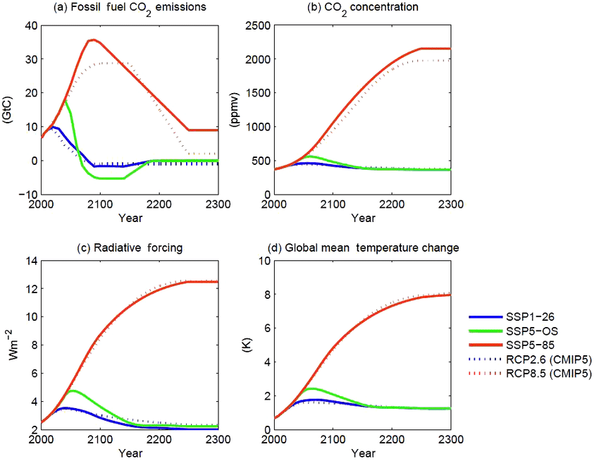
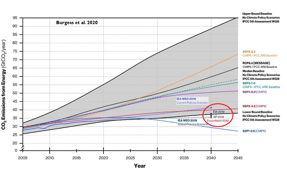
Last month we published the news that the most apocalyptic scenarios of future GHG emissions used by the world’s climate scientists and research organizations have officially been tossed in the trash heap, deemed by the very cabal that created them as “implausible.”

Near the close of Implausible Deniability we posed a few questions (emphasis added):

will the scientific community admit their errors and change course? Tens of thousands of research papers have relied on the now discredited high emissions BAU scenarios, including RCP8.5 and SSP5-8.5, across all six emissions scenario frameworks. Will politically motivated climate scientists continue to push for their relevance as “reference” scenarios?

What about the legacy media? Having published tens of thousands and to possibly over a hundred thousand articles depicting these cremated scenarios as the “business as usual” trajectory the world was on, with every adverse weather event held as evidence of the forthcoming climate Armageddon, and fear their cheapest and easiest sell, will they admit that the truth was not what they chose to present?

It only took a bit more than a month after the news first broke before the answer became clear. What is the Church of Carbon and its priests, apostles and book publishers saying? How are the “implausible” scenarios being portrayed and even defended? Grab your giant soup spoon. It’s time to give some very deserving folks a dose of their own medicine.

The sky-is-falling scenarios were implausible from their conception because
they were grounded in unrealistic assumptions about energy, economics,
or demography (population/birth rates). And despite these clear errors,
the people who built them and are now defending them know it.

But based on the reactions from most of the scientific establishment, explainer media, and climate‑policy world, you’d think the only reason the apocalyptic emissions scenarios known as RCP8.5 and SSP5‑8.5 are now “implausible” is because heroic climate policies and “cheap renewables” saved earth and humanity in the nick of time. Nothing could be further from the truth.

Global carbon intensity peaked in 1960 and has been steadily falling ever since, with no discernible change in the rate since any of these measures. If “climate policies and cheap renewables” have made a material impact, it cannot be seen in the graph above.

[In the last 25 years world energy consumption from oil, coal and natural gas has fallen a whopping three percentage points from 86.1% of total to 83.2%. That is why no changes in the trend of carbon intensity can be seen in the first graph above. Also bear in mind that in 2025 the light green Renewables energy is only 60% wind and solar, the rest mainly biomass.]

The message that “we saved ourselves from the worst case” is politically convenient even as it is scientifically laughable. It’s a two-step dance the very climate research community that portrayed the very same scenarios as “business as usual” might have gotten away with but for the tireless work of researchers like Justin Ritchie, Hadi Dowlatabadi, and Substack publisher Roger Pielke, Jr.

Put simply: Climate policy and “renewable” energy didn’t retroactively
make the high emissions scenarios RCP8.5 and SSP5-8.5 unrealistic.
They were never realistic from their conception.

This is the history the new “implausible thanks to renewables and policy” narrative is trying to omit. But it is the storyline put forth in most explainers that were rushed out to cover the high GHG emissions scenarios’ implosion. [ The article provides several examples of dismissive media stories, including a Michael Mann tweet, Gavin Schmidt at Real Climate Science, Marshall Shepherd at Forbes, and coverups at NY Times, Washington Post and AFP, all of which failed in the same way.]

Absent from all of their pieces was a candid reckoning with the fact that the “business as usual” path required energy, economic and demographic contortions that were never remotely likely, even without climate treaties or “renewable energy” subsidies.

The ENGO’s fared no better. The Center for Progressive Reform – apparently tipped off to the upcoming van Vuuren et al paper announcing the new ScenarioMIP group’s dropping of the high emissions scenarios – said RCP8.5 (and by extension is successor, SSP5-8.5) “remains not only legitimate, but crucial..”

CPR argued that scientists using the high emissions scenarios “are not out to shock or deceive; they are simply following the best science.” Even if the pathway is implausible, the authors insist, using it “is not misleading.”  This is a distraction from the reality that the implausible scenario was the basis  “business as usual” rhetoric that scared the public into believing 4–6 °C of warming by 2100 was what happens if we don’t pass the next climate bill. And the one after that.

Carbon Brief also looked the other way.  John Cook and Ken Rice at SKS accused critics of “bad faith” absent any admission that the assumptions embedded in RCP8.5 or SSP5-8.5 years earlier were erroneous.

If these actors were actually interested in doing so, they should explicitly acknowledge that RCP8.5/ SSP5‑8.5 were erroneous by specification – not just rendered implausible by virtuous policy. They would stop treating as bad‑faith actors legitimate critics who specified very precise plausibility concerns a decade ago (that turned out to be correct).  And they would revise impact assessments, “Social Cost of Carbon” estimates, and financial sector stress‑test designs that were built on what the scenario designers themselves now call implausible futures.

We close by pointing out the delicious and unavoidable irony. For nearly two decades, all of these scientists, legacy media “journalists” and editors, and ENGOs have been screaming “denier” at anyone who challenges the prevailing narrative. Yet here we stand, with the UN’s own scenario development function deeming “implausible” the exceedingly high GHG emissions scenarios on which these people and institutions based their endless use of the pejorative term denier.

Consider the second and third order consequences of scaring the world with the always- farfetched, high GHG emissions scenario projections: Young people are declining to have children based on misplaced fears their kids will have no future. $5 trillion (and counting) has been spent on “solutions” that could not possibly fix an apocalyptic crisis that does not exist. Soaring electricity costs and two lost decades refusing the one electricity generation technology in the advanced world (nuclear) that is GHG emissions free while subsidizing “renewable energy” technologies instead.

The New Deniers™ are the actors that enabled all of these outcomes, are still pretending that RCP8.5 and SSP5-8.5 are important, valuable, or relevant.  In actuality, they were never anything more than climate porn and fear mongering, and that is as much anathema to the scientific method as the idea of scientific “consensus.”


CO2 Warming Rejected on Energetic and Geochemical Grounds (Segalstad)

Tom Segalstad wrote this paper pointing out major holes in the CO2 Warming belief. You can scroll through the text in the embedded document above, or download the pdf by clicking on the Download button. Below is my excerpted synopsis with my bolds and added images.

1. Introduction

It has recently been created a belief among people that an apparent increase in atmospheric CO2 concentration is caused by anthropogenic burning of fossil carbon in petroleum, coal, and natural gas. The extra atmospheric CO has been claimed to cause global climatic change with a significant atmospheric temperature rise, of 1.5 to 4.5°C in the next decennium (Houghton et al., 1990). This postulate is here discussed and rejected on energetic and geochemical grounds.

2. Heat energy and temperatures

Our relatively high global atmospheric temperature near the surface of the Earth, with an average of 14 to 15°C, is caused by heat-absorbing gases in the atmosphere, mainly H2O vapor. Without the Earth’s atmosphere the surface temperature would be approximately -18°C.

All human activities have been claimed to contribute about 1.3% of this (approx. 2 W/m2 ), while a hypothetic doubling of the atmospheric CO concentration would contribute about 2.6% (approx. 4 W/m2 ) to the present “Greenhouse Effect”. 150 years-long time series of temperature measurements are covering too short time spans to be useful for climate prediction, in order to be used as “evidence” for anthropogenic heating (or cooling). The global mean temperature has risen and fallen several times over the last 400 years, with no evidence of anthropogenic causes, although strong explosive volcanic eruptions have caused periodically colder climates.

It should also be noted that clouds can reflect up to approx. 50 W/m2 and can  absorb up to approx. 30 W/m2 of the solar radiation, making the Earth’s average “Greenhouse Effect” vary naturally within approx. 96 and 176 W/m2 . Hence the anticipated anthropogenic atmospheric CO heat absorption is much smaller than the natural variation of the Earth’s “Greenhouse Effect”.

The oceans act as a huge heat energy buffer; the global climate is primarily governed by the enormous amount of heat stored in the oceans (total mass approx. 1.4 x 10^24 g), rather than the minute amount of heat withheld in the heat-absorbing part of the atmosphere (total mass approx. 1.4 x 10^18 g), a mass difference of one million times. Most of the atmospheric heat absorption occurs in water vapor (total mass approx. 1.3 x 10^19 g), which is equivalent to a uniform layer of only 2.5 cm of liquid water covering the globe, with a residence time of about 9 days.

The total internal energy of the whole ocean is more than 1.6 x 10^27 Joules, about 2000 times larger than the total internal energy 9.4 x 10^23 Joules of the whole atmosphere. Furthermore the cryosphere (ice sheets, sea ice, permafrost, and glaciers; total mass of the continental ice is approx. 3.3 x 10^22 g) plays a central role in the Earth’sclimate as an effective heat sink for the atmosphere and oceans.  With a large latent heat of melting on the order of 9.3 x 10^24 Joules, that hypothetic energy is equivalent tocooling the entire oceans by about 2°C (5.8 x 10^24 J/°C). For comparison, the energy needed to warm the entire atmosphere by 1°C is only 5.1 x 10^21 Joules.

Hence it will be impossible to melt the Earth’s ice caps and thereby increase the sea level just by increasing the heat energy of the atmosphere through a few percent by added heat absorption of anthropogenic CO2 in the lower atmosphere.

3. CO2 measurements in atmosphere and ice cores

Houghton et al. (1990) claim in their section 1.2.5 three evidences that the contemporary atmospheric CO2 increase is anthropogenic: First, CO2 measurements from ice cores show a 21% rise from 280 to 353 ppmv (parts per million by volume) since pre-industrial times; second, the atmospheric CO2 increase closely parallels (sic!) the accumulated emission trends from fossil fuel combustion and from land use changes, although the annual increase has been smaller each year than the fossil CO2 input [some 50% deviation]; third, the isotopic trends of C13 and C14 agree qualitatively (sic!) with those expected due to the CO2 emissions from fossil fuels and the biosphere.

Figure 1.  Concentration of CO2 in air bubbles from the pre-industrial ice from Siple, Antarctica (open squares), and in the 1958-1986 atmosphere at Mauna Loa, Hawaii (solid line): (A) original Siple data without assuming an 83 year younger age of air than the age of the enclosing ice, and (B) the same data after arbitrary “correction” of age of air (Neftel et al., 1985; Friedli et al., 1986; and IPCC 1990).

Jaworowski et al. (1992 a) have presented a number of criticisms regarding the 
methodology of atmospheric CO2 measurements, including spectroscopic instrumental
peak overlap errors (from N2O, CH4 , and CFCs in the air). They also pointed out that the CO2 measurements at current CO2 observatories use a procedure involving a subjective editing (Keeling et al., 1976) of measured data, only representative of a few tenths of percent of the total data. There are also fundamental problems connected with the use of stable carbon isotopes ( C13/ C14) in tree rings for model calculations of earlier  atmospheres’ CO2 concentration, a method which now seems to have been abandoned..  The third evidence, based on carbon isotopes, will be discussed below in Section 5.

4. Chemical laws for distribution of CO2 in nature

Statistically it has been found that the atmospheric CO2 concentration rises after temperature rises (Kuo et al., 1990), and it has been suggested that the reason is that  cold water dissolves more CO2 (e.g. Segalstad, 1990). Hence, if the water temperature  increases, the water cannot keep as much CO2 in solution, resulting in CO2 degassing from the water to the atmosphere. According to Takahashi (1961) heating of sea water by 1°C will increase the partial pressure of atmospheric CO by 12.5 ppmv during
upwelling of deep water. For example 12°C warming of the Benguela Current should increase the atmospheric CO2 concentration by 150 ppmv.

From a geochemical consideration of sedimentary rocks deposited throughout the Earth’s history, and the chemical composition of the ocean and atmosphere, Holland (1984) showed that degassing from the Earth’s interior has given us chloride in the  ocean; and nitrogen, CO2 , and noble gases in the atmosphere. Mineral equilibria have  established concentrations of major cations and H in the ocean, and the CO2 concentration in the atmosphere, through different chemical buffer reactions. Biological
reactions have given us sulphate in the ocean and oxygen in the atmosphere.

Carbon dioxide is an equally important requisite for life on Earth as oxygen. Plants. need CO2 for their living (the photo synthesis), and humans and animals breath out CO2 from their respiration. In addition to this biogeochemical balance, there is also an important geochemical balance. CO2 in the atmosphere is in equilibrium with carbonic acid dissolved in the ocean, which in term is close to CaCO saturation and in equilibrium with carbonate shells of organisms and lime (calcium carbonate; limestone) in the ocean through the a series pf reactions.

If the temperature changes, the chemical equilibrium constant will change, and move the equilibrium to the left or right. The result is that the partial pressure of CO (g) will increase or decrease. The equilibrium will mainly be governed by Henry’s Law: the partial pressure of CO2 in the air will be proportional to the concentration of CO2 dissolved in water. The proportional constant is the Henry’s Law Constant, which is strongly temperature dependent, and lesser dependent on total pressure and salinity.

5. Carbon isotopes in atmospheric CO2

Houghton et al. (1990) assumed for the IPCC model 21% of our present-day atmospheric CO2 has been contributed from burning of fossil fuel. This has been made possible by CO2 having a “rough indication” (sic!) lifetime of 50 – 200 years. It is possible to test this assumption by inspecting the stable C13/ C12 isotope ratio (expressed as δ13Cpdb ) of atmospheric CO2 . It is important to note that this value is the net value of mixing all different CO2 components, and would show the results of all natural and non-natural (i.e. anthropogenic) processes involving CO2.

Segalstad (1992, 1993) has by isotope mass balance considerations calculated the atmospheric CO2 lifetime and the amount of fossil fuel CO2 in the atmosphere. The December 1988 atmospheric CO2 composition was computed for its 748 GT C total mass and δ13C = -7.807‰ for 3 components: (1) natural fraction remaining from the pre-industrial atmosphere; (2) cumulative fraction remaining from all annual fossil-fuel CO emissions (from production data); (3) carbon isotope mass-balanced natural fraction. The masses of the components were computed for different atmospheric lifetimes of CO2 .

Source: Skrable et al. (2022) Despite an estimated 205 ppm of FF CO2 emitted since 1750, only 46.84 ppm (23%) of FF CO2 remains, while the other 77% is distributed into natural sinks/sources. As of 2018 atmospheric CO2 was 405, of which 12% (47 ppm) originated from FF. And the other 88% (358 ppm) came from natural sources: 276 prior to 1750, and 82 ppm since. Natural CO2 sources/sinks continue to drive rising atmospheric CO2, presently at a rate of 2 to 1 over FF CO2. [My snyopsis: On CO2 Sources and Isotopes]

The calculations show how the IPCC’s (Houghton et al., 1990) atmospheric CO2 lifetime of 50-200 years only accounts for half the mass of atmospheric CO2 . However, the unique result fits an atmospheric CO2 lifetime of -5 (5.4) years, in agreement with numerous C14 studies compiled by Sundquist (1985) and chemical kinetics (Stumm & Morgan, 1970). The mass of all past fossil-fuel and biogenic emissions remaining in the current atmosphere was in December 1988 calculated to be -30 GT C or less, i.e. a maximum -4%, corresponding to an atmospheric CO concentration of -14 ppmv. This small amount of anthropogenic atmospheric CO2 probably contributes less than half a Watt/m2 of the 146 W/m “Greenhouse Effect” of a cloudless atmosphere, contributing to less than half a degree C of radiative heating of the lower atmosphere.

The isotopic mass balance calculations show that at least 96% of the current atmospheric CO2 is isotopically indistinguishable from non-fossil-fuel sources, i.e. natural marine and juvenile sources from the Earth’s interior. Hence, for the atmospheric CO2 budget, marine equilibration and degassing, and juvenile degassing from e.g. volcanic sources, must be much more important, and burning of fossil-fuel and biogenic materials much less important, than assumed by the authors of the IPCC model
(Houghton et al., 1990)

6. Conclusions

Water vapor is the most important “greenhouse gas”. Man’s contribution to  atmospheric CO2 from the burning of fossil fuels is small, maximum 4% found by carbon isotope mass balance calculations. The “Greenhouse Effect” of this contribution is small and well within natural climatic variability. The amount of fossil fuel carbon is minute compared to the total amount of carbon in the atmosphere, hydrosphere, and lithosphere. The atmospheric CO2 lifetime is about 5 years. The ocean will be able toabsorb the larger part of the CO2 that Man can produce through burning of fossil fuels. The IPCC CO2 global warming model is not supported by the scientific data. Based on geochemical knowledge there should be no reason to fear a climatic catastrophe because of Man’s release of the life-governing CO2 gas.

The global climate is primarily governed by the enormous heat energy stored in the oceans and the latent heat of melting of the ice caps, not by the small amount of heat that can be absorbed inatmospheric CO2 ; hence legislation of “CO2 taxes” to be paid by the public cannot influence on the sea level and the global climate.

See Also:

Complete Slides in English from Dr. Fleischmann

I received today an email from Dr. Bernd Fleischmann acknowledging my effort to present an english version of his recent presentation. In order to have a more accurate and complete communication he sent me the set of english slides in a pdf embedded below. Along with several additional exhibits, this makes a much more powerful and accessible statement of his points regarding the notion of a Climate Crisis. You can either scroll through the exhibits embedded on this page, or download the pdf file by hitting the download button at the bottom.

I thank Dr. Fleischmann for his research and organized critique of this issue and for speaking truth to the powers that be, many of whom are still entranced by a false narrative.

My post is linked above for reference.

Climate Hysteria Surgically Dissected by Dr. Bernd Fleischmann

In the above presentation, Dr. Bernd Fleischmann cuts to the quick on the Issue: Is Climate hysteria scientifically refuted?   In this provocative lecture, the speaker addresses current climate and environmental issues in the context of global warming and the political agenda. He criticizes the German Federal Constitutional Court’s climate ruling and questions the compatibility of fundamental rights with CO2 reduction measures. Furthermore, he refutes the tipping point theory and many climate models as unreliable, emphasizing the marginal influence of CO₂ on temperature in favor of natural factors.

He also addresses the unintended consequences of wind power and warns against a political agenda that allegedly seeks greater control over the population. The speaker appeals to the audience to critically consider the information disseminated. H/T NoTricksZone

May 19 Update: Complete Slides in English from Dr. Fleischmann

I received today an email from Dr. Bernd Fleischmann acknowledging my effort to present an english version of his recent presentation. In order to have a more accurate and complete communication he sent me the set of english slides in a pdf embedded below. Along with several additional exhibits, this makes a much more powerful and accessible statement of his points regarding the notion of a Climate Crisis. You can either scroll through the exhibits embedded on this page, or download the pdf file by hitting the download button at the bottom. Link in red goes to post with english slikes.

The original language is german, but video settings allow for choice of language, both audio and closed captions. For those who prefer to read I provide below a lightly edited transcript with my bolds and added images consisting of the following themes:

  1. Introduction to the Climate Issue
  2. Ignorance as the Basis of Climate Policy
  3. The Media and Their Responsibility
  4. Propaganda in Climate Research
  5. The Reality of the ‘Climate Crisis’
  6. The Influence of CO2 on Plants
  7. Wind Turbines and Their Unexpected Consequences
  8. Redistribution Through Climate Policy
  9. Conclusions and Personal Remarks

Introduction to the Climate Issue

The question is, of course, a rhetorical question, as you can imagine. But the topic is interesting and still very important.  And you can see that, for example, in the climate decision of the Federal Constitutional Court.  Most of you probably don’t remember it being published a few years ago. But the fewest know that we will be affected by it for the next few years. Because it was decided that for Germany a carbon dioxide budget of 6.7 gigatons is still available, so that we can save the global climate.

And we have already used half of that. And we will have used the remaining half in the next five years or so. And what comes next? The Constitutional Court already has a solution for this. It wrote at the time that behaviors that are directly or indirectly associated with CO2 emissions can only be allowed if the basic rights can be implemented in accordance with climate protection. But the relative weight of freedom of movement, i.e. not free time, but freedom of movement, i.e. eating a sausage, driving a car, these are freedom of movement, because all of this is harmful to carbon dioxide. They are then restricted.

And we have to be aware of that. In the decision that took place without oral negotiations and without listening to reasonable people, but only relied on the results of the IPCC and the Potsdam Institute for Climate Research, only these, I would say, alarmist models were laid down. And now we have to ask ourselves, can you trust them? Can you trust the Potsdam Institute for Climate Research? It is the most influential climate institute in the world with almost 500 employees, which we all here finance, as far as we pay taxes.

And they, for example, they brought up the legend of the tipping points. There was a publication in 2008. And this is a picture from this publication without the arrows. I added the arrows. I may have to explain it briefly. Tipping points are elements of the Earth’s climate system.  These are these colorful surfaces here that will tip when it gets a few degrees warmer. That’s the assumption. And they defined around a dozen of these tipping points at the time.

And eleven years later, in 2019, the five elements on which the arrows indicate, I added these arrows because they no longer appeared in the update in 2019. For example, the greening of the Sahara was a positive tipping point. The theory is, and it’s actually true so far, when it gets warmer, more water evaporates from the oceans.  There are then clouds and then it rains more. And then the Sahara turns green. And as a tipping point, it was also defined that way because it stays green.

But because this is not alarmistic enough, this tipping point was thrown out. And the other tipping points don’t appear in the update either. This is a graphic from the update in 2019.  Other tipping points are defined there. But they have long been contradicted by statistics and climate history. So the greening of the Sahara was no longer an issue.

And measurements contradict almost all these tipping points. And as alarmists, they pay for themselves. So you can’t trust the Potsdam Institute for Climate Follow-up Research.

At least, you can trust the World Climate Council. They wrote something right 13 years ago. Namely, if the CO2 content in the atmosphere doubles, i.e. 100% more, then the temperature rises by any value between 1 and 6 degrees.  That was pretty honest. Especially because they also added with 10% more probability, with 5% less probability.

Ignorance as the Basis of Climate Policy

But ultimately, this tension between 1 and 6 degrees means that they don’t know. This is a sign of ignorance. And everything that is told to us, it is based on a mean value that they have taken, but which cannot be justified by the models.  It is arbitrary.

If you look at CO2 alone, then it becomes warmer by a maximum of 1 degree, rather less. And everything that is added, it comes through feedback. And these positive feedbacks, these reinforcing feedbacks. A feedback, a positive one is, for example, if I hold the microphone towards the speaker, then it whistles. This is a reinforcing feedback.

And every reinforcing feedback in a loss-free system leads to instability. And the climate would then be unstable if these models were correct. But the climate has been stable for the last 10,000 years, as we all know.  The climate system is stable, the feedbacks are not reinforcing. And the measurements also confirm these reinforcing feedbacks.

Richard Lindzen is one of the advisors of Donald Trump. And he is an emerited professor. Almost everyone who dares to tell the truth is emerited these days, because they are no longer dependent on financial support.  And he said, all models do not agree with the observations. So the positive feedback in the models is wrong. In the last IPCC report of 2021, this span was slightly reduced from 1 to 6 degrees.

But at the same time he wrote, our new models scatter more than the old ones. That is, it is actually a larger span that these models produce, which has nothing to do with reality. And from the new IPCC report is this graph.

I have to explain this now. This graph represents the reflected solar radiation. What comes down from the sun is reflected.  From clouds, from everything that is on the earth’s surface, from ice and snow, of course, but also from plants, etc. And this graph, the black one, is supposed to be the measurement. And the colorful ones are models. And this graph shows that the reflection is increasing. So more is scattered back. And if more solar radiation is scattered back, it gets colder.

Figure 8. Comparison between observed global temperature anomalies and CERES-reported changes in the Earth’s absorbed solar flux. The two data series representing 13-month running means are highly correlated with the absorbed SW flux explaining 78% of the temperature variation (R2 = 0.78). The global temperature lags the absorbed solar radiation between 0 and 9 months, which indicates that climate change in the 21st Century was driven by solar forcing.

So this graph indicates that this cannot be a reason for the warming that we have found. And this is the original graph, the lower graph. From the CERES program, that is a satellite measurement program, you can call it.  And the two graphs are exactly mirrored. So in fact, the reflected solar radiation, which is reflected by the sun, has become less over the last few years. And significantly less. And that explains the warming. That is, because the IPCC has shown the opposite, they have mirrored it. This cannot have been a coincidence.

Figure 10. This graph is the cloud fraction and is set forth on the left vertical axis. The temperature is on the right vertical axis and the horizontal axis represents the observation year. The information was extrapolated from figures prepared by Hans-Rolf Dubal and Fritz Vahrenholt [37]. Source: Nelson & Nelson (2024;)

The report has 3,000 pages, just the one from the Working Group 1, which deals with physics. And around this graph, there is about a third page, which deals with it and does not really thematize it. So, the increase in the absorbed solar radiation, it is less reflected, it is absorbed more, that explains the warming. And I calculated that, how the temperature development is. And I have taken this increase of the absorbed solar radiation into account.

The exhibit shows since 1947 GMT warmed by 0.8 C, from 13.9 to 14.7, as estimated by Hadcrut4. This resulted from three natural warming events involving ocean cycles. The most recent rise 2013-16 lifted temperatures by 0.2C. Previously the 1997-98 El Nino produced a plateau increase of 0.4C. Before that, a rise from 1977-81 added 0.2C to start the warming since 1947.

And El Niño in the Pacific and the Niño phenomena in the Atlantic. These are ocean cycles, which are irregular, but occur again and again. They then cause, for example, for this warming 2010, 2016, 2024. So it has to do with the ocean cycles. And the linear trend since 2000 to 2025, it comes from the increase of the absorbed solar radiation. The blue curve is the temperature curve measured by satellites. And the orange curve, I hope this is also orange here, the orange curve is the temperature curve that I calculated.

Without greenhouse gases, only the effects, increase of the absorbed solar radiation and the ocean cycles in the Pacific and in the Atlantic. That’s it. That’s it to calculate how the temperature develops. The difference between the two curves is in the middle 0.05 degrees. And you will not find a climate researcher who, with the greenhouse theory, with CO2 and something else, comes to similarly good agreement. I have, as I said, completely ignored the greenhouse gases and come to a very good agreement.

CO2 plays a small role, in my opinion, but it is so small that it has been declining more or less in the rush for at least the last 25 years. So what the IPCC said in 2013, 1 to 6 degrees temperature range, this ignorance, that was the basis for the Paris climate agreement, for the EU Green Deal, for the Climate Decision of the Federal Constitutional Court and, as a result, for the destruction of industry in Germany, for the poverty of the population. You probably already feel it in your wallet. And for future freedom restrictions. All this is based on ignorance.

The Media and Their Responsibility

And the Germans are of course not the only ones who are on this wrong path. The UNO propagates it quite strongly. This figure here, this knight of the sad figure, this is Antonio Guterres, the UN General Secretary, and he spoke of the sinking planet. He is very good with his formulations. The sinking planet, it supposedly stands in the water in front of Tuvalu. This is an island group in the Pacific. Coral islands.

And the article in Time magazine is from 2019. A year earlier there was a publication that dealt with how the surface of Tuvalu develops. And they found that Tuvalu is growing. Coral islands adapt to the sea level. The corals form a rock. This is then partially ground up in the surf and lifted up to the island with the next storm.  That is why they have not sunk in the last thousand years and will not do so when the sea level rises, which it does, but also much slower than many claim. It grows at almost all measuring stations only with 1-2 mm per year. So that was a lie that the planet is sinking.

Nonsense anyway. He then increased it with the statement that the era of global warming is over. We are now in the era of global cooking. I think that from 10 km above sea level the water boils at 40 ° C or so. But what he says is complete nonsense. I ask myself, how did this socialist become UN Secretary General? Who is pulling the strings? And the most important question that interests me the most is, what does this guy smoke? Time magazine definitely spreads lies.

When I read this headline it took me about 5 seconds to find out in Google what is really going on with Tuvalu. And they have to do that too. It is their duty as journalists to report truthfully.

Well, the Time magazine is not so great now, but we still have the Upper Bavarian Volkszeitung. Climate emergency, United Nations set alarm. This, of course, also comes from Guterres. And it says in the article I called it on April 20th. The article is from March 24th. And it says the past year was the second or third warmest since measured.

The second or third warmest, okay. But we know exactly that it was 1.43 degrees warmer than 150 years ago. So they know that by a hundredth of a degree. But not whether it was the second or third warmest. Questionable. Well, the reference period is 1850 to 1900. Guterres added other nonsense, load limits, etc. Of course I looked at it. I thought, okay, very interesting.

What measuring stations were there in 1850? I looked up at NASA. The Goddard Institute for Space Studies has several thousand measuring stations that are, I’m not allowed to say, manipulated, that design it creatively. But of course they didn’t do that for the time from 1850, because these are all measuring stations from the time until 1879.

They don’t need new glasses. There are none. This is a graph directly from the website of NASA GIS.
And you can enter which period. I entered from 1879. So all stations that have been running continuously since 1879. And that’s exactly zero. Exactly zero. And then I looked at what it looks like on the other side of the globe. So it’s Pacific, Australia, Antarctica. And the period from 1880. There were the first measuring stations. And that’s a handful. A handful for half the globe. At that time there was not a single measuring station in Africa.

Not a single one. And in many other countries of the world there was not a single measuring station. And on 95% of the earth’s surface there were no measuring stations at all. There are still no measuring stations today that provide really meaningful values in most of Africa on an area of 20 million square kilometers. That’s twice as much as the area of Europe. There are no measuring stations.

And then they produce a temperature for the globe with an accuracy of one hundredth of a degree for a period when there were practically no measuring stations. That’s nonsense. Yes, down here in Argentina there is a measuring station. I looked at it. It shows a cooling down for the last 150 years. So how much warmer has it actually become? Certainly not 1.43 degrees since the end of the Little Ice Age.

Yes, the end of the 19th century. Yes, this reference period 1850 to 1900. That was the coldest phase of the Holocene of the last 10,000 years. The glaciers have advanced as far as never in the last 10,000 years. They have threatened villages in Switzerland. You can read that. It was the coldest phase.

And a warmer phase was, for example, the High Middle Ages about 1,000 years ago. And you know that it was about as warm as it is today. Otherwise, the Vikings would not have made their way to Greenland. Well, Greenland was not entirely green. It is not entirely covered by ice today. But Iceland was ice-free a few thousand years ago.

And my estimate for the temperature development in the last 1,000 years is 0 plus or minus 1 degree. So I don’t know it exactly. I don’t know if anyone knows it better. But this 0 plus or minus 1 degree is, let’s say, an engineer-like statement with an uncertainty.

 Propaganda in Climate Research

1.43 degrees without uncertainty is propaganda. And propaganda is what the media can do best. Some of you may remember this hysteria from three years ago. Po river and Lake Garda are drying up. The editorial network Deutschland is one of almost 500 media where the SPD has the say. 500. I think they have a share in more media than not.  But they were not the only ones.

Po river and Lake Garda are drying up. Lake Garda is only filled to 38%. The average depth of Lake Garda is 133 meters. Absolutely ridiculous. But news agencies like Reuters and EPA have spread the nonsense. The Süddeutsche Zeitung, Die Zeit and of course ARD and ZDF. And the fact is, the level was only 0.5 meters lower than usual at this time of year. A few months later it was higher than usual in the summer.

Yes, this is just normal variation. Therefore, my recommendation to the media and if a media representative is here, please turn on your brain before you spread nonsense.

The Reality of the ‘Climate Crisis’

So, there would be a climate crisis if it got colder. Yes, the little ice age, that was the phase of starvation, poverty, but also flooding. The largest part of the flood was 200 years ago in the little ice age, 1804. Not the one 5 years ago, in 1804 it was worse. And what you see here, this is the vegetation in North Africa. Once to the peak of the Holocene, that is, the current warm season, about 6000 years ago.

And there you see three little white spots up here. I don’t know if you can see them on the screen. Yes, you can still see them. These three little white spots, that was the desert 6000 years ago. Today it is almost the entire desert of North Africa because it has become colder. It was warmer back then and there were no glaciers on Iceland because it was warmer.

So there were not glaciers, but birch forests. And the lower graphic is for the last interglacial warm period 130,000 years ago. It was even warmer there. It was about 8 degrees warmer than today. And what happened? The Sahara was even greener. And all climate researchers know that it was warmer and greener back then.

That’s why you hear a lot, we had the hottest month, the hottest year since 125,000 years ago. Because 125,000 years ago the interglacial period came to an end and the ice age began. And the EME warm period was so warm without the four private jets of Bill Gates. He has four, two Bombardier, two Gulfstream and without our beautiful SUV.

The Influence of CO2 on Plants

Back to the topic of the climate crisis. More CO2 is of course also good. The plants need CO2 to grow. Everyone knows that. And the more CO2 is in the air, the better they grow. That’s why CO2 dioxide is often added. And this graph is from the Australian Environment Agency. This graph shows the growth of leaf coverings in the last 40 years. And green and blue areas show an increase in leaves and only the red areas show a decrease.

So where there is a fire, there is less fire. But especially in the semi-dry areas in the Sahel, that is the area south of the Sahara, from the Atlantic to the Indian ocean, it has become much greener. In India it has become much greener.

In Australia and other areas it has become much greener. That is why they do not belong to war zones. The population of the Sahel has tripled to quadrupled in all countries in the last 40 years. Because it has become greener, they were able to do that. The deserts are getting smaller. And the Sahel has benefited more than almost any other region in the world.

The Süddeutsche Zeitung has written the opposite. Where is the Sahel zone, whose inhabitants suffer the most from climate change? I think Dr. Weiss, the director of the Wissensredaktion, knows it better. I had a communication with the Süddeutsche three years ago. I showed them with scientific publications ten mistakes on their website . Within a few days I got an answer. They did not try to contradict me. They told me five other things, which were also wrong. These mistakes are still on the website. And I have a presentation on my website, in which the mistakes are shown and why they are mistakes. And because I drew the attention of the Süddeutsche Zeitung to the mistakes, it is no longer an accident or out of ignorance. They deliberately lie.

Is it better to be warm? Someone has to tell this to Karl Lauterbach, who annoys us with his heat protection killers. This is from a publication in Lancet. This is one of the most famous medical science journals. Unfortunately, the graphic is as it is. You can’t see what it says. This is an overview of all European countries, from southern Europe to northern Europe.

The blue bars are deaths from severe cold. The red bars are deaths from severe heat. It looks similar in size. It looks like this for you, because you can’t see the scale below. The ones in the front can see it. The scale is about 5 different.

And if you compare it with the same scale, it looks like the chart on the right. There are 5 to 10 times more deaths from cold than from heat Even in southern Europe, there are more deaths from cold than from heat. Even in the countries of Africa and Oceania, this was found in another publication.

Heat is not the problem. In Singapore, the average temperature is 17 degrees higher than in Germany. And people live 5 years longer. It even says on Wikipedia, there are different times, life expectancy, temperature.  Of course, this is even on Wikipedia on different pages, life expectancy, temperature, but it is a fact. So five to ten times more deaths from cold than from heat.

Wind Turbines and Their Unexpected Consequences

So why are we doing all this with the wind turbines? Can we trust the wind turbine lobby? Of course, this is also a rhetorical question, the solution is coming.

This is unfortunately a complicated graphic, but it can be explained relatively well. Because it doesn’t cool down so well, more water evaporates from the ground. The soils dry out more with wind turbines. And if you plaster the whole world with wind turbines, if you switch the entire energy supply to wind and sun, then there is a Temperature increase that people have calculated. And the red curve down here, this is the temperature curve for the case that 40% of the total energy is generated by wind turbines, 4 seconds. 40% worldwide increases the temperature, I think you can see, by 1 to 3°, so more than carbon dioxide. Its a Chinese publication and Germany would then be a single windpark with hundreds of thousands of wind turbines.

Firstly, we don’t want to see that and, secondly,
we don’t want it for our soils and for the quality of life.

But not only the Chinese have found out, but there is a marine research center, the Helmholz-Zentrum Hereon. They have investigated this for wind turbines in the sea and they have found that these wind farms are changing the North Sea. They even change the ocean currents, they change the mixing on the surface and the reduction of the wind behind the wind farms. This can be measured up to 70 km behind the wind farm.

And then they wrote, so not me, but Helmholz-Zentrum Hereon, who live on taxpayers’ money, they were honest, they wrote that the changes show similar orders of magnitude as the suspected ones changes due to climate change. So, we want to prevent climate change and prevent a suspected and definitely create climate change with the wind turbines. So it really doesn’t get any dumber than that.

And we don’t just change the climate with wind turbines,
some people get sick with the infrasound of the wind turbines.

Not everyone may be so sensitive, but these infracircuits are the pulsed pressure changes that result from such a propeller blade passing the mast. This creates a pressure that spreads. You can’t hear it, but you can feel it. These are enormously high switching pressures and just like they are in the Discoen bass, you can feel it when you’re around. And sensitive people can still do that in 5 km distance, via petzo channels in our cells.

There are publications for this discovery, the Pzukanal even won the Nobel Prize in 2021. So that’s science, that’s not whirlwind. And the organ that suffers the worst from these pressure fluctuations is our brain. And maybe they want to make us stupid on purpose so that we continue to vote for the old parties. I don’t know. So, here are a few sources. There is much more. You can’t find the information on my website yet. I have them relatively new.

Redistribution Through Climate Policy

Okay, they trust Harald Lesch from his statements. He once said that there were temperature increases of more than 10° within a few decades. That’s right. That happened in the Ice Age. Today the argument says:

“Climate change is man-made, leads to catastrophic storms and thermal power plants increase the temperature through their waste heat.”

This is all wrong with the idea of the climate case He has a climate kit for the Ludwig Maximilian University which was distributed to all kinds of schools. When presenting this case, he made 30 false statements in one hour, which I was able to prove to him. 30, so one every 2 minutes. I won’t go into detail about it now, you can find a PDF on my website. If you see, hit me around the ears. Good.

So, who ultimately benefits? Ottmar Edenhofer said that 16 years ago, he is Director of the Potsdam Institute for Climate Research and he said that we are redistributing money and de facto destroying the world’s wealth. He did not say to whom it would be redistributed. However, he has admittedly, it has nothing to do with environmental policy. In any case, it doesn’t reach the poorest. And who benefits?

Yes,  who has benefited from the Covid vaccination? Vaccination in quotation marks, of course. Some of you will probably think of this name here. Bill Gates has sent a letter to all participants of the last climate conference in Brazil and said that there are more important things than a certain temperature that we must not exceed. Feeding the world is more important and he did not say the medical care provided by the pharmaceutical companies he leads. I took a closer look at his letter.

He makes statements in various areas where we have to achieve net zero. He stands by his statement, we need net zero as soon as possible. and he named 36 companies in this letter. And I took a look at what kind of companies they are. They are all from Breakthrough Energy’s portfolio. This is an investment vehicle that he founded, in which Jeff Bezos of  Amazon, Bloomberg Media’s Michael Bloomberg, George Soros, Mark Zuckerberg and other billionaires are involved.

Why did he write this letter?  Because the USA has withdrawn from the Paris Climate Agreement and all these companies are not viable, without subsidies and without regulations that applied in the USA and no longer apply. That was a battle letter to the other states. Make the motto: “Help me, otherwise I’ll get in trouble from my fellow billionaires.” And this energy transition in quotation marks with almost everything we do is a redistribution from poor to rich and super-rich and he actually admitted it himself.

Conclusions and Personal Remarks

So, I’m slowly coming to the end. I spoke a little slower so that I could be understood well. I hope this worked.

The question is, of course, why are other climate scientists not being heard? And there’s this email that was laid out as part of ClimateGate a few years ago, very revealing. The most influential climate scientist to the most influential climate scientist in the United States, saying we will publish and keep out of the IPCC report publications that do not correspond to their opinion. And if necessary, we will redefine what peer review, is. So they deliberately make propaganda.

Conclusion: There is no threat of a climate crisis. The greenhouse effect caused by carbon dioxide is marginal. Carbon dioxide is the gas of life. More carbon dioxide makes the world greener. The influence of the sun from clouds and ocean cycles determines the temperature.

Wind turbines raise the temperature. And they dry out the soils. To do this, they poison the environment with the glass fibers that are knocked out. They kill insects 5000 tons per year. It was once calculated in Germany. They kill feather mice and birds of prey.

Infrasound makes you sick and reduces plant growth. This is because plants also have these petzo channels in their cells and grow less well. Science agrees, it is a lie. I am the living example that it is a lie. And the energy transition is a redistribution of normal earners.

Never trust AD, ZDF, Süddeutsche Zeitung etc. So many of them have not known me to this day. I am not a well-known expert, because you only become a well-known expert if you support government policy, and I don’t do that. Thank you very much.


UN Climate Panel Quietly Admits Its Doomsday Climate Scenarios Were ‘Implausible’

Tyler Durden writes at ZeroHedge UN Climate Panel Quietly Admits Its Doomsday Climate Scenarios Were ‘Implausible‘. excerpts in italics with my bolds and added images.

The IPCC has published a new generation of climate scenarios – and buried in the fine print is a remarkable concession: the extreme warming pathways that dominated climate research, policy, and media coverage for decades were never actually plausible. It took a while to notice because almost no one in mainstream media bothered to report it.  Science policy analyst Roger Pielke Jr. wrote,

“The Intergovernmental Panel on Climate Change (IPCC) has just published the next generation of climate scenarios,” calling it “big news” that “eliminated the most extreme scenarios that have dominated climate research over much of the past several decades.” 

The conclusion was unambiguous. “The IPCC and broader research community has now admitted that the scenarios that have dominated climate research, assessment and policy during the past two cycles of the IPCC assessment process are implausible. They describe impossible futures.”

https://rclutz.com/wp-content/uploads/2020/07/co-2-emissions-a-and-concentrations-b-anthropogenic-radiative-forcing-c-and.png

Those “impossible futures” formed the backbone of a decade-plus of apocalyptic climate messaging – melting ice caps, submerged coastlines, mass extinctions, widespread crop failures, and global hunger, always around the corner, always demanding immediate, economy-reshaping action to avert a catastrophe that, it now turns out, the underlying science community had assigned to a category closer to science fiction than projection.

The new IPCC framework formally demotes its remaining “HIGH scenario” from expected outcome to “exploratory – a thought experiment, not a projection.” [SSP5-85]

That’s a significant institutional retreat. 

https://rclutz.com/wp-content/uploads/2020/12/pielkejr.2020-fig1.png?w=1000

Pielke noted that the previous framework lacked “any systematic effort to evaluate plausibility of scenarios,” meaning the scariest pathways were able to dominate the policy debate for years without anyone in the room applying a basic reality check.

What matters today is that the group with official responsibility for developing climate scenarios for the IPCC and broader research community has now admitted that the scenarios that have dominated climate research, assessment and policy during the past two cycles of the IPCC assessment process are implausible. They describe impossible futures.

Curiously, the revised framework was technically adopted back in 2021, but has only now filtered into public view as related technical and institutional changes caught up. And it’s fair to ask why. The policy consequences of those “impossible futures” were very real.

As the Daily Sceptic’s Chris Morrison opines

It cannot be over-emphasised how important this finding of implausibility is. It means that almost every fearmongering mainstream media climate headline and story that has been written over the last 15 years is junk. Of course it also explains why a growing band of sceptical commentators have refused to accept the political concept of ‘settled’ science and have engaged in widespread debunking. Shooting fish in a barrel is one way of describing this work. At times, with just a modicum of investigative scepticism, the stories can be seen as little more than an insult to average human intelligence.

When the RCP8.5 assumptions are loaded into computer models, they run politically-convenient red hot suggestions that the temperature in 2100 will rise by about 4°C from a 1850-1900 baseline – in other words, a rise of nearly 3°C in the next 80 years. Only the most deranged eco loons will claim such large short-term rises out loud, so the activist scientists quietly loaded garbage assumptions into their computers to arrive at their garbage-out Armageddon scares. The writing was on the wall for RCP8.5 last year when President Trump’s executive order titled ‘Restoring Gold Standard Science’ effectively banned the use of RCP8.5 for scientists on the United States federal payroll. It also noted one of the unrealistic RCP8.5 assumptions driving deliberate climate psychosis to be that end-of-century coal use will exceed estimates of recoverable reserves.

At the time, the climate researcher Zeke Hausfather dismissed the Trump Administration’s claims about RCP8.5 by stating that the research community had moved on. But Pielke has taken issue with this ‘nothing to see here’ claim. He states that from 2018 to 2021, Google Scholar reported 17,000 articles published using RCP8.5 compared with 16,900 in the next three year period. “Some shift,” he observed.

Again, those using less charitable words might note that the ultimate climate crackpipe has proved difficult to put down. A long and painful process of rehabilitation now seems likely.

IBM Shareholders Get Climate/AI Bias Alert (Milloy)

Milloy reads AI bias/climate riot act to IBM management at annual shareholder meeting.  Here is the media release and audio presentation for the IBM shareholder proposal of the Free Enterprise Project of the National Center for Public Policy Research. The annual shareholder meeting is April 28, 2026. Text of press release below with my bolds and added images.

Press Release: IBM’s AI Model: Garbage In, Garbage Out

Washington, D.C. – At next week’s IBM annual meeting, shareholders will vote on a proposal from the National Center for Public Policy Research’s Free Enterprise Project (FEP) tackling potential bias within the company’s artificial intelligence models.

Proposal 7 (“AI Bias Audit”) requests “a report, within the next year, on the methods used to eliminate bias from the Company’s artificial intelligence (AI) models.”

At the April 28 meeting, FEP Executive Director Steve Milloy will cite climate alarmism as an example of where AI too often gets it wrong:

I am an AI user and it can be a great tool. But AI is subject to what 1950s IBM programmer George Fuechsel called “GIGO” – garbage in, garbage out. The Internet is full of amazing information. It is also full of amazing garbage. AI models often cannot distinguish between the two.

An example of garbage-in, garbage-out AI occurs in the controversial area of global warming and climate change. Here are three hardcore facts about climate:

♦  It cannot be scientifically demonstrated that greenhouse gas emissions have had
any effect on global climate.
♦  Emissions-driven climate models do not work.
♦  No emissions-based apocalyptic climate prediction has ever come true.

Despite these realities, if you query IBM AI on climate, you will get back gloom-and-doom climate hoax dogma. This happens because the Internet has been loaded for decades with bogus climate hoax claims and assumptions that are erroneous garbage.

Milloy believes IBM’s own website is partly to blame for this misinformation:

On IBM’s website, IBM’s chief sustainability officer says, for example, that:

Global warming is “leading to increased flooding, causing heat stroke and destroying farms and livelihoods. Insurance is becoming unaffordable.”

None of that is true. But it is what IBM AI is programmed with. Even IBM staff has been polluted with the climate. It is precisely the sort of garbage that George Fueschsel warned about.

The mindless parroting of climate hoax garbage to governments, businesses and the public has had devastating economic and societal impacts around the world – from wars to inflation to deadly energy failures to energy rationing to crop failures to deindustrialization to lost jobs to wasted taxpayer money to traumatized school children and beyond.

It has been estimated that world has wasted $10 trillion chasing the climate hoax narrative since 2015 alone. The list of harms from the climate hoax is endless. Yet IBM AI has learned the hoax and spreads the climate garbage on to users. Milloy will say:

“While IBM may be great at the computing part of AI, the world actually functions on realities that are often lost in the Internet dumpster,”  “Management needs to be much more humble about all this. It needs to take the bias problem seriously. Touchy-feely videos on the IBM website just don’t cut it.”

IBM shareholders can support Proposal 7 by voting their proxies before Tuesday’s meeting.


Climate is Cloud Controlled (John Clauser)

In the above brief interview Nobel Laureate John Clauser explains simply and clearly why CO2 climate hysteria is bogus.  For those preferring to read, below is a transcript in italics with my bolds and added images.

Nobel Laureate John Clauser: Climate Models Miss Key Variable

I think one of the more important things that’s happened recently is a gentleman, Steve Koonin, who was Barack Obama’s science advisor, recently published a very important seminal book called Unsettled, What Climate Science Tells Us, What It Doesn’t, and Why It Matters. It’s a very important book, and his basic message is that the IPCC has 40 different computer models, all of which are making predictions, and all of which are being quoted by the press as predicting a climate crisis apocalypse. The problem is they all are in total disagreement, violent disagreement with each other in their predictions, and not one of them is capable of predicting retroactively, of explaining the history of the Earth’s climate for the last hundred years.

He finds this very distressing, and he then correspondingly says or believes that there is an important piece of physics that is missing in virtually all of these computer models. So what I’m adding to the mix here is I believe I have the missing piece of the puzzle, if you will, that has been left out in virtually all of these computer programs, and that is the effect of clouds. The 2003 National Academy report totally admitted that they didn’t understand it, and they made a whole series of mistaken statements regarding the effects of clouds.

If you look at Al Gore’s movie, he insists on talking about a cloud-free Earth, and the only way he can do this, he generates one from the mosaic of photos. Each one taken on a cloudless day for covering the whole Earth. That’s a totally artificial Earth, and is a totally artificial case for using a model, and this is pretty much what the IPCC and others use is a cloud-free Earth.

If you look at pictures of the Earth in visible light, i.e. real sunlight, which is sunlight is the stuff that heats the Earth. The infrared re-radiation is the stuff that that cools the Earth, and it’s the balance between these two that controls the Earth’s temperature, and the important piece of the puzzle that has been left out is trying to do this all with a cloud-free Earth, when the real Earth is shrouded in clouds. I have some pictures, I don’t know if you can show them, of satellite pictures of the Earth.

These are all freely available on NASA’s website, and they show cloud cover variations anywhere from 5 to 95 percent. Typically, the Earth is shrouded in clouds at least between a third of its area to two-thirds of its area, and it fluctuates, the cloud cover fraction fluctuates quite dramatically on daily, weekly time scales. We call this weather.

You can’t have weather without having clouds, and it is this fluctuation in cloud cover of the Earth that causes what I would refer to as sunlight reflectivity thermostat that controls the climate, controls the temperature of the Earth, and stabilizes it very powerfully and very dramatically. This mechanism, totally heretofore unnoticed, and I call it kind of an elephant in the room, hiding in plain sight that nobody seems to have noticed. I can’t imagine why not, but there were similar elephants in the room in quantum mechanics that I discovered.

So the variation in the cloud cover, the importance in the actual power balance is 200 times more powerful than the effect, the small effect by comparison of CO2. And I might add also of methane. Methane and CO2 are comparable in the total heat loss.

So let me give you an example of how this mechanism works. Okay, first off, you have to notice that the Earth is two-thirds ocean, and that’s where most of the importance of the clouds comes in. Sunlight is the heating mechanism.

Clouds appear bright white. Ground, oceans, etc. are very dark and reflect very little light.
But clouds reflect 90% of the sunlight that hits them, gets reflected back out into space, where it no longer comes to the Earth, no longer heats the Earth. Say you only got a third of a cloud cover. So you now have lots and lots of sunlight.

Sunlight impinging on the ocean evaporates seawater. Seawater forms water vapor. The water vapor floats up into the sky and forms clouds. It forms lots and lots of clouds because the cloud creation rate is very high. But we started out with too low set of clouds, and now we have an increasing number. So now we end up with very high cloud coverage.

Okay, so now say it’s two-thirds. Well, let me give you an example. If you want to try to read a book on an overcast day indoors without turning the lights on, it’s just too dark. You can’t do it without turning the lights off. The question is, where did all that sunlight go? It’s coming in scattered light coming in through the window, but boy, it’s a lot darker now. So where did it go? There’s only one place.

It got scattered back out into space where it’s no longer hitting the Earth. So, okay, so we now have the total power input coming to the Earth is now much, much smaller. Okay, well, this is happening on the oceans too. If you have large cloud cover, you have a lot of shadows. Clouds create shadows. You can see this by standing and watching clouds pass over. Well, the oceans are now shadowed. The shadows don’t have enough energy to evaporate anywhere near as much water. So we have too much cloud cover.

Then we reduce the evaporation rate of water, and so that then reduces the production of cloud. So we now have these two competing clouds. Okay, so the power loss is like 104 watts per square meter when we only have a third cloud cover, and 208 watts per square meter of surface area of the Earth when we have a very low cloud cover.

Figure 10. This graph is the cloud fraction and is set forth on the left vertical axis. The temperature is on the right vertical axis and the horizontal axis represents the observation year. The information was extrapolated from figures prepared by Hans-Rolf Dubal and Fritz Vahrenholt [37]. Source: Nelson & Nelson (2024;)

So the difference between those is the order of 104 watts per square meter of surface area. That needs to be compared with this minuscule half a watt per square meter of surface area that CO2 contributes. So the power in this thermostat, in terms of what they refer to as radiative forcing, these are the how many watts per square meter of surface area are involved, is 200 times more powerful than the effect of CO2 and also methane, by the way.

So I then assert that this is so powerful. I mean, it’s like your house has a huge furnace with a very accurate thermostat controlling its temperature, and somebody leaves a minor, a small bathroom window, and there’s a small heat leak. Would the rest of the house notice a change in temperature? None if your thermostat is working very well.

This is clearly the most important, the controlling mechanism for the Earth’s temperature and climate, and it dwarfs the effect of CO2 and methane. All the government programs that are designed to limit CO2 and methane should be immediately dropped. We’re spending trillions of dollars on this, and it’s sort of like Everett Dirksen’s famous line, you know, a trillion here, a trillion there, and pretty soon you’re talking real money.

See Also:

2025 Evidence of Nature’s Sunscreen

Lawfare Begins Against Repealing Endangerment Finding–Legalities Outlook

The expected blowback from invested climatists is underway, as reported by legacy media whose bias is with the alarmists.  Examples:

EPA faces lawsuit over scrapping the ‘endangerment finding,’ a pillar of climate regulation, Scientific American

E.P.A. Faces First Lawsuit Over Its Killing of Major Climate Rule, NY Times

Lawsuit: EPA revoking greenhouse gas finding risks “thousands of avoidable deaths”, arstechnica

Public health and green groups sue EPA over repeal of rule supporting climate protections, AP News

The legal battle over EPA finding is underway, Axios

U.S. environment agency sued over scrapping scientific rule behind climate protections, CBC

Etc., Etc.

Outlook for the legal proceedings is provided by David Wojick in his CFACT article EPA’s elegant arguments for endangerment repeal.  Excerpts in italics with my bolds and added images.  H/T Climate- Science.press

EPA’s arguments for repealing the Obama endangerment finding are simple, clear, and strong. So, they have a likely chance of winning in the Supreme Court (SCOTUS), which is where the final decision will be made.

I am working from the lengthy EPA press release which contains what amounts to a summary legal brief of the arguments.

The primary argument is legal and aimed directly at SCOTUS. The release even cites several relevant prior decisions. The gist of these decisions is that agencies cannot find new meaning in old statutes that suddenly gives them enormous new regulatory powers. Such recklessness is called regulatory overreach.

EPA’s argument is that massive overreach is precisely what the endangerment finding did, and it sure looks that way. It was not mission creep, more like mission explosion.

Gas stoves only the thin edge of the wedge.

The statute in question is Section 202(a) of the Clean Air Act which lets
EPA regulate harmful tailpipe emissions from motor vehicles.
The Obama endangerment finding is entirely based on this narrow rule.

Here is how EPA puts it:

“The agency concludes that Section 202(a) of the CAA does not provide statutory authority for EPA to prescribe motor vehicle and engine emission standards in the manner previously utilized, including for the purpose of addressing global climate change, and therefore has no legal basis for the Endangerment Finding and resulting regulations. EPA firmly believes the 2009 Endangerment Finding made by the Obama Administration exceeded the agencys authority to combat air pollution” that harms public health and welfare, and that a policy decision of this magnitude, which carries sweeping economic and policy consequences, lies solely with Congress. Unlike our predecessors, the Trump EPA is committed to following the law exactly as it is written and as Congress intended—not as others might wish it to be.”

This is just the sort of statutory issue the Supreme Court usually deals with.

There is an element of the endangerment finding that is so blatantly wrong that it is hilarious. I would start with it because it certainly makes EPA’s case for repeal, at least in part. EPA mentions it in passing saying this:

“In an unprecedented move, the Obama EPA found that carbon dioxide emissions emitted from automobiles – in combination with five other gases, some of which vehicles dont even emit – contribute an unknown amount to greenhouse gas concentrations in the atmosphere….”

So they used the tailpipe statute to assess (and then regulate)
gases that tailpipes do not emit. There is clearly no
statutory basis for these endangerment findings
.

These are not scientific issues, and SCOTUS does not normally adjudicate science. There are, however, one and a half scientific arguments in case the science comes up. That is, one argument is fully stated in the release while the other is merely alluded to.

Here is the fully stated argument:

“Using the same types of models utilized by the previous administrations and climate change zealots, EPA now finds that even if the U.S. were to eliminate all GHG emissions from all vehicles, there would be no material impact on global climate indicators through 2100.”

This is actually an endangerment finding, namely that there is none.

Here is the alluded to argument:

“….the Obama EPA found that carbon dioxide emissions emitted from automobiles – in combination with five other gases, some of which vehicles dont even emit – contribute an unknown amount to greenhouse gas concentrations in the atmosphere that, in turn, play a role through varied causal chains that may endanger human health and welfare.”

Lancet: A 2015 study by 22 scientists from around the world found that cold kills over 17 times more people than heat.

The several scientific issues here are the reality of the “varied causal chains” claimed in the Obama endangerment finding. These causal issues include a great deal of alarmism.

As science, the endangerment finding is a complex attribution claim, and these are highly speculative and contentious. These causal chain issues may be elaborated in the technical support documents for the repeal. But if they are at least mentioned, as in the release, it creates a placeholder for them, in case they come up during the SCOTUS arguments.

Since 1920, deaths each year from natural disasters have decreased by over 90 percent, not only as the planet has warmed, but as world population has quadrupled.

EPA has mounted some elegant arguments for repeal of the endangerment finding. Stay tuned to CFACT as this drama unfolds.

Footnote on Bjorn Lomborg’s estimates of Climate impact from reducing GHG emissions 

Governments have publicly outlined their post-2020 climate commitments in the build-up to the December’s meeting. These promises are known as “Intended Nationally Determined Contributions” (INDCs).

♦  The climate impact of all Paris INDC promises is minuscule: if we measure the impact of every nation fulfilling every promise by 2030, the total temperature reduction will be 0.048°C (0.086°F) by 2100.

♦  Even if we assume that these promises would be extended for another 70 years, there is still little impact: if every nation fulfills every promise by 2030, and continues to fulfill these promises faithfully until the end of the century, and there is no ‘CO₂ leakage’ to non-committed nations, the entirety of the Paris promises will reduce temperature rises by just 0.17°C (0.306°F) by 2100.

♦  US climate policies, in the most optimistic circumstances, fully achieved and adhered to throughout the century, will reduce global temperatures by 0.031°C (0.057°F) by 2100.

♦  EU climate policies, in the most optimistic circumstances, fully achieved and adhered to throughout the century, will reduce global temperatures by 0.053°C (0.096°F) by 2100.

♦  China climate policies, in the most optimistic circumstances, fully achieved and adhered to throughout the century, will reduce global temperatures by 0.048°C (0.086°F) by 2100.

♦  The rest of the world’s climate policies, in the most optimistic circumstances, fully achieved and adhered to throughout the century, will reduce global temperatures by 0.036°C (0.064°F) by 2100.

Overview in Celsius and Fahrenheit by the year 2100

Why Rethinking Climate Change–Nicola Scafetta

[Top] Comparison of the harmonic empirical global climate model under the SSP2-4.5 scenario with the HadCRUT4.6 record (1850–2021) alongside the burning ember diagrams representing the five primary global Reasons for Concern (RFCs) under low-to-no adaptation scenarios, as reported by the IPCC (2023) AR6. [Bottom] Summary and analysis of the projected impacts and risks of global warming for the 2080–2100 period compared to the climate “thermometer” projections from Climate Action Tracker (2024). Credit: Gondwana Research (2026). DOI: 10.1016/j.gr.2025.05.001

Nicola Scafetta writes at  phys.org (site not known for skeptical thinking) Rethinking climate change: Natural variability, solar forcing, model uncertainties, and policy implications.  Exceprts in italics with my bolds and added images.

Current global climate models (GCMs) support with high confidence the view that rising greenhouse gases and other anthropogenic forcings account for nearly all observed global surface warming—slightly above 1 °C—since the pre-industrial period (1850–1900). This is the conclusion presented in the IPCC’s Sixth Assessment Report (AR6) published in 2021.

Figure 3: CMIP6 GCM ensemble mean simulations spanning from 1850 to 2100, employing historical effective radiative forcing functions from 1850 to 2014 (see Figure 1C) and the forcing functions based on the SSP scenarios 1-2.6, 2-4.5, 3-7.0, and 5-8.5. Curve colors are scaled according to the equilibrium climate sensitivity (ECS) of the models. The right panels depict the risks and impacts of climate change in relation to various global Reasons for Concern (RFCs) (IPCC, 2023). (Adapted from Scafetta, 2024).

Moreover, the GCM projections for the 21st century, produced under different socioeconomic pathways (SSPs), underpin estimates of future climate impacts and guide net-zero mitigation strategies worldwide.

The prevailing interpretation is that only net-zero climate policies can keep future climate change-related damages within acceptable limits. Yet such policies carry extremely high economic and societal costs, making it essential to assess whether these certain and immediate costs are fully justified by the current state of climate science.

On the other hand, a closer examination of observational datasets, paleoclimate evidence, and model performance reveals a more intricate picture—one that merits open discussion among students, researchers, and anyone interested in how climate science is evolving.

My study “Detection, attribution, and modeling of climate change: Key open issues,” published in Gondwana Research, examines several unresolved questions in climate detection, attribution, and modeling. These issues concern the foundations of how past climate changes are interpreted and how future ones are projected, and they matter because climate projections influence decisions that will shape economies and societies for decades. [My synopsis: Scafetta: Climate Models Have Issues. ]

A central theme is natural climate variability. Across the Holocene—the last 11,700 years—the climate system exhibited a Climate Optimum (6,000–8,000 years ago) and repeated oscillations: multidecadal cycles, centennial fluctuations, and millennial-scale reorganizations.

Some longer cycles are well known, such as the quasi-millennial Eddy cycle, associated with the Medieval and Roman warm periods, and the 2,000–2,500-year Hallstatt–Bray cycle. These patterns appear in ice cores, marine sediments, tree rings, historical documents, and in both climate and solar proxy records.

Current GCMs, however, struggle to reproduce the Holocene Optimum and these rhythms. They generate internal variability, but not with the correct timing, amplitude, or persistence. When a model cannot capture the natural “heartbeat” of the climate system, distinguishing human-driven warming from background variability becomes challenging. This is particularly relevant for interpreting the warming observed since 1850–1900, because both the Eddy and Hallstatt–Bray cycles have been in rising phases since roughly the 1600s.

Figure 1. Anthropgenic and natural contributions. (a) Locked scaling factors, weak Pre Industrial Climate Anomalies (PCA). (b) Free scaling, strong PCA Source: Larminat, P. de (2023)

A portion of the post-industrial warming could therefore stem from these long natural oscillations, which are expected to peak in the 21st century and in the second half of the third millennium, respectively.

Another key issue concerns the global surface temperature datasets that serve as the backbone of global warming assessment. These datasets are essential but not perfect.

Urbanization, land-use changes, station relocations, and instrumentation shifts can introduce non-climatic biases. Many corrections exist, yet uncertainties persist. Even small unresolved biases can influence long-term trends.

The study highlights well-known discrepancies: satellite-based estimates of lower-troposphere temperatures since 1980 show about 20–30% less warming than surface-based records, particularly over Northern Hemisphere land areas.

Recent reconstructions based on confirmed rural stations also show significantly weaker secular warming. These differences underscore the need for continued scrutiny of observational records.

Solar and astronomical influences represent another area where science is still evolving. The sun varies in ways not fully captured by the simplified irradiance reconstructions used in many models. Multiple lines of evidence indicate that the climate system responds not only to total solar irradiance but also to spectral variations, magnetic modulation, and indirect effects on atmospheric circulation.

These mechanisms are still under investigation, and their representation in models remains incomplete, even though empirical evidence suggests that they may play a dominant role—potentially more influential than the simple total-solar-irradiance forcing currently implemented.

Moreover, despite ongoing controversy surrounding long-term solar variability, current GCMs are typically forced with solar reconstructions that exhibit extremely low secular variability. This helps explain why these models attribute nearly 0 °C of the observed post 1850–1900 warming to solar changes and simultaneously fail to reproduce the millennial-scale oscillations evident in paleoclimate records.

Direct comparisons between GCM global surface temperature simulations and observations also show that the models do not reproduce the quasi-60-year climatic oscillation associated with the 1940s warming period, and they tend to overestimate the warming observed since 1980. This “hot model” problem has been documented in several studies and appears to affect a substantial fraction of current GCMs.

All of this connects to a key parameter in climate science: equilibrium climate sensitivity (ECS). The canonical estimate—around 3 °C for a doubling of CO₂, with a likely range of 2.5–4.0 °C according to the IPCC—derives largely from model-based assessments.

Empirical studies, including those that account more explicitly for natural variability, often suggest lower values, sometimes around 2.2 ± 0.5 °C, or even as low as 1.1 ± 0.4 °C if long-term solar luminosity varies significantly and if additional solar-related mechanisms influence the climate system—mechanisms not included in current models. If ECS is lower than commonly assumed, projected 21st-century warming would be substantially reduced under all SSP scenarios.

These graphs use Hadcrut4 and include the 2016 El Nino warming event. The exhibit shows since 1947 GMT warmed by 0.8 C, from 13.9 to 14.7, as estimated by Hadcrut4. This resulted from three natural warming events involving ocean cycles. The most recent rise 2013-16 lifted temperatures by 0.2C. Previously the 1997-98 El Nino produced a plateau increase of 0.4C. Before that, a rise from 1977-81 added 0.2C to start the warming since 1947.

The interplay between natural and anthropogenic factors is definitely more nuanced than often portrayed. When empirical models that include natural oscillations are used to project future temperatures, the result is typically moderate future warming rather than extreme trajectories. This raises important questions about the scientific basis for the most aggressive mitigation pathways.

The figure compares the warming expected from GCMs, as assessed by the IPCC, with the associated relative risks, alongside the expectations derived from the empirical modeling proposed in the paper. While net-zero pathways such as SSP1 are considered necessary to meet the Paris Agreement target of limiting global warming to below 2 °C by 2100, empirical considerations suggest that the same target could also be achieved under the far more moderate SSP2 scenario.

This distinction has major global economic implications, because the
prevailing climate-crisis narrative does not appear to be fully supported
by the evidence, and far less costly adaptation strategies could be
more appropriate than highly aggressive mitigation policies.

The study stresses the importance of addressing the key open questions of climate science. Climate policy should be informed by the full spectrum of scientific evidence, including uncertainties and alternative interpretations.