Raymond of RiC-Communications studio collaborated with me and content experts in order to produce high quality infographics on CO2 for improving public awareness. This post presents the thirteen charts he has produced on this topic. I find them straightforward and useful, and appreciate his excellent work on this. Project title is link to RiC-Communications. Thanks again to Raymond for recovering access to his work after reorganizing his website.
This project is: The world of CO2
Infographics can be helpful, in making things simple to understand. CO2 is a complex topic with a lot of information and statistics. These simple step by step charts should help to give you an idea of CO2’s importance. Without CO2, plants wouldn’t be able to live on this planet. Just remember, that if CO2 falls below 150 ppm, all plant life would cease to exist.
– N° 1 Earth‘s atmospheric composition
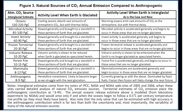
– N° 2 Natural sources of CO2 emissions
– N° 3 Global anthropogenic CO2 emissions
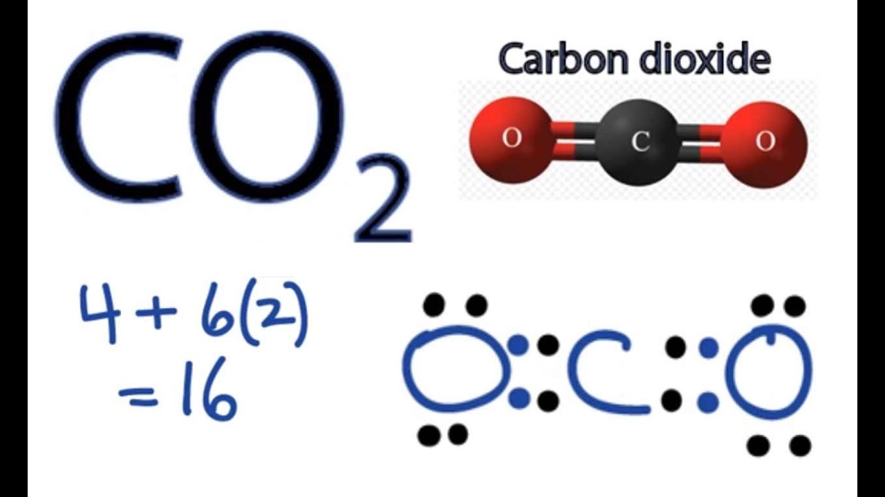
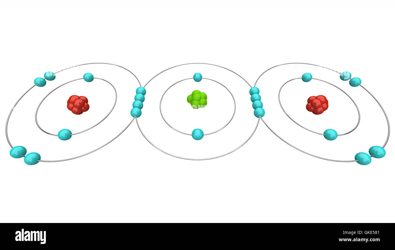
– N° 4 CO2 – Carbon dioxide molecule
– N° 5 The global carbon cycle
– N° 6 Carbon and plant respiration
– N° 7 Plant categories and abundance (C3, C4 & CAM Plants)
– N° 8 Photosynthesis, the C3 vs C4 gap
– N° 9 Plant respiration and CO2
– N° 10 The logarithmic temperature rise of higher CO2 levels.
– N° 11 Earth‘s atmospheric composition in relationship to CO2
– N° 12 Human respiration and CO2 concentrations.
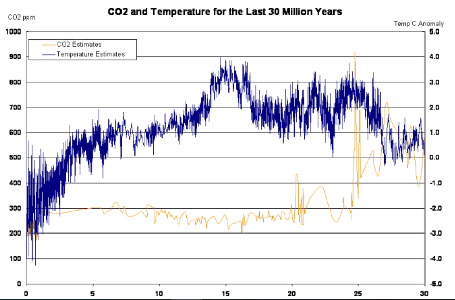
– N° 13 600 million years of temperature change and atmospheric CO2


CO2 plays an important roll for the survival of our planet. Carbon Dioxide is essential for plant photosynthesis and rise of CO2 can be directly linked to the greening of the plant. At the moment climate change and global warming are being presented as a global threat to our species.
According to environmentalists, sea levels and temperatures will rise, resulting in a global breakdown for human civilization. This is based on climate models and numerous environmental studies around the world. According to the IPCC our carbon footprint needs to be reduced. The use of natural gas, oil, coal and any other fossil fuels need to be reduced to zero. The anthropogenic (man-made) influence has to be eliminated to save the planet.
According to some climate models, the planets temperature will increase to a level that will cause drought and famine for a large portion of the population in the very near future. In the future our energy needs will have to be cut so much so that all travel will need to be cut back completely.
In the future only environment friendly approved energy resources will be permitted such as, wind energy, solar energy, geothermal, biomass and hydroelectric as clean alternatives. This would deprive developing nations the possibility of building an economy and developed nations of keeping their economies.
And in Addition
Note that the illustration #10 assumes (as is the “consensus”) that doubling atmospheric CO2 produces a 1C rise in GMT (Global Mean Temperature). Even if true, the warming would be gentle and not cataclysmic. Greta and XR are foolishly thinking the world goes over a cliff if CO2 hits 430ppm. I start to wonder if Greta really can see CO2 as she claims.
It is also important to know that natural CO2 sources and sinks are estimated with large error ranges. For example this table from earlier IPCC reports:

Since the Statue of Liberty features in the sea level graphic, here are observations from there

Below are some other images I find meaningful, though they lack Raymond’s high production values.


Hey super! Thanks a million! Thanks for the added feedback and extra graphs! A few of which are perfect for me to visualize… Science is so much fun!
Just after you published I created a new visual for sea level rise over the past 20000 Years, Nr. 11
Last and final note, there was a time when we the artists worked hand in hand with the sciences, which was called „The Arts and Sciences“. Today we have drifted apart, a sad byproduct of technical innovations. Our cooperation can be of great help in making complicated and often boring themes more exciting and interesting. This helps to make things easier to understand and raise awareness on a wide range of themes.
LikeLike
Yes arts and sciences belong together, More recently it’s has been arts and marketing, since that provides patronage these days. So your efforts are very welcome. If you don’t know Eleanor Lutz, check out her science illustrations at https://tabletopwhale.com.
LikeLike
Wow, Eleanor does some really cool stuff! Amazing.
I updated the mistake on diagram Nr. 4, the double bonds are not integrated.
LikeLike
I guess it would look like this:

LikeLike
Hi Ron
I think you already switched out the diagram for the update. I think the new diagram is like alamy stock photo. The position of the other electrons isn’t exactly the same, but I’ve seen a number of variations on the positions of those that are not connected to the carbon atom. Let me know if you want it adjusted or not. It’s not a problem. R.
LikeLiked by 1 person
It seems that the chemists show carbon and oxygen sharing 8 elections so the diagram should show that.
LikeLike
Maybe this is easier to work with

LikeLike
Thanks Raymond, #4 looks great and your explanation is clear
LikeLike
Yes, I’m gald, I learned something positive about atoms!!!! I’ll keep you posted as I create some new and exciting diagrams! Cheers R
LikeLike
Hi Ron, check the electron diagram in slide 4. Should be double bonds between the C and the Os.
LikeLike
Hi Robin
Thanks for the tip, I’ll fix that later on and update it. I’ll let Ron know when I’ve switched it out.
LikeLike
Hi Robin
I’ve updated the electron diagram. I can’t attache the diagram to this reply, but I think i got it right!
Super tip, you never can learn enough. Cheers Ray
Link to new upload on my website.
https://www.ric-communications.ch/referenzen/simple-science.html
Hi Ron
If the update of diagram Nr. 4 is correct now, maybe it would be a good idea to switch it out.
Sorry for the trouble. Ray
LikeLike
thanks Robin and Raymond, sincerely Ron
LikeLike
Hi Ron
I just added another diagram Nr. 12. It’s a size relation to concentrations in the atmosphere. It’s based on one of the charts you added at the top. I used hot air balloons to show the size relationship in concentrations.
I’m not sure if it’s a little to cheeky … especially the headline at the top. What do you think?
PLEASE DON’T POST IT YET… I’d like to review it a little more.
Cheers and have a nice weekend. Ray
LikeLike
Raymond, it’s a good start. What’s missing are the two microscopes in descending order: 1)GHGs showing CO2 in proportion to H2O, and 2)Anthro CO2 in proportion to natural. You might consider putting the smaller red balloons inside the larger blue ones to show proportions; otherwise the microscope exaggerates the comparable sizes.
LikeLike
A further thought: The point of this slide should be proportions between IR active (infrared) and IR non-active gases. In this sense, N2, O2 and Ar can all be lumped together as non-IR active, and H2O is distinguished as the only condensing IR-active gas.
LikeLike
Hi Ron
OK, I’ll have a look at it. I took it down for now since it’s not to my satisfaction. The chart you included with this article was the origins of the design, however I’m getting the impression that it might be better to keep it a little more simple so that the idea comes across much better. No big deal. I’ve toss out lots of stuff in the past and that’s what makes for a better results. Have a nice weekend… Cheers R
LikeLike
Thanks again Raymond. Here’s some background:
https://www.nku.edu/~hicks/CHE%20120/The%20Greenhouse%20Effect%20alpha.htm
LikeLike
Reblogged this on Climate Collections.
LikeLike
Nice work. Did you know the third (non-IR) spectra of CO2 (1338cm-1) and the single spectra of N2 (2338cm-1) and O2 (1556cm-1) and many of the spectra of the other gases and all of the water vapour spectra are detected by Raman spectrometers? By the Boltzmann constant, Raman instruments measure the temperature of all the gases and it is used as a substitute for current IR instruments – measuring and modelling the real IR atmosphere. See my work at http://vixra.org/abs/1811.0498 I aim to reduce it and publish, I need support. This will end the climate debate.
LikeLike
Thanks for the comment Blair. I do know of your work and it was an eye opener for me. I don’t know what you have in mind but I believe you are on to something. Here is what I posted November 2018:
https://rclutz.wordpress.com/2018/11/09/atmospheric-observations-contradict-global-warming-theory/
LikeLike
Blair, I would also be interested in what you think about Peter Ward’s POV on atmospheric radiative properties.
See post: https://rclutz.wordpress.com/2020/01/11/light-bulbs-disprove-global-warming/
LikeLike
Thanks, it’s nice to hear positive feedback to my diagrams, since most people outside the science community really don’t understand how important it is to do your homework before deciding on the negative aspects of anything at all. The reason why I decided to make my diagrams is as a result of an interview with William Happer who mentioned the logarithmic effect on CO2 and it’s limits on temperature as concentration rise. This was the first time I had a little more hard evidence that CO2 isn’t the only influencer on climate. (Besides that I have a bias against hypes in general of any kind)
LikeLike
Hi Blair (again) what’s your background and how did you decide to do this work? Sorry but my background is a real mix, I did, Illustration and Design at Dawson Collage then went to University of Montreal and did on year of “Environmental Studies” followed by one year of “Art History”. After that I decided to work and moved to Zurich Switzerland, where I have been ever since.
The year I did on Environmental Studies was simply fantastic. I didn’t have it easy, since I was sort of the outsider in the process. However I was a real eye-opener. One of the first atmospheric concepts I learned was atmospheric inversion. One of the professors at that time made it very clear to be careful about jumping to conclusions about climate and any claims made. There is simply too much we still don’t know and looking for easy answers isn’t good science. I have never forgotten his statement. This guy would walk into the class, look at his notes, check where we had left off from the last class, look up once, walk to the chalkboard and never look back for the remaining 1 to 2 hours of class. This is some 30 years ago.
LikeLike
Thanks Raymond for giving your particulars. I am living north of Montreal after retiring from consulting. Know that ETH Zurich is the world leader in researching global dimming and brightening. See details at
https://rclutz.wordpress.com/2019/07/12/more-2019-evidence-of-natures-sunscreen/
LikeLike
Birds of a feather stick together. Wow you’re also from Montreal. Well that just goes to show that we Montrealers do have an interest in the sciences. I don’t miss the winters back home, the climate is much milder here. I’ll keep you posed on my diagrams as the progress … I’m reviewing the balloons that wasn’t a good diagram at all!!!! Cheers R.
And that article for the ETH, super!!!! Finally someone who’s taking it seriously.
LikeLike
Hi Raymond, very sorry for not getting back, it seemed to have got lost in the flood. My background, well, I teach economics, but I have an interest in all science and from since a teenager, weather and climate. This is my blog with my recent work. http://www.fractalnomics.com/2021/05/refuting-greenhouse-theory-experiment.html
I am currently writing a paper on thermoelectric and greenhouse theory, first principles. The experiments I have conducted refute all we know about greenhouse theory, and radiation theory for that matter, no small task ah (he he).
I also work with fractal geometry which has led me (through my economics) into cosmology and quantum mechanics,and I have a theory on those also.
It is busy, but I am hoping to go pro as an independent scientist to get all my discoveries published. Keep in touch and keep it up.
LikeLike
Blair, thanks for commenting Please see my response to you on the other post:
https://wordpress.com/read/blogs/87268333/posts/12923#comment-37858
LikeLike
HI Blair
No problem. Your work sounds interesting. I’m not so much concerned about greenhouse gases as I am about the hype. I think the discussion is more about how we want to view the human impact on climate. As far back as you can think, humans have always believed that the climate is about us and our actions. The gods that punished us in the past by turning the weather against us are now replaced by CO2 that we added and that is now causing global warming. It’s just as narcissistic today as it was in the past. Everything is about us, and only we and no other influences can be the cause. This is very typical of our nature.
LikeLike
– N° 12 Earth’s atmospheric composition in relationship to CO2
https://www.ric-communications.ch/referenzen/simple-science.html
I designed this new chart based on the 3rd chart you added to the list below my designs. I wanted to do this chart a while back since it give a scale representation of CO2 in relationship to the atmosphere.
It is important to note that man-made CO2 emissions as a percentage vary depending on the sources and the year in which the sources were published. This makes it difficult to give an exact percentage, as some sources give it at 4% and others at 3%. I have averaged it at 3.5% at the moment. I have also used an Excel chart to get an exact scale so that the proportions are as accurate as possible.
Cheers R.
LikeLike
Raymond, thanks for your dedication to this work. Two points: Showing Argon is a distraction; it is not IR active. The progression is box#1= all gases (spelling), box#2= all IR active gases, box#3= CO2.
LikeLike
Hi Ron, thanks for the feedback.
OMG, I was so focused on getting the scale right that I had missed the whole point of the chart. No excuses. Ok, I’ve updated and I hope it stands up to critical approval. Otherwise I’ll have failed the exam, not good at all!
LikeLike
Raymond, I renew my objection to including Argon in box#2; it confuses rather than enlightening. Ar belongs in the all gases box along with O2 and N2; It is not true that 3.5% of the atmosphere is IR active (including Ar is misleading) H2O ranges from O% to 4% of the air, so 2% is a fair approximation, though any local humidity will vary. Also one title speaks of 100% of gasse (German language creeping in?)
LikeLike
Hi Ron, did you refresh the Cashe? Sometimes it loads the old visual.
I reduced the avarge to 2% and Argon is nolonger in Box Nr. 2
(browsers are notoriously lazy at refresching data.
Ray
LikeLike
raymond, when I follow this link

https://www.ric-communications.ch/referenzen/simple-science.html
I get this
LikeLike
Hi Ron
I cut the diagram back, it was too complicated and to be honest I missed the point of keeping simple and easy to understand.
It now looks a lot more like the original graph but incorporated into my design layout. Thanks for your feedback it’s appreciated greatly. Ray
LikeLike
Thanks Raymond. Still don’t see this latest version on your project page.
LikeLike
It’s previews with “Under Review” stamped on it.
Try this link. I’ll most likely use this in the future before going live.
http://www.ric-communications.ch/referenzen/under-review.html
LikeLike
OK Raymond. I will wait until you post your final slide .
A suggestion as to context. You have produced a much needed set of images for public information regarding CO2. Now when you start addressing things like sea level and temperature, you are moving into another field of issues which deserve their own heading; i.e. they don’t simply belong to the “World of CO2”.
Climate activists refer to these things as “multiple lines of evidence for climate change.” A typical list would be:
Global temperature rise
Warming oceans
Shrinking ice sheets
Glacial retreat
Decreased snow cover
Sea level rise
Declining Arctic sea ice
Extreme events
Ocean acidification
However, all of these are equivocal, involving signal and noise issues. And in any case, the fact of any changes does not in itself prove human causation. Also notice that they are all side effects of the first one, global warming.
This is the “World of Climate Change” where the public struggles with confusion over what changes are Nature doing what it has always done, and what is caused by humans. IOW these are effects investigated by scientists to raise alarm about climage change. The issue in this arena is “Is anything happening out of the ordinary? ” Alarmists of course spend billions of research dollars to claim all kinds of fearful things to come, from Acne to Zika virus.
I think of this whole topic as a three-legged stool:

The first leg is science of causation, the second is impacts and the third is policies.
LikeLike
SUPER, I thought that it was drifting off of CO2 and more in the climate issues.
The idea of “World of Climate Change” is the perfect jump to the next set of charts. Spot on!!!!!
Ok, I’m going to adjust this a little on my website and create a new category for the next set.
Keep you posted… Cheers R
LikeLike
Hi Ron
I have a question about the last Chart that you added at the bottom of the post.
GISS Annual Global Mean Temperatures and CO2
I’ve tried to track down the original chart form “Goddard Institute for Space Studies” but can’t find it online. All the possible links lead to your website. 😉
Most of the graphs that are now online show a zoomed in version of this graph. This kind of make everything look like a massive temperature rise. Your graph is much better since it give a more realistic perspective verses the CO2 increase.
I would like to put a reference for the original source if possible before adding this chart.
I found this link to a similar graph by Suits Space:
https://suyts.wordpress.com/2017/03/20/back-by-popular-demand-new-and-improved-plus-bonus-graph-of-how-global-warming-looks-on-a-thermometer/
Sorry for the bother … Cheers R
LikeLike
Hi Ron and sorry …
I just tracked the original data down form GISS and it’s up to date till 2019.
https://data.giss.nasa.gov/gistemp/tabledata_v3/GLB.Ts+dSST.txt
I’ll use the GISS as one of the reference source for the temperatures. That clears that up.
Cheers R.
LikeLike
Raymond, thanks for attending to this. I note that your linked source doesn’t show 2019 completely. I got the full results in csv and generated a table and graph which you should be able to access here:
https://rclutz.files.wordpress.com/2020/01/gistemp-2019.xls
LikeLike
Cool! I’ve done the chart and just cross checked it with the excel file you sent that is up till 2019.
(This is the link for “The World of Climate Change”)
http://www.ric-communications.ch/referenzen/simple-science-2.html
Cheers and Thanks R
LikeLike