This is the latest and greatest meme to scare the world of climate collapse, and it is gathering momentum and triggering followers. A sanity check is published at climatetippingpoints, despite they also being prone to CO2 Hysteria. The article is Fact-Check: have actuaries predicted that billions will die beyond 2 degrees? Excerpts below with my bolds and added images and comments.
Roger Hallam (the co-founder of climate activist groups like Extinction Rebellion and Just Stop Oil) has widely promoted this, repeatedly stating for example that “the British insurance sector once did an analysis showing that at 3 degrees Celsius of global warming, 4 billion people could die — and at 2 degrees, 2 billion lives could be lost. But that’s not even the full truth — it’s the minimum.” Hallam has also notedthat the trial of some Just Stop Oil activists (which resulted in acquittal) included the court taking “4 billion deaths at 3°C” as an “agreed fact“.
Based on this analysis, Hallam has co-founded a new campaign called ‘4 Billion Dead‘ (4BD), explicitly referencing the 3°C-based number in its name, connecting it to an outlier estimate of 3°C by 2050 (itself based on a linear extrapolation of just the last few years’ warming), and using it as the basis for planning and promoting a new civil disobedience campaign:
So where did these numbers come from then, and are they reliable?
[However, details in the Risk impact matrix give the game away–see below]
Does this confirm then that the Planetary Solvency report is predicting there’ll be 2 billion dead at 2°C or more, and over 4 billion deaths at over 3°C? It may seem like it, but the answer is actuallyno – the numbers in this dashboard and supporting appendix are labelled as illustrative (as flagged above both instances, including on the latter that it is “not a prediction or central scenario“).
This means these are justhypothetical numbers to show how such a dashboard would work, and not empirical predictions or projections based on some underlying analysis. This has been confirmed by speaking to one of this Planetary Solvency report’s authors, who agreed that these numbers aren’t based on a specific scientific analysis (with no associated calculations on death numbers presented in the report’s supplementary material either, unlike for GDP), rather being meant as a hypothetical illustration of a worst-case scenario to measure risk against, to be followed later with more detailed empirical analyses. Critically, the worst-case scenario here is implicitly part of a spread of many potential outcomes at 3°C, rather than 3°C itself being the worst-case scenario with these numbers the expected outcome if it is reached.
This means that even taking this report as it stands (leaving questions around the robustness of the magnitude of these death and GDP numbers to other posts), these numbers cannot be treated as predictions by actuaries (which implies an empirically-grounded expectation of the most likely future resulting from 3°C), in contrast to how they’ve been referred to in the earlier quotes, social media posts, and campaigns. Instead, they can at most be interpreted as (and for clarity should be communicated as) provisional expert ‘guesstimates‘ of a potential worst-case scenario, which was used to test-run a climate risk analysis methodology,
The UK insurance industry has not predicted mass death then, and four billion dead at 3°C is not an agreed fact but a misunderstood hypothetical worst-case scenario awaiting study. Some of the example reactions above could be down to an honest but widespread misreading, given that media outlets at the time reported these numbers like they were empirical estimates and lacked subsequent pushback (e.g.The Guardianarticle in January 2025), and skim-reading the report itself one might miss the “illustrative” labels.
It might be argued by some promoters that presenting this scenario as a prediction made by a respected body anyway is useful for promoting appropriately urgent action, but such misrepresentation runs the risk of fuelling scepticism or fatalism too. [You Think?]
Raymond Inauen is creating a series of light-hearted chats about CO2 and climate at his blog World of CO2. These are conversing in plain language apart from technical complexities. An example is above from the first four at the Youtube channel Conrad – The World of CO₂
This is a work in progress and more content is forthcoming, and he is hoping to get suggestions for future videos. Thanks Raymond for opening up a new form of communicating about these matters.
There have been various reports, including some reposted here, about the Climate Crisis narrative losing its grip on the public and leaders. Signs the fad is waning include some advocates like Bill Gates recanting, ESG financiers like Larry Fink backtracking, falling media coverage and closure of some climate units, and the recent admission of implausible climate model scenarios.
Even so, there are still many in its thrall, and it’s important to understand how climate doomster culture took over and continues to demand attention and deference. Garry Rogers provides a brief and insightful analysis of how this happened, and why its influence is rightfully dwindling. His blog article is Why So Many People Fall For The Climate Crisis Narrative. Excerpts in italics with my bolds and some added images.
You’ve seen them. Earnest young activists shouting at clouds, gluing themselves to museum walls, and blocking traffic with coroplast signs warning that the world will end in twelve years unless we obey their vision of salvation—complete with windmills, solar panels, and vegan diets. They’re the same people Xing and Instagramming about carbon footprints from their iPhones made in Chinese factories run on sulphur and lignite coal-fired electricity.
It’s easy to dismiss them as naive or misguided, but the uncomfortable truth is this: many of these people are neither stupid nor insane. They are simply caught in a powerful psychological, cultural, and financial machine that has turned “climate change” into a form of religious belief—a doctrine too sacred to question and too profitable to abandon.
Let’s set something straight. I’m not a climate change denier. Climate change is real. The Earth’s climate has always changed. And it always will—human-contributed through emitted greenhouse gas or not.
But the apocalyptic narrative that dominates headlines, policy, and corporate strategy today isn’t just about facts. It’s about framing—about controlling how people think, feel, and act in relation to a deeply complex system they barely understand. And that makes the climate crisis one of the most successful psychological operations in modern history.
In this post, we’ll take a hard look at why so many people have bought in—blindly and without skepticism—to the idea that we’re on the brink of planetary collapse, and that the only solution is top-down control, mass compliance, and the destruction of energy systems that built the modern world.
Some of what I’m going to say may be uncomfortable to some, and I know some
will unsubscribe. But that doesn’t make it untrue, and this needs to be said.
The Climate Crisis as a Religion (aka The Church of Carbon)
First, let’s call it what it is. For a growing number of people—especially in the West (Europe particularly included)—the climate crisis has become a belief system. It functions just like a fundamentalist religion, complete with original sin (industrialization), prophets (Greta, Gore, Gates), sacred texts (IPCC reports), rituals (recycling, carbon offsets), heretics (climate skeptics), and a promised apocalypse for those who fail to convert.
It’s not about science anymore. It’s about meaning. People—especially young people raised in secular cultures—are starving for purpose. They want to feel morally righteous, socially important, and part of a grand, redemptive story. The climate narrative offers all of that in a tidy, emotionally satisfying package. It turns ordinary people into saviors. It makes them matter. You can’t underestimate how powerful that is.
Fear is the Fuel
The second driver is fear. For decades, we’ve been bombarded with doom-laden, global-warming headlines: ice caps melting, oceans rising, hurricanes and tornados worsening, apocalyptical flooding, forests burning, deserts parching… The messaging is relentless—and expertly crafted to trigger our limbic systems. When people are afraid, they don’t reason. They react.
This isn’t new. Back in the 1970s, experts warned of an imminent ice age. Then came acid rain. Then ozone depletion. Each time, the world was supposed to end unless we handed over more power to government, more money to NGOs, and more control to unelected technocrats.
It’s always the same pattern:
Declare a crisis.
Blame human behavior.
Offer a sweeping solution that just happens to consolidate control.
The only difference now is scale. The climate crisis is global,
not regional. And the proposed solutions are systemic, not marginal.
The Collapse of Critical Thinking
But fear alone doesn’t explain the blind belief. There’s another piece of the puzzle: the steady erosion of critical thinking. Schools no longer teach logic, debate, or how to evaluate competing hypotheses. Instead, they promote conformity, activism, and groupthink. You don’t learn how to think. You learn what to think.
By the time students hit university, the programming is complete. Professors reinforce the dogma. Campus culture punishes dissent. Climate change isn’t a topic for exploration—it’s a moral litmus test. Students who question it risk grades, reputation, or worse. Being cancelled.
So, they comply. They absorb. They repeat. And when they graduate into journalism, academia, NGOs, or politics, they carry that unexamined belief system with them—passing it on like gospel.
The Media Echo Chamber
The next layer is media. Legacy outlets like CNN, BBC, CBC, and the New York Times frame climate change in religious terms: “Climate emergency,” “existential threat,” “code red for humanity.” Any nuance is treated as heresy. Any questioning is framed as denialism.
Science itself has been rebranded. Instead of a method of inquiry, it’s now a set of conclusions—conveniently aligned with elite interests. The phrase “The science is settled” is a dead giveaway. No real scientist would ever say that.
Meanwhile, dissenting voices—many with serious credentials—are marginalized, shadowbanned, or censored outright. Their data doesn’t fit the narrative. Their views make people uncomfortable. So, they are erased.
And most people? They never notice.They assume if something was true, they’d hear about it. But when every channel is playing the same tune, they don’t realize they’re listening to a carefully curated soundtrack.
Social Conformity and Virtue Signaling
But here’s the deeper truth. Most people don’t believe the climate crisis because they’ve studied the data. They believe it because everyone else does. That’s the power of social conformity. Nobody wants to be the outlier—the one who raises their hand and asks the uncomfortable question. Especially in a culture obsessed with virtue. Believing in the climate crisis is a modern form of moral signaling. You drive a Tesla. You compost. You use a keep-cup. You care. You’re not like those backward Boomer-deniers who love oil and hate penguins.
You’re evolved
You’re ethical
You’re better
That’s what this has become—not a conversation about climate,
but a competition for social status.
And once belief becomes part of your identity, it becomes non-negotiable. Any challenge feels like a personal attack. Facts don’t matter. Feelings do.
Follow the Money
Now let’s talk about power.
The climate industry is worth trillions—yes, trillions of dollars. It’s the perfect grift: a never-ending crisis that justifies endless funding, regulation, and surveillance.
Governments rake in carbon taxes.
Universities secure research grants.
Corporations get ESG ratings and subsidies.
NGOs fundraise on fear.
It’s an entire ecosystem of incentives,none of which reward skepticism or moderation. And when that much money is on the table, the truth becomes secondary to the narrative.
Even energy companies play along. They don’t want to be regulated out of existence, so they slap green labels on their products and talk about “net zero” while quietly hedging their bets. It’s theater. Everyone’s pretending. But the costs are real.
China’s Role in the Global Equation
While the West ties itself in knots trying to decarbonize, one country is playing a different game entirely: China
Beijing talks green, but burns black. Coal remains its dominant energy source, powering steel, manufacturing, and military growth at a staggering scale. As of 2024, China alone consumes over half the world’s coal supply—and shows no sign of slowing down.
They’re not stupid. While we argue over wind farms and carbon credits,
they build aircraft carriers, drones, and power grids.
While we teach kids to fear climate collapse,
they teach theirs to master engineering and geopolitics.
They make the solar panels we install. They mine the rare earths we need. They profit from the very policies we impose on ourselves. And we call that progress.
Weaponized Guilt
So why don’t people wake up?
Because they’ve been trained to feel guilty. Every gas-guzzling SUV trip, every propane-grilled burger, every jet-fueled flight—is framed as a moral failing. You’re killing the planet. You’re harming future generations. You’re part of the problem. It’s exhausting, and it’s effective.
People internalize this guilt. They try to cleanse themselves through ritualistic consumption: reusable straws, oat milk, biodegradable trash bags, canvas totes at the farmer’s market. None of it makes an infatismal sub-fraction of a surface dent in global emissions—but it feels redemptive.
That’s the point. It’s not about fixing the planet. It’s about managing the soul.
The Useful Idiots
Now we come to the crux.
The term “useful idiot” originated in Soviet times. It referred to Western sympathizers who unknowingly supported the goals of a regime they didn’t understand. They weren’t evil—just naive, manipulated, and eager to be on the “right side of history.”
That’s where we are today. Millions of well-meaning people have been seduced by a narrative that exploits their fears, flatters their vanity, and blinds them to the larger game at play. They march, post, and protest—believing they’re saving the world, while unwittingly aiding those who want to dominate it.
They’re not villains. They’re pawns. And when you try to wake-the-wokes, they look at you like you’re the crazy one. Then they viscerally turn on you.
What’s At Stake
Here’s what’s really at stake. If we continue down this path, we don’t just risk economic collapse or energy poverty. We risk civilizational suicide. We are dismantling the very systems—energy, industry, sovereignty—that made the modern world possible.
And we’re doing it not for the planet, but for appearances.
Meanwhile, the nations that reject this ideology are gaining power, leverage, and independence. They’re not afraid to use fossil fuels while experimenting with futuristics. They’re not ashamed of their ambitions. And they’re not held hostage by narratives designed to make them feel guilty for existing.
They’re playing to win. We’re playing to look virtuous. That’s a losing hand.
So, what do we do?
First, stop apologizing. There is no shame in using energy. Civilization runs on it. Human flourishing depends on energy, regardless of how it’s generated. Without it, we return to darkness—literally and figuratively.
Second, think for yourself. Ask questions. Follow incentives. Trace the money. Be skeptical of anything presented as a one-sided moral truth.
Third, reclaim courage. Don’t be afraid to speak the truth, even when it’s unpopular. Especially when it’s unpopular. History doesn’t remember those who went along to get along. It remembers those who stood up, pointed at the naked emperor, and said, “This is madness.”
And finally, understand this: We are not in a climate crisis. We are in a clarity crisis. Clarity—real, hard-won, human clarity—is the first step back to sanity.
The next time someone tells you the world is ending, ask who’s funding the message—and what they’re selling with it. Because if you look closely, you’ll find it’s not about saving the planet. It’s about controlling the people on the planet by getting them to fall for the climate crisis narrative.
Charles MacKay: “Men, it has been well said, think in herds; it will be seen that they go mad in herds, while they only recover their senses slowly, and one by one.”
Roger Pielke Jr. has created a monitor at his THB (The Honest Broker) blog applying scientific and statistical rigor to detection of US Extreme Weather and Climate Change. All the details and methodology are provided in his blog post US Extreme Weather and Climate Change Dashboard.
Overview
The THB US Extreme Weather and Climate Change Dashboard follows the Intergovernmental Panel on Climate Change’s (IPCC) framework for detecting a change in climate in the context of internal variability. This dashboard tracks 32 variables associated with 7 types of extremes: heat waves, tornadoes, flooding, drought, winter storms, wildfire, and hurricanes. The site presents data for the full range of data judged to be of sufficient quality for trend analysis, and on each page for each phenomena, users can choose the time frame over which to observe the data. This is ongoing work in progress – Suggestions welcome!
Detecting a change in climate is not the same as spotting a trend in a time series — it’s demonstrating that a trend is unlikely to have arisen from natural internal variability by chance alone. Here that means two things:
♦ First, detecting a trend at IPCC’s stated example threshold of below 10% (via the nonparametric Mann-Kendall test).
♦ Second, because a long, low-noise record can show a statistically significant trend as a result of internal variability, this dashboard adds another check before identifying a detected change: the trend’s magnitude must also be a meaningful share (this site’s threshold: at least 25%) of the variable’s historical variability. A trend can be identified in a time series and still not count as a detected change here for that reason: flooding’s trend, for example, is statistically real (p=0.011) but is only about 4% of its typical week-to-week range, and not at all unexpected.
This combined standard — IPCC’s likelihood criterion plus this site’s
magnitude check on trends — is what “detected change” means.
Each tile above shows a variable’s reliable-trend-window data at a glance and its detected-change verdict — click through to that variable’s phenomenon page for the full interactive chart, an adjustable time window, PNG/CSV downloads, and alternative metrics. Full definitions and caveats are documented on the Methodology page. A side-by-side comparison of how IPCC AR6 has characterized each hazard, and how it compares to this site’s findings, can be found on the Detection & Attribution page.
Detection and Attribution
This dashboard focuses only on detection, following the IPCC’s own framework for detecting a change in climate. The IPCC’s definitions are below (Glossary, AR5/AR6/SR15, “Detection and Attribution”), and are applied throughout this site.
Climate: “The average weather, or more rigorously, the statistical description in terms of the mean and variability of relevant quantities over a period of time ranging from months to thousands or millions of years.”
Climate change: “A change in the state of the climate that can be identified (e.g., by using statistical tests) by changes in the mean and/or the variability of its properties, and that persists for an extended period, typically decades or longer.”
Detection: “The process of demonstrating that climate or a system affected by climate has changed in some defined statistical sense, without providing a reason for that change. An identified change is detected in observations if its likelihood of occurrence by chance due to internal variability alone is determined to be small, for example, <10%.”
Attribution: “The process of evaluating the relative contributions of multiple causal factors to a change or event with a formal assessment of confidence.” This dashboard performs detection only — it does not attempt attribution, which requires separate causal/model-based analysis this project hasn’t undertaken.
Green Energy is a mirage that retreats as you approach.
Terigi Ciccone wrote an Open Letter to Ed Ballard Re: “Why Green Energy Makes More Sense With Each Price Shock” (WSJ, April 9, 2026). Excerpts in italics with my bolds and added images.
Open Letter to Ed Ballard Re: “Why Green Energy Makes More Sense With Each Price Shock” (WSJ, April 9, 2026)
Dear Mr. Ballard,
I have sent you several detailed emails over the past few years outlining the engineering and economic realities of integrating variable renewable energy (VRE). You have never replied. Your latest column—celebrating the Iran/Hormuz crisis as yet another “proof” that solar-plus-battery is now the rational choice—is the latest example of journalistic cheerleading that substitutes press-release optimism for rigorous system-level analysis. As a power-plant design engineer with decades of hands-on experience specifying dispatchable generation, I write this open letter to correct the record, not in theory, but in the hard language of capital costs, ancillary services, capacity factors, and ecological externalities that your piece airbrushes away.
Your star exhibit is the Philippines’ MTerra Solar project: 3.5 GW solar + 4.5 GWh battery storage, fast-tracked amid LNG shortages, now supposedly delivering 13 hours of power “marginally below” LNG cost. You quote Actis investor Rahul Agrawal: “This is not theory. This is actually happening on the ground now.” Indeed, it is—but the ground truth is far uglier than your narrative admits.
1. Intermittency is not a rounding error; it is the dominant cost driver. Even with batteries, MTerra is engineered for ~12–13 hours of mid-merit output. The remaining 11–12 hours (and any multi-day typhoon-induced lull) still require dispatchable backup. My own peer-reviewed analysis of ancillary-service burdens shows that adding solar and wind to a reliable grid inflates total system costs by 135–235 % once frequency regulation, inertia, voltage support, and ramping are properly valued. The raw LCOE of ~$40/MWh becomes a delivered cost of ~$500/MWh. See: Terigi Ciccone, “A Narrow Lens on Ancillary Services: Overlooking the Full Costs and Ecological Damage of Solar and Wind Integration”
2. The “phenomenal” price drop in Chinese panels and batteries is a geopolitical trap, not progress. You correctly note falling panel costs, but you fail to mention that China controls ~85% of solar manufacturing and ~80% of the battery supply chain. Swapping Middle-East oil dependence for Beijing’s critical-mineral monopoly and state-subsidized overcapacity is not energy security; it is energy servitude. When those subsidies or export policies shift, the “cheap” becomes expensive overnight.
3. Full-system costing reveals multipliers your LCOE ignores. Economist Bjørn Lomborg has repeatedly documented the same reality using Value-Adjusted LCOE (VALCOE). A peer-reviewed study he cites shows that once reliability and backup are included, wind power becomes 11–12× and solar up to 38–42× more expensive than combined-cycle gas turbines (CCGT). Bjørn Lomborg, “Why solar and wind power aren’t winning,” Financial Post, 17 April 2024 (Identical findings appear in Lomborg’s“The True Cost of Wind and Solar Energy,” NH Journal, 20 May 2024.)
Figure 4 – International Domestic Electricity Prices (p per kWh). UK has the highest domestic electricity prices in the IEA.
My own comparison of 1 GW reliable output at 99.9 % uptime reaches the same conclusion: onshore wind requires 5.6× and offshore wind 7.2× the capital investment of a CCGT, once overbuild, storage, transmission, and peaker plants are added. See: Terigi Ciccone, “The Well Hidden and Distorted Costs of Renewables:A Comprehensive Comparison of Wind Power and Combined Cycle Gas Turbine Plant”
Typically as wind and solar power share of supply increases, distribution and transmission costs rise sharply.
4. Academic “System LCOE” literature confirms the same directional truth— Falko Ueckerdt, Lion Hirth, and colleagues introduced System LCOE precisely because standard LCOE is misleading at high VRE penetrations. Their 2013 analysis (and subsequent updates) shows integration/profile costs can equal or exceed generation costs themselves once wind shares exceed ~20 %. At the levels now being forced, those costs become an economic barrier. Ueckerdt et al., “System LCOE: What are the costs of variable renewables?”Energy 63 (2013) 61–75
5. Ecological and material externalities are catastrophic. Your column is silent on land use (10× that of nuclear or gas for equivalent firm power), avian/bat mortality, 78 million tons of non-recyclable solar waste projected by 2050, and the concrete-steel-copper footprint of batteries that must be replaced every 8–12 years. My third paper tallies these hidden costs in full. See: Terigi Ciccone, “Revised: Let’s Make Electricity Affordable Again”
Moreover, the raw-material demands are staggering. Utility-scale solar and wind installations consume vastly greater quantities of concrete, steel, copper, silver, rare-earth elements, and other minerals per unit of firm, reliable electricity than any dispatchable source. This triggers massive mining operations with severe habitat destruction, water contamination, and toxic tailings. Manufacturing these components remains overwhelmingly dependent on fossil fuels for the energy-intensive processes of silicon purification, steel smelting, and mineral extraction. In full life-cycle terms, many VRE systems may never recover the total primary energy invested in their construction, installation, maintenance, and eventual replacement—rendering the entire enterprise an energy and cost sink rather than a net contributor.
Drone footage shows hundreds of solar panels ripped apart and scattered across farmland after a powerful tornado tore through Wheatfield overnight. Homes in the area also suffered heavy damage as the violent storm carved a path of destruction. Photo credit Joemar Sombero
6. Real-world stress tests expose the fantasy.Philippine typhoons shred solar farms; Florida hurricanes do the same. After every major storm, we see acres of twisted panels and batteries that cannot survive Category 4 winds. Yet the same voices warning about climate risk keep prescribing an energy system that collapses precisely when the weather turns ugly.
7. Ultimately, we are inflicting these enormous costs for no good reason. The entire policy edifice rests on the assumption that anthropogenic CO₂ is the primary driver of dangerous warming. In reality, CO₂’s greenhouse effect is already near saturation in its principal absorption bands; additional emissions yield only minuscule marginal forcing. The true temperature powerhouses on Earth are gravitational auto-compression (the dry adiabatic lapse rate driven by atmospheric mass and pressure) and the dominant water-vapor/latent-heat cycle, which together govern the vast majority of Earth’s energy balance.
We are dismantling reliable, dispatchable power systems, subsidizing
foreign supply chains, and covering productive land in fragile panels
—all to chase a trace-gas tail that cannot wag the climatic dog.
8. Increased atmospheric CO₂ is demonstrably greening the planet. NASA satellite data confirm that rising CO₂ has driven substantial global greening over recent decades. The increase in leaf area is equivalent to twice the size of the continental United States, with CO₂ fertilization responsible for approximately 70 % of this greening across 25–50 % of vegetated lands. Far from harming the biosphere, higher CO₂ levels are enhancing vegetation growth, boosting agricultural yields, and expanding natural habitats worldwide.
9. Humans are not the sole source of rising atmospheric CO₂. As I document in detail in “Revised: Let’s Make Electricity Affordable Again,” natural sources—including volcanic activity, oceanic degassing, and other geological processes—play a far more significant role in the global carbon cycle than the prevailing narrative acknowledges. Attributing nearly all recent increases to human emissions oversimplifies complex geophysical realities and ignores the “Volcanic Vibes” that have shaped atmospheric CO₂ long before industrial civilization.
Mr. Ballard, energy crises do not “hammer home” the virtues of green energy. They expose its fatal engineering defects: zero inertia, negative correlation with demand, dependence on foreign supply chains, and an energy return that fails even basic life-cycle scrutiny. The rational response is an all-of-the-above portfolioanchored by dispatchable, high-capacity-factor sources—modern CCGT, nuclear (including SMRs), and geothermal—with targeted renewables only where they demonstrably lower system cost without compromising reliability.
Your repeated refusal to engage with the peer-reviewed literature or
practicing engineers suggests a commitment to narrative over evidence.
I invite you, once again, to reply—publicly or privately—and defend your claim that solar-plus-battery “makes more sense with each price shock” once full system costs, ecological and material realities, geopolitical risks, and the actual physics and benefits of atmospheric CO₂ are included. Until then, this open letter stands as the record of your April 9 column that you omitted. Let’s bury the narrative. 🔥
Respectfully but firmly, Terigi Ciccone Ret. Gas Turbine Engineer for power generation and aviation, an independent researcher on climate, Sarasota, Florida, USA
Many headlines proclaiming lots of warming with the current La Nina ending. Some examples from the usual suspects:
El Niño is coming, chances rising it will be historically strong,CNN
What Makes This Year’s Super El Niño the Strongest in 140 Years?, Science Times
Weather experts warn of ‘super’ El Niño. Here’s what could happen,. USA Today
Here’s What The Super El Niño Means In Your State, Weather.com
After all, warmists need warming to justify their narrative, and people attending outdoor sporting events in NH are noticing how cool it is presently. So hope abounds for a great reversal in coming months, while leaving unstated that oceanic cycles are a natural climate driver unaffected by CO2 emissions.
Importantly, the theory of human-caused global warming asserts that increasing CO2 in the atmosphere changes the baseline and causes systemic warming in our climate. On the contrary, the graph above shows all of the warming since 1947 was episodic, coming from three brief El Nino events associated with oceanic cycles. And in 2024 we saw an amazing episode with a temperature spike driven by ocean air warming in all regions, along with rising NH land temperatures, now dropping well below its peak.
Is a Super El Nino Coming? Yes and No.
The certainty in the headlines is speculative and exaggerated. The Climate Prediction Center is more circumspect and unbiased. The forecast is here: ENSO Alert System Status: El Niño Watch Synopsis in italics with my bolds and added images.
El Niño is likely to emerge soon (82% chance in May-July 2026)
and continue through Northern Hemisphere winter 2026-27
(96% chance in December 2026-February 2027).
In the past month, ENSO-neutral conditions continued, as indicated by near-average sea surface temperatures (SSTs) in the east-central equatorial Pacific Ocean [Fig. 1].
The latest weekly Niño-3.4 index value was +0.4°C, with the westernmost (Niño-4) and easternmost (Niño-1+2) indices at +0.5°C and +1.0°C, respectively [Fig. 2]. The equatorial subsurface temperature index (average from 180°-100°W) increased for the sixth consecutive month [Fig. 3], with widespread, significantly above-average subsurface temperatures across the equatorial Pacific [Fig. 4]. Westerly wind anomalies were observed over the western equatorial Pacific at low levels and were evident over the central and east-central Pacific at upper levels. Convection was near average on the equator near the Date Line and was suppressed around Indonesia [Fig. 5]. Collectively, the coupled ocean-atmosphere system reflected ENSO-neutral conditions.
The North American Multi-Model Ensemble (NMME) average, including the NCEP CFSv2 [Fig. 6], favors El Niño to form by next month and persist through Northern Hemisphere winter 2026-27.
While confidence in the occurrence of El Niño has increased since last month, there is still substantial uncertainty in the peak strength of El Niño, with no strength categorization exceeding a 37% chance [Figs. 7 & 8].
The strongest El Niño events in the historical record are characterized by significant ocean-atmosphere coupling through the summer, and it remains to be seen whether this occurs in 2026.Stronger El Niño events do not ensure strong impacts; they can only make certain impacts more likely (see CPC outlooks for probabilities of seasonal anomalies). In summary, El Niño is likely to emerge soon (82% chance in May-July 2026) and continue through Northern Hemisphere winter 2026-27 (96% chance in December 2026-February 2027).
Warming in Nino 3.4 index in 2026.
This discussion is a consolidated effort of the National Oceanic and Atmospheric Administration (NOAA), NOAA’s National Weather Service, and their funded institutions. Oceanic and atmospheric conditions are updated weekly on the Climate Prediction Center web site (El Niño/La Niña Current Conditions and Expert Discussions). A probabilistic strength forecast is available here. The next ENSO Diagnostics Discussion is scheduled for 11 June 2026.
In the above presentation, Dr. Bernd Fleischmann cuts to the quick on the Issue: Is Climate hysteria scientifically refuted? In this provocative lecture, the speaker addresses current climate and environmental issues in the context of global warming and the political agenda. He criticizes the German Federal Constitutional Court’s climate rulingand questions the compatibility of fundamental rights with CO2 reduction measures. Furthermore, he refutes the tipping point theory and many climate models as unreliable, emphasizing the marginal influence of CO₂ on temperature in favor of natural factors.
He also addresses the unintended consequences of wind power and warns against a political agendathat allegedly seeks greater control over the population. The speaker appeals to the audience to critically consider the information disseminated. H/T NoTricksZone
I received today an email from Dr. Bernd Fleischmann acknowledging my effort to present an english version of his recent presentation. In order to have a more accurate and complete communication he sent me the set of english slides in a pdf embedded below. Along with several additional exhibits, this makes a much more powerful and accessible statement of his points regarding the notion of a Climate Crisis. You can either scroll through the exhibits embedded on this page, or download the pdf file by hitting the download button at the bottom. Link in red goes to post with english slikes.
The original language is german, but video settings allow for choice of language, both audio and closed captions. For those who prefer to read I provide below a lightly edited transcript with my bolds and added images consisting of the following themes:
Introduction to the Climate Issue
Ignorance as the Basis of Climate Policy
The Media and Their Responsibility
Propaganda in Climate Research
The Reality of the ‘Climate Crisis’
The Influence of CO2 on Plants
Wind Turbines and Their Unexpected Consequences
Redistribution Through Climate Policy
Conclusions and Personal Remarks
Introduction to the Climate Issue
The question is, of course, a rhetorical question, as you can imagine. But the topic is interesting and still very important. And you can see that, for example, in the climate decision of the Federal Constitutional Court. Most of you probably don’t remember it being published a few years ago. But the fewest know that we will be affected by it for the next few years. Because it was decided that for Germany a carbon dioxide budget of 6.7 gigatons is still available, so that we can save the global climate.
And we have already used half of that. And we will have used the remaining half in the next five years or so. And what comes next? The Constitutional Court already has a solution for this. It wrote at the time that behaviors that are directly or indirectly associated with CO2 emissions can only be allowed if the basic rights can be implemented in accordance with climate protection. But the relative weight of freedom of movement, i.e. not free time, but freedom of movement, i.e. eating a sausage, driving a car, these are freedom of movement, because all of this is harmful to carbon dioxide. They are then restricted.
And we have to be aware of that. In the decision that took place without oral negotiations and without listening to reasonable people, but only relied on the results of the IPCC and the Potsdam Institute for Climate Research, only these, I would say, alarmist models were laid down. And now we have to ask ourselves, can you trust them? Can you trust the Potsdam Institute for Climate Research? It is the most influential climate institute in the world with almost 500 employees, which we all here finance, as far as we pay taxes.
And they, for example, they brought up the legend of the tipping points. There was a publication in 2008. And this is a picture from this publication without the arrows. I added the arrows. I may have to explain it briefly. Tipping points are elements of the Earth’s climate system. These are these colorful surfaces here that will tip when it gets a few degrees warmer. That’s the assumption. And they defined around a dozen of these tipping points at the time.
And eleven years later, in 2019, the five elements on which the arrows indicate, I added these arrows because they no longer appeared in the update in 2019. For example, the greening of the Sahara was a positive tipping point. The theory is, and it’s actually true so far, when it gets warmer, more water evaporates from the oceans. There are then clouds and then it rains more. And then the Sahara turns green. And as a tipping point, it was also defined that way because it stays green.
But because this is not alarmistic enough, this tipping point was thrown out. And the other tipping points don’t appear in the update either. This is a graphic from the update in 2019. Other tipping points are defined there. But they have long been contradicted by statistics and climate history. So the greening of the Sahara was no longer an issue.
And measurements contradict almost all these tipping points. And as alarmists, they pay for themselves. So you can’t trust the Potsdam Institute for Climate Follow-up Research.
At least, you can trust the World Climate Council. They wrote something right 13 years ago. Namely, if the CO2 content in the atmosphere doubles, i.e. 100% more, then the temperature rises by any value between 1 and 6 degrees. That was pretty honest. Especially because they also added with 10% more probability, with 5% less probability.
Ignorance as the Basis of Climate Policy
But ultimately, this tension between 1 and 6 degrees means that they don’t know. This is a sign of ignorance. And everything that is told to us, it is based on a mean value that they have taken, but which cannot be justified by the models. It is arbitrary.
If you look at CO2 alone, then it becomes warmer by a maximum of 1 degree, rather less. And everything that is added, it comes through feedback. And these positive feedbacks, these reinforcing feedbacks. A feedback, a positive one is, for example, if I hold the microphone towards the speaker, then it whistles. This is a reinforcing feedback.
And every reinforcing feedback in a loss-free system leads to instability. And the climate would then be unstable if these models were correct. But the climate has been stable for the last 10,000 years, as we all know. The climate system is stable, the feedbacks are not reinforcing. And the measurements also confirm these reinforcing feedbacks.
Richard Lindzen is one of the advisors of Donald Trump. And he is an emerited professor. Almost everyone who dares to tell the truth is emerited these days, because they are no longer dependent on financial support. And he said, all models do not agree with the observations. So the positive feedback in the models is wrong. In the last IPCC report of 2021, this span was slightly reduced from 1 to 6 degrees.
But at the same time he wrote, our new models scatter more than the old ones. That is, it is actually a larger span that these models produce, which has nothing to do with reality. And from the new IPCC report is this graph.
I have to explain this now. This graph represents the reflected solar radiation. What comes down from the sun is reflected. From clouds, from everything that is on the earth’s surface, from ice and snow, of course, but also from plants, etc. And this graph, the black one, is supposed to be the measurement. And the colorful ones are models. And this graph shows that the reflection is increasing. So more is scattered back. And if more solar radiation is scattered back, it gets colder.
Figure 8. Comparison between observed global temperature anomalies and CERES-reported changes in the Earth’s absorbed solar flux. The two data series representing 13-month running means are highly correlated with the absorbed SW flux explaining 78% of the temperature variation (R2 = 0.78). The global temperature lags the absorbed solar radiation between 0 and 9 months, which indicates that climate change in the 21st Century was driven by solar forcing.
So this graph indicates that this cannot be a reason for the warming that we have found. And this is the original graph, the lower graph. From the CERES program, that is a satellite measurement program, you can call it. And the two graphs are exactly mirrored. So in fact, the reflected solar radiation, which is reflected by the sun, has become less over the last few years. And significantly less. And that explains the warming. That is, because the IPCC has shown the opposite, they have mirrored it. This cannot have been a coincidence.
Figure 10. This graph is the cloud fraction and is set forth on the left vertical axis. The temperature is on the right vertical axis and the horizontal axis represents the observation year. The information was extrapolated from figures prepared by Hans-Rolf Dubal and Fritz Vahrenholt [37]. Source: Nelson & Nelson (2024;)
The report has 3,000 pages, just the one from the Working Group 1, which deals with physics. And around this graph, there is about a third page, which deals with it and does not really thematize it. So, the increase in the absorbed solar radiation, it is less reflected, it is absorbed more, that explains the warming. And I calculated that, how the temperature development is. And I have taken this increase of the absorbed solar radiation into account.
The exhibit shows since 1947 GMT warmed by 0.8 C, from 13.9 to 14.7, as estimated by Hadcrut4. This resulted from three natural warming events involving ocean cycles. The most recent rise 2013-16 lifted temperatures by 0.2C. Previously the 1997-98 El Nino produced a plateau increase of 0.4C. Before that, a rise from 1977-81 added 0.2C to start the warming since 1947.
And El Niño in the Pacific and the Niño phenomena in the Atlantic. These are ocean cycles, which are irregular, but occur again and again. They then cause, for example, for this warming 2010, 2016, 2024. So it has to do with the ocean cycles. And the linear trend since 2000 to 2025, it comes from the increase of the absorbed solar radiation. The blue curve is the temperature curve measured by satellites. And the orange curve, I hope this is also orange here, the orange curve is the temperature curve that I calculated.
Without greenhouse gases, only the effects, increase of the absorbed solar radiation and the ocean cycles in the Pacific and in the Atlantic. That’s it. That’s it to calculate how the temperature develops. The difference between the two curves is in the middle 0.05 degrees. And you will not finda climate researcher who, with the greenhouse theory, with CO2 and something else, comes to similarly good agreement. I have, as I said, completely ignored the greenhouse gases and come to a very good agreement.
CO2 plays a small role, in my opinion, but it is so small that it has been declining more or less in the rush for at least the last 25 years. So what the IPCC said in 2013, 1 to 6 degrees temperature range, this ignorance, that was the basis for the Paris climate agreement, for the EU Green Deal, for the Climate Decision of the Federal Constitutional Court and, as a result, for the destruction of industry in Germany, for the poverty of the population. You probably already feel it in your wallet. And for future freedom restrictions. All this is based on ignorance.
The Media and Their Responsibility
And the Germans are of course not the only ones who are on this wrong path. The UNO propagates it quite strongly. This figure here, this knight of the sad figure, this is Antonio Guterres, the UN General Secretary, and he spoke of the sinking planet. He is very good with his formulations. The sinking planet, it supposedly stands in the water in front of Tuvalu. This is an island group in the Pacific. Coral islands.
And the article in Time magazine is from 2019. A year earlier there was a publication that dealt with how the surface of Tuvalu develops. And they found that Tuvalu is growing. Coral islands adapt to the sea level. The corals form a rock. This is then partially ground up in the surf and lifted up to the island with the next storm. That is why they have not sunk in the last thousand years and will not do so when the sea level rises, which it does, but also much slower than many claim. It grows at almost all measuring stations only with 1-2 mm per year. So that was a lie that the planet is sinking.
Nonsense anyway. He then increased it with the statement that the era of global warming is over. We are now in the era of global cooking. I think that from 10 km above sea level the water boils at 40 ° C or so. But what he says is complete nonsense. I ask myself, how did this socialist become UN Secretary General? Who is pulling the strings? And the most important question that interests me the most is, what does this guy smoke? Time magazine definitely spreads lies.
When I read this headline it took me about 5 seconds to find out in Google what is really going on with Tuvalu. And they have to do that too. It is their duty as journalists to report truthfully.
Well, the Time magazine is not so great now, but we still have the Upper Bavarian Volkszeitung. Climate emergency, United Nations set alarm. This, of course, also comes from Guterres. And it says in the article I called it on April 20th. The article is from March 24th. And it says the past year was the second or third warmest since measured.
The second or third warmest, okay. But we know exactly that it was 1.43 degrees warmer than 150 years ago. So they know that by a hundredth of a degree. But not whether it was the second or third warmest. Questionable. Well, the reference period is 1850 to 1900. Guterres added other nonsense, load limits, etc. Of course I looked at it. I thought, okay, very interesting.
What measuring stations were there in 1850? I looked up at NASA. The Goddard Institute for Space Studies has several thousand measuring stations that are, I’m not allowed to say, manipulated, that design it creatively. But of course they didn’t do that for the time from 1850, because these are all measuring stations from the time until 1879.
They don’t need new glasses. There are none. This is a graph directly from the website of NASA GIS. And you can enter which period. I entered from 1879. So all stations that have been running continuously since 1879. And that’s exactly zero. Exactly zero. And then I looked at what it looks like on the other side of the globe. So it’s Pacific, Australia, Antarctica. And the period from 1880. There were the first measuring stations. And that’s a handful. A handful for half the globe. At that time there was not a single measuring station in Africa.
Not a single one. And in many other countries of the world there was not a single measuring station. And on 95% of the earth’s surface there were no measuring stations at all. There are still no measuring stations today that provide really meaningful values in most of Africa on an area of 20 million square kilometers. That’s twice as much as the area of Europe. There are no measuring stations.
And then they produce a temperature for the globe with an accuracy of one hundredth of a degree for a period when there were practically no measuring stations. That’s nonsense. Yes, down here in Argentina there is a measuring station. I looked at it. It shows a cooling down for the last 150 years. So how much warmer has it actually become? Certainly not 1.43 degrees since the end of the Little Ice Age.
Yes, the end of the 19th century. Yes, this reference period 1850 to 1900. That was the coldest phase of the Holocene of the last 10,000 years. The glaciers have advanced as far as never in the last 10,000 years. They have threatened villages in Switzerland. You can read that. It was the coldest phase.
And a warmer phase was, for example, the High Middle Ages about 1,000 years ago. And you know that it was about as warm as it is today. Otherwise, the Vikings would not have made their way to Greenland. Well, Greenland was not entirely green. It is not entirely covered by ice today. But Iceland was ice-free a few thousand years ago.
And my estimate for the temperature development in the last 1,000 years is 0 plus or minus 1 degree. So I don’t know it exactly. I don’t know if anyone knows it better. But this 0 plus or minus 1 degree is, let’s say, an engineer-like statement with an uncertainty.
Propaganda in Climate Research
1.43 degrees without uncertainty is propaganda. And propaganda is what the media can do best. Some of you may remember this hysteria from three years ago. Po river and Lake Garda are drying up. The editorial network Deutschland is one of almost 500 media where the SPD has the say. 500. I think they have a share in more media than not. But they were not the only ones.
Po river and Lake Garda are drying up. Lake Garda is only filled to 38%. The average depth of Lake Garda is 133 meters. Absolutely ridiculous. But news agencies like Reuters and EPA have spread the nonsense. The Süddeutsche Zeitung, Die Zeit and of course ARD and ZDF. And the fact is, the level was only 0.5 meters lower than usual at this time of year. A few months later it was higher than usual in the summer.
Yes, this is just normal variation. Therefore, my recommendation to the media and if a media representative is here, please turn on your brain before you spread nonsense.
The Reality of the ‘Climate Crisis’
So, there would be a climate crisis if it got colder. Yes, the little ice age, that was the phase of starvation, poverty, but also flooding. The largest part of the flood was 200 years ago in the little ice age, 1804. Not the one 5 years ago, in 1804 it was worse. And what you see here, this is the vegetation in North Africa. Once to the peak of the Holocene, that is, the current warm season, about 6000 years ago.
And there you see three little white spots up here. I don’t know if you can see them on the screen. Yes, you can still see them. These three little white spots, that was the desert 6000 years ago. Today it is almost the entire desert of North Africa because it has become colder. It was warmer back then and there were no glaciers on Iceland because it was warmer.
So there were not glaciers, but birch forests. And the lower graphic is for the last interglacial warm period 130,000 years ago. It was even warmer there. It was about 8 degrees warmer than today. And what happened? The Sahara was even greener. And all climate researchers know that it was warmer and greener back then.
That’s why you hear a lot, we had the hottest month, the hottest year since 125,000 years ago. Because 125,000 years ago the interglacial period came to an end and the ice age began. And the EME warm period was so warm without the four private jets of Bill Gates. He has four, two Bombardier, two Gulfstream and without our beautiful SUV.
The Influence of CO2 on Plants
Back to the topic of the climate crisis. More CO2 is of course also good. The plants need CO2 to grow. Everyone knows that. And the more CO2 is in the air, the better they grow. That’s why CO2 dioxide is often added. And this graph is from the Australian Environment Agency. This graph shows the growth of leaf coverings in the last 40 years. And green and blue areas show an increase in leaves and only the red areas show a decrease.
So where there is a fire, there is less fire. But especially in the semi-dry areas in the Sahel, that is the area south of the Sahara, from the Atlantic to the Indian ocean, it has become much greener. In India it has become much greener.
In Australia and other areas it has become much greener. That is why they do not belong to war zones. The population of the Sahel has tripled to quadrupled in all countries in the last 40 years. Because it has become greener, they were able to do that. The deserts are getting smaller. And the Sahel has benefited more than almost any other region in the world.
The Süddeutsche Zeitung has written the opposite. Where is the Sahel zone, whose inhabitants suffer the most from climate change? I think Dr. Weiss, the director of the Wissensredaktion, knows it better. I had a communication with the Süddeutsche three years ago. I showed them with scientific publications ten mistakes on their website . Within a few days I got an answer. They did not try to contradict me. They told me five other things, which were also wrong. These mistakes are still on the website. And I have a presentation on my website, in which the mistakes are shown and why they are mistakes. And because I drew the attention of the Süddeutsche Zeitung to the mistakes, it is no longer an accident or out of ignorance. They deliberately lie.
Is it better to be warm? Someone has to tell this to Karl Lauterbach, who annoys us with his heat protection killers. This is from a publication in Lancet. This is one of the most famous medical science journals. Unfortunately, the graphic is as it is. You can’t see what it says. This is an overview of all European countries, from southern Europe to northern Europe.
The blue bars are deaths from severe cold. The red bars are deaths from severe heat. It looks similar in size. It looks like this for you, because you can’t see the scale below. The ones in the front can see it. The scale is about 5 different.
And if you compare it with the same scale, it looks like the chart on the right. There are 5 to 10 times more deaths from cold than from heat Even in southern Europe, there are more deaths from cold than from heat. Even in the countries of Africa and Oceania, this was found in another publication.
Heat is not the problem. In Singapore, the average temperature is 17 degrees higher than in Germany. And people live 5 years longer. It even says on Wikipedia, there are different times, life expectancy, temperature. Of course, this is even on Wikipedia on different pages, life expectancy, temperature, but it is a fact. So five to ten times more deaths from cold than from heat.
Wind Turbines and Their Unexpected Consequences
So why are we doing all this with the wind turbines? Can we trust the wind turbine lobby? Of course, this is also a rhetorical question, the solution is coming.
This is unfortunately a complicated graphic, but it can be explained relatively well. Because it doesn’t cool down so well, more water evaporates from the ground. The soils dry out more with wind turbines. And if you plaster the whole world with wind turbines, if you switch the entire energy supply to wind and sun, then there is a Temperature increase that people have calculated. And the red curve down here, this is the temperature curve for the case that 40% of the total energy is generated by wind turbines, 4 seconds. 40% worldwide increases the temperature, I think you can see, by 1 to 3°, so more than carbon dioxide. Its a Chinese publication and Germany would then be a single windpark with hundreds of thousands of wind turbines.
Firstly, we don’t want to see that and, secondly,
we don’t want it for our soils and for the quality of life.
But not only the Chinese have found out, but there is a marine research center, the Helmholz-Zentrum Hereon. They have investigated this for wind turbines in the sea and they have found that these wind farms are changing the North Sea. They even change the ocean currents, they change the mixing on the surface and the reduction of the wind behind the wind farms. This can be measured up to 70 km behind the wind farm.
And then they wrote, so not me, but Helmholz-Zentrum Hereon, who live on taxpayers’ money, they were honest, they wrote that the changes show similar orders of magnitude as the suspected ones changes due to climate change. So, we want to prevent climate change and prevent a suspected and definitely create climate change with the wind turbines. So it really doesn’t get any dumber than that.
And we don’t just change the climate with wind turbines,
some people get sick with the infrasound of the wind turbines.
Not everyone may be so sensitive, but these infracircuits are the pulsed pressure changes that result from such a propeller blade passing the mast. This creates a pressure that spreads. You can’t hear it, but you can feel it. These are enormously high switching pressures and just like they are in the Discoen bass, you can feel it when you’re around. And sensitive people can still do that in 5 km distance, via petzo channels in our cells.
There are publications for this discovery, the Pzukanal even won the Nobel Prize in 2021. So that’s science, that’s not whirlwind. And the organ that suffers the worst from these pressure fluctuations is our brain. And maybe they want to make us stupid on purpose so that we continue to vote for the old parties. I don’t know. So, here are a few sources. There is much more. You can’t find the information on my website yet. I have them relatively new.
Redistribution Through Climate Policy
Okay, they trust Harald Lesch from his statements. He once said that there were temperature increases of more than 10° within a few decades. That’s right. That happened in the Ice Age. Today the argument says:
“Climate change is man-made, leads to catastrophic storms and thermal power plants increase the temperature through their waste heat.”
This is all wrong with the idea of the climate case He has a climate kit for the Ludwig Maximilian University which was distributed to all kinds of schools. When presenting this case, he made 30 false statements in one hour, which I was able to prove to him. 30, so one every 2 minutes. I won’t go into detail about it now, you can find a PDF on my website. If you see, hit me around the ears. Good.
So, who ultimately benefits? Ottmar Edenhofer said that 16 years ago, he is Director of the Potsdam Institute for Climate Research and he said that we are redistributing money and de facto destroying the world’s wealth. He did not say to whom it would be redistributed. However, he has admittedly, it has nothing to do with environmental policy. In any case, it doesn’t reach the poorest. And who benefits?
Yes, who has benefited from the Covid vaccination? Vaccination in quotation marks, of course. Some of you will probably think of this name here. Bill Gates has sent a letter to all participants of the last climate conference in Brazil and said that there are more important things than a certain temperature that we must not exceed. Feeding the world is more important and he did not say the medical care provided by the pharmaceutical companies he leads. I took a closer look at his letter.
He makes statements in various areas where we have to achieve net zero. He stands by his statement, we need net zero as soon as possible. and he named 36 companies in this letter. And I took a look at what kind of companies they are. They are all from Breakthrough Energy’s portfolio. This is an investment vehicle that he founded, in which Jeff Bezos of Amazon, Bloomberg Media’s Michael Bloomberg, George Soros, Mark Zuckerberg and other billionaires are involved.
Why did he write this letter? Because the USA has withdrawn from the Paris Climate Agreement and all these companies are not viable, without subsidies and without regulations that applied in the USA and no longer apply. That was a battle letter to the other states. Make the motto: “Help me, otherwise I’ll get in trouble from my fellow billionaires.” And this energy transition in quotation marks with almost everything we do is a redistribution from poor to rich and super-rich and he actually admitted it himself.
Conclusions and Personal Remarks
So, I’m slowly coming to the end. I spoke a little slower so that I could be understood well. I hope this worked.
The question is, of course, why are other climate scientists not being heard? And there’s this email that was laid out as part of ClimateGate a few years ago, very revealing. The most influential climate scientist to the most influential climate scientist in the United States, saying we will publish and keep out of the IPCC report publications that do not correspond to their opinion. And if necessary, we will redefine what peer review, is. So they deliberately make propaganda.
Conclusion: There is no threat of a climate crisis.The greenhouse effect caused by carbon dioxide is marginal. Carbon dioxide is the gas of life. More carbon dioxide makes the world greener. The influence of the sun from clouds and ocean cycles determines the temperature.
Wind turbines raise the temperature. And they dry out the soils. To do this, they poison the environment with the glass fibers that are knocked out. They kill insects 5000 tons per year. It was once calculated in Germany. They kill feather mice and birds of prey.
Infrasound makes you sick and reduces plant growth. This is because plants also have these petzo channels in their cells and grow less well. Science agrees, it is a lie. I am the living example that it is a lie. And the energy transition is a redistribution of normal earners.
Never trust AD, ZDF, Süddeutsche Zeitung etc. So many of them have not known me to this day. I am not a well-known expert, because you only become a well-known expert if you support government policy, and I don’t do that. Thank you very much.
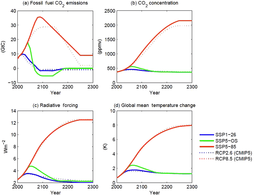
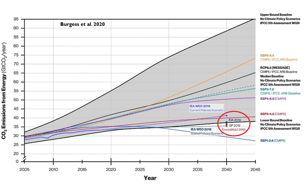
The IPCC has published a new generation of climate scenarios – and buried in the fine print is a remarkable concession: the extreme warming pathways that dominated climate research, policy, and media coverage for decades were never actually plausible. It took a while to notice because almost no one in mainstream media bothered to report it. Science policy analyst Roger Pielke Jr. wrote,
“The Intergovernmental Panel on Climate Change (IPCC) has just published the next generation of climate scenarios,” calling it “big news” that “eliminated the most extreme scenarios that have dominated climate research over much of the past several decades.”
The conclusion was unambiguous. “The IPCC and broader research community has now admitted that the scenarios that have dominated climate research, assessment and policy during the past two cycles of the IPCC assessment process are implausible. They describe impossible futures.”
Those “impossible futures” formed the backbone of a decade-plus of apocalyptic climate messaging – melting ice caps, submerged coastlines, mass extinctions, widespread crop failures, and global hunger, always around the corner, always demanding immediate, economy-reshaping action to avert a catastrophe that, it now turns out, the underlying science community had assigned to a category closer to science fiction than projection.
The new IPCC framework formally demotes its remaining “HIGH scenario” from expected outcome to “exploratory – a thought experiment, not a projection.” [SSP5-85]
Pielke noted that the previous framework lacked “any systematic effort to evaluate plausibility of scenarios,” meaning the scariest pathways were able to dominate the policy debate for years without anyone in the room applying a basic reality check.
What matters today is that the group with official responsibility for developing climate scenarios for the IPCC and broader research community has now admitted that the scenarios that have dominated climate research, assessment and policy during the past two cycles of the IPCC assessment process are implausible. They describe impossible futures.
Curiously, the revised framework was technically adopted back in 2021, but has only now filtered into public view as related technical and institutional changes caught up. And it’s fair to ask why. The policy consequences of those “impossible futures” were very real.
It cannot be over-emphasised how important this finding of implausibility is. It means that almost every fearmongering mainstream media climate headline and story that has been written over the last 15 years is junk. Of course it also explains why a growing band of sceptical commentators have refused to accept the political concept of ‘settled’ science and have engaged in widespread debunking. Shooting fish in a barrel is one way of describing this work. At times, with just a modicum of investigative scepticism, the stories can be seen as little more than an insult to average human intelligence.
When the RCP8.5 assumptions are loaded into computer models, they run politically-convenient red hot suggestions that the temperature in 2100 will rise by about 4°C from a 1850-1900 baseline – in other words, a rise of nearly 3°C in the next 80 years. Only the most deranged eco loons will claim such large short-term rises out loud, so the activist scientists quietly loaded garbage assumptions into their computers to arrive at their garbage-out Armageddon scares. The writing was on the wall for RCP8.5 last year when President Trump’s executive order titled ‘Restoring Gold Standard Science’ effectively banned the use of RCP8.5 for scientists on the United States federal payroll. It also noted one of the unrealistic RCP8.5 assumptions driving deliberate climate psychosis to be that end-of-century coal use will exceed estimates of recoverable reserves.
At the time, the climate researcher Zeke Hausfather dismissed the Trump Administration’s claims about RCP8.5 by stating that the research community had moved on. But Pielke has taken issue with this ‘nothing to see here’ claim. He states that from 2018 to 2021, Google Scholar reported 17,000 articles published using RCP8.5 compared with 16,900 in the next three year period. “Some shift,” he observed.
Again, those using less charitable words might note that the ultimate climate crackpipe has proved difficult to put down. A long and painful process of rehabilitation now seems likely.
Many of my posts include some high quality infographics produced by a colleague, Raymond Inauen of RIC-Communications. In 2024 because of other pressing time demands, Raymond discontinued the website he set up to host the infographics. This post is to announce that he has now reactivated the website up for the public to access a series of infographics regarding CO2 and climate science.
The Website content is:
The World of CO2
Readers will be aware of previous posts on the four themes to be discovered. Raymond introduces this resource in this way:
WELCO₂ME
Would you like to learn more about CO₂ so you can have informed conversations about climate policy and future energy investments? Or would you rather pass judgment on CO₂ after learning about the basics? Then this is the website for you.
There are 29 infographic images that can be downloaded in four PDF files. Thanks again, Raymond for your interest and efforts to make essential scientific information available to one and all. PDF links are in red.
There are 29 infographic images that can be downloaded in four PDF files. Thanks again, Raymond for your interest and efforts to make essential scientific information available to one and all. PDF links are in red.
At that website the high resolution infographic PDFs can be downloaded at no charge with no restrictions on use. There are also informative videos and FAQ pages, as well as links to contact with questions, comments or additional suggestions. There is also a link to support this work if you are so inclined.
A comprehensive new study extending the U.S. Historical Climatology Network (USHCN) record back to 1899 finds that both hot and cold temperature extremes across the contiguous United States have declined over the past 127 years. The research, performed by Dr. John R. Christy, Alabama State Climatologist (retired) and professor of atmospheric and Earth science at The University of Alabama in Huntsville, analyzed more than 40 million daily temperature observations to provide the most complete long-term view to date of U.S. extreme heat and cold. The paper is published in Theoretical and Applied Climatology. Excerpts below with my bolds and some added images.
Abstract
Knowledge of temperature extremes, and their potential changes within a climate system of increasing greenhouse gases, is of vital interest for humans and the infrastructure which supports them. To produce a better understanding of how daily extreme temperatures have changed over time in the conterminous US (CONUS), the United States Historical Climate Network (USHCN) database was extended back to 1899 and forward to 2025. The original 1,218 stations, selected in the 1980s by NOAA as capable of addressing climate concerns, have since been neglected – almost half of the stations have closed since 2000. Incomplete station records were supplemented with nearby stations with high correlation and removeable biases to provide time series for 1,211 of the stations with at least 92% of data present. Extreme temperature metrics for summer daily maximum temperatures and winter daily minimum temperatures were calculated. The general result is that metrics for extreme summer heat, e.g., hottest values, number of heatwave days, etc., show modest negative trends since 1899. Extreme cold temperature metrics also indicate a decline in their occurrences especially since the 1990s. In sum, instances of both hot and cold extreme metrics have declined since 1899. To demonstrate an application of this dataset we examined the claims of one source regarding changing temperature extremes, The National Climate Assessment 5.
This metric determines for each day of the season the particular year in which the hottest (coldest) TMax (TMin) occurred. There are 153 (122) days in the May-Sep (Dec-Mar, leap year) for which a daily record will be achieved. The number of extremes occurring in each year is calculated per station then geographically interpolated as discussed above. This metric is more robust than the single All-Time metric above as each station contributes 153 (122) values to the time series rather than just one. This also provides an indication of the incidence of multiple hot and cold records to help identify periods of excess heat (cold).
The expected value for a purely random process for the number of daily TMax (TMin) records would be 1.20 (0.96) in a given year per station for a 127-year record (i.e., 1.20 = 153/127 and 0.96 = 122/127). The results (Fig. 4) indicate again that 1936 contributed the most daily hot records for the CONUS at 6.7 per station but followed more closely by other years, with 1934 (5.3), 1931 (3.4) and 1911 and 1925 (3.3) completing the top five.
The number of coldest records occurred in 1899 (3.7) in association with February 1899 event. The following years experienced extreme cold as well, 1917 (3.3), 1989 (2.9), 1924 (2.4) and 1936 (2.4). Thus, 1936 was a year with many extremes on both ends of the thermometer.
Comparing the two metrics in Figs. 10 and 11 produces Fig. 12 which displays the sum and the difference, year-by-year of the 15-yr running means. The sum of days in extreme heat/cold declined from over 120 in the 1930s to about 75 since 1960. The conclusion here would be that the CONUS has experienced a decline of around 30% of these durative extreme events in the past 100 years. Along with this decline has been an increase in heatwave days vs. cold wave days since the 1970s, mainly due to the increase in heatwave days in the West (Fig. 10) and the decline in cold wave days overall.
Discussion
Overall, our project indicates that extremes in summer heat-related metrics for the CONUS as defined in the four questions above do not show increasing trends, but rather modest negative trends, and thus appear to be substantially affected by other forcings such as natural variability in addition to GHGs. There are positive TMax metric trends in western regions which are countered by larger negative trends elsewhere.
The number of cold extreme events has declined in the past 30 years too and this is likely, in part, related to the development of infrastructure around the stations which disturbs the nocturnal boundary layer, inhibiting the formation of the cold, shallow layer in which TMin is observed. Additionally, this result may be an early sign of atmospheric warming of the coldest air masses by the added GHGs (e.g., Krayenhoff et al. 2018), though this hypothesis has not been confirmed as a direct result of GHGs (e.g., Huang et al. 2023). Observations of the deep atmospheric temperature in the polar region north of + 60° latitude indicate a warming trend of + 0.47 °F (+ 0.26 C) decade− 1 since 1979 compared with a global trend of + 0.27 °F (+ 0.15 C) decade− 1 (Spencer et al. 2017). This would suggest Arctic air intrusions into the CONUS may be slightly warmer now than in the past century or so (for whatever reason) and thus consistent with the results shown here for a lessening of the magnitude of cold events in recent decades. However, we note the same area in the southern hemisphere shows virtually no warming (+ 0.05 °F (+ 0.03 C) decade− 1).
Conclusions
In the field of climate change, attention has been drawn to extreme metrics occurring in the last several years as evidence for human influences through increasing GHGs (e.g., USGCRP 2017; Seneviratne et al. 2021; Jay et al. 2023). Examining this aspect of climate and weather is appropriate since human thriveability is often constrained by the magnitude of the extremes that we experience. We describe here a dataset constructed to examine the occurrence through time of extreme temperature metrics in the CONUS for the coldest winter and hottest summer days since Dec 1898. The dataset is based on the 1,218 USHCN stations 1,211 of which have been supplemented to be “complete”, i.e., each station having at least 92% of days available for analysis.
The results indicate that extremes in heat-related metrics for daily TMax in the summer have not increased and in fact often show modest declines since 1899, due mostly to the early heat events during 1925–1954. This is consistent with Seneviratne et al. 2021 (IPCC AR6, their Fig. 11). Cold-related extreme events based on winter TMin show evidence of decreasing occurrences, two causes of which were proposed, (1) increasing human development around weather stations, and (2) an early response to increasing GHGs as they warm the coldest air first. When taken together, the occurrences of heat and cold extremes have declined over the past 127 years in the CONUS, i.e., the climate over the CONUS has become less impacted by temperature extremes to this point.
Relating this reduction of extreme events to increasing GHGs would be difficult
as the magnitude of the regional natural variability of weather and climate
is considerable in comparison to a small GHG-induced temperature rise.
Once the shifts were accommodated, the time series (Fig. 14) for Fresno 12-month running anomalies indicate very different results between TMax and TMin, which is a clear indication of the NCI of urbanization. The TMax time series indicates no trend through 2012 (slightly negative) but contains a relatively sudden rise in 2013 which is consistent with the entire western CONUS as seen in Figs. 5 and 10. The overall TMax trend is + 0.03 °F (+ 0.02 C) decade− 1. The trend in TMin is + 0.43 °F (+ 0.24 C) decade− 1.
The impact of Non-Climatic Influences (NCI) was considered in the temperature evolution of one USHCN station, Fresno California, as an example of a clear and large response to forcings unrelated to the increasing GHGs. In this case, the urbanization impact on TMin of 5 °F (~ 3 °C) is clearly apparent, while summer TMax (with urbanization) indicates a trend not significantly different from zero. Voluminous research has and will be performed on this aspect of surface temperature records as these types of influences need to be identified and removed so that changes in the background climate due to GHGs may be estimated with more confidence. We also demonstrated that one must be cautious when interpreting official statements about extreme weather events for the CONUS.


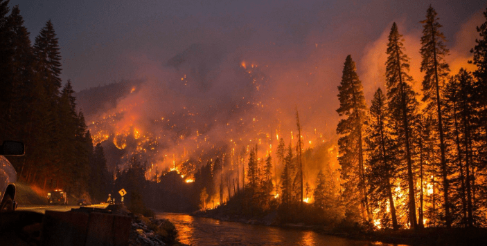


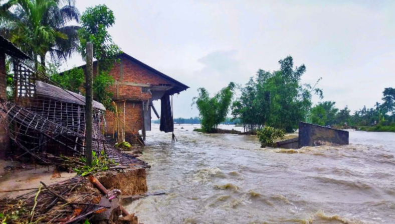






 1. Intermittency is not a rounding error; it is the dominant cost driver. Even with batteries, MTerra is engineered for ~12–13 hours of mid-merit output. The remaining 11–12 hours (and any multi-day typhoon-induced lull) still require dispatchable backup. My own peer-reviewed analysis of ancillary-service burdens shows that adding solar and wind to a reliable grid inflates total system costs by 135–235 % once frequency regulation, inertia, voltage support, and ramping are properly valued. The raw LCOE of ~$40/MWh becomes a delivered cost of ~$500/MWh.


 The latest weekly Niño-3.4 index value was +0.4°C, with the westernmost (Niño-4) and easternmost (Niño-1+2) indices at +0.5°C and +1.0°C, respectively [Fig. 2]. The equatorial subsurface temperature index (average from 180°-100°W) increased for the sixth consecutive month [Fig. 3], with widespread, significantly above-average subsurface temperatures across the equatorial Pacific [Fig. 4]. Westerly wind anomalies were observed over the western equatorial Pacific at low levels and were evident over the central and east-central Pacific at upper levels. Convection was near average on the equator near the Date Line and was suppressed around Indonesia [Fig. 5]. Collectively, the coupled ocean-atmosphere system reflected ENSO-neutral conditions.

 The strongest El Niño events in the historical record are characterized by significant ocean-atmosphere coupling through the summer, and it remains to be seen whether this occurs in 2026. Stronger El Niño events do not ensure strong impacts; they can only make certain impacts more likely (see CPC outlooks for probabilities of seasonal anomalies). In summary, El Niño is likely to emerge soon (82% chance in May-July 2026) and continue through Northern Hemisphere winter 2026-27 (96% chance in December 2026-February 2027).