Xmas 2020: Twelve Forgotten Principles of Public Health

Dr. Martin Kulldorff, PhD, is a Professor of Medicine at Harvard Medical School. His research centers on developing new epidemiological and statistical methods for the early detection and monitoring of infectious disease outbreaks and for post-market drug and vaccine safety surveillance. This holiday gift remembrance is collected from Dr. Kulldorff’s twitter thread courtesy of AIER, which also includes links to articles adding depth to the 12 points. Tweets in italics with my bolds.

  1. Public health is about all health outcomes, not just a single disease like Covid-19. It is important to also consider harms from public health measures. More.

  2. Public health is about the long term rather than the short term. Spring Covid lockdowns simply delayed and postponed the pandemic to the fall. More.

  3. Public health is about everyone. It should not be used to shift the burden of disease from the affluent to the less affluent, as the lockdowns have done. More.

  4. Public health is global. Public health scientists need to consider the global impact of their recommendations. More.

  5. Risks and harms cannot be completely eliminated, but they can be reduced. Elimination and zero-Covid strategies backfire, making things worse. More.

  6. Public health should focus on high-risk populations. For Covid-19, many standard public health measures were never used to protect high-risk older people, leading to unnecessary deaths. More.

  7. While contact tracing and isolation are critically important for some infectious diseases, it is futile and counterproductive for common infections such as influenza and Covid-19. More.

  8. A case is only a case if a person is sick. Mass testing asymptomatic individuals is harmful to public health. More.

  9. Public health is about trust. To gain the trust of the public, public health officials and the media must be honest and trust the public. Shaming and fear should never be used in a pandemic. More.

  10. Public health scientists and officials must be honest with what is not known. For example, epidemic models should be run with the whole range of plausible input parameters. More.

  11. In public health, open civilized debate is profoundly critical. Censoring, silencing and smearing leads to fear of speaking, herd thinking and distrust. More.

  12. It is important for public health scientists and officials to listen to the public, who are living the public health consequences. This pandemic has proved that many non-epidemiologists understand public health better than some epidemiologists. More.

Dr. Martin Kulldorff

California: World Leading Climate Hypocrite Updated Dec. 23, 2020

Update following below Dec. 23, 2020 Has Progressive Californication Peaked?

California’s Climate Extremism
Joel Kotkin reports from the Golden State. Excerpts in italics with my bolds.

The pursuit of environmental purity in the Golden State does nothing to reverse global warming—but it’s costing the poor and middle class dearly.

Environmental extremism increasingly dominates California. The state is making a concerted attack on energy companies in the courts; a bill is pending in the legislature to fine waiters $1,000—or jail them—if they offer people plastic straws; and UCLA issued a report describing pets as a climate threat. The state has taken upon itself the mission of limiting the flatulence of cows and other farm animals. As the self-described capital of the anti-Trump resistance, California presents itself as the herald of a green, more socially and racially just society. That view has been utterly devastated by a new report from Chapman University, in which coauthors David Friedman and Jennifer Hernandez demonstrate that California’s draconian anti-climate-change regime has exacerbated economic, geographic, and racial inequality. And to make things worse, California’s efforts to save the planet have actually done little more than divert greenhouse-gas emissions (GHG) to other states and countries.

Jerry Brown’s return to Sacramento in 2011 brought back to power one of the first American politicians to embrace the “limits of growth.” Brown has long worried about resource depletion (including such debunked notions as “peak oil”), taken a Malthusian approach to population growth, and opposed middle-class suburban development. Like many climate-change activists, he has limitless confidence in the possibility for engineering a green socially just society through “the coercive power of the state,” but little faith that humans can find ways to address the challenge of climate change. If Brown’s “era of limits” message in the 1970s failed to catch on with the state’s voters, who promptly elected two Republican governors in his wake, he has found in climate change a more effective rallying cry, albeit one that often teeters at the edge of hysteria. Few politicians can outdo Brown for alarmism; recently, he predicted that climate change will cause 3 to 4 billion deaths, leading eventually to human extinction. To save the planet, he openly endorses a campaign to brainwash the masses.

The result: relentless ratcheting-up of climate-change policies. In 2016, the state committed to reduce greenhouse-gas (GHG) emissions 40 percent below 1990 levels by 2030. In response, the California Air Resource Board (CARB), tasked with making the rules required to achieve the state’s legislated goals, took the opportunity to set policies for an (unlegislated) target of an 80 percent reduction below 1990 levels by 2050.

Brown and his supporters often tout their policies as in line with the 2015 Paris Agreement, note Friedman and Hernandez, but California’s reductions under the agreement require it to make cutbacks double those pledged by Germany and other stalwart climate-committed countries, many of which have actually increased their emissions in recent years, despite their Paris pledges.

Governor Brown has preened in Paris, at the Vatican, in China, in newspapers, and on national television. But few have considered how his policies have worked out in practice. California is unlikely to achieve even its modest 2020 goals; nor is it cutting emissions faster than other states lacking such dramatic legislative mandates. Since 2007, when the Golden State’s “landmark” global-warming legislation was passed, California has accounted for barely 5 percent of the nation’s GHG reductions. The combined total reductions achieved over the past decade by Ohio, Georgia, Pennsylvania, and Indiana are about 5 times greater than California’s. Even Texas, that bogeyman of fossil-fuel excess, has been reducing its per-capita emissions more rapidly.

In fact, virtually nothing that California does will have an impact on global climate. California per-capita emissions have always been relatively low, due to the mild climate along the coast, which reduces the need for much energy consumption on heating and cooling. In 2010, the state accounted for less than 1 percent of global GHG emissions; the disproportionately large reductions sought by state activists and bureaucrats would have no discernible effect on global emissions under the Paris Agreement. “If California ceased to exist in 2030,” Friedman and Hernandez note, “global GHG emissions would be still be 99.54 percent of the Paris Agreement total.”

Many of California’s “green” policies may make matters worse. California, for example, does not encourage biomass energy use, though the state’s vast forested areas—some 33 million acres— could provide renewable energy and reduce the excessive emissions from wildfires caused by years of forest mismanagement. Similarly, California greens have been adamant in shutting down nuclear power plants, which continue to reduce emissions in France, and they refuse to count hydro-electricity as renewable energy. As a result, California now imports roughly one-third of its electricity from other states, the highest percentage of any state, up from 25 percent in 2010. This is part of what Hernandez and Friedman show to be California’s increasing propensity to export energy production and GHG emissions, while maintaining the fiction that the state has reduced its total carbon output.

Overall, California tends to send its “dirty work”—whether for making goods or in the form of fossil fuels—elsewhere. Unwanted middle- and working-class people, driven out by the high cost of California’s green policies, leave, taking their carbon footprints to other places, many of which have much higher per-capita emission rates. Net migration to other, less temperate states and countries has been large enough to offset the annual emissions cuts within the state. Similarly, the state’s regulatory policies make it difficult for industrial firms to expand or even to remain in California. Green-signaling firms like Apple produce most of their tangible products abroad, mainly in high-GHG emitting China, while other companies, like Facebook and Google, tend to place energy-intensive data centers in other, higher GHG emission states. The study estimates that GHG emissions just from California’s international imports in 2015, and not even counting imports from the rest of the U.S., amounted to about 35 percent of the state’s total emissions.

California’s green regulators predict that the implementation of ever-stricter rules related to climate will have a “small” impact on the economy. They point to strong economic and job growth in recent years as evidence that strict regulations are no barrier to prosperity. Though the state’s economic growth is slowing, and now approaches the national average, a superficial look at aggregate performance makes a seemingly plausible case for even the most draconian legislation. California, as the headquarters for three of the nation’s five largest companies by market capitalization—Alphabet, Apple, and Facebook— has enjoyed healthy GDP growth since 2010. But in past recoveries, the state’s job and income growth was widely distributed by region and economic class; since 2007, growth has been uniquely concentrated in one region—the San Francisco Bay Area, where employment has grown by nearly 17 percent, almost three times that of the rest of the state, with growth rates tumbling compared with past decades.

Some of these inequities are tied directly to policies associated with climate change. High electricity prices, and the war on carbon emissions generally, have undermined the state’s blue-collar sectors, traditionally concentrated in Los Angeles and the interior counties. These sectors have all lost jobs since 2007. Manufacturing employment, highly sensitive to energy-related and other regulations, has declined by 160,000 jobs since 2007. California has benefited far less from the national industrial resurgence, particularly this past year. Manufacturing jobs—along with those in construction and logistics, also hurt by high energy prices—have long been key to upward mobility for non-college-educated Californians.

As climate-change policies have become more stringent, California has witnessed an unprecedented level of bifurcation between a growing cadre of high-income earners and a vast, rapidly expanding poor population. Meantime, the state’s percentage of middle-income earners— people making between $75,000 and $125,000—has fallen well below the national average. This decline of the middle class even occurs in the Bay Area, notes a recent report from the California Budget and Policy Center, where in 1989 the middle class accounted for 56 percent of all households in Silicon Valley, but by 2013, only 45.7 percent. Lower-income residents accounted for 30.3 percent of Silicon Valley’s households in 1989, and that number grew to 34.8 percent in 2013.

Perhaps the most egregious impact on middle and working-class residents can be seen in housing, where environmental regulations, often tied directly to climate policies, have discouraged construction, particularly in the suburbs and exurbs. The state’s determination to undo the primarily suburban, single-family development model in order to “save the planet” has succeeded both in raising prices well beyond national norms and creating a shortfall of some 3 million homes.

As shown in a recent UC Berkeley study, even if fully realized, the state’s proposals to force denser housing would only reach about 1 percent of its 2030 emissions goals. Brown and his acolytes ignore the often-unpredictable consequences of their actions, insisting that density will reduce carbon emissions while improving affordability and boosting transit use. Yet, as Los Angeles has densified under its last two mayors, transit ridership has continued to drop, in part, notes a another UC Berkeley report, because incentives for real-estate speculation have driven the area’s predominantly poor transit riders further from trains and buses, forcing many to purchase cars.

Undaunted, California plans to impose even stricter regulations, including the mandatory installation of solar panels on new houses, which could raise prices by roughly $20,000 per home. This is only the latest in a series of actions that undermines the aspirations of people who still seek “the California dream;” since 2007, California homeownership rates have dropped far more than the national average. By 2016, the overall homeownership rate in the state was just under 54 percent, compared with 64 percent in the rest of the country.

The groups most affected by these policies, ironically, are those on whom the ruling progressives rely for electoral majorities. Millennials have seen a more rapid decline in homeownership rates compared with their cohort elsewhere. But the biggest declines have been among historically disadvantaged minorities—Latinos and African-Americans. Latino homeownership rates in California are well below the national average. In 2016, only 31 percent of African-Americans in the Bay Area owned homes, well below the already low rate of 41 percent black homeownership in the rest of nation. Worse yet, the state takes no account of the impact of these policies on poorer Californians. Overall poverty rates in California declined in the decade before 2007, but the state’s poverty numbers have risen during the current boom. Today, 8 million Californians live in poverty, including 2 million children, by far the most of any state. The state’s largest city, Los Angeles, is also now by some measurements America’s poorest big city.

To allay concerns about housing affordability, the state has allocated about $300 million from its cap-and-trade funds for housing, a meager amount given that the cost of building affordable housing in urban areas can exceed $700,000 per unit. These benefits are dwarfed by those that wealthy Californians enjoy for the purchase of electric cars and home solar: Tesla car buyers with average incomes of $320,000 per year got more than $300 million in federal and state subsidies by early 2015 alone. By contrast, in early 2018, state electricity prices were 58 percent higher, and gasoline over 90 cents per gallon higher, than the national average, disproportionately hurting ethnic minorities, the working class, and the poor. Based on cost-of-living estimation tools from the Census Bureau, 28 percent of African-Americans in the state live in poverty, compared with 22 percent nationally. Fully one-third of Latinos, now the state’s largest ethnic group, live in poverty, compared with 21 percent outside the state.

In a normal political environment, such disparities would spark debate, not only among conservatives, but also traditional Democrats. Some, like failed independent candidate and longtime environmentalist Michael Shellenberger, have expressed the view that California’s policies have made it not “the most progressive state” but “the most racist one.” Recently, some 200 veteran civil rights leaders sued CARB, on the basis that state policies are skewed against the poor and minorities. So far, their voices have been largely ignored. The state’s prospective next governor, Gavin Newsom, seems eager to embrace and expand Brown’s policies, and few in the legislature seem likely to challenge them. The Republicans, for now, look incapable of mounting a challenge.

This leaves California on a perilous path toward greater class and racial divides, increasing poverty, and ever-more strenuous regulation. Other ways to reduce greenhouse gases—such as planting trees, more efficient transportation, and making suburbs more sustainable—should be on the table. The Hernandez-Friedman report could be a first step toward addressing these issues, but however it happens, a return to rationality is needed in the Golden State.

Joel Kotkin serves as Presidential Fellow in Urban Futures at Chapman University and executive director of the Center for Opportunity Urbanism (COU).

Update Dec. 23, 2020 Has Progressive Californication Peaked?

Joel Kotkin has updated the California story as 2020 ends in his article Peak Progressive? at the American Mind. Excerpts in italics with my bolds.

With adjustment for cost of living, California now has the highest overall poverty rate in the United States according to the Census Bureau. Los Angeles, by far the state’s largest metropolitan area, has among the highest poverty rates for the largest U.S. metros. In parts of Los Angeles, the growing homeless encampments have spawned medieval diseases such as typhus. There are even indications of a comeback for bubonic plague, the signature scourge of the Middle Ages.

Hispanics and African Americans, who constitute 45% of the state’s population, do far worse here than elsewhere. Based on cost-of-living estimation tools from the Census Bureau, 28% of African Americans in the state live in poverty, compared with 22% nationally. Fully one third of Hispanics, the state’s largest ethnic group, are below the poverty line, compared with 21% outside the state. Over two thirds of noncitizen Latinos, including the undocumented, live at or below the poverty line.

The pandemic has widened this divide. The state’s unemployment rates now surpass the national average, making them worse even than in New York, the epicenter of the coronavirus outbreak. L.A. County has lost over 1 million jobs to the pandemic and suffers an unemployment rate higher than any of the major California urban counties. Today in Los Angeles, violent crime is spiking, and less than half of residents now hold jobs. Since the pandemic, the state’s largest metro, Los Angeles–Orange County, has suffered the second most job losses in the U.S. Two others, the Bay Area and the Inland Empire, rank in the top ten.

Now the state seems poised to lose much of its tech economy, which has been the one force keeping it afloat.

Yet it is ever more clear to ever more Californians that our state is becoming exactly the vast gated community Newsom warns about. As Ali Modarres showed in “The Demographic Transformation of California” (2003), the “shared prosperity” of the Pat Brown years were based on a broad-based economy spanning the gamut from agriculture and oil to aerospace and finance, software, and basic manufacturing. In contrast, the Newsom progressive model is built largely around one industry—high tech—which provides increasingly little opportunity for most Californians, and now shows disturbing signs of moving elsewhere.

Current progressive policies are chasing key companies out of the state—including, just within the last week, tech giants Tesla, Hewlett Packard Enterprises, and Oracle, all of which are heading to Texas. But the real problem lies in the state’s fading appeal to outsiders. It is losing domestic migrants and, increasingly, losing appeal to immigrants as well. California retains many of its great assets—a huge concentration of technical talent, a robust grassroots economy, unmatched physical beauty, and a remarkably pleasant climate—but these are being increasingly squandered. The question now is whether Californians will challenge the status quo.

More Evidence of California Climate Fumbles:

How Climatism Destroyed California

Climate activists versus affordable housing

California Cop Out

California’s Year: Veering Left from Left Lane


Pandemic of Misinformation

Update: Quote of the Day Dec. 23, 2020

“It’s a vaccine so safe we must be forced to take it, to fight a disease so severe we don’t know we have it without being tested.”

Scott Atlas explains at Wall Street Journal A Pandemic of Misinformation.  Excerpts in italics with my bolds.

The media’s politicization of Covid has proved deadly and puts Americans’ freedoms at risk.

America has been paralyzed by death and fear for nearly a year, and the politicization of the pandemic has made things worse by adding misinformation and vitriol to the mix. With vaccines finally being administered, we should be entering a joyous phase. Instead we endure still more inflammatory rhetoric and media distortion.

Americans need to understand three realities. First, all 50 states independently directed and implemented their own pandemic policies. In every case, governors and local officials were responsible for on-the-ground choices—every business limit, school closing, shelter-in-place order and mask requirement. No policy on any of these issues was set by the federal government, except those involving federal property and employees.

Second, nearly all states used the same draconian policies that people now insist on hardening, even though the number of positive cases increased while people’s movements were constrained, business activities were strictly limited, and schools were closed. Governors in all but a few states—Florida and South Dakota are notable exceptions—imposed curfews, quarantines, directives on group gatherings, and mask mandates.

Mobility tracking verifies that people restricted their movement. Gallup and YouGov data show that 80% to 90% of Americans have been wearing masks since early August. Lockdown policies had baleful effects on local economies, families and children, and the virus spread anyway. If one advocates more lockdowns because of bad outcomes so far, why don’t the results of those lockdowns matter?

Third, the federal government’s role in the pandemic has been grossly mischaracterized by the media and their Democratic allies. That distortion has obscured several significant successes, while undermining the confidence of ordinary Americans. Federal financial support and directives enabled the development of a massive, state-of-the-art testing capacity and produced billions of dollars of personal protective equipment. Federal agencies met all requests for supplemental medical personnel and hospital-bed capacity. Officials in the Health and Human Services Department have told me there are no unmet requests for extra resources.

The federal government also increased the protection of the elderly during late summer and fall. This effort included an intensive testing strategy for nursing-home staff and residents based on community activity, new proactive warnings to the highest-risk elderly living independently, millions of point-of-care tests and extra personal protective equipment for senior living facilities, and new alliances and financial incentives to improve nursing home infection control.

The federal government also expedited development and delivery of lifesaving drugs, such as novel antibody treatments that reduce hospitalizations of high-risk elderly by more than 70%. According to HHS, more than 200,000 doses of these monoclonal-antibody drugs have been delivered to hospitals in all 50 states. Under Operation Warp Speed, the federal government took nearly all the risk away from private pharmaceutical companies and delivered highly effective vaccines, hitting all promised timelines.

In this season when respiratory virus illnesses become more common and people move indoors to keep warm, many states are turning to more severe restrictions on businesses and outdoor activities. Yet empirical data from the U.S., Europe and Japan show that lockdowns don’t eliminate the virus and don’t stop the virus from spreading. They do, however, create extremely harmful health and social problems beyond a dramatic drop in learning, including a tripling of reported depression, skyrocketing suicidal ideation, unreported child abuse, skipped visits for cancer and other medical care.

It adds up to a future health disaster. “For younger people, the lockdowns are so harmful, so deadly, there’s really no good justification,” says Stanford’s Jay Bhattacharya, especially when considering their extremely low risk from Covid-19.

States and cities that keep their economies locked down after highly vulnerable populations have been vaccinated will be doubling down on failed policies that are destroying families and sacrificing children, particularly among the working class and poor.

The media has done its best to misinform the public with political attacks about who is to blame for this pain and misery even as it diminishes the great achievement of the new vaccines. The decline of objectivity in journalism has been evident for years. Now we see that even respected scientific journals, which are supposed to vet and publish the best objective research, have been contaminated by politics. Social media has become the arbiter of allowable discussion, while universities intimidate and suppress the free exchange of ideas necessary to uncover scientific truths.

It is not at all clear that American society with its cherished freedoms will survive, regardless of our success in defeating the pandemic threat.

Dr. Atlas served from August through November as a special adviser to the president.

See Also Science Says: Media Covid Coverage Driving US Crazy

Covid Masquerade


Dominion Election Fraud Redacted

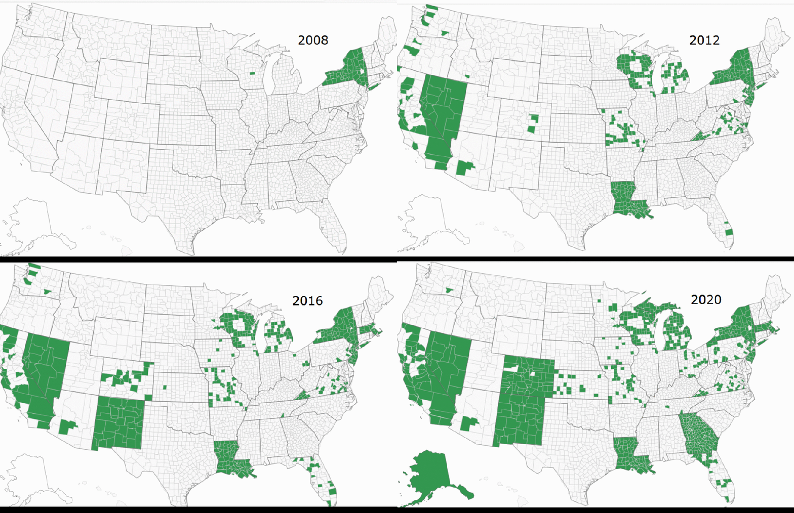
In 2008, although Dominion was in many counties in New York and had an insignificant presence in Wisconsin, it had no presence in the rest of the USA. Dominion built up its presence in 2012, increased it in 2016, and increased it further in 2020.

Update Dec. 19, 2020:  Redacted Information in Dominion Audit Report Shows Races Were Flipped: Analyst

Article at Epoch Times Excerpts in italics with my bolds:

The analyst who led the forensic audit of Dominion Voting Systems in Michigan said on Friday the information state officials pushed to redact shows that the outcomes of races were changed.

“The original report had log evidence that we published in the report to show exactly what we did and exactly the findings. Now, those did ultimately get redacted. And so now, the complaint is ‘well, but there’s no real proof and Dominion says ‘no, these things can’t be done,’” Russell Ramsland Jr. said during a virtual appearance on Newsmax’s “Greg Kelly Reports.”

“But at that point, Dominion’s argument is no longer with us. Dominion’s argument is with their own user’s manual and their own logs, because the logs—had they been able to be published—show very clearly that the RCV [ranked-choice voting] algorithm was enacted. It shows very clearly that the error messages were massive. It was very clearly [sic] that races were flipped,” he added.

Ramsland on Newsmax predicted the emergence of more explosive information soon.

“I think that there’s going to be some information [to] come forth in the next few days, that is going to drastically change the playing field,” he said.

“And the real question is, will people report on it? We’ll see.”

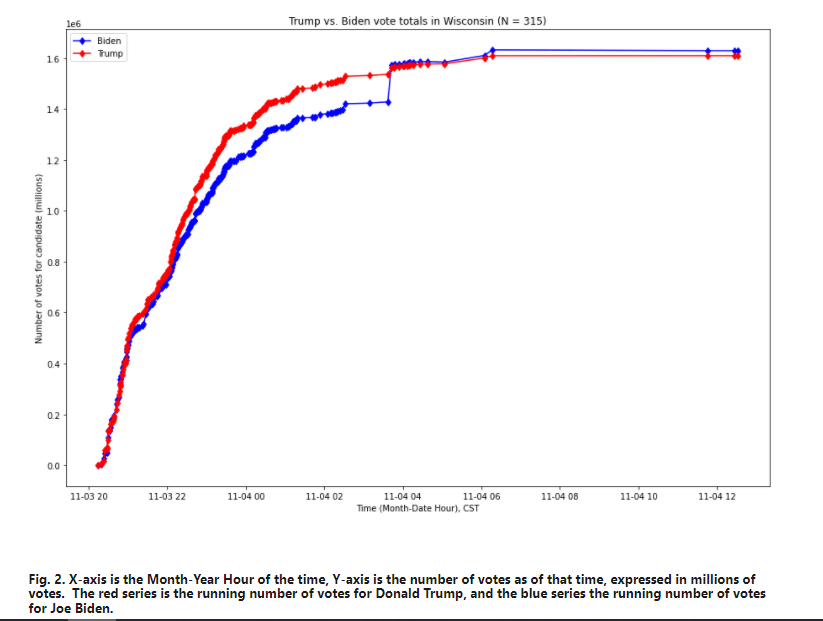
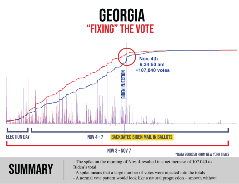
Biden’s Great Leaps Upward
Wisconsin

The Georgia Leap in detail:

Background from previous post Rise of Dominion Effect

Context from Shocking History of Dominion Voting  Excerpts in italics with my bolds.

Dominion Voting Systems Corp. is the Canadian company behind the ballot switching software.

Dominion was founded in 2003, with a mission to provide electronic voting systems friendly for progressives. Because of such partisanship, it languished with almost no customers for the next 5-6 years, until the Obama administration came to power. In 2010, the Obama administration confiscated electronic voting systems assets (software, intellectual property, manufacturing tools, customer base, etc.) from two established American companies, and gave them to Dominion. At the same time, Dominion got some employees and assets from a foreign EVS company, tied to Hugo Chavez.

Its software has been used by some 40% of the voters in this election, mostly by Democrat-controlled states and election commissions. Apparently, no protections were put in place against ballot switching, deletion, or creation. According to Dominion’s own website, it software was used in “battleground” states and the largest Democrat states, including MI, GA, AZ, NV, NM, CO, AK, UT, NJ, CA, NY.

The Dominion Effect on Vote Counting

From Fraudspotters Statistical Evidence of Dominion Election Fraud? Time to Audit the Machines. Excerpts in italics with my bolds.

Overview

Statistical analysis of past presidential races supports the view that in 2020, in counties where Dominion Machines were deployed, the voting outcomes were on average (nationwide) approximately 1.5% higher for Joe Biden and 1.5% lower for Donald Trump after adjusting for other demographic and past voting preferences. Upon running hundreds of models, I would say the national average effect appears to be somewhere between 1.0% and 1.6%.

For Dominion to have switched the election from Trump to Biden, it would have had to have increased Biden outcomes (with a corresponding reduction in Trump outcomes) by 0.3% in Georgia, 0.6% in Arizona, 2.1% in Wisconsin, and 2.5% in Nevada. The apparent average “Dominion Effect” is greater than the margin in Arizona and Georgia, and close to the margin for Wisconsin and Nevada. It is not hard to picture a scenario where the actual effect in Wisconsin and Nevada was greater than the national average and would have changed the current reported outcome in those two states.

Assuming the “Dominion Effect” is real, it is possible that an audit of these machines would overturn the election.

These results are scientifically valid and typically have a p-value of less than 1%, meaning the chances of this math occurring randomly are less than 1 in 100. This article, and its FAQ, shows many ways to model the “Dominion Effect.”

The best way to restore faith in the system is to audit the Dominion voting machines in Arizona, Georgia, Nevada, and Wisconsin.

Discussion

To do this study, we will link results from 2008 to 2020 by each county, parish, or in some cases city. Since this is usually based on county, we will refer to it as county in this article.

By comparing the county to itself, we are constructing the test similar to how a drug company would test the effects of its proposed therapy. In this case, we have 3,050 counties that do not have Dominion in 2008. In 2020, 657 of the counties have Dominion while 2,388 do not. If we assume that the same societal forces are acting upon all of these counties equally, then in comparing the average change from 2008 to 2020 for Dominion counties versus non Dominion counties, we should have a similar change in voter share. In this regard, it is as if Dominion is the proposed treatment, and non-Dominion is the placebo.

When doing this analysis, we do NOT see a change that is constant across counties. In fact, below are the results comparing 2008 to 2020. A verbal description is “the average US county’s percentage of vote for the Democrat presidential candidate was 8.4 percentage points less Democrat in 2020 (Biden vs. Trump) than in 2008. (Obama vs. McCain). However, despite this 8.4%-point decrease, Dominion counties only decreased 6.4% points, while the non-Dominion counties decreased 9.0% points.”

Unlike a drug company’s test of a new treatment, our counties were not randomly selected to be “treated” by Dominion. These counties chose to install Dominion. Was there selection bias? We should control for other factors to see if the presence of Dominion still significantly affects results.

We can obtain demographic data on a county level basis from the U.S. department of agriculture. By attaching this data on a county basis to our already existing dataset, and running multiple linear regression, we obtain the following results. You’ll notice that Dominion’s p-value became more significant as we controlled for other variables. In some cases Dominion is more significant than the control variables.

To provide a basic interpretation, look at the sign of the coefficient. It is telling you whether the demographic factor increased or decreased Democratic presidential voter percentage. So, from 2008 to 2020:

  • The more rural, the less the Democratic share
  • The more manufacturing dependent, the less the Democratic share
  • The more a county is considered a “high natural amenity,” the more the Democratic share if we consider counties equally weighted but not if we give larger counties more weight. Note this variable has a less significant p-value than some of the others.
  • The more a county is considered “high creative class,” the more the Democratic share
  • The more a county is considered “low education,” the more the Democratic share
  • The more the population increased, the more the Democratic share
  • The more international immigration, the more the Democratic share, although one measure had this value with a questionable p-value.
  • And most importantly, if Dominion was installed, there was approximately a 1.5%-point increase in Democratic share which also corresponds to a 1.5%-point Republican decrease, so a total swing of 3% points.

If the “Dominion Effect” is real, would it have affected the election?

This article showed a range of estimates for the “Dominion Effect,” the more persuasive being from the multiple linear regression analysis:

Multiple Linear Regress: Ordinary Least Squares: 1.65%
Multiple Linear Regress: Weighted Least Squares: 1.55%

I find the weighted least square model the most persuasive and refer to it often in the FAQ.

If there is a Dominion Effect, it adds that percentage to Democrat presidential vote and subtracts from Republican. If the Dominion Effect is real, it may have affected this close election. For Dominion to have switched the election from Trump to Biden, it would have had to increase Democratic presidential outcomes by 0.3% and reduced Republican outcomes by 0.3% in Georgia. The factors for the other states are 0.6% in Arizona, 2.1% in Wisconsin, and 2.5% in Nevada. Click here to see the math.

If you believe the Dominion Effect is real, it is not hard to believe that this effect would be greater in swing states and could have swung these four states into Biden’s column, putting the electoral college in his favor.

Are there really enough machines in Wisconsin to have changed the outcome there?

If you go to verifiedvoting.org, and selection Dominion, 2020, Wisconsin, and download the data, you’ll see that they are saying 527 precincts, 640,215 registered voters are on Dominion machines. The state only has a 20k vote difference among Biden and Trump. And, in my paper, the Dominion effect was calculated on a county basis, not precinct basis. To the extent counties are split on which machine they used, then my paper is underestimating the Dominion effect: the effect is likely bigger on a precinct by precinct basis; I don’t have the data to go to that detail.

But to answer the question: yes, based on published, public information, there are enough machines to change the election in Wisconsin.

Have you really accounted for very large and very small counties?

In our model, we are already using these adjustments:

  • weighting by county size
  • a field called “RuralUrbanContinuumCode2013”

These should adjust for county size, but in effort to address concerns of readers, I ran the model with two new flags:

  • 657 counties with highest number of voters in 2008
  • 657 counties with lowest number of voters in 2008

The Dominion Effect is still 1.55% and the p-values are 0.00% (traditional) 0.09% (robust). These p-values are suggesting less than 1 in 1000 chance of randomly occurring.

To further address this, I ran an additional model which also includes a field for the population per square mile. This model produces identical results of Dominion Effect of 1.55% and a p-value of 0.00% and 0.09%.

The Case for Ivermectin Covid Regimen

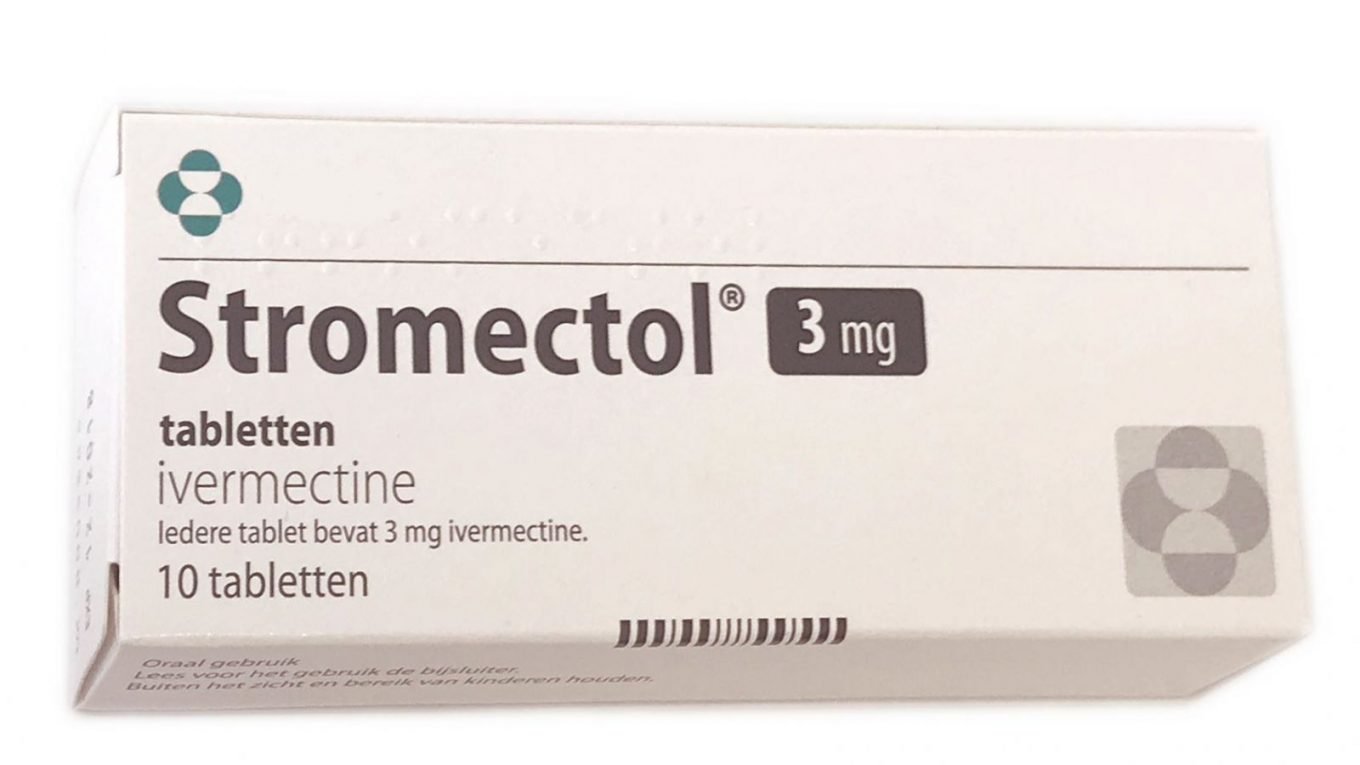
Physicians in many parts of the world needing inexpensive, effective Covid treatments have turned to Ivermectin with encouraging success.  This news is largely ignored, but is now being compiled and promoted by frontline medical caregivers.

Dominican Republic One Example of Ivermectin Results

For example, consider the experience of Dominican Republic, a nation whose primary industry of tourism has been decimated by the pandemic.  At newspaper Dominican Today Doctor explains 99.3% of COVID-19 patients treated with Ivermectin recovered in five days.  Excerpts in italics with my bolds.

After eight months of active clinical observation and attending about 7 thousand patients of Covid-19 in three medical centers located in Puerto Plata, La Romana, and Punta Cana, Dr. José Natalio Redondo revealed that 99.3% of the symptomatic patients who received care in his emergency services, including the use of Ivermectin, managed to recover in the first five days of recorded symptoms.

The renowned cardiologist and health manager affirmed that Ivermectin’s use against the symptoms of Covid-19 is practically generalized in the country and attributed to this factor, among others, the fact that the risk of dying from this disease in the Dominican Republic is significantly lower than in the United States.

He added that “in a therapeutic format duly tested over the years, infections have always been cured faster and leave fewer sequelae if antimicrobial treatment is applied as early as possible since this allows the use of lower doses of the selected drugs. This has been one of the dogmas that remain in our daily medical practice.”

The key is early treatment.

“From the beginning, our team of medical specialists, who were at the forefront of the battle, led by our emergency physicians, intensivists and internists, raised the need to see this disease in a different way than that proposed by international health organizations, says Dr. Redondo in his report.

And he adds that the Group’s experts proposed the urgency of reorienting the management protocols towards earlier and more timely stages. “We realized that the war was being lost because of the obsession of large groups, agencies, and companies linked to research and production of drugs, to focus their interest almost exclusively on the management of critical patients.

“Our results were immediate; the use of Ivermectin, together with Azithromycin and Zinc (plus the usual vitamins that tend to increase the immune response of individuals) produced an impressive variation in the course of the disease; it was demonstrated that 99.3% of the patients recovered quickly when the treatment was started in the first five days of proven symptoms, with an average of 3.5 days, and a fall of more than 50% in the rate and duration of hospitalizations, and reducing from 9 to 1 the mortality rate, when the treatment was started on time.”

The Global Review of Ivermectin Protocol Studies

The Front Line Covid-19 Critical Care Alliance (FLCCC) provides historical and global perspective on this treatment protocol Review of the Emerging Evidence Demonstrating the Efficacy of Ivermectin in the Prophylaxis and Treatment of COVID-19 Excerpts in italics with my bolds.

Recommended Protocol

Despite the growing list of failed therapeutics in COVID-19, the FLCCC recently discovered that ivermectin, an anti-parasitic medicine, has highly potent real-world, anti-viral, and anti-inflammatory properties against SARS-CoV-2 and COVID-19. This conclusion is based on the increasing study results reporting effectiveness, not only within in-vitro and animal models, but also in numerous clinical trials from centers and countries around the world. Repeated, consistent, large magnitude improvements in clinical outcomes have now been reported when ivermectin is used not only as a prophylactic agent but also in mild, moderate, and even severe disease states from multiple, large, randomized and observational controlled trials. Further, data showing impacts on population wide health outcomes have resulted from multiple large “natural experiments” that appear to have occurred when various regional health ministries and governmental authorities within South American countries initiated “ivermectin distribution” campaigns to their citizen populations in the hopes the drug would prove effective. The tight, reproducible, temporally associated decreases in case counts and case fatality rates in each of those regions compared to nearby regions without such campaigns, suggest that ivermectin is proving to be a global solution to the pandemic. This is now further evidenced by the recent incorporation of ivermectin as a prophylaxis and treatment agent for COVID19 in the national treatment guidelines of Egypt as well as the state of Uttar Pradesh in Northern India, populated by 210 million people.

[The article provides a comprehensive review of the available efficacy data as of November 8, 2020, taken from in-vitro, animal, clinical, and real-world studies all showing the above impacts of ivermectin in COVID-19.]

The FLCCC recommendation is based on the following set of conclusions derived from the existing data, which will be comprehensively reviewed below:

1) Since 2012, multiple in-vitro studies have demonstrated that Ivermectin inhibits the replication of many viruses, including influenza, Zika, Dengue and others (19–27).

2) Ivermectin inhibits SARS-CoV-2 replication, leading to absence of nearly all viral material by 48h in infected cell cultures (28).

3) Ivermectin has potent anti-inflammatory properties with in-vitro data demonstrating profound inhibition of both cytokine production and transcription of nuclear factor-κB (NF-κB), the most potent mediator of inflammation (29–31).

4) Ivermectin significantly diminishes viral load and protects against organ damage in multiple animal models when infected with SARS-CoV-2 or similar coronaviruses (32, 33).

5) Ivermectin prevents transmission and development of COVID-19 disease in those exposed to infected patient (34–36,54).

6) Ivermectin hastens recovery and prevents deterioration in patients with mild to moderate disease treated early after symptoms (37–42,54).

7) Ivermectin hastens recovery and avoidance of ICU admission and death in hospitalized patients (40,43,45,54,63,67).

8) Ivermectin reduces mortality in critically ill patients with COVID-19 (43,45,54).

9) Ivermectin leads to striking reductions in case-fatality rates in regions with widespread use (46-48).

10) The safety, availability, and cost of ivermectin is nearly unparalleled given its near nil drug interactions along with only mild and rare side effects observed in almost 40 years of use and billions of doses administered (49).

11) The World Health Organization has long included ivermectin on its “List of Essential Medicines” (50).

Ivermectin in Post-COVID-19 Syndrome

Increasing reports of persistent, vexing, and even disabling symptoms after recovery from acute COVID-19 have been reported and which many have termed the condition as “long Covid” and patients as “long haulers”, estimated to occur in approximately 10% of cases (77–79). Generally considered as a post-viral syndrome consisting of a chronic and sometimes disabling constellation of symptoms which include, in order, fatigue, shortness of breath, joint pains and chest pain. Many patients describe their most disabling symptom as impaired memory and concentration, often with extreme fatigue, described as “brain fog”, and are highly suggestive of the condition myalgic encephalomyelitis/chronic fatigue syndrome, a condition well-reported to begin after viral infections, in particular with Epstein-Barr virus. Although no specific treatments have been identified for long COVID, a recent manuscript by Aguirre-Chang et al from the National University of San Marcos in Peru reported on the experience with ivermectin in such patients (80). They treated 33 patients who were between 4 and 12 weeks from the onset of symptoms with escalating doses of ivermectin; 0.2mg/kg for 2 days if mild, 0.4mg/kg for 2 days if moderate, with doses extended if symptoms persisted. They found that in 87.9% of the patients, resolution of all symptoms was observed after two doses with an additional 7% reporting complete resolution after additional doses. Their experience suggests the need for controlled studies to better test efficacy in this vexing syndrome.

In summary, based on the existing and cumulative body of evidence, we recommend the use of ivermectin in both prophylaxis and treatment for COVID-19. In the presence of a global COVID-19 surge, the widespread use of this safe, inexpensive, and effective intervention could lead to a drastic reduction in transmission rates as well as the morbidity and mortality in mild, moderate, and even severe disease phases.


Arctic Freezing Fast Mid-Dec. 2020


As noted in a previous post, alarms were raised over slower than average Arctic refreezing in October.  Those fears were laid to rest firstly when ice extents roared back in November, and now with the Arctic freezing fast in December. The image above shows the ice gains over the last two weeks, from Dec. 5 to 17, 2020.  In November, 3.5 Wadhams of sea ice were added during the month.  (The metric 1 Wadham = 1 M km2 comes from the professor’s predictions of an ice-free Arctic, meaning less than 1 M km2 extent). So far in December a further 1.9 Wadhams have been added with another two weeks to go in 2020.

Some years ago reading a thread on global warming at WUWT, I was struck by one person’s comment: “I’m an actuary with limited knowledge of climate metrics, but it seems to me if you want to understand temperature changes, you should analyze the changes, not the temperatures.” That rang bells for me, and I applied that insight in a series of Temperature Trend Analysis studies of surface station temperature records. Those posts are available under this heading. Climate Compilation Part I Temperatures

This post seeks to understand Arctic Sea Ice fluctuations using a similar approach: Focusing on the rates of extent changes rather than the usual study of the ice extents themselves. Fortunately, Sea Ice Index (SII) from NOAA provides a suitable dataset for this project. As many know, SII relies on satellite passive microwave sensors to produce charts of Arctic Ice extents going back to 1979.  The current Version 3 has become more closely aligned with MASIE, the modern form of Naval ice charting in support of Arctic navigation. The SII User Guide is here.

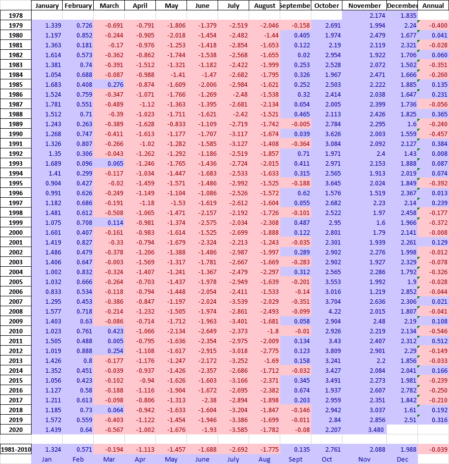
There are statistical analyses available, and the one of interest (table below) is called Sea Ice Index Rates of Change (here). As indicated by the title, this spreadsheet consists not of monthly extents, but changes of extents from the previous month. Specifically, a monthly value is calculated by subtracting the average of the last five days of the previous month from this month’s average of final five days. So the value presents the amount of ice gained or lost during the present month.

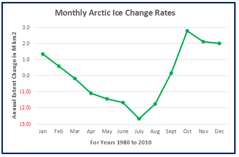
These monthly rates of change have been compiled into a baseline for the period 1980 to 2010, which shows the fluctuations of Arctic ice extents over the course of a calendar year. Below is a graph of those averages of monthly changes during the baseline period. Those familiar with Arctic Ice studies will not be surprised at the sine wave form. December end is a relatively neutral point in the cycle, midway between the September Minimum and March Maximum.

The graph makes evident the six spring/summer months of melting and the six autumn/winter months of freezing.  Note that June-August produce the bulk of losses, while October-December show the bulk of gains. Also the peak and valley months of March and September show very little change in extent from beginning to end.

The table of monthly data reveals the variability of ice extents over the last 4 decades.

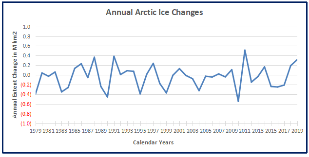
The values in January show changes from the end of the previous December, and by summing twelve consecutive months we can calculate an annual rate of change for the years 1979 to 2019.

As many know, there has been a decline of Arctic ice extent over these 40 years, averaging 40k km2 per year. But year over year, the changes shift constantly between gains and losses.

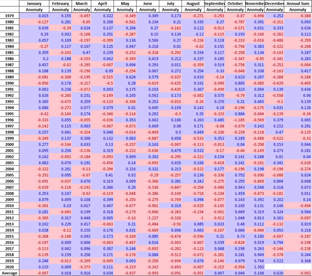
Moreover, it seems random as to which months are determinative for a given year. For example, much ado has been printed about October 2020 being slower than expected to refreeze and add ice extents. As it happens in this dataset, October has the highest rate of adding ice. The table below shows the variety of monthly rates in the record as anomalies from the 1980-2010 baseline. In this exhibit a red cell is a negative anomaly (less than baseline for that month) and blue is positive (higher than baseline).

Note that the  +/ –  rate anomalies are distributed all across the grid, sequences of different months in different years, with gains and losses offsetting one another.  Yes, October 2020 recorded a lower than average gain, but higher than 2016. The loss in July 2020 was the largest of the year, during the hot Siberian summer.  Note November 2020 ice gain anomaly exceeded the October deficit anomaly by more than twice as much.  The bottom line presents the average anomalies for each month over the period 1979-2020.  Note the rates of gains and losses mostly offset, and the average of all months in the bottom right cell is virtually zero.

Combining the months of October and November shows 2020 828k km2 more ice than baseline for the two months and matching 2019 ice recovery.

The average December adds 2M km2 of sea ice according to SII dataset, and in the first 17 days of December 2020 ice increased by 1.9M km2, with 2 weeks of futher freezing to come.

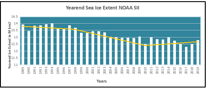
A final observation: The graph below shows the Yearend Arctic Ice Extents for the last 30 years.

Note: SII daily extents file does not provide complete values prior to 1988.

Year-end Arctic ice extents (last 5 days of December) show three distinct regimes: 1989-1998, 1998-2010, 2010-2019. The average year-end extent 1989-2010 is 13.4M km2. In the last decade, 2009 was 13.0M km2, and ten years later, 2019 was 12.8M km2. So for all the the fluctuations, the net loss was 200k km2, or 1.5%. Talk of an Arctic ice death spiral is fanciful.

These data show a noisy, highly variable natural phenomenon. Clearly, unpredictable factors are in play, principally water structure and circulation, atmospheric circulation regimes, and also incursions and storms. And in the longer view, today’s extents are not unusual.


Illustration by Eleanor Lutz shows Earth’s seasonal climate changes. If played in full screen, the four corners present views from top, bottom and sides. It is a visual representation of scientific datasets measuring Arctic ice extents.

Science Says: Media Covid Coverage Driving US Crazy

Two recent analytical studies together lead to the conclusion in the title of this post.  One is a working paper Why is All Covid 19 News Bad News? published at NBER (National Bureau of Economic Research).  The other is an article at Vox Anxiety and depression are following a remarkably similar curve to Covid-19 cases.  Excerpts are in italics with my bolds.

Malevolent Media Covid Coverage

Summary

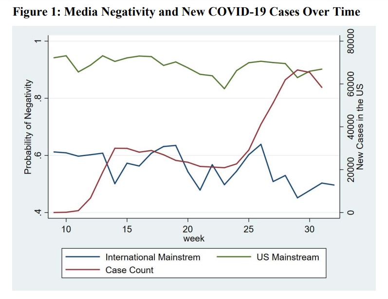
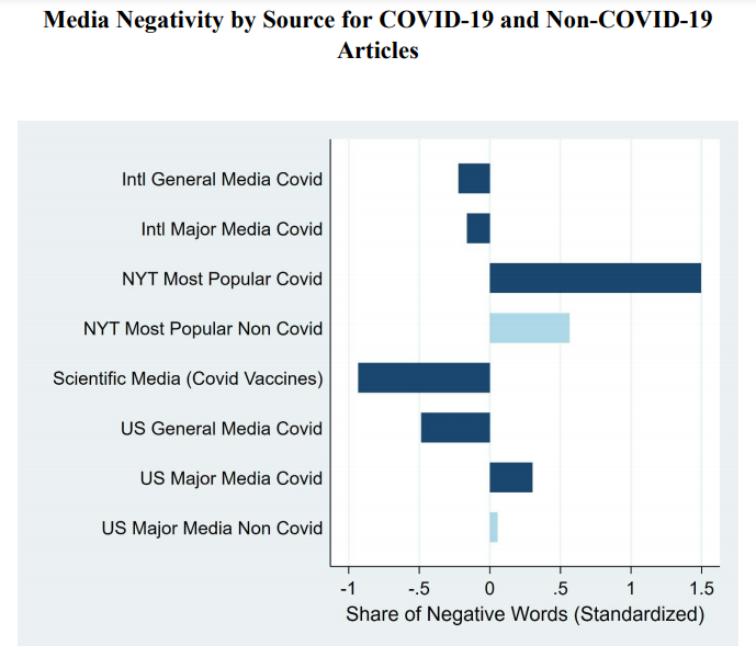
We analyze the tone of COVID-19 related English-language news articles written since January 1, 2020. Ninety one percent of stories by U.S. major media outlets are negative in tone versus fifty four percent for non-U.S. major sources and sixty five percent for scientific journals. The negativity of the U.S. major media is notable even in areas with positive scientific developments including school re-openings and vaccine trials. Media negativity is unresponsive to changing trends in new COVID-19 cases or the political leanings of the audience. U.S. major media readers strongly prefer negative stories about COVID-19, and negative stories in general. Stories of increasing COVID-19 cases outnumber stories of decreasing cases by a factor of 5.5 even during periods when new cases are declining. Among U.S. major media outlets, stories discussing President Donald Trump and hydroxychloroquine are more numerous than all stories combined that cover companies and individual researchers working on COVID-19 vaccines.

Discussion

Notes: Negativity is estimated using supervised machine learning on article phrases coupled with a training data set. Articles are manually downloaded from LexisNexis for the period January 1st, 2020 to July 31st, 2020. The red line shows the weekly average of daily confirmed new COVID-19 cases and is accessed from the New York Times website.

Figure 1 plots the time trend in media negativity for major media outlets in the U.S. (green line) and outside the U.S. (blue line) using the scale on the left. The most striking fact is that 91 percent of the U.S. stories are classified as negative whereas 54 percent of the non-U.S. stories are classified as negative. Figure 1 uses our estimated probability that an article is negative. We obtain similar results using the Hu-Liu dictionary and the fraction of words in the article that are negative.

Notes: Negativity is estimated as the fraction of negative words in the article and is standardized. Dark blue bars are for COVID related articles and light blue bars are for non-COVID related articles. The raw share of negative words is .043 with a standard deviation of .021. Negative words are defined by the Hu-Liu (1997) dictionary. Articles and transcripts are manually downloaded from LexisNexis for the period January 1st, 2020 to July 31st, 2020 and websites for Science, JAMA, The New England Journal of Medicine, The Lancet, and Nature. The New York Times website is used for the list and text of the most popular articles.

US Mental Health Linked to Covid Case Reporting

From Vox article linked above:

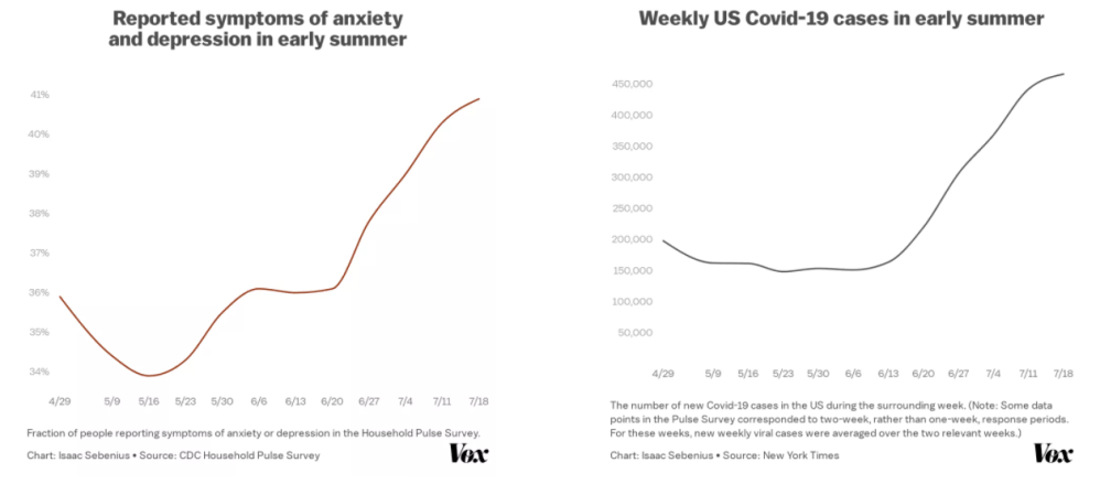
It is well documented that the coronavirus pandemic has taken a serious toll on emotional well-being. Rates of depression and anxiety in June were three to four times higher than at the corresponding point in 2019, according to the CDC, and deteriorating mental health outcomes have been similarly observed in nations across the world, among them the UK, India, and China. Rates of suicidal ideation, substance abuse, and alcohol consumption are rising steadily.

But the connection is even stronger than you might think in the US: As the number of new cases of the virus fluctuates week to week, our mental health moves in lockstep.

Data available from the Mental Health Household Pulse Survey, run by the CDC, offers a week-by-week estimate of the fraction of Americans who experienced symptoms of anxiety or depression between April 23 and July 21. Comparing this data to the weekly US coronavirus cases over the same time interval reveals an unmistakable trend: The incidence of depressive or anxious symptoms among Americans almost exactly mirrors the trajectory of the US coronavirus curve.

With an r2 value (a standard metric of correlation strength) of 0.92 between new Covid-19 cases and the incidence of anxious or depressive symptoms, the correlation between them is very, very strong.

It is always possible that any correlation could be coincidental rather than causal, or that the link could be more complicated than it seems. Indeed, June and July marked a period of increasing viral spread; one might speculate that, as the pandemic stretched on, public mental health could have correspondingly worsened simply as a function of time or some other factor.

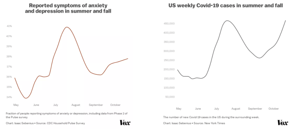
Yet data from the second phase of the Household Pulse Survey, from August through October, showed mental health continued to consistently follow fluctuations in the Covid-19 curve. After the scary viral spike in July, the number of weekly cases declined from roughly 450,000 per week at the end of July to roughly 250,000 by the end of August. And along with this period of slower viral spread, mental health outcomes markedly improved as well, reinforcing the relationship between the two.

Then again, as cases increased during September and October, mental health outcomes correspondingly worsened.

Overall, the pandemic has raised America’s baseline levels of anxiety and depression: Even at its lowest point this summer (early May), the rate of Americans reporting symptoms of anxiety or depression hovered around 34 percent, roughly three times higher than the average of 11 percent reported in a parallel study between January and June 2019.

Fluctuations above this already-high baseline could plausibly be caused, at least in part, by the severity of the pandemic at a given point in time. For example, elevated rates of viral spread directly increase the likelihood that we or someone we know will become exposed and undergo a mentally straining period of quarantining waiting for symptoms — or self-isolation while battling the new illness itself. The state of the pandemic also often determines things like freedom of mobility through lockdown measures or their absence.

Historically, imposed quarantine has been shown to dramatically affect mental health. Moreover, the perceived trajectory of the pandemic has significant repercussions for the economy and unemployment, both of which have been shown to directly impact mental health.

My Comment: 

Early on everyone wondered: What’s different about this pandemic? Some observed: It’s the first pandemic with 24/7 cable news and rampant social media. Informal surveys show that many people have few or no family, friends or associates who have gotten sick, let alone seriously ill or died from Covid19.  What we do get is a deluge of scary messaging and official warnings and restrictions that are literally driving us crazy.  

Bottom Line:  You’re on your own to keep up your spirits and fend off fears and depression.  Take care of your immune system, especially vitamins C, D and Zinc, and make every day count.


Rise of the Dominion Effect

In 2008, although Dominion was in many counties in New York and had an insignificant presence in Wisconsin, it had no presence in the rest of the USA. Dominion built up its presence in 2012, increased it in 2016, and increased it further in 2020.

Background from Shocking History of Dominion Voting  Excerpts in italics with my bolds.

Dominion Voting Systems Corp. is the Canadian company behind the ballot switching software.

Dominion was founded in 2003, with a mission to provide electronic voting systems friendly for progressives. Because of such partisanship, it languished with almost no customers for the next 5-6 years, until the Obama administration came to power. In 2010, the Obama administration confiscated electronic voting systems assets (software, intellectual property, manufacturing tools, customer base, etc.) from two established American companies, and gave them to Dominion. At the same time, Dominion got some employees and assets from a foreign EVS company, tied to Hugo Chavez.

Its software has been used by some 40% of the voters in this election, mostly by Democrat-controlled states and election commissions. Apparently, no protections were put in place against ballot switching, deletion, or creation. According to Dominion’s own website, it software was used in “battleground” states and the largest Democrat states, including MI, GA, AZ, NV, NM, CO, AK, UT, NJ, CA, NY.

The Dominion Effect on Vote Counting

From Fraudspotters Statistical Evidence of Dominion Election Fraud? Time to Audit the Machines. Excerpts in italics with my bolds.

Overview

Statistical analysis of past presidential races supports the view that in 2020, in counties where Dominion Machines were deployed, the voting outcomes were on average (nationwide) approximately 1.5% higher for Joe Biden and 1.5% lower for Donald Trump after adjusting for other demographic and past voting preferences. Upon running hundreds of models, I would say the national average effect appears to be somewhere between 1.0% and 1.6%.

For Dominion to have switched the election from Trump to Biden, it would have had to have increased Biden outcomes (with a corresponding reduction in Trump outcomes) by 0.3% in Georgia, 0.6% in Arizona, 2.1% in Wisconsin, and 2.5% in Nevada. The apparent average “Dominion Effect” is greater than the margin in Arizona and Georgia, and close to the margin for Wisconsin and Nevada. It is not hard to picture a scenario where the actual effect in Wisconsin and Nevada was greater than the national average and would have changed the current reported outcome in those two states.

Assuming the “Dominion Effect” is real, it is possible that an audit of these machines would overturn the election.

These results are scientifically valid and typically have a p-value of less than 1%, meaning the chances of this math occurring randomly are less than 1 in 100. This article, and its FAQ, shows many ways to model the “Dominion Effect.”

The best way to restore faith in the system is to audit the Dominion voting machines in Arizona, Georgia, Nevada, and Wisconsin.

Discussion

To do this study, we will link results from 2008 to 2020 by each county, parish, or in some cases city. Since this is usually based on county, we will refer to it as county in this article.

By comparing the county to itself, we are constructing the test similar to how a drug company would test the effects of its proposed therapy. In this case, we have 3,050 counties that do not have Dominion in 2008. In 2020, 657 of the counties have Dominion while 2,388 do not. If we assume that the same societal forces are acting upon all of these counties equally, then in comparing the average change from 2008 to 2020 for Dominion counties versus non Dominion counties, we should have a similar change in voter share. In this regard, it is as if Dominion is the proposed treatment, and non-Dominion is the placebo.

When doing this analysis, we do NOT see a change that is constant across counties. In fact, below are the results comparing 2008 to 2020. A verbal description is “the average US county’s percentage of vote for the Democrat presidential candidate was 8.4 percentage points less Democrat in 2020 (Biden vs. Trump) than in 2008. (Obama vs. McCain). However, despite this 8.4%-point decrease, Dominion counties only decreased 6.4% points, while the non-Dominion counties decreased 9.0% points.”

Unlike a drug company’s test of a new treatment, our counties were not randomly selected to be “treated” by Dominion. These counties chose to install Dominion. Was there selection bias? We should control for other factors to see if the presence of Dominion still significantly affects results.

We can obtain demographic data on a county level basis from the U.S. department of agriculture. By attaching this data on a county basis to our already existing dataset, and running multiple linear regression, we obtain the following results. You’ll notice that Dominion’s p-value became more significant as we controlled for other variables. In some cases Dominion is more significant than the control variables.

To provide a basic interpretation, look at the sign of the coefficient. It is telling you whether the demographic factor increased or decreased Democratic presidential voter percentage. So, from 2008 to 2020:

  • The more rural, the less the Democratic share
  • The more manufacturing dependent, the less the Democratic share
  • The more a county is considered a “high natural amenity,” the more the Democratic share if we consider counties equally weighted but not if we give larger counties more weight. Note this variable has a less significant p-value than some of the others.
  • The more a county is considered “high creative class,” the more the Democratic share
  • The more a county is considered “low education,” the more the Democratic share
  • The more the population increased, the more the Democratic share
  • The more international immigration, the more the Democratic share, although one measure had this value with a questionable p-value.
  • And most importantly, if Dominion was installed, there was approximately a 1.5%-point increase in Democratic share which also corresponds to a 1.5%-point Republican decrease, so a total swing of 3% points.

If the “Dominion Effect” is real, would it have affected the election?

This article showed a range of estimates for the “Dominion Effect,” the more persuasive being from the multiple linear regression analysis:

Multiple Linear Regress: Ordinary Least Squares: 1.65%
Multiple Linear Regress: Weighted Least Squares: 1.55%

I find the weighted least square model the most persuasive and refer to it often in the FAQ.

If there is a Dominion Effect, it adds that percentage to Democrat presidential vote and subtracts from Republican. If the Dominion Effect is real, it may have affected this close election. For Dominion to have switched the election from Trump to Biden, it would have had to increase Democratic presidential outcomes by 0.3% and reduced Republican outcomes by 0.3% in Georgia. The factors for the other states are 0.6% in Arizona, 2.1% in Wisconsin, and 2.5% in Nevada. Click here to see the math.

If you believe the Dominion Effect is real, it is not hard to believe that this effect would be greater in swing states and could have swung these four states into Biden’s column, putting the electoral college in his favor.

Are there really enough machines in Wisconsin to have changed the outcome there?

If you go to verifiedvoting.org, and selection Dominion, 2020, Wisconsin, and download the data, you’ll see that they are saying 527 precincts, 640,215 registered voters are on Dominion machines. The state only has a 20k vote difference among Biden and Trump. And, in my paper, the Dominion effect was calculated on a county basis, not precinct basis. To the extent counties are split on which machine they used, then my paper is underestimating the Dominion effect: the effect is likely bigger on a precinct by precinct basis; I don’t have the data to go to that detail.

But to answer the question: yes, based on published, public information, there are enough machines to change the election in Wisconsin.

Have you really accounted for very large and very small counties?

In our model, we are already using these adjustments:

  • weighting by county size
  • a field called “RuralUrbanContinuumCode2013”

These should adjust for county size, but in effort to address concerns of readers, I ran the model with two new flags:

  • 657 counties with highest number of voters in 2008
  • 657 counties with lowest number of voters in 2008

The Dominion Effect is still 1.55% and the p-values are 0.00% (traditional) 0.09% (robust). These p-values are suggesting less than 1 in 1000 chance of randomly occurring.

To further address this, I ran an additional model which also includes a field for the population per square mile. This model produces identical results of Dominion Effect of 1.55% and a p-value of 0.00% and 0.09%.

Disputing Ignorant Virtue Signaling

Adam Anderson, CEO of Innovex Downhole Solutions, wrote the letter below to Steve Rendle, CEO of North Face’s parent, VF Corporation, in response to the latter’s refusal to fulfill a shirt order for the oil and gas company. Mr. Rendle has not responded to date. H/T Master Resource  Excerpts in italics with my bolds and images.

I am proud to be the CEO of Innovex Downhole Solutions. We are an industry leader providing tools and technologies to service oil and natural gas producers worldwide.

Our work enables our customers, employees and communities to thrive. Low-cost, reliable energy is critical to enable humans to flourish. Oil and natural gas are the two primary resources humanity can use to create low-cost and reliable energy. The work of my company and our industry more broadly enables humans to have a quality of life and life expectancy that were unfathomable only a century ago.

The merits of low-cost and reliable energy are too numerous to cite in totality but here are a few key highlights:

  • Lifespans and quality of life have expanded dramatically over the last 150 years, enabled by access to abundant energy.
  • Low-cost and reliable energy enables life-saving technologies. For example, the new Pfizer vaccine must be stored at -70 0C. This would be impossible without low cost and reliable energy.
  • American industry is dependent on low-cost and reliable energy to thrive and compete internationally.
  • More than a billion people worldwide live today without access to electricity. As a result, these people live shorter, more difficult and dangerous lives than necessary. The solution to this problem is more low-cost and reliable energy, not less.

Hydrocarbons are the only source of supply for the vast majority of our low-cost and reliable energy needs.  The Oil and Gas industry is essential to enable human flourishing and no low-cost and reliable alternative exists:

Oil and natural gas are the only viable sources for low-cost, reliable energy today.

Wind, solar and many other alternatives suffer from an intermittency problem that has not yet been solved.

Any attempts to move our energy consumption to these unreliable, higher-cost sources of energy will have many negative impacts for humanity as it will dramatically decrease our access to low-cost and reliable energy.

For example, Germany has endeavored to transition their energy grid to alternatives such as wind and solar with disastrous consequences. Electricity costs in Germany have tripled over the last 20 years and are roughly 2x the US costs (which are themselves elevated due to the partial shift to unreliable, intermittent sources of energy in the US).

Oil and natural gas are used in many other important ways to create materials that go into thousands of critical products including, clothes, smart phones, vehicles and life-saving medical devices.

Lastly, the Oil and Gas industry is a bastion of high-quality, high-paying, industrial jobs for our people. Last year, Innovex employed ~650 people and paid our employees an average salary of >$85,000 per year. More than 230 of our employees earned over $100,000 last year. The majority of these individuals do not have a college degree and achieve these high levels of income due to their intelligence, dedication and work ethic. We need more high-quality jobs staffed with individuals like my team members in this country, not fewer.

Frequently people are concerned about the impacts of CO2 released from the burning of hydrocarbons. I acknowledge that CO2 is a greenhouse gas and modest increases in CO2 level will have modest impacts on global temperatures. However, I think the climate catastrophists who claim we will endure dramatic negative impacts from these changes are terribly wrong and misunderstand how low cost energy can help us adapt to our ever changing climate:

  • The US Oil and Gas Industry has enabled an ~14% reduction in US CO2 emissions over the last decade, largely as a result of significant growth in Natural Gas production
  • Climate related deaths have declined ~90% since the beginning of the 20th century as a direct result our society is more robust against floods, draughts, storms, wildfires and extreme temps
  • As there has been a modest increase in CO2, there has been an increase in carbon dioxide fertilization in plants across the Globe. According to NASA there has been significant greening of the Earth over the last 35 years
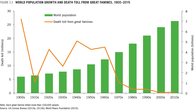
  • This greening combined with incredible technological progress enabled by low cost and reliable energy has led to a dramatic decrease in death by famine. The death rate due to famines has declined by more than 95% over the last century.

At this point, you may wonder why I am directing this letter to you, the CEO of one of the world’s largest apparel companies. We recently contacted North Face to inquire about buying jackets with the Innovex logo for all of our employees as Christmas presents. We viewed North Face as a high-quality brand that our employees would value and cherish for years to come. Unfortunately, we were informed that North Face would not sell us jackets because we were an oil and gas services company.

The irony in this statement is your jackets are made from the oil and gas products the hardworking men and women of our industry produce. I think this stance by your company is counterproductive virtue signaling, and I would appreciate you re-considering this stance. We should be celebrating the benefits of what oil and gas do to enable the outdoors lifestyle your brands embrace. Without Oil and Gas there would be no market for nor ability to create the products your company sells.

I appreciate your consideration and look forward to hearing from you.

Adam Anderson, CEO, Innovex Downhole Solutions, 4310 N Sam Houston Parkway E Houston, TX 77032

How to Pierce the Silicon Curtain

Today’s veil of secrecy and control is made of silicon, not iron.

Bret Swanson explains at Real Clear Politics in his article The Technology Solution to Hysterical Mythmaking. Excerpts in italics with my bolds.

In an MSNBC interview last Monday, Steve Coll, dean of the Columbia University Graduate School of Journalism, was contemplating a staggering dilemma. He noted that Facebook had performed a bit better in 2020 than in 2016 at suppressing inconvenient election content, but it still is not adequately policing the ideas of its 3 billion users. CEO Mark Zuckerberg “profoundly believes in free speech,” Coll lamented. “And,” Coll continued,

“those of us in journalism have to come to terms with the fact that free speech, a principle that we hold sacred, is being weaponized against the principles of journalism. And what do we do about that? As reporters, we march into this war with our facts nobly shouldered, as if they were going to win the day. And what we’re seeing is that because of the scale of this alternate reality … our facts, our principles, our scientific method, it isn’t enough. So what do we do?

Coll is puzzled that citizens aren’t more impressed by the mainstream media’s noble marshaling of facts and science (science!). Could it be that Americans are tired of actors playing roles in elaborately scripted illusions? That they instead prefer actual news and insight? An exploding new array of amateurs, subject matter experts, local reporters, and independent journalists, all leveraging the internet, are often delivering facts far more reliably than the old outlets. When the prestige media pumps and dumps fake conspiracy theories, moralizes over a complex pandemic, blacks out real scandals, collaborates with those it is supposed to cover, and forgets to report on an entire presidential campaign, people will look elsewhere for their information. Today, it’s often former portfolio managers, suburban mothers, lawyers, engineers, curious teenagers, and doctors who are telling us what’s actually happening.

The powerful but cheap tools of the new citizen journalists are tweets, video streams, and podcasts.

So, naturally, Coll and his colleagues of the Fourth Estate have been harassing technology and social media companies to erect a Silicon Curtain (as James Freeman of The Wall Street Journal dubbed it) between the American people and any content not slickly produced in Washington or New York. They’d prefer a social media that is just as incurious, herd-oriented, and partisan as they are. Differentiation is the enemy.

Silicon Valley has been far too willing to oblige. Thus, disfavored people and content get shadow-banned, suspended, demonetized, and, most recently, scolded about the ironclad reliability of signature-less, address-less, mass-marketed, late-arriving mail-in ballots. “Learn how voting by mail is safe and secure,” Twitter insisted a million times over. Twitter even suspended Richard Baris, the pollster who most successfully predicted the 2020 state-by-state election results. And last week, YouTube announced that going forward it will disallow all content questioning the validity of the 2020 election results. Will it let users discuss the multitude of lawsuits, forensic audits, and law enforcement investigations still taking place? Perhaps Rudy Giuliani is crazy, or merely wrong.

Censorship, however, is the refuge not of the confident but the deeply insecure.

In 2005, former President Jimmy Carter and James Baker III issued an authoritative report on election integrity. They found that mail-in ballots are a chief source of fraud. International election monitors have long insisted that top indicators of fraud are stopping counts in mid-stream and prohibiting observation of ballot handling and counting. Yet suddenly the Silicon Valley tech firms became experts in election law, insisting greater information about elections is more dangerous than well-known risky behavior. The soothing new admonition might as well be: “Lamborghinis and whiskey are in fact a safe combination.”

The Silicon Curtain is frustrating, but it has backfired more than Big Media and Silicon Valley know.

Not only have they lost hundreds of millions of readers, viewers, and users, they’ve also locked themselves in a Faraday cage of ignorance. One of the things they are most uninformed about is the hundreds of new tech channels and media outlets already challenging them, and maybe soon looking at them in the rearview mirror.

As technologist and investor Balaji Srinivasan says, “exit > voice.” Meaning, the hope to be treated fairly by CNN, The New York Times, or Twitter is futile. Don’t fight on their battlefield, at least not exclusively. The far more fruitful solution is to exit and create new channels — with crypto communities, Substack newsletters, online magazines, the Brave browser, and video streaming alternatives such as Rumble and NewTube. (The outlet that regularly publishes my articles without question refused to run this one. Which is funny because it proves the point – exactly.)

This path is also more promising than a Washington solution. A clarification and upgrade of Section 230 of the Communications Decency Act to reflect unforeseen dynamics, for example, is warranted. Social media has perverted and exploited it. But throwing it out wholesale and reinstituting a “fairness doctrine” would be unwise. As I wrote last year,

Just as social media offers a Fifth Estate to correct and replace the corrupt and crumbling Fourth Estate, an open society can create a Sixth Estate to hold Big Tech’s feet to the fire. 

No companies, news outlets, political parties, scientific organizations, or government agencies will ever be perfect. That’s why we need continual openness to an Nth Estate, which can help correct our inevitable commercial and cultural mistakes. A new Washington-based regime that seeks to regulate social media in particular and speech in general would do more harm than good. By cementing today’s regime, it would block the pathways to the Nth Estate.

One of our great remaining newsmen, Holman Jenkins of The Wall Street Journal, correctly laments that “the increasing substitution of hysterical mythmaking for news is a malignancy of our time.”

An Nth Estate of American openness, innovation, exit, and free speech is the solution. It is the regenerative vaccine.