To My Grandson: On Greenhouse Gases

This post is in response to questions from my grandson with a homework assignment regarding global warming.

How do Greenhouses function?

A greenhouse is typically made of glass walls and ceiling, which allows the sun to warm the surface (land and plants) which then warms the air. Warmer air rises but is unable to leave the enclosure. Thus the air temperature inside is warmer than outside. The action of air to move heat away from warmer objects is called “convection”, and greenhouses function by preventing convection. The greenhouse effect is also seen in a car left in the sun with the windows closed. Once the air is again allowed to circulate, the outside temperature is restored inside.

What are “Greenhouse Gases?”

99% of the atmosphere is N2 and O2, diatomic molecules (2 atoms), and they are unaffected by radiation in the Infrared (IR) range. Some molecules, principally H2O and Co2 are triatomic (3 atoms) and do absorb and emit radiation in the IR range. The correct term for these gases is “IR active gases,” rather than “greenhouse gases.”

And people are not always forthcoming about the proportions, even forgetting to mention H2O is the predominant IR active gas (9 to 1). This diagram shows the reality:

Why compare IR active gases to greenhouses?

The earth’s surface is constantly warmed by the sun and then warms the air in contact with it (“conduction”). And except for enclosures, the air is free to rise and be replaced by descending cooler air, which is warmed in turn. Convection operates to move surface heat upward toward space. No gas impedes this process.

The notion of ”greenhouse gases” is a claim that IR active gases form a radiative ceiling which delays the rising heat and makes the atmosphere and surface warmer as a result. Some have claimed that this radiative effect causes the surface to be at an average temperature of +15C, compared to -18C without IR active gases. This notion ignores important scientific factors operating in our climate system.

My understanding of how and why earth is warmer than the radiative balance temperature of -18C.

The build up of heat at the surface is caused by a delay in heat transport from surface to space. Surrounded by the nearly absolute cold of space, our planet’s heat must move in that direction, which involves pushing it through the atmosphere. And there is an additional delay within the oceans from the overturning required to bring energy to the surface for cooling. The oceans are a massive thermal energy storage place (1000 times the atmosphere’s heat capacity) which moderates swings in energy and ensures that earth temperature fluctuations are small.

The Difference between climate on the Earth and the Moon

The intensity of solar energy is the same for the Earth and Moon, yet the dark side of the earth is much warmer than the dark side of the moon. And the bright side of the earth is much cooler than the bright side of the moon. Why are the two climates so different?


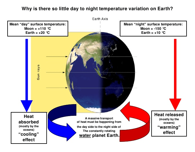
Earth’s oceans and atmosphere make the difference. Incoming sunlight is reduced by gases able to absorb IR and also by reflection from clouds and non-black surfaces. The earth’s surface is heated by sunlight, much of it stored and distributed by the oceans (71% of the planet surface). The atmosphere delays the upward passage of heat, and like a blanket slows the cooling allowing a buildup of temperature at the surface until there is a balance of heat radiating to space from the sky to match the solar energy coming in.

How the Atmosphere Processes Heat

There are 3 ways that heat (Infrared or IR radiation) passes from the surface to space.

1) A small amount of the radiation leaves directly, because all gases in our air are transparent to IR of 10-14 microns (sometimes called the “atmospheric window.” This pathway moves at the speed of light, so no delay of cooling occurs.

2) Some radiation is absorbed and re-emitted by IR active gases up to the tropopause. Calculations of the free mean path for CO2 show that energy passes from surface to tropopause in less than 5 milliseconds. This is almost speed of light, so delay is negligible. H2O is so variable across the globe that its total effects are not measurable. In arid places, like deserts, we see that CO2 by itself does not prevent the loss of the day’s heat after sundown.

3) The bulk gases of the atmosphere, O2 and N2, are warmed by conduction and convection from the surface. They also gain energy by collisions with IR active gases, some of that IR coming from the surface, and some absorbed directly from the sun. Latent heat from water is also added to the bulk gases. O2 and N2 are slow to shed this heat, and indeed must pass it back to IR active gases at the top of the troposphere for radiation into space.

In a parcel of air each molecule of CO2 is surrounded by 2500 other molecules, mostly O2 and N2. In the lower atmosphere, the air is dense and CO2 molecules energized by IR lose it to surrounding gases, slightly warming the entire parcel. Higher in the atmosphere, the air is thinner, and CO2 molecules can emit IR and lose energy relative to surrounding gases, who replace the energy lost.

This third pathway has a significant delay of cooling, and is the reason for our mild surface temperature, averaging about 15C. Yes, earth’s atmosphere produces a buildup of heat at the surface. The bulk gases, O2 and N2, trap heat near the surface, while IR active gases, mainly H20 and CO2, provide the radiative cooling at the top of the atmosphere. Near the top of the atmosphere you will find the -18C temperature.

Summary

It is wrong to claim that IR active gases somehow “trap” heat when they immediately emit any energy absorbed, if not already lost colliding with another molecule. No, it is the bulk gases, N2 and O2, making up the mass of the atmosphere, together with the ocean delaying the cooling and giving us the mild and remarkably stable temperatures that we enjoy.

More on climate theory here:

https://rclutz.wordpress.com/2015/04/25/on-climate-theories-response-to-david-a/

https://rclutz.wordpress.com/2015/04/21/the-climate-water-wheel/

https://rclutz.wordpress.com/2015/10/26/what-is-climate-is-it-changing/

Arctic Ice Recovery Confirmed

Update Nov. 23

I will be resuming the ice watch in mid-December to report how observations compared to the projection below. As of Nov.22, MASIE reports 10.845 while NOAA shows 10.042.

MASIE measurements show that 2007 ice extent was lower than any year since. It is now confirmed that 2015 average annual extent will exceed 2007 by at least 230,000 km2. That difference arises from comparing 2007 annual average of 10.414 M km2 with 2015 running average through day 322 of 10.644. In the 43 days remaining in 2015, we can expect the annual average to rise to about 10.774, or 360,000 km2 higher than 2007.

masie ann est

At this point in the annual cycle, it is possible to project the annual average for the calendar year. The daily average presently is matching the running average for the year, so the year-end average will be increasing each day to the end of December. In the last decade, a typical year added 130k km2 to the annual average in the last 43 days.

masie day 322

Disclaimer: Alarmists will chafe at the word “recovery” above, and I am using it poetically to counter “death spiral” terminology. What we have seen in the last decade is a plateau in Arctic ice extent, analogous to the plateau in surface temperatures. The rise since 2007 is slight and not statistically important, just as the loss of ice from 1979 to 1994 in the NOAA dataset was too slight to count as a decline.

Summary:

Arctic ice declined in the decade prior to 2007, but has not declined since.

MASIE Comparison 2014 and 2015 Day 322

Ice Extents 2014322 2015322 Ice Extent
Region km2 Diff.
 (0) Northern_Hemisphere 10495865 10627850 131985
 (1) Beaufort_Sea 1070445 1070445 0
 (2) Chukchi_Sea 615600 739357 123756
 (3) East_Siberian_Sea 1030145 1087120 56975
 (4) Laptev_Sea 897845 897809 -36
 (5) Kara_Sea 885074 759061 -126012
 (6) Barents_Sea 499164 112508 -386656
 (7) Greenland_Sea 520936 537003 16066
 (8) Baffin_Bay_Gulf_of_St._Lawrence 455426 778098 322672
 (9) Canadian_Archipelago 853214 853107 -107
 (10) Hudson_Bay 374004 502262 128258
 (11) Central_Arctic 3245207 3193274 -51933

As before, the measurements show that Barents and Kara Seas are the main difference between this year and last.  At this point, those lesser extents are more than offset by gains elsewhere, especially in Baffin and Hudson Bays as well as BCE.

Footnote: NOAA was reporting ice extents comparable to MASIE during September and October (~100k km2 less). In November NOAA is showing a less robust recovery, ~400k km2 less for the month so far, and ~ 500k km2 less in recent daily reports.

Inside Barents Ice Crystal Ball

On a previous post (here), I linked to a recent study positing that variations in Barents Sea ice extent are predictive of Arctic extent for at least 1-2 years later. In other words, they concluded based upon measurements of ice extent and ocean heat transfers: As winter ice extent goes in Barents Sea, so goes annual ice extent across the Arctic ocean. The physical cause is changing fluxes of warm North Atlantic water penetrating through the Barents Sea into the rest of the Arctic. They acknowledge that other factors, especially winds are also in play, but believe that the ocean influx (also affected by winds) makes the largest influence. The full study is here.

Arctic Ice Dynamics

Here’s how researchers are connecting the dots:
NAO (North Atlantic Oscillation)► BSO(Heat transport by Atlantic Water (AW) through Barents Sea Opening)► Winter ice extent in Barents Sea► Winter ice extent in Arctic Ocean► Annual ice extents in Barents and Arctic Ocean.

A key scientist in this work is Randi Ingvaldsen of Geophysical Institute, University of Bergen, Institute of Marine Research. Several of her published articles are part of her doctoral thesis available here.  It comprises an informative look into the extensive body of research in this area.

The Barents Sea climate fluctuates between warm and cold periods. By comparing decade by decade we found that although the 1990s had high temperatures, both the 1930s and the 1950s were warmer. This indicates that the warming of the 1990s may very well be related to natural variability rather than anthropogenic effects.

The above results indicate a positive correlation between the NAO winter index and the area occupied by AW, a result clearly evident when investigating the total area across the BSO occupied by AW (Figure 6d). Earlier investigations have shown a positive correlation between the NAO winter index and the mean AW temperature in the BSO (also evident in
Figure 6e). This means that both the temperature and the extent of AW increase with increasing NAO winter index (Figure 6 a and d-e), although with different lags.

In summary, this preliminary investigation has shown that both the mean temperature and lateral extent of AW in the BSO is positively correlated to the strength of the Icelandic low, although with lags.

The extensive bibliography in the linked studies shows that these results are built upon the efforts of many researchers over decades. There are many references to empirical research efforts in recent times (e.g. an array of moorings in the NE Barents Sea):

The pathway and transformation of water from the Norwegian Sea across the Barents Sea and through the St. Anna Trough are documented from hydrographic and current measurements of the 1990s. . .The westward flow originates in the Fram Strait branch of Atlantic Water at the Eurasian continental slope, while the eastward flow constitutes the Barents Sea branch, continuing from the western Barents Sea opening.

In earlier decades, the Atlantic Water advected from Fram Strait was colder by almost 1 K as compared to the 1990s, while the dense Barents Sea water was colder by up 1 K only in a thin layer at the bottom and the salinity varied significantly. However, also with the resulting higher densities, deep Eurasian Basin water properties were met only in the 1970s. The very low salinities of the Great Salinity Anomaly in 1980 were not discovered in the outflow data. We conclude that the thermal variability of inflowing Atlantic water is damped in the Barents Sea, while the salinity variation is strongly modified through the freshwater conditions and ice growth in the convective area off Novaya Zemlya.

http://www.sciencedirect.com/science/article/pii/S0967063702001255

The evidence says Arctic ice varies from a variety of natural factors:


Based on these observational data, Polyakov et al. (2003) concluded that the “examination of records of fast ice thickness and ice extent from four Arctic marginal seas (Kara, Laptev, East Siberian, and Chukchi) indicates that long-term trends are small and generally statistically insignificant, while trends for shorter records are not indicative of the long-term tendencies due to strong low-frequency variability in these time series, which places a strong limitation on our ability to resolve long-term trends”. “Correlation analysis shows that dynamical forcing (wind or surface currents) is at least of the same order of importance as thermodynamical forcing for the ice extent variability in the Laptev, East Siberian, and Chukchi Seas. Source: http://www.climate4you.com/

Conclusion:

As with everything else in the climate system, Arctic ice dynamics are complex and our understanding is growing but still incomplete. And like the rest of the climate system, the more we learn, the more evident it is that fossil fuel emissions have little to do with it. We should take seriously other ways humans impact the climate system, be it from our use of the seas, as Dr. Bernaerts points out, or from using the land, as Dr. Pielke has documented.

There’s no denying climate change. Climate is changing: Not much; Not quickly; And not lately. (Credit: David Siegel here)

Footnote November 16:  

Some additional reflections:

This line of Arctic ice research is interesting because it challenges typical thinking about northern climates such as Barents.

Firstly, it goes beyond simplistic, value-laden notions, such as “less Arctic ice is a bad thing” (popular), or “less Arctic ice is a good thing” (not popular). These researchers are not making those judgments but are asking a purely scientific question: Why? Why is there more ice some years and less ice other years? And they know that any explanation is tested by how well it predicts future ice extents.

Secondly, this line of research requires a shift in focus from the summer melts in August-September, to pay more attention to the action in the winter, especially December-April. The proposed mechanism of heat transfer by means of Atlantic water happens almost entirely in that time frame, when most people leave the Arctic alone in the dark.

Finally, there is humility in making the predictions, recognizing the complexity of the situation, and how effects lag in time.  Certainly, the lack of ice in Barents this last April is a basis for thinking extents there and across the Arctic will be down next April. But there happens to be a cold Blob of surface water in the North Atlantic presently, and that may affect the result. That is the way of science:  make predictions, make observations and adapt the theory accordingly.

Arctic Ice Home Stretch Nov.11

Meltponds and leads in the Arctic ice cap show evidence of refreezing

Day 315, November 11, 2015 produced several milestones for Arctic ice recovery.  2015 extent virtually caught up to 2014 for that same day. For the first time since July 1, ice extent is again 10M km2. MASIE shows 10.1M compared to NOAA at 9.7M.  This is the home stretch since annual averages in the last decade range between 10 to 11 M km2.

2015 has gained steadily averaging a daily rate of 107k km2.  As a result, this year and last are virtually tied at this point.

masie day 315

The BCE region (Beaufort, Chukchi, East Siberian) is now 103% of 2014 at this date, with Beaufort completely frozen and East Siberian nearly so. Most seas exceed 2014 at this date. The largest remaining differences are Barents and Kara, which melted early and have not yet recovered. CAA has recovered after the August 2015 storm and now matches last year, through the Central Arctic still lags behind.  Those shortfalls are offset by much greater ice extents in Baffin and Hudson Bays.

From MASIE

Ice Extents 2014315 2015315 Ice Extent
Region km2 Diff.
 (0) Northern_Hemisphere 10077460 10055179 -22281
 (1) Beaufort_Sea 1070445 1070445 0
 (2) Chukchi_Sea 609398 610670 1272
 (3) East_Siberian_Sea 970647 1045269 74622
 (4) Laptev_Sea 897845 897757 -88
 (5) Kara_Sea 817367 715936 -101431
 (6) Barents_Sea 397719 87660 -310059
 (7) Greenland_Sea 524605 527729 3124
 (8) Baffin_Bay_Gulf_of_St._Lawrence 397085 702650 305566
 (9) Canadian_Archipelago 853214 852724 -490
 (10) Hudson_Bay 250550 339763 89214
 (11) Central_Arctic 3236108 3185406 -50703

The comparison with 2014 informs us whether this year will “bend the trend” of recovering ice extent since 2007, and by how much.  The pace of refreezing this year is impressive and the end result remains to be seen.  It seems unlikely that the previous two years annual averages can be overtaken this late in the calendar.

Summary

My guess: 2015 Average Annual extent will finish as the 3rd highest in the last 10 years, ahead of the years before 2013.

Still a Bronze Medal is not bad for a year that started with a lower March maximum, had the Pacific Blob melt out Bering Sea a month early, saw a negative AO most of the summer ensuring higher insolation and melting, and finally underwent a strong storm late August when ice edges were most fragile.

OLYMPUS DIGITAL CAMERA

Barents Sea: Arctic Ice Predictor?

It looks likely that 2015 annual average ice extent will be lower than 2014, and some will claim this proves global warming is alive and well. But analysis of the details tells a different story.

Firstly, there were many factors working against Arctic ice this year:

  • Lower March maximum;
  • Warm Blob in the Pacific melting out both Okhotsk and Bering Sea earlier than usual;
  • Negative AO most of the summer, ensuring higher insolation and melting;
  • Strong storm in August when ice edges are most fragile.

Hidden in the measurements is perhaps the most important factor affecting Arctic ice extent year over year: Variability in Barents Sea ice due to ingress of warm water from the North Atlantic.

Back in April 2015, Dr. Arnd Bernaerts pointed out that this year’s ice was lagging mainly because of Barents and Okhotsk melting out early. (Here). And he also implicated various offshore marine operations: shipping, fishing, oil extraction, etc.

Presently Arctic ice is recovering as it always does this time of year, and again Barents is notably the difference between this year and others. But a recent analysis (here) shows that it is actually the Barents Sea winter extent that is predictive of the whole Arctic ice cover.

The aim of this study is to understand and assess the predictability of the annual mean, and, in particular, the winter Barents Sea ice cover (Figure 1). We develop a prognostic framework from first principles and, based on direct observations and a 60 year simulation, assess the role of the Atlantic inflow as a main source of Barents Sea ice predictability 1–2 years in advance. Moreover, the influence and predictive potential of meridional winds on the interannual sea ice variability are investigated. (My bold)

1

Figure 1.
(a) Satellite-derived (National Snow and Ice Data Center, NSIDC) mean sea ice concentration between 1980 and 2015. The ice edge (15% ice concentration) is indicated for 1980 (white line) and 2015 (black line). We confine the Barents Sea by the red line. The mooring array across the Barents Sea Opening (BSO, yellow line) is indicated by yellow circles. (b) Time series of interannual sea ice area. Annual (July–June, blue) sea ice variability is dominated by changes in winter (December–April, black) sea ice area. During winter variations in the anomalous Arctic Ocean (interior basins and surrounding shelf seas) sea ice area (green) mainly reflect the Barents Sea ice variability; the correlation between the winter sea ice area in the Barents Sea and the Arctic Ocean is 0.96, and the standard deviations are 131·103 km2 and 191·103 km2, respectively. Observed annual mean heat transport (red) shifted to the ice cover by 2 years is also shown (note reversed axis). (My bold)

Summary

Sorry to sound like a broken record, but the point is again confirmed: Oceans make the climate around the world, and in the Arctic as well. When Arctic ice varies, it is not due to fossil fuel emissions, and the proposed treaty in Paris will do nothing about it.

Footnote:

The authors of the study above project a lower ice extent in Barents Sea and Arctic Ocean in 2016.  But presently there is a cold Blob in the North Atlantic which could change that result if it persists and signals the onset of a colder phase in that ocean.

Climate Ethics and Religion

This post is background to exploring the ethical and religious dimensions of the climate change movement. It is also important to recognize the human journey regarding morality.

Moral Models

The ethic of Good vs. Evil is a teleological paradigm, going all the way back to Plato, but still a reference for some today. This model asserts that values can be determined as eternal truths, applicable in all times and places.

Most people have moved to an ethic of Right vs. Wrong, a legal paradigm. Here morality is relative to a society that determines what is morally acceptable or not. And of course, there are variations both among different places, and within a single society over time.

Modern ethics has taken an additional step to an ethic of Responsibility vs. Irresponsibility, a contextual paradigm. Now moral behavior seeks the largest possible context: “the greatest good for the greatest number.” This can lead to some strange choices, such as suicide bombers or pro-life advocates who justify murdering abortion clinic doctors.  The perversion arises when an actor excludes some living things, or whole classes of creatures from the context of responsibility.

Summary: Climate Morality

It should be clear that when climate alarmists appeal to saving the planet for future generations, they are applying contextual ethics. Less obvious is the ancient religious notion that by making sacrifices, we humans can assure more favorable weather. These days, fossil fuels have become the sacrificial lamb required by Mother Nature to play nice with human beings.

Br’er Canada and the Tar Baby

Disney animation of “Br’er Rabbit and the Tar Baby” from Songs of the South, a collection of Uncle Remus American folk tales.

On Nov. 6, 2015, President Obama canceled the Keystone XL pipeline. Canada PM Trudeau, just installed and wanting not to offend, politely said he was “disappointed.” Here is the back story that you won’t hear in the media.

background
Americans should know all about tar pits. As the traditional folk tale suggests, there have been many tar pools across the US. A famous one is in Los Angeles: La Brea Tar Pit. Pictured above around 1910, it’s an oil spill produced by Nature.  Notice the many oil derricks nearby.

Tar pits are composed of heavy oil fractions called gilsonite, which seeped from the Earth as oil. In Hancock Park, crude oil seeps up along the 6th Street Fault from the Salt Lake Oil Field, which underlies much of the Fairfax District north of the park.[3] The oil reaches the surface and forms pools at several locations in the park, becoming asphalt as the lighter fractions of the petroleum biodegrade or evaporate.

This seepage has been happening for tens of thousands of years. From time to time, the asphalt would form a deposit thick enough to trap animals, and the surface would be covered with layers of water, dust, or leaves. Animals would wander in, become trapped, and eventually die. Predators would enter to eat the trapped animals and also become stuck.

https://en.wikipedia.org/wiki/La_Brea_Tar_Pits

La Brea Tar Pits and Museum today.

Canada’s Tar Baby

So, as you can see, tar pits are hazardous to animal and plant life. In Canada, we have a much greater problem bestowed on us: the Athabasca tar sands in Alberta. The oil deposits are much too large to put fences around it and open it as a museum, as was done in L.A. No, in Alberta the environmentally responsible thing is to clean up the mess Nature left behind.

The cleanup requires a massive effort, but costs can be offset by processing the tar into petroleum products and shipping them to markets who want to use them.  Using those products from syncrude oil liberates CO2 once trapped in bitumen, and in the air becomes available to plants who grow larger and faster from the increased concentration.  The Japanese would call this a “virtuous cycle.”

Br’er America is a neighbor with the facilities to help, but because of CO2 hysteria, the Obama administration is afraid of getting some tar on their hands. Actually a pipeline is the environmentally friendly way of transporting the crude oil, but now trains will be used instead of the pipeline.

The origin of the Alberta oil sands is a debated subject. Two primary theories are asserted:

1.) These sands are the remnants of a once vast reserve of crude oil that, over extremely long periods of time, has escaped or been destroyed microbiologically; thus leaving behind some bitumen and also converting the lighter crude oil into bitumen through bacterial processes.

2.) The bitumen evolved from highly organic cretaceous shales (similar to oil shale). Underground pressure forced the bitumen out of the kerogen rich shales where it soaked into existing silt grade sediments and sand bodies.

In the first theory, petroleum would be formed in the traditional manner, and then converted to bitumen by some additional process.  More description here.

Summary

So whether Nature created the tar mess by bacteria or by underground pressure, it’s up to us humans to clean it up. Canada is doing the heavy lifting, while the Obama administration prefers posing as an innocent bystander.

Objection: Asserting Facts Not in Evidence!

In recent weeks climate activists have turned to the courts to advance their cause. An assembly of international supreme court judges discussed issuing a ruling to establish consensus science as legal fact. The UN proposed agreement for Paris COP includes an International Climate Tribunal “to oversee, control and sanction the fulfilment [sic] of and compliance with the obligations” under the agreement. A letter was sent to US justice officials appealing for RICO law to be used to silence dissenters from consensus climate science. And a plan hatched long ago was activated to catch Exxon in a tobacco-style litigation. More on the latter is here.

Noting these events, Judith Curry had a discussion about the role of the courts regarding climate science. It seems to me that any legal proceeding would bog down at the first testimony by a consensus witness, since any opposing counsel brighter than a fence post should repeatedly object: “Objection, asserting facts not in evidence.” (Probably wishful thinking on my part.)

A separate event yesterday attracted my attention to the topic of climate evidence. At his swearing-in as Canadian Prime Minister, Justin Trudeau appointed a Minister of the Environment and Climate Change portfolio. In his general comments, not specific to that department, he said his government would deliver “evidence-based policy”. Naturally I am wondering what that could mean regarding climate policies.

What does “Evidence-Based” mean?

Robert Sutton has written extensively on the notion of evidence-based management, and says this in the Harvard Business Review here.

We’ve just suggested no less than six substitutes that managers, like doctors, often use for the best evidence—obsolete knowledge, personal experience, specialist skills, hype, dogma, and mindless mimicry of top performers—so perhaps it’s apparent why evidence-based decision making is so rare. At the same time, it should be clear that relying on any of these six is not the best way to think about or decide among alternative practices.

Sutton talks about some of the elements that make up an evidence-based approach. For example,

Start with an Answerable Question:
The decision-making process used at Oxford’s Centre for Evidence-Based Medicine starts with a crucial first step—the situation confronting the practitioner must be framed as an answerable question. That makes it clear how to compile relevant evidence.

Demand Evidence:
When people in the organization see senior executives spending the time and mental energy to unpack the underlying assumptions that form the foundation for some proposed policy, practice, or intervention, they absorb a new cultural norm.

Treat the organization as an unfinished prototype.
For some questions in some businesses, the best evidence is to be found at home—in the company’s own data and experience rather than in the broader-based research of scholars. Companies that want to promote more evidence-based management should get in the habit of running trial programs, pilot studies, and small experiments, and thinking about the inferences that can be drawn from them

Embrace the attitude of wisdom.
Something else, something broader, is more important than any single guideline for reaping the benefits of evidence-based management: the attitude people have toward business knowledge. At least since Plato’s time, people have appreciated that true wisdom does not come from the sheer accumulation of knowledge, but from a healthy respect for and curiosity about the vast realms of knowledge still unconquered.

The approach is summarized here.

Five Principles of EBM

1. Face the hard facts, and build a culture in which people
are encouraged to tell the truth, even if it is unpleasant.
2. Be committed to “fact based” decision making — which
means being committed to getting the best evidence and
using it to guide actions.
3. Treat your organization as an unfinished prototype —
encourage experimentation and learning by doing.
4. Look for the risks and drawbacks in what people recommend
— even the best medicine has side effects.
5. Avoid basing decisions on untested but strongly held beliefs,
what you have done in the past, or on uncritical “benchmarking”
of what winners do.

The Medical Paradigm of Evidence

Throughout this essay you will see references to medical decision making, since the evidence-based idea originated in this arena. The practice of medicine is where the notion took root: treatment choices should be based upon the data of historical results. And in the courts, it was often medical cases where protocols developed for making the case for or against a medicine, treatment or environmental condition causing damage to someone.

I used above the classical image of Justice being blind in weighing evidence, the idea being that the defendant’s wealth or social status has no bearing on the decision of guilt or innocence. Medical science goes one step further to eliminate bias: double-blind randomized controlled trials (RCTs) are the gold standard for evidence.

Rules for Scientific Evidence in Court

A court of law is first and foremost an evidence-based proceeding, and detailed rules are applied when submitting and accepting anything as evidence for the purpose of reaching a decision. Without going into the complexities (I am not a lawyer), it is instructive to see how courts do handle scientific evidence as a background for what a climate case might entail.

Much of the following information comes from Nathan Schachtman here.

Proper epidemiological methodology begins with published study results which demonstrate an association between a drug and an unfortunate effect. Once an association has been found, a judgment as whether a real causal relationship between exposure to a drug and a particular birth defect really exists must be made. This judgment requires a critical analysis of the relevant literature applying proper epidemiologic principles and methods. It must be determined whether the observed results are due to a real association or merely the result of chance. Appropriate scientific studies must be analyzed for the possibility that the apparent associations were the result of chance, confounding or bias. It must also be considered whether the results have been replicated.

Step 1: Establish an association between two variables.
Proper epidemiologic method requires surveying the pertinent published studies that investigate whether there is an association between the medication use and the claimed harm. The expert witnesses must, however, do more than write a bibliography; they must assess any putative associations for “chance, confounding or bias”:

Step 2: Rule out chance as an explanation
The appropriate and generally accepted methodology for accomplishing this step of evaluating a putative association is to consider whether the association is statistically significant at the conventional level.
“Generally accepted methodology considers statistically significant replication of study results in different populations because apparent associations may reflect flaws in methodology.”

Step 3: Rule out bias or confounding factors.
The studies must be structured to analyze and reject other factors or influences, such as non-random sampling, additional intervening variables such as demographic or socio-economic differences.

Step 4: Infer Causation by Applying Accepted Causative Factors
Most often legal proceedings follow the Bradford Hill factors, which are delineated here.

What aspects of that association should we especially consider before deciding that the most likely interpretation of it is causation?

(1) Strength. First upon my list I would put the strength of the association.

(2) Consistency: Next on my list of features to be specially considered I would place the consistency of the observed association. Has it been repeatedly observed by different persons, in different places, circumstances and times?

(3) Specificity: One reason, needless to say, is the specificity of the association, the third characteristic which invariably we must consider. If as here, the association is limited to specific workers and to particular sites and types of disease and there is no association between the work and other modes of dying, then clearly that is a strong argument in favor of causation.

(4) Temporality: My fourth characteristic is the temporal relationship of the association – which is the cart and which is the horse? This is a question which might be particularly relevant with diseases of slow development. Does a particular diet lead to disease or do the early stages of the disease lead to those particular dietetic habits?

(5) Biological gradient: Fifthly, if the association is one which can reveal a biological gradient, or dose-response curve, then we should look most carefully for such evidence.

(6) Plausibility: It will be helpful if the causation we suspect is biologically plausible. But this is a feature I am convinced we cannot demand. What is biologically plausible depends upon the biological knowledge of the day.

(7) Coherence: On the other hand the cause-and-effect interpretation of our data should not seriously conflict with the generally known facts of the natural history and biology of the disease – in the expression of the Advisory Committee to the Surgeon-General it should have coherence.

(8) Experiment: Occasionally it is possible to appeal to experimental, or semi-experimental, evidence. For example, because of an observed association some preventive action is taken. Does it in fact prevent? The dust in the workshop is reduced, lubricating oils are changed, persons stop smoking cigarettes. Is the frequency of the associated events affected? Here the strongest support for the causation hypothesis may be revealed.

(9) Analogy: In some circumstances it would be fair to judge by analogy. With the effects of thalidomide and rubella before us we would surely be ready to accept slighter but similar evidence with another drug or another viral disease in pregnancy.

None of my nine viewpoints can bring indisputable evidence for or against the cause-and-effect hypothesis and none can be required as a sine qua non. What they can do, with greater or less strength, is to help us to make up our minds on the fundamental question – is there any other way of explaining the set of facts before us, is there any other answer equally, or more, likely than cause and effect?

How Does This Apply to Climate Policy?

The legal methodology above is used to decide the causal relationship between two variables. Clearly, in Climate Science the starting question is: Do rising fossil fuel emissions cause temperatures to rise? Those who have been following the issue know that there are many arguments underneath: Are temperatures always rising along with CO2? Has chance been eliminated? Are not natural factors confounding the association? And so on.

But that question is only the beginning when considering an evidence-based climate policy. Daniel Roberts has provided a simple, comprehensive framework of questions, showing that answers to each one impact upon the others.

When governments speak of evidence-based policies, they usually mean allocating scarce public funds to programs that have shown value for money. Cost and benefit analysis is inescapable, along with definitions of outcomes, outputs, service activities, and the metrics to assess performance for the sake of funding priorities. Is that what PM Trudeau has in mind? Will that discipline be applied regarding climate change?

Summary

If I had used a term like “evidence-based” in a schoolboy essay, I would have gotten a red circle with a GG alongside (“Glittering Generality”). I wonder if today’s teachers are as discerning and demanding of rigor, or do they let it go if it is politically correct? Justin Trudeau was formerly a schoolteacher, so I guess we will find out.

For an analysis of the association between fossil fuel emissions and Global Mean Temperature see 2018 Update: Fossil Fuels ≠ Global Warming

Climate Heavyweights

On this blog site there are a number of posts under the category Oceans Make Climate, pointing to the oceans as climate heavyweights on human timescales. Those essays describe various cycles and circulations that cause climate system changes on scales from decades up to millennia.

When we look longer term, other heavyweights show off their punching power.

Bill Illis has done some impressive gathering of data and presenting the scope of natural climate variations over long time scales. “I have the biggest database of paleoclimate Temperature and CO2 estimates of anyone I guess. 17,000 individual temperature estimates going back 2.4 billion years and 2600 CO2 estimates going back 750 million years.”

The diagram below is his remarkable display showing the major climate changes resulting from geologic forces and shifts. (h/t to Paul Vaughn for linking to this chart, new to me)

Illis explains the implications:

Antarctica glaciates over, no change in CO2. Then CO2 finally falls below 280 ppm for perhaps the very first time in history and Antarctica promptly unglaciates. CO2 stays flat for another 13 million years while Antarctica is only half glaciated. Then 14 million years ago, the glaciers advance and CO2 does not change. etc. etc. CO2 has nothing to do with it. It is whether the Antarctic Circumpolar Current is fully operating or not. And that is determined by continental drift and whether individual continental landmasses or even small cratons between South America and Antarctica are blocking it.

To dramatize the lack of correlation between CO2 changes and temperature changes, Bill Illis presents the diagram below. The orange line represents estimated temperatures assuming 3C warming for each doubling of CO2 concentrations

Summary

During 40 million years of history, geologic, astronomic and oceanic forces have shaped the planet’s climate. We conclude that CO2 fits into the flyweight climate class, perhaps even “mini flyweight” or “atom weight.”

Source:
http://wattsupwiththat.com/2014/07/30/co2-destroyer-of-entire-continents-at-the-touch-of-a-knob/#comment-1698003

Footnote Nov. 4

There is a lot of fuss about limiting global warming to +2 Celsius.  According to the charts above, the variations have been within + or – 2 Celsius  during the last 2 million years.