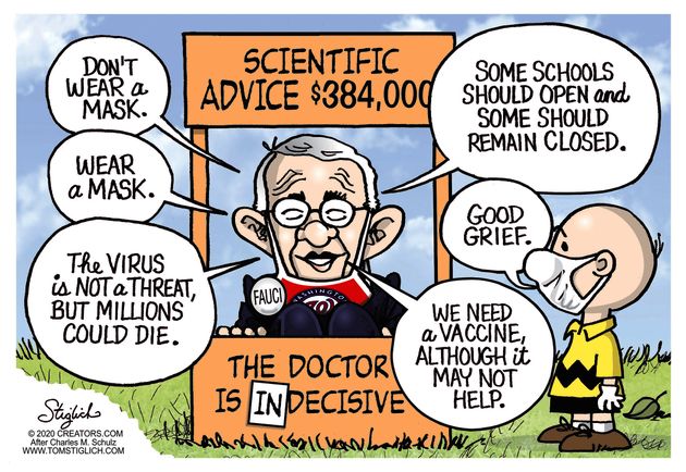
Dr. Fauci’s Hydroxychloroquine Denial
The commentary comes from Mikko Paunio’s article Dr. Fauci’s Hydroxychloroquine Denial. Excerpts in italics with my bolds.
As an epidemiologist, I believe that America has been profoundly ill-served by the contribution of its public health authorities to the debate on the efficacy of treating vulnerable COVID-19 patients with hydroxychloroquine (HCQ). It is a debate with a direct link to whether America’s schools should reopen next month. Even those who reject the World Health Organization’s misleading comparison of COVID-19 with the horrendous 1918 Spanish flu pandemic and its presumption that humans lack any immunity against SARS-CoV-2 would welcome improvements in our ability to treat patients with COVID-19, in order to reduce the risk in reopening schools.
Distinguished Yale epidemiologist Harvey Risch has written extensively on the meticulous research demonstrating the efficacy of the early administration of HCQ in combination with the antibiotic azithromycin and zinc. Conclusions from this research are based on criteria developed by British epidemiologist Sir Bradford Hill and Sir Richard Doll, two of the first scientists to discover the causal link between tobacco smoking and lung cancer, criteria that laid the foundations of modern epidemiology and that are used to this day to determine whether an observed association can be ascribed to causation.
Far from exploring this potential breakthrough in the treatment of COVID-19, the National Institutes of Health and the Food and Drug Administration (FDA) were both dismissive, condemning early outpatient treatment with the HCQ triple therapy as ineffective and dangerous. Instead, these agencies state that the only permissible way to determine its efficacy and safety is with randomized clinical trials (RCTs). Virologist Steven Hatfill has described a circle of self-reinforcing media commentary based on flawed, fraudulent, and withdrawn studies and the FDA’s mistaken decision to withdraw its HCQ Emergency Use Authorization, costing thousands of American lives. See The Real HCQ Story: What We Now Know
Demanding proof when time is short and when there is highly suggestive observational evidence has been condemned by Drs. George Fareed, Michael Jacobs, and Donald Pompan in an open letter to Dr. Fauci. They point out that the FDA has approved many drugs without RCTs—penicillin was so efficacious in treating pneumonia that there was no need for RCTs. Moreover, RCTs are not designed to test the efficacy of a therapy in high-risk outpatient settings before a patient is notified of the results of a test for COVID-19. It cannot be ethical for public health bodies to demand impossible standards of proof for potential lifesaving therapies.
To require an RCT for the HCQ triple therapy is indeed unethical; evidence supporting its use comes from large patient series, controlled trials, and even a natural experiment in the Brazilian state of Pará. In assessing ongoing patient outcomes, keep in mind that observations might be affected should the SARS-CoV-2 virus lose virulence. Spanish authorities report that fatality rates have fallen, even among elderly patients, which would be consistent with reduced SARS-CoV-2 virulence. This, too, should be considered by public authorities in assessing the risks associated with reopening schools. See Death toll mounts as FDA denies HCQ for outpatient therapy
Yet rather than engage in proper debate, Dr. Fauci has resorted to name-calling. “The pushback has been furious,” Risch writes. Dr. Fauci “has implied that I am incompetent, notwithstanding my hundreds of highly regarded, methodologically relevant publications in peer-reviewed scientific literature.” Dr. Fauci’s position calls to mind that of English statistician Ronald A. Fisher, who in the 1950s vehemently argued against Hill and Doll and their finding that smoking causes lung cancer, on very similar grounds to those used by Dr. Fauci to dispute the efficacy of HCQ—that observational data cannot prove causality. This is an extraordinary position for America’s leading health official to adopt; by the same logic, Dr. Fauci would deny the evidence that tobacco smoking kills. See Hydroxychloroquine: A Morality Tale
Dr. Fauci has also waded into the debate on reopening schools, arguing that they should remain closed where the virus is circulating. While the effect of reopening schools on community transmission is uncertain, we know that keeping them closed harms children, especially those in poorer communities. This should not be a matter of politics, left or right. In Britain, chief medical officers have issued a statement on the benefits of school to children and the “exceptionally small risk” of children dying from COVID-19. In my country, Finland, Prime Minister Sanna Marin, a left-of-center Social Democrat, decided in May that Finnish children should return to school, despite opposition from the teachers’ union.
It would be a needless calamity for America’s schools not to reopen at the start of the new school year—and a calamity not to protect the vulnerable with the most efficacious therapies we have.
Clinical evidence strongly supports the use of the HCQ triple therapy at an early stage for the elderly and those with comorbidities. I earnestly hope that Dr. Fauci reconsiders his opposition to HCQ and restores his hitherto considerable reputation. See HCQ Proven First Responder to SARS CV2
Dr. Mikko Paunio, an epidemiologist, has held positions at the University of Helsinki, Johns Hopkins Bloomberg School of Public Health, the European Commission, the World Bank, and the Ministry of Social Affairs and Health in Finland.
Footnote: Excerpt below from COVID-19, Orwell, and the media by Samar Razaq writing at the British Journal of General Practice.
The power of the numbers was immense; a nation paralysed despite being unable to put the numbers into any context. Telling patients that on average 10 000 people die every week in the UK2 (approximately 1500 every day) had little impact on them. The incessant 24-hour media coverage had everyone spooked by an invisible enemy, much like the Eurasian army that had spooked the inhabitants of London in Orwell’s novel.
As a degree of normality has begun to be restored, thanks to the persistently low prevalence levels of COVID-19, mundane chats with my patients often end up discussing the ‘second wave’. There seems to be a general preparedness among everyone for the ‘inevitable second wave’. Reading and hearing about the second wave often reminds me of Orwell’s masterful creation. There is a general agreement that there is no scientific consensus on what a second wave actually is; yet it is on the tongue of every doctor and patient I speak to. At what point does one declare that a second wave has begun?
The figure of 120 000 expected deaths in a winter peak makes the headlines,3 but the fact that the number could be as low as 1300 fails to get a mention in some news outlets.4 The Office for National Statistics reported a prevalence of 0.09% on 25 June 20205 (a non-significant rise from the 0.06% reported in the prior week due to overlapping confidence intervals).6 This was picked up by one media outlet as a cause for pessimism and a sign of a probable impending second wave.7 The prevalence dropped to 0.04% the following week.8 I noticed an amendment in the article a few days later, acknowledging this drop in terms of halving the number of cases.7 This received barely two lines hidden in the middle of the article, with no change to the pessimistic title of the article predicting the second wave. Data released on 17 July revealed a persistently low prevalence at 0.04%.9
Well-respected epidemiologists predicted, from the outset, that the societal, economic, and psychological harm from the unprecedented lockdowns were likely to be far greater than the perceived risk of death. However, such views were lost in the narrative of fear that predominated the early discussions on the matter and treated like an Orwellian Thoughtcrime.
As GPs we should reassure our patients and encourage their active participation in bringing forward other health worries that they may have been ignoring over the last few months.
It is important that as the collateral damage of the steps taken in the last few months to curb the virus becomes clearer and the lower than initially expected fatality rate emerges, a sense of responsibility is demonstrated by those charged with informing the public.
Postscript: This update from CDC (here) H/T William Briggs (here)
Table 3 shows the types of health conditions and contributing causes mentioned in conjunction with deaths involving coronavirus disease 2019 (COVID-19). For 6% of the deaths, COVID-19 was the only cause mentioned. For deaths with conditions or causes in addition to COVID-19, on average, there were 2.6 additional conditions or causes per death. The number of deaths with each condition or cause is shown for all deaths and by age groups.
Comment by William Briggs:
Six percent.
The other number of interest is the official coronadoom death total, which as of Sunday night is 167,558. Math is easy: 167,558 * 0.06 = 10,054. Rounded up, to be fair.
The remaining 157,504 died of other things—an average 2.6 other things!—with the presence of coronadoom. Some fraction of these poor people, considering false positives, died of just other things.
How many times, early on, did we scream, rant, and, yes, rave about juicing the numbers? The answer is a large positive number. Alas, the screams hit the ears of bureaucrats and politicians, our dumbest and evilest classes.
It must be recalled that many deaths were caused by the unnecessary lockdowns themselves. Lockdowns killed. This is not hyperbole or a guess. It is fact.


 Walter E. Williams, a columnist for The Daily Signal, is a professor of economics at George Mason University.