On Aug. 10 the FDA denied the urgent request for emergency approval for COVID-19 outpatient preventive and early treatment use of hydroxychloroquine (HCQ) filed July 1 by Dr. John McKinnon’s team at Henry Ford Hospital in Detroit, supported by Dr. Peter McCullough’s cardiology team at Baylor Heart and Vascular Institute in Dallas.
Approximately 48,000 more Americans have died during the FDA’s 48-day delay since this Emergency Use Authorization (EUA) was requested on July 1. Dr. McKinnon’s clinical trial found an impressive 51% reduction in deaths if HCQ was begun within 24 hours of admission to the hospital.
An outpatient primary care study by Dr. Vladimir Zelenko, using HCQ, azithromycin and zinc given within less than seven days of COVID-19 symptoms, showed approximately 80% decrease in deaths, and less than 1% of his patients needed to be hospitalized. These extraordinary results show how many lives can be saved with early HCQ treatment.
Dr. Harvey Risch, Yale epidemiologist, projected that widespread early treatment for COVID-19 with HCQ could have saved 100,000 American lives.
The physician head of the FDA, Dr. Steven Hahn, has again betrayed physicians and patients by preventing Americans from having the “right to try” HCQ for early COVID-19 treatment. Dr. Hahn knows full well the FDA approved HCQ as safe in 1955, and it has been used in millions of patients worldwide for 65 years with an impressive track record of safety in patients of all ages, all ethnic groups, and even pregnant women and nursing mothers.
The FDA’s denial of the EUA for early outpatient COVID-19 use of HCQ continues the agency’s false narrative in claiming outpatient harm for HCQ, based on inpatient data in critically ill patients. Dr. Hahn has ignored established facts of effectiveness and lack of harm for outpatients that have been established in more than 50 recent studies.
A newly released study from Turkeyfound no cardiac abnormalities with HCQ given at therapeutic doses for five days in early COVID patients. Attributing any late-stage cardiac effects to HCQ that is known to be caused by the virus and inflammatory damage is indefensible.
What amount of “data” will ever satisfy Dr. Hahn?
The FDA used a standard of “may be effective” for the rapid May 1 EUA given to the experimental anti-viral remdesivir, based on one controlled clinical trial terminated early. Yet FDA is now requiring a higher standard of a randomized controlled clinical trial for the already FDA-approved HCQ in safe use for 65 years. Remdesivir showed very little benefit shown in hospitalized COVID patients and had serious side effects.
Nine of the members of the NIH panel relied on for COVID treatment advice were supported financially by Gilead Sciences, maker of remdesivir.
As a cancer specialist, Dr. Hahn knows early treatment of any disease is critical, especially viral illness. But it is more critical with COVID-19, or SARS CoV-2, as we learned in 2005 when National Institutes of Health (NIH) and Centers for Disease Control and Prevention (CDC) published their studies from the 2002 outbreak of the closely related SARS-CoV-1 virus. These laboratory tests of possible anti-viral medicines clearly showed potent antiviral effects of chloroquine (CQ) against SARS-CoV-1 to block the SARS-CoV-1 infection at the earliest stage. Dr. Fauci was at NIH them, so he has known about this work for more than 15 years.
From these studies we know that HCQ with zinc works during the first five days to stop viral entry into our cells and to block the virus from multiplying.
Without HCQ and zinc, by day six or seven the viral load explodes and then triggers an exaggerated inflammatory response. This “cytokine storm” can severely damage critical organs: lungs, kidneys, heart, brain, liver and intestines and is often fatal.
Earlier this year, Dr. Peter McCullough’s team showed prophylactic benefits of HCQ given to hospital workers who were exposed to COVID daily in their work, just as found in India, South Korea, China and multiple other countries.
This preventive benefit of HCQ given once a week could protect front-line medical workers, law enforcement officers, paramedics, clergy, dentists/dental hygienists, truck drivers, food-processing workers, teachers, behavioral health professionals, factory and grocery store workers, flight attendants and many others. We could more safely reopen America’s businesses, schools and churches with doctors and patients having widespread, early access to HCQ.
Doctors treating COVID-19 patients NOW see lives being saved by cheap, safe, FDA-approved medicines – hydroxychloroquine with azithromycin or doxycycline, plus supplemental zinc, vitamin C and vitamin D.
Why don’t Americans have the freedom to use HCQ here as in other countries?
The FDA’s misleading statements about HCQ have led to dangerous, unprecedented restrictions on physicians’ off-label prescribing rights imposed by state governors, medical boards and pharmacy boards. The supply of HCQ has been ramped up to handle its use in early treatment of COVID. The Strategic National Stockpile has millions of doses deteriorating in government warehouses that are not being distributed because doctors are prevented for political reasons from prescribing for outpatients with COVID-19.
Americans are dying needlessly for political and financial agendas waiting for the “magic bullet” of a vaccine, not due to lack of available treatment for COVID-19. We still need therapeutics, such as HCQ, even if a vaccine works and is safe.
Testing is inaccurate and often unavailable, and HCQ dispensing must not be limited to persons with a positive test. Such limits also prevent prophylactic use. Governors and bureaucrats must not be allowed to arbitrarily restrict life-saving HCQ treatment.
The Fauci-Hahn strategies of suppressing the positive studies of HCQ effectiveness for outpatient use, while focusing on mandatory mask edicts and continued shutdowns of businesses, schools and churches are not controlling the pandemic. These political agendas have eroded our constitutional freedoms and devastated our financial, psychological, physical and spiritual well-being – while costing 1,000 American lives every day.
Dr. Hahn needs to be held accountable for the preventable deaths caused on his watch. As a physician licensed in three states that prevent prescribing HCQ for my patients, I submitted a formal request to the chairman of Senate Oversight Committee on Homeland Security and Governmental Affairs (HSGAC) for Dr. Hahn to be called before the Committee to produce the data on which the FDA is claiming “harm” in using HCQ for outpatients in the mild stage of COVID, but no such harm for RA, Lupus, or malaria. FDA’s hypocrisy ignores their own safety data, basic science, clinical studies and common sense.
Americans must speak out and demand the medical freedom to consult their physicians and decide treatment options without government interference.
Yoram Hazony explains the dire situation in USA, with global implications in his essay The Challenge of Marxism at The Quillette. Excerpts in italics with my bolds.
We don’t know what will happen for certain. But based on the experience of recent years, we can venture a pretty good guess. Institutional liberalism lacks the resources to contend with this threat. Liberalism is being expelled from its former strongholds, and the hegemony of liberal ideas, as we have known it since the 1960s, will end. Anti-Marxist liberals are about to find themselves in much the same situation that has characterized conservatives, nationalists, and Christians for some time now: They are about to find themselves in the opposition.
This means that some brave liberals will soon be waging war on the very institutions they so recently controlled. They will try to build up alternative educational and media platforms in the shadow of the prestigious, wealthy, powerful institutions they have lost. Meanwhile, others will continue to work in the mainstream media, universities, tech companies, philanthropies, and government bureaucracy, learning to keep their liberalism to themselves and to let their colleagues believe that they too are Marxists—just as many conservatives learned long ago how to keep their conservatism to themselves and let their colleagues believe they are liberals.
This is the new reality that is emerging. There is blood in the water and the new Marxists will not rest content with their recent victories. In America, they will press their advantage and try to seize the Democratic Party. They will seek to reduce the Republican Party to a weak imitation of their own new ideology, or to ban it outright as a racist organization. And in other democratic countries, they will attempt to imitate their successes in America. No free nation will be spared this trial. So let us not avert our eyes and tell ourselves that this curse isn’t coming for us. Because it is coming for us.
In this essay, I would like to offer some initial remarks about the new Marxist victories in America—about what has happened and what’s likely to happen next. (See article at red link above for parts I to V)
VI. The Marxist endgame and democracy’s end
The most basic thing one needs to know about a democratic regime, then, is this: You need to have at least two legitimate political parties for democracy to work. By a legitimate political party, I mean one that is recognized by its rivals as having a right to rule if it wins an election. For example, a liberal party may grant legitimacy to a conservative party (even though they don’t like them much), and in return this conservative party may grant legitimacy to a liberal party (even though they don’t like them much). Indeed, this is the way most modern democratic nations have been governed.
But legitimacy is one of those traditional political concepts that Marxist criticism is now on the verge of destroying.
From the Marxist point of view, our inherited concept of legitimacy is nothing more than an instrument the ruling classes use to perpetuate injustice and oppression. The word legitimacy takes on its true meaning only with reference to the oppressed classes or groups that the Marxist sees as the sole legitimate rulers of the nation. In other words, Marxist political theory confers legitimacy on only one political party—the party of the oppressed, whose aim is the revolutionary reconstitution of society. And this means that the Marxist political framework cannot co-exist with democratic government. Indeed, the entire purpose of democratic government, with its plurality of legitimate parties, is to avoid the violent reconstitution of society that Marxist political theory regards as the only reasonable aim of politics.
Simply put, the Marxist framework and democratic political theory are opposed to one another in principle.
A Marxist cannot grant legitimacy to liberal or conservative points of view without giving up the heart of Marxist theory, which is that these points of view are inextricably bound up with systematic injustice and must be overthrown, by violence if necessary. This is why the very idea that a dissenting opinion—one that is not “Progressive” or “Anti-Racist”—could be considered legitimate has disappeared from liberal institutions as Marxists have gained power. At first, liberals capitulated to their Marxist colleagues’ demand that conservative viewpoints be considered illegitimate (because conservatives are “authoritarian” or “fascist”). This was the dynamic that brought about the elimination of conservatives from most of the leading universities and media outlets in America.
But by the summer of 2020, this arrangement had run its course. In the United States, Marxists were now strong enough to demand that liberals fall into line on virtually any issue they considered pressing. In what were recently liberal institutions, a liberal point of view has likewise ceased to be legitimate. This is the meaning of the expulsion of liberal journalists from the New York Times and other news organisations. It is the reason that Woodrow Wilson’s name was removed from buildings at Princeton University, and for similar acts at other universities and schools. These expulsions and renamings are the equivalent of raising a Marxist flag over each university, newspaper, and corporation in turn, as the legitimacy of the old liberalism is revoked.
Until 2016, America sill had two legitimate political parties. But when Donald Trump was elected president, the talk of his being “authoritarian” or “fascist” was used to discredit the traditional liberal point of view, according to which a duly elected president, the candidate chosen by half the public through constitutional procedures, should be accorded legitimacy. Instead a “resistance” was declared, whose purpose was to delegitimize the president, those who worked with him, and those who voted for him.
I know that many liberals believe that this rejection of Trump’s legitimacy was directed only at him, personally. They believe, as a liberal friend wrote to me recently, that when this particular president is removed from office, America will be able to return to normal.
But nothing of the sort is going to happen.
The Marxists who have seized control of the means of producing and disseminating ideas in America cannot, without betraying their cause, confer legitimacy on any conservative government. And they cannot grant legitimacy to any form of liberalism that is not supine before them. This means that whatever President Trump’s electoral fortunes, the “resistance” is not going to end. It is just beginning.
With the Marxist conquest of liberal institutions, we have entered a new phase in American history (and, consequently, in the history of all democratic nations). We have entered the phase in which Marxists, having conquered the universities, the media, and major corporations, will seek to apply this model to the conquest of the political arena as a whole.
How will they do this? As in the universities and the media, they will use their presence within liberal institutions to force liberals to break the bonds of mutual legitimacy that bind them to conservatives—and therefore to two-party democracy. They will not demand the delegitimization of just President Trump, but of all conservatives. We’ve already seen this in the efforts to delegitimize the views of Senators Josh Hawley, Tom Cotton, and Tim Scott, as well as the media personality Tucker Carlson and others. Then they will move on to delegitimizing liberals who treat conservative views as legitimate, such as James Bennet, Bari Weiss, and Andrew Sullivan. As was the case in the universities and media, many liberals will accommodate these Marxist tactics in the belief that by delegitimizing conservatives they can appease the Marxists and turn them into strategic allies.
But the Marxists will not be appeased because what they’re after is the conquest of liberalism itself—already happening as they persuade liberals to abandon their traditional two-party conception of political legitimacy, and with it their commitment to a democratic regime. The collapse of the bonds of mutual legitimacy that have tied liberals to conservatives in a democratic system of government will not make the liberals in question Marxists quite yet. But it will make them the supine lackeys of these Marxists, without the power to resist anything that “Progressives” and “Anti-Racists” designate as being important.
And it will get them accustomed to the coming one-party regime, in which liberals will have a splendid role to play—if they are willing to give up their liberalism.
I know that many liberals are confused, and that they still suppose there are various alternatives before them. But it isn’t true. At this point, most of the alternatives that existed a few years ago are gone. Liberals will have to choose between two alternatives: either they will submit to the Marxists, and help them bring democracy in America to an end. Or they will assemble a pro-democracy alliance with conservatives. There aren’t any other choices.
Photo illustration by Slate. Photos by Thinkstock.
A glance at the news aggregator shows the silly season is in full swing. A partial listing of headlines proclaiming the hottest whatever.
Record-crushing heat, fire tornadoes and freak thunderstorms: The weather is wild in the West The Washington Post15:50
Tesla asks owners to help ‘relieve stress on grid’ during heat wave in California, charge… Electrek15:47
Death Valley’s 130-degree Heat Wave May Have Set a 107-year Record Travel & Leisure
Newsom Signs Emergency Proclamation to Free Up Energy Amid Heat Wave NBC Bay Area, California14:10
Dozens of heat records set to be broken this week as Western heat wave continues CNN14:10
Okanagan weather: Mid-30 degree heat to continue for early part of week Global News13:58
Heat Wave To Continue Through Thursday In San Diego County Patch13:40
Death Valley hits an insane 130 degrees, threatens heat records CNET13:18
Sunday brings more record highs as heat lingers Ventura County Star, California EU13:08
As West Coast Faces Historic Heat Wave & Energy Shortages, Governor Newsom Signs Heat Emergency Proclamation to Free Up … California State Portal (Press Release)13:00
California in grip of extreme weather: Broiling heat, fire tornadoes, lightning, blackouts Los Angeles Times11:29
Heat Wave Harvey? Push To Name Extreme Heat Events Warming Up KUER-FM11:20
Heat warnings posted for parts of B.C. as temperature records tumble The Globe and Mail10:49
Heat warnings issued for most of Alberta CBC.ca10:46
US heat wave leads to ‘hottest temperature ever’ and firenados CBBC Newsround07:34
2019 State of the Climate Report: Peak greenhouse gases and record heat EarthSky06:56
Should We Name Heat Waves Like We Name Hurricanes? Planet Friendly News06:41
Meteorologists are extending the heat warning Prague Monitor04:35
Worst Heat Wave in Years Sets Three Temperature Records in LA County NBC Los Angeles02:35
Worst Heat in 70 Years Threatens to Take Down California’s Grid BNN Bloomberg02:15
Heat Wave Grips S. Korea KBS World Radio00:54
Records Tumble As San Francisco Bay Area Swelters Under Stifling Heat Wave CBS San Francisco23:31 Sun, 16 Aug
Sofia Richie Beats Southern California Heat Wave At The Beach In Pink Thong Bikini The Inquisitr23:25 Sun, 16 Aug
After Record Breaking Heat, A Gradual Cooldown In Washington Patch23:21 Sun, 16 Aug
Heat waves, tropical nights to continue this week The Korea Herald22:47 Sun, 16 Aug
Thunderstorms and excessive heat fuel wildfires in California CBS News22:21 Sun, 16 Aug
Heat wave grips South Korea as monsoon season ends Bernama22:14 Sun, 16 Aug
Las Vegas reaches 113 again, ties 1939 record as heat wave continues Las Vegas Review-Journal22:04 Sun, 16 Aug
This past decade was the hottest decade in Earth’s history CNN03:50 Fri, 14 Aug
Last Decade Was Earth’s Hottest On Record UNILAD13:27 Thu, 13 Aug 111-Degree High Forecasted Next Week, Would Be One Of
Sacramento’s Hottest Days Ever CBS Sacramento13:27 Thu, 13 Aug
NWS warns this will be the ‘hottest weekend of the year’ in… San Antonio Express, Texas11:46 Thu, 13 Aug
July 2020 was record hot for N. Hemisphere, 2nd hottest for planet National Oceanic and Atmospheric Administration10:59 Thu, 13 Aug
London is experiencing its hottest weather since the ’60s Time Out London10:49 Thu, 13 Aug
Record shattered for hottest week in Dutch history NL Times10:29 Thu, 13 Aug
Belgium records hottest week in history Anadolu Agency10:00 Thu, 13 Aug
The 2010s were Earth’s hottest decade on record TheJournal.ie07:25 Thu, 13 Aug
Last year was one of the hottest since records began, ending the hottest decade SBS22:21 Wed, 12 Aug
2019 the hottest year on earth since records began, ending the hottest decade SBS21:51 Wed, 12 Aug
Last decade was hottest on record as climate crisis accelerates The Independent21:25 Wed, 12 Aug
Hottest night in 25 YEARS recorded in Reading Reading Chronicle14:03 Wed, 12 Aug
London sees hottest stretch since 1960s BBC12:09 Wed, 12 Aug
Last decade was Earth’s hottest on record as climate crisis accelerates The Guardian11:56 Wed, 12 Aug
Time for some Clear Thinking about Heat Records (Previous Post)
Here is an analysis using critical intelligence to interpret media reports about temperature records this summer. Daniel Engber writes in Slate Crazy From the Heat
The subtitle is Climate change is real. Record-high temperatures everywhere are fake. As we shall see from the excerpts below, The first sentence is a statement of faith, since as Engber demonstrates, the notion does not follow from the temperature evidence. Excerpts in italics with my bolds.
It’s been really, really hot this summer. How hot? Last Friday, the Washington Post put out a series of maps and charts to illustrate the “record-crushing heat.” All-time temperature highs have been measured in “scores of locations on every continent north of the equator,” the article said, while the lower 48 states endured the hottest-ever stretch of temperatures from May until July.
These were not the only records to be set in 2018. Historic heat waves have been crashing all around the world, with records getting shattered in Japan, broken on the eastern coast of Canada, smashed in California, and rewritten in the Upper Midwest. A city in Algeria suffered through the highest high temperature ever recorded in Africa. A village in Oman set a new world record for the highest-ever low temperature. At the end of July, the New York Times ran a feature on how this year’s “record heat wreaked havoc on four continents.” USA Today reported that more than 1,900 heat records had been tied or beaten in just the last few days of May.
While the odds that any given record will be broken may be very, very small, the total number of potential records is mind-blowingly enormous.
There were lots of other records, too, lots and lots and lots—but I think it’s best for me to stop right here. In fact, I think it’s best for all of us to stop reporting on these misleading, imbecilic stats. “Record-setting heat,” as it’s presented in news reports, isn’t really scientific, and it’s almost always insignificant. And yet, every summer seems to bring a flood of new superlatives that pump us full of dread about the changing climate. We’d all be better off without this phony grandiosity, which makes it seem like every hot and humid August is unparalleled in human history. It’s not. Reports that tell us otherwise should be banished from the news.
It’s true the Earth is warming overall, and the record-breaking heat that matters most—the kind we’d be crazy to ignore—is measured on a global scale. The average temperature across the surface of the planet in 2017 was 58.51 degrees, one-and-a-half degrees above the mean for the 20th century. These records matter: 17 of the 18 hottest years on planet Earth have occurred since 2001, and the four hottest-ever years were 2014, 2015, 2016, and 2017. It also matters that this changing climate will result in huge numbers of heat-related deaths. Please pay attention to these terrifying and important facts. Please ignore every other story about record-breaking heat.
You’ll often hear that these two phenomena are related, that local heat records reflect—and therefore illustrate—the global trend. Writing in Slate this past July, Irineo Cabreros explained that climate change does indeed increase the odds of extreme events, making record-breaking heat more likely. News reports often make this point, linking probabilities of rare events to the broader warming pattern. “Scientists say there’s little doubt that the ratcheting up of global greenhouse gases makes heat waves more frequent and more intense,” noted the Times in its piece on record temperatures in Algeria, Hong Kong, Pakistan, and Norway.
Yet this lesson is subtler than it seems. The rash of “record-crushing heat” reports suggest we’re living through a spreading plague of new extremes—that the rate at which we’re reaching highest highs and highest lows is speeding up. When the Post reports that heat records have been set “at scores of locations on every continent,” it makes us think this is unexpected. It suggests that as the Earth gets ever warmer, and the weather less predictable, such records will be broken far more often than they ever have before.
But that’s just not the case. In 2009, climatologist Gerald Meehl and several colleagues published an analysis of records drawn from roughly 2,000 weather stations in the U.S. between 1950 and 2006. There were tens of millions of data points in all—temperature highs and lows from every station, taken every day for more than a half-century. Meehl searched these numbers for the record-setting values—i.e., the days on which a given weather station saw its highest-ever high or lowest-ever low up until that point. When he plotted these by year, they fell along a downward-curving line. Around 50,000 new heat records were being set every year during the 1960s; then that number dropped to roughly 20,000 in the 1980s, and to 15,000 by the turn of the millennium.
From Meehl et al 2009.
This shouldn’t be surprising. As a rule, weather records will be set less frequently as time goes by. The first measurement of temperature that’s ever taken at a given weather station will be its highest (and lowest) of all time, by definition. There’s a good chance that the same station’s reading on Day 2 will be a record, too, since it only needs to beat the temperature recorded on Day 1. But as the weeks and months go by, this record-setting contest gets increasingly competitive: Each new daily temperature must now outdo every single one that came before. If the weather were completely random, we might peg the chances of a record being set at any time as 1/n, where n is the number of days recorded to that point. In other words, one week into your record-keeping, you’d have a 1 in 7 chance of landing on an all-time high. On the 100th day, your odds would have dropped to 1 percent. After 56 years, your chances would be very, very slim.
The weather isn’t random, though; we know it’s warming overall, from one decade to the next. That’s what Meehl et al. were looking at: They figured that a changing climate would tweak those probabilities, goosing the rate of record-breaking highs and tamping down the rate of record-breaking lows. This wouldn’t change the fundamental fact that records get broken much less often as the years go by. (Even though the world is warming, you’d still expect fewer heat records to be set in 2000 than in 1965.) Still, one might guess that climate change would affect the rate, so that more heat records would be set than we’d otherwise expect.
That’s not what Meehl found. Between 1950 and 2006, the rate of record-breaking heat seemed unaffected by large-scale changes to the climate: The number of new records set every year went down from one decade to the next, at a rate that matched up pretty well with what you’d see if the odds were always 1/n. The study did find something more important, though: Record-breaking lows were showing up much less often than expected. From one decade to the next, fewer records of any kind were being set, but the ratio of record lows to record highs was getting smaller over time. By the 2000s, it had fallen to about 0.5, meaning that the U.S. was seeing half as many record-breaking lows as record-breaking highs. (Meehl has since extended this analysis using data going back to 1930 and up through 2015. The results came out the same.)
What does all this mean? On one hand, it’s very good evidence that climate change has tweaked the odds for record-breaking weather, at least when it comes to record lows. (Other studies have come to the same conclusion.) On the other hand, it tells us that in the U.S., at least, we’re not hitting record highs more often than we were before, and that the rate isn’t higher than what you’d expect if there weren’t any global warming. In fact, just the opposite is true: As one might expect, heat records are getting broken less often over time, and it’s likely there will be fewer during the 2010s than at any point since people started keeping track.
This may be hard to fathom, given how much coverage has been devoted to the latest bouts of record-setting heat. These extreme events are more unusual, in absolute terms, than they’ve ever been before, yet they’re always in the news. How could that be happening?
While the odds that any given record will be broken may be very, very small, the total number of potential records that could be broken—and then reported in the newspaper—is mind-blowingly enormous. To get a sense of how big this number really is, consider that the National Oceanic and Atmospheric Administration keeps a database of daily records from every U.S. weather station with at least 30 years of data, and that its website lets you search for how many all-time records have been set in any given stretch of time. For instance, the database indicates that during the seven-day period ending on Aug. 17—the date when the Washington Post published its series of “record-crushing heat” infographics—154 heat records were broken.
That may sound like a lot—154 record-high temperatures in the span of just one week. But the NOAA website also indicates how many potential records could have been achieved during that time: 18,953. In actuality, less than one percent of these were broken. You can also pull data on daily maximum temperatures for an entire month: I tried that with August 2017, and then again for months of August at 10-year intervals going back to the 1950s. Each time the query returned at least about 130,000 potential records, of which one or two thousand seemed to be getting broken every year. (There was no apparent trend toward more records being broken over time.)
Now let’s say there are 130,000 high-temperature records to be broken every month in the U.S. That’s only half the pool of heat-related records, since the database also lets you search for all-time highest low temperatures. You can also check whether any given highest high or highest low happens to be a record for the entire month in that location, or whether it’s a record when compared across all the weather stations everywhere on that particular day.
Add all of these together and the pool of potential heat records tracked by NOAA appears to number in the millions annually, of which tens of thousands may be broken. Even this vastly underestimates the number of potential records available for media concern. As they’re reported in the news, all-time weather records aren’t limited to just the highest highs or highest lows for a given day in one location. Take, for example, the first heat record mentioned in this column, reported in the Post: The U.S. has just endured the hottest May, June, and July of all time. The existence of that record presupposes many others: What about the hottest April, May and June, or the hottest March, April, and May? What about all the other ways that one might subdivide the calendar?
Geography provides another endless well of flexibility. Remember that the all-time record for the hottest May, June, and July applied only to the lower 48 states. Might a different set of records have been broken if we’d considered Hawaii and Alaska? And what about the records spanning smaller portions of the country, like the Midwest, or the Upper Midwest, or just the state of Minnesota, or just the Twin Cities? And what about the all-time records overseas, describing unprecedented heat in other countries or on other continents?
Even if we did limit ourselves to weather records from a single place measured over a common timescale, it would still be possible to parse out record-breaking heat in a thousand different ways. News reports give separate records, as we’ve seen, for the highest daily high and the highest daily low, but they also tell us when we’ve hit the highest average temperature over several days or several weeks or several months. The Post describes a recent record-breaking streak of days in San Diego with highs of at least 83 degrees. (You’ll find stories touting streaks of daily highs above almost any arbitrary threshold: 90 degrees, 77 degrees, 60 degrees, et cetera.) Records also needn’t focus on the temperature at all: There’s been lots of news in recent weeks about the fact that the U.K. has just endured its driest-ever early summer.
“Record-breaking” summer weather, then, can apply to pretty much any geographical location, over pretty much any span of time. It doesn’t even have to be a record—there’s an endless stream of stories on “near-record heat” in one place or another, or the “fifth-hottest” whatever to happen in wherever, or the fact that it’s been “one of the hottest” yadda-yaddas that yadda-yadda has ever seen. In the most perverse, insane extension of this genre, news outlets sometimes even highlight when a given record isn’t being set.
Loose reports of “record-breaking heat” only serve to puff up muggy weather and make it seem important. (The sham inflations of the wind chill factor do the same for winter months.) So don’t be fooled or flattered by this record-setting hype. Your summer misery is nothing special.
Summary
This article helps people not to confuse weather events with climate. My disappointment is with the phrase, “Climate Change is Real,” since it is subject to misdirection. Engber uses that phrase referring to rising average world temperatures, without explaining that such estimates are computer processed reconstructions since the earth has no “average temperature.” More importantly the undefined “climate change” is a blank slate to which a number of meanings can be attached.
Some take it to mean: It is real that rising CO2 concentrations cause rising global warming. Yet that is not supported by temperature records. Others think it means: It is real that using fossil fuels causes global warming. This too lacks persuasive evidence. Over the last five decades the increase in fossil fuel consumption is dramatic and monotonic, steadily increasing by 234% from 3.5B to 11.7B oil equivalent tons. Meanwhile the GMT record from Hadcrut shows multiple ups and downs with an accumulated rise of 0.74C over 53 years, 5% of the starting value.
Others know that Global Mean Temperature is a slippery calculation subject to the selection of stations.
Graph showing the correlation between Global Mean Temperature (Average T) and the number of stations included in the global database. Source: Ross McKitrick, U of Guelph
Global warming estimates combine results from adjusted records. Conclusion
The pattern of high and low records discussed above is consistent with natural variability rather than rising CO2 or fossil fuel consumption. Those of us not alarmed about the reported warming understand that “climate change” is something nature does all the time, and that the future is likely to include periods both cooler and warmer than now.
We live in a culture that has uncritically accepted that every domain of life is political, and that even things we think are not political are so, that all human enterprises are merely power struggles, that even the idea of “truth” is a fantasy, and really a matter of imposing one’s view on others. For a while, some held out hope that science remained an exception to this. That scientists would not bring their personal political biases into their science, and they would not be mobbed if what they said was unwelcome to one faction or another. But the sordid 2020 drama of hydroxychloroquine—which saw scientists routinely attacked for critically evaluating evidence and coming to politically inconvenient conclusions—has, for many, killed those hopes.
Phase 1 of the pandemic saw the near collapse of the credible authority of much of our public health officialdom at the highest levels, led by the exposure of the corruption of the World Health Organization. The crisis was deepened by the numerous reversals on recommendations, which led to the growing belief that too many officials were interpreting, bending, or speaking about the science relevant to the pandemic in a politicized way. Phase 2 is equally dangerous, for it shows that politicization has started to penetrate the peer review process, and how studies are reported in scientific journals, and of course in the press.
What is unique about the hydroxychloroquine discussion is that it is a story of “unwishful thinking”—to coin a term for the perverse hope that some good outcome that most sane people would earnestly desire, will never come to pass. It’s about how, in the midst of a pandemic, thousands started earnestly hoping—before the science was really in—that a drug, one that might save lives at a comparatively low cost, would not actually do so. Reasonably good studies were depicted as sloppy work, fatally flawed. Many have excelled in making counterfeit bills that look real, but few have excelled at making real bills look counterfeit. As such, as we sort this out, we shall observe not only some “tricks” about how to make bad studies look like good ones, but also how to make good studies look like bad ones. And why should anyone facing a pandemic wish to discredit potentially lifesaving medications? Well, in fact, this ability can come in very handy in this midst of a plague, when many medications and vaccines are competing to Save the World—and for the billions of dollars that will go along with that.
So this story is twofold. It’s about the discussion that unfolded (and is still unfolding) around hydroxychloroquine, but if you’re here for a definitive answer to a narrow question about one specific drug (“does hydroxychloroquine work?”), you will be disappointed. Because what our tale is really concerned with is the perilous state of vulnerability of our scientific discourse, models, and institutions—which is arguably a much bigger, and more urgent problem, since there are other drugs that must be tested for safety and effectiveness (most complex illnesses like COVID-19 often require a group of medications) as well as vaccines, which would be slated to be given to billions of people. “This misbegotten episode regarding hydroxychloroquine will be studied by sociologists of medicine as a classic example of how extra-scientific factors overrode clear-cut medical evidence,” Yale professor of epidemiology Harvey A. Risch recently argued. Why not start studying it now?
Norman Doige tells the story in some detail (see article link in red at the top)
the history of quinine, chloroquine, and HCQ medical effectiveness;
how HCQ was used against SARS CV2 early on;
how Raoult was the one in his lab who came up with the idea of combining the two older drugs, HCQ and azithromycin, for COVID-19;
the criticisms of the French studies exemplifying “unwishful thinking”;
Trump’s interest in HCQ and the media backlash against the medicine;
the failure of ICU treatment protocols with ventilators and no alternatives to off-label prescribing;
the insistence upon Randomized Controlled Trials (RCTs) as the only valid test for HCQ;
the confounding factors in such studies and the problems replicating RCT results; and,
the publication in high-profile journals of studies structured for HCQ to fail to help infected patients.
Conclusion from Doige
Lots and lots of COVID-19 studies will come out—several hundred are in the works. People will hope more and more accumulating numbers—and more big data—will settle it. But big data, interpreted by people who have never treated any of the patients involved can be dangerous, a kind of exalted nonsense. It’s an old lesson: Quantity is not quality.
On this, I favor the all-available-evidence approach, which understands that large studies are important, but also that the medication that might be best for the largest number of people may not be best one for an individual patient. In fact, it would be typical of medicine that a number of different medications will be needed for COVID-19, and that there will be interactions of some with patient’s existing medications or conditions, so that the more medications we have to choose from, the better. We should be giving individual clinicians on the front lines the usual latitude to take account of their individual patient’s condition, and preferences, and encourage these physicians to bring to bear everything they have learned and read (they have been trained to read studies), and continue to read, but also what they have seen with their own eyes. Unlike medical bureaucrats or others who issue decrees from remote places physicians are literally on our front lines—actually observing the patients in question, and a Hippocratic Oath to serve them—and not the Lancet or WHO or CNN.
As contentious as this debate has been, and as urgent as the need for informed and timely information seems now, the reason to understand what happened with HCQ is for what it reflects about the social context within which science is now produced:
a landscape overly influenced by technology and its obsession with big data abstraction over concrete, tangible human experience;
academics who increasingly see all human activities as “political” power games, and so in good conscience can now justify inserting their own politics into academic pursuits and reporting;
extraordinarily powerful pharmaceutical companies competing for hundreds of billions of dollars;
politicians competing for pharmaceutical dollars as well as public adoration—both of which come these days too much from social media; and,
the decaying of the journalistic and scholarly super-layers that used to do much better holding everyone in this pyramid accountable, but no longer do, or even can.
If you think this year’s controversy is bad, consider that hydroxychloroquine is given to relatively few people with COVID-19, all sick, many with nothing to lose. It enters the body, and leaves fairly quickly, and has been known to us for decades. COVID vaccines, which advocates will want to be mandatory and given to all people—healthy and not, young and old—are being rushed past their normal safety precautions and regulations, and the typical five-to-10-year observation period is being waived to get “Operation Warp Speed” done as soon as possible.
This is being done with the endorsement of public health officials—the same ones, in many cases who are saying HCQ is suddenly extremely dangerous.
Philosophically, and psychologically, it is a fantastic spectacle to behold, a reversal, the magnitude and the chutzpah of which must inspire awe: a public health establishment, showing extraordinary risk aversion to medications and treatments that are extremely well known, and had been used by billions, suddenly throwing caution to the wind and endorsing the rollout of treatments that are entirely novel—and about which we literally can’t possibly know anything, as regards to their long-term effects. Their manufacturers know this well themselves, which is why they have aimed for, insisted on, and have already been granted indemnification—guaranteed, by those same public health officials and government that they will not be held legally accountable should their product cause injury.
From unheard of extremes of caution and “unwishful thinking,” to unheard of extremes of risk-taking, and recklessly wishful thinking, this double standard, this about-face, is not happening because this issue of public safety is really so complex a problem that only our experts can understand it; it is happening because there is, right now, a much bigger problem: with our experts, and with the institutions that we had trusted to help solve our most pressing scientific and medical problems.
Unless these are attended to, HCQ won’t be remembered simply as that major medical issue that no one could agree on, and which left overwhelming controversy, confusion, and possibly unnecessary deaths of tens of thousands in its wake; it will be one of many in a chain of such disasters.
Norman Doidge, a contributing writer for Tablet, is a psychiatrist, psychoanalyst, and author of The Brain That Changes Itself and The Brain’s Way of Healing.
The map shows that in Canada 9206 deaths have been attributed to Covid19, meaning people who died having tested positive for SARS CV2 virus. This number accumulated over a period of 198 days starting January 31. The daily death rate reached a peak of 177 on May 6, 2020, and is down to 6 as of yesterday. More details on this below, but first the summary picture. (Note: 2019 is the latest demographic report)
Canada Pop
Ann Deaths
Daily Deaths
Risk per Person
2019
37589262
330786
906
0.8800%
Covid 2020
37589262
9206
46
0.0245%
Over the epidemic months, the average Covid daily death rate amounted to 5% of the All Causes death rate. During this time a Canadian had an average risk of 1 in 5000 of dying with SARS CV2 versus a 1 in 114 chance of dying regardless of that infection. As shown later below the risk varied greatly with age, much lower for younger, healthier people.
Background Updated from Previous Post
In reporting on Covid19 pandemic, governments have provided information intended to frighten the public into compliance with orders constraining freedom of movement and activity. For example, the above map of the Canadian experience is all cumulative, and the curve will continue upward as long as cases can be found and deaths attributed. As shown below, we can work around this myopia by calculating the daily differentials, and then averaging newly reported cases and deaths by seven days to smooth out lumps in the data processing by institutions.
A second major deficiency is lack of reporting of recoveries, including people infected and not requiring hospitalization or, in many cases, without professional diagnosis or treatment. The only recoveries presently to be found are limited statistics on patients released from hospital. The only way to get at the scale of recoveries is to subtract deaths from cases, considering survivors to be in recovery or cured. Comparing such numbers involves the delay between infection, symptoms and death. Herein lies another issue of terminology: a positive test for the SARS CV2 virus is reported as a case of the disease COVID19. In fact, an unknown number of people have been infected without symptoms, and many with very mild discomfort.
August 7 in the UK it was reported (here) that around 10% of coronavirus deaths recorded in England – almost 4,200 – could be wiped from official records due to an error in counting. Last month, Health Secretary Matt Hancock ordered a review into the way the daily death count was calculated in England citing a possible ‘statistical flaw’. Academics found that Public Health England’s statistics included everyone who had died after testing positive – even if the death occurred naturally or in a freak accident, and after the person had recovered from the virus. Numbers will now be reconfigured, counting deaths if a person died within 28 days of testing positive much like Scotland and Northern Ireland…
Professor Heneghan, director of the Centre for Evidence-Based Medicine at Oxford University, who first noticed the error, told the Sun:
‘It is a sensible decision. There is no point attributing deaths to Covid-19 28 days after infection…
For this discussion let’s assume that anyone reported as dying from COVD19 tested positive for the virus at some point prior. From the reasoning above let us assume that 28 days after testing positive for the virus, survivors can be considered recoveries.
Recoveries are calculated as cases minus deaths with a lag of 28 days. Daily cases and deaths are averages of the seven days ending on the stated date. Recoveries are # of cases from 28 days earlier minus # of daily deaths on the stated date. Since both testing and reports of Covid deaths were sketchy in the beginning, this graph begins with daily deaths as of April 24, 2020 compared to cases reported on March 27, 2020.
The line shows the Positivity metric for Canada starting at nearly 8% for new cases April 24, 2020. That is, for the 7 day period ending April 24, there were a daily average of 21,772 tests and 1715 new cases reported. Since then the rate of new cases has dropped down, now holding steady at ~1% since mid-June. Yesterday, the daily average number of tests was 47,221 with 377 new cases. So despite more than doubling the testing, the positivity rate is not climbing. Another view of the data is shown below.
The scale of testing has increased and has now reached nearly 50,000 a day, while positive tests (cases) are hovering at 1% positivity. The shape of the recovery curve resembles the case curve lagged by 28 days, since death rates are a small portion of cases. The recovery rate has grown from 83% to 98% steady over the last 3 weeks, so that recoveries now exceed new positives. This approximation surely understates the number of those infected with SAR CV2 who are healthy afterwards, since antibody studies show infection rates multiples higher than confirmed positive tests (8 times higher in Canada). In absolute terms, cases are now down to 377 a day and deaths 6 a day, while estimates of recoveries are 386 a day.
Summary of Canada Covid Epidemic
It took a lot of work, but I was able to produce something akin to the Dutch advice to their citizens.
The media and governmental reports focus on total accumulated numbers which are big enough to scare people to do as they are told. In the absence of contextual comparisons, citizens have difficulty answering the main (perhaps only) question on their minds: What are my chances of catching Covid19 and dying from it?
A previous post reported that the Netherlands parliament was provided with the type of guidance everyone wants to see.
The table presents only those cases with a full clinical documentation, which included some 2194 deaths compared to the 5842 total reported. The numbers show that under 60 years old, few adults and almost no children have anything to fear.
Update May 20, 2020
It is really quite difficult to find cases and deaths broken down by age groups. For Canadian national statistics, I resorted to a report from Ontario to get the age distributions, since that province provides 69% of the cases outside of Quebec and 87% of the deaths. Applying those proportions across Canada results in this table. For Canada as a whole nation:
Age
Risk of Test +
Risk of Death
Population per 1 CV death
<20
0.05%
None
NA
20-39
0.20%
0.000%
431817
40-59
0.25%
0.002%
42273
60-79
0.20%
0.020%
4984
80+
0.76%
0.251%
398
In the worst case, if you are a Canadian aged more than 80 years, you have a 1 in 400 chance of dying from Covid19. If you are 60 to 80 years old, your odds are 1 in 5000. Younger than that, it’s only slightly higher than winning (or in this case, losing the lottery).
As noted above Quebec provides the bulk of cases and deaths in Canada, and also reports age distribution more precisely, The numbers in the table below show risks for Quebecers.
Age
Risk of Test +
Risk of Death
Population per 1 CV death
0-9 yrs
0.13%
0
NA
10-19 yrs
0.21%
0
NA
20-29 yrs
0.50%
0.000%
289,647
30-39
0.51%
0.001%
152,009
40-49 years
0.63%
0.001%
73,342
50-59 years
0.53%
0.005%
21,087
60-69 years
0.37%
0.021%
4,778
70-79 years
0.52%
0.094%
1,069
80-89
1.78%
0.469%
213
90 +
5.19%
1.608%
62
While some of the risk factors are higher in the viral hotspot of Quebec, it is still the case that under 80 years of age, your chances of dying from Covid 19 are better than 1 in 1000, and much better the younger you are.
The annual competition between ice and water in the Arctic ocean is approaching the maximum for water, which typically occurs mid September. After that, diminishing energy from the slowly setting sun allows oceanic cooling causing ice to regenerate. Those interested in the dynamics of Arctic sea ice can read numerous posts here. This post provides a look at mid August from 2007 to yesterday as a context for anticipating this year’s annual minimum. Note that for climate purposes the annual minimum is measured by the September monthly average ice extent, since the daily extents vary and will go briefly lower on or about day 260.
The melting season in August up to yesterday shows 2020 below average but appearing to consolidate in the recent days.
Both MASIE and SII show 2020 ice extents below average and other years beginning August and matching 2019 by mid month. In contrast 2007 melted more slowly than other years reaching average later in August before dropping at the end. 2012 was an average year until the 2012 Great Cyclone, whose effects started after day 230 precipitating a drop of 1.7M km2 of ice in just two weeks. And as we know, 2012 went on to record the lowest September in the record.
The table for day 228 shows how the ice is distributed across the various seas comprising the Arctic Ocean.
Region
2020228
Day 228 Average
2020-Ave.
2007228
2020-2007
(0) Northern_Hemisphere
5081593
5844411
-762818
5640240
-558648
(1) Beaufort_Sea
831909
664315
167594
769154
62755
(2) Chukchi_Sea
405793
398698
7094
256889
148903
(3) East_Siberian_Sea
274583
552107
-277523
163257
111326
(4) Laptev_Sea
21598
253760
-232161
292592
-270994
(5) Kara_Sea
17604
86914
-69311
192800
-175196
(6) Barents_Sea
3285
27907
-24622
15859
-12574
(7) Greenland_Sea
235942
221912
14030
308560
-72618
(8) Baffin_Bay_Gulf_of_St._Lawrence
11620
55856
-44236
81722
-70102
(9) Canadian_Archipelago
359629
415244
-55615
379795
-20166
(10) Hudson_Bay
48519
71815
-23296
90668
-42149
(11) Central_Arctic
2870439
3094846
-224407
3087687
-217247
The extent numbers show that this year’s melt is dominated by the surprisingly hot Siberian summer, leading to major deficits in all the Eurasian shelf seas–East Siberian, Laptev, Kara. As well, the bordering parts of the Central Arctic show a sizeable deficit to average.
It is also the case that many regions have already registered their 2020 minimums. And as discussed below, the marginal basins have little ice left to lose.
The Bigger Picture
We are close to the annual Arctic ice extent minimum, which typically occurs on or about day 260 (mid September). Some take any year’s slightly lower minimum as proof that Arctic ice is dying, but the image above shows the Arctic heart is beating clear and strong.
Over this decade, the Arctic ice minimum has not declined, but since 2007 looks like fluctuations around a plateau. By mid-September, all the peripheral seas have turned to water, and the residual ice shows up in a few places. The table below indicates where we can expect to find ice this September. Numbers are area units of Mkm2 (millions of square kilometers).
Day 260
13 year
Arctic Regions
2007
2010
2012
2014
2015
2016
2017
2018
2019
Average
Central Arctic Sea
2.67
3.16
2.64
2.98
2.93
2.92
3.07
2.91
2.97
2.93
BCE
0.50
1.08
0.31
1.38
0.89
0.52
0.84
1.16
0.46
0.89
LKB
0.29
0.24
0.02
0.19
0.05
0.28
0.26
0.02
0.11
0.16
Greenland & CAA
0.56
0.41
0.41
0.55
0.46
0.45
0.52
0.41
0.36
0.46
B&H Bays
0.03
0.03
0.02
0.02
0.10
0.03
0.07
0.05
0.01
0.04
NH Total
4.05
4.91
3.40
5.13
4.44
4.20
4.76
4.56
3.91
4.48
The table includes three early years of note along with the last 6 years compared to the 13 year average for five contiguous arctic regions. BCE (Beaufort, Chukchi and East Siberian) on the Asian side are quite variable as the largest source of ice other than the Central Arctic itself. Greenland Sea and CAA (Canadian Arctic Archipelago) together hold almost 0.5M km2 of ice at annual minimum, fairly consistently. LKB are the European seas of Laptev, Kara and Barents, a smaller source of ice, but a difference maker some years, as Laptev was in 2016. Baffin and Hudson Bays are inconsequential as of day 260.
For context, note that the average maximum has been 15M, so on average the extent shrinks to 30% of the March high before growing back the following winter. In this context, it is foolhardy to project any summer minimum forward to proclaim the end of Arctic ice.
The best context for understanding decadal temperature changes comes from the world’s sea surface temperatures (SST), for several reasons:
The ocean covers 71% of the globe and drives average temperatures;
SSTs have a constant water content, (unlike air temperatures), so give a better reading of heat content variations;
A major El Nino was the dominant climate feature in recent years.
HadSST is generally regarded as the best of the global SST data sets, and so the temperature story here comes from that source, the latest version being HadSST3. More on what distinguishes HadSST3 from other SST products at the end.
The Current Context
The chart below shows SST monthly anomalies as reported in HadSST3 starting in 2015 through July 2020. A global cooling pattern is seen clearly in the Tropics since its peak in 2016, joined by NH and SH cycling downward since 2016. In 2019 all regions had been converging to reach nearly the same value in April.
Then NH rose exceptionally by almost 0.5C over the four summer months, in August exceeding previous summer peaks in NH since 2015. In the last 4 months of 2019 that warm NH pulse reversed sharply. Now in 2020 the first 4 months show little change from last December. June dropped sharply in SH and Tropics, but now in July we again see a pulse of warm water in the NH along with a smaller rise in the Tropics. NH anomaly in July 2020 matches July a year ago, and may set up for an even warmer August.
I am surprised since the UAH ocean air anomaly for July 2020 did not show such a warming spike.
Note that higher temps in 2015 and 2016 were first of all due to a sharp rise in Tropical SST, beginning in March 2015, peaking in January 2016, and steadily declining back below its beginning level. Secondly, the Northern Hemisphere added three bumps on the shoulders of Tropical warming, with peaks in August of each year. A fourth NH bump was lower and peaked in September 2018. As noted above, a fifth peak in August 2019 exceeded the four previous upward bumps in NH.
And as before, note that the global release of heat was not dramatic, due to the Southern Hemisphere offsetting the Northern one. The major difference between now and 2015-2016 is the absence of Tropical warming driving the SSTs.
A longer view of SSTs
The graph below is noisy, but the density is needed to see the seasonal patterns in the oceanic fluctuations. Previous posts focused on the rise and fall of the last El Nino starting in 2015. This post adds a longer view, encompassing the significant 1998 El Nino and since. The color schemes are retained for Global, Tropics, NH and SH anomalies. Despite the longer time frame, I have kept the monthly data (rather than yearly averages) because of interesting shifts between January and July.
1995 is a reasonable (ENSO neutral) starting point prior to the first El Nino. The sharp Tropical rise peaking in 1998 is dominant in the record, starting Jan. ’97 to pull up SSTs uniformly before returning to the same level Jan. ’99. For the next 2 years, the Tropics stayed down, and the world’s oceans held steady around 0.2C above 1961 to 1990 average.
Then comes a steady rise over two years to a lesser peak Jan. 2003, but again uniformly pulling all oceans up around 0.4C. Something changes at this point, with more hemispheric divergence than before. Over the 4 years until Jan 2007, the Tropics go through ups and downs, NH a series of ups and SH mostly downs. As a result the Global average fluctuates around that same 0.4C, which also turns out to be the average for the entire record since 1995.
2007 stands out with a sharp drop in temperatures so that Jan.08 matches the low in Jan. ’99, but starting from a lower high. The oceans all decline as well, until temps build peaking in 2010.
Now again a different pattern appears. The Tropics cool sharply to Jan 11, then rise steadily for 4 years to Jan 15, at which point the most recent major El Nino takes off. But this time in contrast to ’97-’99, the Northern Hemisphere produces peaks every summer pulling up the Global average. In fact, these NH peaks appear every July starting in 2003, growing stronger to produce 3 massive highs in 2014, 15 and 16. NH July 2017 was only slightly lower, and a fifth NH peak still lower in Sept. 2018.
The highest summer NH peak came in 2019, only this time the Tropics and SH are offsetting rather adding to the warming. Since 2014 SH has played a moderating role, offsetting the NH warming pulses. (Note: these are high anomalies on top of the highest absolute temps in the NH.) July 2020 showed a sharp rise to match 2019 and may exceed last August.
What to make of all this? The patterns suggest that in addition to El Ninos in the Pacific driving the Tropic SSTs, something else is going on in the NH. The obvious culprit is the North Atlantic, since I have seen this sort of pulsing before. After reading some papers by David Dilley, I confirmed his observation of Atlantic pulses into the Arctic every 8 to 10 years.
But the peaks coming nearly every summer in HadSST require a different picture. Let’s look at August, the hottest month in the North Atlantic from the Kaplan dataset. The AMO Index is from from Kaplan SST v2, the unaltered and not detrended dataset. By definition, the data are monthly average SSTs interpolated to a 5×5 grid over the North Atlantic basically 0 to 70N. The graph shows warming began after 1992 up to 1998, with a series of matching years since. Because the N. Atlantic has partnered with the Pacific ENSO recently, let’s take a closer look at some AMO years in the last 2 decades.
This graph shows monthly AMO temps for some important years. The Peak years were 1998, 2010 and 2016, with the latter emphasized as the most recent. The other years show lesser warming, with 2007 emphasized as the coolest in the last 20 years. Note the red 2018 line is at the bottom of all these tracks.
The black line shows that 2020 began near average, but is showing higher temperatures the last three months than any year in the record except for tracking 2010. Now this year is matching 2016 as the warmest in recent decades. It appears that the Atlantic is driving warming in NH and Tropics this year. If 2020 does average out higher than 2019, remember that it came from the ocean, in particular the North Atlantic.
Summary
The oceans are driving the warming this century. SSTs took a step up with the 1998 El Nino and have stayed there with help from the North Atlantic, and more recently the Pacific northern “Blob.” The ocean surfaces are releasing a lot of energy, warming the air, but eventually will have a cooling effect. The decline after 1937 was rapid by comparison, so one wonders: How long can the oceans keep this up? If the pattern of recent years continues, NH SST anomalies may rise slightly in coming months, but once again, ENSO which has weakened will probably determine the outcome.
Footnote: Why Rely on HadSST3
HadSST3 is distinguished from other SST products because HadCRU (Hadley Climatic Research Unit) does not engage in SST interpolation, i.e. infilling estimated anomalies into grid cells lacking sufficient sampling in a given month. From reading the documentation and from queries to Met Office, this is their procedure.
HadSST3 imports data from gridcells containing ocean, excluding land cells. From past records, they have calculated daily and monthly average readings for each grid cell for the period 1961 to 1990. Those temperatures form the baseline from which anomalies are calculated.
In a given month, each gridcell with sufficient sampling is averaged for the month and then the baseline value for that cell and that month is subtracted, resulting in the monthly anomaly for that cell. All cells with monthly anomalies are averaged to produce global, hemispheric and tropical anomalies for the month, based on the cells in those locations. For example, Tropics averages include ocean grid cells lying between latitudes 20N and 20S.
Gridcells lacking sufficient sampling that month are left out of the averaging, and the uncertainty from such missing data is estimated. IMO that is more reasonable than inventing data to infill. And it seems that the Global Drifter Array displayed in the top image is providing more uniform coverage of the oceans than in the past.
USS Pearl Harbor deploys Global Drifter Buoys in Pacific Ocean
Figure 1. The global annual mean energy budget of Earth’s climate system (Trenberth and Fasullo, 2012.)
Recently in a discussion thread a warming proponent suggested we read this paper for conclusive evidence. The greenhouse effect and carbon dioxide by Wenyi Zhong and Joanna D. Haigh (2013) Imperial College, London. Indeed as advertised the paper staunchly presents IPCC climate science. Excerpts in italics with my bolds.
IPCC Conception: Earth’s radiation budget and the Greenhouse Effect
The Earth is bathed in radiation from the Sun, which warms the planet and provides all the energy driving the climate system. Some of the solar (shortwave) radiation is reflected back to space by clouds and bright surfaces but much reaches the ground, which warms and emits heat radiation. This infrared (longwave) radiation, however, does not directly escape to space but is largely absorbed by gases and clouds in the atmosphere, which itself warms and emits heat radiation, both out to space and back to the surface. This enhances the solar warming of the Earth producing what has become known as the ‘greenhouse effect’. Global radiative equilibrium is established by the adjustment of atmospheric temperatures such that the flux of heat radiation leaving the planet equals the absorbed solar flux.
The schematic in Figure 1, which is based on available observational data, illustrates the magnitude of these radiation streams. At the Earth’s distance from the Sun the flux of radiant energy is about 1365Wm−2 which, averaged over the globe, amounts to 1365/4 = 341W for each square metre. Of this about 30% is reflected back to space (by bright surfaces such as ice, desert and cloud) leaving 0.7 × 341 = 239Wm−2 available to the climate system. The atmosphere is fairly transparent to short wavelength solar radiation and only 78Wm−2 is absorbed by it, leaving about 161Wm−2 being transmitted to, and absorbed by, the surface. Because of the greenhouse gases and clouds the surface is also warmed by 333Wm−2 of back radiation from the atmosphere. Thus the heat radiation emitted by the surface, about 396Wm−2, is 157Wm−2 greater than the 239Wm−2 leaving the top of the atmosphere (equal to the solar radiation absorbed) – this is a measure of ‘greenhouse trapping’.
Key Points: Thus greenhouse-warming theory and the diagram above is based on these mistaken assumptions:
(1) that radiative energy can be quantified by a single number of watts per square meter, (2) the assumption that these radiative forcings can be added together, and (3) the assumption that Earth’s surface temperature is proportional to the sum of all of these radiative forcings.
There are other serious problems:
(4) greenhouse gases absorb only a small part of the radiation emitted by Earth, (5) they can only reradiate what they absorb, (6) they do not reradiate in every direction as assumed, (7) they make up only a tiny part of the gases in the atmosphere, and (8) they have been shown by experiment not to cause significant warming. (9) The thermal effects of radiation are not about amount of radiation absorbed, as currently assumed, they are about the temperature of the emitting body and the difference in temperature between the emitting and the absorbing bodies as described below.
Back to the Basics of Radiative Warming in Earth’s Atmosphere
What Physically Is Thermal Radiation?
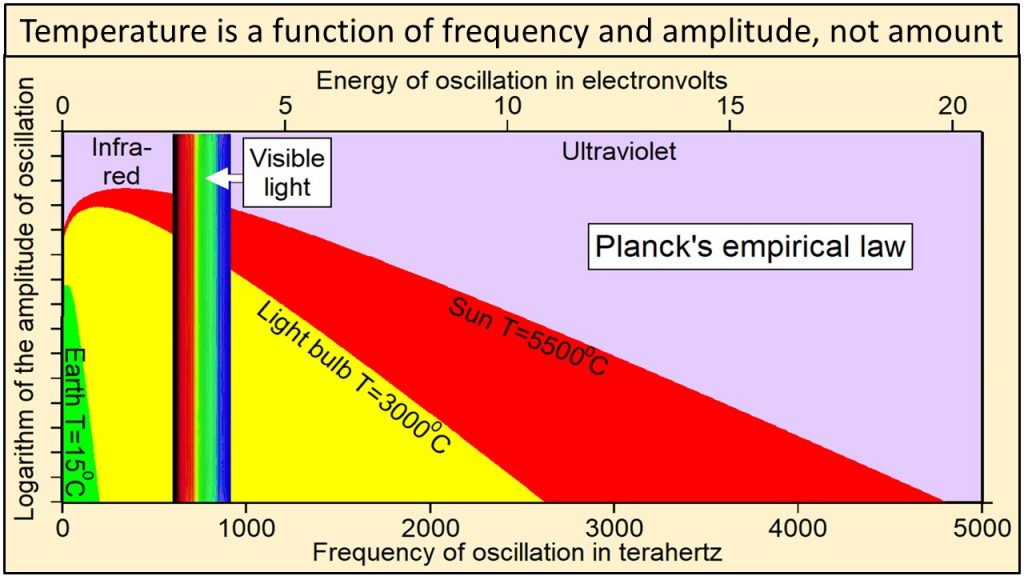
We physically measure visible light as containing all frequencies of oscillation ranging from 450 to 789 terahertz, where one terahertz is one-trillion cycles per second (10^12 cycles per second). We also observe that the visible spectrum is but a very small part of a much wider continuum that we call electromagnetic radiation. Electromagnetic continuum with frequencies extending over more than 20 orders of magnitude from extremely low frequency radio signals in cycles per second to microwave, infrared, visible, ultraviolet, X-rays, to gamma rays with frequencies of more than 100 million, million, million cycles per second (10^20 cycles per second). Thermal radiation is a portion of this continuum of electromagnetic radiation radiated by abody of matter as a result of the body’s temperature—the hotter the body, shown here at the bottom as Temperature, the higher the radiated frequencies of oscillation with significant amplitudes of oscillation.
We observe that electromagnetic radiation has two physical properties: 1) frequency of oscillation, which is color in the visible part of the continuum, and 2) amplitude of oscillation, which we perceive as intensity or brightness at each frequency. Planck’s law In 1900, Max Planck, one of the fathers of modern physics, derived an equation by trial and error that has become known as Planck’s empirical law. Planck’s empirical law is not based on theory, although several derivations have been proposed. It was formulated solely to calculate correctly the intensities at each frequency observed during extensive direct observations of Nature. Planck’s empirical law calculates the observed intensity or amplitude of oscillation at each frequency of oscillation for radiation emitted by a black body of matter at a specific temperature and at thermal equilibrium. A black body is simply a perfect absorber and emitter of all frequencies of radiation.
Thermal radiation from Earth, at a temperature of 15C, consists of the narrow continuum of frequencies of oscillation shown in green in this plot of Planck’s empirical law. Thermal radiation from the tungsten filament of an incandescent light bulb at 3000C consists of a broader continuum of frequencies shown in yellow and green. Thermal radiation from Sun at 5500C consists of a much broader continuum of frequencies shown in red, yellow and green.
Note in this plot of Planck’s empirical law that the higher the temperature, 1) the broader the continuum of frequencies, 2) the higher the amplitude of oscillation at each and every frequency, and 3) the higher the frequencies of oscillation that are oscillating with the largest amplitudes of oscillation.
Radiation from Sun shown in red, yellow, and green clearly contains much higher frequencies and amplitudes of oscillation than radiation from Earth shown in green. Planck’s empirical law shows unequivocally that the physical properties of radiation are a function of the temperature of the body emitting the radiation.
Heat, defined in concept as that which must be absorbed by solid matter to increase its temperature, is similarly a broad continuum of frequencies of oscillation and corresponding amplitudes of oscillation.
For example, the broad continuum of heat that Earth, with a temperature of 15C, must absorb to reach a temperature of 3000C is shown by the continuum of values within the yellow-shaded area in this plot of Planck’s empirical law.
Heat is, therefore, a broad continuum of frequencies and amplitudes of oscillation that cannot be described by a single number of watts per square meter as currently assumed in physics and in greenhouse-warming theory. The physical properties of heat as described by Planck’s empirical law and the thermal effects of this heat are determined both by the temperature of the emitting body and, as we will see below, by the difference in temperature between the emitting body and the absorbing body.
Greenhouse Gases Limited to Low Energy Frequencies
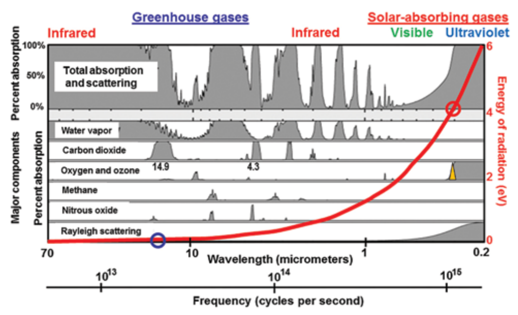
Figure 1.10 When ozone is depleted, a narrow sliver of solar ultraviolet-B radiation with wavelengths close to 0.31 µm (yellow triangle) reaches Earth. The red circle shows that the energy of this ultraviolet radiation is around 4 electron volts (eV) on the red scale on the right, 48 times the energy absorbed most strongly by carbon dioxide (blue circle, 0.083 eV at 14.9 micrometers (µm) wavelength. Shaded grey areas show the bandwidths of absorption by different greenhouse gases. Current computer models calculate radiative forcing by adding up the areas under the broadened spectral lines that make up these bandwidths. Net radiative energy, however, is proportional to frequency only (red line), not to amplitude, bandwidth, or amount.
Greenhouse gases absorb only certain limited bands of frequencies of radiation emitted by Earth as shown in this diagram. Water is, by far, the strongest absorber, especially at lower frequencies.
Climate models neglect the fact, shown by the red line in Figure 1.10 and explained in Chapter 4, that due to its higher frequency, ultraviolet radiation (red circle) is 48 times more energy-rich, 48 times “hotter,” than infrared absorbed by carbon dioxide (blue circle), which means that there is a great deal more energy packed into that narrow sliver of ultraviolet (yellow triangle) than there is in the broad band of infrared. This actually makes very good intuitive sense. From personal experience, we all know that we get very hot and are easily sunburned when standing in ultraviolet sunlight during the day, but that we have trouble keeping warm at night when standing in infrared energy rising from Earth.
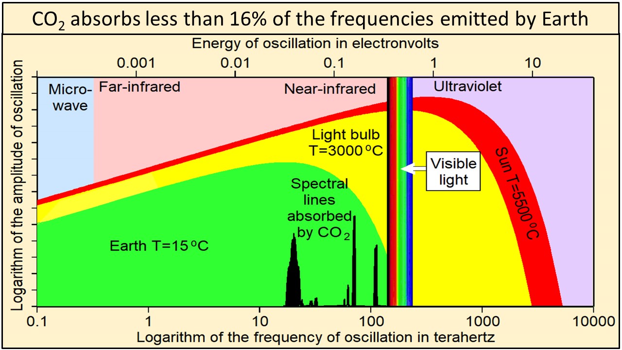
Ångström (1900) showed that “no more than about 16 percent of earth’s radiation can be absorbed by atmospheric carbon dioxide, and secondly, that the total absorption is very little dependent on the changes in the atmospheric carbon dioxide content, as long as it is not smaller than 0.2 of the existing value.” Extensive modern data agree that carbon dioxide absorbs less than 16% of the frequencies emitted by Earth shown by the vertical black lines of this plot of Planck’s empirical law where frequencies are plotted on a logarithmic x-axis. These vertical black lines show frequencies and relative amplitudes only. Their absolute amplitudes on this plot are arbitrary.
Temperature at Earth’s surface is the result of the broad continuum of oscillations shown in green. Absorbing less than 16% of the frequencies emitted by Earth cannot have much effect on the temperature of anything.
Summary
Greenhouse warming theory depends on at least nine assumptions that appear to be mistaken. Greenhouse warming theory has never been shown to be physically possible by experiment, a cornerstone of the scientific method. Greenhouse warming theory is rapidly becoming the most expensive mistake ever made in the history of science, economically, politically, and environmentally.
This post is about the radiative properties of CO2 severely limiting its potential to cause global warming. A separate issue is the belief by warmists and some skeptics that humans are the primary cause of CO2 increases in the atmosphere. I have looked at this and concluded that natural sources and sinks are more likely responsible, as explained in the post What Causes Rising Atmospheric CO2?
Some time ago PM Trudeau floated the idea that pandemic shutdowns can’t be lifted until a vaccine is available. More recently, the lack of a vaccine is touted in the US as a reason for keeping schools closed and travel restrictions in place. What is this obsession with a vaccine as the savior whose healing powers we must await while hiding in isolation? As a previous post reprinted below explains, it is again a case of generals fighting a past war rather than the current one.
But let’s also be attentive to a bait and switch involving shifty use of words. A vaccine by definition works by training our immune system to recognize and resist a targeted pathogen. And it’s a long road to perfecting an agent which achieves that without doing harm to some or many individuals. Meanwhile Bill Gates is promoting something termed a “vaccine” which intends to modify our DNA to defend against SARS CV2. That is not like smallpox or polio vaccine. It is more like making humans a genetically modified organism (GMOs).
I have nothing against GMO plant inventions. As a British princess Anne reminded last month, the world benefited greatly from Canadian researchers who genetically modified rapeseed plants resulting in the nutritionally superior Canola vegetable oil. The “Green Revolution”, involving yellow rice relies on responsible use of GMO. But we drew the line at cloning humans, and the same goes for tinkering with people’s genetic codes.
[Comment: I am somewhat reassured by this statement from an article explaining DNA and RNA vaccines:
If there are ethical concerns in genetics, they might apply to techniques like human-gene editing, where a person’s DNA is altered to cut out a gene that might make you prone to a particular cancer. And those alterations can be passed on through generations. But that’s not the case with DNA vaccines. “They don’t alter a person’s DNA at all. They provide a temporary addition in a small number of cells,” says Gilbert. “DNA vaccines do not enter the genome.” Source: What’s the science on DNA and RNA vaccines?]
Let the race for real vaccines proceed, but we can’t count on a miracle finish any time soon, and it may even prove impossible for a coronavirus. Don’t forget SARS CV1 went away by itself before a vaccine could be deployed. If it turns out Sweden took the right strategy, SARS CV2 may also take its place beside other pathogens with which we learn to live. And in the meantime, many nations around the world are taking care of their citizens, saving lives with the HCQ+ treatment protocol.
Previous Post: The Virus Wars
The proverb is “Generals are always fighting the last war,” and its origin is uncertain. One possibility is a quote from Winston Churchill: “It is a joke in Britain to say that the War Office is always preparing for the last war.” 1948 Winston S. Churchill _The Second World War_ I (Boston: Houghton Mifflin, 1985) 426:
Konrad Lorenz demonstrated how imprinting works upon animal behavior, while military historians have reported how powerfully human social animals are influenced by the past and instilled lessons from others.
Austria – 20th century. Animal behaviourist Konrad Lorenz and mallard goslings
Which brings me to these reflections about the current WuHanFlu outbreak. The chart at the top summarizes our received epidemiological wisdom about the danger of viruses according to the dimensions of deadliness and contagiousness. As the diagram shows, extremely deadly viruses tend to kill their hosts too quickly to be transmitted widely. Conversely, a virus that spreads easily accomplishes that by slowly killing its hosts, perhaps even leaving them alive. The biggest threats are the germs that are lethal, but spread widely because the symptoms are slow to develop (longer incubation period).
Regarding the recent virus wars, consider these four (Source: Big Think. Excerpts in italics with my bolds)
SARS (started in Hong Kong in March 2003), Swine flu (started in Mexico in March 2009), Ebola (started in Western Africa in March 2014), and MERS (started in South Korea in May 2015).
The video below explains the last two impactful wars were against SARS and Swine Flu (HINI).
For the sake of comparison, the graphs for each epidemic are aligned so they all start together on Day One of each outbreak.
At first, Ebola is the scary one. Not only had it infected the most people after just one day, it had killed two thirds of those.
By comparison, SARS killed its first victim only after three days (out of 38 people infected).
By Day 10, SARS had overtaken Ebola as the most infectious of the outbreaks (264 vs. 145 patients), but the latter was ten times more lethal (91 dead from Ebola vs. 9 from SARS). At this time, the coronavirus had infected 39 people, killed none, and was still playing in the same minor league as the swine flu and MERS.
Day 20, and SARS cases are skyrocketing: 1,550 people are ill, 55 have died. That’s a death rate of 3.5%. Ebola has affected only 203 people by now, but killed 61.6% of them, a total of 125. Meanwhile, the coronavirus has taken Ebola’s second place, but is still far behind SARS (284 infected). At this time, the coronavirus has claimed the lives of just five people.
But now the coronavirus cases are exploding; by Day 30, the new virus has infected 7,816 people, killing 204. That’s far more infected than any other virus (SARS comes a distant second with 2,710 patients), and significantly more killed (Ebola, though still just 242 people ill, has killed 147, due to its high fatality rate). Meanwhile, MERS is stuck in triple digits, and the swine flu in double digits.
The swine flu numbers keep growing exponentially: by Day 80, they’ve passed 362,000 cases (and 1,770 deaths), far surpassing any of the other diseases.
Day 100: swine flu cases are approaching 1 million, deaths have surpassed 5,000. That’s far more than all the other diseases combined—they have merged into a single line at the bottom of the graph.
By Day 150, swine flu hit 5.2 million patients, with 25,400 people killed. By the time it was declared over, a year later, the outbreak would eventually have infected more than 60 million people and claimed the lives of almost 300,000.
Swine flu was caused by the H1N1 virus, which also caused the Spanish flu. That outbreak, in 1918/19, infected about 500 million people, or 1 in 3 people alive at that time. It killed at least 50 million people. It was the combination of extreme infectiousness and high fatality that made the Spanish flu such a global, lethal pandemic.
None of the other infectious diseases comes close to that combination. The swine flu, although more infectious than other diseases, was less infectious than the Spanish flu, and also less deadly (0.5%). Unlike COVID-19 or its fellow coronaviruses SARS and MERS, Ebola is not spread via airborne particles, but via contact with infected blood. That makes it hard to spread. Ironically, it may also be too lethal (39.6%) to spread very far. And COVID-19 itself, while relatively lethal (2.4%), is well below the deadliness of the Spanish flu, and does not seem to spread with the same ease.
As that history lesson shows, our pandemic generals have likely been preoccupied with three previous enemies: Spanish Flu, Swine Flu, and SARS. The first one served as the catastrophic defeat to be avoided, H1N1 as the victory achieved by deploying vaccine, and SARS as the coronavirus prototype. Naming the Wuhan virus SARS-CoV-2 (Severe acute respiratory syndrome coronavirus 2) predisposed tacticians and soldiers to fight against a viral pneumonia, and to expect air borne transmission as happened with SARS 1.
The battle plan was drawn up to protect the health care system against the deluge of victims coming to hospitals and ICUs. Flattening the curve of such cases was the strategy, and social distancing and personal immobility was imposed to that end. What has been the effect? For that there is an analysis from John Nolte What Terrible Coronavirus Models Tell Us About Global Warming Models H/T Joe D’Aleo Excerpts in italics with my bolds.
Let’s face it, the coronavirus models are terrible. Not just off, but way, way, way off in their predictions of a doomsday scenario that never arrived.
That’s not to say that over 20,000 dead Americans is not a heartbreaking reality. That’s not even to say that parts of the country should not have been shut down. But come on…
We shut the entire country down using the Institute for Health Metrics and Evaluation (IHME) models, and in doing so put 17 million (and counting) Americans out of work, shattered 17 million (and counting) lives, and… Well, take a look for yourself below.
That gigantic hump is the IHME’s April 1 prediction of coronavirus hospitalizations. The smaller humps way, way, waaaay below that are the IMHE’s predictions of coronavirus hospitalizations after they were revised just a few days later on April 5, 7, and 9.
The green line is the true number of hospitalizations, starting with the whole U.S., and into the states.
So why does this matter? And why are we looking at hospitalizations?
Well, remember, the whole reason for shutting down the economy was to ensure our healthcare system was not overloaded. And it should be noted that these expert models are based on full mitigation, based on what did indeed happen, which was basically a full shutdown of the economy by way of a lockdown. And these models are still horribly, terribly wrong.
Even if you believe the correct decision was made, that does not change how wildly wrong the coronavirus models were, are, and will almost certainly continue to be. That does not change the fact we shut down our entire economy based on incredibly flawed models.
Now I realize that the people who did the terribly flawed coronavirus models are not the same people who do the modeling for global cooling global warming climate change or whatever the hell these proven frauds are calling it today. But hear me out…
We’re still talking about “experts” our media and government grovel down to without question.
We’re still talking about models with the goal of destroying our way of life, our prosperity, our standard of living, and our individual freedoms to live our lives in whatever way we choose
We’re still talking about models with the goal of handing a tremendously scary amount of authority and power to a centralized government.
The coronavirus modeling was based on something real, on something happening at the time. The experts doing the coronavirus models had all kinds of data on which to make their assumptions. Not just reams and reams of scientific data based on previous pandemics, viruses, and human behavior; but also real-time data on the coronavirus itself from China, Italy, and other countries… And they still blew it. They still got it horribly wrong.
A health worker in protective gear waits to hand out self-testing kits in a parking lot of Rose Bowl Stadium in Pasadena, Calif., during the coronavirus outbreak, April 8, 2020. (Mario Anzuoni/Reuters)
What Went Wrong? California Provides a Clue
As the diagram at the top shows, WuHanFlu looked like an especially dangerous mix of deadly contagion. Thus California with its large population and extensive contact with China should be the US viral hot spot, and yet it isn’t. Maybe the contagion is real but the effects are milder than imagined.
Victor Davis Hanson writes at National Review Yes, California Remains Mysterious— Despite the Weaponization of the Debate. Excerpts in italics with my bolds.
How Many People Already Have COVID-19?
California is touchy, and yet still remains confused, about incomplete data showing that the 40-million-person state, as of Sunday, April 12, reportedly had 23,777 cases of residents who have tested posted for the COVID-19 illness. The number of infected by the 12th includes 674 deaths, resulting in a fatality rate of about 17 deaths per million of population. That is among the lowest rates of the larger American states (Texas has 10 deaths per million), and lower than almost all major European countries, (about half of Germany’s 36 deaths per million).
No doubt there are lots of questionable data in all such metrics. As a large state California has not been especially impressive in a per capita sense in testing its population (about 200,000 tests so far). Few of course believe that the denominator of cases based on test results represent the real number of those who have been or are infected.
There is the now another old debate over exactly how the U.S. defines death by the virus versus death because of the contributing factors of the virus to existing medical issues. Certainly, the methodology of coronavirus modeling is quite different from that of, say, the flu. The denominator of flu cases is almost always a modeled approximation, not a misleadingly precise number taken from only those who go to their doctors or emergency rooms and test positive for an influenza strain. And the numerator of deaths from the flu may be calibrated somewhat more conservatively than those currently listed as deaths from the coronavirus.
Nonetheless, the state’s population is fairly certain. And for now, the number of deaths by the virus is the least controversial of many of these data, suggesting that deaths per million of population might be a useful comparative number.
As I wrote in a recent NRO piece, the state on the eve of the epidemic seemed especially vulnerable given the large influx of visitors from China on direct flights to its major airports all fall and early winter until the January 31 ban (and sometime after). It ranks rather low in state comparisons of hospital beds, physicians, and nurses per capita. It suffers high rates of poverty, wide prevalence of state assistance, and medical challenges such as widespread diabetes.
This IHME projection is current as of April 14, at 12 p.m. ET, and will be updated periodically as the modelers input new data. The visualization shows the day each state may reach its peak between now and Aug. 4. The projected peak is when a state’s curve begins to show a consistent trend downward. To enlarge open image in new tab. Source: NPR
Certainly, both then and more recently, there have been a number of anecdotal accounts, media stories, and small isolated studies suggesting that more people than once thought, both here and abroad, have been infected with the virus and developed immunity, that the virus may have reached the West and the U.S. earlier than once or currently admitted by Chinese researchers — so, inter alia, California in theory could weather the epidemic with much less death and illness than earlier models of an eventual 25.5 million infected had suggested. Since then, a number of models, including Governor Newsom’s projection of 25.5 million infected Californians over an eight-week period, have been questioned. Controversy exists over exactly why models are being recalibrated downward. One explanation is that the shelter-in-space orders have been more successful than expected; others point to various flawed modeling assumptions.
Front-line physicians who see sick patients do not necessarily agree with researchers in the lab. For example, a Los Angeles Times story was widely picked up by other news outlets that quoted Dr. Jeff Smith, the chief executive of Santa Clara County. Smith reportedly now believes that the virus arrived in California much earlier than often cited, at least in early 2020:
The severity of flu season made health care professionals think that patients were suffering from influenza given the similarity of some of the symptoms. In reality, however, a handful of sick Californians that were going to the doctor earlier this year may have been among the first to be carrying the coronavirus. “The virus was freewheeling in our community and probably has been here for quite some time,” Smith, a physician, told county leaders in a recent briefing. The failure of authorities to detect the virus earlier has allowed it to spread unchecked in California and across the nation. “This wasn’t recognized because we were having a severe flu season. . . . Symptoms are very much like the flu. If you got a mild case of COVID, you didn’t really notice. You didn’t even go to the doctor. . . . The doctor maybe didn’t even do it because they presumed it was the flu.”
This is a reblog of the post at Sebastian Rushworth M.D. Health and medical information grounded in science. Excerpts in italics with my bolds.
Ok, I want to preface this article by stating that it is entirely anecdotal and based on my experience working as a doctor in the emergency room of one of the big hospitals in Stockholm, Sweden, and of living as a citizen in Sweden. As many people know, Sweden is perhaps the country that has taken the most relaxed attitude of any towards the covid pandemic. Unlike other countries, Sweden never went in to complete lockdown. Non-essential businesses have remained open, people have continued to go to cafés and restaurants, children have remained in school, and very few people have bothered with face masks in public.
Covid hit Stockholm like a storm in mid-March. One day I was seeing people with appendicitis and kidney stones, the usual things you see in the emergency room. The next day all those patients were gone and the only thing coming in to the hospital was covid. Practically everyone who was tested had covid, regardless of what the presenting symptom was. People came in with a nose bleed and they had covid. They came in with stomach pain and they had covid.
Then, after a few months, all the covid patients disappeared. It is now four months since the start of the pandemic, and I haven’t seen a single covid patient in over a month. When I do test someone because they have a cough or a fever, the test invariably comes back negative. At the peak three months back, a hundred people were dying a day of covid in Sweden, a country with a population of ten million. We are now down to around five people dying per day in the whole country, and that number continues to drop. Since people generally die around three weeks after infection, that means virtually no-one is getting infected any more. If we assume around 0.5 percent of those infected die (which I think is very generous, more on that later), then that means that three weeks back 1,000 people were getting infected per day in the whole country, which works out to a daily risk per person of getting infected of 1 in 10,000, which is miniscule. And remember, the risk of dying is at the very most 1 in 200 if you actually do get infected. And that was three weeks ago.
Basically, covid is in all practical senses over and done with in Sweden. After four months.
In total covid has killed under 6,000 people in a country of ten million. A country with an annual death rate of around 100,000 people. Considering that 70% of those who have died of covid are over 80 years old, quite a few of those 6,000 would have died this year anyway. That makes covid a mere blip in terms of its effect on mortality.
That is why it is nonsensical to compare covid to other major pandemics, like the 1918 pandemic that killed tens of millions of people. Covid will never even come close to those numbers. And yet many countries have shut down their entire economies, stopped children going to school, and made large portions of their population unemployed in order to deal with this disease.
The media have been proclaiming that only a small percentage of the population have antibodies, and therefore it is impossible that herd immunity has developed. Well, if herd immunity hasn’t developed, where are all the sick people? Why has the rate of infection dropped so precipitously? Considering that most people in Sweden are leading their lives normally now, not socially distancing, not wearing masks, there should still be high rates of infection.
The reason we test for antibodies is because it is easy and cheap. Antibodies are in fact not the body’s main defence against virus infections. T-cells are. But T-cells are harder to measure than antibodies, so we don’t really do it clinically. It is quite possible to have T-cells that are specific for covid and thereby make you immune to the disease, without having any antibodies. Personally, I think this is what has happened. Everybody who works in the emergency room where I work has had the antibody test. Very few actually have antibodies. This is in spite of being exposed to huge numbers of infected people, including at the beginning of the pandemic, before we realized how widespread covid was, when no-one was wearing protective equipment.
I am not denying that covid is awful for the people who do get really sick or for the families of the people who die, just as it is awful for the families of people who die of cancer, or influenza, or an opioid overdose.
But the size of the response in most of the world (not including Sweden) has been totally disproportionate to the size of the threat.
Sweden ripped the metaphorical band-aid off quickly and got the epidemic over and done with in a short amount of time, while the rest of the world has chosen to try to peel the band-aid off slowly. At present that means Sweden has one of the highest total death rates in the world. But covid is over in Sweden. People have gone back to their normal lives and barely anyone is getting infected any more. I am willing to bet that the countries that have shut down completely will see rates spike when they open up. If that is the case, then there won’t have been any point in shutting down in the first place, because all those countries are going to end up with the same number of dead at the end of the day anyway. Shutting down completely in order to decrease the total number of deaths only makes sense if you are willing to stay shut down until a vaccine is available. That could take years. No country is willing to wait that long.
Covid has at present killed less than 6000 in Sweden. It is very unlikely that the number of dead will go above 7,000. An average influenza year in Sweden, 700 people die of influenza. Does that mean covid is ten times worse than influenza? No, because influenza has been around for centuries while covid is completely new. In an average influenza year most people already have some level of immunity because they’ve been infected with a similar strain previously, or because they’re vaccinated. So it is quite possible, in fact likely, that the case fatality rate for covid is the same as for influenza, or only slightly higher, and the entire difference we have seen is due to the complete lack of any immunity in the population at the start of this pandemic.
This conclusion makes sense of the Swedish fatality numbers – if we’ve reached a point where there is hardly any active infection going on any more in Sweden in spite of the fact that there is barely any social distancing happening then that means at least 50% of the population has been infected already and have developed immunity, which is five million people. This number is perfectly reasonable if we assume a reproductive number for the virus of two: If each person infects two new, with a five day period between being infected and infecting others, and you start out with just one infected person in the country, then you will reach a point where several million are infected in just four months.
If only 6000 are dead out of five million infected, that works out to a case fatality rate of 0.12 percent, roughly the same as regular old influenza, which no-one is the least bit frightened of, and for which we don’t shut down our societies.

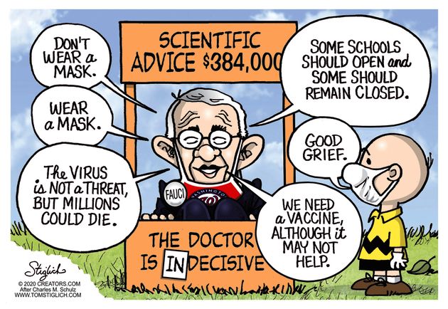


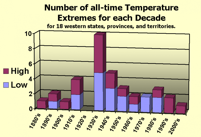


 Others think it means: It is real that using fossil fuels causes global warming. This too lacks persuasive evidence.
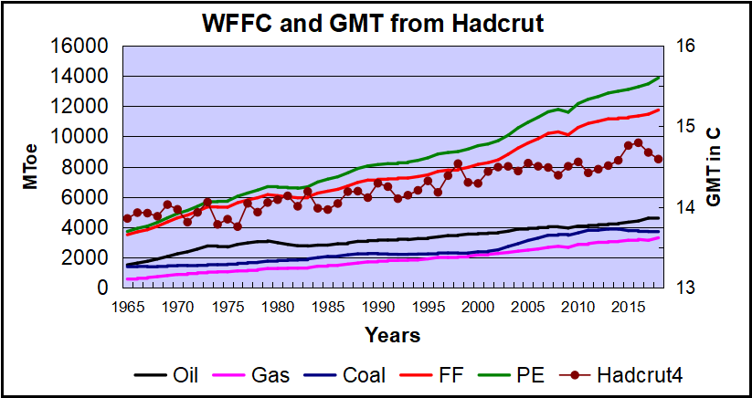 Over the last five decades the increase in fossil fuel consumption is dramatic and monotonic, steadily increasing by 234% from 3.5B to 11.7B oil equivalent tons. Meanwhile the GMT record from Hadcrut shows multiple ups and downs with an accumulated rise of 0.74C over 53 years, 5% of the starting value.
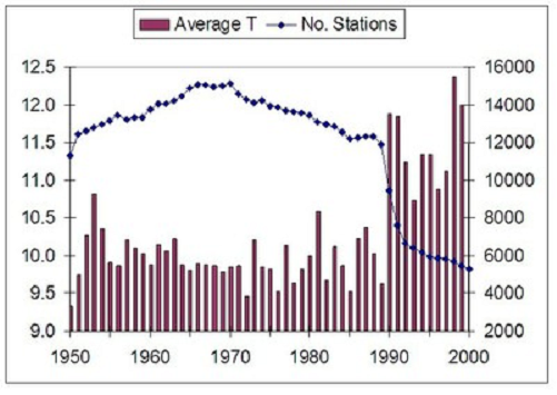
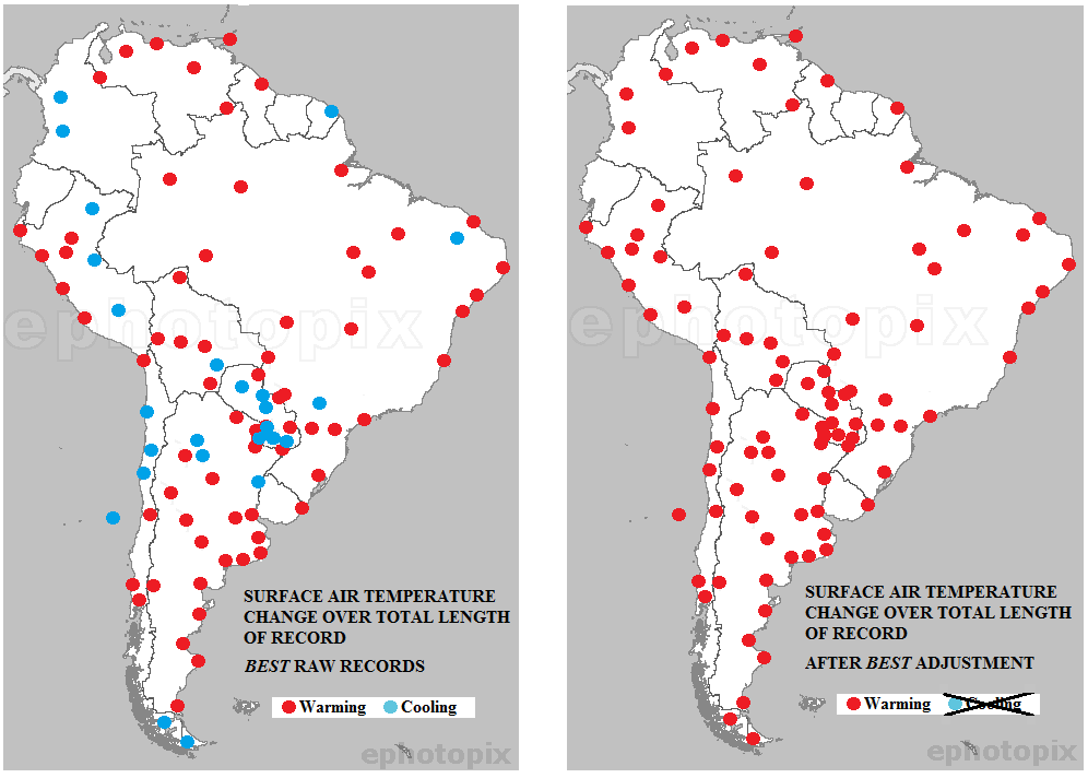 Conclusion
 Norman Doige writes in The Tablet
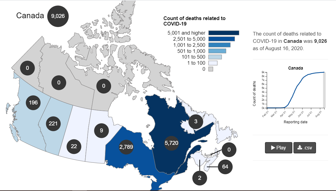
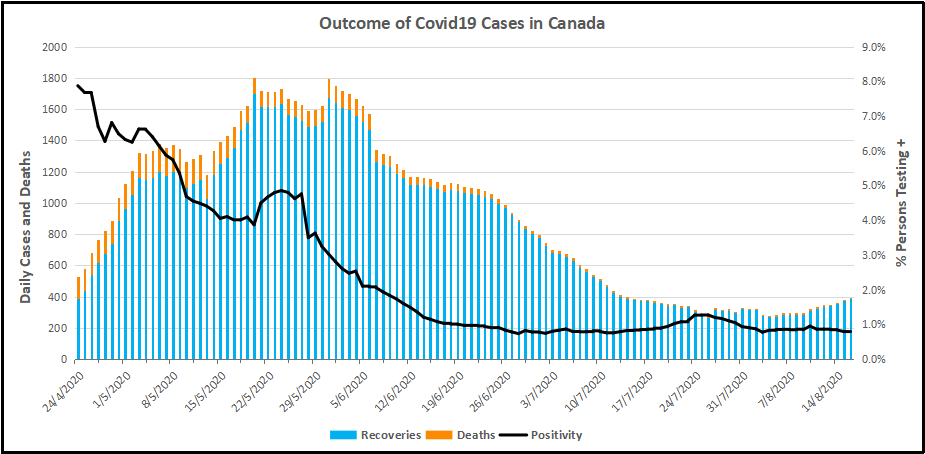
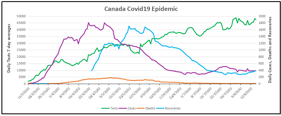

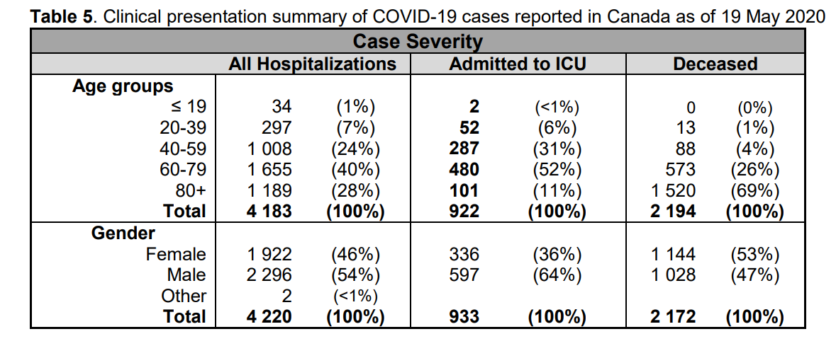
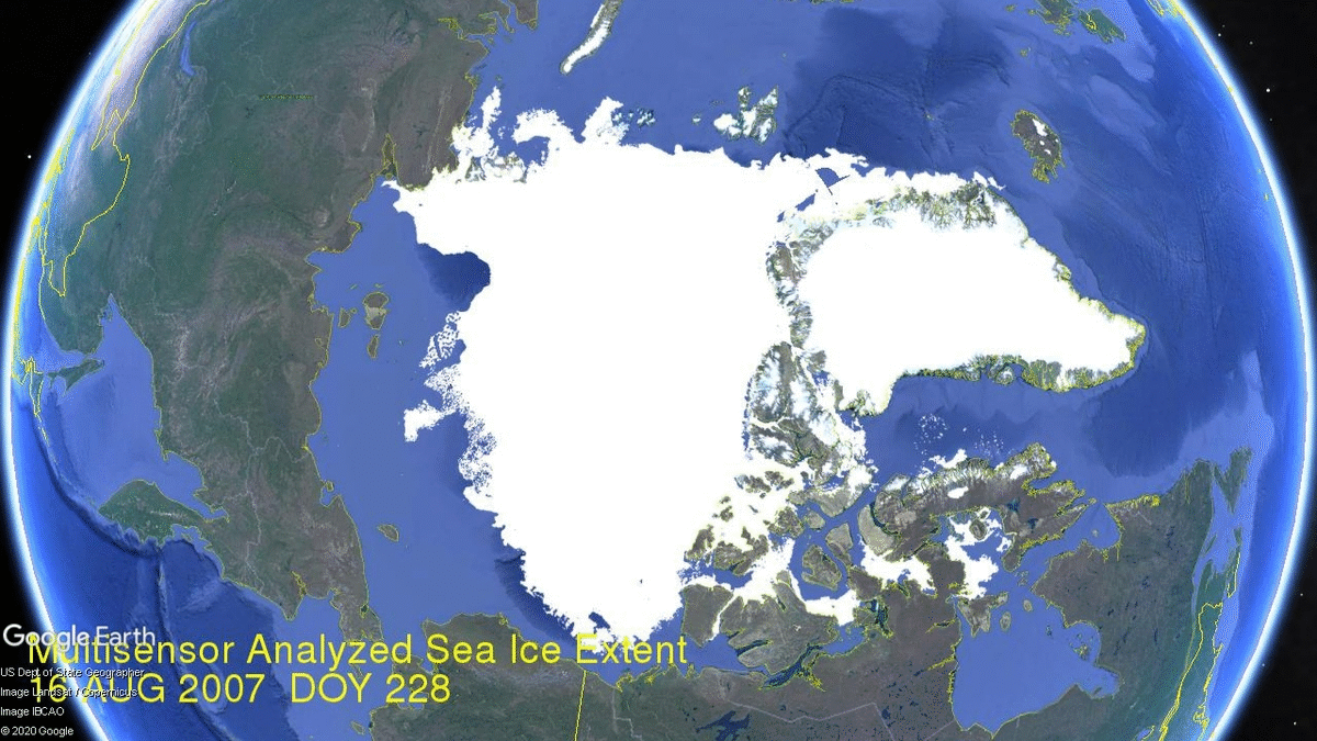
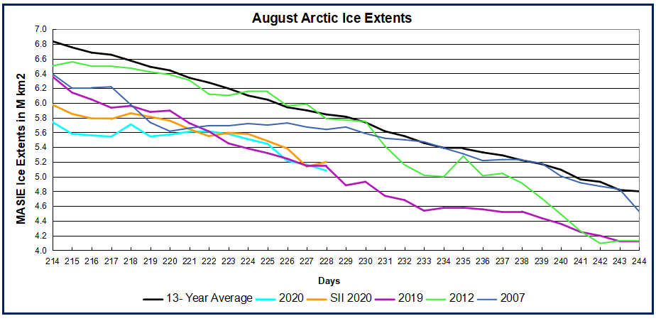


 The best context for understanding decadal temperature changes comes from the world’s sea surface temperatures (SST), for several reasons:
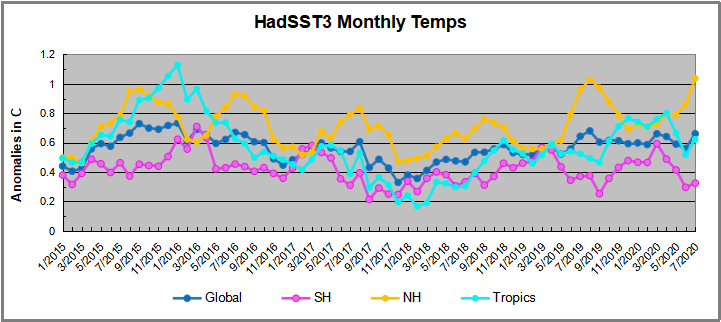
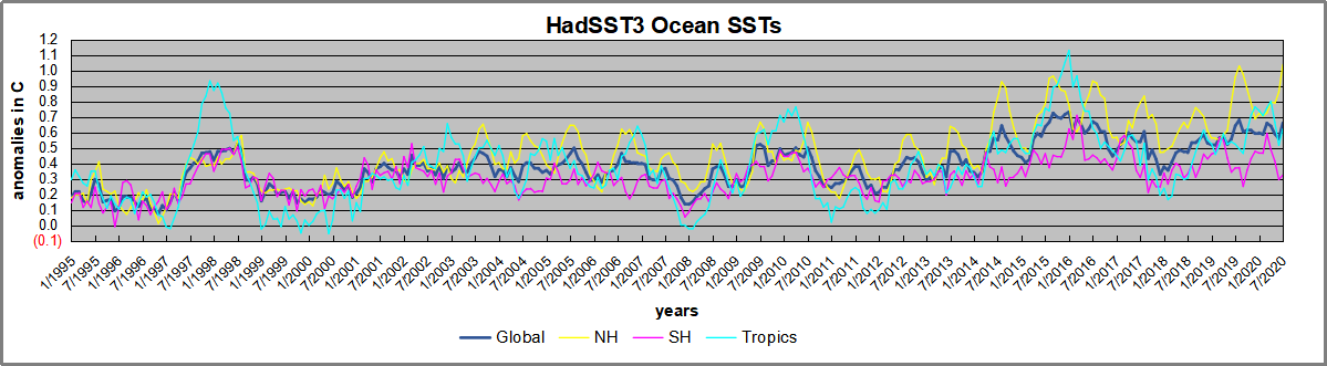
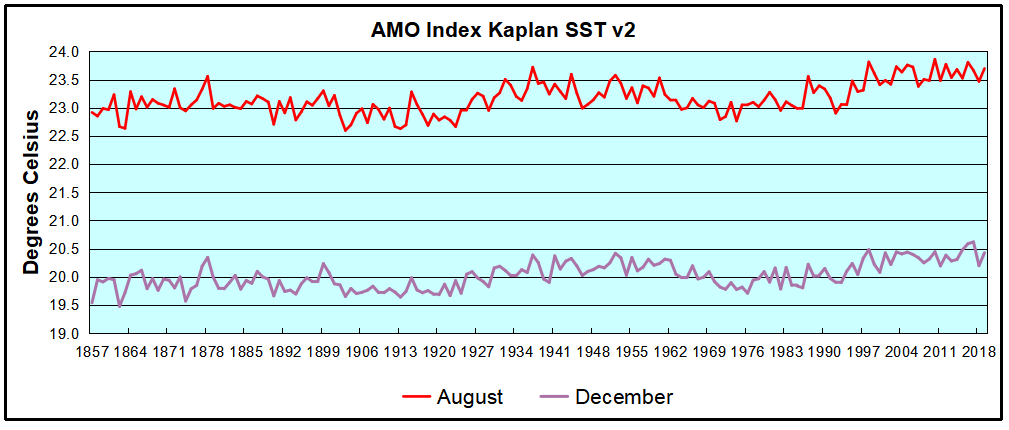
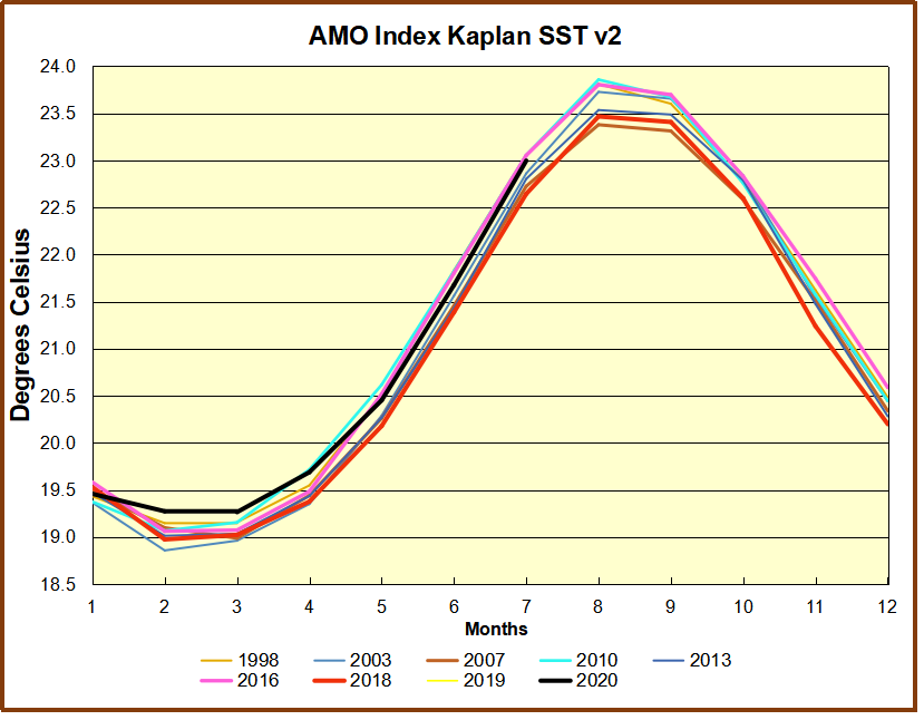

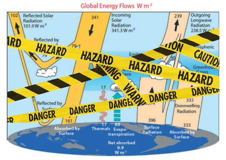
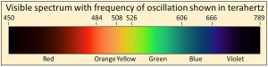
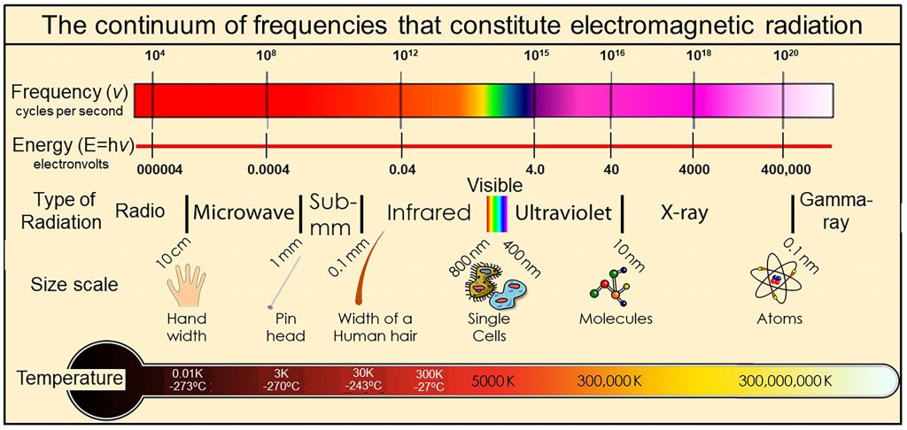 Thermal radiation is a portion of this continuum of electromagnetic radiation radiated by a body of matter as a result of the body’s temperature—the hotter the body, shown here at the bottom as Temperature, the higher the radiated frequencies of oscillation with significant amplitudes of oscillation.