Man-Made Ocean Warming? Yes, but it’s not CO2.
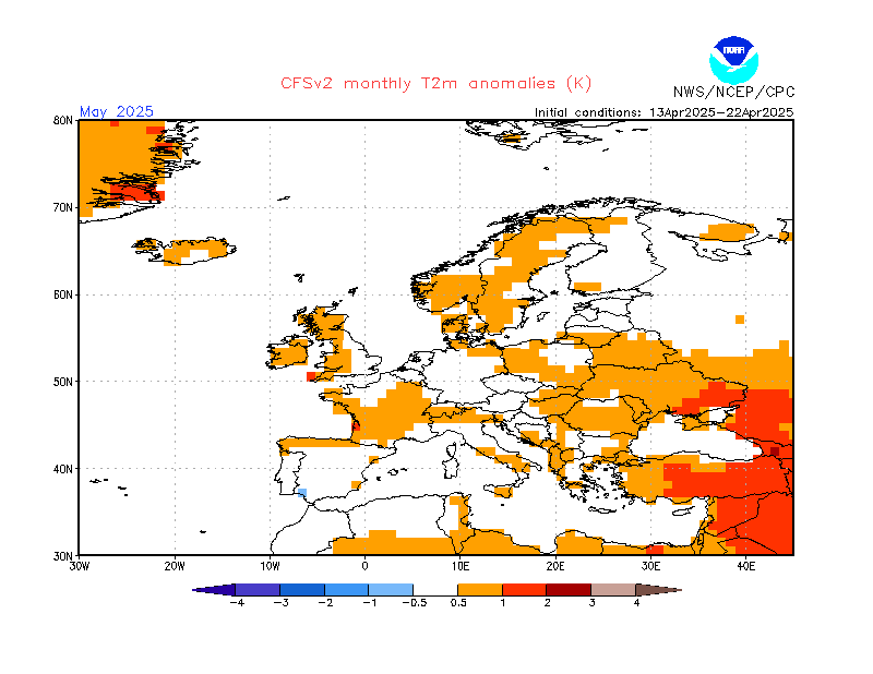
Forecasted Temperature anomalies 2 meters above ground for February 2016 in Europe


Dr Arnd Bernaerts has long studied effects in Northern European Seas. Here are excerpts from his recent publication: Offshore Wind-Parks and Northern Europe’s Mild Winters: Contribution from Ships, Fishery, et cetera? http://www.davidpublisher.org/Public/uploads/Contribute/569da5d061f90.pdf

His main point from the abstract: The marine environment of North Sea and Baltic is one of the most heavily strained by numerous human activities. Simultaneously water and air temperatures increase more than elsewhere in Europe and globally, which cannot be explained with “global warming”.

Excerpts:

Since mankind, during the course of a year, agitates the water column of North Sea and Baltic by stirring, more warmth is taken to deeper water in the summer season and rises to the surface from lower layers in the winter period, where heat is exchanged with the air until sea icing is observed. This is a process that can be seen from the beginning of September until the end of March.

Marine activities play a much bigger role in time factor and duration of ice formation. If the sea surface temperature has already reached the freezing point, any vessel shovels warmer water to the surface, or vice versa, forcing a more rapid melt… The shrinking ice cover correlates well with an increase in human activities, and subsequently leading to higher air temperature throughout the region.

Basically three facts are established: higher warming, a small shift in the seasons, and a decreasing sea ice cover. In each scenario the two seas’ conditions play a decisive role (North Sea and Baltic). These conditions are impaired by wind farms, shipping, fishing, off shore drilling, under sea floor gas-pipe line construction and maintenance, naval exercise, diving, yachting, and so on, about little to nothing has been investigated and is understood.

Summary
The facts are conclusive. “Global Climate Change” cannot cause a special rise in temperatures in Northern Europe, neither in the North Sea nor the Baltic or beyond. Any use of the oceans by mankind has an influence on thermo-haline structures within the water column from a few cm to 10m and more. Noticeable warmer winters in Europe are the logical consequence.

North Americans should not think themselves unaffected by all this.
Consider this graphic of the Siberian Express:

The more the Atlantic weather governs the situation beyond the Ural the further Polar and Siberian cold will be pushed eastwards, called ‘Siberian Express’(Fig.10). This was felt in Alaska, Canada and Eastern U.S. Many days were extremely cold with deviations from the mean of 20°C and beyond.

More information is here:

http://www.ocean-climate-law.com/12/arch/12.html

Barents Icicles

A chart of Barents Ice Cycles looks a lot like the icicles above, except upside down since Barents Sea is usually all water by September. Notice the black lines in the graph below hitting bottom near zero.

Note also the anomalies in red are flat until 1998, then decline to 2007 and then flat again.

Why Barents Sea Ice Matters

Barents Sea is No. 1, being located at the gateway between the Arctic and North Atlantic. Previous posts (here and here) have discussed research suggesting that changes in Barents Sea Ice may signal changes in Arctic Sea Ice a few years later. As well, the studies point to changes in heat transport from the North Atlantic driving the Barents Sea Ice, along with changes in salinity of the upper layer. And, as suggested by Zakharov (here), there are associated changes in atmospheric circulations, such as the NAO (North Atlantic Oscillation).

Here we look at MASIE over the last decade and other datasets over longer terms in search for such patterns.

Observed Barents Sea Ice

Below is a more detailed look at recent years.

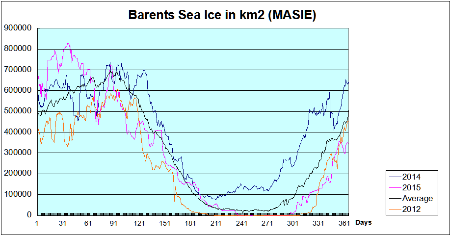
Barents Masierrev

This graph shows that the last two years were outliers in opposite directions. 2014 was an exceptionally high annual average due to melting delayed until April, and then a much higher minimum and faster than average recovery. In contrast 2015 was high initially, became average by day 91, then dropped sharply to a meltout, followed by a slower recovery. 2012 shows the lowest Barents ice year contrasting with 2014, the highest annual extent in the last decade.

Annual average BSIE (Barents Sea Ice Extent) is 315k km2, varying between 250k and 400k over the last ten years. The volatility is impressive, considering the daily Maximums and Minimums in the record. Average Max is 781k, ranging from 608k to 936k. Max occurs on day 77 (average) with a range from day 36 to 103. Average Min is 11k on day 244, ranging from 0k to 77k, and from days 210 to 278.

In fact, over this decade, there are not many average years. Five times BSIE melted to zero, two were about average, and 3 years much higher: 2006-7 were 2 and 3 times average, and 2014 was 7 times higher at 77k.

As for Maxes, only 1 year matched the 781k average. Four low years peaked at about 740k (2006,07,08 and 14), and the lowest year at 608k (2012). The four higher years start with the highest one, 936k in 2010, and include 2011, 13, and 15.

Comparing Barents Ice and NAO
Barents Masierev

This graph confirms that Barents winter extents (JFMA) correlate strongly (0.73) with annual Barents extents. And there is a slightly less strong inverse correlation with NAO index (-0.64). That means winter NAO in its negative phase is associated with larger ice extents, and vice-versa.

Comparing Barents Ice and Arctic Annual

Barents and Arctic

Arctic Annual extents correlate with Barents Annuals at a moderately strong 0.46, but have only weaker associations with winter NAO or Barents winter averages. It appears that 2012 and 2015 interrupted a pattern of slowly rising extents.

NAO and Arctic Ice Longer Term

Fortunately there are sources providing an history of Arctic ice longer term and overlapping with the satellite era. For example:

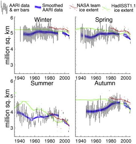
Observed sea ice extent in the Russian Arctic, 1933–2006 Andrew R. Mahoney et al (2008)
http://seaice.alaska.edu/gi/publications/mahoney/Mahoney_2008_JGR_20thC_RSI.pdf

Russian Arctic Sea Ice to 2006

Mahoney et al say this about Arctic Ice oscillations:

We can therefore broadly divide the ice chart record into three periods. Period A, extending from the beginning of the record until the mid-1950s, was a period of declining summer sea ice extent over the whole Russian Arctic, though not consistently in every individual sea. . . Period B extended from the mid-1950s to the mid- 1980s and was a period of generally increasing or stable summer sea ice extent. For the Russian Arctic as a whole, this constituted a partial recovery of the sea ice lost during period A, though this is not the case in all seas. . . Period C began in the mid-1980s and continued to the end of the record (2006). It is characterized by a decrease in total and MY sea ice extent in all seas and seasons.

Comparing Arctic Ice with winter NAO index

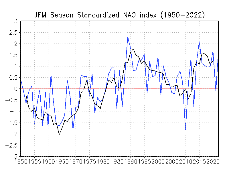
The standardized seasonal mean NAO index during cold season (blue line) is constructed by averaging the monthly NAO index for January, February and March for each year. The black line denotes the standardized five-year running mean of the index. Both curves are standardized using 1950-2000 base period statistics.

The graph shows roughly a 60 year cycle, with a negative phase 1950-1980 and positive 1980 to 2010. As described above, Arctic ice extent grew up to 1979, the year satellite ice sensing started, and declined until 2007. The surprising NAO uptick recently coincides with the anomalous 2012 and 2015 meltings.

As of January 2016 NAO has gone negative for the first time in months.

Summary

If the Barents ice cycle repeats itself over the next decades, we should expect Arctic ice extents to grow as part of a natural oscillation. The NAO atmospheric circulation pattern is part of an ocean-ice-atmosphere system which is driven primarily by winter changes in the North Atlantic upper water layer.

Self-Oscillating Sea Ice System

Self-Oscillating Sea Ice System  See here.


Revisiting “Pause Deniers Busted”


The original post and updates were done in October 2015.  Now Radford Neal has done a complete deconstruction of the published paper in his post (here): Critique of ‘Debunking the climate hiatus’, by Rajaratnam, Romano, Tsiang, and Diffenbaugh .  Neal says:

Climatic Change appears to be a reputable refereed journal, which is published by Springer, and which is cited in the latest IPCC report. The paper was touted in popular accounts as showing that the whole hiatus thing was mistaken — for instance, by Stanford University itself.

You might therefore be surprised that, as I will discuss below, this paper is completely wrong. Nothing in it is correct. It fails in every imaginable respect.

Original post and updates October 3 and 30 below

With Paris COP drawing near, the lack of warming this century is inconvenient and undermines the cause.

As Dr. Judith Curry said, “I have been expecting to start seeing papers on the ‘hiatus is over.’ Instead I am seeing papers on ‘the hiatus never happened.’”

One that was trumpeted came out of my Alma Mater, Stanford.  They garnered the expected headlines from the usual places:

Global Warming “Hiatus” Never Happened: Eos

There never was any global warming “pause.”:  Washington Post

The text is here: Debunking the climate hiatus

http://download.springer.com/static/pdf/969/art%253A10.1007%252Fs10584-015-1495-y.pdf?originUrl=http%3A%2F%2Flink.springer.com%2Farticle%2F10.1007

The write up has statistical razzle-dazzle and lots of opaque sentences, but let’s not get lost in the weeds.

Let’s not talk about the multiple tamperings to the land records they chose to study.  Let’s even overlook their including the bogus upward adjustments to the SSTs by Karl et al.  Bob Tisdale dissected that here: https://bobtisdale.wordpress.com/2015/06/04/noaancdcs-new-pause-buster-paper-a-laughable-attempt-to-create-warming-by-adjusting-past-data/

We don’t need to get into the technicalities of why they stopped with 2013 data, the suitability of the tests applied or their interpretations of the results.

Here’s what you need to know about this study:

They ignored the satellite records (RSS and UAH), the gold standard of temperature measurements, because the absence of warming there is undeniable.

For the land and ocean datasets they analyzed, they ignored the huge divergence between observations and the predictions (projections) from climate models.

Conclusion:

Natural variability in the climate system has neutralized any warming from increased CO2 this century, and also offset most, if not all of the secular rise in temperature since the Little Ice Age.  The models did not forecast this; they can only project warming, and do so at rates several times higher than observations.  The models fail for three reasons:  high sensitivity to CO2; positive feedback from water vapor; and lack of thermal inertia by the oceans.

For more on climate models and temperature projections:
https://rclutz.wordpress.com/2015/03/24/temperatures-according-to-climate-models/

The Stanford football team was impressive beating highly-rated Southern Cal on their home field last Saturday.  The work of the research team, however, looks like pandering rather than science.  They need to up their game: No cookies.

Update October 3

I found the time to look into the details of this paper and the statistical trick comes to light.

They took as the null hypothesis: “Temperatures are not rising.”  After applying several statistical tests, they conclude that the statement is not supported by the data, so we cannot say with certainty temperatures are not rising.

And what about the other null hypothesis: “Temperatures are rising.”  Silence.

I suspect they didn’t want to admit that the same statistical tests would also disprove that statement.

A reasonable person concludes: When you can not say for sure that temperatures are not rising, or that they are rising, that would surely indicate a plateau in temperatures.

Update October 30–Another classic from Josh

Hot Air about Arctic Ice

We are currently treated to another expose of the Climate Scare Machine doing its job. Perhaps you’ve seen these eyeball-grabbing headlines in the last week.

Freak storm in North Atlantic to lash UK, may push temperatures over 50 degrees above normal at North Pole @Washington Post

Arctic ‘heatwave’ hits the North Pole: Storm Frank causes temperatures to soar by 60°F taking the icy region close to melting point @Daily Mail

Arctic ‘heat wave’ sets new record low for sea ice @The Weather Network

These rumor mills start with a factoid, in this case an unusual weather event. Then some know-nothing “journalists” look for quotes from scientists who should know better, but want to grab attention with a sound-bite. Then the editors are off to the races making up headlines to raise circulations and advertising rates.

So, there was a storm called Frank, and it did push warm, moist air toward the North Pole.  From NSIDC (here)

The event was linked to the combination of a very strong low pressure system near Iceland and a somewhat less intense low pressure system located near the North Pole. . . This created a strong, deep inflow of warm, moist air into the Arctic Ocean’s high latitudes. The low near Iceland strengthened rapidly in the last days of December, reaching a minimum pressure of 935 millibars, equivalent to a hurricane. While the event was remarkable and may account for the slow ice growth during the first few days of January 2016, it was short lived and is unlikely to have any long-term effects on the sea ice cover.

And yes, there was a pause in the rate of ice growth in December.

MASIE Dec-Jan 2015 & 16

Here is MASIE data for the last 16 days (Dec. 21 through Jan. 5) compared to averages for the last decade. You can see the pause, and then the acceleration of ice growth in 2016, moving almost 400k km2 above average.

Conclusion:

Do not trust mass media for unbiased reporting of climate news.

And they are pulling the same trick, hoping to melt the Greenland ice sheet by blowing hot air over it.  What you need to know:  Greenland is Melting! Really?

About MASIE produced by NIC (from NSIDC)

The NSIDC Sea Ice Index ice extent is widely used, but the edge position can be off by 10s or in some cases 100s of kilometers. NIC produces a better ice edge product, but it does not reach the same audience as the Sea Ice Index.

In June 2014, we decided to make the MASIE product available back to 2006. This was done in response to user requests, and because the IMS product output, upon which MASIE is based, appeared to be reasonably consistent.

Footnote:

Maybe if all that hot air could be captured, it could be useful, like this:

But wait!  That hot air appears to be rising, rather descending to melt the ice. Hmmm.

Happy Arctic Ice Year!

Update January 3, below.

This year end report shows there is no reason to worry about Arctic ice melting. Against the odds, 2015 recovered from:
The blob melted Bering Sea a month early; it’s now well ahead of 2014.
An August storm pushed extent down for 28 days; it now nearly matches 2014.

masie day 2015365r

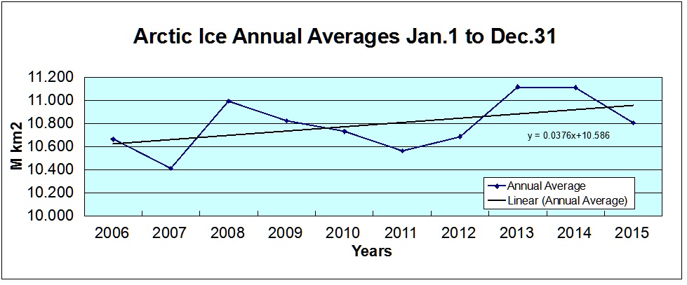
MASIE measurements show that 2007 ice extent was lower than any year since. It is now confirmed that 2015 average annual extent exceeds 2007 by about 400,000 km2. That difference arises from comparing 2007 annual average of 10.414 M km2 with 2015 average through day 365 of 10.808. That makes 2015 virtually tied with 2009 for fourth place in the last ten years.

Summary:

Arctic ice declined in the decade prior to 2007, but has not declined since.

Alarmists chafe at the words “growing” and “recovery”, and I use them poetically to counter “death spiral” terminology. What we have seen in the last decade is a plateau in Arctic ice extent, analogous to the plateau in surface temperatures. The rise since 2007 is slight and not statistically important, just as the loss of ice from 1979 to 1994 in the NOAA dataset was too slight to count as a decline.

Note:   Something unusual happened in the MASIE record.  After increasing ice extent steadily at a rate of 87k km2 per day after Dec. 10, MASIE stopped showing growth and declined a bit after Dec. 23.  Ice extent was lost in Kara, Barents and Greenland Seas.  That allowed NOAA extent to catch up and reduce its deficit.  Previously, NOAA showed ~400k km2 less than MASIE, that difference being typical historically.  For the year NOAA shows about 200k km2 less than MASIE, both at year end and for the annual average.

MASIE Comparison 2014 and 2015 Day 365

Ice Extents Ice Extent
Region 2014365 2015365 km2 Diff.
 (0) Northern_Hemisphere 13330376 13027597 -302778
 (1) Beaufort_Sea 1070445 1070445 0
 (2) Chukchi_Sea 966006 965989 -17
 (3) East_Siberian_Sea 1087137 1087120 -17
 (4) Laptev_Sea 897845 897809 -36
 (5) Kara_Sea 935023 876266 -58757
 (6) Barents_Sea 641686 342398 -299288
 (7) Greenland_Sea 619029 557954 -61075
 (8) Baffin_Bay_Gulf_of_St._Lawrence 1023477 1181297 157820
 (9) Canadian_Archipelago 853214 853178 -36
 (10) Hudson_Bay 1260903 1260723 -181
 (11) Central_Arctic 3245389 3202967 -42422
 (12) Bering_Sea 255711 373594 117883
 (13) Baltic_Sea 7527 2850 -4677
 (14) Sea_of_Okhotsk 454321 345063 -109258
 (15) Yellow_Sea 4475 4312 -163
 (16) Cook_Inlet 130 4490 4360

The small overall difference between 2014 and 2015 at this point matches the deficit in Barents Sea. The major basins have recovered: Central Arctic,  BCE (Beaufort, Chukchi, East Siberian), Canadian Archipelago.  Bering Sea is freezing well ahead of last year, as is Baffin Bay, offsetting deficits elsewhere except for Barents.

Technical Note:  Changes in Ocean Water Structure drive changes in Arctic Ice Extent, and air temperature varies as a result, not the cause.

https://rclutz.wordpress.com/2015/12/23/arctic-sea-ice-self-oscillating-system/


Melt ponds refreezing in the Arctic.

Update January 3, 2015

Neven is the first to attack this post in comments below, followed by a post at his own blog in which he says:

“misleading and embarrassing statements”
“older gentleman”
“mind set in concrete”
“taken apart by Tamino”
“data misrepresentation”

And on cue Tamino’s (Foster’s) attack dogs are coming here.  Now I responded to all of Neven’s and Foster’s bogus objections in Sept. (here). Since they either did not read or did not understand, I will repeat the salient points again.

Warmists fail to see that having two different tracking methods for a climate phenomenon is a good thing.  With temperatures they favor the land surface record and abhor the satellite temps.  With Sea Ice they like the satellite reports and abhor the navigational observations.  JAXA, DMI, NORSEX and NOAA (or NSIDC) are all using data from passive microwave sensors on satellites to estimate ice extents.  Some  differences arise from differing algorithms at each center.

Naval authorities have for centuries prepared ice charts for the safety of ships operating in the Arctic.  There are Russian, Danish, Norwegian, and Canadian charts, in addition to MASIE, the US version.  These estimates rely on multiple sources of data, including the NASA reports.  Charts are made with no climate ax to grind, only to get accurate locations and extents of Arctic ice each day.

MASIE is not the only dataset to show this lull in Arctic ice decline. It is also obvious in Foster’s final graph.  I showed how the same pattern appears in the NOAA (technically NOAA@NSIDC) dataset (here).  Those who object that a decade is too short to claim a recovery were quick to claim a decline (even a “death spiral”) based on a decade-long loss of ice ending in 2007.

Some were upset that I used the MASIE data, despite NSIDC cautions against it.  For the record, the NSIDC Background cites as support a study by Partington et al (2003).  Reading that study, one finds that the authors preferred the MASIE data and said this:
“This analysis has been based on ice chart data rather than the more commonly analyzed passive microwave derived ice concentrations. Differences between the NIC ice chart sea ice record and the passive microwave sea ice record are highly significant despite the fact that the NIC charts are semi-dependent on the passive microwave data, and it is worth noting these differences. . .In summer, the difference between the two sources of data rises to a maximum of 23% peaking in early August, equivalent to ice coverage the size of Greenland.” (my bold)  For clarity: the ice chart data show higher extents than passive microwave data.

http://digitalcommons.unl.edu/cgi/viewcontent.cgi?article=1058&context=usdeptcommercepub

In any case, NSIDC’s last word was this:  “In June 2014, we decided to make the MASIE product available back to 2006. This was done in response to user requests, and because the IMS product output, upon which MASIE is based, appeared to be reasonably consistent.”  And thus, the data appeared this September.