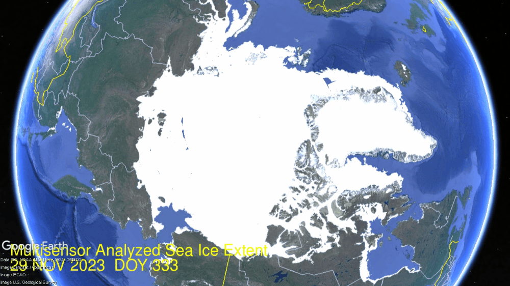
As COP28 began, Arctic ice extrent grew rapidly and by its end the Arctic was completely normal. On lower left, Chukchi sea filled in and below Bering sea started serious freezing. Lower right Hudson Bay more than doubled up to 800k km2, 2/3 of its maximum extent. Center right Baffin Bay grew to 45% of max.
A Lufthansa aircraft at the snow-covered Munich airport on Saturday. Photograph: Karl-Josef Hildenbrand/AP
Coincidently, COP28 also triggered heavy snow bringing chaos to southern Germany causing Munich to suspend flights to anywhere, including Dubai.
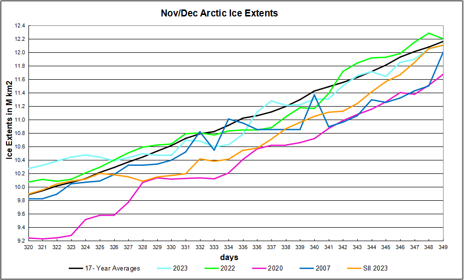
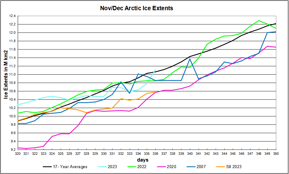
The graph below shows the gains in ice extent mid-November to Mid December for 2023, the 17 year average and some other recent years, as well as SII (Sea Ice Index)
MASIE showed 2023 and 2022 tracking the 17 year average and ending very close together. 2007 fluctuated a lot, well below average in December before rising at the end. SII tracked ~400k km2 lower most of this period, before rising to match MASIE in the last few days.
The table below shows the distribution of ice in the Arctic Ocean basins.
Region
2023349
Day 349
2023-Ave.
2007349
2023-2007
(0) Northern_Hemisphere
12104311
12162108
-57797
12000124
104187
(1) Beaufort_Sea
1070966
1070103
863
1069711
1255
(2) Chukchi_Sea
948805
934827
13978
796459
152347
(3) East_Siberian_Sea
1087137
1086539
598
1077192
9945
(4) Laptev_Sea
897845
897835
9
897845
0
(5) Kara_Sea
826874
847433
-20559
842174
-15300
(6) Barents_Sea
370088
335870
34218
285179
84909
(7) Greenland_Sea
688238
546548
141690
571916
116322
(8) Baffin_Bay_Gulf_of_St._Lawrence
819365
824803
-5438
852443
-33079
(9) Canadian_Archipelago
854860
853420
1440
852556
2304
(10) Hudson_Bay
800760
1101080
-300320
1248305
-447546
(11) Central_Arctic
3212059
3204043
8016
3192331
19728
(12) Bering_Sea
226652
236725
-10073
93340
133312
(13) Baltic_Sea
55323
11920
43403
10353
44970
(14) Sea_of_Okhotsk
231640
200090
31550
206342
25297
Note that Arctic ice now exceeds 12M km2, or 80% of last March maximum. As shown in the table above, the main deficit to average is in Hudson Bay, likely to be overcome with the current rapid growth. Offsetting are surpluses elsewhere, mostly in Greenland sea, along with Barents and Baltic seas.
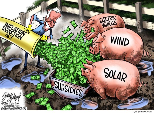
Through Dec. 12, the “Climate!” crowd is swarming COP28, Dubai’s carbophobia cavalcade. The fact that these global-warming alarmists are surrounded by Earth’s deepest pools of fossil fuels makes their Hajj infinitely ironic.
Also astonishing is the nearly immeasurable impact of these people’s gyrations. They blow trillions of dollars, bludgeon human freedom, and yet do shockingly little to fix their vaunted “climate crisis.”
One practically needs an electron microscope to find their promised
reductions in allegedly venomous CO2 or supposedly lethal temperatures.
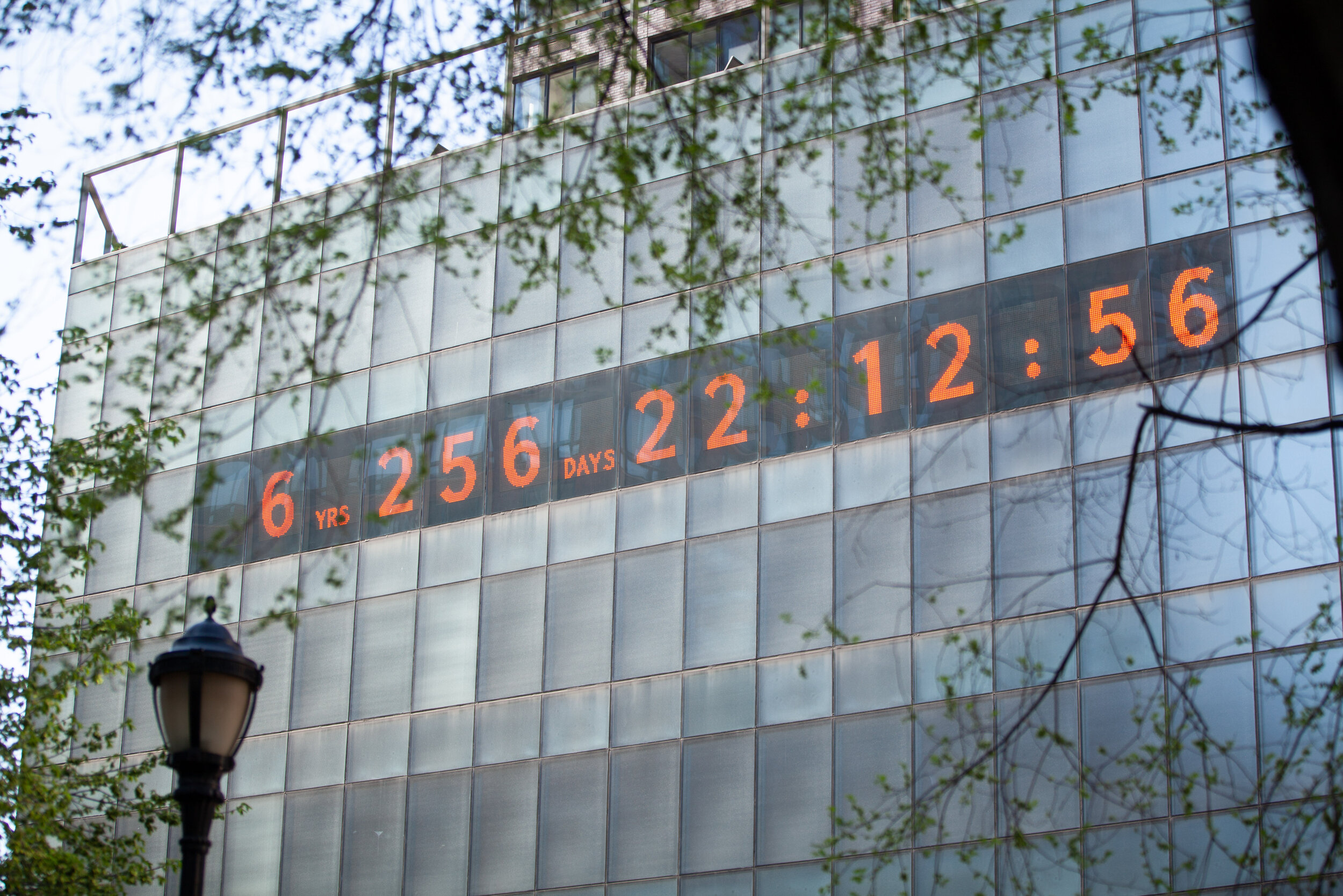
According to #ActInTime’s Climate Clock, high above Manhattan’s Union Square, humans have — at this writing — five years and 227 days until we boil to death in a cauldron of steaming carbon. Since The End is scheduled for Saturday, July 21, 2029 (mark your calendars!)
Big Government Democrats offer jaw-droppingly paltry climate benefits,
despite their spine-chilling predictions and unbridled interventionism.
Clean Power Plan Cost/Benefit
Obama-Biden’s proposed Clean Power Plan was a diamond-encrusted specimen of do-nothingism. According to a May 2015 analysis by their own Energy Information Agency, between 2015 and 2025, the CPP would have slashed real GDP by $993 billion, or an average of $39.7 billion per year.
It would have sliced real disposable income by $382 billion, or $15.3 billion annually. It also would have chopped manufacturing shipments by $1.13 trillion, or $45.4 billion per year.
EIA forecast a decrease of 0.035° Fahrenheit. This would have cranked a thermometer from 72° F way down to 71.965°. As Billy Joel once sang, “Is that all you get for your money?”
IRA Funded Green Energy Projects Cost/Benefit
Biden’s blessed Inflation Reduction Act budgeted $369 billion for green-energy projects. Goldman Sachs subsequently slapped a $1.2 trillion price tag on the IRA.
Danish environmental expert Bjorn Lomborg ran the IRA through the United Nations’ climate models. “Impact of new climate legislation,” Lomborg specified. “Unnoticeable: 0.0009°F to 0.028°F in 2100.” This would chill thermostats from 72° to 71.9991°. If we get lucky: 71.972°.
Biden said on Jan. 31 that “if we don’t stay under 1.5° Celsius” or 2.7° Fahrenheit, “we’re going to have a real problem.” If a 0.0009° F reduction costs $369 billion, then Biden’s 2.7° F goal would devour — brace yourself — $1.107 quadrillion — with a Q.
Biden EV Mandate Cost/Benefit
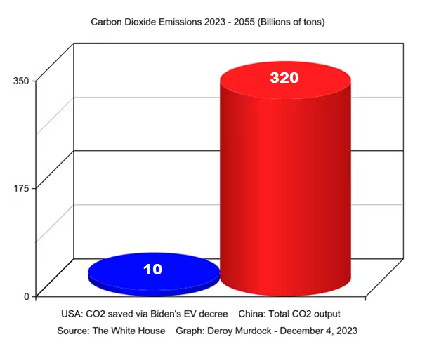
Emperor Biden’s electric-vehicle decree would require that at least 67% of new cars sold in 2032 be electric. This edict already is stalling the auto industry. On Nov. 29, 3,902 U.S. car dealers in all 50 states wrote Biden. Message: Stop tailgating! “Already, electric vehicles are stacking up on our lots,” the dealers complained. “The majority of customers are simply not ready to make the change.”
This chaos aside, Biden’s mandate would limit CO2 by 10 billion tons through 2055. Alas, China is expected to generate 320 billion tons of carbon in the next 32 years. So, Biden’s “savings” will asphyxiate in a giant Chinese carbon cloud.
Holman Jenkins of The Wall Street Journal calculates that Biden’s EV order will decrease planetary emissions by a whopping 0.18%. “The climate effect of the extravagantly expensive Biden plan will steadily approach zero,” Jenkins anticipates.
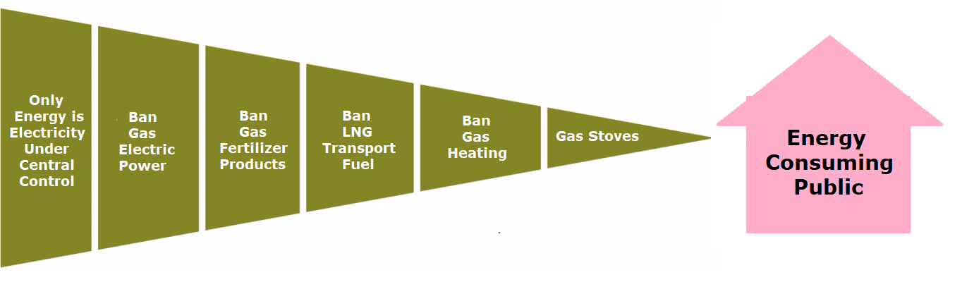
Bans on Gas Stoves and Heaters Cost/Benefit
Rather than jail criminals or deport illegal aliens, Governor Kathy Hochul, D-N.Y., bans gas stoves and demands that gas heaters yield to electric heat pumps — never mind that her constituents freeze to death during post-blizzard blackouts.
“The global effect of the costly program of compulsory electrification will be a reduction in greenhouse gas emissions of less than 0.05%,” the Empire Center for Public Policy calculates.
Summation
Obama, Biden, Hochul and their comrades might respond that no single bauble will fix everything, and every shiny object helps. Maybe. But these four schemes alone carry an enormously high price in shredded freedomandincinerated taxpayer dollars, yet still leave at least 99.82% of emissions untouched.
To quote another Briton, William Shakespeare, perhaps this “sound and fury, signifying nothing” is not about cutting emissions or curbing Earth’s temperatures.
Maybe it’s designed to help Democrats spend trillions of dollars to signal virtue, bark orders at the American people, and lavish taxpayers’ hard-earned cash on their politically connected pals— from the Potomac to the Persian Gulf.
Footnote:
The estimates of lowering temperatures come from IPCC-approved models, which presume that Global Mean Temperature (GMT) rises in response to rising atmospheric CO2. In fact that premise is itself dubious since basic physics requires that a cause precede an effect in time. The evidence points to changes in CO2 lagging rather than leading GMT changes. This is true on all time scales, from last month’s observations to ice cores spanning millenia.
The animation shows remarkable growth of Arctic ice extent just since COP28 began. As noted in the previous Arctic ice post, Hudson Bay (lower right) was a lagging region, but freezing accelerated there. At the top, Barents and Greenland sea added ice. As well, both Bering and Okhotsk seas (far left) added fast ice on coastlines. In all, half a Wadham, 517k km2 of ice extent was added in just three days.
A Lufthansa aircraft at the snow-covered Munich airport on Saturday. Photograph: Karl-Josef Hildenbrand/AP
Coincidently, COP28 also triggered heavy snow bringing chaos to southern Germany causing Munich to suspend flights to anywhere, including Dubai.
The graph below shows the gains in ice extent erasing a brief deficit to average.
MASIE shows a gain of ~0.5M km2 from day 334 to 336, now exceeding average after being lower briefly. SII (Sea Ice Index) also rose but is still estimating ice extent ~500k km2 lower.
The table below shows the distribution of ice in the Arctic Ocean basins.
Region
2023336
Day 336
2023-Ave.
2007336
2023-2007
(0) Northern_Hemisphere
11113626
11059843
53782
10853632
259993
(1) Beaufort_Sea
1070966
1069301
1665
1054586
16380
(2) Chukchi_Sea
765844
797154
-31311
607874
157970
(3) East_Siberian_Sea
1087137
1080765
6372
1023256
63882
(4) Laptev_Sea
897845
897835
9
897845
0
(5) Kara_Sea
812779
796332
16446
829462
-16683
(6) Barents_Sea
350616
259899
90717
222769
127847
(7) Greenland_Sea
711570
538651
172919
541176
170393
(8) Baffin_Bay_Gulf_of_St._Lawrence
571757
697517
-125760
755390
-183633
(9) Canadian_Archipelago
854860
853409
1451
852556
2304
(10) Hudson_Bay
553841
636088
-82247
812965
-259124
(11) Central_Arctic
3220281
3198662
21619
3177278
43003
(12) Bering_Sea
82391
154107
-71716
27916
54475
(13) Baltic_Sea
23276
4889
18387
2898
20378
(14) Sea_of_Okhotsk
106202
70731
35471
46377
59826
Note that Arctic ice now exceeds 11M km2, or 74% of last March maximum. As shown in the table above, the main deficits to average are in Hudson and Baffin Bays, along with less ice in Bering Sea. Offsetting are surpluses elsewhere, especially in Barents and Greenland seas.
The animation shows the continuing growth of Arctic ice extent during November 2023, from day 305 to yesterday, day 334. For all of the fuss over the September minimum, little is said about Arctic ice growing back rapidly; that’s 4 Wadhams in October, plus another 2,2M in Nov to total 10.6M km2, or 10.6 Wadhams. The Russian side on the left froze over in October, and now at the center bottom you can see Beaufort sea and Canadian Archipelago icing over completely. At top center Kara and Barents are adding normal ice extents. On the right side are the two lagging basins: Baffin and Hudson Bays, though freezing has started in Hudson bay in the last ten days. That basin is shallow and likely to freeze over in the next two weeks.
The graph below shows the 30 days of November 2023 compared to the 17 year average (2006 to 2022 inclusive), to SII (Sea Ice Index) and some notable years.
Taking the average extent for the final 5 days of October 2023 compared to same for end of November, the added ice extent is 2.2M km2. The growth slowed at the end resulting in a 290k km2 deficit to average. Sea Ice Index (SII) is ~200k km2 lower than MASIE.
The table below shows the distribution of ice in the Arctic Ocean basins.
Region
2023334
Day 334
2023-Ave.
2007334
2023-2007
(0) Northern_Hemisphere
10626375
10921303
-294928
11009948
-383574
(1) Beaufort_Sea
1070966
1069463
1503
1058872
12094
(2) Chukchi_Sea
722477
788533
-66056
687829
34649
(3) East_Siberian_Sea
1087137
1083567
3570
1082015
5122
(4) Laptev_Sea
897845
897822
23
897613
232
(5) Kara_Sea
799640
792930
6710
826319
-26679
(6) Barents_Sea
262074
248861
13213
216525
45549
(7) Greenland_Sea
607148
533255
73893
618844
-11696
(8) Baffin_Bay_Gulf_of_St._Lawrence
591970
671268
-79298
708497
-116527
(9) Canadian_Archipelago
854826
853266
1560
850249
4577
(10) Hudson_Bay
379047
574308
-195261
751382
-372335
(11) Central_Arctic
3220511
3192296
28215
3183073
37438
(12) Bering_Sea
47829
145731
-97902
72645
-24816
(13) Baltic_Sea
16936
3593
13343
0
16936
(14) Sea_of_Okhotsk
63947
62153
1794
53052
10895
As shown in the table above, the deficit is due to lagging growth in Hudson and Baffin Bays, along with less ice in Chukchi and Bering Seas. Typically these basins are among the last to freeze.
Climate tipping points are much more fantasy than science
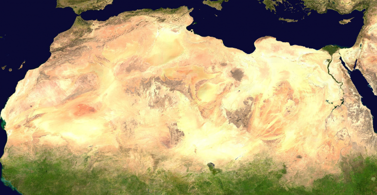
Dr. Kröpelin is an award-wining geologist and climate researcher at the University of Cologne and specializes in studying the eastern Sahara desert and its climatic history. He’s been active out in the field there for more than 40 years.
In the Auf 1 interview, Dr. Kröpelin contradicts the alarmist claims of growing deserts and rapidly approaching climate tipping points. He says that already in the late 1980s rains had begun spreading into northern Sudan and have since indeed developed into a trend. Since then, rains have increased and vegetation has spread northwards. “The desert is shrinking; it is not growing.”
Kröpelin confirms that when the last ice age ended some 12,000 years ago, the eastern Sahara turned green with vegetation, teemed with wildlife and had numerous bodies of water 5000 – 10,000 years ago (more here).
Later in the interview Kröpelin explains how the eastern Sahara climate was reconstructed using a vast multitude of sediment cores and the proxy data they yielded. According to the German geology expert: “The most important studies that we conducted all show that after the ice age, when global temperatures rose, the Sahara greened”…”the monsoon rains increased, the ground water rose”. This all led to vegetation and wildlife taking hold over thousands of year.
Then over the past few thousands of years, the region dried out. It didn’t happen all of a sudden like climate models suggest.
Modelers don’t understand climate complexity
When asked about dramatic tipping points (8:00) such as those claimed to be approaching by the Potsdam Institute (PIK), Kröpelin says he’s very skeptical and doesn’t believe crisis scenarios such as those proposed by former PIK head, Hans-Joachim Schellnhuber. He says people making such claims “never did any studies themselves in any climate zone on the earth and they don’t understand how complex climate change is.”
Except for catastrophic geological events, “it’s not how nature works,” Kröpelin says. “Things change gradually.”
The claims that “we have to be careful that things
don’t get half a degree warmer, otherwise everything will collapse,
is of course complete nonsense.”
“I would say this concept [tipping points] is baseless. Much more indicates that they won’t happen than that they will happen.”
Late last year in Munich, he called the notion of CO2-induced climate tipping points scientifically outlandish. He also called the prospect of the Sahara spreading into Europe preposterous.
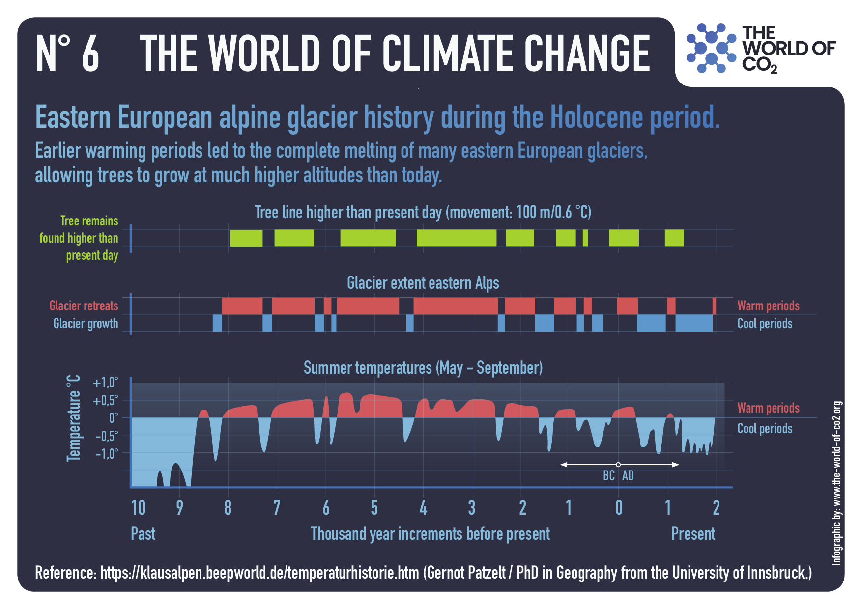
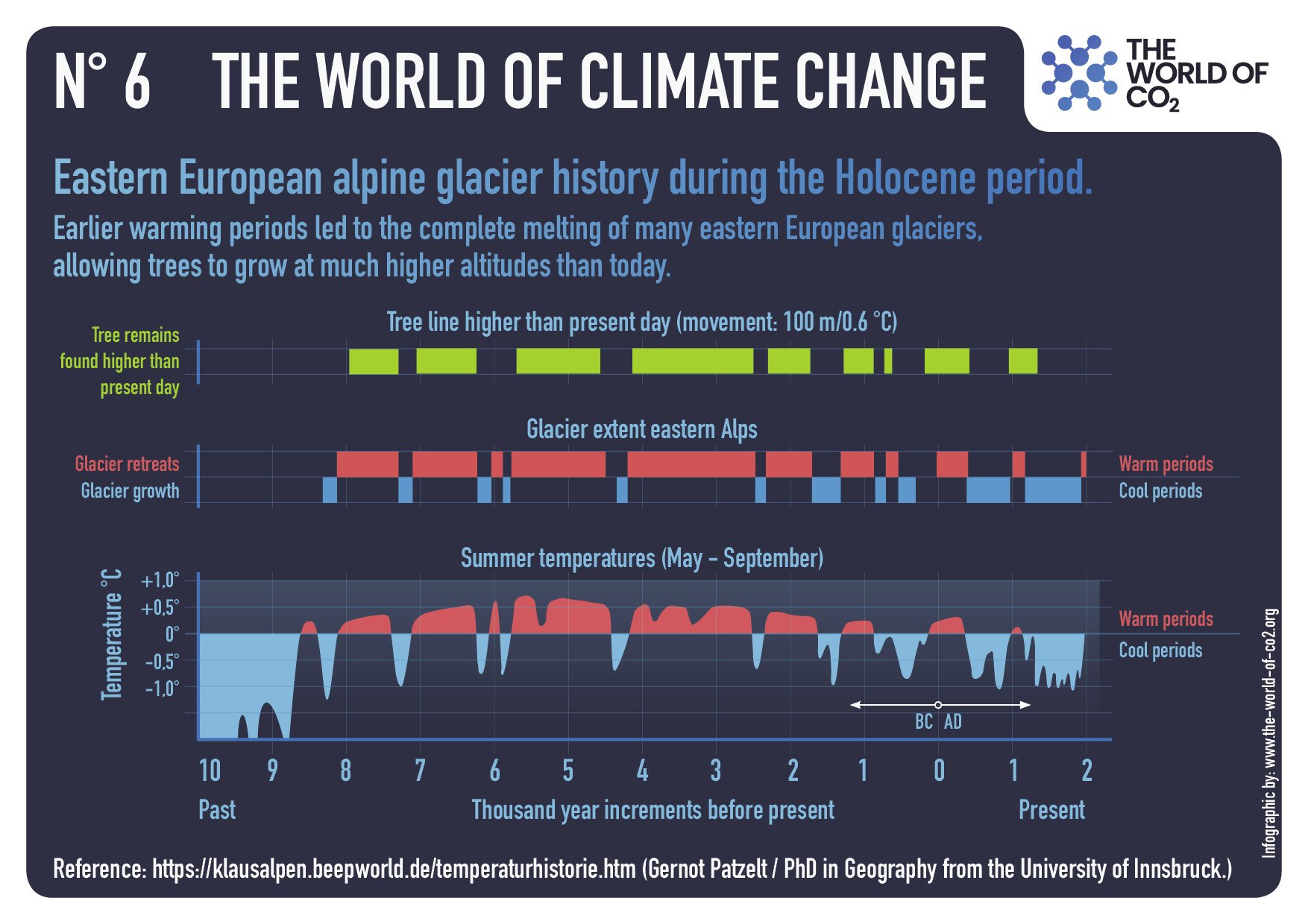
Another example is the fluctuating cycles of Alpine glaciers, waxing and waning over periods of time.
Finally, as the critique shows, tipping points are like climate change itself: Applying labels to something that has already happened, with no predictive utility.
Glenn Spitzer turns the table on alarmists in his American Thinker article Who Are the Real Climate Change Deniers? Excerpts in italics with my bolds and added images.
Who are these “climate change deniers” we hear so much about? Does anyone really doubt the climate changes? Well, yes. There are climate change deniers — a lot of them. They live right under our noses, and they are celebrated. Here’s a quote from one of the most famous climate change deniers:
Our civilization has never experienced any environmental shift remotely similar to this. Today’s climate pattern has existed throughout the entire history of human civilization.
That was Al Gore in 2007. According to Gore, the climate was “shiftless” for thousands of years — a paradigm of stability.
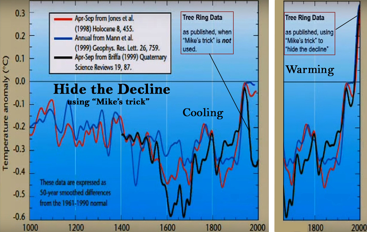
Gore’s quote was a restatement of Michael Mann’s 1998 “hockey stick.” Mann argued that the Earth’s climate held steady for all of human history (the hockey stick handle), until suddenly, in the 1900s, the temperatures increased, representing the upturned blade of the hockey stick.
Mann’s theory is the basis of the modern CO2-focused “global warming” movement, which ironically morphed into the “climate change” movement. Mann’s theory informs the positions taken by the Intergovernmental Panel on Climate Change (IPCC), the agency dictating policy to your local, state, and federal governments.
The most important assumption in Mann’s theory is that there was no climate change prior to the 20th century. But this assumption is false. It is climate change denial; it is the sacrifice of truth for a desired outcome.
The first graph appeared in the IPCC 1990 First Assessment Report (FAR) credited to H.H.Lamb, first director of CRU-UEA. The second graph was featured in 2001 IPCC Third Assessment Report (TAR) the famous hockey stick credited to M. Mann.
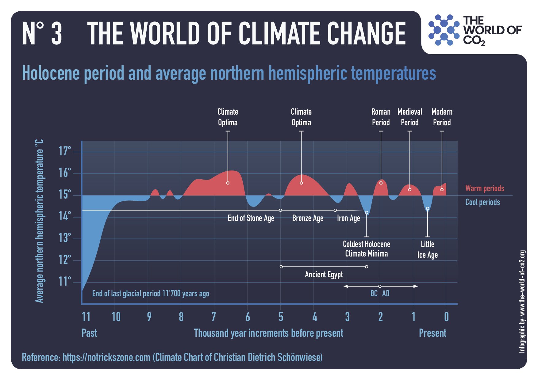
Mann’s 1998 study intentionally ignored several thousand scientific publications showing other periods of climate change throughout human history, such as the Medieval Warm Period (about A.D. 900 to 1300), the Little Ice Age (about 1300 to 1915), and the Roman Warm Period (about A.D. 1 to 500). Despite claims of perpetual stability, it turns out the climate is always changing.
Scientists estimate that, during the Medieval Warm Period, for example, the temperatures in parts of Europe were 1.0–1.4° Celsius (1.8–2.5° Fahrenheit) warmer than they are now. Oxygen isotope studies in China, Germany, Greenland, Ireland, New Zealand, Switzerland, and Tibet, as well as tree ring data from many sites throughout the world, confirm the Medieval Warm Period. The studies are so numerous (several thousand published papers confirming this warming) that it raises the obvious question: “Why do climate activists deny that the climate is always changing?”
There are two important reasons why activists deny climate change. First, the acceptance of prior warming periods undermines the argument that a modern warming is an existential threat, and second, prior warming periods undermine the idea that anthropogenic (man-made) CO2 is the primary cause of climate change.
The Medieval Warm Period is a particularly inconvenient truth for the modern climate activists because it shows that warming has beneficial effects on humanity. As the European region became warmer, agriculture spread and generated food surpluses. The European population doubled. In short, the Medieval Warm Period underscores the reality that, while humans struggle in colder weather, we generally thrive in warmer weather.
In other words: no crisis justifying extraordinary intervention.
But more importantly, what does a constantly changing climate say about the effects of anthropogenic CO2?
The fact that the climate has been changing significantly for thousands of years (actually millions) raises the question: what causes climate change? This is a messy question. Activists seek to foreclose options by addressing causation through simple correlation. If climate change is only a recent phenomenon, one that began coincidentally with the rise in anthropogenic CO2, then causation is simple.
However, if this fact pattern is a fiction, then the correlation argument falls apart. When we understand the climate is always changing, and was changing well before the rise of anthropogenic CO2, then we are confronted with the reality that other factors are at play. Anthropogenic CO2 is placed in proper context as a potential factor of uncertain significance. Importantly, when simple correlation no longer drives our analysis, we are freed to assess other causal factors more seriously.
When people acknowledge that anthropogenic CO2 could not possibly cause climate change throughout human history, they are forced to question their religion. When guided by truth instead of ideology, the following questions become more interesting:
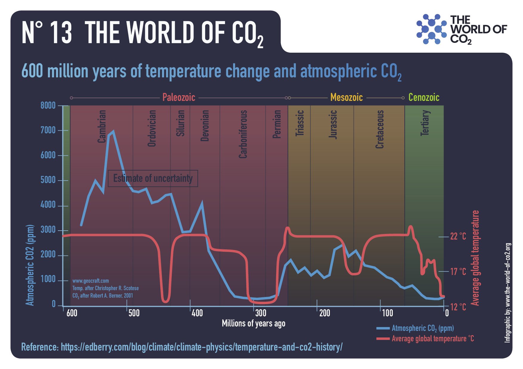
How is it that the last six great ice ages started with far more CO2 in the atmosphere than we have now?
Figure 16. The geological history of CO2 level and temperature proxy for the past 400 million years. CO2 levels now are ~ 400ppm
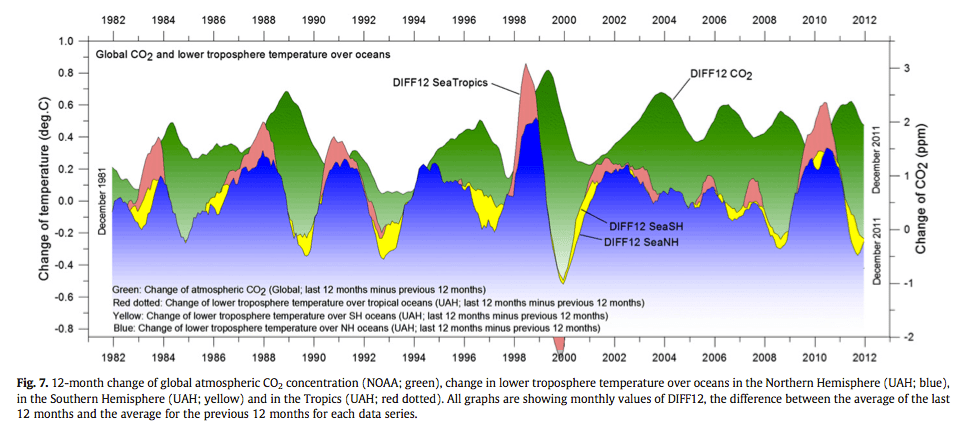
Is it true, as many experts note, that temperatures drive CO2 levels, and not the other way around?
Highlights ► Changes in global atmospheric CO2 are lagging 11–12 months behind changes in global sea surface temperature. ► Changes in global atmospheric CO2 are lagging 9.5–10 months behind changes in global air surface temperature. ► Changes in global atmospheric CO2 are lagging about 9 months behind changes in global lower troposphere temperature. ► Changes in ocean temperatures explain a substantial part of the observed changes in atmospheric CO2 since January 1980. ► Changes in atmospheric CO2 are not tracking changes in human emissions.
How does anthropogenic CO2 drive climate when it makes up less than 5% of total CO2 (with most coming from the oceans, volcanoes, decaying vegetation, and forest fires)?
Isn’t the sun the most important cause of climate, and what effects follow from sun spots and solar flares?
If greenhouse gases (GHGs) are the most significant drivers of climate change, then why do we focus on CO2, when water vapor (i.e., clouds) is a far more impactful GHG? (In fact, there have been a flurry of recent published studies on the effects of clouds.)
For many in science, self-preservation and status remain subordinate to truth and courage. Many have sacrificed research funding and reputation to criticize Mann’s theories, including IPCC lead authors John Christy (former NASA climatologist) and Richard Lindzen (former MIT professor). In fact, numerous climate experts upended their professional lives by pointing out that Mann’s theory is more activism than fact (including Professors Tim Ball, Ian Clark, Ian Plimer, NirShaviv, Piers Corbyn, Steven Koonin, Judith Curry, and William Happer — to name a few).
Experts Steve McIntyre and Ross McKitrick presented a detailed analysis of the flaws of Mann’s 1998 theory in a series of studies in 2003 and 2005, detailing the numerous technical flaws with Mann’s analysis. They found that Mann’s theory was invalid “due to collation errors, unjustifiable truncation or extrapolation of source data, obsolete data, geographical location errors, incorrect calculation of principal components and other quality control defects.”
Hockey stick graph corrected by McKitrick and McIntyre after removing Mann’s errors.
In a 2014 paper, McKitrick summarized the theory’s most significant problem as an issue of unreliable proxy data. Namely, Mann relied on a small and controversial subset of tree ring records of bristlecone pine cores from high and arid mountains in the U.S. Southwest. The scientists who published the tree ring data on which Mann relied (published by Graybill and Idso in 1993) specifically warned that the data should not be used for temperature reconstruction and that the 20th-century data had regional anomalies.
The overarching takeaway here is that we cannot cede the power of thought to the “experts.” Experts serve an important role in that they assist us in analyzing matters beyond our common understanding. But experts are mere fallible humans. When they are controlled by their biases, flawed in their analysis, or misguided by incorrect data, then we must reject their conclusions.
The animation shows the rapid growth of Arctic ice extent during November 2023, from day 304 to yesterday, day 319. For all of the fuss over the September minimum, little is said about Arctic ice growing back rapidly; that’s 4 Wadhams in October, plus another 1.3M in Nov to total 10M km2, or 10 Wadhams. The Russian side on the left froze over in October, and now at the center bottom you can see Beaufort sea and Canadian Archipelago icing up. Center right is Baffin Bay growing ice as well.
The graph below shows the last 30 days of 2023 compared to the 17 year average (2006 to 2022 inclusive), to SII (Sea Ice Index) and some notable years.
From Mid October to Mid November 2023, MASIE shows NH ice extent growing from 6.3 M km2 to 10M. That matches 2022 and exceeds the 17 year average by more than 200K km2. SII (Sea Ice Index) is only slightly lower.
The table below shows the distribution of ice in the Arctic Ocean basins.
Region
2023319
Day 319 Ave.
2023-Ave.
2007319
2023-2007
(0) Northern_Hemisphere
9997068
9784253
212815
9737614
259454
(1) Beaufort_Sea
1051194
1063450
-12257
1053727
-2533
(2) Chukchi_Sea
596947
629695
-32748
503783
93164
(3) East_Siberian_Sea
1064913
1075985
-11072
1043952
20960
(4) Laptev_Sea
897845
897217
628
897845
0
(5) Kara_Sea
696199
658489
37710
765376
-69177
(6) Barents_Sea
245998
154920
91078
145438
100560
(7) Greenland_Sea
613312
460620
152692
527575
85737
(8) Baffin_Bay_Gulf_of_St._Lawrence
536576
526706
9870
533931
2645
(9) Canadian_Archipelago
841536
850736
-9200
852539
-11003
(10) Hudson_Bay
161371
234076
-72704
231544
-70173
(11) Central_Arctic
3236821
3174741
62081
3156228
80594
Overall ice extent has 212k km2 above average or 2%. The only sizeable deficit is in Hudson Bay, more than offset by surpluses elsewhere, especiallly in Greenland and Barents seas, along with the Central Arctic.
With COP28 scheduled to start on November 30, 2023 in Dubai, Climate Crisis Central decided the Greenland Ice Sheet is the doomsday story this week. For Example:
North Greenland ice shelves have lost 35% of their volume, with “dramatic consequences” for sea level rise, study says CBS News
Greenland’s ice shelves have shrunk by more than a THIRD since 1978 – and will cause global sea levels to rise by 6.8 FEET if they collapse entirely, study warns Daily Mail
Alarming collapse of Greenland ice shelves sparks warning of sea level rise Live Science
Greenland’s northern glaciers are in trouble, threatening ‘dramatic’ sea level rise, study shows CNN
Greenland glaciers melt five times faster than 20 years ago Reuters
Satellite data and 100-year-old images reveal quickening retreat of Greenland’s glaciers Space.com
Etc., Etc., Etc.
The scare du jour is about Greenland Ice Sheet (GIS) and how it will melt out and flood us all. It’s declared that GIS has passed its tipping point, and we are doomed. Typical is this report from phys.org Study finds Greenland’s glacier retreat rate has doubled over past two decades. Excerpts in italics with my bolds.
Although glaciers in Greenland have experienced retreat throughout the last century, the rate of their retreat has rapidly accelerated over the last two decades. According to the multiyear collaborative effort between the United States and Denmark, the rate of glacial retreat during the 21st century is twice as fastas retreat during the 20th century. And, despite the range of climates and topographical characteristics across Greenland, the findings are ubiquitous, even among Earth’s northernmost glaciers.
The findings underscore the region’s sensitivity to rising temperatures due to human-caused climate change. The study is published in the journal Nature Climate Change.
“Our study places the recent retreat of peripheral glaciers across Greenland’s diverse climate zones into a century-long perspective and suggests that their rate of retreat in the 21st century is largely unprecedented on a century timescale,” said Laura Larocca, the study’s first author. “The only major possible exception are glaciers in northeast Greenland, where it looks like recent increases in snowfall might be slowing retreat.”
The study finds that climate change explains the accelerated glacier retreat and that glaciers across Greenland respond quickly to changing temperatures. This highlights the importance of slowing global warming.
“Our activities over the next couple decades will greatly affect these glaciers. Every bit of temperature increase really matters,” Larocca said.
Annual Greenland Fluctuations in Perspective
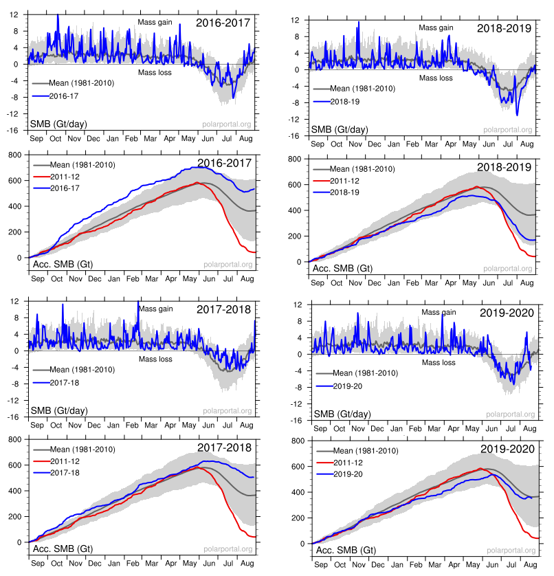
Panic is warranted only if you treat this as proof of an alarmist narrative and ignore the facts and context in which natural variation occurs. For starters, consider the last seven years of GIS fluctuations reported by DMI and summarized in the fourteen graphs below. Note the noisy blue lines showing how the surface mass balance (SMB) changes its daily weight by 8 or 10 gigatonnes (Gt) around the baseline mean from 1981 to 2010. Note also the summer decrease between May and August each year before recovering to match or exceed the mean.
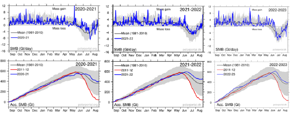
The other seven graphs show the accumulation of SMB for each of the last seven years including 2023. Tipping Point? Note that in both 2017 and 2018, SMB ended about 500 Gt higher than the year began, and way higher than 2012, which added nothing. Then came 2019 dropping below the mean, but still above 2012. Finally, the last three years exceeded the 30-year average. Note also that the charts do not integrate from previous years; i.e. each year starts at zero and shows the accumulation only for that year. Thus the gains from 2017 and 2018 do not result in 2019 starting the year up 1000 Gt, but from zero. Nor will the gains in 2021, 2022 and 2023 be added to the base.
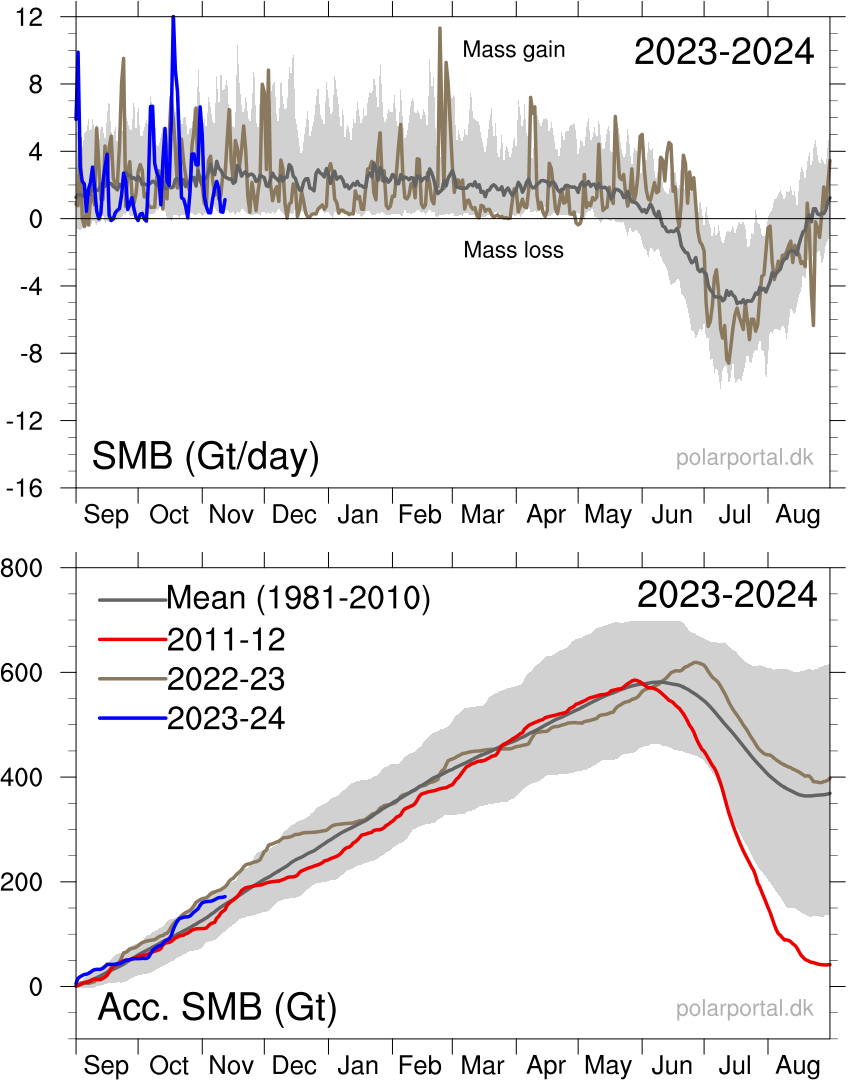
And if you’re wondering, the current year is also above average.
While they may appear solid, all ice sheets—which are essentially giant glaciers—experience movement: ice flows downslope either through the process of deformation or sliding. The latest results suggest that the movement of the ice on the GIS is dominated by sliding, not deformation. This process is moving ice to the marginal zones of the sheet, where melting occurs, at a much faster rate.
“The study was motivated by a major unknown in how the ice of Greenland moves from the cold interior, to the melting regions on the margins,” Neil Humphrey, a professor of geology from the University of Wyoming and author of the study, told Newsweek. “The ice is known to move both by sliding over the bedrock under the ice, and by oozing (deforming) like slowly flowing honey or molasses. What was unknown was the ratio between these two modes of motion—sliding or deforming.
“This lack of understanding makes predicting the future difficult, since we know how to calculate the flowing, but do not know much about sliding,” he said. “Although melt can occur anywhere in Greenland, the only place that significant melt can occur is in the low altitude margins. The center (high altitude) of the ice is too cold for the melt to contribute significant water to the oceans; that only occurs at the margins. Therefore ice has to get from where it snows in the interior to the margins.
“The implications for having high sliding along the margin of the ice sheet means that thinning or thickening along the margins due to changes in ice speed can occur much more rapidly than previously thought,” Maier said. “This is really important; as when the ice sheet thins or thickens it will either increase the rate of melting or alternatively become more resilient in a changing climate.“
“There has been some debate as to whether ice flow along the edges of Greenland should be considered mostly deformation or mostly sliding,” Maier says. “This has to do with uncertainty of trying to calculate deformation motion using surface measurements alone. Our direct measurements of sliding- dominated motion, along with sliding measurements made by other research teams in Greenland, make a pretty compelling argument that no matter where you go along the edges of Greenland, you are likely to have a lot of sliding.”
The sliding ice does two things, Humphrey says. First, it allows the ice to slide into the ocean and make icebergs, which then float away. Two, the ice slides into lower, warmer climate, where it can melt faster.
While it may sound dire, Humphrey notes the entire Greenland Ice Sheet is 5,000 to 10,000 feet thick.
“In a really big melt year, the ice sheet might melt a few feet. It means Greenland is going to be there another 10,000 years,” Humphrey says. “So, it’s not the catastrophe the media is overhyping.”
Humphrey has been working in Greenland for the past 30 years and says the Greenland Ice Sheet has only melted 10 feet during that time span.
Summary
The Greenland ice sheet is more than 1.2 miles thick in most regions. If all of its ice was to melt, global sea levels could be expected to rise by about 25 feet. However, this would take more than 10,000 years at the current rates of melting.
Background from Previous Post: Greenland Glaciers: History vs. Hysteria
The modern pattern of environmental scares started with Rachel Carson’s Silent Spring claiming chemicals are killing birds, only today it is windmills doing the carnage. That was followed by ever expanding doomsday scenarios, from DDT, to SST, to CFC, and now the most glorious of them all, CO2. In all cases the menace was placed in remote areas difficult for objective observers to verify or contradict. From the wilderness bird sanctuaries, the scares are now hiding in the stratosphere and more recently in the Arctic and Antarctic polar deserts. See Progressively Scaring the World (Lewin book synopsis)
The advantage of course is that no one can challenge the claims with facts on the ground, or on the ice. Correction: Scratch “no one”, because the climate faithful are the exception. Highly motivated to go to the ends of the earth, they will look through their alarmist glasses and bring back the news that we are indeed doomed for using fossil fuels.
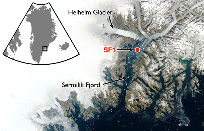
A recent example is a team of researchers from Dubai (the hot and sandy petro kingdom) going to Greenland to report on the melting of Helheim glacier there. The article is NYUAD team finds reasons behind Greenland’s glacier melt. Excerpts in italics with my bolds.
First the study and findings:
For the first time, warm waters that originate in the tropics have been found at uniform depth, displacing the cold polar water at the Helheim calving front, causing an unusually high melt rate. Typically, ocean waters near the terminus of an outlet glacier like Helheim are at the freezing point and cause little melting.
NYUAD researchers, led by Professor of Mathematics at NYU’s Courant Institute of Mathematical Sciences and Principal Investigator for NYU Abu Dhabi’s Centre for Sea Level Change David Holland, on August 5, deployed a helicopter-borne ocean temperature probe into a pond-like opening, created by warm ocean waters, in the usually thick and frozen melange in front of the glacier terminus.
Normally, warm, salty waters from the tropics travel north with the Gulf Stream, where at Greenland they meet with cold, fresh water coming from the polar region. Because the tropical waters are so salty, they normally sink beneath the polar waters. But Holland and his team discovered that the temperature of the ocean water at the base of the glacier was a uniform 4 degrees Centigrade from top to bottom at depth to 800 metres. The finding was also recently confirmed by Nasa’s OMG (Oceans Melting Greenland) project.
“This is unsustainable from the point of view of glacier mass balance as the warm waters are melting the glacier much faster than they can be replenished,” said Holland.
Surface melt drains through the ice sheet and flows under the glacier and into the ocean. Such fresh waters input at the calving front at depth have enormous buoyancy and want to reach the surface of the ocean at the calving front. In doing so, they draw the deep warm tropical water up to the surface, as well.
All around Greenland, at depth, warm tropical waters can be found at many locations. Their presence over time changes depending on the behaviour of the Gulf Stream. Over the last two decades, the warm tropical waters at depth have been found in abundance. Greenland outlet glaciers like Helheim have been melting rapidly and retreating since the arrival of these warm waters.
Then the Hysteria and Pledge of Alligiance to Global Warming
“We are surprised to learn that increased surface glacier melt due to warming atmosphere can trigger increased ocean melting of the glacier,” added Holland. “Essentially, the warming air and warming ocean water are delivering a troubling ‘one-two punch’ that is rapidly accelerating glacier melt.”
My comment: Hold on. They studied effects from warmer ocean water gaining access underneath that glacier. Oceans have roughly 1000 times the heat capacity of the atmosphere, so the idea that the air is warming the water is far-fetched. And remember also that long wave radiation of the sort that CO2 can emit can not penetrate beyond the first millimeter or so of the water surface. So how did warmer ocean water get attributed to rising CO2? Don’t ask, don’t tell. And the idea that air is melting Arctic glaciers is also unfounded.
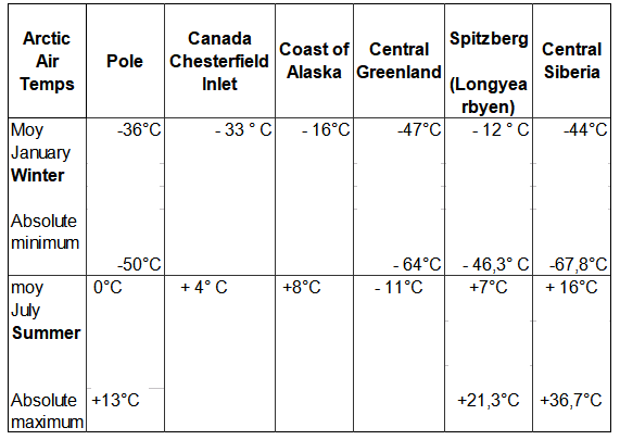
Consider the basics of air parcels in the Arctic.
The central region of the Arctic is very dry. Why? Firstly because the water is frozen and releases very little water vapour into the atmosphere. And secondly because (according to the laws of physics) cold air can retain very little moisture.
Greenland has the only veritable polar ice cap in the Arctic, meaning that the climate is even harsher (10°C colder) than at the North Pole, except along the coast and in the southern part of the landmass where the Atlantic has a warming effect. The marked stability of Greenland’s climate is due to a layer of very cold air just above ground level, air that is always heavier than the upper layers of the troposphere. The result of this is a strong, gravity-driven air flow down the slopes (i.e. catabatic winds), generating gusts that can reach 200 kph at ground level.
Arctic air temperatures Some history and scientific facts are needed to put these claims in context. Let’s start with what is known about Helheim Glacier.
Holocene history of the Helheim Glacier, southeast Greenland
Helheim Glacier ranks among the fastest flowing and most ice discharging outlets of the Greenland Ice Sheet (GrIS). After undergoing rapid speed-up in the early 2000s, understanding its long-term mass balance and dynamic has become increasingly important. Here, we present the first record of direct Holocene ice-marginal changes of the Helheim Glacier following the initial deglaciation. By analysing cores from lakes adjacent to the present ice margin, we pinpoint periods of advance and retreat. We target threshold lakes, which receive glacial meltwater only when the margin is at an advanced position, similar to the present. We show that, during the period from 10.5 to 9.6 cal ka BP, the extent of Helheim Glacier was similar to that of todays, after which it remained retracted for most of the Holocene until a re-advance caused it to reach its present extent at c. 0.3 cal ka BP, during the Little Ice Age (LIA). Thus, Helheim Glacier’s present extent is the largest since the last deglaciation, and its Holocene history shows that it is capable of recovering after several millennia of warming and retreat. Furthermore, the absence of advances beyond the present-day position during for example the 9.3 and 8.2 ka cold events as well as the early-Neoglacial suggest a substantial retreat during most of the Holocene.
The topography of Greenland shows why its ice cap has persisted for millenia despite its southerly location. It is a bowl surrounded by ridges except for a few outlets, Helheim being a major one.
Helheim Glacier is the fastest flowing glacier along the eastern edge of Greenland Ice Sheet and one of the island’s largest ocean-terminating rivers of ice. Named after the Vikings’ world of the dead, Helheim has kept scientists on their toes for the past two decades. Between 2000 and 2005, Helheim quickly increased the rate at which it dumped ice to the sea, while also rapidly retreating inland- a behavior also seen in other glaciers around Greenland. Since then, the ice loss has slowed down and the glacier’s front has partially recovered, readvancing by about 2 miles of the more than 4 miles it had initially retreated.
NASA has compiled a time series of airborne observations of Helheim’s changes into a new visualization that illustrates the complexity of studying Earth’s changing ice sheets. NASA uses satellites and airborne sensors to track variations in polar ice year after year to figure out what’s driving these changes and what impact they will have in the future on global concerns like sea level rise.
Since 1997, NASA has collected data over Helheim Glacier almost every year during annual airborne surveys of the Greenland Ice Sheet using an airborne laser altimeter called the Airborne Topographic Mapper (ATM). Since 2009 these surveys have continued as part of Operation IceBridge, NASA’s ongoing airborne survey of polar ice and its longest-running airborne mission. ATM measures the elevation of the glacier along a swath as the plane files along the middle of the glacier. By comparing the changes in the height of the glacier surface from year to year, scientists estimate how much ice the glacier has lost.
The animation begins by showing the NASA P-3 plane collecting elevation data in 1998. The laser instrument maps the glacier’s surface in a circular scanning pattern, firing laser shots that reflect off the ice and are recorded by the laser’s detectors aboard the airplane. The instrument measures the time it takes for the laser pulses to travel down to the ice and back to the aircraft, enabling scientists to measure the height of the ice surface. In the animation, the laser data is combined with three-dimensional images created from IceBridge’s high-resolution camera system. The animation then switches to data collected in 2013, showing how the surface elevation and position of the calving front (the edge of the glacier, from where it sheds ice) have changed over those 15 years.
Helheim’s calving front retreated about 2.5 miles between 1998 and 2013. It also thinned by around 330 feet during that period, one of the fastest thinning rates in Greenland.
“The calving front of the glacier most likely was perched on a ledge in the bedrock in 1998 and then something altered its equilibrium,” said Joe MacGregor, IceBridge deputy project scientist. “One of the most likely culprits is a change in ocean circulation or temperature, such that slightly warmer water entered into the fjord, melted a bit more ice and disturbed the glacier’s delicate balance of forces.”
In addition consider Greenland Ice Math
Prompted by comments from Gordon Walleville, let’s look at Greenland ice gains and losses in context. The ongoing SMB (surface mass balance) estimates ice sheet mass net from melting and sublimation losses and precipitation gains. Dynamic ice loss is a separate calculation of calving chunks of ice off the edges of the sheet, as discussed in the post above. The two factors are combined in a paper Forty-six years of Greenland Ice Sheet mass balance from 1972 to 2018 by Mouginot et al. (2019) Excerpt in italics. (“D” refers to dynamic ice loss.)
Greenland’s SMB averaged 422 ± 10 Gt/y in 1961–1989 (SI Appendix, Fig. S1H). It decreased from 506 ± 18 Gt/y in the 1970s to 410 ± 17 Gt/y in the 1980s and 1990s, 251 ± 20 Gt/y in 2010–2018, and a minimum at 145 ± 55 Gt/y in 2012. In 2018, SMB was above equilibrium at 449 ± 55 Gt, but the ice sheet still lost 105 ± 55 Gt, because D is well above equilibrium and 15 Gt higher than in 2017. In 1972–2000, D averaged 456 ± 1 Gt/y, near balance, to peak at 555 ± 12 Gt/y in 2018. In total, the mass loss increased to 286 ± 20 Gt/y in 2010–2018 due to an 18 ± 1% increase in D and a 48 ± 9% decrease in SMB. The ice sheet gained 47 ± 21 Gt/y in 1972–1980, and lost 50 ± 17 Gt/y in the 1980s, 41 ± 17 Gt/y in the 1990s, 187 ± 17 Gt/y in the 2000s, and 286 ± 20 Gt/y in 2010–2018 (Fig. 2). Since 1972, the ice sheet lost 4,976 ± 400 Gt, or 13.7 ± 1.1 mm SLR.
Doing the numbers: Greenland area 2.1 10^6 km2 80% ice cover, 1500 m thick in average- That is 2.5 Million Gton. Simplified to 1 km3 = 1 Gton
The estimated loss since 1972 is 5000 Gt (rounded off), which is 110 Gt a year. The more recent estimates are higher, in the 200 Gt range.
200 Gton is 0.008 % of the Greenland ice sheet mass.
Annual snowfall: From the Lost Squadron, we know at that particular spot, the ice increase since 1942 – 1990 was 1.5 m/year ( Planes were found 75 m below surface) Assume that yearly precipitation is 100 mm / year over the entire surface. That is 168000 Gton. Yes, Greenland is Big! Inflow = 168,000Gton. Outflow is 168,200 Gton.
So if that 200 Gton rate continued, (assuming as models do, despite air photos showing fluctuations), that ice loss would result in a 1% loss of Greenland ice in 800 years. (H/t Bengt Abelsson)
Comment:
Once again, history is a better guide than hysteria. Over time glaciers advance and retreat, and incursions of warm water are a key factor. Greenland ice cap and glaciers are part of the Arctic self-oscillating climate system operating on a quasi-60 year cycle.
The animation shows the rapid growth of Arctic ice extent during October 2023, from day 274 to day 304, yesterday. For all of the fuss over the September minimum, little is said about Arctic ice growing 4M km2, that’s 4 Wadhams in one month!. Look on the left (Russian side) at the complete closing of the Northern Sea Route for shipping.
The graph below show 2023 compared to the 17 year average (2006 to 2022 inclusive), to SII (Sea Ice Index) and some notable years.
This year October added 3.95M km2 from end of September compared to an average October increase of 3.45M km2. As of yesterday NH ice extent is 368k km2 above average and nearly 600k km2 greater than 2007.
The table below shows the distribution of ice in the Arctic Ocean basins.
Region
2023304
Ave. Day 304
2023-Ave.
2007304
2023-2007
(0) Northern_Hemisphere
8768573
8422636
345938
8175072
593501
(1) Beaufort_Sea
780946
957189
-176243
1038126
-257180
(2) Chukchi_Sea
535578
454974
80604
242685
292894
(3) East_Siberian_Sea
1078989
936944
142045
835071
243917
(4) Laptev_Sea
897845
842696
55149
887789
10055
(5) Kara_Sea
655623
473780
181843
311960
343664
(6) Barents_Sea
121748
83466
38282
52823
68925
(7) Greenland_Sea
528448
412774
115675
443559
84890
(8) Baffin_Bay_Gulf_of_St._Lawrence
243512
256243
-12731
289374
-45861
(9) Canadian_Archipelago
629955
762429
-132474
817220
-187265
(10) Hudson_Bay
82242
69487
12754
48845
33396
(11) Central_Arctic
3207724
3161034
46690
3206345
1379
Overall ice extent has 346k km2 above average or 4%. Sizeable deficits are in Beaufort Sea and Canadian Archipelago, more than offset by surpluses in Chukchi, East Siberian, Kara and Greenland seas.
‘Shrinking with no sign of recovery’: Scientists issue warning on Antarctic ice shelves
YAHOO!News
Scientists count huge melts in many protective Antarctic ice shelves. Trillions of tons of ice lost.
Associated Press
Antarctica’s Shrinking Sea Ice Hits a Record Low, Alarming Scientists Bloomberg
Melting Antarctic Ice Shelves Have Dumped More Than 7 Trillion Metric Tons of Water Into the Ocean The Messenger
Etc., Etc. Etc.
Looks like it’s time yet again to play Climate Whack-A-Mole. That means stepping back to get some perspective on the reports and the interpretations applied by those invested in alarmism.
Antarctic Basics
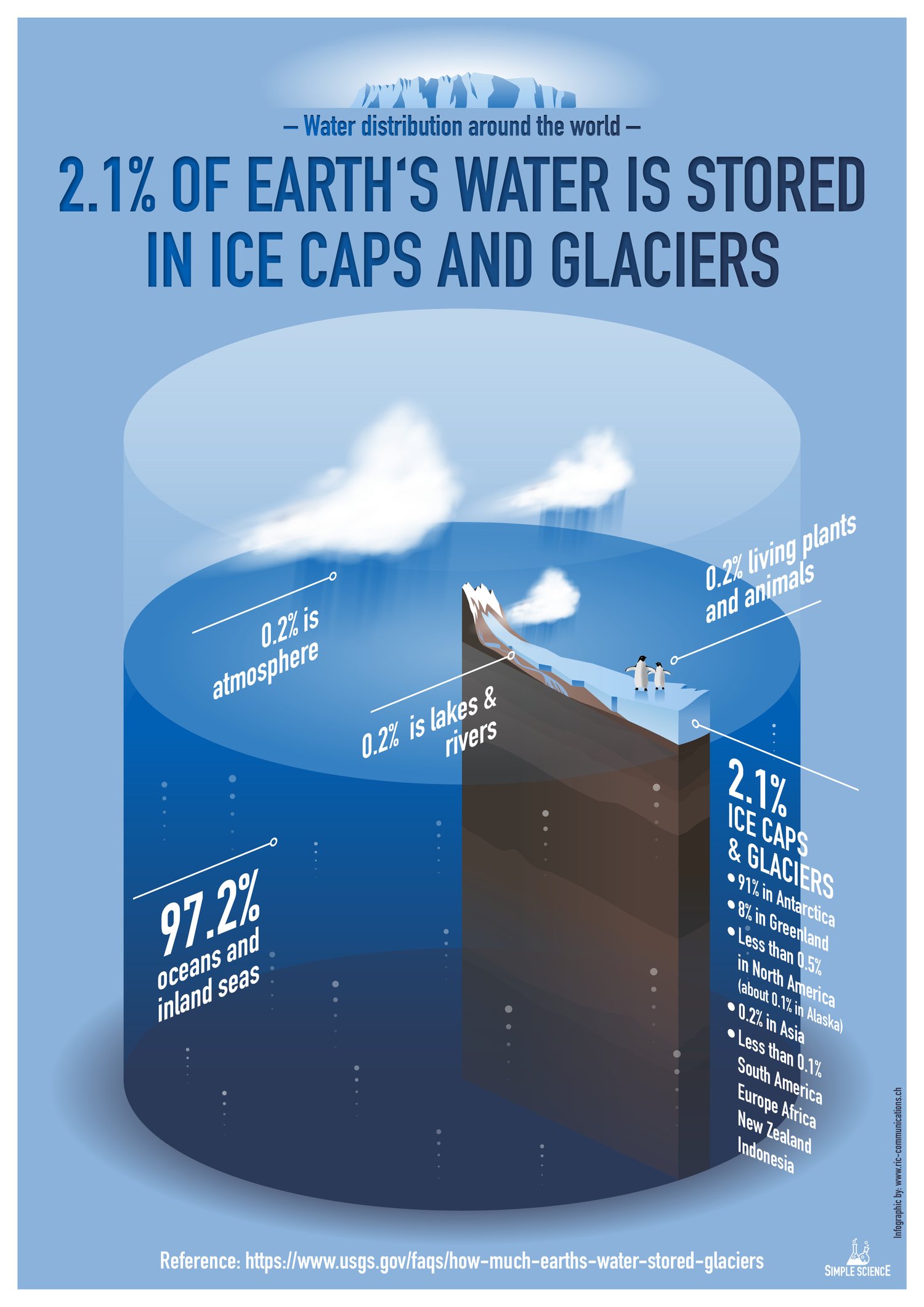
The Antarctic Ice Sheet extends almost 14 million square kilometers (5.4 million square miles), roughly the area of the contiguous United States and Mexico combined. The Antarctic Ice Sheet contains 30 million cubic kilometers (7.2 million cubic miles) of ice. (Source: NSIDC: Quick Facts Ice Sheets)
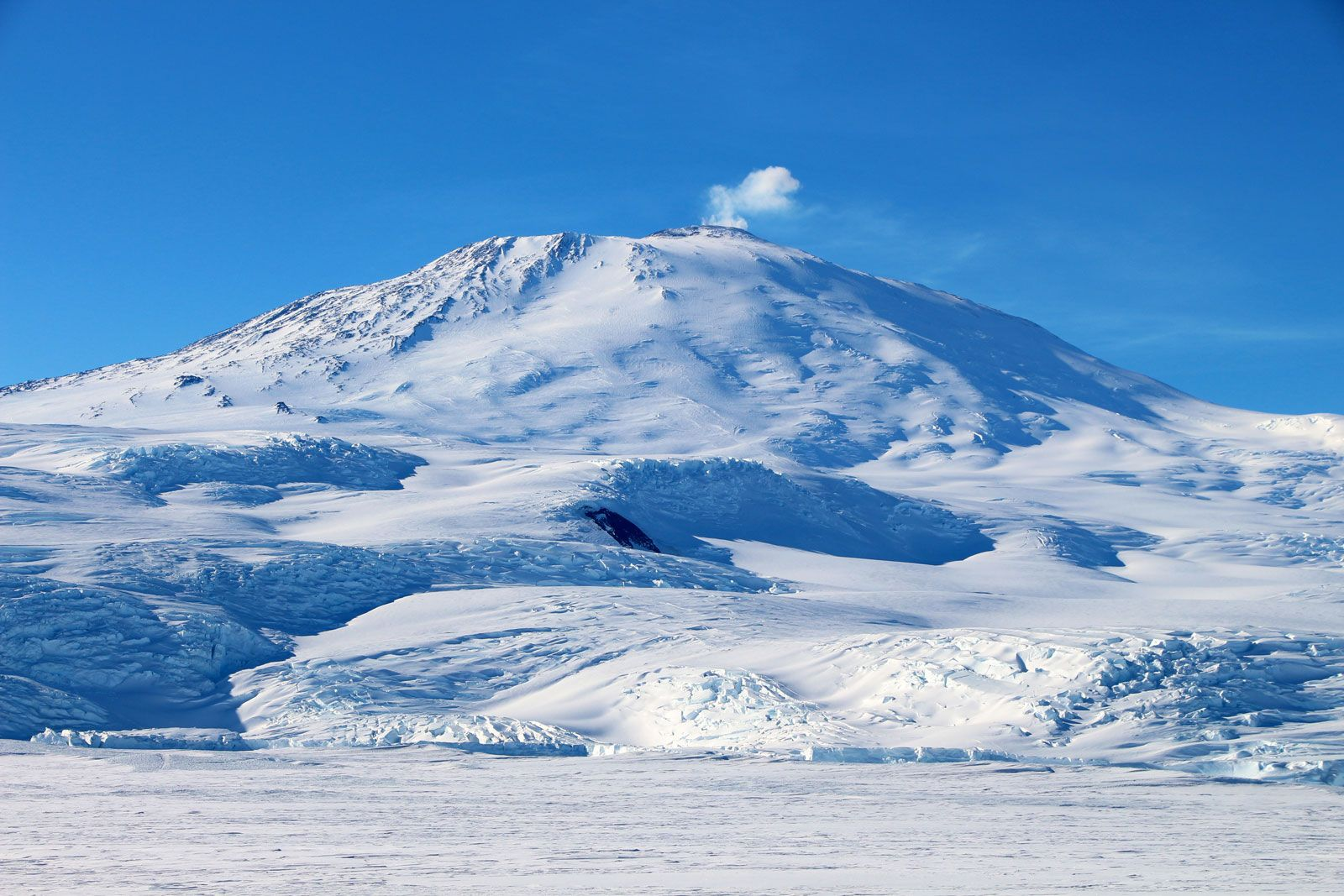
Highly active volcano Mt. Erebus, Ross Island, Antarctica
The Antarctic Ice Sheet covers an area larger than the U.S. and Mexico combined. This photo shows Mt. Erebus rising above the ice-covered continent. Credit: Ted Scambos & Rob Bauer, NSIDC
The study of ice sheet mass balance underwent two major advances, one during the early 1990s, and again early in the 2000s. At the beginning of the 1990s, scientists were unsure of the sign (positive or negative) of the mass balance of Greenland or Antarctica, and knew only that it could not be changing rapidly relative to the size of the ice sheet.
Advances in glacier ice flow mapping using repeat satellite images, and later using interferometric synthetic aperture radar SAR methods, facilitated the mass budget approach, although this still requires an estimate of snow input and a cross-section of the glacier as it flows out from the continent and becomes floating ice. Satellite radar altimetry mapping and change detection, developed in the early to mid-1990s allowed the research community to finally extract reliable quantitative information regarding the overall growth or reduction of the volume of the ice sheets.
By 2002, publications were able to report that both large ice sheets were losing mass (Rignot and Thomas 2002). Then in 2003 the launch of two new satellites, ICESat and GRACE, led to vast improvements in one of the methods for mass balance determination, volume change, and introduced the ability to conduct gravimetric measurements of ice sheet mass over time. The gravimetric method helped to resolve remaining questions about how and where the ice sheets were losing mass. With this third method, and with continued evolution of mass budget and geodetic methods it was shown that the ice sheets were in fact losing mass at an accelerating rate by the end of the 2000s (Veliconga 2009, Rignot et al. 2011b).
Fig. 1. Antarctic Ice Sheet Regions and Drainage Systems (DS). East Antarctica (EA) is divided into EA1 (DS2 to DS11) and EA2 (DS12 to DS17). The Antarctic Peninsula (AP) includes DS24 – 27. West Antarctica (WA) is divided into WA1 (Pine Island Glacier DS22, Thwaites and Smith Glaciers DS21, and the coastal DS20) and WA2 (inland DS1, DS18, and DS19 and coastal DS23). Includes grounded ice within ice shelves and contiguous islands.
A new NASA study [Antarctic Mass Balance] confirms that an increase in Antarctic snow accumulation [Siegert, 2003] that began 10,000 years ago in East Antarctica (EA) [Fig. 1] was adding enough ice to the continent during 1992 to 2008 to outweigh increased lossesfrom its increasing glacier discharge into the ocean from West Antarctica (WA) as previously reported [2015 JOG paper]. Since most other studies reported that the Antarctic ice sheet was losing mass, those 2015 results on gaining mass were controversial. The new study derives consistent rates of mass changes over 24 years (1992 to 2016) using radar-altimetry data from ESA’s Envisat (2003-10) and gravimetry data from NASA’s GRACE (2003-16), in addition to the prior use of radar-altimetry data from ERS1/2 (1992-2001) of the European Space Agency (ESA) and laser-altimetry from NASA’s ICESat (2003-08).
However, the new study shows that beginning in 2009, the dynamic losses from the outlet glaciers in the WA1 part of WA strongly increased by 119 Gt a-1 (from 95 to 214 Gt a-1), which was further enhanced by an accumulation mass decrease of 39 Gt a-1 in the inland WA2 part of WA. Nevertheless, that total decrease of 158 Gt a-1 was not enough to bring the whole ice sheet into balance (input equals output), because there was a concurrent accumulation mass increase of 107 Gt a-1 in EA for three years (2009-11). While that temporary EA accumulation increase diminished, the loss from WA reduced by 71 Gt a-1 and the total ice sheet came into balance at -12 ± 46 Gt a-1 during 2012-16, thereby eliminating its effect on sea level rise.
Fig. 2. M(t) mass time series for West Antarctica (WA), East Antarctica (EA), Antarctica Peninsula (AP), and the total Antarctic Ice Sheet (AIS) from ICESat (blue) and GRACE (red) using the derived equalizing corrections (dBcor and GIAcor) for sub-glacial changes in volume and mass of the Earth’s fluid mantle.
Fig. 3. ICESat map of dM/dt total rate of mass change for 2003-2008 with adjusted correction for bedrock motion.
“We now have an accurate record of how the mass balance of the Antarctic ice sheet has changed over 24 years and the causes of those changes. Short-term changes for 3 to 8 years have been caused by fluctuations in snowfall and accumulation, but there is no significant trend during 1992 to 2016. Mass losses have increased from the dynamic thinning and faster ice discharge of outlet glaciers in West Antarctic, and the large long-term mass gain in East Antarctica has continued”, said lead author Jay Zwally. “However, our findings and those of others [e.g. Barletta and others, 2018] also include some good signs about the future stability of the West Antarctic ice sheet, about which there has been much concern and predictions of increasing mass loss”.
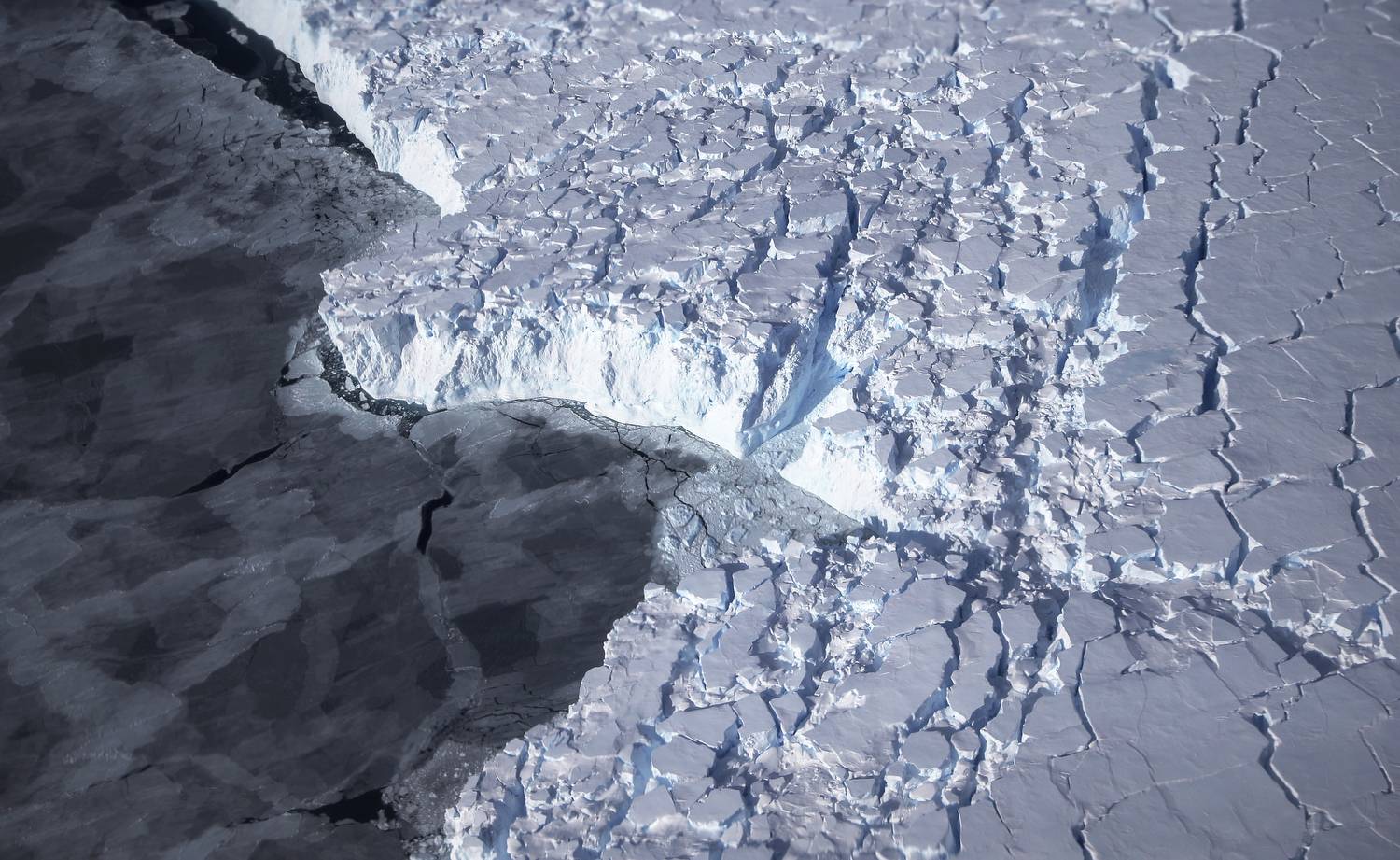
NASA aerial images record West Antarctica melting ice (2016)
Keeping Things in Perspective
Source: NASA
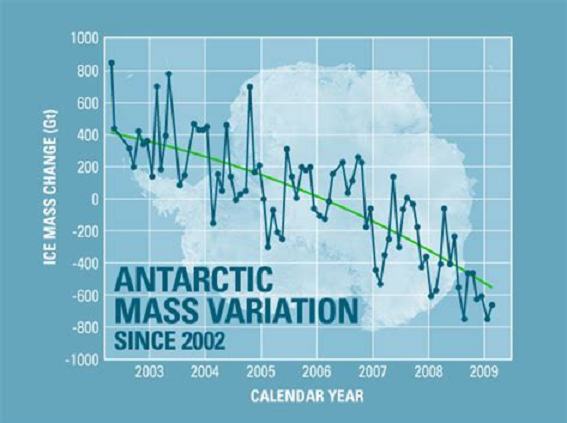
Such reports often include scary graphs like this one and the reader is usually provided no frame of reference or context to interpret the image. First, the chart is showing cumulative loss of mass arising from an average rate of 100 Gt lost per year since 2002. Many years had gains, including 2002, and the cumulative loss went below zero only in 2006. Also, various methods of measuring and analyzing give different results, as indicated by the earlier section.
Most important is understanding the fluxes in proportion to the Antarctic Ice Sheet. Let’s do the math. Above it was stated Antarctica contains ~30 million cubic kilometers of ice volume. One km3 of water is 1 billion cubic meters and weighs 1 billion tonnes, or 1 gigatonne. So Antarctica has about 30,000,000 gigatonnes of ice. Since ice is slightly less dense than water, the total should be adjusted by 0.92 for an estimate of 27.6 M Gts of ice comprising the Antarctic Ice Sheet.
So in the recent decade, an average year went from 27,600,100 Gt to 27,600,000, according to one analysis. Other studies range from losing 200 Gt/yr to gaining 100 Gt/yr.
Even if Antarctica lost 200 Gt/yr. for the next 1000 years,
it would only approach 1% of the ice sheet.
If like Al Gore you are concerned about sea level rise, that calculation starts with the ocean area estimated to be 3.618 x 10^8 km2 (361,800,000 km2). To raise that area 1 mm requires 3.618×10^2 km3 or 361.8 km3 water (1 km3 water=1 Gt.) So 200 Gt./yr is about 0.55mm/yr or 6 mm a decade, or 6 cm/century.
By all means let’s pay attention to things changing in our world, but let’s also notice the scale of the reality and not make mountains out of molehills.
Let’s also respect the scientists who study glaciers and their subtle movements over time (“glacial pace”). Below is an amazing video showing the challenges and the beauty of working on Greenland Glacier.