Photo illustration by Slate. Photos by Thinkstock.
A glance at the news aggregator shows the silly season is in full swing. A partial listing of headlines today proclaiming the hottest whatever.
- Last Month Was the Hottest June in North America in Recent Recorded History TIME
- Global Warming Is Increasing the Likelihood of Frost Damage in Vineyards Martha Stewart
- Heat records smashed in Moscow and Helsinki CGTN
- Alberta glacial melt about 3 times higher than average during heat wave: expert The Weather Network
- US and Canada heatwave ‘impossible’ without climate change, analysis shows Sky News
- Heat waves caused warmest June ever in North America The Independent
- Glacial melt: the European Alps New Age
- The North American heatwave shows we need to know how climate change will change our weather Cyprus Mail
- Global evidence links rise in extreme precipitation to human-driven climate change Phys.org
- Drought-Stricken Western Districts Plan New Ways to Store Water Bloomberg
- Amid record heat, Equilibrium Capital raises $1 billion for second greenhouse fund ImpactAlpha
- Last Month Was Hottest June on Record in North America MTV Lebanon
- Superior National Forest could provide refuge to wildlife as the climate warms Yale Climate Connections
- How climate change is exacerbating record heatwaves The Telegraph
- Lapland records hottest day for more than a century as heatwave grips region Sky News
- Heatwave stokes North America’s warmest June on record The Raw Story
Time for some Clear Thinking about Heat Records (Previous Post)
Here is an analysis using critical intelligence to interpret media reports about temperature records this summer. Daniel Engber writes in Slate Crazy From the Heat
The subtitle is Climate change is real. Record-high temperatures everywhere are fake. As we shall see from the excerpts below, The first sentence is a statement of faith, since as Engber demonstrates, the notion does not follow from the temperature evidence. Excerpts in italics with my bolds.
It’s been really, really hot this summer. How hot? Last Friday, the Washington Post put out a series of maps and charts to illustrate the “record-crushing heat.” All-time temperature highs have been measured in “scores of locations on every continent north of the equator,” the article said, while the lower 48 states endured the hottest-ever stretch of temperatures from May until July.
These were not the only records to be set in 2018. Historic heat waves have been crashing all around the world, with records getting shattered in Japan, broken on the eastern coast of Canada, smashed in California, and rewritten in the Upper Midwest. A city in Algeria suffered through the highest high temperature ever recorded in Africa. A village in Oman set a new world record for the highest-ever low temperature. At the end of July, the New York Times ran a feature on how this year’s “record heat wreaked havoc on four continents.” USA Today reported that more than 1,900 heat records had been tied or beaten in just the last few days of May.
While the odds that any given record will be broken may be very, very small, the total number of potential records is mind-blowingly enormous.
There were lots of other records, too, lots and lots and lots—but I think it’s best for me to stop right here. In fact, I think it’s best for all of us to stop reporting on these misleading, imbecilic stats. “Record-setting heat,” as it’s presented in news reports, isn’t really scientific, and it’s almost always insignificant. And yet, every summer seems to bring a flood of new superlatives that pump us full of dread about the changing climate. We’d all be better off without this phony grandiosity, which makes it seem like every hot and humid August is unparalleled in human history. It’s not. Reports that tell us otherwise should be banished from the news.
It’s true the Earth is warming overall, and the record-breaking heat that matters most—the kind we’d be crazy to ignore—is measured on a global scale. The average temperature across the surface of the planet in 2017 was 58.51 degrees, one-and-a-half degrees above the mean for the 20th century. These records matter: 17 of the 18 hottest years on planet Earth have occurred since 2001, and the four hottest-ever years were 2014, 2015, 2016, and 2017. It also matters that this changing climate will result in huge numbers of heat-related deaths. Please pay attention to these terrifying and important facts. Please ignore every other story about record-breaking heat.
You’ll often hear that these two phenomena are related, that local heat records reflect—and therefore illustrate—the global trend. Writing in Slate this past July, Irineo Cabreros explained that climate change does indeed increase the odds of extreme events, making record-breaking heat more likely. News reports often make this point, linking probabilities of rare events to the broader warming pattern. “Scientists say there’s little doubt that the ratcheting up of global greenhouse gases makes heat waves more frequent and more intense,” noted the Times in its piece on record temperatures in Algeria, Hong Kong, Pakistan, and Norway.
Yet this lesson is subtler than it seems. The rash of “record-crushing heat” reports suggest we’re living through a spreading plague of new extremes—that the rate at which we’re reaching highest highs and highest lows is speeding up. When the Post reports that heat records have been set “at scores of locations on every continent,” it makes us think this is unexpected. It suggests that as the Earth gets ever warmer, and the weather less predictable, such records will be broken far more often than they ever have before.
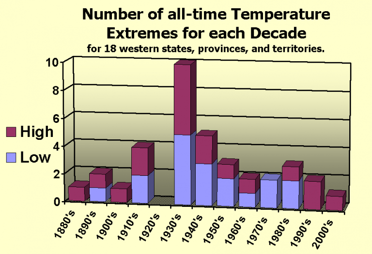
But that’s just not the case. In 2009, climatologist Gerald Meehl and several colleagues published an analysis of records drawn from roughly 2,000 weather stations in the U.S. between 1950 and 2006. There were tens of millions of data points in all—temperature highs and lows from every station, taken every day for more than a half-century. Meehl searched these numbers for the record-setting values—i.e., the days on which a given weather station saw its highest-ever high or lowest-ever low up until that point. When he plotted these by year, they fell along a downward-curving line. Around 50,000 new heat records were being set every year during the 1960s; then that number dropped to roughly 20,000 in the 1980s, and to 15,000 by the turn of the millennium.
From Meehl et al 2009.
This shouldn’t be surprising. As a rule, weather records will be set less frequently as time goes by. The first measurement of temperature that’s ever taken at a given weather station will be its highest (and lowest) of all time, by definition. There’s a good chance that the same station’s reading on Day 2 will be a record, too, since it only needs to beat the temperature recorded on Day 1. But as the weeks and months go by, this record-setting contest gets increasingly competitive: Each new daily temperature must now outdo every single one that came before. If the weather were completely random, we might peg the chances of a record being set at any time as 1/n, where n is the number of days recorded to that point. In other words, one week into your record-keeping, you’d have a 1 in 7 chance of landing on an all-time high. On the 100th day, your odds would have dropped to 1 percent. After 56 years, your chances would be very, very slim.
The weather isn’t random, though; we know it’s warming overall, from one decade to the next. That’s what Meehl et al. were looking at: They figured that a changing climate would tweak those probabilities, goosing the rate of record-breaking highs and tamping down the rate of record-breaking lows. This wouldn’t change the fundamental fact that records get broken much less often as the years go by. (Even though the world is warming, you’d still expect fewer heat records to be set in 2000 than in 1965.) Still, one might guess that climate change would affect the rate, so that more heat records would be set than we’d otherwise expect.
That’s not what Meehl found. Between 1950 and 2006, the rate of record-breaking heat seemed unaffected by large-scale changes to the climate: The number of new records set every year went down from one decade to the next, at a rate that matched up pretty well with what you’d see if the odds were always 1/n. The study did find something more important, though: Record-breaking lows were showing up much less often than expected. From one decade to the next, fewer records of any kind were being set, but the ratio of record lows to record highs was getting smaller over time. By the 2000s, it had fallen to about 0.5, meaning that the U.S. was seeing half as many record-breaking lows as record-breaking highs. (Meehl has since extended this analysis using data going back to 1930 and up through 2015. The results came out the same.)

What does all this mean? On one hand, it’s very good evidence that climate change has tweaked the odds for record-breaking weather, at least when it comes to record lows. (Other studies have come to the same conclusion.) On the other hand, it tells us that in the U.S., at least, we’re not hitting record highs more often than we were before, and that the rate isn’t higher than what you’d expect if there weren’t any global warming. In fact, just the opposite is true: As one might expect, heat records are getting broken less often over time, and it’s likely there will be fewer during the 2010s than at any point since people started keeping track.

This may be hard to fathom, given how much coverage has been devoted to the latest bouts of record-setting heat. These extreme events are more unusual, in absolute terms, than they’ve ever been before, yet they’re always in the news. How could that be happening?
While the odds that any given record will be broken may be very, very small, the total number of potential records that could be broken—and then reported in the newspaper—is mind-blowingly enormous. To get a sense of how big this number really is, consider that the National Oceanic and Atmospheric Administration keeps a database of daily records from every U.S. weather station with at least 30 years of data, and that its website lets you search for how many all-time records have been set in any given stretch of time. For instance, the database indicates that during the seven-day period ending on Aug. 17—the date when the Washington Post published its series of “record-crushing heat” infographics—154 heat records were broken.

That may sound like a lot—154 record-high temperatures in the span of just one week. But the NOAA website also indicates how many potential records could have been achieved during that time: 18,953. In actuality, less than one percent of these were broken. You can also pull data on daily maximum temperatures for an entire month: I tried that with August 2017, and then again for months of August at 10-year intervals going back to the 1950s. Each time the query returned at least about 130,000 potential records, of which one or two thousand seemed to be getting broken every year. (There was no apparent trend toward more records being broken over time.)
Now let’s say there are 130,000 high-temperature records to be broken every month in the U.S. That’s only half the pool of heat-related records, since the database also lets you search for all-time highest low temperatures. You can also check whether any given highest high or highest low happens to be a record for the entire month in that location, or whether it’s a record when compared across all the weather stations everywhere on that particular day.
Add all of these together and the pool of potential heat records tracked by NOAA appears to number in the millions annually, of which tens of thousands may be broken. Even this vastly underestimates the number of potential records available for media concern. As they’re reported in the news, all-time weather records aren’t limited to just the highest highs or highest lows for a given day in one location. Take, for example, the first heat record mentioned in this column, reported in the Post: The U.S. has just endured the hottest May, June, and July of all time. The existence of that record presupposes many others: What about the hottest April, May and June, or the hottest March, April, and May? What about all the other ways that one might subdivide the calendar?
Geography provides another endless well of flexibility. Remember that the all-time record for the hottest May, June, and July applied only to the lower 48 states. Might a different set of records have been broken if we’d considered Hawaii and Alaska? And what about the records spanning smaller portions of the country, like the Midwest, or the Upper Midwest, or just the state of Minnesota, or just the Twin Cities? And what about the all-time records overseas, describing unprecedented heat in other countries or on other continents?
Even if we did limit ourselves to weather records from a single place measured over a common timescale, it would still be possible to parse out record-breaking heat in a thousand different ways. News reports give separate records, as we’ve seen, for the highest daily high and the highest daily low, but they also tell us when we’ve hit the highest average temperature over several days or several weeks or several months. The Post describes a recent record-breaking streak of days in San Diego with highs of at least 83 degrees. (You’ll find stories touting streaks of daily highs above almost any arbitrary threshold: 90 degrees, 77 degrees, 60 degrees, et cetera.) Records also needn’t focus on the temperature at all: There’s been lots of news in recent weeks about the fact that the U.K. has just endured its driest-ever early summer.
“Record-breaking” summer weather, then, can apply to pretty much any geographical location, over pretty much any span of time. It doesn’t even have to be a record—there’s an endless stream of stories on “near-record heat” in one place or another, or the “fifth-hottest” whatever to happen in wherever, or the fact that it’s been “one of the hottest” yadda-yaddas that yadda-yadda has ever seen. In the most perverse, insane extension of this genre, news outlets sometimes even highlight when a given record isn’t being set.
Loose reports of “record-breaking heat” only serve to puff up muggy weather and make it seem important. (The sham inflations of the wind chill factor do the same for winter months.) So don’t be fooled or flattered by this record-setting hype. Your summer misery is nothing special.
Summary
This article helps people not to confuse weather events with climate. My disappointment is with the phrase, “Climate Change is Real,” since it is subject to misdirection. Engber uses that phrase referring to rising average world temperatures, without explaining that such estimates are computer processed reconstructions since the earth has no “average temperature.” More importantly the undefined “climate change” is a blank slate to which a number of meanings can be attached.
Some take it to mean: It is real that rising CO2 concentrations cause rising global warming. Yet that is not supported by temperature records.
 Others think it means: It is real that using fossil fuels causes global warming. This too lacks persuasive evidence.
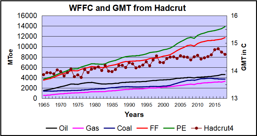 Over the last five decades the increase in fossil fuel consumption is dramatic and monotonic, steadily increasing by 234% from 3.5B to 11.7B oil equivalent tons. Meanwhile the GMT record from Hadcrut shows multiple ups and downs with an accumulated rise of 0.74C over 53 years, 5% of the starting value.
Others know that Global Mean Temperature is a slippery calculation subject to the selection of stations.
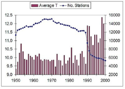
Graph showing the correlation between Global Mean Temperature (Average T) and the number of stations included in the global database. Source: Ross McKitrick, U of Guelph
Global warming estimates combine results from adjusted records.
 Conclusion
The pattern of high and low records discussed above is consistent with natural variability rather than rising CO2 or fossil fuel consumption. Those of us not alarmed about the reported warming understand that “climate change” is something nature does all the time, and that the future is likely to include periods both cooler and warmer than now.
Background Reading:
The Climate Story (Illustrated)
2020 Update: Fossil Fuels ≠ Global Warming
Man Made Warming from Adjusting Data
What is Global Temperature? Is it warming or cooling?
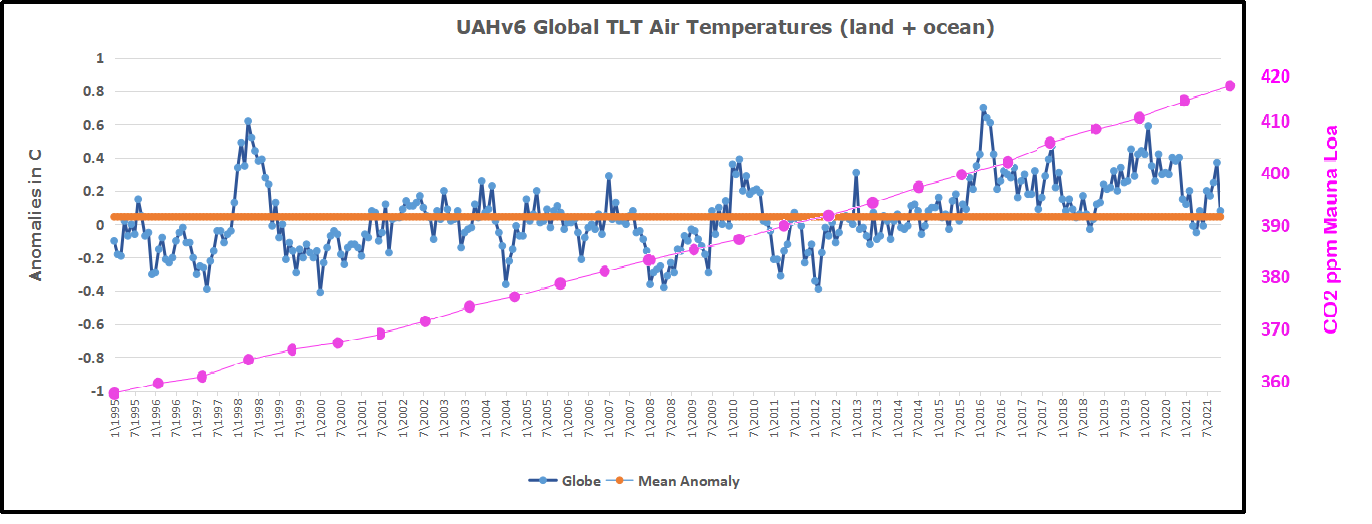
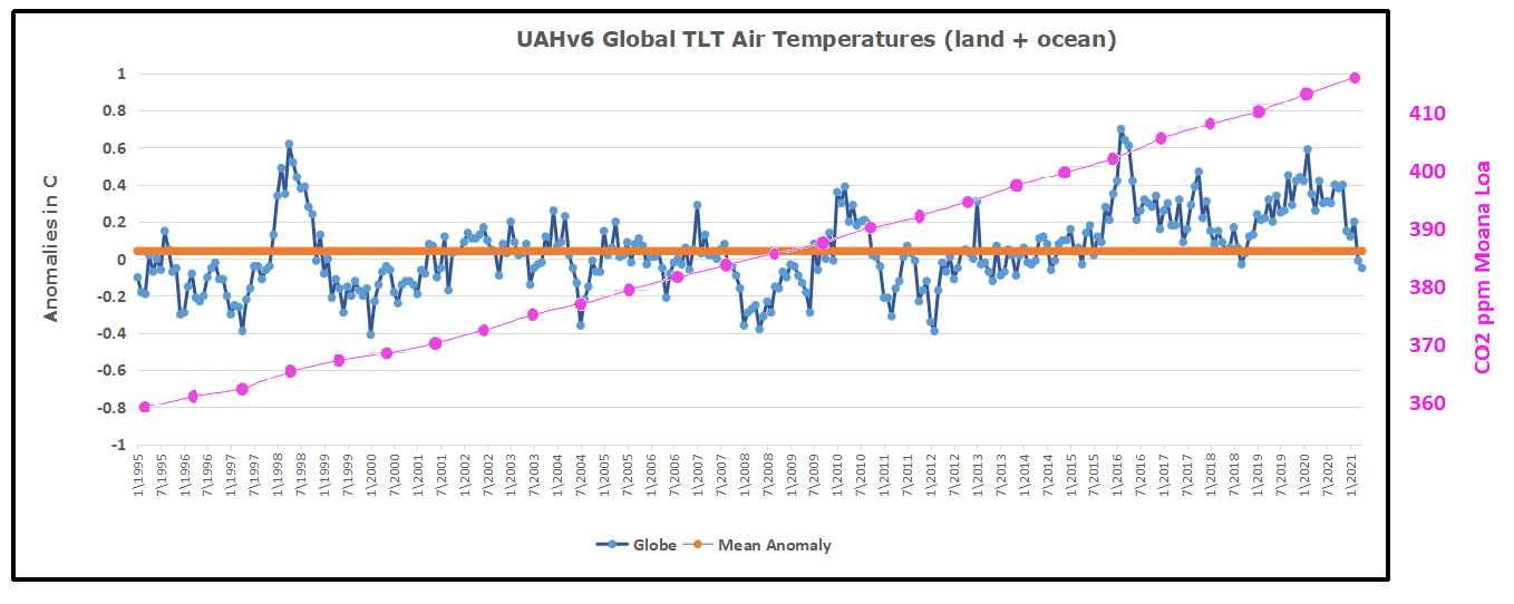 For reference I added an overlay of CO2 annual concentrations as measured at Mauna Loa. While temperatures fluctuated up and down ending flat, CO2 went up steadily by ~55 ppm, a 15% increase.


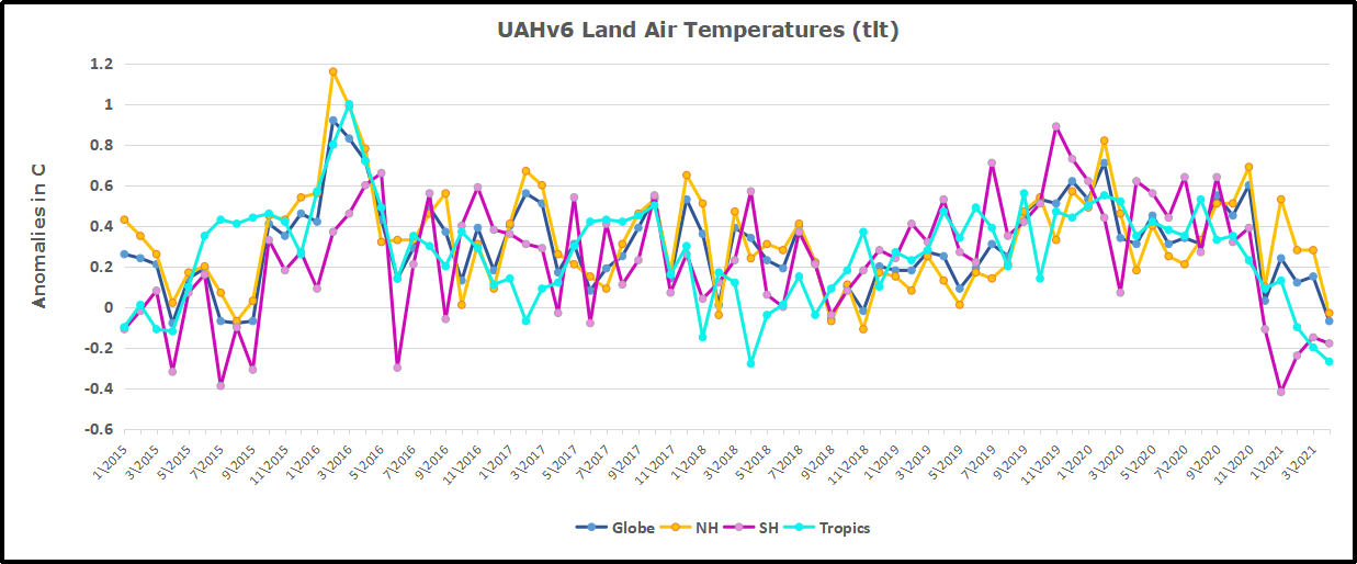
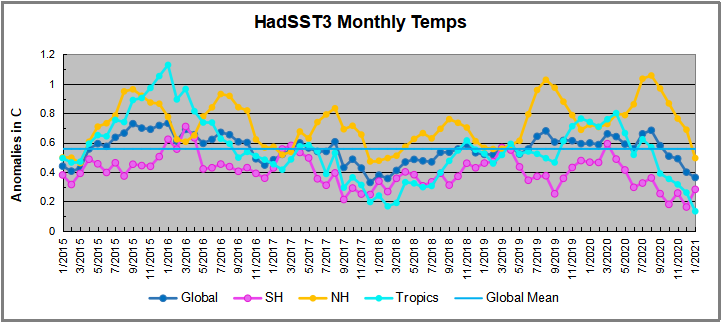
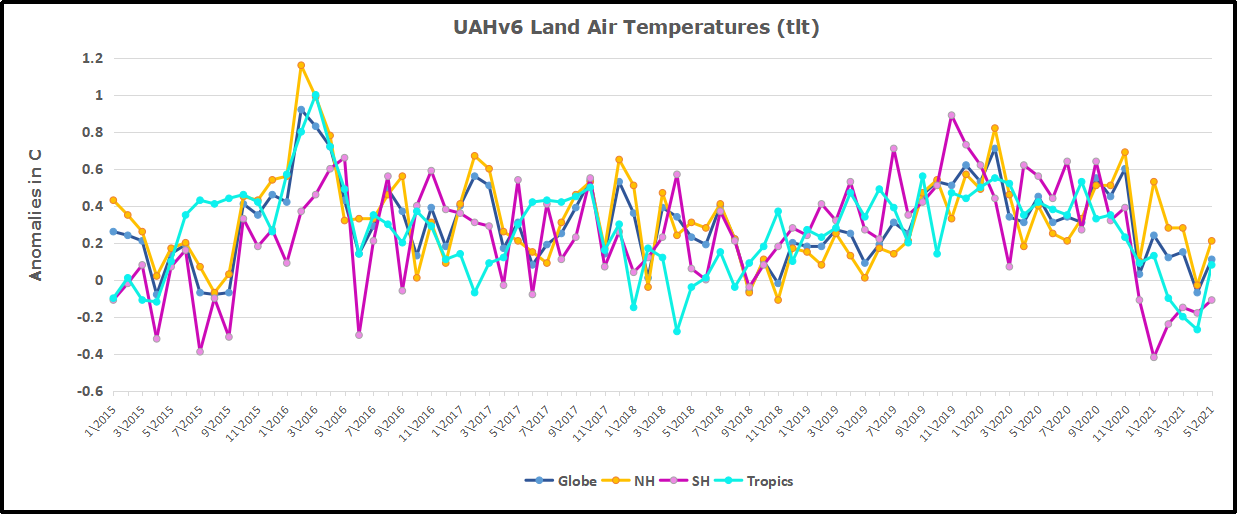
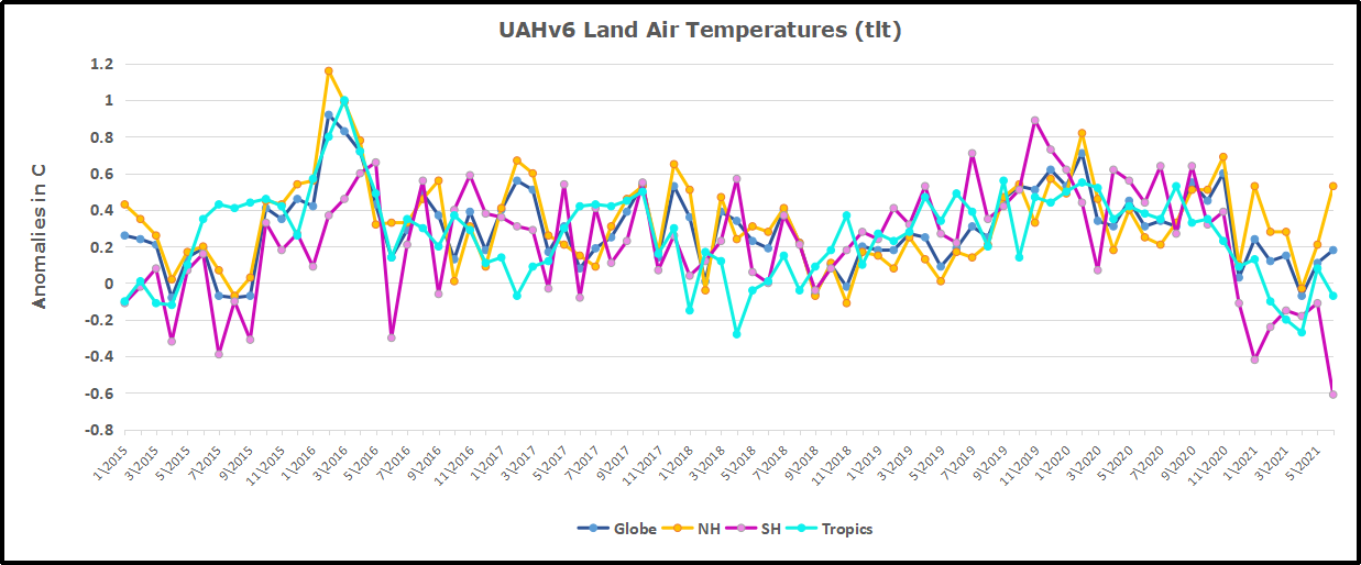 Here we have fresh evidence of the greater volatility of the Land temperatures, along with an extraordinary departure by SH land. Land temps are dominated by NH with a 2020 spike in February, followed by cooling down to July. Then NH land warmed with a second spike in November. Note the mid-year spikes in SH winter months. In December all of that was wiped out.


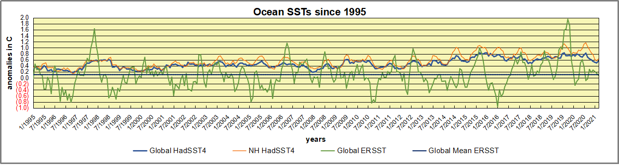
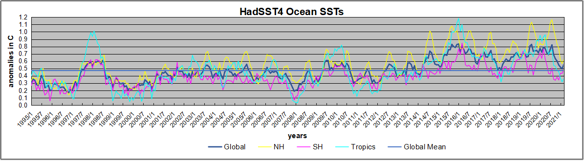
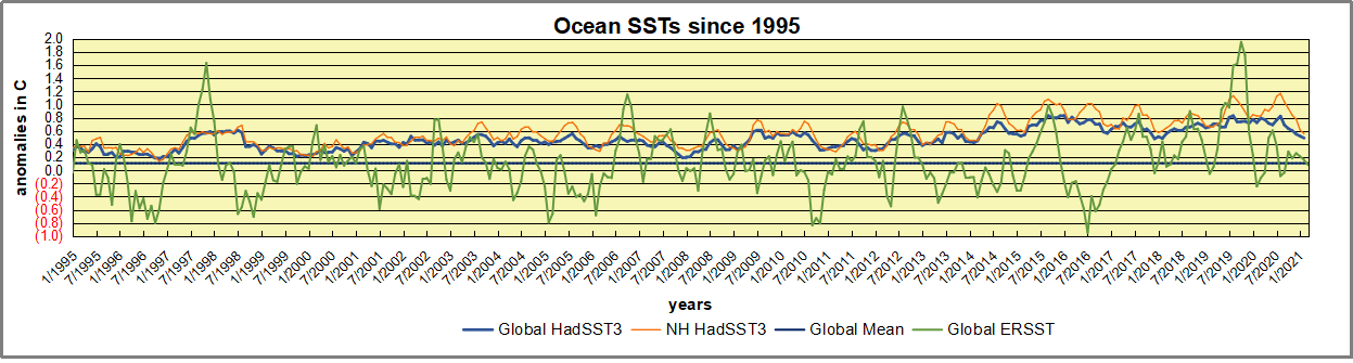
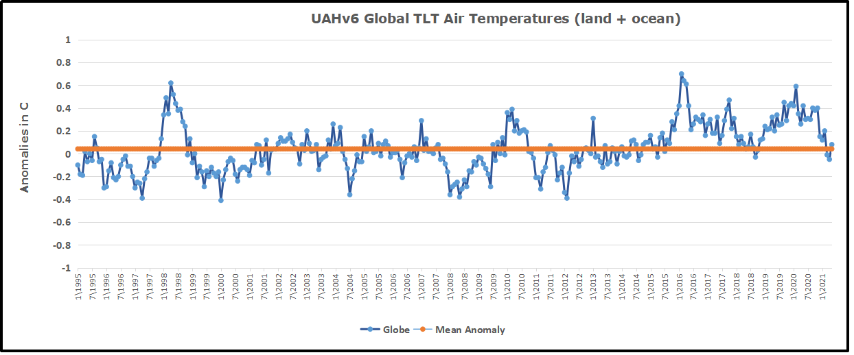
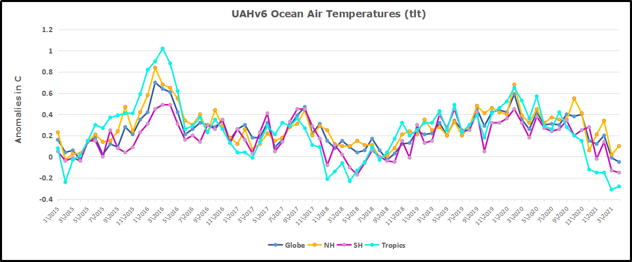
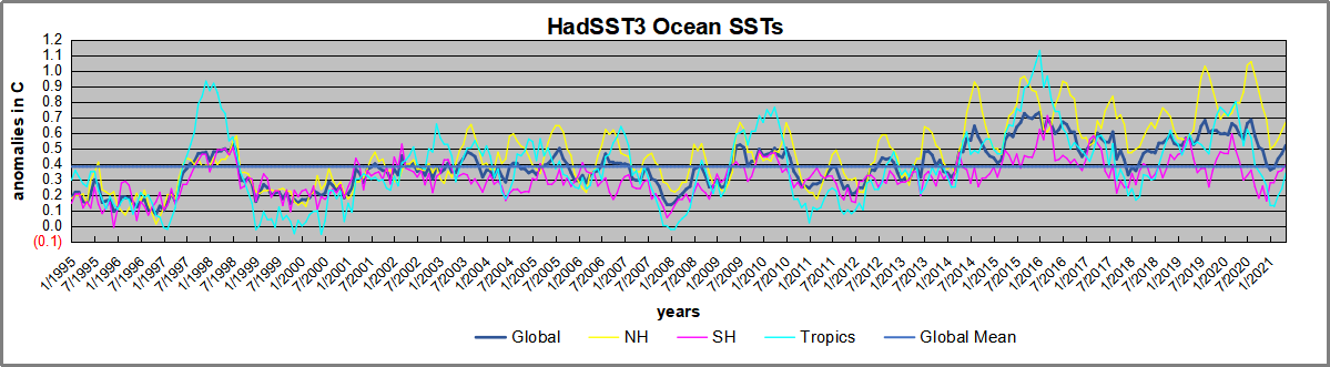 1995 is a reasonable (ENSO neutral) starting point prior to the first El Nino. The sharp Tropical rise peaking in 1998 is dominant in the record, starting Jan. ’97 to pull up SSTs uniformly before returning to the same level Jan. ’99. For the next 2 years, the Tropics stayed down, and the world’s oceans held steady around 0.2C above 1961 to 1990 average.
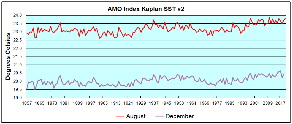
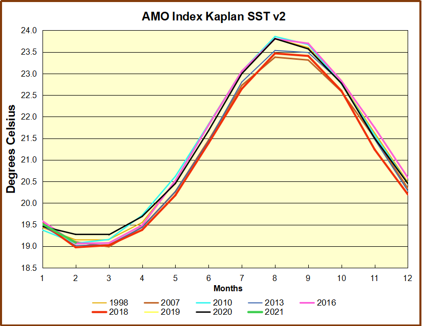
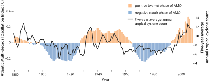
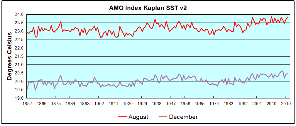 The AMO Index is from from Kaplan SST v2, the unaltered and not detrended dataset. By definition, the data are monthly average SSTs interpolated to a 5×5 grid over the North Atlantic basically 0 to 70N. The graph shows August warming began after 1992 up to 1998, with a series of matching years since, including 2020. Because the N. Atlantic has partnered with the Pacific ENSO recently, let’s take a closer look at some AMO years in the last 2 decades.
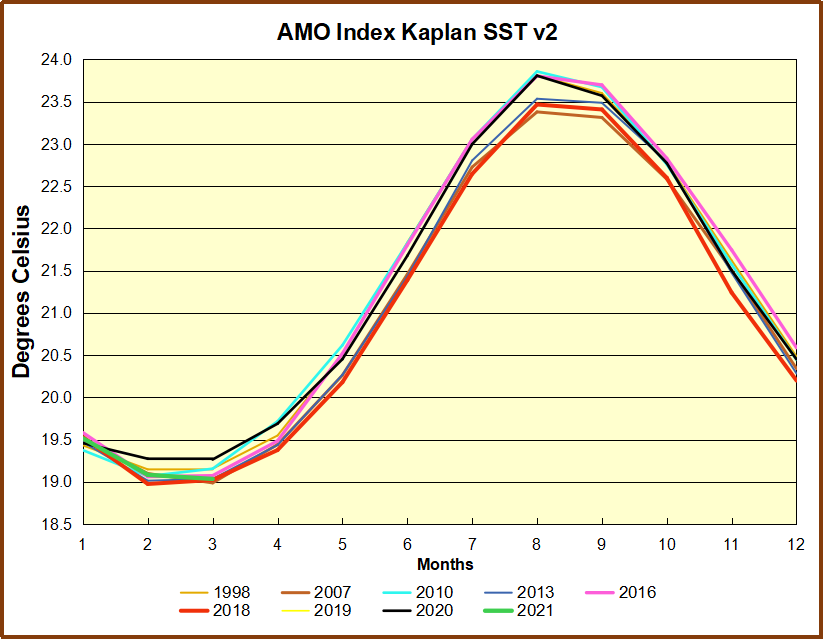
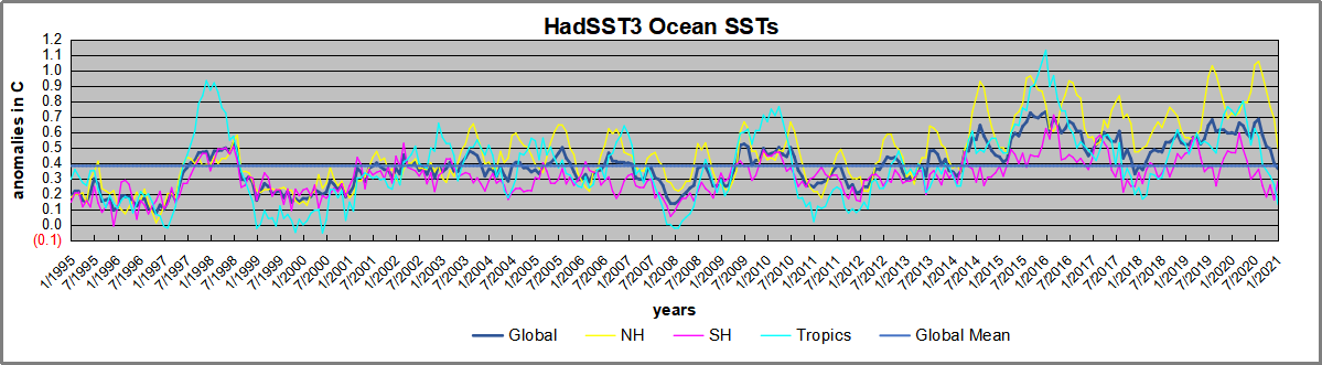
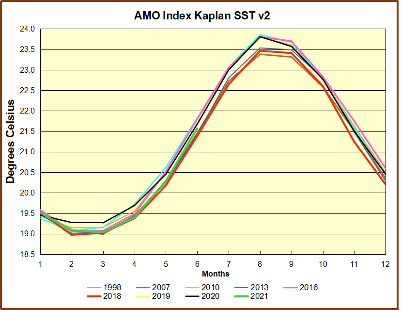
 This graph shows monthly AMO temps for some important years. The Peak years were 1998, 2010 and 2016, with the latter emphasized as the most recent. The other years show lesser warming, with 2007 emphasized as the coolest in the last 20 years. Note the red 2018 line is at the bottom of all these tracks. The black line shows that 2020 began slightly warm, then set records for 3 months. then dropped below 2016 and 2017, peaked in August ending below 2016. Now in 2021, AMO is tracking the coldest years.


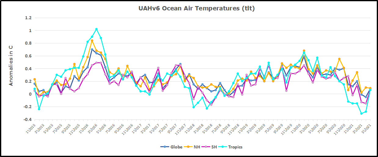
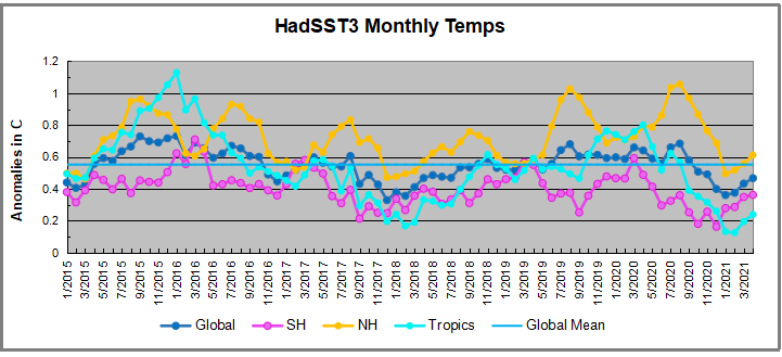


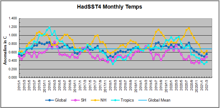
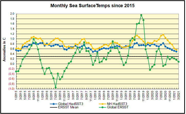
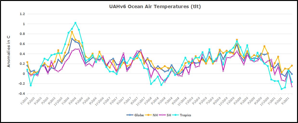
 Note 2020 was warmed mainly by a spike in February in all regions, and secondarily by an October spike in NH alone. End of 2020 November and December ocean temps plummeted in NH and the Tropics. In January SH dropped sharply, pulling the Global anomaly down despite an upward bump in NH. An additional drop in March has SH matching the coldest in this period. March drops in the Tropics and NH make those regions at their coldest since 01/2015. In April despite an uptick in NH, the Global anomaly dropped further.