What is Argo? Argo is a global array of 3,800 free-drifting profiling floats that measures thetemperature and salinity of the upper 2000 m of the ocean. This allows, for the first time, continuous monitoring of the temperature, salinity, and velocity of the upper ocean, with all data being relayed and made publicly available within hours after collection. Positions of the floats that have delivered data within the last 30 days :
Scientists deploy an Argo float. For over a decade, more than 3000 floats have provided near-global data coverage for the upper 2000 m of the ocean.

Update January 22, 2019
In a post at GWPF Nic Lewis critiques the Cheng et al. study and points in detail to the errors and misleading findings. His short analysis: Is ocean warming accelerating faster than thought? – An analysis of Cheng et al (2019), Science . Excerpt in italics with my bolds.
Contrary to what the paper indicates:
Contemporary estimates of the trend in 0–2000 m depth ocean heat content over 1971–2010 are closely in line with that assessed in the IPCC AR5 report five years ago
Contemporary estimates of the trend in 0–2000 m depth ocean heat content over 2005–2017 are significantly (> 95% probability) smaller than the mean CMIP5 model simulation trend.

Figure 1: Updated 0–2000 m OHC linear trend estimates compared with AR5 and the CMIP5 mean. Error bars are 90% confidence intervals; black lines are means. Units relate to the Earth’s entire surface area.

Previous Post: Scare of the Day: Ocean Heat Content (January 11, 2019)
Here is a sample of yesterday’s coordinated reports from CCN- Climate Crisis Network captured by my news aggregator, listed by the most recent first. Note the worldwide scope and editorial poetic license on the titles.
Ocean warming accelerating to record temperatures, scientists warn Engineering and Technology Magazine
Scalding seas? Oceans boil to hottest temp on record USA Today EU
World’s oceans heating up at quickening pace: study Egypt Independent
Ocean warming ‘accelerating’ The London Economic
Oceans warming faster than we thought: Study AniNews.in
Ocean temperatures rising faster than thought in ‘delayed response’ to global warming, scientists say The Japan Times
Oceans warming much faster than previously thought: Study The Hindu Business Line
The Oceans Are Warming Faster Than We Thought, a New Study Says TIME
Oceans Warming Even Faster Than Previously Thought Eurasia Review
The Ocean Is Warming Much Faster Than We Thought, According To A New Study BuzzFeed
Pacific: New research proves ocean warming is accelerating ABC Online – Radio Australia
We’re Boiling the Ocean Faster Than We Thought New York Magazine
Oceans warming faster than expected SBS
Ocean temperatures are rising far faster than previously thought, report says TVNZ
Ocean Temps Rising Faster Than Scientists Thought: Report HuffPost (US)
World’s oceans are heating up at a quickening pace Bangkok Post
The Warming of the World’s Oceans Is Set to Increase Dramatically Over the Next 60 Years Pacific Standard
New Climate Change Report Says Ocean Warming Is Far Worse Than Expected Fortune
Oceans Are Warming Faster Than Expected, Research Says Geek.com
World’s oceans are heating up at a quickening pace: study AFP
Oceans Warming Faster Than Predicted, Scientists Say gCaptain
So the message to the world is very clear: Ocean Heat Content is rising out of control, Be Very Afraid!
The trigger for all of this concern comes from this paper How fast are the oceans warming? by Lijing Cheng, John Abraham, Zeke Hausfather, Kevin E. Trenberth. Science 11 Jan 2019 Excerpts from paper in italics with my bolds.
Climate change from human activities mainly results from the energy imbalance in Earth’s climate system caused by rising concentrations of heat-trapping gases. About 93% of the energy imbalance accumulates in the ocean as increased ocean heat content (OHC). The ocean record of this imbalance is much less affected by internal variability and is thus better suited for detecting and attributing human influences (1) than more commonly used surface temperature records. Recent observation-based estimates show rapid warming of Earth’s oceans over the past few decades (see the figure) (1, 2). This warming has contributed to increases in rainfall intensity, rising sea levels, the destruction of coral reefs, declining ocean oxygen levels, and declines in ice sheets; glaciers; and ice caps in the polar regions (3, 4). Recent estimates of observed warming resemble those seen in models, indicating that models reliably project changes in OHC.
The Intergovernmental Panel on Climate Change’s Fifth Assessment Report (AR5), published in 2013 (4), featured five different time series of historical global OHC for the upper 700 m of the ocean. These time series are based on different choices for data processing (see the supplementary materials). Interpretation of the results is complicated by the fact that there are large differences among the series. Furthermore, the OHC changes that they showed were smaller than those projected by most climate models in the Coupled Model Intercomparison Project 5 (CMIP5) (5) over the period from 1971 to 2010 (see the figure).
Since then, the research community has made substantial progress in improving long-term OHC records and has identified several sources of uncertainty in prior measurements and analyses (2, 6–8). In AR5, all OHC time series were corrected for biases in expendable bathythermograph (XBT) data that had not been accounted for in the previous report (AR4). But these correction methods relied on very different assumptions of the error sources and led to substantial differences among correction schemes. Since AR5, the main factors influencing the errors have been identified (2), helping to better account for systematic errors in XBT data and their analysis.
Multiple lines of evidence from four independent groups thus now suggest a stronger observed OHC warming. Although climate model results (see the supplementary materials) have been criticized during debates about a “hiatus” or “slowdown” of global mean surface temperature, it is increasingly clear that the pause in surface warming was at least in part due to the redistribution of heat within the climate system from Earth surface into the ocean interiors (13). The recent OHC warming estimates (2, 6, 10, 11) are quite similar to the average of CMIP5 models, both for the late 1950s until present and during the 1971–2010 period highlighted in AR5 (see the figure). The ensemble average of the models has a linear ocean warming trend of 0.39 ± 0.07 W m−2 for the upper 2000 m from 1971–2010 compared with recent observations ranging from 0.36 to 0.39 W m−2 (see the figure).
MISSION ACCOMPLISHED: “The recent OHC warming estimates are quite similar to the average of CMIP5 models.”
What They are Not Telling You
The Sea Surface Temperature (SST) record is a mature dataset, not without issues from changing measurement technologies, but providing a lengthy set of observations making up 71% of the surface temperature history. Sussing out temperatures at various depths in the ocean is a whole nother kettle of fish.
The Ocean Heat Content data is sparse, both in time and space.
The Ocean is vast, 360 million square kilometers with an average depth of 3700 meters, and we have 3900 Argo floats operating for 10 years. In addition we have some sensors arrayed at depths in the North Atlantic. As the text above admits, there are lots of holes in the data, and only a short history of the recently available reliable data. Other publications by some of the same authors admit: Large discrepancies are found in the percentage of basinal ocean heating related to the global ocean, with the largest differences in the Pacific and Southern Ocean. Meanwhile, we find a large discrepancy of ocean heat storage in different layers, especially within 300–700 m in the Pacific and Southern Oceans. Source: Consensuses and discrepancies of basin-scale ocean heat content changes in different ocean analyses, Gongjie Wang, Lijing Cheng, John Abraham.
Modelers Make OHC Reconstructions by Adding Guesstimates to Observations
Again climate science alarms are raised after “reanalysis” of the data. No one should be surprised that after computer manipulations and data processing, the “reanalyzed” data has changed and now favors warming and confirms the climate models. The Argo data record by itself is too short to make any such claim. In previous studies, scientists were more circumspect and refrained from “jumping the shark.” Apparently, with the Paris Accord on the ropes in 2019, caution and nuance has been thrown to the wind, as witnessed by the recent SR15 horror show, and now this.
Methodological Problems Bedevil These Reconstructions
One of the studies cited in support of revising OHC upward is the study Quantification of ocean heat uptake from changes in atmospheric O2 and CO2 composition, L. Resplandy et al. Published in Nature 31 October 2018. From the Media Release:
The world’s oceans have absorbed far more heat than we realized, shortening our timeline to stop the causes of global warming, and foreboding some of the worst case scenarios put forth by climate experts, according to new findings.
A novel study by researchers from Scripps Institution of Oceanography at the University of California San Diego and Princeton University, published on Wednesday in Nature, implies that officials have underestimated the amount of heat retained by Earth’s oceans.
Between 1991 and 2016, oceans warmed an average 60 percent more than estimates by the Intergovernmental Panel on Climate Change (IPCC) originally calculated, the study claims. That amount equalled 13 zettajoules, or eight times the world’s annual energy consumption.
Something didn’t look right to climate statistician Nic Lewis so he deconstructed the study, finding several methodological mistakes along the way. He explained and communicated with the authors in a series of 4 posts at Climate Etc. Nov. 6 through 23, 2018.
Nic Lewis, Nov. 6 (here):
The findings of the Resplandy et al paper were peer reviewed and published in the world’s premier scientific journal and were given wide coverage in the English-speaking media. Despite this, a quick review of the first page of the paper was sufficient to raise doubts as to the accuracy of its results. Just a few hours of analysis and calculations, based only on published information, was sufficient to uncover apparently serious (but surely inadvertent) errors in the underlying calculations.
Moreover, even if the paper’s results had been correct, they would not have justified its findings regarding an increase to 2.0°C in the lower bound of the equilibrium climate sensitivity range and a 25% reduction in the carbon budget for 2°C global warming.
Because of the wide dissemination of the paper’s results, it is extremely important that these errors are acknowledged by the authors without delay and then corrected.
Authors Respond:
On November 14, 2018 this paper’s authors announced key errors to the two week-old study that made claims about the amount of heat that Earth’s oceans have absorbed. The errors stem from “incorrectly treating systematic errors in the O2 measurements and the use of a constant land O2:C exchange ratio of 1.1,” co-author Ralph Keeling said in an update from Scripps Institution of Oceanography, which is affiliated with the study. More simply, the team’s findings are too uncertain to conclusively support their statement that Earth’s oceans have absorbed 60 percent more heat than previously thought. Keeling claims the errors “do not invalidate the study’s methodology or the new insights into ocean biogeochemistry on which it is based.”
Subsequent posts by Lewis found other differences between the stated method and the analysis actually applied, adding to the uncertainty of the study and its finding. Lewis is not done yet, and the paper has not been reissued. Unfortunately, it has not been retracted and is still cited in reference to unsupported claims of runaway ocean heat content.
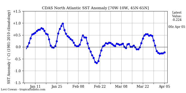
Meanwhile, other measurements, such as those in North Atlantic and Indian Ocean show slight cooling rather than warming, with researchers suspecting natural cyclical activity.
Summary
So anxious are alarmists/activists to cry wolf that they are running the computers flat out to manipulate and extrapolate from precious but incomplete limited data to confirm their suppositions. All to keep alive a deflating narrative that the public increasingly finds offensive.
Footnote:
Oceanographers know that deep ocean temperatures can vary on centennial up to millennial time scales, so if some heat goes into the depths, it is not at all clear when it would come out.

Beware getting sucked into any model, climate or otherwise.
More at Putting Climate Models in Their Place


 Any warming is good, even this small amount seen in the context of a year in the life of a typical American. Moreover, the details of the statistics reveal that the rise is the result of cold months being warmer, while hotter months have cooled very slightly. False Alarm.


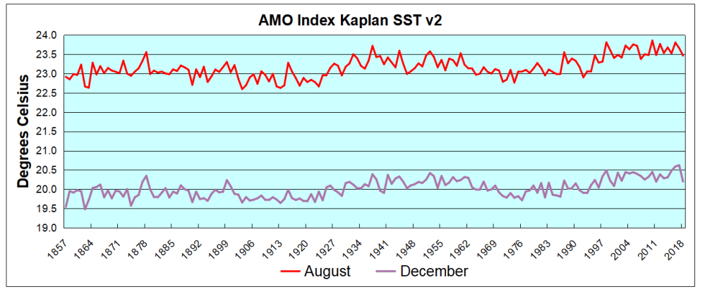

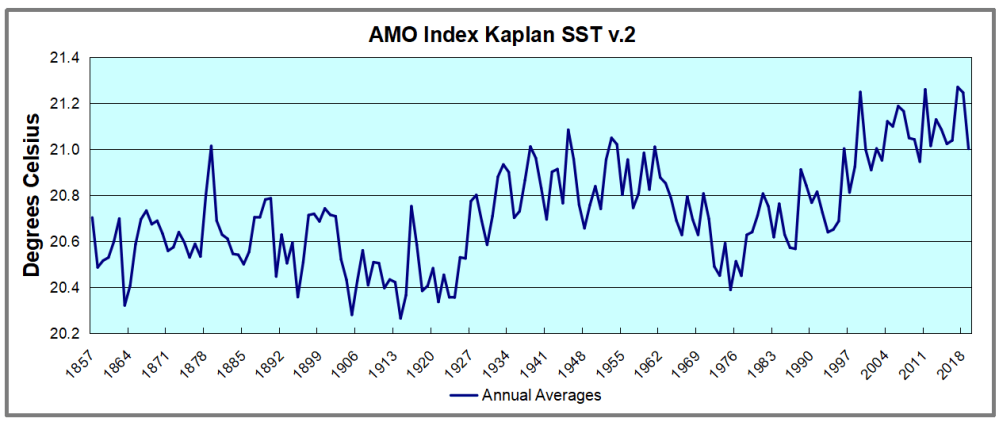

 The best context for understanding decadal temperature changes comes from the world’s sea surface temperatures (SST), for several reasons:
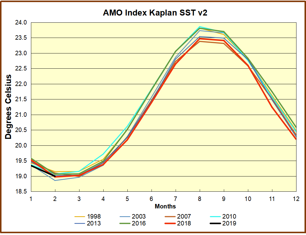


 The best context for understanding decadal temperature changes comes from the world’s sea surface temperatures (SST), for several reasons:
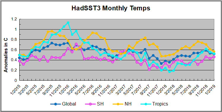
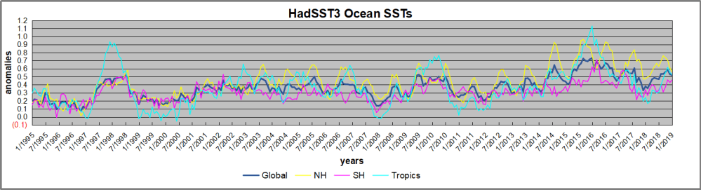

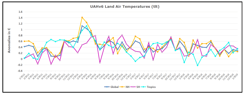
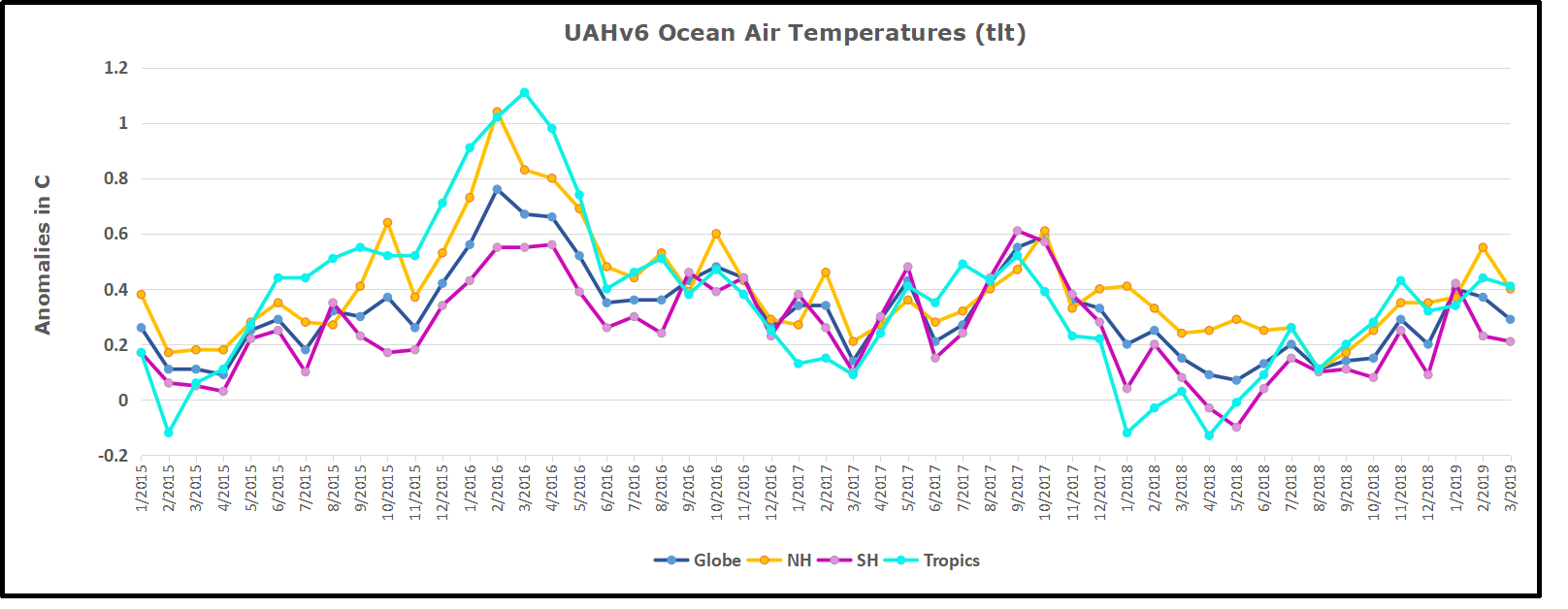
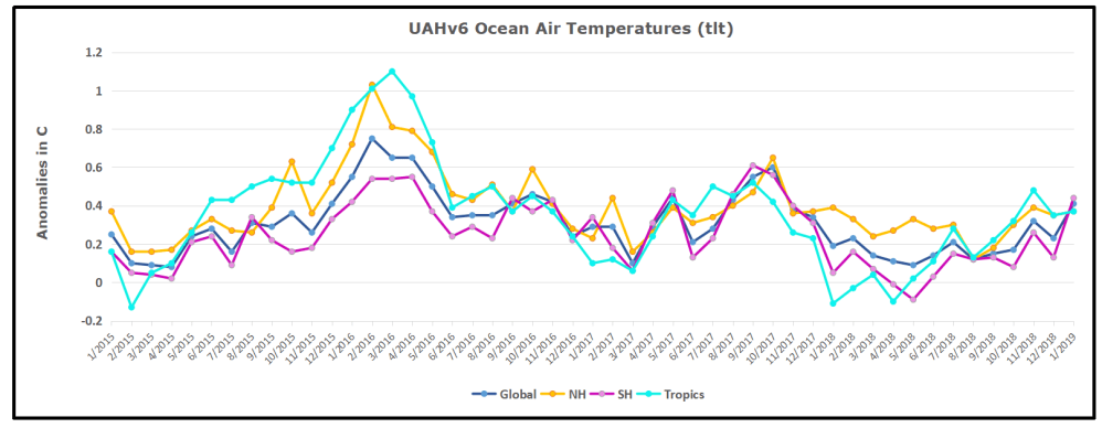 The anomalies over the entire ocean dropped to the same value, 0.12C in August (Tropics were 0.13C). Warming in previous months was erased, and September added very little warming back. In October and November NH and the Tropics rose, joined by SH. In December 2018 all regions cooled resulting in a global drop of nearly 0.1C. Now in January an upward jump in SH overcame slight cooling in NH and the Tropics, pulling up the Global anomaly as well. While the trajectory is not yet set, it is the highest ocean air January since 2016.