“Gotcha” Graph from GISS
Lots of buzz over Brian Cox using the latest GISS land and ocean graph to put down Malcolm Roberts in a TV debate in Australia. Likely we will be seeing the image everywhere and alarmists crowing about “deniers” dismissed once and for all. For the record here is the graph showing no pause whatsoever:

This is accomplished by lowering the 1998 El Nino spike relative to 2015 El Nino. To see what is going on, here is a helpful chart from Dr. Ole Humlum at Climate4you

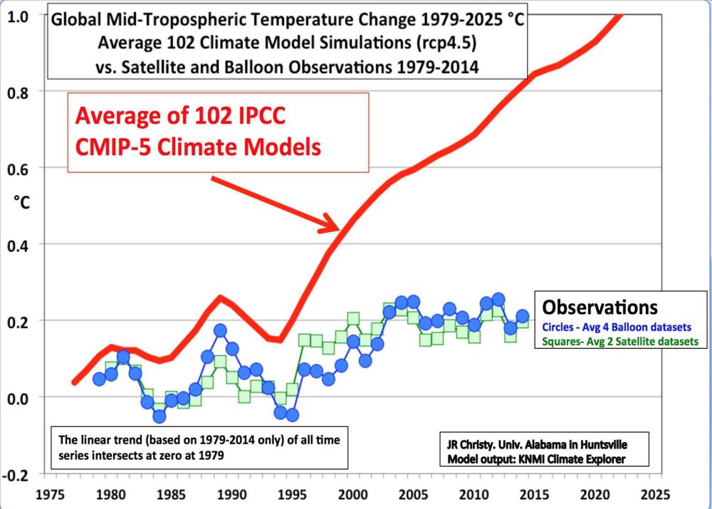
It shows that indeed, GISS is showing 1998 peak lower than several years since, especially 2002, 2010 and 2016. In contrast, the satellite record is dominated by 1998, and may still be in that position once La Nina takes hold later this year. The differences arise because satellites measure air temperature in the lower troposphere, while GISS combines records from land stations with sea surface temperatures (SSTs) to fabricate a global average anomaly, including adjusting, gridding and infilling to make the estimate of Global Mean Temperatures and compare to a 30-year average.
An insight into the adjustments is displayed below.

As we have seen before, the past is cooled, and the present warmed to ensure evidence of global warming. Presently it is claimed that July 2016 is the hottest month ever. But stay tuned for future adjustments necessary to keep the warming going.
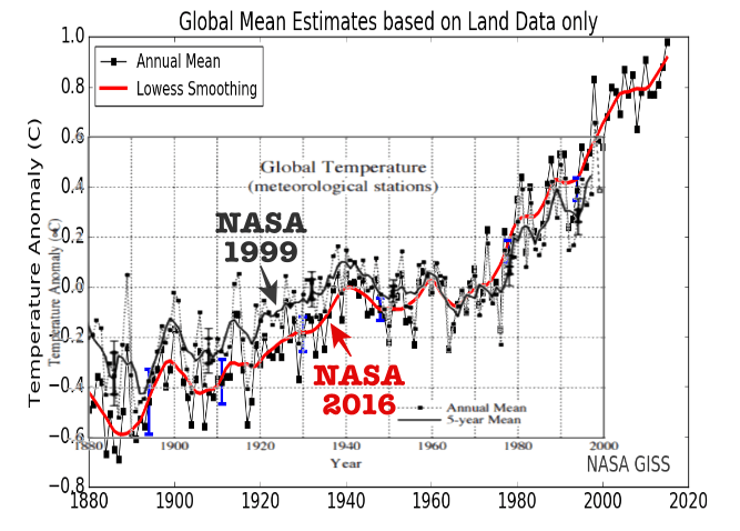
Dr. Humlum demonstrates that GISS is an unstable temperature record.

Dr. Humlum:
Based on the above it is not possible to conclude which of the above five databases represents the best estimate on global temperature variations. The answer to this question remains elusive. All five databases are the result of much painstaking work, and they all represent admirable attempts towards establishing an estimate of recent global temperature changes. At the same time it should however be noted, that a temperature record which keeps on changing the past hardly can qualify as being correct. With this in mind, it is interesting that none of the global temperature records shown above are characterised by high temporal stability. Presumably this illustrates how difficult it is to calculate a meaningful global average temperature. A re-read of Essex et al. 2006 might be worthwhile. In addition to this, surface air temperature remains a poor indicator of global climate heat changes, as air has relatively little mass associated with it. Ocean heat changes are the dominant factor for global heat changes. (my bold)
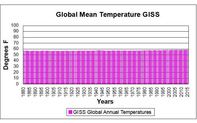
Too much trickery going on. I prefer to see actual temperatures, and this graph presents clearly the GISS record without the distortions:
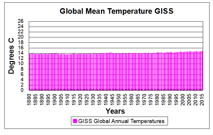
Or, if you prefer Celsius degrees (range represents human sensory experience of daily and seasonal temperature variability)
Conclusion
Brian Cox defended the GISS graph by saying it was from NASA who put men on the moon. He forgot to mention that several of those men and many scientists who put them there find NASA increasingly unscientific and untrustworthy on climate matters.
It could also be said about the recent GISS graph: You show us a graph where the past history is different today than GISS reported it a year ago, and different again from 5 and 10 years ago. Why should we believe this one any more than the other ones? And why does GISS contradict temperatures recorded directly by NASA satellites?
He who controls the past controls the future. He who controls the present controls the past.
George Orwell 1984
Footnote
Same point as Orwell, but with a dash of humour:
A soviet university professor addresses his students: “There’s good news and bad news about this year’s History final exam. The good news is all the questions are exactly the same as last year’s exam. The bad news: Many of the answers have changed.”


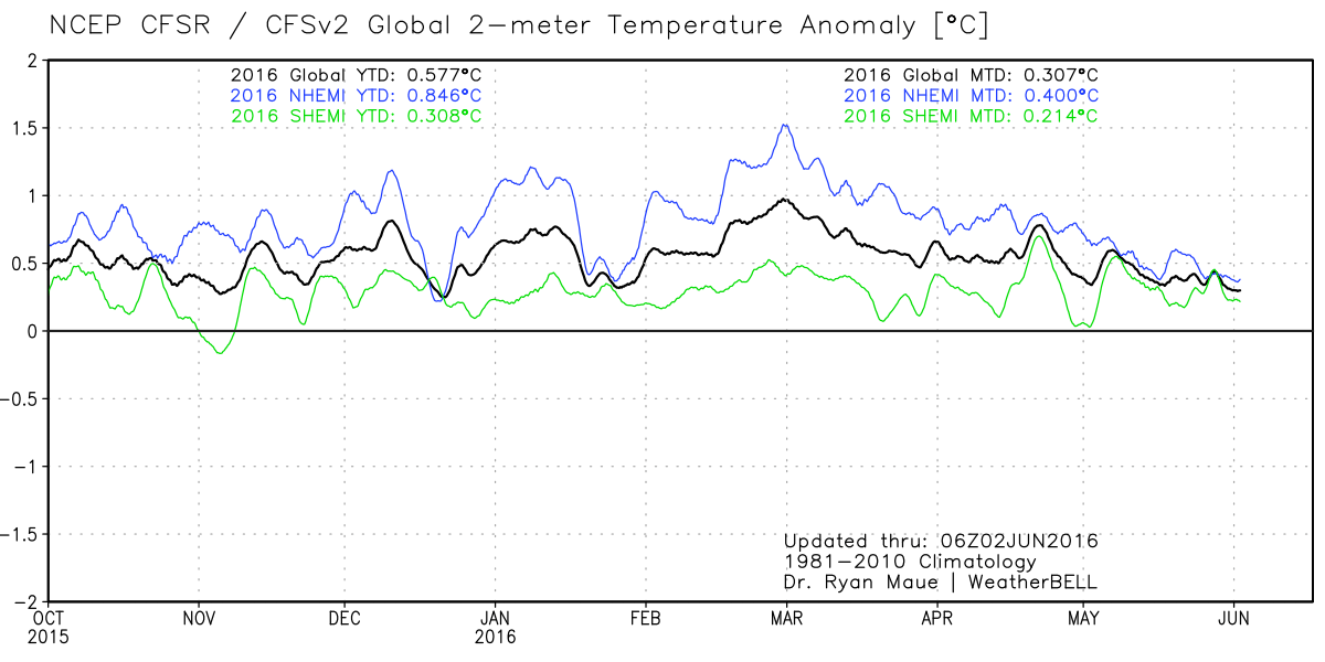


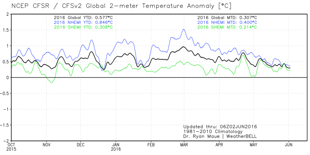 Here is a great view of how the 2015-16 El Nino caused higher surface temperatures last year and this, displayed in 2-meter temp anomalies (weather station height). The satellites’ data show the uptick began in earnest October 2015 and returned to neutral in May 2016. SSTs are now firmly in neutral.