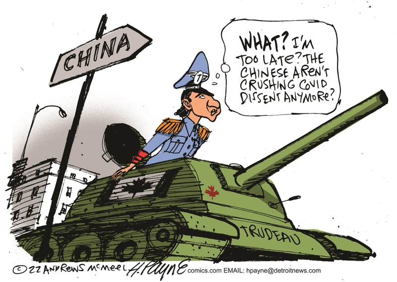
The Federal Court has ruled the Trudeau government’s decision to invoke the Emergencies Act during the so-called “Freedom Convoy” that descended on Ottawa in 2022 violated the Charter of Rights and Freedoms.
In his ruling, Justice Richard G. Mosley said the move was “unreasonable” and outside the scope of the law. Mosley is a 21-year veteran of the Federal Court and is a respected voice on national security legal matters. He has weighed in on some of the most high-profile recent cases in Canadian intelligence, including a 2016 decision that found CSIS had been illegally storing Canadians’ communication data for more than a decade.
The case was brought forward by the Canadian Civil Liberties Association (CCLA), the Canadian Constitution Foundation, Canadian Frontline Nurses and a handful of individuals.
Mosley wrote, “I have concluded that the decision to issue the Proclamation does not bear the hallmarks of reasonableness — justification, transparency and intelligibility — and was not justified in relation to the relevant factual and legal constraints that were required to be taken into consideration.”
“I think it’s in the interest of this government and future governments and all Canadians that the threshold to invoke the Emergencies Act remains high and that it is truly, as Justice Mosley says, a legislation of last resort,” CCLA lawyer Ewa Krajewska told Global News.
Deputy Prime Minister Chrystia Freeland says that Ottawa will appeal the ruling. “We respect very much Canada’s independent judiciary, however we do not agree with this decision, and respectfully we will be appealing it,” Freeland said at the cabinet retreat in Montreal.
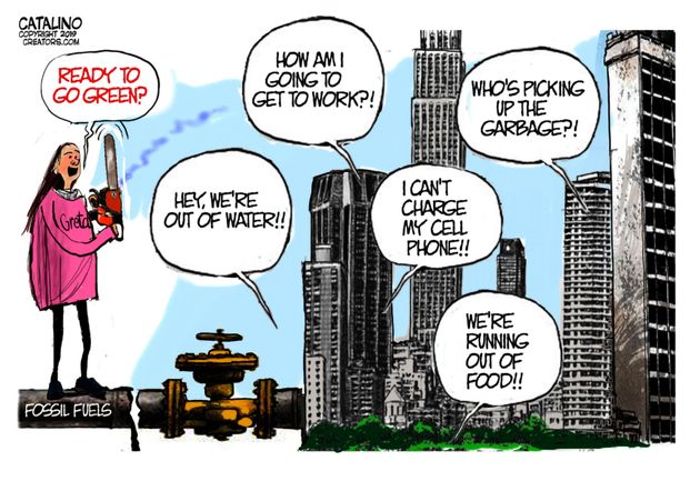
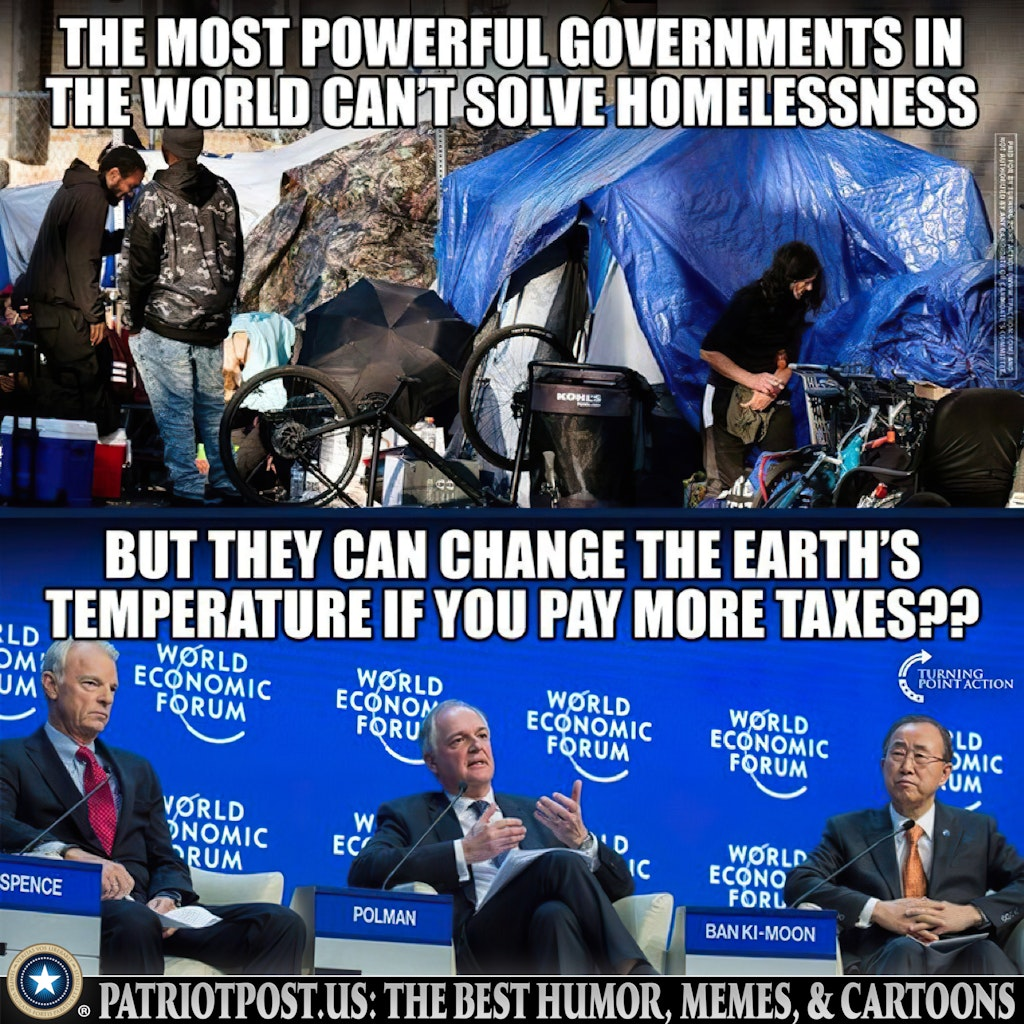
Yes, that’s Canada’s Deputy Prime Minister, Chrystia Freeland calling for imposing unfathomable costs on Canadians to solve an imaginary problem (Climate Change). She also serves on WEF Board of Trustees.
‘The decision follows an application for judicial review launched by the Canadian Constitution Foundation, the Canadian Civil Liberties Association, and several other applicants in 2022 after the emergency measures were used to end the Freedom Convoy protests in Ottawa. The measures controversially allowed the government to freeze the bank accounts of protesters, conscript tow truck drivers, and arrest people for participating in assemblies the government deemed illegal.”
“Yes, what was happening in Coutts may have been concerning, but [Mosley] finds that the existing laws of Canada were sufficient to deal with what was happening in Coutts and elsewhere in the country, and that is what the government was not able to demonstrate,” Krajewska said.
The ruling includes a secret February 2022 memo from the Privy Council Office (PCO), the central government department that supports the prime minister, recommending Trudeau invoke emergency powers. The document, which was partially censored and marked “cabinet confidence” – some of the most sensitive information in the federal government – noted that PCO believed the “examples of evidence to date” support the conclusion that the Emergencies Act was required. Although from the outset, PCO noted their conclusion could be challenged.
Krajewska tells Global News that the document was first produced during POEC, and the CCLA had it submitted to the court during this case. “I think it’s very important from a democracy and transparency perspective that the government produced this document during POEC and that it’s now been appended to this decision,” Krajewska said. “It’s important for Canadians to understand how the decision was made and what information the government had before it when it was making this decision.”
The document is a remarkable window into the advice Trudeau was getting from the public service during the crisis. Cabinet documents are very rarely released, and even the censored version contained some revelations.
For instance, it shows PCO was in active talks with the Canadian Armed Forces (CAF)
about how the military might assist in ending the protests should they be required.
The PCO memo revealed on Tuesday also notes that while Premier Doug Ford was an enthusiastic supporter of Trudeau invoking emergency powers, other premiers were more skeptical.
“A large number of other premiers expressed concern about the need to act carefully to avoid enflaming the underlying sentiment they considered to lie behind the protest, which they linked to public health measures including vaccine mandates,” the document read. “These premiers were not seeing the local manifestations of this movement yet in their jurisdiction.”
Quebec Premier François Legault “had a strong negative reaction to the proposal, saying that he would oppose the application of federal emergency legislation in Quebec,” where the memory of Trudeau’s father invoking the War Measures Act during the FLQ crisis is still alive.
Will Trudeau Finally Pay a Political Price for His Bad Governance? We certainly hope so.
BREAKING: Judge rules Trudeau broke the highest law in the land with the Emergencies Act.
He caused the crisis by dividing people. Then he violated Charter rights to illegally suppress citizens. As PM, I will unite our country for freedom.
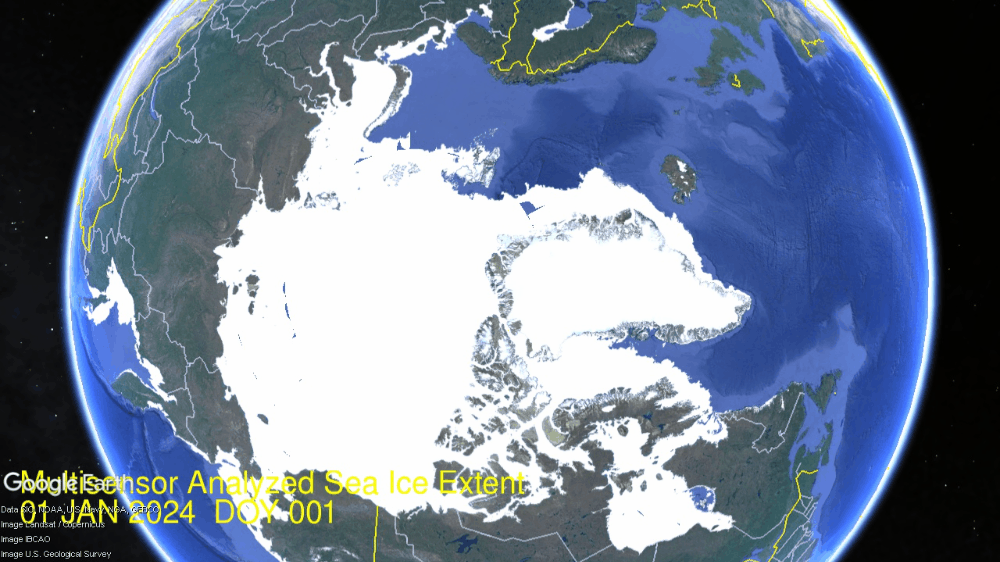
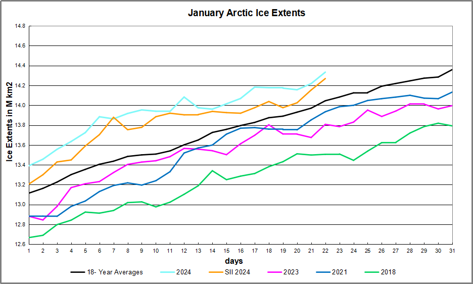
Impressive Arctic ice recovery continued in January, growing a month’s worth in just three weeks, as seen in the animation below:
In three weeks of January 2024, the Arctic added nearly a full Wadham of ice (1M km2). The animation shows Hudson Bay (lower right) freezing completely. Just above Hudson, you can see the Gulf of St. Lawrence icing over, and Baffin Bay adding ice, extending fast ice all the way to Newfoundland, now up to 64% of its annual maximum.
At the extreme and lower left, Okhotsk and Bering Seas also grow rapidly. Okhotsk grew ice extent up to 914k, 81% of its max last March. Bering grew up to 514k km2, 68% of its max. At the top Kara freezes over and Barents and Greenland Seas add ice to their margins.The graph below shows the January ice recovery.
Note the average January ends at 14.36 km2 while 2024 has already reached 14.33 km2, up from 13.39 km2 at the start, and presently 288k km2 above average. SII started slightly lower than MASIE and tracked quite closely since. Note that other recent years have varied below the 18-year average at month end.
The table below shows year-end ice extents in the various Arctic basins compared to the 18-year averages and some recent years.
Region
2024022
Day 22
2024-Ave.
2018022
2024-2018
(0) Northern_Hemisphere
14333601
14045488
288112
13505957
827644
(1) Beaufort_Sea
1070983
1070317
667
1070445
538
(2) Chukchi_Sea
966006
965999
7
965971
35
(3) East_Siberian_Sea
1087137
1087131
6
1087120
18
(4) Laptev_Sea
897845
897837
8
897845
0
(5) Kara_Sea
932571
910022
22549
891776
40795
(6) Barents_Sea
712531
530554
181977
322465
390067
(7) Greenland_Sea
703581
601855
101726
465828
237753
(8) Baffin_Bay_Gulf_of_St._Lawrence
1050488
1239519
-189031
1330666
-280179
(9) Canadian_Archipelago
854860
853382
1479
853109
1752
(10) Hudson_Bay
1260903
1260695
209
1260838
66
(11) Central_Arctic
3230107
3203377
26730
3165195
64912
(12) Bering_Sea
513853
600796
-86943
343164
170689
(13) Baltic_Sea
93892
56072
37820
44364
49528
(14) Sea_of_Okhotsk
914275
720482
193793
782100
132175
This year’s ice extent is 288k km2 or 2.1% above average. Only Baffin Bay and Bering have deficits to average, more than offset by surpluses elsewhere, espcially Greenland, Barents and Okhotsk seas. Many of the others are already maxed out.
Illustration by Eleanor Lutz shows Earth’s seasonal climate changes. If played in full screen, the four corners present views from top, bottom and sides. It is a visual representation of scientific datasets measuring Arctic ice extents and NH snow cover.
Clearly climatists are worried about current cold weather, ironically triggered by the beginning of COP28 coinciding with heavv snow closing airports in Munich, for example. Add to that Buffalo Bills NFL playoff game postponed due to extreme cold. So Climate Central coordinated a PR campaign lest the believers lose faith in Global Warming. Later below are noted the three themes that appear.
Why we still have brutal cold snaps even as the planet warms to record levels, CNN
Why extreme cold weather events still happen in a warming world, PBS
Extreme cold in a warming world: Climate instability may be disrupting polar vortex, UPI
Extreme cold and climate change: What’s the deal? CBC explains.
What is climate? And how is it different from weather? Deutsche Welle (DW)
Why is it so cold in the UK right now – and how long will Arctic chill last? The Guardian
Extreme cold still happens in a warming world – in fact climate instability may be disrupting the polar vortex, Yahoo News
1. Cold is Weather, Not Climate
Some of the reassurances are the familiar refrain that cold is weather, while warming is forever.
2. CO2 Causes Extreme Weather of All Kinds
Others claim that rising CO2 causes all kinds of extreme weather, including big chills. Actually, those stories are way out on a limb, contrary to what IPCC itself says. Roger Pielke Jr. explains at his substack page What the IPCC Actually Says About Extreme Weather. I promise, you’ll be utterly shocked. Excerpts in italics with my bolds and added images.
Back to extreme weather — let’s take a look what IPCC AR6 says about the time of emergence for various extreme events. Here are some direct quotes related to specific phenomena:
An increase in heat extremes has emerged or will emerge in the coming three decades in most land regions (high confidence)
There is low confidence in the emergence of heavy precipitation and pluvial and river flood frequency in observations, despite trends that have been found in a few regions
There is low confidence in the emergence of drought frequency in observations, for any type of drought, in all regions.
Observed mean surface wind speed trends are present in many areas, but the emergence of these trends from the interannual natural variability and their attribution to human-induced climate change remains of low confidence due to various factors such as changes in the type and exposure of recording instruments, and their relation to climate change is not established. . . The same limitation also holds for wind extremes (severe storms, tropical cyclones, sand and dust storms).
The IPCC helpfully provides a summary table for a range of extremes, indicating for various phenomena whether emergence has been achieved with medium or high confidence at three points in time:
to date (today), i.e., specifically when IPCC AR6 was completed in 2021, by 2050 under RCP8.5/SSP5-8.5, and by 2100 under RCP8.5/SSP5-8.5.
Those three dates are displayed as the 3 right-most column in the table below.
A white entry in the table means that emergence has not yet been or is not in the future expected to be achieved. The blue and orange entries represent the emergence of respectively increasing and decreasing signals at various levels of confidence.
Take a moment and look at the table carefully. Look especially at all those white cells.
Clearly, with the exception perhaps of only extreme heat,
the IPCC is badly out of step with today’s apocalyptic zeitgeist.
Maybe that is why no one mentions what the IPCC actually says on extreme events. It may also help to explain why a recent paper that arrives at conclusions perfectly consistent with the IPCC is now being retracted with no claims of error or misconduct.
3. CO2 Makes the Polar Vortex Unstable
The wavy polar vortex is a real phenomenon, but blaming it on us driving our SUVs is a stretch too far. A previous post deconstructs this warmist claim.
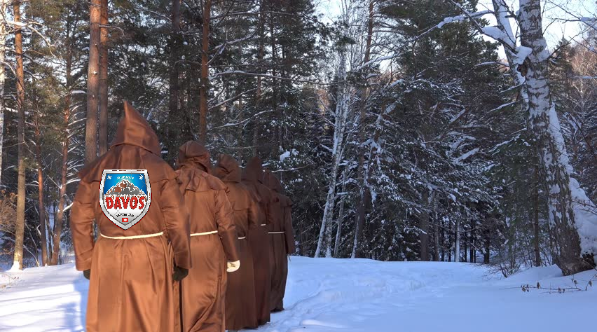
When the World Economic Forum’s conference in Davos wrapped up
it was clear the Davos men were outflanked by the Davos disrupters
By the time the World Economic Forum’s annual conference wrapped up on Friday, it was clear this was the year the Davos men were sidelined by the Davos disrupters.
At the vanguard of these disrupters was Javier Milei, the president of Argentina, whose special address to the conferencemixed dark warnings about the future of the West with optimistic celebrations of free market capitalism.
While Davos attendees gathered to hear panels about creating jobs, harnessing AI and revamping the economy to battle climate change, Milei made headlines with his warnings against “greater regulation which creates a downward spiral until we are all poor.” In his speech, Milei warned the world against creeping towards socialism, arguing that collectivism in any form was the root cause of the West’s problems. The Argentinian president finished his speech with an enthusiastic flourish. “Long live freedom, dammit!”
Core Theme for Davos 2024
The next day Mark Carney, the slick Canadian central banker, joined a panel on monetary policy and argued that his former colleagues deserved “very high marks” for their recent performance battling post-pandemic inflation. To the populist right, which has been resurgent in the West and has trained its ire on Davos in recent years, Carney’s must have seemed like the more eccentric argument.
Federal Conservative Leader Pierre Poilievre has boasted that he sniffed out the inflation problem in early 2022 well before the bankers and economists that Carney praised. Poilievre has also been withering in his criticism of current Bank of Canada governor Tiff Macklem, whom Poilievre has promised to fire if he gets the chance. And Poilievre is no fan of the World Economic Forum (WEF), or what his party refers to as “highfalutin trips” to its annual meeting, or its policies, which “do not align with those of hard-working Canadian families.”
For years, Carney has been trailed by rumours that he wants to succeed Prime Minister Justin Trudeau as Liberal leader, which would set up a showdown with Poilievre. That would see Poilievre, among the new breed of Davos disrupters, facing off against the consummate Davos man.
And if a previous clash between the two men, at a virtual meeting of the finance committee in 2021, is any indication, it would be an ill-tempered contest. That committee meeting was a raucous affair that provoked no less than 10 points of order from other MPs. Poilievre accused Carney’s opposition to Canadian pipelines (while supporting investments in foreign pipelines in his role as as chairman of Brookfield Asset Management) as smacking of “the Davos elite at its worst.”
Although Poilievre has been accused of chasing conspiracy theories about the WEF, his criticism of Carney sounds more like the critique offered in 2004 by Samuel Huntington, the Harvard political scientist who popularized the term “Davos man.”
Poilievre describes Carney as a global elitist who sees the world as an economic playground and national loyalties as an encumbrance or, at best, an irrelevance. While most people have strong patriotic feelings, Huntington described a Davos manthat saw himself as “global citizen” and identified with the world as a whole, in contrast to most people, who describe warm patriotic feelings for their home country.
“Comprising fewer than four percent of the American people, these transnationalists have little need for national loyalty, view national boundaries as obstacles that thankfully are vanishing, and see national governments as residues from the past whose only useful function is to facilitate the elite’s global operations,” wrote Huntington.
Things have changed in the two decades since Huntington wrote his paper about the Davos men. When the London School of Economics Business Review in 2022 analyzed piles of press releases by the World Economic Forum, it found that growth and economic development were falling out of style. Words like “global,” “international” and “world” were also becoming passé. Instead, the World Economic Forum was concerned with the “Earth’s finitude and fragility” and words like “pollution” and “nature” had quadrupled.
It’s this new version of Davos that leaders like Milei want to disrupt.
The Argentinian’s libertarianism may have some overlap with Davos ideas from 20 years ago, but he’s a hostile figure at a conference where the terms “diversity,” “ethnicity,” and “equality” have increased five-fold in six years, according to the LSE Business Review analysis.
In fact, the neoliberal ideas about global trade that Huntington heard at Davos in the early 2000s would probably find some sympathy with both Milei and Poilievre, who are fans of the free market American economist Milton Friedman. Both men have been, somewhat erroneously, compared to former U.S. president Donald Trump but, as long-time libertarians, they more closely resemble each other. Milei’s philosophy even drifts into anarcho-capitalism, a kind of concentrated libertarianism that even Friedman shied away from.
One thing Trump, Poilievre and Milei share, though, is a deep mistrust of the kind of ideas bandied about at Davos and the kind of people who traffic in them. Poilievre has vowed that if he becomes prime minister, his cabinet won’t be allowed to travel to the annual Davos conference, as ministers in the previous Conservative government did.
But given the media reaction to Milei’s performance, which evoked praise from conservative media and curiosity from the mainstream media, Poilievre might be kicking himself that he didn’t think to travel to Davos, to join in person with the new wave of Davos disrupters.
The 20th century called and it wants the word crisis back, the first half of the 20th century in particular. Back then crises were truly terrifying. Think two world wars that exterminated tens of millions of people, genocides of Jews and Armenians, global economic depression, tax rates that topped out at 90 percent, and so much more.
Looking for a Job During the Great Depression. Hulton Archive / Getty Images
Fast forward to the present, and on relatively a quiet day (of which there are thankfully many) one of the most commonly expressed fears on the left concerns global warming born of fossil-fuel consumption. Without presuming to comment on the science here, what a luxurious worry. Back before innovators connected oil to the automation of work formerly done by humans, to cars, and eventually machines capable of cooling and/or warming our homes, weather extremes rendered the indoors and outdoors equally dreadful.
It’s too easily forgotten that air conditioners weren’t a market good until the 1930s, and once on the market, they retailed from $10,000 to $50,000. Fear of excess warmth or cooling care of appliances was well in the future, and worry about outdoor temperatures a likely byproduct of technology that made the indoors so livable. Put another way, if you fear warming or cooling outdoors it’s likely because you suffer neither indoors.
What does the past say about the present? It first signals that worry is hardly a modern concept. There’s always something. In our case, the somethings that have us up at night would have been viewed as positively luxurious by people who had worries of the world war, mass genocide, and back-breaking work kind that didn’t afford a lot of learning of any type. This isn’t to dismiss what has so many up in arms today, but it is to say that our “crises” are truly modern, and a rather bullish effect of immense prosperity.
Up front, I’m strongly of the view that “crypto” or “private money” will soon enough replace the dollar, euro, yuan, pound, Swiss franc, and any other widely circulated exchange mediums. It’s all in my 2022 book, The Money Confusion: How Illiteracy About Currencies and Inflation Sets the Stage for the Crypto Revolution. I believe this will happen simply because no one buys, sells, borrows or lends money. In reality, all monetary transactions are exchanges of goods, services and labor for goods, services, and labor.
This being the case, it’s only logical that private money would replace government money given the historical tendency for governments to devalue their currencies. Devaluation robs individuals of all stripes of the fruits of their work by shrinking the amount of goods, services and labor that money can be exchanged for.
At present, the dollar is the world’s currency with it at least on one side of something like 90% of global transactions. The dollar liquefies global exchange because those who bring market goods for sale expect the dollar they exchange those goods for to command roughly equal resources in the marketplace.
Yet as Jason Les and Brian Morgenstern argue in a column published today at RealClearMarkets, “the U.S. dollar is an inflationary asset.” Their explicit point is that the dollar has historically declined in value. Measured in gold, they’re quite correct. While a dollar purchased 1/35th of a gold ounce in 1971, in 2024 a dollar purchases roughly 1/2050th of a gold ounce. Though trusted globally as the referee in the vast majority of transactions, the dollar has very real demerits.
The problem is that Bitcoin in no way improves on the dollar’s demerits.
If anything, it’s quite a bit more turbulent.
My source? Les and Morgenstern’s essay. They contend that “a dollar today is worth about 30 percent less than it was ten years ago. By contrast, a single Bitcoin is worth 5,000 percent more today than it was ten years ago.” Which is one reason why Bitcoin is the opposite of money.
In reality, money is quiet. Or should be. Good money is never talked about, nor are returns written about with glee. To see why, imagine asking me to come remodel the master bathroom at your house, only for me to ask for payment in Bitcoin. From there, I’ll ask for one coin up front, one in six months, and one at completion in a year. If the coin’s volatility and direction in 2024 mirrors its direction in 2023, you the buyer of my services will be hit excessively hard. Think about it. While the market price of Bitcoin at the moment is $42,000, six months ago it was $30,000, and one year ago it was $21,000.
To say that there are risks associated with Bitcoin-refereed transactions is quite the understatement. Les and Morgenstern explain why. In their words, “Bitcoin’s deflationary properties make it an effective long-term savings instrument.” Ok, but what recommends a “currency” as an asset doesn’t recommend that same currency as money. See above. At the same time, and as evidenced by Bitcoin’s price at the time of this write-up, the value of it is in no way an up, up, up concept.
Les and Morgenstern contend that Bitcoin is digital gold, except that it isn’t.
The simple truth about gold is that the yellow metal itself doesn’t move. Thanks to highly unique stock and flow qualities, gold is constant as a measure. That’s why markets happened on it as the definer of money par excellence over thousands of years. When gold moves in price, that’s the value of the dollar, euro, pound, yuan, or Swiss franc in which it’s being measured moving, not the metal itself.
All of which brings us to what is arguably Bitcoin’s biggest demerit: its circulation is finite. In the words of Les and Morgenstern, “21 million. That’s how many Bitcoin will ever exist. Ever. Period. End of story.” Well yes, but that’s the problem. There’s never too much good money simply because there can never be too much production, and the sole use of money is as a facilitator of the exchange of the fruits of production.
Circulation of good, trusted money is limitless yet there are strict limits
to Bitcoin. That’s why it can never be money. End of story
Argentina’s President Javier Milei had a warning for those attending the annual WEF meeting in Davos, Switzerland; ‘the Western world is in danger’ from ‘collectivist experiments’ such as Diversity, Equity and Inclusion (DEI), and has called on the world to reject socialism and instead embrace “free enterprise capitalism” to end global poverty. H/T zerohedge
“Today, I’m here to tell you that the Western world is in danger,” Milei toild the audience. “And it is in danger because those who are supposed to defend the values of the West are co-opted by a vision of the world that inexorably leads to socialism, and thereby to poverty,” he added.
The self-described “anarcho-capitalist” criticized Davos itself for its “socialist agenda, which will only bring misery to the world,” according to Reuters.
“The main leaders of the Western world have abandoned the model of freedom for different versions of what we call collectivism. We’re here to tell you that collectivist experiments are never the solution to the problems that afflict the citizens of the world — rather they are the root cause,” Milei said, adding “Do believe me, no-one [is] better placed than us Argentines to testify to these two points.”
Below is a lightly edited transcript of Milei’s speech from the closed captions. In the video the talking only begins at 4.25 minutes with Schwab’s introduction. I added some images.
Schwab: Good afternoon ladies and gentlemen it’s for me a great great honor to welcome Javier Milei, as you know is a freely elected president of Argentina. And it’s actually your first trip to a foreign country after being elected. First congratulations for your election and congratulations also to your sister who managed your campaign. Sometimes people would say it was with more radical methods but you introduce a new spirit to Argentina, making Argentina much more related to free enterprise, to entrepreneurial activities, and also to bring Argentina back to the rule of law.
So we have a very extraordinary person among us today and of course we are all all eager to listen to you. Again a very cordial welcome to the World Economic Forum.
Javier Milei: Good afternoon. thank you very much today I’m here to tell you that the Western world is in danger. And it is endangered because those who are supposed to defend the values of the West are co-opted by a vision of the world that inexorably leads to socialism and thereby to poverty. Unfortunately in recent decades, motivated by some well-meaning individuals willing to help others, and others motivated by the wish to belong to a privileged cast, the main leaders of the western world have abandoned the model of freedom for different versions of what we call collectivism.
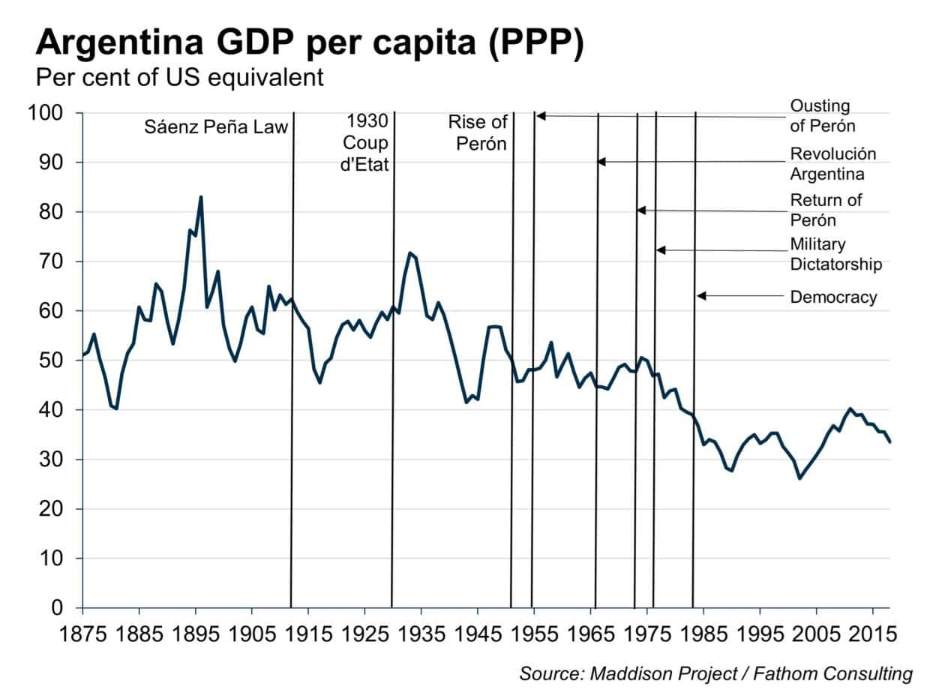
We’re here to tell you that collectivist experiments are never the solution to the problems that afflict the citizens of the world. Rather they are the root cause. Do believe me; no one is better placed than we Argentines to testify to these two points. When we adopted the model of Freedom back in 1860 in 35 years we became a leading world power. And when we embraced collectivism over the course of the last 100 years, we saw how our citizens started to become systematically impoverished. And we dropped to spot number 140 globally.
But before having that discussion it would first be important for us to take a look at the data that demonstrate why free enterprise capitalism is not just the only possible system to end world poverty, but also that it’s the only morally desirable system to achieve this. If we look at the history of economic progress we can see how between the year Zero and the year 1800 approximately world per capita GDP practically remained constant throughout the whole reference period. If you look at a graph of the evolution of economic growth throughout the history of humanity you would see a hockey stick graph. An exponential function that remained constant for 90% of the time and which was exponentially triggered starting in the 19th century.
The only exception to this history was in the late 15th century with the discovery of the American continent but for this exception throughout the whole period between the year zero and the year 1800 Global per capita GDP stagnated. It’s not just that capitalism brought about an explosion in wealth from the moment it was adopted as an economic system. But also if you look at the data you will see that growth continues to accelerate throughout the whole period. Between the year zero and the year 1800 the per capita GDP growth rate remained stable at around 0.02% annually so almost no growth. Starting in the 19th century with the Industrial Revolution the compound annual growth rate was 66% and at that rate in order to double per capita GDP you would need some 107 years.
Now if you look at the period between the year 1900 and the year 1950 the growth rate accelerated to 1.66% a year so you no longer need 107 years to double per capita GDP but 66. And if you take the period between 1950 and the year 2000 you will see that the growth rate was 2.1%, which would mean then in only 33 years we could double the world’s per capita GDP. Far from stopping, this trend remains well and alive today, For the period between the year 2000 and 2023 the growth rate again accelerated to 3% a year which means that we could double world per capita GDP in just 23 years.
That said when you look at per capita GDP since the year 1800 and until today you will see that after the Industrial Revolution Global per capita GDP multiplied by over 15 times, which meant a boom in growth that lifted 90% of the global population out of poverty. We should remember that by the year 1800 about 95% of the world’s population lived in extreme poverty and that figure dropped to 5% by the year 2020 prior to the pandemic.
The conclusion is obvious. Far from being the cause of our problems free trade capitalism as an economic system is the only instrument we have to end hunger, poverty and extreme poverty. Across our planet the empirical evidence is unquestionable. Therefore since there is no doubt that free enterprise capitalism is Superior in productive terms the leftwing doxer has attacked capitalism alleging matters of morality. The detractors claim that it’s unjust; they say capitalism is evil because it’s individualistic and that collectivism is good because it’s altruistic. Of course with the money of others they advocate for social justice.
But this concept which became fashionable in the developed world in recent times, has been in my country a constant in political discourse for over 80 years. The problem is that social justice is not just and nor does it contribute either to the general well being. Quite on the contrary, it’s an intrinsically unfair idea because it’s violent. It’s unjust because the state is financed through tax and taxes are collected coercively. Can anyone of us say that they voluntarily pay taxes? Which means that the state is financed through coercion and that the higher the tax burden the higher the coercion and the lower the freedom.
Those who promote social justice, the Advocates start with the idea that the whole economy is a pie that can be shared differently. But that pie is not a given. It’s wealth that is generated in what Israel Kirzner for instance calls a market Discovery process. If the goods or services offered by a business are not wanted, the business will fail unless it adapts to what the market is demanding. If they make a good quality product at an attractive price they will do well and produce more. So the market is a discovery process in which the capitalist will find the right path as they move forward.
But if the state punishes capitalists when they’re successful and gets in the way of the discovery process, their incentives are destroyed. And the consequence is that they will produce less, the pie will be smaller and this will harm society as a whole. By inhibiting these Discovery processes and hindering the appropriation of discoveries, Collectivism ends up binding the hands of entrepreneurs and prevents them from offering better goods and services at a better price.
So how come that Academia, International organizations, economic theory and politics demonize an economic system that has not only lifted 90% of the world’s population out of extreme poverty but has continued to do this faster and faster? And this is morally Superior. Just thanks to free trade capitalism, the world is now living its best moment. Never in all of Humanity’s history has there been a time of more Prosperity than today. All the world of today has more freedom, is richer, is more peaceful and prosperous.
And this is particularly true for countries that have more freedom and have economic freedom and respect the property rights of individuals. Countries that have more freedom are 12 times richer than those that are repressed and the lowest decile in terms of distribution in free countries are better off than 90% of the population of repressed countries. And poverty is 25 times lower and extreme poverty is 50 times lower. And citizens in free countries live 25% longer than citizens in repressed countries.
Now what do we mean when we talk about libertarianism? Let me quote the words of the greatest Authority on freedom in Argentina Professor Alberto Benegas Lynch who says that libertarianism is the unrestricted respect for the life project of others based on the principle of non-aggression in defense of the right to life, liberty and property. Its fundamental institutions being private property, markets free from State intervention, free competition.
The division of labor and social cooperation as part of which success is achieved only by serving others with Goods of better quality or at a better price. In other words capitalists, successful business people are social benefactors who, far from appropriating the wealth of others, contribute to the general well-being. Ultimately a successful entrepreneur is a hero and this is the model that we are advocating for the Argentine of the future, a model based on the fundamental principles of libertarianism: the defense of Life, of freedom and of property.
Now if free enterprise capitalism and economic freedom have proven to be extraordinary instruments to end poverty in the world, and we are now at the best time in the history of humanity, why do I say that the West is in danger? I say this precisely because in those countries that should defend the values of the free market private property and the other institutions of libertarianism, sectors of the political and economic establishment, some due to mistakes in their theoretical framework and others due to a Greed for power, are undermining the foundations of libertarianism, opening up the doors to socialism and potentially condemning us to Poverty misery and stagnation.
It should never be forgotten that socialism is always and everywhere an impoverishing phenomenon that has failed in all countries where it’s been tried out. It’s been a failure economically, socially culturally and it also murdered over a 100 million human beings. The essential problem for the West today is not just that we need to come to grips with those who even after the fall of the Berlin wall and the overwhelming empirical evidence continue to advocate for impoverishing socialism. But there’s also our own leaders, thinkers and academics relying on a misguided theoretical framework, who undermine the fundamentals of the system that has given us the greatest expansion of life and prosperity in our history. I refer to the misguided neoclassical economic theory which designs a set of instruments that unwillingly or without intention ends up serving intervention by the state socialism and social degradation.
The problem is neoclassicals fell in love with a model that does not map reality. So they put down their mistakes to supposed market failures, rather than reviewing the premises of the model. On the pretext of a supposed market failure regulations are introduced which only create distortions in the price system, They prevent economic calculus and therefore also prevent saving, investment and growth. This problem lies mainly in the fact that not even supposedly libertarian economists understand what is the market. Because if they did understand, it would quickly be seen that it’s impossible for that to be something along the line of market failures.
The market is not a mere graph describing a curve of supply and demand. The market is a mechanism of social cooperation where you voluntarily exchange ownership rights. Therefore based on this definition, talking about a market failure is an oxymoron. There are no market failures if transactions are voluntary. There can only be a market failure if there is coercion. And generally the only one that is able to coerce is the state which holds a monopoly on violence.
Consequently if someone considers that there is a market failure I suggest they check to see if the state intervention was involved. And if they find that’s not the case, I would suggest that they check again. Because market failures do not exist. An example of so-called market failures described by the neoclassicals are the concentrated structures of the economy. However without increasing returns to scale functions whose counterpart are the concentrated structures of the economy, we couldn’t possibly explain economic growth since the year 1800 until today.
Isn’t this interesting that since the the year 1800 onwards with population multiplying by eight or nine times, per capita GDP grow by over 15 times. So there are growing returns which took extreme poverty from 95% to 5%. However the presence of growing returns um involves concentrated structures, what we would call a monopoly. How come then that something that has generated so much wellbeing the neoclassical theory calls a market failure?
Neoclassical economists, think outside of the box! When the model fails you shouldn’t get angry with reality, but rather with a model and change it. Those with the the neoclassical model face a dilemma. They say that they wish to perfect the functioning of the market by attacking what they consider to be failures, but in doing so they don’t just open up the doors to socialism but also go against economic growth. For example, regulating monopolies, destroying their profits and destroying growing returns automatically would destroy economic growth. In other words whenever you want to correct a supposed market failure as a result of not knowing what is the market, or as a result of having fallen in love with a failed model, you are opening up the doors to socialism and condemning people to Poverty.
However faced with the theoretical demonstration that state intervention is harmful and the empirical evidence that it has failed, the solution to be proposed by collectivists is not greater freedom but rather greater regulation which creates a downward spiral of regulations until we’re all poorer. And all of our lives depend on a bureaucrat sitting in a luxury office.
Given the dismal failure of collectivist models and the undeniable advances in the Free World, socialists were forced to change their agenda. They left behind the class struggle based on the economic system, and replaced this with other supposed social conflicts which are just as harmful to community life and to economic growth. The first of these new battles was the ridiculous and unnatural fight between man and woman. Libertarianism already provides for equality of these sexes. The Cornerstone of our creed says that all humans are created equal, that we all have the same unalienable rights granted by the Creator, including life, freedom and ownership. All that this radical feminism agenda has led to is greater State intervention to Hind the economic process giving a job to bureaucrats who have not contributed anything to society. Examples include ministries of women or International organizations devoted to promoting this agenda.
Another conflict presented by socialists is that of humans against nature, claiming that we human beings damage the planet which should be protected at all costs, even going as far as advocating for population control mechanisms or the bloody abortion agenda. Unfortunately these harmful ideas have taken a strong hold in our society. Neo-Marxists have managed to co-opt the common sense of the western world, and this they have achieved by appropriating the media, culture, universities and also International organizations. The latter case is the most serious one probably, because these are institutions that have enormous influence on political and economic decisions of the countries that make up the multilateral organizations.
Fortunately there’s more and more of us who are daring to make our voices heard because we see that if we don’t truly and decisively fight against these ideas, the only possible fate is for us to have increasing levels of State regulation, socialism, poverty and less freedom. And therefore we will be having worse standards of living. The West has unfortunately already started to go along this path.
To many it may sound ridiculous to suggest that the West has turned to socialism but it’s only ridiculous if you only limit yourself to the traditional economic definition of socialism which says that it’s an economic system where the state owns the means of production. This definition in my view should be updated in the light of current circumstances. Today states don’t need to directly control the means of production to control every aspect of the lives of individuals. With tools such as printing money debt, subsidies controlling the interest rate, price controls and regulations to correct the so-called market failures they can control the lives and fates of millions of individuals.
This is how we come to the point where by using different names or guises a good deal of the generally accepted political officers in most Western countries are collectivist variants, whether they proclaim to be openly communist, fascist, Nazis, socialists, social Democrats, National socialists, Democrat Christians or Christian democrats. Whether Progressive populist nationalists or globalists, at bottom there are no major differences. They all say that the state should steer all aspects of the lives of individuals. they all defend a model contrary to that one which led Humanity to the most spectacular progress in our history.
We have come here today to invite the rest of the countries in the Western World to get back on the path of prosperity, economic freedom, limited government and unlimited respect for private property. These are essential elements for economic growth. Tthe impoverishment produced by collectivism is no fantasy nor is it an inescapable fate, but it’s a reality that we Argentines know very well. We have lived through this; we have been through this ever since we decided to abandon the model of Freedom that had made us rich. We have been caught up in the downward spiral as part of which we are poorer and poorer day by day.
So this is something we have lived through and we are here to warn you about what can happen if the countries in the western world that became Rich through the model of Freedom stay on this path of servitude. The case of Argentina is an empirical demonstration that no matter how rich you may be or how much you may have in terms of Natural Resources or how skilled your population may be or educated or how many bars of gold you may have in the central bank, if measures are adopted that hinder the free functioning of markets, free competition, free Price system, If You Hinder trade if you attack private property, the only possible fate is poverty.
Therefore in concluding I would like to leave a message for all business people here and for those who are not here in person but are following from around the world. Do not be intimidated either by the political cast or by parasites who live off the state. Do not surrender to political class that only wants to stay power and retain its privileges. You are social benefactors, you’re Heroes, you’re the creators of the most extraordinary period of prosperity we’ve ever seen. Let no one tell you that your ambition is immoral. If you make money it’s because you offer a better product at a better price thereby contributing to General well being.
Do not surrender to the advance of the state. The state is not the solution, the state is itself the problem. You are the true protagonists of this story and rest assured that from today on Argentina is your unconditional Ally. Thank you very much and Long Live Freedom.
There are signs that cancel culture is in decline and it’s possible
to say things again that everyone knows to be true.
The year just beginning could be a watershed, with turning points in politics, economics and culture, provided common sense and moral clarity prevail both here and abroad.
Two regional wars in Ukraine and Gaza could spread and provoke a direct confrontation between western democracies and Russia, Iran and China. Equivocation or faltering support for embattled allies would weaken the democracies in their struggle with aggressive autocratic foes who harbour malign territorial and ideological/theocratic ambitions. If Vladimir Putin manages to keep Ukrainian land seized by force of arms, he will be less concerned about NATO’s reaction should he invade other countries the Soviet Union once subjugated. Unless Israel destroys Hamas, that group’s genocidal savagery will never end and peace in the Middle East will remain just a dream.
As the world became more dangerous and unstable in 2023,
Canada chose to undermine its own international standing.
To sit at the adult table requires a moral compass, which means opposing anti-Israel votes in the UN and designating Iran’s Revolutionary Guards a terrorist organization, which we failed to do. It also means not being a military free-rider. Our decision to act instead as a “convener” and self- important virtue-signaller irritates allies who must shoulder our share of the burden and third-world countries who see our posturing as post-colonial arrogance.
The American elections in November could be transformative. Canada’s Liberals will face a rude awakening if a triple Republican victory brings to power politicians with whom they have little contact and even less influence. It’s to be hoped they are reaching out discreetly.
On the policy front, the World Economic Forum (WEF) continues to try to influence global governmental, industrial and social agendas. Its “Great Reset” envisages an intrusive public sector in thrall to climate catastrophism that would reduce personal agency through pervasive oversight mechanisms, including central bank digital currencies. Forum chairman Klaus Schwab assured elite Davos attendees that “The future belongs to us” — comforting words for those jealous of their influence and accustomed to ignoring rules that apply to the hoi polloi. Chrystia Freeland and Mark Carney are on the WEF board of trustees and the Justin Trudeau’s Liberal party certainly reflects its centre-left technocratic view.
But European governments are moving away from costly climate initiatives
and support for EVs in response to public opposition. The U.S. will follow suit
if Donald Trump wins back the presidency.
Canadians resent seemingly endless woke policies that defy common sense but only occasionally demonstrate against them, usually saving their outrage for the ballot box. A recent example of ludicrous groupthink was the unanimous decision of Toronto City Council to change the name of Yonge-Dundas Square to Sankofa Square. It cancelled Henry Dundas, a committed British abolitionist, in favour of a Ghanaian name originating with the Akan people, who were themselves slave traders — all this in the name of “racial justice and equality.” In another instance of feel-good inanity, though one that may have harmful consequences, 34 Ontario municipal councils passed resolutions to phase out natural gas power, which is unachievable without electricity blackouts and crushing cost. Subsequently, Windsor city council acknowledged reality and approved plans for two new gas turbines to assure reliable electricity.
On the economic front, Canadians’ personal prosperity, as measured by GDP per capita, is projected to decline this year by more than two per cent. To address affordability and dismal long-term productivity, the federal government needs to shift focus from identity politics and climate obsession to economic growth, fiscal responsibility and raising Canadians’ standard of living. In addition to recommendations I outlined in my last column, we need to pursue academic excellence, colour-blind hiring based on competence and achievement — remember those quaint concepts? — and a return to shareholder capitalism away from stakeholder capitalism, which eats away at free enterprise, the source of our collective prosperity.
Although billions of people around the world would love to settle in the Great White North, progressive elites’ guilt about their own privileged lifestyle does not justify the massive influx of immigrants that is currently disadvantaging hardworking Canadians and exacerbating an already severe housing crisis.
Most Canadians understand that, and in 2023 it became possible
to make such arguments without being cancelled.
Whether antisemitic hate crimes and violence will spread even more in 2024 remains an open question. The late chief rabbi of the U.K., Jonathan Sacks drew on history to tell people that “The hate that begins with the Jews, never ends with the Jews.” This ancient social pathology has broad implications for Canadian society and needs to be dealt with, urgently and decisively, by every level of government. After an initially slow response, there seems to be growing recognition of that.
There were also glimmers of good news on the higher education front. The U.S. Supreme Court declared affirmative action in college admissions unconstitutional. And the resignation of Harvard president Claudine Gay exposed the intellectual rot in American universities. Now, a crucial battle against institutionally entrenched interests has started, aiming to abolish “diversity, equity and inclusion,” a divisive, essentially racist ideology that undermines excellence, integrity and productivity in academia and the workplace. That battle has not really begun yet in Canada.
If these and other issues become constructive turning points,
2024 could be a better year than its dark predecessor.
I should start by telling you what bonafides I have for writing this. I am a retired aerospace engineer. A literal rocket scientist if you will. I worked on MX (Peacekeeper) Space Shuttle, Hubble, Brilliant Pebbles, PACOSS, Space Station, MMU, B2, the Sultan of Brunei’s half billion dollar private 747 with crystal showers, gold sinks and 100 dollar a yard coiffed silk carpets. I designed a satphone installation on prince Jeffry’s 757. I did all of the design work for the structure of Mark 1V propulsion module currently flying on at least 3 spacecraft that I know of. Some of the more exciting projects I have worked on are not shareable.
Solar panels are at best about 20% efficient.
They convert almost 0% of the UV light that hits them. None of the visible spectrum and only some of the IR spectrum. At the same time as they are absorbing lightthey are absorbing heat from the sun. This absorbed heat is radiated into the adjacent atmosphere.
It should be obvious what happens next. When air is warmed it rises. Even small differences in ordinary land surfaces are capable of creating powerful forces of weather like thunderstorms and tornadoes. These weather phenomena are initiated and reinforced by land features as they are blown downwind. It is all too obvious to me what will happen with the heat generated by an entire solar farm. Solar farms will become thunderstorm and tornado incubators and magnets.
Solar panels are dark and and they emit energy to the space above them when they are not being radiated. This is known as black-body radiation. Satellites flying in space use this phenomenon to cool internal components. If they didn’t do this they would fry themselves.
So solar farms not only produce more heat in summer than the original land
that they were installed on, but they also produce more cooling in winter,
thus exacerbating weather extremes.
So I conclude with this. There is nothing green about green energy except the dirty money flowing into corrupt pockets. There is no such thing as green energy. The science doesn’t exist. The technology doesn’t exist. The engineering doesn’t exist. We are being pushed to save the planet with solutions that are worse than the problems.
The best context for understanding decadal temperature changes comes from the world’s sea surface temperatures (SST), for several reasons:
The ocean covers 71% of the globe and drives average temperatures;
SSTs have a constant water content, (unlike air temperatures), so give a better reading of heat content variations;
Major El Ninos have been the dominant climate feature in recent years.
HadSST is generally regarded as the best of the global SST data sets, and so the temperature story here comes from that source. Previously I used HadSST3 for these reports, but Hadley Centre has made HadSST4 the priority, and v.3 will no longer be updated. HadSST4 is the same as v.3, except that the older data from ship water intake was re-estimated to be generally lower temperatures than shown in v.3. The effect is that v.4 has lower average anomalies for the baseline period 1961-1990, thereby showing higher current anomalies than v.3. This analysis concerns more recent time periods and depends on very similar differentials as those from v.3 despite higher absolute anomaly values in v.4. More on what distinguishes HadSST3 and 4 from other SST products at the end. The user guide for HadSST4 is here.
The Current Context
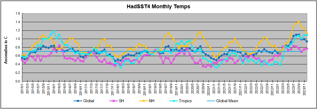
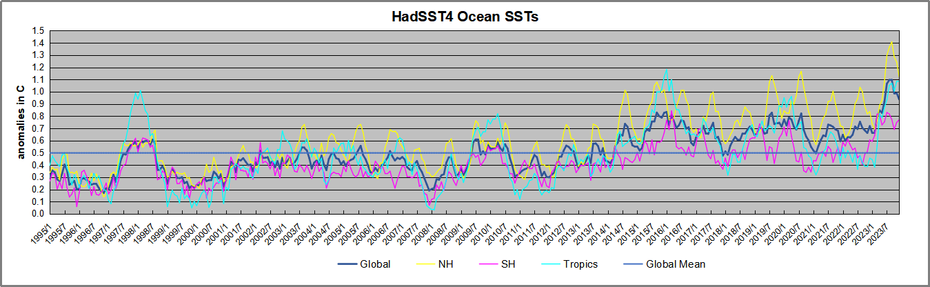
The chart below shows SST monthly anomalies as reported in HadSST4 starting in 2015 through December 2023. A global cooling pattern is seen clearly in the Tropics since its peak in 2016, joined by NH and SH cycling downward since 2016.
Note that in 2015-2016 the Tropics and SH peaked in between two summer NH spikes. That pattern repeated in 2019-2020 with a lesser Tropics peak and SH bump, but with higher NH spikes. By end of 2020, cooler SSTs in all regions took the Global anomaly well below the mean for this period.
Then in 2022, another strong NH summer spike peaked in August, but this time both the Tropic and SH were countervailing, resulting in only slight Global warming, later receding to the mean. Oct./Nov. temps dropped in NH and the Tropics took the Global anomaly below the average for this period. After an uptick in December, temps in January 2023 dropped everywhere, strongest in NH, with the Global anomaly further below the mean since 2015.
Then came El Nino as shown by the upward spike in the Tropics since January, the anomaly nearly tripling from 0.38C to 1.09C. In September 2023, all regions rose, especially NH up from 0.70C to 1.41C, pulling up the global anomaly to a new high for this period. But then in October anomalies in all regions started dropping down bringing down the Global anomaly. In December, NH cooled to 1.1C and the Global anomaly down to 0.94C from its peak of 1.10C, despite slight warming in SH and Tropics.
Comment:
The climatists have seized on this unusual warming as proof of their Zero Carbon agenda, without addressing how impossible it would be for CO2 warming the air to raise ocean temperatures. It is the ocean that warms the air, not the other way around. Recently Steven Koonin had this to say about the phonomenon confirmed in the graph above:
El Nino is a phenomenon in the climate system that happens once every four or five years. Heat builds up in the equatorial Pacific to the west of Indonesia and so on. Then when enough of it builds up it surges across the Pacific and changes the currents and the winds. As it surges toward South America it was discovered and named in the 19th century It is well understood at this point that the phenomenon has nothing to do with CO2.
Now people talk about changes in that phenomena as a result of CO2 but it’s there in the climate system already and when it happens it influences weather all over the world. We feel it when it gets rainier in Southern California for example. So for the last 3 years we have been in the opposite of an El Nino, a La Nina, part of the reason people think the West Coast has been in drought.
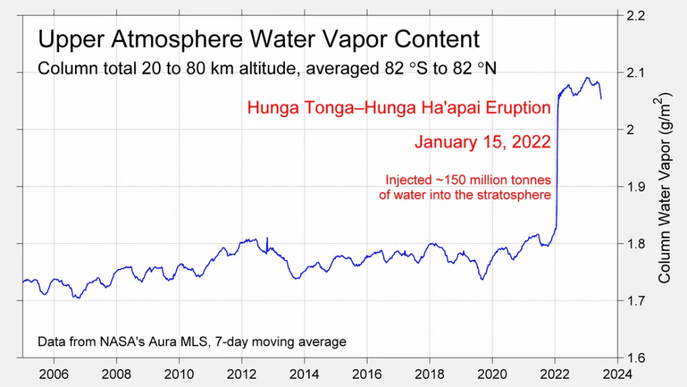
It has now shifted in the last months to an El Nino condition that warms the globe and is thought to contribute to this Spike we have seen. But there are other contributions as well. One of the most surprising ones is that back in January of 2022 an enormous underwater volcano went off in Tonga and it put up a lot of water vapor into the upper atmosphere. It increased the upper atmosphere of water vapor by about 10 percent, and that’s a warming effect, and it may be that is contributing to why the spike is so high.
A longer view of SSTs
Open image in a new tab to enlarge.
The graph above is noisy, but the density is needed to see the seasonal patterns in the oceanic fluctuations. Previous posts focused on the rise and fall of the last El Nino starting in 2015. This post adds a longer view, encompassing the significant 1998 El Nino and since. The color schemes are retained for Global, Tropics, NH and SH anomalies. Despite the longer time frame, I have kept the monthly data (rather than yearly averages) because of interesting shifts between January and July. 1995 is a reasonable (ENSO neutral) starting point prior to the first El Nino.
The sharp Tropical rise peaking in 1998 is dominant in the record, starting Jan. ’97 to pull up SSTs uniformly before returning to the same level Jan. ’99. There were strong cool periods before and after the 1998 El Nino event. Then SSTs in all regions returned to the mean in 2001-2.
SSTS fluctuate around the mean until 2007, when another, smaller ENSO event occurs. There is cooling 2007-8, a lower peak warming in 2009-10, following by cooling in 2011-12. Again SSTs are average 2013-14.
Now a different pattern appears. The Tropics cooled sharply to Jan 11, then rise steadily for 4 years to Jan 15, at which point the most recent major El Nino takes off. But this time in contrast to ’97-’99, the Northern Hemisphere produces peaks every summer pulling up the Global average. In fact, these NH peaks appear every July starting in 2003, growing stronger to produce 3 massive highs in 2014, 15 and 16. NH July 2017 was only slightly lower, and a fifth NH peak still lower in Sept. 2018.
The highest summer NH peaks came in 2019 and 2020, only this time the Tropics and SH were offsetting rather adding to the warming. (Note: these are high anomalies on top of the highest absolute temps in the NH.) Since 2014 SH has played a moderating role, offsetting the NH warming pulses. After September 2020 temps dropped off down until February 2021. In 2021-22 there were again summer NH spikes, but in 2022 moderated first by cooling Tropics and SH SSTs, then in October to January 2023 by deeper cooling in NH and Tropics.
Now in 2023 the Tropics flipped from below to well above average, while NH has produced a summer peak extending into September higher than any previous year. In fact, October and now November are showing that this number is likely the crest, despite El Nino driving the Tropics anomaly close to 1998 and 2015 peaks.
What to make of all this? The patterns suggest that in addition to El Ninos in the Pacific driving the Tropic SSTs, something else is going on in the NH. The obvious culprit is the North Atlantic, since I have seen this sort of pulsing before. After reading some papers by David Dilley, I confirmed his observation of Atlantic pulses into the Arctic every 8 to 10 years.
Contemporary AMO Observations
Through January 2023 I depended on the Kaplan AMO Index (not smoothed, not detrended) for N. Atlantic observations. But it is no longer being updated, and NOAA says they don’t know its future. So I find that ERSSTv5 AMO dataset has data through October. It differs from Kaplan, which reported average absolute temps measured in N. Atlantic. “ERSST5 AMO follows Trenberth and Shea (2006) proposal to use the NA region EQ-60°N, 0°-80°W and subtract the global rise of SST 60°S-60°N to obtain a measure of the internal variability, arguing that the effect of external forcing on the North Atlantic should be similar to the effect on the other oceans.” So the values represent sst anomaly differences between the N. Atlantic and the Global ocean.
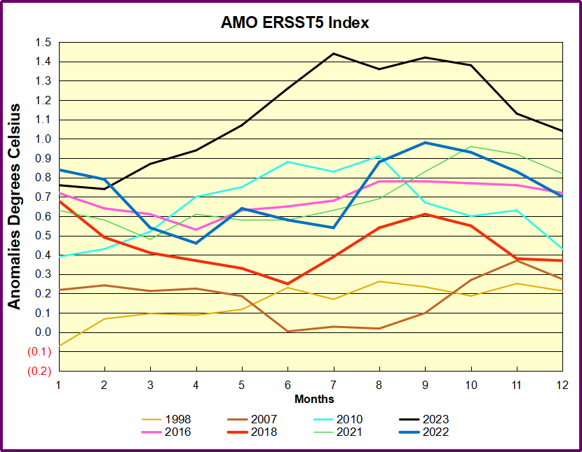
The chart above confirms what Kaplan also showed. As August is the hottest month for the N. Atlantic, its varibility, high and low, drives the annual results for this basin. Note also the peaks in 2010, lows after 2014, and a rise in 2021. Now in 2023 the peak was holding at 1.4C before decling. An annual chart below is informative:
Note the difference between blue/green years, beige/brown, and purple/red years. 2010, 2021, 2022 all peaked strongly in August or September. 1998 and 2007 were mildly warm. 2016 and 2018 were matching or cooler than the global average. 2023 started out slightly warm, then rose steadily to an extraordinary peak in July. August to October were only slightly lower, but by December cooled by ~0.4C.
The pattern suggests the ocean may be demonstrating a stairstep pattern like that we have also seen in HadCRUT4.
The purple line is the average anomaly 1980-1996 inclusive, value 0.18. The orange line the average 1980-202306, value 0.38, also for the period 1997-2012. The red line is 2013-202306, value 0.64. As noted above, these rising stages are driven by the combined warming in the Tropics and NH, including both Pacific and Atlantic basins.
The oceans are driving the warming this century. SSTs took a step up with the 1998 El Nino and have stayed there with help from the North Atlantic, and more recently the Pacific northern “Blob.” The ocean surfaces are releasing a lot of energy, warming the air, but eventually will have a cooling effect. The decline after 1937 was rapid by comparison, so one wonders: How long can the oceans keep this up? And is the sun adding forcing to this process?
Space weather impacts the ionosphere in this animation. Credits: NASA/GSFC/CIL/Krystofer Kim
Footnote: Why Rely on HadSST4
HadSST is distinguished from other SST products because HadCRU (Hadley Climatic Research Unit) does not engage in SST interpolation, i.e. infilling estimated anomalies into grid cells lacking sufficient sampling in a given month. From reading the documentation and from queries to Met Office, this is their procedure.
HadSST4 imports data from gridcells containing ocean, excluding land cells. From past records, they have calculated daily and monthly average readings for each grid cell for the period 1961 to 1990. Those temperatures form the baseline from which anomalies are calculated.
In a given month, each gridcell with sufficient sampling is averaged for the month and then the baseline value for that cell and that month is subtracted, resulting in the monthly anomaly for that cell. All cells with monthly anomalies are averaged to produce global, hemispheric and tropical anomalies for the month, based on the cells in those locations. For example, Tropics averages include ocean grid cells lying between latitudes 20N and 20S.
Gridcells lacking sufficient sampling that month are left out of the averaging, and the uncertainty from such missing data is estimated. IMO that is more reasonable than inventing data to infill. And it seems that the Global Drifter Array displayed in the top image is providing more uniform coverage of the oceans than in the past.
USS Pearl Harbor deploys Global Drifter Buoys in Pacific Ocean
 Global News reports


 Clearly climatists are worried about current cold weather, ironically triggered by the beginning of COP28 coinciding with heavv snow closing airports in Munich, for example. Add to that Buffalo Bills NFL playoff game postponed due to extreme cold. So Climate Central coordinated a PR campaign lest the believers lose faith in Global Warming. Later below are noted the three themes that appear.


:max_bytes(150000):strip_icc():format(webp)/depression-593e9b1e5f9b58d58a0ad46c.jpg)