On Climate “Signal” and Weather “Noise”

Discussions and arguments concerning global warming/climate change often get into the issue of discerning the longer term signal within the shorter term noisy temperature records. The effort to separate natural and human forcings of estimated Global Mean Temperatures reminds of the medieval quest for the Holy Grail. Skeptics of CO2 obsession have also addressed this. For example the graph above from Dr. Syun Akasofu shows a quasi-60 year oscillation on top of a steady rise since the end of the Little Ice Age (LIA). Various other studies have produced similar graphs with the main distinction being alarmists/activists attributing the linear rise to increasing atmospheric CO2 rather than to natural causes (e.g. ocean warming causing the rising CO2).
This post features a comment by rappolini from a thread at Climate Etc. and Is worth careful reading. The occasion was Ross McKitrick’s critique of Santer et al. (2019) that claimed 5-sigma certainty proof of human caused global warming. Excerpts from rappolini in italics with my bolds
Ben Santer was searching for a human footprint back in 2011. Apparently, he is still searching.
Most recent global climate models are consistent in depicting a tropical lower troposphere that warms at a rate much faster than that of the surface. Thus, the models would predict that the trend for warming of the troposphere temperature (TT) would be at a higher rate than the surface.
Douglass and Christy (2009) presented the latest tropospheric temperature measurements (at that time) that did not show this warming. (Since then, this continued lack of warming has continued for another ten years without much change, but that is getting ahead of ourselves).
Hence, in keeping with recent practice over the past few years in which alarmistsj promptly publish rebuttals to any papers that slip through their control of which manuscripts get accepted by climate journals, it was necessary for the alarmists to publish such a rebuttal.
Ben Santer took on this responsibility and the result was Santer et al. (2011). It is interesting, perhaps, that Santer included 16 co-authors in addition to himself; yet the nature of the work is such that it is difficult to imagine how 16 individuals could each contribute significant portions to the work. In other words, many names were added to give the paper political endorsement? In fact, when I redid all their work, it took me about one day!

Santer et al. (2011) were concerned with a very basic problem in climatology: how to distinguish between long-term climate change and short-term variable weather in regard to TT measurements? They treated the problem in terms of signal and noise: the signal is assumed to be a long-term linear trend of rising temperatures due increasing greenhouse gas concentrations, that is obfuscated by short-term noise. However, the climate-weather problem is innately different from a classical signal/noise problem such as a radio signal affected by atmospheric activity. In that case, if the radio signal has a sufficiently narrow frequency band, and the noise has a wider frequency spectrum, the signal-to-noise ratio (S/N) can be improved with a narrow-band receiver tuned to the frequency of the radio signal. The radio signal and the noise are separate and distinct. By contrast, in the climate-weather problem, the instantaneous weather is the noise, and the signal is the long-term trend of the noise. The noise and signal are coupled in a unique way. Furthermore, there is no evidence that it is even meaningful to talk about a “trend” since there is no evidence that the variation of TT with time is linear.
Santer et al. (2011) were primarily concerned with estimating how many years of data are necessary to provide a good estimate of the putative underlying linear trend. They were also intent on showing that short periods with no apparent trend do not violate the possibility that over a longer term, the trend is always there. They derived signal-to-noise (S/N) ratios for both the temperature data and the model average by means that are not exactly clear to this writer.
As Santer et al. (2011) showed, one can pick any starting date and any duration length and fit a straight line to that portion of the curve of TT vs. time. They did this for various 10-year and 20-year durations. In each case, depending on the start date, they derived a best straight-line fit to the TT data for that time period. They found that the range of trends for 10-year periods was greater (-0.05 to +0.44°C/decade) than the range for 20-year periods (+0.15 to +0.25°C/decade).
The trend line was steepest for a start date around 1988 (ending in the giant El Niño year of 1998). Prior to 1988 and after 1998, the trends were minimal.

Santer et al. described use of longer durations as “noise reduction”, which it is, provided that one assumes the overall signal is linear in time. It still was problematic that the trend was nil after 1998 that they rationalized by saying:
“The relatively small values of overlapping 10-year TT trends during the period 1998 to 2010 are partly due to the fact that this period is bracketed (by chance) by a large El Niño (warm) event in 1997/98, and by several smaller La Niña (cool) events at the end of the … record”.
However, as Pielke pointed out, the period after 1998 was 13 years, not 10, and furthermore, the period after 1998 had roughly equal periods of El Niño and La Niña and was not dominated by La Niñas as Santer et al. claimed. What Santer et al. (2011) implied was that an unusual conflux of a large El Niño early on and multiple La Niñas later on caused the trend to minimize for that unique period as a statistical quirk. However, that is like a baseball pitcher saying that if the opponents hadn’t hit that home run, he would have won the game.
In simplistic terms, the signal-to-noise ratio can be estimated as follows. For either 10-year or 20-year durations, the signal was the mean trend derived by a straight-line fit to the TT data over that duration. The noise was the range of trends for different starting dates. For ten-year durations, the trend was 0.19 ± 0.25°C/decade. For twenty-year durations, the trend was 0.20 ± 0.05°C/decade. The signal in each case is taken as the mean trend. The distribution of trends within these ranges was similar to a normal distribution. Thus, we can roughly estimate the noise as ~ 0.7 times the full width of the range. Hence, the S/N ratio for ten-year durations can be crudely estimated to be S/N ~ 0.19/(0.7 0.5) = 0.5 and for twenty-year durations is S/N ~ 0.2/(0.7 0.1) = 2.9. Santer et al. obtained S/N = 1 for ten-year durations and S/N = 2.9 for twenty-year durations. If it can be assumed that the signal varies linearly with time, one can then estimate what level of precision for the estimated trend can be obtained for any chosen duration. Santer et al. obviously believe that the signal is linear with time for all time. By some logic that escapes me, Santer et al. concluded that
“Our results show that temperature records of at least 17 years in length are required for identifying human effects on global-mean tropospheric temperature”.
This conclusion seems to be grossly exaggerated. A more proper statement might be as follows:
Assuming that the variability of TT is characterized by a long-term upward linear trend caused by human impact on the climate, and that variability about this trend is due to yearly variability of weather, El Niños and La Niñas, and other climatological fluctuations, the recent data suggest that the trend can be estimated for any 17-year period with a S/N ratio of roughly 2.5.
Finally, we get to the nub of the paper by Santer et al. that asserted:
“Claims that minimal warming over a single decade undermine findings of a slowly-evolving externally-forced warming signal are simply incorrect”.
Here is where Santer et al. attempted to dispel the notion that minimal warming for a period contradicts the belief that underneath it all, the long-term signal continues to rise at a constant rate. Pielke Sr. argued that this was an overstatement and he concluded:
“If one accepts this statement by Santer et al. as correct, then what should have been written is that the observed lack of warming over a 10-year time period is still too short to definitely conclude that the models are failing to skillfully predict this aspect of the climate system”
However, I would go further than Pielke Sr. First of all, the period of minimal temperature rise was longer than 10 years. Second, there is no cliff at 17 years whereby trends derived from shorter periods are statistically invalid and trends derived from longer periods are valid. According to Santer et al. a trend derived from a 13-year period is associated with a S/N ~ 1.5 which though not ideal, is good enough to cast some doubt on the validity of models.
The continued almost religious belief by alarmists that the temperature always rises linearly and continuously is evidently refuted. If the alarmists would only reduce their hyperbole and argue that rising greenhouse gas concentrations produce a warming force that is one of several factors controlling the Earth’s climate, and there are periods during which the other factors overwhelm the greenhouse forces, perhaps we would have a rational description. Instead, the alarmists continue to find linear trends over various time periods, in some cases when they are not there.
Santer, B. D., C. Mears, C. Doutriaux, P. Caldwell, P. J. Gleckler, T. M. L. Wigley, S. Solomon, N. P. Gillett, D. Ivanova, T. R. Karl, J. R. Lanzante, G. A. Meehl, P. A. Stott, K. E. Taylor, P. W. Thorne, M. F. Wehner, and F. J. Wentz (2011) “Separating Signal and Noise in Atmospheric Temperature Changes: The Importance of Timescale” Journal of Geophysical Research (Atmospheres) 116, D22105.
PS.
There may not be human fingerprint on tropospheric temperatures since 1978, but there very certainly is an El Nino fingerprint. Occurrence of El Ninos dominated over La Ninas from 1978 to 1998, a period when there was more global warming than any other period in the past 150 years. After the great El Nino of 1997-8, global temperatures have meandered in consonance with the Nino 3.4 Index, rising to a new height in the great El Nino of 2015-6, only to fall back after that to about the “pause”.


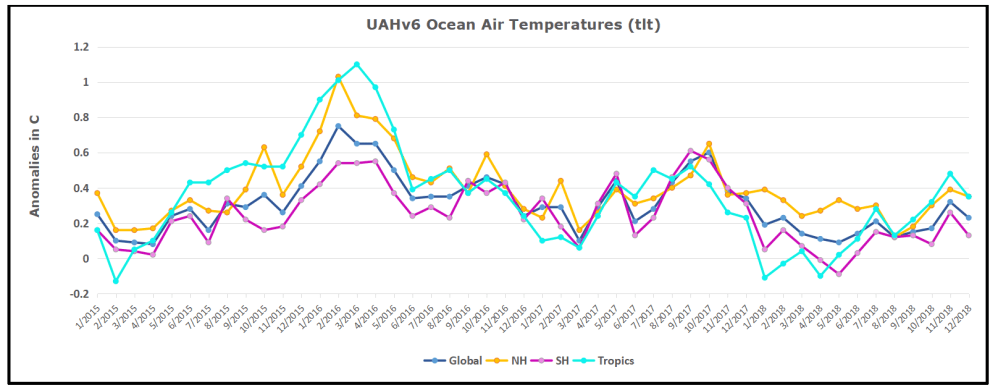
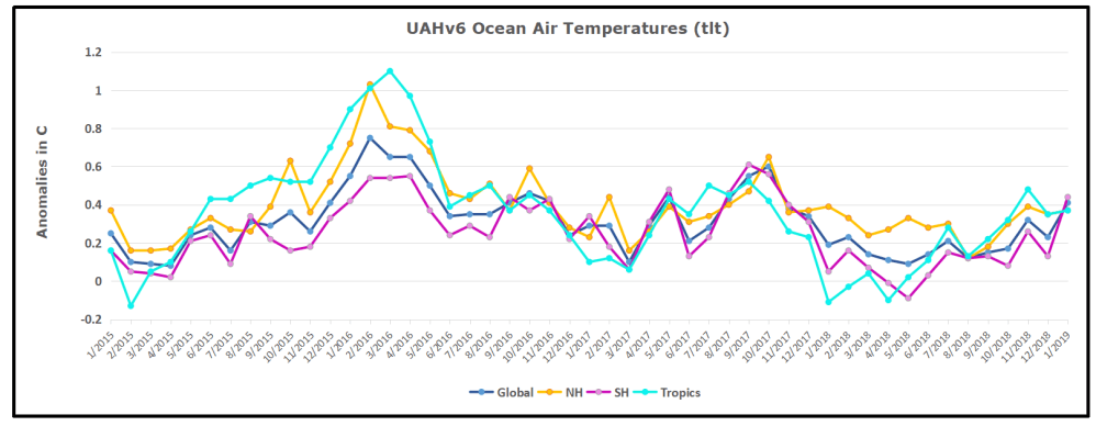 The anomalies over the entire ocean dropped to the same value, 0.12C in August (Tropics were 0.13C). Warming in previous months was erased, and September added very little warming back. In October and November NH and the Tropics rose, joined by SH. In December 2018 all regions cooled resulting in a global drop of nearly 0.1C. Now in January an upward jump in SH overcame slight cooling in NH and the Tropics, pulling up the Global anomaly as well. While the trajectory is not yet set, it is the highest ocean air January since 2016.


 The anomalies over the entire ocean dropped to the same value, 0.12C in August (Tropics were 0.13C). Warming in previous months was erased, and September added very little warming back. In October and November NH and the Tropics rose, joined by SH last month., In December 2018 all regions cooled resulting in a global drop of nearly 0.1C.


 The anomalies over the entire ocean dropped to the same value, 0.12C in August (Tropics were 0.13C). Warming in previous months was erased, and September added very little warming back.
