IPCC Still Deceiving with the Hockey Stick
Fig. 1: Common Era temperature reconstructions
featured in IPCC reports since 2001.

Source Esper et al 2024 Note: In each graph, instrumental global annual mean land and marine temperatures are shown in a red spike, while lower resolution proxy estimates are in blue.
Just published today at Nature Communications is this paper The IPCC’s reductive Common Era temperature history by Esper et al. Excerpts in italics with my bolds and added images.
Abstract
Common Era temperature variability has been a prominent component in Intergovernmental Panel on Climate Change reports over the last several decades and was twice featured in their Summary for Policymakers. A single reconstruction of mean Northern Hemisphere temperature variability was first highlighted in the 2001 Summary for Policymakers, despite other estimates that existed at the time. Subsequent reports assessed many large-scale temperature reconstructions, but the entirety of Common Era temperature history in the most recent Sixth Assessment Report of the Intergovernmental Panel on Climate Change was restricted to a single estimate of mean annual global temperatures. We argue that this focus on a single reconstruction is an insufficient summary of our understanding of temperature variability over the Common Era. We provide a complementary perspective by offering an alternative assessment of the state of our understanding in high-resolution paleoclimatology for the Common Era and call for future reports to present a more accurate and comprehensive assessment of our knowledge about this important period of human and climate history.
Fig. 5: Standard deviations in observed temperature data
and Common Era temperature reconstructions.
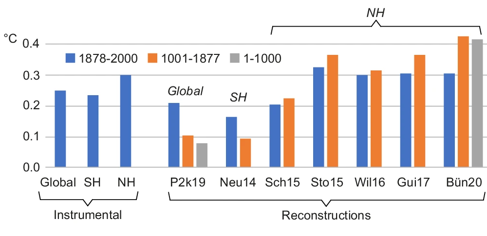
Estimates for the observed and reconstructed temperatures are determined over the 1878-2000 CE (blue), 1001-1877 CE (orange) and 1-1000 CE (gray) periods. Instrumental records shown on the left side include mean annual temperatures averaged over 90°S-90°N land and marine areas (global), mean annual temperatures averaged over 0°−90°S land and marine areas (SH), and mean summer (JJA) temperatures averaged over 30°−90°N land-only areas (NH).
While interpretations of the similarities and differences across the various domains and reconstructions, as shown in Fig. 5, remains the subject of important and interesting research, diagnosing the differences is not the focus of our commentary herein. Our primary concern is that substantial uncertainty exists. The consequence is that there are notable differences in the representation of large-scale estimates of CE temperature variability, as shown in Figs. 2 and 3, that were overlooked and poorly communicated by the 2021 IPCC WGI report. Both the different summary of the global P2k19 ensemble provided in Figs. 2b and 3c, and the inclusion of the additionally available NH and SH temperature reconstruction estimates in Fig. 3, imply substantial uncertainties in large-scale temperature reconstructions that better summarize the existing challenges associated with the science.
Fig. 3: Reconstructions of large-scale temperature variability
over the last 2000 years published since AR5 of the IPCC.
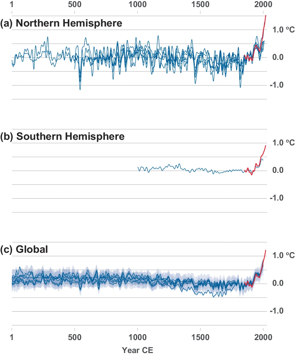
Reconstructions variably target seasonal to annual mean temperatures in the (a) Northern Hemisphere (Sch15, Sto15, Wil16, Xin16, Gui17, Bün20), and annual temperatures for the (b) Southern Hemisphere (Neu14) and (c) globally (P2k19; as shown in Fig. 2) over varying periods of the Common Era (see Table 1 for details). All reconstructions were smoothed using a 20-year low-pass filter and temperatures are shown as anomalies from their 1850–1900 means. Hemispheric and global means of land and ocean temperatures derived from HadCRUT5 instrumental analysis1 are also shown in each respective panel from 1850-2020 (red). Instrumental temperatures were also referenced to zero mean in the 1850–1900 interval and filtered with a 20-year lowpass filter. These instrumental representations are all consistent with the 2021 IPCC report.
Conclusions and future priorities
We propose that a visualization of the contemporary research, as in Fig. 3, offers a more accurate depiction of the uncertainty and temporal evolution of CE temperature variability compared to any single reconstruction. A general feature of Fig. 3 is that long-term trends during the second millennium CE are more coherent and robust, but major discrepancies still exist during the first millennium CE. These uncertainties in the first millennium are the product of severe reductions in the availability of high-resolution proxy records, which affects all large-scale temperature reconstructions. The SH also remains grossly under-sampled.
It is therefore premature, and possibly incorrect, to conclude that
the first millennium was free of centennial-scale temperature trends
and that the decadal variations were systematically smaller
than during subsequent centuries, as detailed in the 2021 SPM.
Regarding global temperature reconstructions specifically, we also highlight the following limitations that must continue to be contextualized in consensus reports on CE temperature reconstructions:
(i) warm season biases due to the dominance of tree-ring records during the CE,
(ii) spatial biases in proxy sampling, with a persistent lack of high-resolution proxy records from the tropics and SH, which are needed for accurately representing lower-latitude and SH temperatures over the past 2000 years,
(iii) the likely loss of variability when including time-uncertain and smoothed proxies in a large-scale reconstruction,
(iv) the potential limited ability of conventional tree-ring records to capture millennial-scale trends in climate, and
(v) the need to more accurately estimate reconstruction uncertainties that reflect changes in replication and statistical model fidelity of the underlying proxy network back in time (a constant uncertainty range back in time is unlikely to accurately represent the increasing uncertainties that exist).
With any set of methods, however, their outcome is ultimately dependent on the data that they incorporate and the assumptions that underpin the statistical model. A major initiative to produce new high-resolution proxy records that span the entire CE is therefore necessary if we are to fundamentally improve our understanding of pre-instrumental temperature variations at policy-relevant timescales. It otherwise remains uncertain how warm and cold first millennium CE temperatures actually were and what caused these earlier changes at hemispheric to global scales, with implications for our understanding of the true range of externally and internally forced variability.
My Comment:
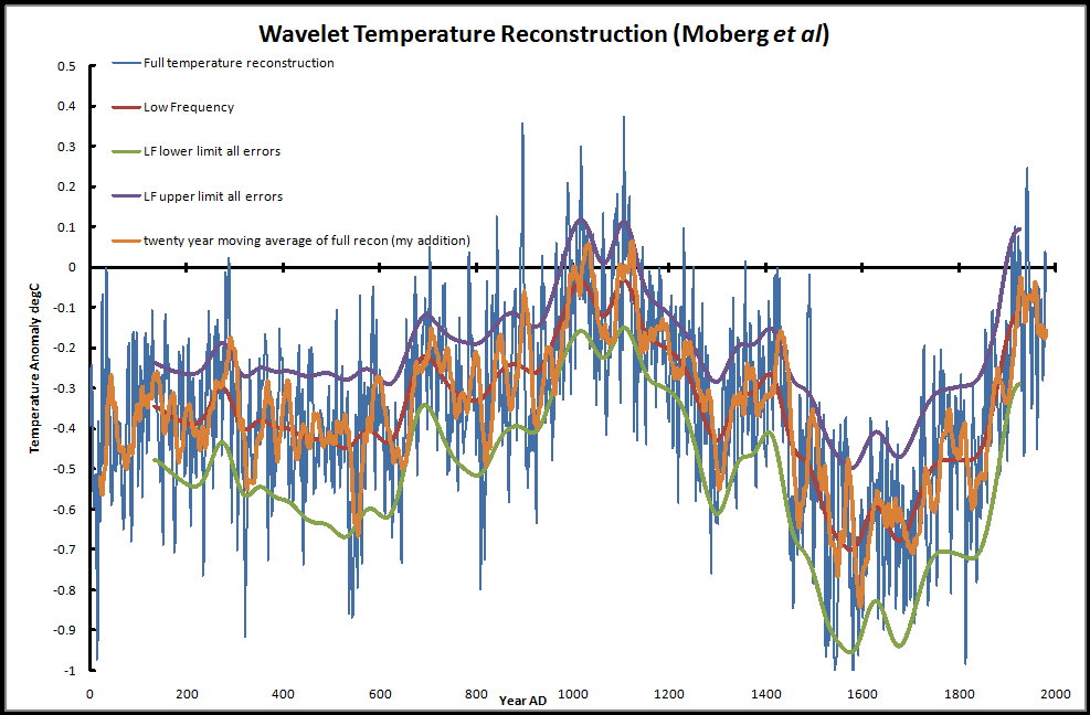
Among the references in the paper is that of Moberg et al (2005) Highly variable Northern Hemisphere temperatures reconstructed from low- and high-resolution proxy data. The graph below shows one example of how more recent high quality reconstructions contradict the Mann depiction of a flat hockey stick handle during the centuries prior to the 20th.
Background of the Mann Hockey Stick Saga

The first graph appeared in the IPCC 1990 First Assessment Report (FAR) credited to H.H.Lamb, first director of CRU-UEA. The second graph was featured in 2001 IPCC Third Assessment Report (TAR) the famous hockey stick credited to M. Mann.