Ice House of Mirrors

In the fable of Snow White, the evil step-mother asked her hand mirror: “Who is the fairest in the land?” The mirror on the wall always flattered her, but this mirror did not. As we all know, the hand mirror told the truth, the queen was angry and people had to suffer.
We expect mirrors to tell the truth, to show us the objective reality. That is why it is amusing at the carnival sideshow to gaze into mirrors that make normal people look obese or like a beanpole, or otherwise distort one’s appearance.
This post is about what Arctic Ice Extent looks like in the mirrors available to the public.
Mirror #1
If you wonder what is happening with Arctic Ice, the first (and maybe only) depiction you encounter will look like this:

I call this The Incredibly Shrinking Ice Mirror, because it is certainly scary (Death Spiral comes to mind). Ice is obviously going to hell in a hand-basket. Once your fright abates, you might wonder about the scale or how much ice is measured. And you might notice this is about September; except for March other months of the year are excluded from view.
You wouldn’t know from this chart that scary looking 2012 had one of the higher March maximums and on average was not so far out. But that wouldn’t be as exciting.
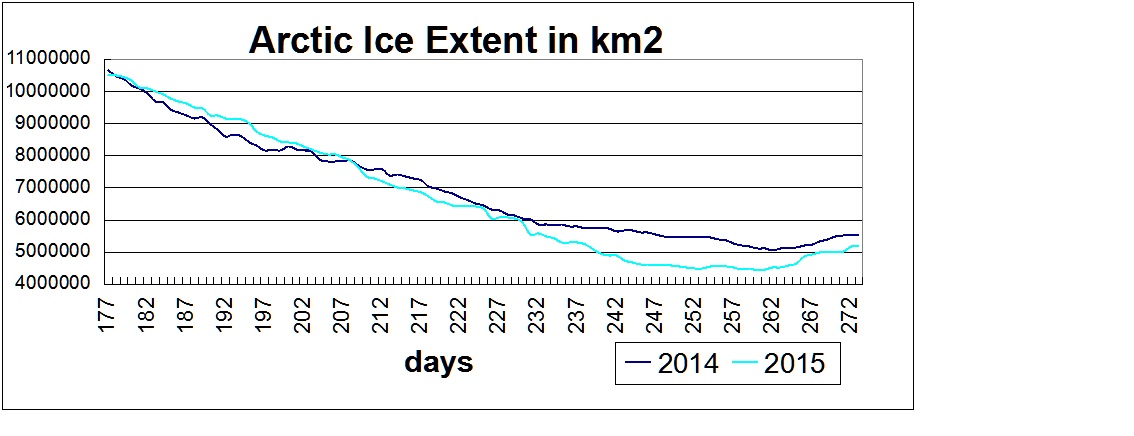
Mirror #2
Just for fun, let’s make a mirror from the same dataset, just one month later. I call this The Incredibly Persisting Ice Mirror.

You won’t find this one on the Internet because it is politically incorrect and pretty boring. But it is just as valid as Mirror #1. It is showing a very slow, unalarming decline with something unusual in 2007, but recovering after that.
Is it a distortion? Absolutely, it is incomplete in the same way as Mirror #1, but gives the opposite impression, just by choosing a different month. But at least this one informs your impression with the actual monthly average extents in M km2 (no anomalies or %s).
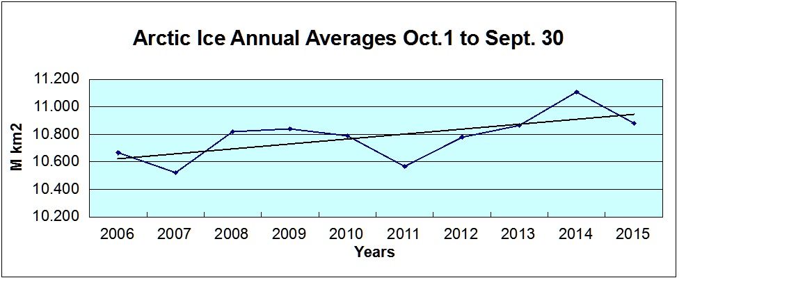
Mirror #3
There are more informative pictures of Arctic Ice dynamics if you look for them. For example, there is this presentation of the complete dataset:

I call this The Bird’s Eye Ice Mirror because you can see the big picture from the satellite passive microwave sensors: the full range of annual variation, the actual measured extents and averages. Note the trend line looks much more like October than September. Is there a reason September is preferred?
Mirror #4
As I have pointed out there are other views of ice extent patterns, such as this:
Let’s call it the The Navigator’s Eye Ice Mirror because it is the accumulation of the ice extents you could expect to observe at sea level from buoys or from the deck of a ship operating in the Arctic region (source: MASIE ice charts).
Of course, there are other mirrors trying in their own ways to tell us about Arctic Ice.
Here’s two Magnifying Ice Mirrors, giving you closeups of what is happening with the ice:


Let’s not forget The Rear-view Ice Mirrors showing that there were ice observations long before the satellite record started in 1979.
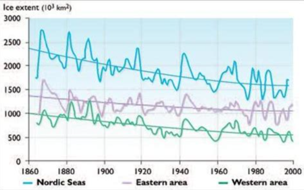
Figure 16-3: Time series of April sea-ice extent in Nordic Sea (1864-1998) given by 2-year running mean and second-order polynomial curves. Top: Nordic Sea; middle: eastern area; bottom: western area (after Vinje, 2000). IPCC Third Assessment Report
Conclusion:
We know as a fact of life that any mirror contains some distortion or bias, even those trying to tell the truth. So it is wise to look at several of them, and pay attention to the frames, before concluding what is happening. Be sure to have a chuckle when you pass by Mirror #1. Although setting energy policies and investing billions of research dollars based on that distortion is not amusing.

Footnote:
Some commentators wondered whether the statistics are affected by icebreakers. I don’t know, but there is evidence of a Norwegian icebreaker in operation: