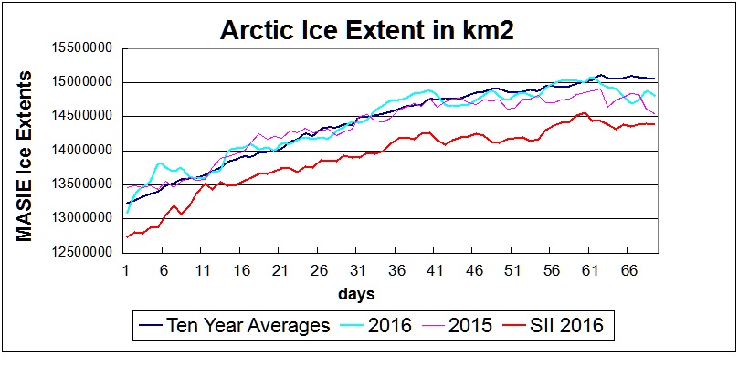
Recently I addressed this claim by referring to this chart produced by scientists from AARI.
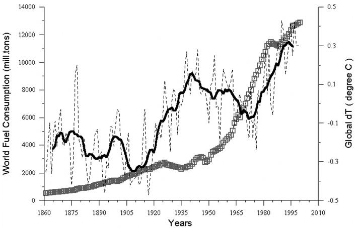
Figure 5.1. Comparative dynamics of the World Fuel Consumption (WFC) and Global Surface Air Temperature Anomaly (ΔT), 1861-2000. The thin dashed line represents annual ΔT, the bold line—its 13-year smoothing, and the line constructed from rectangles—WFC (in millions of tons of nominal fuel) (Klyashtorin and Lyubushin, 2003). Source: Frolov et al. 2009
In their commentary, it is clear why the data does not support claiming fossil fuels cause global warming. From Frolov et al. 2009:
The WFC curve shows an exponential increase, which doubles approximately every 30 years, increasing 25-fold since the middle of the nineteenth century. The global air temperature anomaly curve shows a positive trend of +0.06°C/10 years (Sonechkin et al., 1997). At the same time, there are cyclic changes with periods of about 60 years. The correlation between these curves changes its sign every 30 years, varying from —0.88 (1940 1970) to +0.94 (1970 2000). Hence, there is no direct linear connection between WFC (which indirectly represents CO2 concentration in the atmosphere) and global air temperature. The authors of this study therefore conclude that the WFC increase is not an obvious cause of the increase in global air temperature.
In this post, I am bringing the analysis up to date by showing World Fossil Fuel Consumption (WFFC) compared to Global Temperature Anomalies.
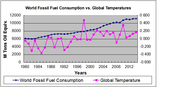
The WFFC numbers come from US EIA and can be accessed here. I have included only the statistics for coal, oil and gas, which comprise 91% of total energy consumed. The remainder are hydro, nuclear and other renewables. 2015 numbers are not yet available. UAH version 6 provides global temperature anomalies for the lower troposphere.
The correlation overall is moderately positive at 0.60, but the two patterns are markedly different because of the 1998 event. 1980 to 2000 (the period overlapping with the AARI graph) shows a weakly positive 0.48 correlation. From 2000 to 2014 the correlation is almost non-existent at 0.07.
Summary
In the long-term and in the recent short-term, use of fossil fuels is not the obvious cause of temperature changes. The context and background for reaching this conclusion is provided below (From the previous post.)
Legal Test of Global Warming

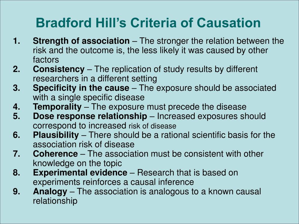
In a previous post (here), I discussed the Bradford Hill protocol that has become precedent for trials concerning scientific evidence for legal liability.
Bradford Hill was the jurist who brought clarity and methodology for the courts to consider and rule on accusations such as:
Thalidimide is causing birth defects;
Asbestos dust is causing lung disease;
as well as frequent claims of causal relationships between illness, injury and conditions of work.
The Global Warming Claim
When it comes to Global Warming, the proposition is straightforward:
Rising fossil fuel emissions are causing rising global temperatures.
The procedure to test that claim is described by Nathan Schachtman here.
Proper epidemiological methodology begins with published study results which demonstrate an association between a drug and an unfortunate effect. Once an association has been found, a judgment as whether a real causal relationship between exposure to a drug and a particular birth defect really exists must be made.
Step 1: Establish an association between two variables.
Proper epidemiological method requires surveying the pertinent published studies that investigate whether there is an association between the medication use and the claimed harm. The expert witnesses must, however, do more than write a bibliography; they must assess any putative associations for “chance, confounding or bias”:
Step 2: Rule out chance as an explanation
The appropriate and generally accepted methodology for accomplishing this step of evaluating a putative association is to consider whether the association is statistically significant at the conventional level.
“Generally accepted methodology considers statistically significant replication of study results in different populations because apparent associations may reflect flaws in methodology.”
Step 3: Rule out bias or confounding factors.
The studies must be structured to analyze and reject other factors or influences, such as non-random sampling, additional intervening variables such as demographic or socio-economic differences.
Step 4: Infer Causation by Applying Accepted Causative Factors
Most often legal proceedings follow the Bradford Hill factors, which are delineated here.

By way of context Bradford Hill says this:
None of my nine viewpoints can bring indisputable evidence for or against the cause-and-effect hypothesis and none can be required as a sine qua non. What they can do, with greater or less strength, is to help us to make up our minds on the fundamental question – is there any other way of explaining the set of facts before us, is there any other answer equally, or more, likely than cause and effect?
Such is the legal terminology for the “null” hypothesis: As long as there is another equally or more likely explanation for the set of facts, the claimed causation is unproven.
The Causative Factors
What aspects of that association should we especially consider before deciding that the most likely interpretation of it is causation?
(1) Strength. First upon my list I would put the strength of the association.
(2) Consistency: Next on my list of features to be specially considered I would place the consistency of the observed association. Has it been repeatedly observed by different persons, in different places, circumstances and times?
To test the Global Warming claim, let’s consider the association between world fuel consumption (WFC) and surface air temperatures (SAT):
Figure 5.1. Comparative dynamics of the World Fuel Consumption (WFC) and Global Surface Air Temperature Anomaly (ΔT), 1861-2000. The thin dashed line represents annual ΔT, the bold line—its 13-year smoothing, and the line constructed from rectangles—WFC (in millions of tons of nominal fuel) (Klyashtorin and Lyubushin, 2003). Source: Frolov et al. 2009
In Figure 5.1, the dynamics of global air temperature anomalies obtained from instrumental measurements over the last 140 years is compared with changes in world fuel consumption (WFC) (Makarov, 1998). The WFC curve shows an exponential increase, which doubles approximately every 30 years, increasing 25-fold since the middle of the nineteenth century. The global air temperature anomaly curve shows a positive trend of +0.06°C/10 years (Sonechkin et al., 1997). At the same time, there are cyclic changes with periods of about 60 years. The correlation between these curves changes its sign every 30 years, varying from —0.88 (1940 1970) to +0.94 (1970 2000). Hence, there is no direct linear connection between WFC (which indirectly represents CO2 concentration in the atmosphere) and global air temperature. The authors of this study therefore conclude that the WFC increase is not an obvious cause of the increase in global air temperature.
The other causative factors could be applied, but can not add weight against the argument above.
Case Closed
The legal methodology above is used to decide the causal relationship between two variables. Clearly, in Climate Science the starting question is: Do rising fossil fuel emissions cause temperatures to rise? Those who have been following the issue know that there are many arguments underneath: Why do not temperatures always rise along with CO2? Has chance been eliminated? Are not natural factors confounding the association? And so on.
For myself, I will join in the conclusion reached by Frolov et al., who go on to further explain their position:
In general, although climate models are based on physics, they inevitably include a number of adjustable parameters that are fitted to past temperature changes. We are not aware of a single climate model based on fundamental physics without adjustable parameters that has been subjected to a rigorous test against actual climate data. Climate modelers appear to assume that the Earth’s climate would continue without change, were it not for greenhouse gas emissions. They do not take into account the possibility that natural climate cycles are also acting independently of effects induced by buildup of greenhouse gas concentrations. As we have shown in Chapter 4, there is evidence for cyclic variability of Arctic climates. Furthermore, there is considerable evidence for past variability of global climate as expressed in the so-called Medieval Warm Period (900-1100) and the Little Ice Age (1600-1850). These fluctuations appear to be as great as the temperature rise of the 20th century, yet, there was no contribution of greenhouse gases to these climate changes.
A major challenge in climate modeling is to understand the range of natural fluctuations, and separate these from climate changes induced by human activity (greenhouse gas emissions, land clearing, irrigation, …). The models neglect natural fluctuations because they have no means of incorporating them, and put the entire blame for climate changes since the 19th century on human activity. As a result, they appear to project an extreme view of the future that seems unlikely to be reliable.
Again my thanks to Dr. Bernaerts for the copy of this book: