Much Ado About CO2

Following a presentation in London by Dr. Murry Salby, there has been much discussion at several sites: No Tricks Zone, Climate Etc. and WUWT. These threads are always a challenge for a reader because there are exchanges debating various issues between highly convinced people who are seldom explicit about the assumptions underlying their relative positions.

Interesting in this case are the reactions to Salby’s assertion that the observed rise in atmospheric CO2 is caused by effects of rising temperatures upon natural sources/sinks, and not by rising fossil fuel emissions. (Leaving aside for today the whole other issue of climate sensitivity to changes in CO2).

Attacks have been mounted both by supporters of IPCC, and also by skeptics of IPCC alarms who nevertheless accept the notion that all or most of the measured rise in CO2 is from humans, fossil fuels and cement in particular. Still others find flaws in Salby’s argument, but are not convinced by the alternative.

I recently posted a review of Salby’s textbook which touched on this topic. Firstly, I agree with those who say you cannot use static calculations on a dynamic and open system like the atmosphere. That is, both inputs and outputs are interactive and vary in response to each other. The most obvious example is increasing CO2 causing plant growth which in turn consumes more CO2. Thus algebra can mislead us, since it is the differentials over time that accumulate the object of interest at changing rates.

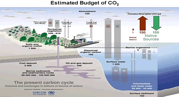
Secondly, it seems to me that the atmosphere itself is too small a subsystem to draw any meaningful conclusions. The ocean and land sources/sinks are orders of magnitude larger than the amount in the atmosphere, and the errors in estimating those flows far exceed the man-made emissions (which are also estimates with larger uncertainties than is usually admitted).

Rather than thinking of the air as a reservoir of CO2, it is more like a tidal pool. Imagine a scientist concerned that this tidal pool is changing volume because of water (unpolluted) leaking from a nearby landfill. So a measuring cup sample is taken periodically and tested. All the while, the pool is repeatedly drenched and drained by waves, currents and tides, along with occasional rains and storms. Whatever the test results, the effect of additional water from the landfill can not be discerned in the absence of markers distinguishing it from ocean and rainwater.

I don’t say Salby has all the answers. I agree with him that at the current state of information, atmospheric CO2 from human sources can not be identified apart from much larger natural fluxes of CO2.

i

Laptev Wall and Nunavut Gauntlet

Update August 14, 2016

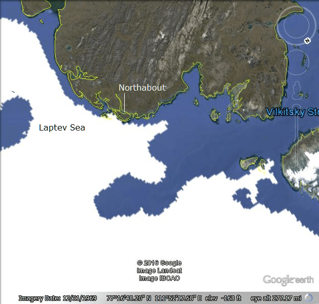
It appears that Northabout has found a way around the Laptev wall, and is close to finding open water.  Below the Google Earth image of ice edges from NIC shows how the strait has opened up along with navigable shore lines.

Aug13googleRev

Imagery date refers to Google Earth capture of land forms. Ice edges are provided by MASIE for August 13, 2016.

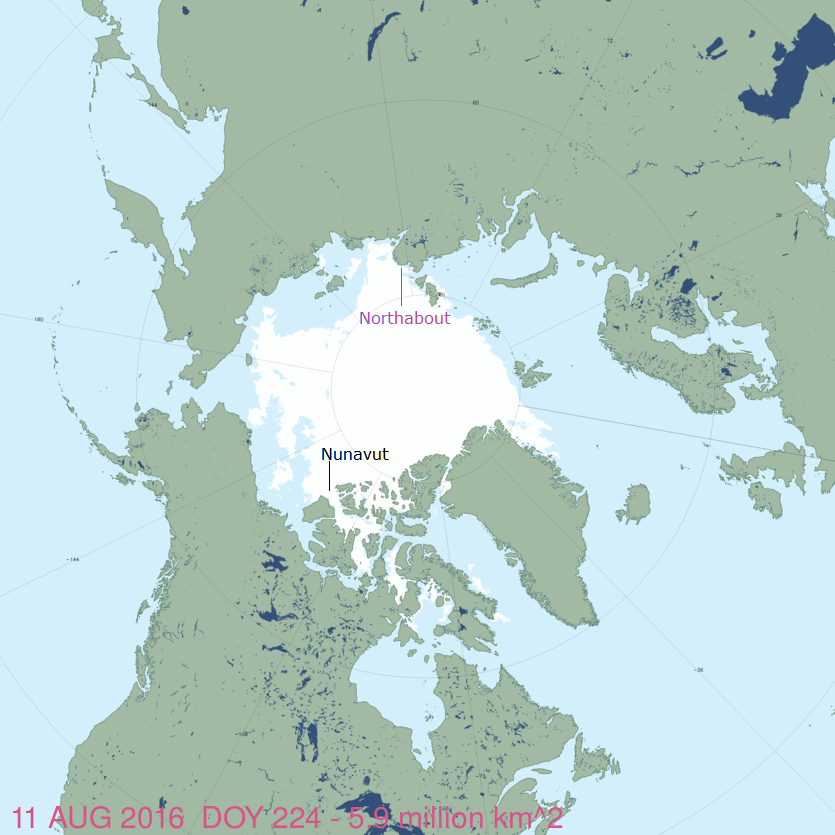
The Big Picture from August 11, 2016.

masie_August 11rev

The Polar Ocean Challenge involves the sailing ship Northabout circumnavigating the North Pole counterclockwise starting from Bristol UK. The chart above from MASIE shows the two choke points in the itinerary: The Laptev Wall of ice at the beginning and the Nunavut Gauntlet of ice at the end. The image shows If Northabout can get past Laptev, it is relatively clear sailing all the way to Beaufort where Nunavut awaits.

20160809en

The above chart from AARI shows how Northabout has passed through the strait from Kara into Laptev and is in a holding pattern up against the wall.  Caleb has some great photos (here) of the views from the deck, along with some comments respecting the explorers despite their being misled by global warming theorists.

20160809enBaffin

Above is the latest chart from AARI showing the present ice situation at the other end of the trip, the Nunavut Gauntlet.  The white part is without data since the Russians are focused on their side of the ocean, but it does show heavy ice in Beaufort Sea on the right,  Within Nunavut, Parry Channel is well blocked, but with some water around the edges.  If and when Northabout gets here, no one knows what they will face.  They are counting on the passage opening this year, unlike previous years.

An image of the ice and snow extents from NOAA by way of National Ice Center (NIC)

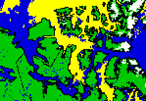
A closeup of Nunavut from that chart shows they have a chance by using the southern route, skipping all but the eastern end of Parry Channel, provided the ice is better not worse than now when they approach.

cursnow_alaskaNOAAnunavut

Footnote:

Another view of the Arctic is available from NIC using Google Earth.  The daily shapefile can be downloaded, and it then opens in Google Earth, which allows you to browse and zoom in on regions of interest.  Here is an image from this source:

20160812google

Note: Imagery date is Google Earth capture of land masses. Ice edges are 20160812 from NIC.


Nunavut is Melting, Or not


From Yale Climate Connections we heard last week about Nunavut melting and a theatrical production to spread news and concerns about this dangerous development.

“I come from a place of rugged mountains, imperial glaciers and tender-covered permafrost. But Nunavut, our land, is only as rich as it is cold, and today most of it is melting.”That’s Chantal Bilodeau, reading a passage from “Sila,” a play about the effects of climate change in the Arctic.

The characters in her play include polar bears, an Inuit goddess, scientists, and coast guard officers – all working together to save their land.

No doubt her personal experience and feelings for her Nunavut are sincere and profound. (Originally I thought it was her homeland, but in fact she is a New York playwright and translator, born in Montreal.) And there will be a large audience receptive to her concerns about global warming. (Bilodeau has writen six plays about the Arctic and founded the international network Artists And Climate Change.) But I wonder if scientific measurements support her belief that Nunavut is melting.

After all, we have learned from medical research that individual life experiences (anecdotes) may not be true more generally. That is why drugs are tested on population samples with double-blind studies: neither the patient nor the doctor knows who gets the medicine and who gets the placebo.

So I went looking for weather station records to see what is the warming trend in that region. As curiosity does so often, it led me on a journey of discovery, learning some new things, and relearning old ones with fresh implications.

Where are temperatures measured in Nunavut?

It is by far the Northernmost territory of Canada, just off the coast of Northern Greenland.

According to Environment Canada, weather is reported at 29 places in Nunavut. So I went to look at the record at Iqaluit, the capital of the territory. You get monthly normals for the period 1981 to 2010. Historical data (daily averages) can be accessed only 1 individual month/year at a time, the menu stops at 2004. Even then, some months are filled with “M” for missing. Historical data from which trends can be analyzed is hard to come by.

Disappearing Weather Records

It turns out that Nunavut also suffered from the great purging of weather station records that was noticed by skeptics years ago.

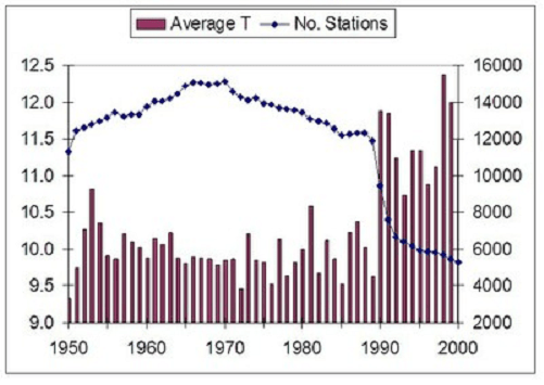
Ave. T vs. No. Stations

Graph showing the correlation between Global Mean Temperature (Average T) and the number of stations included in the global database. Source: Ross McKitrick, U of Guelph

I was aware of this because of a recent study looking at trends at stations around the Arctic circle. Arctic Warming Unalarming.  That study included graphs that showed the dramatic removal of station records in the North.  Though the depletion was not limited to the far North, many Canadian and Russian records disappeared from the global database.

arctic-europe-paper-2015_fig6annual

Fig. 6 Temperature change for annual Arctic averages relative to the temperature during 1961 to 1990 for stations in Europe having more than 150 years of observations. The red curve is the moving 5-year average while the blue curve shows the number of stations reporting in each year. 118 stations contributed to the study. W. A. van Wijngaarden, Theoretical & Applied Climatology (2015)

Eureka, Nunavut, Canada “Last Station above latitude 65N”

Eureka got considerable attention in 2010 due to its surviving the dying out of weather stations. The phrase in quotes above reflects an observation that GISS uses Eureka data to infill across the whole Arctic Circle. That single station record is hugely magnified in its global impact in that temperature reconstruction product. Somewhat like the influence of a single tree in Yamal upon the infamous hockey stick graph.

The first High Arctic Weather Station in history, Eureka was established in April 1947 at 80-degrees north latitude in the vicinity of two rivers, which provided fresh water to the six-man United States Army Air Force team that parachuted in. They erected Jamesway huts to shelter themselves and their equipment until August, when an icebreaker reached Eureka – as it has every year since – and brought permanent buildings and supplies. For decades after that, small, all-male crews would hunker down for entire winters, going a little stir-crazy from the isolation. WUWT 2010

GHCN Records for Nunavut

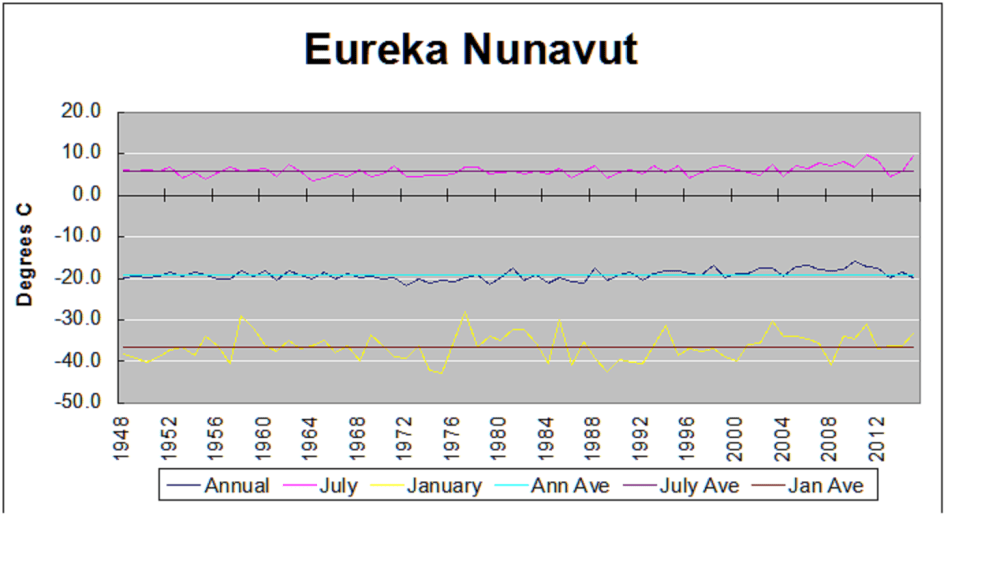
It turns out that in addition to Eureka, GCHN has data for Alert and Clyde (River), but the latter two histories end in 2004 and 2010, respectively. The adjusted files have a few differences in details, but little change from the unadjusted files. The chart below shows the temperatures measured at Eureka, Nunavut, Canada 79° 98’ N, 85° 93’ W.  The other two stations tell the same story as Eureka, though temperatures at Clyde are warmer in absolute terms due to its more Southerly location.

Eureka temps4

The chart shows Annual, July and January averages along with the lifetime averages of Eureka station from 1948 through 2015.  There is slight variability, and a few years higher than average, but nothing alarming or even enough for people to sense any change.  Note also that annual averages are well below freezing, because only 3 months are above 0° C.  I suppose that someone could play with anomalies and generate a chart that looked scary, but the numbers in the record do not support fears of global warming and melting in Nunavut.

Conclusion

Once again we see media announcements that confuse subjective beliefs with empirical observations of objective reality.  And unfortunately, those observations are less and less available to counter the herd instincts of fearing the future and blaming someone.

Footnote

The map at the top shows how crucial is Nunavut to the Polar Ocean Challenge.  If the Northabout  successfuly negotiates the Northern Sea Route (the Russian side), they then must pass from Beaufort Sea through the Parry Channel (or alternative passages) to get to Baffin Bay.  Laptev is the first hurdle, and Nunavut is the last one.

Anthrax–Russia–Global Warming

It’s a trifecta for media alarms with can’t-miss top lines like these in just the last two days:

Russian officials are blaming global warming for a recent Anthrax outbreak in the far north region of Yamal that hospitalized dozens of nomadic tribesmen and killed one 12-year-old boy.

Thawing Russian Arctic Permafrost Leads to Anthrax Outbreak
(that one adds in the permafrost bogeyman)

Climate Change Blamed for the Anthrax Outbreak in Russia

Etc., Etc., Etc

Sputnik News tells what you need to know (and said so back in May)

Global warming can uncover and expose anthrax cattle burial sites in the Arctic and cause the spread of dangerous infections, Russia’s Emergencies Ministry warned on Wednesday.

“Climatic anomaly impacts on permafrost zones, enhances the danger of exposing anthrax cattle burial grounds,” a ministry spokesman said.

There are more than 100,000 anthrax cattle burial sites in Russia, about 400 of which are located in the Arctic region, he said. (My bold)

Anthrax is an acute disease caused by Bacillus anthracis and affects both humans and animals. It can form dormant spores that are able to survive in harsh conditions for decades or even centuries, the spokesman warned.

Some Russian ministries and other government agencies are known for their tendency to issue dire warnings to ensure more federal funding, especially ahead of each new fiscal year.  (My bold)

MOSCOW, May 25 (RIA Novosti)

The Facts of the outbreak: 90 hospitalized, 20 cases confirmed. One Died.

Footnote:

The Sputnik News article is dated in 2011 (h/t manic) and provides a context for this recent news. The Tass story on August 1, 2016, tells of those infected and an investigation into the one death.  No mention of global warming.  That was added by BBC and others, based on  a comment by  a Russian WWF employee.

CNN has a factual report on this event here:

http://www.cnn.com/2016/07/28/health/anthrax-thawed-reindeer-siberia/index.html

Polar Challenge Meets Laptev Wall


northernsearoute


The plan of the Polar Ocean Challenge is to circumnavigate the North Pole counterclockwise in the ship Northabout, starting from Bristol UK, through the Northern Sea Route (Barents to Chukchi), returning through the Northwest Passage (Beaufort to Baffin Bay).  The challenge part is doing it without icebreakers, which is how commercial ships use the NSR.  That is intended to prove the decline of Arctic ice, which is then attributed to global warming, which is due to burning fossil fuels.  (Connecting dots is hard.)

The image from the group’s website shows they are nearby the Vilkitsky Strait waiting for some open water to proceed.  This delay was unforeseen and unwelcome, since refreeezing occurs mid September and the NSR closes in November.  Whether the Northwest Passage opens or not is another matter.

Laptev Gateway
Here is the current Ice chart of the Laptev Sea, looking very much like a wall of ice. By the way, the Vilkitsky strait connecting Kara and Laptev seas is 104 km long. After that, it is all brown stuff..

ru legend


Making the Climate Case

This post is to highlight two recent high quality documents making the case against climate alarms. These are important additions to anyone’s library of climate science resources.

Jamal Munshi has published papers on atmospheric ozone, and as a professor emeritus is free to speak his mind on the UN Environmental Program. His paper is entitled The United Nations: An Unconstrained Bureaucracy 

He provides the history of the UN’s self-serving growth by exploiting two false alarms, first the “ozone hole”, and then “climate change.” The story needs to be remembered and retold against the tide of alarming claims. Since this paper is posted at Tallbloke’s Talkshop, it will likely be part of the intellectual framework for the rising CLEXIT campaign.

Synopsis of The United Nations: An Unconstrained Bureaucracy

The case study takes a close look at the United Nations Environment Program (UNEP) by tracing its history from its humble and noble beginnings to the phenomenal growth in size, wealth, reach, and power of this taxpayer funded public sector bureaucracy.

Ozone Depletion:
For the UNEP to achieve its ambition of being the EPA for the world it needed a global catastrophic pollution problem which it could tackle and clean up just as the EPA had cleaned up the air and water in the USA. A series of events that began in the 1970s and culminated in 1985 provided them with just such an opportunity.

In view of the data presented here and in the prior studies we would like to think that the theory of ozone depletion by HHC and the ban on HHC to save the ozone layer are derived from bad science by good people who felt that they had to act quickly in accordance with the precautionary principle. However, because of the enormous gains made by the UNEP in implementing a program to solve a nonexistent problem and in view of a history of corrupt practices at the UN (Zaruk, 2014) (Ball, 2015) (Lynch, 2006) (Schaefer, 2012) (Dewar, 1995) (Rossett, 2006) (Rossett, 2008), intentional fraud and corruption for financial and bureaucratic gains by the United Nations cannot be ruled out.

Planetary Environmentalism: Climate Change
For the UNEP the frightening new global warming and climate change narrative served as yet another planetary air pollution crisis in which it could seize global leadership and grow in terms of size, funding, and power at the expense of taxpayers in donor countries. In this case, the global “air pollutant” was identified as the unnatural and extraneous new carbon dioxide from the combustion of fossil fuels. The UNEP responded to the events of 1988 almost immediately. It saw its opportunity and seized it having tasted great success in this kind of situation in the case of HHC pollution and ozone depletion.

The IPCC AR reports are biased. They are primarily concerned with selling the idea of climate change calamity and its mitigation by emission reduction. .Their use of science is limited to its utility in supporting that primary purpose. The bias in IPCC AR documents is documented in a 2010 commentary by the Netherlands Environmental Assessment Agency which took it upon itself to audit the IPCC AR4 WG2 forecasts and concluded that “The IPCC systematically favors adverse outcomes in a way that goes beyond serving the needs of policymakers.” (PBL, 2010). . .Yet another independent audit of the IPCC AR4 was carried out in 2011 by the Inter Academy Council (IAC), an international scientific body. The deficiencies are enumerated below. . . 

From the Summary:
They sold fear of catastrophic global warming and climate change allegedly caused by fossil fuel emissions but failed to duplicate their success in the first episode (ozone depletion) because of methodological flaws and also because their own bureaucratic incompetence created an emissions reduction plan that was too complicated to implement. The complication ensures an endless series of annual meetings of thousands of delegates at exotic locations with the only concrete achievement of each meeting being that of setting the date and place for the next meeting.

These episodes serve as evidence that unconstrained and undisciplined public sector bureaucracies do not serve the interest of the public. We conclude that such UN bureaucracies can safely be dismantled without any harm to the public interest.

The second document is a well-reasoned, well-referenced submission by CEI and allies Coalition Letter against the Council on Environmental Quality’s Draft Guidance on consideration of greenhouse gas emissions and climate change effects in enivronmental (NEPA) Reviews. The Final Guidance has just been proclaimed by the White House, despite the strong evidence presented in their submission.

Synopsis of Coalition Letter Against the CEQ Guidance for Environmental Reviews

National Environmental Policy Act (NEPA) review is an inappropriate framework for making climate policy. Project-related greenhouse gas (GHG) emissions should not be a factor determining whether agencies grant or deny permits for individual projects. The Guidance endorses the alarmist perspective of EPA’s GHG endangerment finding, instructs agencies to quantify indirect (upstream and downstream) as well as direct emissions of individual projects, and recommends the use of social cost of carbon (SCC) calculations in cost-benefit analysis of projects. Each of those elements separately, and especially all in combination, will embolden anti-development groups and politicize rather than improve agency decisions. The Draft Guidance should be withdrawn. A summary of key points follows.(Full text includes extensive supporting evidence)

1.EPA’s greenhouse gas endangerment finding is an inappropriate starting point for project-related environmental risk assessments.

2. NEPA review of project-related GHG emissions will politicize, not improve, agency decisions.

3. Incorporating social cost of carbon (SCC) analysis will turn NEPA review into a pseudo-science.

Conclusion
NEPA review is an inappropriate basis for determining climate change policy, and project-related GHG emissions should not be a factor determining whether agencies grant or deny permits for individual projects.

The Draft Guidance instructs agencies to incorporate analysis of project-related GHG emissions and climate effects in NEPA reviews. That will embolden anti-development groups and politicize rather than improve agency decisions. The Draft Guidance should be withdrawn.

Cap and Trade Hype


Reggie2In the comics, it was Archie vs. Reggie, but in the US emissions markets, it is Arnie vs. ReGGI. Arnie Schwarzenegger pushed California cap and trade, now called the Western Climate Initiative, while nine northeastern states make up the Regional Greenhouse Gas Initiative.

The media is touting the “success” of ReGGI, saying it shows how states can comply with the EPA Clean Power Plan (whose implementation was stayed by the Supreme Court but proponents are undeterred.)

Climate Progress Gives the Rosy Outlook

The Regional Greenhouse Gas Initiative, known as RGGI (pronounced: Reggie), is a carbon pricing mechanism that limits emissions and invests in efficiency and low-emission generation. Since it was implemented in 2008, RGGI states have seen a 37 percent decrease in emissions from electricity, while simultaneously decreasing consumer costs. RGGI will also function as a compliance plan for the Clean Power Plan, according to multiple industry sources — if it stays effective.

Right now, RGGI is under review — and businesses, environmental groups, regulators, universities, and private citizens are encouraging the states to double down on the program. They say extending the program to 2030 and lowering the annual limit on emissions will ensure RGGI stays successful.

ReGGI’s Peformance, Warts and All

Actually, emissions came down because of market forces, and the cap was too high to have any effect on reductions. Instead a surplus of allowances drove the price down and investors bought them in lots to hedge against higher future prices. Buried in Acadia Center’s friendly review of ReGGI:

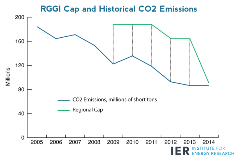
Emissions reductions have outpaced expectations since RGGI’s launch, creating allowance oversupply. Regional CO2 emissions in 2008 were 139 million tons, while the initial cap for the nine currently participating states8 was set at 165 million tons per year from 2009 through 2014. This initial oversupply was a result of a combination of electric sector trends already discussed in this report, conservative emissions projections, and actions taken by compliance entities in anticipation of RGGI implementation.9 With emissions falling significantly below the cap in RGGI’s early years (2008 to 2013) market participants bought tens of millions of low-priced allowances each year to be banked for future use. By the end of 2013, 140 million tons of these surplus allowances had been accrued.xxii This large bank suppressed allowance prices and removed the prospect of market scarcity.

RGGI currently employs price controls to contain allowance prices within predetermined ranges. The price floor represents the minimum price at which allowances can be sold at auctions; beginning at $1.86 in 2009 and rising gradually to $2.10 in 2016. Under the oversupplied cap from 2009 through 2012, the price floor preserved the value of RGGI allowances by preventing additional declines in allowance prices or sales and ensuring that surplus allowances were withheld from the market. As a result, 176 million allowances went unsold during this period.

Benefits Miscredited to ReGGI

ReGGI is also credited with participating states having lower electricity prices and higher economic growth. But depressed oil and gas prices caused the cheap electricity. And the depressed prices of the allowances meant that economic pain has yet to be inflicted. All that is about to change.

RGGI A Faulty Model for a Successful Cap and Trade from Institute for Energy Research

The trend of rising prices is only accelerating. In September 2015, prices breached $6 per ton, and in December 2015, clearing prices rose to $7.50—more than $2 above prices last December.[6] The graph below depicts how average clearing prices have risen after the regional cap tightened substantially in 2014. It compares RGGI emissions as a percentage of the cap with the quantity weighted average of auction clearing prices through the third quarter of 2015.[7].

As clearing prices for CO2 allowances become increasingly expensive and states encounter diminishing returns from cutting carbon dioxide emissions, RGGI members will have more difficulty meeting the regional cap. In fact, for the first three quarters of 2015, RGGI states have emitted about 68 million short tons of CO2 and are quickly approaching the 2015 regional cap of 88.7 million short tons.

Since carbon-trading schemes artificially make certain technologies less economical or even uncompetitive, they create conditions that cause existing power plants to prematurely retire and saddle families and businesses with higher energy bills. An IER study found that existing sources generate electricity more affordably than new sources of the same type. Moreover, electricity from existing coal is nearly 3 times more affordable than electricity from new wind turbines and almost half as expensive as electricity from new natural gas plants. This is particularly problematic for RGGI states because their average retail electricity prices are already above the U.S. average.

Summary

ReGGI prices are too low to take credit for reducing emissions, and raising them will show up in higher energy and electricity prices, and eventually, higher prices of everything.

The whole scheme is running along, disconnected from reality, doing no good, but not yet doing much harm.  And this is the argument for expanding it and building upon its “success.”

Oh. About Arnie’s California punch bowl, is that going better? Not really.

The problem is that the permits are selling at a slower and slower rate. The surplus of allowances is becoming so large in systems run by Europe, California and Quebec — which together account for more than 90 percent of global trading — that by 2022 it could cover the emissions spewing from every car on Earth for a full year, according to estimates by the London environmental group Sandbag Climate Campaign CIC and Bloomberg New Energy Finance.

In California’s market, all 23 million allowances sold in an auction in 2014. In May 2016, 7.3 million permits found buyers, only 11 percent of what was put up for sale.

Activists wear dark shades when pronouncing future climate catastrophes, but switch for rose-colored glasses when telling others to imitate these failed market experiments.

b1197


Arctic Ice Watch July 31

Someone asked how the annual average ice extent was coming along this year, so I crunched the numbers. The table shows 2016 year to date (YTD) compared to the ten-year average YTD (2006 -2015 inclusive).  Results are provided from MASIE as well as SII (Sea Ice Index from NOAA, Multisensor Analyzed Sea Ice Extent from National Ice Center). SII monthly average for September will be the number used by the Sea Ice Prediction Network to compare to forecasted extents.

Monthly 2016 2016 2016 2016-10yr Ave 2016-10yr Ave
Averages MASIE SII SII Deficit MASIE SII
Jan 13.922 13.472 -0.450 0.049 -0.308
Feb 14.804 14.210 -0.593 0.019 -0.422
Mar 14.769 14.405 -0.364 -0.239 -0.481
Apr 13.917 13.694 -0.223 -0.391 -0.613
May 12.086 11.900 -0.186 -0.681 -1.060
June 10.419 10.353 -0.066 -0.533 -0.839
July 8.067 7.920 -0.147 -0.334 -0.501
YTD Ave. 12.569 12.279 -0.290 -0.301 -0.603

MASIE shows 2016 average annual ice extent calculated from the seven monthly averages is 12.6M km2, ~300k km2 below average YTD. SII shows YTD average extent is 12.3M km2, about 300k km2 less than MASIE, and 600k km2 less than SII YTD average of the last ten years. IOW, MASIE YTD is 2.3% below average and SII is 4.7% below average.

The table also shows most of the MASIE ice deficits arose in April, May, and June, offsetting normal January and February measurements.  SII shows all months in 2016 down by much larger amounts.

You may also notice that the monthly loss of extent is increasing, and August will likely be similar to July.  September losses will be smaller since refreezing typically resumes in the last week or so.  Still, there is no cause for alarm, despite what this guy says.

30 August 2012: Cambridge Professor Peter Wadhams predicts Arctic summer sea ice “all gone by 2015”.

MASIE 2016 day213

As the chart below shows, the seas most down from average this year are Beaufort, E. Siberian, Kara, CAA, and Greenland Sea.  Meanwhile higher extents are showing in Chukchi and Laptev, resulting in 2016 ~350k km2 below average for this date.

Region 2016213 Day 213 Average 2016-Ave.
 (0) Northern_Hemisphere 6640969 6988735 -347766
 (1) Beaufort_Sea 669717 793684 -123967
 (2) Chukchi_Sea 582590 540462 42127
 (3) East_Siberian_Sea 661000 784830 -123830
 (4) Laptev_Sea 669258 386981 282277
 (5) Kara_Sea 54858 179795 -124937
 (6) Barents_Sea 144 30868 -30724
 (7) Greenland_Sea 182516 316383 -133866
 (8) Baffin_Bay_Gulf_of_St._Lawrence 126394 122921 3473
 (9) Canadian_Archipelago 482313 545093 -62781
 (10) Hudson_Bay 111666 138699 -27033
 (11) Central_Arctic 3099606 3146919 -47313
 (12) Bering_Sea 0 186 -186
 (13) Baltic_Sea 0 47 -47
 (14) Sea_of_Okhotsk 0 710 -710

2016213 NH Max Loss % Loss Sea Max % Total Loss
 (0) Northern_Hemisphere 8436630 55.95% 100%
 (1) Beaufort_Sea 400728 37.44% 5%
 (2) Chukchi_Sea 383399 39.69% 4%
 (3) East_Siberian_Sea 426120 39.20% 5%
 (4) Laptev_Sea 228552 25.46% 3%
 (5) Kara_Sea 880130 94.13% 10%
 (6) Barents_Sea 599235 99.98% 7%
 (7) Greenland_Sea 477196 72.33% 5%
 (8) Baffin_Bay_Gulf_of_St._Lawrence 1518188 92.31% 17%
 (9) Canadian_Archipelago 370866 43.47% 4%
 (10) Hudson_Bay 1149204 91.14% 13%
 (11) Central_Arctic 147104 4.53% 2%
 (12) Bering_Sea 768232 100.00% 9%
 (13) Baltic_Sea 97582 100.00% 1%
 (14) Sea_of_Okhotsk 1308697 100.00% 15%

It is clear from the above that the bulk of ice losses are coming from Okhotsk, Barents and Bering Seas (100% melted),along with Kara Sea, Hudson Bay and Baffin Bay-St. Lawrence (90+% melted).  All of them are marginal seas that will go down close to zero by September.  Note: Some seas are not at max on the NH max day.  Thus, totals from adding losses will vary from NH daily total.

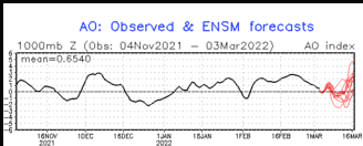
CPC shows the Arctic Oscillation waffling between positive and negative values, recently positive and forecasted to near neutral. Generally, positive AO signifies lower pressures over Arctic ice, with more cloud, lower insolation and less melting.  The outlook at this point is mixed.

September Minimum Outlook

Historically, where will ice be remaining when Arctic melting stops? Over the last 10 years, on average MASIE shows the annual minimum occurring about day 260. Of course in a given year, the daily minimum varies slightly a few days +/- from that.

For comparison, here are sea ice extents reported from 2007, 2012, 2014 and 2015 for day 260:

Arctic Regions 2007 2012 2014 2015
Central Arctic Sea 2.67 2.64 2.98 2.93
BCE 0.50 0.31 1.38 0.89
Greenland & CAA 0.56 0.41 0.55 0.46
Bits & Pieces 0.32 0.04 0.22 0.15
NH Total 4.05 3.40 5.13 4.44

Notes: Extents are in M km2.  BCE region includes Beaufort, Chukchi and Eastern Siberian seas. Greenland Sea (not the ice sheet). Canadian Arctic Archipelago (CAA).  Locations of the Bits and Pieces vary.

As the table shows, low NH minimums come mainly from ice losses in Central Arctic and BCE.  The great 2012 cyclone hit both in order to set the recent record. The recovery since 2012 shows in 2014, with some dropoff last year, mostly in BCE.

Summary

We are well into the melt season, and the resulting minimum will depend upon the vagaries of weather between now and September.  Early on, 2016 was slightly higher than 2015 in March, lower in May and narrowing the gap late June and late July. Note: 2016 melt season is starting without the Blob, with El Nino over, and a cold blob in the North Atlantic.  The AO has been hovering around neutral, now possibly indicating cloud cover reducing the pace of melting.

Meanwhile we can watch and appreciate the beauty of the changing ice conditions.

Arctic sea ice in summer 2015. This photo was made during an expedition of the German research icebreaker Polarstern into the central Arctic Ocean. Credit: Stefan Hendricks

Footnote:  Regarding the colder than normal water in the North Atlantic

A 2016 article for EOS is entitled Atlantic Sea Ice Could Grow in the Next Decade

Changing ocean circulation in the North Atlantic could lead to winter sea ice coverage remaining steady and even growing in select regions.

The researchers analyzed simulations from the Community Earth System Model, modeling both atmosphere and ocean circulation. They found that decadal-scale trends in Arctic winter sea ice extent are largely explained by changes in ocean circulation rather than by large-scale external factors like anthropogenic warming.

From the Abstract of Yeager et al.

We present evidence that the extreme negative trends in Arctic winter sea-ice extent in the late 1990s were a predictable consequence of the preceding decade of persistent positive winter North Atlantic Oscillation (NAO) conditions and associated spin-up of the thermohaline circulation (THC). Initialized forecasts made with the Community Earth System Model decadal prediction system indicate that relatively low rates of North Atlantic Deep Water formation in recent years will result in a continuation of a THC spin-down that began more than a decade ago. Consequently, projected 10-year trends in winter Arctic winter sea-ice extent seem likely to be much more positive than has recently been observed, with the possibility of actual decadal growth in Atlantic sea-ice in the near future.

Electrical Madness in Green Ontario

Consumer Price Index: Ontario Electricity compared to all items, from 2004. Chart: Bank of Montreal.

Rising electricity rates in Ontario are hitting residents and businesses hard. They have gone “out of control” as the Liberal provincial government followed through on eliminating coal-fired power stations.

Brian Hill at Global News provides the back story, a frightening and cautionary tale of “fighting climate change” by pricing away your affordable power grid.

ontarios-electricity-mix-2014-300x192-1

The energy mix in Ontario’s electrical sector is dominated by hydro and nuclear, so getting off coal seemed doable.  But in the provincial government’s drive to reduce CO2 emissions and join the California Emissions Trading Scheme, they have hardwired costly energy contracts that Ontarians will pay for through their noses for decades. Meet the Global Adjustment Fee (covering a multitude of sins and mismanagement).

What is the Global Adjustment fee? The mysterious cost Ontario hydro customers must pay by Brian Hill of Global News

A product of Ontario’s 2009 Green Energy Act, the Global Adjustment fee is a charge billed to all hydro customers in the province.

For major manufacturers and large businesses, the fee appears separately on electricity bills. But for residential customers and small businesses, the fee is hidden – appearing on your electricity bill as a part of the per kilowatt hour charge.

According to data obtained by Global News from the Independent Electricity System Operator (IESO), the organization responsible for managing Ontario’s energy system, residential customers and small businesses in Ontario paid an average of 7.9 cents per kilowatt hour in Global Adjustment fees last year.

So for every $100 in usage that appears on your electricity bill, $77 of that is the Global Adjustment fee. Meaning the cost of electricity use is only $23.

What exactly is included in the Global Adjustment fee?

First, there’s the difference between what the IESO pays energy producers for the electricity they produce, known as the contracted rate, and the actual fair market value of this electricity, known as the Hourly Ontario Energy Price, or HOEP.

In 2015, the average HOEP was 2.36 cents per kilowatt hour, while the IESO paid wind producers as much as 13 cents per kilowatt hour. The remaining 11-cent difference was then passed on to the consumer in the form of the Global Adjustment fee.

Solar producers, many of which signed contracts with the government for as long as 20 or 30 years, were paid as much as 80 cents per kilowatt hour for the energy they produced, despite the fact that fair market value for this energy was the same 2.36 cents per kilowatt hour. Here, too, the 78-cent difference was passed on to consumers.

And while the argument can be made that the Global Adjustment fee simply reflects the true cost of producing reliable, green electricity in the province, this ignores the fact that, in 2015 alone, Ontario sold more than 22.6 billion kilowatt hours of electricity – enough to power 2.5 million homes – to places like New York and Michigan at the fair market price of 2.3 cents per kilowatt hour – generating a loss of more than $1.7 billion for Ontario hydro customers.

So while Ontario customers are required to pay for producing green electricity, utility providers in the United States are able to access this same energy source for a fraction of the cost.

In other words, Ontarians pay the Global Adjustment fee, delivery fees, administration fees and HST, while American utility providers pay for the electricity alone.

The Global Adjustment fee also includes what’s known as “curtailing,” when the IESO pays energy producers not to produce electricity out of fear too much production could cause stress on the system and result in a blackout.

But when asked not to generate power, electricity producers must still be paid because the Government of Ontario initially agreed to purchase everything the energy producer’s facilities were capable of putting out.

The Global Adjustment fee also includes certain government conservation programs.

For example, when you receive a tax credit for purchasing new high-efficiency appliances or LED light-bulbs, that’s included within the Global Adjustment fee. When a delivery man takes away an old refrigerator for free, or when they recycle your old computer parts, the cost of these services are all part of the Global Adjustment fee.

Why conservation won’t make a difference

Over the past seven years, Ontario has signed numerous agreements with energy producers guaranteeing minimum levels of revenue regardless of how much energy they produce.

TransCanada, set to open their Napanee Generating Station later this year, signed an agreement with the Ontario Power Authority in 2012 that guaranteed the company would receive a minimum of $13.7 million per month once the plant comes online – even if they produce zero electricity.

“Essentially… TransCanada is being paid nearly $165 million a year to leave their power generating station running on idle,” said Parker Gallant, former vice president of TD Bank and an outspoken critic of the province’s green energy strategy.

With agreements similar to this in place across the province, Gallant thinks it’s no wonder hydro rates in Ontario continue to rise.

The easiest way to explain it, said Gallant, is that when energy consumption drops due to conservation, the Global Adjustment fee must be increased to make up the difference. So the less power Ontarians use, the higher their electricity costs must be in order to cover the minimum revenues energy producers are guaranteed.

What Cost to Reduce CO2

“When it comes to fighting climate change, Ontario has already been at war with the provincial economy, devastating consumers and undermining growth. In a burst of regulatory overkill, the province ordered a shutdown of its coal plants and orchestrated a massive overhaul of the provincial electricity market, at massive cost to consumers. When the plant shutdowns began around 2009, Ontario industry and individual consumers used 139 TWh (trillions of watt hours) of electricity. In 2014, the province used the same amount of electricity coal free, but the total cost has increased from $8.6 billion in 2009 to $12.7 billion in 2014, a jump of $4 billion.”

“That’s expensive carbon reduction. Much of the increased spending comes from Ontario’s feed-in-tariff and other subsidies to allow the installation of wind and solar power and construction of new gas-powered plants. According to government figures, closing the Ontario coal plants reduced annual carbon emissions by maybe 10-million tonnes between 2009 and 2014. Let’s see, back of the envelope, $4 billion divided by 10-million tonnes of carbon, works out to about $400 per tonne of carbon per year. ”
http://business.financialpost.com/fp-comment/terence-corcoran-manufacturing-carbon-hobgoblins

Summary

it really is quite remarkable. Ontario is not trying to do something crazy like South Australia, chasing the dream of 100% renewable energy. No, Ontario energy is cheap, coming from installed nuclear and hydro plants, along with stations fired by gas, quite cheap these days. They only wanted to swap out the sliver of coal electricity for more renewables. And look at the mess they created in pursuing that very limited green energy objective.

No wonder the new UK administration is reconsidering their 30-year price agreement for Hinkley Point electricity.  Going ahead means following Ontario and others down the rabbit hole into Not-So-Wonderland.

A world-wide look at damage from green energy policies is here:  Clean, Green and Catastrophic

Update August 2

A closer reading of Hillary’s energy platform shows the Democrats want to go over the cliff with the others. http://dailycaller.com/2016/07/31/5-problems-with-hillarys-energy-platform-that-could-leave-you-in-the-dark/

Climate Lemmings h/t Beth

Update August 18 2016

In a recent followup article Global News reports on the increasingly unpaid Ontario electricity bills.

The OEB data shows Hydro One’s total amount of ‘write offs’ for eligible low income customer accounts jumped from $327,230 in 2013 to $1,798,531 in 2015, a 450 per cent increase in the utility’s write off totals in those two years.  . . The total amount owing for Hydro One customers behind on their energy bills rose from nearly $54 million in 2013 to $105.5 million in 2015, according to the OEB. The average amount owing for people in arrears was $292 in 2013 and $467 in 2015, representing a 60 per cent increase.