Potsdam Does a New Hockey Stick Trick

The paper is Setting the tree-ring record straight by Josef Ludescher, Armin Bunde, Ulf Büntgen & Hans Joachim Schellnhuber.  The title is extremely informative, since the trick is to flatten the tree-ring proxies, removing any warm periods to compare with the present.  Excerpts below with my bolds.

Abstract

Tree-ring chronologies are the main source for annually resolved and absolutely dated temperature reconstructions of the last millennia and thus for studying the intriguing problem of climate impacts. Here we focus on central Europe and compare the tree-ring based temperature reconstruction with reconstructions from harvest dates, long meteorological measurements, and historical model data. We find that all data are long-term persistent, but in the tree-ring based reconstruction the strength of the persistence quantified by the Hurst exponent is remarkably larger (h≅1.02) than in the other data (h= 0.52–0.69), indicating an unrealistic exaggeration of the historical temperature variations. We show how to correct the tree-ring based reconstruction by a mathematical transformation that adjusts the persistence and leads to reduced amplitudes of the warm and cold periods. The new transformed record agrees well with both the observational data and the harvest dates-based reconstructions and allows more realistic studies of climate impacts. It confirms that the present warming is unprecedented.

Discussion

Figure 1a shows the tree-ring based reconstruction (TRBR) of central European summer temperatures (Büntgen et al. 2011), together with its 30 year moving average that reveals the long-term temperature variations in the record. Particularly large temperature increases occurred between 1340 and 1410 and between 1820 and 1870 that even are comparable in amplitude with the recent warming trend since 1970, indicating that the recent (anthropogenic) warming may not be unprecedented.

Tree ring-based reconstruction of the central European temperatures in the last millennium. a The reconstructed June-August temperatures in units of the records standard deviation. The red line depicts the moving average over 30 years. b, c The DFA2 fluctuation functions F(s) and the WT2 fluctuation functions G(s), respectively, for the reconstructed data from a, for monthly observational data (Swiss temperatures from Berkeley Earth, station data from Prague) and the MPI-ESM-P-past1000 model output for central European summer temperatures, from top to bottom. For the TRBR and model data, the time scale s is in years, while for the two observational records, it is in months. Note that in the double logarithmic presentation, the asymptotic slopes (Hurst exponents h) for the reconstruction data (h≅1) and the observational and model data (h≅0.6) differ strongly

To correct the enhanced long-term persistence in the TRBR, we are interested in a mathematical transformation of the data, which lowers the natural long-term persistence while leaving the gross features of the record, the positions of the warm and cold periods, unchanged. We performed the following mathematical transformation to change the original TRBR Hurst exponent h0=1.03 to h1=0.60 and thus to be in line with the observational, harvest and model data. Since this transformation is only suitable for altering a record’s natural long-term persistence, i.e., in the absence of external trends, we transformed the TRBR data between 1000 and 1990, before the current anthropogenic trend became relevant.

Figure 4a compares the transformed TRBR data (blue) with h1=0.6 with the original TRBR data (black). The bold lines are the 30-year moving averages. The figure shows that by the transformation the structure of the original TRBR data is conserved, but the climate variations characterized by the depths of the minima and the heights of the maxima are reduced.

Original and transformed tree-ring proxy temperature record. a Compares the original TRBR record for the period 1000–1990, where the Hurst exponent h is 1.03 (black), with the transformed TRBR record, where h≡h1=0.6 (blue). For better visibility, the transformed TRBR record has been shifted downward by 5 units of its standard deviation. b How the magnitudes of the cold periods in the transformed TRBR record decrease with decreasing Hurst exponent h1. The magnitudes are quantified by the differences of the 30 year moving averages between the beginning and the end of the respective periods. c Compares the 30-year moving averages of the original and the transformed TRBR record (h=0.6) with the 30-year moving average of the observational temperatures from Switzerland. The comparison shows that the transformed TRBR record fits quite nicely with the observational data

To see how the strength of the long-term variations in the transformed TRBR data depends on their Hurst exponent h1h1, we have determined, in the 30-year moving average, the temperature differences in 4 periods (1415–1465, 1515–1536, 1562–1595, 1793–1824) where the greatest changes between 1350 and 1950 occur. The result is shown in Fig. 4b. The figure shows that the temperature difference between the beginning and the end of each period decreases continuously with decreasing h. For h around 0.6, the temperature differences are roughly halved.

Conclusion

Since tree ring-based reconstructions play an important role in the understanding of past temperature variability, we suggest the use of the Hurst exponent as a standard practice to assess the reconstructions’ low-frequency properties and to compare the determined values with the Hurst exponents of other respective time series (observational, harvest dates, models). If deviations from the expected values are detected, the data should be transformed to adjust the Hurst exponent. This will lead to a more realistic reconstruction of the record’s low-frequency signal and thus to a better understanding of the climate variations of the past.

My Comment

Wow!  Just Wow!  The Mann-made Hockey Stick was found bogus because it was produced by grafting a high-resolution instrumental temperature record on top of a low-resolution tree ring proxy record.  Now climatists want to erase four bumps in the Medieval period lest they appear comparable to contemporary temperatures sampled minute by minute.  A simple tweaking of a formula achieves the desired result.  Fluctuations which were decadal are now smoothed and cannot compete with modern annual and monthly extremes.  Well done! (extreme snark on)

Background:  See Return of the Hockey Stick

COVID-19 is a lack of nutrients, exploited by a virus

Colleen Huber, NMD explains at The Primary Doctor COVID-19 is a lack of nutrients, exploited by a virus. Excerpts in italics with my bolds.

“There already exist numerous ways to reliably prevent, mitigate, and even cure COVID-19, including in late-stage patients who are already ventilator-dependent.”
– Thomas Levy, MD JD

Abstract

COVID-19 disease is alleged to be caused by the RNA coronavirus SARS-CoV-2. However, clinical findings from around the world show a sharp inflection point from morbidity to recovery on supplementation of one or another nutrient. In other cases, severe COVID-19 morbidity is significantly correlated with deficiency of a particular nutrient. Any of the nutrients that are discussed in this paper, when used alone or with a co-factor, has been either sufficient for prompt and complete recovery in a majority of patients treated or highly correlated with low morbidity and high survival from the disease.

If any one of several nutrients is adequate for victory over COVID-19, then logically (the contrapositive), the simultaneous deficiency of all of those same nutrients is the necessary preliminary condition for the subsequent presence of the virus to result in COVID-19 morbidity and mortality. This paper will show which nutrients are lacking in those with severe pathogenesis, and why all of those nutrients must be deficient in order for severe COVID-19 disease to occur in an individual, and that supplementation with any one of these nutrients is likely to result in recovery.

[Note: The full list of nutrients discussed in the paper are as follows:

  • Vitamin D
  • Glutathione
  • Zinc
  • Quercitin
  • Epigallocatechin-gallate (EGCG)
  • Vitamin C
  • Selenium

    Below are excerpts relating to the big 3 in the image above.]

Vitamin D vs COVID19

Vitamin D3 (commonly known simply as “vitamin D,” but formally as cholecalciferol) may be the most potent defense available against COVID-19, from the studies described below. It may also be the most easily acquired COVID-19 treatment, because vitamin D is produced in the skin on exposure to sunlight, with further processing in the liver and then in the kidneys to its fully useful form.

In this large Israeli study of over 7,000 people, “low plasma [vitamin D] levels almost doubled the risk for hospitalization due to the COVID-19 infection in the Israeli studied cohort.” Also, “the mean plasma vitamin D level was significantly lower among those who tested positive than negative for COVID-19.” (1)

In a retrospective cohort study in Indonesia of 780 cases of COVID-19 positive patients, it was found that those with below normal vitamin D levels were associated with increasing odds of death. (2)

The correlation among low serum vitamin D levels and COVID-19 mortality was so high in that study that this nutrient may turn out to be the most decisively valuable against COVID-19. This graph (3) shows the stark contrast found between high and low vitamin D levels and COVID-19 survivability.

​In European countries also, a significant inverse relationship was found between serum vitamin D levels and COVID-19 mortality. Mean levels of vitamin D and COVID-19 mortality in twenty European countries were examined. Also aging populations, which have been the worst affected by COVID-19 were found to have the lowest serum vitamin D levels. (4)

Vitamin D is known to be essential to the maturing of macrophages, which in turn are a necessary tool of the immune system against pathogenic microbes. Macrophages with vitamin D also produce hydrogen peroxide, an important pro-oxidant molecular weapon against microbial pathogens. (5) However, vitamin D also stimulates production of anti-microbial peptides that appear in natural killer cells and neutrophils in respiratory tract epithelial cells, where they are able to protect the lungs from the ravages of infection.

One of the most alarming features of COVID-19 disease in the clinical setting has been the “cytokine storm,” which is itself life-threatening. It is an inflammatory over-reaction to the replicating viral pathogen. The utility of Vitamin D for the COVID-19 patient may best be appreciated in its prevention of excessive inflammatory cytokines, thereby sparing the patient of the body’s most severe reactions to the virus. (6) Vitamin D deficiency is also implicated in acute respiratory distress syndrome. (7)

Respiratory infectious disease prevalence has a strong seasonality through the centuries and around the world. That season peaks in the winter and early spring, after the year’s fewest hours and lowest angle of sunlight on the winter solstice. That lack of sunlight occurs during a time of the least skin surface exposed to freezing weather, and therefore the least endogenous vitamin D production. Supplementation of oral vitamin D through this difficult season may therefore be a prudent prophylaxis.

Zinc vs COVID-19

​Zinc has many functions in the cell. One of these is to inhibit replication of RNA-type viruses. SARS-CoV-2 is such a virus. The mechanism is that zinc blocks the enzyme RNA-dependent RNA polymerase (RdRp). This enzyme is required for replication of the virus. Without this enzyme, copying of the viral RNA cannot occur. The virus’s assault against the body is not merely inhibited. It is stopped with adequate zinc.

Zinc, however, is mostly kept out of the cell by other mechanisms, partly because zinc plays a role in normal cell death. A survival mechanism of a normal cell is to therefore limit the zinc that can enter.

However, in the event of infection with an RNA virus, a useful strategy for medical treatment is to bring enough zinc into cells to block viral replication. What is needed is a substance that can accompany and transport zinc across the cell membrane and into the cell. Such a substance is an ionophore; it transports the zinc ion. The function is to allow more zinc into a cell than would typically enter. For this purpose, zinc ionophore agents are used in clinical settings together with zinc as a combination strategy against an RNA virus infection. I will discuss a few of these zinc ionophores.

It should also be noted that zinc deficiency is characterized by loss of senses of smell and/or taste. (11) These are also known to be common symptoms of COVID-19 patients. (12) This is further evidence that deficiency of zinc may be correlated with COVID-19 morbidity.

Zinc and Hydroxychloroquine vs COVID-19

Both hydroxychloroquine (HCQ) and its historical predecessor chloroquine (CQ) are on the World Health Organization’s List of Essential Medicines. The latter was discovered in 1934, and it is still used to manage malaria, although resistant strains of malaria make it less useful these days for that purpose. HCQ has been approved by the US Food and Drug Administration (FDA) for over 65 years. It has been prescribed billions of times throughout the world over the previous decades. The US Centers for Disease Control says that HCQ can be prescribed to adults and children of all ages. It can also be safely taken by pregnant women and nursing mothers. (13) It is among the safest of prescription drugs in the US, which is why it is sold over the counter through much of the world. (14) Both HCQ and CQ are chemically similar to quinine, from the bark of Cinchona trees, which is also a flavoring used in tonic water.

These drugs have been observed to raise the pH of the cell and the endosomes in which entering viruses are packaged. These drugs are easily taken up into the cells of the body. Viruses, however, enter cells packaged in endosomes, and require a low pH acidic environment in the endosome in order to replicate. Once HCQ or CQ are inside cells, they easily enter endosomes, and therefore viruses are stopped from replicating (reproducing) due to this alkalinizing effect. Dr. Peter D’Adamo describes and illustrates these mechanisms in more detail. (15)

So in summary of these functions then, HCQ and CQ not only shepherd zinc into the cell, where zinc blocks the enzyme that is required for replication of RNA viruses, but either of these drugs also raise pH inside the cell to a level where viral replication is impossible.

The combination of HCQ, azithromycin and zinc has shown outstanding results in resolving COVID-19. See: Positive HCQ Treatment Outcomes in 88 International Studies

Veteran virologist Steven Hatfill writes of hydroxychloroquine: The Real HCQ Story: What We Now Know

Yale epidemiology professor Harvey Risch, a highly respected scientist with over 300 published peer-reviewed studies, writes of the contrast between the successful clinical use of HCQ and zinc on the one hand, and its suppression by governments and industry on the other:

Dr. Risch, who has 39,779 citations on Google Scholar, adds that “US cumulative deaths through July 15, 2020 are 140,000. Had we permitted HCQ use liberally, we would have saved half, 70,000, and it is very possible we could have saved 3/4, or105,000.”

There are other zinc ionophores that are also being used together with zinc successfully against COVID-19.  Zinc and Quercitin vs COVID-19;  Zinc and EGCG vs COVID-19 (Epigallocatechin-gallate (EGCG) is a green tea extract)

Vitamin C vs COVID-19

At the Ruijing Hospital in Shanghai, 50 COVID-19 patients were treated with vitamin C. Their hospital stays were 5 days shorter than those COVID-19 patients not treated with Vitamin C. There were no deaths in the Vitamin C group, and no significant side effects were noted either. In the other group of COVID-19 patients, those who did not receive vitamin C, there were 3 deaths. (25)

Dr. Zhiyong Peng conducted the first clinical trial of high-dose intravenous vitamin C with COVID19 patients at Wuhan University in Wuhan, China. His findings were that this treatment of COVID-19 patients reduced their inflammation significantly, and that it reduced their stays in ICU and hospitals. (26) (27)

Vitamin C should be no surprise as an addition to the list of nutrients that provide life-saving help against COVID-19. Dr. Fred Klenner wrote in 1948 about use of intravenous and intramuscular use of vitamin C against viral pneumonia: “In almost every case the patient felt better within an hour after the first injection and noted a very definite change after two hours.” And “three to seven injections gave complete clinical and x-ray response in all of our [42] cases.” (28)

Vitamin C has numerous well-studied and documented mechanisms against viruses. Perhaps the most important of these is the production of Type I interferons. (31) This in turn upregulates natural killer cells and cytotoxic T-lymphocytes for anti-viral activity. (32) However, it has been shown to simply inactivate both RNA and DNA viruses. (33) It also detoxifies viral products that are associated with inflammation and pain. High dose vitamin C and oral doses over 3 grams are established to both prevent and treat a variety of viral infections. (34) (35)

Conclusion

To repeat Dr. Thomas Levy’s memorable quote at the beginning of this paper, “There already exist numerous ways to reliably prevent, mitigate, and even cure COVID-19, including in late-stage patients who are already ventilator-dependent.” Dr. Levy documents many of them in this paper. (38)

Those who were diagnosed and sickened from the most feared viral pathogen of our time fell into several categories. Either they died from the disease, or they healed from one of the interventions discussed in this paper, or fortunately, healed with none of those interventions. The above studies show that it was enough that one or the other of the nutrients discussed herein was adequate to prevent or to vanquish COVID-19, without the need to use all of them. Therefore, because any one of these nutrients proved adequate to heal patients to complete recovery, then the patients who succumbed to COVID-19 disease had likely been deficient in all of these nutrients, and a lack of all of these nutrients was likely a necessary condition for pathogenesis of COVID-19.

Because of the therapeutic impact and success that each of the above nutrients have had in reversing the devastation of COVID-19, they each must be made available immediately and widely throughout the world, for both preventative and prompt therapeutic uses. There is therefore no need or justification for pandemic status of COVID-19. Furthermore, nutritional interventions should be used without hesitation as first-line treatment, as well as prevention, of COVID-19.


Fires in US West: History vs. Hysteria

People who struggle with anxiety are known to have moments of “hair on fire.” IOW, letting your fears take over is like setting your own hair on fire. Currently the media, pandering as always to primal fear instincts, is declaring that the US West is on fire, and it is our fault. Let’s see what we can do to help them get a grip.

First the media hysteria.

BAY AREA ON SEPTEMBER 9, 2020. IMAGE: BAY AREA AIR QUALITY

The Headlines are Screaming!

Why wildfire smoke can turn the sky orange and damage your lungs Vox18:31

A 2006 Heat Wave Was a Wake-Up Call. Why Didn’t L.A. Pay Attention? Curbed18:25

Wildfires and weather extremes: It’s not coincidence, it’s climate change CBS News18:20

Trillions up in smoke: The staggering economic cost of climate change inaction The New Daily18:09

‘Zombie Fires’ May Have Sparked Record High Carbon Emissions in the Arctic Smithsonian Magazine17:33

How Did the Wildfires Start? Here’s What You Need to Know The New York Times17:32

‘It Looks Like Doomsday’: California Residents React to Orange Sky The New York Times17:20

Apocalyptic Orange Haze And Darkness Blanket California Amid Fires HuffPost (US)16:46

Fire experts: Western fires are ‘unreal’ Mashable16:00

Devastating Wildfires Ravage The West HuffPost (US)14:25

‘Entire Western US on Fire’ as Region Faces Deadly Flames Compounded by Heatwave, Blackouts, and Coronavirus Common Dreams13:24

Unprecedented Wildfires Turn California Skies Orange Vice (US)13:43

Now the History.  Are these wildfires “unprecedented?”

The National Interagency Fire Center provides the facts and historical context.  Here are the details on this year and the last decade.

Note that for the year-to-date, 2020 is below average both for number of fires and acreage.  Three years were over 8M acres at this point in the year.  And one of them (2012) was also an election year, but lacked the current media fury politicizing everything.

Annual Number of Acres Burned in US Wildland Fires, 1980-2019

Background Information from Previous Post Arctic on Fire! Not.

1. Summer is fire season for northern boreal forests and tundra.

From the Canadian National Forestry Database

Since 1990, “wildland fires” across Canada have consumed an average of 2.5 million hectares a year.

Recent Canadian Forest Fire Activity 2015 2016 2017
Area burned (hectares) 3,861,647 1,416,053 3,371,833
Number of fires 7,140 5,203 5,611

The total area of Forest and other wooded land in Canada  is 396,433,600 (hectares).  So the data says that every average year 0.6% of Canadian wooded area burns due to numerous fires, ranging from 1000 in a slow year to over 10,000 fires and 7M hectares burned in 1994.

2. With the warming since 1980 some years have seen increased areas burning.

From Wildland Fire in High Latitudes, A. York et al. (2017)

Despite the low annual temperatures and short growing seasons characteristic of northern ecosystems, wildland fire affects both boreal forest (the broad band of mostly coniferous trees that generally stretches across the area north of the July 13° C isotherm in North America and Eurasia, also known as Taiga) and adjacent tundra regions. In fact, fire is the dominant ecological disturbance in boreal forest, the world’s largest terrestrial biome. Fire disturbance affects these high latitude systems at multiple scales, including direct release of carbon through combustion (Kasischke et al., 2000) and interactions with vegetation succession (Mann et al., 2012; Johnstone et al., 2010), biogeochemical cycles (Bond-Lamberty et al., 2007), energy balance (Rogers et al., 2015), and hydrology (Liu et al., 2005). About 35% of global soil carbon is stored in tundra and boreal systems (Scharlemann et al., 2014) that are potentially vulnerable to fire disturbance (Turetsky et al., 2015). This brief report summarizes evidence from Alaska and Canada on variability and trends in fire disturbance in high latitudes and outlines how short-term fire weather conditions in these regions influence area burned.

Climate is a dominant control of fire activity in both boreal and tundra ecosystems. The relationship between climate and fire is strongly nonlinear, with the likelihood of fire occurrence within a 30-year period much higher where mean July temperatures exceed 13.4° C (56° F) (Young et al., 2017). High latitude fire regimes appear to be responding rapidly to recent environmental changes associated with the warming climate. Although highly variable, area burned has increased over the past several decades in much of boreal North America (Kasischke and Turetsky, 2006; Gillett et al., 2004). Since the early 1960s, the number of individual fire events and the size of those events has increased, contributing to more frequent large fire years in northwestern North America (Kasischke and Turetsky, 2006). Figure 1 shows annual area burned per year in Alaska (a) and Northwest Territories (b) since 1980, including both boreal and tundra regions.

[Comment: Note that both Alaska and NW Territories see about 500k hectares burned on average each year since 1980.  And in each region, three years have been much above that average, with no particular pattern as to timing.]

Recent large fire seasons in high latitudes include 2014 in the Northwest Territories, where 385 fires burned 8.4 million acres, and 2015 in Alaska, where 766 fires burned 5.1 million acres (Figs. 1 & 2)—more than half the total acreage burned in the US (NWT, 2015; AICC, 2015). Multiple northern communities have been threatened or damaged by recent wildfires, notably Fort McMurray, Alberta, where 88,000 people were evacuated and 2400 structures were destroyed in May 2016. Examples of recent significant tundra fires include the 2007 Anaktuvuk River Fire, the largest and longest-burning fire known to have occurred on the North Slope of Alaska (256,000 acres), which initiated widespread thermokarst development (Jones et al., 2015). An unusually large tundra fire in western Greenland in 2017 received considerable media attention.

Large fire events such as these require the confluence of receptive fuels that will promote fire growth once ignited, periods of warm and dry weather conditions, and a source of ignition—most commonly, convective thunderstorms that produce lightning ignitions. High latitude ecosystems are characterized by unique fuels—in particular, fast-drying beds of mosses, lichens, resinous shrubs, and accumulated organic material (duff) that underlie dense, highly flammable conifers. These understory fuels cure rapidly during warm, dry periods with long daylight hours in June and July. Consequently, extended periods of drought are not required to increase fire danger to extreme levels in these systems.

Most acreage burned in high latitude systems occurs during sporadic periods of high fire activity; 50% of the acreage burned in Alaska from 2002 to 2010 was consumed in just 36 days (Barrett et al., 2016). Figure 3 shows cumulative acres burned in the four largest fire seasons in Alaska since 1990 (from Fig. 1) and illustrates the varying trajectories of each season. Some seasons show periods of rapid growth during unusually warm and dry weather (2004, 2009, 2015), while others (2004 and 2005) were prolonged into the fall in the absence of season-ending rain events. In 2004, which was Alaska’s largest wildfire season at 6.6 million acres, the trajectory was characterized by both rapid mid-season growth and extended activity into September. These different pathways to large fire seasons demonstrate the importance of intraseasonal weather variability and the timing of dynamical features. As another example, although not large in total acres burned, the 2016 wildland fire season in Alaska was more than 6 months long, with incidents requiring response from mid-April through late October (AICC, 2016).

3. Wildfires are part of the ecology cycle making the biosphere sustainable.

Forest Fire Ecology: Fire in Canada’s forests varies in its role and importance.

In the moist forests of the west coast, wildland fires are relatively infrequent and generally play a minor ecological role.

In boreal forests, the complete opposite is true. Fires are frequent and their ecological influence at all levels—species, stand and landscape—drives boreal forest vegetation dynamics. This in turn affects the movement of wildlife populations, whose need for food and cover means they must relocate as the forest patterns change.

lThe Canadian boreal forest is a mosaic of species and stands. It ranges in composition from pure deciduous and mixed deciduous-coniferous to pure coniferous stands.

The diversity of the forest mosaic is largely the result of many fires occurring on the landscape over a long period of time. These fires have varied in frequency, intensity, severity, size, shape and season of burn.

The fire management balancing act: Fire is a vital ecological component of Canadian forests and will always be present.

Not all wildland fires should (or can) be controlled. Forest agencies work to harness the force of natural fire to take advantage of its ecological benefits while at the same time limiting its potential damage and costs.

Tundra Fire Ecology

From Arctic tundra fires: natural variability and responses to climate change, Feng Sheng Hu et al. (2015)

Circumpolar tundra fires have primarily occurred in the portions of the Arctic with warmer summer conditions, especially Alaska and northeastern Siberia (Figure 1). Satellite-based estimates (Giglio et al. 2010; Global Fire Emissions Database 2015) show that for the period of 2002–2013, 0.48% of the Alaskan tundra has burned, which is four times the estimate for the Arctic as a whole (0.12%; Figure 1). These estimates encompass tundra ecoregions with a wide range of fire regimes. For instance, within Alaska, the observational record of the past 60 years indicates that only 1.4% of the North Slope ecoregion has burned (Rocha et al. 2012); 68% of the total burned area in this ecoregion was associated with a single event, the 2007 AR Fire.

The Noatak and Seward Peninsula ecoregions are the most flammable of the tundra biome, and both contain areas that have experienced multiple fires within the past 60 years (Rocha et al. 2012). This high level of fire activity suggests that fuel availability has not been a major limiting factor for fire occurrence in some tundra regions, probably because of the rapid post-fire recovery of tundra vegetation (Racine et al. 1987; Bret-Harte et al. 2013) and the abundance of peaty soils.

However, the wide range of tundra-fire regimes in the modern record results from spatial variations in climate and fuel conditions among ecoregions. For example, frequent tundra burning in the Noatak ecoregion reflects relatively warm/dry climate conditions, whereas the extreme rarity of tundra fires in southwestern Alaska reflects a wet regional climate and abundant lakes that act as natural firebreaks.

Fire alters the surface properties, energy balance, and carbon (C) storage of many terrestrial ecosystems. These effects are particularly marked in Arctic tundra (Figure 5), where fires can catalyze biogeochemical and energetic processes that have historically been limited by low temperatures.

In contrast to the long-term impacts of tundra fires on soil processes, post-fire vegetation recovery is unexpectedly rapid. Across all burned areas in the Alaskan tundra, surface greenness recovered within a decade after burning (Figure 6; Rocha et al. 2012). This rapid recovery was fueled by belowground C reserves in roots and rhizomes, increased nutrient availability from ash, and elevated soil temperatures.

At present, the primary objective for wildland fire management in tundra ecosystems is to maintain biodiversity through wildland fires while also protecting life, property, and sensitive resources. In Alaska, the majority of Arctic tundra is managed under the “Limited Protection” option, and most natural ignitions are managed for the purpose of preserving fire in its natural role in ecosystems. Under future scenarios of climate and tundra burning, managing tundra fire is likely to become increasingly complex. Land managers and policy makers will need to consider trade-offs between fire’s ecological roles and its socioeconomic impacts.

4. Arctic fire regimes involve numerous interacting factors.

Frequent Fires in Ancient Shrub Tundra: Implications of Paleorecords for Arctic Environmental Change
Philip E. Higuera et al. (2008)

Although our fire-history records provide unique insights into the potential response of modern tundra ecosystems to climate and vegetation change, they are imperfect analogs for future fire regimes. First, ongoing vegetation changes differ from those of the late-glacial period: several shrub taxa (Salix, Alnus, and Betula) are currently expanding into tundra [10], whereas Betula was the primary constituent of the ancient shrub tundra. The lower flammability of Alnus and Salix compared to Betula could make future shrub tundra less flammable than the ancient shrub tundra. Second, mechanisms of past and future climate change also differ. In the late-glacial and early-Holocene periods, Alaskan climate was responding to shrinking continental ice volumes, sea-level changes, and amplified seasonality arising from changes in the seasonal cycle of insolation [13]; in the future, increased concentrations of atmospheric greenhouse gases are projected to cause year-round warming in the Arctic, but with a greater increase in winter months [8]. Finally, we know little about the potential effects of a variety of biological and physical processes on climate-vegetation-fire interactions. For example, permafrost melting as a result of future warming [8] and/or increased burning [24] could further facilitate fires by promoting shrub expansion [10], or inhibit fires by increasing soil moisture [24].

5. The Arctic has adapted to many fire regimes stronger than today’s activity.

The Burning Tundra: A Look Back at the Last 6,000 Years of Fire in the Noatak National Preserve, Northwestern Alaska

Fire history in the Noatak also suggests that subtle changes in vegetation were linked to changes in tundra fire occurrence. Spatial variability across the study region suggests that vegetation responded to local-scale climate, which in turn influenced the flammability of surrounding areas. This work adds to evidence from ‘ancient’ shrub tundra in the southcentral Brooks Range suggesting that vegetation change will likely modify tundra fire regimes, and it further suggests that the direction of this impact will depend upon the specific makeup of future tundra vegetation. Ongoing climate-related vegetation change in arctic tundra such as increasing shrub abundance in response to warming temperatures (e.g., Tape et al. 2006), could both increase (e.g., birch) or decrease (e.g., alder) the probability of future tundra fires.

This study provides estimated fire return intervals (FRIs) for one of the most flammable tundra ecosystems in Alaska. Fire managers require this basic information, and it provides a valuable context for ongoing and future environmental change. At most sites, FRIs varied through time in response to changes in climate and local vegetation. Thus, an individual mean or median FRI does not capture the range of variability in tundra fire occurrence. Long-term mean FRIs in many periods were both shorter than estimates based on the past 60 years and statistically indistinct from mean FRIs found in Alaskan boreal forests (e.g., Higuera et al. 2009) (Figure 2). These results imply that tundra ecosystems have been resilient to relatively frequent burning over the past 6,000 years, which has implications for both managers and scientists concerned about environmental change in tundra ecosystems. For example, increased tundra fire occurrence could negatively impact winter forage for the Western Arctic Caribou Herd (Joly et al. 2009). Although the Noatak is only a portion of this herd’s range, our results indicate that if caribou utilized the study area over the past 6,000 years, then they have successfully co-existed with relatively frequent fire.

N. Atlantic August 2020

RAPID Array measuring North Atlantic SSTs.

For the last few years, observers have been speculating about when the North Atlantic will start the next phase shift from warm to cold. The way 2018 went and 2019 followed suggested this may be the onset.  However, 2020 started out against that trend and is matching 2016 the last warm year.  First some background.

. Source: Energy and Education Canada

An example is this report in May 2015 The Atlantic is entering a cool phase that will change the world’s weather by Gerald McCarthy and Evan Haigh of the RAPID Atlantic monitoring project. Excerpts in italics with my bolds.

This is known as the Atlantic Multidecadal Oscillation (AMO), and the transition between its positive and negative phases can be very rapid. For example, Atlantic temperatures declined by 0.1ºC per decade from the 1940s to the 1970s. By comparison, global surface warming is estimated at 0.5ºC per century – a rate twice as slow.

In many parts of the world, the AMO has been linked with decade-long temperature and rainfall trends. Certainly – and perhaps obviously – the mean temperature of islands downwind of the Atlantic such as Britain and Ireland show almost exactly the same temperature fluctuations as the AMO.

Atlantic oscillations are associated with the frequency of hurricanes and droughts. When the AMO is in the warm phase, there are more hurricanes in the Atlantic and droughts in the US Midwest tend to be more frequent and prolonged. In the Pacific Northwest, a positive AMO leads to more rainfall.

A negative AMO (cooler ocean) is associated with reduced rainfall in the vulnerable Sahel region of Africa. The prolonged negative AMO was associated with the infamous Ethiopian famine in the mid-1980s. In the UK it tends to mean reduced summer rainfall – the mythical “barbeque summer”.Our results show that ocean circulation responds to the first mode of Atlantic atmospheric forcing, the North Atlantic Oscillation, through circulation changes between the subtropical and subpolar gyres – the intergyre region. This a major influence on the wind patterns and the heat transferred between the atmosphere and ocean.

The observations that we do have of the Atlantic overturning circulation over the past ten years show that it is declining. As a result, we expect the AMO is moving to a negative (colder surface waters) phase. This is consistent with observations of temperature in the North Atlantic.

Cold “blobs” in North Atlantic have been reported, but they are usually winter phenomena. For example in April 2016, the sst anomalies looked like this

But by September, the picture changed to this

And we know from Kaplan AMO dataset, that 2016 summer SSTs were right up there with 1998 and 2010 as the highest recorded.

As the graph above suggests, this body of water is also important for tropical cyclones, since warmer water provides more energy.  But those are annual averages, and I am interested in the summer pulses of warm water into the Arctic. As I have noted in my monthly HadSST3 reports, most summers since 2003 there have been warm pulses in the north Atlantic, and 2020 is another of them.

The AMO Index is from from Kaplan SST v2, the unaltered and not detrended dataset. By definition, the data are monthly average SSTs interpolated to a 5×5 grid over the North Atlantic basically 0 to 70N.  The graph shows the warmest month August beginning to rise after 1993 up to 1998, with a series of matching years since.  The El Nino years of 2010 and 2016 are obvious, now matched by 2020, but without the Pacific warming.

Because McCarthy refers to hints of cooling to come in the N. Atlantic, let’s take a closer look at some AMO years in the last 2 decades.

The 2020 North Atlantic Surprise
This graph shows monthly AMO temps for some important years. The Peak years were 1998, 2010 and 2016, with the latter emphasized as the most recent. The other years show lesser warming, with 2007 emphasized as the coolest in the last 20 years. Note the red 2018 line was at the bottom of all these tracks.  2019 began slightly cooler than January 2018, then tracked closely before rising in the summer months.  Through December 2019 tracked warmer than 2018 but cooler than other recent years in the North Atlantic.

In 2020 following a warm January, N. Atlantic temps in February, March and April were the highest in the record. Now Summer 2020 temps are as as 2016 and 2017.  That is a concern for the current hurricane season, along with the lack of a Pacific El Nino providing wind shear against developing tropical storms.

More recently, temps in higher Atlantic latitudes (45N to 65N) have warmed rapidly, as shown in this graph and map from Tropical Tidbits (Levi Cowan)

Footnote:  Levi Cowan’s Tropical Tidbits is an excellent source of information regarding tropical storm activity, even before disturbances are assigned names, as well as ones like tropical storm Paulette now in mid-Atlantic moving toward the US east coast.

The Truth About CV Tests

The peoples’ instincts are right, though they have been kept in the dark about this “pandemic” that isn’t.  Responsible citizens are starting to act out their outrage from being victimized by a medical-industrial complex (to update Eisenhower’s warning decades ago).  The truth is, governments are not justified to take away inalienable rights to life, liberty and the pursuit of happiness.  There are several layers of disinformation involved in scaring the public.  This post digs into the CV tests, and why the results don’t mean what the media and officials claim.

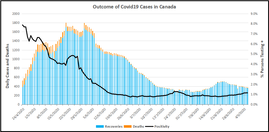
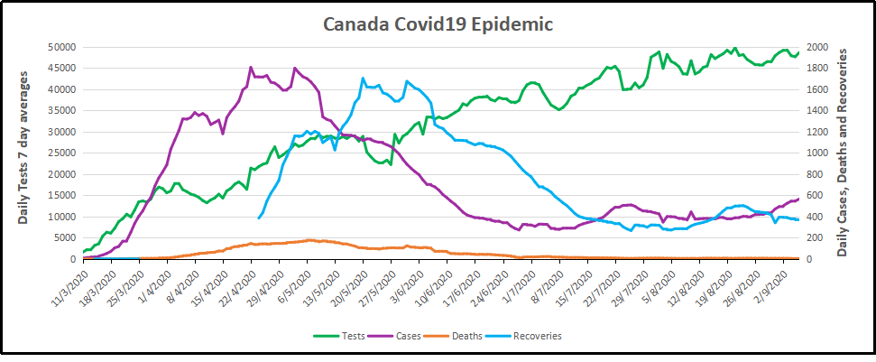
For months now, I have been updating the progress in Canada of the CV outbreak.  A previous post later on goes into the details of extracting data on tests, persons testing positive (termed “cases” without regard for illness symptoms) and deaths after testing positive.  Currently, the contagion looks like this.

The graph shows that deaths are less than 5 a day, compared to a daily death rate of 906 in Canada from all causes.  Also significant is the positivity ratio:  the % of persons testing positive out of all persons tested each day.  That % has been fairly steady for months now:  1% positive means 99% of people are not infected. And this is despite more than doubling the rate of testing.

But what does testing positive actually mean?  Herein lies more truth that has been hidden from the public for the sake of an agenda to control free movement and activity.  Background context comes from  Could Rapid Coronavirus Testing Help Life Return To Normal?, an interview at On Point with Dr. Michael Mina.  Excerpts in italics with my bolds. H/T Kip Hansen

A sign displays a new rapid coronavirus test on the new Abbott ID Now machine at a ProHEALTH center in Brooklyn on August 27, 2020 in New York City. (Spencer Platt/Getty Images)

Dr. Michael Mina:

COVID tests can actually be put onto a piece of paper, very much like a pregnancy test. In fact, it’s almost exactly like a pregnancy test. But instead of looking for the hormones that tell if somebody is pregnant, it looks for the virus proteins that are part of SA’s code to virus. And it would be very simple: You’d either swab the front of your nose or you’d take some saliva from under your tongue, for example, and put it onto one of these paper strips, essentially. And if you see a line, it means you’re positive. And if you see no line, it means you are negative, at least for having a high viral load that could be transmissible to other people.

An antigen is one of the proteins in the virus. And so unlike the PCR test, which is what most people who have received a test today have generally received a PCR test. And looking those types of tests look for the genome of the virus to RNA and you could think of RNA the same way that humans have DNA. This virus has RNA. But instead of looking for RNA like the PCR test, these antigen tests look for pieces of the protein. It would be like if I wanted a test to tell me, you know, that somebody was an individual, it would actually look for features like their eyes or their nose. And in this case, it is looking for different parts of the virus. In general, the spike protein or the nuclear capsid, these are two parts of the virus.

The reason that these antigen tests are going to be a little bit less sensitive to detect the virus molecules is because there’s no step that we call an amplification step. One of the things that makes the PCR test that looks for the virus RNA so powerful is that it can take just one molecule, which the sensor on the machine might not be able to detect readily, but then it amplifies that molecule millions and millions of times so that the sensor can see it. These antigen tests, because they’re so simple and so easy to use and just happen on a piece of paper, they don’t have that amplification step right now. And so they require a larger amount of virus in order to be able to detect it. And that’s why I like to think of these types of tests having their primary advantage to detect people with enough virus that they might be transmitting or transmissible to other people.”

The PCR test, provides a simple yes/no answer to the question of whether a patient is infected.
Source: Covid Confusion On PCR Testing: Maybe Most Of Those Positives Are Negatives.

Similar PCR tests for other viruses nearly always offer some measure of the amount of virus. But yes/no isn’t good enough, Mina added. “It’s the amount of virus that should dictate the infected patient’s next steps. “It’s really irresponsible, I think, to [ignore this]” Dr. Mina said, of how contagious an infected patient may be.

We’ve been using one type of data for everything,” Mina said. “for [diagnosing patients], for public health, and for policy decision-making.”

The PCR test amplifies genetic matter from the virus in cycles; the fewer cycles required, the greater the amount of virus, or viral load, in the sample. The greater the viral load, the more likely the patient is to be contagious.

This number of amplification cycles needed to find the virus, called the cycle threshold, is never included in the results sent to doctors and coronavirus patients, although if it was, it could give them an idea of how infectious the patients are.

One solution would be to adjust the cycle threshold used now to decide that a patient is infected. Most tests set the limit at 40, a few at 37. This means that you are positive for the coronavirus if the test process required up to 40 cycles, or 37, to detect the virus.

Any test with a cycle threshold above 35 is too sensitive, Juliet Morrison, a virologist at the University of California, Riverside told the New York Times. “I’m shocked that people would think that 40 could represent a positive,” she said.

A more reasonable cutoff would be 30 to 35, she added. Dr. Mina said he would set the figure at 30, or even less.

Another solution, researchers agree, is to use even more widespread use of Rapid Diagnostic Tests (RDTs) which are much less sensitive and more likely to identify only patients with high levels of virus who are a transmission risk.

Comment:  In other words, when they analyzed the tests that also reported cycle threshold (CT), they found that 85 to 90 percent were above 30. According to Dr. Mina a CT of 37 is 100 times too sensitive (7 cycles too much, 2^7 = 128) and a CT of 40 is 1,000 times too sensitive (10 cycles too much, 2^10 = 1024). Based on their sample of tests that also reported CT, as few as 10 percent of people with positive PCR tests actually have an active COVID-19 infection. Which is a lot less than reported.

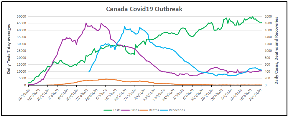
Here is a graph showing how this applies to Canada.

It is evident that increased testing has resulted in more positives, while the positivity rate is unchanged. Doubling the tests has doubled the positives, up from 300 a day to nearly 600 a day presently.  Note these are PCR results. And the discussion above suggests that the number of persons with an active infectious viral load is likely 10% of those reported positive: IOW up from 30 a day to 60 a day.  And in the graph below, the total of actual cases in Canada is likely on the order of 13,000 total from the last 7 months, an average of 62 cases a day.

WuFlu Exposes a Fundamental Flaw in US Health System

Dr. Mina goes on to explain what went wrong in US response to WuFlu:

In the U.S, we have a major focus on clinical medicine, and we have undervalued and underfunded the whole concept of public health for a very long time. We saw an example of this for, for example, when we tried to get the state laboratories across the country to be able to perform the PCR tests back in March, February and March, we very quickly realized that our public health infrastructure in this country just wasn’t up to the task. We had very few labs that were really able to do enough testing to just meet the clinical demands. And so such a reduced focus on public health for so long has led to an ecosystem where our regulatory agencies, this being primarily the FDA, has a mandate to approve clinical medical diagnostic tests. But there’s actually no regulatory pathway that is available or exists — and in many ways, we don’t even have a language for it — for a test whose primary purpose is one of public health and not personal medical health

That’s really caused a problem. And a lot of times, it’s interesting if you think about the United States, every single test that we get, with the exception maybe of a pregnancy test, has to go through a physician. And so that’s a symptom of a country that has focused, and a society really, that has focused so heavily on the medical industrial complex. And I’m part of that as a physician. But I also am part of the public health complex as an epidemiologist. And I see that sometimes these are at odds with each other, medicine and public health. And this is an example where because all of our regulatory infrastructure is so focused on medical devices… If you’re a public health person, you can actually have a huge amount of leeway in how your tests are working and still be able to get epidemics under control. And so there’s a real tension here between the regulations that would be required for these types of tests versus a medical diagnostic test.

Footnote:  I don’t think the Chinese leaders were focusing on the systemic weakness Dr. MIna mentions.  But you do have to bow to the inscrutable cleverness of the Chinese Communists releasing WuFlu as a means to set internal turmoil within democratic capitalist societies.  On one side are profit-seeking Big Pharma, aided and abetted by Big Media using fear to attract audiences for advertising revenues.  The panicked public demands protection which clueless government provides by shutting down the service and manufacturing industries, as well as throwing money around and taking on enormous debt.  The world just became China’s oyster.

Background from Previous Post: Covid Burnout in Canada August 28

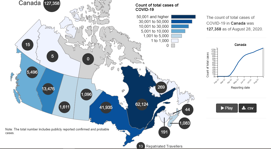
The map shows that in Canada 9108 deaths have been attributed to Covid19, meaning people who died having tested positive for SARS CV2 virus.  This number accumulated over a period of 210 days starting January 31. The daily death rate reached a peak of 177 on May 6, 2020, and is down to 6 as of yesterday.  More details on this below, but first the summary picture. (Note: 2019 is the latest demographic report)

Canada Pop Ann Deaths Daily Deaths Risk per
Person
2019 37589262 330786 906 0.8800%
Covid 2020 37589262 9108 43 0.0242%

Over the epidemic months, the average Covid daily death rate amounted to 5% of the All Causes death rate. During this time a Canadian had an average risk of 1 in 5000 of dying with SARS CV2 versus a 1 in 114 chance of dying regardless of that infection. As shown later below the risk varied greatly with age, much lower for younger, healthier people.

Background Updated from Previous Post

In reporting on Covid19 pandemic, governments have provided information intended to frighten the public into compliance with orders constraining freedom of movement and activity. For example, the above map of the Canadian experience is all cumulative, and the curve will continue upward as long as cases can be found and deaths attributed.  As shown below, we can work around this myopia by calculating the daily differentials, and then averaging newly reported cases and deaths by seven days to smooth out lumps in the data processing by institutions.

A second major deficiency is lack of reporting of recoveries, including people infected and not requiring hospitalization or, in many cases, without professional diagnosis or treatment. The only recoveries presently to be found are limited statistics on patients released from hospital. The only way to get at the scale of recoveries is to subtract deaths from cases, considering survivors to be in recovery or cured. Comparing such numbers involves the delay between infection, symptoms and death. Herein lies another issue of terminology: a positive test for the SARS CV2 virus is reported as a case of the disease COVID19. In fact, an unknown number of people have been infected without symptoms, and many with very mild discomfort.

August 7 in the UK it was reported (here) that around 10% of coronavirus deaths recorded in England – almost 4,200 – could be wiped from official records due to an error in counting.  Last month, Health Secretary Matt Hancock ordered a review into the way the daily death count was calculated in England citing a possible ‘statistical flaw’.  Academics found that Public Health England’s statistics included everyone who had died after testing positive – even if the death occurred naturally or in a freak accident, and after the person had recovered from the virus.  Numbers will now be reconfigured, counting deaths if a person died within 28 days of testing positive much like Scotland and Northern Ireland…

Professor Heneghan, director of the Centre for Evidence-Based Medicine at Oxford University, who first noticed the error, told the Sun:

‘It is a sensible decision. There is no point attributing deaths to Covid-19 28 days after infection…

For this discussion let’s assume that anyone reported as dying from COVD19 tested positive for the virus at some point prior. From the reasoning above let us assume that 28 days after testing positive for the virus, survivors can be considered recoveries.

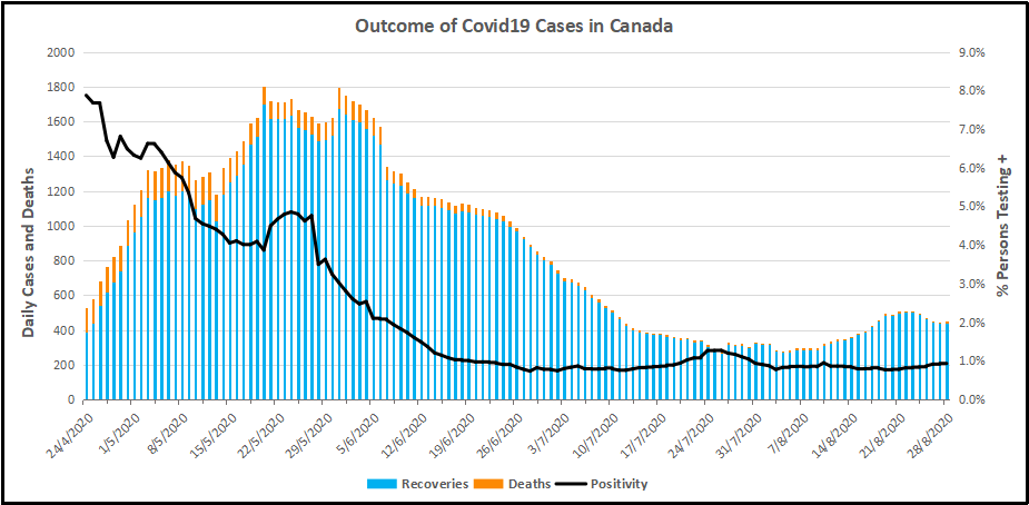
Recoveries are calculated as cases minus deaths with a lag of 28 days. Daily cases and deaths are averages of the seven days ending on the stated date. Recoveries are # of cases from 28 days earlier minus # of daily deaths on the stated date. Since both testing and reports of Covid deaths were sketchy in the beginning, this graph begins with daily deaths as of April 24, 2020 compared to cases reported on March 27, 2020.

The line shows the Positivity metric for Canada starting at nearly 8% for new cases April 24, 2020. That is, for the 7 day period ending April 24, there were a daily average of 21,772 tests and 1715 new cases reported. Since then the rate of new cases has dropped down, now holding steady at ~1% since mid-June. Yesterday, the daily average number of tests was 45,897 with 427 new cases. So despite more than doubling the testing, the positivity rate is not climbing.  Another view of the data is shown below.

The scale of testing has increased and now averages over 45,000 a day, while positive tests (cases) are hovering at 1% positivity.  The shape of the recovery curve resembles the case curve lagged by 28 days, since death rates are a small portion of cases.  The recovery rate has grown from 83% to 99% steady over the last 2 weeks, so that recoveries exceed new positives. This approximation surely understates the number of those infected with SAR CV2 who are healthy afterwards, since antibody studies show infection rates multiples higher than confirmed positive tests (8 times higher in Canada).  In absolute terms, cases are now down to 427 a day and deaths 6 a day, while estimates of recoveries are 437 a day.

The key numbers: 

99% of those tested are not infected with SARS CV2. 

99% of those who are infected recover without dying.

Summary of Canada Covid Epidemic

It took a lot of work, but I was able to produce something akin to the Dutch advice to their citizens.

The media and governmental reports focus on total accumulated numbers which are big enough to scare people to do as they are told.  In the absence of contextual comparisons, citizens have difficulty answering the main (perhaps only) question on their minds:  What are my chances of catching Covid19 and dying from it?

A previous post reported that the Netherlands parliament was provided with the type of guidance everyone wants to see.

For canadians, the most similar analysis is this one from the Daily Epidemiology Update: :

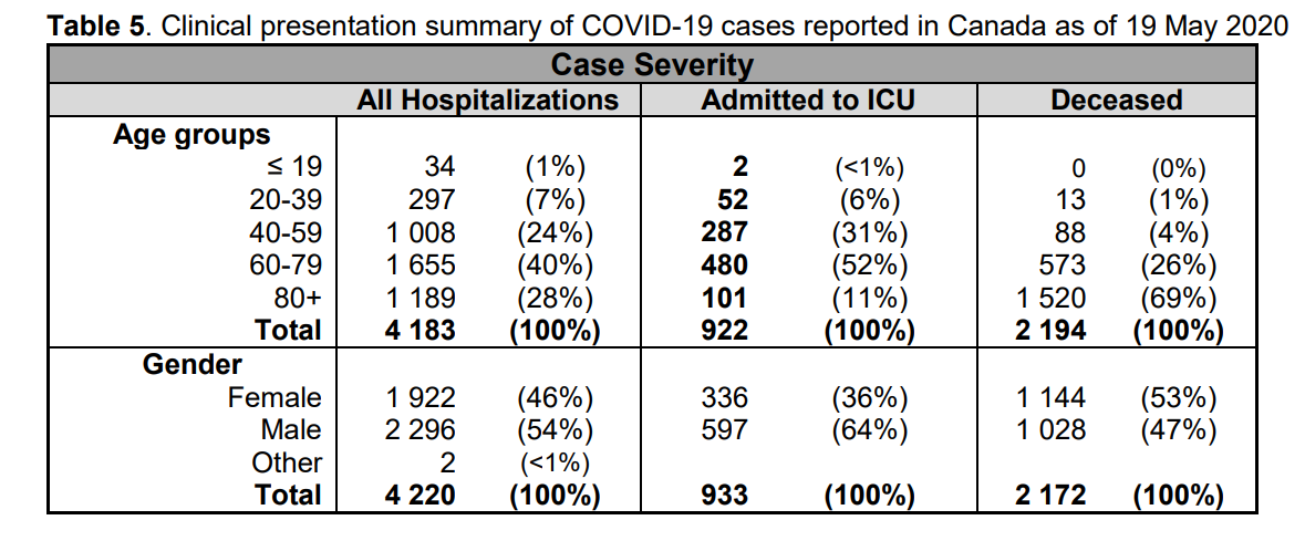
The table presents only those cases with a full clinical documentation, which included some 2194 deaths compared to the 5842 total reported.  The numbers show that under 60 years old, few adults and almost no children have anything to fear.

Update May 20, 2020

It is really quite difficult to find cases and deaths broken down by age groups.  For Canadian national statistics, I resorted to a report from Ontario to get the age distributions, since that province provides 69% of the cases outside of Quebec and 87% of the deaths.  Applying those proportions across Canada results in this table. For Canada as a whole nation:

Age  Risk of Test +  Risk of Death Population
per 1 CV death
<20 0.05% None NA
20-39 0.20% 0.000% 431817
40-59 0.25% 0.002% 42273
60-79 0.20% 0.020% 4984
80+ 0.76% 0.251% 398

In the worst case, if you are a Canadian aged more than 80 years, you have a 1 in 400 chance of dying from Covid19.  If you are 60 to 80 years old, your odds are 1 in 5000.  Younger than that, it’s only slightly higher than winning (or in this case, losing the lottery).

As noted above Quebec provides the bulk of cases and deaths in Canada, and also reports age distribution more precisely,  The numbers in the table below show risks for Quebecers.

Age  Risk of Test +  Risk of Death Population
per 1 CV death
0-9 yrs 0.13% 0 NA
10-19 yrs 0.21% 0 NA
20-29 yrs 0.50% 0.000% 289,647
30-39 0.51% 0.001% 152,009
40-49 years 0.63% 0.001% 73,342
50-59 years 0.53% 0.005% 21,087
60-69 years 0.37% 0.021% 4,778
70-79 years 0.52% 0.094% 1,069
80-89 1.78% 0.469% 213
90  + 5.19% 1.608% 62

While some of the risk factors are higher in the viral hotspot of Quebec, it is still the case that under 80 years of age, your chances of dying from Covid 19 are better than 1 in 1000, and much better the younger you are.
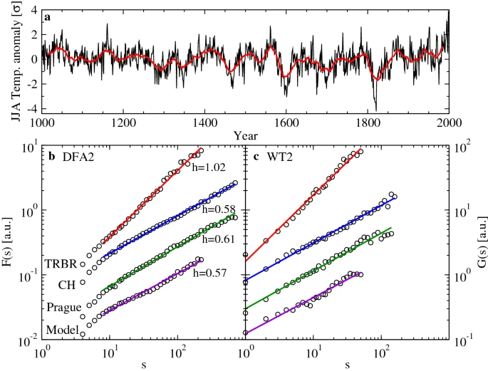
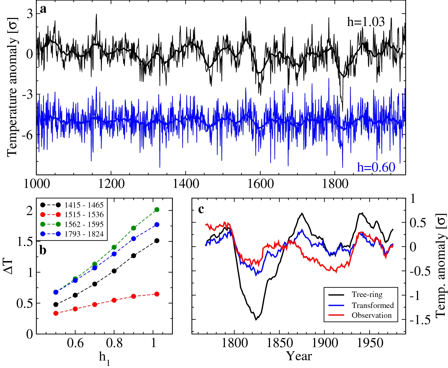
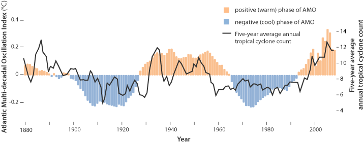
Positive HCQ Treatment Outcomes in 88 International Studies

The report is Early treatment with hydroxychloroquine: a country-based analysis at C19study.com.  Excerpts in italics with my bolds.

Many countries either adopted or declined early treatment with HCQ, effectively forming a large trial with 1.8 billion people in the treatment group and 663 million in the control group. As of September 6, 2020, an average of 57.4 per million in the treatment group have died, and 466.4 per million in the control group, relative risk 0.123. After adjustments, treatment and control deaths become 119.6 per million and 694.7 per million, relative risk 0.17. The probability of an equal or lower relative risk occurring from random group assignments is 0.008. Accounting for predicted changes in spread, we estimate a relative risk of 0.24. The treatment group has a 76.2% lower death rate. Confounding factors affect this estimate. We examined diabetes, obesity, hypertension, life expectancy, population density, urbanization, testing level, and intervention level, which do not account for the effect observed.

The treatment group countries generally show significantly slower growth in mortality which may be due to treatment, interventions, differences in culture, or the initial degree of infections arriving into the country. Over time we expect that increasingly similar percentages of people will have been exposed, since it is unlikely that the virus will be eliminated soon.

To account for future spread, we created an estimate of the future adjusted deaths per million for each country, 90 days in the future, based on a second degree polynomial fit according to the most recent 30 days, enforcing the requirement that deaths do not decrease, and using an assumption of a progressively decreasing maximum increase over time. Figure 5 shows the results, which predicts a future relative risk of 0.24, i.e., the treatment group has 76.2% lower chance of death.

Treatment groups.

Entire countries made different decisions regarding treatment with HCQ based on the same information, thereby assigning their residents to the treatment or control group in advance. Since assignment is done without regard to individual information such as medical status, assignment of individuals is random for the purposes of this study.

We focus here on countries that chose and maintained a clear assignment to one of the groups for a majority of the duration of their outbreak, either adopting widespread use, or highly limiting use. Some countries have very mixed usage, and some countries have joined or left the treatment group during their outbreak. We searched government web sites, Twitter, and Google, with the assistance of several experts in HCQ usage, to confirm assignment to the treatment or control group, locating a total of 225 relevant references, shown in Appendix 12. We excluded countries with <1M population, and countries with <0.5% of people over the age of 80. COVID-19 disproportionately affects older people and the age based adjustments are less reliable when there are very few people in the high-risk age groups. We also excluded countries that quickly adopted aggressive intervention and isolation strategies and consequently have very little spread of the virus to date. This exclusion, based on analysis by [Leffler], favors the control group and is discussed in detail below. We also present results without these exclusions for comparison.

Collectively the countries we identified with stable and relatively clear assignments account for 31.1% of the world population (2.4B of 7.8B). Details of the groups and evidence, including countries identified as having mixed use of HCQ, can be found in Appendix 12.

Case statistics.

We analyze deaths rather than cases because case numbers are highly dependent on the degree of testing effort, criteria for testing, the accuracy and availability of tests, accuracy of reporting, and because there is very high variability in case severity, including a high percentage of asymptomatic cases.

Co-administered treatments.

Several theories exist for why HCQ is effective [Andreani, Brufsky, Clementi, de Wilde, Derendorf, Devaux, Grassin-Delyle, Hoffmann, Hu, Keyaerts, Kono, Liu, Pagliano, Savarino, Savarino (B), Scherrmann, Sheaff, Vincent, Wang, Wang (B)], some of which involve co-administration of other medication or supplements. Most commonly used are zinc [Derwand, Shittu] and Azithromycin (AZ) [Guérin]. In vitro experiments report a synergistic effect of HCQ and AZ on antiviral activity [Andreani] at concentrations obtained in the human lung, and in vivo results are consistent with this [Gautret]. Zinc reduces SARS-CoV RNA-dependent RNA polymerase activity in vitro [te Velthuis], however it is difficult to obtain significant intracellular concentrations with zinc alone [Maret]. Combining it with a zinc ionophore such as HCQ increases cellular uptake, making it more likely to achieve effective intracellular concentrations [Xue]. Zinc deficiency varies and inclusion of zinc may be more or less important based on an individual’s existing zinc level. Zinc consumption varies widely based on diet [NIH]. To the extent that the co-administration of zinc, Azithromycin, or other medication or supplements is important, we may underestimate the effectiveness of HCQ because not all countries and locations are using the optimal combination.

Demise of Journalism Is Confirmed

Glenn Greenwald explains in his Intercept article Journalism’s New Propaganda Tool: Using “Confirmed” to Mean its Opposite.  Excerpts in italics with my bolds.

Outlets claiming to have “confirmed” Jeffrey Goldberg’s story about Trump’s troops comments are again abusing that vital term.

The same misleading tactic is now driving the supremely dumb but all-consuming news cycle centered on whether President Trump, as first reported by the Atlantic’s editor-in-chief Jeffrey Goldberg, made disparaging comments about The Troops. Goldberg claims that “four people with firsthand knowledge of the discussion that day” — whom the magazine refuses to name because they fear “angry tweets” — told him that Trump made these comments. Trump, as well as former aides who were present that day (including Sarah Huckabee Sanders and John Bolton), deny that the report is accurate.

So we have anonymous sources making claims on one side, and Trump and former aides (including Bolton, now a harsh Trump critic) insisting that the story is inaccurate. Beyond deciding whether or not to believe Goldberg’s story based on what best advances one’s political interests, how can one resolve the factual dispute? If other media outlets could confirm the original claims from Goldberg, that would obviously be a significant advancement of the story.  Other media outlets — including Associated Press and Fox News — now claim that they did exactly that: “confirmed” the Atlantic story.

But if one looks at what they actually did, at what this “confirmation” consists of, it is the opposite of what that word would mean, or should mean, in any minimally responsible sense.

AP, for instance, merely claims that “a senior Defense Department official with firsthand knowledge of events and a senior U.S. Marine Corps officer who was told about Trump’s comments confirmed some of the remarks to The Associated Press,” while Fox merely said “a former senior Trump administration official who was in France traveling with the president in November 2018 did confirm other details surrounding that trip.”

In other words, all that likely happened is that the same sources who claimed to Jeffrey Goldberg, with no evidence, that Trump said this went to other outlets and repeated the same claims — the same tactic that enabled MSNBC and CBS to claim they had “confirmed” the fundamentally false CNN story about Trump Jr. receiving advanced access to the WikiLeaks archive. Or perhaps it was different sources aligned with those original sources and sharing their agenda who repeated these claims. Given that none of the sources making these claims have the courage to identify themselves, due to their fear of mean tweets, it is impossible to know.

But whatever happened, neither AP nor Fox obtained anything resembling “confirmation.”

They just heard the same assertions that Goldberg heard, likely from the same circles if not the same people, and are now abusing the term “confirmation” to mean “unproven assertions” or “unverifiable claims” (indeed, Fox now says that “two sources who were on the trip in question with Trump refuted the main thesis of The Atlantic’s reporting”).

It should go without saying that none of this means that Trump did not utter these remarks or ones similar to them. He has made public statements in the past that are at least in the same universe as the ones reported by the Atlantic, and it is quite believable that he would have said something like this (though the absolute last person who should be trusted with anything, particularly interpreting claims from anonymous sources, is Jeffrey Goldberg, who has risen to one of the most important perches in journalism despite (or, more accurately because of) one of the most disgraceful and damaging records of spreading disinformation in service of the Pentagon and intelligence community’s agenda).

But journalism is not supposed to be grounded in whether something is “believable” or “seems like it could be true.” Its core purpose, the only thing that really makes it matter or have worth, is reporting what is true, or at least what evidence reveals. And that function is completely subverted when news outlets claim that they “confirmed” a previous report when they did nothing more than just talked to the same people who anonymously whispered the same things to them as were whispered to the original outlet.

Quite aside from this specific story about whether Trump loves The Troops, conflating the crucial journalistic concept of “confirmation” with “hearing the same idle gossip” or “unproven assertions” is a huge disservice. It is an instrument of propaganda, not reporting. And its use has repeatedly deceived rather than informed the public. Anyone who doubts that should review how it is that MSNBC and CBS both claimed to have “confirmed” a CNN report which turned out to be ludicrously and laughably false. Clearly, the term “confirmation” has lost its meaning in journalism.

EPA Plans for a Bright Environmental Future

EPA Administrator Andrew Wheeler delivered an address laying out the agency vision for fulfilling its mission.  Excerpts in italics with my formatting and bolds.

EPA’s mission has been straight forward since its founding. Protect human health and the environment. Doing this ensures that all Americans – regardless of their zip code – have clean air to breathe, clean water to drink, and clean land to live, work, and play upon. Under President Trump, we have done this as well, if not better, than any recent administration.  This is great news, and like most great news, you rarely read about it in the press.

  • During the first three years of the Trump Administration, air pollution in this country fell 7 percent.
  • Last year, EPA delisted 27 Superfund sites, the most in a single year since 2001.
  • And agency programs have contributed more than $40 billion dollars to clean water infrastructure investment during President Trump’s first term.

For much of the latter part of the 20th century, there was bipartisan understanding on what environmental protection meant. Some of it was captured in legislation and some it by established practice. These principles formed a consensus about how the federal government did its job of protecting the environment.

But unfortunately, in the past decade or so, some members of former administrations and progressives in Congress have elevated single issue advocacy – in many cases focused just on climate change – to virtue-signal to foreign capitals, over the interests of communities within their own country. Communities deserve better than this, but in the recent past, EPA has forgotten important parts of its mission. It’s my belief that we misdirect a lot of resources that could be better used to help communities across this country.

So, if this is where we are – with misdirected policies, misused resources, and a more partisan political environment – and we want an EPA for the next 50 years – how do we get there? One way to do this – and I’ve spent more than 25 years thinking about this problem – is to focus on helping communities become healthier in a more comprehensive manner.

Communities that deal with the worst pollution in this country – and tend to be low-income and minority – face multiple environmental problems that need solving.  Many of the sites EPA has responsibility for are in some of the most disadvantaged communities in this country. And I will point out a truism. Neglect is a form of harm, and it’s not fair for these communities to be abandoned just because they don’t have enough political power to stop the neglect.

So where does this put us as a country in 2020? The truth is this country is facing a lot of environmental and social problems that have not been dealt with the right way up until now. And while the focus of the next 50 years should not be like the last 50, it should be informed by it.

Many towns and cities in the United States are using the same water infrastructure they’ve used for over 100 years, and many schools use lead water pipes long after such pipes were banned from new buildings. The American public views our pesticide program through the lens of the trial lawyers who advertise on television instead of the way we manage the program. And the Superfund Program – which celebrates its 40th anniversary this year, has become focused on process, rather than project completion.

These issues are challenging and would be difficult for any administration in office. But they would be easier to solve if people in power were more aware of the consequences of poor environmental policies.

It’s very disappointing to see governors on the East Coast, such as Governor Cuomo, unilaterally block pipelines that would take natural gas from Pennsylvania to New York and New England. These poor choices subject Americans to imports of gas from places like Russia, even in the face of evidence that U.S. natural gas has a much cleaner emissions profile than imported gas from Europe. Governor Cuomo is doing this in the name of climate change, but the carbon footprint of natural gas to New England through pipeline is much smaller than transporting it across the ocean. It also forces citizens in Vermont, New Hampshire and Maine to use more polluting wood and heating oil to heat their homes because of gas shortages in the winter months, which in turn creates very poor local air quality.

And there are many examples of poor environmental outcomes here in California, despite its environmental reputation. It should go without saying that dumping sewage into San Francisco Bay without disinfection, indeed without any chemical or biological treatment, is a bad idea, but that’s what been happening for many years, against federal law.

And just last month, the rolling blackouts created by California’s latest electricity crisis – the result of policies against power plants being fueled by natural gas – spilled 50,000 gallons of raw sewage into the Oakland Estuary when back-up wastewater pumps failed. As state policymakers push more renewables onto the grid at times of the day when renewables aren’t available, these environmental accidents will happen more often. CARB seems to have no appreciation for baseload power generation. Or at least their regulations don’t.

Instead of confusing words with actions, and choosing empty symbolism over doing a good job, we can focus our attention and resources on helping communities help themselves. Doing this will strengthen this country from its foundation up – and start to solve the environmental problems of tomorrow. We could do a lot of good if the federal government, through Congress, puts resources to work with a fierce focus on community-driven environmentalism that promotes community revitalization on a greater scale.

This will do more for environmental justice than all the rhetoric in political campaigns.

Over the next four years the Trump Administration is going to reorganize how it approaches communities so it can take action and address the range of environmental issues that need to be addressed for people and places in need. In President Trump’s second term, we will help communities across this country take control and reshape themselves through the following five priorities.

  • Creating a Community-Driven Environmentalism that Promotes Community Revitalization.
  • Meeting the 21st Century Demands for Water.
  • Reimagining Superfund as a Project-Oriented Program.
  • Reforming the Permitting Process to Empower States. And,
  • Creating a Holistic Pesticide Program for the Future.

For communities, traditionally, EPA has focused on environmental issues in a siloed manner that only looks at air, water and land separately, and states and local communities end up doing the same. We will change this, and look at Brownfields grants, environmental justice issues, and air quality in each community at the same time and encourage them to do the same.

Since EPA’s Brownfields Program began in 1995, nearly $1.6 billion dollars in grants have been spent to clean-up contaminated sites and return blighted properties to productive reuse. To date, communities participating in the Program have been able to attract an additional $33.3 billion dollars in cleanup and redevelopment funding after receiving Brownfields funds.

And when combined with the Opportunity Zones created in the landmark 2017 Trump tax bill, economic development, job creation and environmental improvements can truly operate together at the same time. A study published last month found that Opportunity Zones, which have only been in existence since 2018, have attracted about $75 billion dollars in private investment, which in turn has lifted about one million people out of poverty through job creation in a very short time. While all the economic data isn’t available yet for 2019, it’s possible that Opportunity Zones are one of the biggest reasons black unemployment in this country fell to its lowest recorded levels ever in 2019.

One other way we are going to help communities is by creating one consolidated grant program that combines several smaller grants from multiple programs. It will help focus local communities to view environmental problems holistically, and it will help refocus EPA.

We can meet the 21st Century Demands for Clean Water by creating an integrated planning approach using WIFIA loans, our Water Reuse Action Plan, and our Nutrient Trading Initiative to improve water quality and modernize legal frameworks that have been around since the 19th Century. Over 40 percent of water utility workers are eligible to retire. We need to do a better job recruiting and training for 21st century threats to the water utilities industry.

And we can reinvigorate the Superfund Program. Roughly 16 percent of the U.S. population lives within 3 miles of a Superfund site today. That’s over 50 million Americans. EPA has allowed litigation and bureaucracy to dictate the pace of Superfund projects, instead of focusing on improving the environmental indicators and moving sites to completion. We need to fully implement the recommendations of the 2018 Superfund Task Force and reimagine the approach to clean up sites using the latest technologies and best practices.

We can improve the way we handle pesticide regulation. We do a good job approving pesticides on an individual basis, but we have not excelled in explaining to the public our holistic approach to pesticide management. The media and the courts tend to view our individual pesticide decisions in a one-off fashion, which has left the American public uninformed on our science-based process.

We will take into account biotech advances and better examinations of new active ingredients. Just this week, we announced a proposed rule that would remove onerous and expensive regulation of gene-edited plant protectants. We will safeguard pollinators to support the agriculture industry. And we can decrease reliance on animal testing to a point where no animal testing takes place for any of the agency’s programs by 2035.

Here are five things EPA is doing – five new pillars that have gone largely unnoticed by the public – that are changing the way the agency operates today.

The first pillar is our Cost-Benefit Rulemaking.
We are creating cost-benefit rules for every statute that governs EPA. The American public deserves to know what the costs and the benefits are for each of our rules. We are starting with the Clean Air Act, which will provide much better clarity to local communities, industry and stakeholders. And we will implement a cost-benefit regulation for all our environmental statutes by 2022.

Our second major pillar is Science Transparency.

The American public has a right to know the scientific justification behind a regulation. We are creating science transparency rules that are applied consistently. This will bring much needed sunlight into our regulatory process. Some people oppose it, calling it a Secret Science rule. Those who oppose it want regulatory decisions to be made behind closed doors. They are the people who say, “Trust us, we know what’s best for you.” I want to bring our environmental decision-making process out of the proverbial smoke-filled back room. The Cost-Benefit and Science Transparency rules will go a long way in delivering that. After finalizing the Science Transparency rule later this year, EPA will conduct a statute by statue rulemaking, much like the Cost-Benefit rule.

Guidance documents are the third pillar of agency change, and it’s an area we’ve made a lot of progress, and we have shined even more light.

The agency for years was criticized for not making guidance documents – which have almost the force of law – available for public review. The costs involved to uncover guidance documents became a major barrier for anyone wanting to improve their communities. Last year, EPA went through all our guidance documents from the agency’s beginnings, and we put all 10,000 documents onto a searchable database. We also rescinded 1,000 guidance documents. Now all our guidance documents are available to the public, for the first time. This is a huge change in administrative procedures at EPA, perhaps the biggest change in at least a generation.

The fourth pillar is our reorganization of all 10 of our regional offices to mirror our headquarters structure.

All the regional offices across the country now have an air division, a water division, a lands division, and a chemical division. This was a change that was needed for decades.

As the fifth pillar of EPA fundamental change, we have implemented a Lean Management System that tracks real metrics with which the agency can measure success or failure.

There is a lot of good news in these changes, but the best news is this: the problems I’ve highlighted are structural, and when a problem is structural or organizational, an agency can be changed. Until the Trump administration, EPA was not able to track how long it took to complete a permit, a grant process, or a state implementation plan, or really any meaningful task the agency had before it. Organizations do change; it can be hard, but they do change, and when they change, it’s usually for the better.

Conclusion:
As I said at the beginning, EPA data points to 2020 air quality being the best on record. Here in California, where the modern environmental movement began – and from where President Nixon brought it to the rest of the country – it’s important to acknowledge the role states have in being laboratories for democracy, and in this case, laboratories for environmental policy.

But for environmental policy to work nationally, the federal government and states must work together as partners, not as adversaries. To do this involves a new vision, and for a country searching for a new consensus, on the environment as well as on many other things, this can seem tough. But I believe we can find a new consensus, if we strive to.

I believe that by focusing EPA toward communities in the coming years, our agency can change the future for people living in this country who have been left behind simply for living in polluted places. We are a nation made up of communities, and communities are the foundation of this nation, not the other way around.

If we can do the work before us – break down the silos between us as an agency and elsewhere – I believe we can both protect the places we love and bring back the places that have been hurt by pollution – and make them even better than they were before.

I see EPA beginning its second half century with big challenges, but ones that can be overcome with the same skill and tenacity that helped this agency, and this country, overcome the challenges of the last 50 years.  I hope everyone can support our agency as we work to deliver this vision of a great environmental future for all Americans – regardless of where they live.

Thank you.”

August Land and Ocean Air Temps Stay Cool

banner-blog
With apologies to Paul Revere, this post is on the lookout for cooler weather with an eye on both the Land and the Sea.  UAH has updated their tlt (temperatures in lower troposphere) dataset for August 2020.  Previously I have done posts on their reading of ocean air temps as a prelude to updated records from HADSST3. This month also has a separate graph of land air temps because the comparisons and contrasts are interesting as we contemplate possible cooling in coming months and years.

Presently sea surface temperatures (SST) are the best available indicator of heat content gained or lost from earth’s climate system.  Enthalpy is the thermodynamic term for total heat content in a system, and humidity differences in air parcels affect enthalpy.  Measuring water temperature directly avoids distorted impressions from air measurements.  In addition, ocean covers 71% of the planet surface and thus dominates surface temperature estimates.  Eventually we will likely have reliable means of recording water temperatures at depth.

Recently, Dr. Ole Humlum reported from his research that air temperatures lag 2-3 months behind changes in SST.  He also observed that changes in CO2 atmospheric concentrations lag behind SST by 11-12 months.  This latter point is addressed in a previous post Who to Blame for Rising CO2?

HadSST3 results were delayed with February and March updates only appearing together end of April.  For comparison we can look at lower troposphere temperatures (TLT) from UAHv6 which are now posted for August. The temperature record is derived from microwave sounding units (MSU) on board satellites like the one pictured above.

The UAH dataset includes temperature results for air above the oceans, and thus should be most comparable to the SSTs. There is the additional feature that ocean air temps avoid Urban Heat Islands (UHI). In 2015 there was a change in UAH processing of satellite drift corrections, including dropping one platform which can no longer be corrected. The graphs below are taken from the latest and current dataset, Version 6.0.

The graph above shows monthly anomalies for ocean temps since January 2015. After all regions peaked with the El Nino in early 2016, the ocean air temps dropped back down with all regions showing the same low anomaly August 2018.  Then a warming phase ensued with NH and Tropics spikes in February and May 2020. As was the case in 2015-16, the warming was driven by the Tropics and NH, with SH lagging behind. Since the peak in January 2020, all ocean regions have trended downward in a sawtooth pattern, returning to a neutral anomaly in June, close to the 0.4C average for the period. July and August are little changed with NH and SH offsetting slight bumps.

Land Air Temperatures Showing Volatility

We sometimes overlook that in climate temperature records, while the oceans are measured directly with SSTs, land temps are measured only indirectly.  The land temperature records at surface stations sample air temps at 2 meters above ground.  UAH gives tlt anomalies for air over land separately from ocean air temps.  The graph updated for August 2020 is below.


Here we see the noisy evidence of the greater volatility of the Land temperatures, along with extraordinary departures, first by NH land with SH often offsetting.   The overall pattern is similar to the ocean air temps, but obviously driven by NH with its greater amount of land surface. The Tropics synchronized with NH for the 2016 event, but otherwise follow a contrary rhythm.  SH seems to vary wildly, especially in recent months.  Note the extremely high anomaly last November, cold in March 2020, and then again a spike in April. In June 2020, all land regions converged, erasing the earlier spikes in NH and SH, and showing anomalies comparable to the 0.5C average land anomaly this period.

After an upward bump In July SH, land air temps in August returned to the same flat result from the prior month.

The longer term picture from UAH is a return to the mean for the period starting with 1995.  2019 average rose and caused 2020 to start warmly, but currently lacks any El Nino or NH warm blob to sustain it.

These charts demonstrate that underneath the averages, warming and cooling is diverse and constantly changing, contrary to the notion of a global climate that can be fixed at some favorable temperature.

TLTs include mixing above the oceans and probably some influence from nearby more volatile land temps.  Clearly NH and Global land temps have been dropping in a seesaw pattern, NH in July more than 1C lower than the 2016 peak.  TLT measures started the recent cooling later than SSTs from HadSST3, but are now showing the same pattern.  It seems obvious that despite the three El Ninos, their warming has not persisted, and without them it would probably have cooled since 1995.  Of course, the future has not yet been written.

ESG Investing Fails Both Activists and Pensioners

Robert Armstrong wrote at the Financial Times The Dubious Appeal Of ESG Investing Is For Dupes Only.  Excerpts in italics with my bolds.

Environmental, social and governance investing is ascendant. Its mirror image, stakeholder capitalism, is now the standard mantra on boards and in executive suites. This is not cause for celebration.

Both rest on weak conceptual foundations and should be viewed suspiciously by investors who seek adequate returns, and by citizens who want real rather than cosmetic change.

The business and financial establishments endorse the new consensus. BlackRock, the world’s largest asset manager, released an open letter warning companies that it would “be increasingly disposed” to vote against boards moving too slowly on sustainability. The World Economic Forum in Davos says that companies exist to create value not just for shareholders but “employees, customers, suppliers, local communities and society”. A letter from the Business Roundtable, signed by prominent chief executives, promised to “commit to deliver value to all” stakeholders.

Investors have responded. In the first half of 2020, net inflows into ESG funds hit $21bn, according to Morningstar, almost matching last year’s record total.

But behind ESG and stakeholderism lies a dangerous idea: that shareholders’ economic interests and the social good always harmonise over the long run.

It is true that when companies subordinate everything to maximisation of shareholder value, it backfires. When IBM, a company that long prioritised technological excellence, shifted its focus in 2012 to a target of hitting $20 in earnings per share a few years later, it was the beginning of the end for both IBM’s industry leadership and its rising share price. General Electric has never recovered from its decision to chase “easy” profits by turning into a finance company in the 1990s. The list goes on.  So ESG supporters are right that companies cannot always maximise long-term profit by aiming to do so.

They have to shoot instead to deliver excellent products, which creates profit as a side effect.

In many cases, excellence creates good stakeholder outcomes too, from investment in employees to lower carbon emissions. But this does not mean shareholder returns and the social good can always align. And there is one important way in which the two must come apart.

Part of the justification for ESG investing is that divesting from certain industries (fossil fuels or tobacco, say) creates economic pressure for change, in the way that boycotting a company’s products might. Divestment increases a company’s cost of capital: when fewer investors line up to buy its shares or bonds, it must sell them for less. This makes it more expensive for it to invest in socially destructive projects.

The necessary corollary? ESG-friendly companies’ cost of capital goes down, as dollars are channelled their way instead. Their shares and bonds become more expensive, meaning lower returns. If ESG investors’ returns are not lower, their choices have not affected corporate incentives.

Given that this is so, many ESG advocates take a different tack. They argue that the point is not to change corporate incentives but to invest in companies that will thrive financially precisely because they take ESG seriously.

There may be a distant and ideal future when this will be achieved. But even the best corporate leaders cannot look out to the end of days. They make choices about what they can foresee with a degree of confidence. At that range, it is obvious that shareholders’ and stakeholders’ interests can conflict. If they did not, there would be far fewer lay-offs announced and far fewer oil wells drilled. If stakeholder capitalism means anything, it is that corporate leaders must sometimes make choices that benefit stakeholders at the cost of shareholders.

The financial mandarins’ manifestos ignore such trade-offs, and say nothing about how they might be managed. They merely repeat that, in BlackRock’s phrase, social purpose “is the engine of long-term profitability”.

If corporate leaders are silent it is because they know how they will choose when such conflicts arise. They are paid in stock, and if monetary incentives are not enough, there are legal ones. Most US companies are incorporated in states where the law requires them to put shareholders first. Promises of virtue do not change this. As Aneesh Raghunandan and Shivaram Rajgopal of Columbia Business School point out, corporate signatories to the Business Roundtable letter have worse ESG records than industry peers.

Is the answer, then, a top-to-bottom change in executive pay packages, and indeed corporate law? No. Rewriting the internal rules of corporate capitalism would put at risk a system that has served us well in its remit: to create wealth. At the same time, do we want more of the power and responsibility for solving our most pressing problems, from inequality to climate change, to be pressed into the hands of corporations, which will still be run and owned by the richest among us? No again.

Shareholder capitalism is an excellent way to manage our corporate economy and we should stick with it.

We also have a very good, if presently neglected, set of tools to ensure that everyone shares in the fruits of economic progress. They are democratic action and the rule of law, which allow us to, for example, set minimum wages, tax carbon emissions and change campaign finance laws. Let’s use the right tools for the right purposes.

Anti-fossil fuel activists storm the bastion of Exxon Mobil, here seen without their shareholder disguises.