Inside the Sea Level Scare Machine
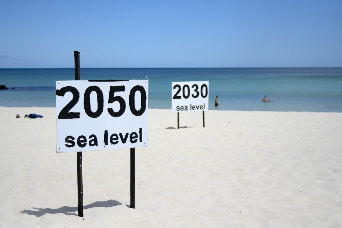
Such beach decorations exhibit the fervent belief of activists that sea levels are rising fast and will flood the coastlines if we don’t stop burning fossil fuels. As we will see below there is a concerted effort to promote this notion empowered with slick imaging tools to frighten the gullible. Of course there are frequent media releases sounding the alarms. Recently for example:
From the Guardian Up to 410 million people at risk from sea level rises – study. Excerpts in italics with my bolds.
The paper, published in Nature Communications, finds that currently 267 million people worldwide live on land less than 2 metres above sea level. Using a remote sensing method called Lidar, which pulsates laser light across coastal areas to measure elevation on the Earth’s surface, the researchers predicted that by 2100, with a 1 metre sea level rise and zero population growth, that number could increase to 410 million people.
The climate emergency has caused sea levels to rise and more frequent and severe storms to occur, both of which increase flood risks in coastal environments.
Last year, a survey published by Climate and Atmospheric Science, which aggregated the views of 106 specialists, suggested coastal cities should prepare for rising sea levels that could reach as high as 5 metres by 2300, which could engulf areas home to hundreds of millions of people.
The rest of this post provides a tour of seven US cities demonstrating how the sea level scare machine promotes fear among people living or invested in coastal properties. In each case there are warnings published in legacy print and tv media, visual simulations powered by computers and desktop publishing, and a comparison of imaginary vs. observed sea level trends.
Prime US Cities on the “Endangered” List
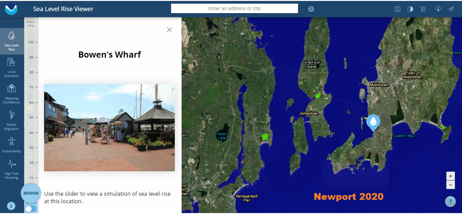
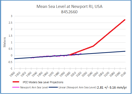
Newport , R.I.
Examples of Media Warnings
Bangor Daily News: In Maine’s ‘City of Ships,’ climate change’s coastal threat is already here
Bath, the 8,500-resident “City of Ships,” is among the places in Maine facing the greatest risks from increased coastal flooding because so much of it is low-lying. The rising sea level in Bath threatens businesses along Commercial and Washington streets and other parts of the downtown, according to an analysis by Climate Central, a nonprofit science and journalism organization.
Water levels reached their highest in the city during a record-breaking storm in 1978 at a little more than 4 feet over pre-2000 average high tides, and Climate Central’s sea level team found there’s a 1-in-4 chance of a 5-foot flood within 30 years. That level could submerge homes and three miles of road, cutting off communities that live on peninsulas, and inundate sites that manage wastewater and hazardous waste along with several museums.
UConn Today: Should We Stay or Should We Go? Shoreline Homes and Rising Sea Levels in Connecticut
As global temperatures rise, so does the sea level. Experts predict it could rise as much as 20 inches by 2050, putting coastal communities, including those in Connecticut, in jeopardy.
One possible solution is a retreat from the shoreline, in which coastal homes are removed to take them out of imminent danger. This solution comes with many complications, including reductions in tax revenue for towns and potentially diminished real estate values for surrounding properties. Additionally, it can be difficult to get people to volunteer to relocate their homes.
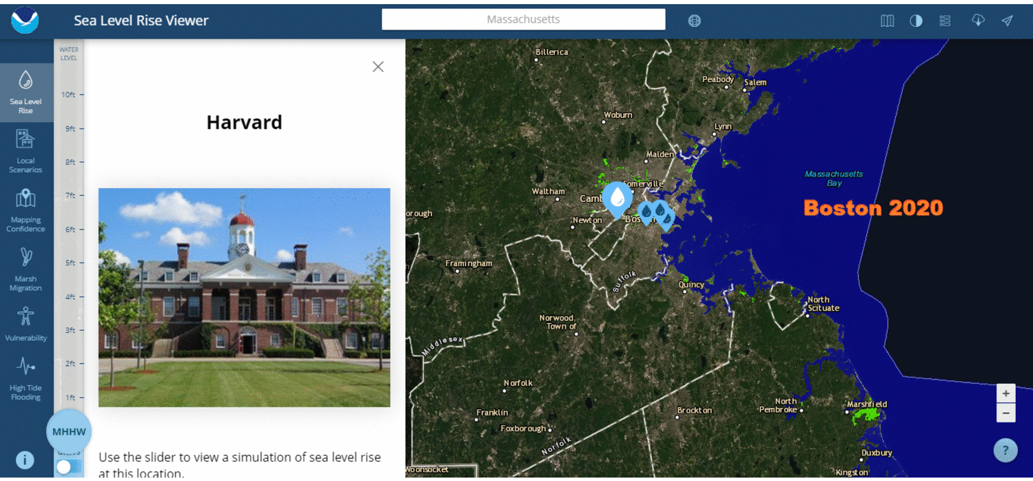
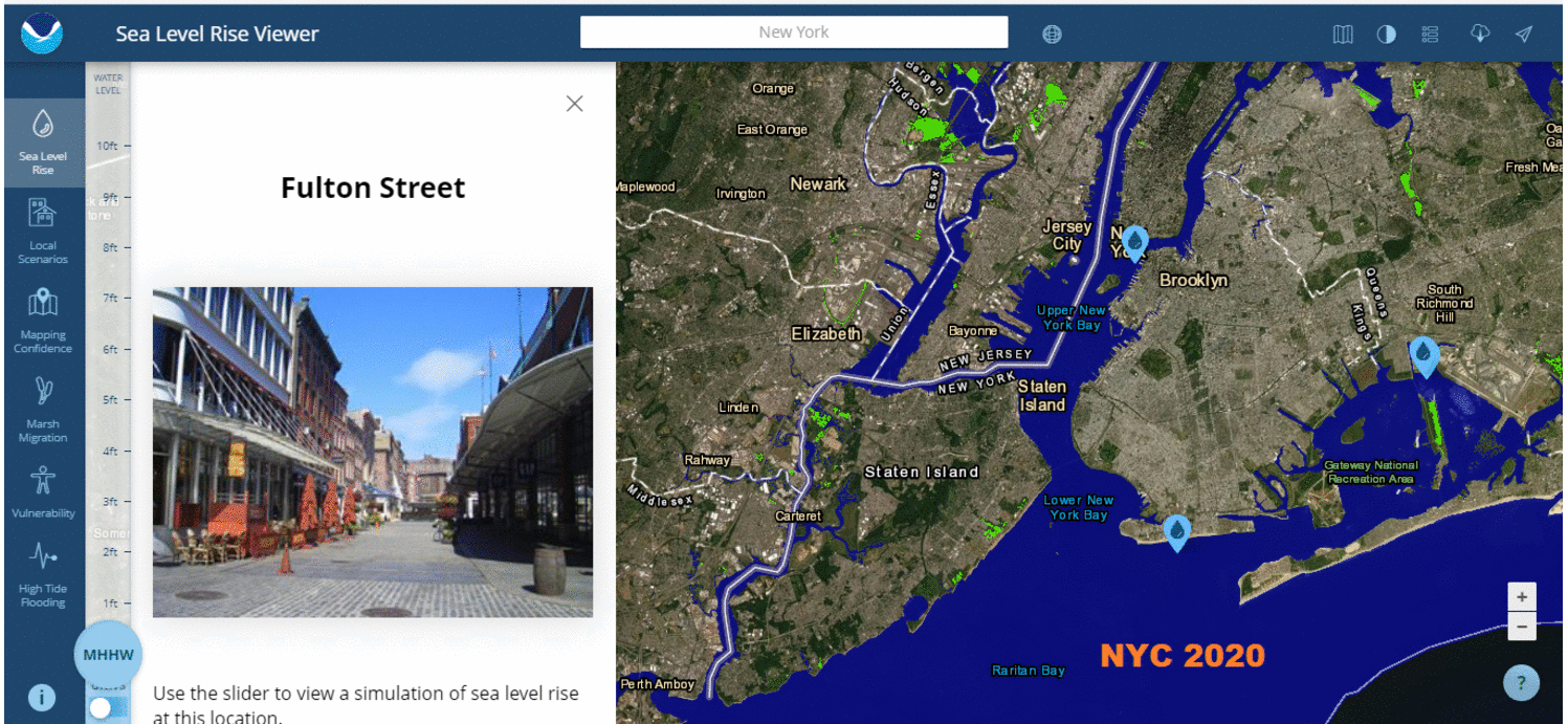
Computer Simulations of the Future
Imaginary vs. Observed Sea Level Trends (2020 Update)
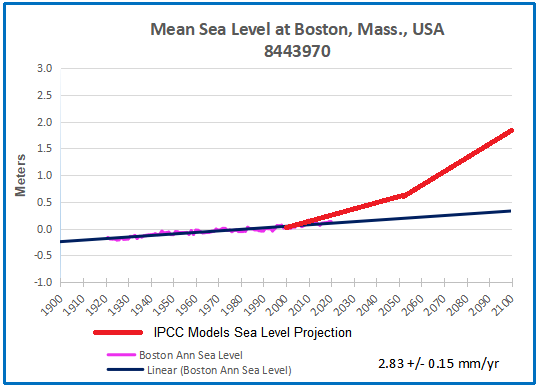
Boston, Mass.
Example of Media Warnings
From WBUR Radio Boston: Rising Sea Levels Threaten MBTA’s Blue Line
Could it be the end of the Blue Line as we know it? The Blue Line, which features a mile-long tunnel that travels underwater, and connects the North Shore with Boston’s downtown, is at risk as sea levels rise along Boston’s coast. To understand the threat sea-level rise poses to the Blue Line, and what that means for the rest of the city, we’re joined by WBUR reporter Simón Ríos and Julie Wormser, Deputy Director at the Mystic River Watershed Association.
As sea levels continue to rise, the Blue Line and the whole MBTA system face an existential threat. The MBTA is also facing a serious financial crunch, still reeling from the pandemic, as we attempt to fully reopen the city and the region. Joining us to discuss is MBTA General Manager Steve Poftak.
Computer Simulations of the Future
Imaginary vs. Observed Sea Level Trends (2020 Update)
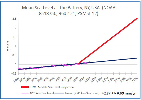
New York City
Example of Media Warnings
From Quartz: Sea level rise will flood the neighborhood around the UN building with two degrees warming
Right now, of every US city, New York City has the highest population living inside a floodplain. By 2100, seas could rise around around the city by as much as six feet. Extreme rainfall is also predicted to rise, with roughly 1½ times more major precipitation events per year by the 2080s, according to a 2015 report by a group of scientists known as the New York City Panel on Climate Change.
But a two-degree warming scenario, which the world is on track to hit, could lock in dramatic sea level rise—possibly as much as 15 feet.
Computer Simulations of the Future
Imaginary vs. Observed Sea Level Trends (2020 Update)
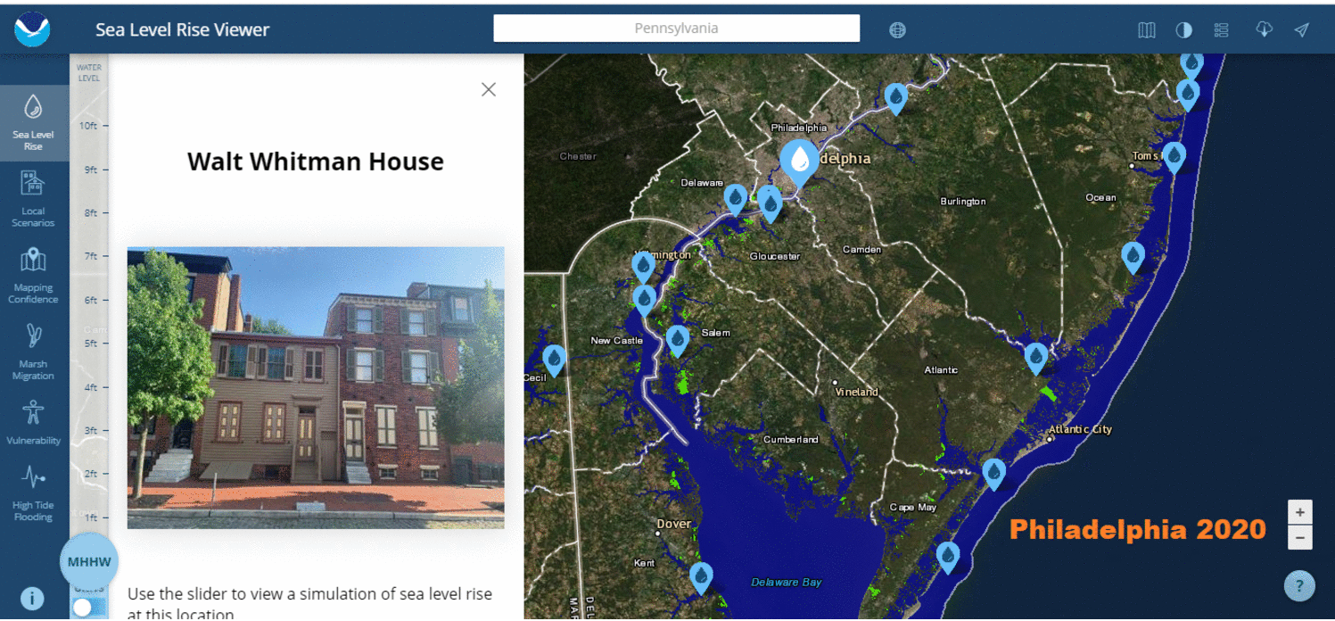
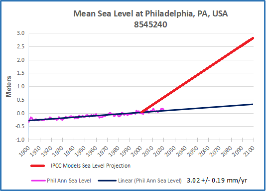
Philadelphia, PA.
Example of Media Warnings
From NBCPhiladelphia: Climate Change Studies Show Philly Underwater
NBC10 is looking at data and reading studies on climate change to showcase the impact. There are studies that show if the sea levels continue to rise at this rate, parts of Amtrak and Philadelphia International Airport could be underwater in 100 years.
Computer Simulations of the Future
Imaginary vs. Observed Sea Level Trends (2020 Update)
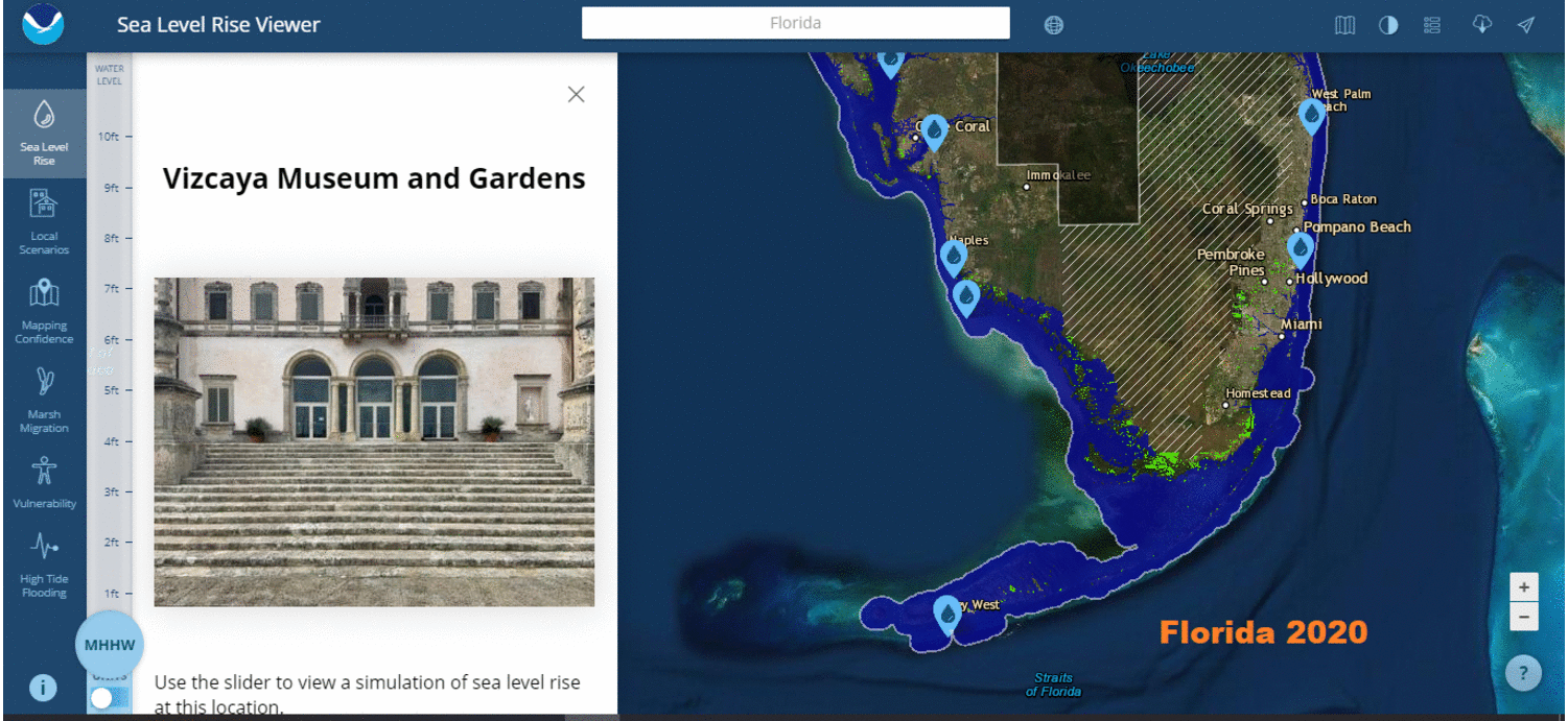
Miami, Florida
Examples of Media Warnings
From WLRN Miami: Miles Of Florida Roads Face ‘Major Problem’ From Sea Rise. Is State Moving Fast Enough?
One 2018 Department of Transportation study has already found that a two-foot rise, expected by mid-century, would imperil a little more than five percent — 250-plus miles — of the state’s most high-traffic highways. That may not sound like a lot, but protecting those highways alone could easily cost several billion dollars. A Cat 5 hurricane could be far worse, with a fifth of the system vulnerable to flooding. The impact to seaports, airports and railroads — likely to also be significant and expensive — is only now under analysis.
From Washington Post: Before condo collapse, rising seas long pressured Miami coastal properties
Investigators are just beginning to try to unravel what caused the Champlain Towers South to collapse into a heap of rubble, leaving at least 159 people missing as of Friday. Experts on sea-level rise and climate change caution that it is too soon to speculate whether rising seas helped destabilize the oceanfront structure. The 40-year-old building was relatively new compared with others on its stretch of beach in the town of Surfside.
But it is already clear that South Florida has been on the front lines of sea-level rise and that the effects of climate change on the infrastructure of the region — from septic systems to aquifers to shoreline erosion — will be a management problem for years.
Computer Simulations of the Future
Imaginary vs. Observed Sea Level Trends (2020 Update)
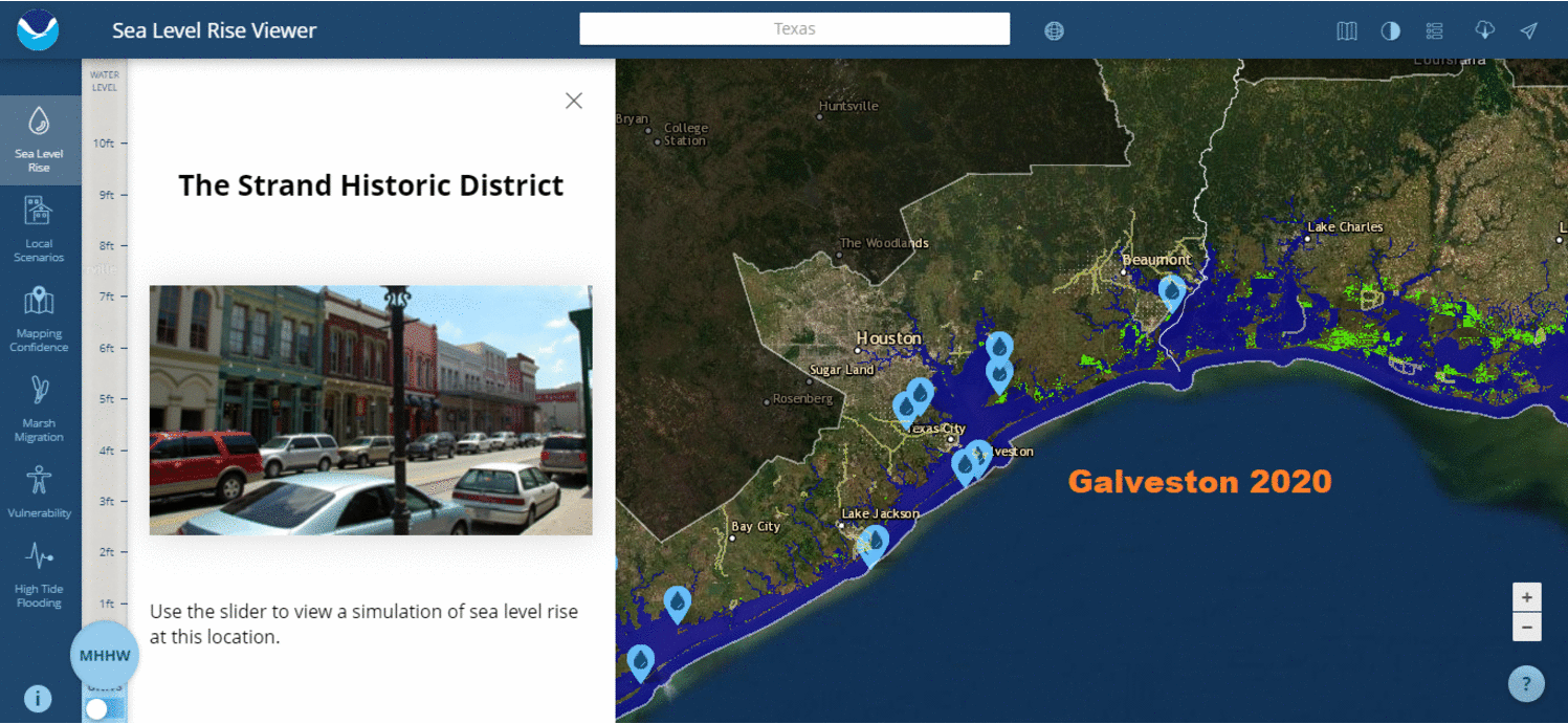
Houston, Texas
Example of Media Warnings
From Undark: A $26-Billion Plan to Save the Houston Area From Rising Seas
As the sea rises, the land is also sinking: In the last century, the Texas coast sank about 2 feet into the sea, partly due to excessive groundwater pumping. Computer models now suggest that climate change will further lift sea levels somewhere between 1 and 6 feet over the next 50 years. Meanwhile, the Texas coastal population is projected to climb from 7 to 9 million people by 2050.
Protecting Galveston Bay is no simple task. The bay is sheltered from the open ocean by two low, sandy strips of land — Galveston Island and Bolivar Peninsula — separated by the narrow passage of Bolivar Roads. When a sufficiently big storm approaches, water begins to rush through that gap and over the island and peninsula, surging into the bay.
Computer Simulations of the Future
Imaginary vs. Observed Sea Level Trends (2020 Update)
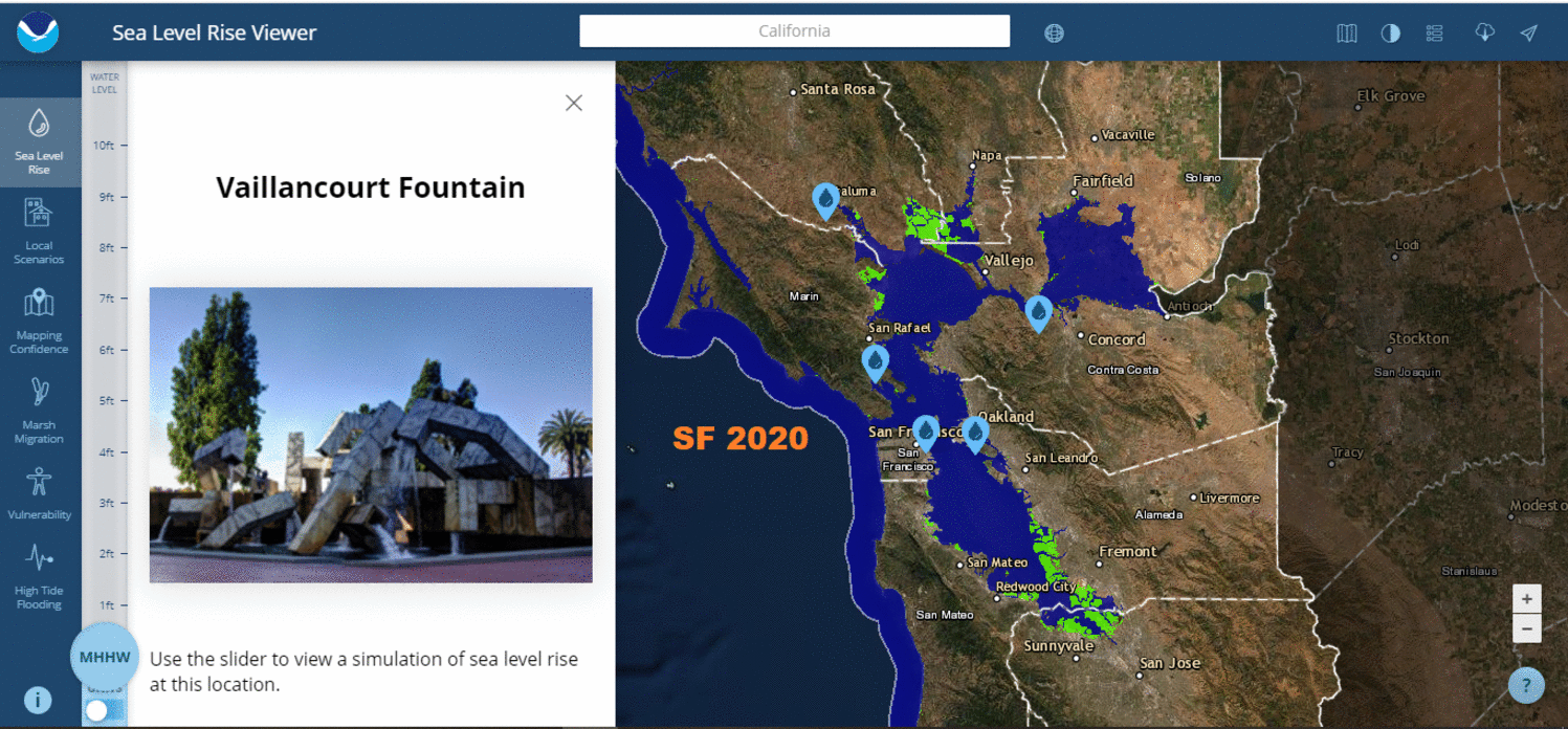
San Francisco, Cal.
Example of Media Warnings
From San Francisco Chronicle: Special Report: SF Bay Sea Level Rise–Hayward
Sea level rise is fueled by higher global temperatures that trigger two forces: Warmer water expands oceans while the increased temperatures hasten the melting of glaciers on Antarctica and Greenland and add yet more water to the oceans.
The California Ocean Protection Council, a branch of state government, forecasts a 1-in-7 chance that the average daily tides in the bay will rise 2 or more feet by 2070. This would cause portions of the marshes and bay trail in Hayward to be underwater during high tides. Add another 2 feet, on the higher end of the council’s projections for 2100 and they’d be permanently submerged. Highway 92 would flood during major storms. So would the streets leading into the power plant.
From San Francisco Chronicle: Special Report: SF Bay Sea Level Rise–Mission Creek
Along San Francisco’s Mission Creek, sea level rise unsettles the waters. Each section of this narrow channel must be tailored differently to meet an uncertain future. Do nothing, and the combination of heavy storms with less than a foot of sea level rise could send Mission Creek spilling over its banks in a half-dozen places, putting nearby housing in peril and closing the two bridges that cross the channel.
Whatever the response, we won’t know for decades if the city’s efforts can keep pace with the impact of global climatic forces that no local government can control.
Though Mission Creek is unique, the larger dilemma is one that affects all nine Bay Area counties.
Computer Simulations of the Future
Imaginary vs. Observed Sea Level Trends (2020 Update)
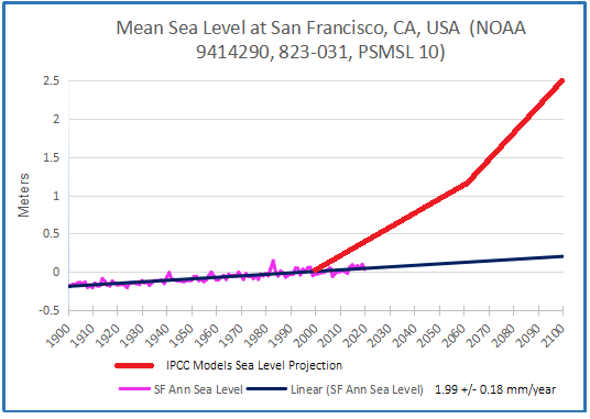
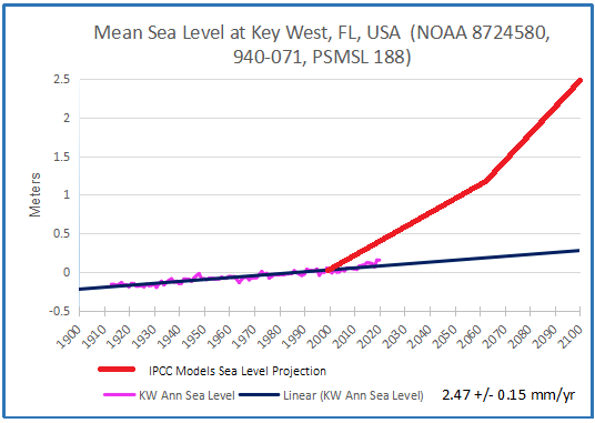
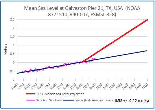
Summary: This is a relentless, high-tech communications machine to raise all kinds of scary future possibilities, based upon climate model projections, and the unfounded theory of CO2-driven global warming/climate change. The graphs above are centered on the year 2000, so that the 21st century added sea level rise is projected from that year forward. In addition, we now have observations at tidal gauges for the first 20 years, 1/5 of the total expected. The gauges in each city are the ones with the longest continuous service record, and wherever possible the locations shown in the simulations are not far from the tidal gauge. For example, NYC best gauge is at the Battery, and Fulton St. is also near the Manhattan southern tip.
Already the imaginary rises are diverging greatly from observations, yet the chorus of alarm goes on. In fact, the added rise to 2100 from tidal gauges ranges from 6 to 9.5 inches, except for Galveston projecting 20.6 inches. Meanwhile models imagined rises from 69 to 108 inches. Clearly coastal settlements must adapt to evolving conditions, but also need reasonable rather than fearful forecasts for planning purposes.
Footnote: The problem of urban flooding is discussed in some depth at a previous post Urban Flooding: The Philadelphia Story
Background on the current sea level campaign is at USCS Warnings of Coastal Floodings
And as always, an historical perspective is important:

 For reference I added an overlay of CO2 annual concentrations as measured at Mauna Loa. While temperatures fluctuated up and down ending flat, CO2 went up steadily by ~55 ppm, a 15% increase.


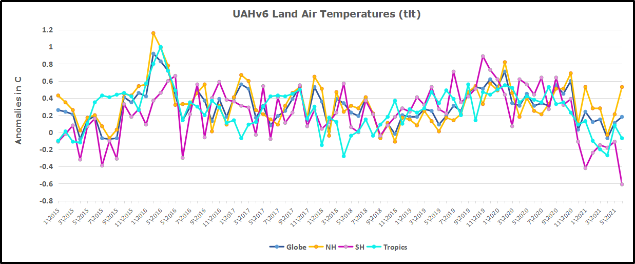 Here we have fresh evidence of the greater volatility of the Land temperatures, along with an extraordinary departure by SH land. Land temps are dominated by NH with a 2020 spike in February, followed by cooling down to July. Then NH land warmed with a second spike in November. Note the mid-year spikes in SH winter months. In December all of that was wiped out.
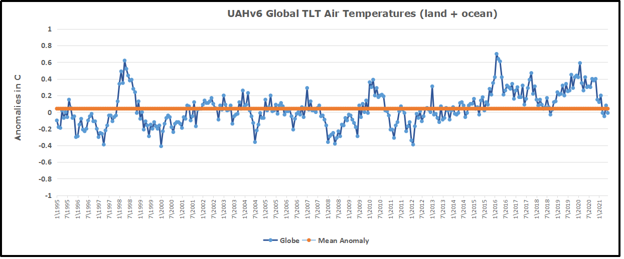


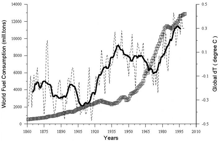


 Others think it means: It is real that using fossil fuels causes global warming. This too lacks persuasive evidence.
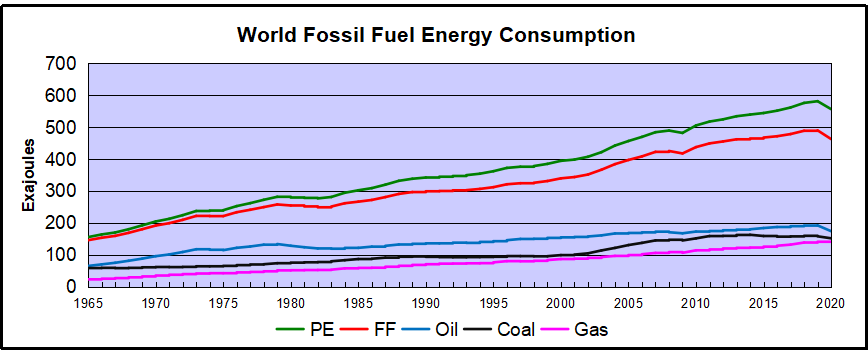
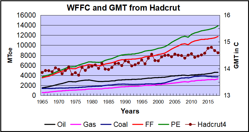 Over the last five decades the increase in fossil fuel consumption is dramatic and monotonic, steadily increasing by 234% from 3.5B to 11.7B oil equivalent tons. Meanwhile the GMT record from Hadcrut shows multiple ups and downs with an accumulated rise of 0.74C over 53 years, 5% of the starting value.
 Conclusion