2023 Update: Fossil Fuels ≠ Global Warming

Previous posts addressed the claim that fossil fuels are driving global warming. This post updates that analysis with the latest (2022) numbers from Energy Institute and compares World Fossil Fuel Consumption (WFFC) with three estimates of Global Mean Temperature (GMT). More on both these variables below. Note: Previously these same statistics were hosted by BP.
WFFC
2022 statistics are now available from Energy Institute for international consumption of Primary Energy sources. Statistical Review of World Energy.
The reporting categories are:
Oil
Natural Gas
Coal
Nuclear
Hydro
Renewables (other than hydro)
Note: Energy Institute began last year to use Exajoules to replace MToe (Million Tonnes of oil equivalents.) It is logical to use an energy metric which is independent of the fuel source. OTOH renewable advocates have no doubt pressured EI to stop using oil as the baseline since their dream is a world without fossil fuel energy.
From BP conversion table 1 exajoule (EJ) = 1 quintillion joules (1 x 10^18). Oil products vary from 41.6 to 49.4 tonnes per gigajoule (10^9 joules). Comparing this annual report with previous years shows that global Primary Energy (PE) in MToe is roughly 24 times the same amount in Exajoules. The conversion factor at the macro level varies from year to year depending on the fuel mix. The graphs below use the new metric.
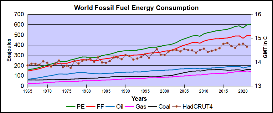
This analysis combines the first three, Oil, Gas, and Coal for total fossil fuel consumption world wide (WFFC). The chart below shows the patterns for WFFC compared to world consumption of Primary Energy from 1965 through 2022.

The graph shows that global Primary Energy (PE) consumption from all sources has grown continuously over nearly 6 decades. Since 1965 oil, gas and coal (FF, sometimes termed “Thermal”) averaged 88% of PE consumed, ranging from 93% in 1965 to 82% in 2022. Note that in 2020, PE dropped 21 EJ (4%) below 2019 consumption, then increased 31 EJ in 2021. WFFC for 2020 dropped 24 EJ (5%), then in 2021 gained back 26 EJ to slightly exceed 2019 WFFC consumption. For the 58 year period, the net changes were:
| Oil | 194% |
| Gas | 525% |
| Coal | 178% |
| WFFC | 239% |
| PE | 287% |
Global Mean Temperatures
Everyone acknowledges that GMT is a fiction since temperature is an intrinsic property of objects, and varies dramatically over time and over the surface of the earth. No place on earth determines “average” temperature for the globe. Yet for the purpose of detecting change in temperature, major climate data sets estimate GMT and report anomalies from it.
UAH record consists of satellite era global temperature estimates for the lower troposphere, a layer of air from 0 to 4km above the surface. HadSST estimates sea surface temperatures from oceans covering 71% of the planet. HadCRUT combines HadSST estimates with records from land stations whose elevations range up to 6km above sea level.
Both GISS LOTI (land and ocean) and HadCRUT4 (land and ocean) use 14.0 Celsius as the climate normal, so I will add that number back into the anomalies. This is done not claiming any validity other than to achieve a reasonable measure of magnitude regarding the observed fluctuations.[Note: HadCRUT4 was discontinued after 2021 in favor of HadCRUT5.]
No doubt global sea surface temperatures are typically higher than 14C, more like 17 or 18C, and of course warmer in the tropics and colder at higher latitudes. Likewise, the lapse rate in the atmosphere means that air temperatures both from satellites and elevated land stations will range colder than 14C. Still, that climate normal is a generally accepted indicator of GMT.
Correlations of GMT and WFFC
The next graph compares WFFC to GMT estimates over the decades from 1965 to 2022 from HadCRUT4, which includes HadSST4.
Since 1965 the increase in fossil fuel consumption is dramatic and monotonic, steadily increasing by 239% from 146 to 494 exajoules. Meanwhile the GMT record from Hadcrut shows multiple ups and downs with an accumulated rise of 0.8C over 56 years, 6% of the starting value.
The graph below compares WFFC to GMT estimates from UAH6, and HadSST4 for the satellite era from 1980 to 2022, a period of 43 years.
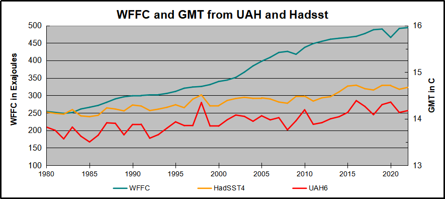
In the satellite era WFFC has increased at a compounded rate of nearly 2% per year, for a total increase of 92% since 1979. At the same time, SST warming amounted to 0.53C, or 3.7% of the starting value. UAH warming was 0.52C, or 3.8% up from 1979. The temperature compounded rate of change is 0.1% per year, an order of magnitude less than WFFC. Even more obvious is the 1998 El Nino peak and flat GMT since.
Summary
The climate alarmist/activist claim is straight forward: Burning fossil fuels makes measured temperatures warmer. The Paris Accord further asserts that by reducing human use of fossil fuels, further warming can be prevented. Those claims do not bear up under scrutiny.
It is enough for simple minds to see that two time series are both rising and to think that one must be causing the other. But both scientific and legal methods assert causation only when the two variables are both strongly and consistently aligned. The above shows a weak and inconsistent linkage between WFFC and GMT.
Going further back in history shows even weaker correlation between fossil fuels consumption and global temperature estimates:

Figure 5.1. Comparative dynamics of the World Fuel Consumption (WFC) and Global Surface Air Temperature Anomaly (ΔT), 1861-2000. The thin dashed line represents annual ΔT, the bold line—its 13-year smoothing, and the line constructed from rectangles—WFC (in millions of tons of nominal fuel) (Klyashtorin and Lyubushin, 2003). Source: Frolov et al. 2009
In legal terms, as long as there is another equally or more likely explanation for the set of facts, the claimed causation is unproven. The more likely explanation is that global temperatures vary due to oceanic and solar cycles. The proof is clearly and thoroughly set forward in the post Quantifying Natural Climate Change.
Footnote: CO2 Concentrations Compared to WFFC
Contrary to claims that rising atmospheric CO2 consists of fossil fuel emissions, consider the Mauna Loa CO2 observations in recent years.
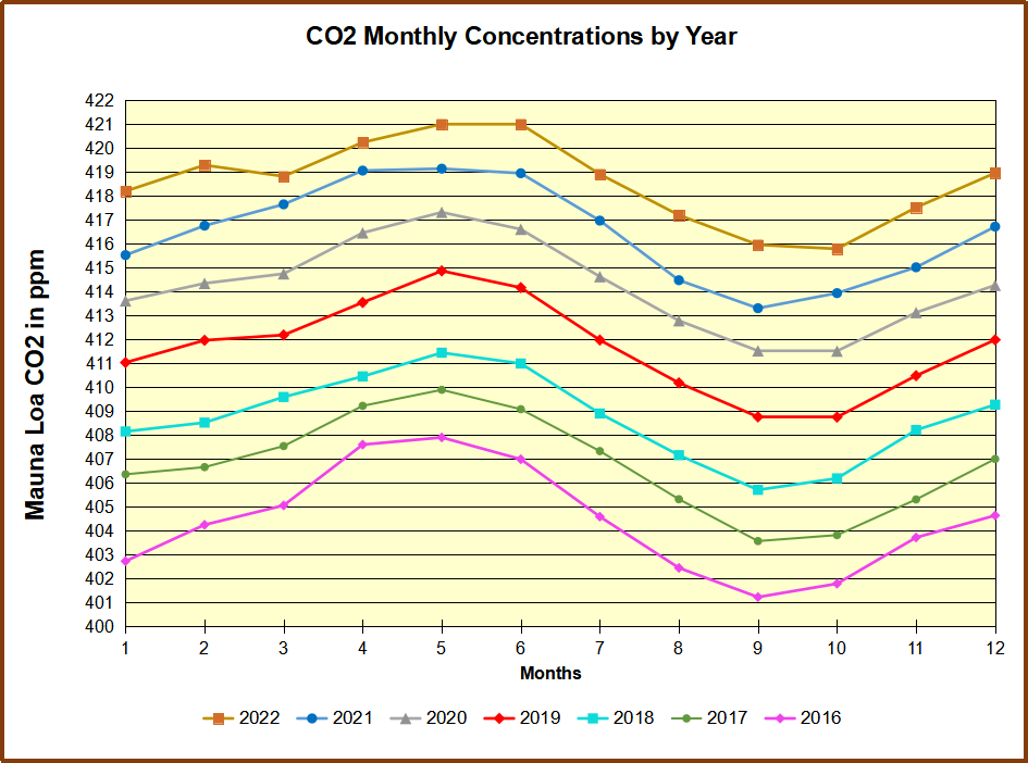
Despite the drop in 2020 WFFC, atmospheric CO2 continued to rise steadily, demonstrating that natural sources and sinks drive the amount of CO2 in the air.
See also: Nature Erases Pulses of Human CO2 Emissions
Temps Cause CO2 Changes, Not the Reverse