SC-GHG: Weapon of Mass Social Destruction

A reminder that first there was Social Cost of Carbon (SCC) which purported to estimate future costs of damages from CO2 emissions. Now there is Social Costs of Green House Gases (SC-GHG) which ups the ante by adding purported damages from methane (CH4) and Nitrogen oxides (N2O). At the end of this post are references describing this sordid history.

Remember also the regulators game.  Regulations by far outnumber laws passed by congress, and they impose costs upon businesses and consumers of the targeted industries.  Instigating agencies justify their rules by claiming greater savings from preventing future damages.  So the higher the damages estimates the more intensive and expensive can be the regulations.

Mark Krebs provides a recent example of this in his Master Resource article Heat Pump Subsidies: Never Enough.  It reports on various machinations by the Biden/Harris regime to spend all the money they can on decarbonizing projects before their term ends.  As Biden himself said after terminating his re-election campaign:  We should have named the Inflation Reduction Act what it really was, the Green New Deal.

The article includes this quote from Competitive Enterprise Institute’s (CEI) regarding SCC (with my bolds):

Junk Science Behind Federal Appliance Regs About to Get Junkier

The Biden-Harris administration has embarked on a wave of anti-consumer home appliance regulations over the last several years. Each was justified in part by overblown claims of climate change benefits. And now, the Department of Energy (DOE) has proposed using a new methodology that would further inflate these hypothetical benefits to justify even worse regulations in the years ahead.

DOE is in the process of creating new energy use limits for stoves, dishwashers, furnaces, washing machines, water heaters, ceiling fans, refrigerators, and more. The agency always asserts that consumers experience net gains from these regulations, but CEI has filed comments highly critical of these rosy assumptions. In reality, such rules often raise the up-front costs of appliances more than is likely to be earned back in the form of energy savings. Some rules also compromise appliance choice, performance, and reliability.

But DOE’s fictitious consumer benefits are only part of the problem. CEI has also taken issue with the agency’s assertions that these regulations deliver quantifiable climate change benefits. For example, DOE’s costly 2023 final rule for residential furnaces was estimated by the agency to provide $16.2 billion worth of such benefits.

The agency arrives at this figure by calculating the reduced energy use attributable to the efficiency standards and then estimating the amount of greenhouse gas emissions avoided as a result – mostly carbon dioxide emitted to produce electricity at coal or natural gas-fired power plants. Then it multiplies the tons of emissions avoided by the calculated per unit dollar cost to society of such emissions.

Until now, DOE has relied upon the 2021 Interagency Working Group on the Social Cost of Greenhouse Gases (IWG 2021). IWG 2021 provides the agency with the per ton Social Cost of Greenhouse Gases (SC-GHG) values.

Relying on IWG 2021 was bad enough, but in its most recent proposed rule for commercial refrigeration equipment DOE is switching to an updated 2023 version of SC-GHG provided by the Environmental Protection Agency.

The new methodology takes several already-dubious assumptions in IWG 2021 and stretches them further. For one category of commercial refrigeration equipment covered in the proposed rule, DOE calculates the climate benefits of $48-$320 million dollars under IWG 2021 but a whopping $564-$1,713 million under the new way. That’s around 5-10 times higher.

How Did They Weaponize SC-GHG?

Briefly recapping, the Obama WH activist bean counters pushed numbers around and came up with $51 per ton of CO2 emitted. Then Trump WH said more realistic interest rates give an SCC of $1 per ton CO2.  Then Biden/Harris came into power with a deluge of Excutive Orders (EO), including one that reset SCC at 51$  Maybe you recall scenes like this from early 2021:

That prompted ten states to file for an injunction against Biden’s EO 13990 which was granted by the federal District Court of Louisiana February 2022.  Manhattan Contrarian commented at the time (my bolds):

On taking office, the Trump administration took steps to neutralize the SCC, so that not much has been heard from it for a while. But Biden’s EO 13990 caused the Obama-era version to get re-instated. The Biden people claim that they are working on further tweaks to the regulations, but meanwhile a large group of Republican-led states went ahead and commenced litigation.

With a regulatory initiative obviously intended to force a gigantic transformation of the economy without statutory basis, the Biden people defended against the Complaint using every shuck and jive and technicality known to man. The SCC rules were not “final” because the administration was still working on a few more tweaks (and then a few more, and then a few more); the state plaintiffs lacked “standing” because the harm was to citizens rather than the state itself; and so forth. The court was having none of it.

The heart of the court’s decision is its determination that the SCC falls under the Supreme Court’s “major questions doctrine,” under which the bureaucracy cannot on its own authority impose “new obligations of vast economic and political significance” unless Congress “speaks clearly.” The states had identified some 83 pending projects involving something in the range of $447 and $561 billion dollars as affected by the SCC rule. That impressed the court as easily within the concept of “major questions.”

However in March 2022 the Fifth Circuit Court of Appeals stopped the injunction, and in May 2022 the Supreme Court refused a request by plaintiff states to block EO 13990.

From Technical Support Document: Social Cost of Carbon, Methane, and Nitrous Oxide 2021

The first table was the same one produced by Obama WH.  Note that at 5% discount rate, CO2 goes from $14 to $32 in 2050.  Obama era regulations presumed the 3% rate which results in $51 up to $85. Note the astronomical numbers for CH4 $1500 per ton up to $3100.  And N2O starts at $18,000 to $33,000.  Hide your cows and fertilizers!.  But that was not expensive enough for Team Biden/Harris .

From the EPA Report on the Social Cost of Greenhouse Gases: Estimates Incorporating Recent Scientific Advances 2023

So no more 5% rate, and the middle scale is 2% rather than 2.5%.  That starts at $190 per ton of CO2 up to $310 by 2050 and $410 in 2080.  CH4 on the same basis is $1600 to $4200 in 2050 up to $6800 by 2080.  Of course a ton of N2O is unaffordable at $54,000 up to $130,000.

In other words, this regime can regulate the hell out of appliance manufacturers and agricultural operations, among others, justified by such numbers. It started with gas stoves, but won’t end there.

Will anyone put a stop to them?

Regarding Social Costs of GHGs

Blatant Hypocrisy re. Social Cost of Carbon

Six Reasons to Rescind Social Cost of Carbon

SBC: Social Benefits of Carbon


2024 Arctic Ice Abounds at Average Daily Minimum

The annual competition between ice and water in the Arctic ocean has reached the maximum for water, which typically occurs mid September.  After that, diminishing energy from the slowly setting sun allows oceanic cooling causing ice to regenerate. Those interested in the dynamics of Arctic sea ice can read numerous posts here.  This post provides a look at mid September from 2007 to yesterday as a context for understanding this year’s annual minimum.

The image above shows Arctic ice extents on day 260 (lowest annual daily extent on average) from 2007 to 2024 yesterday.  Obviously, the regions vary as locations for ice, discussed in more detail later on. The animation shows the ice deficits in years 2007, 2012, 2016, and 2020, as well as surplus years like 2010, 2014, 2022 and 2024.

Note that for climate purposes the annual minimum is measured by the September monthly average ice extent, since the daily extents vary and will go briefly lowest on or about day 260. In a typical year the overall ice extent will end September slightly higher than at the beginning.  2024 September ice extent averaged 4.6M over the first 16 days, and is likely to end the month with at least that amount for the entire month. For comparison, the 17 year average for Sept. 1-16 is 4.7M.

The melting season to mid September shows 2024 tracked lower than average but ended the period slightly above.

The graph above shows September daily ice extents for 2024 compared to 18 year averages, and some years of note. Day 260 has been the lowest daily ice extent on average for the last 18 years.

The black line shows on average Arctic ice extents during September decline 358k km2 down to 4.5M Km2 by day 260. The average increase from now on is 490k km2 up to 5.0M km2 end of September.  2024  tracked a little lower than the 18-year average in the second week reaching a low of 4.49M km2 on day 255, before going above average on day 260.

SII was reporting deficits as high as 0.5M km2 (half a Wadham) compared to  MASIE early in September.  For some reason, apparently data access issues, that dataset has not been updated for the last five days.  2023 bottomed out at 4.1M while 2007 daily minimum hit 4.0M, ended ~ 0.5M km2 in deficit to average and 535k km2 less than MASIE on day 260.  2020 ice on day 260 was ~740k km2 in deficit to average.

The main deficit to average is in CAA with a smaller loss in Chukchi, overcome by surpluses almost everywhere, especially in Central Arctic along with Laptev and Greenland seas. And as discussed below, the marginal basins have little ice left to lose.

The Bigger Picture 

We are close to the annual Arctic ice extent minimum, which typically occurs on or about day 260 (mid September). Some take any year’s slightly lower minimum as proof that Arctic ice is dying, but the image above shows the Arctic heart is beating clear and strong.

Over this decade, the Arctic ice minimum has not declined, but since 2007 looks like fluctuations around a plateau. By mid-September, all the peripheral seas have turned to water, and the residual ice shows up in a few places. The table below indicates where we can expect to find ice this September. Numbers are area units of Mkm2 (millions of square kilometers).

Day 260 17 year
Arctic Regions 2007 2010 2014 2016 2018 2020 2021 2022 2023 Average 2024
Central Arctic Sea 2.67 3.16 2.98 2.92 2.91 2.50 2.95 3.08 2.96 2.92 2.95
BCE 0.50 1.08 1.38 0.52 1.16 0.65 1.55 0.99 0.50 0.88 1.02
LKB 0.29 0.24 0.19 0.28 0.02 0.00 0.13 0.20 0.39 0.18 0.16
Greenland & CAA 0.56 0.41 0.55 0.45 0.41 0.59 0.50 0.43 0.44 0.47 0.39
B&H Bays 0.03 0.03 0.02 0.03 0.05 0.02 0.04 0.02 0.04 0.04 0.05
NH Total 4.05 4.91 5.13 4.20 4.56 3.76 5.17 4.73 4.33 4.49 4.58

The table includes some early years of note along with the last 4 years compared to the 17 year average for five contiguous arctic regions. BCE (Beaufort, Chukchi and East Siberian) on the Asian side are quite variable as the largest source of ice other than the Central Arctic itself.   Greenland Sea and CAA (Canadian Arctic Archipelago) together hold almost 0.5M km2 of ice at annual minimum, fairly consistently.  LKB are the European seas of Laptev, Kara and Barents, a smaller source of ice, but a difference maker some years, as Laptev was in 2016 and 2023.  Baffin and Hudson Bays are inconsequential as of day 260.

2024 extent of 4.58 is 1.3% over average, mainly due to surpluses in Chukchi and East Siberian seas.

For context, note that the average maximum has been 15M, so on average the extent shrinks to 30% of the March high (31% in 2022) before growing back the following winter.  In this context, it is foolhardy to project any summer minimum forward to proclaim the end of Arctic ice.

Resources:  Climate Compilation II Arctic Sea Ice

2024 Arctic Ice Beats 2007 by Half a Wadham

The graph above shows September daily ice extents for 2024 compared to 18 year averages, and some years of note. Day 260 has been the lowest daily ice extent on average for the last 18 years.

The black line shows on average Arctic ice extents during September decline 358k km2 down to 4.5M Km2 by day 260. The average increase from now on is 490k km2 up to 5.0M km2 end of September.  2024  tracked a little lower than the 18-year average in the second week reaching a low of 4.49M km2 on day 255, before going above average on day 260. 

SII was reporting deficits as high as 0.5M km2 (half a Wadham) compared to  MASIE early in September.  For some reason, that dataset has not been updated for the last five days.  2023 bottomed out at 4.1M while 2007 daily minimum hit 4.0M, ended ~ 0.5M km2 in deficit to average and 535k km2 less than MASIE on day 260.  2020 ice on day 260 was ~740k km2 in deficit to average.

Why is this important?  All the claims of global climate emergency depend on dangerously higher temperatures, lower sea ice, and rising sea levels.  The lack of additional warming prior to 2023 El Nino is documented in a post UAH June 2024: Oceans Lead Cool Down.

The lack of acceleration in sea levels along coastlines has been discussed also.  See Observed vs. Imagined Sea Levels 2023 Update.

Also, a longer term perspective is informative:

post-glacial_sea_levelThe table below shows the distribution of Sea Ice on day 260 across the Arctic Regions, on average, this year and 2007. At this point in the year, Bering and Okhotsk seas are open water and thus dropped from the table.

Region 2024260 Day 260 ave 2024-Ave. 2007260 2024-2007
 (0) Northern_Hemisphere 4581327 4524401 56926 4045776 535551
 (1) Beaufort_Sea 304967 491931 -186963 481384 -176416
 (2) Chukchi_Sea 360456 167361 193095 22527 337929
 (3) East_Siberian_Sea 353456 252958 100498 311 353145
 (4) Laptev_Sea 160792 135574 25218 235869 -75076
 (5) Kara_Sea 0 31612 -31612 44067 -44067
 (6) Barents_Sea 0 14610 -14610 7420 -7420
 (7) Greenland_Sea 165965 191196 -25230 333181 -167216
 (8) Baffin_Bay_Gulf_of_St._Lawrence 53126 29745 23381 26703 26423
 (9) Canadian_Archipelago 228869 274428 -45559 225526 3344
 (10) Hudson_Bay 1692 4595 -2903 2270 -578
 (11) Central_Arctic 2950861 2929452 21409 2665243.87 285617

The overall surplus to average is 57k km2, (1.3%).  The major deficit is in Beaufort, offset by large surpluses in Chukchi and East Siberian seas. 

bathymetric_map_arctic_ocean

Illustration by Eleanor Lutz shows Earth’s seasonal climate changes. If played in full screen, the four corners present views from top, bottom and sides. It is a visual representation of scientific datasets measuring ice and snow extents.

There is no charge for content on this site, nor for subscribers to receive email notifications of postings.


Beware “Fact Checking” by Innuendo

Kip Hansen gives the game away in his Climate Realism article Illogically Facts —’Fact-Checking’ by Innuendo.  Excerpts in italics with my bolds and added images.

The latest fad in all kinds of activism to attack one’s ideological opponents via “fact checking”.    We see this in politics and all the modern controversies, including, of course, Climate Science.

Almost none of the “fact checking sites” and “fact checking organizations” actually check facts.  And, if they accidentally find themselves checking what we would all agree is a fact, and not just an opinion or point of view, invariably it is checked against an contrary opinion, a different point of view or an alternative fact.

The resulting fact check report depends on the purposes of the fact check.  Some are done to confirm that “our guy” or “our team” is proved to be correct, or that the opposition is proved to be wrong, lying or misinformation.  When a fact is found to be different in any way from the desired fact, even the tiniest way, the original being checked is labelled a falsehood, or worse, an intentional lie. (or conversely, other people are lying about our fact!).   Nobody likes a liar, so this sort of fake fact checking accomplishes two goals – it casts doubt on the not-favored fact supposedly being checked and smears an ideological opponent as a liar.  One stone – two birds.

While not entirely new on the fact-checking scene, an AI-enhanced effort has popped to the surface of the roiling seas of controversyLogically Facts.  “Logically Facts is part of Meta’s Third Party Fact-Checking Program (3PFC) and works with TikTok in Europe. We have been a verified signatory of the International Fact-Checking Network (IFCN) since 2020 and are a member of the Misinformation Combat Alliance (MCA) in India and the European Digital Media Observatory (EDMO) in Europe.”source ]   Meta? “Meta Platforms…is the undisputed leader in social media. The technology company owns three of the four biggest platforms by monthly active users (Facebook, WhatsApp, and Instagram).” “Meta’s social networks are known as its Family of Apps (FoA). As of the fourth quarter of 2023, they attracted almost four billion users per month.”   And TikTok?  It has over a billion users.

I’m doubting that one can add up the 4 billion and the 1 billion to make 5 billion users of META and TikTok combined, but in any case, that’s a huge percentage of humanity any way one looks at it.

And who is providing fact-checking to those billion of people?  Logically Facts [LF].

And what kind of fact-checking does LF do?  Let’s look at an example that will deal with something very familiar with readers here:  Climate Science Denial.

The definition put forward by the Wiki is:

Climate change denial (also global warming denial) is a form of science denial characterized by rejecting, refusing to acknowledge, disputing, or fighting the scientific consensus on climate change.”

Other popular definitions of climate change denial include: attacks on solutions, questioning official climate change science and/or the climate movement itself.

If I had all the time left to me in this world, I could do a deep, deep dive into the Fact-Checking Industry.  But, being limited, let’s look, together, at one single “analysis” article from Logically Facts:

‘Pseudoscience, no crisis’: How fake experts are fueling climate change denial

This article is a fascinating study in “fake-fact-checking by innuendo”. 

As we go through the article, sampling its claims, I’ll alert you to any check of an actual fact – don’t hold your breath.   If you wish to be pro-active, read the LF piece first, and you’ll have a better handle on what they are doing.

The lede in their piece is this:

“Would you seek dental advice from an ophthalmologist? The answer is obvious. Yet, on social media, self-proclaimed ‘experts’ with little to no relevant knowledge of climate science are influencing public opinion.” 

The two editors of this “analysis” are listed as Shreyashi Roy [MA in Mass Communications and a BA in English Literature] and Nitish Rampal [ … based out of New Delhi and has …. a keen interest in sports, politics, and tech.]  The author is said to be [more on “said to be” in a minute…] Anurag Baruah [MA in English Language and a certificate in Environmental Journalism: Storytelling earned online from the Thompson Founation.]

Why do you say “said to be”, Mr. Hansen?  If you had read the LF piece, as I suggested, you would see that it reads as if it was “written” by an AI Large Language Model, followed by editing for sense and sensibility by a human, probably, Mr. Baruah, followed by further editing by Roy and Rampal.

The lede is itself an illogic.  First it speaks of medical/dental advice, pointing out, quite rightly, that they are different specializations.  But then complains that unnamed so-called self-proclaimed experts who LF claims “have little to no relevant knowledge of climate science” are influencing public opinion.   Since these persons are so-far unnamed, LF’s AI, author and subsequent editors could not possibly know what their level of knowledge about climate science might be.

Who exactly are they smearing here?

The first is:

“One such ‘expert,’ Steve Milloy, a prominent voice on social media platform X (formerly Twitter), described a NASA Climate post (archive) about the impact of climate change on our seas as a “lie” on June 26, 2024.”

It is absolutely true that Milloy, who is well-known to be an “in-your-face” and “slightly over the-top” critic of all things science that he considers poorly done, being over-hyped, or otherwise falling into his category of “Junk Science”, posted on X the item claimed. 

LF , its AI, author and editors make no effort to check what fact/facts
Milloy was calling a lie, or to check NASA’s facts in any way whatever.

You see, Milloy calling any claim from NASA “a lie” would be an a priori case of Climate Denial: he is refuting or refusing to accept some point of official climate science.

Who is Steve Milloy? 

Steve Milloy is a Board Member & Senior Policy Fellow of the Energy and Environment Legal Instituteauthor of seven books and over 600 articles/columns published in major newspapers, magazines and internet outlets.  He has testified by request before the U.S. Congress many times, including on risk assessment and Superfund issues.  He is an Adjunct Fellow of the National Center for Public Policy Research.

“He holds a B.A. in Natural Sciences, Johns Hopkins University; Master of Health Sciences (Biostatistics), Johns Hopkins University School of Hygiene and Public Health; Juris Doctorate, University of Baltimore; and Master of Laws (Securities regulation) from the Georgetown University Law Center.”

It seems that many consider Mr. Milloy to be an expert in many things.

And the evidence for LF’s dismissal of Milloy as a “self-proclaimed expert”  having “little to no relevant knowledge of climate science”?  The Guardian, co-founder of the climate crisis propaganda outfit Covering Climate Nowsaid “JunkScience.com, has been called “the main entrepôt for almost every kind of climate-change denial”” and after a link listing Milloy’s degrees, pooh-poohed him for “lacking formal training in climate science.”  Well, a BA in Natural Sciences might count for something. And a law degree is not nothing. The last link which gives clear evidence that Milloy is a well-recognized expert and it is obvious that the LF AI, author, and editors either did not read the contents of the link or simply chose to ignore it.

Incredibly, LF’s next target is “… John Clauser, a 2022 Nobel Prize winner in physics, claimed that no climate crisis exists and that climate science is “pseudoscience.” Clauser’s Nobel Prize lent weight to his statements, but he has never published a peer-reviewed paper on climate change.“

LF’s evidence against Clauser is The Washington Post in an article attacking not just Clauser, but a long list of major physicists who do not support the IPCC consensus on climate change:  Willie Soon (including the lie that Soon’s work was financed by fossil fuel companies) , Steve Koonin, Dick Lindzen and Will Happer.   The Post article fails to discuss any of the reasons these esteemed, world-class physicists are not consensus-supporting club members. 

Their non-conforming is their crime.  No facts are checked.

LF reinforces the attack on world-renown physicists with a quote from Professor Bill McGuire:  “Such fake experts are dangerous and, in my opinion, incredibly irresponsible—Nobel Prize or not. A physicist denying anthropogenic climate change is actually denying the well-established physical properties of carbon dioxide, which is simply absurd.”

McGuire, is not a physicist and is not a climate scientist, but has a PhD in Geology and is a volcanologist and an IPCC contributor.   He also could be seen as “lacking formal training in climate science.”

But, McGuire has a point, which LF, its AI and its human editors seem to miss, the very basis of the CO2 Global Warming hypothesis is based on physics, not based on what is today called “climate science”. Thus, the physicists are the true experts . (and not the volcanologists….)

LF then launches into the gratuitous comparison of “fake experts” in the anti-tobacco fight, alludes to oil industry ties, and then snaps right to John Cook.

John Cook, a world leader in attacking Climate Change Denial, is not a climate scientist.  He is not a geologist, not an atmospheric scientist, not an oceanic scientist, not a physicist, not even a volcanologist.   He  “earned his PhD in Cognitive Science at the University of Western Australia in 2016”.

The rest of the Logically Facts fake-analysis is basically a re-writing of some of Cook’s anti-Climate Denialists screeds.  Maybe/probably resulting from an AI large language model trained on pro-consensus climate materials.  Logically Facts is specifically and openly an AI-based effort.

LF proceeds to attack a series of persons, not their ideas, one after another:  Tony Heller, Dr. Judith Curry, Patrick Moore and Bjørn Lomborg.

The expertise of these individuals in their respective fields
are either ignored or brushed over.

Curry is a world renowned climate scientist, former chair of the School of Earth and Atmospheric Sciences at the Georgia Institute of Technology.  Curry is the author the book on Thermodynamics of Atmospheres and Oceans, another book on Thermodynamics, Kinetics, and Microphysics of Clouds, and the marvelous groundbreaking Climate Uncertainty and Risk: Rethinking Our Response.  Google scholar returns over 10,000 references to a search of “Dr. Judith Curry climate”.

Lomborg is a socio-economist with an impressive record, a best selling author and a leading expert on issues of energy dependence, value for money spent on international anti-poverty and public health efforts, etc.   Richard Tol, is mention negatively for daring to doubt the “97% consensus”, with no mention of his qualifications as a Professor of Economics and a Professor of the Economics of Climate Change.

Bottom Line:

Logically Facts is a Large Language Model-type AI, supplemented by writers and editors meant to clean-up the mess returned by this chat-bot type AI.    Thus, it is entirely incapable to making any value judgements between repeated slander, enforced consensus views, the prevailing biases of scientific fields and actual facts.  Further, any LLM-based AI is incapable of Critical Thinking and drawing logical conclusions.

In short, Logically Facts is Illogical.

Defence offered by Facebook in Stossel defamation lawsuit.

California Browning from Electricity Policies

Ronald Stein explains the devastation in his Heartland article The Golden State of California Is Turning Brown Without Continuous Electricity.  Excerpts in italics with my bolds and added images.

As a resident of California for more than six decades, I am aware that the availability of continuously generated electricity in California is deteriorating and will get worse!

The “Green New Deal” and “Net Zero” policies in California that are supported by Governor Newsom and the Democratic Presidential candidate Kamala Harris have led to the state’s most expensive electricity and fuel prices in America and increasingly high cost of living, housing, and transportation, coupled with an increase in crime, smash-and-grab robberies, homelessness, pollution, and congestion that has caused many tax-paying residents and companies to exodus California to more affordable cities and states.

California’s net move-out number of residents in 2022 alone was more than 343,000 people that left California — the highest exodus of any state in the U.S.

The California Policy Institute counted more than 237 businesses that have left the state since 2005. Among these businesses were eleven Fortune 1000 companies, including AT&T, Hewlett Packard Enterprise, Exxon Mobil, and Chevron.

The U.S. Department of Energy recently made a startling admission: U.S. electricity demand will double by 2050, and meeting that soaring demand will require the equivalent of building 300 Hoover Dams.

The last California Nuclear Power Plant at Diablo Canyon, a 2.2 GW plant generating continuous uninterruptable electricity, is projected to close soon. In nameplate only, it would take 1,000 2.2MW wind turbines to generate 2.2 GW, but then, it’s only intermittent electricity vs. the continuous uninterruptable electricity from Diablo demanded by the California economy!

As a result of the “Green New Deal” and “Net Zero” policies and renewables of wind and solar stations built at the expense of taxpayer dollars, California now imports more electric power than any other US state, more than twice the amount in Virginia, the USA’s second-largest importer of electric power. California typically receives between one-fifth and one-third of its electricity supply from outside of the state.

Power prices are rocketing into the stratosphere and, even before winter drives up demand, are being deprived of continuous electricity in a way that was unthinkable barely a decade ago. But such is life when you attempt to run the economy on sunshine and breezes.

Projected electricity costs for California Businesses

Further, these so-called “green” electricity sources of wind and solar are not clean, green, renewable or sustainable. They also endanger wildlife.

California’s economy depends on affordable, reliable, and ever-cleaner electricity and fuels. Unfortunately, policymakers are driving up California’s electric and gas prices, and California now has the highest electricity and fuel prices in the nation. Those high energy prices are contributing to the pessimistic business sentiment. California’s emission mandates have done an excellent job of increasing the cost of electricity, products, and fuels to its citizens.

It’s becoming increasingly obvious that these supposed “green” alternative methods of generating electricity won’t work — especially as electricity demand is projected to double by 2050 due to AI, charging of EVs and data centers, government-mandated electric heating and cooking, and charging grid-backup batteries. Intermittent electricity from wind and solar cannot power modern nations.

These “green” wind and solar projects primarily exist because they are financed with taxpayer money, i.e., disguised by taxpayers as “Government Subsidies.”

“GREEN” policymakers are oblivious to humanity’s addiction to the products and fuels from fossil fuels, as they are to these two basic facts:

(1)  No one uses crude oil in its raw form. “Big Oil” only exists because of humanity’s addiction to the products and fuels made from oil!

(2)  “Renewables” like wind and solar only exist to generate intermittent electricity; they CANNOT make products or fuels!

To rid the world of crude oil usage, there is no need to over-regulate or over-tax the oil industry; just STOP using the products and fuels made from crude oil!

Simplistically:

STOP making cars, trucks, aircraft, boats, ships, farming equipment, medical equipment and supplies, communications equipment, military equipment, etc., that demand crude oil for their supply chain of products.

STOPPING the demands of society for the products and fuels made from oil will eliminate the need for crude oil.

The primary growth in electric power usage is coming from new data centers housing AI technologies. It is expected that over the next few decades, 50% of additional electric power will be needed just for AI, but data centers CANNOT run on occasional electricity from wind and solar.

Cal matters raises concerns about state policy to phase out ICE vehicles in favor of EVs.

How will the occasionally generated electricity from wind and solar support the following:

  • America’s military fleet of vehicles, ships, and aircraft?
  • America’s commercial and private aircraft?
  • America’s hospitals?
  • America’s space exploration?

Despite Governor Newsom’s and Democratic presidential candidate Kamala Harris’s support for the “Green New Deal” and “Net Zero” policies in California, it’s time to stimulate conversations about the generation of continuously generated electricity to meet the demands of America’s end users.


Data Say Summer 2024 Not So Hot

For sure you’ve seen the headlines declaring 2024 likely to be the Hottest year ever.  If you’re like me, your response is: That’s not the way it’s going down where I live.  Fortunately there is a website that allows anyone to check their personal experience with the weather station data nearby.  weatherspark.com provides data summaries for you to judge what’s going on in weather history where you live.  In my case a modern weather station is a few miles away Summer 2024 Weather History at Montréal–Mirabel International Airport  The story about Summer 2024 is evident below in charts and graphs from this site.  There’s a map that allows you to find your locale.

The daily average high (red line) and low (blue line) temperature, with 25th to 75th and 10th to 90th percentile bands. The thin dotted lines are the corresponding average perceived temperatures.

First, consider above the norms for Summer from the period 1980 to 2016.

Then, there’s Summer 2024 compared to the normal observations.

The daily range of reported temperatures (gray bars) and 24-hour highs (red ticks) and lows (blue ticks), placed over the daily average high (faint red line) and low (faint blue line) temperature, with 25th to 75th and 10th to 90th percentile bands.

The graph shows Summer had some warm days, some cool days and overall was pretty normal.  But since climate is more than temperature, consider cloudiness.

Wow!  Most of the summer was cloudy, which in summer means blocking the warming sun from hitting the surface.   And with all those clouds, let’s look at precipitation:

So, in the observations out of 92 summer days, there were 56 days when it rained, including 11 days of thunderstorms with heavy rainfall. Given what we know about the hydrology cycles, that means a lot of heat removed upward from the surface.

So the implications for Summer temperatures in my locale.

There you have it before your eyes. Mostly warm days for the
three summer months, with exactly eleven hot afternoons (>30°C).
Otherwise comfortable and cool, and no hot
afternoons in September.

Summary:

Claims of hottest this or that month or year are based on averages of averages of temperatures, which in principle is an intrinsic quality and distinctive to a locale.  The claim involves selecting some places and time periods where warming appears, while ignoring other places where it has been cooling.

Remember:  They want you to panic.  Before doing so, check out what the data says in your neck of the woods.  For example, NOAA declared that “July 2024 was the warmest ever recorded for the globe.”

Good News: SEC’s ESG Plans Thwarted with Biden Term Ending

The news comes from Bloomberg Law article SEC’s Gensler Sees ESG Plans Thwarted as Biden’s Term Nears End. Excerpts in italics with my bolds and added images.

SEC Chair Gary Gensler started out with big plans on ESG.

  • Gensler seeks board diversity, workforce, ESG fund disclosures
  • Agency unlikely to finalize ESG regulations before January

The Democrat arrived at the Securities and Exchange Commission in 2021, after George Floyd’s murder in 2020 and President Joe Biden’s election that year fueled interest in environmental, social and governance investing. Gensler wanted public companies to report details about their climate change risks, workforce management and board members’ diversity.

He also sought new rules to fight greenwashing and other misleading ESG claims by investment funds.

Almost four years later, most of those major ESG regulations are unfinished, and they’ll likely remain so in the less than five months Gensler may have left as chair. A conservative-led backlash against ESG and federal agency authority has fueled challenges in and out of court to corporate greenhouse gas emissions reporting rules and other SEC actions, helping blunt the commission’s power.

The climate rules—Gensler’s marquee ESG initiative—were watered down following intense industry pushback, then paused altogether after business groups, Republican attorneys general and others sued.

“It’s clear the commission leadership is exhausted and feeling buffeted by the courts, Congress and industry complaints,” said Tyler Gellasch, who was a counsel to former Democratic SEC Commissioner Kara Stein and is president and CEO of investor advocacy group Healthy Markets Association.

The SEC has finalized more than 40 rules since 2021, “making our capital markets more efficient, transparent, and resilient,” an agency spokesperson said in a statement to Bloomberg Law.

The spokesperson declined to comment on the status of the agency’s pending ESG rules, beyond pointing to the commission’s most recent regulatory agenda.

Long-standing plans to require human capital and board diversity disclosures from companies have yet to yield formal proposals. Final rules concerning ESG-focused funds still are pending, and even if the SEC adopts them before January as the agenda suggests, a Republican-controlled Congress and White House may have the power to quickly scrap them under the Congressional Review Act.

Unlike the workforce and board diversity rules that have yet to be proposed, investment fund regulations concerning ESG have already been drafted and are targeted for completion in October, according to the SEC’s latest agenda. ESG funds would have to disclose their portfolio companies’ emissions and report on their ESG strategies.

The SEC proposed the regulations in May 2022, along with rules intended to ensure ESG funds’ names align with their investments. The commission issued final fund name rules in September 2023.

The SEC’s investment fund proposal has raised objections from both funds and environmental and investor advocates.

The proposal would require environmentally-focused funds to disclose their carbon footprints, if emissions are part of their investment strategies. But it wouldn’t require funds that look at emissions to disclose other metrics that play a significant role in how they invest and the methodology they use to calculate those measures. The Natural Resources Defense Council, Interfaith Center on Corporate Responsibility, and other environmental and investor groups pushed for those requirements in an April letter to the SEC.

The Investment Company Institute, which represents funds, has raised concerns its members would have to report on their carbon footprints before public companies must disclose their emissions under SEC rules. The group in April called on the SEC to keep fund emissions reporting requirements on ice until the litigation challenging the agency’s public company climate rules is resolved. That litigation is at the US Court of Appeals for the Eighth Circuit, which is unlikely to rule this year.

The fund rules have received no Republican support at the SEC, with only Gensler and his fellow Democratic commissioners voting in favor of proposing them.

“If it’s a Republican Congress and Trump administration, you could imagine they would be willing to disapprove those,” said Susan Dudley, a George Washington University professor who oversaw the White House regulatory policy office under President George W. Bush.


Methane Madness Strikes Again

The latest comes from Australia by way of John Ray at his blog Methane cuts on track for 2030 emissions goal.  Excerpts in italics with my bolds and added images.

Australia’s methane emissions have decreased over the past two decades, according to a new report by a leading global carbon research group.

While the world’s methane emissions grew by 20 per cent, meaning two thirds of methane in the atmosphere is from human activity, Australasia and Europe emitted lower levels of the gas.

It puts Australia in relatively good stead, compared to 150 other signatories, to meet its non-binding commitments to the Global Methane Pledge, which aims to cut methane emissions by 30 per cent by the end of the decade.

The findings were revealed in the fourth global methane budget, published by the Global Carbon Project, with contributions from 66 research institutions around the world, including the CSIRO.

According to the report, agriculture contributed 40 per cent of global methane emissions from human activities, followed by the fossil fuel sector (34 per cent), solid waste and waste­water (19 per cent), and biomass and biofuel burning (7 per cent).

Pep Canadell, CSIRO executive director for the Global Carbon Project, said government policies and a smaller national sheep flock were the primary reasons for the lower methane emissions in Australasia.

“We have seen higher growth rates for methane over the past three years, from 2020 to 2022, with a record high in 2021. This increase means methane concentrations in the atmosphere are 2.6 times higher than pre-­industrial (1750) levels,” Dr Canadell said.

The primary source of methane emissions in the agriculture sector is from the breakdown of plant matter in the stomachs of sheep and cattle.

It has led to controversial calls from some circles for less red meat consumption, outraging the livestock industry, which has lowered its net greenhouse gas emissions by 78 per cent since 2005 and is funding research into methane reduction.

Last week, the government agency advising Anthony Albanese on climate change suggested Australians could eat less red meat to help reduce emissions. And the government’s official dietary guidelines will be amended to incorporate the impact of certain foods on climate change.

There is ongoing disagreement among scientists and policymakers about whether there should be a distinction between biogenic methane emitted by livestock, which already exists in a balanced cycle in plants and soil and the atmosphere, and methane emitted from sources stored deep underground for millennia.

“The frustration is that methane, despite its source, gets lumped into one bag,” Cattle Australia vice-president Adam Coffey said. “Enteric methane from livestock is categorically different to methane from coal-seam gas or mining-related fossil fuels that has been dug up from where it’s been stored for millennia and is new to the atmosphere.

“Why are we ignoring what modern climate science is telling us, which is these emissions are inherently different?”  Mr Coffey said the methane budget report showed the intense focus on the domestic industry’s environmental credent­ials was overhyped.

“I think it’s based mainly on ideology and activism,” Mr Coffey said.

This concern about methane is nonsense.
Water vapour blocks all the frequencies that methane does
so the presence of methane adds nothing

Technical Background

Methane alarm is one of the moles continually popping up in the media Climate Whack-A-Mole game. An antidote to methane madness is now available to those inquiring minds who want to know reality without the hype.

Methane and Climate is a paper by W. A. van Wijngaarden (Department of Physics and Astronomy, York University, Canada) and W. Happer (Department of Physics, Princeton University, USA) published at CO2 Coalition November 22, 2019. Below is a summary of the more detailed publication. Excerpts in italics with my bolds.

Overview

Atmospheric methane (CH4) contributes to the radiative forcing of Earth’s atmosphere. Radiative forcing is the difference in the net upward thermal radiation from the Earth through a transparent atmosphere and radiation through an otherwise identical atmosphere with greenhouse gases. Radiative forcing, normally specified in units of W m−2 , depends on latitude, longitude and altitude, but it is often quoted for a representative temperate latitude, and for the altitude of the tropopause, or for the top of the atmosphere.

For current concentrations of greenhouse gases, the radiative forcing at the tropopause, per added CH4 molecule, is about 30 times larger than the forcing per added carbon-dioxide (CO2) molecule. This is due to the heavy saturation of the absorption band of the abundant greenhouse gas, CO2. But the rate of increase of CO2 molecules, about 2.3 ppm/year (ppm = part per million by mole), is about 300 times larger than the rate of increase of CH4 molecules, which has been around 0.0076 ppm/year since the year 2008.

So the contribution of methane to the annual increase in forcing is one tenth (30/300) that of carbon dioxide. The net forcing increase from CH4 and CO2 increases is about 0.05 W m−2 year−1 . Other things being equal, this will cause a temperature increase of about 0.012 C year−1 . Proposals to place harsh restrictions on methane emissions because of warming fears are not justified by facts.

The paper is focused on the greenhouse effects of atmospheric methane, since there have recently been proposals to put harsh restrictions on any human activities that release methane. The basic radiation-transfer physics outlined in this paper gives no support to the idea that greenhouse gases like methane, CH4, carbon dioxide, CO2 or nitrous oxide, N2O are contributing to a climate crisis. Given the huge benefits of more CO2 to agriculture, to forestry, and to primary photosynthetic productivity in general, more CO2 is almost certainly benefitting the world. And radiative effects of CH4 and N2O, another greenhouse gas produced by human activities, are so small that they are irrelevant to climate.

Transmission of shortwave solar irradiation and long wavelength radiation from the Earth’s surface through atmosphere, as permitted by Rohde [2]. Note absorption wavelengths of CH4 and N2O are already covered by H2O and CO2.

Radiative Properties of Earth Atmosphere

On the left of Fig. 2 we have indicated the three most important atmospheric layers for radiative heat transfer. The lowest atmospheric layer is the troposphere, where parcels of air, warmed by contact with the solar-heated surface, float upward, much like hot-air balloons. As they expand into the surrounding air, the parcels do work at the expense of internal thermal energy. This causes the parcels to cool with increasing altitude, since heat flow in or out of parcels is usually slow compared to the velocities of ascent of descent.

Figure 2: Left. A standard atmospheric temperature profile[9], T = T (z). The surface temperature is T (0) = 288.7 K . Right. Standard concentrations[10], C {i} = N {i}/N for greenhouse molecules versus altitude z. The total number density of atmospheric molecules is N . At sea level the concentrations are 7750 ppm of H2O, 1.8 ppm of CH4 and 0.32 ppm of N2O. The O3 concentration peaks at 7.8 ppm at an altitude of 35 km, and the CO2 concentration was approximated by 400 ppm at all altitudes. The data is based on experimental observations.

If the parcels consisted of dry air, the cooling rate would be 9.8 C km−1 the dry adiabatic lapse rate[12]. But rising air has usually picked up water vapor from the land or ocean. The condensation of water vapor to droplets of liquid or to ice crystallites in clouds, releases so much latent heat that the lapse rates are less than 9.8 C km−1 in the lower troposphere. A representative lapse rate for mid latitudes is dT/dz = 6.5 K km−1 as shown in Fig. 2.

The tropospheric lapse rate is familiar to vacationers who leave hot areas near sea level for cool vacation homes at higher altitudesin the mountains. On average, the temperature lapse rates are small enough to keep the troposphere buoyantly stable[13]. Tropospheric air parcels that are displaced in altitude will oscillate up and down around their original position with periods of a few minutes. However, at any given time, large regions of the troposphere (particularly in the tropics) are unstable to moist convection because of exceptionally large temperature lapse rates.

The vertical radiation flux Z, which is discussed below, can change rapidly in the troposphere and stratosphere. There can be a further small change of Z in the mesosphere. Changes in Z above the mesopause are small enough to be neglected, so we will often refer to the mesopause as “the top of the atmosphere” (TOA), with respect to radiation transfer. As shown in Fig. 2, the most abundant greenhouse gas at the surface is water vapor, H2O. However, the concentration of water vapor drops by a factor of a thousand or more between the surface and the tropopause. This is because of condensation of water vapor into clouds and eventual removal by precipitation. Carbon dioxide, CO2, the most abundant greenhouse gas after water vapor, is also the most uniformly mixed because of its chemical stability. Methane, the main topic of this discussion is much less abundant than CO2 and it has somewhat higher concentrations in the troposphere than in the stratosphere where it is oxidized by OH radicals and ozone, O3. The oxidation of methane[8] is the main source of the stratospheric water vapor shown in Fig. 2.

Future Forcings of CH4 and CO2

Methane levels in Earth’s atmosphere are slowly increasing.  If the current rate of increase, about 0.007 ppm/year for the past decade or so, were to continue unchanged it would take about 270 years to double the current concentration of C {i} = 1.8 ppm. But, as one can see from Fig.7, methane levels have stopped increasing for years at a time, so it is hard to be confident about future concentrations. Methane concentrations may never double, but if they do, WH[1] show that this would only increase the forcing by 0.8 W m−2. This is a tiny fraction of representative total forcings at midlatitudes of about 140 W m−2 at the tropopause and 120 W m−2 at the top of the atmosphere.

Figure 9: Projected mid-latitude forcing increments at the tropopause from continued increases of CO2 and CH4 at the rates of Fig. 7 and Fig. 8 for the next 50 years. The projected forcings are very small, especially for methane, compared to the current tropospheric forcing of 137 W m−2.

The per-molecule forcings P {i} of (13) and (14) have been used with the column density Nˆ of (12) and the concentration increase rates dC¯{i}/dt, noted in Fig. 7 and Fig. 8, to evaluate the future forcing (15), which is plotted in Fig. 9. Even after 50 years, the forcing increments from increased concentrations of methane (∆F = 0.23 W m−2), or the roughly ten times larger forcing from increased carbon dioxide (∆F = 2.2 W m−2) are very small compared to the total forcing, ∆F = 137 W m−2, shown in Fig. 3. The reason that the per-molecule forcing of methane is some 30 times larger than that of carbon dioxide for current concentrations is “saturation” of the absorption bands. The current density of CO2 molecules is some 200 times greater than that of CH4 molecules, so the absorption bands of CO2 are much more saturated than those of CH4. In the dilute“optically thin” limit, WH[1] show that the tropospheric forcing power per molecule is P {i} = 0.15 × 10⁻²² W for CH4, and P {i} = 2.73 × 10⁻²² W for CO2. Each CO2 molecule in the dilute limit causes about 5 times more forcing increase than an additional molecule of CH4, which is only a ”super greenhouse gas” because there is so little in the atmosphere, compared to CO2.

Methane Summary

Natural gas is 75% Methane (CH4) which burns cleanly to carbon dioxide and water. Methane is eagerly sought after as fuel for electric power plants because of its ease of transport and because it produces the least carbon dioxide for the most power. Also cars can be powered with compressed natural gas (CNG) for short distances.

In many countries CNG has been widely distributed as the main home heating fuel. As a consequence, in the past methane has leaked to the atmosphere in large quantities, now firmly controlled. Grazing animals also produce methane in their complicated stomachs and methane escapes from rice paddies and peat bogs like the Siberian permafrost.

It is thought that methane is a very potent greenhouse gas because it absorbs some infrared wavelengths 7 times more effectively than CO2, molecule for molecule, and by weight even 20 times. As we have seen previously, this also means that within a distance of metres, its effect has saturated, and further transmission of heat occurs by convection and conduction rather than by radiation.

Note that when H20 is present in the lower troposphere, there are few photons left for CH4 to absorb:

Even if the IPCC radiative greenhouse theory were true, methane occurs only in minute quantities in air, 1.8ppm versus CO2 of 390ppm. By weight, CH4 is only 5.24Gt versus CO2 3140Gt (on this assumption). If it truly were twenty times more potent, it would amount to an equivalent of 105Gt CO2 or one thirtieth that of CO2. A doubling in methane would thus have no noticeable effect on world temperature.

However, the factor of 20 is entirely misleading because absorption is proportional to the number of molecules (=volume), so the factor of 7 (7.3) is correct and 20 is wrong. With this in mind, the perceived threat from methane becomes even less.

Further still, methane has been rising from 1.6ppm to 1.8ppm in 30 years (1980-2010), assuming that it has not stopped rising, this amounts to a doubling in 2-3 centuries. In other words, methane can never have any measurable effect on temperature, even if the IPCC radiative cooling theory were right.

Because only a small fraction in the rise of methane in air can be attributed to farm animals, it is ludicrous to worry about this aspect or to try to farm with smaller emissions of methane, or to tax it or to trade credits.

The fact that methane in air has been leveling off in the past two decades, even though we do not know why, implies that it plays absolutely no role as a greenhouse gas.  (From Sea Friends (here):

More information at The Methane Misconceptions by Dr. Wilson Flood (UK) here.

Climatists Aim Forks at Our Food Supply

How Damaging Are Math Models? Three Strikes Against Them

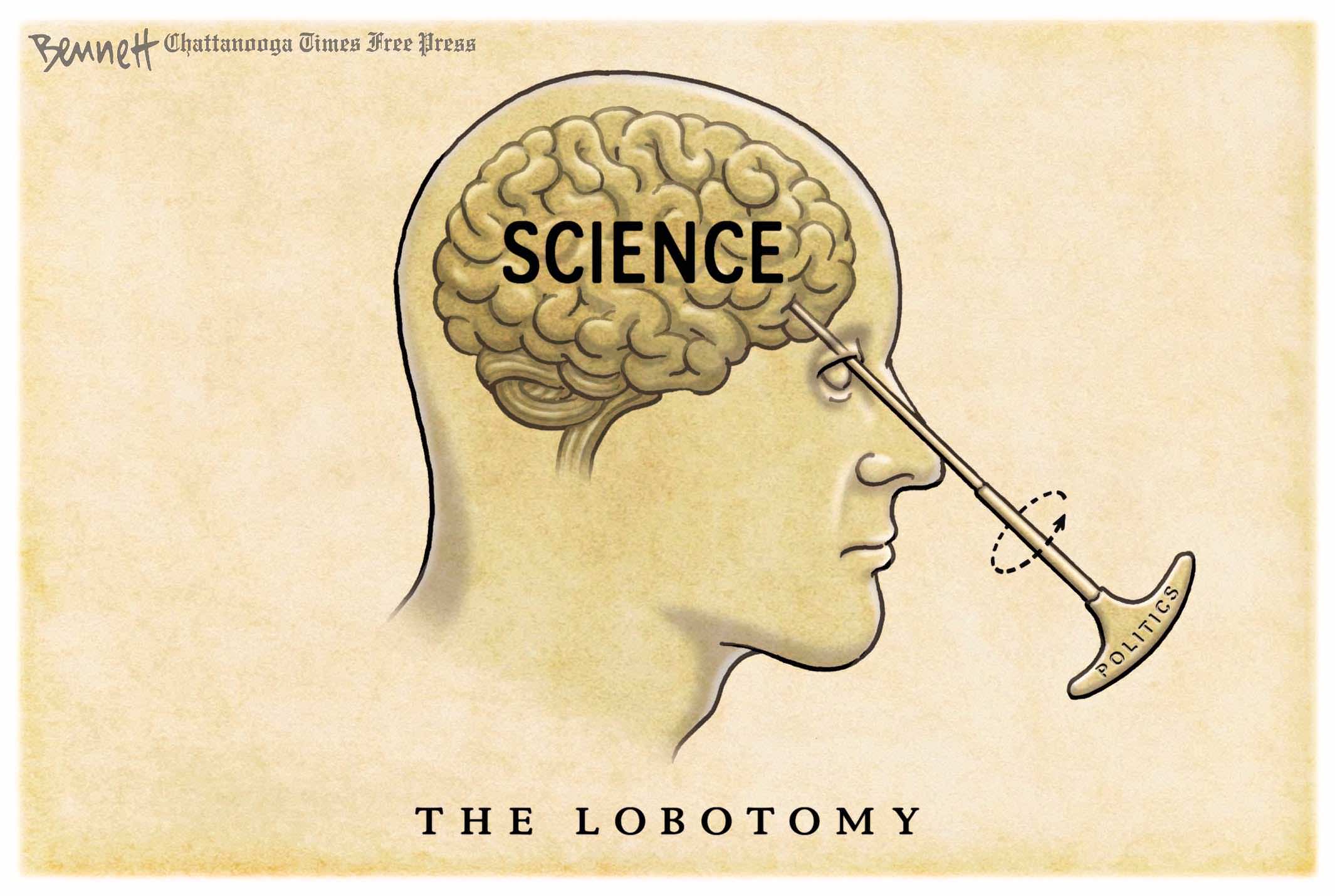
Tomas Fürst explains the dangers in believing models are reality in his Brownstone article Mathematical Models Are Weapons of Mass Destruction.  Excerpts in italics with my bolds and added images.

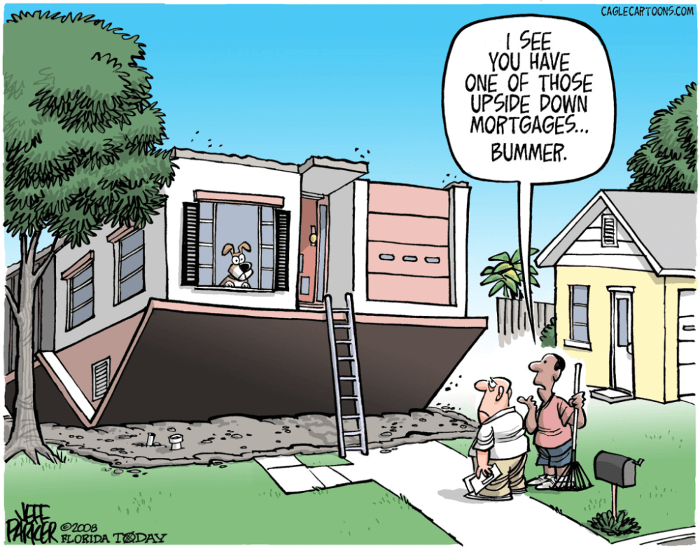
Great Wealth Destroyed in Mortgage Crisis by Trusting a Financial Model

In 2007, the total value of an exotic form of financial insurance called Credit Default Swap (CDS) reached $67 trillion. This number exceeded the global GDP in that year by about fifteen percent. In other words – someone in the financial markets made a bet greater than the value of everything produced in the world that year.

What were the guys on Wall Street betting on? If certain boxes of financial pyrotechnics called Collateralized Debt Obligations (CDOs) are going to explode. Betting an amount larger than the world requires a significant degree of certainty on the part of the insurance provider.

What was this certainty supported by?

A magic formula called the Gaussian Copula Model. The CDO boxes contained the mortgages of millions of Americans, and the funny-named model estimated the joint probability that holders of any two randomly selected mortgages would both default on the mortgage.

The key ingredient in this magic formula was the gamma coefficient, which used historical data to estimate the correlation between mortgage default rates in different parts of the United States. This correlation was quite small for most of the 20th century because there was little reason why mortgages in Florida should be somehow connected to mortgages in California or Washington.

But in the summer of 2006, real estate prices across the United States began to fall, and millions of people found themselves owing more for their homes than they were currently worth. In this situation, many Americans rationally decided to default on their mortgage. So, the number of delinquent mortgages increased dramatically, all at once, across the country.

The gamma coefficient in the magic formula jumped from negligible values ​​towards one and the boxes of CDOs exploded all at once. The financiers – who bet the entire planet’s GDP on this not happening – all lost.

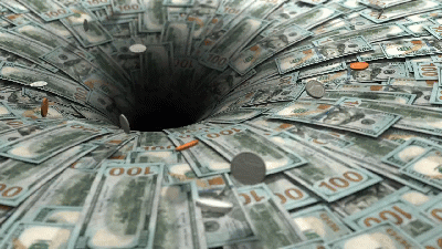
This entire bet, in which a few speculators lost the entire planet, was based on a mathematical model that its users mistook for reality. The financial losses they caused were unpayable, so the only option was for the state to pay for them. Of course, the states didn’t exactly have an extra global GDP either, so they did what they usually do – they added these unpayable debts to the long list of unpayable debts they had made before. A single formula, which has barely 40 characters in the ASCII code, dramatically increased the total debt of the “developed” world by tens of percent of GDP. It has probably been the most expensive formula in the history of mankind.

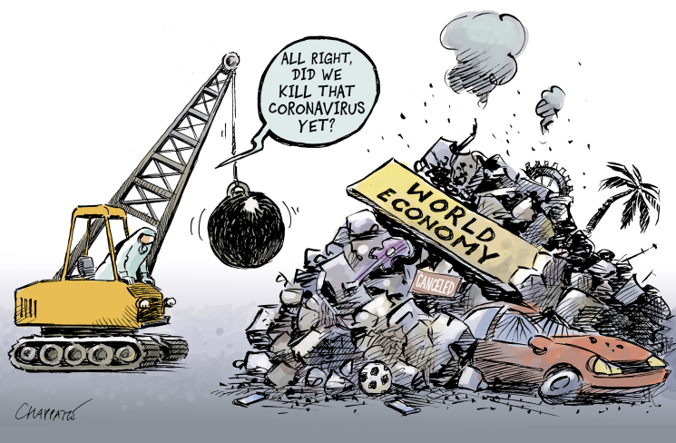
Covid Panic and Social Devastation from Following an Epidemic Model

After this fiasco, one would assume people would start paying more attention to the predictions of various mathematical models. In fact, the opposite happened. In the fall of 2019, a virus began to spread from Wuhan, China, which was named SARS-CoV-2 after its older siblings. His older siblings were pretty nasty, so at the beginning of 2020, the whole world went into a panic mode.

If the infection fatality rate of the new virus was comparable to its older siblings, civilization might really collapse. And exactly at this moment, many dubious academic characters emerged around the world with their pet mathematical models and began spewing wild predictions into the public space.

Journalists went through the predictions, unerringly picked out only the most apocalyptic ones, and began to recite them in a dramatic voice to bewildered politicians. In the subsequent “fight against the virus,” any critical discussion about the nature of mathematical models, their assumptions, validation, the risk of overfitting, and especially the quantification of uncertainty was completely lost.

Most of the mathematical models that emerged from academia were more or less complex versions of a naive game called SIR. These three letters stand for Susceptible–Infected–Recovered and come from the beginning of the 20th century, when, thanks to the absence of computers, only the simplest differential equations could be solved. SIR models treat people as colored balls that float in a well-mixed container and bump into each other.

When red (infected) and green (susceptible) balls collide, two reds are produced. Each red (infected) turns black (recovered) after some time and stops noticing the others. And that’s all. The model does not even capture space in any way – there are neither cities nor villages. This completely naive model always produces (at most) one wave of contagion, which subsides over time and disappears forever.

And exactly at this moment, the captains of the coronavirus response made the same mistake as the bankers fifteen years ago: They mistook the model for reality. The “experts” were looking at the model that showed a single wave of infections, but in reality, one wave followed another. Instead of drawing the correct conclusion from this discrepancy between model and reality—that these models are useless—they began to fantasize that reality deviates from the models because of the “effects of the interventions” by which they were “managing” the epidemic. There was talk of “premature relaxation” of the measures and other mostly theological concepts. Understandably, there were many opportunists in academia who rushed forward with fabricated articles about the effect of interventions.

Meanwhile, the virus did its thing, ignoring the mathematical models. Few people noticed, but during the entire epidemic, not a single mathematical model succeeded in predicting (at least approximately) the peak of the current wave or the onset of the next wave.

Unlike Gaussian Copula Models, which – besides having a funny name – worked at least when real estate prices were rising, SIR models had no connection to reality from the very beginning. Later, some of their authors started to retrofit the models to match historical data, thus completely confusing the non-mathematical public, which typically does not distinguish between an ex-post fitted model (where real historical data are nicely matched by adjusting the model parameters) and a true ex-ante prediction for the future. As Yogi Berra would have it: It’s tough to make predictions, especially about the future.

While during the financial crisis, misuse of mathematical models brought mostly economic damage, during the epidemic it was no longer just about money. Based on nonsensical models, all kinds of “measures” were taken that damaged many people’s mental or physical health.

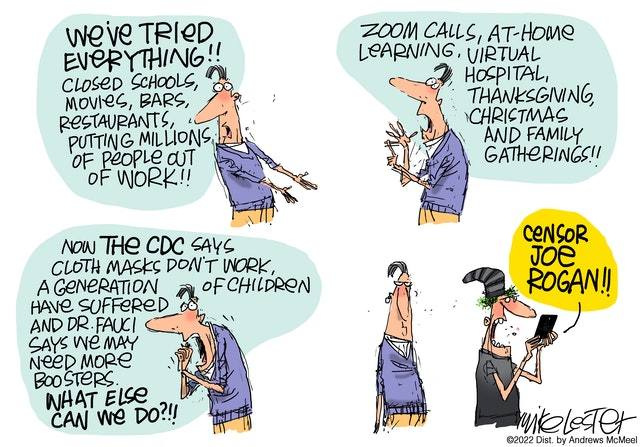
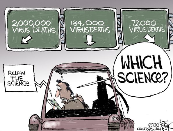
Nevertheless, this global loss of judgment had one positive effect: The awareness of the potential harm of mathematical modelling spread from a few academic offices to wide public circles. While a few years ago the concept of a “mathematical model” was shrouded in religious reverence, after three years of the epidemic, public trust in the ability of “experts” to predict anything went to zero.

Moreover, it wasn’t just the models that failed – a large part of the academic and scientific community also failed. Instead of promoting a cautious and sceptical evidence-based approach, they became cheerleaders for many stupidities the policymakers came forward with. The loss of public trust in the contemporary Science, medicine, and its representatives will probably be the most significant consequence of the epidemic.

Demolishing Modern Civilization Because of Climate Model Predictions

Which brings us to other mathematical models, the consequences of which can be much more destructive than everything we have described so far. These are, of course, climate models. The discussion of “global climate change” can be divided into three parts.

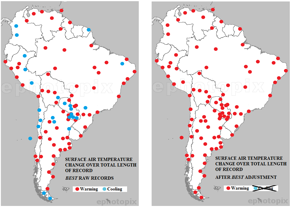
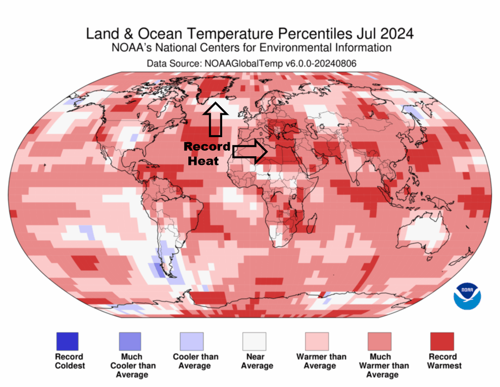
1. The real evolution of temperature on our planet. For the last few decades, we have had reasonably accurate and stable direct measurements from many places on the planet. The further we go into the past, the more we have to rely on various temperature reconstruction methods, and the uncertainty grows. Doubts may also arise as to what temperature is actually the subject of the discussion: Temperature is constantly changing in space and time, and it is very important how the individual measurements are combined into some “global” value. Given that a “global temperature” – however defined – is a manifestation of a complex dynamic system that is far from thermodynamic equilibrium, it is quite impossible for it to be constant. So, there are only two possibilities: At every moment since the formation of planet Earth, “global temperature” was either rising or falling. It is generally agreed that there has been an overall warming during the 20th century, although the geographical differences are significantly greater than is normally acknowledged. A more detailed discussion of this point is not the subject of this essay, as it is not directly related to mathematical models.

2. The hypothesis that increase in CO2 concentration drives increase in global temperature. This is a legitimate scientific hypothesis; however, evidence for the hypothesis involves more mathematical modelling than you might think. Therefore, we will address this point in more detail below.

3. The rationality of the various “measures” that politicians and activists propose to prevent global climate change or at least mitigate its effects. Again, this point is not the focus of this essay, but it is important to note that many of the proposed (and sometimes already implemented) climate change “measures” will have orders of magnitude more dramatic consequences than anything we did during the Covid epidemic. So, with this in mind, let’s see how much mathematical modelling we need to support hypothesis 2.

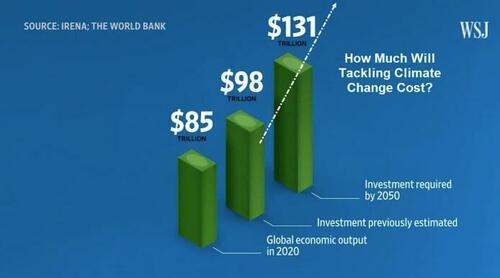
Yes, they are projecting spending more than 100 Trillion US$.

At first glance, there is no need for models because the mechanism by which CO2 heats the planet has been well understood since Joseph Fourier, who first described it. In elementary school textbooks, we draw a picture of a greenhouse with the sun smiling down on it. Short-wave radiation from the sun passes through the glass, heating the interior of the greenhouse, but long-wave radiation (emitted by the heated interior of the greenhouse) cannot escape through the glass, thus keeping the greenhouse warm. Carbon dioxide, dear children, plays a similar role in our atmosphere as the glass in the greenhouse.

This “explanation,” after which the entire greenhouse effect is named, and which we call the “greenhouse effect for kindergarten,” suffers from a small problem: It is completely wrong. The greenhouse keeps warm for a completely different reason. The glass shell prevents convection – warm air cannot rise and carry the heat away. This fact was experimentally verified already at the beginning of the 20th century by building an identical greenhouse but from a material that is transparent to infrared radiation. The difference in temperatures inside the two greenhouses was negligible.

OK, greenhouses are not warm due to greenhouse effect (to appease various fact-checkers, this fact can be found on Wikipedia). But that doesn’t mean that carbon dioxide doesn’t absorb infrared radiation and doesn’t behave in the atmosphere the way we imagined glass in a greenhouse behaved. Carbon dioxide actually does absorb radiation in several wavelength bands. Water vapor, methane, and other gases also have this property. The greenhouse effect (erroneously named after the greenhouse) is a safely proven experimental fact, and without greenhouse gases, the Earth would be considerably colder.

It follows logically that when the concentration of CO2 in the atmosphere increases, the CO2 molecules will capture even more infrared photons, which will therefore not be able to escape into space, and the temperature of the planet will rise further. Most people are satisfied with this explanation and continue to consider the hypothesis from point 2 above as proven. We call this version of the story the “greenhouse effect for philosophical faculties.”

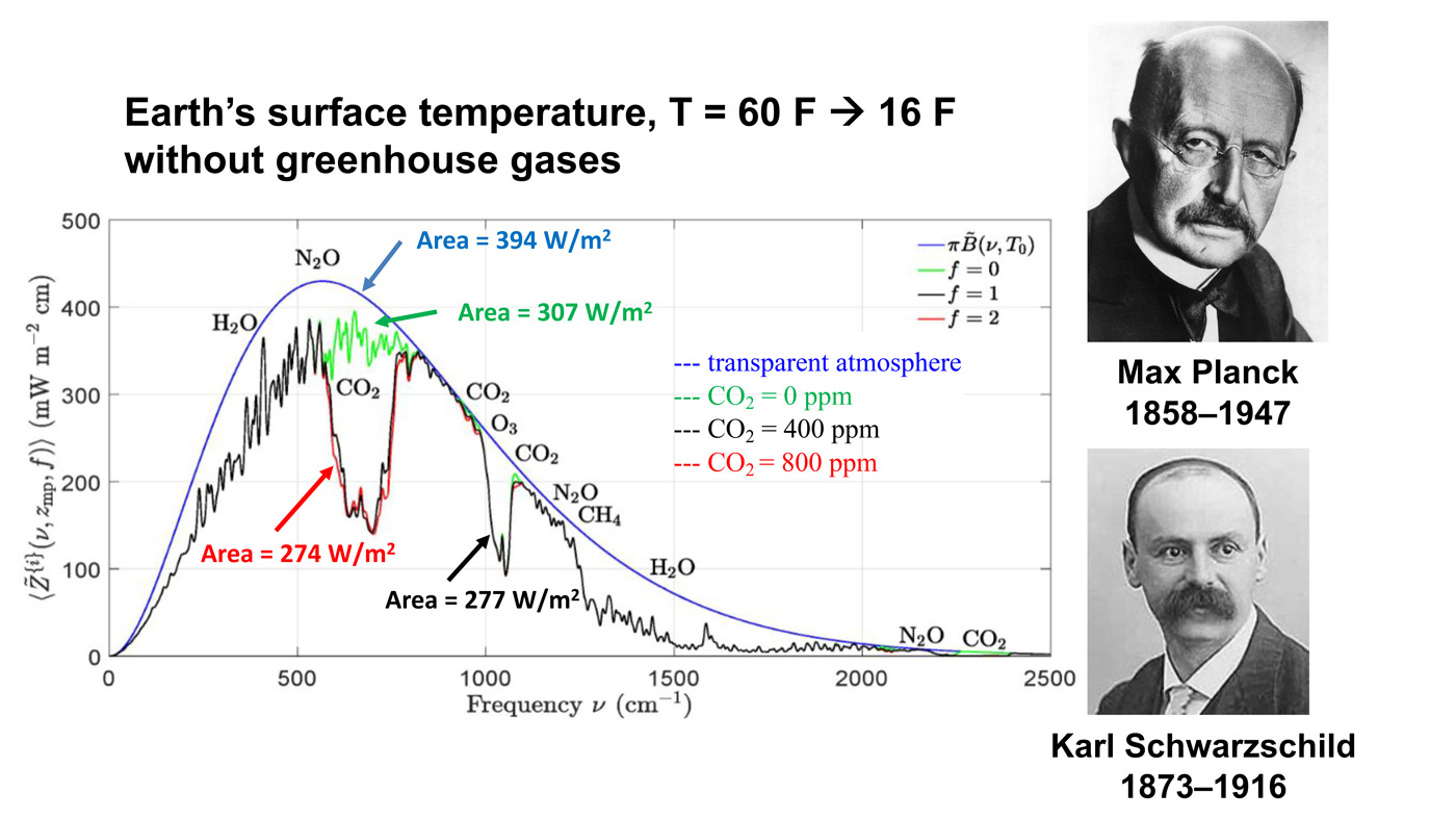
The important point here is the red line. This is what Earth would radiate to space if you were to double the CO2 concentration from today’s value. Right in the middle of these curves, you can see a gap in spectrum. The gap is caused by CO2 absorbing radiation that would otherwise cool the Earth. If you double the amount of CO2, you don’t double the size of that gap. You just go from the black curve to the red curve, and you can barely see the difference.

The problem is, of course, that there is so much carbon dioxide (and other greenhouse gases) in the atmosphere already that no photon with the appropriate frequency has a chance to escape from the atmosphere without being absorbed and re-emitted many times by some greenhouse gas molecule.

A certain increase in the absorption of infrared radiation induced by higher concentration of CO2 can thus only occur at the edges of the respective absorption bands. With this knowledge – which, of course, is not very widespread among politicians and journalists – it is no longer obvious why an increase in the concentration of CO2 should lead to a rise in temperature.

In reality, however, the situation is even more complicated, and it is therefore necessary to come up with another version of the explanation, which we call the “greenhouse effect for science faculties.” This version for adults reads as follows: The process of absorption and re-emission of photons takes place in all layers of the atmosphere, and the atoms of greenhouse gases “pass” photons from one to another until finally one of the photons emitted somewhere in the upper layer of the atmosphere flies off into space. The concentration of greenhouse gases naturally decreases with increasing altitude. So, when we add a little CO2, the altitude from which photons can already escape into space shifts a little higher. And since the higher we go, the colder it is, the photons there emitted carry away less energy, resulting in more energy remaining in the atmosphere, making the planet warmer.

Note that the original version with the smiling sun above the greenhouse got somewhat more complicated. Some people start scratching their heads at this point and wondering if the above explanation is really that clear. When the concentration of CO2 increases, perhaps “cooler” photons escape to space (because the place of their emission moves higher), but won’t more of them escape (because the radius increases)? Shouldn’t there be more warming in the upper atmosphere? Isn’t the temperature inversion important in this explanation? We know that temperature starts to rise again from about 12 kilometers up. Is it really possible to neglect all convection and precipitation in this explanation? We know that these processes transfer enormous amounts of heat. What about positive and negative feedbacks? And so on and so on.

The more you ask, the more you find that the answers are not directly observable but rely on mathematical models. The models contain a number of experimentally (that is, with some error) measured parameters; for example, the spectrum of light absorption in CO2 (and all other greenhouse gases), its dependence on concentration, or a detailed temperature profile of the atmosphere.

This leads us to a radical statement: The hypothesis that an increase in the concentration of carbon dioxide in the atmosphere drives an increase in global temperature is not supported by any easily and comprehensibly explainable physical reasoning that would be clear to a person with an ordinary university education in a technical or natural science field. This hypothesis is ultimately supported by mathematical modelling that more or less accurately captures some of the many complicated processes in the atmosphere.

Flows and Feedbacks for Climate Models

However, this casts a completely different light on the whole problem. In the context of the dramatic failures of mathematical modelling in the recent past, the “greenhouse effect” deserves much more attention. We heard the claim that “science is settled” many times during the Covid crisis and many predictions that later turned out to be completely absurd were based on “scientific consensus.”

Almost every important scientific discovery began as a lone voice going against the scientific consensus of that time. Consensus in science does not mean much – science is built on careful falsification of hypotheses using properly conducted experiments and properly evaluated data. The number of past instances of scientific consensus is basically equal to the number of past scientific errors.

Mathematical modelling is a good servant but a bad master. The hypothesis of global climate change caused by the increasing concentration of CO2 in the atmosphere is certainly interesting and plausible. However, it is definitely not an experimental fact, and it is most inappropriate to censor an open and honest professional debate on this topic. If it turns out that mathematical models were – once again – wrong, it may be too late to undo the damage caused in the name of “combating” climate change.

Beware getting sucked into any model, climate or otherwise.

Addendum on Chameleon Models

Chameleon Climate Models

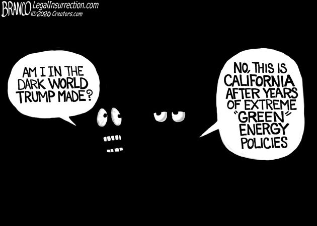
Footnote:  Classic Cartoon on Models
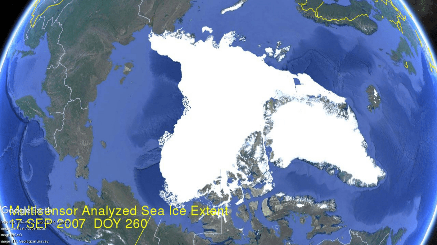
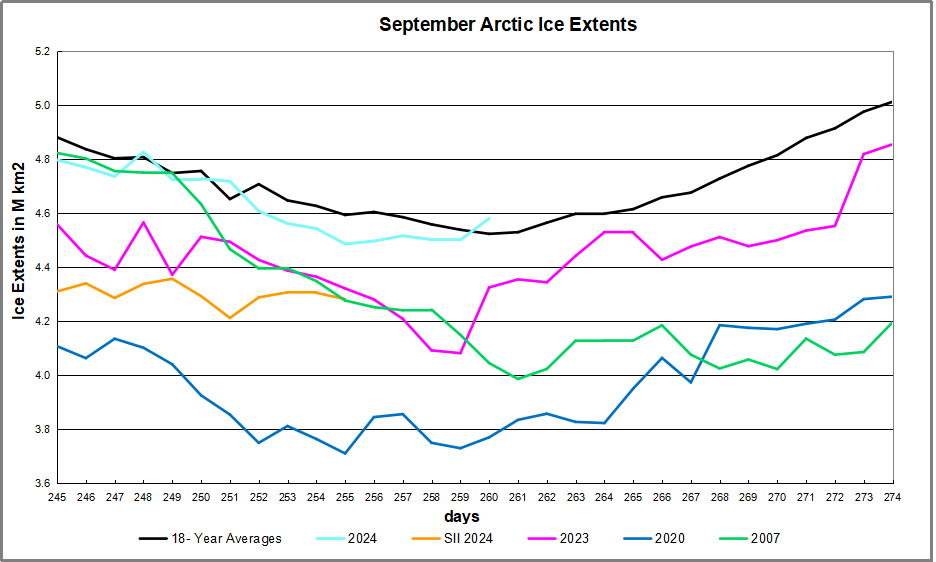
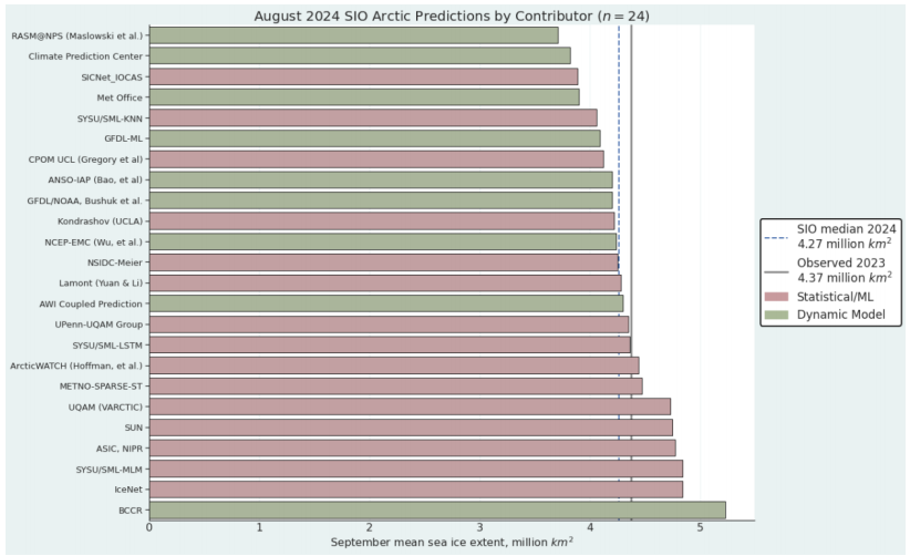
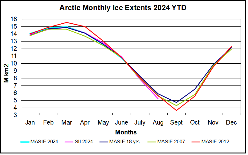
 

September Outlook Arctic Ice 2024

Figure 1. Distribution of SIO contributors for August estimates of September 2024 pan-Arctic sea-ice extent. No Heuristic methods were submitted in August. “Sun” is a public/citizen contribution. Image courtesy of Matthew Fisher, NSIDC.

2024: August Report from Sea Ice Prediction Network

The August 2024 Outlook received 24 pan-Arctic contributions (Figure 1). This year’s median
forecasted value for pan-Arctic September sea-ice extent is 4.27 million square kilometers with
an interquartile range of 4.11 to 4.54 million square kilometers. This is lower than the 2022 (4.83
million square kilometers) and 2023 (4.60 million square kilometers) August median forecasts
for September. . .This reflects relatively rapid ice loss during the month of July, resulting in August
Outlooks revising estimates downward. The lowest sea-ice extent forecast is 3.71 million square
kilometers, from the RASM@NPS submission); the highest sea-ice extent forecast is 5.23
million square kilometers, submitted by BCCR.

These are predictions for the September 2024 monthly average ice extent as reported by NOAA Sea Ice Index (SII). This post provides a look at the 2024 Year To Date (YTD) based on monthly averages comparing MASIE and SII datasets. (18 year average is 2006 to 2023 inclusive).

The graph puts 2024 into recent historical perspective. Note how 2024 was slightly above the 18-year average for the first 5 months, then tracked slightly lower to average through August. The outlier 2012 provided the highest March maximum as well as the lowest September minimum, coinciding with the Great Arctic Cyclone that year.  2007 began the period with the lowest minimum except for 2012.  SII 2024 started slightly higher than MASIE the first 3 months, then ran the same as MASIE until dropping in August 400k km2 below MASIE 2024 and also lower than 2007 and 2012.

The table below provides the monthly Arctic ice extent averages for comparisons (all are M km2)

Monthly MASIE 2024 SII 2024 MASIE -SII MASIE 2024-18 YR AVE SII 2024-18 YR AVE MASIE 2024-2007
Jan 14.055 13.917 0.139 0.280 0.333 0.293
Feb 14.772 14.605 0.167 0.096 0.152 0.121
Mar 14.966 14.873 0.093 0.111 0.199 0.344
Apr 14.113 14.131 -0.018 0.021 0.118 0.418
May 12.577 12.783 -0.207 -0.038 0.123 0.150
June 10.744 10.895 -0.151 -0.072 0.024 -0.082
July 8.181 7.884 0.297 -0.107 -0.160 0.188
Aug 5.617 5.214 0.404 -0.267 -0.423 0.033

The first two data columns are the 2024 YTD shown by MASIE and SII, with the MASIE surpluses in column three.  Column four shows MASIE 2024 compared to MASIE 18 year averages, while column five shows SII 2024 compared to SII 18 year averages.  YTD August MASIE and SII are below their averages, SII by nearly half a Wadham. The last column shows MASIE 2024 holding surpluses over 2007 most of the months, and nearly the same in August.

Summary

The experts involved in SIPN are expecting SII 2024 September to be much lower than 2023 and 2022, based largely on the large deficits SII is showing in July and August. The way MASIE is going, this September looks to be lower than its average, but much higher than SII.  While the daily minimum for the year occurs mid September, ice extent on September 30 is typically slightly higher than on September 1.

Footnote:

Some people unhappy with the higher amounts of ice extent shown by MASIE continue to claim that Sea Ice Index is the only dataset that can be used. This is false in fact and in logic. Why should anyone accept that the highest quality picture of ice day to day has no shelf life, that one year’s charts can not be compared with another year? Researchers do this, including Walt Meier in charge of Sea Ice Index. That said, I understand his interest in directing people to use his product rather than one he does not control. As I have said before:

MASIE is rigorous, reliable, serves as calibration for satellite products, and continues the long and honorable tradition of naval ice charting using modern technologies. More on this at my post Support MASIE Arctic Ice Dataset

MASIE: “high-resolution, accurate charts of ice conditions”
Walt Meier, NSIDC, October 2015 article in Annals of Glaciology.