Dearth of Green Jobs in UK

Chris Morrison provides the analysis in his Daily Sceptic article ONS Reveals the Pitiful Number of New Green Jobs Being Created in the U.K. Economy.  Excerpts in italics with my bolds and added images.

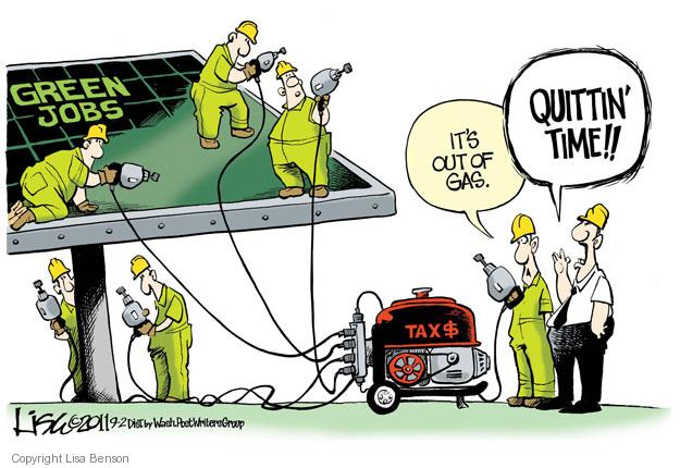
The problem with the green U.K. economy, and its associated destruction of the hydrocarbon environment, is that there are very few jobs being created. The few remaining ‘workers’ in the ruling Labour party are starting to rumble all the luxury boondoggles that are set to further decimate well-paid jobs in their communities. The figures compiled by the Office for National Statistics (ONS), trying to estimate the actual number of green jobs, are always a highly creative hoot, and the latest batch are no exception. Many jobs identified are simply displacement activity, with one repair or maintenance occupation taking over from another. Around 6% of the total are to be found in ‘environmental charities’, an interesting way to describe elite billionaire political funding to push the Net Zero fantasy. Such is the seeming desperation to rustle up a green job, the ONS even includes repairing home appliances, controlling forest fires and separating hydrogen by carbon dioxide-producing electrolysis.

The latest ‘estimates’ from the ONS cover 2021 and 2022, and they are said to show an increase in both years. But as the graph below reveals, the rises are pitiful over a decade, and the 2022 estimate of 639,000 is less than 2% of jobs in the economy as a whole.

As can be seen, environmental charities employ 40,000 people, almost as many as the 47,000 that work in renewable energy. But the charities figure does not include all those make-work jobs in environmental consultancy and education or what is described as in-house environmental activities. If all the displacement, invented or re-badged jobs in repair, electric vehicles, waste disposal, water treatment, energy efficiency, Net Zero promotion, teaching and the ubiquitous bureaucracy are rightly ignored, it is unlikely that more than 150,000 new jobs have been created.

Fairly small pickings, it might be thought, from all the cash sprayed at subsidy-hunting chancers over at least two decades. Even worse, any new jobs are easily offset by the occupations being destroyed in steel making, refining hydrocarbons, coal mining and oil and gas exploration. Fracking for gas would transform a number of deprived areas in the U.K. at little environmental cost, as it has done in the U.S. Energy security would likely be achieved, and the tax take would be considerable. But fracking is anathema to the major political parties in the U.K., except the emerging Reform party.Last week saw some real push back on the madness of Net Zero and the so-called green economy. The boss of GMB, the third largest trade union in the country, told the annual Labour party conference that its plans to decarbonise the energy network by 2030 will cost up to one million jobs, decimate working communities and push up bills for the poorest. According to Smith, Government’s plans for Net Zero were “bonkers” and “fundamentally dishonest”. In a week when it was revealed that British consumers, both industrial and private, had some of the highest electricity prices in the developed world, he charged that current energy policy amounted to virtue signalling by politicians. He accused them of exporting jobs and importing virtue because the jobs were being created abroad rather than in the U.K.

Meanwhile, a recent paper published in Science came to a damning conclusion that will not surprise sceptics, namely that 96% of climate policies over the last 25 years, ultimately designed to reduce carbon dioxide emissions, have been a waste of money. “That’s where green spin has got us,” writes George Monbiot, although these days the Guardian’s extremist-in-chief seems to have given up on all life enhancing processes that run the risk of disturbing anything on the planet. “Finally, 15 years and a trillion dollars too late, George Monbiot says what sceptics have been saying all along,” observes the sceptical journalist Jo Nova. “Nearly every single carbon reduction scheme is a useless make-work machination that creates the illusion that the government is doing something,” she says.

As we can see, the ONS survey is full of these make-work schemes providing jobs that can only exist by rigging free markets and providing eye-watering subsidies from consumers and taxpayers. As the more concerned trade unionists can see, much of the cost of these fantasy ventures falls on the poorest members of society forced to pay higher prices for many of the basic essentials of life. In addition, as we have observed, most green schemes make mugs of the wider investing public, with the RENIXX, a stock capitalisation global index of the 30 largest renewable industrial companies, showing near zero growth since it was started in 2006. None of this matters, of course, to the Mad Miliband and his weird wonks at the U.K. Department of Energy, who are ramping up ideological plans to hose cash at daft ideas like carbon capture, battery energy storage and hydrogen production.

Not only is CO2 Capture and Storage wildly impractical, its aim is to deprive the biosphere of plant food.

But all is not lost on the jobs front – opportunities must be taken when they occur. Earlier this year, Gary Smith was able to point to some new employment clearing away the animal casualties of wind farm blades. “It’s usually a man in a rowing boat, sweeping up the dead birds,” he observed.

Footnote Q & A:

Q:  What is the difference between Golf and Government?

A:  In Government you can always improve your lie.

–Anonymous Source

Resources

Climate Policies Fail in Fact and in Theory

Investors Beware Green Equipment Companies

Green Deal Cuts EU Emissions, Doubles Them Elsewhere

Climatists’ War on Meat updated

Tyler Durden reports at Zerohedge Meat Substitutes Still A Tiny Sliver Of US Meat Market.  Excerpts in italics with my bolds and added images.

Over the past few years, plant-based meat substitutes have come closer and closer to mimicking the real thing, with brands like Beyond Meat having even sussed out how to create fake meat that “bleeds”.

But, as Statista’s Anna Fleck details below, after an initial boom, the company has rapidly come down from its peaks.

There are several reasons for the hype having died down, one of which being that many consumers decided to move away from buying the often more expensive items amid the cost of living crisis.

Another reason cited is that plant-based meats have become a part of the U.S.’s culture war, labeled as a symbol of left-wing politics and a binary to “real” meat.

According to data from Statista’s Market Insights, plant-based meat substitutes accounted for a mere sliver of the U.S. meat market last year.

Not counting insect-based meat alternatives or cultured, i.e. lab-grown meat, meat substitute sales amounted to $1.4 billion in 2023, while sales of fresh and processed meat added up to almost $124 billion.

Outlook

  • Revenue in the Meat market amounts to US$131.60bn in 2024. The market is expected to grow annually by 4.22% (CAGR 2024-2029).
  • In global comparison, most revenue is generated in China (US$273bn in 2024).
  • In relation to total population figures, per person revenues of US$385.00 are generated in 2024.
  • In the Meat market, volume is expected to amount to 12.10bn kg by 2029. The Meat market is expected to show a volume growth of 1.9% in 2025.
  • The average volume per person in the Meat market is expected to amount to 32.4kg in 2024.

What’s Next?

Background Post: Coming Soon: Menu Climate Warnings

Baylen Linnekin writes at Reason Public Health Researchers Float Idea of Climate-Change Warnings on Menu Items.  Excerpts in italics with my bolds and added images.

Warning diners that red meat is bad for the environment is yet another attempt
to socially engineer food choices.

A study released last week suggests that fast-food menus that feature labels urging diners not to order red meat off those same menus due to the “climate impact” of those food items can help convince customers to swap out red meat for what the researchers argue are more climate-friendly foods—from fruits and vegetables to poultry and seafood. The study, published in Jama Network Open and led by researchers from Johns Hopkins University, concludes that “climate impact menu labels may be an effective strategy to promote more sustainable restaurant food choices and that labels highlighting high-climate impact items may be most effective.”

The study’s data comes from more than 5,000 Americans who took part in a nationwide online survey last year. Study participants were instructed to “imagine they were in a restaurant and about to order dinner” from an accurately priced sample menu containing a variety of choices, including hamburgers, chicken sandwiches, plant-based burgers, and salads.

The study asked participants to “order” different foods after viewing one of three types of sample menus online. Outside of a control group, the study presented web users with choices that either disparaged the sustainability of red-meat dishes or touted the sustainability of dishes not containing red meat. Based on the results, which showed people who were more likely to avoid red meat if it had a red warning label and more likely to order other menu items if they featured a green health halo, the authors conclude that “climate impact menu labels [a]re effective” and “that labeling red meat items with negatively framed, red high-climate impact labels was more effective at increasing sustainable selections than labeling non-red meat items with positively framed, green low-climate impact labels.”

The study has spurred some news outlets to suggest governments around the world
may—or should—operationalize its findings.

“Policymakers have been debating how to get people to make less carbon-heavy food choices,” the Guardian recounted in a recent report on the study, “In April, the Intergovernmental Panel on Climate Change (IPCC) report urged world leaders, especially those in developed countries, to support a transition to sustainable, healthy, low-emissions diets.”

“Unfortunately, consumers have been resistant to change and many wish to continue eating meat,” a Phys.org report on the study laments.

Worse still, though the study itself does not suggest that it should be used to form the basis of any government policies, its lead author, Prof. Julia Wolfson of the Johns Hopkins Bloomberg School of Public Health, told CNN last week that “legislation or regulation may be necessary” to force restaurants to add climate warnings to their menus.

Let’s pump the brakes—for a couple of reasons.

Data from the study itself and, more generally, on the effectiveness of government-mandated menu labeling suggests the authors may wish to dial down their perception of the effectiveness of the labels they tested. For example, after completing their respective orders, the survey asked participants if they “notice[d] any labels” on the menu. As the study data reveal, only around 4 out of every 10 participants even noticed any climate-related labeling. While that’s a low percentage, in the real world—in an actual fast-food restaurant setting rather than in an online survey—the percentage would likely be far lower. That’s because, as I’ve explained time and again, study after study has shown that few people pay attention to mandated menu labels (except to choose which food or foods to order), and even fewer use that information.

The premise of the study itself also may rest on shaky ground.

Some critics have pushed back against the notion that some chicken or seafood is more sustainable than all red meat. As the Guardian report on the study notes, “intensively produced chicken has been found to be damaging for the environment, as has some farmed and trawled fish.” Others disagree with the very notion that red meat is an inherently unsustainable food. While it’s become popular in recent years to argue that eating less red meat is better for the environment, that argument has received a good amount of pushback, with critics charging that swapping out meat for plants could be inefficient and ineffective, harm human health, and have unintended consequences for the developing world.

Even if I were to accept arguments that eating less meat is better for the environment, the choice to eat meat (or not) ultimately is and should be an individual’s to make. So it’s not “unfortunate” that consumers “wish to continue eating meat,” as Phys.org posits. And that wish isn’t a cry for government intervention, as Wolfson, the study’s lead author, argues. Rather, it’s a cry for freedom of choice.

If some restaurants competing in the marketplace care to attempt to skew their customers’ choices away from meat and towards vegetarian and/or vegan foods, by all means, they should do so. But the jury is out on whether that would improve the sustainability of those restaurants. What’s more, any restaurant that wants to make such a change should do so on its own accord, without the government’s prompting, backing, or mandate.

Elites’ Energy Fantasies Abound

Stephen Barrett reports on ruminations from technically challenged overlords in his Spectator Australia article by way of John Ray’s blog The chattering climate class and their war on coal. Excerpts in italics with my bolds and added images.

The Climate Chattering Class is now telling each other:
No Such Thing as Baseload Electrical Power.

Electricity is slippery stuff, in that it can be difficult to properly grasp what it is or how to quantify it.  We can blame the school system. Teachers who were taught social politics at University must somehow teach mathematics and physics.

There is a reason for everything in the world and that reason usually comes down to physics until politics gets mixed in. This is a problem. In politics, the same big lie can be repeated many times, as loudly as possible, until people accept it as truth or give up trying to argue the toss.


Readers will be familiar with the nameplate rating on wind farms and solar plants. It lists the rated output under ideal circumstances, measured in watts. If a heater has 1,000W we all understand it is telling us the output at one instant in time. Consumption is a different thing and is measured in watts/hour. Reversing this, we can understand we are seeing a generator’s nameplate watts as the size of the generator and watt hours as how much it provides.

An interesting idea making its way around the energy conversation
at present is that there is no such thing as baseload energy.

The lie is perpetrated by the political system which is, at present, intending to destroy the concept (and existence) of baseload energy. Baseload is created by heavy generators that operate all day, every day, and are typically cheap. The disadvantage of this structure is that baseload plants usually take time to reach full production. Then, they need to run for extended periods of time to be economically viable. Coal and nuclear are the only two types feasible for most of the Australian market.

Gas and diesel plants can provide electricity but they are expensive when operated in this way. Peaking power is where gas comes to the fore. It can be fired up quickly and make electricity rapidly. This is ideal for peaks when people come home from their day and want heating or cooling and to cook. Gas can cover this surge very happily. Diesel is lovely stuff and great in remote locations where there is no access to the grid or if the grid fails. It might not be pretty, but it delivers when needed.

In the whole clean grid argument, those words should be enshrined…
‘When it is needed.’

Coal, nuclear, gas, and diesel will deliver when needed. Reliability has been ignored by the chattering classes who have created the current disaster of high prices and brownouts that continue to destroy various industries.

Perhaps that is the whole point of ‘renewable’ energy.  I put that in quotes because the best figures I can find are that they only return seven-tenths of the power used to build them.

Every wind tower is a hallmark to coal-fired power being able to carry inefficient freeloaders. Freeloaders because renewable technologies can never produce energy when it is needed, only when it wishes.Solar and wind dump themselves on the energy market, making it impossible for reliable supplies to remain economic. If they had to obey the same bidding rules, they would never survive.

Let’s compare the costs of wind, solar, and nuclear. To do this we can look at the Shepherds Flat Wind Farm, Topaz Solar Farm, and Barakah Nuclear Power Plant.

We can skittle the first anti-nuclear claim about taking too long to build. Barakah was completed within eight years. The global average for modern nuclear plant construction (globally) is between seven and eight years. Sadly in Australia we have a less than helpful public service that thrives on inefficiency that might drag out this timeline.

The nameplate ratings on these plants were 845MW for Shepherds Flat, 550MW for Topaz and 5,600MW for Barakah. Nuclear can appear expensive if you compare build cost against the nameplate rating but not markedly. Shepherds Flat cost $2 billion, Topaz $2.5 billion, and Barakah $24.4 billion. Comparing build cost to nameplate rating, Shepherds Flat Wind cost 42 cents/MW, Topaz Solar 22 cents/MW, and Barakah Nuclear 23 cents/MW.

Looking at the size per dollar, nuclear is almost as good as solar and better than wind. The issue already demonstrated is not size as much as provision. That nameplate value is giving you one second of use. One second later, you are going to need that much again. This means the Watt/Hrs is crucial.

This is where wind and solar fail massively. The watts produced are not as important as the Watt Hours provided to the market. Assuming a generous 25-year life span for Shepherds Flat, 30 years for Topaz, and a mean-spirited 60 years for Barakah (when it is likely to still be running 100 years after it started), I calculated the GWh per annum compared to the Build Price over the life of the project. That is Build Price divided by annual GWh times lifespan.

Shepherds Flat was $40,000, Topaz $75,000 and Barakah $9,300.

On this measure, nuclear is significantly cheaper, but the price of firming wind and solar is not added to their totals. So that you can have power on those hot still days of summer when the wind doesn’t blow or the cold nights of winter when the sun is not shining you will need either nuclear or coal to provide you with the electricity you need.

We can discuss batteries some other time, but the new super battery has been coming about as long as perpetual motion and flying cars. Lithium ion batteries are old tech that has been developed to a point of maturity where there is little left to squeeze out of them and without mountains we are not going to get enough pumped hydro no matter how economically bad that model is.

If I magically had the power I would build more coal-fired stations, only because nuclear will need time to be made legal and that cannot be predicted. Nuclear however beats wind and solar to bits as far as costs and output and reliability are concerned.

18 yr. Plateau September Arctic Ice 2024

September daily extents are now fully reported and the 2024 September monthly results can be compared with those of the previous 17 years.  MASIE showed 2024 at 4.6M km2  and SII was slightly lower, reaching 4.4M for the month.  Analysis below shows that the 2024 annual Minimum month was 75k km2 lower than the 18 year average, and was 256 km2 greater than 2007.  The 18 yr. trendlines are virtually flat and matching the averages of 4.6M km2 for the period since 2007.

In August, 4.27M km2 was the median estimate (range 4.11 to 4.54) for the September monthly average extent from the SIPN (Sea Ice Prediction Network) who use the reports from SII (Sea Ice Index), the NASA team satellite product from passive microwave sensors. The SII actual ice extent average was ~100k km2 higher than estimated.

The graph below shows September comparisons through day 274 (Sept. 30).

The graph has some unusual things to note. The typical September is shown by the black line, which reaches the daily minimum on day 260 and ends the month ~100k km2 higher than the beginning. 2024 was unusual by matching average the first half, appearing on day 255 to hit minimum, then going above average on day 260.  Surprisingly, the last two weeks MASIE showed a steady loss of ice extent down to a minimum on day 272, and recovering the last two days.  Instead of a slight gain, MASIE showed September 2024 losing ~400k km2 by month end.

2007 also started matching average, but went down steeply losing more than half a wadham below average on day 261, then recovering slightly but ending ~800k km2 below average on day 274.

The orange line shows SII starting much lower than MASIE, then the dataset is missing six days mid month. Finally, ice extents rise above MASIE by the end, reaching ~200k km2 above the SII month beginning. I calculated the monthly average for SII from the data provided, though the official number may differ once it is reported.

The table shows ice extents in the regions for 2024, 18 year averages and 2007 for day 274. Averages refer to 2006 through 2023 inclusive.

Region 2024274 Day 274 Ave 2024-Ave. 2007274 2024-2007
 (0) Northern_Hemisphere 4446117 5013499 -567382 4196873 249243
 (1) Beaufort_Sea 280737 564271 -283534 503548 -222811
 (2) Chukchi_Sea 350261 214302 135958 1065 349196
 (3) East_Siberian_Sea 320409 307838 12571 311 320098
 (4) Laptev_Sea 207220 169745 37475 237446 -30226
 (5) Kara_Sea 339 39310 -38971 15857 -15518
 (6) Barents_Sea 0 15734 -15734 4851 -4851
 (7) Greenland_Sea 163963 250200 -86237 353210 -189247
 (8) Baffin_Bay_Gulf_of_St._Lawrence 38141 57714 -19573 51770 -13629
 (9) Canadian_Archipelago 112998 388756 -275757 302221 -189223
 (10) Hudson_Bay 0 3062 -3062 1936 -1936
 (11) Central_Arctic 2968286 3001441 -33155 2723382.15 244904

The major deficits are in Beaufort, Greenland sea and Canadian Archipelago. Only Chukchi shows an offsetting surplus.  Overall, the NH ice extent is 567k km2 or 11% below average.

Summary

Earlier observations showed that Arctic ice extents were low in the 1940s, grew thereafter up to a peak in 1977, before declining.  That decline was gentle until 1996 which started a decade of multi-year ice loss through the Fram Strait.  There was also a major earthquake under the north pole in that period.  In any case, the effects and the decline ceased in 2007, 30 years after the previous peak.  Now we have a plateau in ice extents, which could be the precursor of a growing phase of the quasi-60 year Arctic ice oscillation.

Background 

A commenter previously asked, where do they get their data? The answer is primarily from NIC’s Interactive Multisensor Snow and Ice Mapping System (IMS). From the documentation, the multiple sources feeding IMS are:

Platform(s) AQUA, DMSP, DMSP 5D-3/F17, GOES-10, GOES-11, GOES-13, GOES-9, METEOSAT, MSG, MTSAT-1R, MTSAT-2, NOAA-14, NOAA-15, NOAA-16, NOAA-17, NOAA-18, NOAA-N, RADARSAT-2, SUOMI-NPP, TERRA

Sensor(s): AMSU-A, ATMS, AVHRR, GOES I-M IMAGER, MODIS, MTSAT 1R Imager, MTSAT 2 Imager, MVIRI, SAR, SEVIRI, SSM/I, SSMIS, VIIRS

Summary: IMS Daily Northern Hemisphere Snow and Ice Analysis

The National Oceanic and Atmospheric Administration / National Environmental Satellite, Data, and Information Service (NOAA/NESDIS) has an extensive history of monitoring snow and ice coverage.Accurate monitoring of global snow/ice cover is a key component in the study of climate and global change as well as daily weather forecasting.

The Polar and Geostationary Operational Environmental Satellite programs (POES/GOES) operated by NESDIS provide invaluable visible and infrared spectral data in support of these efforts. Clear-sky imagery from both the POES and the GOES sensors show snow/ice boundaries very well; however, the visible and infrared techniques may suffer from persistent cloud cover near the snowline, making observations difficult (Ramsay, 1995). The microwave products (DMSP and AMSR-E) are unobstructed by clouds and thus can be used as another observational platform in most regions. Synthetic Aperture Radar (SAR) imagery also provides all-weather, near daily capacities to discriminate sea and lake ice. With several other derived snow/ice products of varying accuracy, such as those from NCEP and the NWS NOHRSC, it is highly desirable for analysts to be able to interactively compare and contrast the products so that a more accurate composite map can be produced.

The Satellite Analysis Branch (SAB) of NESDIS first began generating Northern Hemisphere Weekly Snow and Ice Cover analysis charts derived from the visible satellite imagery in November, 1966. The spatial and temporal resolutions of the analysis (190 km and 7 days, respectively) remained unchanged for the product’s 33-year lifespan.

As a result of increasing customer needs and expectations, it was decided that an efficient, interactive workstation application should be constructed which would enable SAB to produce snow/ice analyses at a higher resolution and on a daily basis (~25 km / 1024 x 1024 grid and once per day) using a consolidated array of new as well as existing satellite and surface imagery products. The Daily Northern Hemisphere Snow and Ice Cover chart has been produced since February, 1997 by SAB meteorologists on the IMS.

Another large resolution improvement began in early 2004, when improved technology allowed the SAB to begin creation of a daily ~4 km (6144×6144) grid. At this time, both the ~4 km and ~24 km products are available from NSIDC with a slight delay. Near real-time gridded data is available in ASCII format by request.

In March 2008, the product was migrated from SAB to the National Ice Center (NIC) of NESDIS. The production system and methodology was preserved during the migration. Improved access to DMSP, SAR, and modeled data sources is expected as a short-term from the migration, with longer term plans of twice daily production, GRIB2 output format, a Southern Hemisphere analysis, and an expanded suite of integrated snow and ice variable on horizon.

http://www.natice.noaa.gov/ims/ims_1.html

Footnote

Some people unhappy with the higher amounts of ice extent shown by MASIE continue to claim that Sea Ice Index is the only dataset that can be used. This is false in fact and in logic. Why should anyone accept that the highest quality picture of ice day to day has no shelf life, that one year’s charts can not be compared with another year?

MASIE is rigorous, reliable, serves as calibration for satellite products, and continues the long and honorable tradition of naval ice charting using modern technologies. More on this at my post Support MASIE Arctic Ice Dataset