It’s Better to be Outside Paris Accord

Chris Johnson writes at Real Clear Energy to explain Trump’s Withdrawal From the Paris Agreement Won’t Hurt the Climate.  Excerpts in italics with my bolds and added images.

President Donald Trump withdrew from the Paris Agreement. Cue the leftwing meltdown. Though everyone knew the withdrawal was coming, the left and the “international community” are still decrying America’s alleged abdication of leadership on climate.
But toothless agreements window dressed with international
summits and photo ops are not the same as leadership.
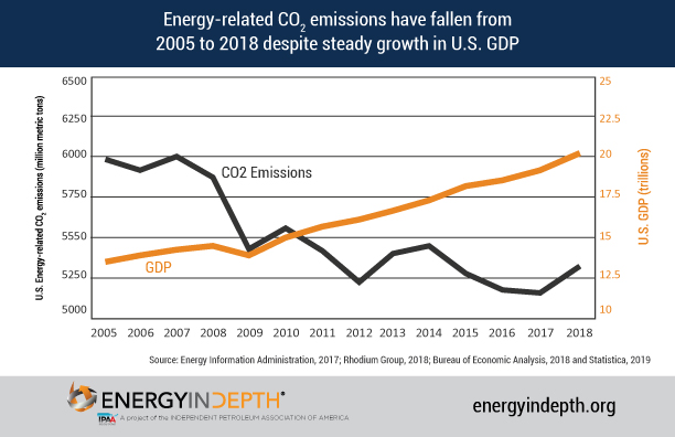
The truth is America has led the world in reducing emissions for years not because of the Paris Agreement, but because innovation and the free market facilitate the deployment of cheaper and cleaner energy.  Let’s review the record.
In recent decades, America has achieved unprecedented — and unexpected — energy production thanks to fracking and horizontal drilling. Since the early 2000s when these twin technologies began to be deployed much more expansively, U.S. natural gas production has more than doubled. By 2016, hydraulically fractured gas wells accessed through horizontal drilling accounted for nearly 70% of all oil and natural gas wells.
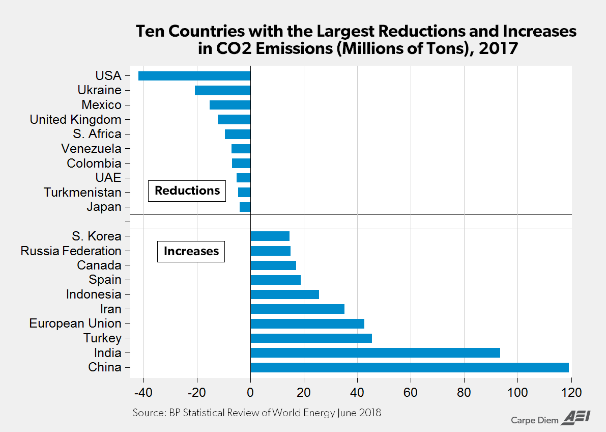
While the left may clutch its pearls at the increased production of a fossil fuel like natural gas, this clean energy source has been a main driver of U.S. emissions reductions. Over the past 15 years when America has massively increased natural gas output, the U.S. reduced carbon emissions more than any other country. We can see this year by year.
For example, from 2022 to 2023, America offset dirtier coal energy generation with natural gas. As coal declined by 121.9 terawatt hours of electric generation over that time, natural gas increased by 118.9 terawatt hours. At the same time, U.S. greenhouse gas emissions declined 1.9%. Notably, 80% of the U.S. carbon emissions reductions were driven by the electric power sector — precisely where natural gas has an outsized impact.
Notice what didn’t cause those emissions reductions? The Paris Agreement.
The American energy sector — powered by innovation and good-old-fashioned free market economics — has been driving down carbon emissions cheaply and effectively before the Paris Agreement was a twinkle in climate activists’ eyes. And it will continue to reduce carbon emissions long after President Trump’s decision to withdraw.
The Paris Agreement is far from the panacea some activists claim it is.
It isn’t even a particularly effective tool to
rally nations toward greater climate success.
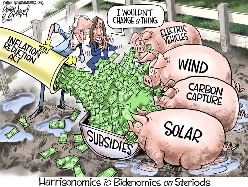
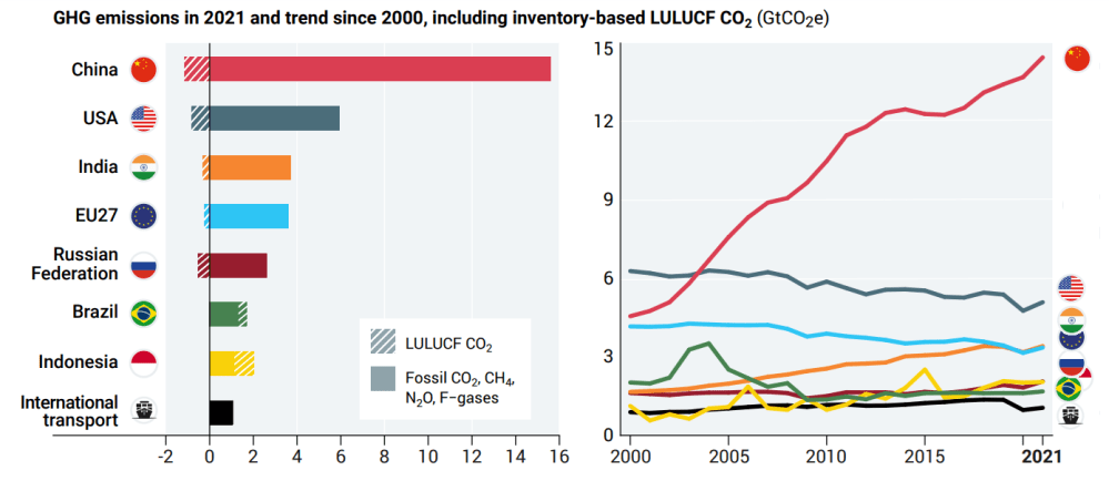
In the middle of the allegedly climate-conscious Biden administration, none of the world’s biggest emitters — America included — had reduced their emissions in accordance with the Paris goals. Apparently, the $1 trillion regulatory and subsidy regime erected by President Biden’s Inflation Reduction Act had little bang for the buck.
What Agreement supporters forget is that no number of high-profile international accords can make command-control tactics work — or instill other nations with the ambition to fulfill their empty promises.

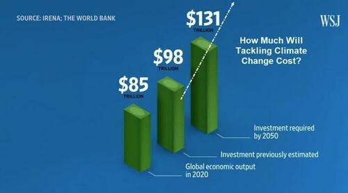
Yes, those are trillions of dollars they are projecting to spend.

The Paris Agreement is the definition of bureaucratic failure, conflating meetings, busyness, and lofty goals as success. Its only achievement is to make climate ideologues and green jetsetters feel good about themselves as they fly to international conferences.
It’s no wonder President Trump withdrew. Talk is cheap. What matters is success. On that metric, the Trump administration is set to actually achieve what Paris Agreement signatories only write on paper.
Trump entered office promising to deregulate the fossil fuel industry, increase permitting for natural gas extraction, approve the construction of energy facilities like natural gas export terminals, and re-establish American energy dominance.
By leaning into America’s carbon advantage and exporting clean American energy abroad, he will boost the U.S. economy, supplant dirty energy from nations like Russia and Venezuela with a clean American alternative, and lower emissions both at home and abroad, all without the jaw-dropping price tag of the failed Biden-era green agenda. We should combine these steps with efforts to actually hold the biggest polluters accountable (which are being discussed by President Trump’s cabinet). This approach would be the antithesis of the Paris Accords’ America-last strategy.
Of course, some are urging President Trump to go further and not just withdraw from the Paris Agreement, but also back out of the UN Framework Convention on Climate Change (UNFCCC). This may seem like an easy choice, seeing as the UNFCCC, like so many UN bodies, acts contrary to American interests. But that’s exactly why America must remain in the UNFCCC.
Climate treaties will be formed whether or not the U.S. is involved, and the UNFCCC will continue to operate as a forum for those negotiations. Staying in the UNFCCC costs America nothing while allowing Trump and his appointees to keep a seat at the table, hold the UN accountable, and counter any deal that would put America at a disadvantage. While the UNFCCC can be harmful, it’s only the Paris Agreement that’s impotent.
The breathless alarm over the withdrawal from the Paris Agreement is overwrought. When President Trump withdrew from the Paris Climate Accord during his first administration, America went on to cut carbon emissions to the lowest level in 25 years. Re-embracing the power of natural gas in his second term, he’ll do it again.
So instead of the UN and international climate activists judging the U.S., we should remind everyone that if you want to put climate first, you should actually put America first.
Chris Johnson is a GOP strategist who organizes the next generation of conservative leaders. He also serves as a senior advisor to the National Federation of College Republicans, focusing on energy issues.


No, Grist, MSN, et al: CO2 Is Not Making Oceans Boil


The Climate Crisis media network is announcing a new claim that rising CO2 is causing recent ocean warming, proving it’s dangerous and must be curtailed.  Examples in the last few days include these:

Finally, an answer to why Earth’s oceans have been on a record hot streak Grist

Ocean warming 4 times faster than in 1980s — and likely to accelerate in coming decades MSN

News spotlight: Fossil fuels behind extreme ocean temperatures, study says. Conservation International

Ocean temperature rise accelerating as greenhouse gas levels keep rising UK Natural History Museum

The surface of our oceans is now warming four times faster than it was in the late 1980s The Independent UK

Oceans Are Warming Four Times Faster as Earth Traps More Energy Bloomberg Law News

All this hype deriving from one study,
and ignoring the facts falsifying that narrative.

Fact:  Historically, ocean natural oscillations drive observed global warming.

The long record of previous warmings prior to the satellite record shows that the entire rise of 0.8C since 1947 is due to oceanic, not human activity.
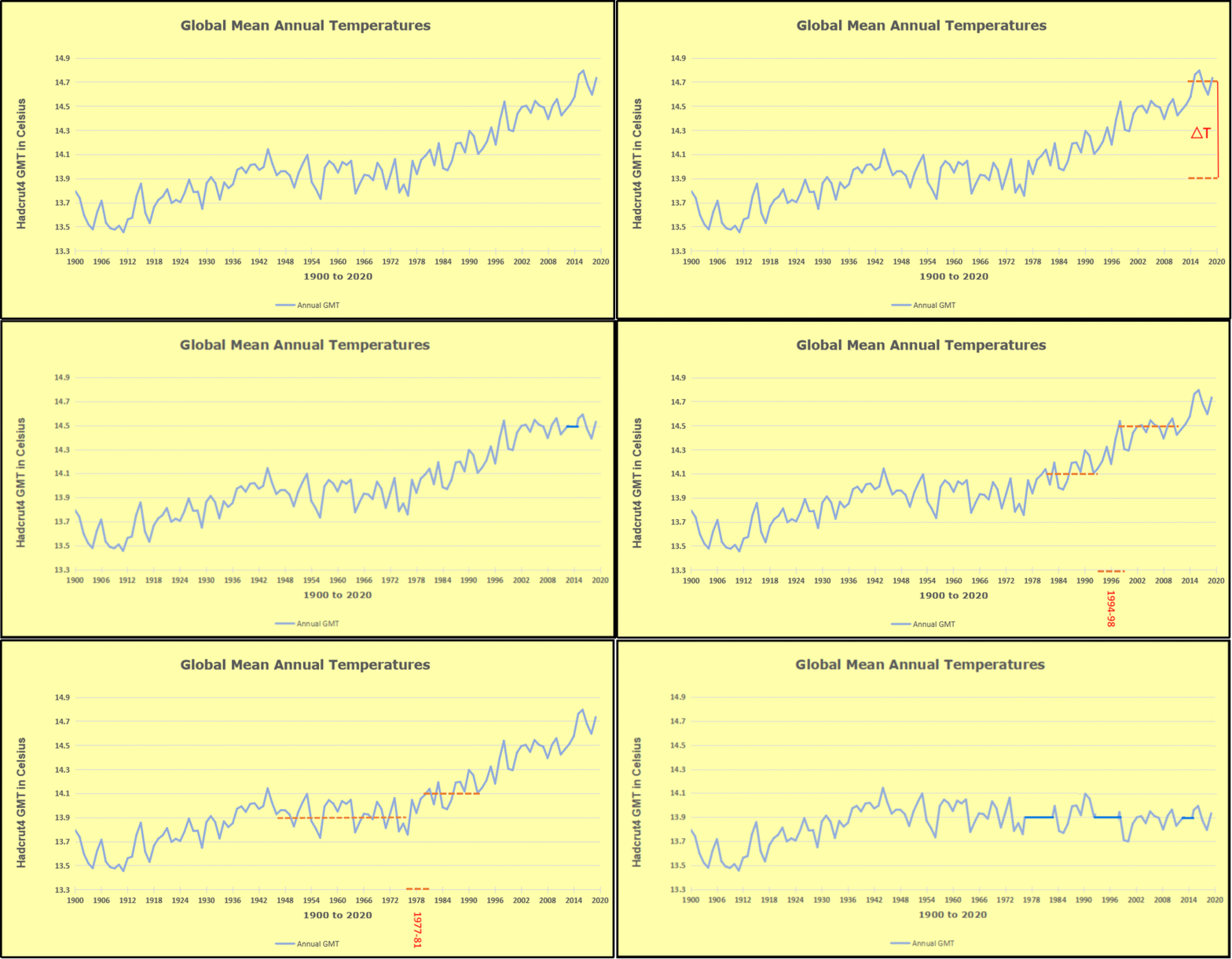
The animation is an update of a previous analysis from Dr. Murry Salby.  These graphs use Hadcrut4 and include the 2016 El Nino warming event.  The exhibit shows since 1947 GMT warmed by 0.8 C, from 13.9 to 14.7, as estimated by Hadcrut4.  This resulted from three natural warming events involving ocean cycles. The most recent rise 2013-16 lifted temperatures by 0.2C.  Previously the 1997-98 El Nino produced a plateau increase of 0.4C.  Before that, a rise from 1977-81 added 0.2C to start the warming since 1947.

Importantly, the theory of human-caused global warming asserts that increasing CO2 in the atmosphere changes the baseline and causes systemic warming in our climate.  On the contrary, all of the warming since 1947 was episodic, coming from three brief events associated with oceanic cycles.

FactRecent rise in SST was driven by ENSO and N. Atlantic Anomalies.

And now in 2024 we have seen an amazing episode with a temperature spike driven by ocean warming in all regions, along with rising NH land temperatures, now dropping below its peak.

The chart below shows SST monthly anomalies as reported in HadSST4 starting in 2015 through December 2024.  A global cooling pattern is seen clearly in the Tropics since its peak in 2016, joined by NH and SH cycling downward since 2016, followed by rising temperatures in 2023 and 2024.

To enlarge, open image in new tab.

Note that in 2015-2016 the Tropics and SH peaked in between two summer NH spikes.  That pattern repeated in 2019-2020 with a lesser Tropics peak and SH bump, but with higher NH spikes. By end of 2020, cooler SSTs in all regions took the Global anomaly well below the mean for this period.  A small warming was driven by NH summer peaks in 2021-22, but offset by cooling in SH and the tropics, By January 2023 the global anomaly was again below the mean.

Now in 2023-24 came an event resembling 2015-16 with a Tropical spike and two NH spikes alongside, all higher than 2015-16. There was also a coinciding rise in SH, and the Global anomaly was pulled up to 1.1°C last year, ~0.3° higher than the 2015 peak.  Then NH started down autumn 2023, followed by Tropics and SH descending 2024 to the present. After 10 months of cooling in SH and the Tropics, the Global anomaly came back down, led by NH cooling the last 4 months from its peak in August. It’s now about 0.1C higher than the average for this period. Note that the Tropical anomaly has cooled from 1.29C in 2024/01 to 0.66C as of 2024/12.

FactEmpirical measurements show ocean warms the air, not the other way around.

One can read convoluted explanations about how rising CO2 in the atmosphere can cause land surface heating which is then transported over the ocean and causes higher SST. But the interface between ocean and air is well described and measured. Not surprisingly it is the warmer ocean water sending heat into the atmosphere, and not the other way around.

The graph displays measures of heat flux in the sub-tropics during a 21-day period in November. Shortwave solar energy shown above in green labeled radiative is stored in the upper 200 meters of the ocean. The upper panel shows the rise in SST (Sea Surface Temperature) due to net incoming energy. The yellow shows latent heat cooling the ocean, (lowering SST) and transferring heat upward, driving convection. [From An Investigation of Turbulent Heat Exchange in the Subtropics by James B. Edson]

As we see in the graphs ocean circulations change sea surface temperatures which then cause global land and sea temperatures to change. Thus, oceans make climate by making temperature changes.

FactOn all time scales, from last month’s observations to ice core datasets spanning millennia, temperature changes first and CO2 changes follow.
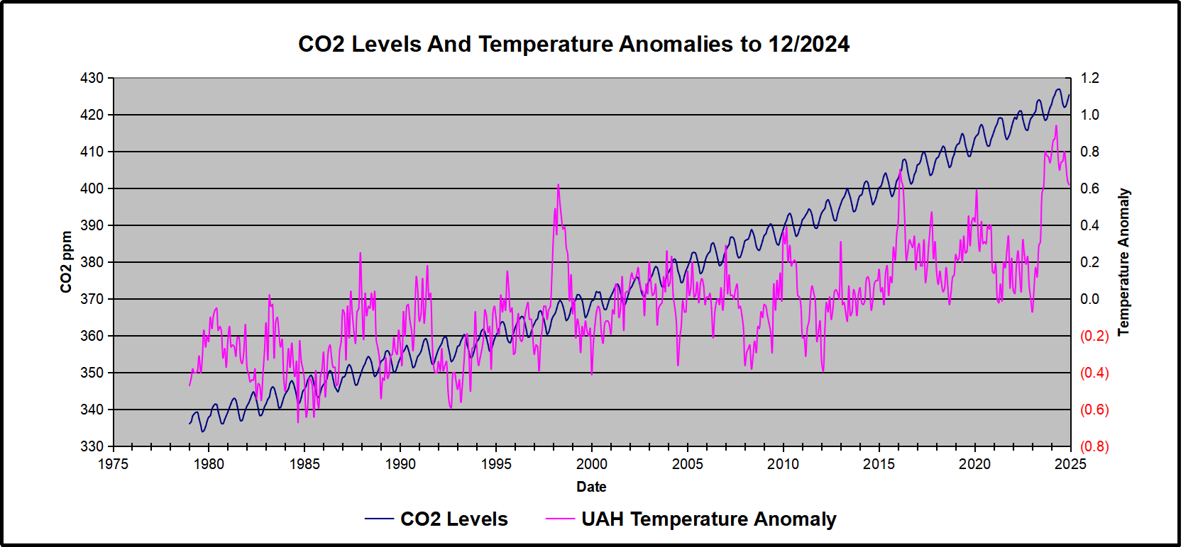
Previously I have demonstrated that changes in atmospheric CO2 levels follow changes in Global Mean Temperatures (GMT) as shown by satellite measurements from University of Alabama at Huntsville (UAH). That background post is included in the posting referenced later below.

My curiosity was piqued by the remarkable GMT spike starting in January 2023 and rising to a peak in April 2024, and then declining afterward.  I also became aware that UAH has recalibrated their dataset due to a satellite drift that can no longer be corrected. The values since 2020 have shifted slightly in version 6.1, as shown in my recent report  Ocean Leads Cooling UAH December 2024.

I tested the premise that temperature changes are predictive of changes in atmospheric CO2 concentrations.  The chart above shows the two monthly datasets: CO2 levels in blue reported at Mauna Loa, and Global temperature anomalies in purple reported by UAHv6.1, both through December 2024. Would such a sharp increase in temperature be reflected in rising CO2 levels, according to the successful mathematical forecasting model? Would CO2 levels decline as temperatures dropped following the peak?

The answer is yes: that temperature spike resulted
in a corresponding CO2 spike as expected.
And lower CO2 levels followed the temperature decline.
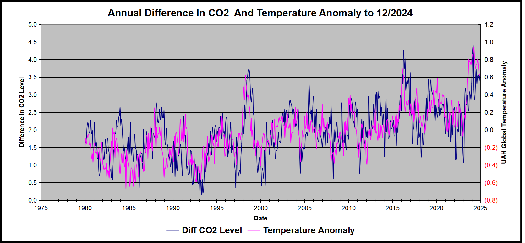
Above are UAH temperature anomalies compared to CO2 monthly changes year over year.

Changes in monthly CO2 synchronize with temperature fluctuations, which for UAH are anomalies now referenced to the 1991-2020 period. CO2 differentials are calculated for the present month by subtracting the value for the same month in the previous year (for example December 2024 minus December 2023).  Temp anomalies are calculated by comparing the present month with the baseline month. Note the recent CO2 upward spike and drop following the temperature spike and drop.

Summary

Changes in CO2 follow changes in global temperatures on all time scales, from last month’s observations to ice core datasets spanning millennia. Since CO2 is the lagging variable, it cannot logically be the cause of temperature, the leading variable. It is folly to imagine that by reducing human emissions of CO2, we can change global temperatures, which are obviously driven by other factors.
12/2024 Update–As Temperature Changes, CO2 Follows


Arctic Ice Recovery Stalls January 2025

Arctic ice recovered more slowly than usual in December and January, likely due to polar vortex pulling freezing air from the Arctic down into lower latitudes, replaced by warmer southern air.  A post at Severe Weather Europe is February 2025 Forecast, describing the dynamics this winter.  

After a mild start, a new Polar Express is looming
for the United States and Canada mid-month.

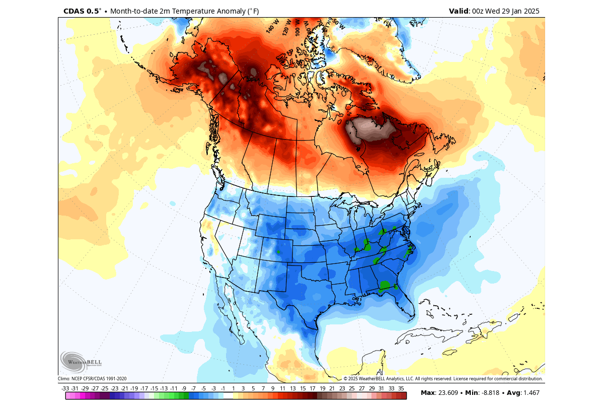
As January is slowly ending, we can look at preliminary surface temperature data for the month so far. Below is the CDAS analysis, and you can see that January was colder than normal across the entire United States, apart from California and parts of Nevada. But these anomalies do not show the full picture of just how cold some days in the month were, breaking records for several years and even decades in the past.

On the other hand, we can see that Canada had warmer than normal temperatures. This is an expected pattern, as while the colder air was transported further south into the United States, it was replaced by high-pressure and a warmer-than-normal airmass.

The movement of the pressure systems drives these temperature patterns and weather changes. Pairs of pressure systems are also known as Rossby Waves. You can see an example of Rossby waves in the image below by NOAA and how they are all connected and function with the jet stream.

The purple line connecting these pressure systems is called the jet stream. This rapid stream of air is found around 9 to 14 kilometers (6 to 9 miles) above sea level.

In late January, the average temperatures in the northern United States and southern Canada are still around or below freezing, so even a strong positive anomaly does not actually mean warm temperatures in that region. But, it is interesting to see the rapid shift in temperature anomalies as the pressure systems reposition.

February 2025 is about to start, with the latest weather forecasts indicating a very dynamic month over the United States and Canada. After the power struggle between the cold and warmth at the start of the month, another Polar Vortex lobe looms for the United States around mid-month.

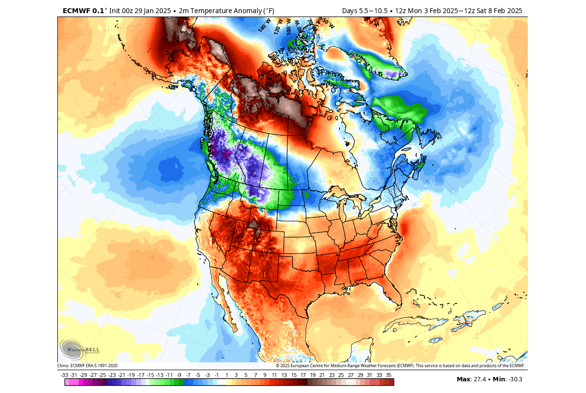
Below is the surface temperature anomaly, averaged for next week. You can see the large supply of colder air over the northern United States and western Canada. Another cooler area is forecast for eastern Canada and the northeastern United States.

But most of the central and southern half of the United States is forecast to have above-normal temperatures. We often see such a division in the weather patterns, where the colder and warmer air separate along the jet stream.

Going into the weather trend for the second half of February, we will use the extended-range ensemble forecasts. These forecasts serve as trends that show the prevailing idea of where the pressure systems are positioned and how the airmass is expected to move.

The continuous low-pressure systems over Canada helped to initiate large-scale cold air transport from the Arctic into the United States and Canada, also powered by the Polar Vortex in the stratosphere.

We continue to see the presence of the low-pressure area over Canada in the forecast for February. But the forecast now indicates an interesting core movement of the Polar Vortex in the stratosphere, likely to initiate another deep cold event around mid-month over the United States and Canada.

Impact on Arctic Ice Extents

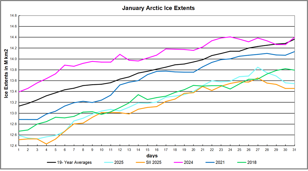
The 19-year average for January shows Arctic ice extents started at 13.13M km2 and ended the month at 14.36M km2.  2024 started somewhat higher and matched average at the end.  Other recent years have been lower, and 2025 started 540k km2 in deficit and 818k km2 below average at month end. The gap had closed to 400k km2 before losing extents at the end.  SII and MASIE tracked closely this month.

The table below shows year-end ice extents in the various Arctic basins compared to the 19-year averages and some recent years.  2007 seven was close to the average, so 2018 is shown for comparison.

Region 2025031 Ave Day 031 2025-Ave. 2018031 2025-2018
 (0) Northern_Hemisphere 13543740 14362137 -818398 13792271 -248532
 (1) Beaufort_Sea 1071001 1070386 614 1070445 556
 (2) Chukchi_Sea 965989 965974 15 965971 18
 (3) East_Siberian_Sea 1087137 1087063 74 1087120 18
 (4) Laptev_Sea 897845 897824 21 897845 0
 (5) Kara_Sea 921520 917381 4139 895363 26157
 (6) Barents_Sea 428814 563859 -135044 481947 -53133
 (7) Greenland_Sea 614789 613370 1418 501411 113378
 (8) Baffin_Bay_Gulf_of_St._Lawrence 1080930 1328380 -247450 1406903 -325972
 (9) Canadian_Archipelago 854878 853510 1368 853109 1769
 (10) Hudson_Bay 1260903 1260778 125 1260838 66
 (11) Central_Arctic 3211379 3210507 872 3184817 26562
 (12) Bering_Sea 534452 648807  -114354 382206 152245
 (13) Baltic_Sea 39334 62876  -23542 41713.99 -2380
 (14) Sea_of_Okhotsk 559692 823877  -264185 704398 -144707

This year’s ice extent is 818k km2 or 5.7% below average.  About half of the deficit comes from the Pacific basins of Bering and Okhotsk sea.  The other two major losses are in Barents Sea and Baffin Bay.  With the annual maximum typically occurring mid-March, it is likely the ice then will also be lower than usual.   


Illustration by Eleanor Lutz shows Earth’s seasonal climate changes. If played in full screen, the four corners present views from top, bottom and sides. It is a visual representation of scientific datasets measuring Arctic ice extents and NH snow cover.