More Evidence Temperatures Drive CO2 Levels, Not the Reverse
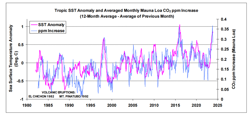
Robbins, 2025 Figure 2: Global tropic SSTs overlaid onto monthly atmospheric CO2 increases (Mauna Loa)
Kenneth Richard posted a No Tricks Zone article: Another New Study Suggests Most – 80% – Of The Modern CO2 Increase Has Been Natural. Excerpts in italics with my bolds and added images.
CO2 concentration increases are not the cause of rising temperature,
but an effect of rising temperature.
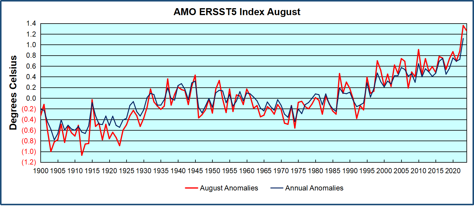
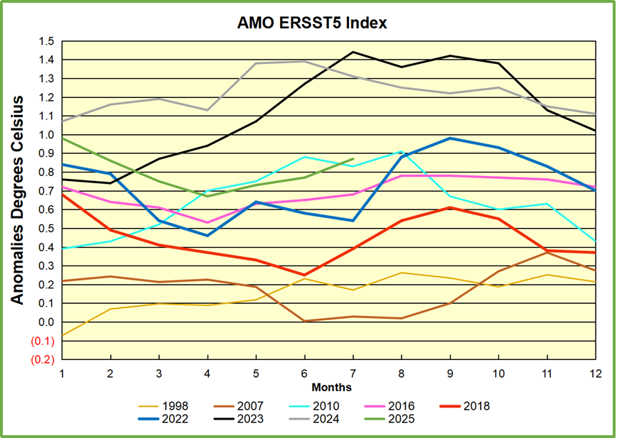
The 2025 paper by Bernard Robbins is Atmospheric CO2: Exploring the Role of Sea Surface Temperatures and the Influence of Anthropogenic CO2. Excerpts in italics with my bolds and added images.
Abstract
Close examination of the small perturbations within the atmospheric CO2 trend, as measured at Mauna Loa, reveals a strong correlation with variations in sea surface temperatures (SSTs), most notably with those in the tropics. The temperature-dependent process of CO2 degassing and absorption via sea surfaces is well-documented, and changes in SSTs will also coincide with changes in terrestrial temperatures, and temperature-dependent changes in the marine and terrestrial biospheres with their associated carbon cycles.

Using SST and Mauna Loa datasets, three methods of analysis are presented that seek to identify and estimate the anthropogenic and, by default, natural components of recent increases in atmospheric CO2, an assumption being that changes in SSTs coincide with changes in nature’s influence, as a whole, on atmospheric CO2 levels. The findings of the analyses suggest that an anthropogenic component is likely to be around 20 %, or less, of the total increase since the start of the industrial revolution.
The inference is that around 80 % or more of those increases are of natural origin, and indeed the findings suggest that nature is continually working to maintain an atmospheric/surface CO2 balance, which is itself dependent on temperature. A further pointer to this balance may come from chemical measurements that indicate a brief peak in atmospheric CO2 levels centred around the 1940s, and that coincided with a peak in global SSTs.
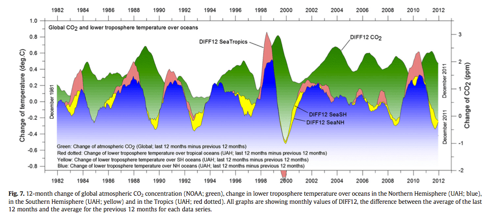
Source: The phase relation between atmospheric carbon dioxide and global temperature OleHumlum, KjellStordahl, Jan-ErikSolheim.
Introduction
Research into the influence SSTs have on changes in atmospheric CO2 includes the work by Humlum et al. (2013). When examining phase relationships, they found a maximum correlation for changes in atmospheric CO2 lagging 11-12 months behind those of global SSTs [1]. A paper by the late Fred Goldberg (2008) noted their correlation by examining El Niño events [2]. He also considered Henry’s law [3] in relation to SSTs, i.e. a temperature-dependent equilibrium between atmospheric CO2 and its solubility in seawater. Spencer (2008) also noted similarities between surface temperature variations with changes in atmospheric CO2 [4].
For the oceans specifically, areas of surface CO2 absorption and degassing are shown in maps provided by NOAA [5] and ESA [6] for example. These maps show that colder sea surfaces towards the poles are net absorbers of CO2 whilst the warmer surface waters of the tropics are net emitters. An analogy often cited is the greater ability of carbonated drinks to retain CO2 at cooler temperatures; this ability drops as the drinks get warmer.
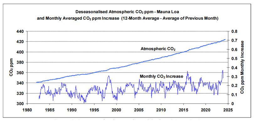
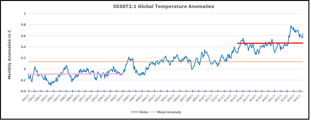
Figure 1: Deseasonalised atmospheric CO2 data (Mauna Loa).
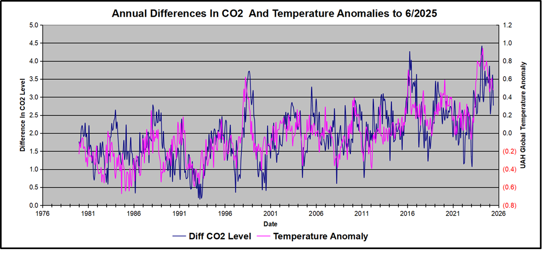
A strong correlation between changes in atmospheric CO2 and SSTs can be readily discerned from the relevant datasets. To illustrate, the upper graph in Fig. 1 plots atmospheric CO2 in parts per million (ppm) as measured at Mauna Loa, Hawaii, since 1982. The data [7] has been ‘deseason-alised’ by NOAA to remove natural annual CO2 cycles.
The similarity between the two traces is striking: short-term fluctuations in CO2 readings at Mauna Loa appear particularly sensitive to tropic conditions (if tropic SSTs are substituted for global SSTs in Fig. 2, the correlation is less strong). Warm tropical seas, with surface temperatures typically around 25-30 oC, cover almost one third of the earth’s surface. The most prominent peaks in the figure coincide with strong El Niño events. Taken at face value, and ignoring any influence from anthropogenic emissions, Fig. 2 suggests that if the tropic SST anomaly dropped to around -1 oC (with related drops globally) then the concentration of CO2 in the atmosphere, as measured at Mauna Loa, would level off.
Robbins, 2025 Figure 2: Global tropic SSTs overlaid onto monthly atmospheric CO2 increases (Mauna Loa)
An important point is that changes in SSTs will coincide with those of terrestrial temperatures, temperature-dependent changes to both terrestrial and marine carbon cycles and, taking into consideration the research by Humlum et al. (2013) who found that changes in atmospheric CO2 followed changes in SSTs, an assumption in the work presented here is that nature’s influence on atmospheric CO2 levels, as a whole, follows on from changes in SSTs.
Discussion
The techniques used in Analyses 1 and 2, aimed at discerning and estimating the human contribution to recent increases in atmospheric CO2, are based on processing of monthly data from both SST and atmospheric CO2 datasets. Using the technique described in Analysis 1, no contribution from human emissions to the measured increases in atmospheric CO2, since 1995, was discerned. Given an approximate 60 % increase in annual human emissions since 1995 this suggests, by itself, that any human contribution to the measured increases is likely to be relatively small compared to nature’s contribution.

For the technique described in Analysis 2, a figure of ~27 ppm was estimated for a possible human contribution out of a total increase of 143 ppm since 1850, equating to around 19 % of the total increase in atmospheric CO2 since the start of the industrial revolution. Thus the results of these two analyses, taken together, suggest that nature appears to account for around 80 % or more of increases in atmospheric CO2 since 1995.
The technique described in Analysis 3 examines the relationship between longer-term trends in SST datasets and atmospheric CO2 measurements. This data analysis goes as far back as the late 1950s, when the ongoing acquisition of atmospheric CO2 measurements began at Mauna Loa. The resulting three graphs show an apparent almost-linear long-term relationship between SSTs and atmospheric CO2. Linear trend lines fitted to these graphs produce gradients of between ~120 and ~145 ppm/ 0C for the three SST datasets examined.
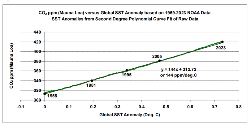
Figure 15: Atmospheric CO2 as a function of global SST trend since 1958
As for anthropogenic CO2, published figures (e.g. GCB data) suggest a roughly linear relationship between cumulative anthropogenic emissions as a function of time, and atmospheric CO2 measurements from Mauna Loa. If it’s reasoned that this mostly accounts for the linear trends as calculated in Analysis 3, this reasoning would not fit with the findings of the first two analysis methods that suggest 80 % or more of recent atmospheric CO2 increases are of natural origin.
Conclusions
Analyses of SST and atmospheric CO2 data, acquired since 1995, produce an estimated atmospheric CO2 increase, possibly attributed to human emissions, of around 20 %, or less, of the total increase since the industrial revolution, thus inferring that around 80 % or more of the increase is of natural origin.
Further data examination points to an almost linear longer-term relationship between SSTs and atmospheric CO2 since at least the late 1950s, and is suggestive of nature working to maintain a temperature-dependent atmosphere/surface CO2 balance. Recent historical evidence of such a balance may come from chemical measurements that indicate a brief peak in atmospheric CO2 levels centred around the 1940s, and that coincided with a peak in global SSTs.
Human emissions of CO2 are about 1/20-th of the natural turnover, and the findings of the analyses presented here suggest that this relatively-small human contribution is being readily incorporated into nature’s carbon cycles as they continually adjust to our constantly-changing climate.
As for surface temperatures, the research by Humlum et al. concluded that changes in atmospheric temperature are an ‘effect’ of changes in SSTs and not a ‘cause’ as some might advocate. And Humlum’s ‘take home’ message from a recent presentation was:
‘What controls the ocean surface temperature, controls the global climate’ [33]. He suggests the sun would be a good candidate, modulated with the cloud cover.
See Also


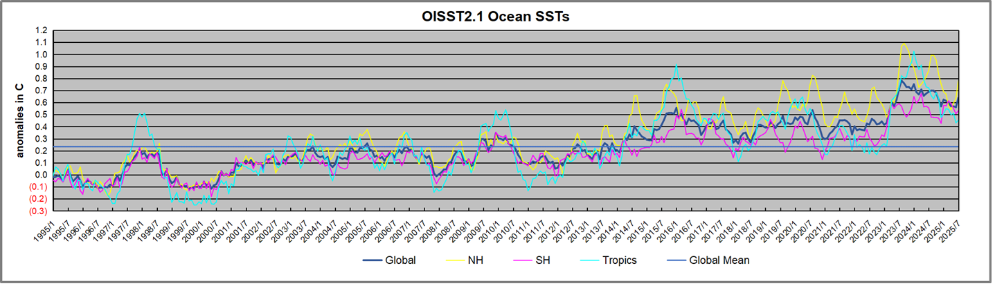
 The best context for understanding decadal temperature changes comes from the world’s sea surface temperatures (SST), for several reasons:


