Placing Melissa in History
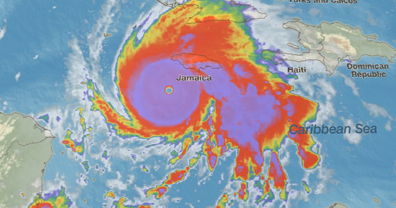
Climatic media has fallen in love with Melissa, many of them blaming “climate change”, i.e. CO2 for her strength and destructive power. No surprise that Imperial College London (who foisted its covid pandemic models upon us) reports that its IRIS model confirms a “rapid attribution” claim. No doubt there will be more such yada yada at Belem COP to stir up the faithful.
For the rest of us, let’s remember the saying attributed to George Santayana: “Those who cannot remember the past are condemned to repeat it.” For example, Melissa belongs to a class of stong Atlantic hurricanes going back almost a century. Here’s a table of them along with peak sustained winds and the CO2 levels at the time.
| Peak Wind | CO2 Level | ||
| Hurricane | Year | mph | ppm |
| “Cuba” | 1932 | 175 | 308 |
| “Labor Day” | 1935 | 185 | 310 |
| Janet | 1955 | 175 | 314 |
| Camille | 1969 | 175 | 325 |
| Anita | 1977 | 175 | 334 |
| David | 1979 | 175 | 337 |
| Allen | 1980 | 190 | 339 |
| Gilbert | 1988 | 185 | 352 |
| Andrew | 1992 | 175 | 356 |
| Mitch | 1998 | 180 | 367 |
| Wilma | 2005 | 185 | 380 |
| Rita | 2005 | 180 | 380 |
| Katrina | 2005 | 175 | 380 |
| Dean | 2007 | 175 | 384 |
| Felix | 2007 | 175 | 384 |
| Irma | 2017 | 180 | 407 |
| Maria | 2017 | 175 | 407 |
| Dorian | 2019 | 185 | 411 |
| Milton | 2024 | 180 | 425 |
| Melissa | 2025 | 185 | 428 |
Note that all twenty hurricanes had winds ranging between 175 to 190 mph, going back to 1932. Meanwhile CO2 has increased from 308 ppm to 428 (2025 ytd). Note also the absence of such storms in the decade 2007 to 2017 despite CO2 adding 23 ppm in that period. The correlation between high wind speeds and CO2 concentrations is an insignificant 0.18.
Then there is the Global Accumulated Cyclone Energy (ACE) report that includes the effects of both minor and major storms, combining strength and frequency.
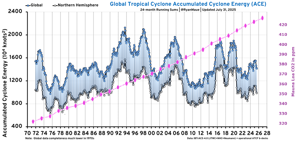
I added an overlay of CO2 to illustrate how unlikely is a link between CO2 and storms. Finally from Roger Pielke Jr. a chart showing ACE strength per hurricane:
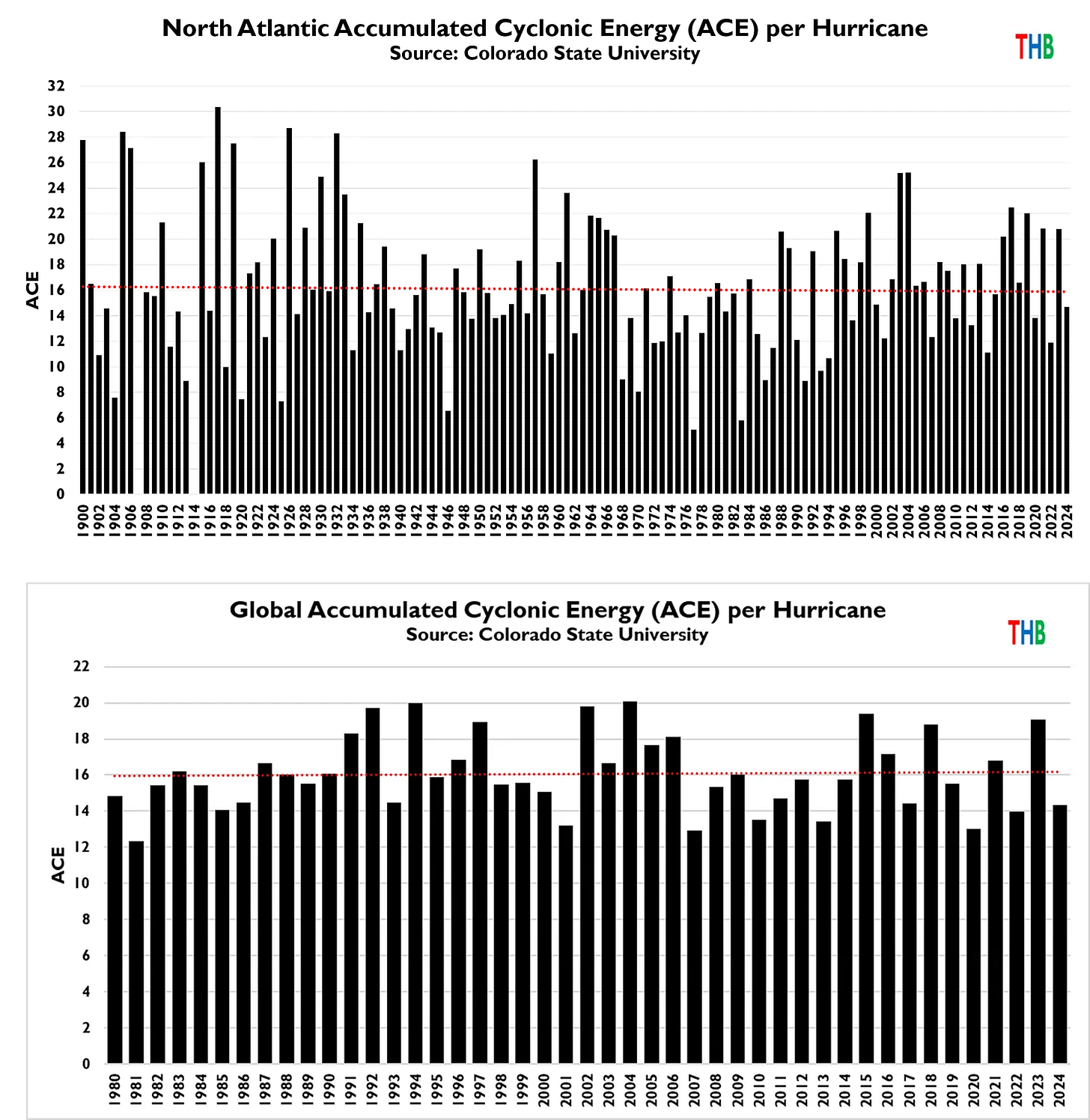
The charts show that 16 is the average ACE per hurricane, in North Atlantic since 1900 and Globally since 1980. The trend is not upward, and in North Atlantic appears currently lower than the past.
See Also: