Matt Ridley explains the demise of climatism in his recent video The Great Climate Climbdown is finally here – How can we undo the Damage Caused? For those preferring to read, there is a transcript below with my bolds and some helpful images.
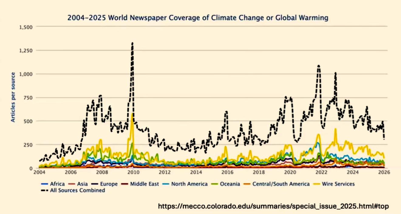
I’m going to try and give you my perspective on which arguments have made the difference in terms of changing people’s minds on climate, and therefore the kinds of evidence and arguments that we should be pushing in order to try to win this battle. The genesis for this was this article I wrote in The Spectator saying that I really do think the climate emergency talk has peaked, and we are seeing a significant change. If you live in the British Isles, that’s not immediately apparent.
Climate Lemmings
It’s still a huge issue in Britain and Ireland, and most of Europe. But if you spend any time in America now, or even in Asia, you are seeing a very, very different debate where the affordability of energy is much more important than decarbonisation, where the demands of AI, etc., have trumped the requirement to cut carbon dioxide emissions. I think Britain and Ireland are getting left behind here, and we need to get with the conversation that’s happening elsewhere.
I think the images are covering the latter half of that graph, so you can’t see, but there has been a decline in newspaper coverage. There’s all sorts of straws in the wind, like I mentioned Bill Gates closing down the advocacy office, the Banking Alliance for Climate Change has closed down. A lot of companies are tiptoeing away from this issue, and it therefore is a moment when it might die out.
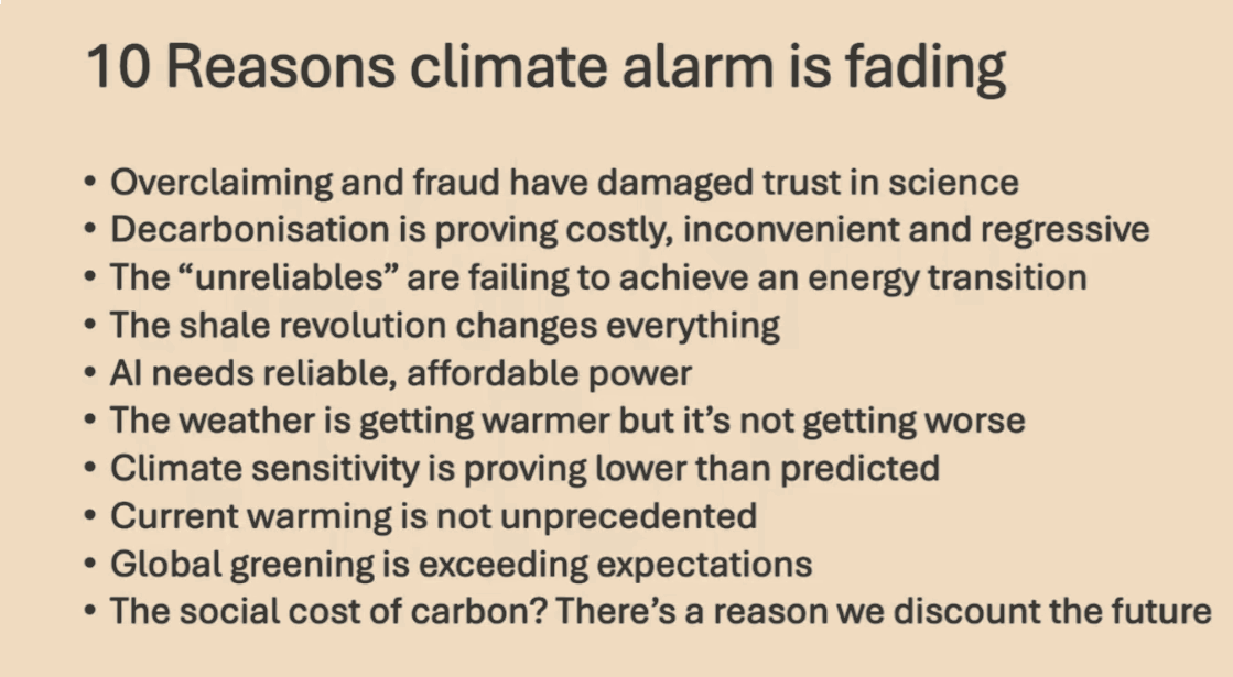
More likely, it will go quiet for a while, and then we’ll have more air pumped into the balloon at some point in some form or other. There’s such a gigantic vested interest these days in climate alarm that one can’t ever write it off completely. But here are 10 reasons I think why it’s fading, and I’ll run through them in more detail, but I’ll just quickly list them here.
I think it’s important not to underestimate the degree to which the COVID pandemic has left people mistrustful of science and of experts, and that has significantly damaged trust in science, and that is infecting the climate debate. Of course, over-claiming and some degree of fraud have been a problem in the climate science arena for even longer, but I think you are getting traction now because of COVID. Most important, of course, is that we were told that the decarbonization of the world energy system would pay for itself, would be profitable.
That is clearly not the case. It’s proving costly, inconvenient, and regressive in that poor people are paying more than rich people for this transition, and that I think is why a lot of ordinary people are beginning to see through the alarm. The transition to wind and solar, which I call unreliable because there are lots of renewable energies, but the distinguishing feature of wind and solar is that you can’t rely on them.
The transition to them is simply failing to materialize, I will argue. I don’t fully understand why, if you’re worried about what’s happening to climate change, you are automatically passionately in favor of wind and solar power. It just doesn’t necessarily follow, in my view.
I think it’s important not to underestimate how much the shale revolution has changed everything. Until 15 years ago, it was still easily possible to talk about oil and gas running out and therefore getting more expensive, and that would therefore necessitate a switch from hydrocarbons. That changed with the discovery of how to get gas and oil out of shale, and the effect on America’s position as a gas and oil producer and as an energy consumer is extraordinary, I think, and many people outside America just don’t realize this.
We’re so indoctrinated with the idea that the big energy transition of our time is windmills and solar panels that we don’t notice that the big energy transition of our time is actually shale. The fact that the AI industry needs reliable, affordable power has led much of tech to become much more realistic and pragmatic about energy, and getting it from shale gas power stations is now the top priority for most of the companies rushing into AI and data centers.
On the science, I’m somebody who thinks it is getting warmer. Springs are getting nicer, winters are getting milder, summer’s not much different, but I don’t think it’s getting worse, and I think that is what most people are now beginning to realize after 50 years of being told that the future is going to be horrible. We’re living in that future, and it ain’t too bad. One of the reasons for that is because the models are still running too hot and have been consistently, because they’re assuming higher climate sensitivity than the science now supports.
I think that there is now so much evidence that the recent past, by which I mean the current interglacial, the Holocene period, starting about 9,000 years ago, has been much, much warmer in its first half than it is today. That evidence is getting harder and harder to hide, deny, or ignore. Therefore, we are a long way from living in unprecedented temperatures.
The fact that we’re unprecedented compared with the 19th century is not really the relevant comparison. For me, one of the big stories is that the effect of carbon dioxide on green vegetation is much greater than scientists expected or predicted. They did not think it was a limiting factor in most ecosystems, and yet it’s turning out to be an enormous effect, much more measurable, actually, than the effect of carbon dioxide on warming.
If carbon dioxide is a problem, we ought to be able to measure its cost and then tell ourselves how much this generation should pay for a cost that’s going to fall on a future generation, how much we discount the future. That calculation, it seems to me, if done honestly, is more and more playing against alarm. Just to the first point about overclaiming and fraud, which is damaging trust in science, the record of predictions about what’s going to happen in the climate and the chickens that are coming home to roost on this are more and more helpful, I think, to the argument.
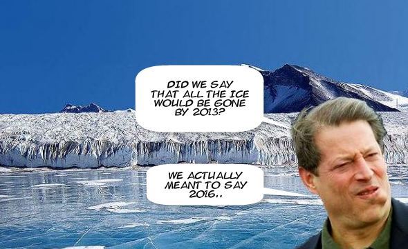
Al Gore is known now more for predicting that the Arctic would be ice-free within five years in 2009 than he is for some of the other things he’s said. It has damaged the reputation of people like that. I enjoyed this quote from Ted Turner, that within 30-40 years, no crops will grow, most people will have died, and the rest of us will be cannibals.
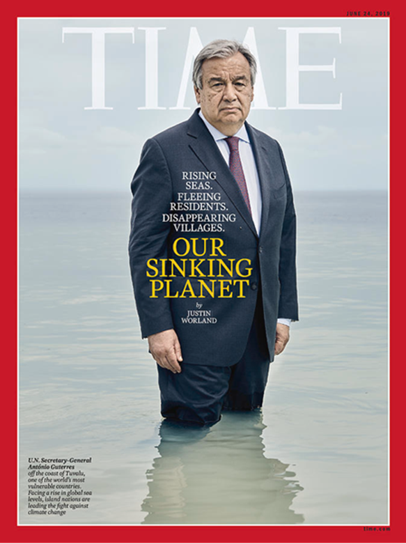
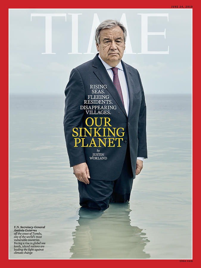
It’s quite extraordinary what people have been getting away with saying in order to get noticed in this debate. The UN Secretary General standing up to his knees on a beach in Tuvalu makes great cover for Time magazine, but I think this kind of thing no longer cuts through to people, partly because people now realize that islands like Tuvalu are not sinking, they’re actually gaining land area because of wave action. You can’t see it because it’s on the corner there, but I’ve included Andrew Montford’s hockey stick delusion here because I do think that the hockey stick story is one of significant scientific malpractice, and that ought to be better known.
This picture just sums up a lot of what went wrong in recent years, and I don’t think you’re going to see this kind of uniparty consensus again. Here is the environment secretary or shadow secretaries of the British government, the Tory party, the Liberal Democrat party, and the Labour party all standing up and giving a round of applause to Greta Thunberg. Greta Thunberg is saying, unfortunately I can’t quite read what she’s saying because it’s hidden behind the thing for me, I hope it is for you, but that we’re setting off an irreversible trend that will end civilization by 2030.
That’s what she actually said in parliament in Westminster that day. Michael Gove, the Tory, said your voice is still calm, it’s the voice of our conscience, we feel great admiration, and Ed Miliband said you’ve woken us up. So this kind of political consensus has been a huge problem.
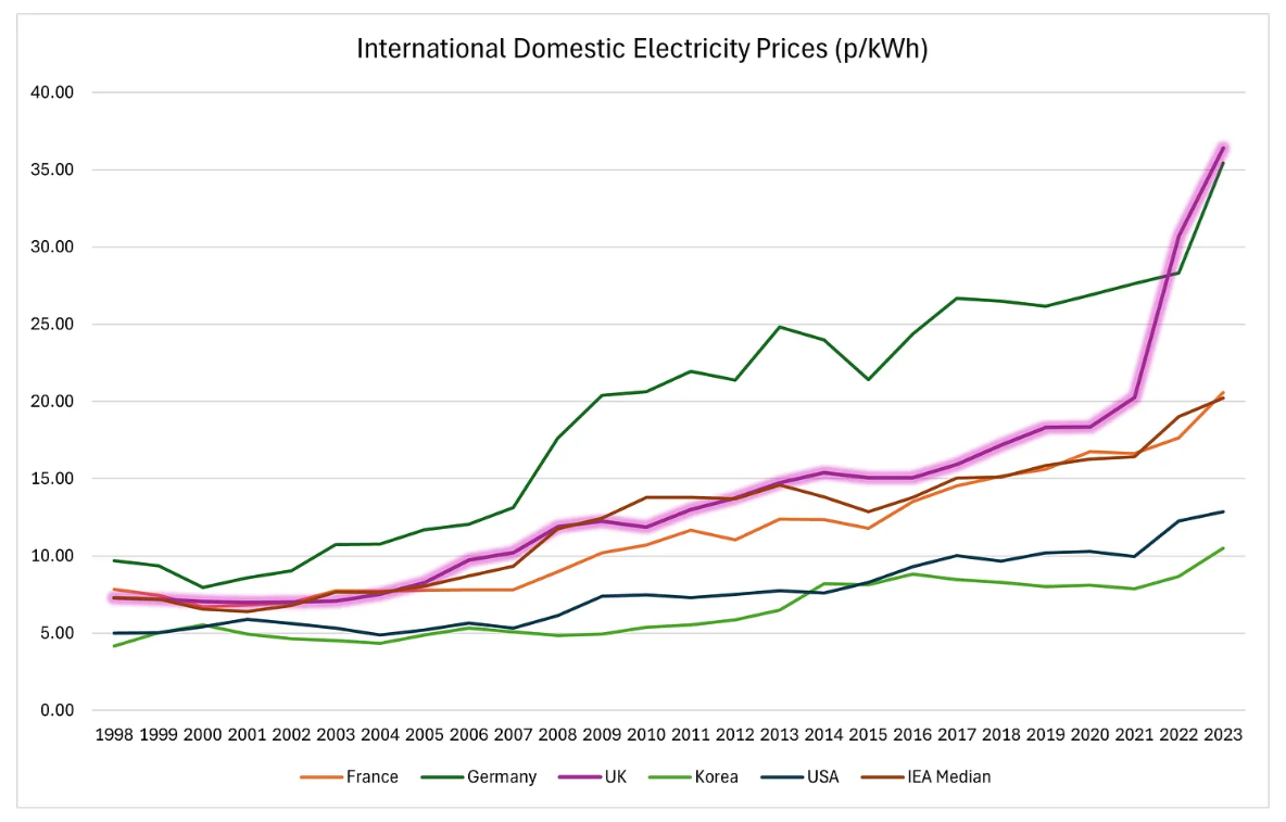
The fact that no party has been prepared to rock the boat, that is changing even in Britain now. We have the Reform Party and the Conservative Party both being much more skeptical on climate and energy issues. The degree to which electricity and gas prices have exceeded those in America now, in Europe and in the UK in particular, and in Ireland, is more and more striking.
Figure 4 – International Domestic Electricity Prices (p per kWh). UK has the highest domestic electricity prices in the IEA.
And paying four times as much for your energy, whether it’s gas or electricity, is not compatible with remaining competitive. And we are seeing Britain losing its fertilizer, chemical, pharmaceutical, motor, steel, many many other industries at a terrifying rate. Not only that, we are cutting ourselves off from being able to take part in a significant way in the AI industry and some of the other industries of the future, some of the robotics industries and so on.
So this really is where it’s going to hurt ordinary people to have been so far ahead of everyone else in trying to decarbonize our economy. The electric car revolution has been forced on consumers, it’s relatively unpopular for lots of reasons, reliability, cost, charging times. And if you do the analysis on a Chinese electric grid, it’s hard to see how they save any emissions at all, because it’s basically a coal car when you’re running an electric car in China.
Less so in Europe, where most of the electricity comes from gas. But even there, it takes many tens of miles before you’ve really saved any emissions at all, or saved significant quantities of emissions. And at that point, the battery is probably nearly dead anyway, so you’re about to replace it.
So to replace a functioning industry, quite a successful industry in the UK, the motor industry, with one that is really struggling, is a bad thing in itself. And to do so at significant cost and inconvenience to the consumer really is an own goal. I’d say the same kind of thing about heat pumps, replacing gas-fired boilers, fine if it’s a new-build house, much harder if you’re adapting an existing house and have to change the insulation and everything.
And even if it works for the same price, you’re removing a system before the end of its useful life and replacing it with one that’s no better. Therefore, there is no growth in economic terms, and you are effectively stranding assets in doing that. And refusing to build a third runway, trying to limit how much people fly, and telling people that they shouldn’t eat meat is not only counterproductive in political terms, this is backfiring quite significantly even in Europe, much more so in Asia and America.
The big one, as far as the electricity system is concerned, is of course the dash for renewables, for unreliables, in particular solar and wind, where it’s not just the unreliability, the intermittency, but the extreme cost of a system based on that. Britain is producing, well, it has the capacity to produce 21% more electricity now than 15 years ago, but it consumes 24% less electricity than 15 years ago. Now, doing less with more is the very definition of degrowth or impoverishment, and that is a real problem that we are creating for ourselves in this country.
You can’t see the end of this chart, but the global direct primary energy consumption is still vastly dominated by the hydrocarbons around the world. That has not changed. They’re all still breaking records, all three of them.
And if you zoom in to the top corner of that graph, you can just about see the contribution that solar and wind are making to the world economy. It is infinitesimal, and yet it’s around 6%, I think, now if you add them both up, and yet the coverage of the energy industry is dominated by these two rather medieval technologies. Talking of medieval, this is a book about the crop yields of the manors belonging to the Bishop of Winchester in the 1300s.
You may wonder why I brought it up, but if you zoom in on it, you’ll see that most of these manors were producing between one and four grains of wheat per grain they sowed in the ground, an energy return on energy invested of about between one and four. And of course, you’ve got to keep one grain back to sow next year’s crop. So in a year when you only produce one grain, you’ve got almost nothing to feed people with.
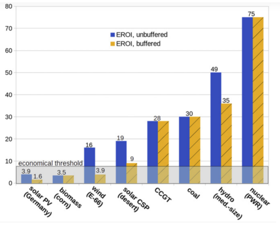
And that is the motor for most of the work done in society by people, and in terms of oats, the same for horses. On my farm in Northumberland today, I would expect to get about 100 grains of wheat for each grain that I sowed in the ground. This energy return on energy invested calculation is, I think, an absolutely critical one, and the one that the unreliable industry is really, really struggling on.
Again, you can’t see the right-hand side of the graph, but you can see this is a calculation of the energy return on energy invested. And if you buffer it by reliability, by the fact that you have to back up wind and solar, it’s hard to see how these reach the economic threshold. Because if you’re producing four units for every unit of energy that goes in, then you’re effectively recreating the medieval economy.
EROI = Total Energy Output / Total Energy Input
And the problem with the medieval economy was that it could only make a few bishops rich, and nobody else could get rich at all. Because otherwise, when you get down to a ratio of three or four energy return on energy invested, a significant proportion of your industry has to be spent making energy. You don’t have much left over to do other things with.
So I think this is the measure that really needs to be rammed home. But on solar, it is just worth pointing out that according to the World Bank, Britain is the second worst country in the world to build solar because of its cloud cover and the cost of land. The only worst country, I’m sorry to say, is Ireland.
Again, it’s disappointing that you can’t see this graph. I hadn’t realized that all these pictures would be on the right-hand side covering it. But the point of this graph is to show that America was a static or declining producer of gas until the early 2000s. It is now by far the biggest gas producer in the world, equal to Russia and Qatar put together. That’s an extraordinary transformation. The same for oil.
Luckily, you can see it here. Everybody, it was said, and it was conventional wisdom, it was groupthink, that America was a played-out declining oil basin, that it would decline steadily from the 1970s onwards. And there was no gain saying that.
And then along came the shale pioneers and turned that around. America now produces more oil than Saudi Arabia and Iraq put together. That’s an extraordinary transformation.
So no one now talks about peak oil, about oil and gas running out in the rest of the world, and therefore about expensive oil. Yes, geopolitics can affect oil and gas prices, but usually only temporarily. The AI revolution is largely fueled by gas and coal with some nuclear. Solar and wind are not the go-to uses for this power, as I mentioned.
What about the climate itself? Well, it is getting warmer. These are early Humlum’s analysis of the five different ways of measuring global average temperature, going up at the rate of, well, going up pretty slowly, heading for about a degree of warming after about 50 years.
But do we believe the numbers?
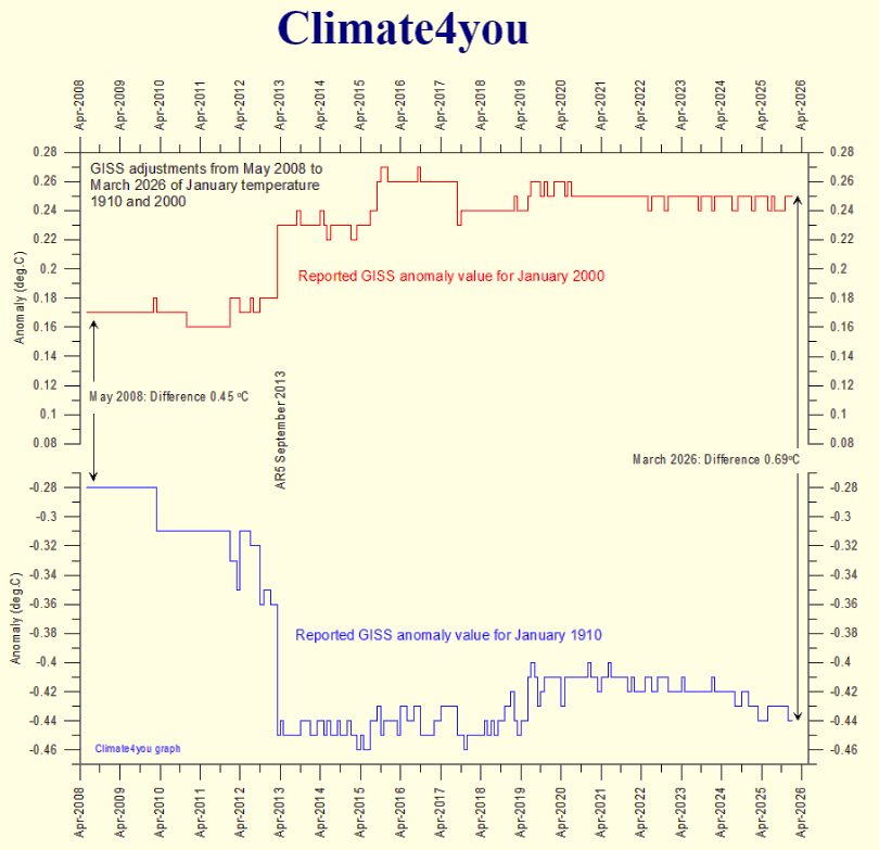
Because I do think that we need to keep talking about the adjustments that are made to temperature records. I mean, here is a graph that early Humlum produces in which he points out that the GISS estimate of what the temperature was in January 2000 has been adjusted upwards, particularly in September 2013. Maybe that’s fair enough. Maybe they had a reason for doing that. But in the same month, they adjusted the temperature for January 1910 significantly downwards. How can they possibly have had a good reason for doing that?
I think one is quite right to be suspicious of this. Cooling the past in order to warm, in order to increase the rate of warming is just too tempting for the people who are in charge of these statistics. And I haven’t touched on the urban heat island effect and the unreliable thermometer stations and so on, but there’s plenty of those issues too. But the real point, as far as the man in the street is concerned, is the weather getting worse? Yes, it’s getting warmer, but is it getting worse? And no, it’s not.
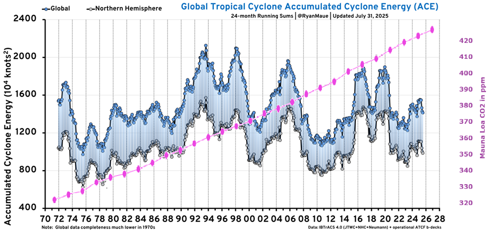
The global tropical cyclones are not getting more frequent or more lethal. Drought is showing no trend in upwards or downwards, really. And as Roger Pielke has summarized, for most of the significant weather effects, except heat waves and perhaps heavy precipitation, then there is no detection or attribution as stated by the Intergovernmental Panel on Climate Change reports.
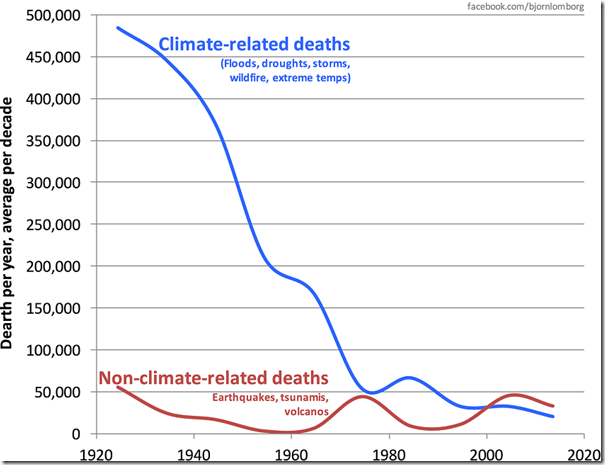
This is from AR7, their latest report. And of course, the point which Bjorn Lomborg has made, among others, that higher temperatures, sorry, heat kills far more people, cold kills far more people than heat, and if we have higher temperatures, we will have slightly more people killed by heat, but a lot fewer people killed by cold. So we are genuinely saving lives through global warming.
My Mind is Made Up, Don’t Confuse Me with the Facts. H/T Bjorn Lomborg, WUWT
Generally, deaths from climate change, as many of you will know, are down significantly, whereas deaths from earthquakes, tsunamis and volcanoes are not. That’s a remarkable statistic, which is not because weather’s getting safer, but because we’re getting better at forecasting, predicting and sheltering people from bad weather. People get very worked up about sea ice decline, but it’s slow.
And the Arctic hasn’t broken a sea ice low record since 2012. Antarctica has seen a recent slight downward trend, but there is no evidence that we’re getting anything like an Arctic, an ice-free period in the Arctic summer, which was quite routine 8,000 or 9,000 years ago.
Sea level rise, significant, but no sign of acceleration. The linear trend since 2010 is higher than the linear trend since 2005, but the linear trend since 2015 is lower again. So it’s going up and down, but it’s around a foot and a half per century, which is easily something we can cope with. I won’t go into the details, but I think Nick Lewis in particular and Judith Currie have done a very good job of showing in the peer-reviewed literature that the estimates of climate sensitivity that are going into the models have broadly been too high and they need to come steadily downwards.
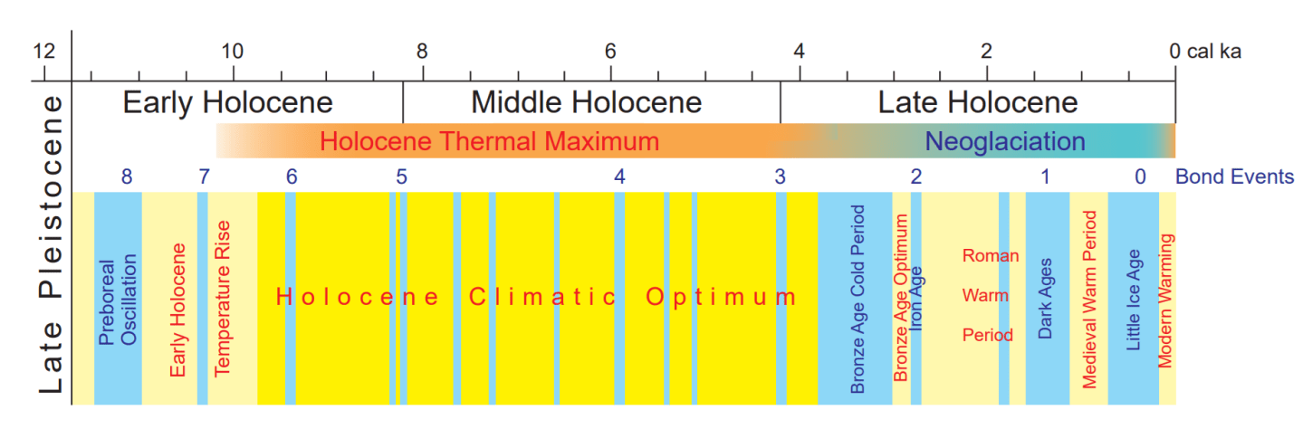
And that would explain why the models have been running too hot compared with the global temperature. I think the Holocene Thermal Maximum is a very important point that we need to keep stressing because the temperature of Greenland and the Makassar Strait, two different datasets here, was significantly higher 6,000 BC, 8,000 years ago, than they are today. This data is coming in now from many different types of paleo temperature records showing the Holocene Climate Optimum.
Fig. 1. Climate change in the Holocene, adapted from Palacios et al. (2024a) and modified: warm periods are in yellow and less warm in pale yellow, and cold in blue; Bond Events are after Bond et al. (1997, 2001) and geochronology after Walker et al. (2019).
I was looking, for example, at evidence that in the Indian Ocean, sea levels were considerably higher than they are today. It used to be the consensus that they’d been going up steadily since the Ice Age, or rapidly and then steadily. It’s now reckoned that they may have been up to two meters higher in the period when the first pharaohs were already appearing in Egypt. So that’s not that long ago. And that Holocene Optimum was a period of considerable wetness in the Sahara, lakes and hippos in the Sahara region. So this was a period within human history, in the early period of human history, when we were experiencing much warmer and damper temperatures.
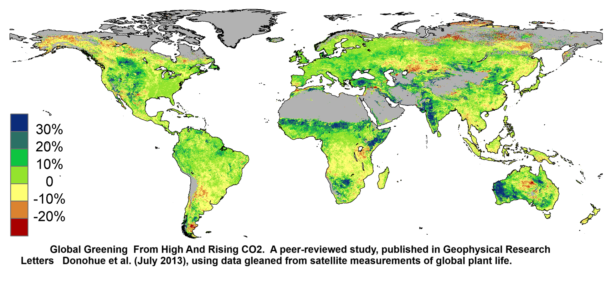
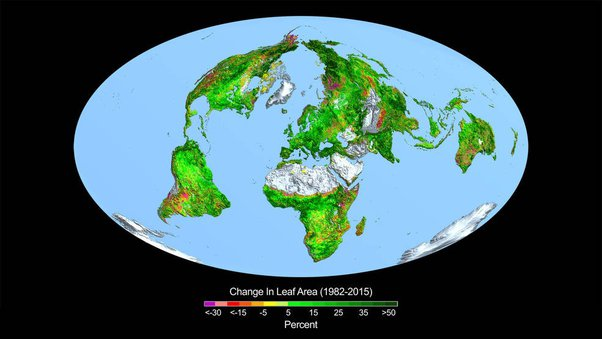
But I think global greening is the big one. Here we have considerable evidence from a number of different directions that there’s 15% more green vegetation on the planet after 30 years because of carbon dioxide fertilization. And that is in all ecosystems, particularly arid ones, but in tropical ones and arctic ones as well, and in marine ones as well as terrestrial ones. That is a really significant effect. If you add the effect it’s had on agricultural yields alone, it comes to trillions of dollars of benefit for mankind. But then let’s add in the benefit for grasshoppers and gazelles and all the other creatures that eat green vegetation.
Now, I published an article about this in 2013, when I first got wind that the satellite data had been analyzed and was showing this global greening. Before then, there were other measures for picking up, but it hadn’t been analyzed from satellite data. And this annoyed the professor whose work I was reporting very much indeed, so much so that when he published his work, the press release from Boston University named me personally, along with Rupert Murdoch, as being the kind of person who mustn’t be allowed to misinterpret this result.
Well, I call that a win, actually, if I’m getting a name checked in the press release. Now, on the social cost of carbon, Britain doesn’t use the social cost of carbon. They can’t make it add up. They simply can’t get an estimate of it that’s high enough to justify the money we’re spending on decarbonization. America did use a high one during the Biden administration, but Ross McKitrick has basically demolished the argument behind that. It largely left out the carbon dioxide fertilization effect.
And his own estimates of the social cost of carbon are that it’s pretty small, that it’s of the order of $5 to $10 per ton of carbon. That’s the total future harm done by each ton of carbon dioxide we produce today. Well, the cost of decarbonization is way higher than that.
So it just doesn’t make sense to pay a fortune for something that will save a penny. Worse than that, they are claiming to help wealthy future people by asking poor people today to make sacrifices, poor people within countries where energy policies tend to be regressive, between countries where we are on the whole denying cheap energy to many poor countries, and of course, between generations as well. I won’t look at those quotes.
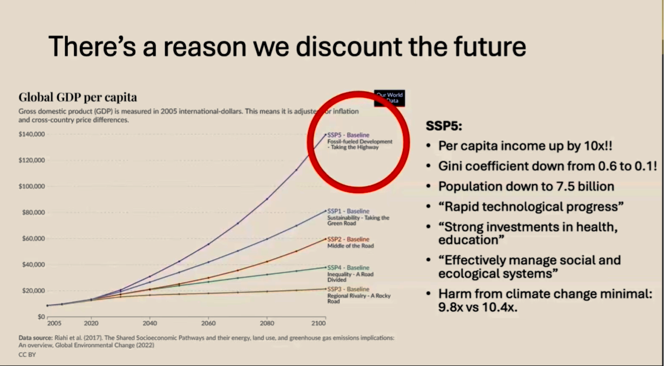
So these are the five economic scenarios that IASA did for the IPCC showing what might happen to global GDP per capita. And it’s worth just looking at the one they call taking the highway fossil fuel development. This is the one in which we really let rip and continue to use hydrocarbons on a significant basis and end up with quite a lot of warming as a result.
It’s a scenario in which per capita income is roughly 10 times what it is today, 10 times. Globally, everybody on planet Earth is earning 10 times as much. Imagine what they could do with that, in which the Gini coefficient is down significantly from 0.6 to 0.1, which population falls faster than expected, whether that’s a good thing or a bad thing, in which there is rapid technological progress, strong investment in health and education, effective management of ecological systems.
This is not a terrible world. It sounds like rather a good world. And if, yes, there’s a lot of warming, then we’re 10 times as rich to deal with it. Surely the warming will have done economic harm. Yes, it will. How much harm? It will have reduced the wealth of your grandchildren. Instead of being 10.4 times as rich, they will be 9.8 times as rich. Is that really an existential catastrophe? There’s a reason why we use a discount rate. Lord Stern persuaded us in the mid-2000s that we should not use a discount rate about the future because we’re looking after our grandchildren. We should care about them just as much as we care about ourselves. But if they’re going to be 10 times as rich, then it doesn’t make sense to hurt poor people today to make them not quite 10 times as rich.
So, just to end, what are we still up against?
Massive subsidies and funding for climate alarm.
You can’t underestimate the power of money.Widespread bias and censorship still in the media. Some doubling down on the point that solar power doesn’t come through the Strait of Hormuz.
Doesn’t this crisis prove that we should wean ourselves off fossil fuels? Climate is a very good excuse for politicians. Again and again you’ve seen people like the governor of California saying yes the Palisades fire burned a lot of people’s homes but there’s nothing I can do about it because it was caused by climate change. There was something you could do about it. You could have done prescribed burning but climate change gets you off the hook as a politician.
I do believe that it’s a mistake to go too far in skepticism and call it things like a hoax. That does tend to put people off. But the problem with our side of the argument is we can’t be bothered to sit on these committees and get stuck into the detail and do all the really boring leg work and go to these awful conferences. And that’s what we ought to be better at. And that’s about the only thing I can say that we are the in criticism of the skeptical side of the debate. Thank you very much.
About Heather Exner-Pirot My research focuses on Indigenous and northern economic development, energy security, and resource politics and policy. I am currently the Director of Energy, Natural Resources and Environment at the Macdonald-Laurier Institute, a Special Advisor to the Business Council of Canada, and a Research Advisor to the Indigenous Resource Network.
in the brief interview below she explains how Canada has squandered abundance, and is now facing an impending energy crisis. Her recent paper shown above (and linked later below) includes the background research for viewpoints expressed, and presented in the transcript with added bolds and images. JS refers to Jim Csek and HEP to Exner-Pirot.
Does Canada produce enough energy to sustain itself?
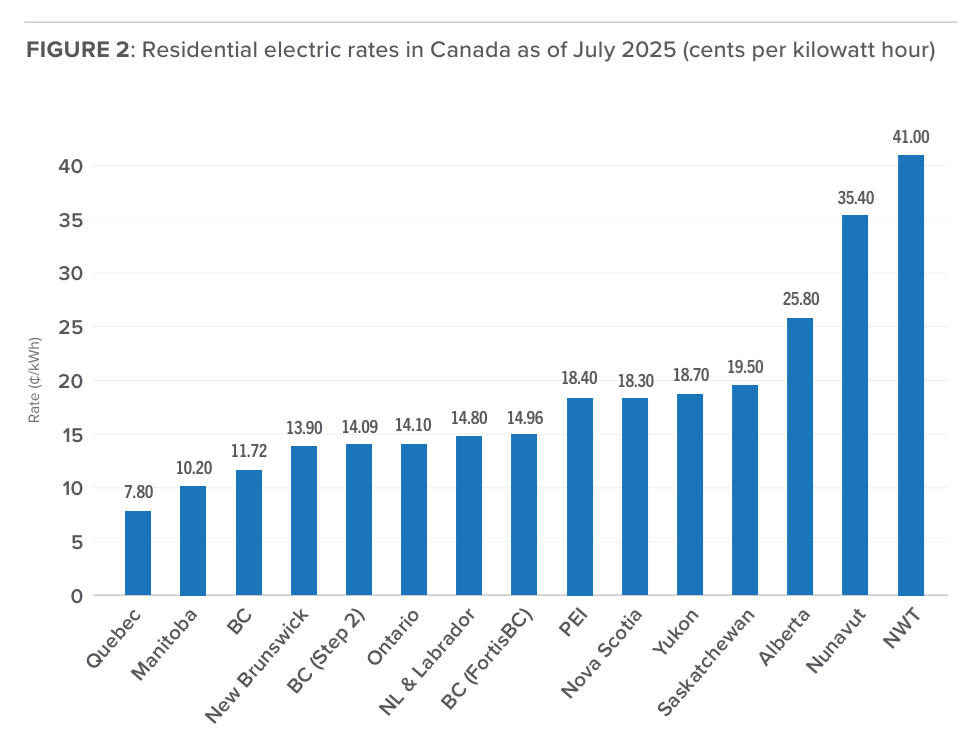
JS: British Columbia is now a net importer of electricity. You would think that would be almost impossible. And I remember a couple of years ago when Fortis applied in the Okanagan here to get a peaker plant, an LNG peaker plant, and they were denied and they seem to be going all in on at the time, all in on wind and solar. Now they’re kind of changing their focus to LNG.
The decisions that have been made over the past 10 years in Canada have put us in this place of energy dependence. Do you see light at the end of the tunnel? Do you see that we’re shifting? It’s been a year now with this new BC government, and they said they’re going to build at a speed like never seen before. Yet the NDP seems to be still stuck in its old ways. And we haven’t seen that speed yet.
HEP: No, we haven’t seen that speed. And maybe you saw I wrote a paper on electricity and our impending crisis that just came out last month. So when you say, you know, there’s a light at the end of the tunnel, is it is it the light because we’re near death or is there actually some more electricity coming on board? And the one thing I think people don’t appreciate is that Canada’s electricity generation peaked in 2017. And I think everyone knows that we’ve added, I don’t know, six million people since then.
So on a per capita basis, our electricity generation is absolutely in decline. And this is happening as we’re pushing electrification of transportation, electrification of heating. And now we want to electrify everything that takes energy. We want to build more critical minerals production, do more smelting here. That takes electricity. We do not have the electricity to do all the things that we say we’re going to do.
And actually, this week, probably on Wednesday, the prime minister is going to announce a national electricity strategy. We’ll see how serious they are. If it’s all incentives for wind and solar and, you know, intertides from Nova Scotia to Quebec, I will say they’re not very serious. If there’s a lot of funding for nuclear and some carve-outs of the clean electricity regulations, I’ll say that they’re thinking about being serious.
But we’ve had such abundance in this country. In Canada, it always comes down to this, that we had time to squander it. We had way too much time to squander it. And we spent eight or 10 years squandering it. And just now we’re starting to worry. I always say, we’re like the frogs in the boiling water. We’re starting to notice it’s hot. But it’s been getting hot for many years.
And so now the question is, there’s real trade offs, Jim, as you know, in British Columbia, that for three years, actually, you’ve been a net importer of electricity. And now we want to build LNG Canada phase two and Ksi Lisims LNG. And you’re also doing wood fiber and you’re also doing cedar. And there’s also three mines that have been permanent or have expansions. And there’s not enough electricity for all of those things, not to mention all the people. And so it’s crazy that in a place like Kelowna the B.C. regulator is saying no more natural gas for home heating, you know, because we’ll miss our climate targets if we do that.
Meaning that people are being pushed with that scarce electricity for their home heating, whereas Kelowna is a beautiful place, but sometimes it does get to minus 25 occasionally. And that’s the exact time where you need to have enough electricity. And that tends to also be when, you know, when when hydro isn’t performing at its peak. And so we focus so much on sustainability and our electricity system these past 10 years that we really did it at the expense of reliability and affordability. And now it’s backtracking to try to balance those.
But I’ve been saying the next trade off is actually going to be between affordability and reliability. You’ll wish we could choose between sustainability and the other two. The choice you’re going to have to make is between affordability and reliability. And that’s not going to be a pleasant place for Canadians to be.
JS: Do you feel like sometimes you’re in a Monty Python skit when they talk about Canada needs to have an all EV mandate? And you know that there’s not enough electricity to do this. And it’s more of a pipe dream than a pipeline. Like, how do we how do we how do you square those two things? You got to drive EVs, yet there’s not enough electricity even for the stuff we have right now.
HEP: And it’s worse than that, Jim. You know, the the subsidies that went into heat pumps in Atlantic Canada, and Atlantic Canada is a big swing jurisdiction. You know, if the liberals can get can sweep Atlantic Canada, OK, they can get a majority. So that’s a very important jurisdiction for them. And they were on heating oil and heating oil is expensive. And heating oil does suck. They don’t have access to natural gas for some reasons of their own making. And so you do want to get off heating oil.
But they push on all these heat pumps and did nothing on the electricity generation side, and you can’t do one part of the equation. If you’re going to change a quarter of households to heat pumps, then you better think about how much electricity you’re going to need for that. Such that now we’ve had emergency applications from the Prince Edward Island utility and from New Brunswick saying we need a new natural gas generation immediately.
We need to be approved right away. This is an emergency. We already saw the cold snap that we had this year. They had to curtail some industrial use. I mean the utilities performed admirably under very difficult circumstances. But the actual situation in that cold snap was that we were not sending very much to the United States. We were importing from New England electricity produced from heating oil, and curtailing generation. And that can be very dangerous when when most of your households are on heat pumps and you have rotating brownouts. That is a very dangerous situation, actually.
Title is link to publication. Some important excerpts below in italics wtih my bolds.
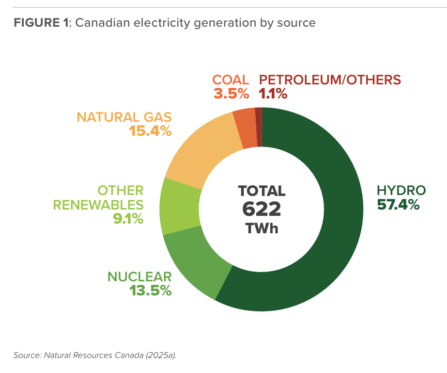
The electricity abundance and affordability that Canada has enjoyed for decades are ending. Generation is down, exports are now imports, and investment is flat. This comes as electricity is increasingly scarce and its availability a competitive advantage. Canada’s impending electricity shortage is not just an affordability crisis; it is an economic and security one as well.
While electricity policy was largely driven by emissions reductions objectives for the past two decades, adequacy, reliability, and affordability are resurging as priorities. Governments that fail to address the issue will be punished at the ballot box: voters are ratepayers.
This paper has sought to outline the growing crisis in Canadian electricity production, describe the policy trajectory that contributed to this state of affairs, identify shifts in policy direction that Canadians should advocate, and understand how to gauge policy improvement, or lack thereof.
Canada’s electricity surplus diminished because we became complacent and took the resource for granted. The sector now demands our attention, and for the sake of all Canadians, we had better respond intelligently.
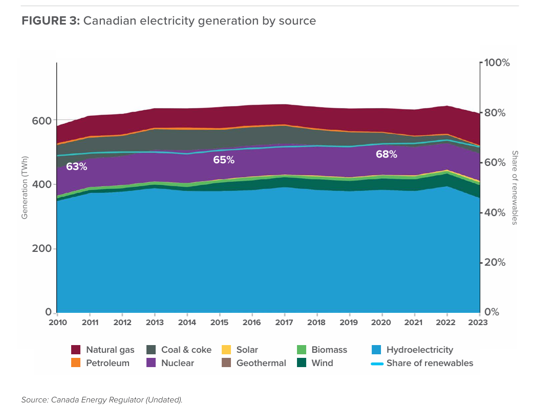
Although demand for electricity is growing, the forecasted growth in generation over the next five years is weak and will be accounted for wholly by intermittent renewables, the majority of which will come from wind. While renewables have their place in the energy mix, their power generation fluctuates based on weather and time of day, rather than conforming to electricity demand. This fundamental mismatch creates reliability, stability, and economic challenges for power grids, which are designed for constant, controllable base-load generation (see Sepulveda 2024). In fact, Canada’s Energy Regulator (CER 2025b) is forecasting that dispatchable capacity (i.e., sources of electricity that can adjust according to demand) will decline in Canada by 1.2 per cent by 2030.
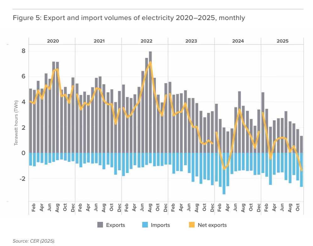
In 2016, Canada sent as much as 64 TWh in net electricity exports annually to the US. However, that number has steadily dwindled due to a combination of drought and the growth in domestic demand. Canada became a net importer of electricity for the first time in modern history in Spring 2024. By the end of 2025, Canada had become a regular net importer of electricity (see Figure 5). In 2025 both BC Hydro and Hydro-Québec were net importers – a previously unthinkable outcome.
Introduced by Environment and Climate Change Canada in 2023 and finalized in December 2024, the CER (Clean Energy Regulations) set federal performance standards to achieve a near-zero emissions electricity grid by 2050 (a change from the initial 2035). The regulations set limits on carbon dioxide emissions from almost all electricity generation units that use fossil fuels beginning in 2035, phase out coal-fired generation, and impose strict limits on emissions from natural gas sources. The CER provides compliance options such as emission reductions at source, carbon credit purchases, and direct investment in clean generation projects. While the CER gives incentives for creating infrastructure for renewables and storage, it also introduces higher capital costs, regulatory complexity, and market uncertainty. With large hydro and nuclear projects becoming too expensive for governments and investors to afford, too longterm, or simply unavailable for many jurisdictions, the CER removed the last best source of firm (i.e. always available) power additions available to many jurisdictions: new natural gas-fired generating units.
Canada’s electricity crunch comes just when a surplus could have been directed to productive capacities. An LNG construction boom, increased oil and gas extraction, significant new mines and expansions in BC, Saskatchewan, Ontario, Yukon, Quebec, and Nunavut, and the implementation of a defence industrial strategy all require significant new generation and transmission. Canada will not reach its goals to double non-US exports without more and affordable electricity.
But the biggest opportunity is in data centres, and the cost of missing out is not only an economic risk, but a security one as well. Electricity is now being selectively rationed in Canada, with data centres facing enhanced scrutiny. This is a problem because data centres are not only at the forefront of global capital investment, but they are also increasingly integral to national security. They are critical infrastructure, essential for the smooth functioning and productivity of an advanced economy, but they are also drivers of economic and military competitiveness. Reliance on foreign infrastructure to train models, store sensitive datasets, or deploy AI systems makes countries vulnerable in much the same way that relying on competitors or adversaries for oil, natural gas, or critical minerals does.
The fact is that Canada’s principal goal guiding electricity policy for the past two decades has been to reduce emissions. Ensuring reliable and affordable electricity has taken a back seat. When those policies were implemented, there was enough abundance in the system that the normal concerns of regulators and producers could fall into the background. That is no longer the case.
The Carney government, which includes senior advisors and Cabinet members with direct experience in the electricity sector, seems better equipped and motivated to tackle the issue than the previous Liberal government, and at the time of writing had announced the imminent release of a National Electricity Strategy. The extent to which it addresses the nuts and bolts of our current dilemma – that the country must find a way to create the conditions to generate, transmit, and distribute more MW at a lower cost,versus investing public dollars in expensive and politically motivated vanity projects with no business case – will determine if, and how fast, we in Canada can extract ourselves from our electricity deficit.
A part of Battle of Ideas Festival 2025 was the above presentation explaining plainly why UK energy has become so expensive. For those who prefer reading, below is a transcript with my added bolds and images.
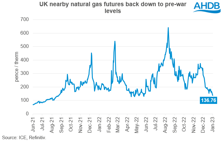
Why are our electricity bills so high? We’re told as Craig referenced that it’s all the fault of gas. Now this argument is going to come to somewhat crashing reality in the next year. I was just checking the prices now and from yesterday’s close we’re now87 percent down from the highs in 2022. Now has anybody seen an 87 percent reduction in their bills, hands up, anybody? Oh that’s a huge shock. Next year gas analysts expect that the gas price will return to its long-term average pre-2021.
So the gas crisis actually began in the autumn of 2021, about six months before the invasion of Ukraine and it was to do with the recovery from COVID. Basically during COVID demand for gas fell because industrial activity dropped, a lot of upstream production was shut in and it takes time to bring that back, you can’t just turn on the tap in most cases, it requires quite a bit more work than that. So there was a delay in bringing that production back online and when you have more demand than you’ve got supply then prices go up and then Putin took advantage of this in the following February and well we all know what happened then.
Since then in the upstream sector they’ve been busy bringing new LNG, liquefied natural gas projects, on stream. By the end of this year there’ll be enough new LNG to fully replace all of Russian gas and sometime next year we’re expecting the global gas market to go back into length. So there’ll be more supply globally than there is demand and prices are expected to fall. In fact the only reason why Miliband could possibly deliver the 300 pound reduction in bills would be because of gas prices falling.
Unfortunately I think he’s going to more than offset that with higher subsidy costs. So the first thing is that gas is not expensive and really for 25 years we had very low and very stable gas prices. Gas was cheap, in fact the cheapness of gas was what enabled the energy transition to even begin. I wrote a report earlier in the year about the cost of renewables, if you do a chart that shows the wholesale price of gas, the wholesale price of electricity and then the domestic price of electricity what you find is that the wholesale gas price was low and stable until 2021.
The wholesale electricity price was basically the wholesale gas price plus a little bit which is what you’d expect and then the domestic price was the wholesale price of electricity plus a little bit. And again you’d expect that you buy a wholesale, you pay for it to be delivered to your house, you’ve got to pay the supplier some money for you know doing the admin for that, they want to take a bit of profit, there’s some taxes, that’s what you’d expect.
Figure 4 – International Domestic Electricity Prices (p per kWh). UK has the highest domestic electricity prices in the IEA.
But from 2006 this relationship started to break down and what we saw was a steep increase in what households were paying despite a flat trajectory for wholesale prices. Why was this? It was because we were adding on policy costs. We’re subsidizing renewables, we started using suppliers to do all sorts of other social programs, wealth redistribution, literally the warm homes discount is suppliers. They phone up the department for work and pensions and they find out which of their customers are eligible and then they calculate how much that discount is going to cost and then they add on an admin fee and then they spread that cost out across all our other customers.
They take money from one group of customers to give to another. This is wealth redistribution, it’s not the job of private companies. The energy company obligation, we’ve heard about that in the news this week where I think the National Audit Office has written a report saying how inefficient it is, how low quality the work is. Well guess what, energy companies are not experts in construction. They are being expected to engage in sub contracts to companies that will come in and install insulation and similar things in your home. They don’t know anything about this, this isn’t part of their core business.
Typically as wind and solar power share of supply increases, distribution and transmission costs rise sharply.
It’s a hugely inefficient thing to expect suppliers to do and the cost of all that is added to bills. The smart meter rollout, we’re the only country in the world that expects suppliers, retailers, to install network equipment in people’s homes. Everyone else got the network companies to do it, you know, duh. And what’s even worse is that the supply business was created within the Utility Act 2000. It was the final part of unbundling the energy system and almost immediately both the governments and the regulators started telling everyone that suppliers were greedy profiteers that couldn’t be trusted.
And then they expressed shock that nobody wants these greedy profiteers who can’t be trusted to install devices in their home that would give the greedy suppliers that can’t be trusted lots of information about how they’re using electricity and gas and potentially enable them to change your prices remotely, put you onto prepayment tariffs remotely and do all sorts of other stuff remotely, potentially without your permission. And they were just kind of shocked that people didn’t want to do that. So the whole market is completely dysfunctional.
Now, when we come to the real costs and the real reasons that our bills are so high has to do with renewables. When we build renewable generation, we have to provide a big subsidy. Now, a lot of people think, well, the wind and the sun are free. And this is true. Wind energy and solar energy is free. But the equipment needed to turn that energy into electricity is not free. That’s actually pretty expensive.
Now, imagine that we only had renewables on our grid. And when you’re setting prices, normally, the price at which you sell your goods is linked to your short run marginal operating cost, which for wind and solar is close to zero. Essentially, you’d be giving it away. How are you going to recover your capital costs for that expensive equipment if you have to give away your products? You’re never going to be able to do it. So basic economic theory will tell you that renewables will never be built without subsidies. They are always going to require subsidies because you will never be able to recover the capital costs to selling the electricity at the short run marginal operating cost of that electricity.
So we give subsidies to renewables. And that subsidy is higher than the cost of generating electricity with gas. So the argument about gas pushing your bills up is nonsense. These subsidies are higher than the cost of generating electricity with gas. And the way the new subsidies work is that the generators are guaranteed a fixed price, and they receive that by selling that electricity in the market. And then if that’s lower than this fixed price, they get a top up.
And it’s a one for one relationship. If you lower the wholesale price of electricity by one pound, you increase the subsidy cost by one pound. And the subsidies are added to our bills. They come straight out of our pockets. So when people say, oh, we’ve got to get off gas, we’ve got to stop marginal pricing. People talk about marginal pricing as if we’re some weird outlier in the world markets doing this strange marginal pricing thing, taking the most expensive form of generation to set the price.
Every deregulated power market in the world sets the electricity price through marginal pricing. In fact, most commodity markets do the same thing. This isn’t weird. It’s completely normal.
And if you decided to change price formation to lower the wholesale price, your bill will stay the same. You’re just moving money in different buckets around the bill. Now the bit that says wholesale price will go down, and the bit that says policy costs will go up. But the amount you pay will stay the same. And so this is the whole misinformation that we have.
The other issues with renewables are you’ve got to pay for backup. They have low energy density, so you need a lot more wires to connect them. A good sized gas power station, 800 megawatts. If you wanted an equivalent size wind farm, you need 60 turbines. So that’s 60 times more wires. But to get the same amount of electricity over the year, because your wind is only working about a third of the time compared with about 86% of the time for gas, you need something like 150 times the wires. You need 150 turbines.
All that gets added onto your bills. The cost of backup to make sure you’ve got generation available when it’s not windy and sunny, that goes straight onto the bill. And the real-time balancing cost, where you’re having to even out the impact of clouds and gusts of wind, all goes on the bill. And so this is why our bills are so high.
The post below updates the UAH record of air temperatures over land and ocean. Each month and year exposes again the growing disconnect between the real world and the Zero Carbon zealots. It is as though the anti-hydrocarbon band wagon hopes to drown out the data contradicting their justification for the Great Energy Transition. Yes, there was warming from an El Nino buildup coincidental with North Atlantic warming, but no basis to blame it on CO2.
As an overview consider how recent rapid cooling completely overcame the warming from the last 3 El Ninos (1998, 2010 and 2016). The UAH record shows that the effects of the last one were gone as of April 2021, again in November 2021, and in February and June 2022 At year end 2022 and continuing into 2023 global temp anomaly matched or went lower than average since 1995, an ENSO neutral year. (UAH baseline is now 1991-2020). Then there was an usual El Nino warming spike of uncertain cause, unrelated to steadily rising CO2, and now dropping steadily back toward normal values.
For reference I added an overlay of CO2 annual concentrations as measured at Mauna Loa. While temperatures fluctuated up and down ending flat, CO2 went up steadily by ~66 ppm, an 18% increase.
Furthermore, going back to previous warmings prior to the satellite record shows that the entire rise of 0.8C since 1947 is due to oceanic, not human activity.
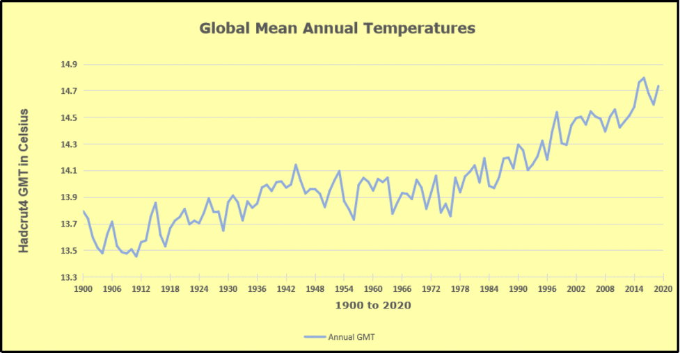
The animation is an update of a previous analysis from Dr. Murry Salby. These graphs use Hadcrut4 and include the 2016 El Nino warming event. The exhibit shows since 1947 GMT warmed by 0.8 C, from 13.9 to 14.7, as estimated by Hadcrut4. This resulted from three natural warming events involving ocean cycles. The most recent rise 2013-16 lifted temperatures by 0.2C. Previously the 1997-98 El Nino produced a plateau increase of 0.4C. Before that, a rise from 1977-81 added 0.2C to start the warming since 1947.
Importantly, the theory of human-caused global warming asserts that increasing CO2 in the atmosphere changes the baseline and causes systemic warming in our climate. On the contrary, all of the warming since 1947 was episodic, coming from three brief events associated with oceanic cycles. And in 2024 we saw an amazing episode with a temperature spike driven by ocean air warming in all regions, along with rising NH land temperatures, now dropping well below its peak.
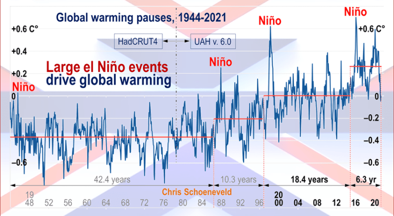
Chris Schoeneveld has produced a similar graph to the animation above, with a temperature series combining HadCRUT4 and UAH6. H/T WUWT
March 2026 UAH Temps: SH Ocean Warms, NH Land Cools
With apologies to Paul Revere, this post is on the lookout for cooler weather with an eye on both the Land and the Sea. While you heard a lot about 2020-21 temperatures matching 2016 as the highest ever, that spin ignores how fast the cooling set in. The UAH data analyzed below shows that warming from the last El Nino had fully dissipated with chilly temperatures in all regions. After a warming blip in 2022, land and ocean temps dropped again with 2023 starting below the mean since 1995. Spring and Summer 2023 saw a series of warmings, continuing into 2024 peaking in April, then cooling off to the present.
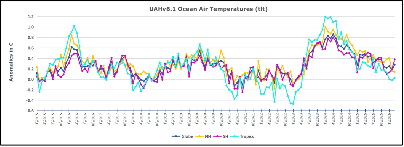
UAH has updated their TLT (temperatures in lower troposphere) dataset for March 2026. Due to one satellite drifting more than can be corrected, the dataset has been recalibrated and retitled as version 6.1 Graphs here contain this updated 6.1 data. Posts on their reading of ocean air temps this month are ahead the update from HadSST4. I posted recently on February 2026 NH and Tropic SSTs Warm Slightly. These posts have a separate graph of land air temps because the comparisons and contrasts are interesting as we contemplate possible cooling in coming months and years.
Sometimes air temps over land diverge from ocean air changes. In July 2024 all oceans were unchanged except for Tropical warming, while all land regions rose slightly. In August we saw a warming leap in SH land, slight Land cooling elsewhere, a dip in Tropical Ocean temp and slightly elsewhere. September showed a dramatic drop in SH land, overcome by a greater NH land increase. 2025 has shown a sharp contrast between land and sea, first with ocean air temps falling in January recovering in February. Then in November and December SH land temps spiked while ocean temps showed litle change. In February 2026 NH land temps doubled, from Dec. 0.53C up to 1.14C last month. Despite SH land changing little, and Tropical land cooling, the Global land anomaly jumped up from 0.53 to 0.93C. That reversed in March with both NH land and Global land anomaly back down to 0.63C. That cooling offset SH Ocean warming doubling from 0.19C to 0.38C.
Note: UAH has shifted their baseline from 1981-2010 to 1991-2020 beginning with January 2021. v6.1 data was recalibrated also starting with 2021. In the charts below, the trends and fluctuations remain the same but the anomaly values changed with the baseline reference shift.
Presently sea surface temperatures (SST) are the best available indicator of heat content gained or lost from earth’s climate system. Enthalpy is the thermodynamic term for total heat content in a system, and humidity differences in air parcels affect enthalpy. Measuring water temperature directly avoids distorted impressions from air measurements. In addition, ocean covers 71% of the planet surface and thus dominates surface temperature estimates. Eventually we will likely have reliable means of recording water temperatures at depth.
Recently, Dr. Ole Humlum reported from his research that air temperatures lag 2-3 months behind changes in SST. Thus cooling oceans portend cooling land air temperatures to follow. He also observed that changes in CO2 atmospheric concentrations lag behind SST by 11-12 months. This latter point is addressed in a previous post Who to Blame for Rising CO2?
After a change in priorities, updates are now exclusive to HadSST4. For comparison we can also look at lower troposphere temperatures (TLT) from UAHv6.1 which are now posted for March 2026. The temperature record is derived from microwave sounding units (MSU) on board satellites like the one pictured above. Recently there was a change in UAH processing of satellite drift corrections, including dropping one platform which can no longer be corrected. The graphs below are taken from the revised and current dataset.
The UAH dataset includes temperature results for air above the oceans, and thus should be most comparable to the SSTs. There is the additional feature that ocean air temps avoid Urban Heat Islands (UHI). The graph below shows monthly anomalies for ocean air temps since January 2015.
After sharp cooling everywhere in January 2023, there was a remarkable spiking of Tropical ocean temps from -0.5C up to + 1.2C in January 2024. The rise was matched by other regions in 2024, such that the Global anomaly peaked at 0.86C in April. Since then all regions have cooled down sharply to a low of 0.27C in January. In February 2025, SH rose from 0.1C to 0.4C pulling the Global ocean air anomaly up to 0.47C, where it stayed in March and April. In May drops in NH and Tropics pulled the air temps over oceans down despite an uptick in SH. At 0.43C, ocean air temps were similar to May 2020, albeit with higher SH anomalies. In November/December all regions were cooler, led by a sharp drop in SH bringing the Global ocean anomaly down to 0.02C. January and February saw continued Tropical cooling and NH cooling as well pulling Global ocean air temps lower. Now in March 2026 SH ocean warmed pulling up the Global ocean air anomaly.
Land Air Temperatures Tracking in Seesaw Pattern
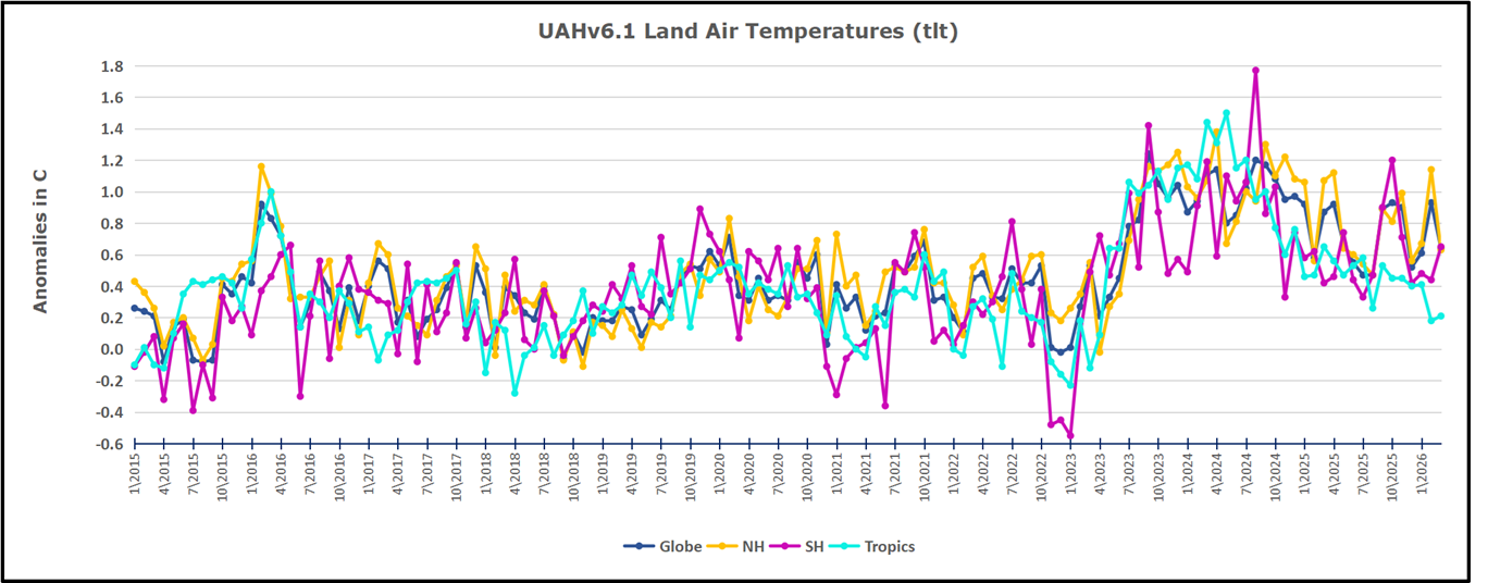
We sometimes overlook that in climate temperature records, while the oceans are measured directly with SSTs, land temps are measured only indirectly. The land temperature records at surface stations sample air temps at 2 meters above ground. UAH gives tlt anomalies for air over land separately from ocean air temps. The graph updated for March is below.
Here we have fresh evidence of the greater volatility of the Land temperatures, along with extraordinary departures by SH land. The seesaw pattern in Land temps is similar to ocean temps 2021-22, except that SH is the outlier, hitting bottom in January 2023. Then exceptionally SH goes from -0.6C up to 1.4C in September 2023 and 1.8C in August 2024, with a large drop in between. In November, SH and the Tropics pulled the Global Land anomaly further down despite a bump in NH land temps. February showed a sharp drop in NH land air temps from 1.07C down to 0.56C, pulling the Global land anomaly downward from 0.9C to 0.6C. Some ups and downs followed with returns close to February values in August. A remarkable spike in October was completely reversed in November/December, along with NH dropping sharply bringing the Global Land anomaly down to 0.52C, half of its peak value of 1.17C 09/2024. In January and February Global land rebounded up to 1.14C, led by a NH warming spike. That was reversed in March back down to 0.63C despits some SH land warming.
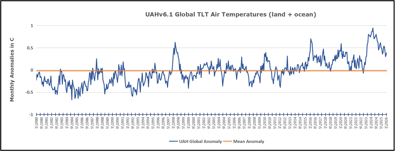
The Bigger Picture UAH Global Since 1980
The chart shows monthly Global Land and Ocean anomalies starting 01/1980 to present. The average monthly anomaly is -0.02 for this period of more than four decades. The graph shows the 1998 El Nino after which the mean resumed, and again after the smaller 2010 event. The 2016 El Nino matched 1998 peak and in addition NH after effects lasted longer, followed by the NH warming 2019-20. An upward bump in 2021 was reversed with temps having returned close to the mean as of 2/2022. March and April brought warmer Global temps, later reversed
With the sharp drops in Nov., Dec. and January 2023 temps, there was no increase over 1980. Then in 2023 the buildup to the October/November peak exceeded the sharp April peak of the El Nino 1998 event. It also surpassed the February peak in 2016. In 2024 March and April took the Global anomaly to a new peak of 0.94C. The cool down started with May dropping to 0.9C, later months declined steadily until August Global Land and Ocean was down to 0.39C. then rose slightly to 0.53 in October, before dropping to 0.3C in December, and slightly higher now in February and March 2026.
The graph reminds of another chart showing the abrupt ejection of humid air from Hunga Tonga eruption.
TLTs include mixing above the oceans and probably some influence from nearby more volatile land temps. Clearly NH and Global land temps have been dropping in a seesaw pattern, nearly 1C lower than the 2016 peak. Since the ocean has 1000 times the heat capacity as the atmosphere, that cooling is a significant driving force. TLT measures started the recent cooling later than SSTs from HadSST4, but are now showing the same pattern. Despite the three El Ninos, their warming had not persisted prior to 2023, and without them it would probably have cooled since 1995. Of course, the future has not yet been written.
At the World Prosperity Forum in Zurich—held alongside the World Economic Forum in Davos—climate scientist Anika Sweetland delivers a provocative and deeply personal address that challenges the foundations of modern climate orthodoxy.
Drawing on her own education and professional experience, Sweetland recounts how climate science training fostered fear, despair, and unquestioned consensus rather than open scientific inquiry. She argues that generations of students have been indoctrinated with alarmist narratives that distort climate history, suppress debate, and justify sweeping political and economic control.
In this speech, Sweetland examines:
♦ The psychological impact of climate alarmism on children and students
♦ Media-driven climate narratives and shifting doomsday predictions
♦ Historical climate cycles, ocean dynamics, and orbital forces
♦ The role of international institutions and the concentration of power
♦ Why carbon dioxide is portrayed as a villain—and why she disputes that claim
♦ How climate policy, finance, and governance have become tightly intertwined
Presented as a counterpoint to the centralized, collectivist worldview promoted at Davos, this talk embodies the mission of the World Prosperity Forum: to challenge prevailing narratives, defend sovereignty, and restore open debate on climate, energy, and economic policy. For those who prefer reading, below is a transcription with my bolds and added images.
My name is Annika Sweetland and I trained as a climate scientist and during my time in what was meant to be a world-class education, I learned the world was a fragile system on the brink of collapse and that we were practically doomed. What sets me apart from most climate scientists is this, I’ve realized I was indoctrinated. Going through my old lecture notes now, I see lie after lie after lie, painting a picture that does not and will not ever exist. I was that girl that ticked the box when booking a plane ticket to say yes, I’m willing to pay a higher price to make this an environmentally friendly transaction and offset my carbon emissions.
Airlines saving polar bears, sign me up. But of course the
consensus was always the same, there was nothing
I could really do to solve the climate crisis.
So let me take you through my journey from being a scientist in complete and utter despair to standing here before you today armed with the truth. Today I’m going to be telling you about the realities of climate education, so let’s start at the beginning of the climate merry-go-round, the indoctrination of school children. Do you realize the alleged consequences from climate change are actually similar to those of war? The child’s world is inherently unstable, after all due to extreme sea level rise and extreme weather events, their lives are at risk. But this is what we’re teaching our kids, that the world they live in is no longer a safe and stable environment, that ecosystems are collapsing and their world is on fire. This is an outrage, they promised this is the truth and if they question that narrative the school will write to their parents, no debate allowed. I have been told my whole life that there is impending doom in the form of climate change. It was in the news every day, my teachers schooled me on it, my friends were talking about it, there were even degrees in it.
I can be forgiven for believing it. Why wouldn’t you believe what your teachers are telling you? They’re the ultimate authority at a young age. But the most significant point is this, it is the effect it has on our children.
They are scaring our children with these ghastly stories, they are shaping them to feel powerless because they can’t do anything about it and they are moulding them to be disillusioned and angry because the so-called people in charge don’t appear to be doing anything about it either. This is how you get the Greta Thunbergs of the world, that girl honestly believes her world is burning. Imagine for a second what it truly feels like to believe that.
I was at school in 1999 and this new emergency of global warming made me feel anxious and at that time three percent of school-aged children were diagnosed with anxiety.By 2023 this had escalated to more than 20 percent of school-aged children being diagnosed with anxiety. This is not a coincidence, the psychological impact of this story is crippling children’s mental health and it is simply unacceptable.
It is wrong, it is socially irresponsible and the minute they try and peddle that story on my child, well let me just make this clear, hell will have no fury like a mother who knows the truth and who is also a climate expert. Hell will not have enough fury and this is why I’m angry because I’ve seen the system from within and what I found at university wasn’t a debate, it was a script. So when I call climate change a narrative, I’m not being edgy, I’m being precise.
If you want a quick test for whether something is solid science or nonsense, just look for consistency and this consistency is exactly what’s missing. Firstly, the story keeps on changing. If it were a real story I guess the general facts surrounding it would probably remain the same but in the 60s and 70s the majority of scientists were predicting global warming but if you looked in the newspaper you’d think we’re heading straight into an ice age.
In 1974, Radio Times ran the headline, the ice age cometh. American media followed suit. Every cold weather event was sold as proof that there was an ice age approaching. Sound familiar? It should. It’s how the media still works today. A flood, a heat wave, a storm, completely normal weather, splash it across the front page, call it unprecedented and blame climate change. Everyday weather is rebranded as existential crisis. My point is this, it was never scientists telling the world an ice age was coming, it was the media with their use of selected experts. But why? Let’s dig deeper.
Newsweek warned governments were unprepared for climate driven food shortages and that planners were ignoring climatic uncertainty and that delay would make the coming crisis impossible to manage. This wasn’t just weather reporting, it was a script to create panic about hunger, global instability, they pull the lever for sympathy, for suffering in poorer countries and even today we see images of flooded villages, failed crops, desperate families, all offered up as proof of climate catastrophe and as justification for sweeping political action, urgent action with no time to consider the consequences.
In 1988, there was a rebranding exercise. The New York Times headline read, global warming has begun, expert tells Senate. I read this article, the evidence rests on five months of slightly warm weather and in climate sciences, a trend takes 30 years to establish, not just a season and worse still was the baseline they chose, 1950 to 1980. This is the very cooling period they had just used to scream ice age.
This is a classic case of data manipulation, you take a cold reference point and everything after that is going to look unusually warm. This was never ever science, there was never ever a global warming trend, it was data manipulated to tell a story. The ice age never came, first wrong prediction, but the story of the ice age, that did its job.
The media succeeded in creating a generation of fearful believers. In a speech to the Royal Society in 1988, Margaret Thatcher talked about the fear that people were feeling, the fear that humans were creating a global heat trap that could lead to climatic instability. This fear was gaslit by an NGO, the National Academy of Sciences, who promised the warming would cause a sea level rise of several feet over the next century.
The following year, another NGO, the UN, went on the record and promised entire nations will be wiped off the face of the earth due to climate change induced sea level rise by 2020. Well, we’re still here aren’t we? Second false prediction, none of this sea level rise has eventuated and it’s exactly the same story they preach today. Extreme sea level rise and climate change refugees are nothing but a myth designed to scare people into whatever policy response is waiting in the wings.
This is the first reason that the man-made climate change story is nothing more than a doomsday tale that has been evolving for the last 60 years. Think about it. These were arguably two of the world’s most powerful organisations. They’d had access to satellite data for 25 years, the best scientists, the most comprehensive data analysis in the world, plus the mainstream media at their fingertips. Was it really a coincidence that their story never came true? We now know that they would have known via satellites that the sea level was always rising steadily at 1.2 inches per decade, just like it does today. Plus, this sea rise actually brings sediment with it and increases the land mass at the same time, therefore rendering it impossible for islands to sink due to sea level rise.
However, because it was never a real story, they were never interested in the real data. They could clearly see that there was no unusual sea level rise, but they intentionally chose to mislead the public and put their fraudulent plan into action. They advised the World Meteorological Organisation, another NGO, to create the Intergovernmental Panel on Climate Change.
Now, here’s where it gets juicy. The IPCC is structurally identical to the single world government model I was presented with during my studies as a prescriptive solution to climate change. My professors in global governance assured me that a global problem requires a single world government to fix it, and I admit it. I believed them. I respected my professors. Most of them were published authors in respected journals, and I was promised a world-class education.
But the tragedy is this. They were never training scientists.
They were training socialists to enact their agenda.
And it’s been clear to me for a time now that there’s never been a problem with our climate system, just a smoke screen to establish power and create control. Welcome to the only crisis where their solution is always the same. More control, more taxes, and less debate.
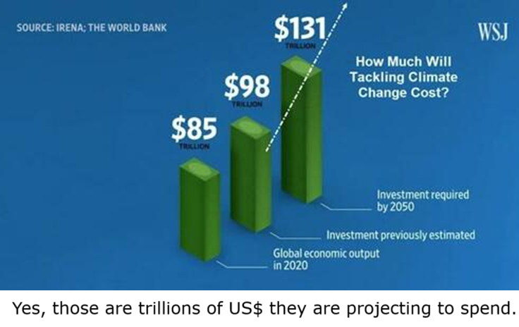
Let me make it clear how the IPCC benefits from maintaining and creating generations of climate change believers. To start with, they sit at the very top of the climate change establishment, and when I say establishment, I simply mean a stable network of institutions that fund, credential, and publish the urgency of man-made global warming. Climate finance reached a record-breaking $1.9 trillion in 2023, and last year saw a record $2.2 trillion in clean energy investment.
That’s more than $4 trillion in a couple of years. Think about who are the main winners here. They’re the unelected officials that sit atop the IPCC hierarchy. These are the people selling, building, financing, and certifying the global transition to clean energy. They are making billions.
The financial victims, the United Kingdom is a victim.
Our economy is on the verge of recession after 30 years of big signatory to international climate agreements. What do we have to show for it? Not only are our energy bills the highest in the developed world, but the economy outside of London is closer to that of Bulgaria’s than Germany’s. Today, 18 to 30-year-olds are the first generation to earn less than their parents. We are getting poorer, both relatively and absolutely. My fellow countrymen are suffering, and this also makes me angry. Because of climate policy, because the IPCC says so, we’re not allowed to drill our own gas fields, which will make us completely reliant for others’ gas in the future.
We have the best quality gas in the world, and its exploration has just been made illegal. For existing projects, for every dollar made, the company is taxed upwards of 78 cents due to unnecessary climate taxation. Let’s take a really good look at just how much power the IPCC have created for themselves. They act as a global risk allocation engine. They determine which technologies reduce subsidies, which activities become legally constrained, which investments are encouraged or stranded.
In the UK, we only have four oil refineries left. These are the basic building blocks of the modern industrial economy, but any company that comes in will not make a profit because the taxes are too high. The IPCC is making us poorer, both as nations and as individuals. Recent blackouts across Europe are just a glimpse into the dystopian future which awaits us.
As long as they continue to make us believe that man-made climate change is going to end life as we know it, we will keep filtering trillions of dollars throughout their organisation without questioning a thing. So what can we do? Firstly, I believe that the average person is more than capable of seeing a situation for what it really is. So please, tune in carefully as I seek to disprove the myth of man-made climate change once and for all.
I’ve got you on tenderhooks now, that’s a good thing. You’re still with me. Let’s bust the first myth. More carbon dioxide causes a warmer planet. Here’s the truth. A recent study by arguably two of the world’s leading atmospheric scientists, both Professor Emeritus, one from MIT, one from Princeton, I mean, these guys are not messing around. They have shown that there is a limit to the amount of heat that is able to be trapped by carbon dioxide and they call this the saturation point. We are at 99% of the saturation point. Relatively speaking, no matter how much carbon dioxide we pump into the air, it will not increase our global temperature. It is but a fallacy. Joe Rogan recently had those authors on his podcast, Dr. Linzen and Dr. Happer. Joe Rogan also wants people to stop drinking the Kool-Aid.
Now let’s bust the second myth, that carbon dioxide is bad for the planet. Guess what? Carbon dioxide is actually good for the planet. That’s right, I said it, the truth. Satellite data shows that plant growth has increased significantly over the last 35 years due to increased carbon dioxide. NASA measured a 10% greening of the earth between 2000 and 2020 alone. Meanwhile, at university, I was taught that trees would starve due to climate change.
They intentionally used the word starve to elicit an emotional response. What actually happens is that when there’s more carbon dioxide available, not only do plants grow faster, but they use less water. We know this because commercial greenhouses pump carbon dioxide to 1400 parts per million because it grows the best plants. It’s called carbon dioxide enrichment. Come on. Carbon dioxide enriches the earth.
And the third myth, carbon dioxide has a direct relationship with temperature. Al Gore was the person responsible for demonizing carbon dioxide, and he said carbon dioxide is the highest it’s ever been. It’s just another lie. It’s actually the lowest it’s been in the last 320 million years. Not only that, but some of the highest levels of carbon dioxide occurred during an ice age 340 million years ago, which just proves that carbon dioxide and temperature have no direct link whatsoever.
Of course, in my training, carbon dioxide and its rise or fall could explain everything that happened in our climatic history through some sort of feedback loop or time lag mechanism. And this is the whole basis of their argument. That more carbon dioxide we put into the atmosphere, the more the temperature will increase. The most important takeaway from this today is that is a lie. The truth is, the earth is just getting greener, and we are simply uneducated as to why the climate actually changes. Indeed, all of us are completely brainwashed to never question it.
So why do the IPCC have a conflict of interest with the truth? Let’s understand exactly how much power this unelected, undemocratic, unaccountable, non-governmental organization are protecting with their lies. The IPCC produce assessments that 195 governments around the world use as an authoritative reference for climate policy. They use IPCC scenarios to set emissions targets, justify carbon budgets. If countries argue for compensation or climate aid, they cite IPCC risk assessments.
The IPCC projections define which regions are at risk and therefore where the money flows. And what they really don’t want you to know is that the most powerful leverage is in financial markets. IPCC scenarios are used in ESG scoring frameworks,climate stress testing for banks, insurance risk models, central bank climate risk assessments, and investment screening criteria. In practice, this means that a company’s ability to access capital increasingly depends on whether its business model is aligned with IPCC-derived pathways.
They have a monopoly not only on the success of entire countries but on individual business interests. In effect, their projections now sit upstream of policy, regulation, infrastructure, and economic structure. And this here, this is why they carry so much power. This isn’t just undemocratic, it’s anti-democratic. I never voted for them to make these decisions. These are people that cannot be held to account by the electorate and that is an unacceptable structure. It is a socialist, globalist agenda that has been carried out right beneath our noses. And it is the spitting image of the one world government framework that was prescribed in my training.
So, with the whole world relying on their projections, with trillions of dollars on the line, you would think that their utmost priority should be the accuracy of those projections. It’s why the believers say, look at the data, you can’t ignore the data. Well, spoiler alert, the data is doctored, just like it’s always been, just like my textbooks were, just like my lecture notes were, this whole thing is indoctrination.
And here is the proof. Hackers leaked emails from IPCC assessment report authors which exposed them freely discussing their efforts in deleting and manipulating the real data because it didn’t quite fit with their doomsday story.
And I quote, I’ll maybe cut the last few points of the filtered curve as that’s trending down. They needed it to be trending upward to fit with their past projections. Another email says, I’ve just completed Mike’s nature trick to hide the decline. These are real emails between the authors of the IPCC report. There are more than 2000 emails like this showing corrupt behavior and they are still the lead authors today. They are unelected, corrupt and have a conflict of interest with the truth. Trillions of dollars of spending rests on fabricated nonsense.
In the UK, if we don’t allocate our national budget to their satisfaction, we’re taken to court. Most recently, we were taken to the European Court of Human Rights because of failure to adequately prepare for extreme heat and flooding. And this, they say, violates fundamental human rights because we are not protecting people against man-made climate change. It is an outrage. So what can we do? It’s time to reclaim our sovereignty.
And we do this by formally leaving all agreements governed by the climate establishment, repeal the Climate Change Act, withdraw from the Kyoto Protocol, withdraw from the UNFCC, leave the Paris Agreement. America withdrew from all United Nations architecture this month. It’s time for the rest of the world to follow suit.
I can already hear the objections, but if we don’t act, aren’t we doomed? As a climate scientist, let me reassure you. The climate is meant to change and it’s meant to change drastically. It is just its natural state and this is very much like the earth. We are in a natural period of warming called the Holocene. We’re still coming out of the Little Ice Age, which was between 1400 and 1900. Our earth’s climate gets warmer and cooler in 1500 year cycles. There is also an ocean pattern called El Nino Southern Oscillation, (ENSO) which drives huge temperature changes. Most global warming is in fact driven by changes in the ocean currents. Other changes are driven by orbital forcings called milankovitch cycles. These cycles change the position of our planet relative to the sun and historically produce an ice age every 100,000 years. There’s nothing man-made about it. There is only natural climate change.
But training experts that the world will listen to and who will enact their agenda is a crucial part of the IPCC’s strategy to retain control. Well, I’m a climate scientist. I’m an expert. So, listen to me. All man-made climate education in schools has to stop. It is not science. It is consensus which is very different to objective scientific fact.
Teach them natural climate change. Teach them about milankovitch cycles, the El Nino. Do not teach them lies that I have just proven wrong. I don’t want my child to gain an ideology. I want him to gain an education. The next generation must be clever. And for this to happen, they need to be learning factual information.
For anyone out there that has ever felt guilty or afraid due to climate change, I want to reassure you, you are not the problem. We have been brainwashed every day by the media. We are being lied to every day. And if we question it, we’re told we’re crazy. We are told we’re in denial because the climate establishment is afraid.
They will tell you that I’m the extreme one because I don’t believe the world is on fire. They will do everything they can to make us fearful. The world as we know it is ending, burning, boiling, to maintain control, constrain us in regulatory burden, and have us accountable to their courts if we spend our taxpayers money the wrong way.
The climate establishment targeted intelligent people who genuinely loved the environment. They taught us the earth was dying and on the brink of collapse. And I believed it. That is not stupidity. That is programming. Because my university lecturers who I respected and the institution of the university itself assured me this was the latest cutting edge research.
I mean I’m thinking I want my money back at this point. They told you it’s settled. They told you it’s urgent. They told you to comply. Well, I’ve told you what they haven’t. The climate is meant to change. The man couldn’t affect the climate system even if he wanted to. Carbon dioxide is good for the planet and will not increase the temperature any. And both children and university students are being brainwashed to blindly perform and enact their agenda.
Well, I am no puppet. For me, once, shame on you. Fool me twice, shame on me. The choice of what to believe is now yours. But the establishment should be afraid because I am a climate scientist who knows the truth. Thank you. Thank you so much. I also just want to thank the Heartland Institute so much for having me speak at the inaugural World Prosperity Forum here in Zurich.
The arctic ice extents are now reported through end of March 2026, the month whose average is taken as the annual maximum. As noted previously the wavy polar vortex has hampered ice formation with incusions of warmer southern air into the Arctic circle. This may be changing according to the most recent image from AER PV blog.
Figure 12. Observed 10 mb geopotential heights (dam; contours) and temperature anomalies (°C; shading) across the Northern Hemisphere averaged from 17 Mar. (b) Same as (a) except forecasted averaged from 28 Mar to 1 Apr 2026. The forecasts are from the 00Z 17 Mar 2026 GFS ensemble.
Remarkably, the 2025 annual daily extent maximum of 14.48M km2 was on day 73 of that year. Arctic ice reached 14.55 on day 63 in 2026, and continued near that level until day 74, before starting the usual decline.
The chart below shows the 20-year averages for Arctic ice extents for March along with 2026, 2025 and 2006 as well as SII v.4.
The 20-year average maximum daily ice extent appears at 14.93M km2 on day 71 before starting to decline. MASIE 2006 and 2026 started this period the same and tracked each other until 2026 ended higher by ~200k km2, and slightly above 2025.
The table below shows the distibution of ice extents on day 90 across regions of the Arctic ocean.
Region
2026090
Day 90 Average
2026-Ave.
2006090
2026-2006
(0) Northern_Hemisphere
14149101
14587351
-438250
13913402
235699
(1) Beaufort_Sea
1071070
1070279
791
1068683
2387
(2) Chukchi_Sea
966006
964325
1681
959091
6915
(3) East_Siberian_Sea
1087137
1086309
828
1084627
2510
(4) Laptev_Sea
897845
897135
709
897773
71
(5) Kara_Sea
930404
918948
11456
922164
8240
(6) Barents_Sea
582189
653649
-71460
623912
-41723
(7) Greenland_Sea
569080
667067
-97988
604935
-35856
(8) Baffin_Bay_Gulf_of_St._Lawrence
1403737
1384371
19366
1026934
376804
(9) Canadian_Archipelago
854931
853349
1582
851691
3240
(10) Hudson_Bay
1260887
1255554
5333
1240389
20498
(11) Central_Arctic
3223020
3234756
-11736
3241074
-18054
(12) Bering_Sea
819147
705446
113701
662863
156284
(13) Baltic_Sea
36855
60091
-23235
129348
-92492
(14) Sea_of_Okhotsk
433109
826350
-393242
588167
-155058
The table shows that most regions are close to or above the 20-year average. The majority of the 3% overall deficit is from Sea of Okhotsk, down ~400k km2, Smaller deficits are in Barents and Greenland seas, partly offset by a surplus in Bering sea. All of those regions will be nearly ice-free end of summer.
As for the March Monthly Averages, here is the history:
Illustration by Eleanor Lutz shows Earth’s seasonal climate changes. If played in full screen, the four corners present views from top, bottom and sides. It is a visual representation of scientific datasets measuring ice and snow extents.
Drone footage shows hundreds of solar panels ripped apart and scattered across farmland after a powerful tornado tore through Wheatfield overnight. Homes in the area also suffered heavy damage as the violent storm carved a path of destruction. Photo credit Joemar Sombero
Energy Bad Boys draw the lessons from an Indiana tornado impacting power supply in their blog article Solar Scattered, Coal Still Standing. Excerpts in italics with my bolds and added images.
What an Indiana tornado revealed about the cost of fragile power
On Tuesday, March 10th, an EF-1 tornado destroyed the Dunns Bridge Solar I and II facilities owned by the Northern Indiana Public Service Company (NIPSCO). The facilities, located outside of Wheatfield, Indiana, had2.4 million solar panels, totaling 700 megawatts (MW) of power capacity, and reportedly cost $1 billion to construct—a little over $1,400 per kilowatt (kW).
The Chief Deputy of Jasper County Sheriff’s Department, Brandon Napier, noted, “Just the path of the tornado that came through, we have several large solar fields to the east of the town here it went right through the solar field and just ripped a lot of them out.”
While the solar panels were damaged by the tornado, we are not aware of any reports of damage at the nearby R.M. Schahfer Generating Station, a 950 MW coal facility that NIPSCO was planning to retire at the end of 2025. However, it is still running thanks to a 202(C) order issued by the U.S. Department of Energy (DOE) requiring the plant to continue operations. Click on the map below to explore the custom Google Map we made this week of the facilities.
To enlarge, open in new tab.
This article will explore the cost of the destroyed solar facility compared to the nearby R.M. Schahfer Plant, and explore how energy costs have changed in the NIPSCO service territory in response to changes in the company’s generation fleet, using some cool data from S&P Global.
According to S&P Global, the Dunns Bridge solar projects were built to “support Northern Indiana Public Service’s goal of becoming coal-free by 2028, reducing carbon emissions by more than 90 percent by 2030, compared to a 2005 baseline, according to the utility.”
The situation begs several questions:
If climate change is going to make the weather more extreme,how does it make any sense to shut down coal plants and build energy generation facilities, like solar, that are destroyed by extreme weather?
Are the company’s coal-free and emissions reduction goals increasing the company’s exposure to costs associated with weather events, and why should ratepayers be saddled with these additional costs?
Was there any damage to the R.M. Schahfer coal plant or the onsite battery storage facility at Dunns Bridge?
What type of insurance policy is in place for the solar facility, and what deductible would the company be required to pay, if any?
What liability, if any, does the company have for the cleanup of the site and surrounding areas?
How is any of this in the best interests of ratepayers?
The Cost of Tornado-Truncated Solar Facility
Let’s be incredibly uncharitable and look at the anticipated levelized cost of energy (LCOE) of the solar facility over its projected 25-year useful lifetime, and its actual, tornado-truncated lifetime.
Dunns Bridge I began generating power in June of 2023, producing a total of 1.3 million megawatt hours (MWh) up until December of 2025, the most recent month for which data are available. Dunns Bridge II began generating power in January of 2025, and through December, it produced 812,439 MW of power, which is good for a 21.3 percent capacity factor.
We calculated the LCOE over two time periods: a 25-year lifecycle, a standard assumption in the industry, and a 2-year lifecycle to account for the facility being destroyed very early in its lifecycle. The results are about what we would expect. Our estimated subsidized costs over 25 years are approximately equal to S&P Global’s reported PPA cost for the facilities, including subsidies.
Is this a fair comparison? Probably not, because the solar facility was almost certainly insured and will likely be rebuilt after the site is remediated. The question is: how much are the cleanup and replacement costs,and what is the insurance deductible for the damaged facility, and who has to pay them?
The Cost of the Nearby Coal Plant
In our upcoming LCOE study for Reliable Energy Inc. in Indiana, we found that the R.M. Schahfer plant was the most expensive coal plant in the state, due primarily to very high delivered fuel costs at the plant ($50 per MWh).
However, the December 2025 data from S&P Global, the most recent available, show the delivered fuel cost was about $27 per MWh, which substantially improves the economics of the plant, although this could possibly be the result of the company assuming the plant would retire at the end of the year, rather than being required to stay open.
At $70 per MWh, the Schahfer plant is competitive with subsidized solar
over a 25-year lifespan, cheaper than the unsubsidized cost over 25 years,
and a bargain compared with our admittedly uncharitable comparison
to the facility’s actual 2-year lifespan.
NIPSCO’s Changing Generation Profile
NIPSCO’s Dunns Bridge solar facilities are part of a larger trend away from coal-fired power generation toward natural gas, MISO market purchases, and increasingly, wind and solar ownership or power purchase agreements (PPAs).
This trend has coincided with a massive increase in the utilities’ estimated rate base. Data from S&P Global show NIPSCO’s rate base has more than doubled since 2016. You’ll notice that the rate base was essentially flat from 2000 to 2010 in non-inflation-adjusted terms. This is because electric companies are supposed to see their rate bases stabilize as their assets depreciate over time.
It’s also interesting to look at what’s causing the rate base growth. In the mid 2000s and 2010s, the growth in NIPSCO’s spending was driven by generation spending. However, transmission and distribution spending began to increase around 2018, and generation spending fell in 2021, but rebounded slightly in 2024.
Conclusion
There are lots of things that break when they get hit by a tornado,
but our power plants shouldn’t be one of them.
The demise of the Dunns Bridge I & II solar facilities by one of the weakest classifications of tornado should be a nudge to Indiana policymakers and utility regulators that shutting down dispatchable thermal plants in favor of flimsier wind and solar facilities is not a prudent course of action.
Frankly, the Trump administration should be lambasting companies like NIPSCO for continuing to pursue their voluntary decarbonization pledges when electricity bills are rising, and demand is soaring due to data centers. A few mean tweets might go a long way toward helping utility executives and their Wall Street investors understand they can no longer Green Plate the grid at the expense of everyday Americans.
Solar panels in field with the sun reflecting on the panels creating a glare. Source: Northern Indiana Public Service Company LLC (NIPSCO),
It rewrote March record books and even topped a few April records.
Here’s our full recap on this historic early spring heat wave
and how climate change likely influenced it.
Record-breaking March heatwave, intensified by climate change, continues to shatter records across the U.S., Climate Central
Record-shattering March temperatures in Western North America virtually impossible without climate change, World Weather Attribution
2026 likely to be the Hottest year ever? If you’re like me, your response is: That’s not the way it’s going down where I live. Fortunately there is a website that allows anyone to check their personal experience with the weather station data nearby. weatherspark.com provides data summaries for you to judge what’s going on in weather history where you live. In my case a modern weather station is a few miles away March 2026 Weather History at Montréal–Mirabel International Airport.The story about March 2026 is evident below in charts and graphs from this site. There’s a map that allows you to find your locale.
First, consider above the norms for March from the period 1980 to 2016.
Then, there’s March 2026 compared to the normal observations.
The graph shows this March had a few warm days, many days below zero and overall pretty much sub-normal. But since climate is more than temperature, consider cloudiness.
Wow, look at all that gray and just a few spots of blue. Most of the month was cloudy, which means blocking the warming sun from hitting the surface. And with all those clouds, let’s look at precipitation:
So, there were twenty-three days when it rained or snowed, including freezing rainstorms. Given what we know about the hydrology cycles, that means a lot of heat removed upward from the surface.
So the implications for March temperatures in my locale.
There you have it before your eyes. March is often the beginning of
spring weather, but this year was completely cold, frigid or freezing.
No sign of global warming around here.
Summary:
Claims of hottest this or that month or year are based on averages of averages of temperatures, which in principle is an intrinsic quality and distinctive to a locale. The claim involves selecting some places and time periods where warming appears, while ignoring other places where it has been cooling. Attribution studies select hot spots and exclude cold places, despite CO2 supposedly being evenly distributed.
Remember: They want you to panic. Before doing so, check out what the data says in your neck of the woods. For example, NOAA declared that “July 2024 was the warmest ever recorded for the globe.”
London, 24 March. Extreme weather attribution studies are based on flawed logic and generate misleading headlines, according to a new briefing paper from The Global Warming Policy Foundation (GWPF).
In Contorted Science: The Flawed Logic of Extreme Event Attribution, Dr. Ralph B. Alexander argues that studies attempting to link specific heatwaves, hurricanes and floods to human-caused climate change are fundamentally misleading and have been created for legal and political, rather than scientific reasons.
The paper scrutinises recent high-profile studies by World Weather Attribution and the Grantham Institute. In 2025 alone, World Weather Attribution claimed that 24 of 29 extreme events examined were made more severe or more likely by climate change.
Alexander shows how such conclusions depend heavily on climate models that struggle to reproduce historical climate patterns and assume scientists can accurately simulate a “natural” climate without human emissions.
Some key recurring weaknesses are identified within attribution studies:
Flawed logic: attribution claims involve “begging the question”, the act of simply assuming the conclusion you are trying to investigate.
Statistical practices that inflate headline probability claims while downplaying uncertainty.
The neglect of historical records showing comparable extreme events long before modern emissions levels.
The report traces the growth of rapid event attribution to political frustration with the cautious conclusions of the Intergovernmental Panel on Climate Change (IPCC), which has expressed low confidence in long-term global trends for most types of extreme weather. It recognises the role of a 2012 meeting convened by the Union of Concerned Scientists. The meeting was aimed at strengthening the perceived link between extreme weather and climate change in order to pursue litigation against fossil fuel companies.
The report’s author, Ralph Alexander, said:
“Extreme event attribution studies are a blot on science, the hallmarks of which are empirical evidence and logic. Neither feature is central to attribution studies, which were created for legal and political not scientific reasons.”
Harry Wilkinson, Head of Policy at The Global Warming Policy Foundation said:
“It is disturbing that event attribution studies have got so much traction in the international media, despite their underlying flaws. This is a major scientific scandal.”
Recent event attribution studies 2025 was no exception to the ever-growing trend of assigning weather extremes to global warming: World Weather Attribution contended that 24 of 29 extreme events studied were made more severe or more likely by climate change, as indicated in Figure 1.7 That is a staggeringly large number, at a time when event attribution methodology is still highly uncertain. To begin with, attribution studies rely on computer climate models that have a dismal track record in predicting the future, or indeed of hindcasting the past. Not only do a majority of the models overestimate the warming rate, but they also wrongly predict a hot spot in the upper atmosphere that is not there, and are unable to accurately reproduce sea surface temperatures and sea-level rise.
But, more importantly, the underlying scientific basis of such studies can be questioned too, as done in a recent series of blog posts by Roger Pielke Jr., a prolific climate writer and former professor at the University of Colorado.
Pielke identifies three ‘tricks’ used in event attribution studies to justify their highly exaggerated claims.
♦ The first, which he terms ‘attribution inflation,’ arises from mathematical sloppiness. Rounding numbers used in calculating probabilities of a particular extreme event happening, instead of retaining decimal points, can lead to inflated and misleading probabilities. ♦ The second trick, which Pielke calls ‘begging the question’ (a logical fallacy), simply assumes the conclusion that the study seeks to prove. For example, assuming that every storm is made stronger due to warmer oceans makes it child’s play to conclude that the storm which just happened was made more likely due to climate change. ♦ The third trick, ‘ignoring evidence,’ means just that. The following sections will reveal numerous examples.
The paper goes on to deconstruct several studies including these examples:
Conclusions
Physicist Friederike Otto, WWA’s chief scientist, has stated:
Unlike every other branch of climate science or science in general, event attribution was actually originally suggested with the courts in mind.
Apart from WWA, the US National Academies have recently established a committee to ‘examine current scientific understanding of attribution of extreme weather events and their impacts on climate change, and consider user needs and opportunities to improve attribution science capabilities.’ Nonetheless, the committee intends to focus on the dubious science behind extreme event attribution, and not any legal ramifications.
It remains to be seen whether multiple court cases against fossil fuel companies, based on extreme event attribution, will succeed. Nevertheless, there is already a burgeoning industry of legal activists with a vested interest in exploiting so-called attribution science. By September 2024, it was estimated that 50 lawsuits had been filed by US states, counties and local governments, and about half that number in Europe and other countries.
Extreme event attribution studies are deeply flawed, with fundamental logical and methodological errors – the result of such studies being created for legal and political, not scientific, reasons. The examples presented here, involving heatwaves, hurricanes and floods, are but a few of the proliferating number of mistaken studies appearing in contemporary scientific reports.
Alex Newman reports at Liberty Sentinel New Climate Study Debunks Key UN IPCC Dogma. Excerpts in italics with my added bolds and images. Discussion of the Study itself follows later below.
Breaking research reveals the key metric behind so-called global warming
is based on “physically meaningless” calculations. If true,
it could upend decades of climate science and policy.
Lead author Jonathan Cohler, a physicist, who worked with top scientists around the world including Dr. Willie Soon, explained that even though the U.S. government is leaving the IPCC under Trump, the UN continues to march on with its climate agenda. However, with more and more evidence and scientific papers dismantling the core “science,” the UN’s agenda appears to be on thin ice.
“The public has been told that the ocean is ‘warming’ and absorbing over 90% of ‘excess’ planetary heat,” explained Cohler. “But when we examined how these numbers are actually calculated, we found they represent computational artifacts rather than measurements of real physical energy rendering the entire process a category error.”
The analysis focuses on data from the international Argo float program, a network of approximately 4,000 autonomous floats that drift through the ocean measuring temperature and other data. These measurements form the backbone of modern climate assessments, including those by the IPCC. Even leaving aside the fundamental category error, for the sake of argument, this research nonetheless reveals multiple fundamental problems with how this data is processed, Cohler said.
Fig. 1. (left) Global mean OHC (Cheng et al. 2024a) for 0–2000 m relative to a base period 1981–2010 (ZJ). The 95% confidence intervals are shown (sampling and instrumental uncertainties). (right) Trend from 2000 to 2023 in OHC for 0–2000 m (W m−2). The stippled areas show places where the trend is not significant at the 5% level. Source: Distinctive Pattern of Global Warming in Ocean Heat Content by Trenberth et al (2025).
[Note: The graph showing zettajoules can be misleading. Ocean heat graphs labelled in Zettajoules make it look scary, but the actual temperature changes involved are microscopic, and impossible to measure to such accuracy in pre-ARGO days. And as this post shows, ARGO measurements are also unreliable.]
Since 2004, for instance, ARGO data shows an increase of about two hundredths of a degree.
Abstract Global ocean heat content (OHC) anomalies and derived Earth Energy Imbalance (EEI) estimates, central to contemporary climate assessments including IPCC AR6, are constructed through processes that violate the scientific method. These metrics rely almost exclusively on temperature data from the Argo profiling float array. Their validity and reliability hinge on several critical but herein refuted assumptions about measurement representativeness, interpolation/extrapolation methods, the physical meaning of anomalies, and integration conventions.
Core Argo and Biogeochemical Argo floats deliver discrete, point measurements of intensive properties like temperature along irregular, untracked three-dimensional trajectories during ascent from 2000 m to the surface. This samples only the upper ocean, excluding roughly 50% of total ocean volume and thermal energy. Horizontal positions are recorded only at surface intervals ~10 days apart, leaving subsurface locations entirely unknown. All data from each ascent are arbitrarily assigned to the surfacing position, introducing unknown horizontal offsets (up to 50 km) and temporal offsets (up to 10 hours) for the deepest measurements.
Anomalies are computed by subtracting values from statistically derived reference climatologies based on sparse historical data over arbitrary baseline periods. Measured temperatures are then interpolated onto global 3D grids using prescribed covariance functions. These anomalies represent numerical differences without physical meaning as temperature deviations, because temperature, an intensive property, is not additive across non-equilibrium spatial or temporal domains (Essex et al., 2007; Essex & Andresen, 2018).
IPCC AR6 Earth Energy Budget fig. 7.2
The integrated OHC scalar depends heavily on arbitrary averaging and interpolation rules, producing computational artifacts rather than measures of actual ocean energy uptake or planetary radiative imbalance. Derived EEI values, such as the 0.7 ± 0.2 W m⁻² in IPCC AR6 Figure 7.2, inherit these biases and stem from circular methodology: CERES satellite top-of-atmosphere radiative flux measurements (absolute uncertainties ± 3–5 W m⁻² or higher) are adjusted via least squares to match Argo OHC-derived estimates, rather than offering independent validation.
We rigorously quantify major uncertainty sources, including unresolved mesoscale variability (± 0.9 W m⁻²), deep ocean ignorance bounds (± 0.35 W m⁻² from sparse Deep Argo), polar undersampling (± 0.1 W m⁻²), Nyquist-Shannon aliasing in sparse deep ocean and polar sampling, sealevel budget closure discrepancy between satellite altimetry/gravimetry and Argo OHC (±0.33 Wm-2), arbitrary baseline choices (± 0.2 W m⁻²), Eulerian-Lagrangian discrepancies (± 0.25 W m⁻²), and untracked trajectories and positional assignments.
Although the concepts of OHC and EEI are thermodynamically well-defined physical quantities, the numerical values produced by current Argo-based methodologies are physically meaningless computational constructs that do not validly represent those quantities. We conclude that EEI uncertainties reach >± 1 W m⁻² at 95% confidence, roughly an order of magnitude larger than the uncertainty that IPCC AR6 reports, rendering current OHC change and EEI estimates statistically indistinguishable from zero.
Conclusions
EEI estimates that depend on Argo-derived global OHC lack physical validity and reliability as measures of ocean thermal energy change or planetary radiative imbalance. The final OHC scalar is a computational artifact produced by assigning sparse intensive temperature measurements to arbitrary positions, subtracting them from a non-physical climatological reference, and integrating interpolated values that dominate the unsampled ocean volume. These operations destroy thermodynamic interpretability, rendering the resulting scalar sensitive to methodological choices rather than to any conserved physical quantity.
The widely cited claim that ~90–93% of the observed planetary heat gain is stored in the ocean, and that ~85–93% of oceanic uptake resides in the upper 2000 m (as adopted in Forster et al., 2021, Chapter 7, based on von Schuckmann et al., 2020, 2023), rests on this invalid calculation and is non-compliant with the scientific method. The claimed vertical partitioning is not empirically robust; given the structural uncertainties quantified herein, alternative distributions including a physically plausible 50-50 split between upper and deep ocean remain consistent with the flawed observational constraints and cannot be scientifically excluded.
The fundamental thermodynamic invalidity of averaging intensive temperature measurements across non-equilibrium spatial and temporal domains (as detailed in Section 1.2; Essex et al., 2007; Essex & Andresen, 2018; Cohler, 2025) renders global temperature metrics physically meaningless numerical abstractions. Without a physically meaningful, thermodynamically valid global metric for ocean energy change or planetary imbalance, current assessments of anthropogenic climate forcing and future projections lack an empirical foundation (see also Cohler et al.,2025, for independent evidence that the anthropogenic CO₂-global warming hypothesis lacks empirical substantiation due to natural dominance and model failures).