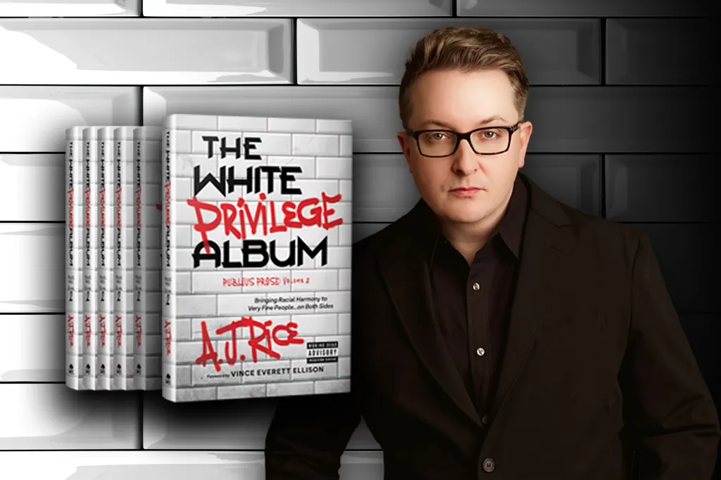
White privilege gave us Western civilization, the middle class,
and the nuclear family—you’re welcome! This book is dedicated
to the very fine people that made it all happen.
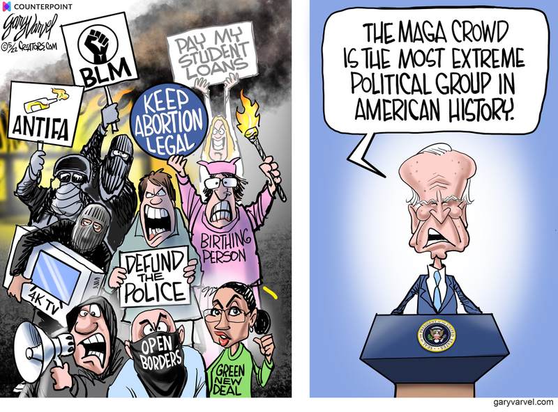
I just became aware of A.J. Rice from this American Greatness article Rice: Woke initiatives were ‘one uppercut to the face after another’ for Gen Z. Excerpts in italics with my bolds and added images.
A J Rice said Gen Z is a generation that struggles with human connection because of the mass social justice movements they grew up with. He made the comments on a recent episode of The Greatness Conversation.
“You had one uppercut to the face after another here for Gen Z where, first, it’s the Me Too movement, males are told to take it down a notch, toxic masculinity,” Rice said on a recent episode of The Greatness Conversation. “You might be a predator, you might be a rapist. And then, and then all of a sudden, George Floyd dies. You’re now a racist. All of your history stinks.”
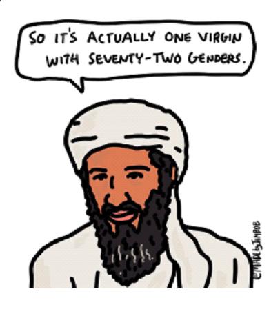
“And then when that’s all over, they’re going to drop on you that there are 72 genders and Gary and Tim and Bill are coming into the women’s locker room and the girl’s bathroom,” Rice said. “So, you know, if you wonder why Gen Z has a hard time being authentically human.”
Rice joined the podcast to discuss his new book, “The White Privilege Album,” the use of comedy to talk about progressive “wokeness,” and the future of what society looks like for younger generations.
Who’s A. J. Rice? More from American Spectator A.J. Rice’s White Privilege Album Is a Vaccine for the Woke Mind Virus. Excerpts in italics with my bolds and added images.
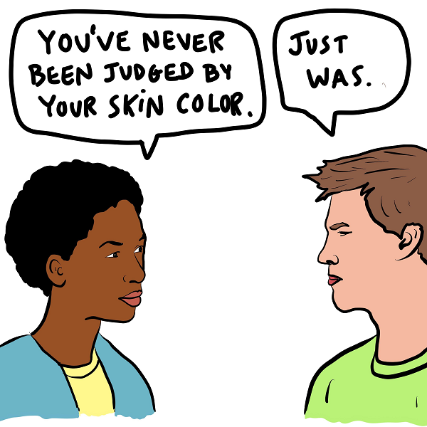
Rice exposes what actual white privilege looks like
and why you don’t have it.
You already know this, but we live in deeply stuffy, oppressive times. You can get canceled for saying the wrong thing, not saying the right thing, or even looking at someone in a way they don’t like. Don’t believe me? Go to the gym and glance for more than three seconds at that 20-something girl in the bralette and bike shorts; woe betide you if you’re not in better shape than she is.
One minute you’re on top of the world — the next minute, you’re canceled and your whole world is turned upside down. It would be no small thing to just say forget all this and say and do whatever you want without fear. A younger Mel Brooks or Woody Allen might relish taking the fight to wokeness, but few others around would.
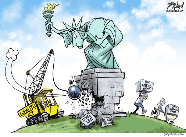
The digital gulag awaits us all, it seems. A hunger for thus imprisoning one’s fellow man is what the woke mind virus instills in its victims.
Into this climate of fear and loathing comes a writer, an entrepreneur, a madcap thinker with the sand to call the entire woke-industrial complex “zombies” and then follow that up with a book that quotes from Blazing Saddles on its opening page.
You remember Blazing Saddles, don’t you? It’s one of the funniest and most controversial movies ever made, a cultural sacrament for Generation X if ever there was one. It uses racism to mock racism, stupidity to rip stupidity, and comedy to take a sledgehammer to anyone who takes themselves too seriously — and in ways and from angles that make it an impossible movie to get produced today.
But back to the book. Its title is — mischievously —The White Privilege Album, and it’s A.J. Rice’s newest exploration of the insanity of our times.
The Worst of Times and the Worse of Times
According to Rice, we live in the worst of times, and, well, also the worse of times. Sure, we have all the technology we’ll probably ever need and the whole world’s knowledge at our fingertips at any given moment. You can explore the finest works of art, delve into the achievements of the Maya, study the miraculous founding of America — anything you want.
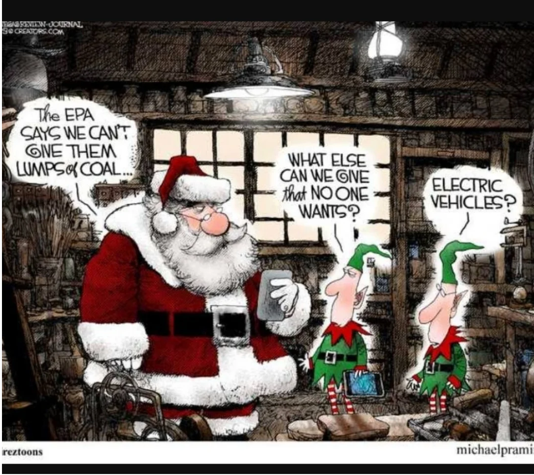
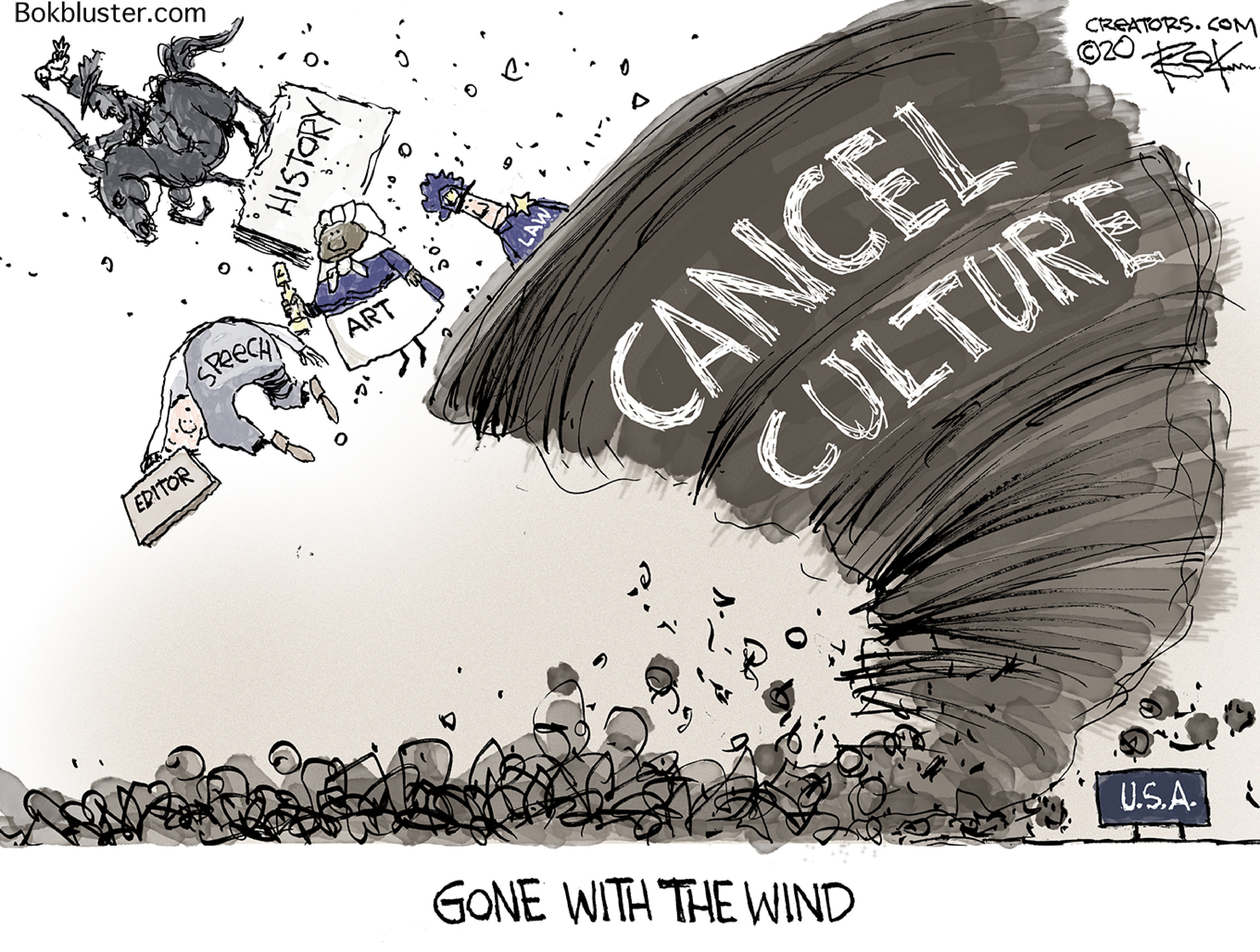
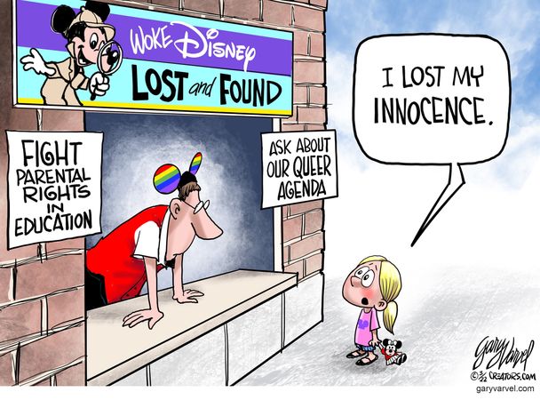
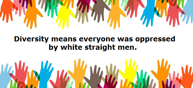
But millions merely use all this technology and knowledge we’re privileged to have to attack America relentlessly every hour of the day. We pay for public schools through our taxes, and those schools are filled with woke activists masquerading as teachers, indoctrinating our kids with ESG, DEI, and transgenderist trash and telling them that every generation before them was hopelessly racist and evil.
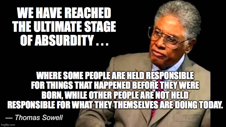
Well, only if they were white. Everyone else gets a free pass even if their ancestors owned slaves, committed genocide, or did other terrible things. Only white people need apply for the re-education camps Hillary Clinton wants, and only white people would be subject to the censorship regime that the entire Democratic Party so openly wants.
There’s your white privilege, Rice says. You’ll be subject to the whims of woke wackos and their digital shock troops. Your leaders will be cast as villains. You’ll be lied to, hoaxed, and perhaps doxxed and canceled. And you’ll like it or they’ll call you a racist and cancel you again.

Rice Exposes Hoaxes and Lies as the Foundation of the Left
As Rice documents and exposes in this extremely well-researched and written book, the major movements of our time are based on hoaxes, lies, smears, and bullying. Wokeness incorporates all of that — it’s a hoax against America and Western values, based on lies and half-truths taken out of context, aimed at smearing and undermining our history and culture, and weaponizes organized bullying to intimidate the weak-minded into submission.
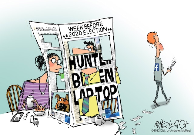
Likewise, Joe Biden’s very reason for running for president was, according to him, based on the Trump “very fine people” quote — which was torn out of context and twisted into a hoax in which he is said to have praised neo-Nazis.Spoiler: He didn’t. Biden lied. A lot.
These hoaxes and lies are the foundation of the entire left now, Rice writes. Chapter by chapter, Rice takes on and tears apart the woke NBA, California Gov. Gavin Newsom’s Marxist racism, Barack Obama’s stealth wokeness, Ibrahim X. Kendi’s lucrative race-hustling grift, and so much more. Along the way, you will see actual white privilege, in the form of a ne’er-do-well crackhead who suspiciously stays out of jail no matter what while black and brown offenders end up in prison for years on similar offenses. You’ll also learn why Aunt Jemima and Uncle Ben were really fired. In fact, you’ll get 12 months of “white privilege” in this amazing book.
But The White Privilege Album isn’t just about mowing down woke zombies. There’s plenty of that, but it’s also about lifting up heroes who deserve it and rebuilding the sense that America is great and good and always has been. A.J. Rice delivers the triumphs amid the seemingly overwhelming evil, through chapter after chapter that you won’t be able to put down.
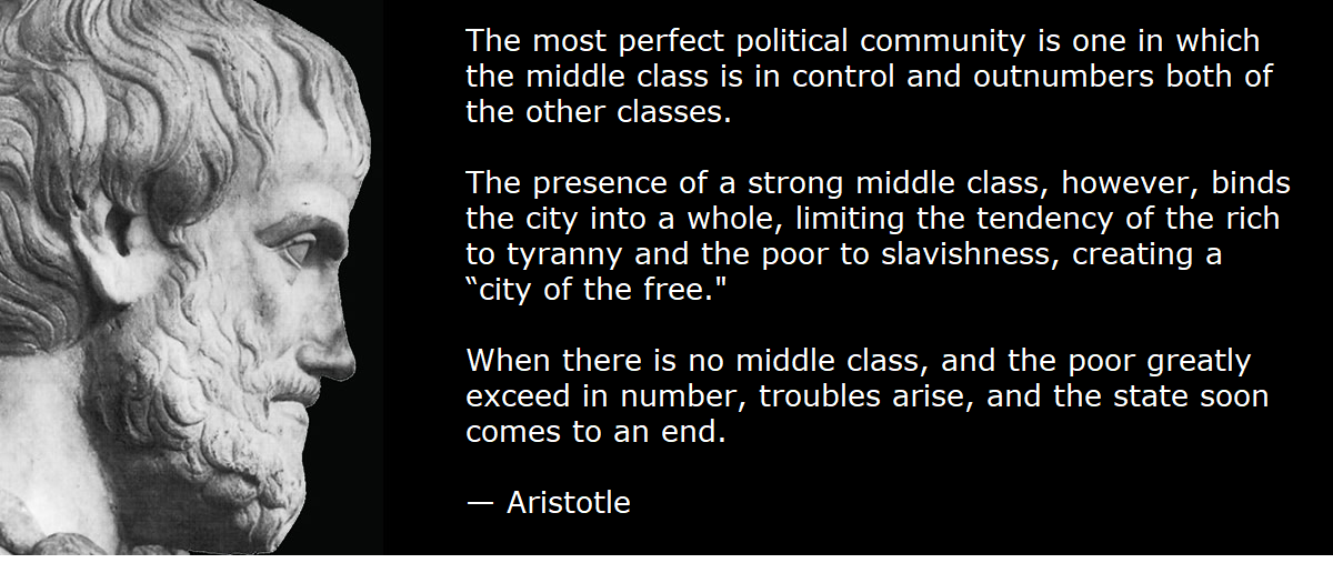
Rice: The left hates Western civilization, the middle class, children
“Here’s the takeaway,” he said. “I’m abducting their language and using it against them.”
It started with so-called “white privilege,” he said.
“When you hear these terms, ‘white privilege,’ ‘intersectionality,’ or ‘check your privilege,’ or these constructs of white privilege, when you hear the left, do that what they’re really talking about is three things,” he said.
“One, Western civilization, and I mean Greco-Roman Judeo-Christian civilization, which has to go, they want it to go away,” the author said. “That’s why it’s not just about tearing down statues. It’s everything from Columbus to Winston Churchill — it has to go.”
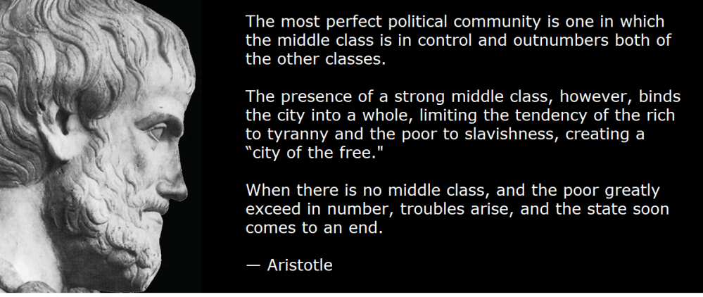
The second thing is the middle class, Rice said. “The left cultural Marxists and economic Marxists have been trying to destroy the middle class for 100 years,” he said.
“They know to do that because they want a peasant class because Marxism has never thrived,” he said. “Not in Venezuela, not North Korea, none of these places when there’s been a healthy middle class — so middle class has to go.”
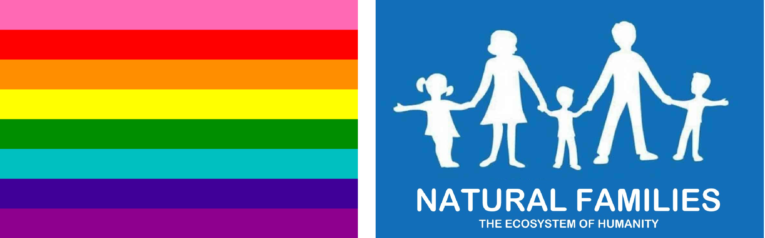
The third thing is children, he said. “I believe happy people have more children; of course, more children mean more global warming, so the third thing that they have to destroy is the nuclear family,” he said.
“We know they have to destroy it because Black Lives Matter told us that they wanted to destroy it on their website.”

Rice: America is a multi-ethnic country
Rice said he is trying to untangle Americans from the labels that the left uses to confuse us.
“Let me just say, we are not a multicultural country,” he said.
“We are a multi-ethnic country, and the middle class and Western civilization in the nuclear family are colorblind,” he said.
“They’re not white, black, or anything else, and if you want to come here and you do it legally, you can come here and participate in this great experiment,” Rice said.
“As long as the cultural Marxists don’t destroy it.”


 Canada does not need another way to slow its economy. One