SCOTUS Must Stop Climate Extortion Lawfare
Jon Decker explains what’s at stake in the case awaiting US Supreme Court consideration. His Real Clear Markets article is The Supreme Court Must Stop Climate Extortion Schemes. Excerpts in itallics with my bolds and added images.
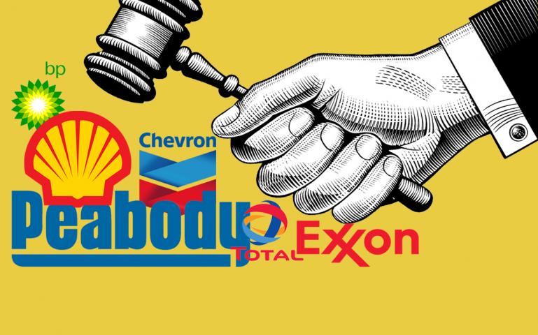
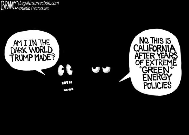
Chevron recently announced that it is moving out of California after almost a century and a half in the state. No wonder, since Sacramento sued the company, along with a number of other oil companies, for allegedly deceptive practices.
In their war on energy, progressive politicians increasingly turn to lawfare as another scheme to extract funds from productive citizens and dramatically reshape the economy. In the coming weeks, we’ll learn if the Supreme Court will stand up to them.
The critical case is Sunoco v. Honolulu, currently pending before SCOTUS. Honolulu is suing several oil companies, alleging their fossil fuel production caused significant damage to the city through rising sea levels and other climate-related infrastructure issues.

That these companies are being sued not for specific instances of purported environmental harm, but instead under “public nuisance” and “consumer fraud” laws for an alleged “multi-decadal campaign of deception” about the nature of their products is crucial. That’s because it lets progressive cities and states get around long-standing legal doctrine that kept climate cases in federal courts, where defendants are somewhat likelier to get a fair hearing.
Knowing that federal environmental law presents a more difficult path for litigation, activists instead went “venue shopping” with their climate agenda to deep blue states, knowing that a multi-jurisdictional assault would be unworkable, and potentially fatal, for American energy companies. The progressive politicians who support this approach not only see a boost for their careers and fundraising goals, but a potentially massive source of new government revenue.
Because Honolulu, like a spate of other lawsuits driven by ambitious progressive state AGs and prosecutors, models its assault on energy companies on the 90s tobacco wars. And they are unsurprisingly seeking an eye-watering settlement similar to what the tobacco industry was forced to pay (dollars that still flow to the government to this day).
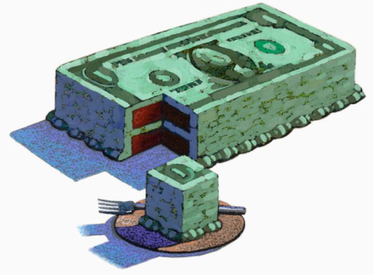
But you don’t have to be a fossil fuel corporate booster or a climate change skeptic to recognize that these paydays will come at the expense of ordinary consumers and taxpayers, and of the economy as a whole.
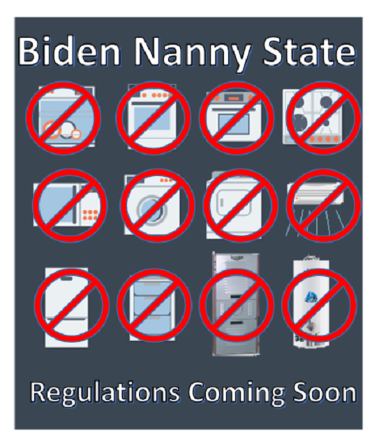
Fossil fuels are ubiquitous in every sector, from agriculture and clothing to steel production, electricity, heating, and transportation. If this lawfare succeeds then every single one of these products and services—anything that takes energy as an input—becomes more expensive.
There’s also a kind of incoherence to the idea that a small handful of companies are alone to blame for perceived climate ills. What about the thousands of companies worldwide that are involved in the exploration, production, and distribution of fossil fuels – or the millions of companies that use fossil fuels to make their own goods and perform their services? That’s not even to mention the fact that the same few energy companies now being sued also play a critical role in the U.S. leading the world in CO2 emission reductions, through greater adoption of natural gas. How do the companies spearheading the natural gas renaissance figure into the supposed “deception” at work here?
The stakes here remind us that judges—and therefore elections—matter. Hawaii Supreme Court Chief Justice Mark Recktenwald, who ruled in favor of Honolulu and thereby triggered SCOTUS review, has been associated with the far-left Environmental Law Institute’s (ELI) Climate Judiciary Project, a group that “trains” and “educates” thousands of judges and government lawyers across the country to deliver legal outcomes favored by progressives.
The Supreme Court may be the last line of defense against
fringe activists dictating energy policy for the rest of us.
But of course, SCOTUS itself is in the crosshairs of left-wing judicial scheming, with top Democrats, including presidential nominee Kamala Harris, threatening to pack the Supreme Court if elected. No doubt with judges in the Mark Recktenwald mode.
If Honolulu succeeds in its case, and progressives in their larger campaign of lawfare, Americans can say Aloha to higher prices.
Postscript on Arguing Deception in These Cases
As noted above, the rationale for filing these cases in state rather than federal courts depends on claiming consumer fraud, I.e. oil companies deceived the public while knowing about their damaging energy products. A good rebuttal against the “Exxon Knew” fiction is provided (with my bolds) by Randal Utech at Master Resource:
To say that Exxon knew the truth back in the early 80s is a laughable fallacy. Effectively they built a primitive model that is characteristically similar to the erroneous modern climate models of today.
Fundamentally their work is based on the poorly understood climate sensitivity (ECS) derived from radiative convective models and GCM models. To their credit, they actually acknowledged the high degree of uncertainty in these estimations. Today, even Hausfather (2022 vs 2019) is beginning to understand the climate sensitivity (ECS) is too high. CMIP6 is running still even hotter than CMIP5 and using ECS of 3 to 5° C rather than ~ 1.2° C as highlighted in Nick Lewis’s 2022 study.
CMIP6 should have been better because it incorporated solar particle forcing (Matthes et. al.) and as they incorporate more elements of natural forcing (an active area of research as we still do not have a predictive theory for climate), the effect is highlighting more underlying problems with the models.
However, Exxon investigators fell into the same trap that climate modelers of today where they build the models to history match temperatures and then wow, because they can create a model that appears to history match temperatures, they assume it is telling them something. Truth? Anyone can create a model to do this, but it would never mean the model is correct. While the models today are much more complex, they are based on a complex set of non-linear equations, and the understanding of the various sources of nonlineararity is poor. This opens up wide degrees of uncertainty yet wide opportunity for tuning. Furthermore, natural forcing is undercharacterized and deemed inconsequential.
The contrived sense of accomplishment in history matching is spurious correlation for an infinitesimally small period of time. Using Exxon’s internal analysis of CO2 climate forcing is little more than a propaganda tool. Current climate models, much more sophisticated, face the same problem of unknown, false causality.

See Background Post:


 “If there’s anything that I argue, it’s that we need to be resilient. We should stop pretending that if we changed or lowered our emissions the climate would stop changing. That’s the true denial of climate right there,” Wielicki says. “What we need to accept is that regardless of the CO2 in the atmosphere, we are going to have climate change and those shifts could occur over timescales of decades or centuries, and we should be prepared.


 Today we have a coordinated release globally of a study claiming to disprove the Covid 19 virus came from the Wuhan Institute of Viology (WIV). An example is the article from the UK so-called Independent


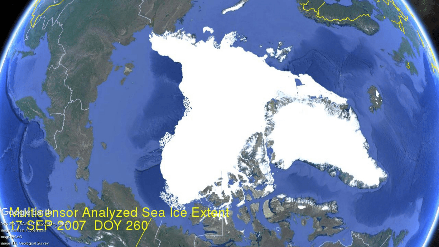
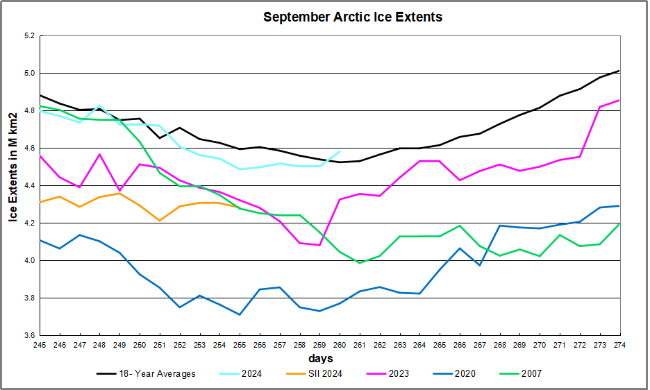


 The table below shows the distribution of Sea Ice on day 260 across the Arctic Regions, on average, this year and 2007. At this point in the year, Bering and Okhotsk seas are open water and thus dropped from the table.


 Kip Hansen gives the game away in his Climate Realism article


Two seemingly mutually excluding theories of SARS-CoV2 origin are now a matter of a heated debate.
On one hand, scientists siding with the lab-leak idea are bringing up a lot of reasonable but circumstantial evidence in favor it. There is no real way to prove the leak until an unbiased commission of researchers inspects the potential sites and lab records. That is unlikely to happen, and the problem may be never solved, unless another leak, next time a leak of critical information happens.
On the other hand, a seemingly large group of scientists supports the natural origin of the COVID19 pandemics. The key point here is that they also do not have a direct evidence of SARS-CoV2 being transmitted to humans through an intermediate host in a manner similar to what was found before for SARS and MERS viruses.
The debate becomes more and more heated, not at the least being motivated by non-scientific reasons. Major journals publish unbalanced editorials favoring ‘natural origin’ theory that so far has not produced the fatal blow to the opposite view. It is argued that it is hard to find a needle in the haystack (an animal that is an intermediate host for SARS-CoV2), but this is the real source of uncertainty.
For an unbiased critical mind, it is impossible to take sides in this debate simply because both previous lab leaks (including of SARS virus) and a natural transmission through intermediate hosts of human SARS and MERS coronaviruses have been documented. If one wants to convince that unbiased critical mind of the natural origin of human SARS-CoV2 – show us the money!
Find the intermediate host, find the virus, explain in molecular terms
how it got the furin cleavage site, or better continue working hard.
The article by Michael Worobey is an example of delivering arguments that can hardly make a dent in the leak theory for the following reasons:
Calm, however, is an unlikely outcome of this debate. My argument is that scientific thinking and integrity should come first. It is really tiring to read the numerous editorials and letters that are unilateral with no substance. I rest my case totally prepared to be convinced one way or another by solid direct evidence.