Green Baloney, Hype and Fairy Tales in Australia

Viv Forbes writes at Spectator Australia Battery baloney, hydrogen hype, and green fairy tales in Australia.  Excerpts in italics with my bolds and added images.  H/T John Ray at his blog Greenie Watch.

How low Australia has fallen… Our once-great BHP now has a ‘Vice President for Sustainability and Climate Change’, the number of Australian students choosing physics at high school is collapsing, and our government opposes nuclear energy while pretending we can build and operate nuclear submarines.

Our Green politicians want: ‘No Coal, No Gas, No Nuclear!’ while Our ABC, Our CSIRO, and Our Australian Energy Market Operator (AEMO) are telling us that wind and solar energy (plus a bit of standby gas, heaps of batteries, and new power lines) can power our homes, industries and the mass electrification of our vehicle fleet. This sounds like Australia’s very own great leap backwards.

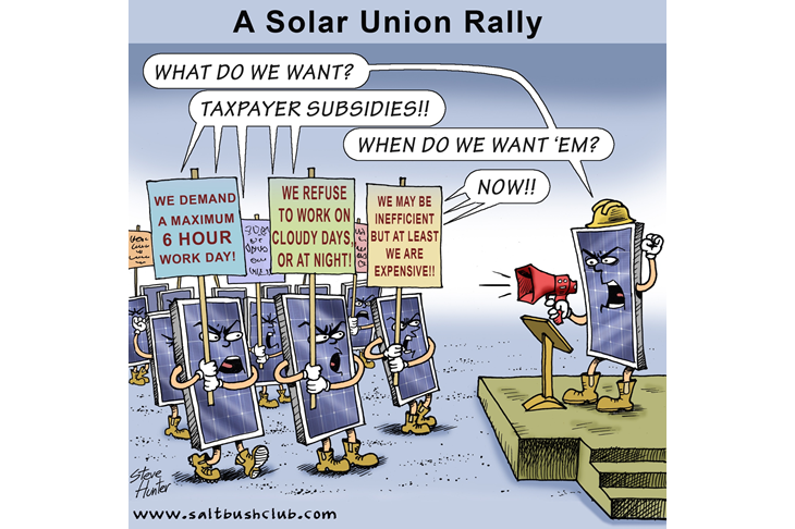
There are two troublesome Green Energy Unions: the Solar Workers down tools every night and cloudy day, and the Turbine Crews stop work if winds are too weak or too strong. And wind droughts can last for days. The reliable Coal and Gas Crews spend sunny days playing cards, but are expected to keep their turbines revving up and down to keep stable power in the lines.

From Duck to Canyon Curve

Magical things are also expected from more rooftop solar. But panel-power has four huge problems:

♦  Zero solar energy is generated to meet peak demand at breakfast and dinner times.

♦  Piddling solar power is produced from many poorly oriented roof panels or from the weak sunshine anywhere south of Sydney.

♦  If too much solar energy pours into the network (say at noon on a quiet sunny Sunday), the grid becomes unstable. Our green engineers have the solution – be ready to charge people for unwanted power they export to the grid, or just use ‘smart meters’ to turn them off.

♦  More rooftop solar means less income and more instability for power utilities so they have to raise electricity charges. This cost falls heaviest on those with no solar panels, or no homes.

Magical things are also expected from batteries.

When I was a kid on a dairy farm in Queensland, I saw our kerosene lamps and beeswax candles replaced by electric lights. We had 16 X 2 volt batteries on the verandah and a big thumping diesel generator in the dairy.

It was a huge relief, years later, when power poles bringing reliable electricity marched up the lane to our house. All those batteries disappeared with the introduction of 24/7 coal power.

Batteries are never a net generator of power – they store energy generated elsewhere, incurring losses on charging and discharging.

There has to be sufficient generating capacity to meet current demand while also recharging those batteries. What provides electricity to power homes, lifts, hospitals, and trains and to recharge all those vehicle batteries after sundown on a still winter night? (Hint: Call the reliable coal/gas/nuclear crews.)

The same remorseless equations apply to all the pumped hydro schemes being dreamed up – everyone is a net consumer of power once losses are covered and the water is pumped back up the hill.

Yet AEMO hopes we will install 16 times our current capacity of batteries and pumped hydro by 2050 – sounds like the backyard steel plans of Chairman Mao or the Soviet Gosplan that constipated initiative in USSR for 70 years. Who needs several Snowy 2 fiascos running simultaneously?

Mother Nature has created the perfect solar battery which holds the energy of sunlight for millions of years. When it releases that energy for enterprising humans, it returns CO2 for plants to the atmosphere from whence it came. It is called ‘Coal’.

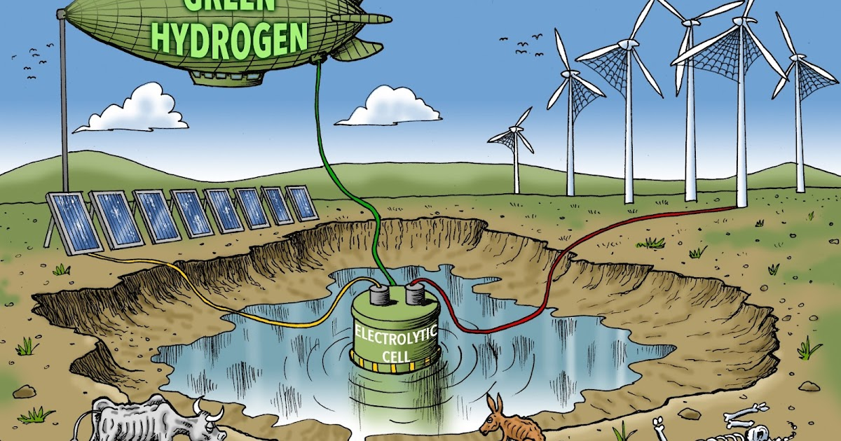
‘Hydrogen’ gets a lot of hype, but it is an elusive and dangerous gas that is rarely found naturally. To use solar energy to generate hydrogen and to then use that hydrogen as a power source is just another silly scheme to waste water and solar energy. It always takes more energy to produce hydrogen than it gives back. Let green billionaires, not taxpayers, spend their money on this merry-go-round.

Who is counting the energy and capital consumed, and the emissions generated, to manufacture, transport, and install a continent being covered by ugly solar panels, bird slicers, high voltage power lines, access roads, and hydro schemes? Now they want to invade our shallow seas. Who is going to clean up this mess in a few years’ time?

As Jo Nova says:

‘No one wants industrial plants in their backyard, but when we have to build 10,000 km of high voltage towers, 40 million solar panels, and 2,500 bird-killing turbines – it’s in everyone’s backyard.’

With all of this planned and managed by the same people who gave us Pink Batts, Snowy 2 hydro, and the NBN/NDIS fiascoes, what could possibly go wrong?

Another big problem is emerging – country people don’t want power lines across their paddocks, whining wind turbines on their hills, and glittering solar panels smothering their flats. And seaside dwellers don’t want to hear or see wind turbines off their beaches. Even whales are confused.

The solution is obvious – build all wind and solar facilities in electorates that vote Green, Teal, and Labor. Those good citizens can then listen to the turbines turning in the night breezes and look out their windows to see shiny solar panels on every roof. This will make them feel good that they are preventing man-made global warming. Those electorates who oppose this silly green agenda should get their electricity from local coal, gas or nuclear plants.

What about the Net Zero targets?

At the same time as Australia struggles to generate enough reliable power for today, governments keep welcoming more migrants, more tourists, more foreign students and planning yet more stadiums, games, and circuses. None of this is compatible with their demand for Net Zero emissions.

Unlike Europe, the Americas, and Asia, Australia has no extension cords to neighbours with reliable power from nuclear, hydro, coal, or gas – we are on our own.

Australia has abundant resources of coal and uranium – we mine and export these energy minerals but Mr Bowen, our Minister for Blackouts, says we may not use our own coal and uranium to generate future electricity here. Someone needs to tell him that no country in the world relies solely on wind, solar, and pumped hydro. Germany tried but soon found they needed French nuclear, Scandinavian hydro, imported gas, and at least 20 coal-fired German power plants are being resurrected or extended past their closing dates to ensure Germans have enough energy to get through the winter.

Australia is the only G20 country in which nuclear power is illegal (maybe no one has told green regulators that we have had a nuclear reactor at Lucas Heights in Sydney since 1958). Australia is prepared to lock navy personnel beside nuclear power plants in our new nuclear-powered submarines but our politicians forbid nuclear power stations in our wide open countryside.

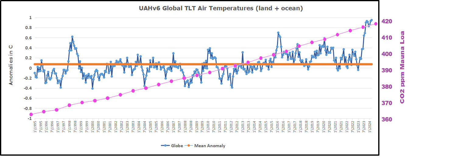
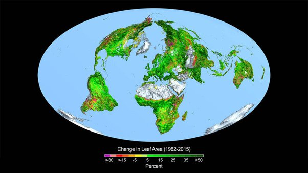
More CO2 in the atmosphere brings great benefits to life on Earth. If man adds to it, the oceans dissolve a swag of it, and what stays in the atmosphere is gratefully welcomed by all plant life.

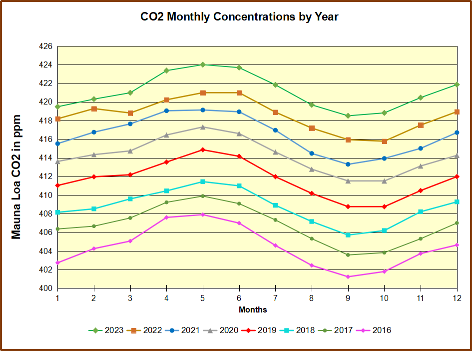
In 2023, Australia added just 0.025 ppm to the 420 ppm in today’s atmosphere. Most of this probably dissolved in the oceans. If we in Australia turned everything off tomorrow, the climate wouldn’t notice, but our plant life would, especially those growing near power stations burning coal or gas and spreading plant food.

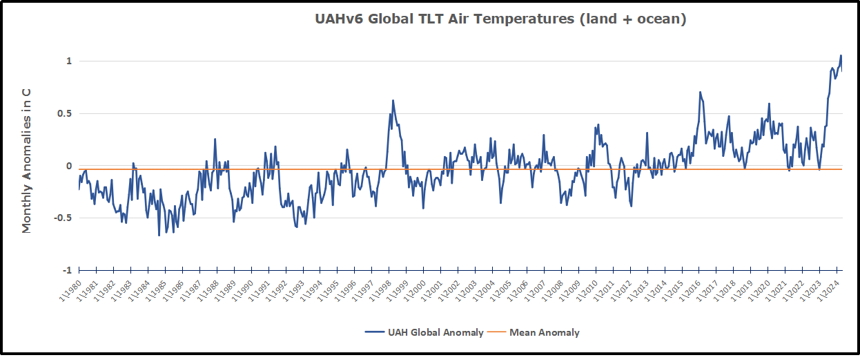
Climate has always changed and a warm climate has never been a problem
on Earth. 
It is cold that kills. Especially during blackouts.

Still Surplus Arctic Ice End of June 2024

The graph above shows June daily ice extents for 2024 compared to 18 year averages, and some years of note.

The black line shows on average Arctic ice extents decline from a maximum of 11.6M km2 on day 153 down to 9.7M Km2 by day 182.  2024 started slightly higher, then tracked below the 18-year average, before ending above average.  SII was somewhat higher than MASIE most of June until ending nearly the same. 2007 melted faster than average, while 2020 ice started and ended much in deficit.

Why is this important?  All the claims of global climate emergency depend on dangerously higher temperatures, lower sea ice, and rising sea levels.  The lack of additional warming prior to 2023 El Nino is documented in a post UAH May 2024: NH Cooling by Land and Sea.

The lack of acceleration in sea levels along coastlines has been discussed also.  See Observed vs. Imagined Sea Levels 2023 Update.

Also, a longer term perspective is informative:

post-glacial_sea_levelThe table below shows the distribution of Sea Ice on day 182 across the Arctic Regions, on average, this year and 2007. At this point in the year, Bering and Okhotsk seas are open water and thus dropped from the table.

Region 2024182 Day 182 Ave 2024-Ave. 2007182 2024-2007
 (0) Northern_Hemisphere 9829571 9662331  167240  9379951.31 449620 
 (1) Beaufort_Sea 921615 919484  2132  912323.51 9292 
 (2) Chukchi_Sea 832358 723506  108851  650489.98 181868 
 (3) East_Siberian_Sea 1028480 1008708  19772  878945.14 149534 
 (4) Laptev_Sea 674023 696937  -22914  652206.83 21816 
 (5) Kara_Sea 733875 529007  204868  600511.02 133364 
 (6) Barents_Sea 100803 105335  -4531  112929.89 -12127 
 (7) Greenland_Sea 501023 496290  4733  546984.13 -45961 
 (8) Baffin_Bay_Gulf_of_St._Lawrence 591648 512555  79093  427145.99 164502 
 (9) Canadian_Archipelago 717214 776159  -58946  765307.59 -48094 
 (10) Hudson_Bay 505046 671642  -166596  617582.73 -112537 
 (11) Central_Arctic 3216938 3205266  11672  3210046.66 6891 

The overall surplus to average is 167k km2, (2%).  The only major deficit is in Hudson Bay, going to open water next month anyway.  That is more than offset by surpluses everywhere, especially in Chukchi, Kara and Baffin Bay.  Note that 2007 had almost half a Wadham of less ice extent at June 30. 

bathymetric_map_arctic_ocean

Illustration by Eleanor Lutz shows Earth’s seasonal climate changes. If played in full screen, the four corners present views from top, bottom and sides. It is a visual representation of scientific datasets measuring ice and snow extents.

There is no charge for content on this site, nor for subscribers to receive email notifications of postings.


Scientists Say: Net Zero Wins Nearly Zero Results

Chris Morrison explains at his Daily Sceptic article Net Zero Will Prevent Almost Zero Warming, Say Three Top Atmospheric Scientists.  Excerpts in italics with my bolds and added images.

Recent calculations by the distinguished atmospheric scientists Richard Lindzen, William Happer and William van Wijngaarden suggest that if the entire world eliminated net carbon dioxide emissions by 2050 it would avert warming of an almost unmeasurable 0.07°C. Even assuming the climate modelled feedbacks and temperature opinions of the politicised Intergovernmental Panel on Climate Change (IPCC), the rise would be only 0.28°C. Year Zero would have been achieved along with the destruction of economic and social life for eight billion people on Planet Earth. “It would be hard to find a better example of a policy of all pain and no gain,” note the scientists. [Paper is Net Zero Averted Temperature Increase  by Lindzen, Happer and van Wijngaarden.]

In the U.K., the current General Election is almost certain to be won by a party that is committed to outright warfare on hydrocarbons. The Labour party will attempt to ‘decarbonise’ the electricity grid by the end of the decade without any realistic instant backup for unreliable wind and solar except oil and gas. Britain is sitting on huge reserves of hydrocarbons but new exploration is to be banned. It is hard to think of a more ruinous energy policy, but the Conservative governing party is little better. Led by the hapless May, a woman over-promoted since her time running the education committee on Merton Council, through to Buffo Boris and Washed-Out Rishi, its leaders have drunk the eco Kool-Aid fed to them by the likes of Roger Hallam, Extinction Rebellion and the Swedish Doom Goblin. Adding to the mix in the new Parliament will be a likely 200 new ‘Labour’ recruits with university degrees in buggerallology and CVs full of parasitical non-jobs in the public sector.

Hardly any science knowledge between them, they even believe that they can spend billions of other people’s money to capture CO2 – perfectly good plant fertiliser – and bury it in the ground. As a privileged, largely middle class group, they have net zero understanding of how a modern industrial society works, feeds itself and creates the wealth that pays their unnecessary wages. All will be vying to save the planet and stop a temperature rise that is barely a rounding error on any long-term view.

They plan to cull the farting cows, sow wild flowers where food
once grew, take away efficient gas boilers and internal combustion
cars and stop granny visiting her grandchildren in the United States.

On a wider front, banning hydrocarbons will remove almost everything from a modern society including many medicines, building materials, fertilisers, plastics and cleaning products. It might be shorter and easier to list essential items where hydrocarbons are absent than produce one where they are present. Anyone who dissents from their absurd views is said to be in league with fossil fuel interests, a risible suggestion given that they themselves are dependent on hydrocarbon producers to sustain their enviable lifestyles.

Unlike politicians the world over who rant about fire and brimstone, Messrs Lindzen, Happer and van Wijngaarden pay close attention to actual climate observations and analyses of the data. Since it is impossible to determine how much of the gentle warming of the last two centuries is natural or caused by higher levels of CO2, they assume a ‘climate sensitivity’ – rise in temperature when CO2 doubles in the atmosphere – of 0.8°C. This is about four times less than IPCC estimates, which lacks any proof. Understandably the IPCC does not make a big issue of this lack of crucial proof at the heart of the so-called 97% anthropogenic ‘consensus’.

The 0.8°C estimate is based on the idea that greenhouse gases like CO2 ‘saturate’ at certain levels and their warming effect falls off a logarithmic cliff. This idea has the advantage of explaining climate records that stretch back 600 million years since CO2 levels have been up to 10-15 times higher in the past compared with the extremely low levels observed today. There is little if any long term causal link between temperature and CO2 over time. In the immediate past record there is evidence that CO2 rises after natural increases in temperature as the gas is released from warmer oceans.

Any argument that the Earth has a ‘boiling’ problem caused by the small CO2 contribution that humans make by using hydrocarbons is ‘settled’ by an invented political crisis, but is backed by no reliable observational data. Most of the fear-mongering is little more than a circular exercise using computer models with improbable opinions fed in, and improbable opinions fed out.

The three scientists use a simple formula using base-two logarithms to assess the CO2 influence on the atmosphere based on decades of laboratory experiments and atmospheric data collection. They demonstrate how trivial the effect on global temperature will be if humanity stops using hydrocarbons. After years wasted listening to Greta Thunberg, the message is starting to penetrate the political arena. In the United States, the Net Zero project is dead in the water if Trump wins the Presidential election. In Europe, the ruling political elites, both national and supranational, are retreating on their Net Zero commitments. Reality is starting to dawn and alternative political groupings emerge to challenge the comfortable insanity of Net Zero virtue signalling. In New Zealand, the nightmare of the Ardern years is being expunged with a roll back of Net Zero policies ahead of possible electricity black outs.

Only in Britain it seems are citizens prepared to elect a Government obsessed with self-inflicted poverty and deindustrialisation. The only major political grouping committed to scrapping Net Zero is the Nigel Farage-led Reform party and although it could beat the ruling Conservatives into second place in the popular vote, it is unlikely to secure many Parliamentary seats under the U.K.’s first-past-the-post electoral system. Only a few years ago the Labour leader Sir Keir Starmer, who thinks some women have penises, and his imbecilic Deputy Leader Angela Rayner, were bending the knee to an organisation that wanted to cut funding for the police and fling open the borders. The new British Parliament will have plenty of people who still support Net Zero and assorted woke woo woo, and the great tragedy is that they will still be found across most of the represented political parties.

See Also 

Delusions of Davos and Dubai


The Global Biomedical Power Game

Bruce Pardy explains how the public health power grab is operating in his Brownstone article WHO’s on First, referring to the World Health Organization. Excerpts in italics with my bolds and added images.

A new game is coming to every town and city on Earth. It’s called Global Public Health baseball. The team to beat is the Biomedical State. Here’s their starting lineup exhibited above.

Pitcher: Public Health Bureaucracy

Prone to mistakes and wild pitches. Arrogant, can do no wrong. Was a role player in the bullpen for most of career but broke into the limelight in the last campaign. To everyone’s surprise, has become an attention whore. 

Catcher: Military and Scientific Research Institutes

Controls the game for the Biomedical State but doesn’t want to be in the spotlight. Lets Public Health have the attention. Self-interested. Team player as long as the team is doing as it’s told. Good buddies with Pharma. 

First Base: World Health Organization

The new team captain, at least on paper. Very ambitious. Disappointing skills. Full of bluster but weak performance, especially during the previous campaign. Dropped balls and wandered off base. Being promoted into a role for which it’s not equipped.

Second Base: Pharmaceutical Industry

Highest paid player on the team. Terrible on-field performance but Manager’s favourite. Good buddies with Military and Scientific Research Institutes. Dirty player but hardly ever gets caught. Somehow manages to have the rules changed to its advantage. Excellent self-promoter. Fan favorite; people can’t get enough. 

Shortstop: Legacy Media and Big Tech

Team spokesman. Speaks in vacuous cliches. Won’t let others talk. Double standards. Won’t admit to errors. Not a fan favorite.

Third Base: Medical Profession

Rigid skills, stuck in routine. Not creative, doesn’t take criticism well, hard to coach unless paid huge bonuses. One of the higher-paid players, beneficiary of a legacy contract. Claims to care but often observed living the high life. Doesn’t like to practice.

Out in Left Field: Legislatures

Easily distracted, often doesn’t know the score. Tendency to drop the ball. Has accepted minor role on the team even though has more power than realizes. Supports other players even when they don’t reciprocate.

Center Field: Academics and Activists

Most vocal but least skilled on the team. Won’t stop yelling. Usually incoherent but good at rallying the crowd.

Right Field: Common Good Conservatives

Most enthusiastic team booster. Steadfast belief in the value of teamwork and fair play. Most naïve member of the team. Least popular player on the team but doesn’t realize it.

Manager and Owner: Governments

Rules the team with an iron fist. Often wants to appear to be in the background. Pretends to defer to the players. Gives big payouts to favored players like Research Institutes and Pharma. Leans on Media and Big Tech when other players make mistakes.

Umpires: Courts

Think that they’re on the team. Every call is in favor of the Biomedical State. Wild pitches called strikes.

The League

There are no other teams, just an endless series of citizens at bat. The goal is get them out, out, out of the game.

The Real Game

Of course, the game of Global Public Health is not played on a baseball diamond. But the game is real, and so are the players. Yes, the biomedical state exists. Yes, its players are part of a global public health regime. Yes, it is controlled by national governments, research institutes, and domestic public health authorities, but it will be publicly led by the WHO. A new international pandemic agreement is still in the works. 

The WHO will appear to transition from an advisory body to the directing mind and will of global health, even though certain national governments will be pulling the strings. The WHO will have authority to declare public health emergencies on loose criteria. National and local governments will undertake to do as the WHO directs. They will make private citizens and domestic businesses comply too. Lockdowns, quarantine, vaccines, travel restrictions, surveillance, data collection, and more will be on the table.

Yes, governments are still ultimately in control in their own countries or states/provinces. But many want the WHO to be the face of pandemic response. They want to hide their responsibility and avoid scrutiny from their own people. Officials will be able to justify restrictions by citing international obligations. WHO recommendations leave them no choice, they will say. “The WHO has mandated vaccines, so we cannot let you enter public spaces without one. It’s out of our hands.”

For the pharmaceutical industry, the global public health regime is a business model. The Covid “emergency” allowed the use of new pharmaceutical technology without a normal approval process or rigorous testing. Pharma was already adept at inventing ailments to be treated with new drugs, and at making people dependent upon their supply. Pandemic emergencies take this strategy to the next level. Government mandates make participation in society dependent upon the use of pharmaceutical products.

During Covid, legacy media reflected the official, hysterical narrative. Governmental authorities and social media platforms attempted to restrict competing facts and skeptical opinions. Regulators of the health professions prohibited doctors and other healthcare workers from expressing views contrary to Covid policies. Most doctors went along. Despite these efforts, dissenters managed to voice alternative stories and to pierce the Covid bubble. The biomedical state plans to do better next time.

Our society runs on illusions. Things are not what they appear to be. The global public health plan is not just international cooperation to be better prepared for pandemics. It is not an innocent effort to produce more accurate science and better policy. The biomedical state and its partners aim to protect and extend a governance model that serves the interests of its various constituencies. They seek to manage the whole of society using health as the rationale. They’re running away with the game.

Bruce Pardy is executive director of Rights Probe and professor of law at Queen’s University.


2024 Update: Fossil Fuels ≠ Global Warming

gas in hands

Previous posts addressed the claim that fossil fuels are driving global warming. This post updates that analysis with the latest (2023) numbers from Energy Institute and compares World Fossil Fuel Consumption (WFFC) with three estimates of Global Mean Temperature (GMT). More on both these variables below. Note: Previously these same statistics were hosted by BP.

WFFC

2023 statistics are now available from Energy Institute for international consumption of Primary Energy sources. Statistical Review of World Energy. 

The reporting categories are:
Oil
Natural Gas
Coal
Nuclear
Hydro
Renewables (other than hydro)

Note:  Energy Institute began last year to use Exajoules to replace MToe (Million Tonnes of oil equivalents.) It is logical to use an energy metric which is independent of the fuel source. OTOH renewable advocates have no doubt pressured EI to stop using oil as the baseline since their dream is a world without fossil fuel energy.

From BP conversion table 1 exajoule (EJ) = 1 quintillion joules (1 x 10^18). Oil products vary from 41.6 to 49.4 tonnes per gigajoule (10^9 joules).  Comparing this annual report with previous years shows that global Primary Energy (PE) in MToe is roughly 24 times the same amount in Exajoules.  The conversion factor at the macro level varies from year to year depending on the fuel mix. The graphs below use the new metric.

This analysis combines the first three, Oil, Gas, and Coal for total fossil fuel consumption world wide (WFFC).  The chart below shows the patterns for WFFC compared to world consumption of Primary Energy from 1965 through 2023.

The graph shows that global Primary Energy (PE) consumption from all sources has grown continuously over nearly 6 decades. Since 1965  oil, gas and coal (FF, sometimes termed “Thermal”) averaged 88% of PE consumed, ranging from 93% in 1965 to 82% in 2023.  Note that in 2020, PE dropped 21 EJ (4%) below 2019 consumption, then increased 31 EJ in 2021.  WFFC for 2020 dropped 24 EJ (5%), then in 2021 gained back 26 EJ to slightly exceed 2019 WFFC consumption. For the 59 year period, all net changes were increases from previous years and were:

Oil 203%
Gas 536%
Coal 182%
WFFC 246%
PE 297%
Global Mean Temperatures

Everyone acknowledges that GMT is a fiction since temperature is an intrinsic property of objects, and varies dramatically over time and over the surface of the earth. No place on earth determines “average” temperature for the globe. Yet for the purpose of detecting change in temperature, major climate data sets estimate GMT and report anomalies from it.

UAH record consists of satellite era global temperature estimates for the lower troposphere, a layer of air from 0 to 4km above the surface. HadSST estimates sea surface temperatures from oceans covering 71% of the planet. HadCRUT combines HadSST estimates with records from land stations whose elevations range up to 6km above sea level.

Both GISS LOTI (land and ocean) and HadCRUT4 (land and ocean) use 14.0 Celsius as the climate normal, so I will add that number back into the anomalies. This is done not claiming any validity other than to achieve a reasonable measure of magnitude regarding the observed fluctuations.[Note: HadCRUT4 was discontinued after 2021 in favor of HadCRUT5.]

No doubt global sea surface temperatures are typically higher than 14C, more like 17 or 18C, and of course warmer in the tropics and colder at higher latitudes. Likewise, the lapse rate in the atmosphere means that air temperatures both from satellites and elevated land stations will range colder than 14C. Still, that climate normal is a generally accepted indicator of GMT.

Correlations of GMT and WFFC

The next graph compares WFFC to GMT estimates over the decades from 1965 to 2023 from HadCRUT4, which includes HadSST4.

Since 1965 the increase in fossil fuel consumption is dramatic and monotonic, steadily increasing by 246% from 146 to 505 exajoules.  Meanwhile the GMT record from Hadcrut shows multiple ups and downs with an accumulated rise of 0.8C over 56 years, 6% of the starting value.

The graph below compares WFFC to GMT estimates from UAH6, and HadSST4 for the satellite era from 1980 to 2023 a period of 44 years.

In the satellite era WFFC has increased at a compounded rate of 1.5% per year, for a total increase of 97% since 1979. At the same time, SST warming amounted to 0.76C, or 5% of the starting value.  UAH warming was 0.85C, or 6% up from 1979.  The temperature compounded rate of change is 0.1% per year, an order of magnitude less than WFFC.  Even more obvious is the 1998 El Nino peak and flat GMT since.

Summary

The climate alarmist/activist claim is straight forward: Burning fossil fuels makes measured temperatures warmer. The Paris Accord further asserts that by reducing human use of fossil fuels, further warming can be prevented.  Those claims do not bear up under scrutiny.

It is enough for simple minds to see that two time series are both rising and to think that one must be causing the other. But both scientific and legal methods assert causation only when the two variables are both strongly and consistently aligned. The above shows a weak and inconsistent linkage between WFFC and GMT.

Going further back in history shows even weaker correlation between fossil fuels consumption and global temperature estimates:

wfc-vs-sat

Figure 5.1. Comparative dynamics of the World Fuel Consumption (WFC) and Global Surface Air Temperature Anomaly (ΔT), 1861-2000. The thin dashed line represents annual ΔT, the bold line—its 13-year smoothing, and the line constructed from rectangles—WFC (in millions of tons of nominal fuel) (Klyashtorin and Lyubushin, 2003). Source: Frolov et al. 2009

In legal terms, as long as there is another equally or more likely explanation for the set of facts, the claimed causation is unproven. The more likely explanation is that global temperatures vary due to oceanic and solar cycles. The proof is clearly and thoroughly set forward in the post Quantifying Natural Climate Change.

Footnote: CO2 Concentrations Compared to WFFC

Contrary to claims that rising atmospheric CO2 consists of fossil fuel emissions, consider the Mauna Loa CO2 observations in recent years.


Despite the drop in 2020 WFFC, atmospheric CO2 continued to rise steadily, demonstrating that natural sources and sinks drive the amount of CO2 in the air.

See also: Nature Erases Pulses of Human CO2 Emissions

Temps Cause CO2 Changes, Not the Reverse

UAH May 2024: NH Cooling by Land and Sea

The post below updates the UAH record of air temperatures over land and ocean. Each month and year exposes again the growing disconnect between the real world and the Zero Carbon zealots.  It is as though the anti-hydrocarbon band wagon hopes to drown out the data contradicting their justification for the Great Energy Transition.  Yes, there has been warming from an El Nino buildup coincidental with North Atlantic warming, but no basis to blame it on CO2.  

As an overview consider how recent rapid cooling  completely overcame the warming from the last 3 El Ninos (1998, 2010 and 2016).  The UAH record shows that the effects of the last one were gone as of April 2021, again in November 2021, and in February and June 2022  At year end 2022 and continuing into 2023 global temp anomaly matched or went lower than average since 1995, an ENSO neutral year. (UAH baseline is now 1991-2020). Now we have an usual El Nino warming spike of uncertain cause, but unrelated to steadily rising CO2.

For reference I added an overlay of CO2 annual concentrations as measured at Mauna Loa.  While temperatures fluctuated up and down ending flat, CO2 went up steadily by ~60 ppm, a 15% increase.

Furthermore, going back to previous warmings prior to the satellite record shows that the entire rise of 0.8C since 1947 is due to oceanic, not human activity.

gmt-warming-events

The animation is an update of a previous analysis from Dr. Murry Salby.  These graphs use Hadcrut4 and include the 2016 El Nino warming event.  The exhibit shows since 1947 GMT warmed by 0.8 C, from 13.9 to 14.7, as estimated by Hadcrut4.  This resulted from three natural warming events involving ocean cycles. The most recent rise 2013-16 lifted temperatures by 0.2C.  Previously the 1997-98 El Nino produced a plateau increase of 0.4C.  Before that, a rise from 1977-81 added 0.2C to start the warming since 1947.

Importantly, the theory of human-caused global warming asserts that increasing CO2 in the atmosphere changes the baseline and causes systemic warming in our climate.  On the contrary, all of the warming since 1947 was episodic, coming from three brief events associated with oceanic cycles. And now in 2024 we are seeing an amazing episode with a temperature spike driven by ocean air warming in all regions, along with rising NH land temperatures.

Update August 3, 2021

Chris Schoeneveld has produced a similar graph to the animation above, with a temperature series combining HadCRUT4 and UAH6. H/T WUWT

image-8


mc_wh_gas_web20210423124932

See Also Worst Threat: Greenhouse Gas or Quiet Sun?

May 2024 NH Ocean and Land Cool Down from Peaksbanner-blog

With apologies to Paul Revere, this post is on the lookout for cooler weather with an eye on both the Land and the Sea.  While you heard a lot about 2020-21 temperatures matching 2016 as the highest ever, that spin ignores how fast the cooling set in.  The UAH data analyzed below shows that warming from the last El Nino had fully dissipated with chilly temperatures in all regions. After a warming blip in 2022, land and ocean temps dropped again with 2023 starting below the mean since 1995.  Spring and Summer 2023 saw a series of warmings, continuing into October, but with cooling since. 

UAH has updated their tlt (temperatures in lower troposphere) dataset for May 2024. Posts on their reading of ocean air temps this month comes after the May update from HadSST4.  I posted last week on SSTs using HadSST4 Oceans Cooling May 2024. This month also has a separate graph of land air temps because the comparisons and contrasts are interesting as we contemplate possible cooling in coming months and years.

Sometimes air temps over land diverge from ocean air changes. Last February 2024, both ocean and land air temps went higher driven by SH, while NH and the Tropics cooled slightly, resulting in Global anomaly matching October 2023 peak. Then in March Ocean anomalies cooled while Land anomalies rose everywhere. After a mixed pattern in April, the May anomalies are back down led by a large drop in NH land, and a smaller ocean decline in all regions.

Note:  UAH has shifted their baseline from 1981-2010 to 1991-2020 beginning with January 2021.  In the charts below, the trends and fluctuations remain the same but the anomaly values changed with the baseline reference shift.

Presently sea surface temperatures (SST) are the best available indicator of heat content gained or lost from earth’s climate system.  Enthalpy is the thermodynamic term for total heat content in a system, and humidity differences in air parcels affect enthalpy.  Measuring water temperature directly avoids distorted impressions from air measurements.  In addition, ocean covers 71% of the planet surface and thus dominates surface temperature estimates.  Eventually we will likely have reliable means of recording water temperatures at depth.

Recently, Dr. Ole Humlum reported from his research that air temperatures lag 2-3 months behind changes in SST.  Thus cooling oceans portend cooling land air temperatures to follow.  He also observed that changes in CO2 atmospheric concentrations lag behind SST by 11-12 months.  This latter point is addressed in a previous post Who to Blame for Rising CO2?

After a change in priorities, updates are now exclusive to HadSST4.  For comparison we can also look at lower troposphere temperatures (TLT) from UAHv6 which are now posted for May.  The temperature record is derived from microwave sounding units (MSU) on board satellites like the one pictured above. Recently there was a change in UAH processing of satellite drift corrections, including dropping one platform which can no longer be corrected. The graphs below are taken from the revised and current dataset.

The UAH dataset includes temperature results for air above the oceans, and thus should be most comparable to the SSTs. There is the additional feature that ocean air temps avoid Urban Heat Islands (UHI).  The graph below shows monthly anomalies for ocean air temps since January 2015.

Note 2020 was warmed mainly by a spike in February in all regions, and secondarily by an October spike in NH alone. In 2021, SH and the Tropics both pulled the Global anomaly down to a new low in April. Then SH and Tropics upward spikes, along with NH warming brought Global temps to a peak in October.  That warmth was gone as November 2021 ocean temps plummeted everywhere. After an upward bump 01/2022 temps reversed and plunged downward in June.  After an upward spike in July, ocean air everywhere cooled in August and also in September.   

After sharp cooling everywhere in January 2023, all regions were into negative territory. Note the Tropics matched the lowest value, but since have spiked sharply upward +1.7C, with the largest increases in April to July, and continuing through adding to a new high of 1.3C January to March 2024. In April that dropped to 1.2C.  NH also spiked upward to a new high, while Global ocean rise was more modest due to slight SH cooling. In February, NH and Tropics cooled slightly, while greater warming in SH resulted in a small Global rise. Now in May NH has backed down from its peak, and along with SH also dropping, the Global anomaly fell to nearly match the January value.

Land Air Temperatures Tracking in Seesaw Pattern

We sometimes overlook that in climate temperature records, while the oceans are measured directly with SSTs, land temps are measured only indirectly.  The land temperature records at surface stations sample air temps at 2 meters above ground.  UAH gives tlt anomalies for air over land separately from ocean air temps.  The graph updated for May is below.


Here we have fresh evidence of the greater volatility of the Land temperatures, along with extraordinary departures by SH land.  Land temps are dominated by NH with a 2021 spike in January,  then dropping before rising in the summer to peak in October 2021. As with the ocean air temps, all that was erased in November with a sharp cooling everywhere.  After a summer 2022 NH spike, land temps dropped everywhere, and in January, further cooling in SH and Tropics offset by an uptick in NH. 

Remarkably, in 2023, SH land air anomaly shot up 2.1C, from  -0.6C in January to +1.5 in September, then dropped sharply to 0.6 in January 2024, matching the SH peak in 2016. Then in February and March SH anomaly jumped up nearly 0.7C, and Tropics went up to a new high of 1.5C, pulling up the Global land anomaly to match 10/2023. In April SH dropped sharply back to 0.6C, Tropics cooled very slightly, but NH land jumped up to a new high of 1.5C, pulling up Global land anomaly to its new high of 1.24C. Now in May that NH spike is reversed.  Despite warming in Tropics and SH, the much larger NH land mass pulled the Global land anomaly back down to the February value.

The Bigger Picture UAH Global Since 1980

The chart shows monthly Global anomalies starting 01/1980 to present.  The average monthly anomaly is -0.04, for this period of more than four decades.  The graph shows the 1998 El Nino after which the mean resumed, and again after the smaller 2010 event. The 2016 El Nino matched 1998 peak and in addition NH after effects lasted longer, followed by the NH warming 2019-20.   An upward bump in 2021 was reversed with temps having returned close to the mean as of 2/2022.  March and April brought warmer Global temps, later reversed

With the sharp drops in Nov., Dec. and January 2023 temps, there was no increase over 1980. Then in 2023 the buildup to the October/November peak exceeded the sharp April peak of the El Nino 1998 event. It also surpassed the February peak in 2016. After March and April took the Global anomaly to a new peak of 1.05C, in May it dropped to 0.90C. Where it goes from here, warming or cooling, remains to be seen, though there is evidence that El Nino is weakening.

The graph reminds of another chart showing the abrupt ejection of humid air from Hunga Tonga eruption.

TLTs include mixing above the oceans and probably some influence from nearby more volatile land temps.  Clearly NH and Global land temps have been dropping in a seesaw pattern, nearly 1C lower than the 2016 peak.  Since the ocean has 1000 times the heat capacity as the atmosphere, that cooling is a significant driving force.  TLT measures started the recent cooling later than SSTs from HadSST4, but are now showing the same pattern. Despite the three El Ninos, their warming has not persisted prior to 2023, and without them it would probably have cooled since 1995.  Of course, the future has not yet been written.


Redressing Antarctic Glacier Porn

With the potential to raise global sea levels, Antarctica’s Thwaites Glacier has been widely nicknamed the ‘Doomsday Glacier’

Climate alarmists are known to recycle memes to frighten the public into supporting their agenda. The climate news control desk calls the plays and the media fills the air and print with the scare du jour.

‘Doomsday glacier’ rapid melt could lead to higher sea level rise than thought: study
Vancouver Sun on MSN.com

Thwaites ‘Doomsday Glacier’ in Antarctica is melting much faster than predicted
USA Today

For the first time, there’s visual evidence warm sea water is pushing under doomsday glacier: Study
CBC.ca 

‘Doomsday Glacier’ Explained: Why Scientists Believe It Predicts Devastating Sea Levels—Which Might Happen Faster Than Thought
Forbes on MSN.com

Scientists worry so-called “Doomsday Glacier” is near collapse, satellite data reveals
Yahoo

The doomsday glacier is undergoing “vigorous ice melt” that could reshape sea level rise projections
CBS News on MSN.com

We’ve underestimated the ‘Doomsday’ glacier – and the consequences could be devastating
The Independent on MSN.com

Etc., Etc., Etc.,

This torrent of concern was on the front burner in 2022, rested for awhile, and now it’s back.  Below is what you need to know and not be bamboozled.

A Primer on Antarctic Ice Shelves Including Thwaites Glacier

William D. Balgord explains the glacier dynamics in his Townhall article Fracturing Thwaites Ice-Shelf–Just a Normal Function of Nature.  Excerpts in italics with my bolds and added images.

The West Antarctic ice sheet and its subsidiary Thwaites glacier overlie an active volcanic region of the Earth’s crust. Volcanoes are observed, from seismic observations, to be venting beneath the surface of the glacial ice. This fact is conveniently ignored by the authors.

Independent studies have implicated, not so much the impinging sea currents, but geothermal heat rising upward through the crust from the mantle below as the likely cause of the observed melting of the ice shelf and anticipated calving of another large block of ice. Once freed from grounding and afloat, it will be referred to as an “ice berg.”

But the process of melting at the terminus of a glacier, whether it be on land or at the edge of the ocean needs to be properly understood. Glacial ice flows (very slowly) down gradient under the influence of gravity (it behaves somewhat akin to a viscous fluid). In the instance of glaciers in Antarctica and Greenland, they continue their downhill courses until meeting the ocean where melting and calving of icebergs occur.

On arrival at the shoreline, the outward flow of ice, urged oceanward by additional glacial ice arriving behind it, forms an ice shelf often extending some distance out over the adjoining sea. The glacier behind continues to push outward until a portion of the shelf finally weakens and develops a crack. The crack deepens and a block of ice, if not securely grounded to land, breaks free and floats away as an iceberg. The ‘berg then melts in warmer water as it is carried along toward the Equator by ocean currents. One such iceberg, after breaking free from Greenland in the North Atlantic, brought down the Titanic in April 1912.

The mass of ice (water) lost by calving is continuously being made up
by sparse snowfall that falls across the broad expanse of
highlands in the interior of the continent.

In fact, if the polar climate were to warm somewhat, the relative humidity would increase, inducing a higher precipitation rate over the interior. During past warmer periods (speaking relatively for Antarctica) increased snowfall is documented from the ice-core samples taken at the interior Vostok station operated by Russian scientists.

The overwhelming portion of Antarctica’s landed ice is currently (and permanently) resident on the main continent that accounts for some 90% of all landed ice on the planet. Only the melting of landed ice would contribute to sea-level rise.

The Vostok corings also show that at no time during the past 600,000 years has Antarctica been ice free despite several prolonged interglacial periods when temperatures around the globe exceeded those experienced during the previous 10,000 years of the Holocene up to the present.

It is highly unlikely that any temperature rise that can be reasonably anticipated during the next century or two would be sufficient to cause significant melting of the main body of ice now covering Antarctica. The UN/IPCC climate models are shown to be not up to the task of making reliably accurate predictions and should be discounted.

Background Post: OMG! Doomsday Glacier Melting. Again.

Climate alarms often involve big numbers in far away places threatening you in your backyard.  Today’s example of such a scare comes from Daily Mail  Antarctica’s ‘Doomsday Glacier’ is melting at the fastest rate for 5,500 YEARS – and could raise global sea levels by up to 11 FEET, study warns.  Excerpts in italics with my bolds.

Although these vulnerable glaciers were relatively stable during the past few millennia, their current rate of retreat is accelerating and already raising global sea level,’ said Dr Dylan Rood of Imperial’s Department of Earth Science and Engineering, who co-authored the study.

The West Antarctic Ice Sheet (WAIS) is home to the Thwaites and Pine Island glaciers, and has been thinning over the past few decades amid rising global temperatures.  The Thwaites glacier currently measures 74,131 square miles (192,000 square kilometres) – around the same size as Great Britain.  Meanwhile, at 62,662 square miles (162,300 square kilometres), the Pine Island glacier is around the same size as Florida.  Together, the pair have the potential to cause enormous rises in global sea level as they melt.

‘These currently elevated rates of ice melting may signal that those vital arteries from the heart of the WAIS have been ruptured, leading to accelerating flow into the ocean that is potentially disastrous for future global sea level in a warming world,’ Dr Rood said.

‘We now urgently need to work out if it’s too late to stop the bleeding.’

On the Contrary

From Volcano Active Foundation:  West Antarctica hides almost a hundred volcanoes under the ice:

The colossal West Antarctic ice sheet hides what appears to be the largest volcanic region on the planet, according to the results of a study carried out by researchers at the University of Edinburgh (UK) and reported in the journal Geological Society.

Experts have discovered as many as 91 volcanoes under Antarctic ice, the largest of which is as high as Switzerland’s Eiger volcano, rising 3,970 meters above sea level.

“We found 180 peaks, but we discounted 50 because they didn’t match the other data,” explains Robert Bingham, co-author of the paper. They eventually found 138 peaks under the West Antarctic ice sheet, including 47 volcanoes already known because their peaks protrude through the ice, leaving the figure of 91 newly discovered.

Source: volcanofoundation with glacier locations added

The media narrative blames glacier changes on a “warming world,” code for our fault for burning fossil fuels.  And as usual, it is lying by omission.  Researcher chaam jamal explains in his article A Climate Science Obsession with the Thwaites Glacier.  Excerpts in italics with my bolds.

It appears that costly and sophisticated research by these very dedicated climate scientists has made the amazing discovery that maps the deep channels on the seafloor bathymetry by which warm water reaches the underside of the Thwaites glacier and thus explains how this Doomsday glacier melts.

Yet another consideration, not given much attention in this research, is the issue not of identifying the channels by which the deep ocean waters flow to the bottom of the Doomsday Glacier, but of identifying the source of the heat that makes the water warm. Only if that source of heat is anthropogenic global warming caused by fossil fuel emissions that can be moderated by taking climate action, can the observed melt at the bottom of the Thwaites glacier be attributed to AGW climate change.

However, no such finding is made in this research project possibly because these researchers know, as do most researchers who study Antarctica, that this region of Antarctica is extremely geologically active. It is located directly above the West Antarctic Rift system with 150 active volcanoes on the sea floor and right in the middle of the Marie Byrd Mantle Plume with hot magma seeping up from the mantle.

Ralph Alexander updates the situation in 2022 with his article No Evidence That Thwaites Glacier in Antarctica Is about to Collapse.  Excerpts in italics with my bolds.

Contrary to recent widespread media reports and dire predictions by a team of earth scientists, Antarctica’s Thwaites Glacier – the second fastest melting glacier on the continent – is not on the brink of collapse. The notion that catastrophe is imminent stems from a basic misunderstanding of ice sheet dynamics in West Antarctica.

Because the ice shelf already floats on the ocean, collapse of the shelf itself and release of a flotilla of icebergs wouldn’t cause global sea levels to rise. But the researchers argue that loss of the ice shelf would speed up glacier flow, increasing the contribution to sea level rise of the Thwaites Glacier – often dubbed the “doomsday glacier” – from 4% to 25%.

But such a drastic scenario is highly unlikely, says geologist and UN IPCC expert reviewer Don Easterbrook. The misconception is about the submarine “grounding” of the glacier terminus, the boundary between the glacier and its ice shelf extending out over the surrounding ocean, as illustrated in the next figure.

A glacier is not restrained by ice at its terminus. Rather, the terminus is established by a balance between ice gains from snow accumulation and losses from melting and iceberg calving. The removal of ice beyond the terminus will not cause unstoppable collapse of either the glacier or the ice sheet behind it.

Other factors are important too, one of which is the source area of Antarctic glaciers. Ice draining into the Thwaites Glacier is shown in the right figure above in dark green, while ice draining into the Pine Island glacier is shown in light green; light and dark blue represent ice draining into the Ross Sea to the south of the two glaciers.

The two glaciers between them drain only a relatively small portion of the West Antarctic ice sheet, and the total width of the Thwaites and Pine Island glaciers constitutes only about 170 kilometers (100 miles) of the 4,000 kilometers (2,500) miles of West Antarctic coastline.

Of more importance are possible grounding lines for the glacier terminus. The retreat of the present grounding line doesn’t mean an impending calamity because, as Easterbrook points out, multiple other grounding lines exist. Although the base of much of the West Antarctic ice sheet, including the Thwaites glacier, lies below sea level, there are at least six potential grounding lines above sea level, as depicted in the following figure showing the ice sheet profile. A receding glacier could stabilize at any of these lines, contrary to the claims of the recent research study.

As can be seen, the deepest parts of the subglacial basin lie beneath the central portion of the ice sheet where the ice is thickest. What is significant is the ice thickness relative to its depth below sea level. While the subglacial floor at its deepest is 2,000 meters (6,600 feet) below sea level, almost all the subglacial floor in the above profile is less than 1,000 meters (3,300 feet) below the sea. Since the ice is mostly more than 2,500 meters (8,200 ft) thick, it couldn’t float in 1,000 meters (3,300 feet) of water anyway.

Oceans Cooling May 2024

The best context for understanding decadal temperature changes comes from the world’s sea surface temperatures (SST), for several reasons:

  • The ocean covers 71% of the globe and drives average temperatures;
  • SSTs have a constant water content, (unlike air temperatures), so give a better reading of heat content variations;
  • Major El Ninos have been the dominant climate feature in recent years.

HadSST is generally regarded as the best of the global SST data sets, and so the temperature story here comes from that source. Previously I used HadSST3 for these reports, but Hadley Centre has made HadSST4 the priority, and v.3 will no longer be updated.  HadSST4 is the same as v.3, except that the older data from ship water intake was re-estimated to be generally lower temperatures than shown in v.3.  The effect is that v.4 has lower average anomalies for the baseline period 1961-1990, thereby showing higher current anomalies than v.3. This analysis concerns more recent time periods and depends on very similar differentials as those from v.3 despite higher absolute anomaly values in v.4.  More on what distinguishes HadSST3 and 4 from other SST products at the end. The user guide for HadSST4 is here.

The Current Context

The chart below shows SST monthly anomalies as reported in HadSST4 starting in 2015 through May 2024.  A global cooling pattern is seen clearly in the Tropics since its peak in 2016, joined by NH and SH cycling downward since 2016.

Note that in 2015-2016 the Tropics and SH peaked in between two summer NH spikes.  That pattern repeated in 2019-2020 with a lesser Tropics peak and SH bump, but with higher NH spikes. By end of 2020, cooler SSTs in all regions took the Global anomaly well below the mean for this period.  

Then in 2022, another strong NH summer spike peaked in August, but this time both the Tropic and SH were countervailing, resulting in only slight Global warming, later receding to the mean.   Oct./Nov. temps dropped  in NH and the Tropics took the Global anomaly below the average for this period. After an uptick in December, temps in January 2023 dropped everywhere, strongest in NH, with the Global anomaly further below the mean since 2015.

Then came El Nino as shown by the upward spike in the Tropics since January 2023, the anomaly nearly tripling from 0.38C to 1.09C.  In September 2023, all regions rose, especially NH up from 0.70C to 1.41C, pulling up the global anomaly to a new high for this period. By December, NH cooled to 1.1C and the Global anomaly down to 0.94C from its peak of 1.10C, despite slight warming in SH and Tropics.

Then in January 2024 both Tropics and SH rose, resulting in Global Anomaly going higher. Tropics anomaly reached a new peak of 1.29C and all ocean regions were higher than 01/2016, the previous peak. Since then in February and March all regions cooled bringing the Global anomaly back down 0.18C from its September peak. In April and now May Tropics cooled further, SH dropped down, so the Global anomaly declined despite NH rising.  The next months will reveal the strength of 2024 NH warming spike, which could resemble summer 2020, or could rise to the 2023 level.

Comment:

The climatists have seized on this unusual warming as proof their Zero Carbon agenda is needed, without addressing how impossible it would be for CO2 warming the air to raise ocean temperatures.  It is the ocean that warms the air, not the other way around.  Recently Steven Koonin had this to say about the phonomenon confirmed in the graph above:

El Nino is a phenomenon in the climate system that happens once every four or five years.  Heat builds up in the equatorial Pacific to the west of Indonesia and so on.  Then when enough of it builds up it surges across the Pacific and changes the currents and the winds.  As it surges toward South America it was discovered and named in the 19th century  It is well understood at this point that the phenomenon has nothing to do with CO2.

Now people talk about changes in that phenomena as a result of CO2 but it’s there in the climate system already and when it happens it influences weather all over the world.   We feel it when it gets rainier in Southern California for example.  So for the last 3 years we have been in the opposite of an El Nino, a La Nina, part of the reason people think the West Coast has been in drought.

It has now shifted in the last months to an El Nino condition that warms the globe and is thought to contribute to this Spike we have seen. But there are other contributions as well.  One of the most surprising ones is that back in January of 2022 an enormous underwater volcano went off in Tonga and it put up a lot of water vapor into the upper atmosphere. It increased the upper atmosphere of water vapor by about 10 percent, and that’s a warming effect, and it may be that is contributing to why the spike is so high.

A longer view of SSTs

To enlarge, open image in new tab.

The graph above is noisy, but the density is needed to see the seasonal patterns in the oceanic fluctuations.  Previous posts focused on the rise and fall of the last El Nino starting in 2015.  This post adds a longer view, encompassing the significant 1998 El Nino and since.  The color schemes are retained for Global, Tropics, NH and SH anomalies.  Despite the longer time frame, I have kept the monthly data (rather than yearly averages) because of interesting shifts between January and July. 1995 is a reasonable (ENSO neutral) starting point prior to the first El Nino. 

The sharp Tropical rise peaking in 1998 is dominant in the record, starting Jan. ’97 to pull up SSTs uniformly before returning to the same level Jan. ’99. There were strong cool periods before and after the 1998 El Nino event. Then SSTs in all regions returned to the mean in 2001-2. 

SSTS fluctuate around the mean until 2007, when another, smaller ENSO event occurs. There is cooling 2007-8,  a lower peak warming in 2009-10, following by cooling in 2011-12.  Again SSTs are average 2013-14.

Now a different pattern appears.  The Tropics cooled sharply to Jan 11, then rise steadily for 4 years to Jan 15, at which point the most recent major El Nino takes off.  But this time in contrast to ’97-’99, the Northern Hemisphere produces peaks every summer pulling up the Global average.  In fact, these NH peaks appear every July starting in 2003, growing stronger to produce 3 massive highs in 2014, 15 and 16.  NH July 2017 was only slightly lower, and a fifth NH peak still lower in Sept. 2018.

The highest summer NH peaks came in 2019 and 2020, only this time the Tropics and SH were offsetting rather adding to the warming. (Note: these are high anomalies on top of the highest absolute temps in the NH.)  Since 2014 SH has played a moderating role, offsetting the NH warming pulses. After September 2020 temps dropped off down until February 2021.  In 2021-22 there were again summer NH spikes, but in 2022 moderated first by cooling Tropics and SH SSTs, then in October to January 2023 by deeper cooling in NH and Tropics.  

Then in 2023 the Tropics flipped from below to well above average, while NH produced a summer peak extending into September higher than any previous year.  Despite El Nino driving the Tropics January 2024 anomaly higher than 1998 and 2016 peaks, the last two months cooled in all regions, and the Tropics continued cooling in April and May, along with SH dropping, suggesting that the peak likely has been reached, though NH warming is the outlier.

What to make of all this? The patterns suggest that in addition to El Ninos in the Pacific driving the Tropic SSTs, something else is going on in the NH.  The obvious culprit is the North Atlantic, since I have seen this sort of pulsing before.  After reading some papers by David Dilley, I confirmed his observation of Atlantic pulses into the Arctic every 8 to 10 years.

Contemporary AMO Observations

Through January 2023 I depended on the Kaplan AMO Index (not smoothed, not detrended) for N. Atlantic observations. But it is no longer being updated, and NOAA says they don’t know its future.  So I find that ERSSTv5 AMO dataset has current data.  It differs from Kaplan, which reported average absolute temps measured in N. Atlantic.  “ERSST5 AMO  follows Trenberth and Shea (2006) proposal to use the NA region EQ-60°N, 0°-80°W and subtract the global rise of SST 60°S-60°N to obtain a measure of the internal variability, arguing that the effect of external forcing on the North Atlantic should be similar to the effect on the other oceans.”  So the values represent sst anomaly differences between the N. Atlantic and the Global ocean.

The chart above confirms what Kaplan also showed.  As August is the hottest month for the N. Atlantic, its varibility, high and low, drives the annual results for this basin.  Note also the peaks in 2010, lows after 2014, and a rise in 2021. Now in 2023 the peak was holding at 1.4C before declining.  An annual chart below is informative:

Note the difference between blue/green years, beige/brown, and purple/red years.  2010, 2021, 2022 all peaked strongly in August or September.  1998 and 2007 were mildly warm.  2016 and 2018 were matching or cooler than the global average.  2023 started out slightly warm, then rose steadily to an  extraordinary peak in July.  August to October were only slightly lower, but by December cooled by ~0.4C.

Now in 2024 the AMO anomaly started higher than any previous year, then leveled off for two months declining slightly into April.  Remarkably, May shows an upward leap putting this on a higher track than 2023.  The next months will show us if that warming strengthens or levels off.

The pattern suggests the ocean may be demonstrating a stairstep pattern like that we have also seen in HadCRUT4. 

The purple line is the average anomaly 1980-1996 inclusive, value 0.18.  The orange line the average 1980-202404, value 0.39, also for the period 1997-2012. The red line is 2013-202404, value 0.66. As noted above, these rising stages are driven by the combined warming in the Tropics and NH, including both Pacific and Atlantic basins.

See Also:

2024 El Nino Collapsing

Curiosity:  Solar Coincidence?

The news about our current solar cycle 25 is that the solar activity is hitting peak numbers now and higher  than expected 1-2 years in the future.  As livescience put it:  Solar maximum could hit us harder and sooner than we thought. How dangerous will the sun’s chaotic peak be?  Some charts from spaceweatherlive look familar to these sea surface temperature charts.

Summary

The oceans are driving the warming this century.  SSTs took a step up with the 1998 El Nino and have stayed there with help from the North Atlantic, and more recently the Pacific northern “Blob.”  The ocean surfaces are releasing a lot of energy, warming the air, but eventually will have a cooling effect.  The decline after 1937 was rapid by comparison, so one wonders: How long can the oceans keep this up? And is the sun adding forcing to this process?

Space weather impacts the ionosphere in this animation. Credits: NASA/GSFC/CIL/Krystofer Kim

Footnote: Why Rely on HadSST4

HadSST is distinguished from other SST products because HadCRU (Hadley Climatic Research Unit) does not engage in SST interpolation, i.e. infilling estimated anomalies into grid cells lacking sufficient sampling in a given month. From reading the documentation and from queries to Met Office, this is their procedure.

HadSST4 imports data from gridcells containing ocean, excluding land cells. From past records, they have calculated daily and monthly average readings for each grid cell for the period 1961 to 1990. Those temperatures form the baseline from which anomalies are calculated.

In a given month, each gridcell with sufficient sampling is averaged for the month and then the baseline value for that cell and that month is subtracted, resulting in the monthly anomaly for that cell. All cells with monthly anomalies are averaged to produce global, hemispheric and tropical anomalies for the month, based on the cells in those locations. For example, Tropics averages include ocean grid cells lying between latitudes 20N and 20S.

Gridcells lacking sufficient sampling that month are left out of the averaging, and the uncertainty from such missing data is estimated. IMO that is more reasonable than inventing data to infill. And it seems that the Global Drifter Array displayed in the top image is providing more uniform coverage of the oceans than in the past.

uss-pearl-harbor-deploys-global-drifter-buoys-in-pacific-ocean

USS Pearl Harbor deploys Global Drifter Buoys in Pacific Ocean


Extreme Talk About Weather Events

Brian Sussman ovethrows the prevailing climatist narrative blaming human energy choices for extreme weather events.  His American Thinker article is Climate BS from the Wall Street Journal. Excerpts in italics with my bolds and added images.

My publisher contacted me this week, drawing attention to a Wall Street Journal article claiming climate change is producing shortages of “the finer things in life,” like wine, coffee, cocoa, and olive oil. The implication was clear: your carbon footprint is causing the price of these commodities to sharply rise.

“Total bull-bleep,” I replied.

Specifically, the story speaks of the recent drought in West Africa, which has resulted in a cocoa shortage; dry spells in Vietnam, which have reduced coffee harvests; and parched Italian olive groves and grape vineyards recently destroyed by wildfires.

None of these meteorological events has anything to do with
the use of fossil fuels and the subsequent release of carbon dioxide
into the atmosphere. The truth is that these regions of the world are historically
well known for witnessing wild swings in otherwise natural weather patterns
.

As I explain repeatedly in my new book Climate Cult: Exposing and Defeating Their War on Life, Liberty, and Property, such misinformation feeds into an elaborate propaganda campaign designed to frighten the developed world into demanding a carbon-neutral energy grid that would be about as reliable North Korea’s.

Let’s begin with West Africa, where the climate periodically exhibits large spatial and temporal variabilities that allow for recurrent droughts, some lasting hundreds of years. In fact, the past couple years of dry weather pales in comparison to the West African droughts in the 1970s and 80s. As for the cocoa production, a reality missing from the discussion is that global consumers are demanding more cocoa than ever, so a blip in production impacts retail price and availability like never before.

The recent drought in Vietnam is quite serious, but I’m
happy to report it’s not being caused by your SUV.

While the lack of rain in parts of Southeast Asia is the worst since the 1930s (a decade which remains the hottest on record throughout much of the world), the drought is associated with an El Nino weather pattern. El Nino, and its sister La Nina, are ancient occurrences that possess the dynamics to both enhance or diminish precipitation, depending on a variety of quite ordinary atmospheric circumstances.

Wildfires feeding on extremely dry vegetation have certainly taken a recent toll on olive groves in Italy and drought has impacted wine production there as well. The journal Nature recently published a study, claiming, “Climate change is affecting grape yield, composition and wine quality. As a result, the geography of wine production is changing.” However, the publication’s editorial bias seems to have caused them to ignore the historical record. The worst drought in modern Italy occurred in the 1920s. However, going back further, that region’s most catastrophic precipitation deficiency began in the 1530s and lasted the better part of a decade. It was so extreme that Protestant reformer Martin Luther wondered if it was a sign of the end times. Clergy in Germany, Italy, and England urged the people to beg God for forgiveness and pray for the deliverance of rain.

As I explain in my book, those pushing the climate agenda employ ad hominem arguments that appeal to raw emotions rather than intellect. And, as I also detail, those on the left aren’t fond of examining history. For them, Karl Marx stated it best in his 1844 book, The Holy Family: “History does nothing; it possesses no immense wealth; it wages no battles.” [Marx also said:

Brian Sussman is a meteorologist, author, and podcaster.

For more on history and weather extremes see:

Our Weather Extremes Are Customary in History


Fossil Fuels–For the Children’s Sake

Jason Isaac writes at Real Clear Energy Fossil Fuels: The Best-Kept Secret in Our World Today.  Excerpts in italics with my bolds and added images.

Apparently, you can litigate anything these days, and it’s gotten far more insidious than suing McDonald’s over hot coffee being, you know, hot. A new climate activist group called Our Children’s Trust is suing state and federal government agencies on behalf of individual children, claiming that fossil fuel regulators are negligently ruining their future.

That children should feel entitled to come of age under a specific set of favorable environmental and political circumstances — and to demand punishment for individuals they disagree with — isn’t just a testament to the egocentrism dominating the 21st Century. It also exposes our culture’s deeply warped understanding of climate science, which, surprisingly to many of us, actually shows global warming has no meaningful negative effects on our lives or our environment.

In fact, we have fossil fuels to thank for the twenty-first century being
the best time in human history to be alive.
Unfortunately, it’s the best-kept secret in our world today.

If we really want to earn “our children’s trust,” we should teach them the truth instead of foisting crippling and needless anxiety on an entire generation.

Contrary to the attention-grabbing clips of forests burning and shock-inducing statistics about record-high temperatures, modern climate science suggests that warming is likely to remain mild and manageable while our resilience continues to improve. In fact, despite average global temperatures increasing about 1° Fahrenheit and our population quadrupling in the last century, climate-related disasters claim 99% fewer lives. Our resistance to severe weather events (which actually have remained consistent or even declined in recent decades) is actually growing at a faster rate than non-weather-related natural disasters like volcanoes and earthquakes. The alarmists want you to believe a changing climate is jeopardizing human lives; however, the opposite is true.

Our environment is also better than ever. The U.S. has cut air pollution by nearly 80% in the last 50 years and ranks number one in the world for access to clean drinking water. In fact, those infamous greenhouse gases may actually help the planet. Mild increases in atmospheric carbon dioxide create a “global greening” effect that stimulates plant growth, which both helps natural ecosystems and makes agricultural production more efficient.

Meanwhile, this is the best time in human history to be alive,
thanks largely to widespread access to affordable, reliable energy.

Children today have a far greater chance of living a long, healthy, fruitful life than ever before. Around the world, in both developing and developed nations, poverty has plummeted and people are enjoying the tangible, life-improving benefits of lower infant and child mortality, better nutrition, improved education, lower infectious disease rates, more economic opportunity, gender equality, and longer lives. It’s no coincidence that global quality of life spiked and has continued to improve consistently since the Industrial Revolution — or that communities without access to electricity are still plagued by poverty, danger, and disease.

For a group claiming to seek “Our Children’s Trust,” this activist group seems to be deliberately abusing children’s trust.

With nearly any factoid we could wonder about immediately accessible on our smartphones, how could we have possibly gotten it so wrong about climate change? The jury is out on whether the cultural cancer of climate alarmism is the result of a deliberate plot for political power by global elites or simple negligence by a society that accepts the claims of those in authority (or simply those who pop up in our Tik Tok algorithm) at face value.

I suspect it’s a combination of both. “Indoctrination” has become a political buzzword, and while there’s no denying there are bad actors out there in schools and governments with agendas to push at all costs, the real problem with the public’s view of climate change is far subtler — which means it’s also harder to root out.

The problem is that no political issue, including this one, is black and white, but few feel they have the time to educate themselves on the nuances and confounding variables of hundred- or even thousand-page research reports. It’s easier to accept grossly oversimplified top-line takeaways as gospel and reduce them to even less accurate headlines and soundbites. I’ve seen the consequences firsthand working with state education leaders on science curriculum standards. Few are truly setting out to put misleading or incomplete information in our classrooms, but the misinformation is pervasive and there’s simply so much information to sift through to get to the real nuggets of truth.

But we need to do better — for our children’s sake.