During Trump 1.0 the appointed EPA Director summarized the false dichotomy long plaguing the agency: “If you are for the Environment, you must be against Development; and if you are for Development, you must be against the Environment.” In reality, a balance must be struck, and a new administration intends to find it. There has been much gnashing of teeth in the legacy media over this month’s dismissal of scientists from EPA advisory boards, without mentioning the same housecleaning happened in 2021 when Biden regime took over. Now we have an official announcementabout the new EPA direction and priorities. Text in italics with my bolds and added images.
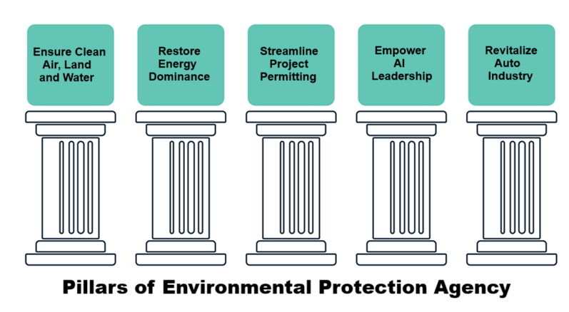
WASHINGTON – On February 4, 2025, U.S. Environmental Protection Agency (EPA) Administrator Lee Zeldin announced the agency’s Powering the Great American Comeback Initiative, to achieve the agency’s mission while energizing the greatness of the American economy. This plan outlines the agency’s priorities under the leadership of President Trump and Administrator Zeldin. The newly announced Powering the Great American Comeback initiative consists of five pillars that will guide the EPA’s work over the first 100 days and beyond:
Pillar 1: Clean Air, Land, and Water for Every American
“Every American should have access to clean air, land, and water. I will ensure the EPA is fulfilling its mission to protect human health and the environment. In his first term, President Trump advanced conservation, reduced toxic emissions in the air, and cleaned up hazardous sites, while fostering economic growth for families across the country. We remain committed to these priorities in this administration, as well as ensuring emergency response efforts are helping Americans get back on their feet in the quickest and safest way possible. We will do so while remaining good stewards of tax dollars and ensuring that every penny spent is going towards advancing this mission,” said Administrator Zeldin.
Pillar 2: Restore American Energy Dominance
“Pursuing energy independence and energy dominance will cut energy costs for everyday Americans who are simply trying to heat their homes and put gas in their cars. This will also allow our nation to stop relying on energy sources from adversaries, while lowering costs for hardworking middle-income families, farmers, and small business owners. I look forward to working with the greatest minds driving American innovation, to ensure we are producing and developing the cleanest energy on the planet,” said Administrator Zeldin.
Pillar 3: Permitting Reform, Cooperative Federalism, and Cross-Agency Partnership
“Any business that wants to invest in America should be able to do so without having to face years-long, uncertain, and costly permitting processes that deter them from doing business in our country in the first place. It will be important for the EPA to work with our partners at the state and federal levels to ensure projects are being approved and companies can invest billions of dollars into our nation. Streamlining these processes, while partnering with businesses to follow the necessary steps to safeguard our environment, will incentivize investment into our economy and create American jobs,” said Administrator Zeldin.
Pillar 4: Make the United States the Artificial Intelligence Capital of the World
“As we rapidly advance into this new age of AI, it is important that the United States lead the world in this field. Those looking to invest in and develop AI should be able to do so in the U.S., while we work to ensure data centers and related facilities can be powered and operated in a clean manner with American-made energy. Under President Trump’s leadership, I have no doubt that we will become the AI capital of the world,” said Administrator Zeldin.
Pillar 5: Protecting and Bringing Back American Auto Jobs
“Our American auto industry is hurting because of the burdensome policies of the past.
Under President Trump, we will bring back American auto jobs and invest in domestic manufacturing to revitalize a quintessential American industry. We will partner with leaders to streamline and develop smart regulations that will allow for American workers to lead the great comeback of the auto industry,” said Administrator Zeldin.
Footnote:
The Trump Administration not only cut “environmental justice” programs at the Environmental Protection Agency, they put nearly 200 staffers on leave.
According to reports, the staffers were called into a meeting on Thursday afternoon where they were informed that they were being placed on leave.
“Effective immediately, you are being placed on administrative leave with full pay and benefits. This administrative leave is not being done for any disciplinary purpose,” the email stated, according to Politico.
“Career staff made determinations on which Office of Environmental Justice employees had statutory duties or core mission functions,” EPA spokesperson Molly Vaseliou said in a statement. “As such, 168 staffers were placed on administrative leave as their function did not relate to the agency’s statutory duties or grant work. EPA is in the process of evaluating new structure and organization to ensure we are meeting our mission of protecting human health and the environment for all Americans.” Source.
The Climate Crisis media network is announcing a new claim that rising CO2 is causing recent ocean warming, proving it’s dangerous and must be curtailed. Examples in the last few days include these:
Finally, an answer to why Earth’s oceans have been on a record hot streak Grist
Ocean warming 4 times faster than in 1980s — and likely to accelerate in coming decades MSN
News spotlight: Fossil fuels behind extreme ocean temperatures, study says. Conservation International
Ocean temperature rise accelerating as greenhouse gas levels keep rising UK Natural History Museum
The surface of our oceans is now warming four times faster than it was in the late 1980s The Independent UK
Oceans Are Warming Four Times Faster as Earth Traps More Energy Bloomberg Law News
All this hype deriving from one study,
and ignoring the facts falsifying that narrative.
Fact: Historically, ocean natural oscillations drive observed global warming.
The long record of previous warmings prior to the satellite record shows that the entire rise of 0.8C since 1947 is due to oceanic, not human activity.
The animation is an update of a previous analysis from Dr. Murry Salby. These graphs use Hadcrut4 and include the 2016 El Nino warming event. The exhibit shows since 1947 GMT warmed by 0.8 C, from 13.9 to 14.7, as estimated by Hadcrut4. This resulted from three natural warming events involving ocean cycles. The most recent rise 2013-16 lifted temperatures by 0.2C. Previously the 1997-98 El Nino produced a plateau increase of 0.4C. Before that, a rise from 1977-81 added 0.2C to start the warming since 1947.
Importantly, the theory of human-caused global warming asserts that increasing CO2 in the atmosphere changes the baseline and causes systemic warming in our climate. On the contrary, all of the warming since 1947 was episodic, coming from three brief events associated with oceanic cycles.
Fact: Recent rise in SST was driven by ENSO and N. Atlantic Anomalies.
And now in 2024 we have seen an amazing episode with a temperature spike driven by ocean warming in all regions, along with rising NH land temperatures, now dropping below its peak.
The chart below shows SST monthly anomalies as reported in HadSST4 starting in 2015 through December 2024. A global cooling pattern is seen clearly in the Tropics since its peak in 2016, joined by NH and SH cycling downward since 2016, followed by rising temperatures in 2023 and 2024.
To enlarge, open image in new tab.
Note that in 2015-2016 the Tropics and SH peaked in between two summer NH spikes. That pattern repeated in 2019-2020 with a lesser Tropics peak and SH bump, but with higher NH spikes. By end of 2020, cooler SSTs in all regions took the Global anomaly well below the mean for this period. A small warming was driven by NH summer peaks in 2021-22, but offset by cooling in SH and the tropics, By January 2023 the global anomaly was again below the mean.
Now in 2023-24 came an event resembling 2015-16 with a Tropical spike and two NH spikes alongside, all higher than 2015-16. There was also a coinciding rise in SH, and the Global anomaly was pulled up to 1.1°C last year, ~0.3° higher than the 2015 peak. Then NH started down autumn 2023, followed by Tropics and SH descending 2024 to the present. After 10 months of cooling in SH and the Tropics, the Global anomaly came back down, led by NH cooling the last 4 months from its peak in August. It’s now about 0.1C higher than the average for this period. Note that the Tropical anomaly has cooled from 1.29C in 2024/01 to 0.66C as of 2024/12.
Fact: Empirical measurements show ocean warms the air, not the other way around.
One can read convoluted explanations about how rising CO2 in the atmosphere can cause land surface heating which is then transported over the ocean and causes higher SST. But the interface between ocean and air is well described and measured. Not surprisingly it is the warmer ocean water sending heat into the atmosphere, and not the other way around.
The graph displays measures of heat flux in the sub-tropics during a 21-day period in November. Shortwave solar energy shown above in green labeled radiative is stored in the upper 200 meters of the ocean. The upper panel shows the rise in SST (Sea Surface Temperature) due to net incoming energy. The yellow shows latent heat cooling the ocean, (lowering SST) and transferring heat upward, driving convection. [From An Investigation of Turbulent Heat Exchange in the Subtropics by James B. Edson]
As we see in the graphs ocean circulations change sea surface temperatures which then cause global land and sea temperatures to change. Thus, oceans make climate by making temperature changes.
Fact: On all time scales, from last month’s observations to ice core datasets spanning millennia, temperature changes first and CO2 changes follow.
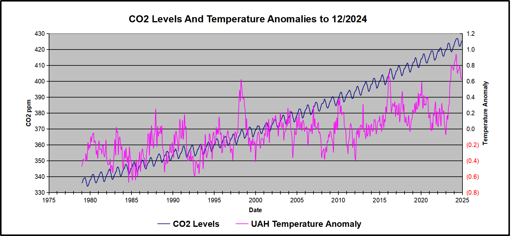
Previously I have demonstrated that changes in atmospheric CO2 levels follow changes in Global Mean Temperatures (GMT) as shown by satellite measurements from University of Alabama at Huntsville (UAH). That background post is included in the posting referenced later below.
My curiosity was piqued by the remarkable GMT spike starting in January 2023 and rising to a peak in April 2024, and then declining afterward. I also became aware that UAH has recalibrated their dataset due to a satellite drift that can no longer be corrected. The values since 2020 have shifted slightly in version 6.1, as shown in my recent report Ocean Leads Cooling UAH December 2024.
I tested the premise that temperature changes are predictive of changes in atmospheric CO2 concentrations. The chart above shows the two monthly datasets: CO2 levels in blue reported at Mauna Loa, and Global temperature anomalies in purple reported by UAHv6.1, both through December 2024. Would such a sharp increase in temperature be reflected in rising CO2 levels, according to the successful mathematical forecasting model? Would CO2 levels decline as temperatures dropped following the peak?
The answer is yes: that temperature spike resulted
in a corresponding CO2 spike as expected.
And lower CO2 levels followed the temperature decline.
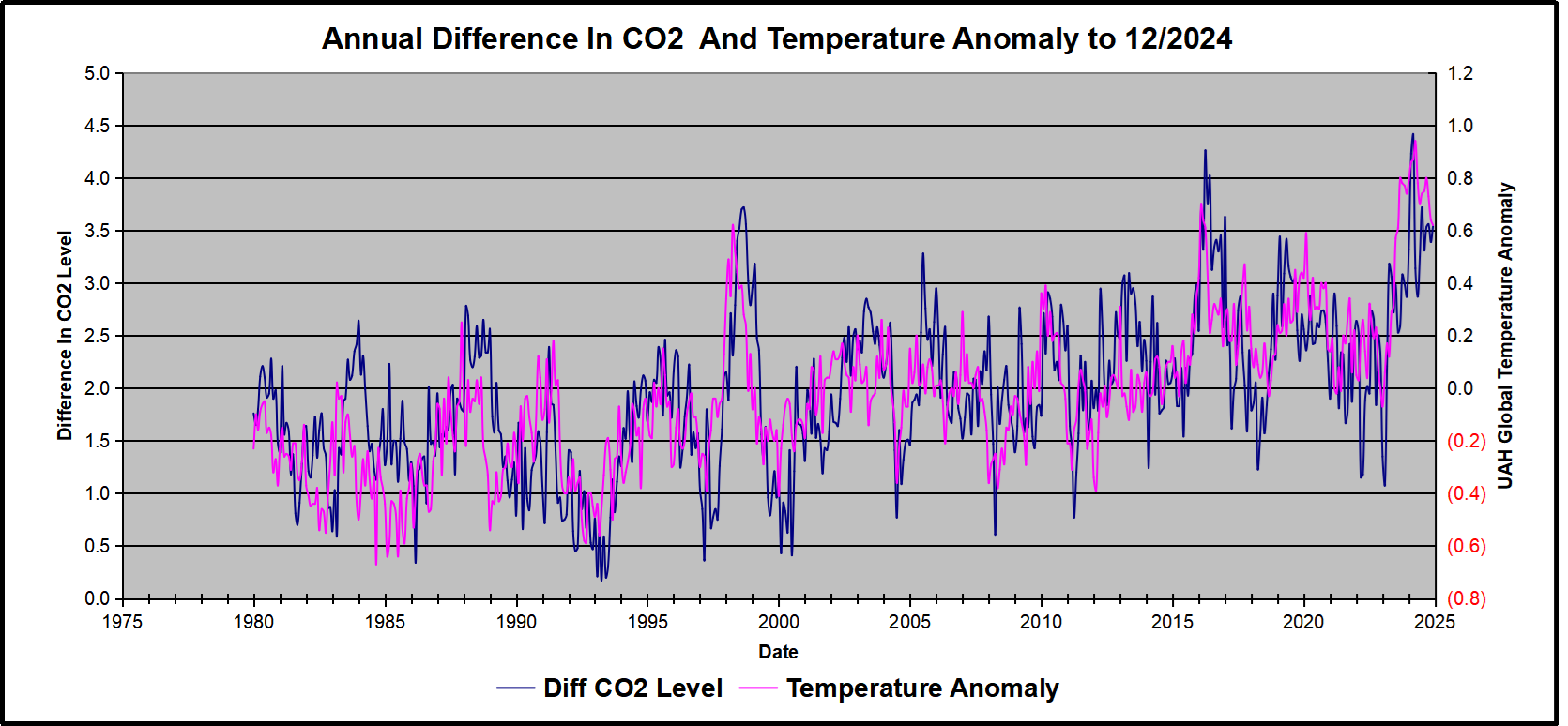
Above are UAH temperature anomalies compared to CO2 monthly changes year over year.
Changes in monthly CO2 synchronize with temperature fluctuations, which for UAH are anomalies now referenced to the 1991-2020 period. CO2 differentials are calculated for the present month by subtracting the value for the same month in the previous year (for example December 2024 minus December 2023). Temp anomalies are calculated by comparing the present month with the baseline month. Note the recent CO2 upward spike and drop following the temperature spike and drop.
Summary
Changes in CO2 follow changes in global temperatures on all time scales, from last month’s observations to ice core datasets spanning millennia. Since CO2 is the lagging variable, it cannot logically be the cause of temperature, the leading variable. It is folly to imagine that by reducing human emissions of CO2, we can change global temperatures, which are obviously driven by other factors.
Arctic ice recovered more slowly than usual in December and January, likely due to polar vortex pulling freezing air from the Arctic down into lower latitudes, replaced by warmer southern air. A post at Severe Weather Europe is February 2025 Forecast, describing the dynamics this winter.
After a mild start, a new Polar Express is looming for the United States and Canada mid-month.
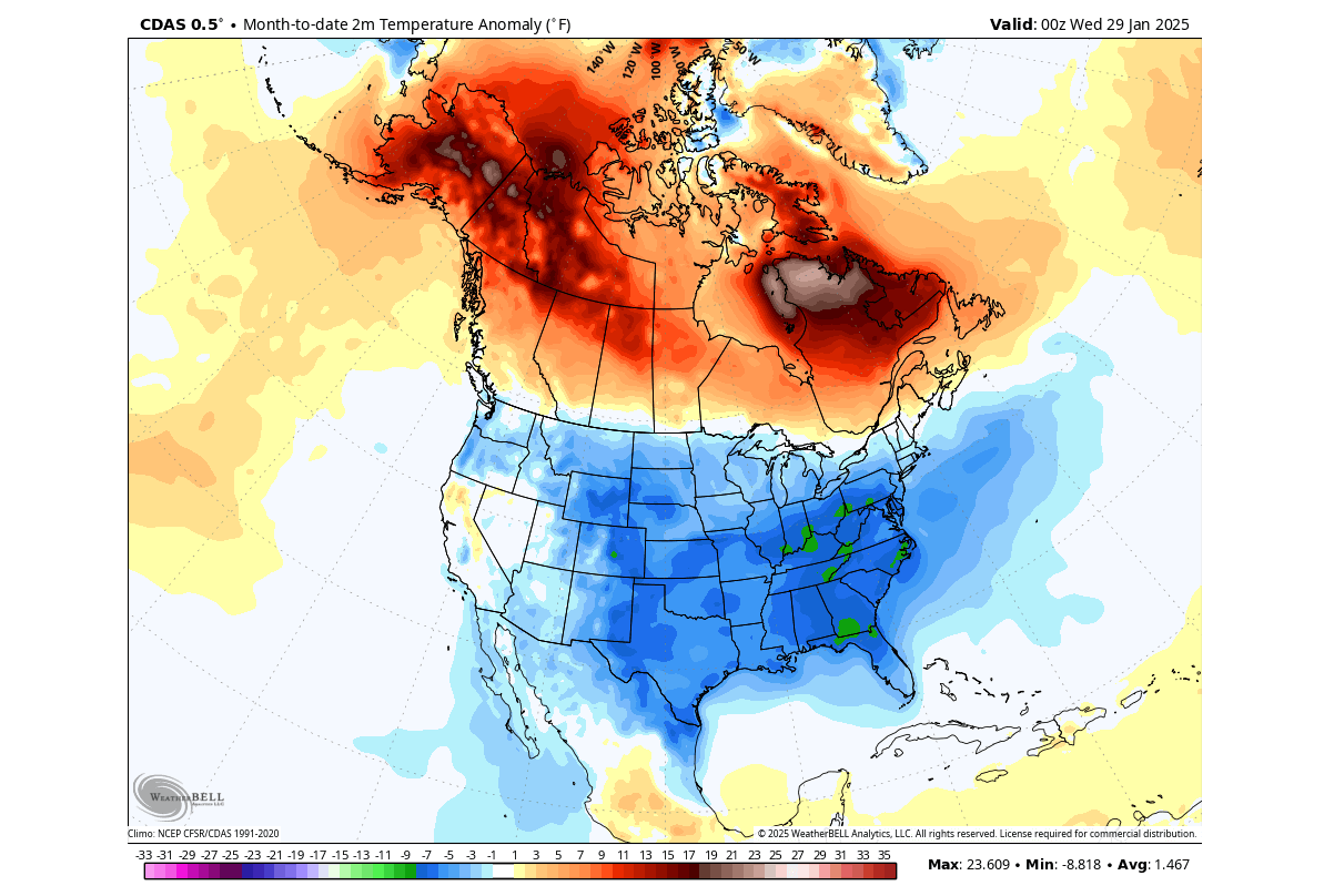
As January is slowly ending, we can look at preliminary surface temperature data for the month so far. Below is the CDAS analysis, and you can see that January was colder than normal across the entire UnitedStates, apart from California and parts of Nevada. But these anomalies do not show the full picture of just how cold some days in the month were, breaking records for several years and even decades in the past.
On the other hand, we can see that Canada had warmer than normal temperatures. This is an expected pattern, as while the colder air was transported further south into the United States, it was replaced by high-pressure and a warmer-than-normal airmass.
The movement of the pressure systems drives these temperature patterns and weather changes. Pairs of pressure systems are also known as Rossby Waves. You can see an example of Rossby waves in the image below by NOAA and how they are all connected and function with the jet stream.
The purple line connecting these pressure systems is called the jet stream. This rapid stream of air is found around 9 to 14 kilometers (6 to 9 miles) above sea level.
In late January, the average temperatures in the northern United States and southern Canada are still around or below freezing, so even a strong positive anomaly does not actually mean warm temperatures in that region. But, it is interesting to see the rapid shift in temperature anomalies as the pressure systems reposition.
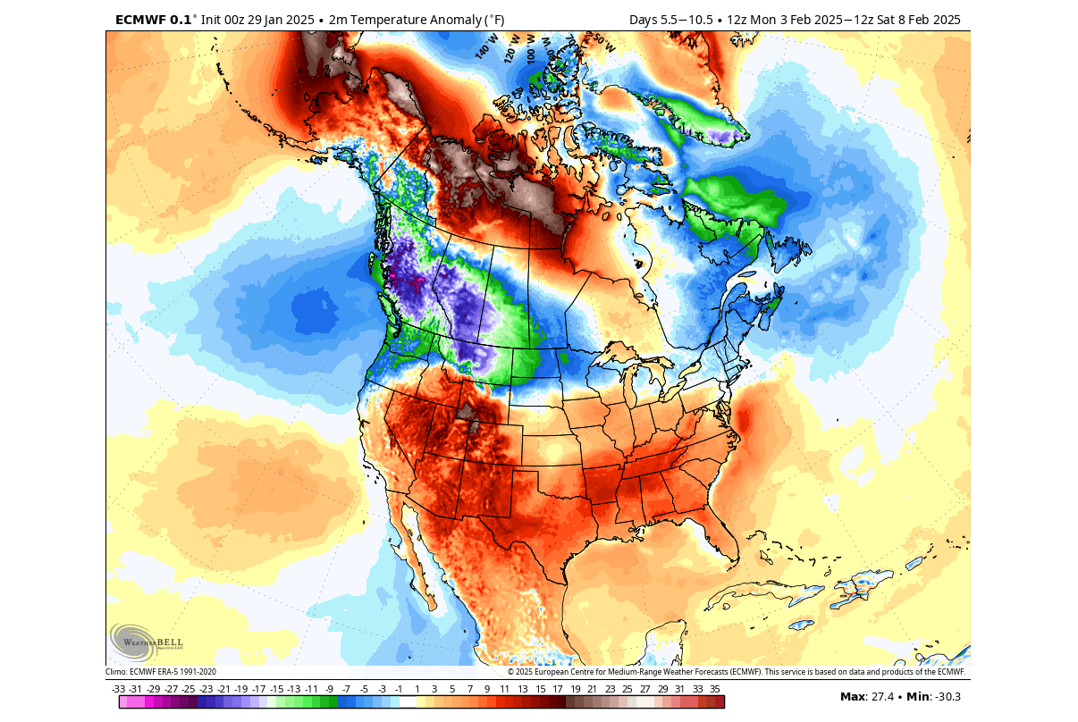
February 2025 is about to start, with the latest weather forecasts indicating a very dynamic month over the United States and Canada. After the power struggle between the cold and warmth at the start of the month, another Polar Vortex lobe looms for the United States around mid-month.
Below is the surface temperature anomaly, averaged for next week. You can see the large supply of colder air over the northern United States and western Canada. Another cooler area is forecast for eastern Canada and the northeastern United States.
But most of the central and southern half of the United States is forecast to have above-normal temperatures. We often see such a division in the weather patterns, where the colder and warmer air separate along the jet stream.
Going into the weather trend for the second half of February, we will use the extended-range ensemble forecasts. These forecasts serve as trends that show the prevailing idea of where the pressure systems are positioned and how the airmass is expected to move.
The continuous low-pressure systems over Canada helped to initiate large-scale cold air transport from the Arctic into the United States and Canada, also powered by the Polar Vortex in the stratosphere.
We continue to see the presence of the low-pressure area over Canada in the forecast for February. But the forecast now indicates an interesting core movement of the Polar Vortex in the stratosphere, likely to initiate another deep cold event around mid-month over the United States and Canada.
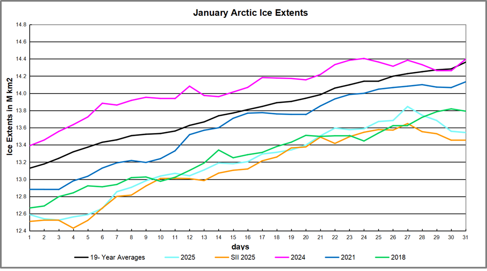
Impact on Arctic Ice Extents
The 19-year average for January shows Arctic ice extents started at 13.13M km2 and ended the month at 14.36M km2. 2024 started somewhat higher and matched average at the end. Other recent years have been lower, and 2025 started 540k km2 in deficit and 818k km2 below average at month end. The gap had closed to 400k km2 before losing extents at the end. SII and MASIE tracked closely this month.
The table below shows year-end ice extents in the various Arctic basins compared to the 19-year averages and some recent years. 2007 seven was close to the average, so 2018 is shown for comparison.
Region
2025031
Ave Day 031
2025-Ave.
2018031
2025-2018
(0) Northern_Hemisphere
13543740
14362137
-818398
13792271
-248532
(1) Beaufort_Sea
1071001
1070386
614
1070445
556
(2) Chukchi_Sea
965989
965974
15
965971
18
(3) East_Siberian_Sea
1087137
1087063
74
1087120
18
(4) Laptev_Sea
897845
897824
21
897845
0
(5) Kara_Sea
921520
917381
4139
895363
26157
(6) Barents_Sea
428814
563859
-135044
481947
-53133
(7) Greenland_Sea
614789
613370
1418
501411
113378
(8) Baffin_Bay_Gulf_of_St._Lawrence
1080930
1328380
-247450
1406903
-325972
(9) Canadian_Archipelago
854878
853510
1368
853109
1769
(10) Hudson_Bay
1260903
1260778
125
1260838
66
(11) Central_Arctic
3211379
3210507
872
3184817
26562
(12) Bering_Sea
534452
648807
-114354
382206
152245
(13) Baltic_Sea
39334
62876
-23542
41713.99
-2380
(14) Sea_of_Okhotsk
559692
823877
-264185
704398
-144707
This year’s ice extent is 818k km2 or 5.7% below average. About half of the deficit comes from the Pacific basins of Bering and Okhotsk sea. The other two major losses are in Barents Sea and Baffin Bay. With the annual maximum typically occurring mid-March, it is likely the ice then will also be lower than usual.
Illustration by Eleanor Lutz shows Earth’s seasonal climate changes. If played in full screen, the four corners present views from top, bottom and sides. It is a visual representation of scientific datasets measuring Arctic ice extents and NH snow cover.
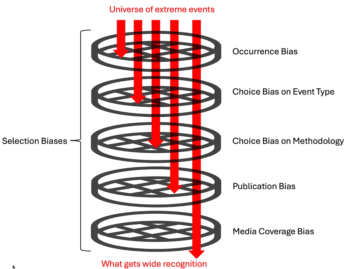
How a cascade of selection effects bias
the collective output of extreme event attribution studies.
Weather and climate extremes—such as high temperatures, floods, droughts, tropical cyclones, extratropical cyclones, and severe thunderstorms—have always threatened both human and natural systems. Given their significant impacts, there is considerable interest in how human-caused climate change influences these extremes. This is the focus of the relatively new discipline of Extreme Event Attribution (EEA).
The collective output of these kinds of studies certainly gives the impression that human-caused climate change is drastically changing the frequency and intensity of all kinds of weather extremes. Indeed, Carbon Brief recently published an extensive summary of the science of EEA studies, which begins with the proclamation, “As global temperatures rise, extreme weather events are becoming more intense and more frequent all around the world.”
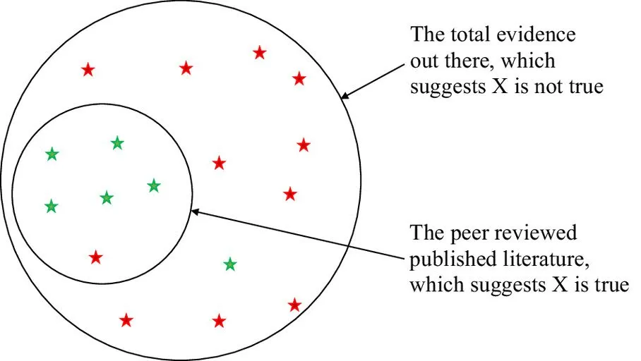
However, these numbers cannot be taken as an accurate quantification of the influence of climate change on extreme weather because they are heavily influenced by a cascade of selection biases originating from the physical climate system, as well as researcher and media incentives. Identifying and understanding these biases is a prerequisite for properly interpreting the collective output of EEA studies and, thus, what implications they hold for general scientific understanding, as well as political and legal questions.
The large apparent discrepancy between the size of the influence of human-caused climate change on extreme weather reported in EEA studies (like those compiled by Carbon Brief) compared to more comprehensive systematic analyses (like those compiled by the IPCC) can, in large part, be attributed to the many layers of Selection Biasesthat influence the EEA literature’s collective output.
Selection Bias is a broad term that refers to any bias that arises from a process that selects data for analysis in a way that fails to ensure that data is representative of the broader population that the study wishes to describe.
Selection biases in the context of EEA studies include those associated with the physical climate system itself, those concerning proclivities and incentives facing researchers/journals, and those concerning the proclivities and incentives facing the media. They include
Occurrence Bias is a bias introduced by the physical climate system. Since EEA studies tend to be triggered by extreme events that have actually occurred, there is reason to believe that these studies will disproportionately sample events that are more likely than average to be exacerbated by climate change because the events occurred in the first place. Essentially, extreme events that are more likely to occur under climate change—and thus more likely to be observed—are going to be overrepresented in EEA studies, and extreme events that are less likely to occur under climate change—and thus less likely to be observed—are going to be underrepresented in EEA studies.
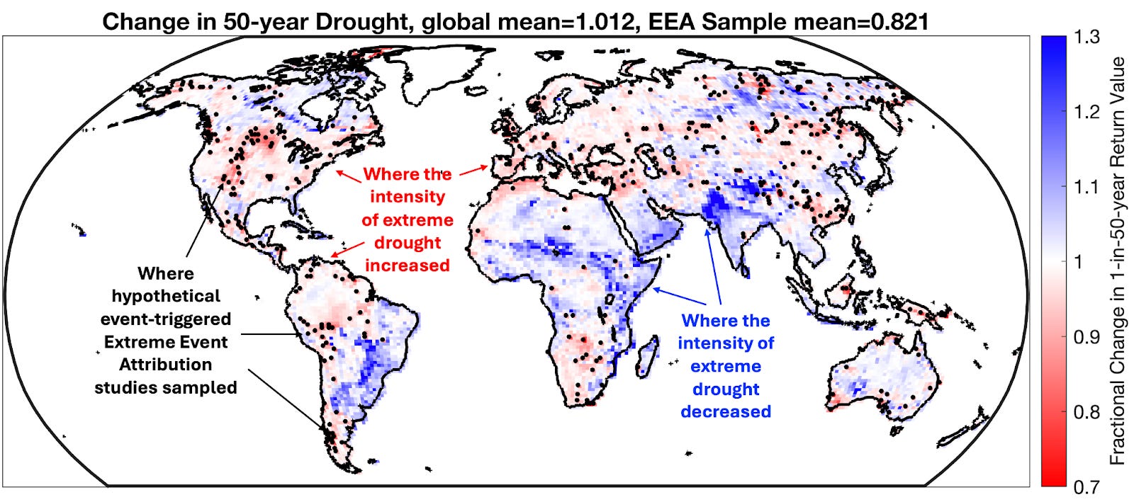
The map below illustrates this phenomenon. It shows changes in the magnitude of extreme drought under climate change. Specifically, it shows the fractional change in the intensity of once-per-50-year droughts (as quantified by monthly soil moisture) between a preindustrial and 21st-century run (SSP2-4.5 emissions) of the highly-regarded NCAR CESM2 Climate Model.Blue areas represent locations where the model simulates that extreme droughts become less frequent and intense with enhanced greenhouse gas concentrations, and red areas represent locations where the model simulates that extreme droughts become more frequent and intense with enhanced greenhouse gas concentrations. It is notable that overall, this model simulates that warmingdecreases the frequency and intensity of extreme drought in more locations than it increases it (consistent with soil moistening under warming simulated by other models).
Now, here’s the kicker: The black dots show locations where once-per-50-year droughts actually occurred in the 21st-century simulation and thus represent events that would plausibly trigger EEA studies.
What do you notice about where the dots are compared to where the red is? That’s right; the simulated EEA studies overwhelmingly sample areas where droughts are getting more intense and more frequent by the very nature that those are the types of droughts that are more likely to occur in the warming climate. The result is that the EEA sample is majorly biased: warming decreased the intensity of once-per-50-year droughts by about 1% overall, but it increased their intensity within the EEA sample by 18%!
Thus, if you just relied on the EEA sample, you would come away with an
incorrect impression not only on the magnitude of change in extreme droughts
but also on the sign of the direction of change!
Choice Bias arises when researchers use prior knowledge to choose events for EEA studies that are more likely to have been made more severe by climate change. A clear example of Choice Bias pervading the Carbon Brief database is there have been 3.6 times more studies on extreme heat than there have been on extreme winter weather (205 vs. 57). Another example would be the dearth of EEA studies on extratropical cyclones (the kinds of low-pressure systems with cold and warm fronts that are responsible for most of the dramatic weather outside of the tropics). The IPCC states that the number of extratropical cyclones associated with intense surface wind speeds is expected to decrease strongly in the Northern Hemisphere with warming. Yet, it is relatively rare for EEA attribution studies to be done on these types of systems, which results in an exclusion of this good news from the EEA literature.
Finally, the climate reporting media ecosystem is characterized by actors whose explicit mission is to raise awareness of the negative impacts of climate change, and thus, there will be a natural Media Coverage Bias with a tendency to selectively highlight EEA studies where climate change is found to be a larger driver than EEA studies that do not reach such a conclusion. These selection biases are apparent at the aggregate level, but there is also strong evidence of their presence in individual studies.
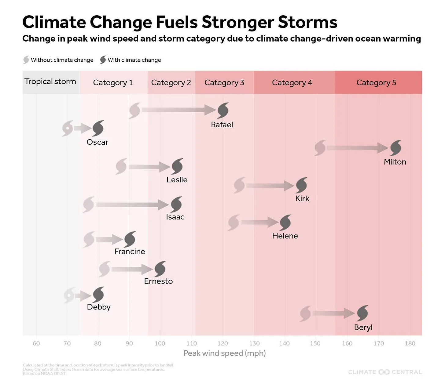
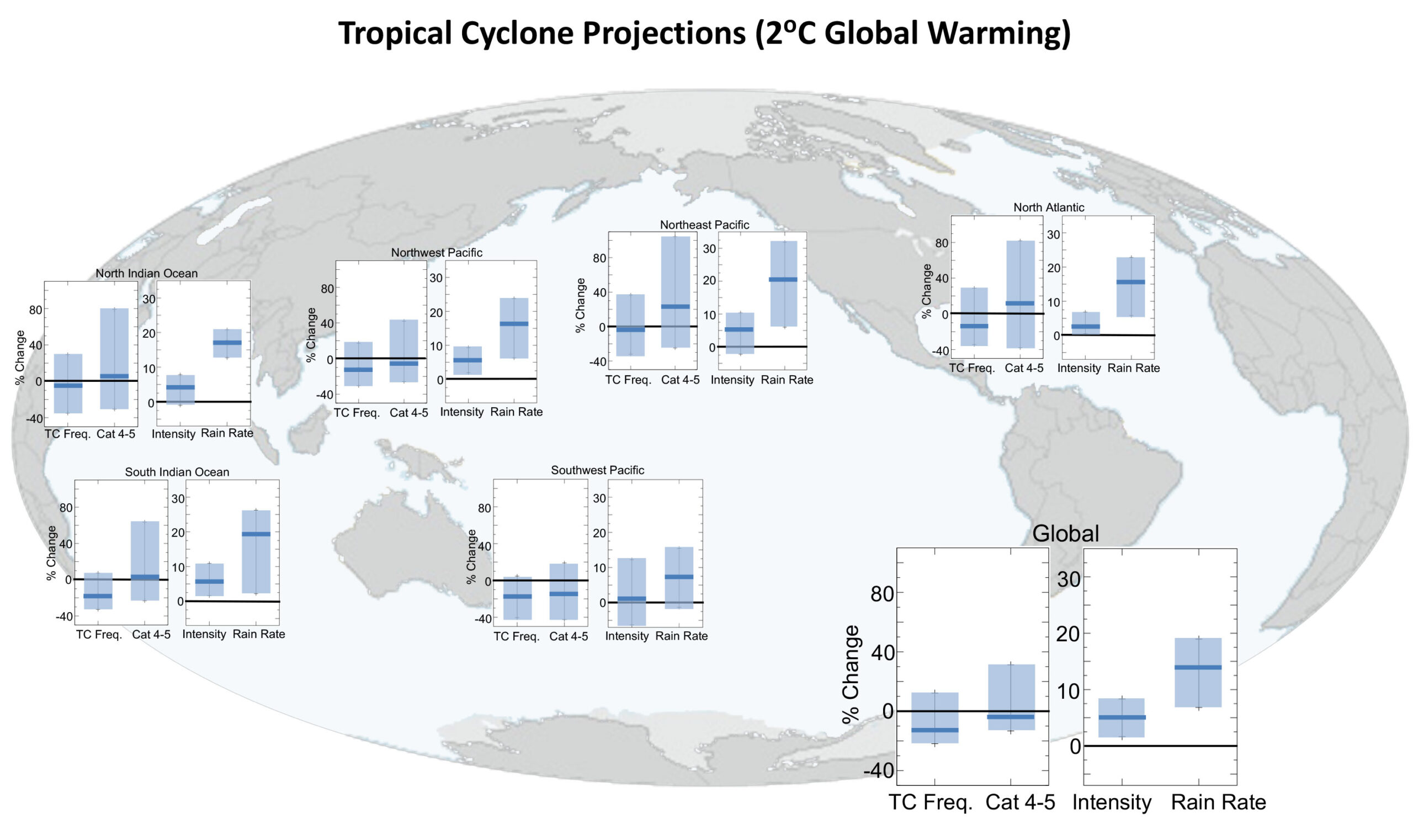
A more recent specific example suggestive of many of these dynamics is a study, Gilford et al. (2024), titled “Human-caused ocean warming has intensified recent hurricanes”. This study was conducted by three researchers at Climate Central, which summarizes the study’s findings with the following infographic:
From Climate Central press release on Gilford et al. (2024).
Essentially, they claim that climate change is enhancing the intensity of all hurricanes and that the enhancement is quite large: Storms today are calculated to be an entire Category stronger than they would have been in a preindustrial climate.
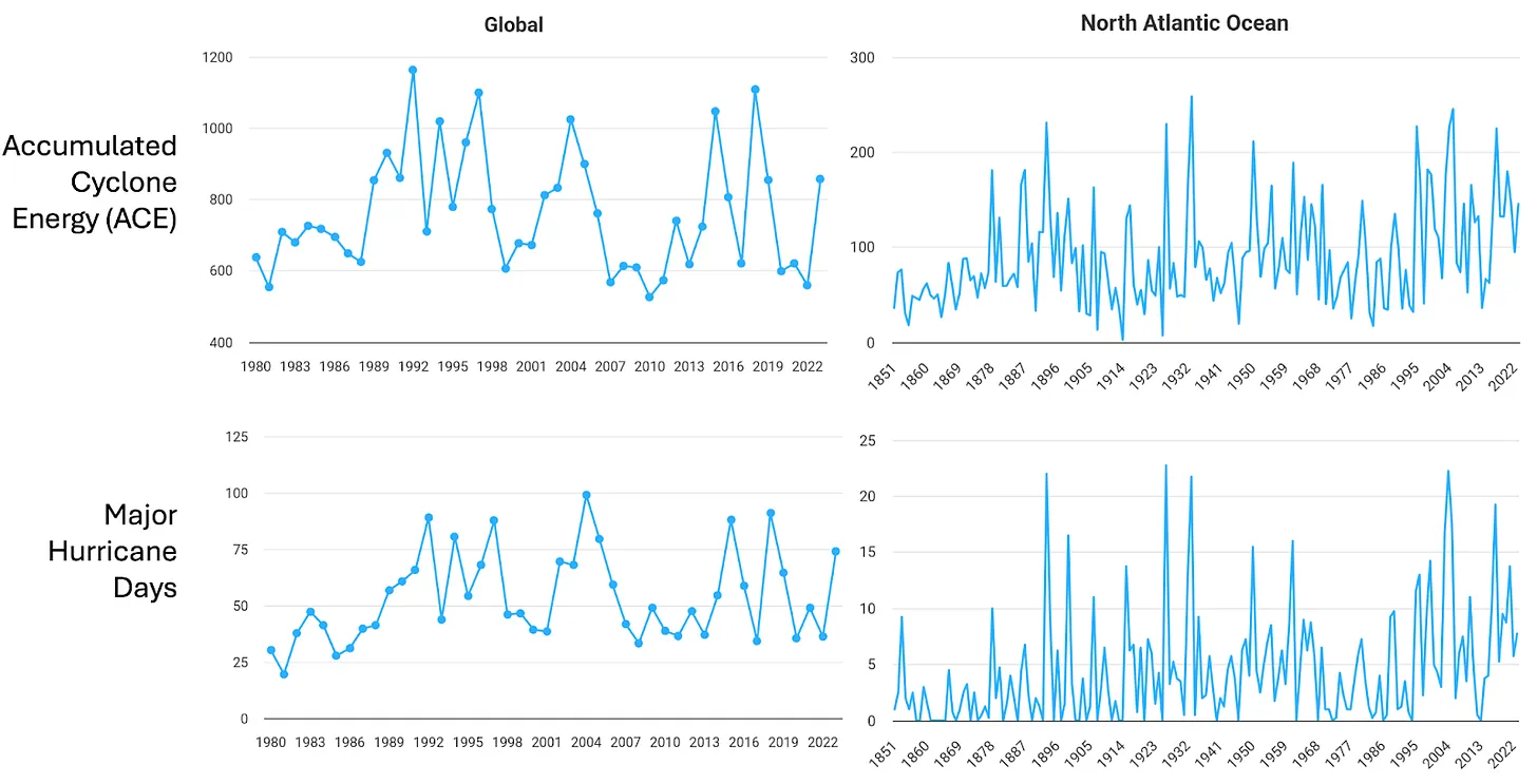
This is a huge effect, and thus, if it were real, it is reasonable to expect to see clear long-term trends in metrics of tropical cyclone (hurricane) intensity like the accumulated number of major (Category 3+) hurricane days or the accumulated cyclone energy from all tropical cyclones (which is proportional to the square of hurricane windspeed accumulated over their lifetimes). However, any long-term trends in such metrics are subtle at best, both globally and over the North Atlantic.
From Colorado State University Department of Atmospheric Science Tropical Meteorology Project.
So, this is a microcosm of the aforementioned apparent discrepancy between more broad quantifications of changes in extremes and their associated EEA counterparts, and again, I’d argue there are several selection biases at play affecting the production and dissemination of the EEA study.
Let’s start with Choice Bias on methodology. Human-caused warming changes the environment in some ways that work to enhance hurricanes and in other ways that diminish them. The main way that hurricanes are enhanced is via the increase in sea surface temperatures (which provides the fundamental fuel for hurricanes), and the main way that hurricanes are diminished isvia changes in atmospheric wind shear and humidity.
However, the Climate Central researchers made the methodological choice
to largely exclude the influence of factors that diminish
hurricane development from the study.
Are these Choice Biases in event type and methodology an accident? There are many reasons to believe they are not.
The research paper itself spells out that the motivation of the study is to “connect the dots” between climate change and hurricanes because “landfalling hurricanes with high intensities—can act as ‘focusing events’ that draw public attention” and that “Increased attention during and in wake of storms creates opportunities for public and private discourse around climate and disaster preparedness.”
Then, there is the extensive media coverage of this study. It was picked up by 134 news outlets and ranked in the 99.95th percentile of research articles (across all journals) of similar age in terms of online attention. Further, it was immediately incorporated into seven Wikipedia articles (likely having high leverage on AI queries, which would make its findings indistinguishable from scientific “fact”). This is affected by the aforementioned Media Coverage Bias, but it is also undoubtedly directly influenced by the efforts of Climate Central, which is explicitly an advocacy organization whose self-described specialty is media placement and dissemination.
“Attributing extreme weather events to climate change, as I do
through my work as a climatologist, means we can hold
countries and companies to account for their inaction.”
Given the explicitly stated motivation of those in the EEA field, it is quite reasonable to suppose that there are major selection biases at play, and thus, it is not at all surprising that the collective output of the EEA field would look so different from more broad comprehensive assessments.
Hubris is a Greek word that means dangerously overconfident. Based on my research, hubris fairly describes our current response to the issue of climate change.
Here’s what many people believe:
One: The planet is warming catastrophically because of certain human behaviors.
Two: Thanks to powerful computers we can project what the climate will be like
20, 40, or even 100 years from now.
Three: That if we eliminate just one behavior, the burning of fossil fuels,
we can prevent the climate from changing for as long we like.
Each of these presumptions—together, the basis of our hubris regarding the changing climate—is either untrue or so far off the mark as to be useless.
Yes, it’s true that the globe is warming, and that humans are exerting a warming influence upon it. But beyond that, to paraphrase a line from the classic movie The Princess Bride, “I do not think ‘The Science’ says what you think it says.”
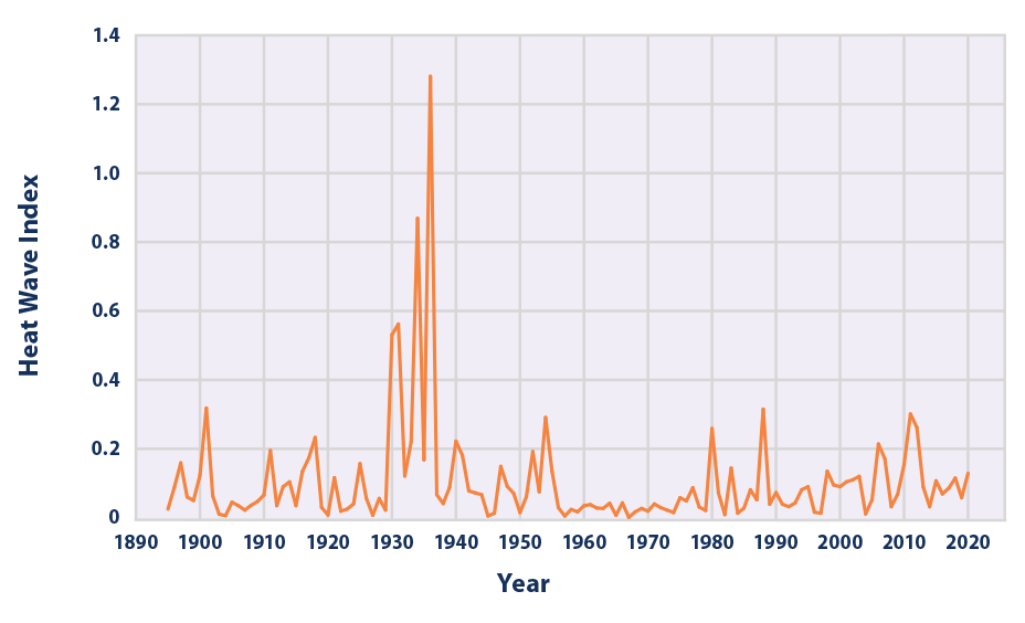
For example, government reports state clearly that heat waves in the US are now no more common than they were in 1900.
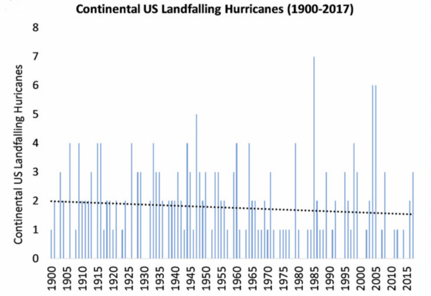
Hurricane activity is no different than it was a century ago.
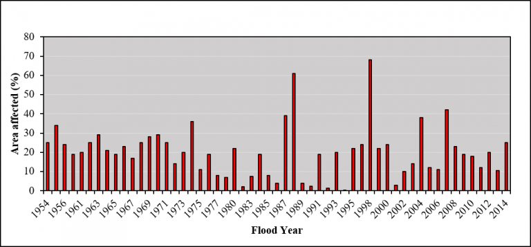
Floods have not increased across the globe over more than seventy years.
Source: Voice of International Affairs
Greenland’s ice sheet isn’t shrinking any more rapidly today than it was 80 years ago.
Why aren’t these reassuring facts better known?
Because the public gets its climate information almost exclusively from the media.
And from a media perspective, fear sells.
“Things aren’t that bad” doesn’t sell.
Very few people, and that includes journalists who report on climate news, read the actual science. I have. And what the data—the hard science—from the US government and UN Climate reports say is that… “things aren’t that bad.”
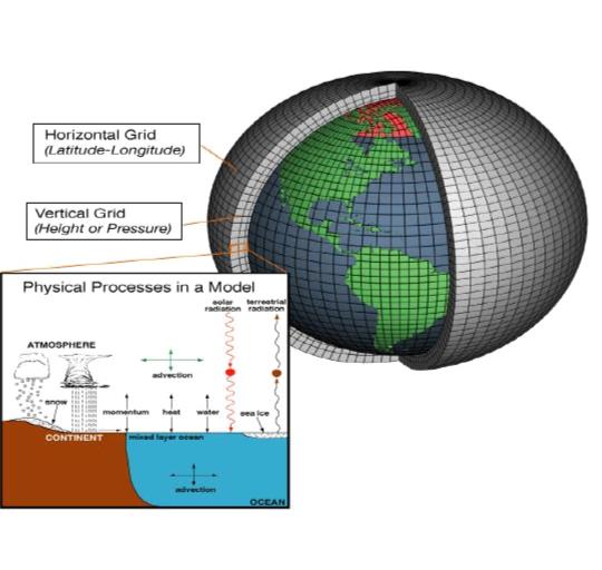
Nor does the public understand the questionable basis of all catastrophic climate change projections: computer modeling.
Projecting future climate is excruciatingly difficult. Yes, there are human influences, but the climate is complex. Anyone who says that climate models are “just physics” either doesn’t understand them or is being deliberately misleading. I should know: I wrote one of the first textbooks on computer modeling.
While modelers base their assumptions upon both fundamental physical laws and observations of the climate, there is still considerable judgment involved. And since different modelers will make different assumptions, results vary widely among different models.
Let’s just take one simple, but significant assumption modelers must make: the impact of clouds on the climate.
Natural fluctuations in the height and coverage of clouds have at least as much of an impact on the flows of sunlight and heat as do human influences. But how can we possibly know global cloud coverage say 10, let alone 50 years from now? Obviously, we can’t. But to create a climate model, we have to make assumptions. That’s a pretty shaky foundation on which to transform the world’s economy.
By the way, creating more accurate models isn’t getting any easier. In fact, the more we learn about the climate system, the more we realize how complex it is.
Rather than admit this complexity, the media, the politicians, and a good portion of the climate science community attribute every terrible storm, every flood, every major fire to “climate change.” Yes, we’ve always had these weather events in the past, the narrative goes, but somehow “climate change” is making everything “worse.”
Even if that were true, isn’t the relevant question, how much worse? Not to mention that “worse” is not exactly a scientific term. And how would we make it better? For the alarmists, that’s easy: we get rid of fossil fuels.
Not only is this impractical—we get over 80% of the world’s energy from fossil fuels—it’s not scientifically possible. That’s because CO2 doesn’t disappear from the atmosphere in a few days like, say, smog. It hangs around for a really long time.
About 60 percent of any CO2 that we emit today will remain in the atmosphere 20 years from now, between 30 and 55 percent will still be there after a century, and between 15 and 30 percent will remain after one thousand years.
In other words, it takes centuries for the excess carbon dioxide to vanish from the atmosphere. So, any partial reductions in CO2 emissions would only slow the increase in human influences—not prevent it, let alone reverse it.
CO2 is not a knob that we can just turn down to fix everything. We don’t have that ability. To think that we do is… hubris.
Hubris leads to bad decisions. A little humility and
a little knowledge would lead to better ones.
I’m Steve Koonin, former Undersecretary for Science in the Obama Administration, and author of Unsettled: What Climate Science Tells Us, What It Doesn’t, and Why It Matters, for Prager University.
Professors Lindzen, Happer and Koonin CO2 Coalition Paper April 2024
Table of Contents
I. THERE WILL BE DISASTROUS CONSEQUENCES FOR THE POOR, PEOPLE WORLDWIDE, FUTURE GENERATIONS AND THE WEST IF FOSSIL FUELS, CO2 AND OTHER GHG EMISSIONS ARE REDUCED TO “NET ZERO”
A. CO2 is Essential to Our Food, and Thus to Life on Earth
B. More CO2, Including CO2 from Fossil Fuels, Produces More Food.
C. More CO2 Increases Food in Drought-Stricken Areas.
D. Greenhouse Gases Prevent Us from Freezing to Death
E. Enormous Social Benefits of Fossil Fuels
F. “Net Zeroing” Fossil Fuels Will Cause Massive Human Starvation by Eliminating Nitrogen Fertilizer
II. THE IPCC IS GOVERNMENT CONTROLLED AND THUS ONLY ISSUES GOVERNMENT OPINIONS, NOT SCIENCE
III. SCIENCE DEMONSTRATES FOSSIL FUELS, CO2 AND OTHER GHGs WILL NOT CAUSE CATASTROPHIC GLOBAL WARMING AND EXTREME WEATHER
A. Reliable Science is Based on Validating Theoretical Predictions With Observations, Not Consensus, Peer Review, Government Opinion or Cherry-Picked or Falsified Data
B. The Models Predicting Catastrophic Warming and Extreme Weather Fail the Key Scientific Test: They Do Not Work, and Would Never Be Used in Science.
C. 600 Million Years of CO2 and Temperature Data Contradict the Theory That High Levels of CO2 Will Cause Catastrophic Global Warming.
D. Atmospheric CO2 Is Now “Heavily Saturated,” Which in Physics Means More CO2 Will Have Little Warming Effect.
E. The Theory Extreme Weather is Caused by Fossil Fuels, CO2 and Other GHGs is Contradicted by the Scientific Method and Thus is Scientifically Invalid
Ryan Maue @RyanMaue Starting to wonder what’s going on.
During next 2-weeks, extreme cold over Northern Hemisphere continents may be enough to return global temperatures to the 1991-2020 climatological mean temporarily erasing the last 5-years of global warming.
Javier Vinós @JVinos_Climate Scientist. Molecular neurobiologist and climate researcher
In 2018 (SR15), the IPCC predicted a decline in global crop yields at 1.5°C global warming. At 1.6°C warming in 2024, the USDA reports a continuation of the global yield increase trend. Alarmism = Model-based imaginary fears. pic.twitter.com/1I7HVFLQyv
Last year William Happer spoke on Radiation Transfer in Clouds at the EIKE conference, and the video is above. For those preferring to read, below is a transcript from the closed captions along with some key exhibits. I left out the most technical section in the latter part of the presentation. Text in italics with my bolds.
William Happer: Radiation Transfer in Clouds
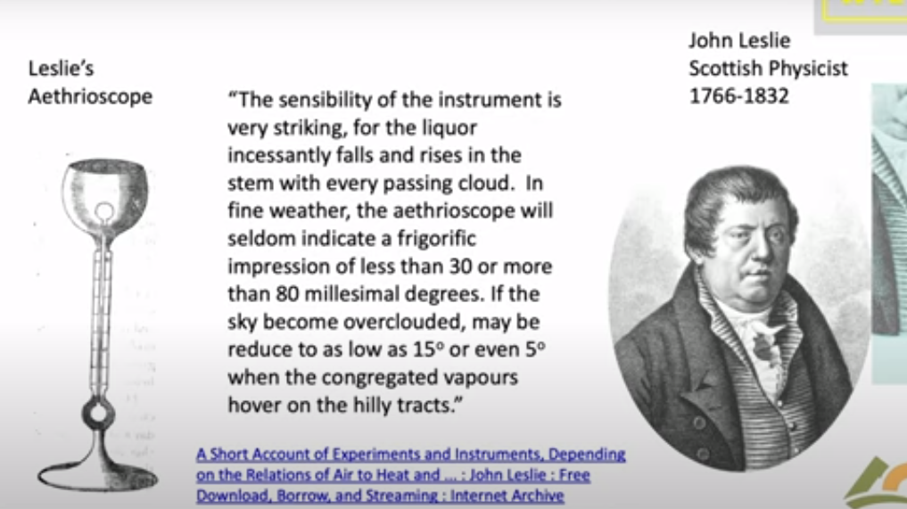
People have been looking at Clouds for a very long time in in a quantitative way. This is one of the first quantitative studies done about 1800. And this is John Leslie, a Scottish physicist who built this gadget. He called it an Aethrioscope, but basically it was designed to figure out how effective the sky was in causing Frost. If you live in Scotland you worry about Frost. So it consisted of two glass bulbs with a very thin capillary attachment between them. And there was a little column of alcohol here.
The bulbs were full of air, and so if one bulb got a little bit warmer it would force the alcohol up through the capillary. If this one got colder it would suck the alcohol up. So he set this device out under the clear sky. And he described that the sensibility of the instrument is very striking. For the liquor incessantly falls and rises in the stem with every passing cloud. in fine weather the aethrioscope will seldom indicate a frigorific impression of less than 30 or more than 80 millesimal degrees. He’s talking about how high this column of alcohol would go up and down if the sky became overclouded. it may be reduced to as low as 15 refers to how much the sky cools or even five degrees when the congregated vapours hover over the hilly tracks. We don’t speak English that way anymore but I I love it.
The point was that even in 1800 Leslie and his colleagues knew very well that clouds have an enormous effect on the cooling of the earth. And of course anyone who has a garden knows that if you have a clear calm night you’re likely to get Frost and lose your crops. So this was a quantitative study of that.
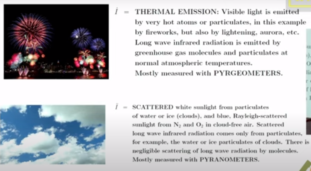
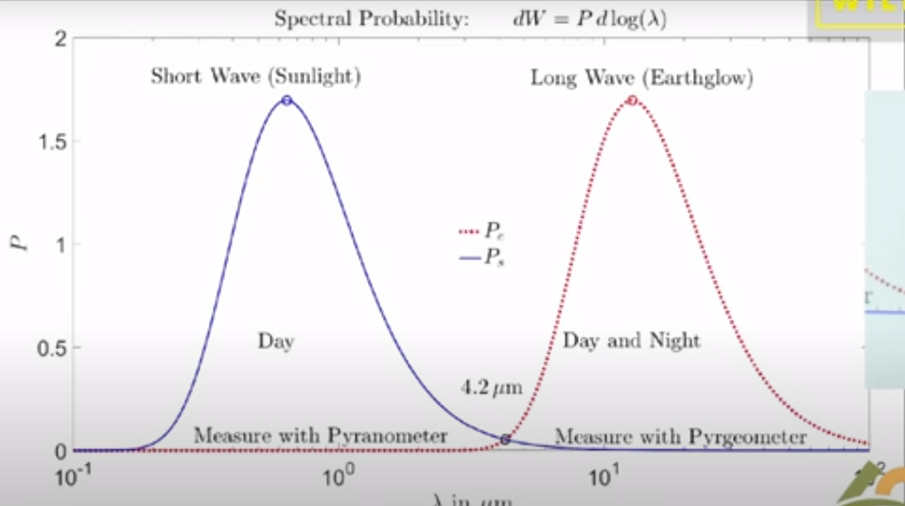
Now it’s important to remember that if you go out today the atmosphere is full of two types of radiation. There’s sunlight which you can see and then there is the thermal radiation that’s generated by greenhouse gases, by clouds and by the surface of the Earth. You can’t see thermal radiation but you you can feel it if it’s intense enough by its warming effect. And these curves practically don’t overlap so we’re really dealing with two completely different types of radiation.
There’s sunlight which scatters very nicely and off of not only clouds but molecules; it’s the blue sky the Rayleigh scattering. Then there’s the thermal radiation which actually doesn’t scatter at all on molecules so greenhouse gases are very good at absorbing thermal radiation but they don’t scatter it. But clouds scatter thermal radiation and plotted here is the probability that you will find Photon of sunlight between you know log of its wavelength and the log of in this interval of the wavelength scale.
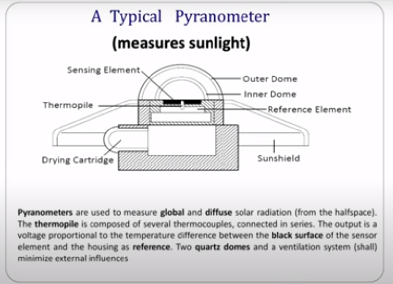
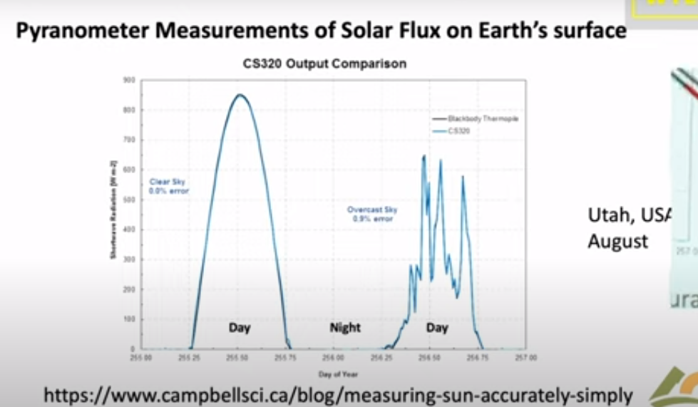
Since Leslie’s day two types of instruments have been developed to do what he did more precisely. One of them is called a pyranometer and this is designed to measure sunlight coming down onto the Earth on a day like this. So you put this instrument out there and it would read the flux of sunlight coming down. It’s designed to see sunlight coming in every direction so it doesn’t matter which angle the sun is shining; it’s uh calibrated to see them all.
Let me show you a measurement by a pyranometer. This is a actually a curve from a sales brochure of a company that will sell you one of these devices. It’s comparing two types of detectors and as you can see they’re very good you can hardly tell the difference. The point is that if you look on a clear day with no clouds you see sunlight beginning to increase at dawn it peaks at noon and it goes down to zero and there’s no sunlight at night. So half of the day over most of the Earth there’s no sunlight in the in the atmosphere.
Here’s a day with clouds, it’s just a few days later shown by days of the year going across. You can see every time a cloud goes by the intensity hitting the ground goes down. With a little clear sky it goes up, then down up and so on. On average at this particular day you get a lot less sunlight than you did on the clear day.
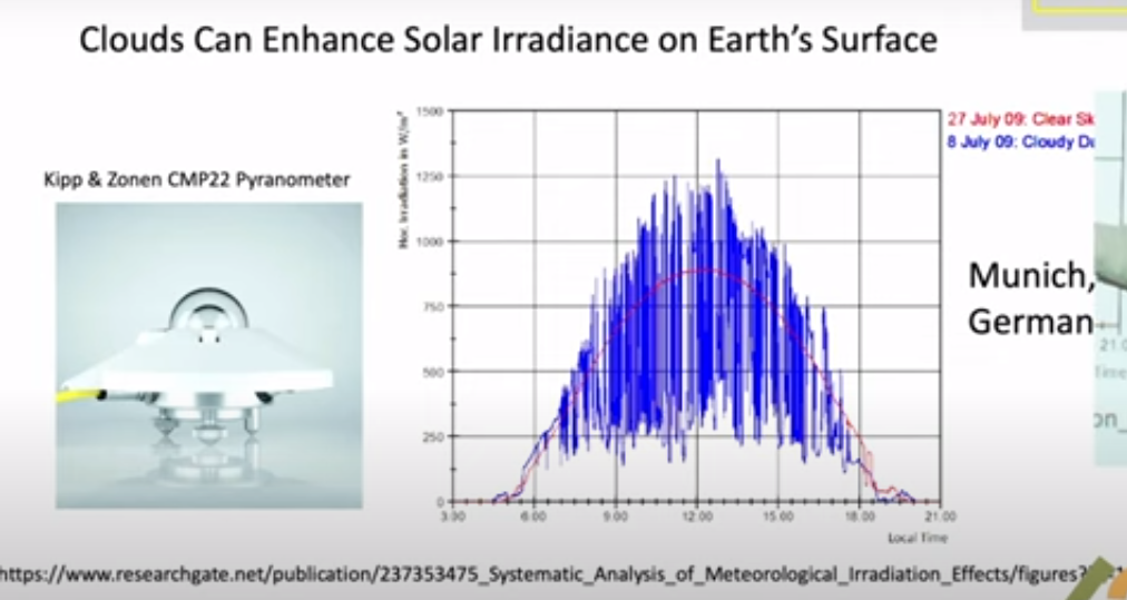
But you know nature is surprising.Einstein had this wonderful quote: God is subtle but he’s not malicious. He meant that nature does all of sorts of things you don’t expect, and so let me show you what happens on a partly cloudy day. Here so this is data taken near Munich. The blue curve is the measurement and the red curve is is the intensity on the ground if there were no clouds. This is a partly cloudy day and you can see there are brief periods when the sunlight is much brighter on the detector on a cloudy day than it is on the clear day. And that’s because coming through clouds you get focusing from the edges of the cloud pointing down toward your detector. That means somewhere else there’s less radiation reaching the ground. But this is rather surprising to most people. I was very surprised to learn about it but it just shows that the actual details of climate are a lot more subtle than you might think.
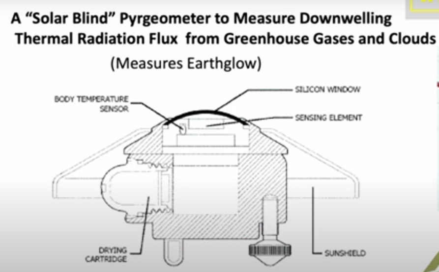
We know that visible light only happens during the daytime and stops at night. There’s a second type of important radiation which is the thermal radiation which is measured by a similar device. You have a silicon window that passes infrared, which is below the band gap of silicon, so it passes through it as though transparent. Then there’s some interference filters here to give you further discrimination against sunlight. So sunlight practically doesn’t go through this at all, so they call it solar solar blind since it doesn’t see the Sun.
But it sees thermal radiation very clearly with a big difference between this device and the sunlight sensing device I showed you. Because actually most of the time this is radiating up not down. Out in the open air this detector normally gets colder than the body of the instrument. And so it’s carefully calibrated for you to compare the balance of down coming radiation with the upcoming radiation. Upcoming is normally greater than down coming.
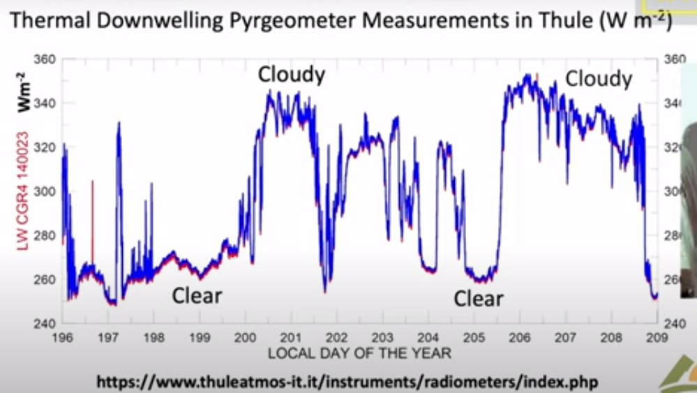
I’ll show you some measurements of the downwelling flux here; these are actually in Greenland in Thule and these are are watts per square meter on the vertical axis here. The first thing to notice is that the radiation continues day and night you can you if you look at the output of the pyrgeometer you can’t tell whether it’s day or night because the atmosphere is just as bright at night as it is during the day. However, the big difference is clouds: on a cloudy day you get a lot more downwelling radiation than you do on a clear day. Here’s a a near a full day of clear weather there’s another several days of clear weather. Then suddenly it gets cloudy. Radiation rises because the bottoms of the clouds are relatively warm at least compared to the clear sky. I think if you put the numbers In, this cloud bottom is around 5° Centigrade so it was fairly low Cloud. it was summertime in Greenland and this compares to about minus 5° for the clear sky.
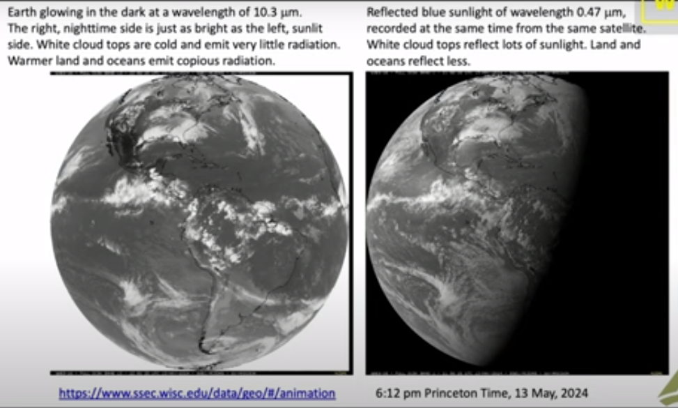
So there’s a lot of data out there and there really is downwelling radiation there no no question about that you measure it routinely. And now you can do the same thing looking down from satellites so this is a picture that I downloaded a few weeks ago to get ready for this talk from Princeton and it was from Princeton at 6 PM so it was already dark in Europe. So this is a picture of the Earth from a geosynchronous satellite that’s parked over Ecuador. You are looking down on the Western Hemisphere and this is a filtered image of the Earth in Blue Light at 47 micrometers. So it’s a nice blue color not so different from the sky and it’s dark where the sun has set. There’s still a fair amount of sunlight over the United States and the further west.
Here is exactly the same time and from the same satellite the infrared radiation coming up at 10.3 which is right in the middle of the infrared window where there’s not much Greenhouse gas absorption; there’s a little bit from water vapor but very little, trivial from CO2.
As you can see, you can’t tell which side is night and which side is day. So even though the sun has set over here it is still glowing nice and bright. There’s sort of a pesky difference here because what you’re looking at here is reflected sunlight over the intertropical Convergence Zone. There are lots of high clouds that have been pushed up by the convection in the tropics and uh so this means more visible light here. You’re looking at emission of the cloud top so this is less thermal light so white here means less light, white there means more light so you have to calibrate your thinking. to
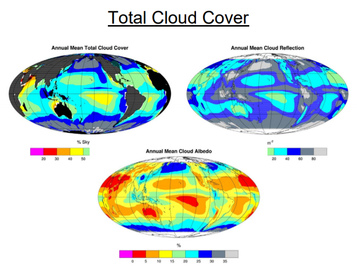
But the Striking thing about all of this: if you can see the Earth is covered with clouds, you have to look hard to find a a clear spot of the earth. Roughly half of the earth maybe is clear at any given time but most of it’s covered with clouds. So if anything governs the climate it is clouds and and so that’s one of the reasons I admire so much the work that Svensmark and Nir Shaviv have done. Because they’re focusing on the most important mechanism of the earth: it’s not Greenhouse Gases, it’s Clouds. You can see that here.
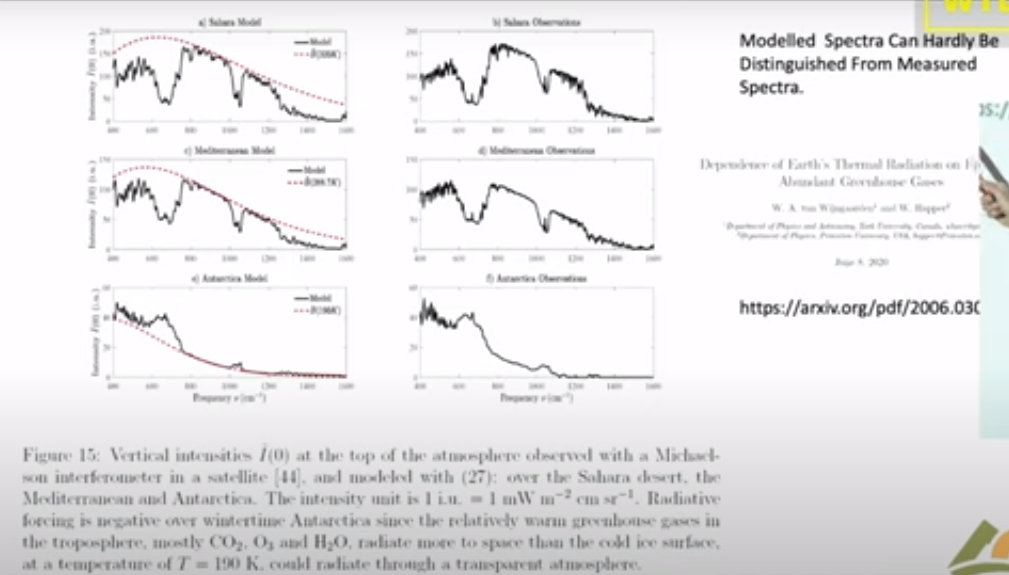
Now this is a single frequency let me show you what happens if you look down from a satellite and do look at the Spectrum. This is the spectrum of light coming up over the Sahara Desert measured from a satellite. And so here is the infrared window; there’s the 10.3 microns I mentioned in the previous slide it’s it’s a clear region. So radiation in this region can get up from the surface of the Sahara right up to outer space.
Notice that the units on these scales are very different; over the Sahara the top unit is 200, 150 over the Mediterranean and it’s only 60 over the South Pole. But at least the Mediterranean and the Sahara are roughly similar so the right side here these three curves on the right are observations from satellites and the three curves on the left are are calculations modeling that we’ve done. The point here is that you can hardly tell the difference between a model calculation and observed radiation.
So it’s really straightforward to calculate radiation transfer. If someone quotes you a number in watts per square centimeter you should take it seriously; that probably a good number. If they tell you a temperature you don’t know what to make about it. Because there’s a big step between going from watts per square centimeter to a temperature change. All the mischief in the whole climate business is going from watts per square centimeter to to Centigrade or Kelvin.
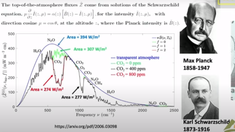
Now I will say just a few words about clear sky because that is the simplest. Then we’ll get on to clouds, the topic of this talk. This is a calculation with the same codes that I showed you in the previous slide which as you saw work very well. It’s worth spending a little time because this is the famous Planck curve that was the birth of quantum mechanics. There is Max Planck who figured out what the formula for that curve is and why it is that way. This is what the Earth would radiate at 15° Centigrade if there were no greenhouse gases. You would get this beautiful smooth curve the Planck curve. If you actually look at the Earth from the satellites you get a raggedy jaggedy black curve. We like to call that the Schwarzchild curve because Carl Schwarzchild was the person who showed how to do that calculation. Tragically he died during World War I, a Big Big loss to science.
There are two colored curves that I want to draw your attention. The green curve is is what Earth would radiate to space if you took away all the CO2 so it only differs from the black curve you know in the CO2 band here this is the bending band of CO2 which is the main greenhouse effect of CO2. There’s a little additional effect here which is the asymmetric stretch but it it doesn’t contribute very much. Then here is a red curve and that’s what happens if you double CO2.
So notice the huge asymmetry. If taking all 400 parts per million of CO2 away from the atmosphere causes this enormous change 30 watts per square meter, the difference between this green 307 and and the black 277, that’s 30 watts per square meter. But if you double CO2 you practically don’t make any change. This is the famous saturation of CO2. At the levels we have now doubling CO2, a 100% Increase of CO2 only changes the radiation to space by 3 watts per square meter. The difference between 274 for the red curve and 277 for the curve for today. So it’s a tiny amount: for 100% increase in CO2 a 1% decrease of radiation to space.
That allows you to estimate the feedback-free climate sensitivity in your head. I’ll talk you through the feedback-free climate free sensitivity. So doubling CO2 is a 1% decrease of radiation to space. If that happens then the Earth will start to warm up. But it will radiate as the fourth power of the temperature. So temperature starts to rise but if you’ve got a fourth power, the temperature only has to rise by one-quarter of a percent absolute temperature. So a 1% forcing in watts per square centimeter is a one-quarter percent of temperature in Kelvin. Since the ambient Kelvin temperature is about 300 Kelvin (actually a little less) a quarter of that is 75 Kelvin. So the feedback free equilibrium climate sensitivity is less than 1 Degree. It’s 0.75 Centigrade. It’s a number you can do in your head.
So when you hear about 3 centigrade instead of .75 C that’s a factor of four, all of which is positive feedback. So how is there really that much positive feedback? Because most feedbacks in nature are negative. The famous Le Chatelier principle which says that if you perturb a system it reacts in a way to to dampen the perturbation not increase it. There are a few positive feedback systems that we’re familiar with for example High explosives have positive feedback. So if the earth’s climate were like other positive feedback systems, all of them are highly explosive, it would have exploded a long time ago. But the climate has never done that, so the empirical observational evidence from geology is that the climate is like any other feedback system it’s probably negative Okay so I leave that thought with you and and let me stress again:
This is clear skies no clouds; if you add clouds all this does is
suppress the effects of changes of the greenhouse gas.
So now let’s talk about clouds and the theory of clouds, since we’ve already seen clouds are very important. Here is the formidable equation of transfer which has been around since Schwarzchild’s day. So some of the symbols here relate to the intensity, another represents scattering. If you have a thermal radiation on a greenhouse gas where it comes in and immediately is absorbed, there’s no scattering at all. If you hit a cloud particle it will scatter this way or that way, or some maybe even backwards.
So all of that’s described by this integral so you’ve got incoming light at One Direction and you’ve got outgoing light at a second Direction. And then at the same time you’ve got thermal radiation so the warm particles of the cloud are are emitting radiation creating photons which are coming out and and increasing the Earth glow the and this is represented by two parameters. Even a single cloud particle has an albedo, this is is the fraction ofradiation that hits the cloud that is scattered as opposed to absorbed and being converted to heat. It’s a very important parameter for visible light and white clouds, typically 99% of the encounters are scattered. But for thermal radiation it’s much less. So water scatters thermal radiation only half as efficiently as shorter wavelengths.
The big problem is that in spite of all the billions of dollars that we have spent, these things which should be known and and would have been known if there hadn’t been this crazy fixation on carbon dioxide and greenhouse gases. And so we’ve neglected working on these areas that are really important as opposed to the trivial effects of greenhouse gases. Attenuation in a cloud is both scattering and absorption. Of course you have to solve these equations for every different frequency of the light because especially for molecules, there’s a strong frequency dependence.
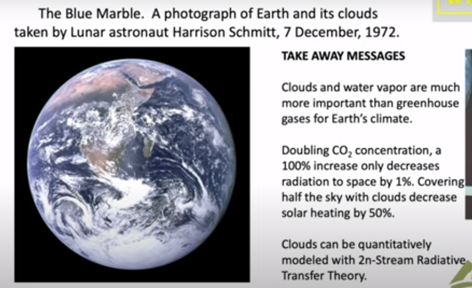
In summary, let me show you this photo which was taken by Harrison Schmitt who was a friend of mine on one of the first moonshots. It was taken in December and looking at this you can see that they were south of Madagascar when the photograph was taken. You can see it was Winter because here the Intertropical Convergence Zone is quite a bit south of the Equator; it’s moved Way South of India and Saudi Arabia. By good luck they had the sun behind them so they had the whole earth Irradiated.
There’s a lot of information there and and again let me draw your attention to how much of the Earth is covered with clouds. So only very small parts of the Earth can actually be directly affected by greenhouse gases, of the order of half. The takeaway message is that clouds and water vapor are much more important than greenhouse gases for earth’s climate. The second point is the reason they’re much more important: doubling CO2 as I indicated in the middle of the talk only causes a 1% difference of radiation to space. It is a very tiny effect because of saturation. You know people like to say that’s not so, but you can’t really argue that one, even the IPCC gets the same numbers that we do.
And you also know that covering half of the sky with clouds will decrease solar heating by 50%. So for clouds it’s one to one, for greenhouse gases it’s a 100 to one. If you really want to affect the climate, you want to do something to the clouds. You will have a very hard time making any difference with Net Zero with CO2 if you are alarmed about the warmings that have happened.
So one would hope that with all the money that we’ve spent trying to turn CO2 into a demon that some good science has come out of it. From my point of view this is a small part of it, this scattering theory that I think will be here a long time after the craze over greenhouse gases has gone away. I hope there will be other things too. You can point to the better instrumentation that we’ve got, satellite instrumentation as well as ground instrumentation. So that’s been a good investment of money. But the money we’ve spent on supercomputers and modeling has been completely wasted in my view.
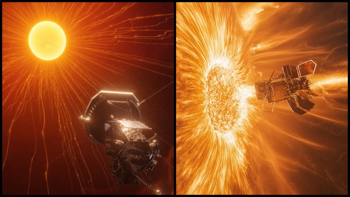
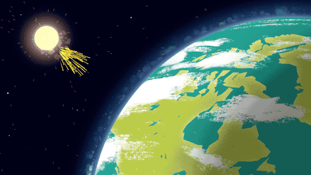
NASA’s Parker solar probe just completed one of its primary multi-year mission objectives, with the closest ever approach to the Sun. On Christmas Eve, the probe flew through the Sun’s corona at a blistering (literally and figuratively) 430,000 mph. For aircraft buffs, that’s Mach 560 — fast enough to circle the earth in about 3 minutes!
NASA’s Closest Approach to the Sun’s Fiery Surface Achieved by Parker Probe
A faint signal from Parker indicates that it survived its scorching flyby, and scientists are expecting it to download a treasure trove of data later this month. It turns out there’s a lot the guys with the PhDs don’t understand about the sun. As NASA states:
The NASA Parker Solar Probe mission is a mission designed to help humanity better understand the Sun, where changing conditions can propagate out into the solar system, affecting Earth and other worlds. As such, the primary goals are to examine the acceleration of solar wind through the movement of heat and energy in the Sun’s corona in addition to study solar energetic particles.
They’re hoping data collected while flying through the Sun’s corona will provide a few answers and make it a bit more predictable.
I confess I’m just a lowly engineer, and many of the mysteries they’re trying to unravel are well beyond my college physics courses. But reading about the Parker probe got me wondering: Doesn’t the Sun have something to do with our weather? I mean it’s warm on sunny days, and plants grow better when the earth’s surface is the closest to the Sun.
Those observations may sound obtuse, but they’re no more obtuse than “experts” saying that “climate science is settled” — when they don’t understand how the freaking Sun works! (Looking at you “Science Guy” Bill Nye.)
The science can only be settled when the smart guys understand all the factors that affect our climate — and how they interact — well enough to predict outcomes. The Sun imparts about 342 watts of energy on every square meter of the earth’s surface (according to NASA). That’s the equivalent of 44 million average electric power plants (700 times what the world has) — yet we don’t understand its fluctuations.
That’s a rather big unpredictable factor for this supposedly “settled science” — no?
One can only conclude that when highly educated people — who should know better — claim climate science is settled, they’re lying. Perhaps that’s why multiple predictions that the polar bears would be extinct and New York would be underwater by now have all been wrong. It might also explain why the greenies avoid discussion of ice ages and interglacial periods when assuring us that our cars are delivering planetary doom – while their private jets are perfectly fine.
Given what little we know about the Sun, the anthropogenic climate change “experts” are either:
Ignorant men, succumbing to irrational fears — placing superstition above science, or
Evil men — profiting by scaring us into irrational behavior.
We should keep that in mind when they insist that we halt progress, live in destitution, and scare our children that apocalypse is imminent. Our only rational response is to ignore them … and cut off their funding.
Yes, IPCC, Our Climate Responds to Our Sun
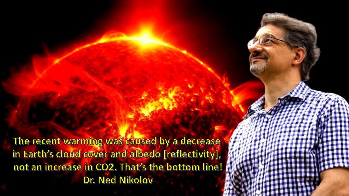
John Gideon Hartnett writes at Spectator Australia The sun is in control of our oceans.Text is from John Ray at his blog, excerpts in italics with my bolds and added images.
In recent years, there has been observed an increase in ocean temperature. Those who adhere to the Climate Change version of events say that the oceans are getting warmer because of trapped carbon dioxide (CO2) in the atmosphere causing a massive greenhouse effect leading to boiling oceans.
Well, anyone who has a brain knows that the oceans are not boiling, but let’s assume that is just hyperbole. When actual research – when actual measurements were taken – reality turns out to be the exact opposite.
New research shows that the temperature of our oceans are controlled by incident radiation from the Sun. Who would have guessed?
And as a consequence of the oceans warming, dissolved carbon dioxide gas is released due to reduced is solubility in ocean water. This means the warming of the oceans would lead (or cause) an increase in CO2 concentration in the atmosphere. One of the researchers in the study wrote on X.com:
A decrease in cloud cover and albedo means more short wavelength (SW) solar radiation reaches the oceans. Albedo is the reflectivity of the Earth. Lower albedo means more sunlight reaching the land and oceans and more warming by the Sun.
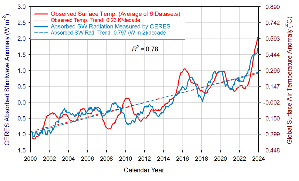
Figure 8. Comparison between observed global temperature anomalies and CERES-reported changes in the Earth’s absorbed solar flux. The two data series representing 13-month running means are highly correlated with the absorbed SW flux explaining 78% of the temperature variation (R2 = 0.78). The global temperature lags the absorbed solar radiation between 0 and 9 months, which indicates that climate change in the 21st Century was driven by solar forcing.
I mean to say that this is so obvious. The Sun heats Earth’s surface of which 71% is covered by the oceans! Basic physics!
The energy from the Sun powers all life on the planet and causes all Earth changes. Every second, the Earth receives the equivalent energy of 42 megatons of TNT in radiation from the Sun. That cannot be ignored.
Climate Change, the ideological movement which I prefer to call a cult, views all evidence through the lens of their religious belief that the Earth is warmed by human activity. That activity releases carbon dioxide gas, which has been observed to be increasing. Their belief is that CO2 traps heat in a giant greenhouse effect. That is the dogma anyway. And I must add, we all are the carbon they want to eliminate.
But how much of that observed increase in CO2 is actually from natural causes and not from human activity? At least 94 per cent is. This new evidence now suggests it could be even more than that.
If the oceans emit CO2 gas following changes in the water temperature, which this research shows is due to the amount (flux) of solar radiation reaching the surface, then more CO2 comes from natural causes.
It is basic physics that as you heat water the dissolved gases are released due to a decrease in gas solubility. This means as the solar flux increases CO2 gas is released from the warmer ocean water.
Thus an ocean temperature increase leads to an increase in CO2 in the atmosphere, and not the other way around.
Space weather impacts the ionosphere in this animation. Credits: NASA/GSFC/CIL/Krystofer Kim
Graeme Weber reports from Australia on the history revealing multiple holes in IPCC claimed “settled science.” His paper is IPCC – Miss/Diss information? shared with me by email. Graeme is an earth scientist, retired consulting geologist and advocate for nuclear energy. His text is in italics with my bolds and added images.
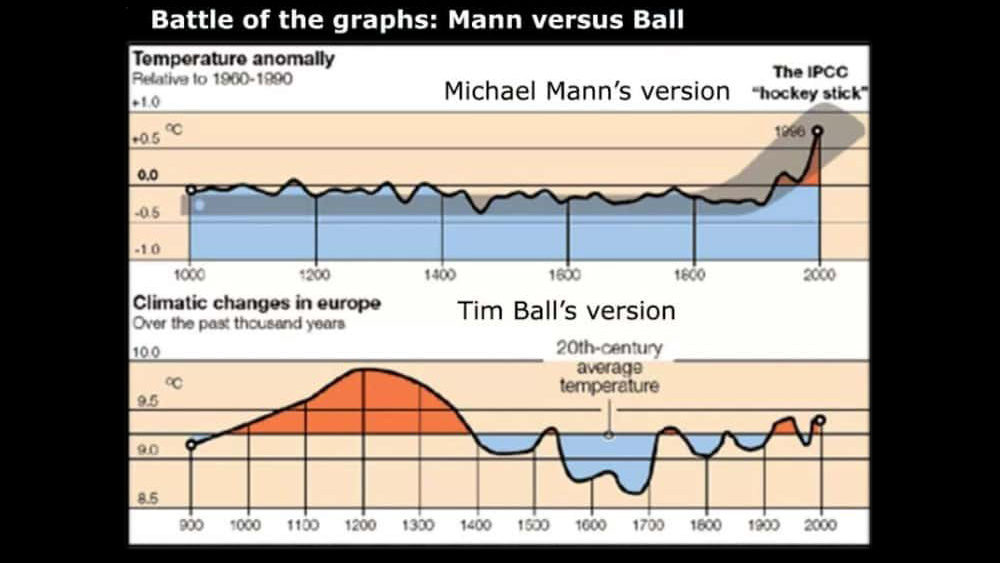
Several years ago, the cry from the IPCC (International Panel on Climate Change) was ‘the science is settled’. This should have been a ‘red flag’ to any scientists who know that science is never settled. This is especially so in such a complex system, as Mother Earth’s climate. It is now 32 years since the first IPCC Report was issued. Many claims in this and later IPCC reports have since been debunked especially the ‘Hockey Stick’ graph of Mann, Bradley and Hughes (1999) where Mann was finally taken to court to reveal his calculations that subsequently led to him losing a court case and the IPCC getting embarrassed, as monumental errors and manipulation of data was exposed.
Professor Tim Ball, who was sued by Michael Mann for defamation regarding comments he made about the integrity of the Hockey Stick Graph, succeeded in having the case thrown out and Mann ordered to pay costs. Mann had failed to comply with a court order that he produce his Hockey Stick Data! Supreme Court of British Columbia 2019
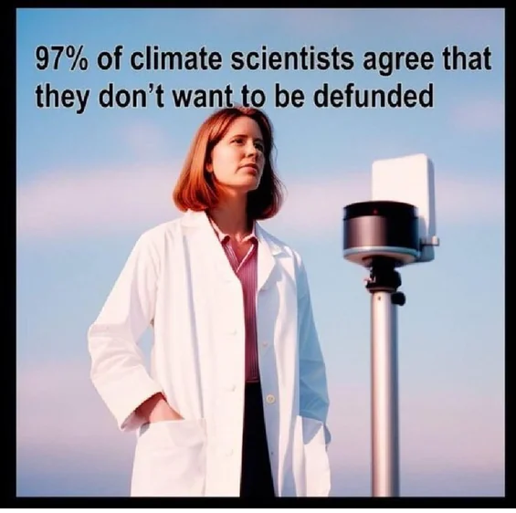
Another erroneous claim by the IPCC was that 97% of Scientists believed in Global Warming. How did they make this claim? It was based on a study in the Proceedings of the National Academy of Sciences of the United States of America (2010) who reviewed publication and citation data for 1,372 climate researchers, 908 of whom had authored 20 or more publications on climate, and found that 97–98% of the climate researchers (the 908) most actively publishing in the field support the tenets of ACC (Anthropogenic Climate Change) outlined by the IPCC, and the relative climate expertise and scientific prominence of the researchers unconvinced of ACC are substantially below that of the convinced researchers. Well, how strange people who research in this field and rely on financial support believe in Global Warming!
A Consensus You Can Trust!
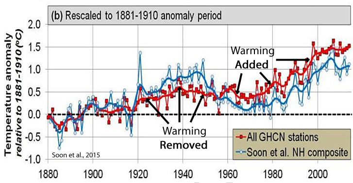
Another study by Dr Soon and Dr Michael Connolly and His son Dr. Ronan Connolly released in 2023 was on Rural and Urban temperature records in the Northern Hemisphere. This study is similar to articles reported by JoNova and Jennifer Marohasy in Australia on temperature measurement equipment and stations in Australia with encroaching buildings, air conditioners, changes to recording gear and BOM changing temperature records by outright manipulation and homogenisation. The most obvious one is changing from reading manually by a person at a set time each day to continuous recording machines every minute or so, so increasing the likelihood of higher daily temperatures. In many cases BOM (Australian Bureau of Meteorology) claimed significant warming trends by starting at a cool point rather than a warm point.
The BOM never mentions the extreme temperatures recorded throughout Australia in January 1896nor the elevated temperature during the 1930’s decade culminating in 1939 Black Friday. In the days preceding these fires, the Victorian state capital, Melbourne, experienced some of its hottest temperatures on record at the time: 43.8 °C (110.8 °F) on 8 January and 44.7 °C (112.5 °F) on 10 January. On 13 January, the day of the fires, temperatures reached 45.6 °C (114.1 °F), which stood as the hottest day officially recorded in Melbourne for the next 70 years. Now BOM issue weather alerts when the temperature reaches 30 degrees!
The study by Soon et al clearly shows that temperature measuring stations are increasingly being influenced by solar radiation being absorbed by bitumen and concrete and released through the night. One of the most remarkable illustrations of this effect was an aerial thematic view of the City of Rome at 8.30am in the morning. Vapour trails of early aircraft take-offs are clearly visible. The airport is hot (usually site of temperature gauges) surrounding country is relatively cold
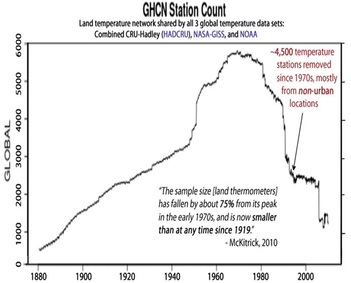
Another reveal over the last 30 years is the number of Land Temperature stations (LTS). Total LTS in the Northern Hemisphere has declined from 5,000 to 2,000 stations but rural stations have declined from 500 to 200. This has been particularly relevant in the Northern Hemisphere where the most remote Artic stations (northern and coldest) have been closed. The product of this is the average temperature of these remote areas has risen. Mathematics 101. Soon et al have examined 4,500 temperature stations in China, USA the Artic and Ireland that show a warming trend of 0.89º C per Century in Urban areas whereas Rural Stations only show 0.55ºC per Century. This is a significant difference.
Another factor producing higher biased temperatures is the IPCC technique of ‘homogenisation’ where a particular area has all the temperature readings added together then divided by the number of stations. As is expected the number of urban stations read higher than rural ones thus increasing the overall temperature average. Taking the overall rural average the warming trend results in an increase of 0.9ºC since 1850.
So, Antonio Guterres the UN Secretary General prognosis that the ‘World is boiling’ is wrong, stupid and farcical. Soon et al believe the warming is more likely due to Total Solar Radiance whereas the IPCC believe it is due to a trace gas CO2 a plant food. It is interesting to note that commercial greenhouses use about 1,000–1,300 ppm under ideal circumstances. A lower level (800–1,000 ppm) is recommended for raising seedlings (tomatoes, cucumbers and peppers) as well as for lettuce production. Currently the world CO2 sits at 423ppm.
Al Gore (former USA Vice Presidential candidate) has made numerous predictions in his film ‘Inconvenient Truth’ most if not all have proved false. His biggest claim was the Arctic Ocean will be ice free by 2013 or was that 2014 or even 2015! When this did not happen, the argument was that overall, the ice was drastically thinning. Last month October 2024 icebreakers were madly trying to extract ships in the northern passages some two weeks before expected, from Arctic ice closing in.
At the other end of our world in Antarctica numerous IPCC papers claimed that the West Antarctic Ice Sheet was about to, or already collapsing because of warmer waters were circulating caused by Climate change. However, a new study in 2017 found 91 new volcanic vents to add to the 47 volcanoes already known to exist under this ice sheet. As volcanic activity waxes and wanes ice melt will continue in this hot volcanic zone. Whether this ice sheet melts or not it is certainly more probable the effects are more controlled by volcanic activity rather than circulating waters. The IPPC reports also failed to acknowledge that ice buildup was occurring at other points in Antarctica.
Source: volcano foundation with glacier locations added
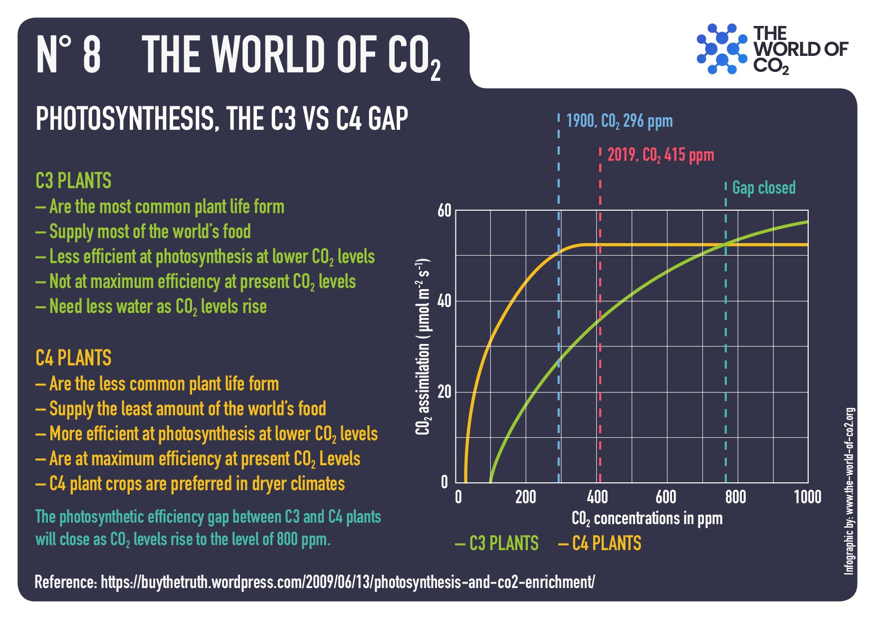
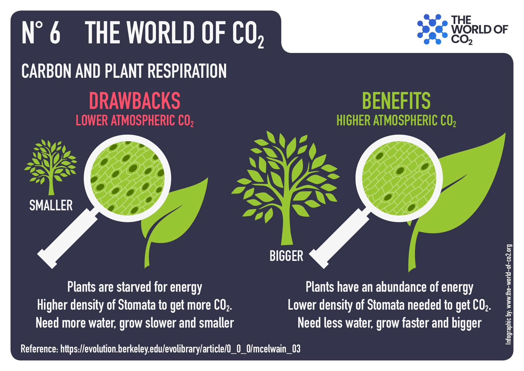
Is CO2 bad? One remarkable and observable thing is that trees and plants take in carbon dioxide through stomata in their leaves. Since plants first invaded continents (perhaps chasing higher concentrations of carbon dioxide) science has a very good record of the CO2 gas concentrations in the atmosphere. The larger the Stomata the lower the CO2 concentration.
Approximately 580 Ma years ago the concentration was just under 3000ppm. This was soon after a major ice age around 750Ma years ago. The concentration has been steadily falling, since apart from two very low CO2 events occurred around 430Ma and 280Ma and if at any stage the CO2 concentration had dropped below 150ppm then we would not be here as all plants would have died. Other scientific studies show there is a lag between periods when the Earth’s temperature increases and CO2 concentrations rise. Maybe just maybe, the Industrial Revolution saved the planet!
Other scientific papers are showing that the world climate has a natural buffering system. As temperatures rise evaporation increases over the oceans that cover 71% of the earth’s surface. Increased precipitation has a marked cooling effect and together with increased CO2 will lead to greater vegetation growth to feed the worlds increasing population. Desertification will likely decrease. Maybe Central Australia will bloom and make the central Australian Aboriginal communities wealthy.
A paper provided to the Court of Appeals, The Hague November 2023 by Richard Lindzen Professor of Earth, Atmospheric, and Planetary Sciences, Emeritus Massachusetts Institute of Technology, William Harper Professor of Physics, Emeritus Princeton University and Steven Koonin University Professor, New York University, Senior Fellow at the Hoover Institute wrote:
‘We are career physicists who have specialized in radiation physics, dynamic heat transfer and computer modelling for decades, subjects directly relevant to the global warming debate. Each of us has published over 200 peer-reviewed papers, many on the science of climate or closely related subjects. In our opinion, the District Court of The Hague findings that “dangerous” climate change and extreme weather are caused by CO2 emissions from fossil fuels are contradicted by the scientific method and only supported by the unscientific methods of government opinions, consensus, peer review, and cherry-picked or falsified data. Science demonstrates fossil fuels, and CO2 will not cause dangerous climate change. Rather, there will be disastrous consequences for people worldwide if fossil fuels and CO2 emissions are reduced to “net zero,” including mass starvation’.
What if the Net Zero fossil fuels and CO2 policy was in effect in 1750 and CO2 did not rise from 280 ppm to 420 ppm? There would be 21% less food worldwide. Therefore it can be concluded that the Earth’s surface temperature is rising but not at the rate the IPCC would have you believe. As Bjorg Lomborg is saying it is much better to prepare for this eventuality something we cannot change than try to reduce a trace gas that is essential for life.
I fear for those who have trusted governments like they did the Covid science. The false claims of Government about an approaching Armageddon causing an induced psychosis resulting in stunts paralysing normal economic industry. These stunts such as hanging from pylons or gluing to windows, throwing paint, disrupting parliament. Where will it all end? The destruction of our civilisation?


 Under President Trump, we will bring back American auto jobs and invest in domestic manufacturing to revitalize a quintessential American industry. We will partner with leaders to streamline and develop smart regulations that will allow for American workers to lead the great comeback of the auto industry,” said Administrator Zeldin.


