Our Weather Extremes Are Customary in History

Ralph Alexander provides the facts and data in his GWPF paper Weather Extremes in Historical Context.  Excerpts in italics with my bolds and selected images.

Introduction

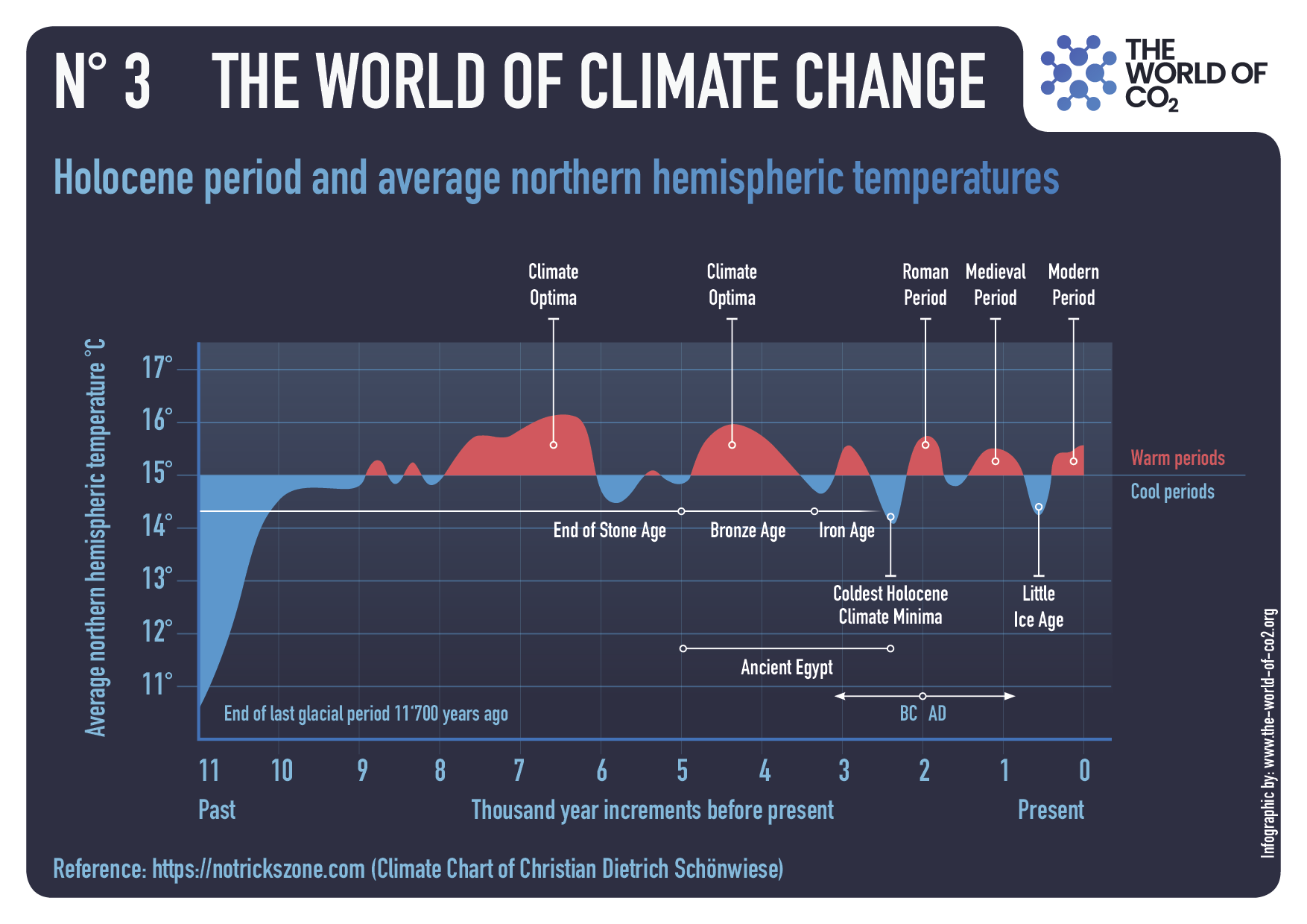
This report refutes the popular but mistaken belief that today’s weather extremes are more common and more intense because of climate change, by examining the history of extreme weather events over the past century or so.  Drawing on newspaper archives, it presents multiple examples of past extremes that match or exceed anything experienced in the present day. That so many people are unaware of this fact shows that collective memories of extreme weather are short-lived.

Heatwaves

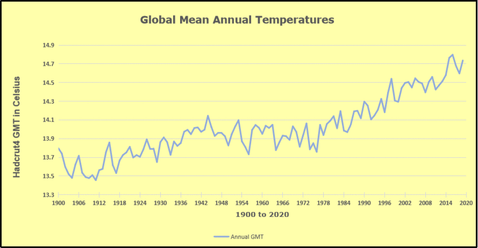
Heatwaves of the last few decades pale in comparison to those of the 1930s – a period whose importance is frequently downplayed by the media and environmental activists. The evidence shows that the record heat of that time was not confined to the US ‘Dust Bowl’, but extended throughout much of North America, as well as to other countries, such as France, India and Australia. US heatwaves during July 2023, falsely trumpeted by the mainstream media as the hottest month in history, failed to exceed the scorching heat of 1934.

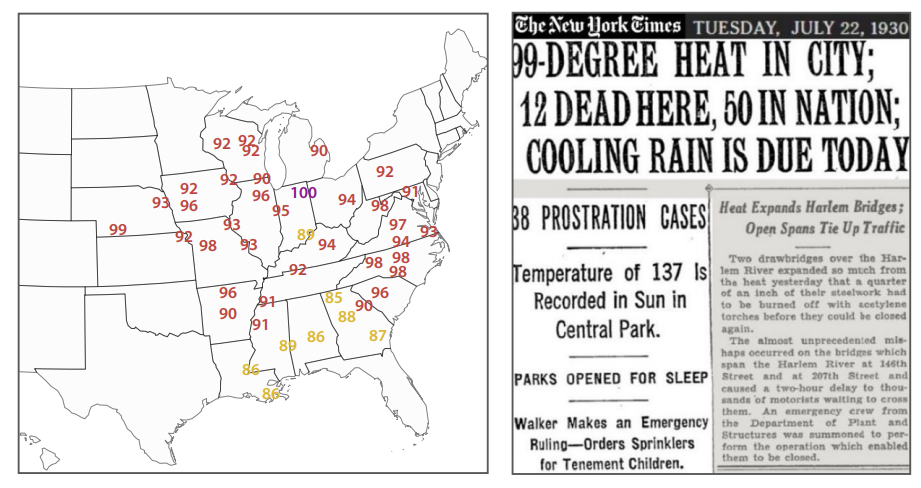
Figure1: US heatwaves in 1930. Left: sample maximum temperatures for selected cities in April heatwave; right: exceptionally warm July heatwave in New York city.

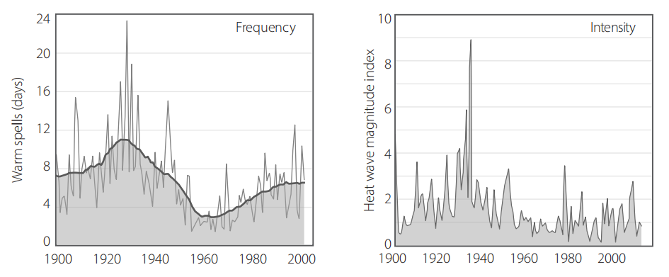
Figure5: Observed changes in heatwaves in the contiguous US, 1901–2018. Source: CSSR.99

Heatwaves lasting a week or longer in the 1930s were not confined to North America; the Southern Hemisphere baked too. Adelaide, on Australia’s south coast, experienced a heatwave at least 11 days long in 1930, and Perth on the west coast saw a 10-day spell in 1933.  In August 1930, Australian and New Zealand (and presumably French) newspapers recounted a French heatwave that month, in which the temperature soared to a staggering 50°C (122°F) in the Loire valley – besting a purported record of 46°C (115°F) set in southern France in 2019. Many more examples exist of the exceptionally hot 1930s all over the globe. Even with modern global warming, there’s nothing unprecedented about current heatwaves, either in frequency or magnitude.

Floods

Major floods today are no more common nor deadly or disruptive than any of the thousands of floods in the past, despite heavier precipitation in a warming world (which has increased flash flooding in some regions).  Many of the world’s countries regularly experience major floods, especially China, India and Pakistan. A significant 1931 flood in China covered a far greater area and affected many more people than the devastating 2022 floods in Pakistan.

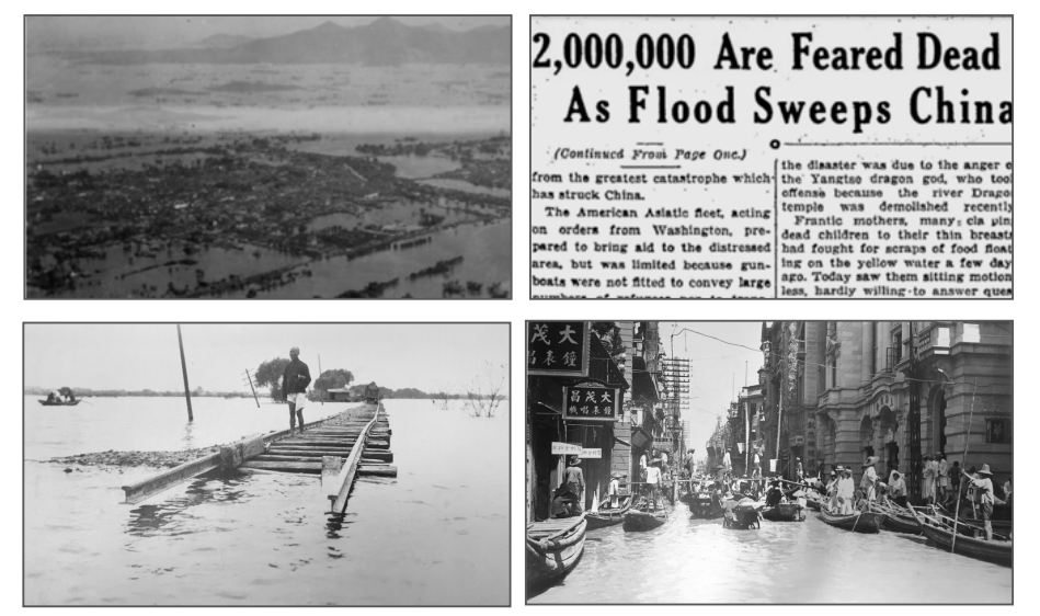
Figure 8: Disastrous Yangtze River flood in China, 1931.

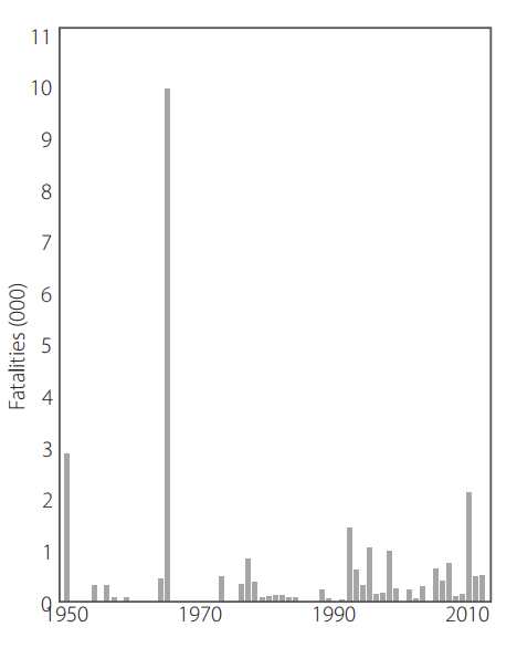
Figure 10: Annual number of deaths from major floods in Pakistan, 1950 to 2012. Source: M.J. Paulikas and M.K. Rahman.100

The Pakistan floods of 2022 were the nation’s sixth since 1950 to kill over 1,000 people, although the death toll from the 2022 floods was a comparable 1,739. Major floods which killed as many as 3,100 people afflicted the country in 1950, 1955, 1956, 1957, 1959, throughout the 1970s and in more recent years.

Monsoonal rains in 1950 led to flooding that killed an estimated 2,900 people across the country and caused the Ravi River in northeastern Pakistan to burst its banks; 10,000 villages were decimated and 900,000 people made homeless.  In 1973, one of Pakistan’s worst-ever floods followed intense rainfall of 325 mm (13 inches) in Punjab (which means ‘Five Rivers’) province, affecting more than 4.8 million people out of a total population of about 65 million.

Droughts

Severe droughts have been a continuing feature of the Earth’s climate for millennia, despite the brouhaha in the mainstream media over the extended drought in Europe during the summer of 2022. Not only was the European drought not unprecedented, but there have been numerous longer and drier droughts throughout history, including during the past century.

Figure 12: Famine following drought in India, 1966–67

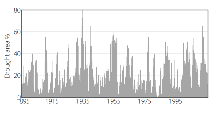
Figure14: Percentage of the US in drought 1895–2015. Based on the Palmer Drought Severity Index. Source: NOAA/NCEI.101

As an illustration that the 1930s and 1950s were not the only decades over the past century in which the US experienced significant droughts, Figure 14 depicts observational data showing the area of the contiguous US in drought from 1895 up until 2015. As can be seen, the long-term pattern in the US is featureless, despite global warming. Reconstructions of ancient droughts using tree rings or pollen as proxies reveal that historical droughts were even longer and more severe than those described here, many lasting for decades – so-called ‘megadroughts.’

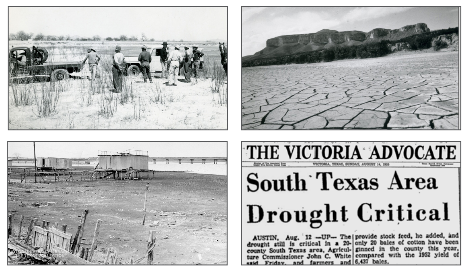
Figure13: Texas drought, 1950–57. Left top photo: car being towed after becoming stuck in parched riverbed; left bottom photo: once lakeside cabins on shrinking Lake Waco; right top photo: dry lakebed; right bottom: newspaper excerpt.
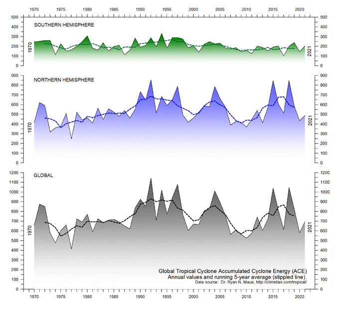
Hurricanes

Hurricanes overall actually show a decreasing trend around the globe, and the frequency of their landfalling has not changed for at least 50 years. The deadliest US hurricane in recorded history, which killed an estimated 8–12,000 people, struck Galveston, Texas in 1900. As a comparison, the death toll of 2022’s Category 5 Hurricane Ian, which ldeluged much of Florida with a storm surge as high as Galveston’s, was just 156.

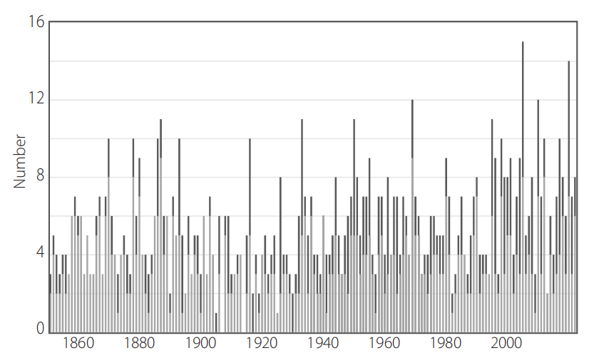
Figure 17: Annual number of North Atlantic hurricanes, 1851–2022. Source: NOAA Hurricane Research Division103 and Paul Homewood.104

Hurricanes have been a fact of life for Americans in and around the Gulf of Mexico since Galveston and before. The death toll has fallen over time, with improvements in planning and engineering to safeguard structures, and the development of early warning systems to allow evacuation of threatened communities. Nevertheless, the frequency of North Atlantic hurricanes has been essentially unchanged since 1851, as shown in Figure 17. The apparent heightened hurricane activity over the last 20 years, particularly in 2005 and 2020, simply reflects improvements in observational capabilities since 1970, and is unlikely to be a true climate trend, say a team of hurricane experts. The incidence of major North Atlantic hurricanes in recent decades is no higher than that in the 1950s and 1960s, when the Earth was actually cooling, unlike today.

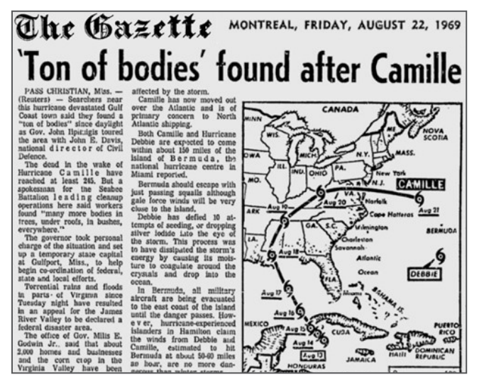
Figure22: Hurricane Camille, 1969.

These are just a handful of hurricanes from our past, all as massive and deadly as Category 5 Hurricane Ian, which in 2022 deluged Florida with a storm surge as high as Galveston’s and rainfall up to 685 mm (27 inches); 156 were killed. Hurricanes are not on the rise today

Tornadoes

Likewise, there is no evidence that climate change is causing tornadoes to become more frequent and stronger. The annual number of strong (EF3 or greater) US tornadoes has in fact declined dramatically over the last 72 years, and there are ample examples of past tornadoes just as or more violent and deadly than today’s.

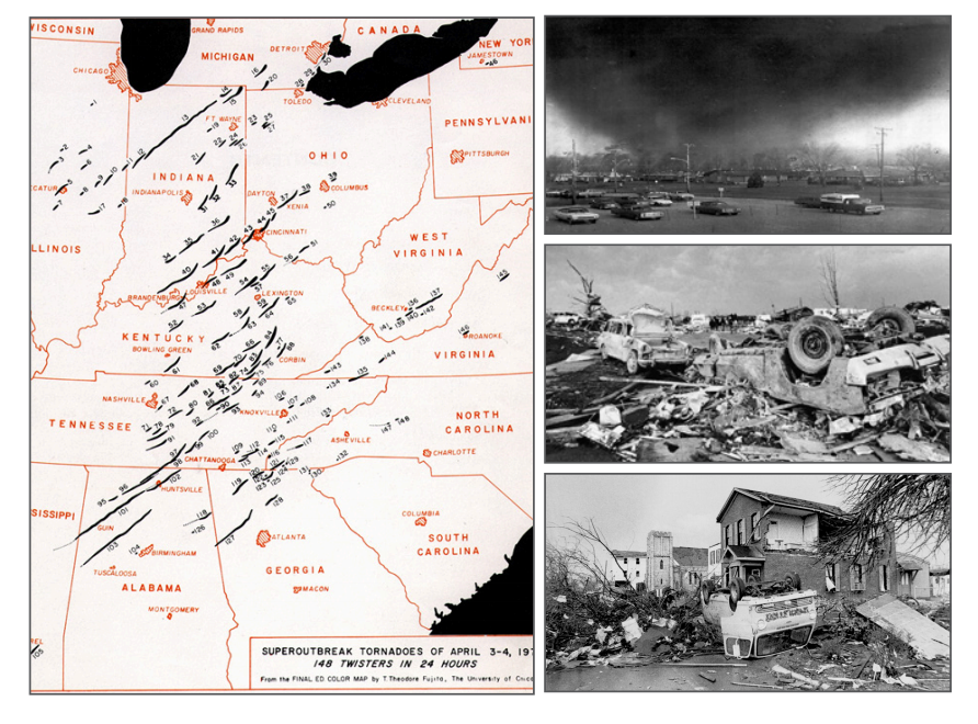
Figure26: Super Outbreak of tornadoes, 1974. Left: distribution and approximate path lengths of tornadoes; top right photo: F5 tornado approaching Xenia, Ohio (population 29,000); center right and bottom right photos: consequent wreckage in Xenia.

Figure27: Annual count of EF3 and above tornadoes in the US, 1950–2021. Source: Source: NOAA/NCEI.106, 107

After a flurry of tornadoes swarmed the central US in March 2023, the media quickly fell into the trap of linking the surge to climate change, as often occurs with other forms of extreme weather. But there is no evidence that climate change is causing tornadoes to become more frequent and  stronger, any more than hurricanes are increasing in strength and number.

Wildfires

Wildfires are not increasing either. On the contrary, the area burned annually is diminishing in most countries. The total number of US fires and the area burned in 2022 were both 20% less than in 2007; data before 1983 that mysteriously disappeared recently from a government website shows an even larger historical decline. And, in  spite of popular belief, ignition of wildfires by arson plays a larger role than sustained high temperatures and wind.

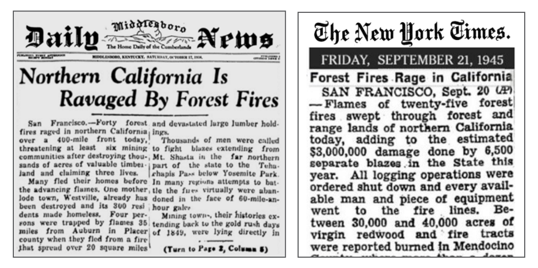
Figure30: Wildfires in northern California Left: near Auburn, Mt. Shasta and Yosemite, 1936; right: in Mendocino County, known for its redwood forests, 1945.

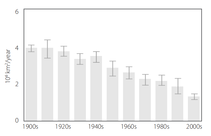
Figure32: Global forest area burned by wildfires, 1900–2010 Source: Jia Yang et al.108

Smoke that wafted over the US from extensive Canadian wildfires in 2023 has given credence to the mistaken belief that wildfires are intensifying because of climate change. However, just as with all the other examples of extreme weather, there is no scientific evidence that wildfires today are any more frequent or severe than anything experienced in the past. Although they can be exacerbated by weather extremes, such as heatwaves and droughts, we’ve already seen that those are not on the rise either.

In addition to examples of past weather extremes from newspaper archives, the report concludes with a short section on documented extreme weather events dating back centuries and even millennia.

Conclusion

The perception that extreme weather is increasing in frequency and severity is primarily a consequence of modern technology – the Internet and smart phones – which have revolutionised communication and made us much more aware of such disasters than we were 50 or 100 years ago. The misperception has only been amplified by the mainstream media, eager to promote the latest climate scare. And as psychologists know, constant repetition of a false belief can, over time, create the illusion of truth. But history tells a different story.

There is no charge for content on this site, nor for subscribers to receive email notifications of postings.

Arctic Ice Marches Upward 2024

The animation shows end of March Arctic ice extents on day 91 over the last 19 years (length of MASIE dataset). Of course central Arctic basins are frozen solid, and the fluctuations are visible on the marginal basins both the Atlantic side (right) and the Pacific (left). Note the higher extents in 2012, followed by lesser ice, now overcome by 2024.

The graph below shows Monthly averages for March since 2007.  March is the maximum month in the annual cycle in contrast to September being the minimum Arctic ice extents. Note the low 2007 extents followed by several years over15M km2, then lesser extents 2015 to 2018, and increasing extents up to 2024 nearly averaging 15M for the month.


The graph below shows March daily ice extents for 2024 compared to 18 year averages, and some years of note.


The black line shows during March on average Arctic ice extents nearly reach 15 Wadhams (15M km2) on Day 62, March 2.  A slow decline is normal until Day 91, March 31.  However, that period in 2024 saw Arctic ice go over 15M on day 68 and remain there until day 79. Afterward both MASIE and SII show above average extents to month end.  2006 was the first year in this dataset and ended March ~800k km2 in deficit to average.  2021 and 2023 were ~200k below average on Day 91 while 2024 ended 266k km2 surplus ice.   As usual in transitional months like March and September, SII (Sea Ice Index) shows a similar pattern with generally lower extents.

Why is this important?  All the claims of global climate emergency depend on dangerously higher temperatures, lower sea ice, and rising sea levels.  The lack of additional warming prior to 2023 El Nino is documented in a post UAH February 2024: SH Saves Global Warming.

The lack of acceleration in sea levels along coastlines has been discussed also.  See USCS Warnings of Coastal Flooding

Also, a longer term perspective is informative:

post-glacial_sea_level
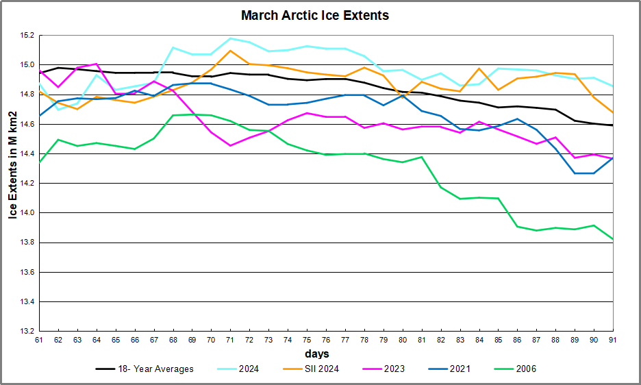
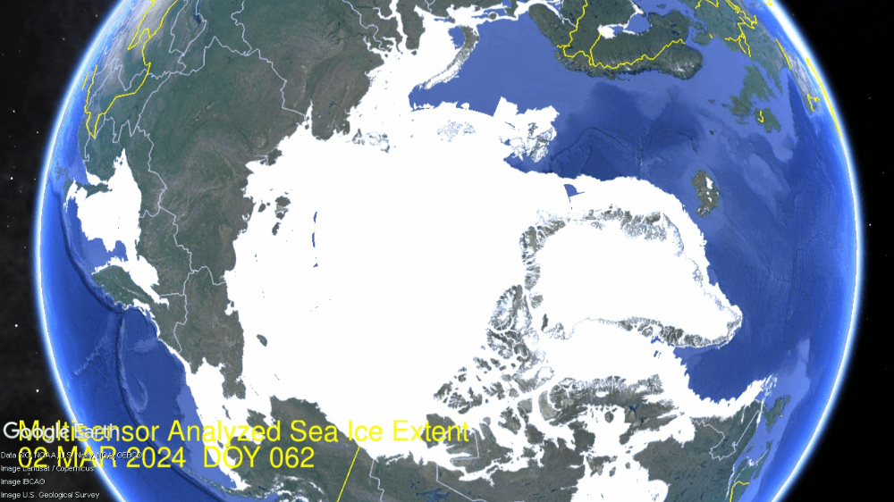
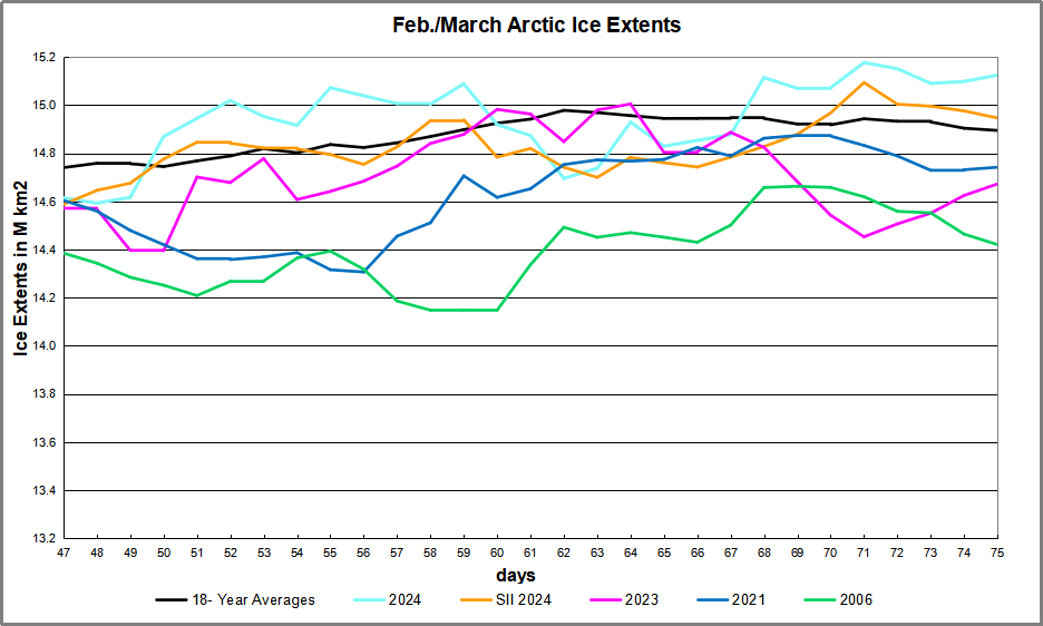
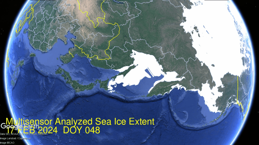
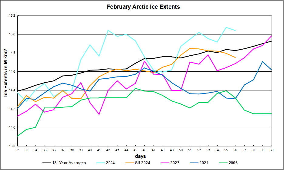
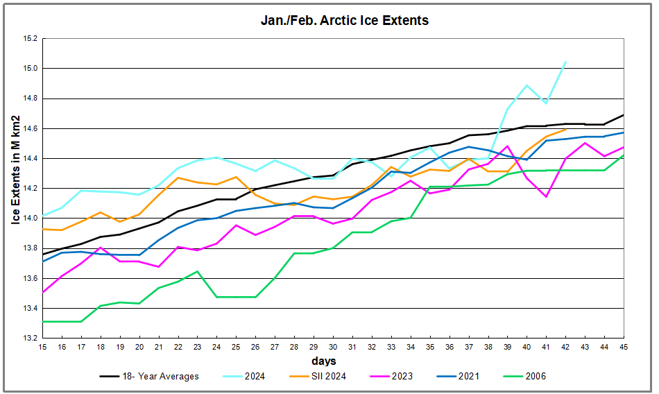
The table below shows the distribution of Sea Ice on day 91 across the Arctic Regions, on average, this year and 2006.

Region 2024091 Day 91 ave 2024-Ave. 2006091 2024-2006
 (0) Northern_Hemisphere 14854967 14589377 265590 13821470 1033497
 (1) Beaufort_Sea 1070983 1070226 758 1068683 2301
 (2) Chukchi_Sea 966006 963401 2606 959091 6915
 (3) East_Siberian_Sea 1087137 1086151 987 1084120 3017
 (4) Laptev_Sea 897845 896053 1792 896510 1335
 (5) Kara_Sea 935023 919656 15367 910487 24536
 (6) Barents_Sea 845789 657875 187914 622588 223201
 (7) Greenland_Sea 771533 661909 109624 601310 170223
 (8) Baffin_Bay_Gulf_of_St._Lawrence 1238205 1384413 -146208 1003875 234330
 (9) Canadian_Archipelago 854860 853089 1772 851691 3169
 (10) Hudson_Bay 1260903 1255353 5551 1240389 20514
 (11) Central_Arctic 3248013 3235452 12561 3239349 8664
 (12) Bering_Sea 724493 703487 21006 658979 65514
 (13) Baltic_Sea 50165 61636 -11471 114622 -64457
 (14) Sea_of_Okhotsk 900660 831057 69602 558027 342633

The overall surplus to average is 266k km2, (2%).  The only major deficit is in Baffin Bay, more than offset by surpluses everywhere, especially in Okhotsk, Barents and Greenland seas.  Note Arctic ice yesterday was more than a Wadham greater than the same day in 2006.

bathymetric_map_arctic_ocean

Illustration by Eleanor Lutz shows Earth’s seasonal climate changes. If played in full screen, the four corners present views from top, bottom and sides. It is a visual representation of scientific datasets measuring Arctic ice extents.


2023 Climate Report: Earth’s Climate Is Fine

Preface

This report is written for people wishing to form their own opinion on issues relating to climate. Its focus is on publicly available observational datasets, and not on the output of numerical models, although there are a few exceptions, such as Figure 42. References and data sources are listed at the end.

The observational data presented here reveal a vast number of natural variations, some of which appear in more than one series. The existence of such natural climatic variations is not always fully acknowledged, and therefore generally not considered in contemporary climate conversations. The drivers of most of these climatic variations are not yet fully understood, but should represent an important focus for climatic research in future.

In this report, meteorological and climatic observations are described according to the following overall structure: atmosphere, oceans, sea level, sea ice, snow cover, precipitation, and storms. Finally, in the last section (below), the observational evidence as at 2023 is briefly summarised.

Ten facts about the year 2023

1. Air temperatures in 2023 were the highest on record (since 1850/1880/1979, according to the particular data series). Recent warming is not symmetrical, but is mainly seen in the Northern Hemisphere (Figures 1 and 13).

Figure 1: 2023 surface air temperatures compared to the average for the previous 10 years. Green-yellow-red colours indicate areas with higher temperature than the average, while blue colours indicate lower than average temperatures. Data source: Remote Sensed Surface Temperature Anomaly, AIRS/Aqua L3 Monthly Standard Physical Retrieval 1-degree x 1-degree V006 (https://airs.jpl.nasa.gov/), obtained from the GISS data portal (https://data.giss.nasa.gov/gistemp/maps/).

 Figure 13: Zonal air temperatures. Global monthly average lower troposphere temperature since 1979 for the tropics and the northern and southern extratropics, according to University of Alabama at Huntsville, USA. Thin lines: monthly value; thick lines: 3-year running mean.

2. Arctic air temperatures have increased during the satellite era (since 1979), but Antarctic temperatures remain essentially stable (Figure 14).

Figure 14: Polar temperatures Global monthly average lower troposphere temperature since 1979 for the North and South Pole regions, according to University of Alabama at Huntsville (UAH), USA. Thick lines are the simple running 37-month average.

3. Since 2004, globally, the upper 1900m of the oceans has seen net warming of about 0.037°C. The greatest warming (of about 0.2°C) is in the uppermost 100m, and mainly in regions near the Equator, where the greatest amount of solar radiation is received (Figure 28).

Figure 28: Temperature changes 0–1900m Global ocean net temperature change since 2004 from surface to 1900m depth, using Argo-data. Source: Global Marine Argo Atlas.

4. Since 2004, the northern oceans (55–65°N) have, on average, experienced a marked cooling down to 1400m depth, and slight warming below that (Figure 29). Over the same period, the southern oceans (55–65°S) have, on average, seen some warming at most depths (above 1900m), but mainly near the surface.

Figure 29: Temperature changes 0–1900m Global ocean net temperature change since 2004 from surface to 1900m depth. Source: Global Marine Argo Atlas

5. Sea level globally is increasing at about 3.4 mm per year or more according to satellites, but only at 1-2 mm per year according to coastal tide gauges (Figures 39 and 41). Local and regional sea-level changes usually deviate significantly from such global averages.

Figure 39: Global sea level change since December 1992 The two lower panels show the annual sea level change, calculated for 1- and 10-year time windows, respectively. These values are plotted at the end of the interval considered. Source: Colorado Center for Astrodynamics Research at University of Colorado at Boulder. The blue dots are the individual observations (with calculated GIA e”ect removed), and the purple line represents the running 121-month (ca. 10-year) average.

Figure 41: Holgate-9 monthly tide gauge data from PSMSL Data Explorer The Holgate-9 are a series of tide gauges located in geologically stable sites. The two lower panels show the annual sea level change, calculated for 1- and 10-year time windows, respectively. These values are plotted at the end of the interval considered. Source: Colorado Center for Astrodynamics Research at University of Colorado at Boulder. The blue dots are the individual observations, and the purple line represents the running 121-month (ca. 10-year) average.

6. Global sea-ice extent remains well below the average for the satellite era (since 1979). Since 2018, however, it has remained quasistable, perhaps even exhibiting a small increase (Figure 43).

Figure 43: Global and hemispheric sea ice extent since 1979 12-month running means. The October 1979 value represents the monthly average of November 1978–October 1979, the November 1979 value represents the average of December 1978–November 1979, etc. The stippled lines represent a 61-month (ca. 5 years) average. The last month included in the 12-month calculations is shown to the right in the diagram. Data source: National Snow and Ice Data Center (NSIDC).

7. Global snow cover has remained essentially stable throughout the satellite era (Figure 47), although with important regional and seasonal variations.

Figure 47: Northern hemisphere weekly snow cover since 2000 (a) Since January 2000 and (b) Since 1972. Source: Rutgers University Global Snow Laboratory. The thin blue line is the weekly data, and the thick blue line is the running 53-week average (approximately 1 year). The horizontal red line is the 1972–2022 average.

8. Global precipitation varies from more than 3000mm per year in humid regions to almost nothing in deserts. Global average precipitation exhibits variations from one year to the next, and from decade to decade, but since 1901 there has been no clear overall trend (Figure 50).

Figure 50: Global precipitation anomalies. Variation of annual anomalies in relation to the global average precipitation from 1901 to 2021 based on rainfall and snowfall measurements from land-based weather stations worldwide. Data source: United States Environmental Protection Agency (EPA).

9. Storms and hurricanes display variable frequency over time, but without any clear global trend towards higher or lower values (Figure 51).

Figure 51: Annual global accumulated cyclone energy Source: Ryan Maue.


10. Observations confirm the continuing long-term variability of average meteorological and oceanographic conditions, but do not support the notion of an ongoing climate crisis.

Summing up

The global climate system is multifaceted, involving sun, planets, atmosphere, oceans, land, geological processes, biological life, and complex interactions between them. Many components and their mutual coupling are still not fully understood or perhaps not even recognised.

Believing that one minor constituent of the atmosphere (CO2) controls nearly all aspects of climate is naïve and entirely unrealistic.

The global climate has remained in a quasi-stable condition within certain limits for millions of years, although with important variations playing out over periods ranging from years to centuries or more, but the global climate has never been in a fully stable state without change.

Modern observations show that this behaviour continues today;
there is no evidence of a global climate crisis.

There is no charge for content on this site, nor for subscribers to receive email notifications of postings.

For Millions of Years Earth Temperatures Not Driven by CO2

Figure 5 , W J Davis (2017)

The Relationship between Atmospheric Carbon Dioxide Concentration and Global Temperature for the Last 425 Million Years by W. Jackson Davis describes the evidence why earth temperatures are decoupled from CO2 throughout 425 Million years of history.  Excerpts in italics with my bolds.

Abstract:

Assessing human impacts on climate and biodiversity requires an understanding of the relationship between the concentration of carbon dioxide (CO2) in the Earth’s atmosphere and global temperature (T). Here I explore this relationship empirically using comprehensive, recently-compiled databases of stable-isotope proxies from the Phanerozoic Eon (~540 to 0 years before the present) and through complementary modeling using the atmospheric absorption/ transmittance code MODTRAN.

Atmospheric CO2 concentration is correlated weakly but negatively
with linearly-detrended T proxies over the last 425 million years.

Of 68 correlation coefficients (half non-parametric) between CO2 and T proxies encompassing all known major Phanerozoic climate transitions, 77.9% are non-discernible (p > 0.05) and 60.0% of discernible correlations are negative. Marginal radiative forcing (ΔRFCO2), the change in forcing at the top of the troposphere associated with a unit increase in atmospheric CO2 concentration, was computed using MODTRAN. The correlation between ΔRFCO2 and linearly-detrended T across the Phanerozoic Eon is positive and discernible, but only 2.6% of variance in T is attributable to variance in ΔRFCO2.

Spectral analysis, auto- and cross-correlation show that proxies for T, atmospheric CO2 concentration and ΔRFCO2 oscillate across the Phanerozoic, and cycles of CO2 and ΔRFCO2 are antiphasic. A prominent 15 million-year CO2 cycle coincides closely with identified mass extinctions of the past, suggesting a pressing need for research on the relationship between CO2, biodiversity extinction, and related carbon policies.

This study demonstrates that changes in atmospheric CO2 concentration did not cause temperature change in the ancient climate.

Introduction

The role of atmospheric CO2 in climate includes short- and long-term aspects. In the short term, atmospheric trace gases including CO2 are widely considered to affect weather by influencing surface sea temperature anomalies and sea-ice variation, which are key leading indicators of annual and decadal atmospheric circulation and consequent rainfall, drought, floods and other weather extremes [33–37]. Understanding the role of atmospheric CO2 in forcing global temperature, therefore has the potential to improve weather forecasting.

In the long term, the Intergovernmental Panel on Climate Change (IPCC) promulgates a significant role for CO2 in forcing global climate, estimating a “most likely” sensitivity of global temperature to a doubling of CO2 concentration as 2–4 °C [29–31]. Policies intended to adapt to the projected consequences of global warming and to mitigate the projected effects by reducing anthropogenic CO2 emissions are on the agenda of local, regional and national governments and international bodies.

The compilation in the last decade of comprehensive empirical databases containing proxies of Phanerozoic temperature and atmospheric CO2 concentration enables a fresh analytic approach to the CO2/T relationship. The temperature-proxy databases include thousands of measurements by hundreds of investigators for the time period from 522 to 0 Mybp [28,38,39], while proxies for atmospheric CO2 from the Phanerozoic Eon encompass 831 measurements reported independently by hundreds of investigators for the time period from 425 to 0 Mybp [40]. Such an unprecedented volume of data on the Phanerozoic climate enables the most accurate quantitative empirical evaluation to date of the relationship between atmospheric CO2 concentration and temperature in the ancient climate, which is the purpose of this study.

I report here that proxies for temperature and atmospheric CO2 concentration
are generally uncorrelated across the Phanerozoic climate,
showing that atmospheric CO2 did not drive the ancient climate.

The concentration of CO2 in the atmosphere is a less-direct measure of its effect on global temperature than marginal radiative forcing, however, which is nonetheless also generally uncorrelated with temperature across the Phanerozoic. The present findings from the Phanerozoic climate provide possible insights into the role of atmospheric CO2 in more recent glacial cycling and for contemporary climate science and carbon policies. Finally, I report that the concentration of atmospheric CO2 oscillated regularly during the Phanerozoic and peaks in CO2 concentration closely match the peaks of mass extinctions identified by previous investigators. This finding suggests an urgent need for research aimed at quantifying the relationship between atmospheric CO2  concentration and past mass extinctions. I conclude that that limiting anthropogenic emissions of CO2 may not be helpful in preventing harmful global warming, but may be essential to  conserving biodiversity.

Discussion of Temperature versus Atmospheric Carbon Dioxide

Temperature and atmospheric CO2 concentration proxies plotted in the same time series panel (Figure 5) show an apparent dissociation and even an antiphasic relationship. For example, a CO2 concentration peak near 415 My occurs near a temperature trough at 445 My. Similarly, CO2 concentration peaks around 285 Mybp coincide with a temperature trough at about 280 My and also  with the Permo-Carboniferous glacial period (labeled 2 in Figure 5). In more recent time periods, where data sampling resolution is greater, the same trend is visually evident. The atmospheric CO2  concentration peak near 200 My occurs during a cooling climate, as does another, smaller CO2 concentration peak at approximately 37 My. The shorter cooling periods of the Phanerozoic, labeled 1–10 in Figure 5, do not appear qualitatively, at least, to bear any definitive relationship with fluctuations in the atmospheric concentration of CO2.

[My Comment: Antiphasic in this context refers to times when temperatures are rising while CO2 is declining, and also periods when temperatures are falling while CO2 is going higher.  These negative correlations are to be expected if temperature is the leading variable and CO2 the dependent variable.]

Regression of linearly-detrended temperature proxies (Figure 3b, lower red curve) against atmospheric CO2 concentration proxy data reveals a weak but discernible negative correlation between CO2 concentration and T (Figure 6). Contrary to the conventional expectation, therefore, as the concentration of atmospheric CO2 increased during the Phanerozoic climate, T decreased. This finding is consistent with the apparent weak antiphasic relation between atmospheric CO2 concentration proxies and T suggested by visual examination of empirical data (Figure 5). The percent of variance in T that can be explained by variance in atmospheric CO2 concentration, or conversely, R2 × 100, is 3.6%. Therefore, more than 95% of the variance in T is explained by unidentified variables other than the atmospheric concentration of CO2.

Regression of non-detrended temperature against atmospheric CO2 concentration shows a weak but discernible positive correlation between CO2 concentration and T. This weak positive association may result from the general decline in temperature accompanied by a weak overall decline in CO2 concentration.

The correlation coefficients between the concentration of CO2 in the atmosphere and T were computed also across 15 shorter time segments of the Phanerozoic.

These time periods were selected to include or bracket the three major glacial periods of the Phanerozoic, ten global cooling events identified by stratigraphic indicators, and major transitions between warming and cooling of the Earth designated by the bar across the top of Figure 5. The analysis was done separately for the most recent time periods of the Phanerozoic, where the sampling resolution was highest (Table 1), and for the older time periods of the Phanerozoic, where the sampling resolution was lower (Table 2).

For the most highly-resolved Phanerozoic data (Table 1), 12/15 (80.0%) Pearson correlation coefficients computed between atmospheric CO2 concentration proxies and T proxies are non-discernible (p > 0.05). Of the three discernible correlation coefficients, all are negative, i.e., T and atmospheric CO2 concentration are inversely related across the corresponding time periods.

For the less highly-resolved older Phanerozoic data (Table 2), 14/20 (70.0%) Pearson correlation coefficients computed between atmospheric CO2 concentration and T are non-discernible. Of the six discernible correlation coefficients, two are negative. For the less-sampled older Phanerozoic (Table 2), 17/20 (85.0%) Spearman correlation coefficients are non-discernible. Of the three discernible Spearman correlation coefficients, one is negative.

Combining atmospheric CO2 concentration vs. T correlation coefficients
from both tables, 53/68 (77.9%) are non-discernible, and of
the 15 discernible correlation coefficients, nine (60.0%) are negative.

These data collectively support the conclusion that the atmospheric concentration of CO2 was largely decoupled from T over the majority of the Phanerozoic climate.

The finding that periodograms of atmospheric CO2 concentration proxies and T proxies exhibit different frequency profiles implies that atmospheric CO2 concentration and T oscillated at different frequencies during the Phanerozoic, consistent with disassociation between the respective cycles. This conclusion is corroborated by auto- and cross-correlation analysis.

If ΔRFCO2 is a more direct indicator of the impact of CO2 on temperature than atmospheric concentration as hypothesized, then the correlation between ΔRFCO2 and T over the Phanerozoic Eon might be expected to be positive and statistically discernible. This hypothesis is confirmed (Figure 9). This analysis entailed averaging atmospheric CO2 concentration in one-My bins over the recent Phanerozoic and either averaging or interpolating CO2 values over the older Phanerozoic (Methods). Owing to the relatively large sample size, the Pearson correlation coefficient is statistically discernible despite its small value (R = 0.16, n = 199), with the consequence that only a small fraction (2.56%) of the variance in T can be explained by variance in ΔRFCO2 (Figure 9). Even though the correlation coefficient between ΔRFCO2 and T is positive and discernible as hypothesized, therefore, the correlation coefficient can be considered negligible and the maximum effect of ΔRFCO2 on T is for practical purposes insignificant (<95%).

Conclusions

The principal findings of this study are that neither the atmospheric concentration
of CO2 nor ΔRFCO2 is correlated with T over most of the ancient (Phanerozoic) climate.

Over all major climate transitions of the Phanerozoic Eon, about three-quarters of 136 correlation coefficients computed here between T and atmospheric CO2 concentration, and between T and ΔRFCO2, are non-discernible, and about half of the discernible correlations are negative. Correlation does not imply causality, but the absence of correlation proves conclusively the absence of causality [63]. The finding that atmospheric CO2 concentration and ΔRFCO2 are generally uncorrelated with T, therefore, implies either that neither variable exerted significant causal influence on T during the Phanerozoic Eon or that the underlying proxy databases do not accurately reflect the variables evaluated.

The generally weak or absent correlations between the atmospheric concentration of CO2 and T,and between ΔRFCO2 and T, imply that other, unidentified variables caused most (>95%) of the variance in T across the Phanerozoic climate record. The dissimilar structures of periodograms for T and atmospheric CO2 concentration found here also imply that different but unidentified forces drove independent cyclic fluctuations in T and CO2. Since cycles in atmospheric CO2 concentrationoccur independently of temperature cycles, the respective rhythms must have a different etiology. It has been suggested that volcanic activity and seafloor spreading produce periodic CO2 emissions from the Earth’s mantle ([69] and references therein) which could in principle increase radiative forcing of temperature globally.

The present findings corroborate the earlier conclusion based on study of the Paleozoic climate that “global climate may be independent of variations in atmospheric carbon dioxide concentration.” [64] (p. 198). The present study shows further, however, that past atmospheric CO2 concentration oscillates on a cycle of 15–20 My and an amplitude of a few hundred to several hundreds of ppmv. A second longer cycle oscillates at 60–70 My. As discussed below, the peaks of the ~15 My cycles align closely with the times of identified mass extinctions during the Phanerozoic Eon, inviting further research on the relationship between atmospheric CO2 concentration and mass extinctions during the Phanerozoic.

My Added Comment

Some climatists will admit that CO2 changes did not cause ancient climate changes, but then assert that everything shifted when humans began burning hydrocarbons and releasing CO2.  Somehow natural processes ceased and now only warming can occur due to CO2 added by humans.  On the contrary, we can look more recently at the recovery from the LIA (Little Ice Age) to see the same antiphasic pattern described in the above paper.

Moberg is a highly respected recontruction of NH temperatures over the last 2000 years.  It shows peak warming after 1000, followed by a sharp cooling hitting bottom by 1600.  Kouwenberg is a CO2 time series based on plant stomata proxies.  For 250 years during the cooling, CO2 was rising, and then later CO2 was declining for 240 years while temperatures were rising.

As for the 20th century, consider the graph from climate4you (KNMI Climate Explorer)

Even with modern instrumental temperature records, correlation is inconsistent between temperature and CO2.  Much ado is made about the happenstance of positive linking between the 1990s to 2007, while ignoring the negative relation earlier, and a weak connection since.  The latter period is obviously driven by oceanic ENSO activity rather than CO2 radiation.

Background Post

What If Climate is Self-Regulating?

Cosmic radiation and temperature through Phanerozoic according to Nir Shaviv and Jan Veizer. 


There is no charge for content on this site, nor for subscribers to receive email notifications of postings.

WMO Jumps the Warming Shark

Considering the relentless fear mongering by the World Meteorological Organization (WMO), the acronym should  be pronounced “Whaammo.”  The latest is their hype about temperatures in 2023 as reported in the Daily Mail Climate change is ‘off the charts’:

Damning report reveals how records were smashed for greenhouse gas emissions, global temperatures and sea level rise in 2023 – and scientists warn ‘changes are speeding up’

Their killer graph is this one:

John Ray explains the exaggerations in comments at his blog In talics with my bolds and added images.

Here we go again. The temperature changes they are talking about are tiny and their link to human activities is just a wobbly theory. There is no proof that human activities had any impact at all.

All the warming since 1947 followed three strong El Nino events.

And note the chart. It is calibrated in TENTHS of one degree and has to go back to 1850 to show anything like a smooth rise. A more detailed chart would show long periods of stasis and falls, unlike CO emissions, which have been rising fairly steadily as industrial civilization has progressed. It is all just asssertion and even they admit that recent rises could be due to El Nino rather than CO2 emissions

And note that they show NO details of the CO2 changes which they allege to be at fault.

The sharp rise in ocean temps in 2023 has uncertain causes, but cannot be attributed to slow systemtic increases in CO2.


Arctic Ice Breaks Max Ceiling Mid March 2024

Arctic Ice Roaring Back in Max Month of March

The animation shows growing Arctic ice extents over the last two weeks. Of course central Arctic basins are frozen solid, and the additions are visible on both the Atlantic side (right) and the Pacific (left).

The graph below shows March daily ice extents for 2024 compared to 18 year averages, and some years of note.

The black line shows during March on average Arctic ice extents nearly reach 15 Wadhams (15M km2) on Day 62, March 2.  A slow decline is normal until Day 75, March 15.  However, that period in 2024 saw Arctic ice increase 430k km2, nearly half a Wadham.  Note also that this year ice extents rose above 15M already in February, and now in March ice has been well above that threshold for the last week.  2006 was the first year in this dataset and on Day 75 was 704k km2 less than yesterday.  As usual in transitional months like March and September SII (Sea Ice Index) shows a similar pattern with generally lower extents.

Why is this important?  All the claims of global climate emergency depend on dangerously higher temperatures, lower sea ice, and rising sea levels.  The lack of additional warming prior to 2023 El Nino is documented in a post UAH January 2024: Ocean Warm, Land Cooling.

The lack of acceleration in sea levels along coastlines has been discussed also.  See USCS Warnings of Coastal Flooding

Also, a longer term perspective is informative:

post-glacial_sea_levelThe table below shows the distribution of Sea Ice on day 75 across the Arctic Regions, on average, this year and 2006.

Region 2024075 Day 75 Ave 2024-Ave. 2006075 2024-2006
 (0) Northern_Hemisphere 15124987 14895040 229947 14420679 704309
 (1) Beaufort_Sea 1070983 1070317 667 1069711 1273
 (2) Chukchi_Sea 966006 965891 115 964227 1779
 (3) East_Siberian_Sea 1087137 1087110 27 1086702 435
 (4) Laptev_Sea 897845 897837 8 897773 71
 (5) Kara_Sea 935023 920555 14469 921428 13595
 (6) Barents_Sea 671826 643180 28646 646196 25630
 (7) Greenland_Sea 771468 621747 149721 613161 158308
 (8) Baffin_Bay_Gulf_of_St._Lawrence 1336897 1529678 -192781 1134817 202080
 (9) Canadian_Archipelago 854860 853214 1646 852715 2145
 (10) Hudson_Bay 1260903 1258048 2855 1251360 9543
 (11) Central_Arctic 3243865 3222218 21647 3244243 -378
 (12) Bering_Sea 723227 735481 -12254 635252 87975
 (13) Baltic_Sea 78741 80321 -1580 175063 -96322
 (14) Sea_of_Okhotsk 1215262 990338 224924 874372 340890

The overall surplus to average is 230k km2, (2%).  The only major deficit is in Baffin Bay, more than offset by surpluses in Okhotsk and Greenland seas.  Everywhere else is maxed out.

bathymetric_map_arctic_ocean

Illustration by Eleanor Lutz shows Earth’s seasonal climate changes. If played in full screen, the four corners present views from top, bottom and sides. It is a visual representation of scientific datasets measuring Arctic ice extents.


Big Asian Chill Pushes Arctic Ice Over 15 Wadhams

For ice extent in the Arctic, the bar is set at 15M km2. The highest daily average in the last 18 years occurs on day 61 at 15.08M before descending. Most years are able to clear 15M, but in recent previous years, 2017, 2018, 2019 and 2021 ice extents failed to clear the bar at 15M km2.  On February 11, 2024 (day 42) Arctic ice extent already leaped over that bar 20 days early. Then extent dropped for several days, but has again topped 15 Wadhams with ice in Asian basins contributing greatly.

The animation shows Pacific ice growth in the last week.  Bering Sea on the right changed little, while Okhotsk in the center added ice down to N. Japan, and now well above 2023 March maximum.  The ice patch in far left is the harbor close to Beijing where the Yellow Sea added 20K km2 ice extent in two days.

The graph shows the rapid rise in Arctic ice reaching 15 M km2 extent already on Feb. 11 (day 42)  Then the extent dropped down to 14.6M before rising again to reach a new high of 15.07M. Yesterday Arctic ice was 215k km2 above average, with nearly all the surplus appearing in Okhotsk.  SII showed neither the first peak or the current one in February.

The table shows the distribution of ice compared to day 56 averages and other years on that day.

Region 2024056 Day 56 Ave 2024-Ave. 2006056 2024-2006
 (0) Northern_Hemisphere 15039168 14823967 215201 14318117 721051
 (1) Beaufort_Sea 1070983 1070317 667 1069711 1273
 (2) Chukchi_Sea 966006 964499 1507 961796 4210
 (3) East_Siberian_Sea 1087137 1087109 28 1086702 435
 (4) Laptev_Sea 897845 897837 8 897773 71
 (5) Kara_Sea 925734 916917 8818 899871 25864
 (6) Barents_Sea 598915 606693 -7778 484567 114348
 (7) Greenland_Sea 742472 612727 129745 577357 165115
 (8) Baffin_Bay_Gulf_of_St._Lawrence 1391601 1508331 -116730 1365491 26110
 (9) Canadian_Archipelago 854860 853163 1697 852715 2145
 (10) Hudson_Bay 1260903 1260462 441 1257077 3827
 (11) Central_Arctic 3220834 3210037 10797 3214577 6257
 (12) Bering_Sea 619130 665856 -46727 629210 -10080
 (13) Baltic_Sea 85666 98767 -13101 101029 -15363
 (14) Sea_of_Okhotsk 1282477 1028678 253799 853467 429010

Note that moderate deficits in Bering Sea and Baffin Bay are more than offset by a large 254k km2 surplus in Okhotsk along with 130k km2 in Greenland Sea.

These results fly in the face of those claiming for years that Arctic ice is in a “death spiral.”  More sober and clear-eyed observers have called out the alarmists for their exaggerations.  A recent example comes from Allan Alsup Jensen at Nordic Institute of Product Sustainability, Environmental Chemistry and Toxicology, Denmark.  His December 2023 paper is Time Trend of the Arctic Sea Ice Extent.  Excerpts in italics with my bolds and added images.

Since 2007 no significant decline has been observed

Abstract

The NSIDC website, IPCC’s reports and some scientific papers have announced that the Arctic Sea ice extent, when it is lowest in September month, in recent years has declined dramatically, and in few decades the sea ice is supposed to disappear completely in the summer. In that way new and shorter ships routes will open up north of the continents.

The facts are, that the Arctic Sea ice extent measured by satellites since 1978 expresses annual variations and it has declined considerably from 1997 to 2007. However, before that time period, from 1978 to 1996, the downward trend was minimal, and in the last 17 years from 2007 to 2023 the downward trend has also been about zero. Therefore, there is no indication that we should expect the Arctic Sea summer ice to disappear completely, as predicted, in one or two decades.

Regarding the extent of the summer (February) sea ice at the Antarctic, the downward trend during the years 1979-2021 was very small but in 2022 and 2023 a considerable decline was observed, and a decline was also clearly observed for the whole period of 2007- 2023. That was in contradiction to what happened in the Arctic. The pattern of the annual levels was not the same for the Arctic and Antarctic, indicating different drivers in the North and the South.

Figure 4: The minimum extent of the sea ice at Antarctic
in February month 1979-2023 (data
from NSIDC.org)

These data show that there is no apparent correlation between the variable extent of the Arctic and the Antarctic Sea ice and the gradually increasing CO2-concentrations in the atmosphere as proposed by NSIDC, IPCC and others, also for these areas of cold climate.

Postscript Feb. 14

Some seek to deny the current plateau in Arctic Sea Ice by saying that extent measure is only surface, while volume would be a truer metric.  That is true in theory, but in practice obtaining accurate and consistent data on sea ice thickness is a challenge yet to be reached.  As you can imagine, detecting a depth dimension from satellites is fraught with errors, especially with drift ice not land anchored, moving around, sometimes piling up from winds.  The scientific effort to measure volume has a short history and several uncertainties to ovecome before it can be trusted.

Unfortunately for those wanting an ice free Arctic (well, no more than 1 Wadham they say), the volume record so far shows the same plateau:

“Satellite derived sea ice thickness (CryoSat 2, AWI algorithm v2.6) shows an anomaly thickness pattern very similar to that from PIOMAS, but CS2 shows negative anomalies propagating north of the Canadian Archipelago into the central Arctic while PIOMAS has neutral conditions there. A positive thickness anomaly around Wrangle Island is spatially more extensive in CS2. January 2024 adds another month to the record of CS2 data which now spans 13 years. Neither CS2 nor PIOMAS show any discernible trend over that time period underlining the importance of internal variability at decadal timescales.”  Source: Polar Science Center


Why Oranges Disprove Global Warming 2024

Paul Noel writes at Quora in response to a question: What are the best arguments of the movement “global warming deniers” to back their version of the story? Excerpts in italics with my bolds.

Well since this question has only been answered by those who want to say no such science exists It has to be answered.

Here is an absolute proof that there is no global warming going on. It absolutely has no denial possible.

In 1899 there was a large swath of the Southern USA that was used for Commercial Citrus Growing. Citrus Trees do not tolerate hard freezing. In fact they are tropical plants with only very slight ability to withstand freezing conditions. Their fruit is even more tender, and so a Commercial Producer cannot tolerate any significant extended freezing. In Florida for example the Citrus producers have methods to withstand FROST. These are pretty amazing. (See photo above)

They literally spray their trees with water so that as the water freezes it prevents the citrus from freezing as the sugar content keeps the freezing point slightly lower than water. This method only works against light freezes of short duration. It often results in having to sell the crop in a rush to juice operations at loss of value.

So Citrus Commercial Production is prevented in all but areas with 365 day growing seasons.

The large swath of growing included about 1/2 of eastern Texas essentially south of Tyler Texas. It included almost all of Louisiana south of Interstate 20. It included Most of Mississippi south of Jackson and across Alabama up to Evergreen. It then extended across Georgia essentially from Columbus to Augusta and then up South Carolina all the way to North Carolina and a coastal strip of North Carolina up to almost Virginia. It also included All of Florida.

Basically this map shows in Zone 8b and slightly into Zone 8a the region that used to raise citrus. Today none can be raised outside of Zone 9b or higher. Actually the only safe in zone 10.

Today due to severe cooling of the environment, it only includes 4 of the most southern counties along the Rio Grande Valley in Texas and the southern part of Florida. Over the past 120 years, this has almost deleted Citrus growing from much of the southern part of North America.

This is the remaining Florida range of Citrus.

There is no remaining commercial citrus in Louisiana, Mississippi, Alabama, Georgia, South Carolina or North Carolina.

Now if you were to pick any location that was better for determining the global temperature you could not do it. This is the focal point for all of the global heat circulation of the world’s oceans. The heat focuses on the Yucatan Channel, goes through into the Gulf of Mexico forms a loop, shearing off much rainfall and heat into the Southeastern USA and subsequently going out the Florida Strait as the Gulf Stream, the world’s largest and warmest ocean current.

As such the temperature and climate of the area is the best representation of the world climate condition.

This is the reason that of the wettest states in the USA 4 of the top 5 are in this area.

#5 Florida
#4 Alabama
#3 Mississippi
#2 Louisiana
(#1 is Hawaii)

Now that is fact. That is solid evidence. Silly claims and graphs cannot refute it.

Now some may point to an occasional remaining group of trees or such , but the fact is that commercial citrus is out of that region. The remnants are proof of exactly what I have said here.

Probability of a Hard Freeze under ENSO neutral conditions. Source: National Weather Service 

Source: National Weather Service, South Florida

See Also:  Oceans Make Climate: SST, SSS and Precipitation Linked

February Arctic Ice Jumps Over 15 Wadhams a Month Early

For ice extent in the Arctic, the bar is set at 15M km2. The highest daily average in the last 18 years occurs on day 61 at 15.08M before descending. Most years are able to clear 15M, but in recent previous years, 2017, 2018, 2019 and 2021 ice extents failed to clear the bar at 15M km2.  Now on February 11, 2024 (day 42) Arctic ice extent has already leaped over that bar 20 days early.

All years including averages are from MASIE, except for SII 2024.

The graph shows how rapidly the Arctic froze this year, reaching 14.4M km2 extent already on January 24.  Then the extent waffled around that level, until suddenly a Hockey Stick shape appeared when 600k km2 of ice was added in just the last four days. That is 400k km2 above average, and well above many other years, including 2006.  SII is also lagging at 400k km2 lower.

The table shows the distribution of ice compared to day 45 averages and other years on that day.

Region 2024042 Day 45 Ave. 2024-Ave. 2006045 2024-2006
 (0) Northern_Hemisphere 15040629 14687838 352791 14419407 621223
 (1) Beaufort_Sea 1070983 1070317 667 1069711 1273
 (2) Chukchi_Sea 966006 965761 245 966006 0
 (3) East_Siberian_Sea 1087137 1087131 6 1087103 35
 (4) Laptev_Sea 897845 897837 8 897773 71
 (5) Kara_Sea 934647 908486 26161 932726 1920
 (6) Barents_Sea 662793 582078 80715 530801 131992
 (7) Greenland_Sea 825638 622774 202864 579677 245961
 (8) Baffin_Bay_Gulf_of_St._Lawrence 1340370 1456370 -115999 1227497 112873
 (9) Canadian_Archipelago 854860 853383 1478 852715 2145
 (10) Hudson_Bay 1260903 1260579 325 1257433 3470
 (11) Central_Arctic 3233243 3208074 25168 3198987 34255
 (12) Bering_Sea 631508 700745 -69237 889518 -258010
 (13) Baltic_Sea 136308 90991 45317 79904 56404
 (14) Sea_of_Okhotsk 1101713 923694 178019 759197 342516

The Pacific basins show a moderate deficit in Bering Sea offset by a large 178k km2 surplus in Okhotsk.  Baffin Bay is down 120k km2, offset by Greenland Sea over 200k km2 and Barents up 81k km2.

These results fly in the face of those claiming for years that Arctic ice is in a “death spiral.”  More sober and clear-eyed observers have called out the alarmists for their exaggerations.  A recent example comes from Allan Alsup Jensen at Nordic Institute of Product Sustainability, Environmental Chemistry and Toxicology, Denmark.  His December 2023 paper is Time Trend of the Arctic Sea Ice Extent.  Excerpts in italics with my bolds and added images.

Since 2007 no significant decline has been observed

Abstract

The NSIDC website, IPCC’s reports and some scientific papers have announced that the Arctic Sea ice extent, when it is lowest in September month, in recent years has declined dramatically, and in few decades the sea ice is supposed to disappear completely in the summer. In that way new and shorter ships routes will open up north of the continents.

The facts are, that the Arctic Sea ice extent measured by satellites since 1978 expresses annual variations and it has declined considerably from 1997 to 2007. However, before that time period, from 1978 to 1996, the downward trend was minimal, and in the last 17 years from 2007 to 2023 the downward trend has also been about zero. Therefore, there is no indication that we should expect the Arctic Sea summer ice to disappear completely, as predicted, in one or two decades.

Regarding the extent of the summer (February) sea ice at the Antarctic, the downward trend during the years 1979-2021 was very small but in 2022 and 2023 a considerable decline was observed, and a decline was also clearly observed for the whole period of 2007- 2023. That was in contradiction to what happened in the Arctic. The pattern of the annual levels was not the same for the Arctic and Antarctic, indicating different drivers in the North and the South.

Figure 4: The minimum extent of the sea ice at Antarctic
in February month 1979-2023 (data
from NSIDC.org)

These data show that there is no apparent correlation between the variable extent of the Arctic and the Antarctic Sea ice and the gradually increasing CO2-concentrations in the atmosphere as proposed by NSIDC, IPCC and others, also for these areas of cold climate.

Postscript Feb. 14

Some seek to deny the current plateau in Arctic Sea Ice by saying that extent measure is only surface, while volume would be a truer metric.  That is true in theory, but in practice obtaining accurate and consistent data on sea ice thickness is a challenge yet to be reached.  As you can imagine, detecting a depth dimension from satellites is fraught with errors, especially with drift ice not land anchored, moving around, sometimes piling up from winds.  The scientific effort to measure volume has a short history and several uncertainties to ovecome before it can be trusted.

Unfortunately for those wanting an ice free Arctic (well, no more than 1 Wadham they say), the volume record so far shows the same plateau:

“Satellite derived sea ice thickness (CryoSat 2, AWI algorithm v2.6) shows an anomaly thickness pattern very similar to that from PIOMAS, but CS2 shows negative anomalies propagating north of the Canadian Archipelago into the central Arctic while PIOMAS has neutral conditions there. A positive thickness anomaly around Wrangle Island is spatially more extensive in CS2. January 2024 adds another month to the record of CS2 data which now spans 13 years. Neither CS2 nor PIOMAS show any discernible trend over that time period underlining the importance of internal variability at decadal timescales.”  Source: Polar Science Center


Observed vs. Imagined Sea Levels 2023 Update

3047060508_737c7687bd_o.0.0

Such beach decorations exhibit the fervent belief of activists that sea levels are rising fast and will flood the coastlines if we don’t stop burning fossil fuels.  As we will see below there is a concerted effort to promote this notion empowered with slick imaging tools to frighten the gullible.  Of course there are frequent media releases sounding the alarms.  For example some examples already in 2024:

How rising sea levels will affect our coastal cities and towns Phys.org

Sea-level rise is here to stay and gathering pace, but the rate of future increase remains uncertain. It largely depends on what happens in Antarctica over the coming decades. This in turn depends on land and sea temperatures around the southern continent, which are directly linked to our efforts to limiting global warming to 1.5°C in line with the Paris Agreement. With over 250 million people now living on land less than 2 m above sea level, most in Asia, it is imperative we do everything we can to limit future sea-level rise.

Sea level rise could cost Europe billions in economic losses, study finds CBS News

Some regions of Europe could see “devastating” economic losses in the coming decades due to the rising oceans, researchers say. A new study found that under the worst-case scenario for emissions and sea level rise, the European Union and United Kingdom could lose 872 billion Euros (about $950 billion) by the end of this century, with many regions within them suffering GDP losses between 10% and 21%.

The study, published Thursday in the journal Scientific Reports, analyzed the economic impacts of sea level rise for 271 European regions. Researchers conducted their analysis based on estimates of high greenhouse gas emissions, which drive global temperature increases, a process that causes sea levels to rise.

Climate scientists project sea levels around New York City will rise by 1ft in 2030s alongside tropical storms and hotter temperatures  Daily Mail

The New York City Panel on Climate Change (NPCC) released sea level projections that annual precipitation could increase by up to 10 percent over the years and warming would rise between two and 4.7 degrees Fahrenheit. The projection is part of a final report set to be released this spring. The estimates are based on carbon emissions and greenhouse gas emissions that cause ice caps to melt and increases precipitation, which leads to rising sea levels.

The rest of this post provides a tour of seven US cities demonstrating how the sea level scare machine promotes fear among people living or invested in coastal properties.  In each case there are warnings published in legacy print and tv media, visual simulations powered by computers and desktop publishing, and a comparison of imaginary vs. observed sea level trends, updated with 2023 tidal gauge reports.

[Note: Some readers may be confused by the imagined sea level projections shown in red.  These come from models that include IPCC suppositions in estimating sea level rise in various localities.  For example, from the UCS (Union of Concerned Scientists):

Three sea level rise scenarios, developed by the National Oceanic and Atmospheric Administration (NOAA) and localized for this analysis, are included:

    • A high scenario that assumes a continued rise in global carbon emissions and an increasing loss of land ice; global average sea level is projected to rise about 2 feet by 2045 and about 6.5 feet by 2100.
    • An intermediate scenario that assumes global carbon emissions rise through the middle of the century then begin to decline, and ice sheets melt at rates in line with historical observations; global average sea level is projected to rise about 1 foot by 2035 and about 4 feet by 2100.
    • A low scenario that assumes nations successfully limit global warming to less than 2 degrees Celsius (the goal set by the Paris Climate Agreement) and ice loss is limited; global average sea level is projected to rise about 1.6 feet by 2100.

The charts below also reflect sea level forecasts by state agencies like the California Coastal Commission]

Prime US Cities on the “Endangered” List
Newport, R.I.

Examples of Media Warnings

Bangor Daily News:  In Maine’s ‘City of Ships,’ climate change’s coastal threat is already here

Bath, the 8,500-resident “City of Ships,” is among the places in Maine facing the greatest risks from increased coastal flooding because so much of it is low-lying. The rising sea level in Bath threatens businesses along Commercial and Washington streets and other parts of the downtown, according to an analysis by Climate Central, a nonprofit science and journalism organization.

Water levels reached their highest in the city during a record-breaking storm in 1978 at a little more than 4 feet over pre-2000 average high tides, and Climate Central’s sea level team found there’s a 1-in-4 chance of a 5-foot flood within 30 years. That level could submerge homes and three miles of road, cutting off communities that live on peninsulas, and inundate sites that manage wastewater and hazardous waste along with several museums.

UConn Today:  Should We Stay or Should We Go? Shoreline Homes and Rising Sea Levels in Connecticut

As global temperatures rise, so does the sea level. Experts predict it could rise as much as 20 inches by 2050, putting coastal communities, including those in Connecticut, in jeopardy.

One possible solution is a retreat from the shoreline, in which coastal homes are removed to take them out of imminent danger. This solution comes with many complications, including reductions in tax revenue for towns and potentially diminished real estate values for surrounding properties. Additionally, it can be difficult to get people to volunteer to relocate their homes.

Computer Simulations of the Future

Newport Obs Imaged

Imaginary vs. Observed Sea Level Trends (2023 Update)

Boston, Mass.

Example of Media Warnings

From WBUR Radio Boston:  Rising Sea Levels Threaten MBTA’s Blue Line

Could it be the end of the Blue Line as we know it? The Blue Line, which features a mile-long tunnel that travels underwater, and connects the North Shore with Boston’s downtown, is at risk as sea levels rise along Boston’s coast. To understand the threat sea-level rise poses to the Blue Line, and what that means for the rest of the city, we’re joined by WBUR reporter Simón Ríos and Julie Wormser, Deputy Director at the Mystic River Watershed Association.

As sea levels continue to rise, the Blue Line and the whole MBTA system face an existential threat. The MBTA is also facing a serious financial crunch, still reeling from the pandemic, as we attempt to fully reopen the city and the region. Joining us to discuss is MBTA General Manager Steve Poftak.

Computer Simulations of the Future

Boston Obs Imaged2

Imaginary vs. Observed Sea Level Trends (2023 Update)

New York City

Example of Media Warnings

From Quartz: Sea level rise will flood the neighborhood around the UN building with two degrees warming

Right now, of every US city, New York City has the highest population living inside a floodplain. By 2100, seas could rise around around the city by as much as six feet. Extreme rainfall is also predicted to rise, with roughly 1½ times more major precipitation events per year by the 2080s, according to a 2015 report by a group of scientists known as the New York City Panel on Climate Change.

But a two-degree warming scenario, which the world is on track to hit, could lock in dramatic sea level rise—possibly as much as 15 feet.

Computer Simulations of the Future

NYC Obs Imaged

Imaginary vs. Observed Sea Level Trends (2023 Update)

Philadelphia, PA.

Example of Media Warnings

From NBC Philadelphia:  Climate Change Studies Show Philly Underwater

NBC10 is looking at data and reading studies on climate change to showcase the impact. There are studies that show if the sea levels continue to rise at this rate, parts of Amtrak and Philadelphia International Airport could be underwater in 100 years.

Computer Simulations of the Future

Philly Obs Imaged

Imaginary vs. Observed Sea Level Trends (2023 Update)

Miami, Florida

Examples of Media Warnings

From WLRN Miami: Miles Of Florida Roads Face ‘Major Problem’ From Sea Rise. Is State Moving Fast Enough?

One 2018 Department of Transportation study has already found that a two-foot rise, expected by mid-century, would imperil a little more than five percent — 250-plus miles — of the state’s most high-traffic highways. That may not sound like a lot, but protecting those highways alone could easily cost several billion dollars. A Cat 5 hurricane could be far worse, with a fifth of the system vulnerable to flooding. The impact to seaports, airports and railroads — likely to also be significant and expensive — is only now under analysis.

From Washington Post:  Before condo collapse, rising seas long pressured Miami coastal properties

Investigators are just beginning to try to unravel what caused the Champlain Towers South to collapse into a heap of rubble, leaving at least 159 people missing as of Friday. Experts on sea-level rise and climate change caution that it is too soon to speculate whether rising seas helped destabilize the oceanfront structure. The 40-year-old building was relatively new compared with others on its stretch of beach in the town of Surfside.

But it is already clear that South Florida has been on the front lines of sea-level rise and that the effects of climate change on the infrastructure of the region — from septic systems to aquifers to shoreline erosion — will be a management problem for years.

Computer Simulations of the Future

Florida Obs Imaged

Imaginary vs. Observed Sea Level Trends (2023 Update)

Houston, Texas

Example of Media Warnings

From Undark:  A $26-Billion Plan to Save the Houston Area From Rising Seas

As the sea rises, the land is also sinking: In the last century, the Texas coast sank about 2 feet into the sea, partly due to excessive groundwater pumping. Computer models now suggest that climate change will further lift sea levels somewhere between 1 and 6 feet over the next 50 years. Meanwhile, the Texas coastal population is projected to climb from 7 to 9 million people by 2050.

Protecting Galveston Bay is no simple task. The bay is sheltered from the open ocean by two low, sandy strips of land — Galveston Island and Bolivar Peninsula — separated by the narrow passage of Bolivar Roads. When a sufficiently big storm approaches, water begins to rush through that gap and over the island and peninsula, surging into the bay.

Computer Simulations of the Future

Galv Obs Imaged

Imaginary vs. Observed Sea Level Trends (2023 Update)

San Francisco, Cal.

Example of Media Warnings

From San Francisco Chronicle:  Special Report: SF Bay Sea Level Rise–Hayward

Sea level rise is fueled by higher global temperatures that trigger two forces: Warmer water expands oceans while the increased temperatures hasten the melting of glaciers on Antarctica and Greenland and add yet more water to the oceans.

The California Ocean Protection Council, a branch of state government, forecasts a 1-in-7 chance that the average daily tides in the bay will rise 2 or more feet by 2070. This would cause portions of the marshes and bay trail in Hayward to be underwater during high tides. Add another 2 feet, on the higher end of the council’s projections for 2100 and they’d be permanently submerged. Highway 92 would flood during major storms. So would the streets leading into the power plant.

From San Francisco Chronicle Special Report: SF Bay Sea Level Rise–Mission Creek

Along San Francisco’s Mission Creek, sea level rise unsettles the waters.  Each section of this narrow channel must be tailored differently to meet an uncertain future. Do nothing, and the combination of heavy storms with less than a foot of sea level rise could send Mission Creek spilling over its banks in a half-dozen places, putting nearby housing in peril and closing the two bridges that cross the channel.

Whatever the response, we won’t know for decades if the city’s efforts can keep pace with the impact of global climatic forces that no local government can control.

Though Mission Creek is unique, the larger dilemma is one that affects all nine Bay Area counties.

Computer Simulations of the Future

SF Obs Imaged

Imaginary vs. Observed Sea Level Trends (2023 Update)


Summary: This is a relentless, high-tech communications machine to raise all kinds of scary future possibilities, based upon climate model projections, and the unfounded theory of CO2-driven global warming/climate change.  The graphs above are centered on the year 2000, so that the 21st century added sea level rise is projected from that year forward.  In addition, we now have observations at tidal gauges for the first 23 years, nearly 1/4 of the total expected.  The gauges in each city are the ones with the longest continuous service record, and wherever possible the locations shown in the simulations are not far from the tidal gauge.  For example, NYC best gauge is at the Battery, and Fulton St. is also near the Manhattan southern tip.

Already the imaginary rises are diverging greatly from observations, yet the chorus of alarm goes on.  In fact, the added rise to 2100 from tidal gauges ranges from 6 to 9.5 inches, except for Galveston projecting 20.6 inches. Meanwhile models imagined rises from 69 to 108 inches. Clearly coastal settlements must adapt to evolving conditions, but also need reasonable rather than fearful forecasts for planning purposes.

Footnote:  The problem of urban flooding is discussed in some depth at a previous post Urban Flooding: The Philadelphia Story

Background on the current sea level campaign is at USCS Warnings of Coastal Floodings

And as always, an historical perspective is important:

post-glacial_sea_level