Data vs. Models #3: Disasters

Addendum at end on Wildfires

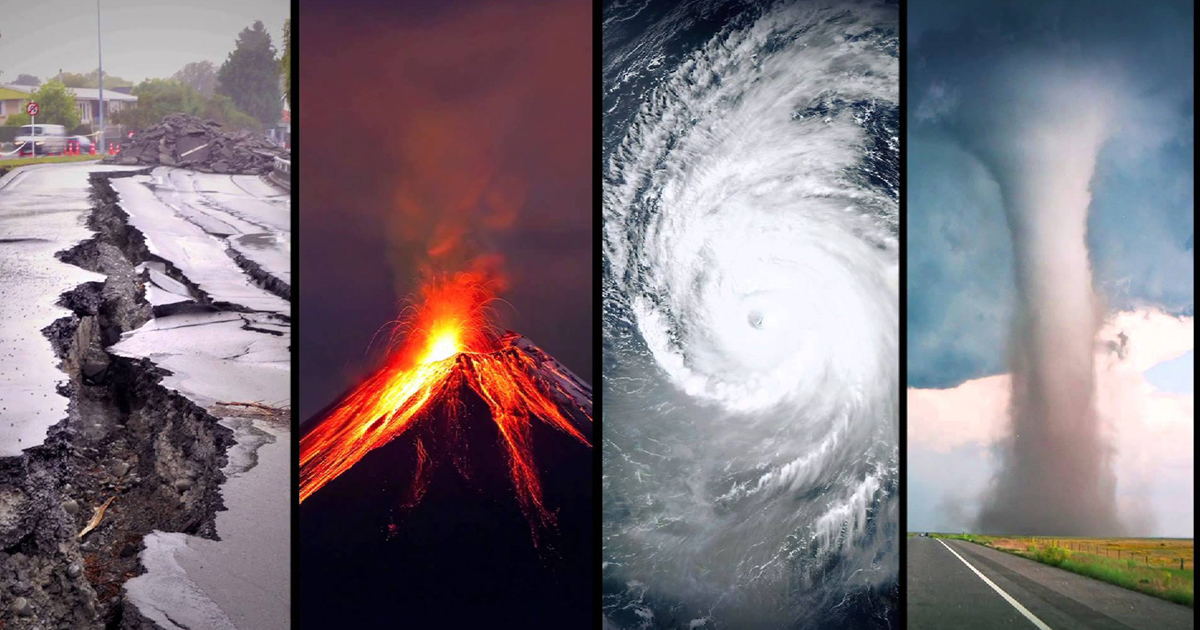
Looking Through Alarmist Glasses

In the aftermath of COP21 in Paris, the Irish Times said this:

Scientists who closely monitored the talks in Paris said it was not the agreement that humanity really needed. By itself, it will not save the planet. The great ice sheets remain imperiled, the oceans are still rising, forests and reefs are under stress, people are dying by tens of thousands in heatwaves and floods, and the agriculture system that feeds 7 billion human beings is still at risk.

That list of calamities looks familiar from insurance policies where they would be defined as “Acts of God.” Before we caught CO2 fever, everyone accepted that natural disasters happened, unpredictably and beyond human control. Now of course, we have computer models to project scenarios where all such suffering will increase and it will be our fault.

For example, from an alarmist US.gov website we are told:

Human-induced climate change has already increased the number and strength of some of these extreme events. Over the last 50 years, much of the U.S. has seen increases in prolonged periods of excessively high temperatures, heavy downpours, and in some regions, severe floods and droughts.

By late this century, models, on average, project an increase in the number of the strongest (Category 4 and 5) hurricanes. Models also project greater rainfall rates in hurricanes in a warmer climate, with increases of about 20% averaged near the center of hurricanes.

Looking Without Alarmist Glasses

But looking at the data without a warmist bias leads to a different conclusion.

The trends in normalized disaster impacts show large differences between regions and weather event categories. Despite these variations, our overall conclusion is that the increasing exposure of people and economic assets is the major cause of increasing trends in disaster impacts. This holds for long-term trends in economic losses as well as the number of people affected.

From this recent study:  On the relation between weather-related disaster impacts, vulnerability and climate change, by Hans Visser, Arthur C. Petersen, Willem Ligtvoet 2014 (open source access here)

Data and Analysis

All the analyses in this article are based on the EM-DAT emergency database. This database is open source and maintained by the World Health Organization (WHO) and the Centre for Research on the Epidemiology of Disasters (CRED) at the University of Louvain, Belgium (Guha-Sapir et al. 2012).

The EM-DAT database contains disaster events from 1900 onwards, presented on a country basis. . .We aggregated country information on disasters to three economic regions: OECD countries, BRIICS countries (Brazil, Russia, India, Indonesia, China and South Africa) and the remaining countries, denoted hereafter as Rest of World (RoW) countries. OECD countries can be seen as the developed countries, BRIICS countries as upcoming economies and RoW as the developing countries.

The EM-DAT database provides three disaster impact indicators for each disaster event: economic losses, the number of people affected and the number of people killed. . .The data show large differences across disaster indicators and regions: economic losses are largest in the OECD countries, the number of people affected is largest in the BRIICS countries and the number of people killed is largest in the RoW countries.
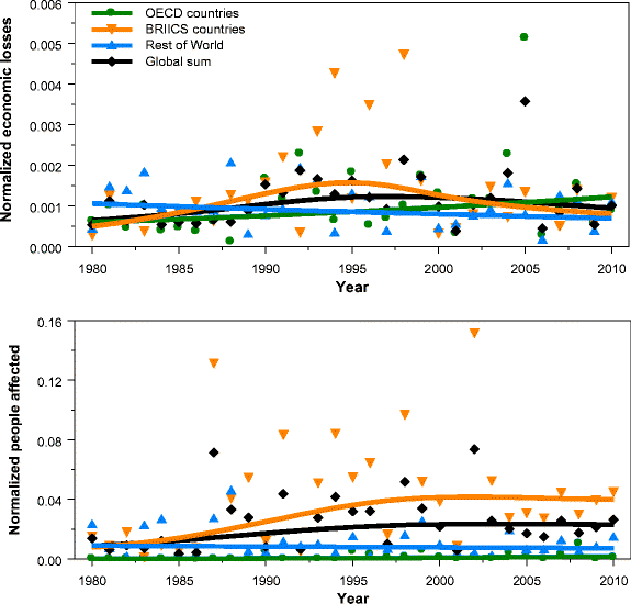
Fig. 3 Economic losses normalized for wealth (upper panel) and the number of people affected normalized for population size (lower panel). Sample period is 1980–2010. Solid lines are IRW trends for the corresponding data.

Fig. 3
Economic losses normalized for wealth (upper panel) and the number of people affected normalized for population size (lower panel). Sample period is 1980–2010. Solid lines are IRW trends for the corresponding data.

The general idea behind normalization is that if we want to detect a climate signal in disaster losses, the role of changes in wealth and population should be ruled out; however, this is complicated by the fact that changes in vulnerability may also play a role. . .(After extensive research), we conclude that quantitative information on time-varying vulnerability patterns is lacking. More qualitatively, we judge that a stable vulnerability V t, as derived in this study, is not in contrast with estimates in the literature.

Climate drivers

Historic trend estimates for weather and climate variables and phenomena are presented in IPCC-SREX (2012, see their table 3-1). The categories ‘winds’, ‘tropical cyclones’ and ‘extratropical cyclones’ coincide with the ‘meteorological events’ category in the CRED database. In the same way, the ‘floods’ category coincides with the CRED ‘hydrological events’ category. The IPCC trend estimates hold for large spatial scales (trends for smaller regions or individual countries could be quite different).

The IPCC table shows that little evidence is found for historic trends in meteorological and hydrological events. Furthermore, Table 1 shows that these two events are the main drivers for (1) economic losses (all regions), (2) the number of people affected (all regions) and (3) the number of people killed (BRIICS countries only). Thus, trends in normalized data and climate drivers are consistent across these impact indicators and regions.

Summary

People who are proclaiming that disasters rise with fossil fuel emissions are flying in the face of the facts, and in denial of IPCC scientists.

Trends in normalized data show constant, stabilized patterns in most cases, a result consistent with findings reported in Bouwer (2011a) and references therein, Neumayer and Barthel (2011) and IPCC-SREX (2012).

The absence of trends in normalized disaster burden indicators appears to be largely consistent with the absence of trends in extreme weather events.

For more on attributing x-weather to climate change see: X-Weathermen Are Back

Addendum on Wildfires

Within all the coverage of the Fort McMurray Alberta wildfire, there have also been lazy journalists linking the event to fossil fuel-driven global warming, with a special delight of this being located near the oil sands.  The best call to reason has come from A Chemist in Langley, who argues for defensible science against mindless activism.  Of course, he has taken some heat for being so rational.

Here is what he said about the data and the models regarding boreal forest wildfires:

Well the climate models indicate that in the long-term (by the 2091-2100 fire regimes) climate change, if it continues unabated, should result in increased number and severity of fires in the boreal forest. However, what the data says is that right now this signal is not yet evident. While some increases may be occurring in the sub-arctic boreal forests of northern Alaska, similar effects are not yet evident in the southern boreal forests around Fort McMurray.

My final word is for the activists who are seeking to take advantage of Albertans’ misfortunes to advance their political agendas. Not only have you shown yourselves to be callous and insensitive at a time where you could have been civilized and sensitive but you cannot even comfort yourself by hiding under the cloak of truth since, as I have shown above, the data does not support your case.

Data vs. Models #2: Droughts and Floods

This post compares observations with models’ projections regarding variable precipitation across the globe.

There have been many media reports that global warming produces more droughts and more flooding. That is, the models claim that dry places will get drier and wet places will get wetter because of warmer weather. And of course, the models predict future warming because CO2 continues to rise, and the model programmers believe only warming, never cooling, can be the result.

Now we have a recent data-rich study of global precipitation patterns and the facts on the ground lead the authors to a different conclusion.

Stations experiencing low, moderate and heavy annual precipitation did not show very different precipitation trends. This indicates deserts or jungles are neither expanding nor shrinking due to changes in precipitation patterns. It is therefore reasonable to conclude that some caution is warranted about claiming that large changes to global precipitation have occurred during the last 150 years.

The paper (here) is:

Changes in Annual Precipitation over the Earth’s Land Mass excluding Antarctica from the 18th century to 2013 W. A. van Wijngaarden, Journal of Hydrology (2015)

Study Scope

Fig. 1. Locations of stations examined in this study. Red dots show the 776 stations having 100–149 years of data, green dots the 184 stations having 150–199 years of data and blue dots the 24 stations having more than 200 years of data.

Fig. 1. Locations of stations examined in this study. Red dots show the 776 stations having 100–149 years of data, green dots the 184 stations having 150–199 years of data
and blue dots the 24 stations having more than 200 years of data.

This study examined the percentage change of nearly 1000 stations each having monthly totals of daily precipitation measurements for over a century. The data extended from 1700 to 2013, although most stations only had observations available beginning after 1850. The percentage change in precipitation relative to that occurring during 1961–90 was plotted for various countries as well as the continents excluding Antarctica. 

There are year to year as well as decadal fluctuations of precipitation that are undoubtedly influenced by effects such as the El Nino Southern Oscillation (ENSO) (Davey et al., 2014) and the North Atlantic Oscillation (NAO) (Lopez-Moreno et al., 2011). However, most trends over a prolonged period of a century or longer are consistent with little precipitation change.Similarly, data plotted for a number of countries and or regions thereof that each have a substantial number of stations, show few statistically significant trends.

Fig. 8. Effect of total precipitation on percentage precipitation change relative to 1961–90 for stations having total annual precipitation (a) 1000 mm. The red curve is the moving 5 year average while the blue curve shows the number of stations. Considering only years having at least 10 stations reporting data, the trends in units of % per century are: (a) 1.4 ± 2.8 during 1854–2013, (b) 0.9 ± 1.1 during 1774–2013 and (c) 2.4 ± 1.2 during 1832–2013.

Fig. 8. Effect of total precipitation on percentage precipitation change relative to 1961–90 for stations having total annual precipitation (a) less than 500 mm, (b) 500 to 1000 mm, (c) more than 1000 mm. The red curve is the moving 5 year average while the blue curve shows the number of stations. Considering only years having at least 10 stations reporting data, the trends in units of % per century are: (a) 1.4 ± 2.8 during 1854–2013, (b) 0.9 ± 1.1 during 1774–2013 and (c) 2.4 ± 1.2 during 1832–2013.

Fig. 8 compares the percentage precipitation change for dry stations (total precipitation <500 mm), stations experiencing moderate rainfall (between 500 and 1000 mm) and wet stations (total precipitation >1000 mm). There is no dramatic difference. Hence, one cannot conclude that dry areas are becoming drier nor wet areas wetter.

Summary

The percentage annual precipitation change relative to 1961–90 was plotted for 6 continents; as well as for stations at different latitudes and those experiencing low, moderate and high annual precipitation totals. The trends for precipitation change together with their 95% confidence intervals were found for various periods of time. Most trends exhibited no clear precipitation change. The global changes in precipitation over the Earth’s land mass excluding Antarctica relative to 1961–90 were estimated to be:

Periods % per Century
 1850–1900 1.2 ± 1.7
 1900–2000 2.6 ± 2.5
 1950–2000 5.4 ± 8.1

A change of 1% per century corresponds to a precipitation change of 0.09 mm/year or 9 mm/century.

As a background for how precipitation is distributed around the world, see the post: Here Comes the Rain Again. Along with temperatures, precipitation is the other main determinant of climates, properly understood as distinctive local and regional patterns of weather.  As the above study shows, climate change from precipitation change is vanishingly small.

Data vs. Models #1 was Arctic Warming.


Look in the Past for Extreme Weather

Recently I posted X-Weathermen are Back on news stories claiming that extreme weather events can be tied to global warming.  As Mike Hulme explained, the methods do not support those attributions.

Now we have a study looking at extreme weather in the past and concluding: Climate data since Vikings cast doubt on more wet, dry extremes.  It seems that our weather today is quite tame by comparison. There are the usual comments assuring readers that this in no way contradicts global warming doctrine.  But the conclusions say otherwise:

Climate records back to Viking times show the 20th century was unexceptional for rainfall and droughts despite assumptions that global warming would trigger more wet and dry extremes, a study showed on Wednesday.

Stretching back 1,200 years, written accounts of climate and data from tree rings, ice cores and marine sediments in the northern hemisphere indicated that variations in the extremes in the 20th century were less than in some past centuries.

“Several other centuries show stronger and more widespread extremes,” lead author Fredrik Ljungqvist of Stockholm University told Reuters of findings published in the journal Nature. “We can’t say it’s more extreme now.”

Ljungqvist said many existing scientific models of climate change over-estimated assumptions that rising temperatures would make dry areas drier and wet areas wetter, with more extreme heatwaves, droughts, downpours and droughts.

The 10th century, when the Vikings were carrying out raids across Europe and the Song dynasty took power in China, was the wettest in the records ahead of the 20th, according to the researchers in Sweden, Germany, Greece and Switzerland.

And the warm 12th century and the cool 15th centuries, for instance, were the driest, according to the report, based on 196 climate records. Variations in the sun’s output were among factors driving natural shifts in the climate in past centuries.

“This paper adds to the growing evidence that the simple paradigm of ‘wet-gets-wetter, dry-gets-drier’ under a warming climate does not apply over land areas,” said Ted Shepherd, a professor at the University of Reading.

For more on how rainfall is distributed across the globe see Here Comes the Rain Again

Rainbow signifying the promise of safety from global flooding