
Arctic Ice Aplenty at Annual Dip September 2025

After a sub-par March maximum, by end of May 2025 Arctic ice closed the gap with the 19-year average.  In mid-August MASIE showed the Arctic ice extent matching the 19-year average.  Mid month Arctic ice went above average and remained in surplus, ranging from a high of +231k km2 to +160k km2 at end of August. Now during the annual minimum month of September 2025 there is  Arctic ice aplenty.

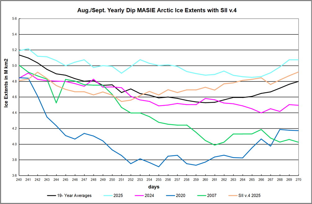
During the annual dip in Arctic ice extent, the average year since 2006 is lowest on day 260 at 4.53M km2.  It then rises to 4.8M km2 ten days later.  The cyan line shows 2025 above average throughout, its lowest extent at 4.85M km2 on day 265, and now up to 5.07M km2.  SII v.4 was lower than MASIE throughout, but has drawn closer in recent days.  So far MASIE September average is 5.0M and SII is 4.7M, with 4 more days remaining in the month. Note 2007 was ~800k km2 in deficit, 2020 ~600k down at day 270, while last year was ~300k below average.

The regional distribution of ice extents is shown in the table below. (Bering and Okhotsk seas are excluded since both are now virtually open water.)

Region 2025270 Day 270 ave. 2025-Ave. 2007270 2025-2007
 (0) Northern_Hemisphere 5074777 4798758 276018 4023569 1051207
 (1) Beaufort_Sea 483527 520730 -37203 482030 1497
 (2) Chukchi_Sea 332213 210352 121861 214 331999
 (3) East_Siberian_Sea 499915 280923 218992 311 499604
 (4) Laptev_Sea 273431 152794 120636 238340 35091
 (5) Kara_Sea 4906 33680 -28774 15113 -10207
 (6) Barents_Sea 0 12945 -12945 4851 -4851
 (7) Greenland_Sea 165160 225916 -60756 339720 -174560
 (8) Baffin_Bay_Gulf_of_St._Lawrence 70284 47480 22804 43624 26660
 (9) Canadian_Archipelago 302771 336303 -33533 280360 22410
 (10) Hudson_Bay 2415 2252 163 1936 479
 (11) Central_Arctic 2938588 2974115 -35527 2615795.38 322792

The table shows large surpluses in Eurasian basins  Laptev, Chukchi and E. Siberian, more than offsetting smaller deficits in Central Arctic, CAA and Greenland seas. Hudson Bay is mostly open water at this time of year. 2025 exceeds the average ice extents by 276k km2, or 6%, and is over 1 wadham greater than 2007 or a surplus of 1.05M km2 of ice extent.

September monthly average ice extent is considered the annual minimum for climate purposes.  Note also that typically the lowest daily value occurs mid September, with a small positive gain between the end of August and end of September.

Why is this important?  All the claims of global climate emergency depend on dangerously higher  temperatures, lower sea ice, and rising sea levels.  The lack of additional warming prior to 2023 El Nino is documented in a post SH Drives UAH Temps Cooler July 2025.

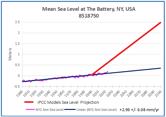
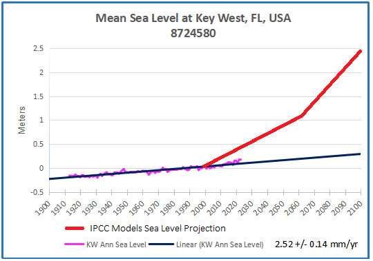
The lack of acceleration in sea levels along coastlines has been discussed also.  See Observed vs. Imagined Sea Levels 2023 Update

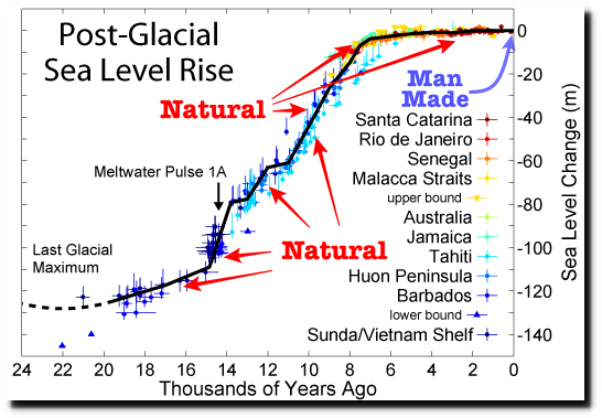
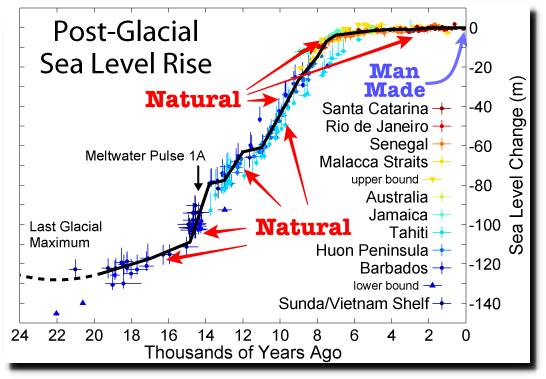
Also, a longer term perspective is informative:

post-glacial_sea_level

Footnote Regarding  SII v.4

NSDIC acknowledged my query regarding the SII (Sea Ice Index) dataset. While awaiting an explanation I investigated further. My last download of the SII Daily Arctic Ice Extents was on July 30, meaning that the most recent data in that file was day 210, July 29. The header on that file was Sea_Ice_Index_Daily_Extent_G02135_v3.

Then on August 1, the downloaded file had the heading Sea_Ice_Index_Daily_Extent_G02135_v4. So it appears that these are now the values from a new version of SII. As I wrote in my query, since March 14 all of the values for Arctic Ice Extents are lower in this new record. The graph above shows the implications for August as an example of estimates from SIIv.4.

In the past, SIIv.3 tracked MASIE with slightly lower values.  But with v.4, larger monthly average deficits to MASIE were reported in July 2025 ( -282k km2) and in August (-440k km2).

The change started in January 2025 and will be the basis for future reporting.  The logic for this is presented in this document: Sea Ice Index Version 4 Analysis

In June 2025, NSIDC was informed that access to data from the Special Sensor Microwave
Imager/Sounder (SSMIS) onboard the Defense Meteorological Satellite Program (DMSP)
satellites would end on July 31 (NSIDC, 2025). To prepare for this, we rapidly developed version
4 of the Sea Ice Index. This new version transitions from using sea ice concentration fields
derived from SSMIS data as input to using fields derived from the Advanced Microwave
Scanning Radiometer 2 (AMSR2) sensor onboard the Global Change Observation Mission – W1
(GCOM-W1) satellite.  On 29 July 2025, we learned that the Defense Department decision to terminate access to DMSP data had been reversed and that data will continue to be available until September 2026.

We are publishing Version 4, however, for these reasons:

• The SSMIS instruments are well past their designed lifespan and a transition to
AMSR2 is inevitable. Unless the sensors fail earlier, the DoD will formally end the
program in September 2026.
• Although access of SSMIS will continue through September 2026, the Fleet
Numerical Meteorology and Oceanography Center (FNMOC), where SSMIS data
from the DMSP satellite are downloaded, made an announcement that “Support
will be on a best effort basis and should be considered data of opportunity.” This
means that SSMIS data will likely contain data gaps.
• We have developer time to make this transition now and may not in the future.
• We are confident that Version 4 data are commensurate in accuracy to those
provided by Version 3.

Advance Briefing for COP30 Belém 2025


Overview from E Co. A summit at the crossroads

When the world gathers in Belém, Brazil, in November 2025 for COP30, it won’t be just another climate conference. It will be the first major summit after the Paris Agreement’s initial Global Stocktake at COP28, and the moment where climate ambition must decisively shift from words to delivery.

As many observers have begun to remark in the run-up to COP30, “Belém is where the climate community will be asked to prove that promises can become practice.”

What’s at stake at COP30

The Brazilian presidency has laid out a clear mandate: COP30 must focus on implementation, inclusion, and innovation. In practical terms, that means:

♦  A ‘Belém Package’ of outcomes across forests, finance, adaptation, just transition, and gender.
♦  The formal launch of the Tropical Forest Forever Facility (TFFF), a proposed $125 billion results-based finance mechanism to incentivise forest conservation.
♦  Progress on a roadmap to mobilize $1.3 trillion annually in climate finance by 2035, building on the ‘Baku to Belém’ finance commitments made at COP29.
♦  New modalities for inclusive governance, such as Brazil’s proposed ‘Global Mutirão’, bringing Indigenous peoples, local governments, and civil society closer to the heart of climate decision-making .

COP30 will not be judged by the number of new pledges it produces. As several analysts have argued, it will be remembered “for whether the world found the tools to finally deliver on them.”

The main challenges Brazil faces

While Brazil has bold ambitions for COP30, turning them into concrete outcomes will not be easy. The presidency faces several challenges:

  1. Domestic contradictions: Despite progress under President Lula, agribusiness and mining interests remain powerful drivers of deforestation. Balancing economic pressures with climate leadership will test political resolve.
  2. Financing the transition: Brazil is pushing for massive climate finance scaling, but securing commitments for the $1.3 trillion annual target will be politically contentious, especially given donor fatigue and fiscal constraints in developed economies.
  3. Geopolitical polarisation: COP30 is the first climate summit taking place without strong U.S. engagement, given Washington’s announced withdrawal from the Paris Agreement in 2026 . This leaves Brazil trying to mediate between the EU, China, BRICS, and vulnerable countries, all with diverging agendas.
  4. Institutional fragility: While Brazil champions new governance ideas like a UN Climate Change Council, consensus on reforming multilateral processes is difficult. Many countries remain wary of ceding more authority to new structures.
  5. Logistics and credibility: Hosting COP30 in Belém is symbolically powerful but practically challenging. The Amazonian city faces infrastructure constraints, raising concerns about logistics, inclusivity, and whether Brazil can deliver an event of this scale smoothly.

“Brazil has set the bar high. But if expectations outpace deliverables, COP30 risks being remembered as another missed opportunity.”

My Comments
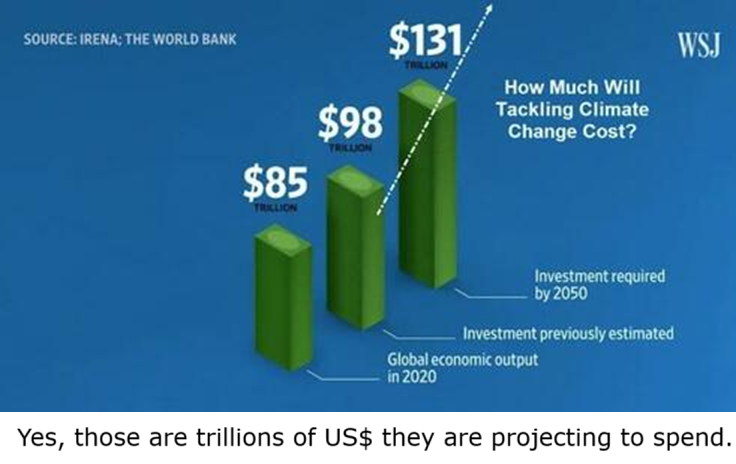
Since there is a big push on climate funding, maybe they could get to the bottom of this.

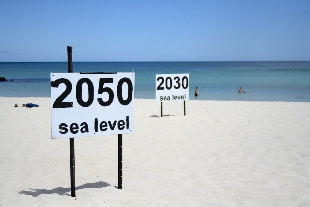
Maybe donors are put off by no one knowing who gets the money and for what it is spent.  And while they are investigating, how about understanding Energy Return on Investment (EROI): you know, the notion that an energy project is worth doing if the energy produced is greater than energy spent.  The poster at the top reminds of people dreaming of a world free of fossil fuels.

Why a COP Briefing?

Actually, climate hysteria is like a seasonal sickness.  Each year a contagion of anxiety and fear is created by disinformation going viral in both legacy and social media in the run up to the annual autumnal COP.  Since the climatists are especially desperate with the US outspokenly against the climate movement, we can expect the public will be hugely hosed with alarms over the next few weeks.  Before the distress signals go full tilt, individuals need to inoculate themselves against the false claims, in order to build some herd immunity against the nonsense the media will promulgate. This post is offered as a means to that end.

Media Climate Hype is a Cover Up

Back in 2015 in the run up to Paris COP, French mathematicians published a thorough critique of the raison d’etre of the whole crusade. They said:

Fighting Global Warming is Absurd, Costly and Pointless.

  • Absurd because of no reliable evidence that anything unusual is happening in our climate.
  • Costly because trillions of dollars are wasted on immature, inefficient technologies that serve only to make cheap, reliable energy expensive and intermittent.
  • Pointless because we do not control the weather anyway.

The prestigious Société de Calcul Mathématique (Society for Mathematical Calculation) issued a detailed 195-page White Paper presenting a blistering point-by-point critique of the key dogmas of global warming. The synopsis with links to the entire document is at COP Briefing for Realists

Even without attending to their documentation, you can tell they are right because all the media climate hype is concentrated against those three points.

Finding: Nothing unusual is happening with our weather and climate.
Hype: Every metric or weather event is “unprecedented,” or “worse than we thought.”

Finding: Proposed solutions will cost many trillions of dollars for little effect or benefit.
Hype: Zero carbon will lead the world to do the right thing.  Anyway, the planet must be saved at any cost.

Finding: Nature operates without caring what humans do or think.
Hype: Any destructive natural event is blamed on humans burning fossil fuels.

How the Media Throws Up Flak to Defend False Suppositions

The Absurd Media:  Climate is Dangerous Today, Yesterday It was Ideal.

Billions of dollars have been spent researching any and all negative effects from a warming world: Everything from Acne to Zika virus.  A recent Climate Report repeats the usual litany of calamities to be feared and avoided by submitting to IPCC demands. The evidence does not support these claims. An example:

 It is scientifically established that human activities produce GHG emissions, which accumulate in the atmosphere and the oceans, resulting in warming of Earth’s surface and the oceans, acidification of the oceans, increased variability of climate, with a higher incidence of extreme weather events, and other changes in the climate.

Moreover, leading experts believe that there is already more than enough excess heat in the climate system to do severe damage and that 2C of warming would have very significant adverse effects, including resulting in multi-meter sea level rise.

Experts have observed an increased incidence of climate-related extreme weather events, including increased frequency and intensity of extreme heat and heavy precipitation events and more severe droughts and associated heatwaves. Experts have also observed an increased incidence of large forest fires; and reduced snowpack affecting water resources in the western U.S. The most recent National Climate Assessment projects these climate impacts will continue to worsen in the future as global temperatures increase.

Alarming Weather and Wildfires

But: Weather is not more extreme.


And Wildfires were worse in the past.
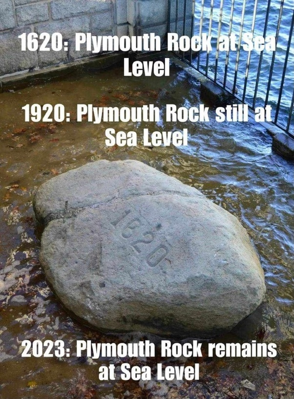
But: Sea Level Rise is not accelerating.

post-glacial_sea_level

Litany of Changes

Seven of the ten hottest years on record have occurred within the last decade; wildfires are at an all-time high, while Arctic Sea ice is rapidly diminishing.

We are seeing one-in-a-thousand-year floods with astonishing frequency.

When it rains really hard, it’s harder than ever.

We’re seeing glaciers melting, sea level rising.

The length and the intensity of heatwaves has gone up dramatically.

Plants and trees are flowering earlier in the year. Birds are moving polewards.

We’re seeing more intense storms.

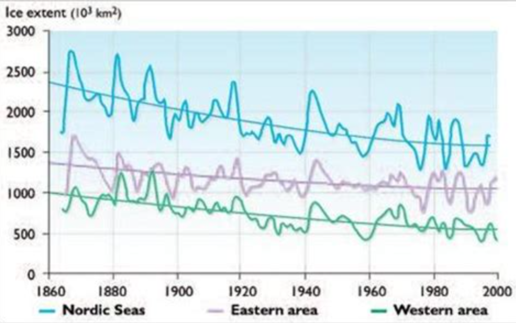
But: Arctic Ice has not declined since 2007.

But: All of these are within the range of past variability.In fact our climate is remarkably stable, compared to the range of daily temperatures during a year where I live.

And many aspects follow quasi-60 year cycles.
The Impractical Media:  Money is No Object in Saving the Planet.

Here it is blithely assumed that the UN can rule the seas to stop rising, heat waves to cease, and Arctic ice to grow (though why we would want that is debatable).  All this will be achieved by leaving fossil fuels in the ground and powering civilization with windmills and solar panels.  While admitting that our way of life depends on fossil fuels, they ignore the inadequacy of renewable energy sources at their present immaturity.

An Example:
The choice between incurring manageable costs now and the incalculable, perhaps even irreparable, burden Youth Plaintiffs and Affected Children will face if Defendants fail to rapidly transition to a non-fossil fuel economy is clear. While the full costs of the climate damages that would result from maintaining a fossil fuel-based economy may be incalculable, there is already ample evidence concerning the lower bound of such costs, and with these minimum estimates, it is already clear that the cost of transitioning to a low/no carbon economy are far less than the benefits of such a transition. No rational calculus could come to an alternative conclusion. Defendants must act with all deliberate speed and immediately cease the subsidization of fossil fuels and any new fossil fuel projects, and implement policies to rapidly transition the U.S. economy away from fossil fuels.

But CO2 relation to Temperature is Inconsistent.

But: The planet is greener because of rising CO2.

But: Modern nations (G20) depend on fossil fuels for nearly 90% of their energy.

But: Renewables are not ready for prime time.

People need to know that adding renewables to an electrical grid presents both technical and economic challenges.  Experience shows that adding intermittent power more than 10% of the baseload makes precarious the reliability of the supply.  South Australia is demonstrating this with a series of blackouts when the grid cannot be balanced.  Germany got to a higher % by dumping its excess renewable generation onto neighboring countries until the EU finally woke up and stopped them. Texas got up to 29% by dumping onto neighboring states, and some like Georgia are having problems.

But more dangerous is the way renewables destroy the economics of electrical power.  Seasoned energy analyst Gail Tverberg writes:

In fact, I have come to the rather astounding conclusion that even if wind turbines and solar PV could be built at zero cost, it would not make sense to continue to add them to the electric grid in the absence of very much better and cheaper electricity storage than we have today. There are too many costs outside building the devices themselves. It is these secondary costs that are problematic. Also, the presence of intermittent electricity disrupts competitive prices, leading to electricity prices that are far too low for other electricity providers, including those providing electricity using nuclear or natural gas. The tiny contribution of wind and solar to grid electricity cannot make up for the loss of more traditional electricity sources due to low prices.

These issues are discussed in more detail in the post Climateers Tilting at Windmills

The Irrational Media:  Whatever Happens in Nature is Our Fault.

An Example:

Other potential examples include agricultural losses. Whether or not insurance
reimburses farmers for their crops, there can be food shortages that lead to higher food
prices (that will be borne by consumers, that is, Youth Plaintiffs and Affected Children).
There is a further risk that as our climate and land use pattern changes, disease vectors
may also move (e.g., diseases formerly only in tropical climates move northward).36 This
could lead to material increases in public health costs

But: Actual climate zones are local and regional in scope, and they show little boundary change.

But: Ice cores show that it was warmer in the past, not due to humans.

The hype is produced by computer programs designed to frighten and distract children and the uninformed.  For example, there was mention above of “multi-meter” sea level rise.  It is all done with computer models.  For example, below is San Francisco.  More at USCS Warnings of Coastal Floodings

In addition, there is no mention that GCMs projections are running about twice as hot as observations.

Omitted is the fact GCMs correctly replicate tropospheric temperature observations only when CO2 warming is turned off.

Figure 5. Simplification of IPCC AR5 shown above in Fig. 4. The colored lines represent the range of results for the models and observations. The trends here represent trends at different levels of the tropical atmosphere from the surface up to 50,000 ft. The gray lines are the bounds for the range of observations, the blue for the range of IPCC model results without extra GHGs and the red for IPCC model results with extra GHGs.The key point displayed is the lack of overlap between the GHG model results (red) and the observations (gray). The nonGHG model runs (blue) overlap the observations almost completely.

In the effort to proclaim scientific certainty, neither the media nor IPCC discuss the lack of warming since the 1998 El Nino, despite two additional El Ninos in 2010 and 2016, plus an unexplained spike in 2023-24, now cooling off.

Further they exclude comparisons between fossil fuel consumption and temperature changes. The legal methodology for discerning causation regarding work environments or medicine side effects insists that the correlation be strong and consistent over time, and there be no confounding additional factors. As long as there is another equally or more likely explanation for a set of facts, the claimed causation is unproven. Such is the null hypothesis in legal terms: Things happen for many reasons unless you can prove one reason is dominant.

Finally, advocates and IPCC are picking on the wrong molecule. The climate is controlled not by CO2 but by H20. Oceans make climate through the massive movement of energy involved in water’s phase changes from solid to liquid to gas and back again. From those heat transfers come all that we call weather and climate: Clouds, Snow, Rain, Winds, and Storms.

Esteemed climate scientist Richard Lindzen ended a very fine recent presentation with this description of the climate system:

I haven’t spent much time on the details of the science, but there is one thing that should spark skepticism in any intelligent reader. The system we are looking at consists in two turbulent fluids interacting with each other. They are on a rotating planet that is differentially heated by the sun. A vital constituent of the atmospheric component is water in the liquid, solid and vapor phases, and the changes in phase have vast energetic ramifications. The energy budget of this system involves the absorption and reemission of about 200 watts per square meterDoubling CO2 involves a 2% perturbation to this budget. So do minor changes in clouds and other features, and such changes are common. In this complex multifactor system, what is the likelihood of the climate (which, itself, consists in many variables and not just globally averaged temperature anomaly) is controlled by this 2% perturbation in a single variable? Believing this is pretty close to believing in magic. Instead, you are told that it is believing in ‘science.’ Such a claim should be a tip-off that something is amiss. After all, science is a mode of inquiry rather than a belief structure.
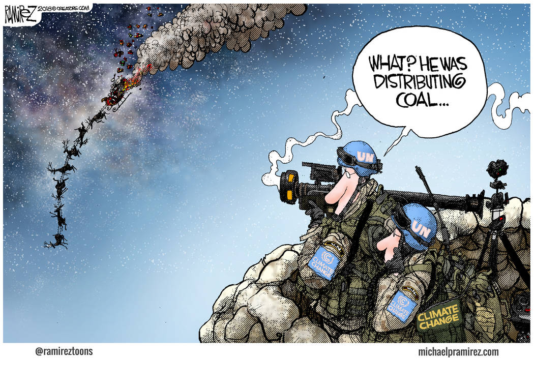
Summary:  From this we learn three things:

Climate warms and cools without any help from humans.
Warming is good and cooling is bad.
The hypothetical warming from CO2 would be a good thing.

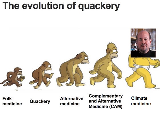


Climate Medical Quackery Exposed

The following 65 page report was Submitted September 19, 2025 by physicians Dr. D. Weston Allen, Dr. Jan Breslow, and Dr. Daniel Nebert CO2 Coalition Comment on Reconsideration of 2009 Endangerment Finding and Greenhouse Gas Vehicle Standards  Excerpts in italics with my bolds and added images.

Table of Contents
Climate Change and Health …………………………………………………………………………………… 3
Introduction……………………………………………………………………………………………………. 3
Warmth, Wealth and Health……………………………………………………………………………….. 3
Temperature, Morbidity and Mortality ………………………………………………………………….. 6
Future Warming ……………………………………………………………………………………………. 10
Temperature Extremes…………………………………………………………………………………….. 12
Temperature and Disease Vectors………………………………………………………………………. 15
Extreme Weather Events………………………………………………………………………………….. 24
Food, Famine, Climate and CO2 ………………………………………………………………………….. 33
Mental Health……………………………………………………………………………………………….. 37
Energy Sources and Health……………………………………………………………………………….. 39
Conclusion……………………………………………………………………………………………………. 44
References……………………………………………………………………………………………………. 45

Some examples of Climate Medical Mischief

Introduction

Human health, morbidity, mortality and longevity are significantly impacted by climate. This review examines the evidence for past, present and possible future human health impacts of climate change and its ramifications. It will also examine the health impacts of different energy sources and climate actions. It will not examine every link in the literature to a range of conditions where attribution is implausible or tenuous, or where association assumes causation.

Warmth, Wealth and Health

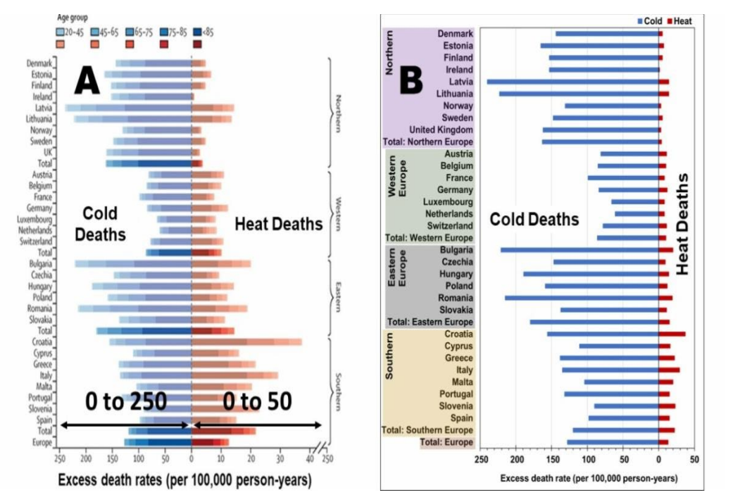
Davis et al (2003)23 found a 74.4% decline in heat-related mortality in 28 of the largest U.S. cities from 1964 to 1998 and estimated that another 1⁰C increase would further reduce the net mortality rate.24 Analyzing over 74 million deaths in 384 locations across 13 countries, Gasparrini et al (2015)25 found that cold weather was over 17 times more lethal than hot weather: 7.3% of all deaths due to cold and 0.42% from heat. Masselot et al (2023) found cold weather to be ten times more lethal than hot weather across Europe and forty times more so in northern Europe.26 Their visual display of this difference (Fig. 1) was camouflaged by making the X-axis for heat-related deaths 5.6 times greater than the X-axis for cold-related deaths!

Figure 1: Temperature-related mortality in European cities from Masselot et al. 2023 (A) As depicted in the Lancet (B) Identical X-axis for heat and cold, corrected by the CO2 Coalition

Temperature and Diseases

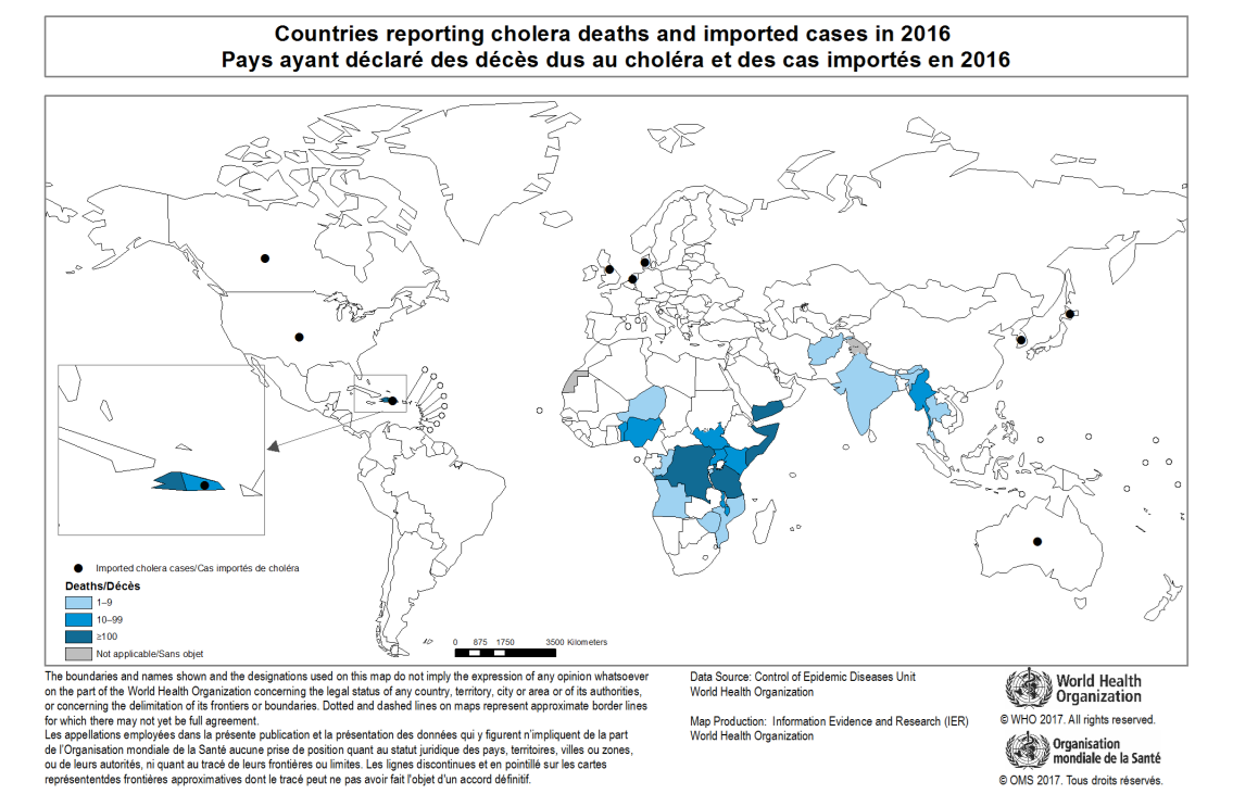
Cholera, which afflicts 3-5 million people and kills about 100,000 annually,76 is now confined to developing countries in the tropics and subtropics (Fig. 5). When an epidemic broke out in London in 1848, Dr. John Snow performed the world’s first epidemiological studies in linking itto contaminated water. Nearly a century and a half later, a paper in the prestigious journal Science77 linked a 1991 outbreak in South America to climate change. The real cause, however, was a failure of the Peruvian authorities to properly chlorinate water supplies.78 Climate change can be a convenient scapegoat for government failure!

Temperature Extremes

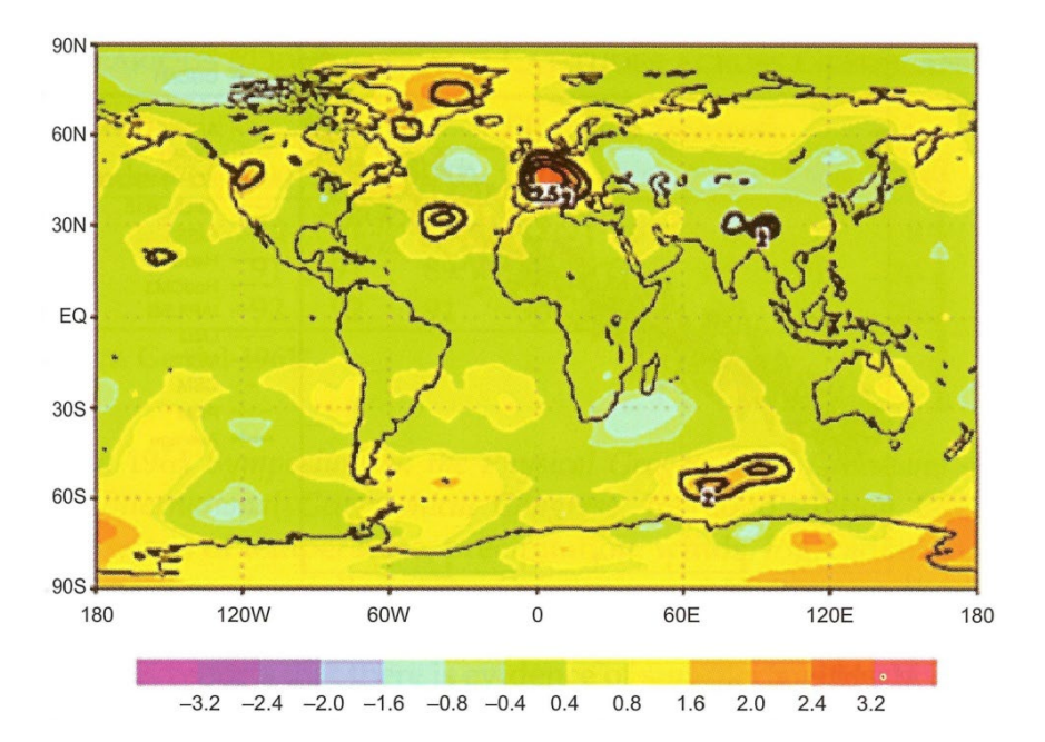
Deadly heatwaves such as the European one in 2003 are often attributed to climate change.93
Temperatures elsewhere across the globe at the time, however, were normal or below normal (Fig.
7).94

Figure 7: Global tropospheric temperature anomalies, June-August 2003. Source: Chase et al. (2006)

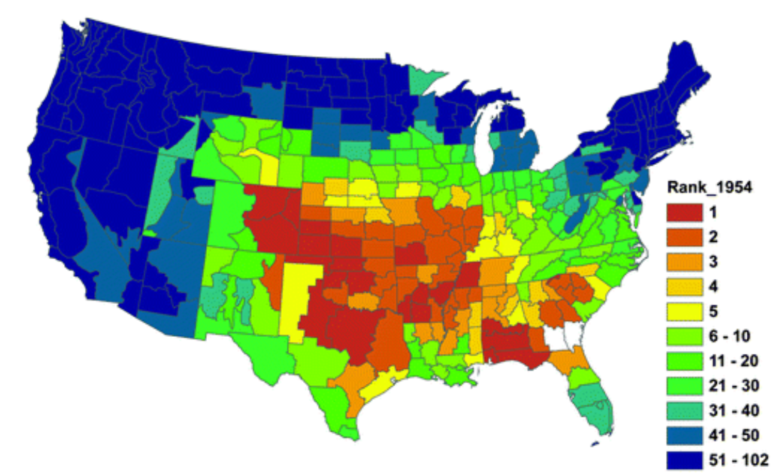
The 1936 North American heatwave during the Dust Bowl decade set record temperatures across 14 states, reaching 49⁰C in Steele, North Dakota, and killed at least 5,000 people.99 The 1954 summer-long heatwave across the Midwest, reaching 117⁰F (47.2⁰C) in East St Louis, ranks as the hottest in 11 states (Fig. 8) based on an analysis of Midwest temperature records from 1845 to 2009.100 Nancy Westcott (2011) also found a reducing trend of heatwaves over the 20th century.

Figure 8: Rank of the June–September 1954 heat wave based on National Climatic Data Center (NCDC) climate division temperature data for the years 1895–2009. Source: Westcott (2011)

Temperature and Disease Vectors

West Nile Virus (WNV) was first identified in a West Nile district of Uganda in 1937. It is asymptomatic in 80% of infected people but can cause severe encephalitis or meningitis in about 1 in 150 infected persons, especially the elderly or immunocompromised. It is transmitted by a Culex species of mosquito that has bitten an infected bird (not human). Appearing in New York in 1999 and spreading across the states taking hundreds of lives, it was soon linked to climate change. 173 174 But its rapid spread from northeast to the south and west (Fig. 12) and its decline despite warming (Figs. 13 and 14) indicates that the vector was already there and climate change had nothing to do with that.

Figure 12: Progress of WNV in the U.S. 1999-2003. White 0, Blue <1%, Green1-5%, Yellow 5-10%, Red >10%

Food, Famine, Climate and CO2

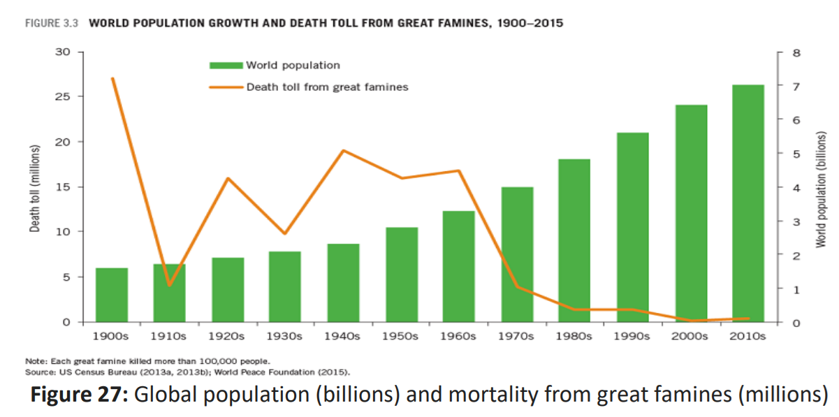
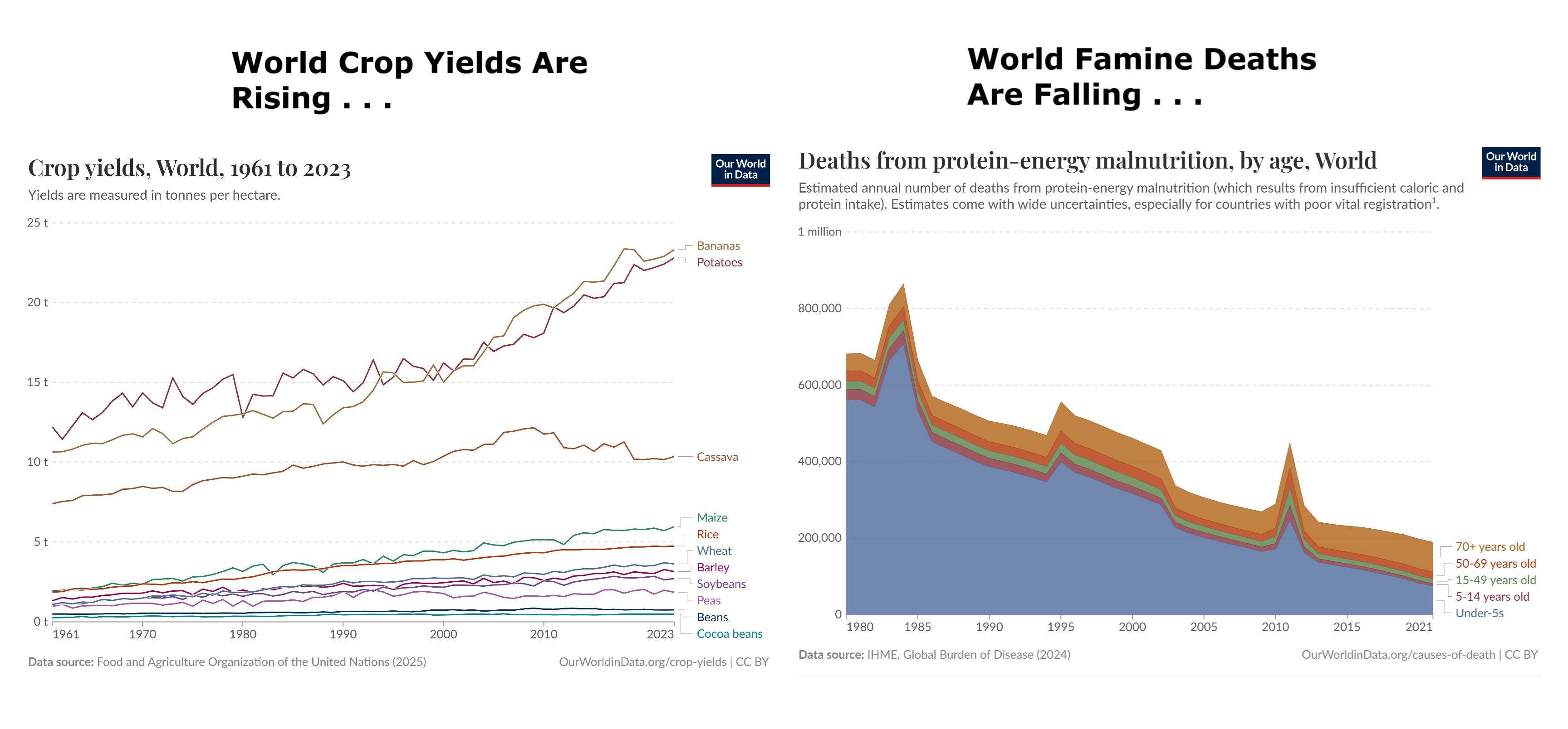
In his 1968 book The Population Bomb, Paul Ehrlich predicted widespread famine with hundreds of millions starving to death in the 1970s, but the death toll declined as the population grew
(Fig. 27).

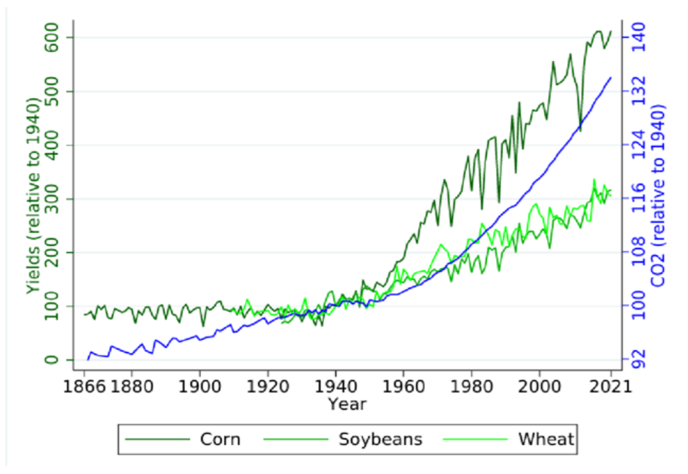
The U.S. National Bureau of Economic Research matched satellite-based observations of outdoor CO2 levels across the U.S. with county-level agricultural output data and other economic variables and concluded that CO2 emissions had boosted U.S. crop production since 1940 by 50 to 80%, much larger than previous estimations using FACE experiments, and found that every ppm of increase in CO2 boosts corn yields by 0.5%, soybeans by 0.6%, and wheat by 0.8 % (Fig. 29).305

Figure 29: U.S. average CO2 levels and yields of corn, soy and wheat all normalized so 1940=100. Source: Taylor and Schlenker (2023)

Mental Health

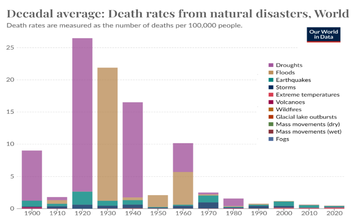
Dire predictions are often based on flawed models, exaggerations, wild imaginations and a failure to factor in human ingenuity.335 Predictions made in the 1970s of an impending ice age, falling crop yields, increasing global famine, advancing deserts, a pesticide-induced cancer epidemic, of oil, gas and other resources rapidly running out, were not only wrong but the very opposite has happened.

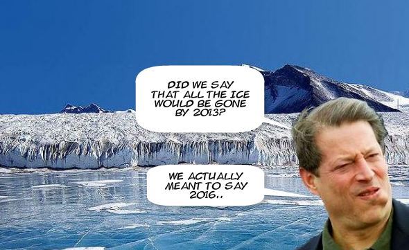
More recent predictions of malaria spreading across the globe, Arctic ice disappearing by 2013, increasing droughts and tropical cyclones have all failed to materialize. Indeed, the world has never been safer than now (Fig. 30).

The academic left first quarreled with science339 before capturing, corrupting and politicizing it. They then ignored quantitative uncertainties343 to contrive a catastrophic climate change consensus, calling sceptics deniers and inventing a climate crisis and global boiling to foster fear, funding and a rush to renewables. Anthropocentric purists prohibit alternative diagnoses, prognoses, priorities or remedies and suspect fossil fuel funding behind anyone challenging “The Science”. Climate change does impact the poorest the most but, as we shall see in the next section, a lucrative climate industry makes them even poorer and more vulnerable.

Conclusion

Warmth is good for human health and prosperity. Fossil fuels have played a vital role in providing the wealth essential for health and environmental protection. They have also boosted atmospheric CO2 and added a little warmth, both being hitherto beneficial overall for plants and people. The ingenuity of Homo sapiens at adapting to climate has permitted people to populate almost the entire globe from the freezing Arctic to the steamy tropics. If we stick to doing what we do best – adaptation – we will continue to thrive.

We must be prepared not only for global warming, but also for global cooling,
which will surely occur as our present warm Holocene draws to its inevitable end.

Human health and that of the planet depends on balancing productivity and development with conservation and environmental protection. Only developed countries with people lifted out of poverty can afford to produce clean energy, protect the environment, put power lines underground, construct buildings with 5-star energy ratings and use efficient lighting/appliances to minimize energy and water use, provide adequate safe water supplies and effective public health measures to control communicable diseases. It is vital that governments focus on real pollutants, not imagined ones, and that they avoid using climate change as a scapegoat for failure to implement sound public health policies and proven preventive measures. Misguided climate action can be worse than unmitigated climate change.

The 2014 IPCC Summary for Policymakers nicely summed it up:

“The most effective vulnerability reduction measures for health in the near term are programs that implement and improve basic public health measures such as provision of clean water and sanitation, secure essential health care including vaccination and child health services, increase capacity for disaster preparedness and response, and alleviate poverty (very high confidence).”


No Right to Stable Climate in Our Holocene Epoch

Leszek Marks explains how warming and cooling alternated throughout the last 12,000 years and how our modern period is no different in his paper Contemporary global warming versus climate change in the Holocene.  Excerpts in italics with my bolds and added images.  H/T No Tricks Zone

Leszek Eugeniusz Marks is a Polish geologist, professor ordinarius, currently at the Warsaw University, Department of Climate Geology; and the Polish Geological Institute-National Research Institute, president of Committee for Quaternary Research of the Polish Academy of Sciences. At present, member of editorial boards of scientific journals Boreas, “Litosfera”, “Geography and Geology”, and Studia Quaternaria.

Abstract

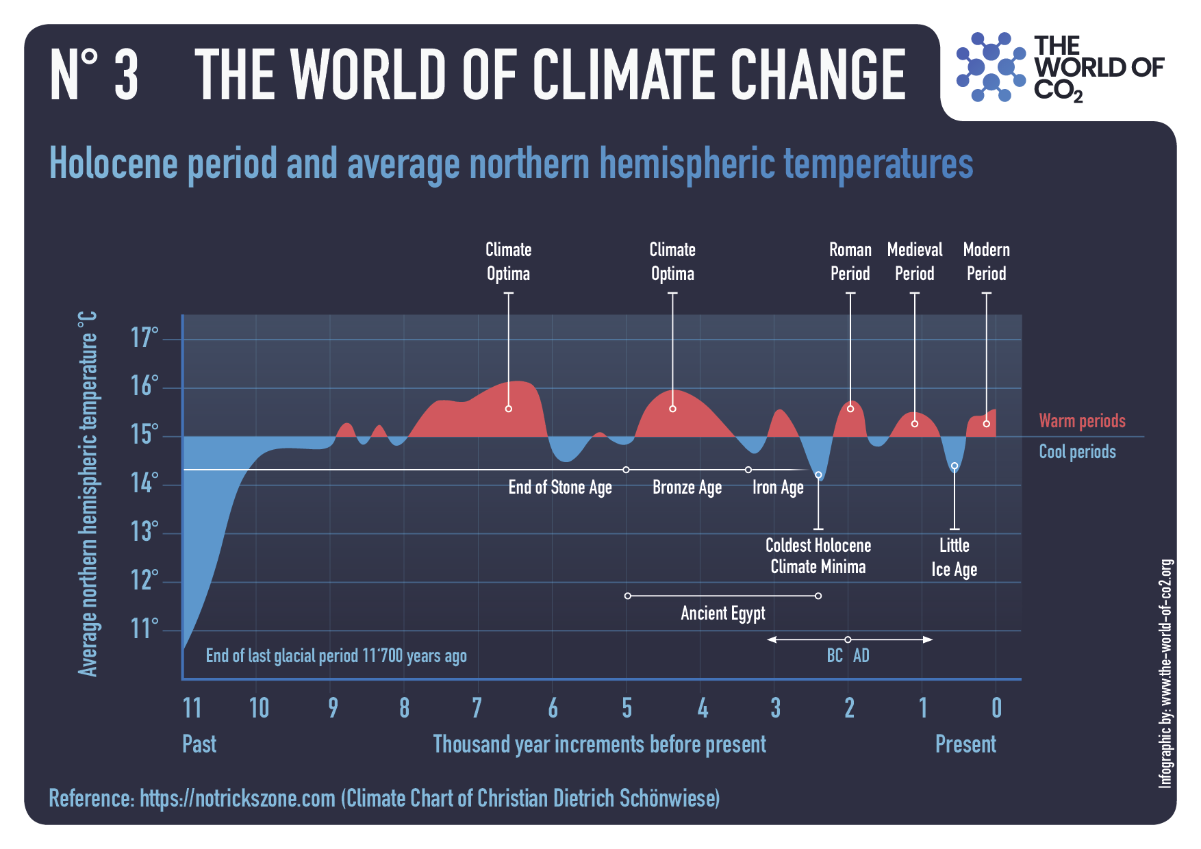
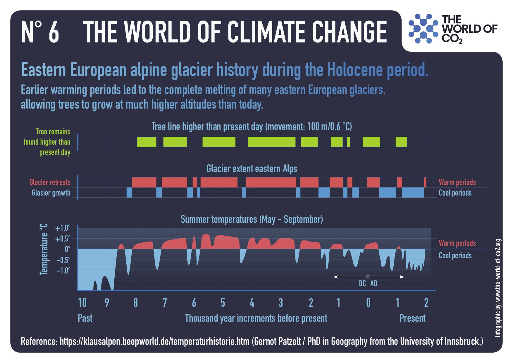
Cyclical climate change is characteristic of the Holocene, with successive warmings and coolings. A solar forcing mechanism has steered Holocene climate change, expressed by 9 cooling phases known as Bond events. There is reliable geological evidence that the temperatures of most warming phases in the Holocene were globally higher or similar to that of the current warming period, Arctic sea ice was less extensive and most mountain glaciers in the northern hemisphere either disappeared or were smaller.
During the African Humid Period in the Early and Middle Holocene, much stronger summer monsoons made the Sahara green with growth of savanna vegetation, huge lakes and extensive peat bogs. The modern warming is part of a climatic cycle with a progressive warming after the Little Ice Age, the last cold episode of which occurred at the beginning of the 19th century. Successive climate projections of the Intergovernmental Panel on Climate Change are based on the assumption that the modern temperature rise is steered exclusively by the increasing content of human-induced CO2 in the atmosphere. If compared with the observational data, these projected temperatures have been highly overestimated.

Overview

This paper presents the current state of knowledge of the climate change in the Holocene. The geological record of the climate change in this epoch has been verified by the results of archaeological, historical and meteorological investigations (Marks, 2016). Determination of the steering forces of modern warming is among the current scientific priorities in the world and, therefore, geological input is an important contribution to the discussion about human impact on the climate.

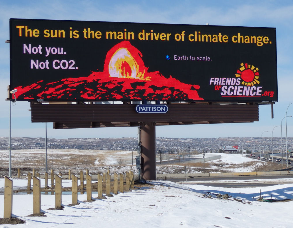
The current interglacial of the Holocene started 11.7 ka cal BP (Walker et al., 2018), with progressively increasing human impact on the Earth’s environment, especially strong during the past decades (Gibbard et al., 2021). Geological examination of past climate changes is crucial to distinguish the natural and the human-induced factors of the current climate change. The most important climate-steering factor is solar radiation, subjected to cyclical changes caused by the Sun’s activity that supplies with over 99% of the energy that is responsible for the climate of the Earth. Geological reconstructions show that rises and falls in the temperature on the Earth are dependent on the sunspot cycles (Table 1; Easterbrook, 2011; Usoskin et al., 2016; Usoskin,2023), and these in turn respond to the varying magnetic activity of the Sun.

The natural input of solar energy is transformed by different external and internal factors to modulate climate on the Earth. Latitudinal insolation in the Holocene depended on the Earth’s orbital parameters (Milankovič cycles). In comparison with the present values, summer temperatures in the northern hemisphere were higher in the Early and Middle Holocene (Beer, Van Geel, 2008; Beer, Wanner, 2012). Winter temperatures in the southern hemisphere were higher in the Middle Holocene, followed by higher temperatures in the northern hemisphere in the Late Holocene. In the coming 3 ka, lower temperatures are expected everywhere, except for the intertropical zone where higher winter temperatures are expected (Marks, 2016).

The natural rhythm of climate change during the Holocene was disturbed by large volcanic eruptions. Emission of dust into the atmosphere was responsible for a couple of cold events during the Holocene (Shindell et al., 2003). Such eruptions can be detected by concentrations of SO2 in polar ice core records (Zielinski et al., 1994; Castellano et al., 2004). The extent of the vegetation cover had an important, but very complex, effect on the climate (Foley et al., 2003), because the evaporative cooling by a forest mitigated warmings and limited dust mobilisation (Bonan, 2008). The atmospheric CO2 concentration decreased in the Early Holocene and started to increase since 7 ka, being independent of temperature variations (Palacios et al., 2024a). Ocean-atmosphere interchange was the main source of CO2 until the recent decades when the anthropogenic emission of CO2 became significant (Brovkin et al., 2019).

Fig. 1. Climate change in the Holocene, adapted from Palacios et al. (2024a) and modified: warm periods are in yellow and less warm in pale yellow, and cold in blue; Bond Events are after Bond et al. (1997, 2001) and geochronology after Walker et al. (2019).

Climate change after the Holocene Thermal Maximum

The temperature deduced from the oxygen isotope curve in the Greenland ice core GISP2 shows that several warmings occurred after the Holocene Thermal Maximum (Fig. 1; Drake, 2012). These were periods during which great progress in the development of human societies occurred: Late Bronze Age, Roman Warm Period and the MWP.  The separating cold Bond Events, named the Iron Age and Dark Ages Cold Periods respectively, were expressed by economic, intellectual and cultural decline. The temperature history since 900 CE was based firstly on the estimated climate history of central England (Lamb, 1977; IPCC, 1990). This showed a distinct warming of ~1.3°C when compared with the LIA (Moberg et al., 2005; D’Arrigo et al., 2006; Mann et al., 2009). This warming was a result of natural processes, because human activity could not have had any significant effect on temperature changes before 1900 CE. The Roman Warm Period (250 BC–450 CE), the MWP (950–1250 CE) and the Modern Warming Period reflect 1000-cycles with high solar radiation (Table 1; Vahrenholt, Lüning, 2014).

Discussion

The claim of the IPCC (2021) that ‘…the latest decade was warmer than any multi-century period after the Last Interglacial, around 125,000 years ago’ ignores all the knowledge about reconstructed temperatures in the Holocene, based on multi-proxy palaeoclimatic data.

Despite the extensive northern ice sheets, the increased summer insolation in the northern hemisphere caused a warming trend from the beginning of the Holocene and lasting until the Middle Holocene (Palacios et al., 2024a).  This warming trend was reversed from 6–5 ka onwards, due to decreased summer insolation in the northern hemisphere. Such general warming or cooling trends in the Holocene were interrupted by short periods with opposite and abrupt temperature changes (Fig. 1).

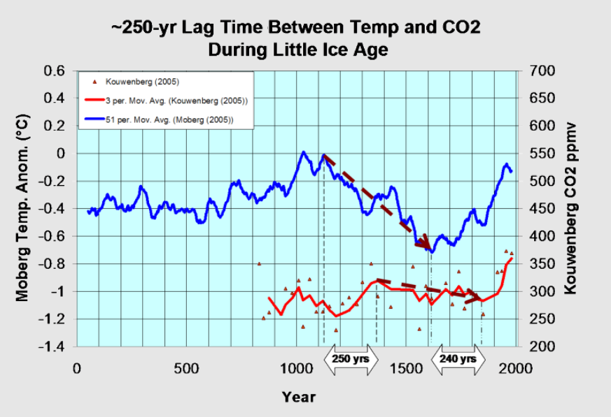
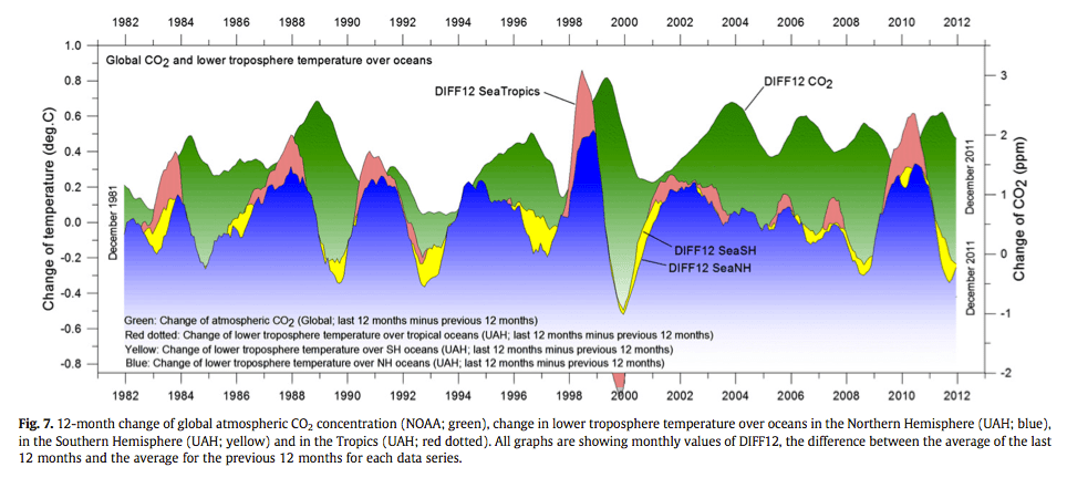
The modern warming represents a part of the cyclical climate change after the LIA, the last cold episode of which occurred at the beginning of the 19th century. The LIA with low temperatures is named the pre industrial period by the advocates of global anthropogenic warming and such an approach helps them to promote the idea that an increased human emission of CO2 (especially in the 20th century) is the only reason for rising temperatures on Earth. They do not bother with the evidence that the mutual time relations of global temperature and contents of CO2 in the atmosphere in 1980–2019 indicate a leading role of temperature, a rise of which was followed in that time by a 6-month delay in the rise of CO2 (Humlum et al., 2012; Koutsoyiannis, Kundzewicz, 2020).

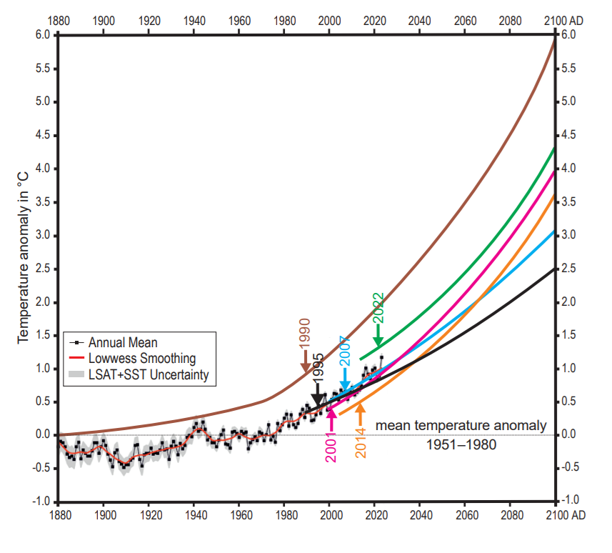
The official curve of the global mean annual temperature anomalies based on regular measurements (https://data.giss.nasa.gov/gistemp/graphs_v4/) overlaps slightly with the temperature projections in reports of the IPCC (1990, 1995, 2001, 2007, 2014, 2021). These IPCC projections were created by climate models, based on the assumption that the modern temperature rise is steered exclusively by the increasing content of human-induced CO2 in the atmosphere while the role of water vapour as the main greenhouse gas is neglected (cf. Hołyst, 2020). Such an approach makes the IPCC-projected temperature highly overestimated if compared with the observational data (Fig. 3). Despite the lockdowns during the Covid-19 pandemic in 2020–2021, connected with large cutbacks in transport, travel, industrial production and energy generation, no reduction in atmospheric CO2 was noted. This fact suggests that the proposed reductions in global energy use would be most probably highly ineffective in limiting the level of atmospheric CO2.

Fig. 3. Global estimates of mean annual temperature anomalies (1880–2023), based on land and ocean data (https://data.giss.nasa.gov/gistemp/graphs_v4/) and temperature projections to AD 2100 in the successive IPCC reports (1990, 1995, 2001, 2007, 2014, 2021)

Conclusions

The Holocene climate change was characterized by cyclical warmings (such as: Holocene Thermal Maximum, Late Bronze Age, Roman Warm Period, MWP) and coolings (Bond Events: including Iron Age Cold Period, Dark Ages Cold Period and LIA). The IPCC claims that current warming is unprecedented in the last 2000 or even the last 125,000 years; this statement is very unconvincing and it is not supported by the geological data. There is good evidence that both in the last 2000 years as well during the Holocene Thermal Maximum, temperatures were higher or broadly similar to the ones in the current warming period, the Arctic sea ice was less extensive and most mountain glaciers (especially in the northern hemisphere) either disappeared or were smaller. Much stronger summer monsoons in the Early and Middle Holocene made the Sahara green with savanna vegetation, huge lakes and extensive peat bogs. The terms ‘the Holocene Thermal Maximum’ and ‘the Holocene Climatic Optimum’ are avoided by the IPCC (2021), and its popularized statements making the current warming look ‘unprecedented’ and therefore ‘unique’ are false and flatten the climate history (cf. Marcott et al., 2013).

The climate is a product of complicated interdependence of many factors that have not been yet sufficiently recognized qualitatively and quantitatively. It is a great scientific challenge that requires an extensive interdisciplinary research. There is a crucial need to make climate science less political and climate policy more scientific.


New England Facing Energy Crisis, Worries About Bugs

Linnea Lueken explains the false alarm in her Climate Realism article Climate Change Is Not Causing New England’s ‘Creepy’ Bacteria and Bugs, Boston Globe.  Excerpts in italics with my bolds and added images.

The Boston Globe posted an article titled “Climate change is bringing creepy — and dangerous — bacteria, bugs, and viruses to New England,” claiming that global warming is “fueling an increase in bacteria and disease” in New England. The headline and the attached story are highly misleading. For things like mosquito-borne illness, mosquitos carrying diseases previously thrived even in New England in previous centuries, with 20th century human intervention wiping them out, not temperature changes. Also, bacteria in waterways are a seasonal phenomenon which has always existed.

The Real New England Crisis is Green Agenda Attack on Electricity Supply

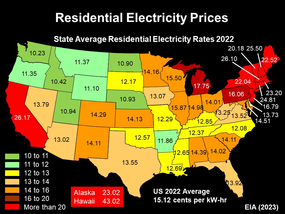
Source: granitegeek, Concord Monitor

Daniel Turner explains in his Real Clear Energy article The Green Agenda Turned New England Into an Energy Price Punchline.  Excerpts in italics with my bolds and added images.

Fall is here, the leaves are changing, the temperature is dropping and sadly New England families know the routine.

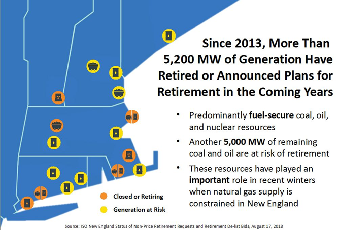
Every month, the electric bill arrives, and it’s larger than the month before. The region pays more for electricity than almost anyone else in America—higher than the national average and, outside of Alaska and Hawaii, higher than anywhere else in the country. This is not a coincidence. It is the inevitable result of politicians who pushed the risky and unreliable green agenda while forcing reliable power plants off the grid.

Here’s an inconvenient history lesson. When Joe Biden took office, electricity in New England cost 20.7 cents per kilowatt-hour. By the time he left, it was more than 28.2 cents. That’s a staggering spike of more than 36% in just four years. Hundreds of dollars gone from family budgets and small businesses every single year. For working households already feeling the squeeze of Biden’s inflation, it can mean the difference between savings and debt, between heating a home and keeping it uncomfortably cold.

October 2022 generation in New England, by fuel source

And the blame is clear. The forced closure of coal, oil, and natural gas plants in the name of “climate progress” is why rates are climbing. In 2022, Massachusetts Senators Elizabeth Warren and Ed Markey traveled to Somerset to celebrate the shutdown of traditional energy plants. They smiled for the cameras, congratulated themselves on a “victory,” and then went back to Washington while families were left to pay the tab.
First came the celebration, but now we see the deflection. Four Democratic senators, including Warren and Markey, recently wrote a letter to the Trump administration suddenly pretending to care about rising electricity bills. It is political theater and nothing more. They didn’t care when they cheered the closures in 2022, and they don’t care now. New England’s families are stuck with the consequences of the green agenda they applauded; they just want to escape the blame.

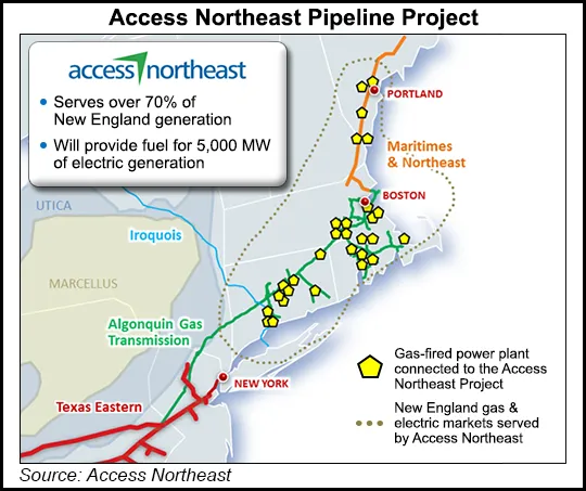
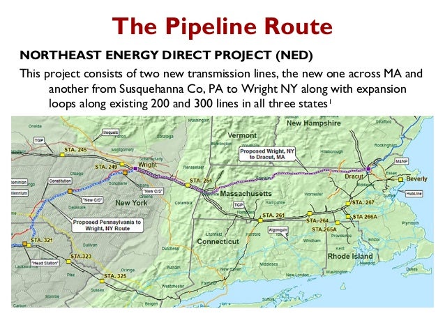
Project abandoned in 2017 after New York blocked planning and permit processes.

Let’s be clear: This cascade of closures started when Joe Biden was vice president and accelerated under his presidency. Nearly 400 fossil fuel plants have been shuttered across the country since 2010, including almost 300 coal plants. In the Northeast alone, names like Indian Point in New York, Eagle Point in New Jersey, Schiller Station in New Hampshire, and Canal Station in Massachusetts have been crossed off the map. Each closure meant fewer megawatts of reliable power and higher bills for families.

 Project abandoned in April 2016

The problem is not complicated. Shutting down affordable, always-on power and replacing it with expensive, intermittent sources like wind and solar leads to higher prices. Add the surge in demand from artificial intelligence data centers, which analysts say could double electricity consumption by 2030, and the consequences are obvious: higher costs, weaker reliability, and a grid at the breaking point.

There is a way out of this crisis, but it requires real action, not pointless blaming. My organization, Power The Future, lays out the steps in our recent report.
♦  First, use the Defense Production Act to treat grid reliability as the national security issue it is, and direct resources to keep critical plants online.
♦  Second, build new fossil fuel plants—modern natural gas and coal facilities that can deliver decades of dependable, affordable power.
♦  Third, halt premature closures until replacement capacity is running, not just promised on paper. And fourth, expand the capacity of existing coal plants, many of which are running below potential thanks to political limits, to quickly add thousands of megawatts back to the grid.

These are not radical ideas. They are common sense. They put working families, not political slogans, at the center of energy policy. They recognize that you cannot run a 21st-century economy on wishful thinking, photo-ops, and subsidies for technology that fails when the wind doesn’t blow, or the sun doesn’t shine.

Too many of New England’s “leaders” in Washington have turned their states into punchlines of America’s power prices. Working families deserve leaders who care more about their constituents’ bills than their standing with environmental activists. They deserve an energy policy grounded in reality, not ideology.

If you want to know who killed affordable power in New England, it wasn’t President Trump and it wasn’t the utility companies. All you need to do is just look at who popped the champagne when the plants closed.


Tropics UAH Temps Cooler August 2025

The post below updates the UAH record of air temperatures over land and ocean. Each month and year exposes again the growing disconnect between the real world and the Zero Carbon zealots.  It is as though the anti-hydrocarbon band wagon hopes to drown out the data contradicting their justification for the Great Energy Transition.  Yes, there was warming from an El Nino buildup coincidental with North Atlantic warming, but no basis to blame it on CO2.

As an overview consider how recent rapid cooling  completely overcame the warming from the last 3 El Ninos (1998, 2010 and 2016).  The UAH record shows that the effects of the last one were gone as of April 2021, again in November 2021, and in February and June 2022  At year end 2022 and continuing into 2023 global temp anomaly matched or went lower than average since 1995, an ENSO neutral year. (UAH baseline is now 1991-2020). Then there was an usual El Nino warming spike of uncertain cause, unrelated to steadily rising CO2, and now dropping steadily back toward normal values.

For reference I added an overlay of CO2 annual concentrations as measured at Mauna Loa.  While temperatures fluctuated up and down ending flat, CO2 went up steadily by ~65 ppm, an 18% increase.

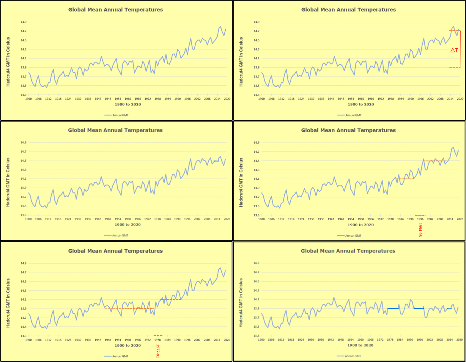
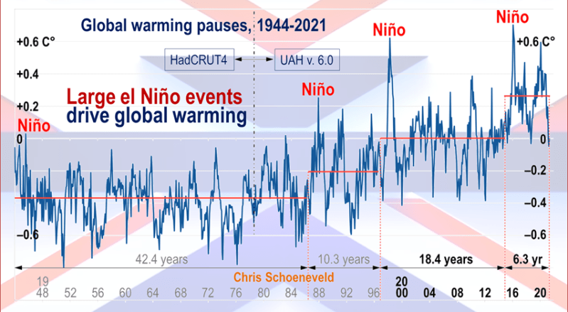
Furthermore, going back to previous warmings prior to the satellite record shows that the entire rise of 0.8C since 1947 is due to oceanic, not human activity.

gmt-warming-events

The animation is an update of a previous analysis from Dr. Murry Salby.  These graphs use Hadcrut4 and include the 2016 El Nino warming event.  The exhibit shows since 1947 GMT warmed by 0.8 C, from 13.9 to 14.7, as estimated by Hadcrut4.  This resulted from three natural warming events involving ocean cycles. The most recent rise 2013-16 lifted temperatures by 0.2C.  Previously the 1997-98 El Nino produced a plateau increase of 0.4C.  Before that, a rise from 1977-81 added 0.2C to start the warming since 1947.

Importantly, the theory of human-caused global warming asserts that increasing CO2 in the atmosphere changes the baseline and causes systemic warming in our climate.  On the contrary, all of the warming since 1947 was episodic, coming from three brief events associated with oceanic cycles. And in 2024 we saw an amazing episode with a temperature spike driven by ocean air warming in all regions, along with rising NH land temperatures, now dropping below its peak.

Chris Schoeneveld has produced a similar graph to the animation above, with a temperature series combining HadCRUT4 and UAH6. H/T WUWT

image-8

See Also Worst Threat: Greenhouse Gas or Quiet Sun?

August 2025 Lower Tropics UAH Temps  banner-blog

With apologies to Paul Revere, this post is on the lookout for cooler weather with an eye on both the Land and the Sea.  While you heard a lot about 2020-21 temperatures matching 2016 as the highest ever, that spin ignores how fast the cooling set in.  The UAH data analyzed below shows that warming from the last El Nino had fully dissipated with chilly temperatures in all regions. After a warming blip in 2022, land and ocean temps dropped again with 2023 starting below the mean since 1995.  Spring and Summer 2023 saw a series of warmings, continuing into 2024 peaking in April, then cooling off to the present.

UAH has updated their TLT (temperatures in lower troposphere) dataset for August 2025. Due to one satellite drifting more than can be corrected, the dataset has been recalibrated and retitled as version 6.1 Graphs here contain this updated 6.1 data.  Posts on their reading of ocean air temps this month are ahead the update from HadSST4 or OISST2.1.  I posted recently on SSTs July 2025 Ocean SSTs: NH Warms Slightly.  These posts have a separate graph of land air temps because the comparisons and contrasts are interesting as we contemplate possible cooling in coming months and years.

Sometimes air temps over land diverge from ocean air changes. In July 2024 all oceans were unchanged except for Tropical warming, while all land regions rose slightly. In August we saw a warming leap in SH land, slight Land cooling elsewhere, a dip in Tropical Ocean temp and slightly elsewhere.  September showed a dramatic drop in SH land, overcome by a greater NH land increase. 2025 has shown a sharp contrast between land and sea, first with ocean air temps falling in January recovering in February.  Then land air temps, especially NH, dropped in February and recovered in March. Now in July SH ocean dropped markedly, pulling down the Global ocean anomaly despite a rise in the Tropics.  SH land also cooled by half, driving Global land temps down despite Tropics land warming.

Note:  UAH has shifted their baseline from 1981-2010 to 1991-2020 beginning with January 2021.   v6.1 data was recalibrated also starting with 2021. In the charts below, the trends and fluctuations remain the same but the anomaly values changed with the baseline reference shift.

Presently sea surface temperatures (SST) are the best available indicator of heat content gained or lost from earth’s climate system.  Enthalpy is the thermodynamic term for total heat content in a system, and humidity differences in air parcels affect enthalpy.  Measuring water temperature directly avoids distorted impressions from air measurements.  In addition, ocean covers 71% of the planet surface and thus dominates surface temperature estimates.  Eventually we will likely have reliable means of recording water temperatures at depth.

Recently, Dr. Ole Humlum reported from his research that air temperatures lag 2-3 months behind changes in SST.  Thus cooling oceans portend cooling land air temperatures to follow.  He also observed that changes in CO2 atmospheric concentrations lag behind SST by 11-12 months.  This latter point is addressed in a previous post Who to Blame for Rising CO2?

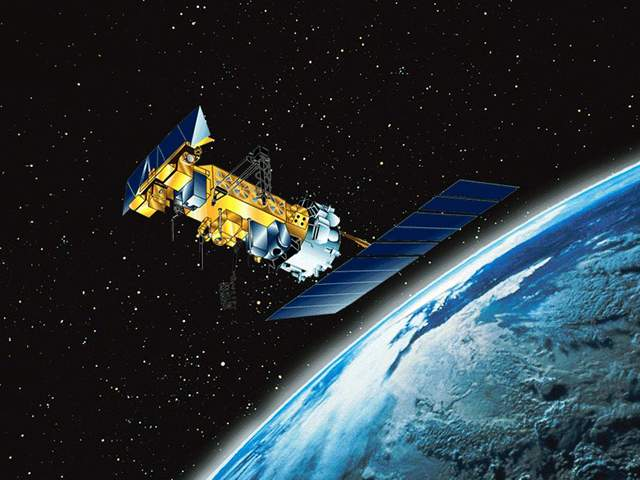
After a change in priorities, updates are now exclusive to HadSST4.  For comparison we can also look at lower troposphere temperatures (TLT) from UAHv6.1 which are now posted for August 2025.  The temperature record is derived from microwave sounding units (MSU) on board satellites like the one pictured above. Recently there was a change in UAH processing of satellite drift corrections, including dropping one platform which can no longer be corrected. The graphs below are taken from the revised and current dataset.

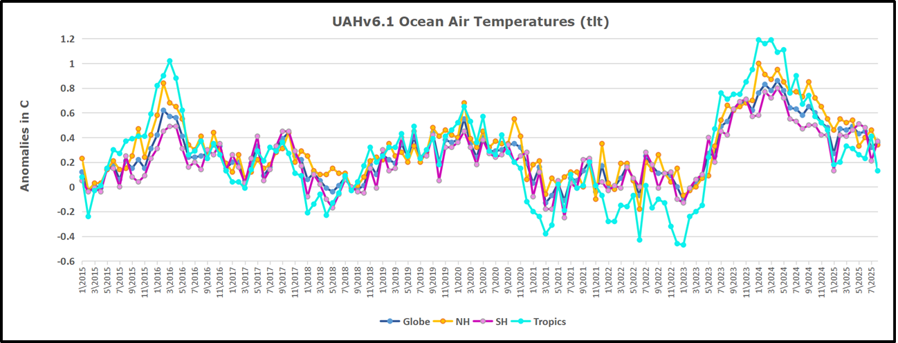
The UAH dataset includes temperature results for air above the oceans, and thus should be most comparable to the SSTs. There is the additional feature that ocean air temps avoid Urban Heat Islands (UHI).  The graph below shows monthly anomalies for ocean air temps since January 2015.

In 2021-22, SH and NH showed spikes up and down while the Tropics cooled dramatically, with some ups and downs, but hitting a new low in January 2023. At that point all regions were more or less in negative territory.

After sharp cooling everywhere in January 2023, there was a remarkable spiking of Tropical ocean temps from -0.5C up to + 1.2C in January 2024.  The rise was matched by other regions in 2024, such that the Global anomaly peaked at 0.86C in April. Since then all regions have cooled down sharply to a low of 0.27C in January.  In February 2025, SH rose from 0.1C to 0.4C pulling the Global ocean air anomaly up to 0.47C, where it stayed in March and April. In May drops in NH and Tropics pulled the air temps over oceans down despite an uptick in SH. At 0.43C, ocean air temps were similar to May 2020, albeit with higher SH anomalies. Now in August Global ocean temps are little changed since SH rose, offsetting NH cooling and Tropics plummenting down to 0.16C from its peak of 1.24C March 2024.

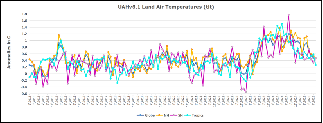
Land Air Temperatures Tracking in Seesaw Pattern

We sometimes overlook that in climate temperature records, while the oceans are measured directly with SSTs, land temps are measured only indirectly.  The land temperature records at surface stations sample air temps at 2 meters above ground.  UAH gives tlt anomalies for air over land separately from ocean air temps.  The graph updated for August is below.

Here we have fresh evidence of the greater volatility of the Land temperatures, along with extraordinary departures by SH land.  The seesaw pattern in Land temps is similar to ocean temps 2021-22, except that SH is the outlier, hitting bottom in January 2023. Then exceptionally SH goes from -0.6C up to 1.4C in September 2023 and 1.8C in  August 2024, with a large drop in between.  In November, SH and the Tropics pulled the Global Land anomaly further down despite a bump in NH land temps. February showed a sharp drop in NH land air temps from 1.07C down to 0.56C, pulling the Global land anomaly downward from 0.9C to 0.6C. In March that drop reversed with both NH and Global land back to January values, holding there in April.  In May sharp drops in NH and Tropics land air temps pulled the Global land air temps back down close to February value. In August Tropics land air dropped sharply, down from 0.58C to 0.26C, and NH land also cooled by 0.1C, offset by SH rising, resulting in no change of Global land air temps.

The Bigger Picture UAH Global Since 1980

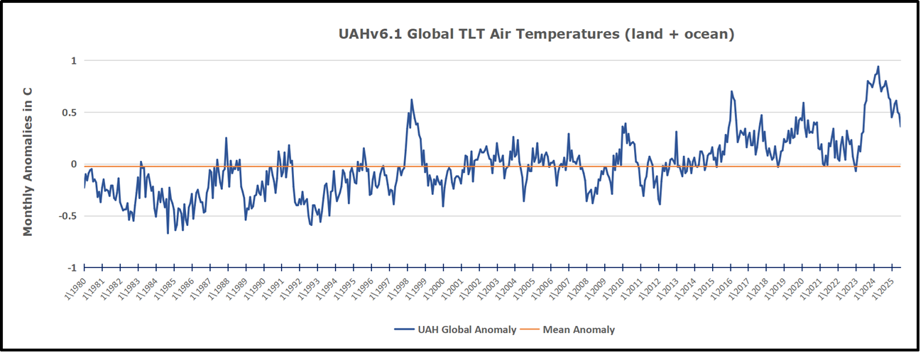
The chart shows monthly Global Land and Ocean anomalies starting 01/1980 to present.  The average monthly anomaly is -0.0, 2for this period of more than four decades.  The graph shows the 1998 El Nino after which the mean resumed, and again after the smaller 2010 event. The 2016 El Nino matched 1998 peak and in addition NH after effects lasted longer, followed by the NH warming 2019-20.   An upward bump in 2021 was reversed with temps having returned close to the mean as of 2/2022.  March and April brought warmer Global temps, later reversed

With the sharp drops in Nov., Dec. and January 2023 temps, there was no increase over 1980. Then in 2023 the buildup to the October/November peak exceeded the sharp April peak of the El Nino 1998 event. It also surpassed the February peak in 2016. In 2024 March and April took the Global anomaly to a new peak of 0.94C.  The cool down started with May dropping to 0.9C, and in June a further decline to 0.8C.  October went down to 0.7C,  November and December dropped to 0.6C. Now in August Global Land and Ocean is down to 0.39C

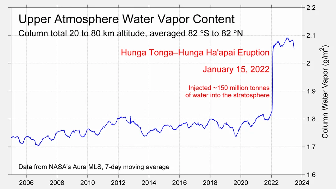
The graph reminds of another chart showing the abrupt ejection of humid air from Hunga Tonga eruption.

TLTs include mixing above the oceans and probably some influence from nearby more volatile land temps.  Clearly NH and Global land temps have been dropping in a seesaw pattern, nearly 1C lower than the 2016 peak.  Since the ocean has 1000 times the heat capacity as the atmosphere, that cooling is a significant driving force.  TLT measures started the recent cooling later than SSTs from HadSST4, but are now showing the same pattern. Despite the three El Ninos, their warming had not persisted prior to 2023, and without them it would probably have cooled since 1995.  Of course, the future has not yet been written.

The Sea is Not Coming to Get You

Issues and Insights Editorial Board published Another Crack Appears In The Global Warming Narrative.  Excerpts in italics with my bolds and added images.

Al Gore famously warned that sea level rise caused by man’s use of fossil fuels was going to kill us. Barack Obama implied that he had magic powers that would control surging sea levels. A fresh study shows just how dishonest this pair and the many others who did their best to misinform the public have been.

Gore’s 2006 propaganda film told us to beware of sea levels rising by 20 feet, devastating New York and Florida. The uber-narcissistic Obama promised an adoring crowd that his nomination to be the Democratic Party’s 2008 presidential nominee “was the moment when the rise of the oceans began to slow and our planet began to heal.” California Gov. Jerry Brown predicted a little more than a decade ago that collapsing glaciers would submerge both the Los Angeles and San Francisco international airports.

These of course are just three of many examples of alarmists, hacks, globalist busybodies, NASA eggheads, academic ideologues and true believers fear-mongering over sea-level rise.

Obama, no climate refugee he, was later roasted for buying oceanfront compounds in Martha’s Vineyard and Hawaii. The purchases clearly show he didn’t believe what he said – he was just another political hack appealing for votes and hoping to burnish a legacy before he even set foot in the White House.

But how can we know it’s just fear-mongering?

Actual science, not Gore’s junk variety, now tells us that “approximately 95% of the suitable locations” researchers looked at showed “no statistically significant acceleration of the rate of sea level rise.” This “suggests that local, non-climatic phenomena are a plausible cause of the accelerated sea level rise observed at the remaining 5% of the suitable locations.”

“On average,” the European paper says, “the rate of rise projected by the IPCC is biased upward with approximately 2 mm per year in comparison with the observed rate.”

As it turns out:

The majority of the local causes of rapid sea level rise (or drop) appear to be geologic. Tectonic motion explains sudden changes of sea level rise found in a few places. More gradual but rapid rise (or fall) of sea level is mostly caused by glacial isostatic adjustment and in a few isolated cases by an excessive sediment load.

What else do we know about the oceans? It’s been well established that sea levels, like Earth’s climate, have been constantly changing without any human influence.

We acknowledge that we live in an era of rising sea levels, just as we live in a time in which we are escaping the lower temperatures of the Little Ice Age that lasted until the late 19th century, if not, according to some researchers, the early 20th century. But the rise we’re seeing is slow, not remotely catastrophic, and not outside of historical norms (even though the hysterics continue to claim the rise is “accelerating” and is “unprecedented”).

The climate cranks, warming crackpots, and those possessed of Marxphilia won’t be deterred by this or any other scientific evidence. But it’s news that can help persuade larger swaths of voters that the global warming scare is a con. As more Americans learn the truth, the radicals and zealots who perpetuate the fiction will fade into the oblivion they deserve.

See Also

Observed vs. Imagined Sea Levels 2023 Update

Fear Not For Fiji

Surplus Arctic Ice Persists to End of August 2025

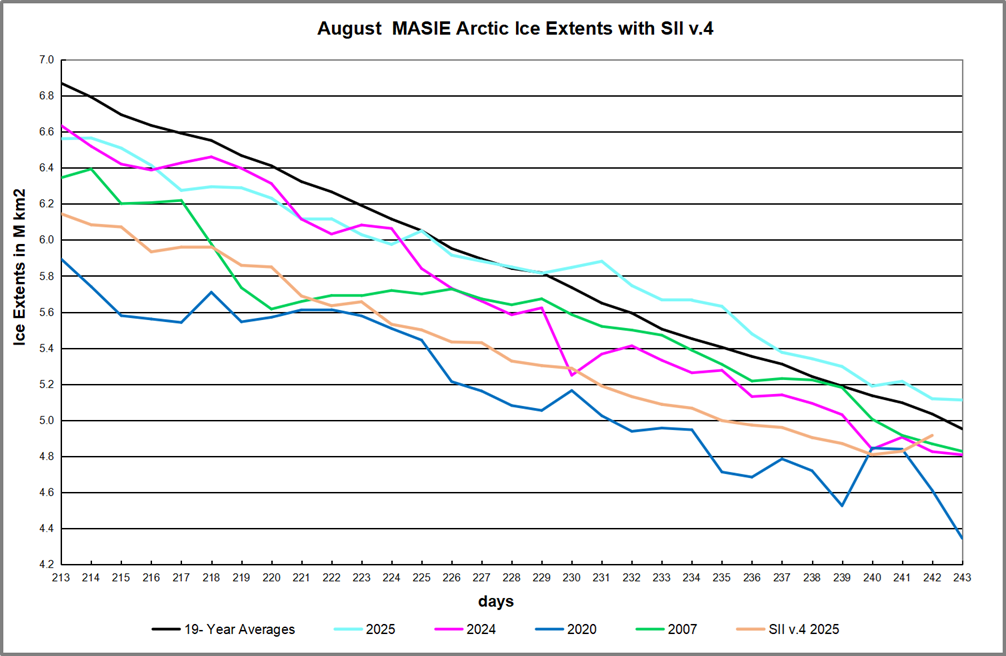
After a sub-par March maximum, by end of May 2025 Arctic ice closed the gap with the 19-year average. Then in June the gap reopened and in July the melting pace matched the average, abeit four days in advance of average. In mid-August MASIE showed the Arctic ice extent matching the 19-year average.  Mid month Arctic ice went above average and remained in surplus, ranging from a high of +231k km2 to +160k km2 at end of August.

During August the average year loses 1.9M km2 of ice extent.  MASIE on day 213 was 308k km2 down, and the gap closed steadily, going into surplus on day 230. Note 2020 and 2024 were well  below average mid-August.  2024 ended nearly average, while 2020 went down almost off the chart. Meanwhile SII v.4 started August ~400k km2 lower than MASIE, increasing to -690k mid month, before drawing closer to MASIE (-200k km2) on the last reported day 242. More on what happened to SII in footnote.

The regional distribution of ice extents is shown in the table below. (Bering and Okhotsk seas are excluded since both are now virtually open water.)

Region 2025243 Day 243 Ave. 2025-Ave. 2020243 2025-2020
 (0) Northern_Hemisphere 5112372 4952249 160123 4345398 766974
 (1) Beaufort_Sea 646546 569909 76637 763281 -116735
 (2) Chukchi_Sea 400517 284622 115895 212438 188079
 (3) East_Siberian_Sea 563058 360155 202902 176996 386062
 (4) Laptev_Sea 172574 175114 -2540 1029 171545
 (5) Kara_Sea 2579 48983 -46404 23958 -21379
 (6) Barents_Sea 0 15952 -15952 0 0
 (7) Greenland_Sea 106688 167723 -61035 192361 -85673
 (8) Baffin_Bay_Gulf_of_St._Lawrence 61034 27656 33378 5016 56019
 (9) Canadian_Archipelago 278943 298169 -19226 273116 5827
 (10) Hudson_Bay 8604 20611 -12006 23611 -15007
 (11) Central_Arctic 2870279 2982526 -112247 2672903.81 197375

The table shows large surpluses in Eurasian basins  Beaufort, Chukchi and E. Siberian, more than offsetting deficits in Central Arctic, Kara and Greenland seas. Hudson Bay is mostly open water at this time of year. 2025 exceeds the average ice extents by 160k km2, or 3%, and is 767k km2 greater than 2020, or nearly 0.8 Wadhams of ice extent.

September monthly average ice extent is considered the annual minimum for climate purposes.  Note also that typically the lowest daily value occurs mid September, with a small positive gain between the end of August and end of September.

Why is this important?  All the claims of global climate emergency depend on dangerously higher  temperatures, lower sea ice, and rising sea levels.  The lack of additional warming prior to 2023 El Nino is documented in a post SH Drives UAH Temps Cooler July 2025.

The lack of acceleration in sea levels along coastlines has been discussed also.  See Observed vs. Imagined Sea Levels 2023 Update

Also, a longer term perspective is informative:

post-glacial_sea_level

Footnote Regarding  SII v.4

NSDIC acknowledged my query regarding the SII (Sea Ice Index) dataset. While awaiting an explanation I investigated further. My last download of the SII Daily Arctic Ice Extents was on July 30, meaning that the most recent data in that file was day 210, July 29. The header on that file was Sea_Ice_Index_Daily_Extent_G02135_v3.

Then on August 1, the downloaded file had the heading Sea_Ice_Index_Daily_Extent_G02135_v4. So it appears that these are now the values from a new version of SII. As I wrote in my query, since March 14 all of the values for Arctic Ice Extents are lower in this new record. The graph above shows the implications for August as an example of estimates from SIIv.4.

In the past, SIIv.3 tracked MASIE with slightly lower values.  But with v.4, larger monthly average deficits to MASIE were reported in July 2025 ( -282k km2) and in August (-440k km2).

The change started in January 2025 and will be the basis for future reporting.  The logic for this is presented in this document: Sea Ice Index Version 4 Analysis

In June 2025, NSIDC was informed that access to data from the Special Sensor Microwave
Imager/Sounder (SSMIS) onboard the Defense Meteorological Satellite Program (DMSP)
satellites would end on July 31 (NSIDC, 2025). To prepare for this, we rapidly developed version
4 of the Sea Ice Index. This new version transitions from using sea ice concentration fields
derived from SSMIS data as input to using fields derived from the Advanced Microwave
Scanning Radiometer 2 (AMSR2) sensor onboard the Global Change Observation Mission – W1
(GCOM-W1) satellite.  On 29 July 2025, we learned that the Defense Department decision to terminate access to DMSP data had been reversed and that data will continue to be available until September 2026.

We are publishing Version 4, however, for these reasons:

• The SSMIS instruments are well past their designed lifespan and a transition to
AMSR2 is inevitable. Unless the sensors fail earlier, the DoD will formally end the
program in September 2026.
• Although access of SSMIS will continue through September 2026, the Fleet
Numerical Meteorology and Oceanography Center (FNMOC), where SSMIS data
from the DMSP satellite are downloaded, made an announcement that “Support
will be on a best effort basis and should be considered data of opportunity.” This
means that SSMIS data will likely contain data gaps.
• We have developer time to make this transition now and may not in the future.
• We are confident that Version 4 data are commensurate in accuracy to those
provided by Version 3.

More Evidence Temperatures Drive CO2 Levels, Not the Reverse

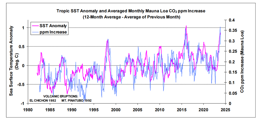
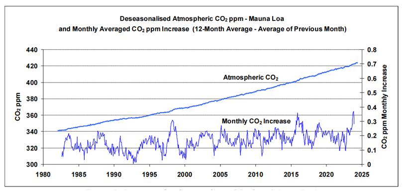
Robbins, 2025 Figure 2: Global tropic SSTs overlaid onto monthly atmospheric CO2 increases (Mauna Loa)

Kenneth Richard posted a No Tricks Zone article: Another New Study Suggests Most – 80% – Of The Modern CO2 Increase Has Been Natural.  Excerpts in italics with my bolds and added images.

CO2 concentration increases are not the cause of rising temperature,
but an effect of rising temperature.

The 2025 paper by Bernard Robbins is Atmospheric CO2: Exploring the Role of Sea Surface Temperatures and the Influence of Anthropogenic CO2.  Excerpts in italics with my bolds and added images.

Abstract

Close examination of the small perturbations within the atmospheric CO2 trend, as measured at Mauna Loa, reveals a strong correlation with variations in sea surface temperatures (SSTs), most notably with those in the tropics. The temperature-dependent process of CO2 degassing and absorption via sea surfaces is well-documented, and changes in SSTs will also coincide with changes in terrestrial temperatures, and temperature-dependent changes in the marine and terrestrial biospheres with their associated carbon cycles.

Using SST and Mauna Loa datasets, three methods of analysis are presented that seek to identify and estimate the anthropogenic and, by default, natural components of recent increases in atmospheric CO2, an assumption being that changes in SSTs coincide with changes in nature’s influence, as a whole, on atmospheric CO2 levels. The findings of the analyses suggest that an anthropogenic component is likely to be around 20 %, or less, of the total increase since the start of the industrial revolution.

The inference is that around 80 % or more of those increases are of natural origin, and indeed the findings suggest that nature is continually working to maintain an atmospheric/surface CO2 balance, which is itself dependent on temperature. A further pointer to this balance may come from chemical measurements that indicate a brief peak in atmospheric CO2 levels centred around the 1940s, and that coincided with a peak in global SSTs.

Source: The phase relation between atmospheric carbon dioxide and global temperature OleHumlum, KjellStordahl, Jan-ErikSolheim.

Introduction

Research into the influence SSTs have on changes in atmospheric CO2 includes the work by Humlum et al. (2013). When examining phase relationships, they found a maximum correlation for changes in atmospheric CO2 lagging 11-12 months behind those of global SSTs [1]. A paper by the late Fred Goldberg (2008) noted their correlation by examining El Niño events [2]. He also considered Henry’s law [3] in relation to SSTs, i.e. a temperature-dependent equilibrium between atmospheric CO2 and its solubility in seawater. Spencer (2008) also noted similarities between surface temperature variations with changes in atmospheric CO2 [4].

For the oceans specifically, areas of surface CO2 absorption and degassing are shown in maps provided by NOAA [5] and ESA [6] for example. These maps show that colder sea surfaces towards the poles are net absorbers of CO2 whilst the warmer surface waters of the tropics are net emitters. An analogy often cited is the greater ability of carbonated drinks to retain CO2 at cooler temperatures; this ability drops as the drinks get warmer.

Figure 1: Deseasonalised atmospheric CO2 data (Mauna Loa).

A strong correlation between changes in atmospheric CO2 and SSTs can be readily discerned from the relevant datasets. To illustrate, the upper graph in Fig. 1 plots atmospheric CO2 in parts per million (ppm) as measured at Mauna Loa, Hawaii, since 1982. The data [7] has been ‘deseason-alised’ by NOAA to remove natural annual CO2 cycles.

The similarity between the two traces is striking: short-term fluctuations in CO2 readings at Mauna Loa appear particularly sensitive to tropic conditions (if tropic SSTs are substituted for global SSTs in Fig. 2, the correlation is less strong). Warm tropical seas, with surface temperatures typically around 25-30 oC, cover almost one third of the earth’s surface. The most prominent peaks in the figure coincide with strong El Niño events. Taken at face value, and ignoring any influence from anthropogenic emissions, Fig. 2  suggests that if the tropic SST anomaly dropped to around -1 oC (with related drops globally) then the concentration of CO2 in the atmosphere, as measured at Mauna Loa, would level off.

Robbins, 2025 Figure 2: Global tropic SSTs overlaid onto monthly atmospheric CO2 increases (Mauna Loa)

An important point is that changes in SSTs will coincide with those of terrestrial temperatures, temperature-dependent changes to both terrestrial and marine carbon cycles and, taking into consideration the research by Humlum et al. (2013) who found that changes in atmospheric CO2 followed changes in SSTs, an assumption in the work presented here is that nature’s influence on atmospheric CO2 levels, as a whole, follows on from changes in SSTs.

Discussion

The techniques used in Analyses 1 and 2, aimed at discerning and estimating the human contribution to recent increases in atmospheric CO2, are based on processing of monthly data from both SST and atmospheric CO2 datasets. Using the technique described in Analysis 1, no contribution from human emissions to the measured increases in atmospheric CO2, since 1995, was discerned. Given an approximate 60 % increase in annual human emissions since 1995 this suggests, by itself, that any human contribution to the measured increases is likely to be relatively small compared to nature’s contribution.

For the technique described in Analysis 2, a figure of ~27 ppm was estimated for a possible human contribution out of a total increase of 143 ppm since 1850, equating to around 19 % of the total increase in atmospheric CO2 since the start of the industrial revolution. Thus the results of these two analyses, taken together, suggest that nature appears to account for around 80 % or more of increases in atmospheric CO2 since 1995.

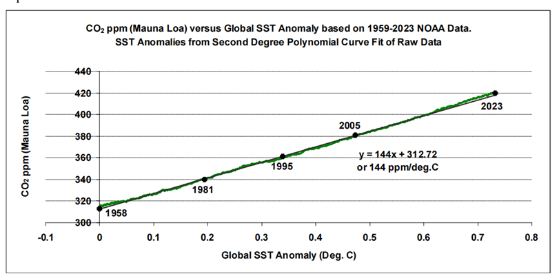
The technique described in Analysis 3 examines the relationship between longer-term trends in SST datasets and atmospheric CO2 measurements. This data analysis goes as far back as the late 1950s, when the ongoing acquisition of atmospheric CO2 measurements began at Mauna Loa. The resulting three graphs show an apparent almost-linear long-term relationship between SSTs and atmospheric CO2. Linear trend lines fitted to these graphs produce gradients of between ~120 and ~145 ppm/ 0C for the three SST datasets examined.

Figure 15: Atmospheric CO2 as a function of global SST trend since 1958

As for anthropogenic CO2, published figures (e.g. GCB data) suggest a roughly linear relationship between cumulative anthropogenic emissions as a function of time, and atmospheric CO2 measurements from Mauna Loa. If it’s reasoned that this mostly accounts for the linear trends as calculated in Analysis 3, this reasoning would not fit with the findings of the first two analysis methods that suggest 80 % or more of recent atmospheric CO2 increases are of natural origin.

Conclusions

Analyses of SST and atmospheric CO2 data, acquired since 1995, produce an estimated atmospheric CO2 increase, possibly attributed to human emissions, of around 20 %, or less, of the total increase since the industrial revolution, thus inferring that around 80 % or more of the increase is of natural origin.

Further data examination points to an almost linear longer-term relationship between SSTs and atmospheric CO2 since at least the late 1950s, and is suggestive of nature working to maintain a temperature-dependent atmosphere/surface CO2 balance. Recent historical evidence of such a balance may come from chemical measurements that indicate a brief peak in atmospheric CO2 levels centred around the 1940s, and that coincided with a peak in global SSTs.

Human emissions of CO2 are about 1/20-th of the natural turnover, and the findings of the analyses presented here suggest that this relatively-small human contribution is being readily incorporated into nature’s carbon cycles as they continually adjust to our constantly-changing climate.

As for surface temperatures, the research by Humlum et al. concluded that changes in atmospheric temperature are an ‘effect’ of changes in SSTs and not a ‘cause’ as some might advocate. And Humlum’s ‘take home’ message from a recent presentation was:

‘What controls the ocean surface temperature, controls the global climate’ [33]. He suggests the sun would be a good candidate, modulated with the cloud cover.

See Also

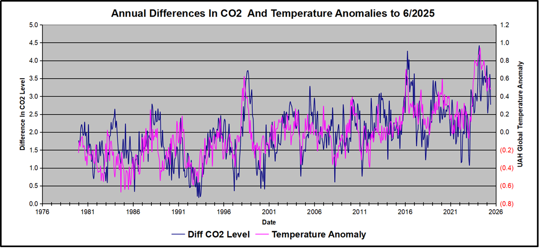
June 2025 Update–Temperature Falls, CO2 Follows