Michael Simpson of Sheffield University did the literature review and tells it like it is in his recent paper The Scientific Case Against Net Zero: Falsifying the Greenhouse Gas Hypothesis published at Journal of Sustainable Development (2024). Excerpts in italics with my bolds and added images.
Abstract
The UK Net Zero by 2050 Policy was undemocratically adopted by the UK government in 2019. Yet the science of so-called ‘greenhouse gases’ is well known and there is no reason to reduce emissions of carbon dioxide (CO2), methane (CH4), or nitrous oxide (N2O) because absorption of radiation is logarithmic. Adding to or removing these naturally occurring gases from the atmosphere will make little difference to the temperature or the climate. Water vapor (H2O) is claimed to be a much stronger ‘greenhouse gas’ than CO2, CH4 or N2O but cannot be regulated because it occurs naturally in vast quantities.
This work explores the established science and recent developments in scientific knowledge around Net Zero with a view to making a rational recommendation for policy makers. There is little scientific evidence to support the case for Net Zero and that greenhouse gases are unlikely to contribute to a ‘climate emergency’ at current or any likely future higher concentrations. There is a case against the adoption of Net Zero given the enormous costs associated with implementing the policy, and the fact it is unlikely to achieve reductions in average near surface global air temperature, regardless of whether Net Zero is fully implemented and adopted worldwide. Therefore, Net Zero does not pass the cost-benefit test. The recommended policy is to abandon Net Zero and do nothing about so-called ‘greenhouse gases’. [Topics are shown below with excerpted contents.]
1. Introduction
The argument for Net Zero is that the concentration of CO2 in air is increasing, some small portion of which may be due to human activities and that Net Zero will address this supposed ‘problem’. The underpinning consensus hypothesis is that the human emission of so-called ‘greenhouse gases’ will increase concentrations of these gases in the atmosphere and thereby increase the global near surface atmospheric temperature by absorbance of infrared radiation leading to catastrophic changes in the weather. This leads to the idea that global temperatures should be limited to 2°C and preferably 1.5°C to avoid catastrophic climate change (Paris Climate Agreement, 2015).
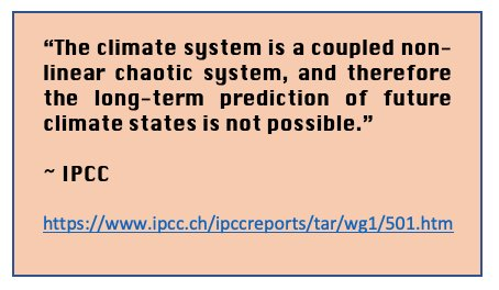
A further hypothesis is that there are tipping points in the climate system which will result in positive feedback and a runaway heating of the planet’s atmosphere may occur (Schellnhuber & Turner, 2009; Washington et al., 2009; Levermann et al., 2009; Notz & Schellnhuber, 2009; Lenton et al., 2008; Dakos et al., 2009; Archer et al., 2009). Some of these tipping point assumptions are built into faulty climate models, the outputs of which are interpreted as facts or evidence by activists and politicians. However, output from computer models is not data, evidence or fact and is controversial (Jaworowski, 2007; Bastardi, 2018; Innis, 2008: p.30; Smith, 2021; Nieboer, 2021; Craig, 2021). Only empirical scientifically established facts should be considered so that cause and effect are clear.
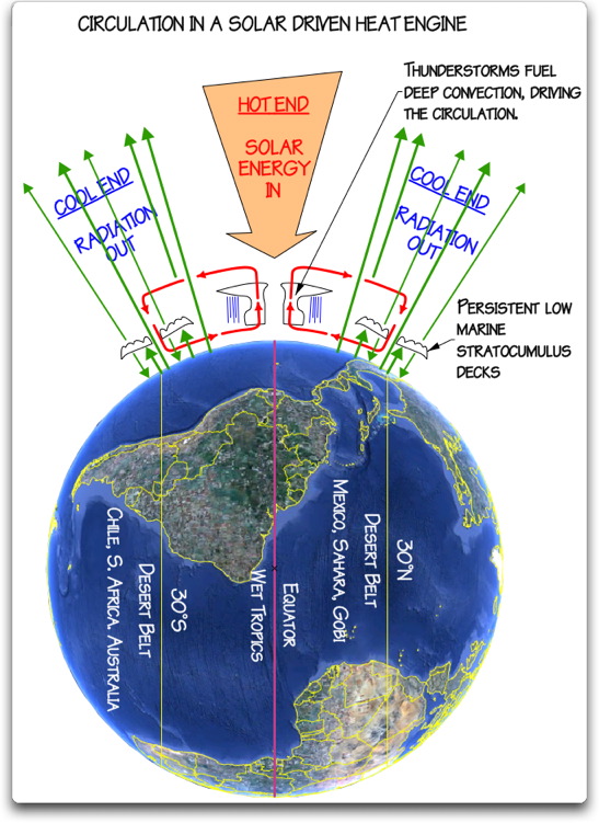
From the point of view of physics, the atmosphere is an almost perfect example of a stable system (Coe, et al., 2021). The climate operates with negative feedback (Le Chatelier’s Principle) as do most natural systems with many degrees of freedom (Kärner, 2007; Lindzen et al., 2001 & 2022). The ocean acts as a heat sink, effectively controlling the air temperature. Recent global average surface temperatures remain relatively stable (Easterbrook, 2016; Moran, 2015; Morano, 2021; Marohasy, 2017; Ridley, 2010) or warming very slightly from other causes (Sangster, 2018) and the increase in temperature from 1880 through 2000 is statistically indistinguishable from 0°K (Frank, 2010; Statistics Norway, 2023) and is less than predicted by climate models (Fyfe, 2013). This shows the difference between the consensus view and established facts.

The results imply that the effect of man-made CO2 emissions does not appear to be sufficiently strong to cause systematic changes in the pattern of the temperature fluctuations. In other words, our analysis indicates that with the current level of knowledge, it seems impossible to determine how much of the temperature increase is due to emissions of CO2. Dagsvik et al. 2024
The IPCC has produced six major assessment reports (AR1 to 6) and several special reports which report on a great deal of good science (Noting that the IPCC does not do any science itself but merely compiles literature reviews). The Summaries for Policy Makers (SPM) are followed by most politicians. Yet the SPM do not agree in large part with the scientific assessment by the IPCC reports and appear to exaggerate the role of CO2 and other ‘greenhouse gases’ in climate change. It appears that the SPM is written by governments and activists before the scientific assessment is reached which is a questionable practice (Ball 2011, 2014 and 2016; Smith 2021).
Other organizations have produced reports of a similar nature and using a similar literature (e.g. Science and Public Policy Institute; The Heartland Institute; The Centre for the Study of CO2; CO2 Science; Global Warming Policy Foundation; Net Zero Watch; The Fraser Institute; CO2 Coalition) and arrived at completely different conclusions to the IPCC and the SPM (Idso et al., 2013a; Idso et al., 2013b; Idso et al., 2014; Idso et al., 2015a, 2015b; Happer, et al., 2022). There are also some web pages (e.g. Popular Technology) which list over a thousand mainstream journal papers casting doubt on the role of CO2 and other greenhouse gases as a source of climate change. For example, a recent report by the CO2 Coalition (2023) states clearly Net Zero regulations and actions are scientifically invalid because they:
- “Fabricate data or omit data that contradict their conclusions.
- Rely on computer models that do not work.
- Rely on findings of the Intergovernmental Panel on Climate Change (IPCC) that are government opinions, not science.
- Omit the extraordinary social benefits of CO2 and fossil fuels.
- Omit the disastrous consequences of reducing fossil fuels and CO2 emissions to Net Zero.
- Reject the science that demonstrates there is no risk of catastrophic global warming caused by fossil fuels and CO2.
Net Zero, then, violates the tenets of the scientific method that for more than 300 years has underpinned the advancement of western civilization.” (CO2 Coalition, 2023; p. 1)
With such a strong scientific conviction the entire Net Zero agenda needs investigating. This paper reviews some of the important science which supports and undermines the Net Zero agenda.
2. Material Studied
A literature review was carried out on various topics related to greenhouse gases, climate change and the relevant scientific literature from the last 20 years in the areas of physics, chemistry, biology, paleoclimatology, geology etc. The method used was an evidence-based approach where several issues were critically evaluated based on fundamental knowledge of the science, emerging areas of scientific investigation and developments in scientific methods. The evidence-based approach is widely used (Green & Britten, 1998; Odom et al., 2005; Easterbrook, 2016; Pielke, 2014; IPCC, 2007a; IPCC 2007b; Field, 2012; IPCC 2014; McMillan & Shumacher, 2013).
Evidence-based research uses data to establish cause and effect relationships which are known to work and allows interventions which are therefore expected to be effective.
3. Greenhouse Gas Theory
The historical development of the greenhouse effect, early discussions and controversies are presented by Mudge (2012) and Strangeways (2011). The explanation of the greenhouse effect or greenhouse gas theory of climate change is given in the IPCC Fourth Assessment Report Working Group 1, The Physical Science Basis (IPCC, 2007, p. 946):
“Greenhouse gases effectively absorb thermal infrared radiation emitted by the Earth’s surface, by the atmosphere itself due to some gases, and by clouds. Atmospheric radiation is emitted to all sides, including downward to the Earth’s surface. Thus, greenhouse gases trap heat within the surface-troposphere system. This is called the greenhouse effect.”
This is plausible but does not necessarily lead to global warming as radiation will be emitted at longer wavelengths in other areas of the electromagnetic spectrum where greenhouse gases do not absorb radiation potentially leading to an energy balance without increase in temperature. To further complicate matters the definition continues with the explanation:
“Thermal infrared radiation in the troposphere is strongly coupled to the temperature of the atmosphere at the altitude at which it is emitted. In the troposphere, the temperature generally decreases with height. Effectively, infrared radiation emitted to space originates from an altitude with a temperature of, on average, -19°C in balance with the net incoming solar radiation, whereas the Earth’s surface is kept at a much higher temperature of, on average, +14°C. An increase in the concentration of greenhouse gases leads to an increased infrared opacity of the atmosphere, and therefore to an effective radiation into space from a higher altitude at a lower temperature. This causes a radiative forcing that leads to an enhancement of the greenhouse effect, the so-called enhanced greenhouse effect.”
This sort of statement is not comprehensible to the average person, makes no sense scientifically and is immediately falsified by recent research (Seim and Olsen, 2020; Coe etal., 2021; Lange et al., 2022, Wijngaarden & Happer, 2019, 2020, 2021(a), 2021(b), 2022, Sheahen, 2021; Gerlich & Tscheuschner, 2009; Zhong & Haigh, 2013). It also contradicts the work of Gray (2015 and 2019) and others and has been heavily criticized (Plimer, 2009; Plimer, 2017; Carter, 2010).
3.1 The Falsifications of the Greenhouse Effect
There are numerous falsifications of the greenhouse gas theory (sometimes called ‘trace gas heating theory’, see Siddons in Ball, 2011, p.19), of global warming and/or climate change (Ball, 2011; Ball, 2014; Ball, 2016; Gerlich & Tscheuschner, 2009; Hertzberg et al, 2017; Allmendinger, 2017; Blaauw, 2017; Nikolov and Zeller, 2017).
Fundamental empirically derived physical laws place limits on any changes in the atmospheric temperature unless there is some strong external force (e.g. increased or decreased solar radiation). For example, the Ideal Gas Law, the Beer-Lambert Law, heat capacities, heat conduction etc., (Atkins & de Paula, 2014; Barrow, 1973; Daniels & Alberty, 1966) all place physical limits on the amount of warming or cooling one might see in the climate system given any changes to heat from the sun or other sources.
3.1.1 The Ideal Gas Law
PV = nRT (1)
The average near-surface temperature for planetary bodies with an atmosphere calculated from the Ideal Gas Law is in excellent agreement with measured values suggesting that the greenhouse effect is very small or non-existent (Table 1). It is thought that the residual temperature difference of 33K between the Stephan-Boltzmann black body effective temperature (255K) on Earth and the measured near-surface temperature (288K) is caused by adiabatic auto-compression (Allmendinger, 2017; Robert, 2018; Holmes 2017, 2018 and 2019). An alternative view of this is given by Lindzen (2022). There is no need for the ‘greenhouse effect’ to explain the near surface atmospheric temperature of planetary bodies with atmospheric pressures above 10kPa (Holmes, 2017). The ideal gas law is robust and works for all gases.
3.1.2 Measurement of Infrared Absorption of the Earth’s Atmosphere
It is now possible to calculate the effect of ‘greenhouse gases’ on the surface atmospheric temperature by (a) using laboratory experimental methods; (b) using the Hitran database (https://hitran.org/); (c) using satellite observations of outgoing radiation compared to Stephan-Boltzmann effective black body radiation and calculated values of temperature.
The near surface temperature and change in surface temperature can be calculated. The result is that climate sensitivity to doubling concentration of CO2 is (0.5°C) including 0.06°C from CH4 and 0.08°C from N2O which is so small as to be undetectable. Most of the temperature change has already occurred and increasing CO2, CH4, N2O concentrations will not lead to significant changes in air temperatures because absorption is logarithmic (Beer-Lambert Law of attenuation) – a law of diminishing returns.

Figure 1. Delta T vs CO2 concentration
The important point here is that the Ideal Gas Law, the logarithmic absorption of radiation and the theoretical calculations by Wijngaarden & Happer (2020 and 2021), Coe et al., (2021) based on the Beer-Lambert Law and the Stephan-Boltzmann Law show that there is an upper limit to the temperature change which can occur by adding ‘greenhouse gases’ to the atmosphere if the main source of incoming radiation (the Sun) does not change over time. The upper limit is ~0.81°C.
3.1.3 Other Falsifications
Many climatologists ignore the well-established ideas of the Ideal Gas Law, Kinetic Theory of Gases and Collision Theory which explain the interaction of gases in the atmosphere (Atkins & de Paula, 2014; Salby, 2012; Tec science). For example, it is difficult for CO2 to retain heat energy (by vibration, rotation, and translation) as there are 1034 collisions between air molecules per second per cubic meter of gas at a pressure of 1 atmosphere (~101.3kPa) and on each collision, energy is exchanged leading to a Maxwell-Boltzmann distribution (similar to a normal distribution) of molecular energies across all molecules in air (Tec science). The Maxwell-Boltzmann distribution has been experimentally determined (Atkins & de Paula, 2014). Thus, the major components of air (nitrogen and oxygen) retain most of the energy, cause evaporation of water vapor by heat transfer (mainly by conduction and convection) and emit radiation at longer wavelengths. The small concentration of CO2 in air (circa 420ppmv) cannot account for large changes in the climate system which have occurred in the past (Wrightstone, 2017 and 2023; Ball, 2014). Plimer (2009 and 2017) presents a great deal of geological scientific evidence which covers paleoclimatology concluding that:
“There is no such thing as the greenhouse effect. The atmosphere behaves neither as a greenhouse nor as an insulating blanket preventing heat escaping from the Earth. Competing forces of evaporation, convection, precipitation, and radiation create an energy balance in the atmosphere.” (Plimer 2009: p.364).
Ball (2014) summarizes a great deal of the geological science:
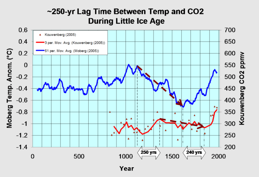
“The most fundamental assumption in the theory that human CO2 is causing global warming and climate change is that an increase in CO2 will cause an increase in temperature. The problem is that every record of any duration for any period in the history of the Earth exactly the opposite relationship occurs temperature increase precedes CO2 increase. Despite that a massive deception has developed and continues.” Ball (2014: p. 1).
This statement agrees with many other scientists working in geology, earth sciences, physics and physical chemistry as can be seen in cited references in books (Easterbrook, 2016; Wrightstone 2017 and 2023; Plimer, 2009; Plimer 2017; Ball, 2014; Ball,2011; Ball, 2016; Carter, 2010; Koutsoyiannis et al, 2023 & 2024; Hodzic, and Kennedy, 2019). Easterbrook (2016) uses the evidence-based approach to climate science and concludes that:
“Because of the absence of any physical evidence that CO2 causes global warming, the main argument for CO2 as the cause of warming rests largely on computer modelling.” Easterbrook (2016: p.5).
The results of the models are projected far into the future (circa 80 to 100years) where uncertainties are large, but projections can be used to demonstrate unrealistic but scary scenarios (Idso et al., 2015b). The literature that is used for the IPCC reports appears to be ‘cherry picked’ to agree with their paradigms that increasing CO2 concentrations leads to warming. They ignore the vast literature in climatology, atmospheric physics, solar physics, physics, physical chemistry, geology, biology and palaeoclimatology much of which contradicts the IPCC’s assessment in the summary for policymakers (SPM).
The objective of the IPCC was to find the human causes of climate change – not to look at all the causes of climate change which would be the sensible thing to do if the science were to be used to inform policy decisions. However, there is no experimental evidence for a significant anthropogenic component to climate change (Kaupinnen and Malmi, 2019) which leaves genuine scientists and citizens concerned about the role of the IPCC.
3.1.4 Anthropogenic CO2 and the Residence time of Carbon Dioxide in Air
There is a suggestion (IPCC) that the residence time of CO2 in the atmosphere is different for anthropogenic CO2 and naturally occurring CO2. This breaks a fundamental scientific principle, the Principle of Equivalence. That is: if there is equivalence between two things, they have the same use, function, size, or value (Collins English Dictionary, online). Thus, CO2 is CO2 no matter where it comes from, and each molecule will behave physically and react chemically in the same way.
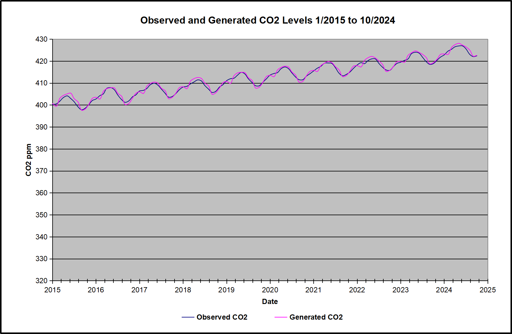
The figures above illustrate how exaggerated claims are made for CO2 based on the false assumption that CO2 resides in the atmosphere for long periods and can affect the climate. These results are enough to falsify the ideas of anthropogenic global warming caused by CO2 and shows how little human activity contributes to CO2 emissions and concentrations in air. The argument is clear, that if the fictitious greenhouse effect were real for CO2 the human contribution would have no measurable effect upon the climate in terms of global average surface temperature.
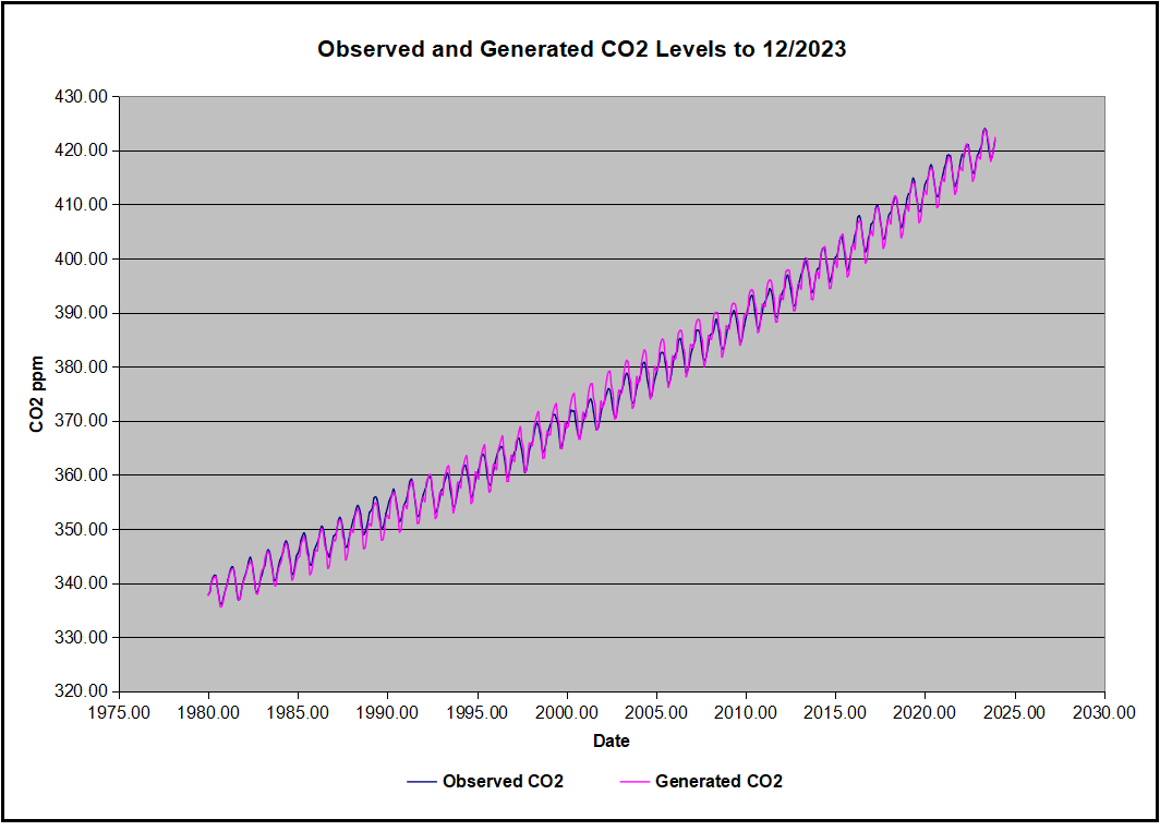
The residence time of CO2 in the atmosphere is between 3.0 and 4.1 years using the IPCC’s own data and not the supposed 100 years or 1000 years for anthropogenic CO2 suggested by the IPCC summaries for policy makers (Harde, 2017) which contravenes the Equivalence Principle (Berry, 2019).
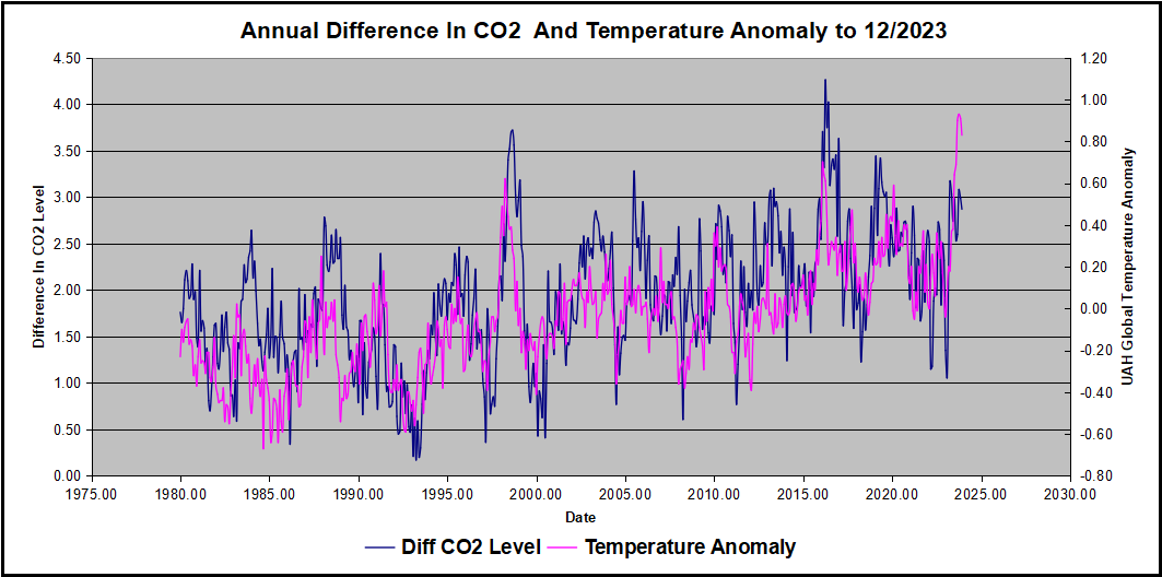
“These results indicate that almost all of the observed change of CO2 during the industrial era followed, not from anthropogenic emission, but from changes of natural emission. The results are consistent with the observed lag of CO2 changes behind temperature changes (Humlum et al., 2013; Salby, 2013), a signature of cause and effect.” (Harde, 2017a: 25).
It is well-known that the residence time of CO2 in the atmosphere is approximately 5 years (Boehmer-Christiansen, 2007: 1124; 1137; Kikuchi, 2010). Skrable et al., (2022), show that accumulated human CO2 is 11% of CO2 in air or ~46.84ppmv based on modelling studies. Berry (2020, 2021) uses the Principle of Equivalence (which the IPCC violates by assuming different timescales for the uptake of natural and human CO2) and agrees with Harde (2017a) that human CO2 adds about 18ppmv to the concentration in air. These are physically extremely small concentrations of CO2 which suggest most CO2 arises from natural sources. It can be concluded that the IPCC models are wrong and human CO2 will have little effect on the temperature.
4. Conclusions
Like many other researchers it was assumed there was robust science behind the greenhouse gas theory and that Net Zero was essential to achieve, but after investigation it now appears that the greenhouse gas theory is questionable and has been successfully challenged for at least 100 years (Gerlich and Tscheuschner, 2009). Much better explanations for planetary near surface atmospheric temperatures are available based on robust, empirically derived scientific laws such as the Ideal Gas law.
Better assessments of the potential increase in temperature with doubling CO2 concentrations are available and the calculated increase is small ~0.5°C (Coe et al., 2021; van Wijngaarden & Happer, 2019, 2020 and 2021; Sheahen, 2021; Schildknecht, 2020) and will remain very small with increased CO2 concentration because the infrared CO2 absorption bands are almost saturated and absorption follows the logarithmic Beer-Lambert law (Figure 1). Much of the work using the Hitran database has been tested against satellite measurements of the outgoing radiation from the Earth’s atmosphere and the calculations are in almost perfect agreement (Sheahen, 2021).
This suggests that the physicists are correct in their assessment of the likely very small increase in atmospheric temperature and therefore there is a strong case against Net Zero as it will have no discernible effect on temperature and the cost of Net Zero is huge. Therefore, the Net Zero project does not pass the cost-benefit test (Montford, 2024b; NESO, 2024). That is the costs are disproportionately high for little or no benefit. Thus, the correct response to a non-problem is to do nothing. The monies being wasted on Net Zero should be spent for the benefit of citizens (e.g. education, health care, public health, water infrastructure, waste processing, economic prosperity etc.). There are many other pressing public health problems from burning fossil fuels which should be addressed (e.g. air pollution especially particulates and carbon monoxide).
Better calculations of the human contribution to atmospheric CO2 concentrations are available and it is small ~18ppmv (Skrable et al., 2022; Berry, 2020; Harde 2017a & 2017b; Harde, 2019; Harde 2014). The phase relation between temperature and CO2 concentration changes are now clearly understood; temperature increases are followed by increases in CO2 likely from outgassing from the ocean and increased biological activity (Davis , 2017; Hodzic and Kennedy, 2019; Humlum, 2013; Salby, 2012; Koutsoyiannis et al, 2023 & 2024).
“In conclusion on the basis of observational data, the climate crisis that, according to many sources, we are experiencing today, is not evident yet.” Alimonti etal. 2022: 111.
Many researchers are addressing the ‘CO2 and climate change problem’ by suggesting decarbonization and other approaches such as Net Zero. CO2 is more than likely not the temperature control and has a very minor to negligible role in global warming (The Bruges Group, 2021; De Lange and Berkhout, 2024; Manheimer, 2022; Statistics Norway 2023; Lindzen and Happer, 2024; Lindzen, et al., 2024).
The scientific literature was examined and found to provide several alternative views concerning CO2 and the need for Net Zero. The objectives of this paper have been achieved and the conclusions can be briefly summarized:
- CO2 is a harmless highly beneficial rare trace gas essential for all life on Earth due to photosynthesis which produces simple sugars and carbohydrates in plants and a bi-product Oxygen (O2). CO2is therefore the basis of the entire food supply chain (see Biology or Botany textbooks or House, 2013). CO2 is close to an all-time low geologically (Wrightstone, 2017 and 2023) and controls on CO2 emissions and concentrations in air should be considered as very dangerous and expensive policy indeed. Net Zero is not necessary and should be abandoned.
- The greenhouse gas theory has been falsified (i.e. proven wrong) from several disciplines including paleoclimatology, geology, physics, and physical chemistry. CO2 cannot affect the climate in such small concentrations (~420ppmv or ~0.04%) and basing government policy on output from faulty climate models will prove to be very expensive and achieve nothing for the environment, public health, or the climate.
“There is no atmospheric greenhouse effect, in particular CO2 greenhouse effect, in theoretical physics and engineering thermodynamics. Thus, it is illegitimate to deduce predictions which provide a consulting solution for economics and intergovernmental policy.” (Gerlich & Tscheuschner, 2009: 354).
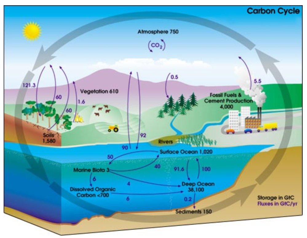
- The oceans contain approximately 50 times as much CO2 as is currently present in the air (Easterbrook, 2016; Wrightstone, 2017 and 2023) and as such Henry’s Law will work to maintain the dynamic equilibrium concentration in air over the longer term as the ocean will absorb and outgas CO2(Atkins & de Paula, 2014). Net Zero will, therefore, achieve nothing for the concentration of CO2 in the atmosphere. If the volcanic sources of CO2 are as Kamis (2021), the IPCC and others suggest many times the human contribution, then Net Zero will have no measurable effect on atmospheric CO2 concentrations. Net Zero should, therefore, be abandoned.
- The contribution to greenhouse gases, especially CO2, attributable to humans is extremely small, almost negligible (~4.3% or ~18ppmv total accumulation) and half is absorbed by the ocean and biomass. Other naturally occurring so-called greenhouse gases are present in very small/negligible quantities (e.g. CH4, N2O). The systematic attempts to eliminate these trace gases from the atmosphere by reducing industrial output, reducing farming, eliminating fossil fuel use, and changing the way human civilization lives is totally unnecessary – again the ‘do-nothing strategy’ is strongly recommended.
- The sciences have been largely ignored by politicians and activists. There have been numerous failings of governments to take notice of scientific findings and they have succumbed to unnecessary pressure from activist groups (including the United Nations and the IPCC). Net Zero is just one example where costly efforts by governments will achieve nothing and not address the real problems of air pollution, public health, or economic well-being of citizens.
“There is not a single fact, figure or observation that leads us to conclude that the world’s climate is in any way disturbed.” (Société de Calcul Mathématique SA, 2015:3).
- Circular reasoning is used by the climate modelers. That is, the fictitious greenhouse effect is built into the models such that when the parameter of CO2concentration is increased then the temperature output of the models increases, producing models which run relatively hot compared to natural variability. This reduces the so-called greenhouse effect to little more than a ‘fudge factor’ or ‘parameter’ within models which essentially gives you the answer that you set out to prove. This circular reasoning is hardly scientific enquiry and with data ‘homogenization’ and infilling of missing data begins to look rather peculiar. Climatologists need to recognize these issues, address the real reasons for climate change and offer genuine solutions to any real problems.
- The claim of consensus is completely unscientific in its approach (Idso et al, 2015a). Noting that 31,000 US scientists and engineers signed the petition protest (Robinson et al., 2007), recently 90 Italian scientists wrote an open letter to the Italian government (Crescenti et al., 2019), and 500 climatologists and scientists signed an open letter to the UN Secretary General (Berkhout, 2019). All explaining that CO2 is not the cause of climate change. There are thousands of academic papers and books questioning anthropogenic climate change with good data.
Many other concerned individuals have looked at the evidence for anthropogenic climate change based on CO2 and found it wanting (e.g. Davison, 2018; Rofe, 2018).
“If in fact ‘the science is settled’, it seems to be much more settled in the fact that there is no particular correlation between CO2 level and the earth’s temperature.” (Manheimer, 2022).
and
“If you assume the Intergovernmental Panel on Climate Change are right about everything and use only their numbers in the calculation, you will arrive at the conclusion that we should do nothing about climate change!” (Field, 2013).
The academic literature in science offers numerous and far better explanations for climate change than the fictitious greenhouse effect. Researchers should recognize this fact and start to look at dealing with the real causes of climate change. Net Zero is an enormously expensive solution to a non-problem and has no obvious redeeming features. The Net Zero policy is not financially sustainable and should be abandoned.