Jason Isaac and Steve Milloy bring tidings of great joy in 2026 in their Washington Examiner article with the title as above.
Every April, like clockwork, a predictable ritual unfolds. Earth Day rolls around with the same tired apocalyptic sermon from the climate catastrophe cult.
The routine never changes: The planet is dying, humans are to blame, and only surrendering your freedom, your car, and your paycheck to the green elites will save it. Fifty-six years later, they’re still wrong.
The planet is fine. It’s the climate cult that’s cracked.
You’d think after all the busted prophecies, they’d tone it down. Instead, they double down.
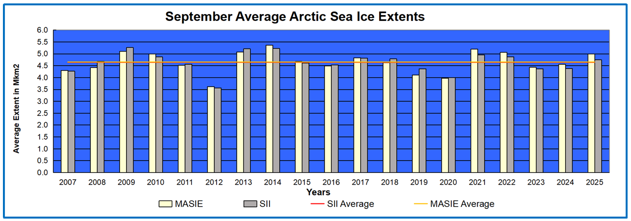
Remember when the “experts” said the Arctic would be ice-free by 2013? The ice is still there, just as thick and stubborn as ever.
We were told hurricanes would grow “more frequent and more powerful.” Instead, there were near-normal seasons in 2023 and 2024.
So now they move the goalposts: Every weather event, hot or cold, wet or dry, is “caused by climate change.” It’s not science. It’s superstition plotted on graphs. They said snow would vanish from ski resorts — remember that “End of Snow” panic? Instead, skiers in the Northeast this year were digging out from record blizzards.
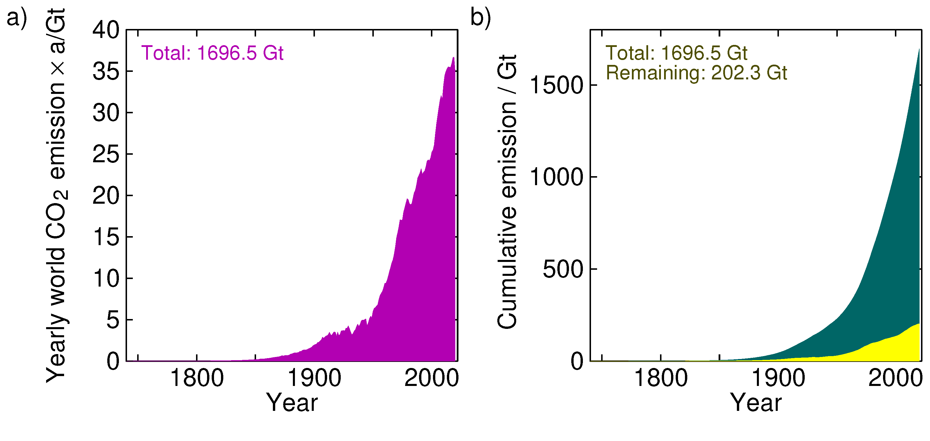
The 2023-2024 warming spike was caused by a natural El Nino. When the El Nino ended, the spike ended. February 2026 was cooler, in fact, than February 1998 despite a trillion tons of emissions.
Time after time, the “experts” predict apocalypse. And year after year, Mother Nature refuses to corroborate their stories.
Cleaner Air Than Ever Before
Air Quality – National Summary EPA
Meanwhile, the actual data tell a different story. U.S. air quality today is the cleanest it’s been in 50 years.
My Mind is Made Up, Don’t Confuse Me with the Facts. H/T Bjorn Lomborg, WUWT
Global deaths from natural disasters have plummeted over 90% since the early 20th century. Crop yields worldwide keep hitting records.
Humans are safer, wealthier, and more energy-secure than at any time in history.
The planet isn’t gasping for breath — it’s very healthy.
That’s exactly what George Carlin was getting at in his legendary bit, “The Planet Is Fine.” Over three decades ago, long before “climate anxiety” was a diagnosis, Carlin, perhaps the most famous comedian of his time, saw through the sanctimony.
The planet’s been through ice ages, asteroid strikes, and supervolcanoes — and it’s still spinning. Yet today’s enviroactivists think your SUV is going to do what Mount Tambora couldn’t? Please. Their arrogance is nauseating.
The self-appointed saviors of Earth don’t really care about the planet.
They care about control.
Earth Day has turned into a political holiday — a green May Day for those who want to remake society in their image. Their “solutions” invariably mean more regulation, higher taxes, and fewer choices.
Shut down the power plants, outlaw gas stoves, ban plastic straws while flying private jets to elitist conclaves dressed up as ‘‘climate conferences.”
It’s not about saving Earth. It’s about saving face.
When the predictions fail, the excuse shifts. Sea levels were supposed to swallow Manhattan, but the only thing underwater now is former Vice President Al Gore’s credibility.
Polar bears were “going extinct” until the population hit record highs. Every “climate emergency” gets debunked, but the headlines roll on because fear sells.
Carlin joked that people crave bad news. The legacy media just industrialized it.
And the public is getting wise. Net-zero mandates
are collapsing under their own absurdity.
Europe ran headfirst into the wall of “green reality” and came crawling back to coal and nuclear. Even California’s self-inflicted energy shortages have people asking whether energy policy should be based on cockamamie models or common sense.
The answer should be obvious: If your plan can’t keep the lights on, it’s not saving the planet — it’s sabotaging it.
“Follow the science” is their mantra. Fine.
The science says carbon dioxide is plant food.
The science says climate models have blown past reality for decades. The science says mankind thrives in warmer eras.
None of this fits the narrative, so it gets buried under the next climate scare of the month. The apocalypse never arrives — but the grant money does.
Here’s the part Earth Day activists really hate: The planet isn’t fragile — we are.
Nature doesn’t need our policies, our pledges, or our petitions. It will outlast every last panel discussion in Davos, Switzerland.
So instead of groveling over our collective “climate guilt,” maybe they should celebrate what we’ve actually accomplished: clean air, longer lives, record food production, and energy that works at the flick of a switch.
The planet doesn’t care about your compost bin or your latest electric car mandate. It’s been around for 4.5 billion years, and cooling for the last 485 million years, and it will still be here when the last climate model is rotting on an obsolete hard drive.
It’s humans who need perspective. As Carlin famously said, “The planet is doing great.” The hysterical people who keep screaming that it isn’t are the problem.
Two things happened in February that will change the world. The first is the Iran War.
The second is an event so obscure most Americans don’t even know it happened — the Feb. 12 repeal of the 2009 Endangerment Finding by the Trump Administration’s Environmental Protection Agency (EPA). This decision puts a knife into the kidney of all the major U.S. climate rules made under the Obama and Biden administrations. It was the legal underpinning for the Green New Deal.
Of the two events, the end of the Endangerment Finding is of a greater consequence, yet 21st Century conventional wisdom — curated and gatekept by social media, the most unwise medium ever invented — makes it hard to fit one’s head around this argument. But here goes.
The Iran War is costing about $1-2 billion a day in direct costs,and several times that in indirect costs from higher energy prices across most of Europe and Asia, though less so in the United States, which is increasingly energy independent.
Meanwhile, the 2009 Endangerment is one of those “regulatory state” workarounds when Congress doesn’t pass a law or the Supreme Court passes on a tough decision. This administrative decision is the foundation of ALL modern climate regulation and global climate diplomacy. Its reversal has the Trump administration crowing about the $1.3 trillion in savings over the next decade to American citizens through cheaper automobiles, among other things.
This has made a lot of the right people unhappy.
In an interview with The New York Times, Jody Freeman, director of Harvard Law School’s Environmental and Energy Law Program, who happened to design the Endangerment Finding for the Obama White House, said the Trump administration wants “to not just do what other Republican administrations have done, which is weaken regulations. They want to take the federal government out of the business of regulation, period.”
Speaking as someone who worked at the EPA during the first Trump administration, I know Freeman is wrong. Republicans don’t mind environmental regulation based on good incentives that don’t penalize industries that are politically disfavored through no fault of their own.
But there is a human cost to all regulation that is essentially unpriced,
and it is something Freeman and the Left never acknowledge.
Federal regulation itself was invented by the government to improve human lives — think the Safe Drinking Water Act, the Clean Air Act, or the 1938 Fair Labor Standards Act that ended child labor. The problem is that future choices forgone, which economists call opportunity costs, are nearly impossible to quantify and constrain, thereby stifling innovation and invention in almost unfathomable ways.
Consider the following counterfactual.
If the U.S. Supreme Court had made privacy laws stricter in the late 1990s, sharing pictures of strangers without their permission would have been illegal. This would have disincentivized early camera phone makers, Sharp and Sanyo, from including cameras in the first smartphones in the early 2000s and would have slowed or even undermined Apple’s decision to build the iPhone.
Less than 25 years after the first U.S. camera phone was released, the total value of mobile technologies and services globally exceeds $7 trillion, representing more than 6% of global GDP. Much of these trillions of dollars of newly created wealth exists in the share price of Silicon Valley firms, and the retirement savings of nearly 100 million Americans and the U.S. economy writ large.
What the Endangerment Finding did was create a domestic legal predicate
to treat carbon dioxide as a pollutant under the Clean Air Act.
That predicate, in turn, allowed Democratic administrations to commit America to the Paris Agreementand the broader U.N. climate regime that the U.S. Senate was fooled into accepting when it passed the United Nations Framework Convention on Climate Change (UNFCCC) in 1992.
It’s quite possible that the global climate regime created under UN sponsorship had a similar effect on energy-intensive industries to that a strict privacy law would have had on smartphones, which became the entry point for billions of people into the digital economy.
And now it’s ending. By undoing the Endangerment Finding, you don’t just repeal a regulation; you repeal the regulatory superstructure that has saddled the United States with trillions of dollars in opportunity costs and billions in explicit costs every year.
Thus, however costly a short conflict with Iran would be, it hasn’t been
nearly as much as the unpriced opportunity costs of
the last 30 years under the UN Climate regime.
Once the U.S. is no longer legally bound at home, it can exit the international framework cleanly. And when America leaves, the dominoes fall in order. Russia, China, India, and Saudi Arabia — none of whom ever believed “the planet is dying” rhetoric anyway — will follow suit. They never saw the climate treaty as anything other than a wealth-transfer mechanism from the West, and now the jig is up for the American Left and the European establishment.
Instead of this transhumanist dystopia, we have the possibility of
returning meaningful heavy industry to the U.S.,
creating over a million good-paying craft jobs,
while still maintaining strong environmental laws.
Indeed, fears of environmental backsliding could be easily remedied by Congress if it were to pass the Affordable, Reliable, Clean Energy Security Act (ARC-ES), introduced in Congress late last year by Rep. Troy Balderson (R-OH). The ARC-ES bill would codify into law clear definitions of key terms like “affordable,” “reliable,” and “clean,” ensuring that investment risks are limited to cost-effective infrastructure projects only.
The bill would help America’s most affordable, reliable, and environmentally-friendly energy sources, including nuclear and natural gas, remain part of the energy mix — a crucial requirement for American households and businesses.
The fact that neither the ARC-ES nor the Endangerment Finding’s reversal of fortune is anywhere in the news tells you everything you need to know about the current state of global journalism.
This is no slight to the news coverage concerning Iran, which is compelling, but all over the place. It just shows how incentives for informing the public in the 21st century about what truly matters in their lives are weak and getting worse. Perhaps one day someone will invent a better medium for information.
William Murray is a former speechwriter for the Environmental Protection Agency (EPA), the past editor of RealClearEnergy from 2015 to 2017, and currently the chief speechwriter for the Commodity Futures Trading Commission (CFTC).
The Biden administration’s obsession with climate change has contributed to the housing affordability challenges Americans face today, and there are many harmful green policies that need to be undone. The Trump administration is taking an ax to several of them, and it just received a big boost when a U.S. District Court repealed a measure burdening low-income and first-time home buyers.
Specifically, on March 5th, an Eastern District of Texas decision vacated a 2024 requirement from the Department of Housing and Urban Development (HUD) that new homes qualifying for federally-backed mortgages must comply with the 2021 International Energy Conservation Code (IECC). Thankfully, the court in Utah v. HUD found the agency’s actions in violation of the law.
The IECC is a spare-no-expense assault on residential energy use – for example, by requiring far more insulation than makes sense and necessitating costlier appliances. A number of environmental organizations advocated for the IECC’s building code dictates, saying they would ensure that “low-income homeowners and residents are prioritized in a climate-aligned future.”
And mind you, this was HUD – not the Environmental Protection Agency – an agency whose core mission is to make housing more affordable. Yet it was trying to impose these expensive environmental requirements on the very Americans who need federal help to qualify for a mortgage. In fact, over 80% of HUD-backed mortgages have gone to first-time buyers with lower credit scores and smaller down payments than those served by conventional lenders.
Matt Ridley explains the demise of climatism in his recent video The Great Climate Climbdown is finally here – How can we undo the Damage Caused? For those preferring to read, there is a transcript below with my bolds and some helpful images.
I’m going to try and give you my perspective on which arguments have made the difference in terms of changing people’s minds on climate, and therefore the kinds of evidence and arguments that we should be pushing in order to try to win this battle. The genesis for this was this article I wrote in The Spectator saying that I really do think the climate emergency talk has peaked, and we are seeing a significant change. If you live in the British Isles, that’s not immediately apparent.
Climate Lemmings
It’s still a huge issue in Britain and Ireland, and most of Europe. But if you spend any time in America now, or even in Asia, you are seeing a very, very different debate where the affordability of energy is much more important than decarbonisation, where the demands of AI, etc., have trumped the requirement to cut carbon dioxide emissions. I think Britain and Ireland are getting left behind here, and we need to get with the conversation that’s happening elsewhere.
I think the images are covering the latter half of that graph, so you can’t see, but there has been a decline in newspaper coverage. There’s all sorts of straws in the wind, like I mentioned Bill Gates closing down the advocacy office, the Banking Alliance for Climate Change has closed down. A lot of companies are tiptoeing away from this issue, and it therefore is a moment when it might die out.
More likely, it will go quiet for a while, and then we’ll have more air pumped into the balloon at some point in some form or other. There’s such a gigantic vested interest these days in climate alarm that one can’t ever write it off completely. But here are 10 reasons I think why it’s fading, and I’ll run through them in more detail, but I’ll just quickly list them here.
I think it’s important not to underestimate the degree to which the COVID pandemic has left people mistrustful of science and of experts, and that has significantly damaged trust in science, and that is infecting the climate debate. Of course, over-claiming and some degree of fraud have been a problem in the climate science arena for even longer, but I think you are getting traction now because of COVID. Most important, of course, is that we were told that the decarbonization of the world energy system would pay for itself, would be profitable.
That is clearly not the case. It’s proving costly, inconvenient, and regressive in that poor people are paying more than rich people for this transition, and that I think is why a lot of ordinary people are beginning to see through the alarm. The transition to wind and solar, which I call unreliable because there are lots of renewable energies, but the distinguishing feature of wind and solar is that you can’t rely on them.
The transition to them is simply failing to materialize, I will argue. I don’t fully understand why, if you’re worried about what’s happening to climate change, you are automatically passionately in favor of wind and solar power. It just doesn’t necessarily follow, in my view.
I think it’s important not to underestimate how much the shale revolution has changed everything. Until 15 years ago, it was still easily possible to talk about oil and gas running out and therefore getting more expensive, and that would therefore necessitate a switch from hydrocarbons. That changed with the discovery of how to get gas and oil out of shale, and the effect on America’s position as a gas and oil producer and as an energy consumer is extraordinary, I think, and many people outside America just don’t realize this.
We’re so indoctrinated with the idea that the big energy transition of our time is windmills and solar panels that we don’t notice that the big energy transition of our time is actually shale. The fact that the AI industry needs reliable, affordable power has led much of tech to become much more realistic and pragmatic about energy, and getting it from shale gas power stations is now the top priority for most of the companies rushing into AI and data centers.
On the science, I’m somebody who thinks it is getting warmer. Springs are getting nicer, winters are getting milder, summer’s not much different, but I don’t think it’s getting worse, and I think that is what most people are now beginning to realize after 50 years of being told that the future is going to be horrible. We’re living in that future, and it ain’t too bad. One of the reasons for that is because the models are still running too hot and have been consistently, because they’re assuming higher climate sensitivity than the science now supports.
I think that there is now so much evidence that the recent past, by which I mean the current interglacial, the Holocene period, starting about 9,000 years ago, has been much, much warmer in its first half than it is today. That evidence is getting harder and harder to hide, deny, or ignore. Therefore, we are a long way from living in unprecedented temperatures.
The fact that we’re unprecedented compared with the 19th century is not really the relevant comparison. For me, one of the big stories is that the effect of carbon dioxide on green vegetation is much greater than scientists expected or predicted. They did not think it was a limiting factor in most ecosystems, and yet it’s turning out to be an enormous effect, much more measurable, actually, than the effect of carbon dioxide on warming.
If carbon dioxide is a problem, we ought to be able to measure its cost and then tell ourselves how much this generation should pay for a cost that’s going to fall on a future generation, how much we discount the future. That calculation, it seems to me, if done honestly, is more and more playing against alarm. Just to the first point about overclaiming and fraud, which is damaging trust in science, the record of predictions about what’s going to happen in the climate and the chickens that are coming home to roost on this are more and more helpful, I think, to the argument.
Al Gore is known now more for predicting that the Arctic would be ice-free within five years in 2009 than he is for some of the other things he’s said. It has damaged the reputation of people like that. I enjoyed this quote from Ted Turner, that within 30-40 years, no crops will grow, most people will have died, and the rest of us will be cannibals.
It’s quite extraordinary what people have been getting away with saying in order to get noticed in this debate. The UN Secretary General standing up to his knees on a beach in Tuvalu makes great cover for Time magazine, but I think this kind of thing no longer cuts through to people, partly because people now realize that islands like Tuvalu are not sinking, they’re actually gaining land area because of wave action. You can’t see it because it’s on the corner there, but I’ve included Andrew Montford’s hockey stick delusion here because I do think that the hockey stick story is one of significant scientific malpractice, and that ought to be better known.
This picture just sums up a lot of what went wrong in recent years, and I don’t think you’re going to see this kind of uniparty consensus again. Here is the environment secretary or shadow secretaries of the British government, the Tory party, the Liberal Democrat party, and the Labour party all standing up and giving a round of applause to Greta Thunberg. Greta Thunberg is saying, unfortunately I can’t quite read what she’s saying because it’s hidden behind the thing for me, I hope it is for you, but that we’re setting off an irreversible trend that will end civilization by 2030.
That’s what she actually said in parliament in Westminster that day. Michael Gove, the Tory, said your voice is still calm, it’s the voice of our conscience, we feel great admiration, and Ed Miliband said you’ve woken us up. So this kind of political consensus has been a huge problem.
The fact that no party has been prepared to rock the boat, that is changing even in Britain now. We have the Reform Party and the Conservative Party both being much more skeptical on climate and energy issues. The degree to which electricity and gas prices have exceeded those in America now, in Europe and in the UK in particular, and in Ireland, is more and more striking.
Figure 4 – International Domestic Electricity Prices (p per kWh). UK has the highest domestic electricity prices in the IEA.
And paying four times as much for your energy, whether it’s gas or electricity, is not compatible with remaining competitive. And we are seeing Britain losing its fertilizer, chemical, pharmaceutical, motor, steel, many many other industries at a terrifying rate. Not only that, we are cutting ourselves off from being able to take part in a significant way in the AI industry and some of the other industries of the future, some of the robotics industries and so on.
So this really is where it’s going to hurt ordinary people to have been so far ahead of everyone else in trying to decarbonize our economy. The electric car revolution has been forced on consumers, it’s relatively unpopular for lots of reasons, reliability, cost, charging times. And if you do the analysis on a Chinese electric grid, it’s hard to see how they save any emissions at all, because it’s basically a coal car when you’re running an electric car in China.
Less so in Europe, where most of the electricity comes from gas. But even there, it takes many tens of miles before you’ve really saved any emissions at all, or saved significant quantities of emissions. And at that point, the battery is probably nearly dead anyway, so you’re about to replace it.
So to replace a functioning industry, quite a successful industry in the UK, the motor industry, with one that is really struggling, is a bad thing in itself. And to do so at significant cost and inconvenience to the consumer really is an own goal. I’d say the same kind of thing about heat pumps, replacing gas-fired boilers, fine if it’s a new-build house, much harder if you’re adapting an existing house and have to change the insulation and everything.
And even if it works for the same price, you’re removing a system before the end of its useful life and replacing it with one that’s no better. Therefore, there is no growth in economic terms, and you are effectively stranding assets in doing that. And refusing to build a third runway, trying to limit how much people fly, and telling people that they shouldn’t eat meat is not only counterproductive in political terms, this is backfiring quite significantly even in Europe, much more so in Asia and America.
The big one, as far as the electricity system is concerned, is of course the dash for renewables, for unreliables, in particular solar and wind, where it’s not just the unreliability, the intermittency, but the extreme cost of a system based on that. Britain is producing, well, it has the capacity to produce 21% more electricity now than 15 years ago, but it consumes 24% less electricity than 15 years ago. Now, doing less with more is the very definition of degrowth or impoverishment, and that is a real problem that we are creating for ourselves in this country.
You can’t see the end of this chart, but the global direct primary energy consumption is still vastly dominated by the hydrocarbons around the world. That has not changed. They’re all still breaking records, all three of them.
And if you zoom in to the top corner of that graph, you can just about see the contribution that solar and wind are making to the world economy. It is infinitesimal, and yet it’s around 6%, I think, now if you add them both up, and yet the coverage of the energy industry is dominated by these two rather medieval technologies. Talking of medieval, this is a book about the crop yields of the manors belonging to the Bishop of Winchester in the 1300s.
You may wonder why I brought it up, but if you zoom in on it, you’ll see that most of these manors were producing between one and four grains of wheat per grain they sowed in the ground, an energy return on energy invested of about between one and four. And of course, you’ve got to keep one grain back to sow next year’s crop. So in a year when you only produce one grain, you’ve got almost nothing to feed people with.
And that is the motor for most of the work done in society by people, and in terms of oats, the same for horses. On my farm in Northumberland today, I would expect to get about 100 grains of wheat for each grain that I sowed in the ground. This energy return on energy invested calculation is, I think, an absolutely critical one, and the one that the unreliable industry is really, really struggling on.
Again, you can’t see the right-hand side of the graph, but you can see this is a calculation of the energy return on energy invested. And if you buffer it by reliability, by the fact that you have to back up wind and solar, it’s hard to see how these reach the economic threshold. Because if you’re producing four units for every unit of energy that goes in, then you’re effectively recreating the medieval economy.
EROI = Total Energy Output / Total Energy Input
And the problem with the medieval economy was that it could only make a few bishops rich, and nobody else could get rich at all. Because otherwise, when you get down to a ratio of three or four energy return on energy invested, a significant proportion of your industry has to be spent making energy. You don’t have much left over to do other things with.
So I think this is the measure that really needs to be rammed home. But on solar, it is just worth pointing out that according to the World Bank, Britain is the second worst country in the world to build solar because of its cloud cover and the cost of land. The only worst country, I’m sorry to say, is Ireland.
Again, it’s disappointing that you can’t see this graph. I hadn’t realized that all these pictures would be on the right-hand side covering it. But the point of this graph is to show that America was a static or declining producer of gas until the early 2000s. It is now by far the biggest gas producer in the world, equal to Russia and Qatar put together. That’s an extraordinary transformation. The same for oil.
Luckily, you can see it here. Everybody, it was said, and it was conventional wisdom, it was groupthink, that America was a played-out declining oil basin, that it would decline steadily from the 1970s onwards. And there was no gain saying that.
And then along came the shale pioneers and turned that around. America now produces more oil than Saudi Arabia and Iraq put together. That’s an extraordinary transformation.
So no one now talks about peak oil, about oil and gas running out in the rest of the world, and therefore about expensive oil. Yes, geopolitics can affect oil and gas prices, but usually only temporarily. The AI revolution is largely fueled by gas and coal with some nuclear. Solar and wind are not the go-to uses for this power, as I mentioned.
What about the climate itself? Well, it is getting warmer. These are early Humlum’s analysis of the five different ways of measuring global average temperature, going up at the rate of, well, going up pretty slowly, heading for about a degree of warming after about 50 years.
But do we believe the numbers?
Because I do think that we need to keep talking about the adjustments that are made to temperature records. I mean, here is a graph that early Humlum produces in which he points out that the GISS estimate of what the temperature was in January 2000 has been adjusted upwards, particularly in September 2013. Maybe that’s fair enough. Maybe they had a reason for doing that. But in the same month, they adjusted the temperature for January 1910 significantly downwards. How can they possibly have had a good reason for doing that?
I think one is quite right to be suspicious of this. Cooling the past in order to warm, in order to increase the rate of warming is just too tempting for the people who are in charge of these statistics. And I haven’t touched on the urban heat island effect and the unreliable thermometer stations and so on, but there’s plenty of those issues too. But the real point, as far as the man in the street is concerned, is the weather getting worse? Yes, it’s getting warmer, but is it getting worse? And no, it’s not.
The global tropical cyclones are not getting more frequent or more lethal. Drought is showing no trend in upwards or downwards, really. And as Roger Pielke has summarized, for most of the significant weather effects, except heat waves and perhaps heavy precipitation, then there is no detection or attribution as stated by the Intergovernmental Panel on Climate Change reports.
This is from AR7, their latest report. And of course, the point which Bjorn Lomborg has made, among others, that higher temperatures, sorry, heat kills far more people, cold kills far more people than heat, and if we have higher temperatures, we will have slightly more people killed by heat, but a lot fewer people killed by cold. So we are genuinely saving lives through global warming.
My Mind is Made Up, Don’t Confuse Me with the Facts. H/T Bjorn Lomborg, WUWT
Generally, deaths from climate change, as many of you will know, are down significantly, whereas deaths from earthquakes, tsunamis and volcanoes are not. That’s a remarkable statistic, which is not because weather’s getting safer, but because we’re getting better at forecasting, predicting and sheltering people from bad weather. People get very worked up about sea ice decline, but it’s slow.
And the Arctic hasn’t broken a sea ice low record since 2012. Antarctica has seen a recent slight downward trend, but there is no evidence that we’re getting anything like an Arctic, an ice-free period in the Arctic summer, which was quite routine 8,000 or 9,000 years ago.
Sea level rise, significant, but no sign of acceleration. The linear trend since 2010 is higher than the linear trend since 2005, but the linear trend since 2015 is lower again. So it’s going up and down, but it’s around a foot and a half per century, which is easily something we can cope with. I won’t go into the details, but I think Nick Lewis in particular and Judith Currie have done a very good job of showing in the peer-reviewed literature that the estimates of climate sensitivity that are going into the models have broadly been too high and they need to come steadily downwards.
And that would explain why the models have been running too hot compared with the global temperature. I think the Holocene Thermal Maximum is a very important point that we need to keep stressing because the temperature of Greenland and the Makassar Strait, two different datasets here, was significantly higher 6,000 BC, 8,000 years ago, than they are today. This data is coming in now from many different types of paleo temperature records showing the Holocene Climate Optimum.
Fig. 1. Climate change in the Holocene, adapted from Palacios et al. (2024a) and modified: warm periods are in yellow and less warm in pale yellow, and cold in blue; Bond Events are after Bond et al. (1997, 2001) and geochronology after Walker et al. (2019).
I was looking, for example, at evidence that in the Indian Ocean, sea levels were considerably higher than they are today. It used to be the consensus that they’d been going up steadily since the Ice Age, or rapidly and then steadily. It’s now reckoned that they may have been up to two meters higher in the period when the first pharaohs were already appearing in Egypt. So that’s not that long ago. And that Holocene Optimum was a period of considerable wetness in the Sahara, lakes and hippos in the Sahara region. So this was a period within human history, in the early period of human history, when we were experiencing much warmer and damper temperatures.
But I think global greening is the big one. Here we have considerable evidence from a number of different directions that there’s 15% more green vegetation on the planet after 30 years because of carbon dioxide fertilization. And that is in all ecosystems, particularly arid ones, but in tropical ones and arctic ones as well, and in marine ones as well as terrestrial ones. That is a really significant effect. If you add the effect it’s had on agricultural yields alone, it comes to trillions of dollars of benefit for mankind. But then let’s add in the benefit for grasshoppers and gazelles and all the other creatures that eat green vegetation.
Now, I published an article about this in 2013, when I first got wind that the satellite data had been analyzed and was showing this global greening. Before then, there were other measures for picking up, but it hadn’t been analyzed from satellite data. And this annoyed the professor whose work I was reporting very much indeed, so much so that when he published his work, the press release from Boston University named me personally, along with Rupert Murdoch, as being the kind of person who mustn’t be allowed to misinterpret this result.
Well, I call that a win, actually, if I’m getting a name checked in the press release. Now, on the social cost of carbon, Britain doesn’t use the social cost of carbon. They can’t make it add up. They simply can’t get an estimate of it that’s high enough to justify the money we’re spending on decarbonization. America did use a high one during the Biden administration, but Ross McKitrick has basically demolished the argument behind that. It largely left out the carbon dioxide fertilization effect.
And his own estimates of the social cost of carbon are that it’s pretty small, that it’s of the order of $5 to $10 per ton of carbon. That’s the total future harm done by each ton of carbon dioxide we produce today. Well, the cost of decarbonization is way higher than that.
So it just doesn’t make sense to pay a fortune for something that will save a penny. Worse than that, they are claiming to help wealthy future people by asking poor people today to make sacrifices, poor people within countries where energy policies tend to be regressive, between countries where we are on the whole denying cheap energy to many poor countries, and of course, between generations as well. I won’t look at those quotes.
So these are the five economic scenarios that IASA did for the IPCC showing what might happen to global GDP per capita. And it’s worth just looking at the one they call taking the highway fossil fuel development. This is the one in which we really let rip and continue to use hydrocarbons on a significant basis and end up with quite a lot of warming as a result.
It’s a scenario in which per capita income is roughly 10 times what it is today, 10 times. Globally, everybody on planet Earth is earning 10 times as much. Imagine what they could do with that, in which the Gini coefficient is down significantly from 0.6 to 0.1, which population falls faster than expected, whether that’s a good thing or a bad thing, in which there is rapid technological progress, strong investment in health and education, effective management of ecological systems.
This is not a terrible world. It sounds like rather a good world. And if, yes, there’s a lot of warming, then we’re 10 times as rich to deal with it. Surely the warming will have done economic harm. Yes, it will. How much harm? It will have reduced the wealth of your grandchildren. Instead of being 10.4 times as rich, they will be 9.8 times as rich. Is that really an existential catastrophe? There’s a reason why we use a discount rate. Lord Stern persuaded us in the mid-2000s that we should not use a discount rate about the future because we’re looking after our grandchildren. We should care about them just as much as we care about ourselves. But if they’re going to be 10 times as rich, then it doesn’t make sense to hurt poor people today to make them not quite 10 times as rich.
So, just to end, what are we still up against?
Massive subsidies and funding for climate alarm.
You can’t underestimate the power of money.Widespread bias and censorship still in the media. Some doubling down on the point that solar power doesn’t come through the Strait of Hormuz.
Doesn’t this crisis prove that we should wean ourselves off fossil fuels? Climate is a very good excuse for politicians. Again and again you’ve seen people like the governor of California saying yes the Palisades fire burned a lot of people’s homes but there’s nothing I can do about it because it was caused by climate change. There was something you could do about it. You could have done prescribed burning but climate change gets you off the hook as a politician.
I do believe that it’s a mistake to go too far in skepticism and call it things like a hoax. That does tend to put people off. But the problem with our side of the argument is we can’t be bothered to sit on these committees and get stuck into the detail and do all the really boring leg work and go to these awful conferences. And that’s what we ought to be better at. And that’s about the only thing I can say that we are the in criticism of the skeptical side of the debate. Thank you very much.
The post below updates the UAH record of air temperatures over land and ocean. Each month and year exposes again the growing disconnect between the real world and the Zero Carbon zealots. It is as though the anti-hydrocarbon band wagon hopes to drown out the data contradicting their justification for the Great Energy Transition. Yes, there was warming from an El Nino buildup coincidental with North Atlantic warming, but no basis to blame it on CO2.
As an overview consider how recent rapid cooling completely overcame the warming from the last 3 El Ninos (1998, 2010 and 2016). The UAH record shows that the effects of the last one were gone as of April 2021, again in November 2021, and in February and June 2022 At year end 2022 and continuing into 2023 global temp anomaly matched or went lower than average since 1995, an ENSO neutral year. (UAH baseline is now 1991-2020). Then there was an usual El Nino warming spike of uncertain cause, unrelated to steadily rising CO2, and now dropping steadily back toward normal values.
For reference I added an overlay of CO2 annual concentrations as measured at Mauna Loa. While temperatures fluctuated up and down ending flat, CO2 went up steadily by ~66 ppm, an 18% increase.
Furthermore, going back to previous warmings prior to the satellite record shows that the entire rise of 0.8C since 1947 is due to oceanic, not human activity.
The animation is an update of a previous analysis from Dr. Murry Salby. These graphs use Hadcrut4 and include the 2016 El Nino warming event. The exhibit shows since 1947 GMT warmed by 0.8 C, from 13.9 to 14.7, as estimated by Hadcrut4. This resulted from three natural warming events involving ocean cycles. The most recent rise 2013-16 lifted temperatures by 0.2C. Previously the 1997-98 El Nino produced a plateau increase of 0.4C. Before that, a rise from 1977-81 added 0.2C to start the warming since 1947.
Importantly, the theory of human-caused global warming asserts that increasing CO2 in the atmosphere changes the baseline and causes systemic warming in our climate. On the contrary, all of the warming since 1947 was episodic, coming from three brief events associated with oceanic cycles. And in 2024 we saw an amazing episode with a temperature spike driven by ocean air warming in all regions, along with rising NH land temperatures, now dropping well below its peak.
Chris Schoeneveld has produced a similar graph to the animation above, with a temperature series combining HadCRUT4 and UAH6. H/T WUWT
March 2026 UAH Temps: SH Ocean Warms, NH Land Cools
With apologies to Paul Revere, this post is on the lookout for cooler weather with an eye on both the Land and the Sea. While you heard a lot about 2020-21 temperatures matching 2016 as the highest ever, that spin ignores how fast the cooling set in. The UAH data analyzed below shows that warming from the last El Nino had fully dissipated with chilly temperatures in all regions. After a warming blip in 2022, land and ocean temps dropped again with 2023 starting below the mean since 1995. Spring and Summer 2023 saw a series of warmings, continuing into 2024 peaking in April, then cooling off to the present.
UAH has updated their TLT (temperatures in lower troposphere) dataset for March 2026. Due to one satellite drifting more than can be corrected, the dataset has been recalibrated and retitled as version 6.1 Graphs here contain this updated 6.1 data. Posts on their reading of ocean air temps this month are ahead the update from HadSST4. I posted recently on February 2026 NH and Tropic SSTs Warm Slightly. These posts have a separate graph of land air temps because the comparisons and contrasts are interesting as we contemplate possible cooling in coming months and years.
Sometimes air temps over land diverge from ocean air changes. In July 2024 all oceans were unchanged except for Tropical warming, while all land regions rose slightly. In August we saw a warming leap in SH land, slight Land cooling elsewhere, a dip in Tropical Ocean temp and slightly elsewhere. September showed a dramatic drop in SH land, overcome by a greater NH land increase. 2025 has shown a sharp contrast between land and sea, first with ocean air temps falling in January recovering in February. Then in November and December SH land temps spiked while ocean temps showed litle change. In February 2026 NH land temps doubled, from Dec. 0.53C up to 1.14C last month. Despite SH land changing little, and Tropical land cooling, the Global land anomaly jumped up from 0.53 to 0.93C. That reversed in March with both NH land and Global land anomaly back down to 0.63C. That cooling offset SH Ocean warming doubling from 0.19C to 0.38C.
Note: UAH has shifted their baseline from 1981-2010 to 1991-2020 beginning with January 2021. v6.1 data was recalibrated also starting with 2021. In the charts below, the trends and fluctuations remain the same but the anomaly values changed with the baseline reference shift.
Presently sea surface temperatures (SST) are the best available indicator of heat content gained or lost from earth’s climate system. Enthalpy is the thermodynamic term for total heat content in a system, and humidity differences in air parcels affect enthalpy. Measuring water temperature directly avoids distorted impressions from air measurements. In addition, ocean covers 71% of the planet surface and thus dominates surface temperature estimates. Eventually we will likely have reliable means of recording water temperatures at depth.
Recently, Dr. Ole Humlum reported from his research that air temperatures lag 2-3 months behind changes in SST. Thus cooling oceans portend cooling land air temperatures to follow. He also observed that changes in CO2 atmospheric concentrations lag behind SST by 11-12 months. This latter point is addressed in a previous post Who to Blame for Rising CO2?
After a change in priorities, updates are now exclusive to HadSST4. For comparison we can also look at lower troposphere temperatures (TLT) from UAHv6.1 which are now posted for March 2026. The temperature record is derived from microwave sounding units (MSU) on board satellites like the one pictured above. Recently there was a change in UAH processing of satellite drift corrections, including dropping one platform which can no longer be corrected. The graphs below are taken from the revised and current dataset.
The UAH dataset includes temperature results for air above the oceans, and thus should be most comparable to the SSTs. There is the additional feature that ocean air temps avoid Urban Heat Islands (UHI). The graph below shows monthly anomalies for ocean air temps since January 2015.
After sharp cooling everywhere in January 2023, there was a remarkable spiking of Tropical ocean temps from -0.5C up to + 1.2C in January 2024. The rise was matched by other regions in 2024, such that the Global anomaly peaked at 0.86C in April. Since then all regions have cooled down sharply to a low of 0.27C in January. In February 2025, SH rose from 0.1C to 0.4C pulling the Global ocean air anomaly up to 0.47C, where it stayed in March and April. In May drops in NH and Tropics pulled the air temps over oceans down despite an uptick in SH. At 0.43C, ocean air temps were similar to May 2020, albeit with higher SH anomalies. In November/December all regions were cooler, led by a sharp drop in SH bringing the Global ocean anomaly down to 0.02C. January and February saw continued Tropical cooling and NH cooling as well pulling Global ocean air temps lower. Now in March 2026 SH ocean warmed pulling up the Global ocean air anomaly.
Land Air Temperatures Tracking in Seesaw Pattern
We sometimes overlook that in climate temperature records, while the oceans are measured directly with SSTs, land temps are measured only indirectly. The land temperature records at surface stations sample air temps at 2 meters above ground. UAH gives tlt anomalies for air over land separately from ocean air temps. The graph updated for March is below.
Here we have fresh evidence of the greater volatility of the Land temperatures, along with extraordinary departures by SH land. The seesaw pattern in Land temps is similar to ocean temps 2021-22, except that SH is the outlier, hitting bottom in January 2023. Then exceptionally SH goes from -0.6C up to 1.4C in September 2023 and 1.8C in August 2024, with a large drop in between. In November, SH and the Tropics pulled the Global Land anomaly further down despite a bump in NH land temps. February showed a sharp drop in NH land air temps from 1.07C down to 0.56C, pulling the Global land anomaly downward from 0.9C to 0.6C. Some ups and downs followed with returns close to February values in August. A remarkable spike in October was completely reversed in November/December, along with NH dropping sharply bringing the Global Land anomaly down to 0.52C, half of its peak value of 1.17C 09/2024. In January and February Global land rebounded up to 1.14C, led by a NH warming spike. That was reversed in March back down to 0.63C despits some SH land warming.
The Bigger Picture UAH Global Since 1980
The chart shows monthly Global Land and Ocean anomalies starting 01/1980 to present. The average monthly anomaly is -0.02 for this period of more than four decades. The graph shows the 1998 El Nino after which the mean resumed, and again after the smaller 2010 event. The 2016 El Nino matched 1998 peak and in addition NH after effects lasted longer, followed by the NH warming 2019-20. An upward bump in 2021 was reversed with temps having returned close to the mean as of 2/2022. March and April brought warmer Global temps, later reversed
With the sharp drops in Nov., Dec. and January 2023 temps, there was no increase over 1980. Then in 2023 the buildup to the October/November peak exceeded the sharp April peak of the El Nino 1998 event. It also surpassed the February peak in 2016. In 2024 March and April took the Global anomaly to a new peak of 0.94C. The cool down started with May dropping to 0.9C, later months declined steadily until August Global Land and Ocean was down to 0.39C. then rose slightly to 0.53 in October, before dropping to 0.3C in December, and slightly higher now in February and March 2026.
The graph reminds of another chart showing the abrupt ejection of humid air from Hunga Tonga eruption.
TLTs include mixing above the oceans and probably some influence from nearby more volatile land temps. Clearly NH and Global land temps have been dropping in a seesaw pattern, nearly 1C lower than the 2016 peak. Since the ocean has 1000 times the heat capacity as the atmosphere, that cooling is a significant driving force. TLT measures started the recent cooling later than SSTs from HadSST4, but are now showing the same pattern. Despite the three El Ninos, their warming had not persisted prior to 2023, and without them it would probably have cooled since 1995. Of course, the future has not yet been written.
It rewrote March record books and even topped a few April records.
Here’s our full recap on this historic early spring heat wave
and how climate change likely influenced it.
Record-breaking March heatwave, intensified by climate change, continues to shatter records across the U.S., Climate Central
Record-shattering March temperatures in Western North America virtually impossible without climate change, World Weather Attribution
2026 likely to be the Hottest year ever? If you’re like me, your response is: That’s not the way it’s going down where I live. Fortunately there is a website that allows anyone to check their personal experience with the weather station data nearby. weatherspark.com provides data summaries for you to judge what’s going on in weather history where you live. In my case a modern weather station is a few miles away March 2026 Weather History at Montréal–Mirabel International Airport.The story about March 2026 is evident below in charts and graphs from this site. There’s a map that allows you to find your locale.
First, consider above the norms for March from the period 1980 to 2016.
Then, there’s March 2026 compared to the normal observations.
The graph shows this March had a few warm days, many days below zero and overall pretty much sub-normal. But since climate is more than temperature, consider cloudiness.
Wow, look at all that gray and just a few spots of blue. Most of the month was cloudy, which means blocking the warming sun from hitting the surface. And with all those clouds, let’s look at precipitation:
So, there were twenty-three days when it rained or snowed, including freezing rainstorms. Given what we know about the hydrology cycles, that means a lot of heat removed upward from the surface.
So the implications for March temperatures in my locale.
There you have it before your eyes. March is often the beginning of
spring weather, but this year was completely cold, frigid or freezing.
No sign of global warming around here.
Summary:
Claims of hottest this or that month or year are based on averages of averages of temperatures, which in principle is an intrinsic quality and distinctive to a locale. The claim involves selecting some places and time periods where warming appears, while ignoring other places where it has been cooling. Attribution studies select hot spots and exclude cold places, despite CO2 supposedly being evenly distributed.
Remember: They want you to panic. Before doing so, check out what the data says in your neck of the woods. For example, NOAA declared that “July 2024 was the warmest ever recorded for the globe.”
Alex Newman reports at Liberty Sentinel New Climate Study Debunks Key UN IPCC Dogma. Excerpts in italics with my added bolds and images. Discussion of the Study itself follows later below.
Breaking research reveals the key metric behind so-called global warming
is based on “physically meaningless” calculations. If true,
it could upend decades of climate science and policy.
Lead author Jonathan Cohler, a physicist, who worked with top scientists around the world including Dr. Willie Soon, explained that even though the U.S. government is leaving the IPCC under Trump, the UN continues to march on with its climate agenda. However, with more and more evidence and scientific papers dismantling the core “science,” the UN’s agenda appears to be on thin ice.
“The public has been told that the ocean is ‘warming’ and absorbing over 90% of ‘excess’ planetary heat,” explained Cohler. “But when we examined how these numbers are actually calculated, we found they represent computational artifacts rather than measurements of real physical energy rendering the entire process a category error.”
The analysis focuses on data from the international Argo float program, a network of approximately 4,000 autonomous floats that drift through the ocean measuring temperature and other data. These measurements form the backbone of modern climate assessments, including those by the IPCC. Even leaving aside the fundamental category error, for the sake of argument, this research nonetheless reveals multiple fundamental problems with how this data is processed, Cohler said.
Fig. 1. (left) Global mean OHC (Cheng et al. 2024a) for 0–2000 m relative to a base period 1981–2010 (ZJ). The 95% confidence intervals are shown (sampling and instrumental uncertainties). (right) Trend from 2000 to 2023 in OHC for 0–2000 m (W m−2). The stippled areas show places where the trend is not significant at the 5% level. Source: Distinctive Pattern of Global Warming in Ocean Heat Content by Trenberth et al (2025).
[Note: The graph showing zettajoules can be misleading. Ocean heat graphs labelled in Zettajoules make it look scary, but the actual temperature changes involved are microscopic, and impossible to measure to such accuracy in pre-ARGO days. And as this post shows, ARGO measurements are also unreliable.]
Since 2004, for instance, ARGO data shows an increase of about two hundredths of a degree.
Abstract Global ocean heat content (OHC) anomalies and derived Earth Energy Imbalance (EEI) estimates, central to contemporary climate assessments including IPCC AR6, are constructed through processes that violate the scientific method. These metrics rely almost exclusively on temperature data from the Argo profiling float array. Their validity and reliability hinge on several critical but herein refuted assumptions about measurement representativeness, interpolation/extrapolation methods, the physical meaning of anomalies, and integration conventions.
Core Argo and Biogeochemical Argo floats deliver discrete, point measurements of intensive properties like temperature along irregular, untracked three-dimensional trajectories during ascent from 2000 m to the surface. This samples only the upper ocean, excluding roughly 50% of total ocean volume and thermal energy. Horizontal positions are recorded only at surface intervals ~10 days apart, leaving subsurface locations entirely unknown. All data from each ascent are arbitrarily assigned to the surfacing position, introducing unknown horizontal offsets (up to 50 km) and temporal offsets (up to 10 hours) for the deepest measurements.
Anomalies are computed by subtracting values from statistically derived reference climatologies based on sparse historical data over arbitrary baseline periods. Measured temperatures are then interpolated onto global 3D grids using prescribed covariance functions. These anomalies represent numerical differences without physical meaning as temperature deviations, because temperature, an intensive property, is not additive across non-equilibrium spatial or temporal domains (Essex et al., 2007; Essex & Andresen, 2018).
IPCC AR6 Earth Energy Budget fig. 7.2
The integrated OHC scalar depends heavily on arbitrary averaging and interpolation rules, producing computational artifacts rather than measures of actual ocean energy uptake or planetary radiative imbalance. Derived EEI values, such as the 0.7 ± 0.2 W m⁻² in IPCC AR6 Figure 7.2, inherit these biases and stem from circular methodology: CERES satellite top-of-atmosphere radiative flux measurements (absolute uncertainties ± 3–5 W m⁻² or higher) are adjusted via least squares to match Argo OHC-derived estimates, rather than offering independent validation.
We rigorously quantify major uncertainty sources, including unresolved mesoscale variability (± 0.9 W m⁻²), deep ocean ignorance bounds (± 0.35 W m⁻² from sparse Deep Argo), polar undersampling (± 0.1 W m⁻²), Nyquist-Shannon aliasing in sparse deep ocean and polar sampling, sealevel budget closure discrepancy between satellite altimetry/gravimetry and Argo OHC (±0.33 Wm-2), arbitrary baseline choices (± 0.2 W m⁻²), Eulerian-Lagrangian discrepancies (± 0.25 W m⁻²), and untracked trajectories and positional assignments.
Although the concepts of OHC and EEI are thermodynamically well-defined physical quantities, the numerical values produced by current Argo-based methodologies are physically meaningless computational constructs that do not validly represent those quantities. We conclude that EEI uncertainties reach >± 1 W m⁻² at 95% confidence, roughly an order of magnitude larger than the uncertainty that IPCC AR6 reports, rendering current OHC change and EEI estimates statistically indistinguishable from zero.
Conclusions
EEI estimates that depend on Argo-derived global OHC lack physical validity and reliability as measures of ocean thermal energy change or planetary radiative imbalance. The final OHC scalar is a computational artifact produced by assigning sparse intensive temperature measurements to arbitrary positions, subtracting them from a non-physical climatological reference, and integrating interpolated values that dominate the unsampled ocean volume. These operations destroy thermodynamic interpretability, rendering the resulting scalar sensitive to methodological choices rather than to any conserved physical quantity.
The widely cited claim that ~90–93% of the observed planetary heat gain is stored in the ocean, and that ~85–93% of oceanic uptake resides in the upper 2000 m (as adopted in Forster et al., 2021, Chapter 7, based on von Schuckmann et al., 2020, 2023), rests on this invalid calculation and is non-compliant with the scientific method. The claimed vertical partitioning is not empirically robust; given the structural uncertainties quantified herein, alternative distributions including a physically plausible 50-50 split between upper and deep ocean remain consistent with the flawed observational constraints and cannot be scientifically excluded.
The fundamental thermodynamic invalidity of averaging intensive temperature measurements across non-equilibrium spatial and temporal domains (as detailed in Section 1.2; Essex et al., 2007; Essex & Andresen, 2018; Cohler, 2025) renders global temperature metrics physically meaningless numerical abstractions. Without a physically meaningful, thermodynamically valid global metric for ocean energy change or planetary imbalance, current assessments of anthropogenic climate forcing and future projections lack an empirical foundation (see also Cohler et al.,2025, for independent evidence that the anthropogenic CO₂-global warming hypothesis lacks empirical substantiation due to natural dominance and model failures).
The assumed level three million years ago of CO2 was around 400 ppm, a convenient mark that has been used to explain the subsequent ice age and a drop to 250 ppm. Due to the recently published paper, this explanation has become more problematic and natural climate variation is correctly noted to have occurred with the temperature changes. Alas, similar explanations are mostly ignored in discussing today’s climate changes in the interests of promoting the Net Zero fantasy. Some cling desperately to a dominant CO2 role, including one of the authors of the findings published in Nature. The co-author states that the results suggest even greater climate sensitivity to the warming effect of CO2. In short, there is a great deal of applying the laws of physics and chemistry to one era, but failing to extend the same courtesy to another.
Critics seeking to downplay ice core evidence often suggest it is too imprecise to provide a wholly accurate record of gas levels and temperature. But it is accurate enough to give a broad cyclical insight. It remains the source of some of the best data we have on the past climate. It is undoubtedly more accurate than most proxy evidence from millions of years ago. But whatever the evidence used, it is hard to detect any obvious and continuous link between CO2 and temperature across the entire geological record going back 600 million years to the start of abundant life on Earth. Certainly none to justify the political notion that humans control the climate thermostat by burning hydrocarbons.
In fact the evidence is so slim that Les Hatton, Emeritus Professor in Computer Science at Kingston University, was recently able to determine from ice core records that 100-year rises of 1.1°C in the current interglacial, which started 20,000 years ago, have occurred in one in six centuries. Going back 150,000 years, the frequency was around one in six to one in 20 centuries.
None of these findings suggest that current warming is either unusual or
primarily caused by human activity. Needless to say, none of these findings
trouble the headline writers in narrative-addicted mainstream media.
Much public discourse in global warming centres around the oft-quoted rise in temperature of approximately 1.1°C in global average temperature in the post-industrial period. This is considered in some quarters to constitute a “Climate Emergency” demanding “Climate Action”. In this paper we first dissect the background behind this number and what it means. Second, we use the Epica-Vostok Ice core dataset, a single proxy dataset for temperature data sampled every century for the last 800,000 years or so.
And ask the question “Is a 1.1°C temperature rise in a century unusual in this dataset?” The answer is surprising.
By considering interglacial onsets and decays as well as intermediating Ice Ages, it turns out that a rise of this amount would have been considered unusual more than 200,000 years ago, but this rise is not unusual in the current interglacial which started some 20,000 years ago with around 16% of all centuries since the last Ice Age exhibiting a temperature rise of at least 1.1°C. None of these could have anthropogenic components as they pre-dated the industrial era.
This result suggests that attempts to partition the current rise
into anthropogenic and nonanthropogenic components
are questionable given that it is not even unusual.
The last 20,000 years
It is important to note that we live in an Interglacial rise, a period of generally rising temperature. As can be seen in Fig. 2, temperatures have climbed by about 12°C since we emerged from the last Ice Age some 20,000 years ago. In other words, on average they have increased by about 12/200 = 0.06°C per century. Just after the Ice Age ended, the rate of increase was almost twice as high at around 0.1°C per century. Since then it has continued to rise but more slowly although with considerable century on century variability.
Conclusions
The Vostok Ice Core data contains numerous interesting features which can be confirmed by anybody as the data is open. We can conclude the following:
♦ A rise of 1.1°C in a century is not unusual in the current interglacial. In fact 16% of the centuries since the end of the last Ice age show a rise at least as big as the current century and none of these could have been affected by anthropogenic action.
♦ A rise of 1.1°C in a century would have been considered unusual any time more than 200,000 years ago. For some unknown reason nothing to do with us, the temperature has become more volatile in century on century changes in the last 200,000 years. Whether this is a physical effect or an artifact of isotopic smoothing with time is unknown although there is no evidence for the latter on the peaks of the last four interglacials and there is an abrupt change in magnitude of about 4°C in between the last 5 interglacials and the preceding 4 which is atypical of a continuous smoothing process.
♦ The current interglacial is nothing special. It is currently still more than 3°C cooler than the peak of the last one about 130,000 years ago (which was by assumption entirely free of anthropogenic effect) and the degree of variability in this data is much the same now as then.
Given then that a rise of 1.1°C is quite commonplace in this current interglacial and that none of the earlier occurrences could have been affected by anthropogenic activity, this raises the question of why we are trying to attribute the current rise to anthropogenic effects as if it was unusual.
In the above brief interview Nobel Laureate John Clauser explains simply and clearly why CO2 climate hysteria is bogus. For those preferring to read, below is a transcript in italics with my bolds and added images.
Nobel Laureate John Clauser: Climate Models Miss Key Variable
I think one of the more important things that’s happened recently is a gentleman, Steve Koonin, who was Barack Obama’s science advisor, recently published a very important seminal book called Unsettled, What Climate Science Tells Us, What It Doesn’t, and Why It Matters. It’s a very important book, and his basic message is that the IPCC has 40 different computer models, all of which are making predictions, and all of which are being quoted by the press as predicting a climate crisis apocalypse. The problem is they all are in total disagreement, violent disagreement with each other in their predictions, and not one of them is capable of predicting retroactively, of explaining the history of the Earth’s climate for the last hundred years.
He finds this very distressing, and he then correspondingly says or believes that there is an important piece of physics that is missing in virtually all of these computer models. So what I’m adding to the mix here is I believe I have the missing piece of the puzzle, if you will, that has been left out in virtually all of these computer programs, and that is the effect of clouds. The 2003 National Academy report totally admitted that they didn’t understand it, and they made a whole series of mistaken statements regarding the effects of clouds.
If you look at Al Gore’s movie, he insists on talking about a cloud-free Earth, and the only way he can do this, he generates one from the mosaic of photos. Each one taken on a cloudless day for covering the whole Earth. That’s a totally artificial Earth, and is a totally artificial case for using a model, and this is pretty much what the IPCC and others use is a cloud-free Earth.
If you look at pictures of the Earth in visible light, i.e. real sunlight, which is sunlight is the stuff that heats the Earth. The infrared re-radiation is the stuff that that cools the Earth, and it’s the balance between these two that controls the Earth’s temperature, and the important piece of the puzzle that has been left out is trying to do this all with a cloud-free Earth, when the real Earth is shrouded in clouds. I have some pictures, I don’t know if you can show them, of satellite pictures of the Earth.
These are all freely available on NASA’s website, and they show cloud cover variations anywhere from 5 to 95 percent. Typically, the Earth is shrouded in clouds at least between a third of its area to two-thirds of its area, and it fluctuates, the cloud cover fraction fluctuates quite dramatically on daily, weekly time scales. We call this weather.
You can’t have weather without having clouds, and it is this fluctuation in cloud cover of the Earth that causes what I would refer to as sunlight reflectivity thermostat that controls the climate, controls the temperature of the Earth, and stabilizes it very powerfully and very dramatically. This mechanism, totally heretofore unnoticed, and I call it kind of an elephant in the room, hiding in plain sight that nobody seems to have noticed. I can’t imagine why not, but there were similar elephants in the room in quantum mechanics that I discovered.
So the variation in the cloud cover, the importance in the actual power balance is 200 times more powerful than the effect, the small effect by comparison of CO2. And I might add also of methane. Methane and CO2 are comparable in the total heat loss.
So let me give you an example of how this mechanism works. Okay, first off, you have to notice that the Earth is two-thirds ocean, and that’s where most of the importance of the clouds comes in. Sunlight is the heating mechanism.
Clouds appear bright white. Ground, oceans, etc. are very dark and reflect very little light. But clouds reflect 90% of the sunlight that hits them, gets reflected back out into space, where it no longer comes to the Earth, no longer heats the Earth. Say you only got a third of a cloud cover. So you now have lots and lots of sunlight.
Sunlight impinging on the ocean evaporates seawater. Seawater forms water vapor. The water vapor floats up into the sky and forms clouds. It forms lots and lots of clouds because the cloud creation rate is very high. But we started out with too low set of clouds, and now we have an increasing number. So now we end up with very high cloud coverage.
Okay, so now say it’s two-thirds. Well, let me give you an example. If you want to try to read a book on an overcast day indoors without turning the lights on, it’s just too dark. You can’t do it without turning the lights off. The question is, where did all that sunlight go? It’s coming in scattered light coming in through the window, but boy, it’s a lot darker now. So where did it go? There’s only one place.
It got scattered back out into space where it’s no longer hitting the Earth. So, okay, so we now have the total power input coming to the Earth is now much, much smaller. Okay, well, this is happening on the oceans too. If you have large cloud cover, you have a lot of shadows. Clouds create shadows. You can see this by standing and watching clouds pass over. Well, the oceans are now shadowed. The shadows don’t have enough energy to evaporate anywhere near as much water. So we have too much cloud cover.
Then we reduce the evaporation rate of water, and so that then reduces the production of cloud. So we now have these two competing clouds. Okay, so the power loss is like 104 watts per square meterwhen we only have a third cloud cover, and 208 watts per square meter of surface area of the Earth when we have a very low cloud cover.
Figure 10. This graph is the cloud fraction and is set forth on the left vertical axis. The temperature is on the right vertical axis and the horizontal axis represents the observation year. The information was extrapolated from figures prepared by Hans-Rolf Dubal and Fritz Vahrenholt [37]. Source: Nelson & Nelson (2024;)
So the difference between those is the order of 104 watts per square meter of surface area. That needs to be compared with this minuscule half a watt per square meter of surface area that CO2 contributes. So the power in this thermostat, in terms of what they refer to as radiative forcing, these are the how many watts per square meter of surface area are involved, is 200 times more powerful than the effect of CO2 and also methane, by the way.
So I then assert that this is so powerful. I mean, it’s like your house has a huge furnace with a very accurate thermostat controlling its temperature, and somebody leaves a minor, a small bathroom window, and there’s a small heat leak. Would the rest of the house notice a change in temperature? None if your thermostat is working very well.
This is clearly the most important, the controlling mechanism for the Earth’s temperature and climate, and it dwarfs the effect of CO2 and methane. All the government programs that are designed to limit CO2 and methane should be immediately dropped. We’re spending trillions of dollars on this, and it’s sort of like Everett Dirksen’s famous line, you know, a trillion here, a trillion there, and pretty soon you’re talking real money.
The best context for understanding decadal temperature changes comes from the world’s sea surface temperatures (SST), for several reasons:
The ocean covers 71% of the globe and drives average temperatures;
SSTs have a constant water content, (unlike air temperatures), so give a better reading of heat content variations;
A major El Nino was the dominant climate feature in recent years.
Previously I used HadSST3 for these reports, but Hadley Centre has made HadSST4 the priority, and v.3 will no longer be updated. This February report is based on HadSST 4, but with a twist. The data is slightly different in the new version, 4.2.0.0 replacing 4.1.1.0. Product page is here.
The Current Context
The chart below shows SST monthly anomalies as reported in HadSST 4.2 starting in 2015 through February 2026. A global cooling pattern is seen clearly in the Tropics since its peak in 2016, joined by NH and SH cycling downward since 2016, followed by rising temperatures in 2023 and 2024 and cooling in 2025, now with a small bump upward in 2026.
Note that in 2015-2016 the Tropics and SH peaked in between two summer NH spikes. That pattern repeated in 2019-2020 with a lesser Tropics peak and SH bump, but with higher NH spikes. By end of 2020, cooler SSTs in all regions took the Global anomaly well below the mean for this period. A small warming was driven by NH summer peaks in 2021-22, but offset by cooling in SH and the tropics, By January 2023 the global anomaly was again below the mean.
Then in 2023-24 came an event resembling 2015-16 with a Tropical spike and two NH spikes alongside, all higher than 2015-16. There was also a coinciding rise in SH, and the Global anomaly was pulled up to 1.1°C in 2023, ~0.3° higher than the 2015 peak. Then NH started down autumn 2023, followed by Tropics and SH descending 2024 to the present. During 2 years of cooling in SH and the Tropics, the Global anomaly came back down, led by Tropics cooling from its 1.3°C peak 2024/01, down to 0.6C in September this year. Note the smaller peak in NH in July 2025 now declining along with SH and the Global anomaly cooler as well. In December the Global anomaly exactly matched the mean for this period, with all regions converging on that value, led by a 6 month drop in NH. Essentially, all the warming since 2015 was gone, with a slight warming starting 2026.
Comment:
The climatists have seized on this unusual warming as proof their Zero Carbon agenda is needed, without addressing how impossible it would be for CO2 warming the air to raise ocean temperatures. It is the ocean that warms the air, not the other way around. Recently Steven Koonin had this to say about the phonomenon confirmed in the graph above:
El Nino is a phenomenon in the climate system that happens once every four or five years. Heat builds up in the equatorial Pacific to the west of Indonesia and so on. Then when enough of it builds up it surges across the Pacific and changes the currents and the winds. As it surges toward South America it was discovered and named in the 19th century It iswell understood at this point that the phenomenon has nothing to do with CO2.
Now people talk about changes in that phenomena as a result of CO2 but it’s there in the climate system already and when it happens it influences weather all over the world. We feel it when it gets rainier in Southern California for example. So for the last 3 years we have been in the opposite of an El Nino, a La Nina, part of the reason people think the West Coast has been in drought.
It has now shifted in the last months to an El Nino condition that warms the globe and is thought to contribute to this Spike we have seen. But there are other contributions as well. One of the most surprising ones is that back in January of 2022 an enormous underwater volcano went off in Tonga and it put up a lot of water vapor into the upper atmosphere. It increased the upper atmosphere of water vapor by about 10 percent, and that’s a warming effect, and it may be that is contributing to why the spike is so high.
A longer view of SSTs
To enlarge, open image in new tab.
The graph above is noisy, but the density is needed to see the seasonal patterns in the oceanic fluctuations. Previous posts focused on the rise and fall of the last El Nino starting in 2015. This post adds a longer view, encompassing the significant 1998 El Nino and since. The color schemes are retained for Global, Tropics, NH and SH anomalies. Despite the longer time frame, I have kept the monthly data (rather than yearly averages) because of interesting shifts between January and July. 1995 is a reasonable (ENSO neutral) starting point prior to the first El Nino.
The sharp Tropical rise peaking in 1998 was dominant in the record, starting Jan. ’97 to pull up SSTs uniformly before returning to the same level Jan. ’99. There were strong cool periods before and after the 1998 El Nino event. Then SSTs in all regions returned to the mean in 2001-2.
SSTS fluctuate around the mean until 2007, when another, smaller ENSO event occurs. There is cooling 2007-8, a lower peak warming in 2009-10, following by cooling in 2011-12. Again SSTs are average 2013-14.
Now a different pattern appears. The Tropics cooled sharply to Jan 11, then rise steadily for 4 years to Jan 15, at which point the most recent major El Nino takes off. But this time in contrast to ’97-’99, the Northern Hemisphere produces peaks every summer pulling up the Global average. In fact, these NH peaks appear every July starting in 2003, growing stronger to produce 3 massive highs in 2014, 15 and 16. NH July 2017 was only slightly lower, and a fifth NH peak still lower in Sept. 2018.
The highest summer NH peaks came in 2019 and 2020, only this time the Tropics and SH were offsetting rather adding to the warming. (Note: these are high anomalies on top of the highest absolute temps in the NH.) Since 2014 SH has played a moderating role, offsetting the NH warming pulses. After September 2020 temps dropped off down until February 2021. In 2021-22 there were again summer NH spikes, but in 2022 moderated first by cooling Tropics and SH SSTs, then in October to January 2023 by deeper cooling in NH and Tropics.
Then in 2023 the Tropics flipped from below to well above average, while NH produced a summer peak extending into September higher than any previous year. Despite El Nino driving the Tropics January 2024 anomaly higher than 1998 and 2016 peaks, following months cooled in all regions, and the Tropics continued cooling in April, May and June along with SH dropping. After July and August NH warming again pulled the global anomaly higher, September through January 2025 resumed cooling in all regions, continuing February through April 2025, with little change in May,June and July despite upward bumps in NH. Now temps in all regions have cooled led by NH from August through December 2025. A slight warming in 2026 is led by SH and Tropics.
What to make of all this? The patterns suggest that in addition to El Ninos in the Pacific driving the Tropic SSTs, something else is going on in the NH. The obvious culprit is the North Atlantic, since I have seen this sort of pulsing before. After reading some papers by David Dilley, I confirmed his observation of Atlantic pulses into the Arctic every 8 to 10 years.
Contemporary AMO Observations
Through January 2023 I depended on the Kaplan AMO Index (not smoothed, not detrended) for N. Atlantic observations. But it is no longer being updated, and NOAA says they don’t know its future. So I find that ERSSTv5 AMO dataset has current data. It differs from Kaplan, which reported average absolute temps measured in N. Atlantic. “ERSST5 AMO follows Trenberth and Shea (2006) proposal to use the NA region EQ-60°N, 0°-80°W and subtract the global rise of SST 60°S-60°N to obtain a measure of the internal variability, arguing that the effect of external forcing on the North Atlantic should be similar to the effect on the other oceans.” So the values represent SST anomaly differences between the N. Atlantic and the Global ocean.
The chart above confirms what Kaplan also showed. As August is the hottest month for the N. Atlantic, its variability, high and low, drives the annual results for this basin. Note also the peaks in 2010, lows after 2014, and a rise in 2021. Then in 2023 the peak reached 1.4C before declining to 0.9 August 2026. An annual chart below is informative:
Note the difference between blue/green years, beige/brown, and purple/red years. 2010, 2021, 2022 all peaked strongly in August or September. 1998 and 2007 were mildly warm. 2016 and 2018 were matching or cooler than the global average. 2023 started out slightly warm, then rose steadily to an extraordinary peak in July. August to October were only slightly lower, but by December cooled by ~0.4C.
Then in 2024 the AMO anomaly started higher than any previous year, then leveled off for two months declining slightly into April. Remarkably, May showed an upward leap putting this on a higher track than 2023, and rising slightly higher in June. In July, August and September 2024 the anomaly declined, and despite a small rise in October, ended close to where it began. Note 2025 started much lower than the previous year and headed sharply downward, well below the previous two years, then since April through September aligning with 2010. In October there was an unusual upward spike, now reversed down to match 2022 and 2016. The orange 2026 line continues downward and is visible on top of 2016 purple line.
The pattern suggests the ocean may be demonstrating a stairstep pattern like that we have also seen in HadCRUT4.
The rose line is the average anomaly 1982-1996 inclusive, value 0.18. The orange line the average 1982-2025, value 0.41 also for the period 1997-2012. The red line is 2015-2025, value 0.74. As noted above, these rising stages are driven by the combined warming in the Tropics and NH, including both Pacific and Atlantic basins.
The oceans are driving the warming this century. SSTs took a step up with the 1998 El Nino and have stayed there with help from the North Atlantic, and more recently the Pacific northern “Blob.” The ocean surfaces are releasing a lot of energy, warming the air, but eventually will have a cooling effect. The decline after 1937 was rapid by comparison, so one wonders: How long can the oceans keep this up? And is the sun adding forcing to this process?
USS Pearl Harbor deploys Global Drifter Buoys in Pacific Ocean
After a recent squabble with a pack of Net Zero zealots, I realized that interested people should have access to a number of CO2 science facts that are hidden from public view, and certainly won’t appear in the AI bots programmed to repeat IPCC slogans. Below is a compendium of important contemporary findings everyone needs to know, not to be duped by the climatists. The titles are links to published research papers along with brief highlights of their importance and some pertinent graphics. There are many more skeptical findings, but these show the different analyses revealing numerous holes in IPCC swiss cheese “consensus science.”
World Atmospheric CO2, Its 14CSpecific Activity, Non-fossil Component, Anthropogenic Fossil Component, and Emissions (1750–2018)
We determined that in 2018, atmospheric anthropogenic fossil CO2 represented 23% of the total emissions since 1750 with the remaining 77% in the exchange reservoirs. Our results show that the percentage of the total CO2 due to the use of fossil fuels from 1750 to 2018 increased from 0% in 1750 to 12% in 2018, much too low to be the cause of global warming. [My snyopsis: On CO2 Sources and Isotopes]
The graph above is produced from Skrable et al. dataset Table 2. World atmospheric CO2, its C‐14 specific activity, anthropogenic‐fossil component, non fossil component, and emissions (1750 ‐ 2018). The purple line shows reported annual concentrations of atmospheric CO2 from Energy Information Administration (EIA) The starting value in 1750 is 276 ppm and the final value in this study is 406 ppm in 2018, a gain of 130 ppm.
The red line is based on EIA estimates of human fossil fuel CO2 emissions starting from zero in 1750 and the sum slowly accumulating over the first 200 years. The estimate of annual CO2 emitted from FF increases from 0.75 ppm in 1950 up to 4.69 ppm in 2018. The sum of all these annual emissions rises from 29.3 ppm in 1950 (from the previous 200 years) up to 204.9 ppm (from 268 years). These are estimates of historical FF CO2 emitted into the atmosphere, not the amount of FF CO2 found in the air.
Atmospheric CO2 is constantly in two-way fluxes between multiple natural sinks/sources, principally the ocean, soil and biosphere. The annual dilution of carbon 14 proportion is used to calculate the fractions of atmospheric FF CO2 and Natural CO2 remaining in a given year. The blue line shows the FF CO2 fraction rising from 4.03 ppm in 1950 to 46.84 ppm in 2018. The cyan line shows Natural CO2 fraction rising from 307.51 in 1950 to 358.56 in 2018.
Despite an estimated 205 ppm of FF CO2 emitted since 1750, only 46.84 ppm (23%) of FF CO2 remains, while the other 77% is distributed into natural sinks/sources. As of 2018 atmospheric CO2 was 405, of which 12% (47 ppm) originated from FF. And the other 88% (358 ppm) came from natural sources: 276 prior to 1750, and 82 ppm since. Natural CO2 sources/sinks continue to drive rising atmospheric CO2, presently at a rate of 2 to 1 over FF CO2.
Residence Time vs. Adjustment Time of Carbon Dioxide in the Atmosphere
We study the concepts of residence time vs. adjustment time time for carbon dioxide in the atmosphere. The system is analyzed with a two-box first-order model. Using this model, we reach three important conclusions: (1) The adjustment time is never larger than the residence time and can, thus, not be longer than about 5 years. (2) The idea of the atmosphere being stable at 280 ppm in pre-industrial times is untenable. (3) Nearly 90% of all anthropogenic carbon dioxide has already been removed from the atmosphere. [My synopsis: CO2 Fluxes Not What IPCC Telling You]
Figure 3. (a) Yearly global CO 2 emissions from fossil fuels. (b) Cumulative emissions (integral of left plot). The yellow curve is the remainder of the anthropogenic CO 2 in the atmosphere if we assume a residence time in the sink much longer than the 5-year residence time in the atmosphere; in this case τs=50τa was used. (Source of data: Our World In Data [8]).
In these years, the amount of CO2 in the atmosphere has risen from 280 ppm (2268 Gt) to 420 ppm (3403 Gt), an increment of 1135 Gt. Of these, 202.3 Gt (17.8%) would be attributable to humans and the rest, 932.7 Gt (82.2%), must be from natural sources.
In view of this, curbing carbon emissions seems rather fruitless; even if we destroy the fossil-fuel-based economy (and human wealth with it), we would only delay the inevitable natural scenario by a couple of years.
The Scientific Case Against Net Zero: Falsifying the Greenhouse Gas Hypothesis
There is a suggestion (IPCC) that the residence time of CO2 in the atmosphere is different for anthropogenic CO2 and naturally occurring CO2. This breaks a fundamental scientific principle, the Principle of Equivalence. That is: if there is equivalence between two things, they have the same use, function, size, or value (Collins English Dictionary, online). Thus, CO2 is CO2 no matter where it comes from, and each molecule will behave physically and react chemically in the same way.
The results imply that the effect of man-made CO2 emissions does not appear to be sufficiently strong to cause systematic changes in the pattern of the temperature fluctuations. In other words, our analysis indicates that with the current level of knowledge, it seems impossible to determine how much of the temperature increase is due to emissions of CO2. Dagsvik et al. 2024
It is well-known that the residence time of CO2 in the atmosphere is approximately 5 years (Boehmer-Christiansen, 2007: 1124; 1137; Kikuchi, 2010). Skrable et al., (2022), show thataccumulated human CO2 is 11% of CO2 in air or ~46.84ppmv based on modelling studies. Berry (2020, 2021) uses the Principle of Equivalence (which the IPCC violates by assuming different timescales for the uptake of natural and human CO2) and agrees with Harde (2017a) that human CO2 adds about 18ppmv to the concentration in air. These are physically extremely small concentrations of CO2 which suggest most CO2 arises from natural sources. It can be concluded that the IPCC models are wrong and human CO2 will have little effect on the temperature. [My synopsis: Straight Talk on Climate Science and Net Zero]
Better calculations of the human contribution to atmospheric CO2 concentrations are available and it is small ~18ppmv (Skrable et al., 2022; Berry, 2020; Harde 2017a & 2017b; Harde, 2019; Harde 2014). The phase relation between temperature and CO2 concentration changes are now clearly understood; temperature increases are followed by increases in CO2 likely from outgassing from the ocean and increased biological activity (Davis , 2017; Hodzic and Kennedy, 2019; Humlum, 2013; Salby, 2012; Koutsoyiannis et al, 2023 & 2024).
Historical data were reviewed from three different time periods spanning 500 million years. It showed that the curves and trends were too dissimilar to establish a connection. Observations from CO2/temp ratios showed that the CO2 and the temperature moved in opposite directions 42% of the time. Many ratios displayed zero or near zero values, reflecting a lack of response. As much as 87% of the ratios revealed negative or near zero values, which strongly negate a correlation.
The fact that the curves were wildly divergent suggests there were major factors in play that were not considered. Excluding water vapor from the analysis may be one reason, as explained in sections 4 and 5. The list of other contributing factors is extensive. For example, changes in the orbital paths of the sun and planets, as suggested by the Milankovitch Cycles, may have had an effect. Changes in the sun’s radiation intensity may play a role. The Earth’s volcanism, nuclear fission at its core, radioactive decay, or changes in the magnetic fields may have an effect over millions of years. These are only a few possibilities not considered in the hypothesis.
Figure 10. This graph is the cloud fraction and is set forth on the left vertical axis. The temperature is on the right vertical axis and the horizontal axis represents the observation year. The information was extrapolated from figures prepared by Hans-Rolf Dubal and Fritz Vahrenholt [37].
Studies have reported that the rise in the CO2 concentration lagged behind temperature increases by 400 to 1000 years [6]. In 2007 the IPCC stated at page 105 [7] “However, it now appears that the initial climatic change preceded the change in CO2 but was enhanced by it (Section 6.4)” But there was no proof provided in section 6.4 supporting the enhancement theory. They stated on page 442 “it may be the result of increased ocean heat transports due to either an enhanced thermohaline circulation” (citations) “or increased flow of surface ocean currents.” A lagging CO2 concentration after the temperature changes contradicts the Greenhouse-CO2 hypothesis, i.e. a rise in CO2 concentration results in warming.
The Relationship between Atmospheric Carbon Dioxide Concentration and Global Temperature for the Last 425 Million Years
“Assessing human impacts on climate and biodiversity requires an understanding of the relationship between the concentration of carbon dioxide (CO2) in the Earth’s atmosphere and global temperature (T). Here I explore this relationship empirically using comprehensive, recently-compiled databases of stable-isotope proxies from the Phanerozoic Eon (~540 to 0 years before the present) and through complementary modeling using the atmospheric absorption/transmittance code MODTRAN. Atmospheric CO2 concentration is correlated weakly but negatively with linearly-detrended T proxies over the last 425 million years. … This study demonstrates that changes in atmospheric CO2 concentration did not cause temperature change in the ancient climate.”
Figure 5. Temperature (T) and atmospheric carbon dioxide (CO2) concentration proxies during the Phanerozoic Eon. Davis (2017)
Reconstruction of Atmospheric CO2 Background Levels since 1826 from Direct Measurements near Ground
The data also suggest higher levels in the first half of the 19th century than reconstructed from commonly used ice cores. Using modern MLO CO2 data, we can calculate a centennial average for the 20th century 1901–2000 of 331.38 ppm and of a MBL [Marine Boundary Level samples]in the 19th century (1826–1900) of 322.67. This is a growth rate of +2.6 % in contrast to about 30 % as derived from ice cores and therefore within measurement variability. Analysing the new series of directly measured CO2 MBL levels from 1926 to 2010 suggests a possible cyclic behaviour. The CO2 MBL levels since 1826 to 2008 show a good correlation to the global SST (Kaplan, KNMI; see Figure 26) with a CO2 lag of 1 year after SST from cross correlation (Figure 26a). Kuo et al. (1990) had derived 5 months lag from MLO data alone.
Stomata data confirm the CO2 MBL reconstruction as well as the raw data showing high CO2-levels in the 1930s and 40s at higher temperatures. This is the pre-condition for the inverse stomata/CO2 relation.
About Historical CO2-Data since 1826: Explanation of the Peak around 1940 Hermann Harde
An extensive compilation of almost 100.000 historical data about CO2 concentration measurements between 1826 and 1960 has been published as post mortem memorial edition of the late Ernst-Georg Beck (Beck 2022). Different to the widely used interpretation of proxy data, Beck’s compilation contains direct measurements of chemically analysed air samples with much higher accuracy and time resolution than available from ice core or tree ring data.
Beck already found a high correlation of the CO2 level data to the global Sea Surface Temperature (SST) series of the Royal Netherlands Meteorological Institute (Kaplan, KNMI). Supported by different observations of CO2 enriched air at the coast (North Sea, Barents Sea, Northern Atlantic) he suggested that warmer ocean currents over the Northern Atlantic are the sources of the enhanced CO2-levels.
Figure 26. Annual atmospheric CO2 background level 1856–2008 compared to SST (Kaplan, KNMI); red ine: CO2 MBL reconstruction 1826–1959 (Beck), 1960–2008 (MLO); blue line: Annual SST (Kaplan) 1856 –2003; a) cross correlation of SST and CO2 MBL showing correlation of r=0.668 and a lag of 1 year for CO2 after global SST. Beck 2010
In this contribution we compare the temperature sensitivity of oceanic and land emissions and their expected contributions to the atmospheric CO2 mixing ratio. Our simulations with a land-air temperature series (Soon et al. 2015) alone, or in combination with sea surface data (HadSST4, Kennedy et al. 2019) can well reproduce the increased mixing ratio over the 30s to 40s, the consecutive decline over the 50s and the additional rise up to 2010. This stronger variation cannot be explained only by fossil fuel emissions, which show a monotonic increase over the Industrial Era.
Atmospheric CO2: Exploring the Role of Sea Surface Temperatures and the Influence of Anthropogenic CO2 Bernard Robbins
“ Using SST and Mauna Loa datasets, three methods of analysis are presented that seek to identify and estimate the anthropogenic and, by default, natural components of recent increases in atmospheric CO2, an assumption being that changes in SSTs coincide with changes in nature’s influence, as a whole, on atmospheric CO2 levels.
Figure 16: Atmospheric CO2 measurements, shown in Blue (chemical measurements to 1960 and Mauna Loa measurements from 1960) and global SSTs (shown in Violet). The error margins and confidence intervals are as supplied with the chemical CO2 and SST datasets.
The findings of the analyses suggest that an anthropogenic component is likely to be around 20 %, or less, of the total increase since the start of the industrial revolution. The inference is that around 80 % or more of those increases are of natural origin, and indeed the findings suggest that nature is continually working to maintain an atmospheric/surface CO2 balance, which is itself dependent on temperature.”
Multivariate Analysis Rejects the Theory of Human-caused Atmospheric Carbon Dioxide Increase: The Sea Surface Temperature Rules
“The main factor governing the annual increase in atmospheric CO2 concentration is the SST [sea surface temperature] rather than human emissions.” – Ato, 2024
Another day, another new scientific paper has been published reporting efforts to curb anthropogenic CO2 emissions are “meaningless.” In this study multiple linear regression analysis was performed comparing SST versus anthropogenic CO2 emissions as explanatory factors and the annual changes in atmospheric CO2 as the objective variable over the period 1959-2022.
The model using the SSTs (NASA, NOAA, UAH) best explained the annual CO2 change (regression coefficient B = 2.406, P = <0.0002), whereas human emissions were not shown to be an explanatory factor at all in annual CO2 changes (regression coefficient B = 0.0027, P = 0.863). Most impressively, the predicted atmospheric CO2 concentration using the regression equation derived from 1960-2022 SSTs had an extremely high correlation coefficient of r = 0.9995.
Thus, not only is the paradigm that says humans drive atmospheric CO2 changes wrong, but “the theory that global warming and climate change are caused by human-emitted CO2 is also wrong.”
“SST has been the determinant of the annual changes in atmospheric CO2 concentrations and […] anthropogenic emissions have been irrelevant in this process, by head-to-head comparison.”
Revisiting the greenhouse effect – a hydrological perspective
“As the formulae used for the greenhouse effect quantification were introduced 50-90 years ago, we examine whether these are still representative or not, based on eight sets of observations, distributed in time across a century. We conclude that the observed increase of the atmospheric CO2 concentration has not altered, in a discernible manner, the greenhouse effect, which remains dominated by the quantity of water vapour in the atmosphere, and that the original formulae used in hydrological practice remain valid. Hence, there is no need for adaptation due to increased CO2 concentration.”
Net Isotopic Signature of Atmospheric CO2 Sources and Sinks: No Change since the Little Ice Age
This is a follow-on to the paper above, which received more than 1,000 comments on Judith Curry’s blog. He revisits the calculations and claims that the CO2 in the atmosphere today, and the rise during the last 100 years or so, is natural and there is no “signature” from humans.
Figure 1. Typical ranges of isotopic signatures δ13C for each of the pools interacting with atmospheric CO2, and related exchange processes.
The results of the analyses in this paper provide negative answers to the research questions posed in the Introduction. Specifically:
♦ From modern instrumental carbon isotopic data of the last 40 years, no signs of human (fossil fuel) CO2 emissions can be discerned; ♦ Proxy data since the Little Ice Agesuggest that the modern period of instrumental data does not differ, in terms of the net isotopic signature of atmospheric CO2 sources and sinks, from earlier centuries.
Comment and Declaration on the SEC’s Proposed Rule “The Enhancement and Standardization of Climate-Related Disclosures for Investors”
The Logarithmic Forcing from CO2 Means that Its Contributions to Global Warming is Heavily Saturated, Instantaneously Doubling CO2 Concentrations from 400 ppm to 800 ppm, a 100% Increase, Would Only Diminish the Thermal Radiation to Space by About 1.1%, and therefore tiny changes of Earth’s surface temperature, on the order of 1° C (about 2° F). Thus Confirming There is No Reliable Scientific Evidence Supporting the Proposed Rule.
This means that from now on our emissions from burning fossil fuels could have little impact on global warming. There is no climate emergency. No threat at all. We could emit as much CO2 as we like, with little warming effect.
Saturation also explains why temperatures were not catastrophically high over the hundreds of millions of years when CO2 levels were 10-20 times higher than they are today.
Further, saturation also provides another reason why reducing the use of fossil fuels to“net zero” by 2050 would have a trivial impact on climate, contradicting the theory there is a climate related risk from fossil fuel and CO2 emissions.
Laws of Physics Define the Insignificant Warming of Earth by CO2
The authors use real-world data (not models or simulations) to determine that at the tropics, water vapor does virtually all the work of the greenhouse effect, and at the poles, where it is very dry, carbon dioxide plays no measurable role. They show that almost three-quarters of the atmosphere’s water molecules are in the Tropics, which is where the greenhouse effect takes place. They don’t say this, but the CO2 at the poles can’t cause any heating simply because there is no greenhouse effect at the poles. In fact, CO2 at the poles causes cooling.
Calculating the increase in the heat content of the atmosphere caused by increased CO2 is the method for determining the rise in Earth’s temperature. An increase from 311 ppm to 418 ppm causes a maximum rise of 0.006oC from McMurdo to Taoudenni, Mali, in the Sahara Desert. This value indicates the temperature increase is too small to measure, i.e., negligible [15].
This study is a significant step forward in the science of the Earth’s atmosphere. It provides robust quantitative evidence that the overall warming by CO2 is insignificant, and water vapor is the most significant greenhouse gas.
Footnote: Clashing CO2 Paradigms
For insight into the two conflicting viewpoints regarding CO2 and temperatures, see:


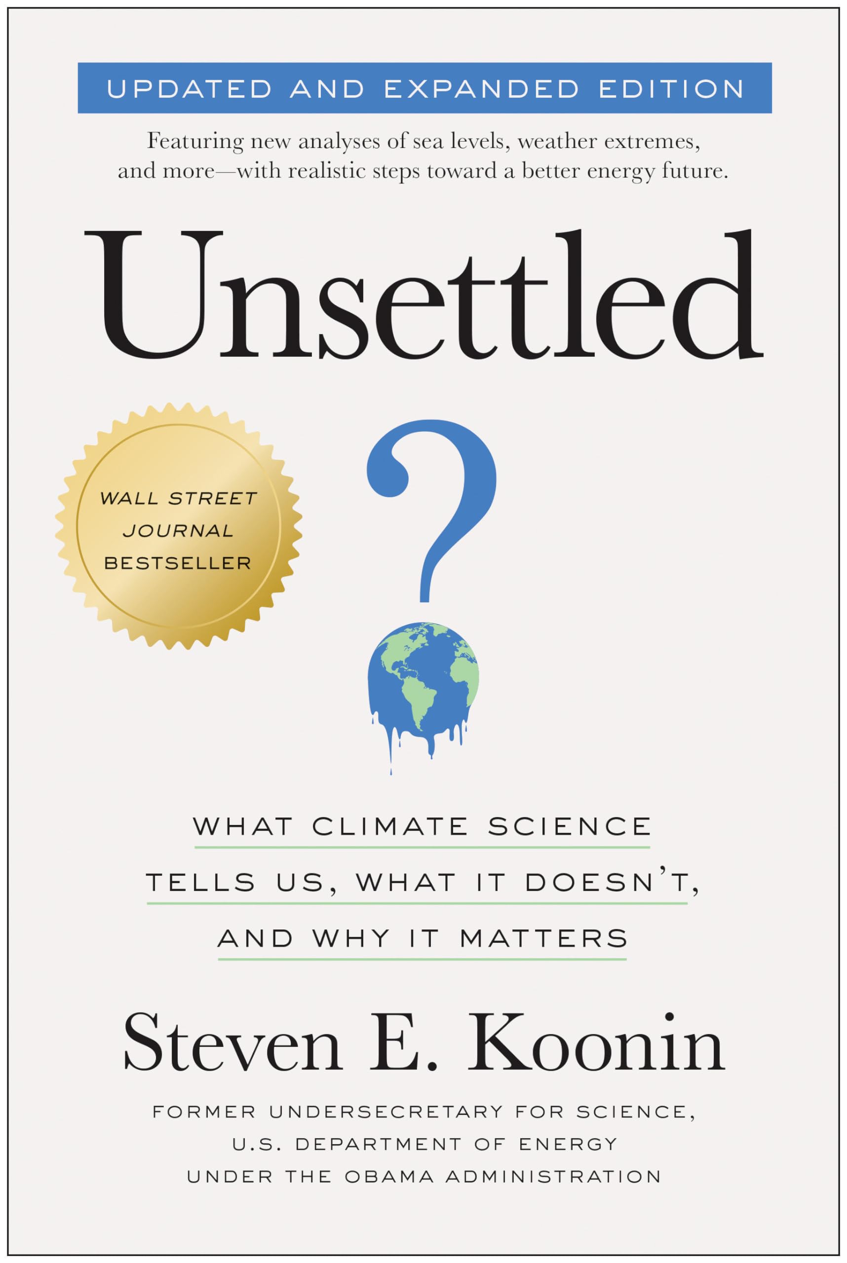


 The best context for understanding decadal temperature changes comes from the world’s sea surface temperatures (SST), for several reasons: