Ocean Air Temps Tepid in July

Presently sea surface temperatures (SST) are the best available indicator of heat content gained or lost from earth’s climate system.  Enthalpy is the thermodynamic term for total heat content in a system, and humidity differences in air parcels affect enthalpy.  Measuring water temperature directly avoids distorted impressions from air measurements.  In addition, ocean covers 71% of the planet surface and thus dominates surface temperature estimates.  Eventually we will likely have reliable means of recording water temperatures at depth.

Recently, Dr. Ole Humlum reported from his research that air temperatures lag 2-3 months behind changes in SST.  He also observed that changes in CO2 atmospheric concentrations lag behind SST by 11-12 months.  This latter point is addressed in a previous post Who to Blame for Rising CO2?

The July update to HadSST3 will appear later this month, but in the meantime we can look at lower troposphere temperatures (TLT) from UAHv6 which are already posted for July. The temperature record is derived from microwave sounding units (MSU) on board satellites like the one pictured above.

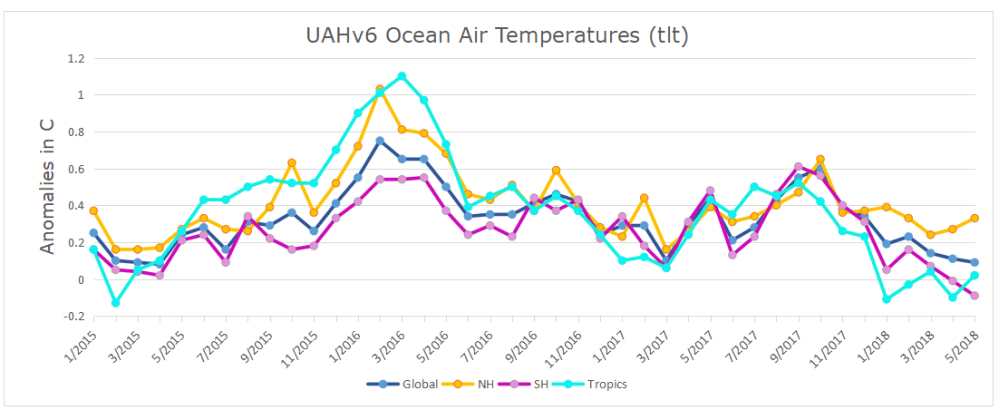
The UAH dataset includes temperature results for air above the oceans, and thus should be most comparable to the SSTs. There is the additional feature that ocean air temps avoid Urban Heat Islands (UHI).  The graph below shows monthly anomalies for ocean temps since January 2015.

UAH Oceans 201807The anomalies are holding close to the same levels as 2015. In July, both the Tropics and SH rose, while NH rose very slightly, resulting in a small increase in the Global average of air over oceans. Taking a longer view, we can look at the record since 1995, that year being an ENSO neutral year and thus a reasonable starting point for considering the past two decades.  On that basis we can see the plateau in ocean temps is persisting. Since last October all oceans have cooled, with offsetting bumps up and down.

UAHv6 TLT 
Monthly Ocean
Anomalies
Average Since 1995 Ocean 7/2018
Global 0.13 0.21
NH 0.16 0.3
SH 0.11 0.15
Tropics 0.13 0.29

As of July 2018, global ocean temps are slightly higher than June and the average since 1995.  NH remains virtually the same,  while both SH and Tropics rose making the global temp warmer.  Global, NH and SH are matching July temps in 2015, while the Tropics are the lowest July since 2013.

The details of UAH ocean temps are provided below.  The monthly data make for a noisy picture, but seasonal fluxes between January and July are important.

Open image in new tab to enlarge.

The greater volatility of the Tropics is evident, leading the oceans through three major El Nino events during this period.  Note also the flat period between 7/1999 and 7/2009.  The 2010 El Nino was erased by La Nina in 2011 and 2012.  Then the record shows a fairly steady rise peaking in 2016, with strong support from warmer NH anomalies, before returning to the 22-year average.

Summary

TLTs include mixing above the oceans and probably some influence from nearby more volatile land temps.  They started the recent cooling later than SSTs from HadSST3, but are now showing the same pattern.  It seems obvious that despite the three El Ninos, their warming has not persisted, and without them it would probably have cooled since 1995.  Of course, the future has not yet been written.


N. Atlantic Finally Cooling?

RAPID Array measuring North Atlantic SSTs.

For the last few years, observers have been speculating about when the North Atlantic will start the next phase shift from warm to cold.
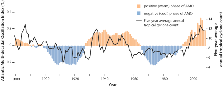
Source: Energy and Education Canada

An example is this report in May 2015 The Atlantic is entering a cool phase that will change the world’s weather by Gerald McCarthy and Evan Haigh of the RAPID Atlantic monitoring project. Excerpts in italics with my bolds.

This is known as the Atlantic Multidecadal Oscillation (AMO), and the transition between its positive and negative phases can be very rapid. For example, Atlantic temperatures declined by 0.1ºC per decade from the 1940s to the 1970s. By comparison, global surface warming is estimated at 0.5ºC per century – a rate twice as slow.

In many parts of the world, the AMO has been linked with decade-long temperature and rainfall trends. Certainly – and perhaps obviously – the mean temperature of islands downwind of the Atlantic such as Britain and Ireland show almost exactly the same temperature fluctuations as the AMO.

Atlantic oscillations are associated with the frequency of hurricanes and droughts. When the AMO is in the warm phase, there are more hurricanes in the Atlantic and droughts in the US Midwest tend to be more frequent and prolonged. In the Pacific Northwest, a positive AMO leads to more rainfall.

A negative AMO (cooler ocean) is associated with reduced rainfall in the vulnerable Sahel region of Africa. The prolonged negative AMO was associated with the infamous Ethiopian famine in the mid-1980s. In the UK it tends to mean reduced summer rainfall – the mythical “barbeque summer”.Our results show that ocean circulation responds to the first mode of Atlantic atmospheric forcing, the North Atlantic Oscillation, through circulation changes between the subtropical and subpolar gyres – the intergyre region. This a major influence on the wind patterns and the heat transferred between the atmosphere and ocean.

The observations that we do have of the Atlantic overturning circulation over the past ten years show that it is declining. As a result, we expect the AMO is moving to a negative (colder surface waters) phase. This is consistent with observations of temperature in the North Atlantic.

Cold “blobs” in North Atlantic have been reported, but they are usually a winter phenomena. For example in April 2016, the sst anomalies looked like this
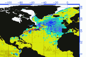
But by September, the picture changed to this
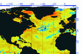
And we know from Kaplan AMO dataset, that 2016 summer SSTs were right up there with 1998 and 2010 as the highest recorded.

As the graph above suggests, this body of water is also important for tropical cyclones, since warmer water provides more energy.  But those are annual averages, and I am interested in the summer pulses of warm water into the Arctic. As I have noted in my monthly HadSST3 reports, most summers since 2003 there have been warm pulses in the north atlantic.
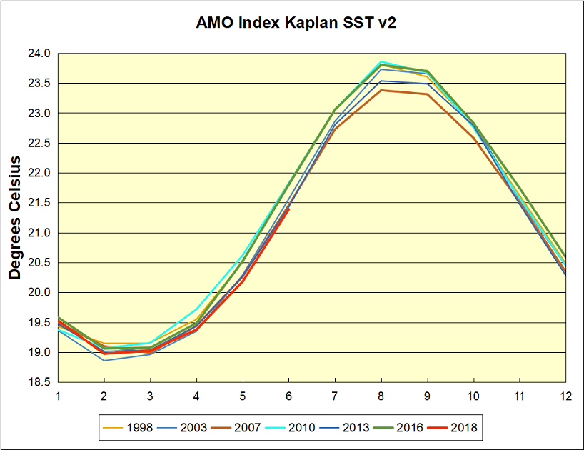
The AMO Index is from from Kaplan SST v2, the unaltered and untrended dataset. By definition, the data are monthly average SSTs interpolated to a 5×5 grid over the North Atlantic basically 0 to 70N.  The graph shows warming began after 1992 up to 1998, with a series of matching years since.  Because McCarthy refers to hints of cooling to come in the N. Atlantic, let’s take a closer look at some AMO years in the last 2 decades.

This graph shows monthly AMO temps for some important years. The Peak years were 1998, 2010 and 2016, with the latter emphasized as the most recent. The other years show lesser warming, with 2007 emphasized as the coolest in the last 20 years. Note the red 2018 line is at the bottom of all these tracks.  Most recently June 2018 is 0.4C lower than June 2016.

With all the talk of AMOC slowing down and a phase shift in the North Atlantic, we await SST measurements for July, August and September to confirm if cooling is starting to set in.

June 2018 Ocean SSTs Resume Cooling

globpopThe best context for understanding decadal temperature changes comes from the world’s sea surface temperatures (SST), for several reasons:

  • The ocean covers 71% of the globe and drives average temperatures;
  • SSTs have a constant water content, (unlike air temperatures), so give a better reading of heat content variations;
  • A major El Nino was the dominant climate feature in recent years.

HadSST is generally regarded as the best of the global SST data sets, and so the temperature story here comes from that source, the latest version being HadSST3.  More on what distinguishes HadSST3 from other SST products at the end.

The Current Context

The chart below shows SST monthly anomalies as reported in HadSST3 starting in 2015 through June 2018.

Hadsst062018

A global cooling pattern has persisted, seen clearly in the Tropics since its peak in 2016, joined by NH and SH dropping since last August. Upward bumps occurred last October, in January and again in March and April 2018.  Five months of 2018 now show slight warming since the low point of December 2017, led by steadily rising NH. Since 4/2018 SH and Tropics cooled slightly while NH pulled the Global anomaly upwards. Now in June 2018  lower temps in SH and Tropics more than offset NH warming.

2018 is the coolest June since 2013 in all regions: Global, NH, SH and Tropics.

Note that higher temps in 2015 and 2016 were first of all due to a sharp rise in Tropical SST, beginning in March 2015, peaking in January 2016, and steadily declining back below its beginning level. Secondly, the Northern Hemisphere added three bumps on the shoulders of Tropical warming, with peaks in August of each year. Also, note that the global release of heat was not dramatic, due to the Southern Hemisphere offsetting the Northern one.

With ocean temps positioned the same as three years ago, we can only wait and see whether the previous cycle will repeat or something different appears.  As the analysis belows shows, the North Atlantic has been the wild card bringing warming this decade, and cooling will depend upon a phase shift in that region.

A longer view of SSTs

The graph below  is noisy, but the density is needed to see the seasonal patterns in the oceanic fluctuations.  Previous posts focused on the rise and fall of the last El Nino starting in 2015.  This post adds a longer view, encompassing the significant 1998 El Nino and since.  The color schemes are retained for Global, Tropics, NH and SH anomalies.  Despite the longer time frame, I have kept the monthly data (rather than yearly averages) because of interesting shifts between January and July.

Hadsst1995to062018

Open image in new tab to enlarge.

1995 is a reasonable starting point prior to the first El Nino.  The sharp Tropical rise peaking in 1998 is dominant in the record, starting Jan. ’97 to pull up SSTs uniformly before returning to the same level Jan. ’99.  For the next 2 years, the Tropics stayed down, and the world’s oceans held steady around 0.2C above 1961 to 1990 average.

Then comes a steady rise over two years to a lesser peak Jan. 2003, but again uniformly pulling all oceans up around 0.4C.  Something changes at this point, with more hemispheric divergence than before. Over the 4 years until Jan 2007, the Tropics go through ups and downs, NH a series of ups and SH mostly downs.  As a result the Global average fluctuates around that same 0.4C, which also turns out to be the average for the entire record since 1995.

2007 stands out with a sharp drop in temperatures so that Jan.08 matches the low in Jan. ’99, but starting from a lower high. The oceans all decline as well, until temps build peaking in 2010.

Now again a different pattern appears.  The Tropics cool sharply to Jan 11, then rise steadily for 4 years to Jan 15, at which point the most recent major El Nino takes off.  But this time in contrast to ’97-’99, the Northern Hemisphere produces peaks every summer pulling up the Global average.  In fact, these NH peaks appear every July starting in 2003, growing stronger to produce 3 massive highs in 2014, 15 and 16, with July 2017 only slightly lower.  Note also that starting in 2014 SH plays a moderating role, offsetting the NH warming pulses. (Note: these are high anomalies on top of the highest absolute temps in the NH.)

What to make of all this? The patterns suggest that in addition to El Ninos in the Pacific driving the Tropic SSTs, something else is going on in the NH.  The obvious culprit is the North Atlantic, since I have seen this sort of pulsing before.  After reading some papers by David Dilley, I confirmed his observation of Atlantic pulses into the Arctic every 8 to 10 years as shown by this graph:

The data is annual averages of absolute SSTs measured in the North Atlantic.  The significance of the pulses for weather forecasting is discussed in AMO: Atlantic Climate Pulse

But the peaks coming nearly every July in HadSST require a different picture.  Let’s look at August, the hottest month in the North Atlantic from the Kaplan dataset.Now the regime shift appears clearly. Starting with 2003, seven times the August average has exceeded 23.6C, a level that prior to ’98 registered only once before, in 1937.  And other recent years were all greater than 23.4C.

Summary

The oceans are driving the warming this century.  SSTs took a step up with the 1998 El Nino and have stayed there with help from the North Atlantic, and more recently the Pacific northern “Blob.”  The ocean surfaces are releasing a lot of energy, warming the air, but eventually will have a cooling effect.  The decline after 1937 was rapid by comparison, so one wonders: How long can the oceans keep this up?

To paraphrase the wheel of fortune carnival barker:  “Down and down she goes, where she stops nobody knows.”  As recent months show, nature moves in cycles, not straight lines, and human forecasts and projections are tenuous at best.

einsteinalbert-integratesempirically800px

Postscript:

In the most recent GWPF 2017 State of the Climate report, Dr. Humlum made this observation:

“It is instructive to consider the variation of the annual change rate of atmospheric CO2 together with the annual change rates for the global air temperature and global sea surface temperature (Figure 16). All three change rates clearly vary in concert, but with sea surface temperature rates leading the global temperature rates by a few months and atmospheric CO2 rates lagging 11–12 months behind the sea surface temperature rates.”

Footnote: Why Rely on HadSST3

HadSST3 is distinguished from other SST products because HadCRU (Hadley Climatic Research Unit) does not engage in SST interpolation, i.e. infilling estimated anomalies into grid cells lacking sufficient sampling in a given month. From reading the documentation and from queries to Met Office, this is their procedure.

HadSST3 imports data from gridcells containing ocean, excluding land cells. From past records, they have calculated daily and monthly average readings for each grid cell for the period 1961 to 1990. Those temperatures form the baseline from which anomalies are calculated.

In a given month, each gridcell with sufficient sampling is averaged for the month and then the baseline value for that cell and that month is subtracted, resulting in the monthly anomaly for that cell. All cells with monthly anomalies are averaged to produce global, hemispheric and tropical anomalies for the month, based on the cells in those locations. For example, Tropics averages include ocean grid cells lying between latitudes 20N and 20S.

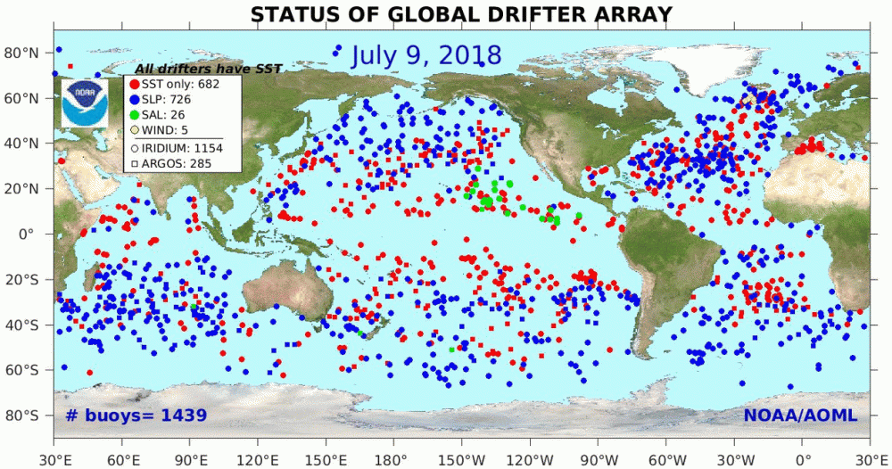
Gridcells lacking sufficient sampling that month are left out of the averaging, and the uncertainty from such missing data is estimated. IMO that is more reasonable than inventing data to infill. And it seems that the Global Drifter Array displayed in the top image is providing more uniform coverage of the oceans than in the past.

uss-pearl-harbor-deploys-global-drifter-buoys-in-pacific-ocean

USS Pearl Harbor deploys Global Drifter Buoys in Pacific Ocean


Ocean Air Temps Keep Cool

Presently sea surface temperatures (SST) are the best available indicator of heat content gained or lost from earth’s climate system.  Enthalpy is the thermodynamic term for total heat content in a system, and humidity differences in air parcels affect enthalpy.  Measuring water temperature directly avoids distorted impressions from air measurements.  In addition, ocean covers 71% of the planet surface and thus dominates surface temperature estimates.  Eventually we will likely have reliable means of recording water temperatures at depth.

Recently, Dr. Ole Humlum reported from his research that air temperatures lag 2-3 months behind changes in SST.  He also observed that changes in CO2 atmospheric concentrations lag behind SST by 11-12 months.  This latter point is addressed in a previous post Who to Blame for Rising CO2?

The June update to HadSST3 will appear later this month, but in the meantime we can look at lower troposphere temperatures (TLT) from UAHv6 which are already posted for June. The temperature record is derived from microwave sounding units (MSU) on board satellites like the one pictured above.

The UAH dataset includes temperature results for air above the oceans, and thus should be most comparable to the SSTs. The graph below shows monthly anomalies for ocean temps since January 2015.

The anomalies are holding close to the same levels as 2015. In June, both the Tropics and SH rose, while NH declined slightly, resulting in a small increase in the Global average of air over oceans. Taking a longer view, we can look at the record since 1995, that year being an ENSO neutral year and thus a reasonable starting point for considering the past two decades.  On that basis we can see the plateau in ocean temps is persisting. Since last October all oceans have cooled, with offsetting bumps up and down.

UAHv6 TLT 
Monthly Ocean
Anomalies
Average Since 1995 Ocean 6/2018
Global 0.13 0.14
NH 0.16 0.28
SH 0.11 0.03
Tropics 0.12 0.11

As of June 2018, global ocean temps are slightly higher than May and close to the average since 1995.  NH remains higher, but not enough to offset much lower temps in SH and  nearly average Tropics (between 20N and 20S latitudes).  Global ocean air temps are matching the last two March temps, but are the lowest June temps since 2012.  Both NH and SH are the lowest June temps since 2014.

The details of UAH ocean temps are provided below.  The monthly data make for a noisy picture, but seasonal fluxes between January and July are important.

Open image in new tab to enlarge.

The greater volatility of the Tropics is evident, leading the oceans through three major El Nino events during this period.  Note also the flat period between 7/1999 and 7/2009.  The 2010 El Nino was erased by La Nina in 2011 and 2012.  Then the record shows a fairly steady rise peaking in 2016, with strong support from warmer NH anomalies, before returning to the 22-year average.

Summary

TLTs include mixing above the oceans and probably some influence from nearby more volatile land temps.  They started the recent cooling later than SSTs from HadSST3, but are now showing the same pattern.  It seems obvious that despite the three El Ninos, their warming has not persisted, and without them it would probably have cooled since 1995.  Of course, the future has not yet been written.


2018 Update: Fossil Fuels ≠ Global Warming

gas in hands

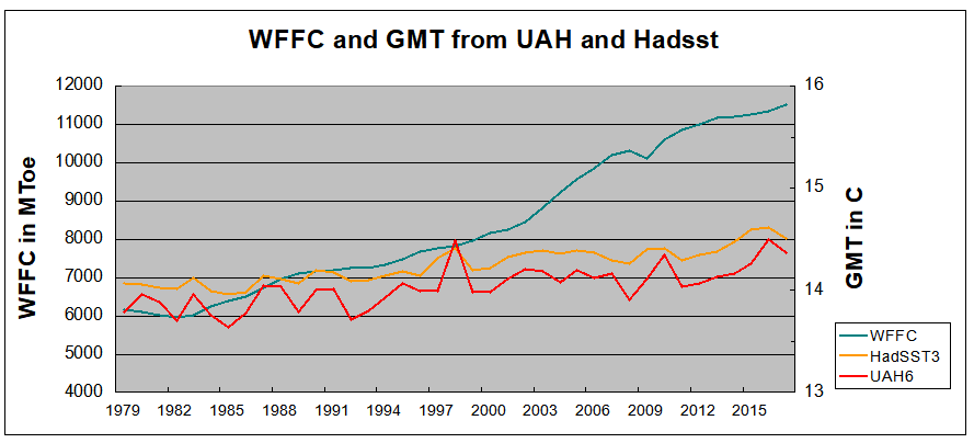
Previous posts addressed the claim that fossil fuels are driving global warming. This post updates that analysis with the latest (2017) numbers from BP Statistics and compares World Fossil Fuel Consumption (WFFC) with three estimates of Global Mean Temperature (GMT). More on both these variables below.

WFFC

2017 statistics are now available from BP for international consumption of Primary Energy sources. 2018 Statistical Review of World Energy. 

The reporting categories are:
Oil
Natural Gas
Coal
Nuclear
Hydro
Renewables (other than hydro)

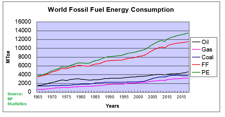
This analysis combines the first three, Oil, Gas, and Coal for total fossil fuel consumption world wide. The chart below shows the patterns for WFFC compared to world consumption of Primary Energy from 1965 through 2017.

WFFC2017

The graph shows that Primary Energy consumption has grown continuously for 5 decades. Over that period oil, gas and coal (sometimes termed “Thermal”) averaged 89% of PE consumed, ranging from 94% in 1965 to 85% in 2017.  MToe is millions of tons of oil equivalents.

Global Mean Temperatures

Everyone acknowledges that GMT is a fiction since temperature is an intrinsic property of objects, and varies dramatically over time and over the surface of the earth. No place on earth determines “average” temperature for the globe. Yet for the purpose of detecting change in temperature, major climate data sets estimate GMT and report anomalies from it.

UAH record consists of satellite era global temperature estimates for the lower troposphere, a layer of air from 0 to 4km above the surface. HadSST estimates sea surface temperatures from oceans covering 71% of the planet. HADCRUT combines HadSST estimates with records from land stations whose elevations range up to 6km above sea level.

Both GISS LOTI (land and ocean) and HADCRUT4 (land and ocean) use 14.0 Celsius as the climate normal, so I will add that number back into the anomalies. This is done not claiming any validity other than to achieve a reasonable measure of magnitude regarding the observed fluctuations.

No doubt global sea surface temperatures are typically higher than 14C, more like 17 or 18C, and of course warmer in the tropics and colder at higher latitudes. Likewise, the lapse rate in the atmosphere means that air temperatures both from satellites and elevated land stations will range colder than 14C. Still, that climate normal is a generally accepted indicator of GMT.

Correlations of GMT and WFFC

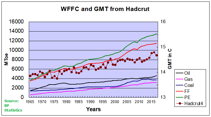
The next graph compares WFFC to GMT estimates over the five decades from 1965 to 2017 from HADCRUT4, which includes HadSST3.

WFFC&GMT2017

Over the last five decades the increase in fossil fuel consumption is dramatic and monotonic, steadily increasing by 227% from 3.5B to 11.5B oil equivalent tons.  Meanwhile the GMT record from Hadcrut shows multiple ups and downs with an accumulated rise of 0.9C over 52 years, 6% of the starting value.

The second graph compares to GMT estimates from UAH6, and HadSST3 for the satellite era from 1979 to 2017, a period of 38 years.

WFFC&UAH&HAD2017

In the satellite era WFFC has increased at a compounded rate of nearly 2% per year, for a total increase of 87% since 1979. At the same time, SST warming amounted to 0.44C, or 3.1% of the starting value.  UAH warming was 0.58C, or 4.2% up from 1979.  The temperature compounded rate of change is 0.1% per year, an order of magnitude less.  Even more obvious is the 1998 El Nino peak and flat GMT since.

Summary

The climate alarmist/activist claim is straight forward: Burning fossil fuels makes measured temperatures warmer. The Paris Accord further asserts that by reducing human use of fossil fuels, further warming can be prevented.  Those claims do not bear up under scrutiny.

It is enough for simple minds to see that two time series are both rising and to think that one must be causing the other. But both scientific and legal methods assert causation only when the two variables are both strongly and consistently aligned. The above shows a weak and inconsistent linkage between WFFC and GMT.

Going further back in history shows even weaker correlation between fossil fuels consumption and global temperature estimates:

wfc-vs-sat

Figure 5.1. Comparative dynamics of the World Fuel Consumption (WFC) and Global Surface Air Temperature Anomaly (ΔT), 1861-2000. The thin dashed line represents annual ΔT, the bold line—its 13-year smoothing, and the line constructed from rectangles—WFC (in millions of tons of nominal fuel) (Klyashtorin and Lyubushin, 2003). Source: Frolov et al. 2009

In legal terms, as long as there is another equally or more likely explanation for the set of facts, the claimed causation is unproven. The more likely explanation is that global temperatures vary due to oceanic and solar cycles. The proof is clearly and thoroughly set forward in the post Quantifying Natural Climate Change.

Background context for today’s post is at Claim: Fossil Fuels Cause Global Warming.

Cooling Ocean Air Temps

Presently sea surface temperatures (SST) are the best available indicator of heat content gained or lost from earth’s climate system.  Enthalpy is the thermodynamic term for total heat content in a system, and humidity differences in air parcels affect enthalpy.  Measuring water temperature directly avoids distorted impressions from air measurements.  In addition, ocean covers 71% of the planet surface and thus dominates surface temperature estimates.  Eventually we will likely have reliable means of recording water temperatures at depth.

Recently, Dr. Ole Humlum reported from his research that air temperatures lag 2-3 months behind changes in SST.  He also observed that changes in CO2 atmospheric concentrations lag behind SST by 11-12 months.  This latter point is addressed in a previous post Who to Blame for Rising CO2?

The May update to HadSST3 will appear later this month, but in the meantime we can look at lower troposphere temperatures (TLT) from UAHv6 which are already posted for May. The temperature record is derived from microwave sounding units (MSU) on board satellites like the one pictured above.

The UAH dataset includes temperature results for air above the oceans, and thus should be most comparable to the SSTs. The graph below shows monthly anomalies for ocean temps since January 2015.

UAH May2018

Open image in new tab to enlarge.

The anomalies have reached the same levels as 2015.  Taking a longer view, we can look at the record since 1995, that year being an ENSO neutral year and thus a reasonable starting point for considering the past two decades.  On that basis we can see the plateau in ocean temps is persisting. Since last October all oceans have cooled, with upward bumps in Feb. 2018, now erased.

UAHv6 TLT 
Monthly Ocean
Anomalies
Average Since 1995 Ocean 5/2018
Global 0.13 0.09
NH 0.16 0.33
SH 0.11 -0.09
Tropics 0.12 0.02

As of May 2018, global ocean temps are slightly lower than April and below the average since 1995.  NH remains higher, but not enough to offset much lower temps in SH and Tropics (between 20N and 20S latitudes).  Global ocean air temps are now the lowest since April 2015, and SH the lowest since May 2013.

The details of UAH ocean temps are provided below.  The monthly data make for a noisy picture, but seasonal fluxes between January and July are important.

Click on image to enlarge.

The greater volatility of the Tropics is evident, leading the oceans through three major El Nino events during this period.  Note also the flat period between 7/1999 and 7/2009.  The 2010 El Nino was erased by La Nina in 2011 and 2012.  Then the record shows a fairly steady rise peaking in 2016, with strong support from warmer NH anomalies, before returning to the 22-year average.

Summary

TLTs include mixing above the oceans and probably some influence from nearby more volatile land temps.  They started the recent cooling later than SSTs from HadSST3, but are now showing the same pattern.  It seems obvious that despite the three El Ninos, their warming has not persisted, and without them it would probably have cooled since 1995.  Of course, the future has not yet been written.


Climate Canary? N. America Cooling

Hidden amid reports of recent warmest months and years based on global averages, there is a significant departure in North America. Those of us living in Canada and USA have noticed a distinct cooling, and our impressions are not wrong.

The image above shows how much lower have been April 2018 temperatures. The table below provides the numbers behind the graphs from NOAA State of the Climate.

CONTINENT ANOMALY (1910-2000) TREND (1910-2018) RANK RECORDS
°C °F °C °F (OUT OF 109 YEARS) YEAR(S) °C °F
North America -0.97 -1.75 0.11 0.19 Warmest 94ᵗʰ 2010 2.65 4.77
South America 1.34 2.41 0.13 0.24 Warmest 1ˢᵗ 2018 1.34 2.41
Europe 2.82 5.08 0.14 0.25 Warmest 1ˢᵗ 2018 2.82 5.08
Africa 1.23 2.21 0.12 0.22 Warmest 5ᵗʰ 2016 1.72 3.1
Asia 1.66 2.99 0.18 0.32 Warmest 9ᵗʰ 2016 2.4 4.32
Oceania 2.47 4.45 0.14 0.25 Warmest 2ⁿᵈ 2005 2.54 4.57

The table shows how different was the North American experience: 94th out of 109 years.  But when we look at the first four months of the year, the NA is more in line with the rest of the globe.


As the image shows, cooling was more widespread during the first third of 2018, particularly in NA, Northern Europe and Asia, as well as a swath of cooler mid ocean latitudes in the Southern Hemisphere.

CONTINENT ANOMALY (1910-2000) TREND (1910-2018) RANK RECORDS
°C °F °C °F (OUT OF 109 YEARS) YEAR(S) °C °F
North America 0.44 0.79 0.16 0.29 Warmest 44ᵗʰ 2016 2.71 4.88
South America 0.94 1.69 0.13 0.24 Warmest 6ᵗʰ 2016 1.39 2.5
Europe 1.35 2.43 0.13 0.24 Warmest 13ᵗʰ 2014 2.46 4.43
Africa 1.08 1.94 0.1 0.18 Warmest 3ʳᵈ 2010 1.62 2.92
Asia 1.57 2.83 0.19 0.34 Warmest 8ᵗʰ 2002 2.72 4.9
Oceania 1.58 2.84 0.12 0.22 Warmest 1ˢᵗ 2018 1.58 2.84

The table confirms that Europe and Asia are cooler in 2018 than recent years in the decade.

Summary

These data show again that temperature indicators of climate are not global but regional, and even local in their manifestations.  At the continental level there are significant differences.  North America is an outlier, but who is to say whether it is an aberration that will join the rest, or whether it is the trend setter signaling a widespread cooler future.

See Also:  Is This Cold the New Normal?

CanAm Bucks the Trend

Hidden amid reports of recent warmest months and years based on global averages, there is a significant departure in North America. Those of us living in Canada and USA have noticed a distinct cooling, and our impressions are not wrong.

The image above shows how much lower have been April 2018 temperatures. The table below provides the numbers behind the graphs from NOAA State of the Climate.

CONTINENT ANOMALY (1910-2000) TREND (1910-2018) RANK RECORDS
°C °F °C °F (OUT OF 109 YEARS) YEAR(S) °C °F
North America -0.97 -1.75 0.11 0.19 Warmest 94ᵗʰ 2010 2.65 4.77
South America 1.34 2.41 0.13 0.24 Warmest 1ˢᵗ 2018 1.34 2.41
Europe 2.82 5.08 0.14 0.25 Warmest 1ˢᵗ 2018 2.82 5.08
Africa 1.23 2.21 0.12 0.22 Warmest 5ᵗʰ 2016 1.72 3.1
Asia 1.66 2.99 0.18 0.32 Warmest 9ᵗʰ 2016 2.4 4.32
Oceania 2.47 4.45 0.14 0.25 Warmest 2ⁿᵈ 2005 2.54 4.57

The table shows how different was the North American experience: 94th out of 109 years.  But when we look at the first four months of the year, the NA is more in line with the rest of the globe.


As the image shows, cooling was more widespread during the first third of 2018, particularly in NA, Northern Europe and Asia, as well as a swath of cooler mid ocean latitudes in the Southern Hemisphere.

CONTINENT ANOMALY (1910-2000) TREND (1910-2018) RANK RECORDS
°C °F °C °F (OUT OF 109 YEARS) YEAR(S) °C °F
North America 0.44 0.79 0.16 0.29 Warmest 44ᵗʰ 2016 2.71 4.88
South America 0.94 1.69 0.13 0.24 Warmest 6ᵗʰ 2016 1.39 2.5
Europe 1.35 2.43 0.13 0.24 Warmest 13ᵗʰ 2014 2.46 4.43
Africa 1.08 1.94 0.1 0.18 Warmest 3ʳᵈ 2010 1.62 2.92
Asia 1.57 2.83 0.19 0.34 Warmest 8ᵗʰ 2002 2.72 4.9
Oceania 1.58 2.84 0.12 0.22 Warmest 1ˢᵗ 2018 1.58 2.84

The table confirms that Europe and Asia are cooler in 2018 than recent years in the decade.

Summary

These data show again that temperature indicators of climate are not global but regional, and even local in their manifestations.  At the continental level there are significant differences.  North America is an outlier, but who is to say whether it is an aberration that will join the rest, or whether it is the trend setter signaling a widespread cooler future.

Apr. 2018 Ocean Cooling Delayed

globpop_countries

The best context for understanding decadal temperature changes comes from the world’s sea surface temperatures (SST), for several reasons:

  • The ocean covers 71% of the globe and drives average temperatures;
  • SSTs have a constant water content, (unlike air temperatures), so give a better reading of heat content variations;
  • A major El Nino was the dominant climate feature in recent years.

HadSST is generally regarded as the best of the global SST data sets, and so the temperature story here comes from that source, the latest version being HadSST3.  More on what distinguishes HadSST3 from other SST products at the end.

The Current Context

The chart below shows SST monthly anomalies as reported in HadSST3 starting in 2015 through April 2018.

HadSST042018

A global cooling pattern has persisted, seen clearly in the Tropics since its peak in 2016, joined by NH and SH dropping since last August. Upward bumps occurred last October, in January and again in March and April 2018.  Four months of 2018 now show slight warming since the low point of December 2017, led by steadily rising NH.  Only the Tropics are showing temps the lowest in this time frame, despite an anomaly rise of 0.14 in April. Globally, and in both hemispheres anomalies closely match April 2015.

Note that higher temps in 2015 and 2016 were first of all due to a sharp rise in Tropical SST, beginning in March 2015, peaking in January 2016, and steadily declining back below its beginning level. Secondly, the Northern Hemisphere added three bumps on the shoulders of Tropical warming, with peaks in August of each year. Also, note that the global release of heat was not dramatic, due to the Southern Hemisphere offsetting the Northern one.

With ocean temps positioned the same as three years ago, we can only wait and see whether the previous cycle will repeat or something different appears.  As the analysis belows shows, the North Atlantic has been the wild card bringing warming this decade, and cooling will depend upon a phase shift in that region.

A longer view of SSTs

The graph below  is noisy, but the density is needed to see the seasonal patterns in the oceanic fluctuations.  Previous posts focused on the rise and fall of the last El Nino starting in 2015.  This post adds a longer view, encompassing the significant 1998 El Nino and since.  The color schemes are retained for Global, Tropics, NH and SH anomalies.  Despite the longer time frame, I have kept the monthly data (rather than yearly averages) because of interesting shifts between January and July.

HadSST95to042018

Open image in new tab for sharper detail.

1995 is a reasonable starting point prior to the first El Nino.  The sharp Tropical rise peaking in 1998 is dominant in the record, starting Jan. ’97 to pull up SSTs uniformly before returning to the same level Jan. ’99.  For the next 2 years, the Tropics stayed down, and the world’s oceans held steady around 0.2C above 1961 to 1990 average.

Then comes a steady rise over two years to a lesser peak Jan. 2003, but again uniformly pulling all oceans up around 0.4C.  Something changes at this point, with more hemispheric divergence than before. Over the 4 years until Jan 2007, the Tropics go through ups and downs, NH a series of ups and SH mostly downs.  As a result the Global average fluctuates around that same 0.4C, which also turns out to be the average for the entire record since 1995.

2007 stands out with a sharp drop in temperatures so that Jan.08 matches the low in Jan. ’99, but starting from a lower high. The oceans all decline as well, until temps build peaking in 2010.

Now again a different pattern appears.  The Tropics cool sharply to Jan 11, then rise steadily for 4 years to Jan 15, at which point the most recent major El Nino takes off.  But this time in contrast to ’97-’99, the Northern Hemisphere produces peaks every summer pulling up the Global average.  In fact, these NH peaks appear every July starting in 2003, growing stronger to produce 3 massive highs in 2014, 15 and 16, with July 2017 only slightly lower.  Note also that starting in 2014 SH plays a moderating role, offsetting the NH warming pulses. (Note: these are high anomalies on top of the highest absolute temps in the NH.)

What to make of all this? The patterns suggest that in addition to El Ninos in the Pacific driving the Tropic SSTs, something else is going on in the NH.  The obvious culprit is the North Atlantic, since I have seen this sort of pulsing before.  After reading some papers by David Dilley, I confirmed his observation of Atlantic pulses into the Arctic every 8 to 10 years as shown by this graph:

The data is annual averages of absolute SSTs measured in the North Atlantic.  The significance of the pulses for weather forecasting is discussed in AMO: Atlantic Climate Pulse

But the peaks coming nearly every July in HadSST require a different picture.  Let’s look at August, the hottest month in the North Atlantic from the Kaplan dataset.Now the regime shift appears clearly. Starting with 2003, seven times the August average has exceeded 23.6C, a level that prior to ’98 registered only once before, in 1937.  And other recent years were all greater than 23.4C.

Summary

The oceans are driving the warming this century.  SSTs took a step up with the 1998 El Nino and have stayed there with help from the North Atlantic, and more recently the Pacific northern “Blob.”  The ocean surfaces are releasing a lot of energy, warming the air, but eventually will have a cooling effect.  The decline after 1937 was rapid by comparison, so one wonders: How long can the oceans keep this up?

To paraphrase the wheel of fortune carnival barker:  “Down and down she goes, where she stops nobody knows.”  As this month shows, nature moves in cycles, not straight lines, and human forecasts and projections are tenuous at best.

einsteinalbert-integratesempirically800px

Postscript:

In the most recent GWPF 2017 State of the Climate report, Dr. Humlum made this observation:

“It is instructive to consider the variation of the annual change rate of atmospheric CO2 together with the annual change rates for the global air temperature and global sea surface temperature (Figure 16). All three change rates clearly vary in concert, but with sea surface temperature rates leading the global temperature rates by a few months and atmospheric CO2 rates lagging 11–12 months behind the sea surface temperature rates.”

Footnote: Why Rely on HadSST3

HadSST3 is distinguished from other SST products because HadCRU (Hadley Climatic Research Unit) does not engage in SST interpolation, i.e. infilling estimated anomalies into grid cells lacking sufficient sampling in a given month. From reading the documentation and from queries to Met Office, this is their procedure.

HadSST3 imports data from gridcells containing ocean, excluding land cells. From past records, they have calculated daily and monthly average readings for each grid cell for the period 1961 to 1990. Those temperatures form the baseline from which anomalies are calculated.

In a given month, each gridcell with sufficient sampling is averaged for the month and then the baseline value for that cell and that month is subtracted, resulting in the monthly anomaly for that cell. All cells with monthly anomalies are averaged to produce global, hemispheric and tropical anomalies for the month, based on the cells in those locations. For example, Tropics averages include ocean grid cells lying between latitudes 20N and 20S.

Gridcells lacking sufficient sampling that month are left out of the averaging, and the uncertainty from such missing data is estimated. IMO that is more reasonable than inventing data to infill. And it seems that the Global Drifter Array displayed in the top image is providing more uniform coverage of the oceans than in the past.

uss-pearl-harbor-deploys-global-drifter-buoys-in-pacific-ocean

USS Pearl Harbor deploys Global Drifter Buoys in Pacific Ocean


Plateau in Ocean Air Temps

Years ago, Dr. Roger Pielke Sr. explained why sea surface temperatures (SST) were the best indicator of heat content gained or lost from earth’s climate system.  Enthalpy is the thermodynamic term for total heat content in a system, and humidity differences in air parcels affect enthalpy.  Measuring water temperature directly avoids distorted impressions from air measurements.  In addition, ocean covers 71% of the planet surface and thus dominates surface temperature estimates.

More recently, Dr. Ole Humlum reported from his research that air temperatures lag 2-3 months behind changes in SST.  He also observed that changes in CO2 atmospheric concentrations lag behind SST by 11-12 months.  This latter point is addressed in a previous post Who to Blame for Rising CO2?

The April update to HadSST3 will appear later this month, but in the meantime we can look at lower troposphere temperatures (TLT) from UAHv.6 which are already posted for April. The temperature record is derived from microwave sounding units (MSU) on board satellites like the one pictured above.

The UAH dataset includes temperature results for air above the oceans, and thus should be most comparable to the SSTs. The graph below shows monthly anomalies for ocean temps since January 2015.
The anomalies have reached the same levels as 2015.  Taking a longer view, we can look at the record since 1995, that year being an ENSO neutral year and thus a reasonable starting point for considering the past two decades.  On that basis we can see the plateau in ocean temps is persisting. Since last October all oceans have cooled, with upward bumps in Feb. 2018, now erased.

UAHv.6 TLT 
Monthly Ocean Anomalies
Ave. Since 1995 Ocean 4/2018
Global 0.13 0.11
NH 0.16 0.27
SH 0.11 -0.01
Tropics 0.12 -0.1

As of April 2018, global ocean temps are slightly below the average since 1995.  NH remains higher, but not enough to offset much lower temps in SH and Tropics (between 20N and 20S latitudes).

The details of UAH ocean temps are provided below.  The monthly data make for a noisy picture, but seasonal fluxes between January and July are important.

Click on image to enlarge.

The greater volatility of the Tropics is evident, leading the oceans through three major El Nino events during this period.  Note also the flat period between 7/1999 and 7/2009.  The 2010 El Nino was erased by La Nina in 2011 and 2012.  Then the record shows a fairly steady rise peaking in 2016, with strong support from warmer NH anomalies, before returning to the 22-year average.

Summary

TLTs include mixing above the oceans and probably some influence from nearby more volatile land temps.  They started the recent cooling later than SSTs from HadSST3, but are now showing the same pattern.  It seems obvious that despite the three El Ninos, their warming has not persisted, and without them it would probably have cooled since 1995.  Of course, the future has not yet been written.