Maryland Governor: Can’t Afford Climate Virtue Projects

Inside Climate News speaking on the side of Climate Virute reported Moore Vetoes Key Maryland Climate Studies, Reversing Course on Environmental Justice Commitments.  Excerpts in italics with my bolds.

The governor nixed a series of high-profile bills that aimed to study the economic impacts of climate change, energy infrastructure and reparations, leaving advocates questioning his commitment to environmental and racial justice priorities.

Maryland legislators and environmental advocates expressed dismay after Gov. Wes Moore vetoed a series of widely supported climate and environmental study bills last week, actions they believe not only mark a sharp departure from his climate promises, but also reflect a breakdown in communication between the governor and members of his own party in the legislature.

Climate Lemmings

On May 16, Moore vetoed more bills than he had in the past two years combined, including multiple proposals that had passed with strong backing from legislative leadership and key climate coalitions.

The vetoes—affecting studies on climate costs, energy reliability, data center impacts and racial reparations—have left activists and lawmakers questioning whether Moore remains a reliable ally in the fight for climate and racial justice and whether his political calculus may have shifted, placing short-term cost savings above long-term structural reform.

Among the vetoed bills was the Responding to Emergency Needs from Extreme Weather (RENEW) Act of 2025, which would have tasked the comptroller and state agencies with assessing the total cost of greenhouse gas emissions and reporting findings by December 2026. Stripped down from its original version, which proposed financial penalties for fossil fuel companies, the bill was seen as an important step toward documenting climate damages and laying the groundwork for future polluter-pay policies.

The estimated cost of the study was about $500,000, drawn from the state’s Strategic Energy Investment Fund (SEIF)—a dedicated fund supported by penalties utilities paid for failing to meet renewable energy targets. It has ballooned to over $300 million in recent years.

Moore also rejected the Data Center Impact Analysis and Report bill, which called for a collaborative study on the environmental and economic footprint of data center expansion across Maryland. The report, required to be completed by September 2026, was meant to guide future zoning and energy decisions as these power-intensive facilities expand statewide.

In a letter to the Senate and House leadership, Moore stated budget shortage, agency workload and redundancy as key reasons for the vetoes. “Many of these reports are never read and simply collect dust on shelves,” Moore wrote, calling the expected $1.28 million cost “an unsustainable commitment given the state’s current financial constraints.”

Also vetoed was the Energy Resource Adequacy and Planning Act, which would have created a Strategic Energy Planning Office within the Public Service Commission to assess long-term electricity reliability, model resource scenarios and recommend planning strategies. It was designed to help Maryland manage increasing energy demands as the state transitions toward clean power. The office would have released a major report every three years, coordinating with state agencies and collecting public input. The veto stalls forward-thinking energy planning, critics said.

In a separate letter to Senate President Bill Ferguson and House Speaker Adrienne Jones, Moore justified his veto of the Energy Resource Adequacy and Planning Act by citing fiscal constraints and overlaps. He pointed to the estimated annual cost of $4.4 million to $5.3 million, warning it would duplicate efforts and pass costs on to consumers. “This cost would ultimately be passed along to Maryland ratepayers at a time when we are actively working to limit their burden, not add to it,” he wrote.

“This veto is extremely frustrating and simply does not support the state’s climate goals.”

— Kim Coble, Maryland League of Conservation Voters

April 2025 Two Years Ocean Warming Gone

The best context for understanding decadal temperature changes comes from the world’s sea surface temperatures (SST), for several reasons:

  • The ocean covers 71% of the globe and drives average temperatures;
  • SSTs have a constant water content, (unlike air temperatures), so give a better reading of heat content variations;
  • A major El Nino was the dominant climate feature in recent years.

HadSST is generally regarded as the best of the global SST data sets, and so the temperature story here comes from that source. Previously I used HadSST3 for these reports, but Hadley Centre has made HadSST4 the priority, and v.3 will no longer be updated.  HadSST4 is the same as v.3, except that the older data from ship water intake was re-estimated to be generally lower temperatures than shown in v.3.  The effect is that v.4 has lower average anomalies for the baseline period 1961-1990, thereby showing higher current anomalies than v.3. This analysis concerns more recent time periods and depends on very similar differentials as those from v.3 despite higher absolute anomaly values in v.4.  More on what distinguishes HadSST3 and 4 from other SST products at the end. The user guide for the current version HadSST4.1.1.0 is here.   The charts and analysis below is produced from the current data.

The Current Context

The chart below shows SST monthly anomalies as reported in HadSST4 starting in 2015 through April 2025. A global cooling pattern is seen clearly in the Tropics since its peak in 2016, joined by NH and SH cycling downward since 2016, followed by rising temperatures in 2023 and 2024.

Note that in 2015-2016 the Tropics and SH peaked in between two summer NH spikes.  That pattern repeated in 2019-2020 with a lesser Tropics peak and SH bump, but with higher NH spikes. By end of 2020, cooler SSTs in all regions took the Global anomaly well below the mean for this period.  A small warming was driven by NH summer peaks in 2021-22, but offset by cooling in SH and the tropics, By January 2023 the global anomaly was again below the mean.

Then in 2023-24 came an event resembling 2015-16 with a Tropical spike and two NH spikes alongside, all higher than 2015-16. There was also a coinciding rise in SH, and the Global anomaly was pulled up to 1.1°C last year, ~0.3° higher than the 2015 peak.  Then NH started down autumn 2023, followed by Tropics and SH descending 2024 to the present. After 12 months of cooling in SH and the Tropics, the Global anomaly came back down, led by NH cooling the last 8 months from its 1.3C peak in August, down to 0.8C in March and April. With some recent warming in the Tropics and SH, all regions are now close together nearly at the global anomaly, less than 0.1C higher than the average for this period.

Remarkably, April 2025 SST anomalies in all regions and globally are the coolest since March 2023.

Comment:

The climatists have seized on this unusual warming as proof their Zero Carbon agenda is needed, without addressing how impossible it would be for CO2 warming the air to raise ocean temperatures.  It is the ocean that warms the air, not the other way around.  Recently Steven Koonin had this to say about the phonomenon confirmed in the graph above:

El Nino is a phenomenon in the climate system that happens once every four or five years.  Heat builds up in the equatorial Pacific to the west of Indonesia and so on.  Then when enough of it builds up it surges across the Pacific and changes the currents and the winds.  As it surges toward South America it was discovered and named in the 19th century  It iswell understood at this point that the phenomenon has nothing to do with CO2.

Now people talk about changes in that phenomena as a result of CO2 but it’s there in the climate system already and when it happens it influences weather all over the world.   We feel it when it gets rainier in Southern California for example.  So for the last 3 years we have been in the opposite of an El Nino, a La Nina, part of the reason people think the West Coast has been in drought.

It has now shifted in the last months to an El Nino condition that warms the globe and is thought to contribute to this Spike we have seen. But there are other contributions as well.  One of the most surprising ones is that back in January of 2022 an enormous underwater volcano went off in Tonga and it put up a lot of water vapor into the upper atmosphere. It increased the upper atmosphere of water vapor by about 10 percent, and that’s a warming effect, and it may be that is contributing to why the spike is so high.

A longer view of SSTs

The graph below  is noisy, but the density is needed to see the seasonal patterns in the oceanic fluctuations.  Previous posts focused on the rise and fall of the last El Nino starting in 2015.  This post adds a longer view, encompassing the significant 1998 El Nino and since.  The color schemes are retained for Global, Tropics, NH and SH anomalies.  Despite the longer time frame, I have kept the monthly data (rather than yearly averages) because of interesting shifts between January and July.

To enlarge image, open in new tab.

The graph above is noisy, but the density is needed to see the seasonal patterns in the oceanic fluctuations.  Previous posts focused on the rise and fall of the last El Nino starting in 2015.  This post adds a longer view, encompassing the significant 1998 El Nino and since.  The color schemes are retained for Global, Tropics, NH and SH anomalies.  Despite the longer time frame, I have kept the monthly data (rather than yearly averages) because of interesting shifts between January and July. 1995 is a reasonable (ENSO neutral) starting point prior to the first El Nino.

The sharp Tropical rise peaking in 1998 is dominant in the record, starting Jan. ’97 to pull up SSTs uniformly before returning to the same level Jan. ’99. There were strong cool periods before and after the 1998 El Nino event. Then SSTs in all regions returned to the mean in 2001-2.

SSTS fluctuate around the mean until 2007, when another, smaller ENSO event occurs. There is cooling 2007-8,  a lower peak warming in 2009-10, following by cooling in 2011-12.  Again SSTs are average 2013-14.

Now a different pattern appears.  The Tropics cooled sharply to Jan 11, then rise steadily for 4 years to Jan 15, at which point the most recent major El Nino takes off.  But this time in contrast to ’97-’99, the Northern Hemisphere produces peaks every summer pulling up the Global average.  In fact, these NH peaks appear every July starting in 2003, growing stronger to produce 3 massive highs in 2014, 15 and 16.  NH July 2017 was only slightly lower, and a fifth NH peak still lower in Sept. 2018.

The highest summer NH peaks came in 2019 and 2020, only this time the Tropics and SH were offsetting rather adding to the warming. (Note: these are high anomalies on top of the highest absolute temps in the NH.)  Since 2014 SH has played a moderating role, offsetting the NH warming pulses. After September 2020 temps dropped off down until February 2021.  In 2021-22 there were again summer NH spikes, but in 2022 moderated first by cooling Tropics and SH SSTs, then in October to January 2023 by deeper cooling in NH and Tropics.

Then in 2023 the Tropics flipped from below to well above average, while NH produced a summer peak extending into September higher than any previous year.  Despite El Nino driving the Tropics January 2024 anomaly higher than 1998 and 2016 peaks, following months cooled in all regions, and the Tropics continued cooling in April, May and June along with SH dropping.  After July and August NH warming again pulled the global anomaly higher, September through January 2025 resumed cooling in all regions, continuing February through April 2025.

What to make of all this? The patterns suggest that in addition to El Ninos in the Pacific driving the Tropic SSTs, something else is going on in the NH.  The obvious culprit is the North Atlantic, since I have seen this sort of pulsing before.  After reading some papers by David Dilley, I confirmed his observation of Atlantic pulses into the Arctic every 8 to 10 years.

Contemporary AMO Observations

Through January 2023 I depended on the Kaplan AMO Index (not smoothed, not detrended) for N. Atlantic observations. But it is no longer being updated, and NOAA says they don’t know its future.  So I find that ERSSTv5 AMO dataset has current data.  It differs from Kaplan, which reported average absolute temps measured in N. Atlantic.  “ERSST5 AMO  follows Trenberth and Shea (2006) proposal to use the NA region EQ-60°N, 0°-80°W and subtract the global rise of SST 60°S-60°N to obtain a measure of the internal variability, arguing that the effect of external forcing on the North Atlantic should be similar to the effect on the other oceans.”  So the values represent SST anomaly differences between the N. Atlantic and the Global ocean.

The chart above confirms what Kaplan also showed.  As August is the hottest month for the N. Atlantic, its variability, high and low, drives the annual results for this basin.  Note also the peaks in 2010, lows after 2014, and a rise in 2021. Then in 2023 the peak was holding at 1.4C before declining.  An annual chart below is informative:


Note the difference between blue/green years, beige/brown, and purple/red years.  2010, 2021, 2022 all peaked strongly in August or September.  1998 and 2007 were mildly warm.  2016 and 2018 were matching or cooler than the global average.  2023 started out slightly warm, then rose steadily to an  extraordinary peak in July.  August to October were only slightly lower, but by December cooled by ~0.4C.

Then in 2024 the AMO anomaly started higher than any previous year, then leveled off for two months declining slightly into April.  Remarkably, May showed an upward leap putting this on a higher track than 2023, and rising slightly higher in June.  In July, August and September 2024 the anomaly declined, and despite a small rise in October, ended close to where it began.  Note 2025 started much lower than the previous year and is headed sharply downward, well below the previous two years.

The pattern suggests the ocean may be demonstrating a stairstep pattern like that we have also seen in HadCRUT4.

The purple line is the average anomaly 1980-1996 inclusive, value 0.17.  The orange line the average 1980-2024, value 0.38, also for the period 1997-2012. The red line is 2013-2024, value 0.67. As noted above, these rising stages are driven by the combined warming in the Tropics and NH, including both Pacific and Atlantic basins.

Curiosity:  Solar Coincidence?

The news about our current solar cycle 25 is that the solar activity is hitting peak numbers now and higher  than expected 1-2 years in the future.  As livescience put it:  Solar maximum could hit us harder and sooner than we thought. How dangerous will the sun’s chaotic peak be?  Some charts from spaceweatherlive look familar to these sea surface temperature charts.

Summary

The oceans are driving the warming this century.  SSTs took a step up with the 1998 El Nino and have stayed there with help from the North Atlantic, and more recently the Pacific northern “Blob.”  The ocean surfaces are releasing a lot of energy, warming the air, but eventually will have a cooling effect.  The decline after 1937 was rapid by comparison, so one wonders: How long can the oceans keep this up? And is the sun adding forcing to this process?

Footnote: Why Rely on HadSST4

HadSST is distinguished from other SST products because HadCRU (Hadley Climatic Research Unit) does not engage in SST interpolation, i.e. infilling estimated anomalies into grid cells lacking sufficient sampling in a given month. From reading the documentation and from queries to Met Office, this is their procedure.

HadSST4 imports data from gridcells containing ocean, excluding land cells. From past records, they have calculated daily and monthly average readings for each grid cell for the period 1961 to 1990. Those temperatures form the baseline from which anomalies are calculated.

In a given month, each gridcell with sufficient sampling is averaged for the month and then the baseline value for that cell and that month is subtracted, resulting in the monthly anomaly for that cell. All cells with monthly anomalies are averaged to produce global, hemispheric and tropical anomalies for the month, based on the cells in those locations. For example, Tropics averages include ocean grid cells lying between latitudes 20N and 20S.

Gridcells lacking sufficient sampling that month are left out of the averaging, and the uncertainty from such missing data is estimated. IMO that is more reasonable than inventing data to infill. And it seems that the Global Drifter Array displayed in the top image is providing more uniform coverage of the oceans than in the past.

uss-pearl-harbor-deploys-global-drifter-buoys-in-pacific-ocean

USS Pearl Harbor deploys Global Drifter Buoys in Pacific Ocean

IPCC Climate Models Proven to Lack Predictive Ability

The recently published paper is Are Climate Model Forecasts Useful for Policy Making? by Kesten C. Green and Willie Soon. Excerpts in italics with my bolds and added images.

Effect of Variable Choice on Reliability and Predictive Validity

Abstract

For a model to be useful for policy decisions, statistical fit is insufficient. Evidence that the model provides out-of-estimation-sample forecasts that are more accurate and reliable than those from plausible alternative models, including a simple benchmark, is necessary.

The UN’s IPCC advises governments with forecasts of global average temperature drawn from models based on hypotheses of causality. Specifically, manmade warming principally from carbon dioxide emissions  (Anthro) tempered by the effects of volcanic eruptions (Volcanic) and by variations in the  Sun’s energy (Solar). Out-of-sample forecasts from that model, with and without the IPCC’s favoured measure of Solar, were compared with forecasts from models that excluded human influence and included Volcanic and one of two independent measures of Solar. The models were used to forecast Northern Hemisphere land temperatures and—to avoid urban heat island effects—rural only temperatures. Benchmark forecasts were obtained by extrapolating estimation sample median temperatures.

The independent solar models reduced forecast errors relative to those of the benchmark model for all eight combinations of four estimation periods and the two temperature variables tested. The models that included the IPCC’s Anthro variable reduced errors for only three of the eight combinations and produced extreme forecast errors from most model estimation periods. The correlation between estimation sample statistical fit and forecast accuracy was -0.26. Further tests might identify better models: Only one extrapolation model and only two of many possible independent solar models were tested, and combinations of forecasts from different methods were not examined.

The anthropogenic models’ unreliability would appear to void policy relevance. In practice, even the models validated in this study may fail to improve accuracy relative to naïve forecasts due to uncertainty over the future causal variable values. Our findings emphasize that out-of-sample forecast errors, not statistical fit, should be used to choose between models (hypotheses).

Background

In their attempts to achieve the IPCC objective of identifying a human cause for temperature changes—specifically “global warming”—the IPCC researchers have framed the problem as one of “attributing” changes in the Earth’s temperature to the respective contributions of putative anthropogenic (“Anthro”) principally carbon dioxide emissions altering the composition of the atmosphere—and natural influences—principally aerosols from volcanic eruptions altering the composition of the atmosphere (“Volcanic”), and total solar irradiance, or TSI, variations (“Solar”).

Given the task they were set, the IPCC researchers have devoted
much of their efforts into developing estimates of the Anthro variable.

The IPCC’s most recent, AR6, report (IPCC, 2021) only considered one estimate of Solar for the purpose of attribution (Matthes et al., 2017) and made no allowance for the effect of urban heat islands on the temperature measures they used (Connolly et al., 2021, 2023; Soon et al., 2023). Moreover, a study of the statistical attribution or “fingerprinting” approach used by IPCC researchers (e.g., Allen and Tett, 1999; Hasselmann, et al., 1995; Hegerl et al., 1997; Santer et al.,1995) concluded that the approach was invalid (McKitrick, 2022). The IPCC authors’ analyses failed to meet the assumptions of the method they used, and they failed to correctly implement the method.

In sum, the objective given to the IPCC researchers and the approach that they have taken suggests that plausible alternative hypotheses on the causes of terrestrial temperature changes may not have been adequately tested, as is required by the scientific method (Armstrong and Green, 2022). That concern is consistent with Armstrong and Green’s (2022) observation that government sponsorship of research can create incentives that may influence researchers’ choices of hypotheses to test and how they test them.

1.1 Alternative hypotheses on Solar

To address the first of the foregoing limitations in the IPCC attribution studies—failure to fairly test alternative TSI estimates—Connolly et al. (2021, 2023) comprehensively reviewed alternative estimates of TSI covering the 169 years from 1850 to 2018. In addition to the Matthes, et al. (2017) TSI estimates series used by the IPCC (2021)—henceforth “IPCC Solar”—Connolly et al. (2023) identified 27 alternative Solar time series.

The alternative estimates of Solar correlate quite well with the TSI used in the AR6 report—Pearson’s r values range between 0.39 and 0.97 with a median of 0.82—but the degree of TSI variation in Watts per square metre (Wm-2) differs considerably between the estimates. The ranges of the individual alternative TSI estimate series vary between 0.49 and 4.64 Wm-2, with a median range of 1.77 Wm-2, while IPCC Solar has a range of only 0.19 Wm-2.

In this study, we consider two plausible TSI reconstructions from Connolly et al. (2023). Those from Hoyt and Schatten (1993) and from Bard et al. (2000), which Connolly et al. (2023) updated to the year 20182. The former TSI record (“H1993 Solar”) was based on the so-called multiproxy—i.e., equatorial solar rotation rate, sunspot structure, the decay rate of individual sunspots, the number of sunspots without umbrae, and the length and decay rate of the 11-yr sunspot activity cycle—reconstruction of the solar irradiance history.

1.2 Alternative hypotheses on temperature estimation

The IPCC’s attribution studies do not account for the direct effects of human activities on local temperatures (heat islands)—the second weakness addressed in this study. For example, heating and cooling of building interiors, electricity generation, manufacturing, freight and transport, asphalt and concrete, and where vegetation and open water have been removed or added. Where temperature readings are taken close to such human sources of heat or absence of natural cooling, they cannot properly reflect the individual effects of human emissions of carbon dioxide, etc., that the IPCC are concerned about (their Anthro variable), the Volcanic variable, and TSI.

To address this second limitation in the IPCC attribution studies, Connolly et al. (2021, 2023) developed four alternative estimates of surface temperatures that were intended to avoid heat island effects. They were based on rural only weather station readings, sea surface temperature readings, tree-ring width measurements, and glacier length measurements. For comparison with the approach used by the IPCC, they also developed an all-land temperature estimates series for the Northern Hemisphere.

1.5 Hypotheses tested

The foregoing discussion suggests the following hypotheses, which are tested in this study.

    • H1. Forecasts from causal models will [will not] be usefully more accurate than forecasts from a naïve no-change model.
    • H2. Models using variable measures developed independently of the IPCC dangerous manmade global warming hypothesis will [will not] have greater predictive validity.
    • H3. The statistical fit of the models (adjusted-R2) will not [will] be substantively positively related to their predictive validity.
    • H4. Models using variable measures developed independently of the IPCC dangerous manmade global warming hypothesis will [will not] be more reliable.

Findings

Figure 1: Absolute Errors of NH All Land and Rural Land Temperature Forecasts to 2018 (℃) — Forecasts from four alternative models plus naïve estimates over four periods. Legend (Causal variables in models):    Black Anthro, Volcanic; Red Anthro, Volcanic, IPCC Solar;  Green B2000 Solar, Volcanic;  Blue H1993 Solar, Volcanic; Yellow Estimation sample median temperature.

3.1 Predictive validity of causal models versus naïve model [H1]

Forecast errors were larger than the benchmark errors (UMBRAE) for the IPCC Anthro models AVL and AVSL estimated with data from 1850 to 1949 and from 1850 to 1969, and for the AVR and AVSR models estimated with data from 1850 to 1899, 1850 to 1949, and 1850 to 1969. The anthropogenic warming models showed predictive validity relative the naïve model (UMBRAE less than 1.0) for only three of the eight combinations of forecast variable and estimation sample period.

3.2 Predictive validity of independent versus IPCC models [H2]

The MdAEs (median absolute error) of the forecasts from the models with IPCC’s anthropogenic and volcanic series as causal variables (AVL and AVR) and from the models that also included IPCC’s solar series (AVSL and AVSR) were greater than 1°C (roughly 2°F) for five of the eight combinations tested. The MdAEs of the forecasts from the models with B2000 solar and the volcanic series as causal variables (SBVL and SBVR) were less than 0.55°C (1°F) for all eight of the estimation periods used and temperature series being forecast combinations and for seven of the eight in the case of the models with H1993 as the solar variable (SHVL and SHVR).

3.3 Relationship between predictive validity and statistical fit of models [H3]

The correlations (sign-reversed Pearson’s r) between the accuracy of out-of-sample forecasts, as measured by UMBRAE (an error measure, hence the sign reversal), and the statistical fit of the models to the estimation data (adjusted-R2) for the causal models tested were large and negative for six (6) of the eight (8) combinations of estimation period (1850 to 1899, 1949, 1969, and 1999) used—and hence maximum forecast horizon of 119, 69, 49, and 19 years, respectively—and temperature series (NH Land and NH Rural) forecast.

3.4 Reliability of independent versus IPCC models [H4]

Charts of the results of Test 2 are presented in Figure 2 and are discussed below.

Figure 2. Median absolute errors of NH temperature forecasts 2000 to 2018 in ℃. Legend (Causal variables in models): Black Anthro, Volcanic; Red Anthro, Volcanic, IPCC Solar;  Green B2000 Solar, Volcanic;  Blue H1993 Solar, Volcanic;  Yellow Estimation sample median temperature.

The independent solar models—SBVL and SHVL, and SBVR and SHVR—perform largely as one
would expect of causal models when forecasting using known values of the causal variables.

In the case of the AVR and AVSR models—forecasting the rural land temperatures, on the right of Figure 2—the MdAEs decreased rapidly from roughly 17 times the corresponding naïve forecast errors to beat the naïve MdAE when the 76th observation (1925) was added to the estimation samples. After that observation was added, the MdAEs for the AVR and AVSR model forecasts increased rapidly with each extra observation then stayed high before rapidly declining again after the 116th observation (1965) was added to the estimation samples.

When a model of causal relationships is estimated from empirical data on valid causal variables reliably measured, one would expect forecast errors to get smaller as more observations are used in the estimation of the model’s parameters. That is what the charts in Figure 2 show in the case of the naïve benchmark model forecasts and, broadly, what can be seen in the case of the independent models SBVL, SHVL, SBVR, and SHVR, but is not seen in the case of the models using the IPCC variables: AVL, AVSL, AVR, and AVSR.

The errors of the Anthro models’ forecast errors explode well beyond 1 °C and the benchmark model errors for forecast years beyond the mid-1970s, with puzzling exceptions. Namely, forecasts from Anthro models estimated from the largest sample size in the chart—1850 to 1999—and from models estimated from the smallest sample—1850 to 1899—forecasting All Land temperatures. In those cases, involving three of the eight charts, the Anthro model errors are less than the median historical temperature benchmark model errors, and mostly less than the errors of the independent models in later years.

The explosion in Anthro model errors from the 1970s is more extreme for models estimated to forecast Rural Land temperatures. Moreover, for the models estimated using only 1850 to 1899 data, errors are larger than those of the benchmark and independent models from 1920 and, prior to 1970, without any obvious pattern.

5. Conclusions

The IPCC’s models of anthropogenic climate change lack predictive validity. The IPCC models’ forecast errors were greater for most estimation samples —often many times greater—than those from a benchmark model that simply predicts that future years’ temperatures will be the same as the historical median. The size of the forecast errors and unreliability of the models’ forecasts in response to additional observations in the estimation sample implies that the anthropogenic models fail to realistically capture and represent the causes of Earth’s surface temperature changes. In practice, the IPCC models’ relative forecast errors would be still greater due to the uncertainty in forecasting the models’ causal variables, particularly Volcanic and IPCC Solar.

The independent solar models of climate change—which did not include a variable representing the IPCC postulated anthropogenic influence—do have predictive validity. The models reduced errors of forecasts for the years 2000 to 2018 relative to the benchmark errors for all, and all but one of 101 estimation samples tested for each of the two models. One of the models (B2000 Solar) reduced errors by more than 75 percent for forecasts from models estimated from 35 of the samples—a particularly impressive improvement given that the benchmark errors were no greater than 1 °C for all but one of the estimation samples.

The independent solar models provide realistic representations of the causal relationships with surface temperatures. The question of whether the independent solar variables can be forecast with sufficient accuracy to improve on the benchmark model forecasts in practice, however, remains relevant. All in all, and contra to the IPCC reports, there is insufficient evidential basis for the use of carbon dioxide, et cetera, emissions—taken together, the IPCC’s Anthro—as climate policy variables.

Finally, this study provides further evidence that measures of statistical fit provide misinformation about predictive validity. Predictive validity can only be properly estimated when the proposed model or hypothesis is used for forecasting new-to-the-model data, and the forecasts are then compared for accuracy against forecasts from a plausible benchmark model. This important conclusion needs bearing in mind when evaluating policy models.

See Also:

Lacking Data, Climate Models Rely on Guesses

Figure 1. Anthropgenic and natural contributions. (a) Locked scaling factors,
weak Pre Industrial Climate Anomalies (PCA). (b) Free scaling, strong PCA

Climate Models Hide the Paleo Incline

Antidote to Climate Doomsters

At Quora someone posed this  question:  Will we avoid a climate catastrophe just in time (please be positive I need some hope)?

Paul Noel ,Former Research Scientist 6 Level 2 UAH (2008–2014) wrote this response.  Excerpts in italics with my bolds and added images.

I have researched this issue in depth. As a good scientist I have gone deeply and gotten the facts. I have gotten:

  • the Satellite data on the global profiles,
  • the weather data.
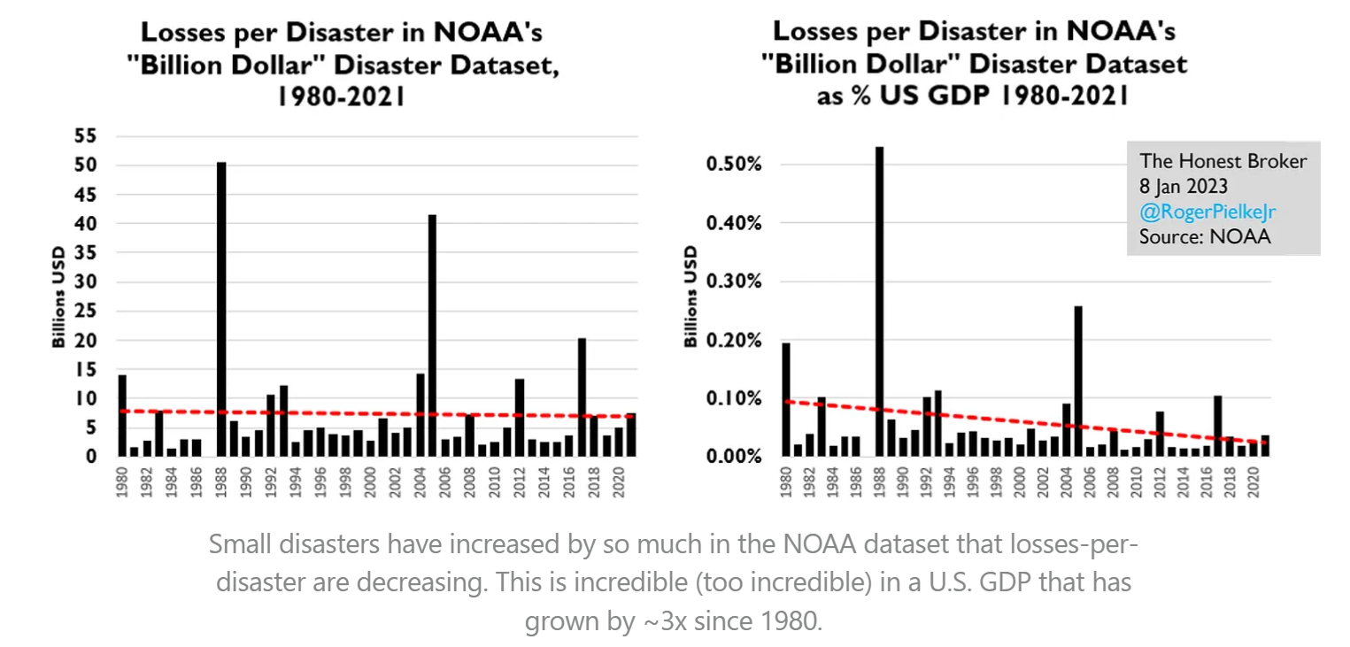
  • the storm data and disaster data
  • the polar ice data.
  • the historical data.

I have looked in deeply on this issue. I have studied the physics too! I have studied the history too! I have studied the archeology and even the paleo geology and even the ice core data.

This isn’t easy to get because lots of people are producing lies on the topic. So I have worked very hard to get down to the facts. Then the job becomes one which is very hard. If I just tell you the answers I got , it is a case of if you believe me or not. If I tell you the science data it is likely to get way in over your understanding and that is back to if you believe me or not. This is a job of explaining to you very carefully what the data is using things you can see and understand.

So taking this from the top there are 2 ways I can go.
One way is to go into the advocates of the topic that are so scaring you deeply
and the other is to go into the science.

The explanation of the science is pretty easy and such but explaining to you the motives of people and their actions and methods is much harder. But I am going to start with the people.

Why are they scaring you about the climate?

Climate policy has almost nothing to do anymore with environmental protection, says the German economist and IPCC official Ottmar Edenhofer.

This is what this is all about. There is no other motive. You may dispense with your worries here if you are worried for the world environment. But I will now switch to the facts and reality on the ground. Remember this alone should pretty much put an end to your worries. You are facing a very large deliberate well funded and most professionally constructed set of lies and propaganda designed to get you scared like you are. This is 5th generational warfare. It is not anything you are used to thinking about. That is why it is effective.

What are the climate facts on the ground?

The fact on the ground are that if the changes you are supposing to see are real they should be obvious. They should be something you can see, feel, hear and touch. That is where we are going right now!

If the world is warming up the paleo-climate data says that the polar regions warm first. That is what you are being told about arctic ice melting and sea level raise. If you go to the Denmark Polar Portal on the web you can get the data.

Greenland Ice Sheet is not Melting Away

Because these people have to comply with the IPCC they put in all kinds of disclaimers trying to keep you scared of melt down etc.. The reality is we are solidly into the melt season and the ice is not melting down more than usual.

Arctic Sea Ice Is Not Going Away

The polar ice is at normal levels. I can go on and on here but the reality is that there is no emergency.

Global Warming is Not Accumulating

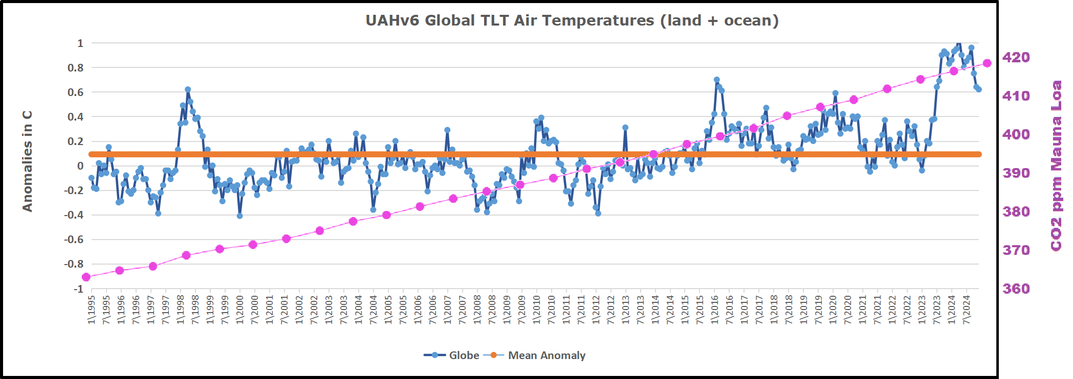
The data from UAH which is technical showed from January 1995 to January 2023 the global temperature did not increase at all.  And from 2016 actually went down (-0.7C) . That isn’t some melting or Global Warming or some Climate Catastrophe. It just is not.

CO2 Is Rising But Far Below Its Optimum

Is CO2 rising it sure is and it isn’t even to the maximum level that occurred in the last maximum in the last interglacial period of earth. CO2 is not 1% it is 0.042%. The earth has thrived with maximum life at 1% CO2 there are no melt down periods.

Is the climate variable, You bet it is. We have seen in the last 2000 years it go up and down in temperature and we are actually near the bottom of that period. The reality is that we have been up to 10C warmer and guess what that time mankind did his very best. We don’t thrive on cold.

Warming Has Been Beneficial and More Would be a Good Thing

Now let’s look at the trends and in a way you never imagined. I have looked into this matter because Alabama where I live has a cute lovely vacation town called Orange Beach. I highly recommend Orange Beach for a vacation it is beautiful. Orange Beach was named in 1898 when the US Post Office (Now the USPS) opened a new post office there. The unincorporated town’s principal business was raising oranges commercially. Alabama used to raise oranges up to about Evergreen Alabama or almost to Montgomery Alabama the state capitol.

 Production of Oranges Limited by Freezing Temperatures in SE US

No commercial orange production exists in Alabama at this time. The reason is simple. The growing season in Orange Beach Alabama went from 365 days a year to 268 days a year. The orange trees froze out. Now they have new varieties that can grow in the colder weather but even they are severely limited in Alabama. The orange trees have frozen out almost to Orlando Florida now.

Orange beach would be right next to North Florida along the Gulf of Mexico. Literally Florida is just across the Perdido River from Orange Beach.

The Gulf Stream Makes Climate Change in the North Atlantic

The reality is the climate from 1898 to the present has gotten colder in the USA. This is significant to the whole earth for a very important reason.

You see the heat from the whole earth gets aimed directly at Alabama! We cool down so is the rest of the world. The whole circulation for the whole earth focuses on the Gulf of Mexico and Alabama.

This by the way is why Greenland has so much ice. You see it is the warm water from the Gulf Stream that generates the steam that freezes and comes down as snow. You have to make the steam to make the ice.

Sea Level Depends on Land Buoyancy, not CO2

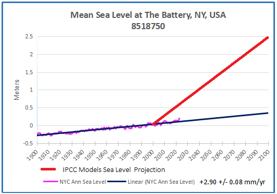
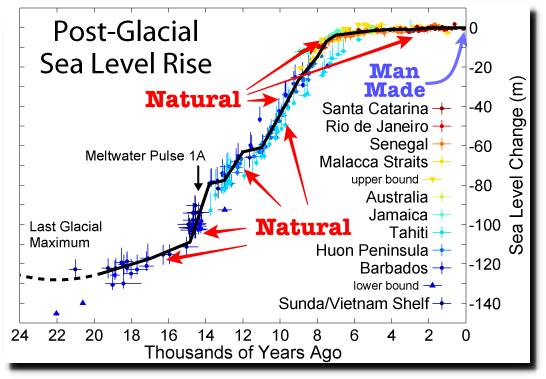
Now on to sea level rise. First of all if you believe that the sea level is rising and such it is only reported to be rising in the order of the thickness of 2 US 5 Cent coins per year. So if you believe it is happening it is no emergency and no real problem. It isn’t worthy of losing sleep over. The stories of melting sea ice are silly. First of all even if they melt they will have absolutely no effect on the sea level because they are floating. But there is another thing these people don’t tell you about.

The sea level is not the product of the amount of water in the ocean. It is in fact the product of a large sum of buoyancy issues and the gravity of the earth. The continents are where they are because they have less gravity than the other areas. The seafloor is a zone of higher gravity. Because the continents are floating that means that their level above the sea is determined by the laws of buoyancy. If Greenland were to melt off, the resulting reality would cause the area to buoy up because it would weigh less. At the same time the water added to the oceans would simply sink the sea floor deeper.

Continents Can Sink to Form New Seas

But to illustrate this you must learn about the Great Rift Valley of Africa. That valley is a place where the base continental rocks have spread apart. The land is sinking there and has already sunk to form the Red Sea! A new ocean is forming in Africa. This is what has sunk the continental shelves of the continents. The edge of the continents tinned out and lost the thick granite below that floats on the magma and they sunk. So sea level is not in any way related to ice melting. Sea level is related to this continental buoyancy issue. So nothing in their story not melting ice nor rising seas is happening. But I will show you this in pictures because we have these now.

Many Coastlines Show Water Receding Rather than Rising

Tell me if you see any sea level rise in the past 246 years now. (None!)

[Since we are looking in New England:]

This is just about due south of London–Pevensey Castle.

It was started construction in about 203 AD. It was built right on the sea on a coastal island. Such a fort only has value as far as an archer can shoot an arrow. It guarded the entrance to Pevensey Bay. The bay doesn’t exist it is nearly 30 meters above sea level now. Lots of people just refuse to see them. The fort itself is 110 feet above sea level and 5/8 mile from the sea.

If it isn’t clear yet that you have been hoaxed into a panic I don’t know what I can do. I have shown you that it got colder not warmer. That the ice is not melting. That the seas are not rising. Shall I go on?

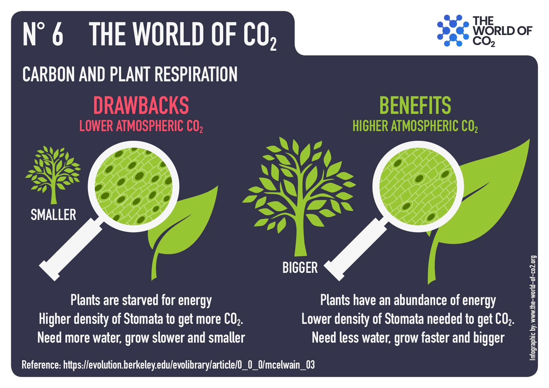
CO2 Is Plant Food not a Pollutant

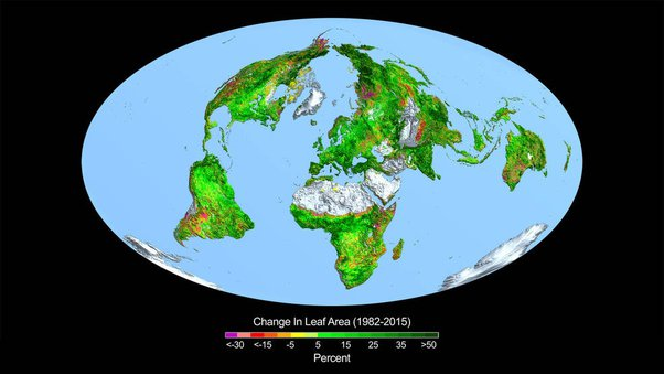
How about the real truth of CO2 and what it is doing on our earth. Look at these pictures carefully they tell the truth beyond any possible doubt.

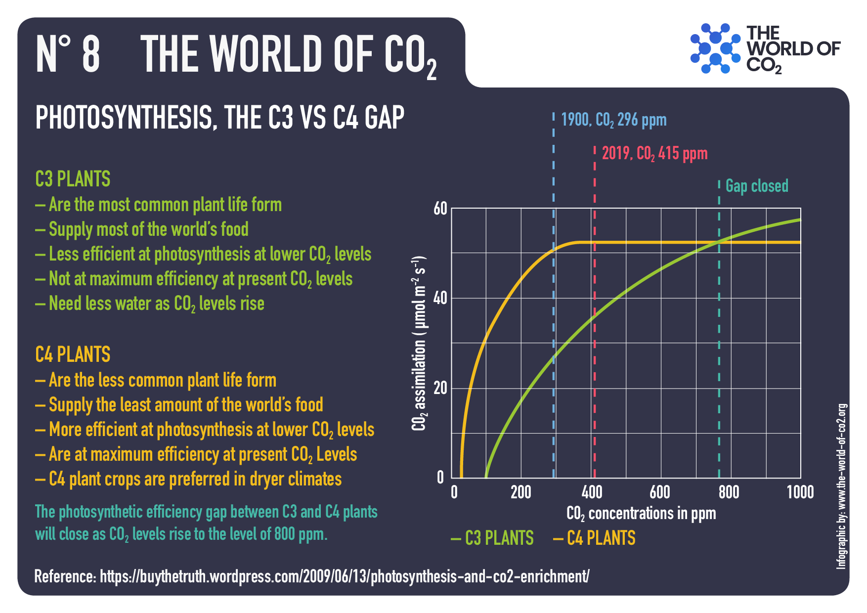
C3 photosynthesis plants are growing 800% better than they were. Our C4 plants are doing 650% better.

The whole earth is growing better and the forests are growing because of CO2. Sorry this isn’t a “doom and gloom” story here.

Wild fires are down too!

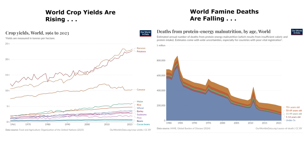
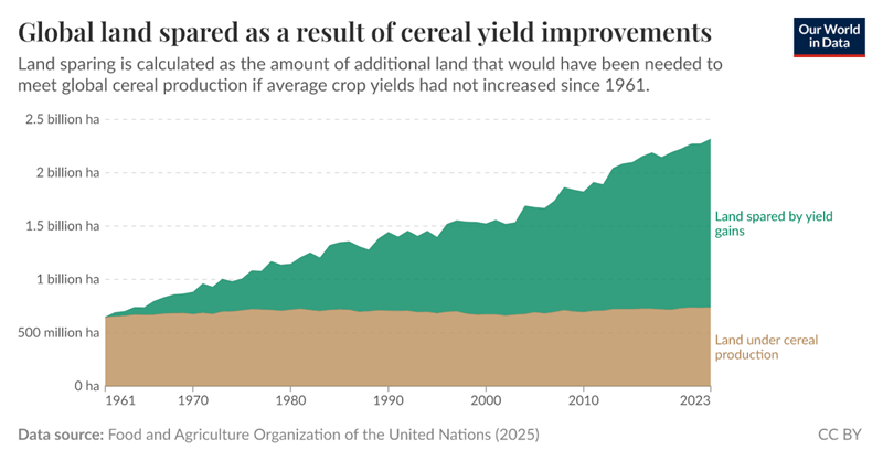
The fact is that in 1960 the world was running out of food because our plants and farms were at their limits. Today we are run over with food and 45% of our crop land has been turned back to the forests. We are not at the limits. This has led to an explosion of wildlife too!

Life is Thriving Not Facing Extinction

There literally is no mass extinction going on. We are in the largest bloom of life on earth that has been seen in the past 10,000 years.

The human race is on the edge of unlimited energy, unlimited food, unlimited technology and we are sitting here in terror of some imaginary doom and gloom hating the very system that is feeding mankind and building him up.

Everything is quite literally the opposite of what you are told!

In Sum;

The only catastrophe would be ill-advised climate policies willfully destroying
our energy platform and economic supply processes out of irrational CO2 hysteria.

Who Knew? Western Societies Growing More Equal, Not Less

Daniel Waldenstrom makes the case at Foreign Affairs The Inequality Myth.  Excerpts in italics with my bolds and added images.

Western Societies Are Growing More Equal, Not Less

Spend a few minutes browsing political commentary or scrolling social media and you will discover a seemingly settled truth: inequality in the West is soaring, the middle class is being hollowed out, and democracies stand on the brink of oligarchy. The idea is seductive because it fits everyday anxieties in many Western countries—housing has grown increasingly unaffordable, billionaire wealth mushrooms unfathomably, and the pandemic exposed yawning gaps in social safety nets. Yet the most influential claims about inequality rest on selective readings of history and partial measurements of living standards. When the full balance sheet of modern economies is tallied—including taxes, transfers, pension entitlements, homeownership, and the fact that people move through income brackets across their lives—the story looks markedly different. Western societies are not nearly as unequal as many believe them to be.

Getting the facts right matters because bad diagnosis breeds bad prescriptions. If governments assume that capitalism is inexorably recreating the disparities of the Gilded Age, they will reach for wealth confiscations, price controls, or ever-larger public sectors funded by fragile tax bases. If, instead, the evidence shows that free-market economies have enriched middle classes by expanding asset ownership, that entrepreneurs’ fortunes are associated with advances shared with the broader public, and that much of the post-1980 rise in recorded inequality reflects methodological quirks, then a different agenda follows: states should encourage ambition, protect competition, widen access to wealth-building, and ensure that public services complement—not smother—private prosperity.

In short, before treating inequality as an existential crisis,
it is worth double-checking the thermometer.

Conventional Wisdom Overturned by Evidence

The canonical data tell only part of the story, and the least flattering part at that. A growing body of scholarship reassesses the long-run distribution of wealth by adding what earlier studies neglected. Three findings stand out.

First, private wealth has exploded—but so has broad ownership of it.

Reconstructed national balance sheets for France, Germany, Spain, Sweden, the United Kingdom, and the United States show real per-adult wealth roughly tripling since 1980 and rising more than sevenfold since 1950. Crucially, an increasing share of that capital sits in the homes and pension funds of ordinary households. In 1900, assets held by the elite—agricultural domains and shares in industrial or financial corporations—dominated; today, residential property and funded retirement accounts represent the majority of private assets. That shift parallels mass homeownership: in most Western countries, 60 to 70 percent of households now own the roof over their heads—an equity stake unavailable to their great-grandparents. Most workers hold pension claims in mutual funds or index funds, granting them the high returns of stock markets at low risk—what amounts to financial democratization.

Second, wealth concentration has fallen—not risen—over the past century.

In Europe, the top one percent now owns barely a third of the share it held in 1910, right before the beginning of the transformative era of world wars, democratization, and the growth of governmental capacity, and since the 1970s that share has been essentially flat, even as real wealth—that is, wealth adjusted for inflation—has tripled with rising asset prices. The United States shows a clearer uptick beginning in the 1970s, most visible among the spectacular fortunes of tech and finance titans, whose gains have outpaced even the impressive wealth growth of the middle class. Yet U.S. concentration remains closer to its 1960 level than to its pre-1914 peak.

The dominant quantitative fact of the century, therefore,
is not a new Gilded Age but a dramatic wealth equalization
propelled by mass asset ownership.

Third, the fact that people move through different income brackets over the course of their lives should temper typical measures of inequality.

So, too, should the effects of welfare payments. Annual snapshots lump graduate students with retirees living off savings, making income and wealth gaps appear wider than lifetime consumption gaps. When studies in different countries instead follow individuals over time, they typically find that within only a few years, half the households in the bottom income decile have climbed to higher levels. Many top-decile households can drop to lower rungs of the ladder after business or investment setbacks. Government welfare programs further compress differences. In Sweden, when public pension entitlements are capitalized and added to assessments of personal wealth, this alone cuts the measured wealth inequality—known as the Gini coefficient—by almost half. In the United States, the market’s redistributive role is smaller, but when Social Security, Medicare, and employer-provided health insurance are treated as in-kind income, median households fare far better than raw wage data suggest.

Social Alarmists Out of Touch with Today’s Realities

These facts undermine the image of an inexorably widening chasm between a plutocratic elite and the rest. Yes, superstar entrepreneurs have amassed fortunes measured in tens of billions. But that outcome signals success, not failure: they furnished goods and services that millions freely bought. Their booming companies also supply jobs, higher wage earnings, and substantial tax revenue—directly through profits and payrolls and indirectly by raising the broader tax base. Over the past four decades, life expectancy in advanced economies (including in the United States despite the much-noted increase in “deaths of despair”) rose roughly six years, high school completion became nearly universal, and personal computers once reserved for elites went mainstream.

Those who typically bemoan the rise of inequality
don’t correctly weigh the size and division of the pie.

Rising real incomes and higher asset values are preconditions for mass prosperity and for a well-funded public sector. Even advocates of government intervention should champion efficient growth: every percentage point of GDP adds billions to tax revenue. The West’s most durable path to fairness, then, is to scale up the channels through which ordinary households acquire assets—including affordable housing supply, portable retirement accounts, and low-fee index funds—and to keep markets open so new firms can challenge incumbents.

That perspective should also moderate calls for annual taxes on the stock of net wealth, which have recently been proposed by some politicians and researchers, and have even been discussed officially at G-20 and UN meetings. These so-called wealth taxes are problematic because they hit illiquid assets, forcing entrepreneurs or farmers to borrow or liquidate. Scandinavian experience of such taxes shows that they produce meager revenues, come with high administrative costs, and encourage capital flight. If capital is to be taxed, a more efficient and equitable way is to tax capital income—such as dividends, realized gains, and corporate profits.

Evidence-based Priorities for Policymakers

Misreading inequality courts several risks. It diverts energy from the real challenges to Western economies, which include lax productivity growth, aging populations, and the imperatives of climate adaptation. These problems will strain public budgets. But excessive state-centrism and confiscatory wealth taxes impede capital formation and make financing those tasks harder, not easier. Misunderstanding inequality also breeds regressivity: taxing housing wealth indiscriminately can hit asset-rich but cash-poor retirees; taxing private firms can force sales to multinational giants with cheaper credit. And it corrodes trust: when citizens hear that capitalism benefits only the elite—even as their own living standards rise—they may grow cynical about official statistics and susceptible to populist cures worse than the disease.

A more accurate reading of the data supports a balanced agenda. To be clear, excessive wealth concentration poses risks—most notably to political integrity. Transparent rules for campaign financing and party contributions are essential to minimize the undue influence of money. Core welfare services, such as education and health care, should not become overly dependent on private funding, otherwise they would tie the quality of care to personal wealth—and in the process deepen inequality. The solution is not to curb wealth itself but to safeguard the integrity of political institutions and ensure equitable access to public goods.

States should celebrate entrepreneurial success and foster competition by reducing regulatory burdens—especially those that disproportionately affect smaller and younger firms. Taxation on labor income should be modest enough to incentivize hard work and also allow for the accumulation of new wealth, while capital taxation should target income rather than wealth or inheritances. Public investment should focus on building the capabilities that let households become stakeholders—education, infrastructure, and a rules-based climate that rewards risk-taking. Such an agenda accepts that inequality can coexist with, and even flow from, broad prosperity. Frustration with privilege should be channeled into reforms that expand opportunity rather than cap success.
This agenda advances neither laissez-faire complacency nor egalitarian maximalism. It is an acknowledgment that the West’s most remarkable achievement is not the fortune of a Jeff Bezos or Bernard Arnault but the mundane riches enjoyed by millions whose grandparents lived without antibiotics, central heating, or college degrees. Policymakers would do well to remember that progress before they diagnose calamity—and nurture the conditions that make it possible: secure property rights, open markets, and an efficient public sector powered by the very economic growth its advocates sometimes disparage.

Footnote: The issue of adapting to climate change, raised in the article, perfectly illustrates the dichotomy of social perspectives regarding equality.


April 2025 UAH Temps Little Changed For Now

The post below updates the UAH record of air temperatures over land and ocean. Each month and year exposes again the growing disconnect between the real world and the Zero Carbon zealots.  It is as though the anti-hydrocarbon band wagon hopes to drown out the data contradicting their justification for the Great Energy Transition.  Yes, there was warming from an El Nino buildup coincidental with North Atlantic warming, but no basis to blame it on CO2.

As an overview consider how recent rapid cooling  completely overcame the warming from the last 3 El Ninos (1998, 2010 and 2016).  The UAH record shows that the effects of the last one were gone as of April 2021, again in November 2021, and in February and June 2022  At year end 2022 and continuing into 2023 global temp anomaly matched or went lower than average since 1995, an ENSO neutral year. (UAH baseline is now 1991-2020). Then there was an usual El Nino warming spike of uncertain cause, unrelated to steadily rising CO2 and now dropping steadily.

For reference I added an overlay of CO2 annual concentrations as measured at Mauna Loa.  While temperatures fluctuated up and down ending flat, CO2 went up steadily by ~60 ppm, a 15% increase.

Furthermore, going back to previous warmings prior to the satellite record shows that the entire rise of 0.8C since 1947 is due to oceanic, not human activity.

gmt-warming-events

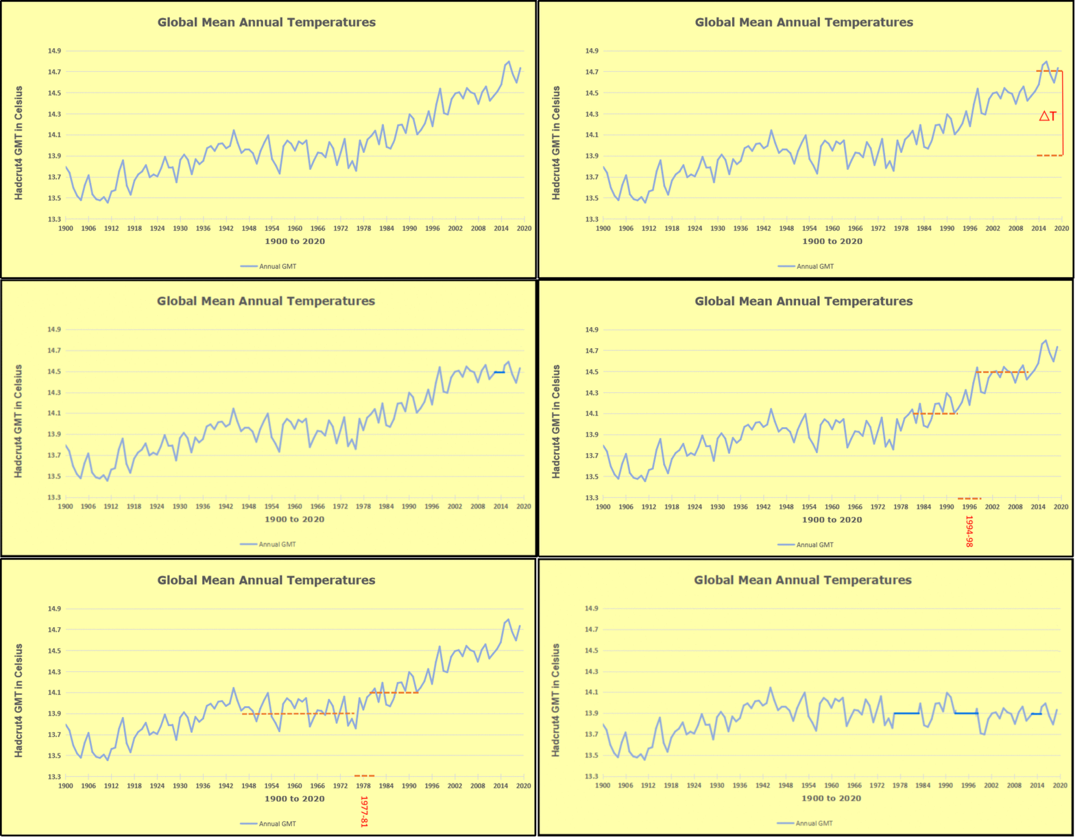
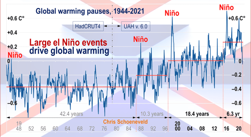
The animation is an update of a previous analysis from Dr. Murry Salby.  These graphs use Hadcrut4 and include the 2016 El Nino warming event.  The exhibit shows since 1947 GMT warmed by 0.8 C, from 13.9 to 14.7, as estimated by Hadcrut4.  This resulted from three natural warming events involving ocean cycles. The most recent rise 2013-16 lifted temperatures by 0.2C.  Previously the 1997-98 El Nino produced a plateau increase of 0.4C.  Before that, a rise from 1977-81 added 0.2C to start the warming since 1947.

Importantly, the theory of human-caused global warming asserts that increasing CO2 in the atmosphere changes the baseline and causes systemic warming in our climate.  On the contrary, all of the warming since 1947 was episodic, coming from three brief events associated with oceanic cycles. And in 2024 we saw an amazing episode with a temperature spike driven by ocean air warming in all regions, along with rising NH land temperatures, now dropping below its peak.

Chris Schoeneveld has produced a similar graph to the animation above, with a temperature series combining HadCRUT4 and UAH6. H/T WUWT

image-8

See Also Worst Threat: Greenhouse Gas or Quiet Sun?

April 2025 UAH Temps Little Changed Despite Tropical Cooling banner-blog

With apologies to Paul Revere, this post is on the lookout for cooler weather with an eye on both the Land and the Sea.  While you heard a lot about 2020-21 temperatures matching 2016 as the highest ever, that spin ignores how fast the cooling set in.  The UAH data analyzed below shows that warming from the last El Nino had fully dissipated with chilly temperatures in all regions. After a warming blip in 2022, land and ocean temps dropped again with 2023 starting below the mean since 1995.  Spring and Summer 2023 saw a series of warmings, continuing into 2024 peaking in April, then cooling off to the present.

UAH has updated their TLT (temperatures in lower troposphere) dataset for April 2025. Due to one satellite drifting more than can be corrected, the dataset has been recalibrated and retitled as version 6.1 Graphs here contain this updated 6.1 data.  Posts on their reading of ocean air temps this month are ahead of the update from HadSST4.  I posted recently on SSTs March 2025 Oceans Cooling Persists These posts have a separate graph of land air temps because the comparisons and contrasts are interesting as we contemplate possible cooling in coming months and years.

Sometimes air temps over land diverge from ocean air changes. In July 2024 all oceans were unchanged except for Tropical warming, while all land regions rose slightly. In August we saw a warming leap in SH land, slight Land cooling elsewhere, a dip in Tropical Ocean temp and slightly elsewhere.  September showed a dramatic drop in SH land, overcome by a greater NH land increase. 2025 has shown a sharp contrast between land and sea, first with ocean air temps falling in January recovering in February.  Then land air temps, especially NH, dropped in February and recovered in March.

Note:  UAH has shifted their baseline from 1981-2010 to 1991-2020 beginning with January 2021.   v6.1 data was recalibrated also starting with 2021. In the charts below, the trends and fluctuations remain the same but the anomaly values changed with the baseline reference shift.

Presently sea surface temperatures (SST) are the best available indicator of heat content gained or lost from earth’s climate system.  Enthalpy is the thermodynamic term for total heat content in a system, and humidity differences in air parcels affect enthalpy.  Measuring water temperature directly avoids distorted impressions from air measurements.  In addition, ocean covers 71% of the planet surface and thus dominates surface temperature estimates.  Eventually we will likely have reliable means of recording water temperatures at depth.

Recently, Dr. Ole Humlum reported from his research that air temperatures lag 2-3 months behind changes in SST.  Thus cooling oceans portend cooling land air temperatures to follow.  He also observed that changes in CO2 atmospheric concentrations lag behind SST by 11-12 months.  This latter point is addressed in a previous post Who to Blame for Rising CO2?

After a change in priorities, updates are now exclusive to HadSST4.  For comparison we can also look at lower troposphere temperatures (TLT) from UAHv6.1 which are now posted for April 2025.  The temperature record is derived from microwave sounding units (MSU) on board satellites like the one pictured above. Recently there was a change in UAH processing of satellite drift corrections, including dropping one platform which can no longer be corrected. The graphs below are taken from the revised and current dataset.

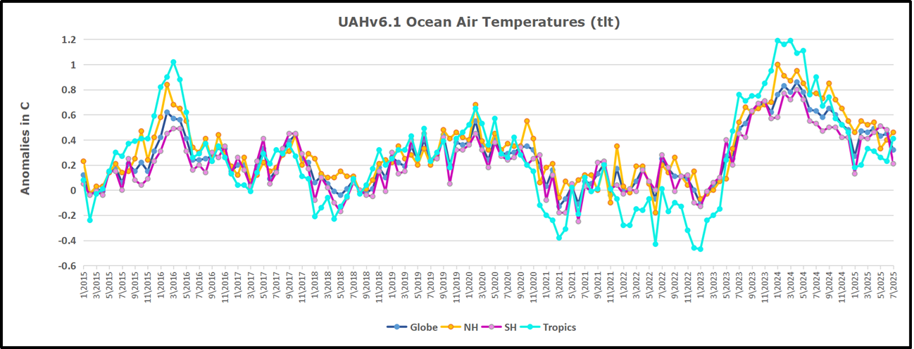
The UAH dataset includes temperature results for air above the oceans, and thus should be most comparable to the SSTs. There is the additional feature that ocean air temps avoid Urban Heat Islands (UHI).  The graph below shows monthly anomalies for ocean air temps since January 2015.

In 2021-22, SH and NH showed spikes up and down while the Tropics cooled dramatically, with some ups and downs, but hitting a new low in January 2023. At that point all regions were more or less in negative territory.

After sharp cooling everywhere in January 2023, there was a remarkable spiking of Tropical ocean temps from -0.5C up to + 1.2C in January 2024.  The rise was matched by other regions in 2024, such that the Global anomaly peaked at 0.86C in April. Since then all regions have cooled down sharply to a low of 0.27C in January.  In February 2025, SH rose from 0.1C to 0.4C pulling the Global ocean air anomaly up to 0.47C, where it stayed in March and April

Land Air Temperatures Tracking in Seesaw Pattern

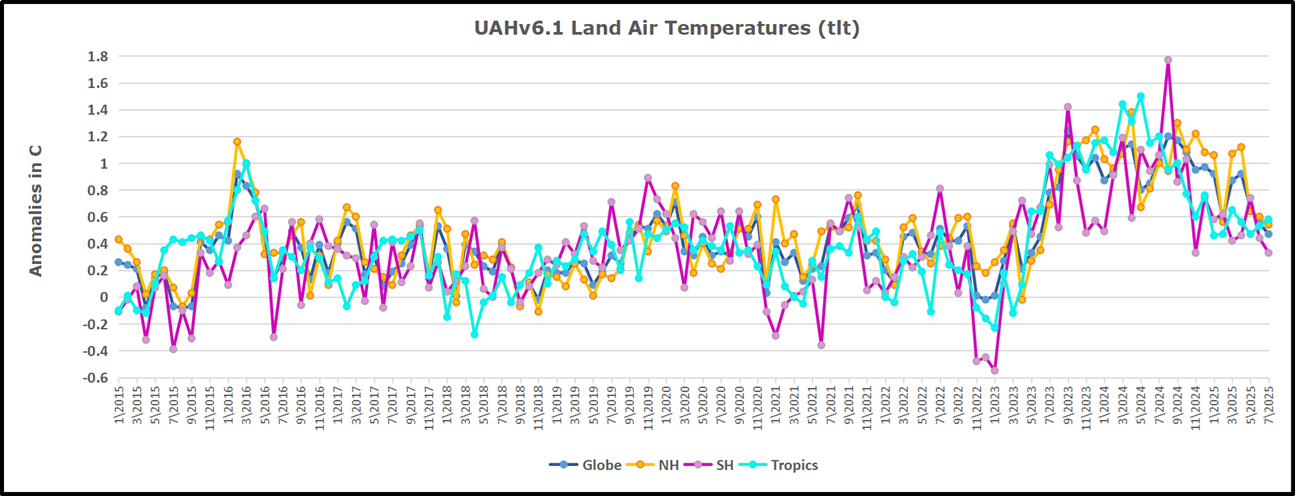
We sometimes overlook that in climate temperature records, while the oceans are measured directly with SSTs, land temps are measured only indirectly.  The land temperature records at surface stations sample air temps at 2 meters above ground.  UAH gives tlt anomalies for air over land separately from ocean air temps.  The graph updated for March is below.

Here we have fresh evidence of the greater volatility of the Land temperatures, along with extraordinary departures by SH land.  The seesaw pattern in Land temps is similar to ocean temps 2021-22, except that SH is the outlier, hitting bottom in January 2023. Then exceptionally SH goes from -0.6C up to 1.4C in September 2023 and 1.8C in  August 2024, with a large drop in between.  In November, SH and the Tropics pulled the Global Land anomaly further down despite a bump in NH land temps. February showed a sharp drop in NH land air temps from 1.07C down to 0.56C, pulling the Global land anomaly downward from 0.9C to 0.6C. In March that drop reversed with both NH and Global land back to January values, despite another drop in SH land air temps. Now in April there is a slight upward bump despite a dip in Tropical land temperatures

The Bigger Picture UAH Global Since 1980

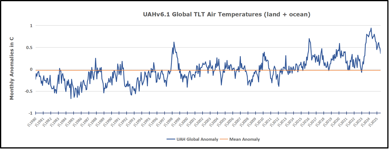
The chart shows monthly Global Land and Ocean anomalies starting 01/1980 to present.  The average monthly anomaly is -0.03, for this period of more than four decades.  The graph shows the 1998 El Nino after which the mean resumed, and again after the smaller 2010 event. The 2016 El Nino matched 1998 peak and in addition NH after effects lasted longer, followed by the NH warming 2019-20.   An upward bump in 2021 was reversed with temps having returned close to the mean as of 2/2022.  March and April brought warmer Global temps, later reversed

With the sharp drops in Nov., Dec. and January 2023 temps, there was no increase over 1980. Then in 2023 the buildup to the October/November peak exceeded the sharp April peak of the El Nino 1998 event. It also surpassed the February peak in 2016. In 2024 March and April took the Global anomaly to a new peak of 0.94C.  The cool down started with May dropping to 0.9C, and in June a further decline to 0.8C.  October went down to 0.7C,  November and December dropped to 0.6C. February went down to 0.5C, then back up to 0.6C in March and April driven by the bounce in NH land air temps.

The graph reminds of another chart showing the abrupt ejection of humid air from Hunga Tonga eruption.

Note on Ocean Cooling Not Fully Appearing in UAH Dataset

The above chart shows sea surface temperature anomalies (SSTA)  in the North Atlantic 0 to 60N.  The index is derived from ERSSTv.5 by subtracting the global anomalies from the North Atlantic anomalies, the differences as shown in the chart. The baseline of  0.0C is the average for the years 1951 to 1980.  The mean anomaly since 1980 is in purple at 0.33C, and persisted throughout up to 2018. The orange line is the average anomaly in the the last six years, 2019 to 04/2025 inclusive, at 0.84C. The remarkable spikes in 2023 and 2024 drove that rise to exceed 1.4C, which has been cut in half over the last 10 months.  As Dr. Humlum observed, such oceanic changes usually portend air temperature changes later on.

TLTs include mixing above the oceans and probably some influence from nearby more volatile land temps.  Clearly NH and Global land temps have been dropping in a seesaw pattern, nearly 1C lower than the 2016 peak.  Since the ocean has 1000 times the heat capacity as the atmosphere, that cooling is a significant driving force.  TLT measures started the recent cooling later than SSTs from HadSST4, but are now showing the same pattern. Despite the three El Ninos, their warming had not persisted prior to 2023, and without them it would probably have cooled since 1995.  Of course, the future has not yet been written.

Merit-Based Energy: Best of the Above, Not All

Steve Milloy puts things in context in his Daily Caller article  ‘All Of The Above’ Is DEI For Energy.  Excerpts in italics with my bolds and added images.

The Restoring Energy Dominance (RED) Coalition recently produced an ad advocating for “all forms of energy.” “You voted for it, you got it,” the ad starts. It features a clip of President Trump saying “All forms of energy, yep…” What exactly does “all forms of energy,” or its 21st century shorthand, “all of the above” really mean? Is it good policy” And, is President Trump for it?

The concept of ‘all of the above’ dates back to a mid-2000s convergence of energy-related events including: (1) the then emerging but imaginary “climate crisis” and (2) an actual energy crisis caused by a combination of factors including the Iraq war, US dependence on OPEC, the rise of energy-hungry China and India, the notion of Peak Oil and more. Congress’s solution to this was the Energy Policy Act of 2005 signed into law by President Bush. It called for expanding domestic energy production, including: oil, natural gas, coal, nuclear, and renewables. “All of the above” wasn’t in common usage at the time, but the law essentially embodied it.

“All of the above” subsequently came into more common use, albeit with different variations, during President Obama’s “war on coal” and his embrace of Executive action to cut emissions because of “climate change.” For President Obama, “all of the above” meant all forms of energy except for coal, which he tried to regulate into extinction. To counter Obama, the coal industry and its Republican supporters used “all of the above” as a desperate means of including coal in the US energy equation.

But the tables have now turned. President Trump supports:
the booming oil and gas industry;
the now-crippled coal industry;
the flailing nuclear industry, and
solar power.

He campaigned and has repeatedly spoken against the onshore and offshore wind industry. He has also issued an executive order to review offshore wind projects and has, thus far, paused one specific project. It is now the wind industry’s turn to scream “all of the above” in hopes of remaining part of the US energy equation.

President Trump also campaigned and has taken executive action against what he often calls the “Green New Scam,” which means the climate spending and energy subsidies contained in President Biden’s 2022 Inflation Reduction Act. Opponents of the Green New Scam hope to repeal the subsidies in President Trump’s upcoming Big Beautiful Bill.

The RED Coalition ad would take us back to the days of the Energy Policy Act and its focus on producing domestic energy from all sources. While that may sound reasonable, it ignores the realities we’ve experienced and lessons we’ve learned over the past 20 years.

First, Energy Policy Act proponents did not foresee the late-2000s advent and impact of fracking for oil and gas. Whereas in 2005 we were dependent on imports of natural gas and were running out of cheap oil production options, fracking changed the global energy situation almost overnight. Fracking gave the US essentially a limitless supply of oil and gas. That has essentially crushed OPEC’s ability to control the global price of oil. Thanks to fracking, we probably have enough oil and gas to run the entire US economy without any other form of energy.

Second, we have been told for decades that wind and solar were cheaper than fossil fuels and were a solution to the alleged “climate crisis.” Both claims have been proven to be false. Wind and solar have not reduced the price of electricity for anyone. At best, they have only reallocated energy costs to taxpayers. Wind and solar have only increased the price of electricity for consumers, even when it is subsidized by taxpayers.

Worse, solar and wind have jeopardized the reliability of our grid. Grid operators now routinely warn of possible grid failure during peak demand. A February winter storm in Texas froze the wind turbines, resulting in hundreds of deaths and almost causing catastrophic grid failure. Too much solar and wind caused a similar grid crisis in Spain and Portugal just last month.

Wind and solar have never been economically viable without subsidies. That’s why wind and solar supporters oppose the end of the Green New Scam. Not only do wind and solar require taxpayer subsidies, they are also intrinsically subsidized by government mandates, and the sourcing of materials and labor from Communist China. This has also had the national security-imperiling effect of making our electricity grid dependent on our geopolitical rival.

Finally, wind and solar have also been an environmental disaster in terms of great birds, bats, whales and much other marine life killed. Their oversized footprints are made essentially a permanent part of the environment because of the vast amounts of concrete and iron rebar used in their foundations. There are also national security concerns with offshore wind.

We need energy that works. After 20 years of experience,
“all of the above” is just affirmative action for wind and solar energy.

If energy decisions were made on the basis of standard economic merit, like cost and functionality, then oil, gas, coal and nuclear power would win hands down. President Trump occasionally says kind things about solar, but not about wind. He saves his lavish praise and attention for those most deserving: oil, gas and coal.

W. J. Lee expands on this topic in his AMAC article Spain’s Green Energy Blackout Proves Trump is Right about Energy.  Excerpts in italics with my bolds and added images.

Last week’s sweeping blackouts across Spain and Portugal
delivered a stark reminder: energy policy rooted in ideology,
not engineering, has real-world consequences.

Days before the lights went out, Spanish leadership celebrated their power grid’s high reliance on renewables. But when solar and wind faltered—as all intermittent sources eventually do—the system buckled. Their mistake should give Americans added confidence that President Donald Trump’s all-of-the-above energy vision will lead to American energy dominance and dependability.

As large swaths of the Iberian Peninsula went dark, Europe came face-to-face with the instability that results from over-reliance on wind and solar power. The irony? This chaos unfolded on a sunny, wind-swept day—exactly the kind of day when renewables are supposed to dominate.

At the heart of the disruption was a grid built not on resilience, but on fashionable climate politics. Spain’s grid operator reported that just before the outage, solar power provided nearly 60 percent of the country’s electricity. Wind contributed another 9 percent. Together, these intermittent sources accounted for over two-thirds of supply—and when the system folded, it did so calamitously.

Spanish Prime Minister Pedro Sánchez stubbornly holds to the belief that the country’s high reliance on renewable energy had nothing to do with the extensive blackout, but several experts disagree. Leading former International Energy Agency board member Jorge Sanz told the press that the grid did not have enough support from nuclear and fossil fuel power plants to fill in when a sudden drop in power occurred from solar and wind power plants.

André Merlin, a former executive of France’s power grid, warned Europe against following Spain. “We need to be careful about the policy of maximum development and maximum use of intermittent renewable energy to the detriment of more conventional means,” he said.

It’s no coincidence that President Trump’s all-of-the-above energy policy—embracing fossil fuels, nuclear, renewables, and hydro—is giving the economy supreme confidence in our energy future. By diversifying America’s energy mix instead of putting all our eggs in the wind-and-solar basket, Trump ensures stability, affordability, and national security.

In contrast, the European Union is marching toward a self-defeating future where 69 percent of electricity must come from renewables by 2030, regardless of the consequences. Technocrats in Brussels may pat themselves on the back, but grid operators are still scrambling to solve basic technical challenges—like how to keep the lights on when clouds roll in or the wind dies.

One of the key technical problems is the loss of grid “inertia”—the momentum in spinning turbines at coal, gas, and nuclear plants that help stabilize voltage and frequency. When a solar farm goes offline, the output vanishes instantly. There’s no cushion, no time to react. This is precisely the kind of fragility President Trump warned about in 2018 when he pushed back on radical energy mandates and shutdowns of baseload power plants.

British energy expert Professor David Brayshaw of the University of Reading, summed it up: future blackouts will likely become “more significant and widespread” as renewables dominate the grid. Europe is learning that the hard way. Meanwhile, American energy independence—secured under Trump through expanded oil and gas production—offers the flexibility and robustness that Europe sorely lacks.

Back in Spain, grid operator Red Eléctrica wouldn’t say for sure what caused the outage, but all eyes turned to solar. The system collapsed in broad daylight, when solar production was at its peak. Two rapid losses of power—just 1.5 seconds apart—threw the grid into chaos and severed Spain’s connection with the wider European system.

And when it came time to reboot the grid, what energy sources did authorities rely on? Not wind. Not solar. It was hydroelectric and natural gas—energy sources vilified by climate activists but proven once again to be essential. President Trump understands this dynamic and refuses to bow to the environmental lobby’s demand for a total shift to intermittent renewables.

His administration is supporting investment in solar and wind
—when and where it makes sense—
but never at the expense of coal, oil, gas, or nuclear.

That balance, that pragmatism, ensures that America stays competitive, keeps utility bills low, and avoids the kind of disaster Europe just experienced. Spain’s blackout was not the result of a freak accident—it was the predictable outcome of an energy policy that treats physics as optional.

Spain is still moving forward with its plans to shut down its nuclear plants, the most reliable sources of zero-emissions power, and doubling down on wind and solar. That decision defies common sense. Nuclear energy is precisely the kind of carbon-free, high-output technology we should all support—technology that delivers stability and allows us to be good stewards of natural resources.

Europe’s push for a continent-wide “supergrid” is another
green utopian dream not grounded in reality.

The idea is that countries can share power more efficiently—but this past week’s outage rippled through Spain, Portugal, and even parts of France. Interdependence sounds great until a single failure spreads like wildfire.

This blackout should be Europe’s wake-up call. The “transition” they keep touting isn’t a triumph—it’s a gamble, and one that’s starting to cost real people their livelihoods, their travel plans, and their basic security.

Trump will continue to show the world what a sane energy policy looks like: use everything. Don’t demonize fossil fuels that keep the lights on. Don’t shut down nuclear reactors that provide dependable, carbon-free power. Don’t force the economy to depend on whether the sun shines or the wind blows.
As Spain gropes in the dark for answers, one thing is clear: President
Trump’s all-of-the-above approach isn’t just sensible—it is essential.

Beware Renewable Energy Trap

Terry L. Headley exposes the entanglements unheeded by carbon free activists in his Real Clear Energy article The Renewable Energy Trap: A Warning to Nations Pursuing Blind Sustainability  Excerpts in italics with my bolds and added images.

As the world increasingly shifts toward renewable energy, there is a growing risk that nations could fall into the “renewable energy trap.” This trap is the result of embracing an energy transition without fully understanding its economic, environmental, and geopolitical consequences. While renewable energy sources like wind, solar, and hydropower have been hailed as the future of global energy, nations rushing toward these technologies without a strategic plan may face grave economic and security challenges. The truth is that blind adherence to renewable energy, in its current form at least, is not the panacea many believe it to be. In fact, it could prove to be a short, green path to economic ruin for both developed and developing nations alike.

The up front gold is clear and considerable, while the end of the road is in the shadows and uncertain.

The False Promises of Renewables: Hidden Costs and Risks

The promise of renewable energy often comes with an aura of infallibility—clean, green, and limitless. However, this narrative overlooks the hidden costs of transitioning to renewable energy systems, many of which are disguised through misleading claims and incomplete accounting. For example, Germany’s “Energiewende” (Energy Transition) provides a cautionary tale of how well-intentioned policies can lead to unintended consequences.

Germany, once hailed as a leader in the renewable energy revolution, has spent over a decade investing heavily in wind and solar energy. Despite spending billions of euros, Germany has seen little reduction in its greenhouse gas emissions, and the financial burden on consumers has been significant. In 2020, Germany had the highest electricity prices in Europe, largely due to the subsidies and support provided to renewable energy companies. The country’s energy bills for consumers have surged, in part because of the costs associated with maintaining backup fossil fuel plants to ensure grid stability when wind and solar energy are insufficient.

Furthermore, Germany’s renewable energy push has led to a paradoxical reliance on coal. As has been said so many times before, when the wind isn’t blowing and the sun isn’t shining, Germany has been forced to turn back to coal-fired power plants to meet demand. Ironically, this has undermined the very environmental goals the country sought to achieve. Despite Germany’s heavy investment in renewables, it has seen a rise in coal usage due to the intermittent nature of its renewable energy sources, highlighting one of the most significant flaws of a renewable-dominant grid: reliance on fossil fuels to fill in the gaps.

Why? Because Germany must maintain at least as much baseload coal generation in reserve as it has in renewable energy generation to make sure it has electricity available at all times. The reality is that Germans are paying for the same electricity two or three times.

Rising Energy Costs and the Threat of Energy Poverty

The financial burden of renewable energy policies extends beyond Germany, affecting millions of households across the globe. One of the most significant, yet often overlooked, consequences of the renewable energy transition is the rising cost of electricity. The shift toward renewables has caused electricity prices to increase to the point where energy poverty is becoming a real issue in many countries.

Energy poverty refers to the inability of households to afford sufficient energy for heating, cooling, and powering their homes. The International Energy Agency (IEA) defines energy poverty as the lack of access to affordable and reliable energy. As the costs of renewable energy policies continue to rise, more and more households find themselves at risk of falling into energy poverty.

In the United Kingdom, for example, the government’s push for renewable energy has resulted in substantial increases in electricity prices. A report by the UK’s National Grid showed that between 2008 and 2020, the average annual energy bill for a UK household rose by 30%, with a significant portion of the increase attributed to the country’s renewable energy investments. The UK government has heavily subsidized wind and solar energy projects, but those subsidies are paid for by consumers through higher electricity bills. The result has been a situation where millions of British households struggle to keep up with the rising costs of energy.

In California, energy poverty is also on the rise as the state aggressively pursues renewable energy goals. While California has invested heavily in solar power, it has failed to address the intermittent nature of renewable energy. During periods of peak demand, when solar and wind energy are insufficient, the state is forced to turn to natural gas and imported electricity, which drives up costs. California has one of the highest electricity prices in the United States, and many low-income families are feeling the impact.

According to the California Public Utilities Commission, more than 1.3 million households in the state were at risk of energy poverty in 2020. Despite the state’s focus on clean energy, many residents are unable to afford their electricity bills, forcing them to choose between paying for energy or other necessities like food and medicine.

In South Australia, another example of the renewable energy trap is evident. South Australia has aggressively pursued renewable energy policies, becoming one of the leading adopters of wind and solar power in the world. However, this shift has led to significant spikes in electricity prices. The state has faced price volatility and blackouts due to the intermittent nature of renewable energy. In 2017, South Australia experienced a widespread blackout after a storm damaged the transmission network, and the state has since struggled to maintain grid stability. The increased reliance on renewables has led to soaring electricity prices, and many households are now unable to afford basic energy needs. According to the Australian Energy Regulator, electricity prices in South Australia have risen by 50% in the past decade, and many low-income families are feeling the squeeze.

The Geopolitical Trap: Energy Dependency, Raw Materials and National Security

The renewable energy transition also raises important geopolitical concerns, particularly in the area of raw materials. Renewable energy technologies are heavily reliant on rare earth metals, lithium, cobalt, and nickel for the production of batteries, solar panels, and wind turbines. These materials are predominantly sourced from countries with less stable political environments or are monopolized by a few nations, such as China.

This creates a new form of energy dependency. For instance, the global supply chain for lithium and cobalt is largely controlled by China, raising questions about national security and the potential for price manipulation or trade disruptions. Countries that rush toward renewables without developing diversified supply chains may find themselves dependent on a handful of foreign nations for critical materials—echoing the geopolitical vulnerability that oil-dependent countries have faced for decades. This new energy dependence could undermine the goal of energy independence that many nations seek.

Moreover, the mining process for these materials is far from clean or environmentally friendly. In countries like the Democratic Republic of Congo, where much of the world’s cobalt is sourced, mining operations are linked to severe environmental degradation and human rights abuses. The environmental damage associated with mining for lithium, cobalt, and rare earth metals often goes unreported in the “green” narrative surrounding renewable energy. In many cases, the extraction of these materials results in significant water contamination, deforestation, and harmful air emissions.

The Hidden Costs: Economic Burdens and Social Inequality

Another significant issue with the renewable energy push is the way its real costs are hidden from the public. Governments often advertise the economic benefits of renewables without accounting for the financial burden on consumers. The transition to renewable energy technologies often requires substantial government subsidies, which are typically funded by taxpayers or passed onto consumers through higher utility rates. In the case of the European Union, the cost of renewable energy subsidies is often obscured by misleading accounting practices that fail to capture the true cost of maintaining grid stability.

Take California, a state that has aggressively pursued renewable energy initiatives. While solar and wind have gained in popularity, California’s reliance on intermittent renewables has led to skyrocketing energy prices and blackouts. The state has been forced to rely on natural gas plants as backup power sources, creating a contradictory energy system that still depends on fossil fuels. Additionally, the high costs of implementing renewable energy infrastructure have disproportionately affected low-income families, who are unable to afford higher utility bills.

The Crucial Role of Coal-Fired Baseload Electricity

As nations scramble to meet ambitious renewable energy goals, the role of coal-fired baseload electricity cannot be overlooked. Contrary to the widespread narrative that coal is a relic of the past, coal remains the most dependable, affordable, and scalable option for providing stable electricity in an increasingly energy-demanding world.

Baseload electricity refers to the minimum level of demand on an electrical grid over a span of time. Coal-fired power plants are uniquely capable of providing this baseload power reliably. Unlike wind and solar, which are intermittent and weather-dependent, coal-fired plants can produce electricity 24/7, irrespective of external conditions. This ensures a stable and predictable energy supply, crucial for both industrial needs and residential consumption.

Coal is also among the most affordable sources of electricity. The levelized cost of energy (LCOE)—the cost to produce electricity per megawatt-hour—is lower for coal-fired plants than for many renewable alternatives, especially when factoring in the full infrastructure and grid integration costs associated with wind and solar energy. In the U.S., for example, coal remains more cost-effective than natural gas and many renewables, particularly in regions like the Midwest, where the energy grid is more reliant on coal-fired plants.

Moreover, coal is abundant and domestically available in many countries, reducing dependence on foreign energy sources. This enhances energy security, particularly for nations that are trying to avoid the geopolitical risks associated with imported energy, including oil, natural gas, and the rare earth metals required for renewable technologies.

Conclusion: A Balanced Approach, Grounded in Reality is Essential

While renewable energy holds promise for a sustainable future, the world must proceed with caution. Nations cannot afford to fall into the renewable energy trap by embracing these technologies without considering the full spectrum of their impacts. Germany’s experience with its Energiewende shows that pushing too hard for renewables can create new environmental problems, economic burdens, and political risks. A balanced energy strategy that incorporates energy security, economic sustainability, and environmental responsibility is crucial.

Coal-fired baseload electricity remains an essential and reliable component of a balanced energy portfolio. It provides affordable, stable, and secure electricity, ensuring that nations do not risk energy poverty or grid instability as they transition to greener sources. The renewable energy revolution must be a step forward, not a leap into the unknown. By acknowledging the true costs of renewable energy and the irreplaceable role of coal, we can forge a more reliable and sustainable energy future for all.


Update: Congress Enacting Climate Realism

Nico Portuondo reports on progress to enact realistic climate laws in his E&E News article Energy and Commerce unveils broad climate law rollbacks.  Excerpts in italics with my bolds and added images.

The House committee’s portion of the Republicans’ big party-line bill
also includes expedited permitting for gas exports and other projects.

The House Energy and Commerce Committee’s section of the Republicans’ party-line megabill includes billions of dollars in clawbacks from a host of Inflation Reduction Act programs.

The legislation — up for markup Tuesday — would affect the Department of Energy’s Loans Program Office, EPA’s Greenhouse Reduction Fund and many other climate law initiatives, according to text released Sunday night.

Chair Brett Guthrie (R-Ky.) said the climate law repeals would add up to $6.5 billion in savings. He said the unobligated balances represented “the most reckless parts of the engorged climate spending in the misnamed Inflation Reduction Act.”

“The 2024 election sent a clear signal that Americans are tired of an extreme left-wing agenda that favors wokeness over sensible policy and spurs price increases,” Guthrie said in a Sunday Wall Street Journal op-ed.

Guthrie said the administration “has already reversed President Biden and Democrats’ electric-vehicle mandates and natural-gas export ban; now it’s Congress’s turn.”

Guthrie told committee Republicans on a call Sunday that the overall legislation — including changes to Medicaid — would create more than $900 billion in savings, according to POLITICO.

A committee spokesperson said “the bill specifically rescinds funding leftover from nine of the Biden Administration’s IRA renewable energy and electrification subsidy programs at the Department of Energy — saving taxpayers money and allowing for deficit reduction.”

Department of Energy

The legislation would scrap “the unobligated balance” of IRA funding for the Loans Program Office and money dedicated to transmission projects.

The LPO received over $35 billion from the climate law, while DOE’s Grid Deployment Office got around $3 billion as part from the IRA’s “Transmission Facility Financing” section.

Republicans will also try to rescind IRA funds boosting a number of other DOE programs, including initiatives on advanced vehicle manufacturing, energy infrastructure reinvestment financing, tribal energy loan guarantees and state-based efficiency grants. Those programs, in total, received around $8.3 billion from the climate law.

The committee, however, did not make clear just how much leftover funding is available to repeal after the Biden administration pushed to get as much as possible out the door.

Outside of IRA programs, the legislation would accelerate permitting for infrastructure projects through new fees, something similar to the Natural Resources Committee text and what Democrats have called a pay-to-play scheme.

One Energy and Commerce provision, for example, would allow DOE to automatically deem a potential liquefied natural gas export facility to be in the “public interest” — normally a key regulatory hurdle — if the applicant pays a one-time fee of $1 million.

Another provision would allow other natural gas infrastructure developers to receive an “expedited permitting process” from the Federal Energy Regulatory Commission under the Natural Gas Act if the applicants pays $10 million or 1 percent of the project’s projected cost.

The proposal eyes permitting being completed within a year and would exempt projects from certain litigation. A similar timeline and fee would apply to carbon dioxide, oil and hydrogen pipeline permitting.

The legislation would also rescind congressionally appropriated funding outside of the IRA for key DOE programs, including around $401 million from the Office of Energy Efficiency and Renewable Energy and around $260 million from DOE’s State and Community Energy Programs.

It would grant $2 billion for the department to refill the Strategic Petroleum Reserve, a longtime objective of Republicans to shore up the nation’s energy security.

EPA

The bill text confirmed a longtime promise from Energy and Commerce leaders that they would target unobligated balances from the EPA’s Greenhouse Gas Reduction Fund, a $27 billion IRA program designed to support clean energy projects particularly in low-income and disadvantaged communities.

Outside of the Greenhouse Gas Reduction Fund, the plan would repeal a variety of IRA programs designed to reduce air pollution at schools and ports, reduce emissions from diesel engines and construction materials, and promote carbon monitoring initiatives.

And, as expected, the legislation takes aim at the Inflation Reduction Act’s methane fee. That program is designed to reduce methane leaks from natural gas infrastructure. Congress, through the Congressional Review Act, already repealed EPA regulations implementing the fee.

The legislation would also roll back two regulations on emissions from passenger vehicles. Gone would be the latest corporate average fuel economy, or CAFE, standards issued by the National Highway Traffic Safety Administration and EPA’s newest multipollutant emissions standards for model years 2027 and later, requiring significant reductions in greenhouse gas and pollutant emissions from light-duty and medium-duty vehicles.

Republicans went further in their targeting of Biden-era vehicle policies with a proposed repeal of $600 million in grants and rebates to states, municipalities tribes and nonprofits to expand the use of zero-emission vehicles.

See also: 

How To Fix US Energy After Biden Broke It

Wind And Solar Power Both Capricious and Costly

Bill Ponton reminds us that in addition to being fickle, renewables are also costly, in his American Thinker article What are the merits of renewables?  Excerpts in italics with my bolds and added images.

The Spanish blackout made us all aware of how unstable the grid can get when renewables are in the driver’s seat, but one should also not forget that they don’t come cheaply. The idea of getting free energy from wind and solar is inaccurate. Man must build machines to extract energy from nature and those machines, windmills and solar panels, are expensive.

Usually, proponents of renewables point to the fact that once the windmills and solar panels are installed, there is no added cost for fuel. That’s true, but there is more to the story. The capital cost of capacity for onshore wind, solar, and natural gas is $1.7 /MW, $1.3/MW, and $1.2/MW, respectively, a difference, but maybe not what one would call significant.

However, there is a gross disparity between capacity factors for each with 31% for wind, 20% for solar, and 60% for natural gas, as evidenced by the figures from Texas grid operator, ERCOT, in 2023. The capacity factor is a measure of how effectively a power plant or energy-producing system is operating compared to its maximum potential output over a specific period (Capacity Factor = Actual Output / Maximum Possible Output).

It should be said that a capacity factor of 60% for natural gas is what one would expect if the operator were only dependent upon natural gas. The current situation where natural gas generation is used to backup solar and wind generation drives the capacity factor for natural gas generation down to 36%.

With these lower capacity factors, one gets a cost multiple
of over 1.5 times greater to operate a mixed energy system
versus a system with just natural gas.

My calculations are here for all to examine. Another way to look at it is that the price of natural gas would have to go up by a factor of five (x5) to make the combined system with wind, solar, and natural gas cost competitive against a system with natural gas alone. Although Texas has a lot to brag about, its use of multiple energy sources to power its grid is not one of them. Why would one expect any other result from a scheme that requires massive subsidies, mandates, and tax breaks to even exist?

So, if renewables are unreliable and expensive, who finds them appealing? The answer is folks that are so guilt-ridden about their role in a supposed climate catastrophe that they will grab on to any scheme that offers them absolution, whether it has merit or not.