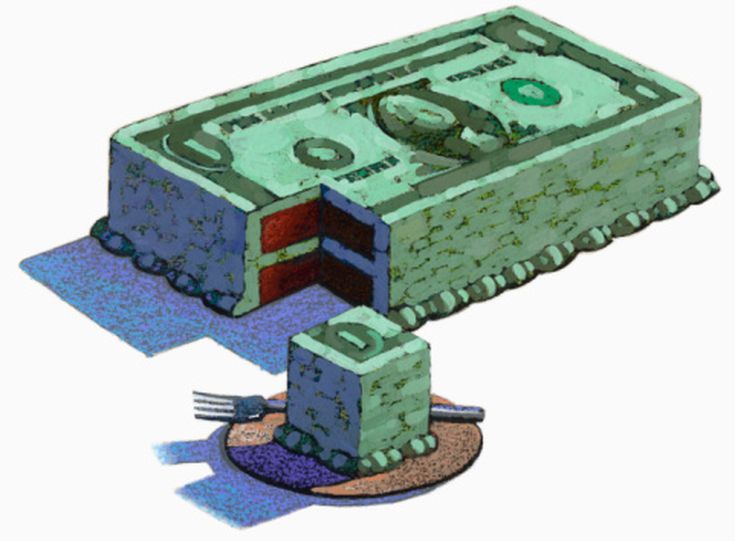
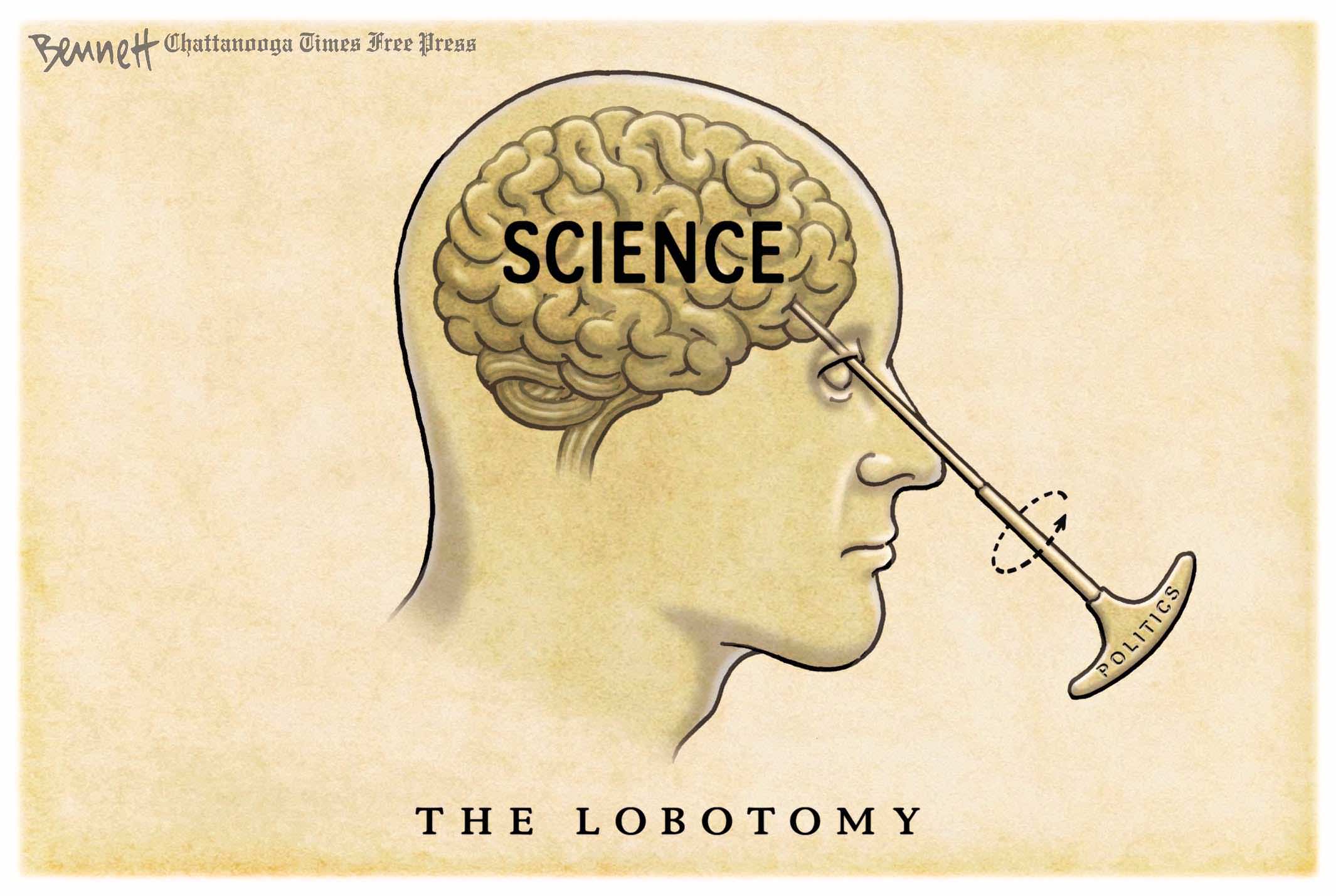
Climatists’ War on Meat updated
Tyler Durden reports at Zerohedge Meat Substitutes Still A Tiny Sliver Of US Meat Market. Excerpts in italics with my bolds and added images.
Over the past few years, plant-based meat substitutes have come closer and closer to mimicking the real thing, with brands like Beyond Meat having even sussed out how to create fake meat that “bleeds”.
But, as Statista’s Anna Fleck details below, after an initial boom, the company has rapidly come down from its peaks.
There are several reasons for the hype having died down, one of which being that many consumers decided to move away from buying the often more expensive items amid the cost of living crisis.
Another reason cited is that plant-based meats have become a part of the U.S.’s culture war, labeled as a symbol of left-wing politics and a binary to “real” meat.
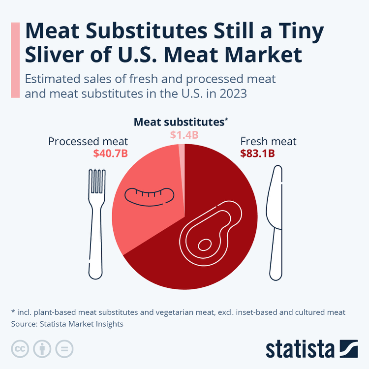
According to data from Statista’s Market Insights, plant-based meat substitutes accounted for a mere sliver of the U.S. meat market last year.
Not counting insect-based meat alternatives or cultured, i.e. lab-grown meat, meat substitute sales amounted to $1.4 billion in 2023, while sales of fresh and processed meat added up to almost $124 billion.
Outlook
- Revenue in the Meat market amounts to US$131.60bn in 2024. The market is expected to grow annually by 4.22% (CAGR 2024-2029).
- In global comparison, most revenue is generated in China (US$273bn in 2024).
- In relation to total population figures, per person revenues of US$385.00 are generated in 2024.
- In the Meat market, volume is expected to amount to 12.10bn kg by 2029. The Meat market is expected to show a volume growth of 1.9% in 2025.
- The average volume per person in the Meat market is expected to amount to 32.4kg in 2024.
What’s Next?

Background Post: Coming Soon: Menu Climate Warnings
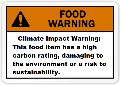
Baylen Linnekin writes at Reason Public Health Researchers Float Idea of Climate-Change Warnings on Menu Items. Excerpts in italics with my bolds and added images.
Warning diners that red meat is bad for the environment is yet another attempt
to socially engineer food choices.
A study released last week suggests that fast-food menus that feature labels urging diners not to order red meat off those same menus due to the “climate impact” of those food items can help convince customers to swap out red meat for what the researchers argue are more climate-friendly foods—from fruits and vegetables to poultry and seafood. The study, published in Jama Network Open and led by researchers from Johns Hopkins University, concludes that “climate impact menu labels may be an effective strategy to promote more sustainable restaurant food choices and that labels highlighting high-climate impact items may be most effective.”

The study’s data comes from more than 5,000 Americans who took part in a nationwide online survey last year. Study participants were instructed to “imagine they were in a restaurant and about to order dinner” from an accurately priced sample menu containing a variety of choices, including hamburgers, chicken sandwiches, plant-based burgers, and salads.
The study asked participants to “order” different foods after viewing one of three types of sample menus online. Outside of a control group, the study presented web users with choices that either disparaged the sustainability of red-meat dishes or touted the sustainability of dishes not containing red meat. Based on the results, which showed people who were more likely to avoid red meat if it had a red warning label and more likely to order other menu items if they featured a green health halo, the authors conclude that “climate impact menu labels [a]re effective” and “that labeling red meat items with negatively framed, red high-climate impact labels was more effective at increasing sustainable selections than labeling non-red meat items with positively framed, green low-climate impact labels.”

The study has spurred some news outlets to suggest governments around the world
may—or should—operationalize its findings.
“Policymakers have been debating how to get people to make less carbon-heavy food choices,” the Guardian recounted in a recent report on the study, “In April, the Intergovernmental Panel on Climate Change (IPCC) report urged world leaders, especially those in developed countries, to support a transition to sustainable, healthy, low-emissions diets.”
“Unfortunately, consumers have been resistant to change and many wish to continue eating meat,” a Phys.org report on the study laments.

Worse still, though the study itself does not suggest that it should be used to form the basis of any government policies, its lead author, Prof. Julia Wolfson of the Johns Hopkins Bloomberg School of Public Health, told CNN last week that “legislation or regulation may be necessary” to force restaurants to add climate warnings to their menus.
Let’s pump the brakes—for a couple of reasons.
Data from the study itself and, more generally, on the effectiveness of government-mandated menu labeling suggests the authors may wish to dial down their perception of the effectiveness of the labels they tested. For example, after completing their respective orders, the survey asked participants if they “notice[d] any labels” on the menu. As the study data reveal, only around 4 out of every 10 participants even noticed any climate-related labeling. While that’s a low percentage, in the real world—in an actual fast-food restaurant setting rather than in an online survey—the percentage would likely be far lower. That’s because, as I’ve explained time and again, study after study has shown that few people pay attention to mandated menu labels (except to choose which food or foods to order), and even fewer use that information.
The premise of the study itself also may rest on shaky ground.
Some critics have pushed back against the notion that some chicken or seafood is more sustainable than all red meat. As the Guardian report on the study notes, “intensively produced chicken has been found to be damaging for the environment, as has some farmed and trawled fish.” Others disagree with the very notion that red meat is an inherently unsustainable food. While it’s become popular in recent years to argue that eating less red meat is better for the environment, that argument has received a good amount of pushback, with critics charging that swapping out meat for plants could be inefficient and ineffective, harm human health, and have unintended consequences for the developing world.

Even if I were to accept arguments that eating less meat is better for the environment, the choice to eat meat (or not) ultimately is and should be an individual’s to make. So it’s not “unfortunate” that consumers “wish to continue eating meat,” as Phys.org posits. And that wish isn’t a cry for government intervention, as Wolfson, the study’s lead author, argues. Rather, it’s a cry for freedom of choice.

If some restaurants competing in the marketplace care to attempt to skew their customers’ choices away from meat and towards vegetarian and/or vegan foods, by all means, they should do so. But the jury is out on whether that would improve the sustainability of those restaurants. What’s more, any restaurant that wants to make such a change should do so on its own accord, without the government’s prompting, backing, or mandate.


 Steve Goreham explains in his Heartland article


 Emmett Hare reports in City Journal


 By way of John Ray comes this Spectator Australia article